Promoting Sustainable Energy Consumption Behavior through Interactive Data Visualizations


1
Faculty of Computer Science, University of Applied Sciences Augsburg, 86161 Augsburg, Germany
2
School of Arts, Design and Architecture, Aalto University, 02150 Espoo, Finland
*
Author to whom correspondence should be addressed.
Multimodal Technol. Interact. 2019, 3(3), 56; https://doi.org/10.3390/mti3030056
Submission received: 1 June 2019
/
Revised: 17 July 2019
/
Accepted: 18 July 2019
/
Published: 21 July 2019
(This article belongs to the Special Issue Interactive Visualizations for Sustainability)
Abstract
:With an increasing worldwide need for energy and the ever-decreasing availability of energy resources, a wide range of interactive visualizations are being developed to allow people to use energy more efficiently by monitoring their consumption patterns and changing their energy usage behavior. For these visualizations to achieve their aim, they must not only target people’s energy saving objectives but also support the necessary factors that help people to change their underlying energy consumption behavior. In this paper, we survey several categories of existing interactive energy visualizations and through a number of selected examples in each case, identify possible potentials for supporting any user behavior changes. For this survey, we have used the behavior change model originally proposed by B. J. Fogg, which defines three factors of motivation, trigger and ability. Our survey has shown that most existing interactive visualizations target the motivation factor, with some supporting trigger or ability and only a few dealing with all the three factors of the behavior change model.
1. Introduction
The limited nature of fossil-fuel energy resources available worldwide, as well as the negative impact of their use on the environment and climate, are making it necessary to not only find alternative means of generating energy through more renewable resources, but also to save energy whenever possible. As such, over the past two decades many technologies have been proposed to support people with saving energy by, for instance, using it more efficiently.
It is, however, a well-known problem that energy use is often “hidden” or “not directly obvious” to most people [1]. Furthermore, there is almost always a lack of information about the amount of energy costs caused by a certain activity (e.g., using a microwave oven vs. a kettle to boil a cup of water) or a neglected activity (e.g., leaving electrical appliances on stand-by mode), which are nearly impossible for most users to analyze or understand.
In recent years, many smart metering devices have been developed and deployed to fill this type of energy usage information gap by gathering electricity consumption data. Such devices are either mounted at: (a) the main fuse box of a household, (b) between a socket outlet and an appliance or (c) inside an appliance itself. They measure the amount of power consumption and either show this information on a built-in display device or send it to other hardware or software applications which may include some form of a data visualization (examples of these will be discussed in Section 4). The aim of such visualizations—built-in or otherwise—is to provide users with some kind of feedback, in an attempt to make the energy use less “hidden” to them.
In addition to smart metering devices, advances in affordable and easy-to-install sensors, WiFi-enabled mobile technologies, and flat display screens in a range of sizes, have made it possible to design a wide variety of visualizations—interactive or not—to support monitoring and managing energy consumption in different contexts such as home, office or industrial settings. As different as such visualizations may be, they all share a common goal in trying to encourage and stimulate more responsible approaches to using energy in consumers’ daily lives.
In this paper, we survey different categories of interactive energy data visualizations, and provide a selection of demonstrative example in each category. We have taken some of these examples from published work, while others are from our own previous research—for instance, conducted within the scope of a collaborative project, called IT4SE [2]. In selecting a suitable variety of example visualizations in these categories, we have taken the following dimensions into consideration:
- Phenotype: This dimension concerns the phenotypic attributes of a visualization. Along this dimension we distinguish whether a visualization is, for instance, a pictorial representation of data, or uses an abstract design to convey some information. This dimension is used to categorize visualizations (e.g., into a graph or an eco-visualization). We will discuss these differences in Section 4.
- Temporal: This dimension concerns the temporal aspect of how a visualization is used. Along this dimension we distinguish between visualizations that are static (i.e., they do not change over time), dynamic (i.e., users must observe them over a time period to notice meaningful changes), and interactive (i.e., users can interact with them to cause changes, for example by manipulating some visualization parameters). We will discuss these in Section 4.
- Discourse: This dimension concerns the application use context, in which visualizations may be deployed to achieve specific discourse purposes with their users. Along this dimension we distinguish between visualizations that serve primarily informational purposes (e.g., showing consumption data to evoke emotional responses in the users, for instance to motivate them). The discourse purpose of a visualization relates to the superordinate objective of the application that deploys the visualization. We will discuss these objectives in Section 2.
It must be emphasized that our aim here is not to provide a comprehensive survey of all the related interactive energy visualizations but rather to focus on the potential of our identified categories of visualizations in changing people’s behavior so that they would be more likely to consume energy more efficiently and in a sustainable manner. As such, we start this paper with a review of the primary motivations for the development of energy visualizations. We then present a behavior change model we have adopted for analyzing our visualization categories. This is followed by a discussion of the role of feedback in changing users’ behavior. The remainder of this paper is then devoted to the categories of different visualizations we have identified.
2. Motivations and Objectives for Saving Energy
While it is clear that there are a countless number of reasons that may motivate a person to want to conserve energy, there are certain types of motivations which are considered to be more widespread than others. Some of these more widely targeted motivations have therefore formed the underlying objectives for the development of many interactive visualizations. Below we define the most important of these objectives.
- Avoid wasting energy: If there is a choice between two equally performing devices or services, and , then the less energy-consuming or more energy-efficient service, say , should be preferred. Examples of such choices include replacing devices that use a lot more energy than their similar alternatives, such as replacing incandescent light bulbs with fluorescent or LED lights. One could go even further and suggest that LED lights should be chosen over fluorescent lights, not only because of their lower energy consumption but also due to other concerns such as environmental factors related to their manufacturing.
- Conserve energy where possible: Energy-consuming services which are not necessary for a user’s essential needs or well-being should not be used. Examples of these include turning off lights when leaving a room or switching off the standby function found in consumer electronic devices, such as TVs, coffee machines and so forth.
- Help to ease energy management: This objective accounts for the fact that users’ energy consumption profiles have a net effect on the power supply system to which they are connected. Therefore, better coordinating energy use by everyone connected to the same power supply system can have positive net effects, such as peak demand reduction. This would in turn allow power grid operators to reduce their maximum grid capacity provisions. Measures to meet this objective are also subsumed by the term Demand Side Management [3]. This objective becomes increasingly important in cases where a high percentage of renewable, but fluctuating, energy resources such as wind and solar energy are used for power generation.
- Rely on renewable energy resources as much as possible: The rationale behind this objective is to save as much of the earth’s remaining fossil-fuel energy resources as possible for future generations and to avoid negative impacts on the environment and climate.
- Raise awareness of the consumers: The idea behind this objective is that, to have any considerable impact, a large percentage of the user population needs to save energy. Educational objectives, for instance, attempt to raise people’s interest in general knowledge about the environmental issues related to energy consumption.
- Promote commercial and business interests: It is also understandable that generating and supplying energy is a commercial undertaking and as such, business interests of energy companies need to be considered. For example, there is a growing number of companies and public authorities that make use of energy visualizations to pursue promotional objectives, for instance, to demonstrate their commitment to sustainability and the environment to their clients.
While, in a broader context, other objectives may also be considered (e.g., the objective of reducing the energy costs associated with the production and disposal of everyday products), at present these are not very widespread and therefore will not be considered in our review in this paper.
Assuming that most people are rational in their behavior, in an ideal world, it may be expected that they would be willing to save energy, simply because by saving energy they would be saving money. In addition, one could go even further and assume that in our modern world—or at least in the developed countries—with widespread concerns about the environment, saving energy would be motivated by a “feel good” factor associated with resource-saving behavior. While the need for energy conservation and a more efficient use of energy might be commonly accepted, there are often many reasons as to why saving energy may not be possible or feasible. Furthermore, as mentioned earlier, most people also have very little knowledge of how energy is actually consumed. For instance, it has been shown that people often overestimate the amount of energy used by salient low-energy activities (e.g., energy use by light bulbs), while they underestimate energy use by less salient high-energy activities (e.g., energy use by a freezer during defrosting) [4].
3. Providing Feedback to Change Behavior
Several reviews of empirical studies [5,6,7,8,9] (including surveys, field trials and in-laboratory user evaluations) have been carried out to assess the effectiveness of different feedback methods. For instance, Darby [7] concludes that more effective display tools are needed as part of smart meters, which should at the very least show feedback on instantaneous usage, expenditure and historic usage data. Similarly, Fisher [8], having conducted a review of 26 cases, suggests that “Successful feedback has to capture the consumer’s attention, to link specific actions to their effects and to activate various motives. If this is the case, then different characteristics of the feedback itself become relevant, among them, its frequency, content, breakdown, presentation, inclusion of comparisons, and combination with additional information and other instruments.” (p. 85). Abrahamse et al. [5] further support the importance of feedback as an effective strategy for reducing energy consumption, particularly if it is given frequently, is combined with goal-setting, allows comparison and is supported with rewards. However, the majority of these studies, including those by Darby and Fisher, have only considered classical forms of feedback, such as paper-printed bills and textual information material often illustrated with diagrams or statistical graphs.
A few other surveys [10,11,12,13,14] have, on the other hand, focused on computerized or digital feedback systems. These have resulted on further design considerations which need to be taken into account, including factors such as which kind of display to use and whether feedback should be given on demand (pull mode) or when deemed necessary (push mode).
While conclusions derived from such reviews are valuable sources of knowledge for designers of energy feedback systems, unfortunately most of them tend to be rather general in nature. Thus, for a concrete design task at hand, they provide little advice on how to design effective interactive visualizations of energy-related data. So far, only a few evaluation studies have addressed such design choices (see References [9,15,16,17]). For instance, Costanza et al. [17] developed an energy monitoring system which offered users the possibility of annotating their consumption data and to play what-if scenarios. In an evaluation of their system they found that these interactive elements add to a stronger engagement with the system and lead to a greater understanding of the presented energy data.
However, the provision of information about energy consumption data or historical usage patterns alone does not necessarily result in consumers changing their behavior. Indeed, assisting people in actually changing their behavior is much more challenging. Froehlich et al. [12] argue that “Eco-feedback designers, whether conscious of it or not, imbue their designs with some theory of human behavior” (p. 2001), and point out the relevance of psychological models and theories concerned with explaining and motivating pro-environmental attitudes and behavior changes.
The idea of using technology to help people change their behavior, by stopping their undesirable habits and adopting better ones, has been targeted by the field of persuasive computing. One of the pioneers of persuasive computing, B. J. Fogg, proposes the design principle of putting “hot triggers in the path of motivated people” [18]. According to Fogg’s model [19], for behavior change to happen, three factors must coincide: (1) people must be motivated in principle, (2) a trigger must be present that just-in-time reminds them to do the right thing, and (3) they must be enabled to act instantly. Fogg’s behavior change model has been adopted and used in a number of fields, for instance for the design of health and well-being applications which aim to promote a healthier lifestyle. Here, we also adopt Fogg’s model and relate it to changing people’s energy saving behavior by defining the following three factors:
- Motivation: Strengthen users’ motivation to conserve and use energy more effectively and keep them motivated about sustainability. Activities related to the motivation factor comprise measures to create and increase users’ awareness of energy consumption and usage patterns, as well as measures that relate their own individual energy consumption to a larger context.
- Trigger: Identify opportunities at which the user should perform actions that contribute to efficient energy use and provide appropriate notifications as triggers.
- Ability: Set-up usable services and technical infrastructures as enabling means for the execution of actions as easily as possible.
From an energy user’s point of view, Fogg’s factors of motivation, trigger and ability relate to the questions of why, when and how to take behavior changing actions. Providing feedback about energy consumption behavior is the first—and perhaps the most important—step in motivating users to save energy. According to Fogg’s behavior change model, providing feedback is a means to increasing people’s awareness of their energy consumption patterns and if this is supported by elements of trigger and ability, then it could lead to actual behavior change over time.
In what follows, we survey and categorize existing energy-related applications that rely on interactive visualizations in one way or another. While doing so, we attempt to identify any specific roles such visualizations aim to play in fulfilling different aspects of Fogg’s behavior change model.
It should, however, be pointed out that there are also other behavior change models that could serve as a basis for analyzing the role of energy visualizations. One candidate for this is the model developed by the environmental psychologist Matthies [20], who in-turn has extended a model of moral decision-making by Schwartz and Howard [21]. The reason for adopting Fogg’s model here is its simplicity. Also, as pointed out by Fogg, his model is a high-level abstraction based on experiences gained from numerous studies conducted over a period of more than 20 years, which has also been proven to be useful in several different application areas, as mentioned above.
4. Interactive Energy Visualizations
The use of visualizations to promote energy saving is no longer a new concept and, as mentioned earlier, a wide range of such visualizations have already been proposed and developed. Our interest here, however, is mainly in interactive visualizations which allow users to not only view some aspects of their energy consumption data but also to interact with the provided visualization in some form. It is this interactivity aspect that we believe could—if designed effectively—provide users with control and ability to investigate their energy usage behavior and patterns more closely, and as such, motivate and assist them to change their underlying energy consumption behavior.
It should also be pointed out that in this paper we consider visualizations which change over time—either automatically or interactively—as being dynamic. These changes could, for instance, be the result of changes in the real-time energy consumption data used by the visualization, or due to the interactions between the user and the visualization. Therefore, one can assume that interactive visualizations are in almost all cases dynamic, and dynamic visualizations go beyond mere static visualizations which are typically used in conventional print media (e.g., visualized snapshots of past usage data).
In this section, we classify and review the most common types of interactive visualizations used in energy-related areas. The aim here is not to make this review systematic or comprehensive but rather to identify behavior-changing factors that could make these categories of interactive visualizations more effective.
4.1. Charts and Graphs
Time-series type charts and graphs are widely used to visualize energy-related data, such as energy consumption data, which are often time-stamped. There are many example of these kinds of visualizations, for instance created using Google’s PowerMeter online service [22] (for an example see Reference [23]). Time-series charts or graphs are useful for visualizing variations in energy use between a minimum “base load” value and a maximum “peak load” value over a period of time. Depending on the granularity of the time scale used, these visualization can make it possible for the user to identify some predominant consumption patterns, such as the day and night cycles or typical peak load time periods. If the visualization tool allows the user to change data selection parameters (e.g., time span of interest), then such visualizations can be considered interactive.
Google stopped offering its PowerMeter service after two years (2009–2011) due to the lower than expected uptake by the consumers. As pointed out by a number of online bloggers (e.g., see Reference [24]), a visual representation of energy usage load on its own is not very likely to affect users’ behavior, and therefore would not contribute much towards any of the energy saving objectives identified here earlier.
Furthermore, the use of such visualizations without any means of comparison does not motivate users to change their behavior, simply because they are not able to judge whether their energy consumption is normal, exhaustive or economical. Also, a chart alone does not provide any practical hints about what could be done to use energy more efficiently, nor to enable users to take any steps to save energy. In order to achieve a motivational effect, the charted consumption data could be related to other data. Using charts, one option is to relate a user’s load profile to the profile of a more energy-efficient user, or to the user’s own consumption data over a past period with a lower consumption rate. To this end, different charts can be aligned or different curves could be overlaid in a single chart. Another strategy is to relate energy consumption data to data of another type. The most straightforward approach is to associate energy consumption (measured in kWh) with incurred costs (in currency units). A diagram that shows both, a consumption curve and a cost curve is especially useful in case of a non-linear mapping between both values, which can occur due to stacked pricing models of some power suppliers.
4.2. Energy Gauges
Another method for providing visual feedback on energy consumption is through the use of energy gauges. An early popular example of this was the Google-o-Meter widget [25] as shown in Figure 1 (or its new alternative gauge visualization [26]). This type of widget is a dynamic representational graphics which maps a user’s current energy consumption onto a scale, similar to an analog meter device. Visual elements such as color and text annotations, can be modified to provide easy-to-understand real-time feedback to users and inform them about their current energy usage, for example by a specific device or the entire household (e.g., see Reference [27]).
Figure 2 provides an example of the use of a gauge feedback visualization in the USEM mobile app [28] for showing the current power usage (at the top). In addition, the interface of the USEM mobile app includes a number of iconic representations of energy consuming devices. This enables users to trace back the share of individual devices on the accumulated overall energy consumption and based on this information, make informed decisions about which devices to turn off to reduce energy consumption.
Visualizations that provide real-time feedback make the strong assumption that users are actually interested in a continuous monitoring of their energy usage. As such, gauges are often included in energy visualization dashboards, which to a large extent follow the idea of using dashboards in cars for informing drivers of the current state of their car (e.g., speed, engine temperature, fuel level, etc.). Figure 3 provides an example of such an energy visualization dashboard [29], which uses gauges not only for showing the current total power consumption (at the bottom center) but also the amount of power currently being generated from different power sources (on either sides). Similar examples of the use of energy dashboards, with gauges and other visualizations, have been provided by Sequeira et al. [30].
The assumption regarding the usefulness of gauges on a dashboard is generally valid while driving a car and therefore, an indicator showing whether the current style of driving is, for instance, economical or not is likely to have a positive impact on drivers’ behavior. Figure 4 shows part of the dashboard of a Toyota Corolla car, in which the “ECO” indicator turns off automatically when acceleration exceeds a certain limit, to inform drivers that their driving style is less economical. Based on Fogg’s model, this kind of “ECO” indicator can provide the trigger for responsible drivers who, since they are in control of their driving, wish to adopt more economical driving behavior. In contrast, in the case of energy usage monitoring, it is unlikely that users would devote the same level of attention to a web-based or mobile device dashboard that shows their current overall household power consumption (as was the case in Google PowerMeter service). The success of a real-time energy consumption feedback tool is not only a matter of effective visualization but rather, the application context is perhaps a more critical factor which needs to be carefully analyzed when designing such tools.
4.3. Eco-Visualizations
As mentioned earlier, energy usage is often invisible to most ordinary people. In attempt to make energy consumption data, as well as other relevant environmental data, more visually accessible, graphic design an media arts techniques have been used to create a particular category of visualizations, commonly known as “eco-visualizations” [10]. In the application area of energy conservation, an eco-visualization refers to a real-time dynamic mapping of energy usage data onto a domain that: (1) can be associated with an effect caused by the amount of the consumption, (2) addresses a concern of the ecologically responsible user and (3) that is visually accessible [10]. It is important to note that the prefix “eco” in this context emphasizes an ecological responsibility rather than necessarily an economic advantage—while in practice ecological responsibility sometimes may also lead to economic benefits (e.g., a lower cost due to less energy use), in some cases more ecological responsibility may actually be more costly.
In an early form of an eco-visualization developed by Holmes [10], energy usage data is converted to the estimated amount of carbon dioxide resulting from fossil-fuel based generation of the used energy. The amount of carbon dioxide is then mapped onto a the number of oak trees which need to be planted to compensate for the carbon footprint of the used energy.
A wide variety of other eco-visualizations have since been proposed [16,31,32] (for other examples also see [33]). Figure 5 provides an example of an eco-visualization developed by Bühling [34]. In this visualization, consisting of photo-realistic representation of trees, a healthy tree shown on the left can gradually die because of the user’s less efficient energy consumption behavior, as shown on the right. Figure 6 gives another similar example, which uses a meadow metaphor to provide users with ecological feedback based on their energy consumption behavior [35]. Eco-visualizations of this type provide a mapping of energy consumption data, resulting from users’ behavior, to wanted or unwanted impacts on the environment. As such, they play a motivational role in changing users’ behavior, and for people who are committed to saving energy, eco-visualizations may also serve as a reminder not to neglect their good intentions.
A well-designed eco-visualization can serve two discourse purposes at once. Firstly, a unique benefit of an eco-visualization is in its potential as an artistic or decorative element, which can be used to enhance a user’s home or work environment (e.g., as an image on a digital photo-frame). In addition, such an “eco-decoration” visualization can also provide its users with ambient energy usage feedback more effectively over a longer time period.
It should however be mentioned that, so far, not many evaluations of eco-visualizations have actually been carried out. Therefore, despite their perceived potential, the effectiveness of eco-visualizations in promoting change of behavior in energy usage is largely unknown. One of the handful of studies evaluating an eco-visualization has been carried out by Kim et al. [15]. In this study a coral-reef metaphor was used as an eco-visualization for showing the amount energy used by a computer during its idle times. This study found that the visualization increased users’ awareness of their computer usage and consequently some of the users changed their behavior to save energy (e.g., by putting their computers to sleep-mode or turning them off).
Another example of an eco-visualization, which has been evaluated over several months, is provided by Tiefenbeck et al. [36]. In this project, an eco-visualization was designed to give real-time feedback on water and energy consumption to people while having a shower, using a small measurement and display device called amphiro b1. This device is mounted between the shower-hose and the shower-head, and automatically turns on to display information on water and energy consumption when the water is turned on. The monochromatic display screen is divided vertically into three sections. The upper section shows the current water temperature (in degree Celsius), the middle section shows the aggregated water/energy consumption (in liters/kWh) and the bottom section shows an eco-visualization in the style of a simplistic line drawing. This eco-visualizations depicts a polar bear standing on an ice floe, which melts and gets smaller as more hot water is used. A large-scale field study of amphiro b1 [36] showed that the real-time feedback resulted in shorter shower duration, and on average energy savings of about 20%—an impressive rate indeed.
Finally, a heuristic evaluation of a paper prototype of two eco-visualizations by Olsen [37] has shown some interest in such visualizations by potential users taking part in the study. However, in this study one of the eco-visualization was actually used in combination with a conventional graph. This may indicate the benefit of using eco-visualizations in combination with other supplementary visualizations or forms of feedback, as was also the case with amphiro b1.
In terms of Fogg’s behavior change model, we propose that an eco-visualization can play two important roles in supporting behavior change. Firstly, it can remind motivated users about their energy saving objectives and secondly, it can trigger them to stop their undesirable behavior (e.g., reduce their shower time as soon as the area of the melting ice floe has fallen below a critical size in amphiro b1 [36]).
4.4. Visualizations for Analytics
The visualization categories discussed so far are not usually designed to support direct exploration of energy data interactively, in the sense that a user can actively select or modify the visual elements to explore the underlying data. In a visual analytics approach, visualizations serve as tools that support a user-driven data exploration and help users to gain a better understanding of their energy-related data. This would in turn, hopefully, contribute to users identifying those of their energy-consuming behavior that could be improved.
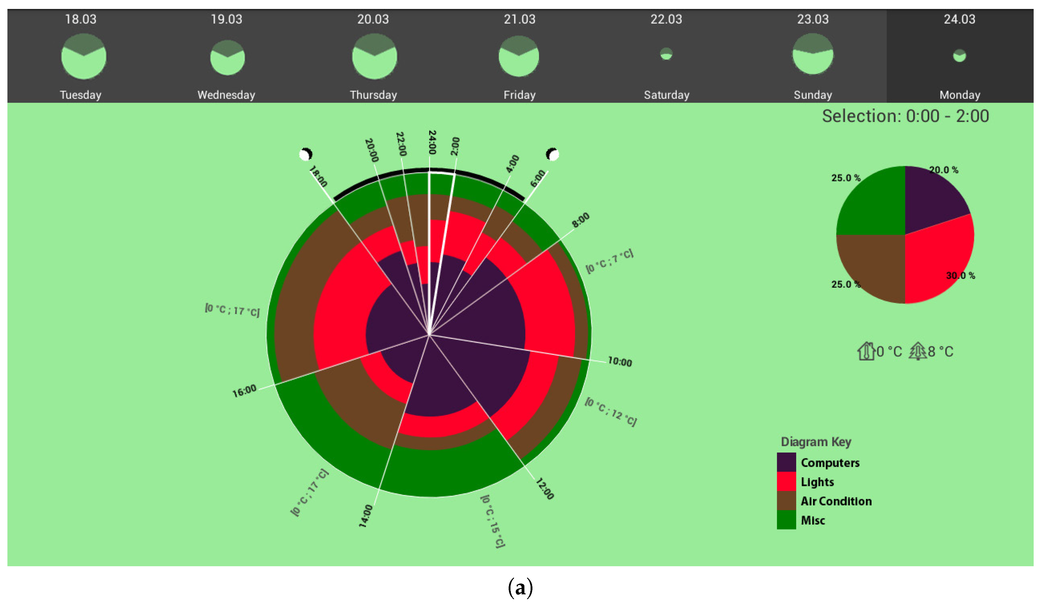
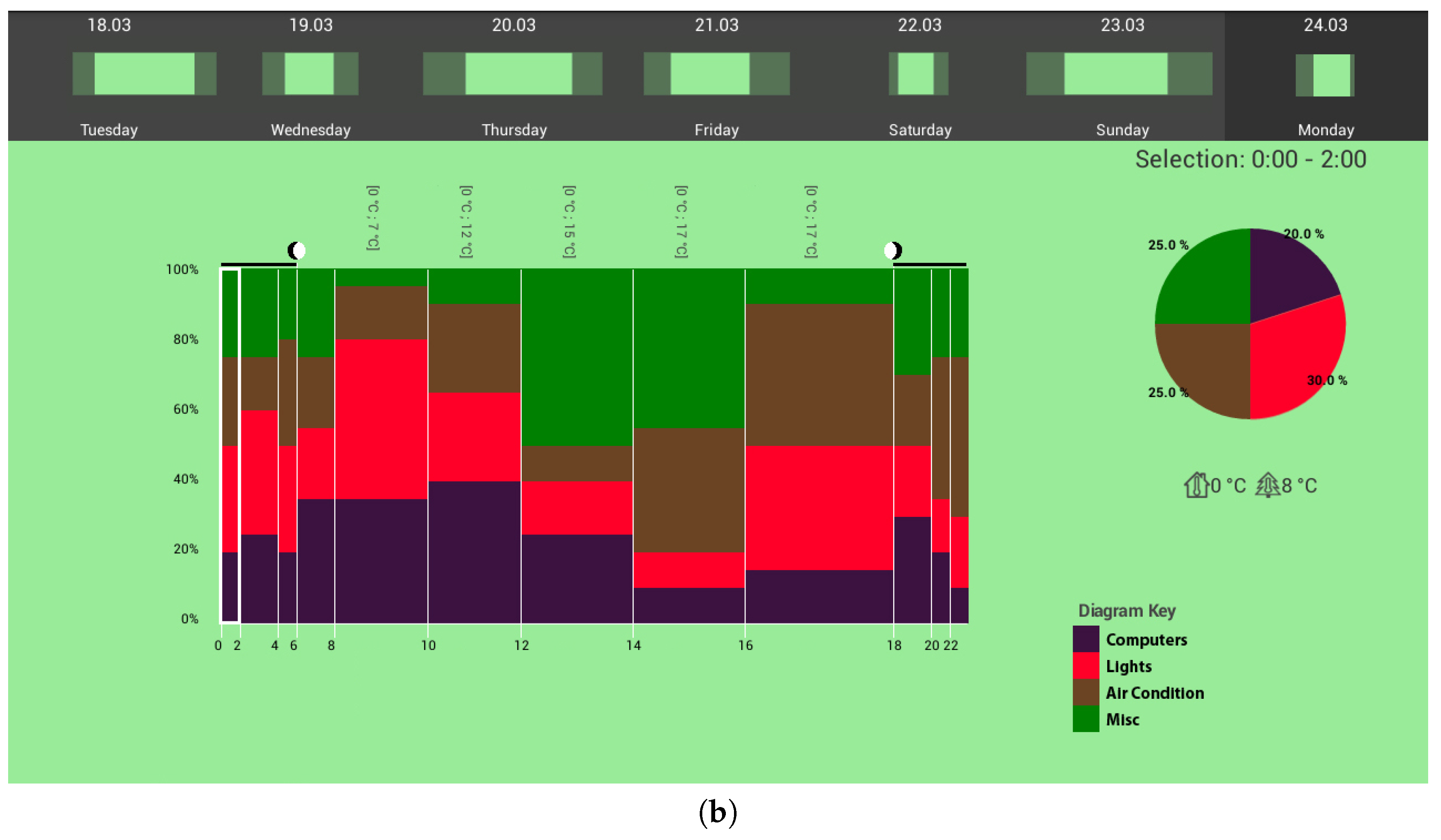
As partners in the IT4SE project [2], we have previously developed a wide variety of interactive visualizations to support users in their investigation of energy consumption data—for instance, to allow them to compare their current usage data with their own past data (historic), or those of others (normative). Examples of these include the time-pie [38] and time-stack [39] visualizations, as shown in Figure 7, which support not only historic and normative comparisons, but also provide contextual information such as inside and outside temperatures at different time periods. Other visualizations which support analysis of energy consumption data together with other environmental data include a visualization tool developed by Itoh et al. [40] that links to a Building Energy Management System for business offices.
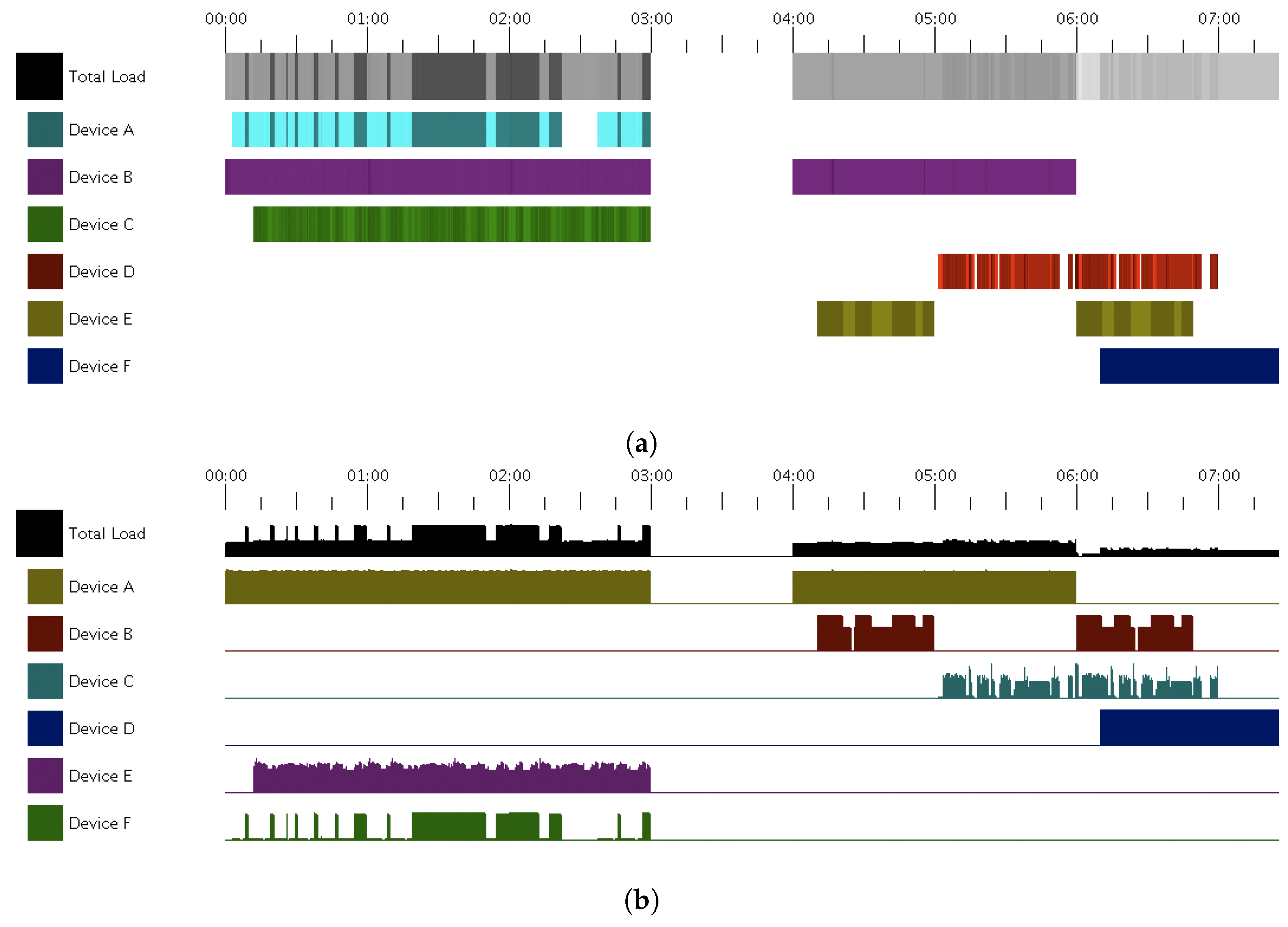
There are also interactive visualizations that aim to support analysis of different aspects of energy consumption, other than just representing the amount consumed. For example, the time-tone visualization [41] allows visual analysis of variations in energy consumption by different categories of devices over time and their respective contributions to the total energy usage load. Figure 8 shows an example of the time-tone visualization along with its corresponding area chart alternative. Time-tone uses variations in tonal value of a selected color hue to represent the percentage load of a device in relation to its maximum energy usage load. Similarly, the total energy usage load, say for an entire household, is shown as variations in grey-scale. Sato et al. [42] provide similar visualizations, for instance, using heath maps for analysis of energy consumption in different laboratories in an office building.
Figure 9 shows yet another example of an interactive visualization of energy data developed by the IT4SE project partners. This interactive visualization is the interface of a simulation tool, which allows users to explore different options of an energy generation portfolio, consisting of renewable (e.g., wind, solar, bio-gas, geothermal) and non-renewable (e.g., coal, oil, gas, atomic power) energy resources. The upper part of the visualization compares the overall amount of generated energy (shown as stacked bars) to a power load profile (line curve). The bar chart in the lower part of the interface consists of interactive bars which represent different energy resources. The user can adjust the share of a certain energy resource by modifying the size of its corresponding bar and dynamically observe the consequences of those changes in the upper visualization. The simulation part of the system takes into account historic weather data to compute the performance of weather-dependant renewable energies. The system is meant to be used as a decision-making support tool for deciding on what investments to make in terms of future renewable energies resources. The tool enables what-if explorations of scenarios assuming different energy portfolios. Given a certain share of renewable resources and a certain time period (e.g., the last year), the upper diagram shows both energy shortfall gaps that must be compensated for with non-renewable resources, as well as over-capacities renewable energy generation that, for instance, require investment in energy storage capacities. Tools such as this can contribute to users’ understanding of the choices available to them, and the consequences of the choices they make in terms of the main energy saving objectives discussed earlier (i.e., relying on renewable energy resources as much as possible).
Figure 10 shows another interactive visual analysis tool, developed as part of a dashboard tool [29] presented earlier (see Figure 3). Clicking on the house icon shown in Figure 3, brings up this visual tool, which shows the daily energy consumption of the household over the past week and compares the current day’s usage and cost with that of the past week. The user can modify the comparison period. The pie chart provided in the visualization shows the distribution of energy consumption by different functional areas. Drilling down further using the pie chart provides even more detail.
Finally, the FigureEnergy visualization system [17] allows users to interactively annotate and manipulate a time-series line graph of their own electricity consumption data. A video-demo of FigureEnergy has been created to show this annotation feature [43]).
The visualizations discussed in this section all aim to support one of the main energy conservation objectives discussed earlier in this paper (i.e., helping to ease energy management). While such visualizations are mainly concerned with the motivation and trigger factors of Fogg’s behavior change model, their longer-term success is largely dependant on also satisfying Fogg’s third factor, by enabling users to act accordingly once they have been motivated and triggered by the information the visualization has provided them through their interactive visual analytics process.
4.5. Gamified and Serious Game Visualizations
Over the past decade the use of games for non-entertainment purposes—known as serious games [44]—and the use of game-like elements (e.g., scores, rewards and levels) within non-game applications—known as gamification [45]—have become more popular in a number of areas, including sustainability. The basic idea behind both serious games and gamification is to utilize elements of play for engaging users in the underlying areas target by the applications. Increasingly, interactive visualizations are also being used within serious games or gamified tools and applications. If designed well, such serious games or gamified visualizations can be very effective in targeting one or more of the factors identified by Fogg for better motivating users (especially younger users), providing them with triggers or enabling them to act in a timely manner to change their behavior.
Due to the ever-increasing popularity of computer games, particularly amongst younger people, many attempts have been made to use games, for instance to raise users’ awareness of energy-related issues and to stimulate pro-environmental behavior. Examples of these include energy management simulation games like EnerCities [46], 2020 Energy [47] and Power Matrix [48], as well as pervasive multiplayer games or mobile energy games such as EnergyLife [49], as shown in Figure 11 and Power Agent [50] which rely on the ubiquitous nature of mobile devices to support user engagement on a more regular basis (e.g., daily or even hourly) over longer time periods (e.g., months or years).
A number of other serious games aim to promote social interactions between people, for instance people living in a local neighborhood, to motivate them to save energy. For example, the Social Power Game [51] attempts to help people save energy not only on their own but also by fostering community collaboration and through increasing people’s intrinsic motivations. Figure 12 shows examples of the visualizations provided by Social Power Game. Figure 12a shows a player’s profile screen, with information related to individual energy consumption, social contributions, experience progression, missions and friends. Figure 12b, on the other hand, shows information related to an individual’s Energy Hive, which incorporates wider energy-related information such as transportation, infrastructures and so on.
In another example, Hedin et al. [52] report on a serious game they have designed, called Energy Piggy Bank, which aims to reduce households’ energy consumption by enabling and motivating users to learn new energy-saving habits. In this game, players are part of a team and they collect points for their team by doing energy-saving actions. Based on their user evaluation of Energy Piggy Bank, Hedin et al. suggest that the designers of this type of serious games should take into considration the theories and frameworks they have used in their study. They also emphasize that “in order for ICT-driven behavior change interventions to be successful it is important these interventions are mindful of the many barriers for achieving long-term behavior change and aim at promoting behaviors that are intrinsically motivated which have a greater potential for standing the test of time.” [52] (p. 6).
With the widespread availability of easy-to-assemble and use tools from the Internet of Things (IoT) domain, as well as many WiFi-enabled energy measurement components and sensors, increasing number of serious games have been developed in recent years to motivate users to save energy. For example, Garcia-Garcia et al. [53] introduce a serious game that provides realistic representation of buildings with which players can interact. It also gets current weather conditions of the geographical area surrounding a target building from a server and uses this information to change the game scenario. Another serious game which uses data from WiFi-enabled energy usage measurement components—in this case not only electricity but also gas—is EnerGAware [54]. In this game, the player is represented as an Energy Cat whose aim is to live in a house which is comfortable and energy-efficient. The main objective of the game is to increase the understanding and engagement of the social housing tenants in energy efficiency.
As an alternative approach to serious games, gamified visualizations are designed to change users’ behavior by trying to benefit from some of the fun and engaging elements of games, without having to fully design and implement a gameplay or any game mechanics. An interesting example of a gamified visualization, which also adopts artistic elements of an eco-visualization, is ChArGED [55]. The aim of this gamified framework is to change the energy consumption-related behavior of the occupants of public buildings and reduce their energy wastage. This gamified mobile app visualizes data about users’ behavior both at an individual level, as well as a team level. Users’ energy saving behavior and achievements result in accumulating scores, which are eco-visualized in the form of a living tree that grows and prospers according to the users’ accumulated scores.
An example of a gamified mobile app, which has been designed to assists its users to reduce CO2 emissions and save energy through sustainable mobility [56], is GoEco! [57]. This gamified app utilizes the location-tracking component of a mobile phone to provide its users with eco-feedback and social comparisons, in an attempt to persuade them to use alternative (i.e., more environmentally-friendly and sustainable) modes of transport. Based on the evaluation of this app, its developers propose that such apps should be designed in a way that their features support creating personal relationships and make users feel that they belong to a community.
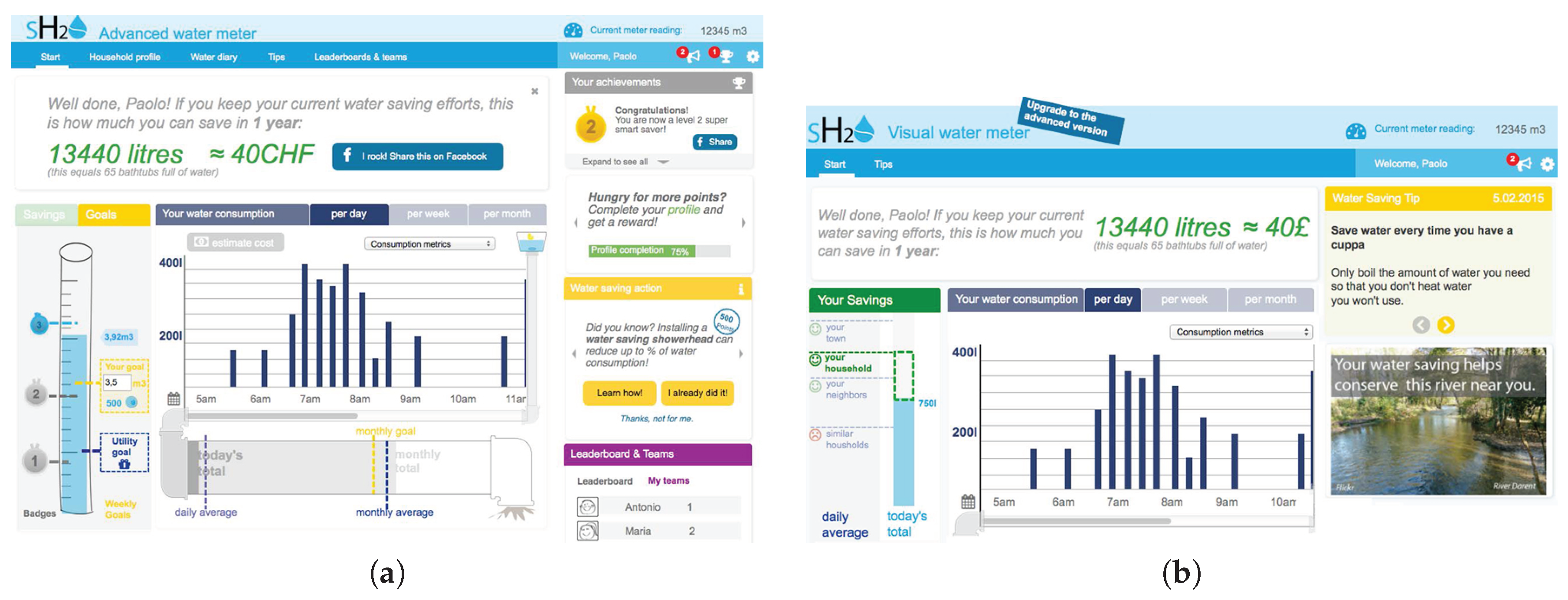
Although not in the area of interactive energy data visualization, Micheel et al. [58] also provide an interesting example of the use of gamification elements in supporting a visualization for sustainability—in this case the visualization of water usage data to assist behavior change towards water conservation—as part of the SmartH2O project (see Figure 13).
More recently, due to their processing and rendering capabilities and a wide range of level-building and other visual elements and tools, 3D game engines have become increasingly popular as platforms for creating interactive visualizations and other applications. For instance, the EEPOS project [59] developed a game-like environment in which a user navigates through a 3D model of a virtual neighborhood to inspect the energy consumption of the models’ real-world counterparts. Using color coding, the surface color of the virtual buildings indicates the amount of energy they consume (for an image, see Reference [60]).
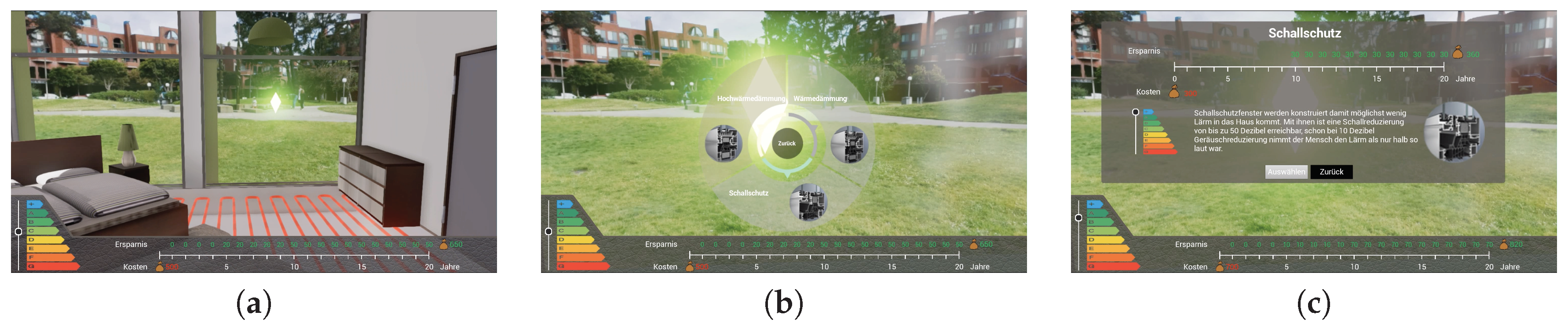
Another example of the use of a 3D game engine to create a game-like environment for energy-related visualizations is the 3D-Infokit prototype [61]. Figure 14 shows several images form different parts of this prototype, which provides an interactive 3D model of a building. Users can navigate the 3D model using a conventional game pad, to discover and explore different building materials and HVAC (Heating, Ventilating and Air Conditioning) technologies (Figure 14a). A number of choice points are embedded into the 3D exploration space (Figure 14b). Selecting an option changes the initial investment costs, and generates potential energy saving estimates on a 20-year time horizon (Figure 14c).
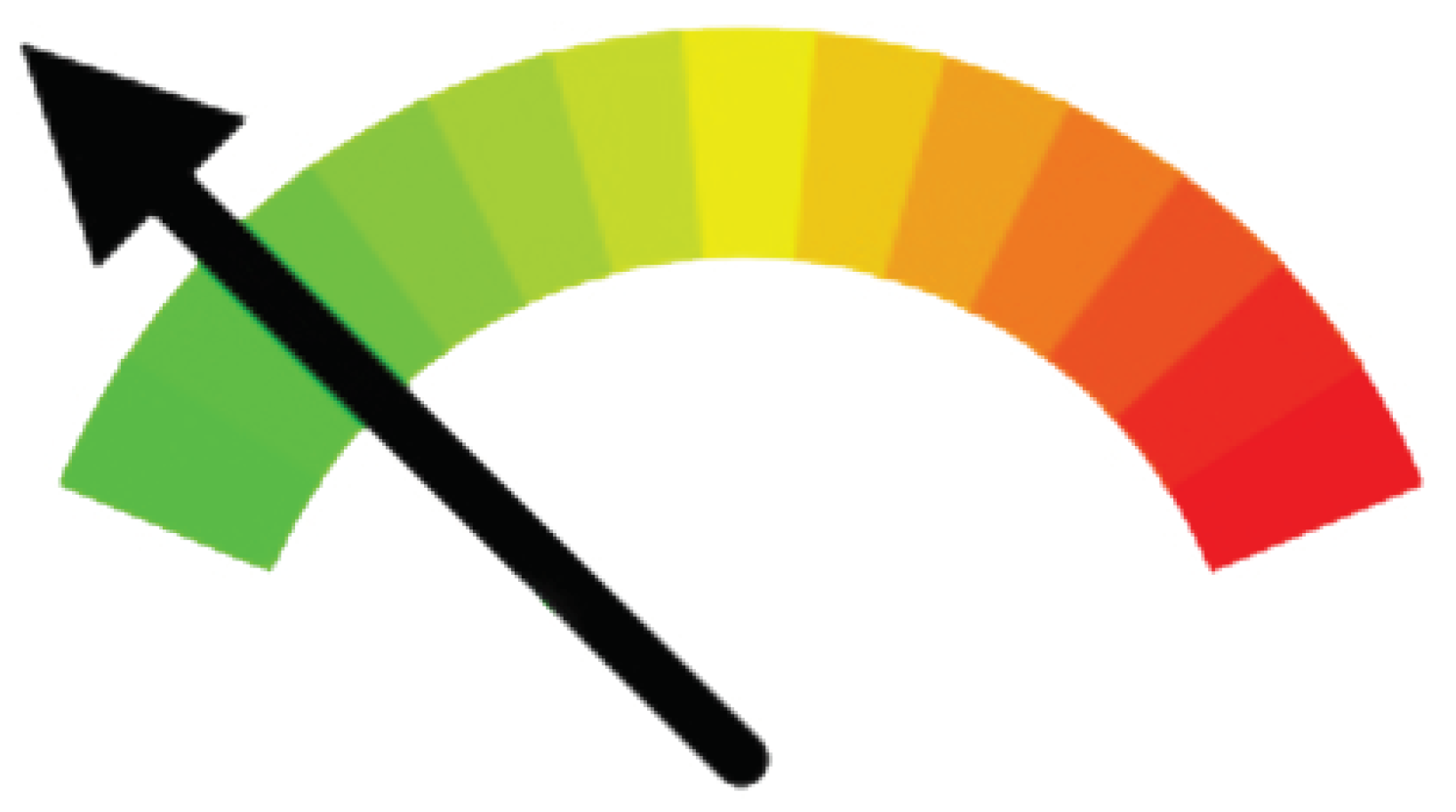
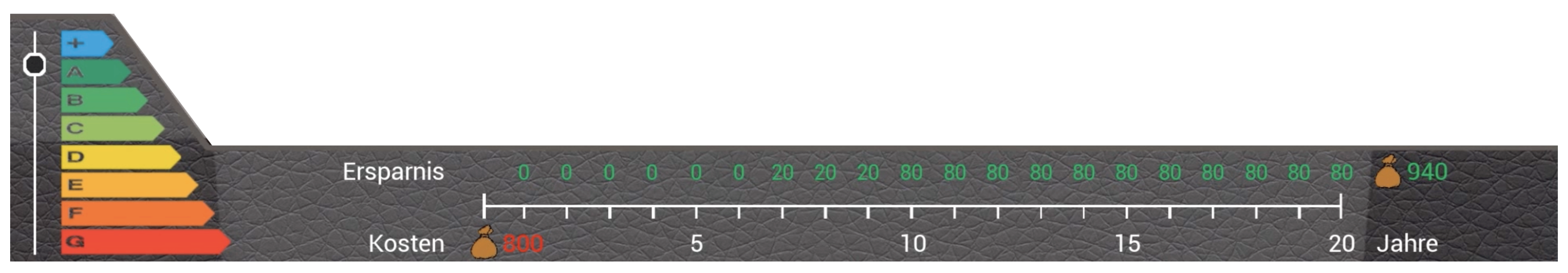
Such virtually executed changes on a building could help users to learn about available energy saving measures. Using Fogg’s terminology, this can be seen as a form of enablement. The 3D-Infokit also features a so-called energy passport gauge (Figure 15), which is used to provide direct visual feedback on the quality of a choice in terms of its energy efficiency (indicator on the left, showing ratings A–G), initial cost (amount on the bottom left of the bar, showing 800 in red), and the resulting annual and total monetary savings made (amount on the top right of the bar, showing 940 in green). During an interactive exploration session with 3D-Infokit, this energy passport gauge could provide the users with triggering information to increase their virtual scores, by motivating them to making better energy saving decisions based on their testing of different available choices.
While the underlying game concepts or gamification elements used in existing examples are rather different, most of them include visualizations of energy-related data in some form or another (e.g., the use of charts, graphs, gauges or even interactive virtual 3D environments as discussed above). However, as with any type of game, the design choices must be made very carefully and the game-specific requirements are critical to the success or failure of such serious games or gamified applications. Indeed, most games—whether serious or not—fail due to shortcomings in the their underlying game concept or their basic game design, including their visual design elements.
4.6. Ambient and Physical Visualizations
Though not always interactive, many forms of ambient (for examples, see Reference [31]) and tangible or physical (for examples, see Reference [62]) visualizations have been created in recent years to provide users with feedback about their energy consumption to: (a) motivate them to change their behavior, (b) generate information triggers or even (c) enable users to act to save energy.
An interesting example of a tangible energy visualization has been developed by Quintal et al. [63,64], in a system called Watt-I-See. The aim of Watt-I-See is to raise consumers’ awareness about energy production. As shown in Figure 16a, glass pipes filled with distilled water and liquid paraffin are used to create color effects representing different energy sources, including thermal (purple), wind (clear), hydro (dark blue) and solar (yellow). In addition, visual feedback on the overall quota of renewable energy in the grid is given using colored power sockets, as shown in Figure 16b. A mixed method evaluation of Watt-I-See has been conducted using surveys, observations of the exploration of the actual installation and semi-structured interviews of users [63]. The results of this evaluation showed an increase in users’ energy literacy and awareness. It also showed that users much preferred simple representative interfaces, as well as ubiquitous immediate feedback.
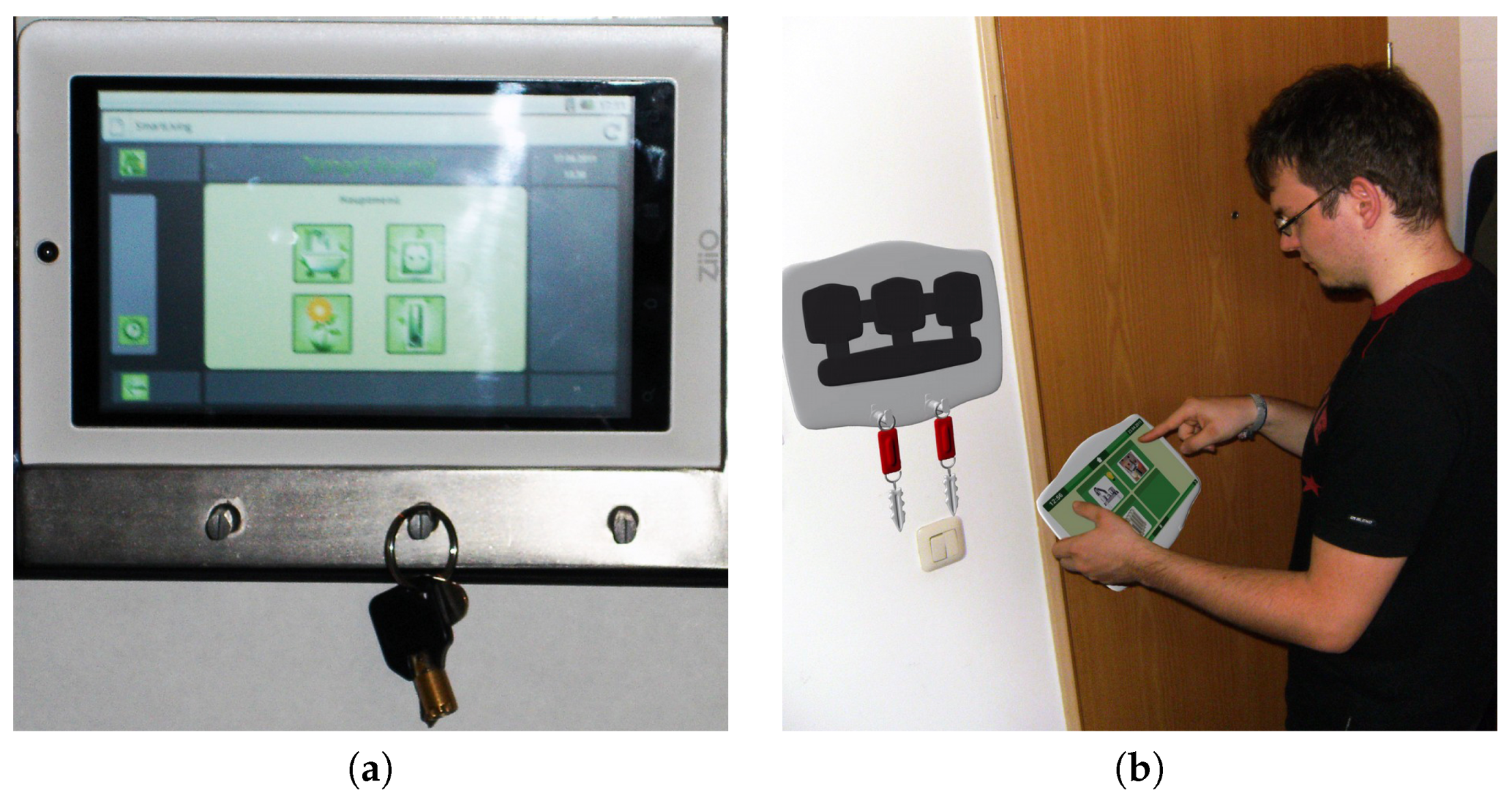
Figure 17 shows two versions of a key-holder interactive display device, which is placed near the entrance door of a home as part of the Smart Living project [66]. In this application, Fogg’s design mantra of “putting hot triggers in the path of motivated people” is taken literally. The aim is to provide users with information about their energy-consuming devices as they are leaving their home, to enable them to take action and turn off immediately those devices that are no longer needed.
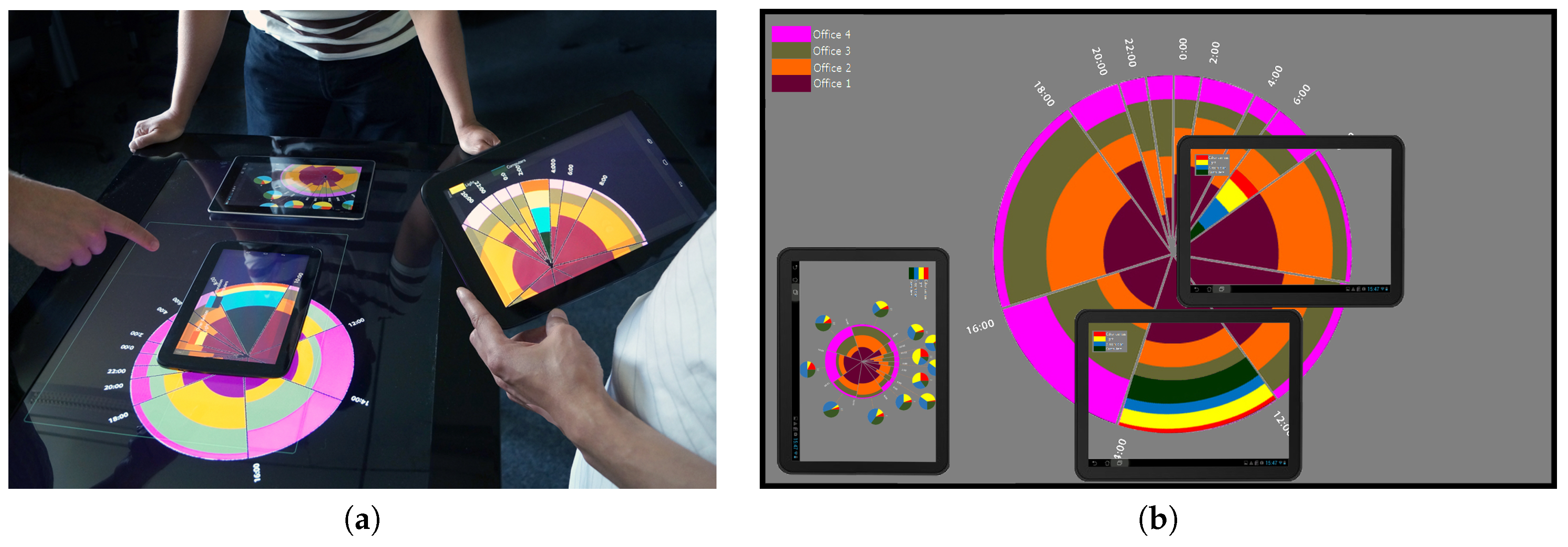
Another example of an interactive visualization, which could be considered a mixed-device or a physical visualization, is Show-Me [67]. Show-Me is designed to support individual users to focus on their own data and areas of interest using their private mobile devices (e.g., tablets) in the context of shared common visualization displayed on a group display (e.g., a tabletop). While Show-Me could be used for a range of co-located collaborative visualization tasks, we have previously used it in combination with the time-pie [38] visualization (see Section 4.4). Figure 18a shows this visualization in use. As depicted in Figure 18b, each tablet can be used for presenting its own time-pie view of the shared time-pie visualization shown on the tabletop display.
The main potential of ambient and physical visualizations is due to their availability over longer periods of time in people’s living and work environments. As interactive technologies are incorporated into physical environments to a greater extent in the future, this potential is likely to increase further. Based on Fogg’s model, this potential could be used to motivate users more continuously, provide triggers more timely and more literally and allow inclusion of physical enablers in people’s real-world.
5. Discussion
The main purpose of our survey has been to identify the roles that a visualization may play within an application designed to support people in changing their behavior to use energy more efficiently. As discussed in Section 3, we have adopted Fogg’s behavior change model [19] as a tool for the analysis of the visualization categories we have identified. Using this model it has been possible to relate the main energy saving objectives discussed in Section 2 with Fogg’s three factors of motivation, trigger and ability—which must be met by any visualization tool aiming to promote and support behavior change. This model has allowed us to pin down more specifically both the intended use, as well as the potential contributions, of visualizations within an energy-saving application.
Table 1 provides a summary of our survey findings. As can be seen from this table, we have observed in our example cases that all visualization categories attempt to generate and maintain users’ motivation to pursue certain energy-saving objectives. In some real-time feedback applications, visualizations may convey triggering information to notify users to act accordingly. Visualizations that aim to provide enabling information are more likely to be found in tools for visual analytics, or in game-like simulation environments, where users are provided with different options on how to achieve certain energy-saving objectives and are given the possibility of trying them out individually to support some form of energy-related decision-making.
6. Conclusions
In this paper, we have defined and surveyed several categories of interactive visualizations which aim to foster sustainable and responsible use of energy and other natural resources. While there are a wide range of such visualizations, rather than providing a comprehensive review of them, here we have attempted to select a limited set of examples along the three basic dimensions of phenotype, temporal and discourse. We have also identified several main objectives that often motivate energy-saving initiatives by consumers and as such, need to be taken into account by designers of energy monitoring and management visualizations.
Based on these, we have then provided a classification of existing visualizations and given case examples of a number of different strategies for the dynamic and interactive visualization of energy-related data in each category. This survey has shown that most of these previous approaches aim at saving energy and visualizations are mainly used to raise users’ awareness of their energy consumption in one way or another, to better motivate them to save energy. Differences of course exist in the style of these visualizations, the degree of data granularity they represent (e.g., overall consumption vs. consumption per appliance), the time resolution they deal with (e.g., near real-time vs. aggregated over a period, such as hours, days, months or years), and whether or not they support interactive exploration of data.
In terms of the future research directions in the area of interactive visualizations for supporting energy conservation, we would like to highlight two possible directions. Firstly, as proposed by Hargreaves [68], we support taking other alternative approaches to designing energy visualizations— for instance, through speculative design—and rather than just focusing solely on saving more energy, it is crucial to consider how energy feedback visualizations could frame energy problems and shape the agency and engagement of all the different actors involved [68].
Secondly, lessons learned from the development of different categories of visualizations, as presented in this paper, together with experiences gathered in various energy conversation initiatives and activities can inform the design of systems which aim to help people monitor their consumption of natural resources in general and energy resources in particular. Recent advances in the analysis and mining of mass data could allow correlating energy-related data with many other data sources. In this approach, there is a great potential for gaining insights into users’ behavioral patterns, which in turn must be communicated back to them. Interactive visualizations can play an important role as communication tools for making such insights resulting from automated data-mining approaches more readily available to ordinary users—ultimately making energy consumption more visible to non-expert users.
Finally, it should be pointed out that while most of our example visualizations in this paper have focused on residential users, energy saving is also important in other sectors such as commercial and industrial settings [69]. Clearly, interactive visualizations are also needed to target these other sectors and these would have their own primary objectives to fulfill, as well as requiring alternative models to be adopted for the analysis of their effectiveness.
Author Contributions
T.R. created the basic structure of the classification survey; T.R. and M.M. contributed equally to the collection, analysis, and classification of the surveyed visualizations; M.M. coordinated the writing and editing of the manuscript.
Funding
Some of the example visualizations reported in this paper were developed by us and/or our project partners as part of the IT4SE research cooperation, funded under the APRA initiative (Grant number 01DR12041 IT4SE) by the German Federal Ministry of Education and Research (BMBF). For further information about the IT4SE project see its website at http://it4se.hs-augsburg.de/.
Conflicts of Interest
The authors declare no conflict of interest.
References
- Broms, L.; Katzeff, C.; Bång, M.; Nyblom, A.; Hjelm, S.I.; Ehrnberger, K. Coffee Maker Patterns and the Design of Energy Feedback Artefacts. In Proceedings of the 8th ACM Conference on Designing Interactive Systems (DIS ’10), Aarhus, Denmark, 16–20 August 2010; ACM: New York, NY, USA, 2010; pp. 93–102. [Google Scholar] [CrossRef]
- IT4SE. IT for Smart Renewable Energy Generation and Use. 2016. Available online: http://it4se.hs-augsburg.de/ (accessed on 3 July 2019).
- International Energy Agency. IEA Demand Side Management Programme. 2019. Available online: http://www.ieadsm.org/ (accessed on 3 July 2019).
- Herrmann, M.R.; Brumby, D.P.; Oreszczyn, T.; Gilbert, X.M.P. Does data visualization affect users’ understanding of electricity consumption. Build. Res. Inf. 2018, 46, 238–250. [Google Scholar] [CrossRef]
- Abrahamse, W.; Steg, L.; Vlek, C.; Rothengatter, T. A review of intervention studies aimed at household energy conservation. J. Environ. Psychol. 2005, 25, 273–291. [Google Scholar] [CrossRef]
- Abrahamse, W.; Steg, L.; Vlek, C.; Rothengatter, T. The effect of tailored information, goal setting, and tailored feedback on household energy use, energy-related behaviors, and behavioral antecedents. J. Environ. Psychol. 2007, 27, 265–276. [Google Scholar] [CrossRef]
- Darby, S. The Effectiveness of Feedback on Energy Consumption. 2006. Available online: https://www.eci.ox.ac.uk/research/energy/downloads/smart-metering-report.pdf (accessed on 3 July 2019).
- Fischer, C. Feedback on household electricity consumption: A tool for saving energy? Energy Eff. 2008, 1, 79–104. [Google Scholar] [CrossRef]
- Fitzpatrick, G.; Smith, G. Technology-Enabled Feedback on Domestic Energy Consumption: Articulating a Set of Design Concerns. IEEE Pervasive Comput. 2009, 8, 37–44. [Google Scholar] [CrossRef]
- Holmes, T.G. Eco-visualization: Combining Art and Technology to Reduce Energy Consumption. In Proceedings of the 6th ACM SIGCHI Conference on Creativity & Cognition (C&C ’07), Washington, DC, USA, 13–15 June 2007; ACM: New York, NY, USA, 2007; pp. 153–162. [Google Scholar] [CrossRef]
- Vine, D.; Buys, L.; Morris, P. The effectiveness of energy feedback for conservation and peak demand: A literature review. Open J. Energy Eff. 2013, 2, 7–15. [Google Scholar] [CrossRef]
- Froehlich, J.; Findlater, L.; Landay, J. The Design of Eco-feedback Technology. In Proceedings of the SIGCHI Conference on Human Factors in Computing Systems (CHI ’10), Atlanta, GA, USA, 10–15 April 2010; ACM: New York, NY, USA, 2010; pp. 1999–2008. [Google Scholar] [CrossRef]
- Masoodian, M.; André, E.; Kugler, M.; Reinhart, F.; Rogers, B.; Schlieper, K. USEM: A Ubiquitous Smart Energy Management System for Residential Homes. Int. J. Adv. Intell. Syst. 2014, 7, 519–532. [Google Scholar]
- Spence, A.; Goulden, M.; Leygue, C.; Banks, N.; Bedwell, B.; Jewell, M.; Yang, R.; Ferguson, E. Digital energy visualizations in the workplace: The e-Genie tool. Build. Res. Inf. 2018, 46, 272–283. [Google Scholar] [CrossRef]
- Kim, T.; Hong, H.; Magerko, B. Design requirements for ambient display that supports sustainable lifestyle. In Proceedings of the 8th ACM Conference on Designing Interactive Systems (DIS ’10), Aarhus, Denmark, 16–20 August 2010; ACM: New York, NY, USA, 2010; pp. 103–112. [Google Scholar] [CrossRef]
- Hargreaves, T.; Nye, M.; Burgess, J. Making energy visible: A qualitative field study of how householders interact with feedback from smart energy monitors. Energy Policy 2010, 38, 6111–6119. [Google Scholar] [CrossRef]
- Costanza, E.; Ramchurn, S.D.; Jennings, N.R. Understanding Domestic Energy Consumption Through Interactive Visualisation: A Field Study. In In Proceedings of the 2012 ACM Conference on Ubiquitous Computing (UbiComp ’12), Pittsburgh, PA, USA, 5–8 September 2012; ACM: New York, NY, USA, 2012; pp. 216–225. [Google Scholar] [CrossRef]
- Groenewegen, A. BJ Fogg Model Explained. 2018. Available online: https://suebehaviouraldesign.com/bj-fogg-model/ (accessed on 3 July 2019).
- Fogg, B.J.; Cueller, G.; Danielson, D. Motivating, Influencing, and Persuading Users: An Introduction to Captology. In The Human-Computer Interaction Handbook: Fundamentals, Evolving Technologies and Emerging Applications, 2nd ed.; Sears, A., Jacko, J.A., Eds.; CRC Press: Boca Raton, FL, USA, 2007; Chapter 7; pp. 133–147. [Google Scholar]
- Matthies, E. Wie können PsychologInnen ihr Wissen besser an die PraktikerIn bringen? Vorschlag eines neuen integratives Einflussschemas umweltbewussten Alltagshandelns. Umweltpsychologie 2005, 9, 62–81. [Google Scholar]
- Schwartz, S.H.; Howard, J.A. A Normative Decision-Making Model of Altruism. In Altruism and Helping Behavior: Social, Personality, and Developmental Perspectives; Rushton, P.J., Sorrentino, R.M., Eds.; Lawrence Erlbaum: Hillsdale, MI, USA, 1981; pp. 189–211. [Google Scholar]
- Google. PowerMeter Partner Resources. 2019. Available online: https://sites.google.com/site/powermeterpartners/Overview (accessed on 3 July 2019).
- Dawson-Haggerty, S.; Ortiz, J.; Jiang, X.; Hsu, J.; Shankar, S.; Culler, D. Enabling Green Building Applications. In Proceedings of the 6th Workshop on Hot Topics in Embedded Networked Sensors (HotEmNets ’10), Killarney, Ireland, 28–29 June 2010; ACM: New York, NY, USA, 2010; pp. 4:1–4:5. [Google Scholar] [CrossRef]
- Fehrenbacher, K. 5 Reasons Google PowerMeter Didn’T Take Off. 2011. Available online: https://gigaom.com/2011/06/26/5-reasons-google-powermeter-didnt-take-off/ (accessed on 3 July 2019).
- Google. Google-O-Meter Charts. 2012. Available online: https://developers.google.com/chart/image/docs/gallery/googleometer_chart (accessed on 3 July 2019).
- Google. Visualization: Gauge. 2019. Available online: https://developers.google.com/chart/interactive/docs/gallery/gauge (accessed on 3 July 2019).
- Murugesan, L.; Hoda, R.; Salcic, Z.; Verma, P. Policy Recommendations to Induce Behavioural Changes through Interactive Energy Visualisation. In Proceedings of the IEEE Innovative Smart Grid Technologies (ISGT Asia ’18), Singapore, 22–25 May 2018; pp. 1091–1096. [Google Scholar] [CrossRef]
- Reinhart, F.; Schlieper, K.; Kugler, M.; André, E.; Masoodian, M.; Rogers, B. Fostering Energy Awareness in Residential Homes Using Mobile Devices. In Proceedings of the 4th International Conference on Smart Grids, Green Communications and IT Energy-aware Technologies (ENERGY 2014), Chamonix, France, 20–24 April 2014; pp. 35–43. [Google Scholar]
- Apperley, M.; Kalyan, J. A Mobile Personal Residential Electricity Dashboard. In Proceedings of the 19th International Conference on Information Visualisation (IV ’15), Barcelona, Spain, 21–24 July 2015; pp. 195–199. [Google Scholar] [CrossRef]
- Sequeira, H.; Carreira, P.; Goldschmidt, T.; Vorst, P. Energy Cloud: Real-Time Cloud-Native Energy Management System to Monitor and Analyze Energy Consumption in Multiple Industrial Sites. In Proceedings of the 7th IEEE/ACM International Conference on Utility and Cloud Computing, London, UK, 8–11 December 2014; pp. 529–534. [Google Scholar] [CrossRef]
- Rodgers, J.; Bartram, L. Exploring Ambient and Artistic Visualization for Residential Energy Use Feedback. IEEE Trans. Vis. Comput. Graph. 2011, 17, 2489–2497. [Google Scholar] [CrossRef] [PubMed]
- Bartram, L. Design Challenges and Opportunities for Eco-Feedback in the Home. IEEE Comput. Graph. Appl. 2015, 35, 52–62. [Google Scholar] [CrossRef]
- FlowingData. 21 (Eco)Visualizations for Energy Consumption Awareness. 2008. Available online: https://flowingdata.com/2008/04/03/21-ecovisualizations-for-energy-consumption-awareness/ (accessed on 3 July 2019).
- Bühling, R. Ästhetisch Motivierte Gestaltung Als Persuasives Element in Interaktiven Medien. Ph.D. Thesis, Augsburg University, Augsburg, Germany, 2015. [Google Scholar]
- Rist, T. Towards a More Responsible Use of Energy through Visualization of Energy Data. In Proceedings of the Workshop on Fostering Smart Energy Applications through Advanced Visual Interfaces (FSEA ’14), Como, Italy, 27 May 2014; pp. 9–14. [Google Scholar]
- Tiefenbeck, V.; Goette, L.; Degen, K.; Tasic, V.; Fleisch, E.; Lalive, R.; Staake, T. Overcoming Salience Bias: How Real-Time Feedback Fosters Resource Conservation. Manag. Sci. 2018, 64, 1458–1476. [Google Scholar] [CrossRef] [Green Version]
- Olsen, C.S. Visualization of energy consumption: Motivating for a sustainable behaviour through social media. In Proceedings of the International Conference on Collaboration Technologies and Systems (CTS ’14), Minneapolis, MN, USA, 19–23 May 2014; pp. 641–646. [Google Scholar] [CrossRef]
- Masoodian, M.; Endrass, B.; Bühling, R.; Ermolin, P.; André, E. Time-Pie visualization: Providing Contextual Information for Energy Consumption Data. In Proceedings of the 17th International Conference on Information Visualisation (IV ’13), London, UK, 16–18 July 2013; pp. 102–107. [Google Scholar] [CrossRef]
- Masoodian, M.; Endrass, B.; Bühling, R.; Ermolin, P.; André, E. Visualization Support for Comparing Energy Consumption Data. In Proceedings of the 19th International Conference on Information Visualisation (IV ’15), Barcelona, Spain, 21–24 July 2015; pp. 28–34. [Google Scholar] [CrossRef]
- Itoh, T.; Kawano, M.; Kutsuna, S.; Watanabe, T. A Visualization Tool for Building Energy Management System. In Proceedings of the 19th International Conference on Information Visualisation (IV ’15), Barcelona, Spain, 21–24 July 2015; pp. 15–20. [Google Scholar] [CrossRef]
- Masoodian, M.; Buchwald, I.; Luz, S.; André, E. Temporal Visualization of Energy Consumption Loads Using Time-Tone. In Proceedings of the 21st International Conference Information Visualisation (IV ’17), London, UK, 11–14 July 2017; pp. 146–151. [Google Scholar] [CrossRef]
- Sato, I.; Diptarama; Shinohara, A. Visualization and Analysis of Electrical Energy Consumption in Laboratories. In Proceedings of the 5th IIAI International Congress on Advanced Applied Informatics (IIAI-AAI ’16), Kumamoto, Japan, 10–14 July 2016; pp. 509–512. [Google Scholar] [CrossRef]
- Costanza, E.; Ramchurn, S.D.; Jennings, N.R. FigureEnergy. 2012. Available online: https://vimeo.com/42328926 (accessed on 3 July 2019).
- Luz, S.; Masoodian, M.; Cesario, R.R.; Cesario, M. Using a serious game to promote community-based awareness and prevention of neglected tropical diseases. Entertain. Comput. 2016, 15, 43–55. [Google Scholar] [CrossRef] [Green Version]
- Seaborn, K.; Fels, D.I. Gamification in theory and action: A survey. Int. J. Hum.-Comput. Stud. 2015, 74, 14–31. [Google Scholar] [CrossRef]
- Paladin Studios. EnerCities. 2018. Available online: https://paladinstudios.com/enercities/ (accessed on 3 July 2019).
- 2020 Energy. Serious Games. 2019. Available online: http://www.2020energy.eu/en/serious-game (accessed on 3 July 2019).
- Siemens. Power Your World—Siemens Energy Introduces the New Browser Game Power Matrix. 2013. Available online: https://www.siemens.com/press/en/feature/2013/energy/2013-06-power-matrix.php (accessed on 3 July 2019).
- Jacucci, G.; Spagnolli, A.; Gamberini, L.; Chalambalakis, A.; Björkskog, C.; Bertoncini, M.; Torstensson, C.; Monti, P. Designing Effective Feedback of Electricity Consumption for Mobile User Interfaces. PsychNology J. 2009, 7, 265–289. [Google Scholar]
- Gustafsson, A.; Bång, M.; Svahn, M. Power explorer: A casual game style for encouraging long term behavior change among teenagers. In Proceedings of the International Conference on Advances in Computer Enterntainment Technology (ACE ’09), Athens, Greece, 29–31 October 2009; pp. 182–189. [Google Scholar] [CrossRef]
- De Luca, V.; Castri, R. The Social Power Game: A smart application for sharing energy-saving behaviours in the city. In Proceedings of the Workshop on Fostering Smart Energy Applications through Advanced Visual Interfaces (FSEA ’14), Como, Italy, 27 May 2014; pp. 27–30. [Google Scholar]
- Hedin, B.; Lundström, A.; Westlund, M.; Markström, E. The Energy Piggy Bank—A serious game for energy conservation. In Proceedings of the Sustainable Internet and ICT for Sustainability (SustainIT ’17), Funchal, Portugal, 6–7 December 2017; pp. 1–6. [Google Scholar] [CrossRef]
- Garcia-Garcia, C.; Terroso-Saenz, F.; Gonzalez-Burgos, F.; Skarmeta, A.F. Integration of serious games and IoT data management platforms to motivate behavioural change for energy efficient lifestyles. In Proceedings of the Global Internet of Things Summit (GIoTS ’17), Geneva, Switzerland, 6–9 June 2017; pp. 1–6. [Google Scholar] [CrossRef]
- Casals, M.; Gangolells, M.; Macarulla, M.; Fuertes, A.; Vimont, V.; Pinho, L.M. A serious game enhancing social tenants’ behavioral change towards energy efficiency. In Proceedings of the Global Internet of Things Summit (GIoTS ’17), Geneva, Switzerland, 6–9 June 2017; pp. 1–6. [Google Scholar] [CrossRef]
- Dimitriou, N.; Garbi, A.; Vasilakis, K.; Schoofs, A.; Taha, A.; Nikiforakis, M.; Kotsilitis, S. ChArGED: Implementing a framework for improving energy efficiency in public buildings through IoTenabled energy disaggregation and serious games. In Proceedings of the 2018 IEEE International Conference on Pervasive Computing and Communications Workshops (PerCom Workshops), Athens, Greece, 19–23 March 2018; pp. 65–70. [Google Scholar] [CrossRef]
- Anagnostopoulou, E.; Bothos, E.; Magoutas, B.; Schrammel, J.; Mentzas, G. Persuasive Technologies for Sustainable Mobility: State of the and Emerging Trends. Sustainability 2018, 10, 2128. [Google Scholar] [CrossRef]
- Cellina, F.; Bucher, D.; Veiga Simão, J.; Rudel, R.; Raubal, M. Beyond Limitations of Current Behaviour Change Apps for Sustainable Mobility: Insights from a User-Centered Design and Evaluation Process. Sustainability 2019, 11, 2281. [Google Scholar] [CrossRef]
- Micheel, I.; Novak, J.; Fraternali, P.; Baroffio, G.; Castelletti, A.; Rizzoli, A.E. Visualizing & Gamifying Water & Energy Consumption for Behavior Change. In Proceedings of the 15th IFIP TC.13 International Conference on Human-Computer Interaction (INTERACT 2015), Bamberg, Germany, 15 September 2015; pp. 555–564. [Google Scholar]
- Klebow, B.; Purvins, A.; Piira, K.; Lappalainen, V.; Judex, F. EEPOS automation and energy management system for neighbourhoods with high penetration of distributed renewable energy sources: A concept. In Proceedings of the IEEE International Workshop on Intelligent Energy Systems (IWIES), Vienna, Austria, 14 November 2013; pp. 89–94. [Google Scholar] [CrossRef]
- EEPOS Project. EEPOS Virtual Demonstrator Langenfeld Is Now Operational. 2015. Available online: http://eepos-project.eu/news/ (accessed on 3 July 2019).
- Rist, T.; Willam, M.; Herpich, M.; Masoodian, M. Illustrating Energy Related Properties of Buildings Using an Interactive 3D-InfoKit. In Proceedings of the 8th International Conference on Sustainability in Energy and Buildings (SEB 2016), Turin, Italy, 11–13 September 2016. KES Series in Smart Innovation, Systems and Technologies. [Google Scholar]
- Broms, L. Storyforming: Experiments in Creating Discursive Engagements between People, Things and Environments. Ph.D. Thesis, KTH, Product and Service Design, Green Leap, Stockholm, Sweden, 2014. [Google Scholar]
- Quintal, F.; Jorge, C.; Nisi, V.; Nunes, N.J. Watt-I-See: A Tangible Visualization of Energy. In Proceedings of the International Working Conference on Advanced Visual Interfaces (AVI ’16), Bari, Italy, 7–10 June 2016; pp. 120–127. [Google Scholar] [CrossRef]
- Quintal, F.; Barreto, M.; Jorge, C.; Nisi, V.; Nunes, N.J. Watt-I-See: Design and Evaluation of an Interactive Installation Using Eco-feedforward Strategies. Interact. Comput. 2018, 30, 31–45. [Google Scholar] [CrossRef]
- Jorge, C.; Quintal, F.; Nunes, N.J.; Nisi, V. Watt-I-See: Probing Future Distributed Energy Scenarios. In Proceedings of the 15th IFIP TC13 Conference on Human-Computer Interaction (FSEA ’15), 2015, Bamberg, Germany, 15 September 2015; INTERACT Workshop on Fostering Smart Energy Applications through Advanced Visual Interfaces. pp. 605–612. [Google Scholar]
- Rist, T.; Wendzel, S.; Masoodian, M.; André, E. Next-Generation Home Automation Systems. In Usability Day X; Intelligent Wohnen: Dornbirn, Austria, 1 June 2012; pp. 80–87. [Google Scholar]
- Dang, C.T.; Masoodian, M.; André, E. Private Focus Portals to Shared Energy Visualizations. In Proceedings of the 15th IFIP TC13 Conference on Human-Computer Interaction (FSEA ’15), INTERACT Workshop on Fostering Smart Energy Applications through Advanced Visual Interfaces, Bamberg, Germany, 15 September 2015; pp. 585–594. [Google Scholar]
- Hargreaves, T. Beyond energy feedback. Build. Res. Inf. 2018, 46, 332–342. [Google Scholar] [CrossRef]
- Wittenburg, K.; Laughman, C.; Nikovski, D.; Sahinoglu, Z. Advanced Visual Interfaces for Smart Energy: Focusing Where it Matters Most. In Proceedings of the Workshop on Fostering Smart Energy Applications through Advanced Visual Interfaces (FSEA ’14), Como, Italy, 27 May 2014; pp. 31–34. [Google Scholar]
Figure 1.
An example of a Google-o-Meter widget.

Figure 2.
An example of a gauge visualization used in the USEM mobile app for showing the current power consummation data (at the top). Image from Reference [28].
Figure 2.
An example of a gauge visualization used in the USEM mobile app for showing the current power consummation data (at the top). Image from Reference [28].
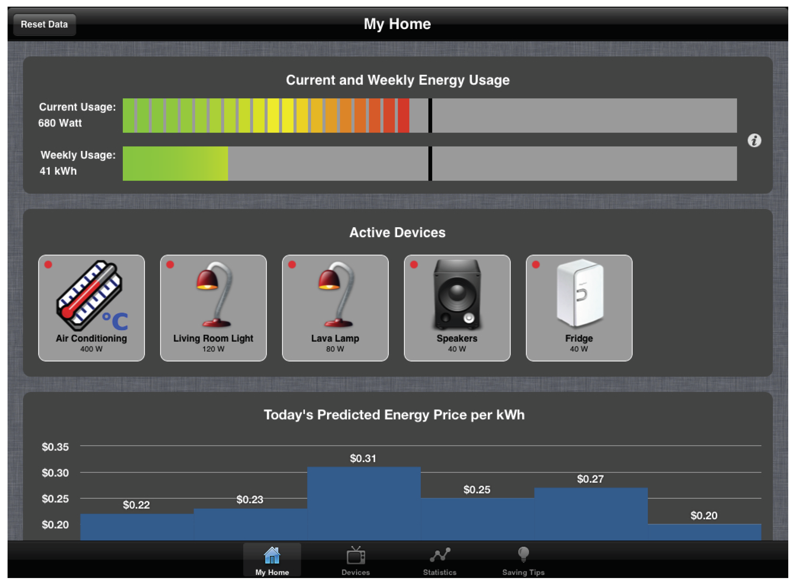
Figure 3.
An example of the use of gauges in an energy visualization dashboard for showing both the current power consummation level (at the bottom center), as well as the current power generation levels (on either sides). Image from Reference [29].
Figure 3.
An example of the use of gauges in an energy visualization dashboard for showing both the current power consummation level (at the bottom center), as well as the current power generation levels (on either sides). Image from Reference [29].
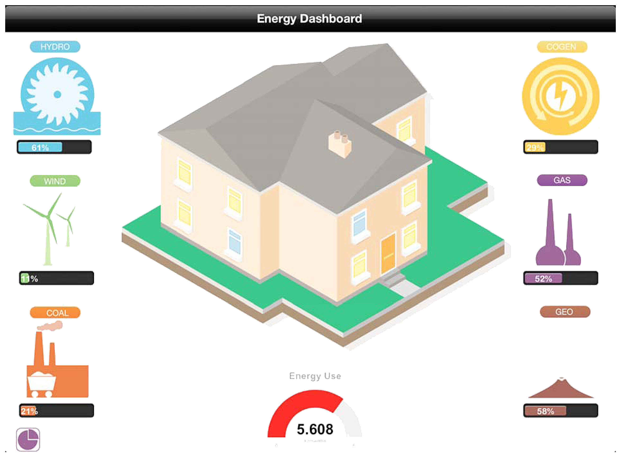
Figure 4.
An example of a car dashboard with an “ECO” indicator, showing whether a driving mode is economical or not.
Figure 4.
An example of a car dashboard with an “ECO” indicator, showing whether a driving mode is economical or not.
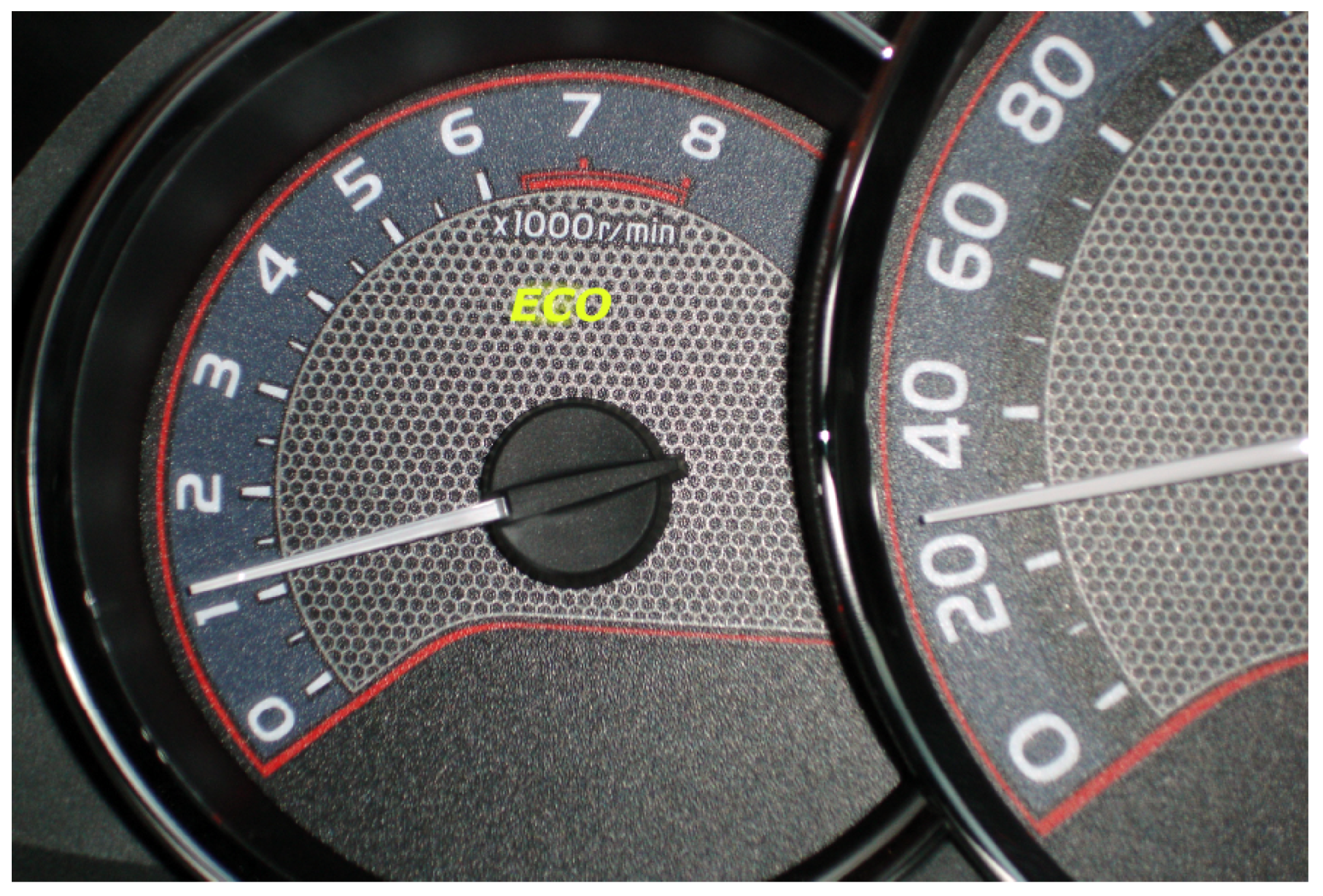
Figure 5.
An example of an eco-visualization showing a healthy tree (a), which can die (b) because of bad energy consumption behavior. Images from Reference [34].
Figure 5.
An example of an eco-visualization showing a healthy tree (a), which can die (b) because of bad energy consumption behavior. Images from Reference [34].
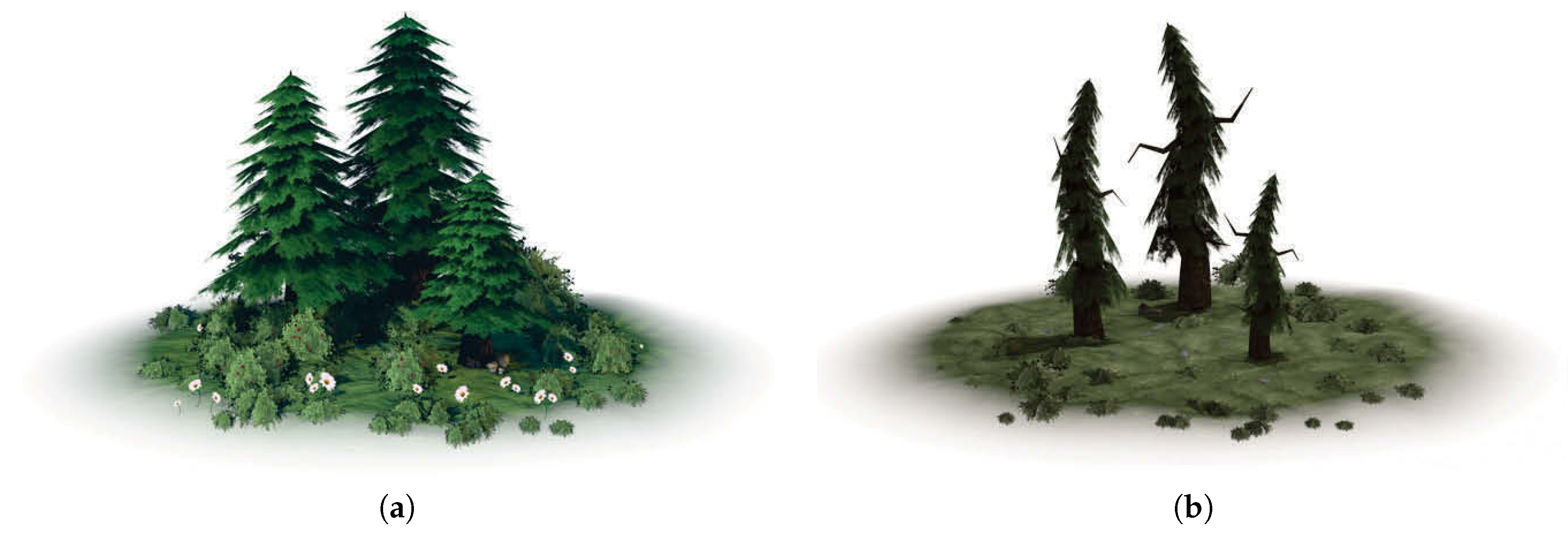
Figure 6.
An example of an eco-visualization showing a green meadow (a), which can gradually die (b) because of the users’ energy consumption behavior. Images from Reference [35].
Figure 6.
An example of an eco-visualization showing a green meadow (a), which can gradually die (b) because of the users’ energy consumption behavior. Images from Reference [35].
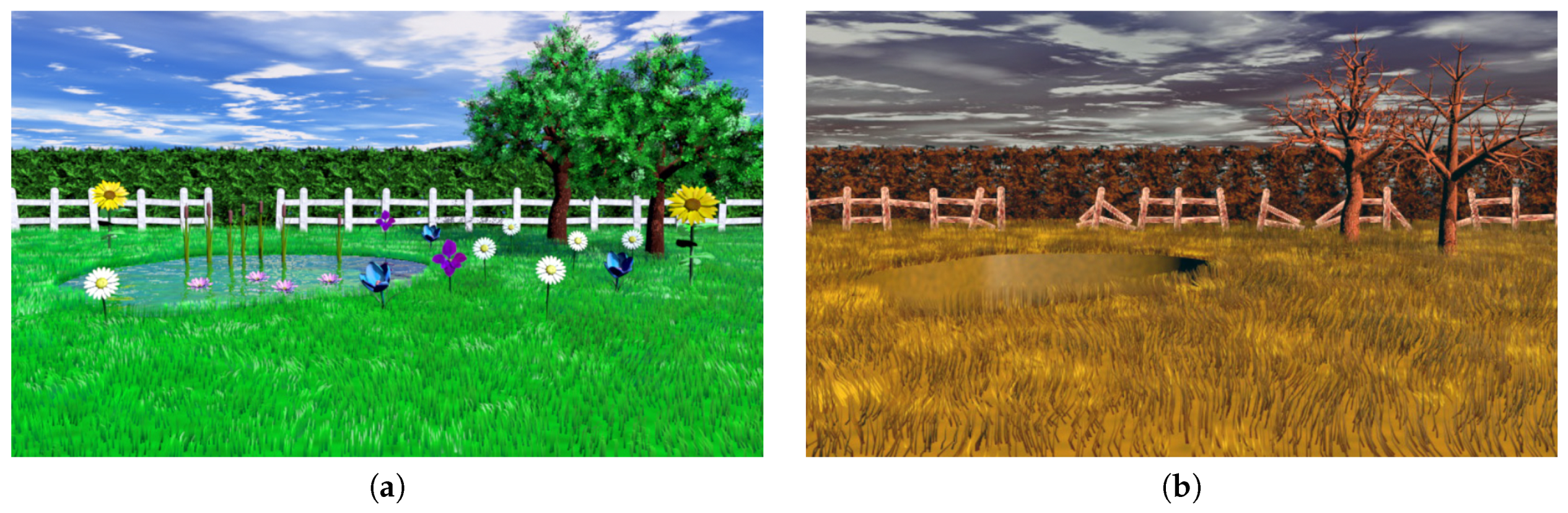
Figure 7.
Examples of visualizations designed to support visual analytics of energy consumption data, showing time-pie (a) and its corresponding time-stack (b). Images from Reference [39].
Figure 7.
Examples of visualizations designed to support visual analytics of energy consumption data, showing time-pie (a) and its corresponding time-stack (b). Images from Reference [39].


Figure 8.
Example of a time-tone visualization (a) and its corresponding area chart (b), showing variations in energy usage load by each individual device, as well as the total, over time. Images from Reference [41].
Figure 8.
Example of a time-tone visualization (a) and its corresponding area chart (b), showing variations in energy usage load by each individual device, as well as the total, over time. Images from Reference [41].

Figure 9.
An example of a visualization used as part of a simulation tool. The bars shown in the lower part represent different energy resources. The share of a resource can be changed by interactively changing the height of its corresponding bar. Image from Reference [35].
Figure 9.
An example of a visualization used as part of a simulation tool. The bars shown in the lower part represent different energy resources. The share of a resource can be changed by interactively changing the height of its corresponding bar. Image from Reference [35].
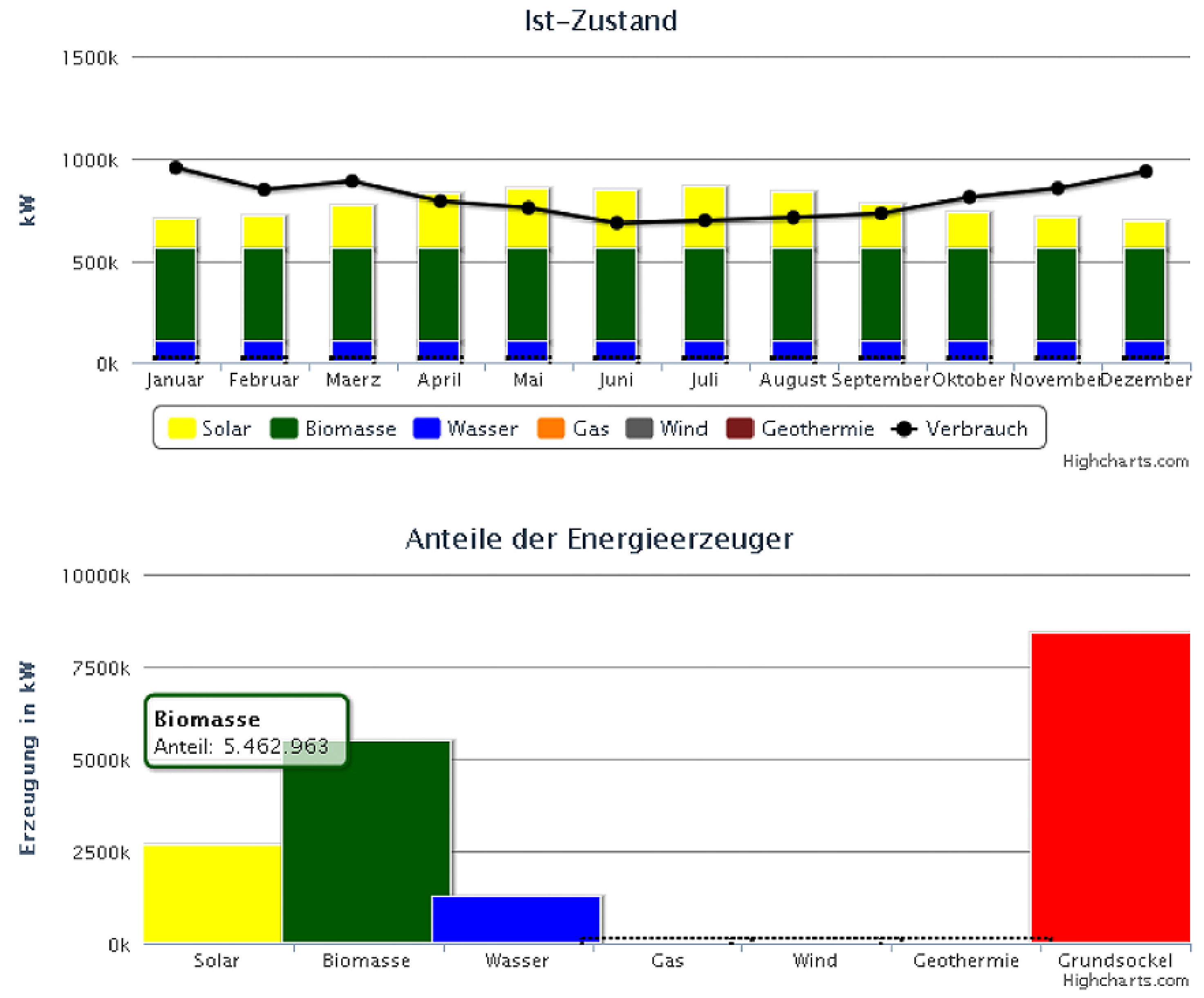
Figure 10.
An example of an interactive visualization used for analysis as part of the dashboard tool shown in Figure 3. Image from Reference [29].
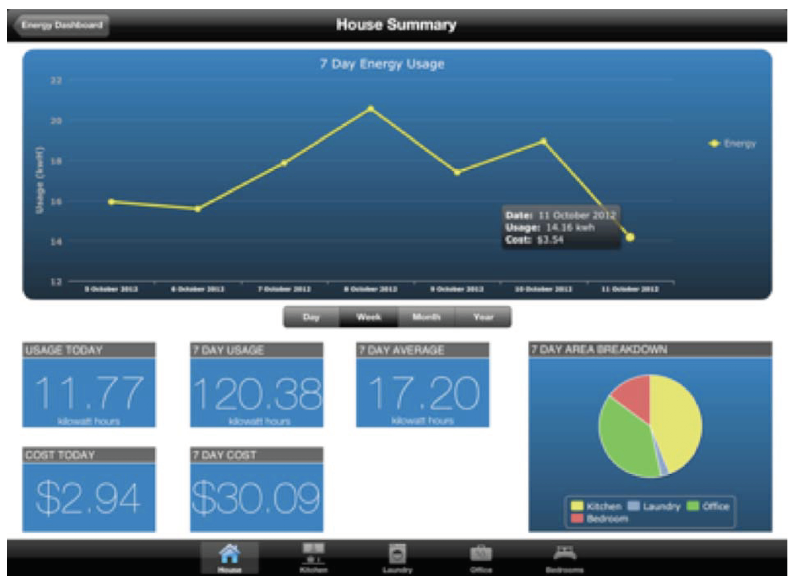
Figure 11.
The main screen of EnergyLife game showing a carusel of cards, each related to an energy- consuming device. Image from Reference [49].
Figure 11.
The main screen of EnergyLife game showing a carusel of cards, each related to an energy- consuming device. Image from Reference [49].
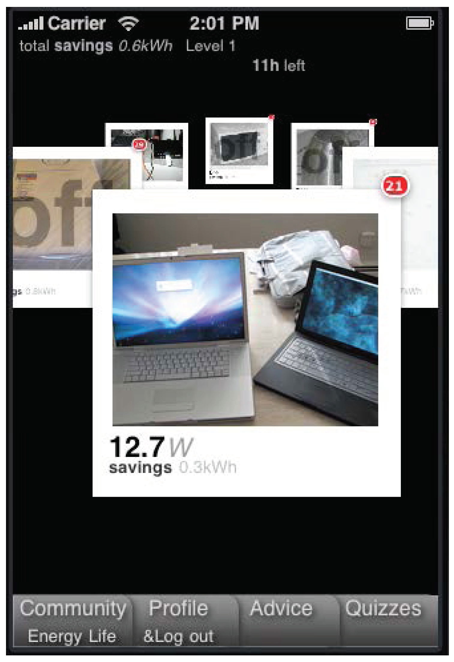
Figure 12.
Examples of visualizations from the Social Power Game, showing information related to a personal profile (a) and a social “Energy Hive” (b). Image from Reference [51].
Figure 12.
Examples of visualizations from the Social Power Game, showing information related to a personal profile (a) and a social “Energy Hive” (b). Image from Reference [51].
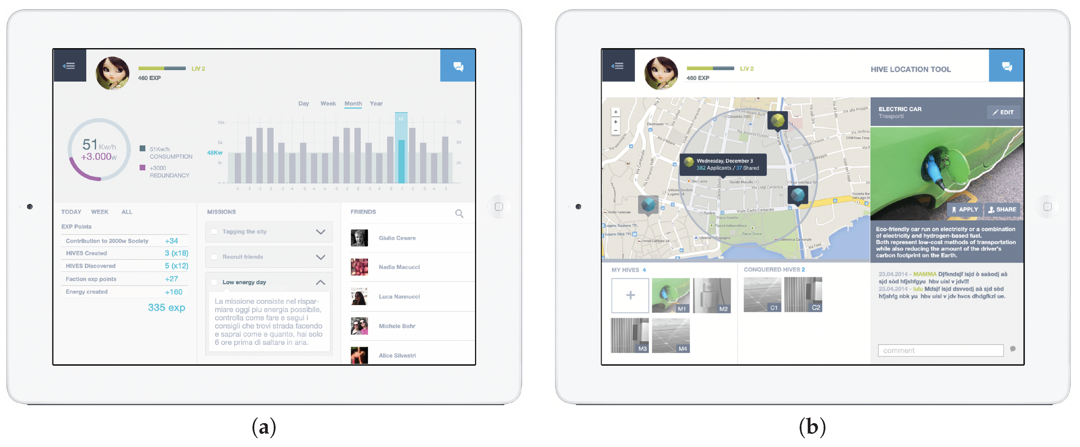
Figure 13.
A gamified application for promoting water saving behavior in the SmartH2O project, showing the visualization with (a) and without (b) gamification elements. Images from Reference [58].
Figure 13.
A gamified application for promoting water saving behavior in the SmartH2O project, showing the visualization with (a) and without (b) gamification elements. Images from Reference [58].

Figure 14.
The 3D-Infokit prototype has a 3D game-like environment in which the user can navigate (a) and interacting with energy-related information to select from different options (b) and see the consequences of their choices (c).
Figure 14.
The 3D-Infokit prototype has a 3D game-like environment in which the user can navigate (a) and interacting with energy-related information to select from different options (b) and see the consequences of their choices (c).

Figure 15.
The energy passport gauge of the 3D-Infokit prototype.

Figure 16.
Colored glass pipes used in Watt-I-See to show different energy sources (a), and the colored power sockets (b). Images from Reference [65].
Figure 16.
Colored glass pipes used in Watt-I-See to show different energy sources (a), and the colored power sockets (b). Images from Reference [65].
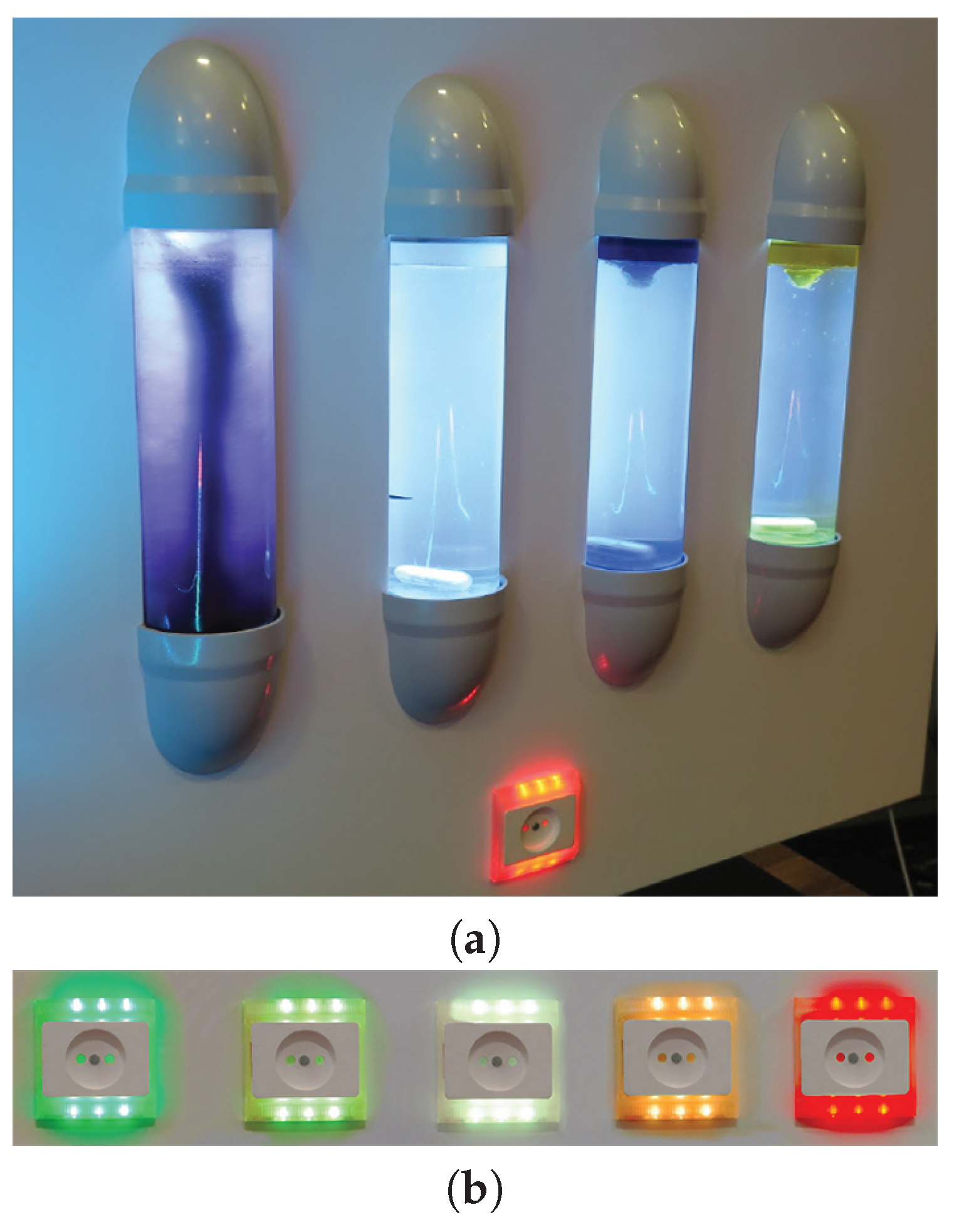
Figure 17.
A key-holder interactive tool (a) used as part of the Smart Living project, to inform people about their energy-consuming devices as they are about to live their home and enabling them to act (b). Images from Reference [66].
Figure 17.
A key-holder interactive tool (a) used as part of the Smart Living project, to inform people about their energy-consuming devices as they are about to live their home and enabling them to act (b). Images from Reference [66].

Figure 18.
A co-located collaborative visualization session using Show-Me (a), with each tablet device showing its own view of the shared tabletop visualization (b). Images from Reference [67].
Figure 18.
A co-located collaborative visualization session using Show-Me (a), with each tablet device showing its own view of the shared tabletop visualization (b). Images from Reference [67].


Table 1.
The list of the surveyed energy visualization categories and the user behavior change factors they aim to support.
Table 1.
The list of the surveyed energy visualization categories and the user behavior change factors they aim to support.
| Visualization Category | Surveyed Visualizations | Behavior Change Factors | ||
|---|---|---|---|---|
| Motivation | Trigger | Ability | ||
| Charts and Graphs † | [22,23,30] | √ | ||
| [28] | √ | √ | √ | |
| Energy Gauges † | [25,26,27,29] | √ | ||
| [30] | √ | √ | ||
| [28] | √ | √ | √ | |
| Eco-Visualizations | [10,34,35,37,55] | √ | ||
| [15,36] | √ | √ | ||
| Visualizations for Analytics | [17,29,35,38,39,40,41,42,43] | √ | √ | |
| Gamified and Serious Game Visualizations | [50,51,58,59,60] | √ | ||
| [46,47,49,52,53,54,61] ‡ | √ | √ | ||
| [55,57] | √ | √ | √ | |
| Ambient and Physical Visualizations | [62,66,67] | √ | ||
| [63,64,65] | √ | √ | √ | |
† All example cases listed in the categories Visualizations for Analytics and Gamified and Serious Game Visualizations often also deploy some form of Charts, Graphs or Gauges for communicating energy consumption data. ‡ The example cases listed in this row are learning applications which aim to inform users about potential energy-saving options. Therefore, they also support the Ability factor of Fogg’s behavior change model.
© 2019 by the authors. Licensee MDPI, Basel, Switzerland. This article is an open access article distributed under the terms and conditions of the Creative Commons Attribution (CC BY) license (http://creativecommons.org/licenses/by/4.0/).
Share and Cite
MDPI and ACS Style
Rist, T.; Masoodian, M. Promoting Sustainable Energy Consumption Behavior through Interactive Data Visualizations. Multimodal Technol. Interact. 2019, 3, 56. https://doi.org/10.3390/mti3030056
AMA Style
Rist T, Masoodian M. Promoting Sustainable Energy Consumption Behavior through Interactive Data Visualizations. Multimodal Technologies and Interaction. 2019; 3(3):56. https://doi.org/10.3390/mti3030056
Chicago/Turabian StyleRist, Thomas, and Masood Masoodian. 2019. "Promoting Sustainable Energy Consumption Behavior through Interactive Data Visualizations" Multimodal Technologies and Interaction 3, no. 3: 56. https://doi.org/10.3390/mti3030056