Article

Discourse with Visual Health Data: Design of Human-Data Interaction

1
Department of Computer Science, University of British Columbia, Vancouver, BC V6T 1Z4, Canada
2
Department of Computer Science, Western University, London, ON N6A 3K7, Canada
*
Author to whom correspondence should be addressed.
Multimodal Technol. Interact. 2018, 2(1), 10; https://doi.org/10.3390/mti2010010
Submission received: 19 December 2017 / Revised: 9 March 2018 / Accepted: 10 March 2018 / Published: 20 March 2018
(This article belongs to the Special Issue Coupling Computation and Human Cognition through Interaction Design)

Abstract

:
Previous work has suggested that large repositories of data can revolutionize healthcare activities; however, there remains a disconnection between data collection and its effective usage. The way in which users interact with data strongly impacts their ability to not only complete tasks but also capitalize on the purported benefits of such data. Interactive visualizations can provide a means by which many data-driven tasks can be performed. Recent surveys, however, suggest that many visualizations mostly enable users to perform simple manipulations, thus limiting their ability to complete tasks. Researchers have called for tools that allow for richer discourse with data. Nonetheless, systematic design of human-data interaction for visualization tools is a non-trivial task. It requires taking into consideration a myriad of issues. Creation of visualization tools that incorporate rich human-data discourse would benefit from the use of design frameworks. In this paper, we examine and present a design process that is based on a conceptual human-data interaction framework. We discuss and describe the design of interaction for a visualization tool intended for sensemaking of public health data. We demonstrate the utility of systematic interaction design in two ways. First, we use scenarios to highlight how our design approach supports a rich and meaningful discourse with data. Second, we present results from a study that details how users were able to perform various tasks with health data and learn about global health trends.

Graphical Abstract

1. Introduction

The massive influx of data has the potential to revolutionize population health efforts and enhance personalized medicine. Health data can help reduce healthcare costs, support early detection of diseases, improve insurance fraud detection, manage population health, and facilitate identification of epidemics or at-risk groups in society [1,2,3,4]. While health data presents rich opportunities, the health community has historically been slow to leverage the data [4]. This is in part due to the nature of the data. Health data is relatively large, comes from a variety of sources, is generated at different velocities, is largely unstructured, and sometimes is erroneous or incomplete [1,5,6,7]. These characteristics make it difficult for users to effectively work with the data. Interactive visualizations, when properly designed, can provide a means for analyzing and exploring large sets of data. Interactive visualizations can help maintain context during exploration, support the identification of patterns, and facilitate a wide variety of tasks in which users engage [8,9]. When involved in data-driven efforts, the tasks that users perform are mostly non-routine, exploratory, and interrelated [9,10,11,12]. Users need to be able to interact with data seamlessly to complete these tasks. As data is accessible through the visually-perceptible interface of the tool, the ability of users to complete tasks is partially dependent on how effectively the visualization mediates the discourse. This back-and-forth between users and the tool is made possible by interaction.
Through interaction, users can become active participants in the analysis of data. For example, interaction can allow users to gradually retrieve or display data. This progressive unfoldment of data is critical, as encoding only one aspect of the data in a visualization, while encoding too much data strains the cognitive resources of users [13,14]. Allowing users to reveal data gradually within a visualization has been shown to be an effective way of aiding analysts to explore and understanding large, multivariate datasets [15]. To date, much of the interaction available in visualizations allows users to perform simple manipulations and selections of model choices [8,16]. This is unfortunate, as researchers note that in addition to allowing users to control which subset of data be visualized, interactions need to enable users to analyze and view data from different perspectives (e.g., change visualizations’ density, complexity, configuration, and so on) or add their own inferences (e.g., annotate visualizations) [11,17,18]. The more ways by which users can interact with the data, the more involved their discourse with the data can be, and the more effective their analysis will be [10,19,20,21,22,23].
Researchers have highlighted the need for a deeper understanding of interaction [18,21,24,25,26,27,28]. As visualizations are often designed for different domains, the research on how to properly design interaction is fragmented across disciplines. There is a need for theoretical structures that can help designers systematically create interactive visualizations, frameworks that bring together concepts from multiple fields, provide a consistent vocabulary, and have structure while at the same time allowing for designer creativity are needed [29,30,31].
This research would benefit the health field, in which currently there is a lack of guidance on how to create interactive visualizations [22,32,33,34]. Sedig et al. have developed a comprehensive framework concerned with the different aspects of human-data discourse mediated by visualizations tools. In a previous paper, we have demonstrated how designers can use a framework to create non-trivial visualizations for health data [35]. The purpose of this paper is to demonstrate the utility of frameworks for the systematic design of interaction for visualizations, particularly health data visualizations. Such systematic interaction design can in turn help support meaningful human-data discourse and task performance.
To this end, the rest of the paper is organized as follows. Section 2 provides the necessary terminological and conceptual background. Section 3 presents elements of a framework used to guide the design of interaction for visualizations. Section 4 details a design process that we developed based on the framework. Section 5 presents three usage scenarios, highlighting interactive human-data discourse to make sense of global health trends. Section 6 offers some of the observations from a user-study conducted with the visualizations. Finally, Section 7 presents some general conclusions.

2. Background

2.1. Data-Driven Tasks

The field of health historically has generated massive amounts of data. As far back as the 1980s, the widening gap between data collection and usage was discussed [36]. For humans, our ability to solve problems does not solely rely on the collection and storage of data but on our ability to use the data to complete tasks. We conceptualize health tasks as any set of goal-oriented behaviors that involve the use of health data. Consequently, our discussion of health tasks is not limited to one specific task but encompasses a variety of tasks in which users engage. This includes, but is not limited to, the use of data by health professionals to diagnose patients, ascertain the cause of disease, and determine if there is an outbreak, as well as the use of data by laypeople to understand their treatment options, explore risk factors that relate to a disease, and seek support from an online community.
In the context of interactive visualizations, tasks can be thought of as having three aspects: cognitive, visual, and interactive [37]. Cognitive tasks are conscious and deliberate mental processes such as generating hypotheses, comparing them to existing mental structures, and constructing analogies [38]. Visual tasks are behaviors carried out by our visuoperceptual system as we look at visualizations [37]. For instance, consider the scenario in which an individual is using a choropleth map to understand the distribution of HIV/AIDS in South Asia. Some of the visual tasks may include locating Bhutan and perceiving which nation has the highest mortality rate. Interactive tasks require users to manipulate data visualizations. For instance, in the example above, the user may need to rank nations based on mortality rate, identify the nation with the lowest transmission rate, and assess countries to determine those that would benefit from external aid. In this paper, our discussion centers on how to support interactive tasks.
At a fundamental level, tasks are emergent in nature, co-occurring, and can be performed in an iterative and ill-defined manner [28,39]. In many situations, completing tasks in a straightforward progression is unlikely and may be impossible [10,11]. For instance, as users interact with data, new questions arise that may change which tasks need to be performed, as well as the order in which they are executed. It is important to allow users to not only complete a single task but engage in a series of tasks in the manner of their choosing [7,28]. In the next section, we briefly discuss how visualizations can support users’ tasks.

2.2. Visualization Tools

In this paper, we use the term visualization to refer to computational tools that represent data in a visual format and allow users to manipulate how the data is shown. Visualizations can extend the capacity of individuals to complete tasks [37,40]. When a visualization tool mediates a user’s discourse with data, a joint cognitive system is formed. This system is comprised of a set of couplings and partnerships between the user and the tool’s sub-systems: the user and the tool’s data visualizations, the user and the tool’s data processing, the user and the tool’s interactions, and so on [41,42]. For instance, a doctor who needs to diagnose a patient may first observe the patient’s symptoms. Next, she may use a visualization to view the summary of the patient’s medical history before asking for certain tests to be done. This partnership between the user and the tool allows for the computational strengths of the tool to be used in conjunction with human abilities.
As data is accessible through the visually-perceptible interface of the tool, the user’s ability to complete tasks is partially dependent on how effectively the tool encodes data [43,44]. Even when the visual elements of the tool are properly designed, there still exists a perceptual and cognitive distance between the internal and external realms [45,46]. In other words, a gap exists between users’ internal representations and the tool’s external representations. Hence, part of the analysis process involves users coordinating these distinct representational forms. Interaction allows users to harmonize and coordinate their internal cognitive representations with external visual representations [28,45,46,47]. In the next section, we discuss the role of interaction.

2.3. Interaction

When discussing visualization tools, interaction can be conceptualized as the actions users perform and the consequent reactions that occur via the tool’s interface [28]. Interaction is critical to human-data discourse, as it allows users to engage in the process of testing assertions, assumptions, and hypotheses [48]. The ability of the user to pose a question and get an answer from the data is made possible by interaction [10]. Also, interaction can strengthen the partnership and coupling between the user’s cognition and the tool [23,28]. This is important, as humans have an irreplaceable role in the analysis process. For example, even when using advanced statistical techniques, human judgment plays a vital role in outlier analysis tasks [49]. Through interaction, the analysis of data can be user-directed, and this is beneficial for several reasons. First, it promotes a seamless flow of data and reduces the cognitive load of users [13]. Second, it allows for the incorporation of the users’ knowledge in the analysis process [21,29,50]. Furthermore, interaction allows users to adjust features of the tool to suit their cognitive, perceptual, and contextual needs, thus better supporting their exploration experience [11,51].
If visualizations are to be used to capitalize on the potential of collected health data, interaction must allow users to reach into the dataset and perform various tasks. As human judgment is at the center of successful data analysis, the more ways humans can control their discourse with data the better their analysis will be [9,10,18]. Pike et al. note that “this manipulative aspect is crucial; the more ways users can ‘hold’ the data; the more insight will accumulate” [10]. In a survey of visualizations for web-linked data, researchers note that visualizations need to have interactions that provide users with the ability to customize the exploration experience based on their preferences and the problem requirements [11]. To this end, users need to be able to view data from different perspectives (i.e., changing the visual representation form), select latent data (i.e., filtering or drilling into the data), or add their inferences (i.e., annotating data items) [28].
There is a need for tools that allows humans to have more control in the analysis and exploration of data [9,11,16,27,52,53]. To date, most of the interactive tasks that are supported by visualization tools allow users to perform simple visual representation manipulations (e.g., panning and zooming) and selection of model choices (e.g., selecting Naïve-Bayes or Support Vector Machine technique). In a recent survey of biomedical visualizations, it was observed that tools typically offer interactions like rotating and zooming but provide limited support for querying and other more advanced interactive tasks [8]. Ko et al. conducted a survey of visualizations for financial data and noted that most visualizations failed to support tasks such as exploring, annotating, and linking [16]. In a comprehensive survey of malware visualizations, it was noted that most tools did not have interactions that allowed users to incorporate their expert knowledge sufficiently in the analysis process [54]. Creating visualizations that effectively support users’ interaction with data is not a trivial task. In the next section, we present conceptual constructs that can help systematize the design of interaction.

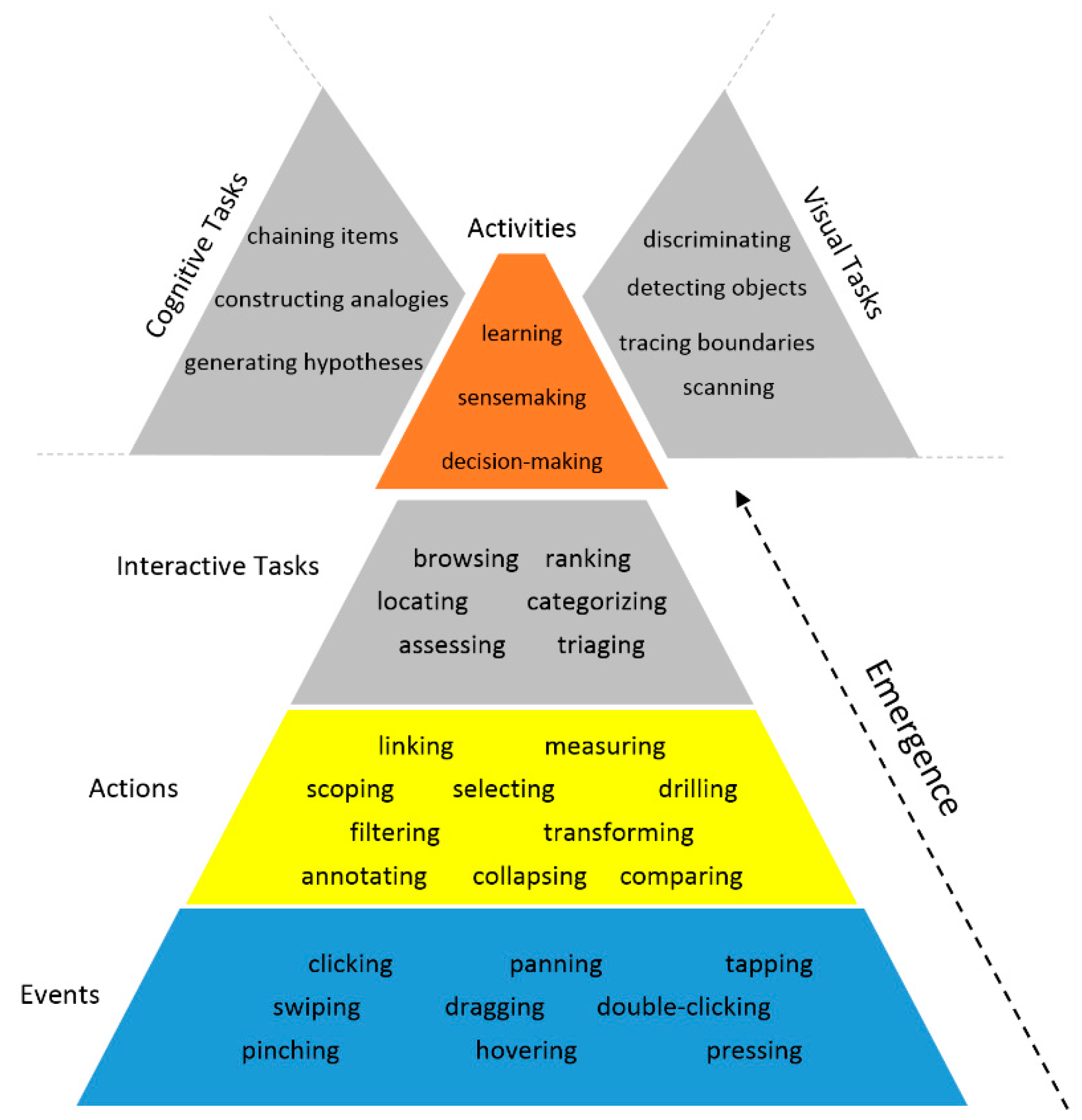
3. Elements of Theoretical Framework

In the previous section, we highlighted the importance of interaction. But how does one design it? To properly design interaction, there is a need to consider the cognitive and perceptual capacities of users, their cognitive and visual tasks, the nature of the data, and the potential avenues in which data can be explored [21,23,41,55]. Interaction should be designed in such a manner that users can complete tasks that are dependent on or related to other tasks in a harmonious fashion. Trying to design interaction while considering the above issues is not an easy task. Designers need support structures to help them systematically think about issues.
Researchers have developed taxonomies, theories, models, and frameworks that deal with the different aspects of interaction design [10,56,57,58,59,60,61]. Frameworks can provide structure, a common language, and a better understanding of the design space of interaction [28,59]. Also, frameworks can provide the theoretical rationale that justifies design choices [62]. In this work, we use elements of a comprehensive framework developed by Sedig and colleagues. The comprehensive nature of their framework ensures that different aspects that impact human-data discourse are examined in tandem with one another, thus ensuring a holistic approach to interaction design. Their framework includes elements that deal with the design of visualizations, the analysis of visual properties that affect the performance of cognitive tasks, the analysis of the anatomical structure of interaction, and the design of interaction for visualization tools [17,28,31,37]. In this section, we focus on two elements of the framework that can help guide the design of interaction.

3.1. Conceptualization of the Human-Data Discourse

In their framework, Sedig and Parsons characterize the human-data discourse mediated by visualization tools at four levels of granularity: events, actions, tasks, and cognitive activities (shown in Figure 1). Events are physical occurrences that users perform on the visualization. Examples include clicking, touching, swiping, and tapping. Performance of a series of events gives emergence to epistemic actions. For instance, for a data analyst to filter data, he may need to click on a visual item or swipe the screen to reveal a sub-menu that he then clicks on. Filtering and other epistemic actions transform the world to facilitate mental information-processing needs [28,63]. In other words, these actions alter the visualization in a manner that supports cognitive processes. Table 1 includes a subset of the actions identified in the framework [28].
Tasks can be thought of as having three aspects: cognitive, interactive, and visual. Different tasks require different degrees of visual, cognitive, and interactive processing. Interactive tasks are goal-oriented behaviors that emerge from the completion of actions. For example, to complete the task of triaging with a visualization, an ER nurse may need to arrange patient records based on the severity of symptoms and then annotate each record to assign a priority level. Performance of a sequence of tasks gives emergence to activities. Activities (e.g., decision-making, analytical reasoning, problem-solving) are made up of not only interactive tasks but also visual and cognitive tasks. For instance, for an epidemiologist to decide that an epidemic of West Nile virus exists, she may have to engage in the cognitive task of testing a hypothesis, the visual task of observing the spread of the disease on the visualization, and the interactive task of categorizing the severity of the disease in each country. While our discussion centers on interactive tasks, it is worth mentioning that cognitive and visual tasks can also be characterized at multiple levels of granularity (see [28,37] for a more detailed analysis of cognitive activities and tasks). At this point, it is important to note that even though events are the only physical forms of discourse with visual representations of data, the relationship across the granularity levels of human-data discourse is not unidirectional. Indeed, the discourse is bidirectional: human intentions and goals flow from overall activities that need to be accomplished down to a few tasks and sub-tasks (visual, cognitive, and interactive), to a multiplicity of epistemic actions, and then to a great many physical events; emergence flows from physical events up to epistemic actions, to tasks, and, finally, to activities.
The conceptualization of the human-data discourse as a multi-leveled phenomenon is of benefit, because it helps designers structure the design process [21,28]. Let us imagine a doctor who needs to diagnose a patient. How does one create a visualization that supports diagnosis? First, designers can break down the activity into a series of tasks that doctors typically perform with data. Next, for each task, designers can select epistemic actions that facilitate the data-driven mental processes of physicians. For instance, for doctors to assess a patient, they may need to be able to filter out extraneous data, select relevant medical information, and compare current physiological data to previous data. Once actions have been determined, designers can then decide how to best operationalize them with events.

3.2. Quality of Interaction

The manner in which interaction is operationalized contributes to the quality of users’ discourse with data and thus is an important consideration for designers [53,64]. For instance, one visualization might allow users to change the subset of data being visualized, while another may only allow users to change aesthetic qualities of the visualization such as size and color. While both visualizations are interactive, the difference is in the quality of the interaction. The mere presence of interaction does not guarantee effectiveness. The distinction between interaction and the quality of interaction is important, because if the quality of interaction is inadequate, the ability of users to complete tasks will be negatively impacted [31]. In our subsequent discussions, we will refer to the quality of interaction as interactivity. As the exploration and analysis of data requires the performance of inter-related tasks, it is important to examine interactivity at the level of actions. At this level, interactivity is concerned with how the combination and chaining of individual actions affects and facilitates tasks. Sedig and colleagues [31] have identified some factors that influence interactivity at the level of actions. In this paper, we focus on two of those factors: complementarity and flexibility.
Complementarity is concerned with how well actions work with and supplement each other. It is important to provide users with actions that, when performed in conjunction, lead to the emergence of a task. Studies suggest that complementary actions can contribute towards the completion of sensemaking tasks [64,65,66,67]. For example, in a study on making sense of 4D mathematical structures, the authors note that providing complementary actions can enhance the user’s discourse with the data [64]. Furthermore, complementary actions support flexibility by increasing the ways in which users can complete a specific task [21]. For each task, designers should consider which actions should be used conjunctively. For instance, let us examine the task of triaging data; designers can allow users to filter the data, select items of the data, and annotate encoded data items for further analysis. Thus, the actions of filtering, annotating, and selecting should be operationalized to support this task.
Flexibility is concerned with the degree to which users can adjust properties of the interface to suit their preferences, characteristics, and goals. This factor is of great importance in health, as past computational tools that adopted a one-size-fits-all approach failed to sufficiently support the diverse user groups and their needs [32,68,69]. One way of making a visualization flexible is by allowing users to adjust properties of the visualization. Parsons and Sedig have identified essential properties of visualizations that influence cognitive and visual processes [17]. As activities emerge from the completion of visual, cognitive, and interactive tasks, it is important for us to consider how interacting with the visualization (i.e., completion of interactive tasks) facilitates visual and cognitive tasks. Some of the adjustable properties include the following:
o
Appearance: aesthetic features (e.g., color and texture) by which data items are encoded in a visualization
o
Complexity: degree to which encoded data items exhibit elaborateness and intricacy in terms of their quantity and interrelationships in a visualization
o
Configuration: manner of arrangement, organization, and ordering of data items that are encoded in a visualization
o
Density: degree to which data items are encoded compactly in a visualization
o
Interiority: degree to which data items are latent and remain hidden below the surface of a visualization but are potentially accessible and encodable
o
Type: form of a visualization in which data items are encoded
While in this paper we focus on the conceptualization of interaction as a tiered phenomenon and the quality of interaction, it is worth mentioning that other factors can influence human-data discourse. The interested reader can refer to [17,31,38] for a more thorough discussion.

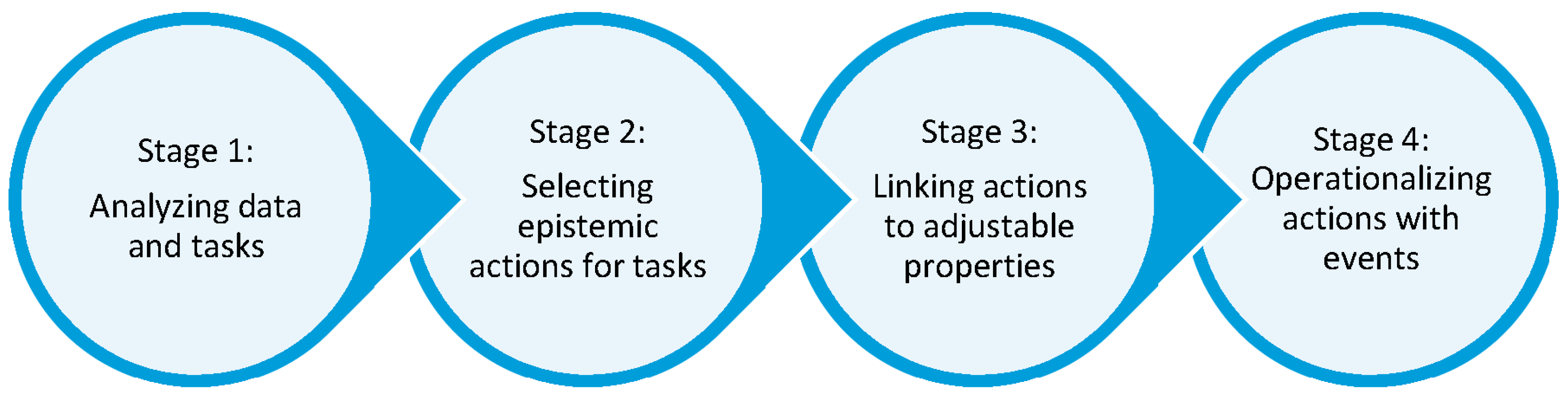
4. Systematic Design of Interactions

Here, we present a process for designing interactive visualizations for health data. This process is based on the two elements of the framework presented in Section 3. We first explicate the design process and then illustrate the process with an example.

4.1. Process for Designing Interaction for Visualizations

The process has four main stages: analyzing data and tasks, mapping tasks to actions, linking actions to adjustable properties in the visualization, and operationalizing actions with events. Figure 2 depicts the major stages.
The first stage is concerned with understanding the data and users’ tasks. At this stage, designers need to consider the sources of data, how often the data is updated, as well as the properties, relationships, and typology of data items. Task analysis requires a detailed exploration of users’ intended discourse with data at the level of activities and tasks. In this stage, we are primarily concerned with determining what the users’ goals and intentions are in relation to the data. For more information on how to analyze data and tasks, the interested reader can consult [21,37,70,71].
The second stage involves selecting actions for each task. In this stage, designers need to consider how users will manipulate the data via the interface of the tool. While it may seem that having every possible action operationalized is a good idea, research indicates that too many actions may result in increased temporal and cognitive cost, thus negatively impacting users’ ability to complete tasks [72,73]. At this stage, it is beneficial to itemize the actions that will contribute to the completion of each task and then check to see whether the selected actions are appropriate for the users and the context in which the tool will be used.
The third stage is concerned with linking actions to properties in the visualization that can be adjusted. The reader should recall that interaction is composed of the action of the user and the reaction that takes place in the tool. The reaction is evident in the change in certain properties of the visualization. The manipulation of the properties can influence cognitive and perceptual processes, thereby strengthening the bond between the user and the tool [17]. Designers need to determine which properties of the visualization need to be adjusted so that an action can be performed.
The last stage involves the operationalization of the actions with lower-level events. In this stage, designers need to consider how to present each action so that users know it is available and how to activate/use it. One consideration at this level is the number of events necessary to complete an action. For instance, if a user needs to drill, does he first click the visual item, drag it to another location, and then click a button? Or can he just click the item and drilling occur? Another consideration at this level pertains to when the reaction occurs. Should it occur immediately or be delayed? While in this paper we do not focus on interactivity at the level of events, it is an important aspect that impacts human-data discourse.
The design process outlined above is an iterative one, in which designers can go back and forth between stages to modify and improve their design. In addition, the process can be carried out multiple times for each visualization or sub-visualization that exists in the tool. While in this paper, we focus primarily on interaction design, it must not be construed that interaction should be designed in isolation. Typically, the design of interaction happens in conjunction with the design of the visualization. This provides the designer with maximum flexibility. However, even with previously designed static visualizations, designers can use the presented process to create interactive visualizations.

4.2. An Illustrative Example of the Design Process

We have created a visualization tool to facilitate making sense of the global burden of disease. This tool includes visualizations that allow users to explore the demographical, geographical, and chronological distribution of mortality. In this section, we illustrate how the design process helped systematize the design of interaction for the demography visualization.
The Institute for Health Evaluation and Metrics (IHME) aggregated the data used in our tool [74]. The datasets include over 12 million records that present estimates of mortality for causes, risk factors, cause-clusters, and risk-clusters. We use the term cluster to refer to an intermediary level of grouping. For example, the physiological risk-cluster includes the following risk factors: high blood pressure, high body-mass index, high fasting plasma glucose, high total cholesterol, and low bone mineral density. The datasets include 235 causes of death that are grouped into 21 cause-clusters that are further aggregated into three main groups: (1) non-communicable; (2) injury-based; and (3) communicable, maternal, neonatal, and nutritional. The datasets also include estimates for 57 risk factors which are grouped into 10 risk-clusters and further categorized into three groups: (1) behavioral; (2) metabolic; and (3) environmental and occupational. From a geographical perspective, mortality rates are aggregated at the level of regions or location-clusters. From a geographic standpoint, the datasets include estimates for 187 countries that belong to 21 regions (e.g., Eastern Europe, southern sub-Saharan Africa, and tropical Latin America). In terms of age groups, mortality is aggregated into 17 age groups and also at a higher level into five main age groups: 1–4, 5–14, 15–49, 50–69, and over 70. For more information on how the data was collected and aggregated, refer to [74].
The demography visualization shows the distribution of mortality by age group. In its initial configuration, the visualization, shown in Figure 3a, encodes over 800 data items. The risk and cause-clusters are encoded as arcs. Each visual item also identifies the group to which the cluster belongs. For the cause groups, we use blue, red, and black for non-communicable, communicable, and injury clusters, respectively. For the risk groups, we use light shades of orange, green, and pink for metabolic, behavioral, and environmental and occupational risk groups, respectively. The location-clusters are encoded as grey bars. The clusters are ranked and arranged according to their mortality rate per 100,000 people. For the cause and risk aspects, the cluster with the highest rank is on top, while location-clusters are arranged in descending order left to right. Figure 3b shows an enlarged portion of the visualization. For certain age groups, not all risk- or cause-clusters contribute to mortality; these clusters are encoded as light grey circles. Through observation, users are able to learn about how mortality affects different age groups. That being said, the visualization is densely packed and without interaction, so it is difficult for users to perform diverse tasks.
Having reported the analysis of the data and the design of the visualization previously [35], here we focus on the analysis of the activities and tasks of users. The overall activity that the visualization supports is sensemaking. Sensemaking typically involves users performing a variety of tasks including searching and filtering data; organizing, categorizing, and examining relevant data; developing, proving, and discarding hypotheses; and integrating data into mental models [38]. More specifically, to make sense of the demographic distribution of mortality, users need to be able to identify the ranking of clusters, explore mortality rates and ranking across age groups for different aspects (i.e., cause-, risk-, or location-clusters), assess mortality across geographical regions, explore age-specific trends, examine the distribution of mortality at lower levels of granularity, and investigate relationships that exist across aspects.
To support these tasks, we need to break them down into epistemic actions. For users to be able to identify a cluster’s ranking, we will need to enable users to select each cluster that is represented. To facilitate exploration, users need to be able to select, search for, and filter clusters. In order to assess mortality for specific age groups, users need to be able to select, filter, and compare data items. In the visualization, mortality is depicted at the level of clusters. To allow users to investigate the distribution of mortality at lower levels of granularity (e.g., country), users need to be able to retrieve data that is latent in the system. To do this, they need to be able to drill. To allow users to explore relationships among data, they need to be able to link and unlink items.
Before operationalizing the above actions, it is important to consider if there are additional actions that may work in tandem with the chosen epistemic actions. As an example, since our visualization has many data items encoded in its default configuration, identifying specific items may be tedious and time-consuming. To facilitate such identification, when needed, it may help to allow users to reduce the amount of visualized data. Collapsing and expanding are two actions that enable users to control the number of visualized items. Giving users this control can help reduce the burden that high density data visualization may cause. In addition, it may be advantageous to allow users to change the visualization in order to assess the properties of data items. Different types of visualizations have different benefits and limitations for communicating information [35,70]; consequently, changing the visualization may help users understand the various aspects of the data. As a further example, a map is better at showing the dispersion of a disease across a geographical area than a bar chart, while a bar chart is better than a map for an accurate comparison of disease prevalence. Translating is the action that allows users to convert a given visualization to an alternative informationally and/or conceptually equivalent visualization. Hence, augmenting the visualization with this epistemic action may support user tasks better. We carried out a similar process to determine complementary actions for other tasks that users would need to perform. At the end of stage two of the design process, the final list of the actions was comprised of selecting, searching, filtering, drilling, comparing, linking, unlinking, collapsing, expanding, and translating.
Now that we have our list of actions, we need to determine which properties of the visualization will be manipulated. In other words, we need to determine the reaction (i.e., how the visualization will change). Selecting is concerned with focusing on an item or group of items, searching is concerned with seeking out specific items or relationships, and filtering is concerned with displaying a subset of elements that meet specific criteria. For these three actions, changing the aesthetic features (e.g., color, texture, saturation) can facilitate and increase the speed of identification of visual items. For example, in Figure 4a, the risk track has been selected, and the saturation of the cause and location visual items has been altered. In Figure 4b, the cause track has been filtered, and only the visual items for nutritional deficiencies are emphasized.
Linking allows users to establish a relationship or association between items. To support linking and unlinking, we need to allow users to alter the complexity of the visualization. Complexity is an adjustable property that is concerned with the quantity and relationships between data items in the visual representation. Research indicates that a significant burden is placed on the mental resources of users when visual complexity is not suitable for the task at hand [14,75]. If users were not able to manipulate the configuration property of the visualization, the visualization would look like Figure 5a. Alternatively, the approach we take is to have the data items shown without any relationships (see Figure 5b) and allow users to select which relationships to explore (see Figure 5c).
Comparing is concerned with determining the degree of similarity or difference between items. It is worth mentioning that the term ‘comparing’ can be used to refer to visual, cognitive, or interactive tasks. In this paper, we use the term ‘comparing’ in an interactive sense at the level of epistemic actions, not tasks. In other words, comparing refers to the ability of users to select two or more visual items so that the tool will emphasize differences and similarities. In this context, in addition to selecting the items that will be compared, users may need to change the arrangement, organization, or ordering of items (i.e., altering the configuration). Translating is concerned with converting the visualization into an alternative form. To facilitate this action, we will allow users to change the visualization’s type. For instance, users can change a bar chart into a choropleth map to better explore how mortality impact individuals across a region.
Next, we need to determine which property needs to be adjusted so that users can collapse and expand segments of the visualization. The main idea behind collapsing and expanding is changing the amount of data visualized at a specific point in time. They can be used to adjust the density of a visualization. Density is concerned with the degree to which items are compactly encoded in a visualization. Research indicates that when the density is too high, perceptual tasks such as locating and extracting pertinent information become difficult [76]. That being said, sometimes it is beneficial to have a high level of density, as it may allow users to obtain a high-level overview of the data [77]. By giving users control over the number of data items encoded, they can control the density to suit their needs. Figure 6 shows the state of the visualization with density controlled by users.
Drilling is concerned with revealing data that is not currently visualized. To do this, we need to allow users to change the degree to which data items are latent and remain hidden in the visualization. In the default arrangement of the visualization, users can obtain an overview of the demographic distribution of mortality, but if they wanted to learn about the mortality rate for children living in Eastern European countries, they would need to access data that is not currently visualized. Drilling can be used to adjust the degree of interiority of a visualization. By adjusting the interiority of the visualization, we enable users to access this data, thus controlling the flow of information.
Now that we have determined the adjustable properties, in the last stage we focus on the events the users will perform on the visualization to prompt the change. To ensure consistency in how users interact with the demography visualization, as well as the rest of visualization in the tool, we opted to use the clicking event. In addition to clicking visual items, buttons were used to indicate the presence of actions that required multiple events. For example, to filter cause-clusters, users will first need to click on the filter button for cause-clusters; this results in the presentation of a sub-visualizations that shows the different cluster options. At this point, users would need to click on a particular cluster in order to filter.

5. Scenarios

The three visualizations presented in this section are part of a tool designed to facilitate making sense of the global burden of disease. The first visualization is the demography visualization discussed in the preceding section, while the other two visualizations focus on the geographical and temporal distribution of mortality. For each visualization, we present a scenario to illustrate how through interaction users can engage in a meaningful discourse with data to learn about global health trends.

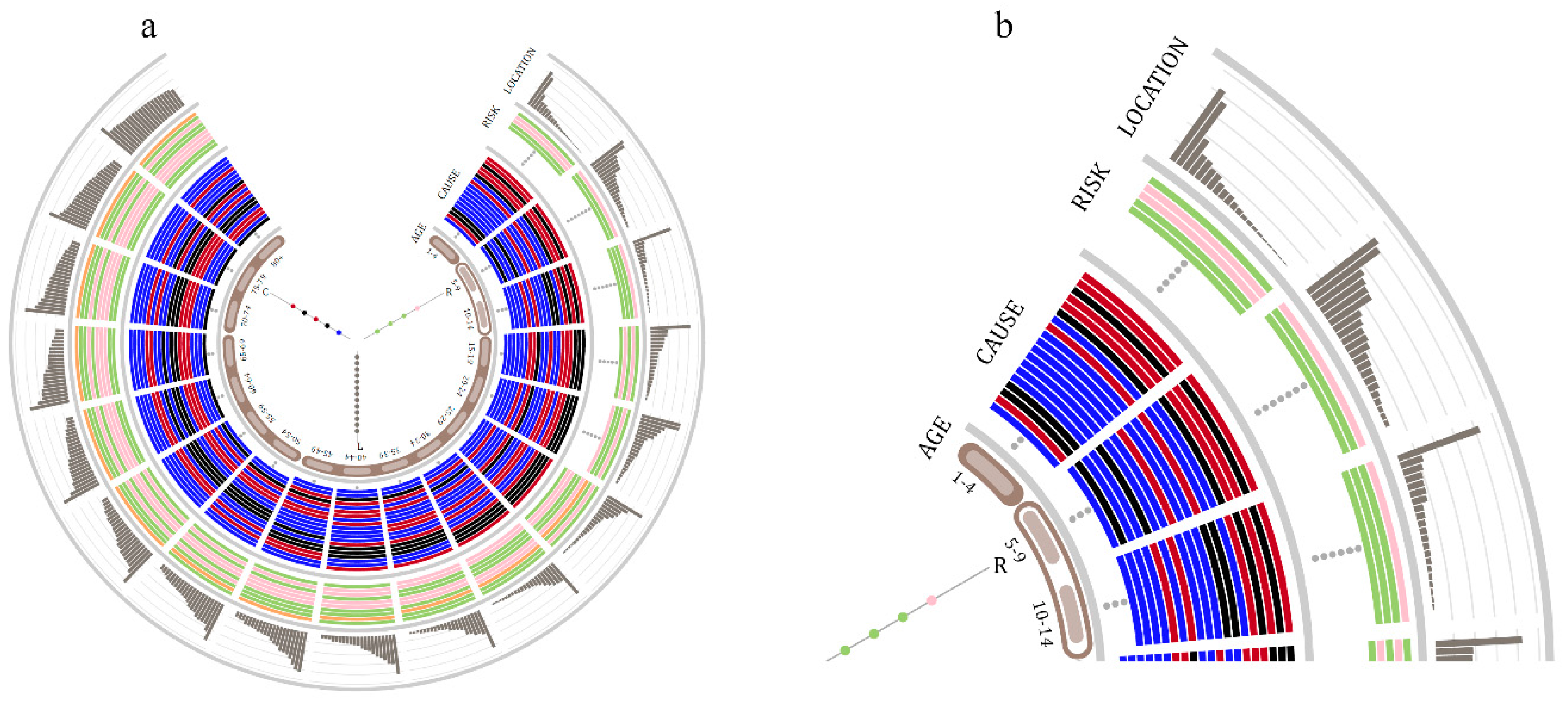
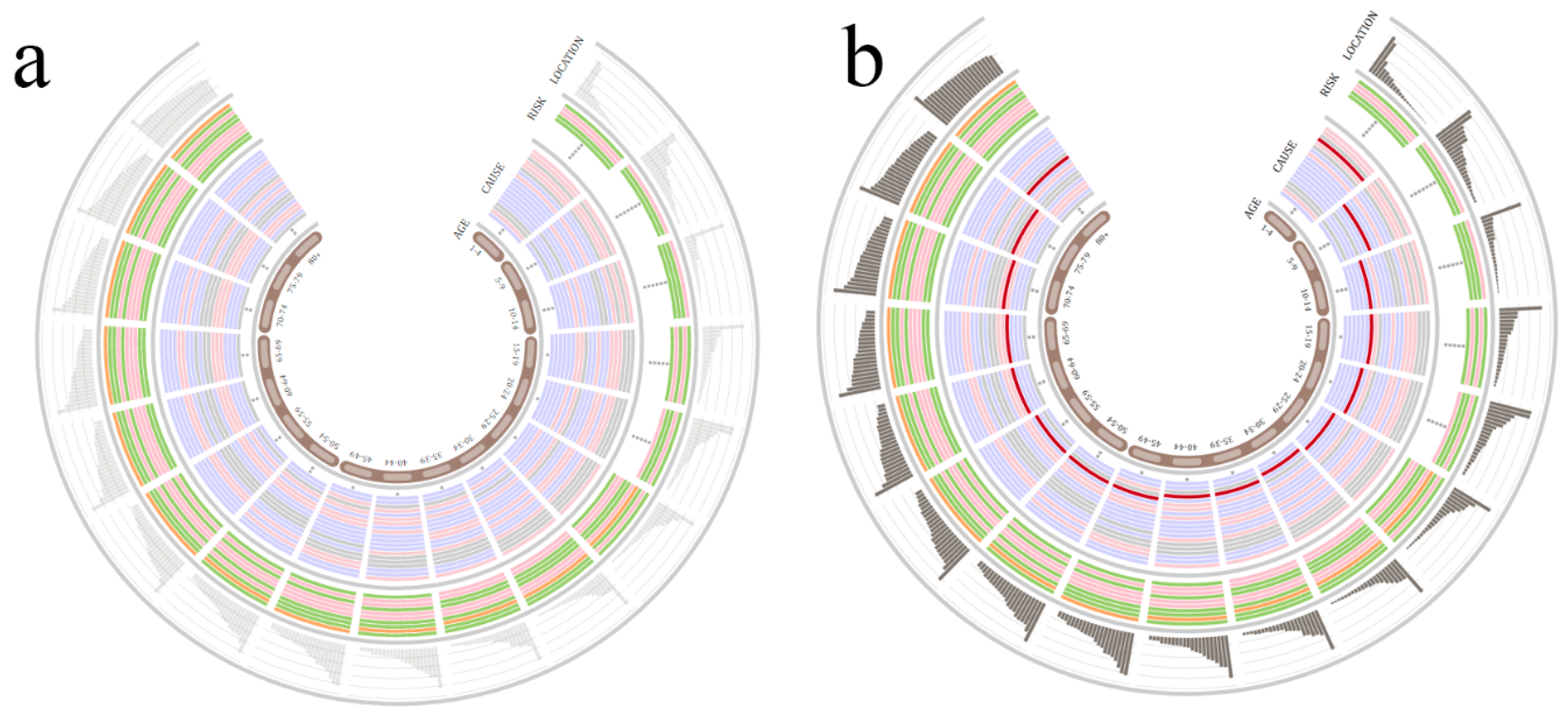
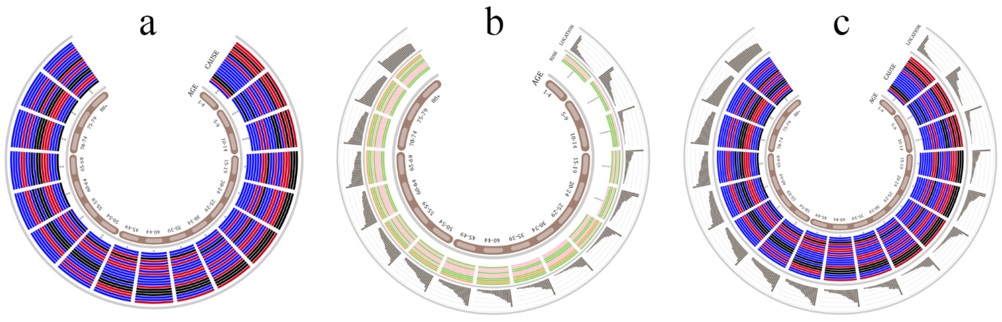
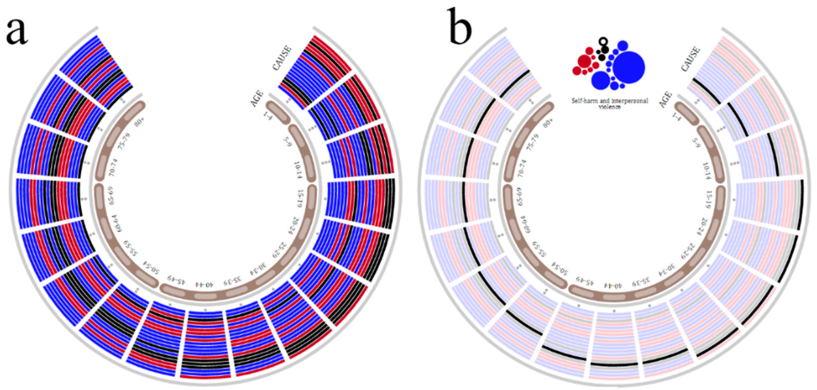
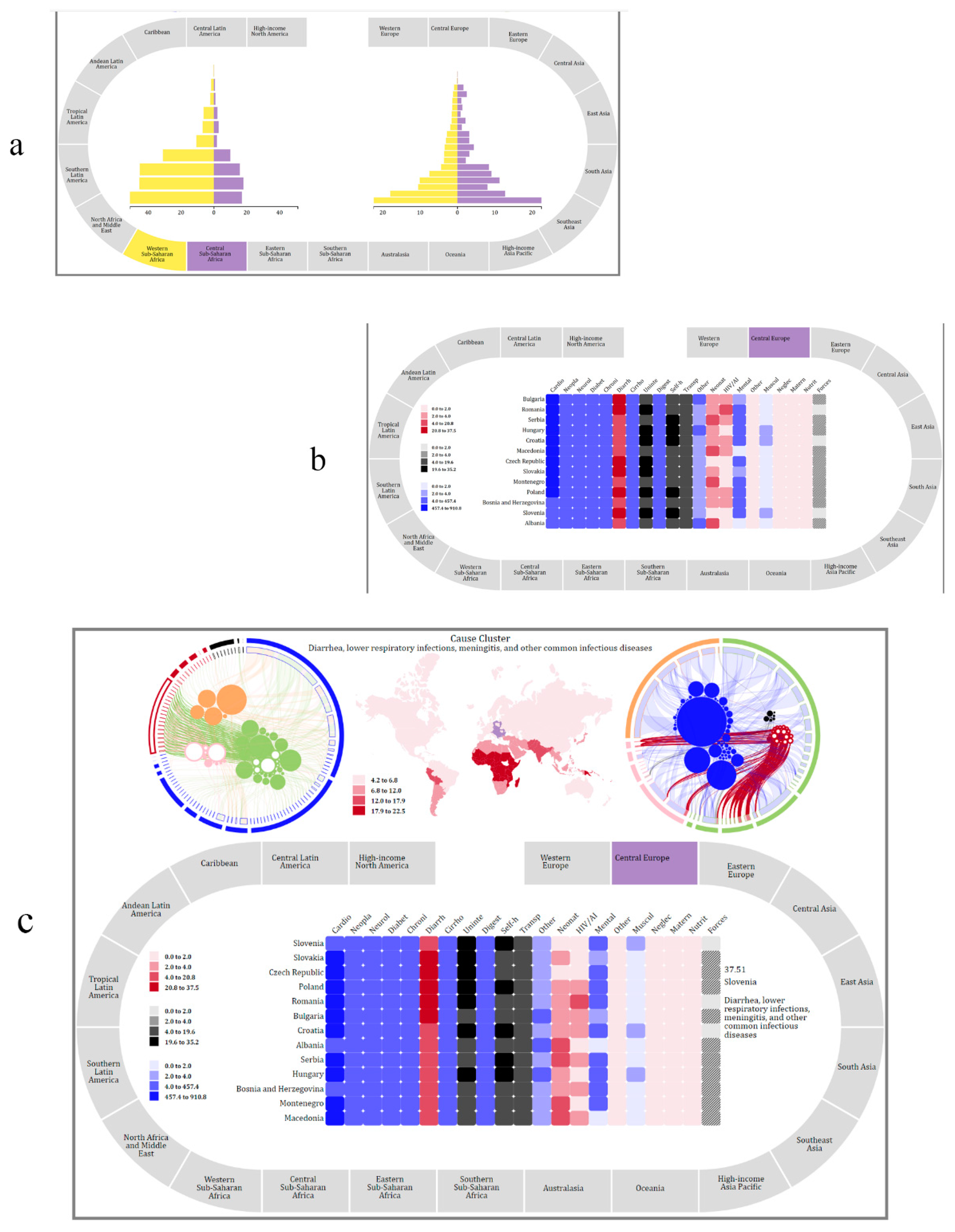
5.1. Demography Visualization

Let us consider a college student who is interested in knowing the causes of death for young people. The student may start by learning the rank of different cause-clusters. To focus specifically on causes, he collapses the risk and location parts of the visualization as shown in Figure 7a. At this point, he observes that for individuals between the ages of 15 and 34, injury-related causes of death are highly ranked (i.e., for each age group in the range, black-colored arcs are in the top 5 positions). To explore the demographical distribution, he may choose to filter by cause-cluster. Figure 7b depicts the state of the visualization when the self-harm and interpersonal violence cluster is filtered. He continues this process until he understands the ranking of clusters. One trend he observes is that mortality from neglected tropical diseases and malaria decreases as one gets older. He also observes an opposite trend for cardiovascular and circulatory diseases. To get a better understanding of what causes the make-up of the self-harm and interpersonal violence cluster that affects young people, he drills and then explores the mortality rates, as shown in Figure 7c. At this point, he can assess death rates and notices that self-harm has a higher mortality rate than assault by firearm for individuals between the ages of 15 and 19. By clicking on each arc, he notices that the same trend applies to the other young adult age groups (i.e., 20–34). This dispels a previous notion he had that, on a global scale, assault by weapon was the primary cause of death for young people. At this point, he collapses the cause part, expands the risk part, and engages in a similar exploration of risk factors. Next, he chooses to explore mortality across geographical regions, so he collapses the risk tracks and expands the cause and location tracks. By filtering, he learns that the location-cluster with the highest mortality rate for young people is southern sub-Saharan Africa. He focuses specifically on the age group 25–29 and notices that for this age group, in addition to the injury-related cause-clusters, there is a communicable cluster (i.e., red colored arc) that is highly ranked. He drills to retrieve latent data that relates to the causes that make up this cluster. As shown in Figure 7d, tuberculosis (TB) and two strains of HIV/AIDS make up this cluster. At this point, he explores the relationship between cause-, risk-, and location-clusters. By drilling and linking visual items, he notes that there are five location-clusters with a strong relationship between HIV/AIDS & TB and the physiological risk-cluster (see Figure 7e). The student can continue to use the visualization to learn more about mortality for different age groups.

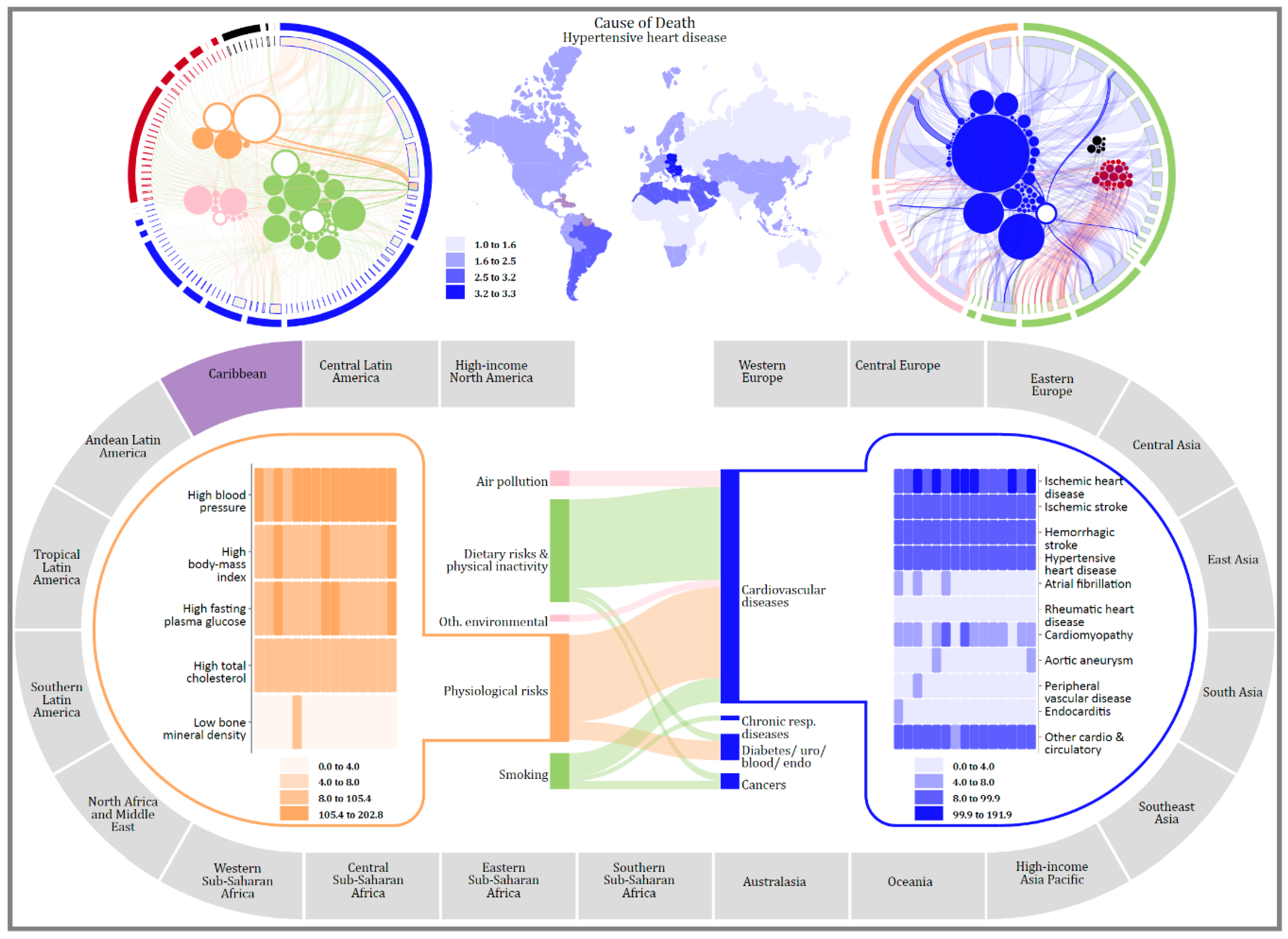
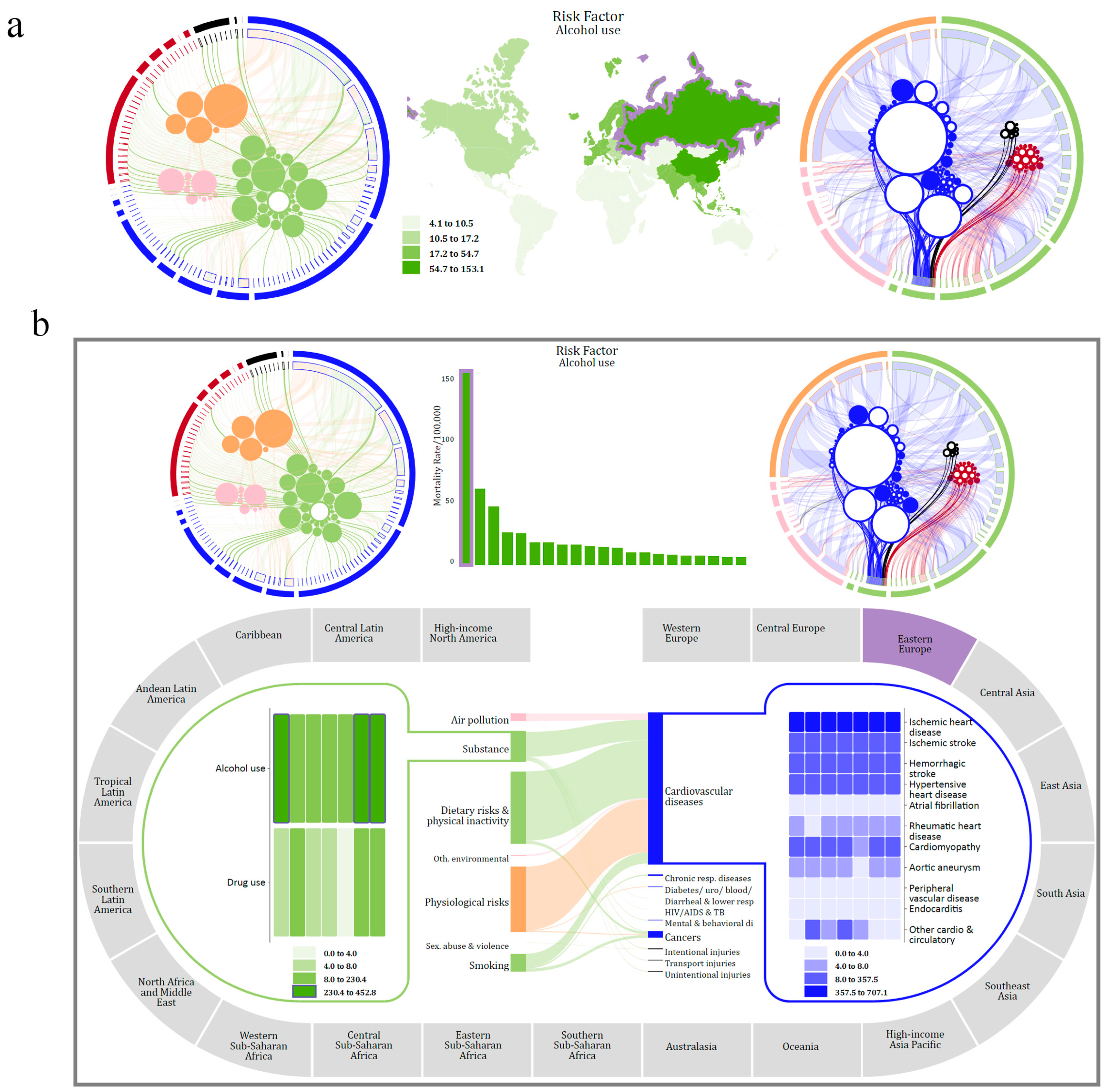
5.2. Geography Visualization

The next visualization supports making sense of the burden of disease from a geographic perspective. One of the datasets we used quantifies mortality as attributed to each risk for each cause of death, thus focusing on the relationship between causes and risks. Additional datasets include the global, regional, and country-level estimates of mortality for causes, cause-clusters, risk-clusters, and risks.
Depicted in Figure 8, the top half of the visualization details the relationship between risk factors and causes at a global level, as well as the geographical distribution of mortality for a selected risk or cause across the 21 regions of the world. The circular sub-visualization on the left shows the relationship between causes and risks. Each cause is encoded as an arc, while each risk factor is encoded as a circle. Risk factors are colored and clustered together to emphasize their grouping. For instance, the largest orange circle represents high blood pressure, where the color orange signifies it is a member of the metabolic group. Causes and their clusters are similarly colored and arranged circularly based on their group. The links between the arcs and the circles represent the attributed mortality between a cause and risk factor. The circular sub-visualization on the right shows the same information but in a different manner. In this visualization, the causes are encoded as circles, while the risk factors are encoded as arcs. For instance, the largest blue circle represents ischemic heart disease, while the longest green arc represents the cluster dietary risks and physical inactivity. One of the reasons why both representations are shown is that they emphasize different aspects of the data and thus may facilitate different tasks. The choropleth map in between them shows the geographical distribution of death for a selected cause, risk, or cluster across regions of the world. In its default configuration, the bottom half of the visualization is comprised of four main elements. The circular track is divided into segments that represent each region of the world. In the center of the track is a partial flow diagram that shows the relationship between cause- and risk-clusters for a specific region. On either side of the flow diagram are heatmaps that show the mortality rates for countries for each cause or risk in the selected cluster.
To design interaction, we analyzed the tasks in which users may engage. These tasks include examining mortality or the relationship between causes and risk factors at different levels of granularity, focusing on a region, assessing the variability of mortality, exploring prevalent causes and risks for regions, and discovering the similarities and differences of the burden of disease between two regions, or between countries in a region. To support these tasks we have operationalized the following actions: selecting, drilling, filtering, searching, arranging, translating, and comparing. Similar to the demography visualization, to activate or initiate an action, users can either click on a visual item or, for compound interactions (i.e., interactions that involve multiple steps), click on the appropriate button.
Let us imagine a situation in which an analyst in a non-governmental agency needs to develop a proposal that reduces mortality by tackling risk factors in high-risk regions of the world. Using the circular sub-visualizations, she can select a risk factor or cluster to determine the distribution across the regions of the world. An alternative approach may be to search for a specific risk factor using the searching capabilities of the tool. Figure 9a shows the top half of the visualization when alcohol use has been selected. Unfortunately, while this view allows her to see how alcohol affects different regions, it is not effective in determining whether Eastern Europe has a higher rate than East Asia. To address this issue, she switches the representation to a bar chart as shown in Figure 9b and observes that Eastern Europe has the higher rate. Next, she drills to get a more detailed look at the relationships between causes and risk factors for Eastern Europe, as shown in the bottom half of Figure 9b. As she also wants to understand how alcohol use affects each country in the region, she drills to display country-level data related to substance abuse. The heatmap in the lower left portion of Figure 9b depicts how both alcohol and drug use affect the nations in Eastern Europe. By filtering, she can ascertain the countries in Eastern Europe that have a high mortality from alcohol use (i.e., Belarus, Russia, and Ukraine). The employee repeats this process of searching for risk factors, determining the region that has the highest mortality rate and exploring the distribution at the level of countries until she has a better understanding of which nations can benefit from intervention measures directed at certain risk factors.
Next, to assess the similarities in mortality between geographical areas, she uses the comparing action. Figure 10a shows the bottom of the visualization when she is comparing the regions of western and central sub-Saharan Africa. Next, she decides to contrast the mortality rates for cause-clusters across countries in central Europe. To identify the cause-cluster that has the highest mortality rate for Bulgaria, she can choose to re-arrange the heatmap as shown in Figure 10b. With this method, she notices that the cardiovascular cluster has the highest mortality rate. An alternate and time-consuming approach would be to select each one of the cause-clusters and mentally keep track of each cluster’s mortality rate.
Next, because she is interested in determining which country has the highest rate of death from diarrheal diseases, she re-arranges the heatmap by cause-cluster (as opposed to country). While she may deviate slightly from her original task of understanding the impact of certain risk factors, the interactive nature of the tool supports this divergence. She observes that Slovenia has the highest rate, as shown in the bottom portion of Figure 10c. To get the exact rate for this nation, she hovers over the visual item for Slovenia and notes the mortality rate is 37.51 (hovering over an item reduces its saturation; this is why the rectangle for Slovenia appears lighter than the one for Slovakia). Next, she chooses to investigate, at a global level, which regions are most affected by diarrheal diseases, and so she returns to the top half of the visualization and selects that cluster (top of Figure 10c). At this point, she notices that diarrheal diseases significantly impact Oceania and regions in Africa. She makes a note of these regions and leaves for the day, with the intention of beginning at this point the following day.
In this scenario, the analyst was able to navigate between data aggregated at different levels. She started by exploring the cause-risk relationship at a global level, then moved on to exploring how risk factors affect different regions of the world, and ended her session by learning about the impact of certain cause-clusters on specific nations.

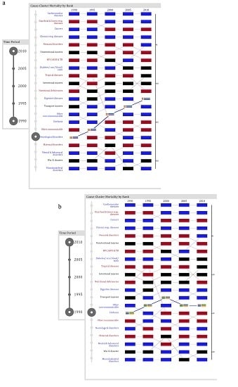
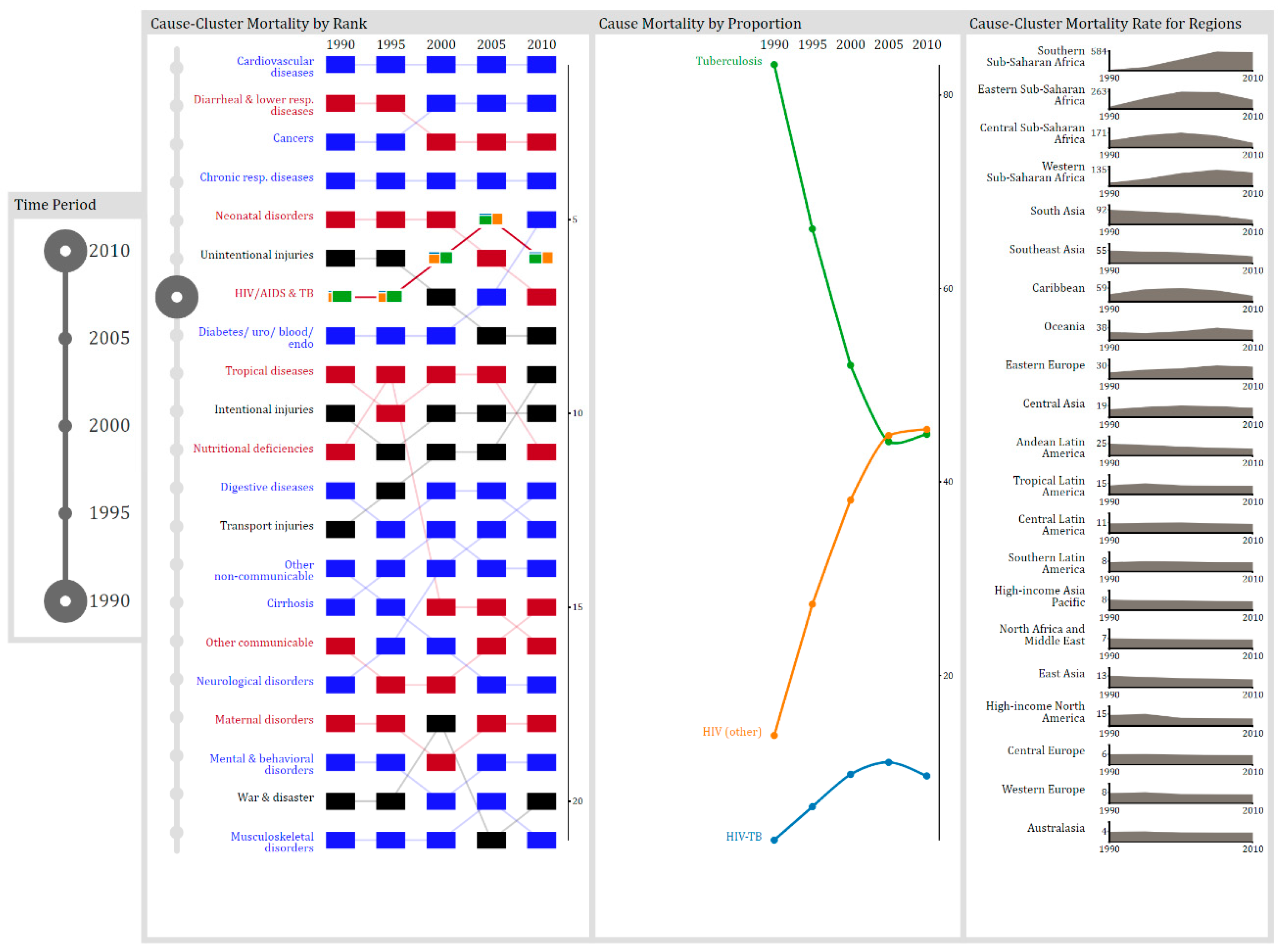
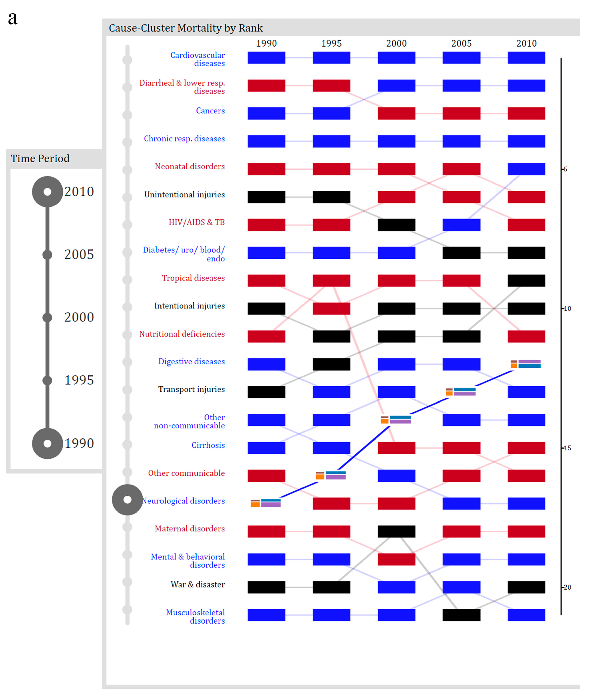
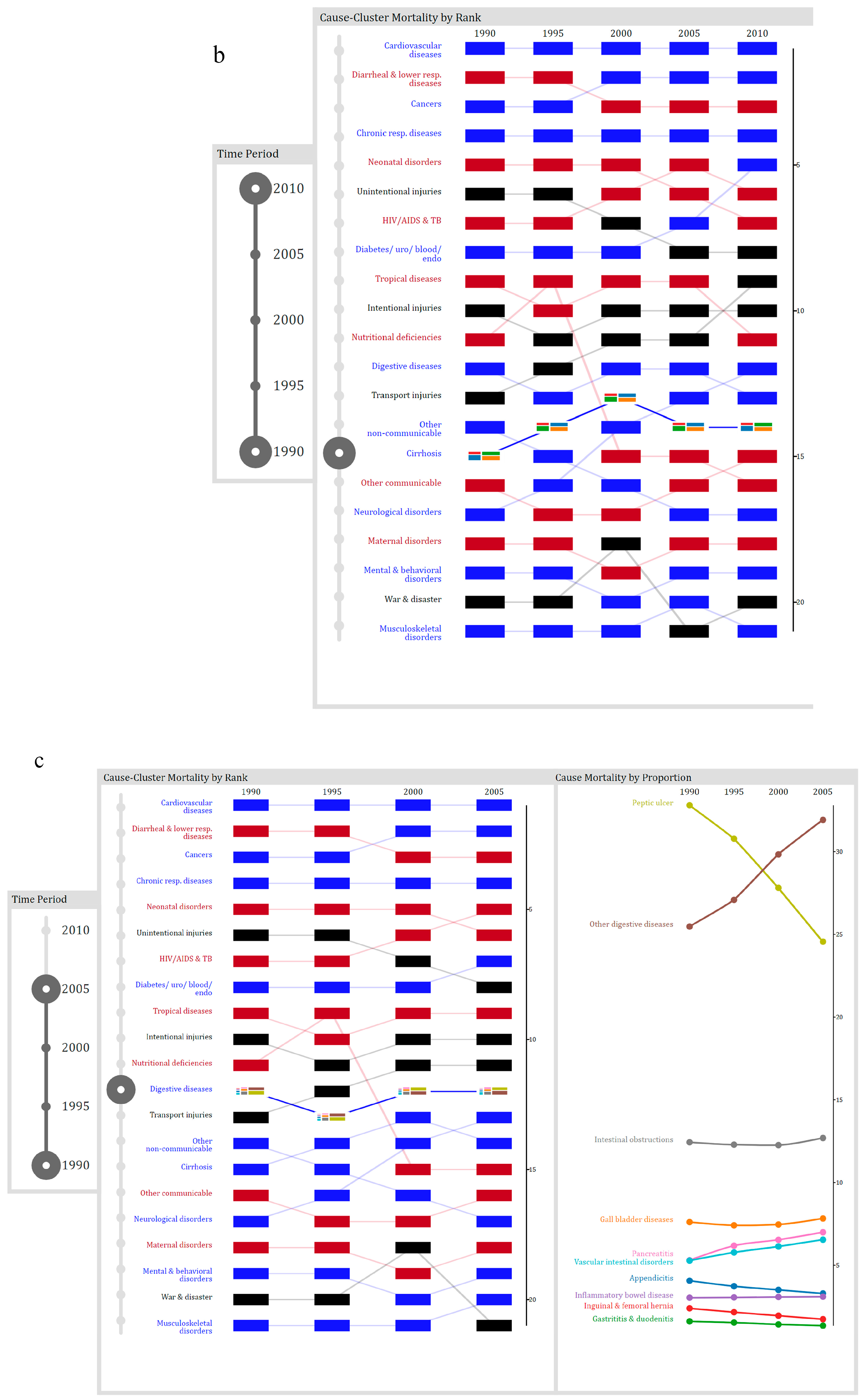
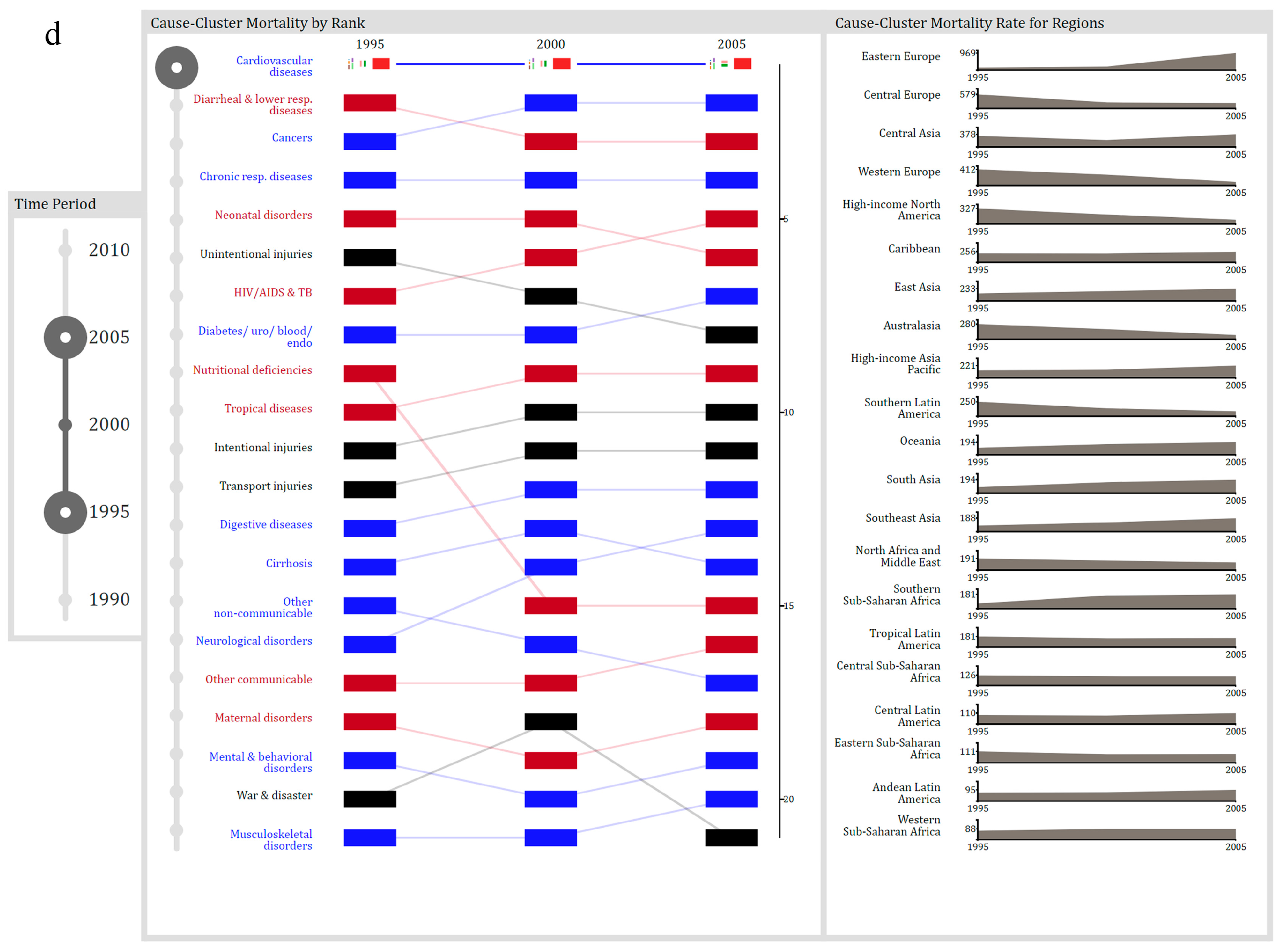
5.3. Chronology Visualization

The last visualization we present facilitates the understanding of temporal trends of mortality. The data utilized includes estimates of mortality at regional and global levels for each cause and cause-cluster. The estimates are at five different points in time: 1990, 1995, 2000, 2005, and 2010. The visualization has three main parts (see Figure 11). The first part (i.e., the left panel) presents the ranking for cause-clusters at a global level. Each rectangle represents a cause-cluster for a specific year. We use color to represent the group to which each cluster belongs, and the position of the rectangle represents the cluster’s rank. The scale on the left side shows the rank values from 1 to 21, with 1 representing the cluster with the highest mortality rate. For instance, one can notice that the cardiovascular-diseases cluster is consistently ranked number 1, while the nutritional deficiencies cluster starts at position 11, goes up to position 9, and drops to position 16 in 2010. Embedded within each rectangle is the hierarchical and proportional make-up of the cluster. Each cluster is comprised of several causes, each with varying prevalence. For example, the HIV/AIDS & TB cluster is made up of three causes: Tuberculosis, HIV from TB, and HIV diseases that result in other unspecified diseases. In 1990, tuberculosis accounted for over 80% of the deaths in this cluster, but by 2010, tuberculosis accounted for less than 50%. The proportion of each cause for a cluster is also depicted in the second panel (i.e., Cause Mortality by Proportion). This sub-visualization uses a multi-line chart to depict the proportion of mortality for causes.
The third part of the visualization uses area charts to depict the temporal distribution of a selected cluster for each region of the world. For example, one can observe that for South Asia, death from HIV & TB has decreased over the 20-year period. The area charts are arranged according to their mortality rate, with the region with the highest mortality rate at the top.
To design interaction, we once again considered the tasks that users would perform with the data. These tasks include assessing trends for cluster-specific mortality at a global and regional level, comparing cause and cause-cluster ranks, exploring temporal trends within a cluster on a global scale, and comparing rates between geographical regions. To support these tasks, we have operationalized the following actions: selecting, drilling, filtering, arranging, collapsing, expanding, and comparing.
For this last scenario, let us imagine a student, enrolled in a global health course, who has an assignment that requires him to answer the following questions:
  • Between 1990 and 2010, which cause-cluster increased in rank the most?
  • Over the 20-year period, what was the highest rank for liver cirrhosis?
  • Between 1990 and 2005, which digestive diseases significantly decreased in proportion?
  • Which region of the world had the lowest mortality rate from cardiovascular and circulatory diseases between 1995 and 2005?
After reading over the questions, the student recognizes that the first three questions do not require regional-level data, and so he collapses the third panel. By selecting each cluster, he observes that the neurological disorders cluster increased from position 17 to 12 over the 20-year period. He selects this cluster (see Figure 12a), writes down the answer, and then proceeds to the second question. To determine the highest rank for the liver cirrhosis cluster, he changes the time range and then selects the cluster as shown in Figure 12b. He notes that the highest position for liver cirrhosis was 13 in 2010. To discover the digestive disease that significantly decreased in proportion between 1990 and 2005, he changes the time range, selects the cluster, and then focuses his attention on the cause mortality panel. Next, he performs a visual search and determines that peptic ulcers significantly decreased in proportion (see Figure 12c). To answer the last question, he collapses the cause panel and expands the region panel as shown in Figure 12d, and also changes the time frame so that only data between 1995 and 2005 is visualized. Next, he selects the cardiovascular and circulatory disease cluster and notices that western Sub-Saharan Africa has the lowest mortality rate during the specified time frame.
The scenarios presented in this section highlight some of the ways in which users can interact with the underlying data. In the first and second scenarios, we demonstrated how exploring the data in an open-ended fashion may occur. In the third scenario, we focused on how users can answer specific questions. We have shown that when interaction is designed in a systematic fashion; users can perform a variety of tasks. The way users perform tasks is dependent on the complementary actions that are made available to them and the way in which the visualization reacts to users’ actions.

6. User Study

To underscore how our design approach supports a meaningful discourse with data, in this section, we briefly highlight results from a recent study conducted with the visualizations. This study is part of a larger work that explores the use of elaborate visualizations to make sense of large repositories of health data. For a more thorough discussion of the study, the interested reader is directed to [78].
Twenty-eight students from a university in Canada were recruited to participate in the study. Half of the students interacted with the visualization, while the other 14 were part of the control group. Participants in the treatment group were asked to use a visualization tool, comprised of 4 visualizations (three of which were presented in Section 5) to complete a series of tasks. After completing the tasks, participants were given a health literacy quiz to determine if the visualization tool improved their understanding of health trends. Following the quiz, they completed a short questionnaire in which they described their experience using the tool. Some of the participants were later invited back for an interview in which they discussed their use of the tool. Participants in the control group did not use the tool and only completed the health literacy quiz.
The tasks that participants were asked to complete varied in difficulty. Some tasks were atomic, while others had sub-tasks and required multiple actions. For instance, for the Demography visualization, participants were asked to determine which country in Central Asia had the highest mortality rate for individuals between the ages of 75 and 79. This task can be completed in multiple ways; one would be for the participant to, first, filter by region; next, select the appropriate bar for the age group; and, finally, move their mouse over the embedded visualization to determine the name of the country. There were 20 tasks, 5 for each visualization, that participants were asked to complete. While participants were provided with a brief (3–4 min) video tutorial for each visualization that described the basic methods of interaction, they were not told how to complete the tasks.
The average score on the health literacy test was 79% for those in the treatment group and 21% for those in the control group. In the treatment, 9 out of the 14 participants scored 80% or above. These results suggest that all participants in the treatment group could use the visualizations to improve their understanding of global health trends. In addition to their test scores, we used a 7-point Likert scale to obtain their opinion of the tool. Their responses were mostly positive. 13 out of 14 participants reported that the tool was engaging, easy to use, and easy to learn. Some of their positive remarks centered around the interactive nature of the tool. Participant 1 noted that it was easy to get more information and filter down a search, and that the visualization was not too cluttered. This sentiment was echoed by Participant 2, who wrote, “Elegant presentation of a mind-boggling amount of information.” Participant 5 highlighted that the interactive quality allowed for easy navigation through the data; they wrote, “I like how I can move through it and make sense of the information. A tool like this that you can go and eliminate data is easy. Better than Google. The information was very direct; you don’t have to go through a lot of reading to find it.”
In designing the tool, our goal was to create an environment in which users could perform a myriad of tasks and engage in meaningful discourse with data. While this is not an in-depth usability study of the developed visualizations, the results suggest that with the tool participants were able to interact with the data and explore different health trends while at the same time not being overwhelmed by the size of the data.

7. Conclusions

Data has the potential to impact health care efforts positively. However, in the past, the health community has been slow to leverage the data and capitalize on the opportunities it presents. This is partially due to the complexity of the data and the challenges it presents for individuals trying to complete tasks. Interactive visualizations can play a role in supporting the data-driven health tasks. While research indicates that visualizations allow users to interact with the data, to date, recent surveys suggest that much of the interaction in visualizations allows for simple manipulations.
In this paper, we contend that when dealing with large sets of data, users need to be able to interact with it and change its form so that they can perform a variety of tasks effectively. Designing interaction is a non-trivial issue, and efforts to design it in an ad-hoc manner may lead to tools that inadvertently constrain users’ ability to complete tasks. There is a need for conceptual structures to help systematize the design process. In this work, we have demonstrated how elements of a theoretical framework contribute to the process of structuring the design process for interaction. We have presented a process for designing human-data interaction and illustrated its usage and benefit using health data. In addition, we reported on results from a recent study that highlight the ability of users to make sense of health trends and perform a myriad of tasks with the visualizations.
As previously discussed, this work is part of a broader effort to explore the use of elaborate visualizations to improve health literacy. In our previous work, we have explored why the use of simple visual representations may not be sufficient to address the challenges of individuals working with large datasets. In the past, people have argued that such sophisticated visualizations cannot be used by the general public, so part of our goal was to test this assumption. As human-data discourse is influenced by both the design of visual representations and interaction, we investigated how users interpreted and interacted with the tool. We observed that users were able to not only make sense of how the data was encoded, but, with short minimalist video tutorials, they were also able to figure out how to interact with the data and engage in a meaningful discourse with it.
We intend to help raise awareness of the potential of interactive visualizations to support data-driven health tasks. Although this research uses global health data, we anticipate that the presented design process may be beneficial in supporting other datasets in healthcare, as well as other domains. Furthermore, the systematic design of interaction has applications for large datasets, in which leveraging expert knowledge is critical.

Author Contributions

Kamran Sedig and Oluwakemi Ola contributed to the design of the tool and the study; Oluwakemi Ola implemented the tool, performed the experiment, and analyzed the data. Both authors contributed to the paper.

Conflicts of Interest

The authors declare no conflict of interest.

References

  1. Kruse, C.S.; Goswamy, R.; Raval, Y.; Marawi, S. Challenges and Opportunities of Big Data in Health Care: A Systematic Review. JMIR Med. Inform. 2016, 4, e38. [Google Scholar] [CrossRef] [PubMed]
  2. Luo, J.; Wu, M.; Gopukumar, D.; Zhao, Y. Big Data Application in Biomedical Research and Health Care: A Literature Review. Biomed. Inform. Insights 2016, 8, 1–10. [Google Scholar] [CrossRef] [PubMed]
  3. Gotz, D.; Borland, D. Data-Driven Healthcare: Challenges and Opportunities for Interactive Visualization. IEEE Comput. Graph. Appl. 2016, 36, 90–96. [Google Scholar] [CrossRef] [PubMed]
  4. White, S. A Review of Big Data in Health Care: Challenges and Opportunities. Open Access Bioinform. 2014, 6, 13. [Google Scholar] [CrossRef]
  5. Raghupathi, W.; Raghupathi, V. Big Data Analytics in Healthcare: Promise and Potential. Heal. Inf. Sci. Syst. 2014, 2, 3. [Google Scholar] [CrossRef] [PubMed]
  6. Viceconti, M.; Hunter, P.; Hose, R. Big Data, Big Knowledge: Big Data for Personalized Healthcare. IEEE J. Biomed. Heal. Inform. 2015, 19, 1209–1215. [Google Scholar] [CrossRef] [PubMed]
  7. Ola, O.; Sedig, K. The Challenge of Big Data in Public Health: An Opportunity for Visual Analytics. Online J. Public Health Inform. 2014, 5, 223. [Google Scholar] [PubMed]
  8. Pretorius, A.J.; Khan, I.A.; Errington, R.J. A Survey of Visualization for Live Cell Imaging. Comput. Graph. Forum 2016, 36, 46–63. [Google Scholar] [CrossRef]
  9. Fisher, D.; DeLine, R.; Czerwinski, M.; Drucker, S. Interactions with Big Data Analytics. Interactions 2012, 19, 50. [Google Scholar] [CrossRef]
  10. Pike, W.A.; Stasko, J.; Chang, R.; O′Connell, T.A. The Science of Interaction. Inf. Vis. 2009, 8, 263–274. [Google Scholar] [CrossRef]
  11. Bikakis, N.; Athens, N.T.U. Exploration and Visualization in the Web of Big Linked Data: A Survey of the State of the Art—Semantic Scholar. arXiv, 2016; arXiv:1601.08059. [Google Scholar]
  12. Katsis, Y.; Koulouris, N.; Papakonstantinou, Y.; Patrick, K. Assisting Discovery in Public Health. In Proceedings of the 2nd Workshop on Human-In-the-Loop Data Analytics, HILDA’17, Chicago, IL, USA, 14–19 May 2017; ACM Press: New York, NY, USA, 2017; pp. 1–6. [Google Scholar]
  13. Kaufman, D.R.; Kannampallil, T.G.; Patel, V.L. Cognition and Human Computer Interaction in Health and Biomedicine; Springer International Publishing: Cham, Switzerland, 2015; pp. 9–34. [Google Scholar]
  14. Huang, W.; Eades, P.; Hong, S.-H. Measuring Effectiveness of Graph Visualizations: A Cognitive Load Perspective. Inf. Vis. 2009, 8, 139–152. [Google Scholar] [CrossRef]
  15. Torres, S.O.S.O.; Eicher-Miller, H.; Boushey, C.; Ebert, D.; Maciejewski, R. Applied Visual Analytics for Exploring the National Health and Nutrition Examination Survey. In Proceedings of the IEEE 45th Hawaii International Conference on System Sciences, Maui, HI, USA, 4–7 January 2012; pp. 1855–1863. [Google Scholar]
  16. Ko, S.; Cho, I.; Afzal, S.; Yau, C.; Chae, J.; Malik, A.; Beck, K.; Jang, Y.; Ribarsky, W.; Ebert, D.S. A Survey on Visual Analysis Approaches for Financial Data. Comput. Graph. Forum 2016, 35, 599–617. [Google Scholar] [CrossRef]
  17. Parsons, P.; Sedig, K. Adjustable Properties of Visual Representations: Improving the Quality of Human-Information Interaction. J. Assoc. Inf. Sci. Technol. 2014, 65, 455–482. [Google Scholar] [CrossRef]
  18. Heer, J. Interactive Visualization of Big Data. Available online: http://radar.oreilly.com/2013/12/interactive-visualization-of-big-data.html (accessed on 22 February 2017).
  19. Che, D.; Safran, M.; Peng, Z. From Big Data to Big Data Mining: Challenges, Issues, and Opportunities. In Proceedings of the International Conference on Database Systems for Advanced Applications, Wuhan, China, 22–25 April 2013; Springer: Berlin/Heidelberg, Germany, 2013; pp. 1–15. [Google Scholar]
  20. Endert, A.; Ribarsky, W.; Turkay, C.; Wong, B.L.W.; Nabney, I. The State of the Art in Integrating Machine Learning into Visual. Comput. Graph. Forum 2017, 36, 458–486. [Google Scholar] [CrossRef]
  21. Tominski, C. Interaction for Visualization; Morgan & Claypool Publishers: San Rafael, CA, USA, 2015; Volume 3. [Google Scholar]
  22. Sedig, K.; Parsons, P.; Dittmer, M.; Ola, O. Beyond Information Access: Support for Complex Cognitive Activities in Public Health Informatics Tools. Online J. Public Health Inform. 2012, 4. [Google Scholar] [CrossRef] [PubMed]
  23. Sedig, K.; Sumner, M. Characterizing Interaction with Visual Mathematical Representations. Int. J. Comput. Math. Learn. 2006, 11, 1–55. [Google Scholar] [CrossRef]
  24. Murray, C.J.L.; Vos, T.; Lozano, R.; Naghavi, M.; Flaxman, A.D.; Michaud, C.; Ezzati, M.; Shibuya, K.; Salomon, J.A.; Abdalla, S.; et al. Disability-Adjusted Life Years (DALYs) for 291 Diseases and Injuries in 21 Regions, 1990–2010: A Systematic Analysis for the Global Burden of Disease Study 2010. Lancet 2012, 380, 2197–2223. [Google Scholar] [CrossRef]
  25. Aigner, W. Understanding the Role and Value of Interaction: First Steps. In Proceedings of the International Workshop on Visual Analytics; Miksch, S., Santucci, G., Eds.; The Eurographics Association: Geneve, Switzerland, 2011. [Google Scholar]
  26. Dou, W.; Ziemkiewicz, C.; Harrison, L.; Jeong, D.H.; Ribarsky, W.; Wang, X.; Chang, R. Toward a Deeper Understanding of the Relationship between Interaction Constraints and Visual Isomorphs. Inf. Vis. 2012, 11, 222–236. [Google Scholar] [CrossRef]
  27. Endert, A.; Chang, R.; North, C.; Zhou, M. Semantic Interaction: Coupling Cognition and Computation through Usable Interactive Analytics. IEEE Comput. Graph. Appl. 2015, 35, 94–99. [Google Scholar] [CrossRef]
  28. Sedig, K.; Parsons, P. Interaction Design for Cognitive Activity Support Tools: A Pattern-Based Taxonomy. AIS Trans. Hum.-Comput. Interact. 2013, 5, 84–133. [Google Scholar] [CrossRef]
  29. Thomas, J.; Cook, K. Illuminating the Path: The Research and Development Agenda for Visual Analytics; Thomas, J., Cook, K.A., Eds.; IEEE Computer Society: Los Alamitos, CA, USA, 2005. [Google Scholar]
  30. Purchase, H.C.; Andrienko, N.; Jankun-Kelly, T.; Ward, M. Theoretical Foundations of Information Visualization. In Information Visualization: Human-Centered Issues and Perspectives (Lecture Notes in Computer Science); Springer: Berlin, Germany, 2008; Volume 4950, pp. 46–64. [Google Scholar]
  31. Sedig, K.; Parsons, P.C.; Dittmer, M.; Haworth, R. Human-Centered Interactivity of Visualization Tools: Micro- and Macro-Level Considerations. In Handbook of Human Centric Visualization; Huang, T., Ed.; Springer: New York, NY, USA, 2013; pp. 717–743. [Google Scholar]
  32. Turner, A.M.; Stavri, Z.; Revere, D.; Altamore, R. From the Ground up: Information Needs of Nurses in a Rural Public Health Department in Oregon. J. Med. Libr. Assoc. 2008, 96, 335–342. [Google Scholar] [CrossRef] [PubMed]
  33. Carroll, L.N.; Au, A.P.; Detwiler, L.T.; Fu, T.-C.; Painter, I.S.; Abernethy, N.F. Visualization and Analytics Tools for Infectious Disease Epidemiology: A Systematic Review. J. Biomed. Inform. 2014, 51C, 287–298. [Google Scholar] [CrossRef] [PubMed]
  34. Folorunso, O.; Ogunseye, O.S. Challenges in the Adoption of Visualization System: A Survey. Kybernetes 2008, 37, 1530–1541. [Google Scholar] [CrossRef]
  35. Ola, O.; Sedig, K. Beyond Simple Charts: Design of Visualizations for Big Health Data. Online J. Public Health Inform. 2016, 8, 195. [Google Scholar] [CrossRef] [PubMed]
  36. Wurman, R.S. Information Anxiety, 1st ed.; Doubleday: New York, NY, USA, 1989. [Google Scholar]
  37. Sedig, K.; Parsons, P. Design of Visualizations for Human-Information Interaction: A Pattern-Based Framework. Synth. Lect. Vis. 2016, 4, 1–185. [Google Scholar] [CrossRef]
  38. Parsons, P.; Sedig, K. Distribution of Information Processing While Performing Complex Cognitive Activities with Visualization Tools. In Handbook of Human Centric Visualization; Huang, T., Ed.; Springer: New York, NY, USA, 2013; pp. 639–715. [Google Scholar]
  39. Knauff, M.; Wolf, A.G. Complex Cognition: The Science of Human Reasoning, Problem-Solving, and Decision-Making. Cogn. Process. 2010, 11, 99–102. [Google Scholar] [CrossRef] [PubMed]
  40. Shneiderman, B.; Plaisant, C.; Hesse, B.W. Improving Healthcare with Interactive Visualization. Computer 2013, 46, 58–66. [Google Scholar] [CrossRef]
  41. Sedig, K.; Parsons, P.C.; Babanski, A. Towards a Characterization of Interactivity in Visual Analytics. J. Multimed. Process. 2012, 3, 12–28. [Google Scholar]
  42. Parsons, P.; Sedig, K.; Didandeh, A.; Khosravi, A. Interactivity in Visual Analytics: Use of Conceptual Frameworks to Support Human-Centered Design of a Decision-Support Tool. In Proceedings of the IEEE 2015 48th Hawaii International Conference on System Sciences, Kauai, HI, USA, 5–8 January 2015; pp. 1138–1147. [Google Scholar]
  43. Zhang, J. External Representations in Complex Information Processing Tasks. Encycl. Libr. Inf. Sci. 2001, 68, 164–180. [Google Scholar]
  44. Dou, W.; Ziemkiewicz, C.; Harrison, L.; Jeong, D.H.; Ryan, R.; Ribarsky, W.; Wang, X.; Chang, R. Comparing Different Levels of Interaction Constraints for Deriving Visual Problem Isomorphs. In Proceedings of the 2010 IEEE Symposium on Visual Analytics Science and Technology (VAST), Salt Lake City, UT, USA, 25–26 October 2010; pp. 195–202. [Google Scholar]
  45. Liu, Z.; Stasko, J. Mental Models, Visual Reasoning and Interaction in Information Visualization: A Top-down Perspective. IEEE Trans. Vis. Comput. Graph. 2010, 16, 999–1008. [Google Scholar] [PubMed]
  46. Kirsh, D. Interaction, External Representation and Sense Making. In Proceedings of the 31st Annual Conference of the Cognitive Science Society, Amsterdam, The Netherlands, 29 July–1 August 2009; pp. 1103–1108. [Google Scholar]
  47. Ziemkiewicz, C.; Kosara, R. The Shaping of Information by Visual Metaphors. IEEE Trans. Vis. Comput. Graph. 2007, 14, 1269–1276. [Google Scholar] [CrossRef] [PubMed]
  48. Endert, A.; North, C.; Chang, R.; Zhou, M. Toward Usable Interactive Analytics: Coupling Cognition and Computation. In Proceedings of the KDD 2014 Workshop on Interactive Data Exploration and Analytics (IDEA), New York, NY, USA, 24 August 2014. [Google Scholar]
  49. Cao, N.; Lin, Y.-R.; Gotz, D.; Du, F. Z-Glyph: Visualizing Outliers in Multivariate Data. Inf. Vis. 2017, 17, 22–40. [Google Scholar] [CrossRef]
  50. Andrienko, G.; Andrienko, N.; Jankowski, P.; Keim, D.A.; Kraak, M.-J.; MacEachren, A.; Wrobel, S. Geovisual Analytics for Spatial Decision Support: Setting the Research Agenda. Int. J. Geogr. Inf. Sci. 2007, 21, 839–857. [Google Scholar] [CrossRef]
  51. Kamel Boulos, M.N.; Viangteeravat, T.; Anyanwu, M.N.; Ra Nagisetty, V.; Kuscu, E. Web GIS in Practice IX: A Demonstration of Geospatial Visual Analytics Using Microsoft Live Labs Pivot Technology and WHO Mortality Data. Int. J. Health Geogr. 2011, 10, 19. [Google Scholar] [CrossRef] [PubMed]
  52. Greitzer, F.L.; Noonan, C.F.; Franklin, L.R. Cognitive Foundations for Visual Analytics; Pacific Northwest National Laboratory (PNNL): Richland, WA, USA, 2011. [Google Scholar]
  53. Elmqvist, N.; Moere, A.V.; Jetter, H.-C.; Cernea, D.; Reiterer, H.; Jankun-Kelly, T. Fluid Interaction for Information Visualization. Inf. Vis. 2011, 10, 327–340. [Google Scholar] [CrossRef]
  54. Wagner, M.; Fischer, F.; Luh, R.; Haberson, A.; Rind, A.; Keim, D.A.; Aigner, W. A Survey of Visualization Systems for Malware Analysis. In Proceedings of the EG Conference on Visualization (EuroVis)-STARs, Cagliari, Italy, 25–29 May 2015. [Google Scholar]
  55. Thomas, J.; Cook, K. Visualization Viewpoints a Visual Analytics Agenda. IEEE Comput. Graph. Appl. 2006, 26, 10–13. [Google Scholar] [CrossRef] [PubMed]
  56. Shneiderman, B. The Eyes Have It: A Task by Data Type Taxonomy for Information Visualizations. In Proceedings of the IEEE Symposium on Visual Languages, Boulder, CO, USA, 3–6 September 1996; pp. 336–343. [Google Scholar]
  57. Amar, R.; Eagan, J.; Stasko, J. Low-Level Components of Analytic Activity in Information Visualization. In Proceedings of the 2005 IEEE Symposium on Information Visualization, Washington, DC, USA, 23–25 October 2005; pp. 111–117. [Google Scholar]
  58. Gotz, D.; Zhou, M.X. Characterizing Users Visual Analytic Activity for Insight Provenance. In Proceedings of the IEEE Symposium on Visual Analytics Science and Technology, Columbus, OH, USA, 19–24 October 2008; Ebert, D., Ertl, T., Eds.; IEEE: Piscataway Township, NJ, USA, 2008; pp. 123–130. [Google Scholar]
  59. Yi, J.S.; Kang, Y.A.; Stasko, J.; Jacko, J. Toward a Deeper Understanding of the Role of Interaction in Information Visualization. IEEE Trans. Vis. Comput. Graph. 2007, 13, 1224–1231. [Google Scholar] [CrossRef] [PubMed]
  60. Brehmer, M.; Munzner, T. A Multi-Level Typology of Abstract Visualization Tasks. IEEE Trans. Vis. Comput. Graph. 2013, 19, 2376–2385. [Google Scholar] [CrossRef] [PubMed]
  61. Pohl, M.; Wiltner, S.; Miksch, S.; Aigner, W.; Rind, A. Analysing Interactivity in Information Visualisation. KI Künstliche Intelligenz 2012, 26, 151–159. [Google Scholar] [CrossRef]
  62. Amy, F.; Johnson, T.R.; Thimbleby, H.; Killoran, P. Cognitive Informatics for Biomedicine; Springer International Publishing: Cham, Switzerland, 2015. [Google Scholar]
  63. Kirsh, D.; Maglio, P. On Distinguishing Epistemic from Pragmatic Action. Cogn. Sci. A Multidiscip. J. 1994, 18, 513–549. [Google Scholar] [CrossRef]
  64. Sedig, K.; Parsons, P.; Liang, H.; Morey, J. Supporting Sensemaking of Complex Objects with Visualizations: Visibility and Complementarity of Interactions. Informatics 2016, 3, 20. [Google Scholar] [CrossRef]
  65. Wang, T.D.; Wongsuphasawat, K.; Plaisant, C.; Shneiderman, B. Extracting Insights from Electronic Health Records: Case Studies, a Visual Analytics Process Model, and Design Recommendations. J. Med. Syst. 2011, 35, 1135–1152. [Google Scholar] [CrossRef] [PubMed]
  66. Siirtola, H.; Räihä, K.-J. Interacting with Parallel Coordinates. Interact. Comput. 2006, 18, 1278–1309. [Google Scholar] [CrossRef]
  67. Groth, D.P.; Streefkerk, K. Provenance and Annotation for Visual Exploration Systems. IEEE Trans. Vis. Comput. Graph. 2006, 12, 1500–1510. [Google Scholar] [CrossRef] [PubMed]
  68. Turner, A.M.; Liddy, E.D.; Bradley, J.; Wheatley, J.A. Modeling Public Health Interventions for Improved Access to the Gray Literature. J. Med. Libr. Assoc. 2005, 93, 487–494. [Google Scholar] [PubMed]
  69. Berner, E.S.; Moss, J. Informatics Challenges for the Impending Patient Information Explosion. J. Am. Med. Inform. Assoc. 2005, 12, 614–617. [Google Scholar] [CrossRef] [PubMed]
  70. Munzner, T. Visualization Analysis and Design; A K Peters/CRC Press: New York, NY, USA, 2014. [Google Scholar]
  71. Ward, M.; Grinstein, G.G.; Keim, D. Interactive Data Visualization: Foundations, Techniques, and Applications, 2nd ed.; A K Peters/CRC Press: New York, NY, USA, 2015. [Google Scholar]
  72. van Wijk, J.J. Views on Visualization. IEEE Trans. Vis. Comput. Graph. 2006, 12, 421–432. [Google Scholar] [CrossRef] [PubMed]
  73. Lam, H. A Framework of Interaction Costs in Information Visualization. IEEE Trans. Vis. Comput. Graph. 2008, 14, 1149–1156. [Google Scholar] [CrossRef] [PubMed]
  74. Lozano, R.; Naghavi, M.; Foreman, K.; Lim, S.; Shibuya, K.; Aboyans, V.; Abraham, J.; Adair, T.; Aggarwal, R.; Ahn, S.Y.; et al. Global and Regional Mortality from 235 Causes of Death for 20 Age Groups in 1990 and 2010: A Systematic Analysis for the Global Burden of Disease Study 2010. Lancet 2012, 380, 2095–2128. [Google Scholar] [CrossRef]
  75. Moody, D. What Makes a Good Diagram? Improving the Cognitive Effectiveness of Diagrams in IS Development. In Advances in Information Systems Development; Springer: Boston, MA, USA, 2007; pp. 481–492. [Google Scholar]
  76. Rosenholtz, R.; Li, Y.; Nakano, L. Measuring Visual Clutter. J. Vis. 2007, 7, 1–22. [Google Scholar] [CrossRef] [PubMed]
  77. Hornbæk, K.; Hertzum, M. The Notion of Overview in Information Visualization. Int. J. Hum. Comput. Stud. 2011, 69, 509–525. [Google Scholar] [CrossRef]
  78. Ola, O.; Sedig, K. Health Literacy for the General Public: Making a Case for Non-Trivial Visualizations. Informatics 2017, 4, 33. [Google Scholar]
Figure 1. Conceptualization of the human-data discourse.
Mti 02 00010 g001
Figure 2. Interaction design process for visualizations.
Mti 02 00010 g002
Figure 3. (a) Overall visualization for demography; (b) enlarged partial demography visualization.
Mti 02 00010 g003
Figure 4. (a) Risk track emphasized while location and cause tracks de-emphasized; (b) nutritional deficiencies cluster emphasized in the cause track.
Mti 02 00010 g004
Figure 5. (a) Visualization with all the relationships shown; (b) default configuration used in our visualization with no relationships shown; (c) state of the visualization when the user has selected specific relationships to explore.
Mti 02 00010 g005
Figure 6. (a) Collapsed location and risk tracks; (b) collapsed cause track; (c) collapsed risk track.
Mti 02 00010 g006
Figure 7. (a) Expanded cause track; (b) filtered to emphasize the self-harm and interpersonal violence cluster; (c) drilled to show the breakdown of the self-harm and interpersonal violence cluster for ages 15–19; (d) filtered to emphasize southern sub-Saharan Africa location-cluster and drilled to show the HIV/AIDS&TB cluster for ages 25–29; (e) linked to highlight relationship between HIV/AIDS & TB and the physiological risks for ages 15–49.
Mti 02 00010 g007aMti 02 00010 g007b
Figure 8. Geography visualization with hypertensive heart disease is selected in the top portion and the Caribbean is selected in the bottom portion.
Mti 02 00010 g008
Figure 9. (a) Top portion of the geography visualization with a map in the center and alcohol use selected; (b) In the top portion, an alternative view (i.e., bar chart) has been chosen to better aid the task of comparison; in the bottom portion, Eastern Europe has been selected.
Mti 02 00010 g009
Figure 10. (a) Bottom portion of the geography visualization, comparing risk- and cause-clusters for two regions in African; (b) bottom portion of the visualization, with central Europe selected and the heatmap arranged in a configuration to support understanding mortality rates for Bulgaria; (c) geography visualization in which the bottom portion supports comparing countries in eastern Europe affected by diarrheal diseases and the top portion shows the impact of the cluster at a regional level.
Mti 02 00010 g010
Figure 11. Chronology visualization with HIV/AIDS & TB cluster selected.
Mti 02 00010 g011
Figure 12. (a) First panel of chronology visualization with neurological disorders selected; (b) first panel of visualization with cirrhosis selected; (c) Third panel collapsed and the time frame changed to 1990–2005 and digestive disorders selected; (d) Second panel collapsed and time changed to 1995–2005 and cardiovascular cluster selected.
Mti 02 00010 g012aMti 02 00010 g012bMti 02 00010 g012c
Table 1. Some of the epistemic actions from [28].
ActionCharacterization: Acting upon Visualizations to …
Annotatingaugment them with additional visual marks and coding schemes, as personal meta-information
Arrangingchange their ordering, either spatially or temporally
Blendingfuse them together such that they become one indivisible, single, new visualization
Comparingdetermine degree of similarity or difference between them
Drillingbring out, make available, and display interior, deep information
Filteringdisplay a subset of their elements according to certain criteria quantify
Navigatingmove on, through, and/or around them
Searchingseek out the existence of or locate position of specific items, relationships, or structures
Selectingfocus on or choose them, either as an individual or as a group
Translatingconvert them into alternative informationally- or conceptually-equivalent forms
Collapsing/Expandingfold in or compact them, or conversely, fold them out or make them diffuse assemble
Linking/Unlinkingestablish a relationship or association between them or, conversely, dissociate them and disconnect their relationships

