
Visualizing 3D Terrain, Geo-Spatial Data, and Uncertainty

Abstract
:
1. Introduction
- Concept of prioritizing the visualization of 3D terrain, data, and uncertainty
- Visual representations for depicting all three aspects simultaneously
- Visualization tool for rapidly prototyping differently prioritized visualizations
2. Related Work
2.1. Presenting Geo-spatial Data in Terrain
2.2. Presenting Uncertainty of Geo-Referenced Data
2.3. Presenting Uncertainty and Data in 3D Terrain
3. Prioritizing Terrain, Data, and Uncertainty
3.1. Scenarios
- Take-off and approach : During take-off and approach the flight altitude is low and natural obstacles in the terrain (e.g., mountains) constitute a principal threat to an aircraft. Therefore, the topography of T should be communicated accurately and as detailed as possible. Weather conditions and forecast reliability have to be considered as well, but they are not as relevant as the terrain. Therefore, it is sufficient to provide a qualitative representation of D and U, rather than full quantitative details.
- Overflight : In overflight scenarios, the flight altitude is quite high (>10 km). Hence, fine-grained features of the terrain are not essential. The visual representation of T merely serves as an overview to facilitate orientation. Weather forecast data, on the other hand, can be of primary interest, in particular, the spatial distribution and characteristics of hazardous weather zones. Therefore, D should be represented at high detail. Information about potential uncertainty are needed as well. But providing a coarse overview of U to estimate the forecast quality is usually sufficient.
- Re-planning : Hazardous weather zones can make it necessary to adapt flight routes. Before planning a new route, the reliability of the corresponding forecast has to be verified. Hence, the presentation of U is important and should be prioritized. Weather forecast data are needed as well, yet arguably, individual quantitative data values are not needed. A qualitative distinction of safe zones and hazardous zones is sufficient. Similarly, local terrain features are not as relevant. Therefore, D and T can be shown at less detail.
3.2. Rendering Strategies
Representing Terrain T
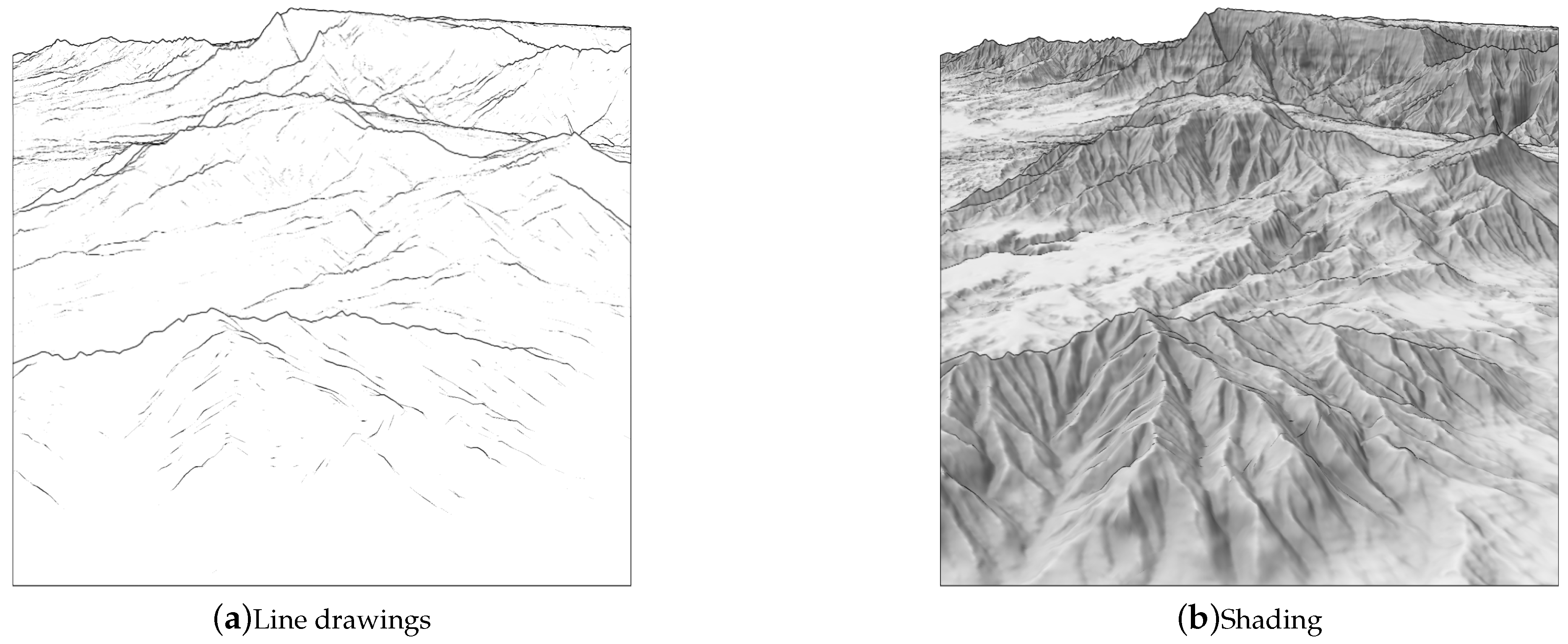
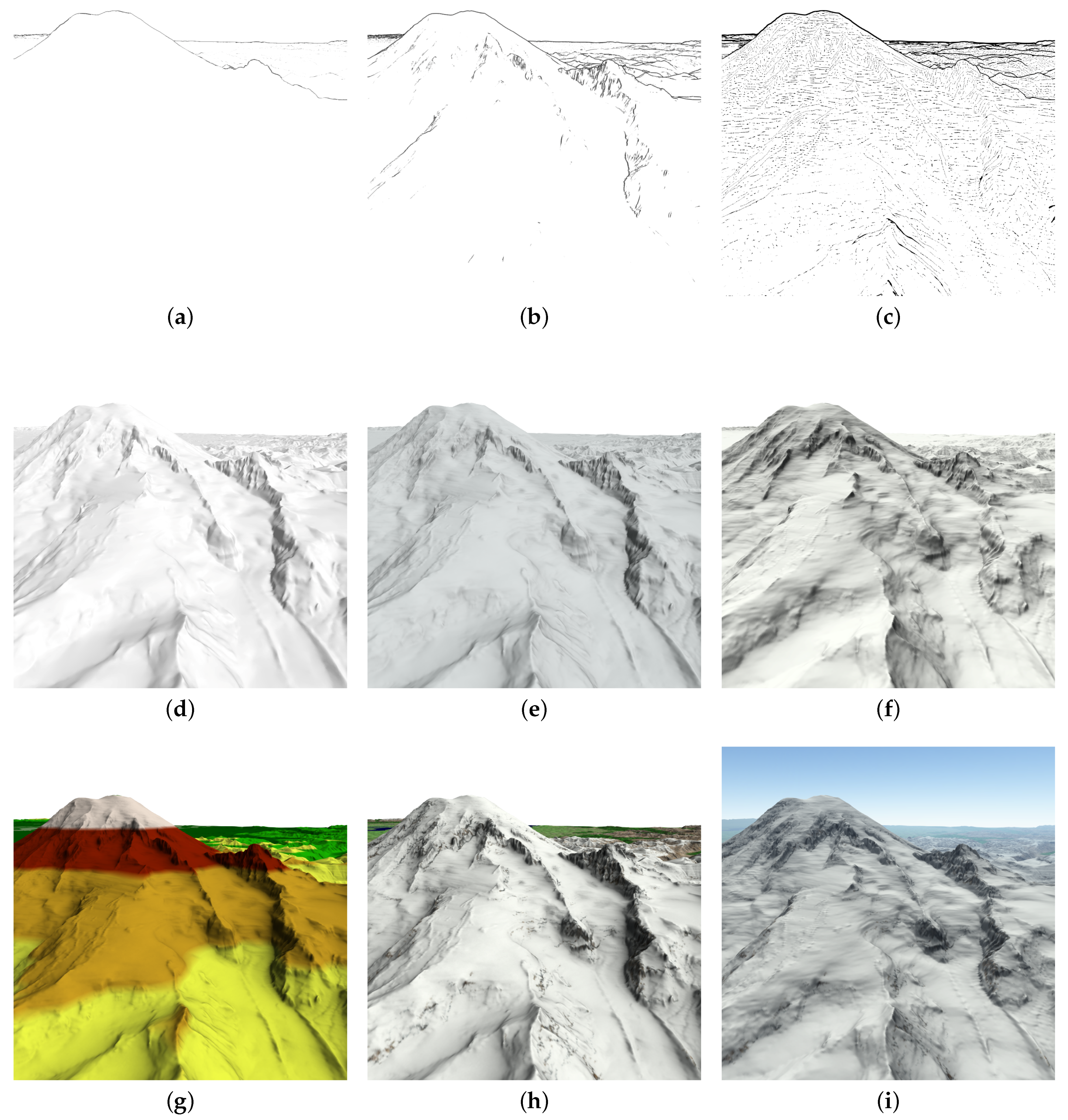
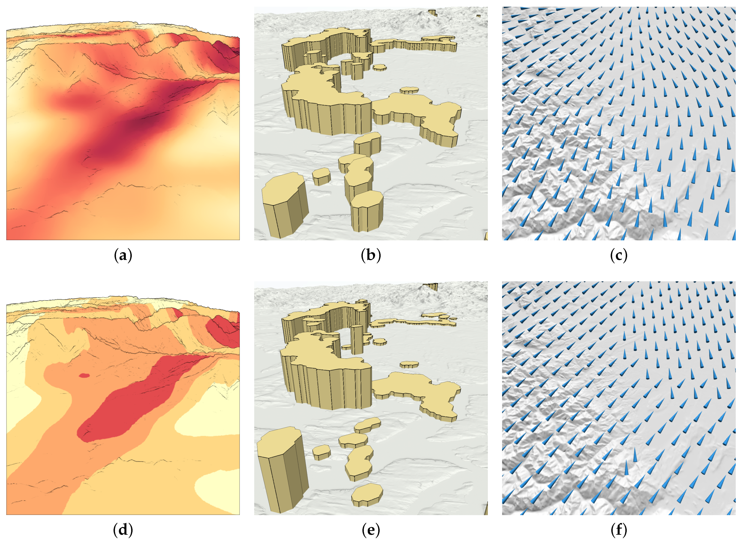
- Line drawing for : Our fundamental strategy for less-detailed representations of the terrain is to use line drawings. Silhouettes, contours, or characteristic curves communicate significant geometric features [11]. Various edge styles can emphasize object boundaries or provide shape details [9]. Line drawings have been applied successfully to technical 3D models [40] as well as to terrain surfaces [41]. Figure 2a illustrates that the global topography of a terrain is communicated quite well, whereas fine-grained features are suppressed.
- Shading for : We define shading, including texturing, as the fundamental strategy to visualize terrain at high fidelity. Different illumination methods can be applied to shade a terrain surface, ranging from simple local to highly sophisticated global techniques. By applying shading, local terrain features become visible and texturing can improve spatial details. For example, grid textures are useful to emphasize 3D structures [12,42]. This rendering style is demonstrated in Figure 2b. It can be seen that shading shows more and finer details of the terrain, compared to what can be discerned when using line drawings.
Representing Data D
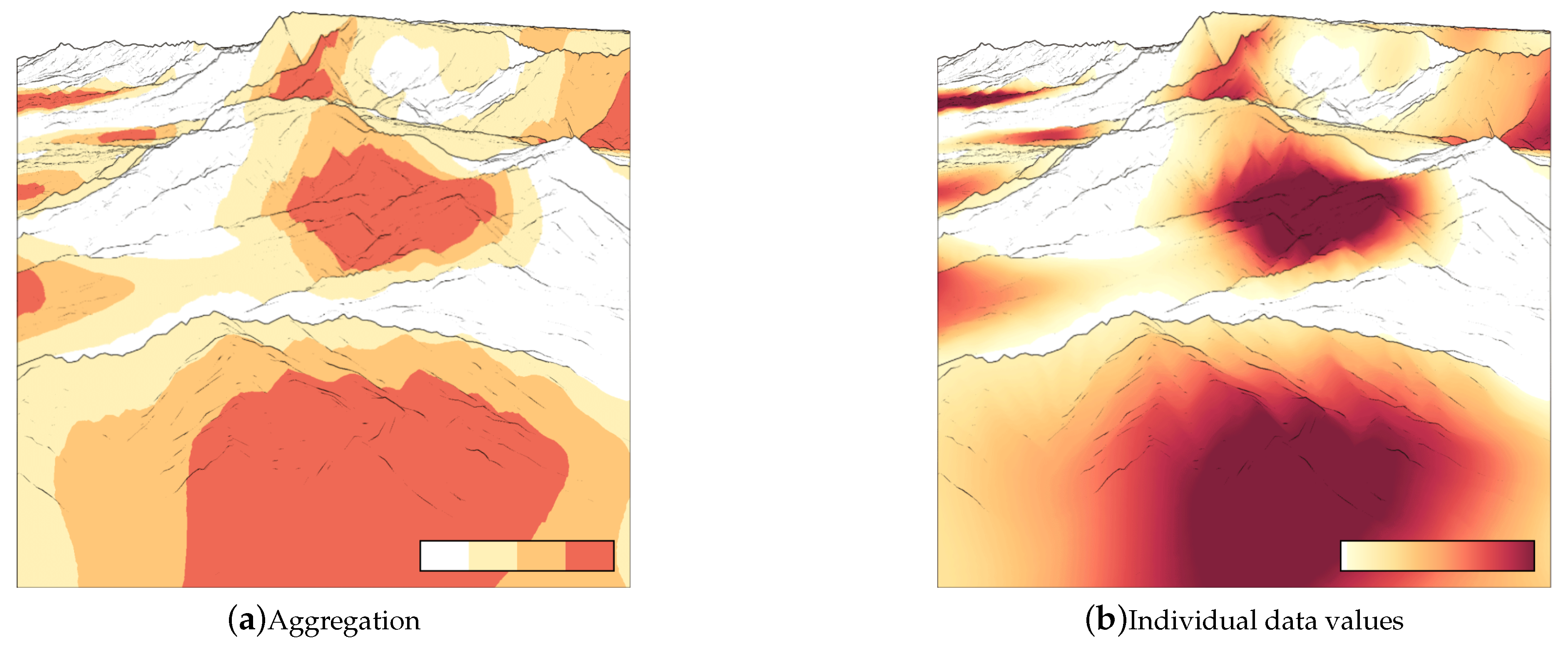
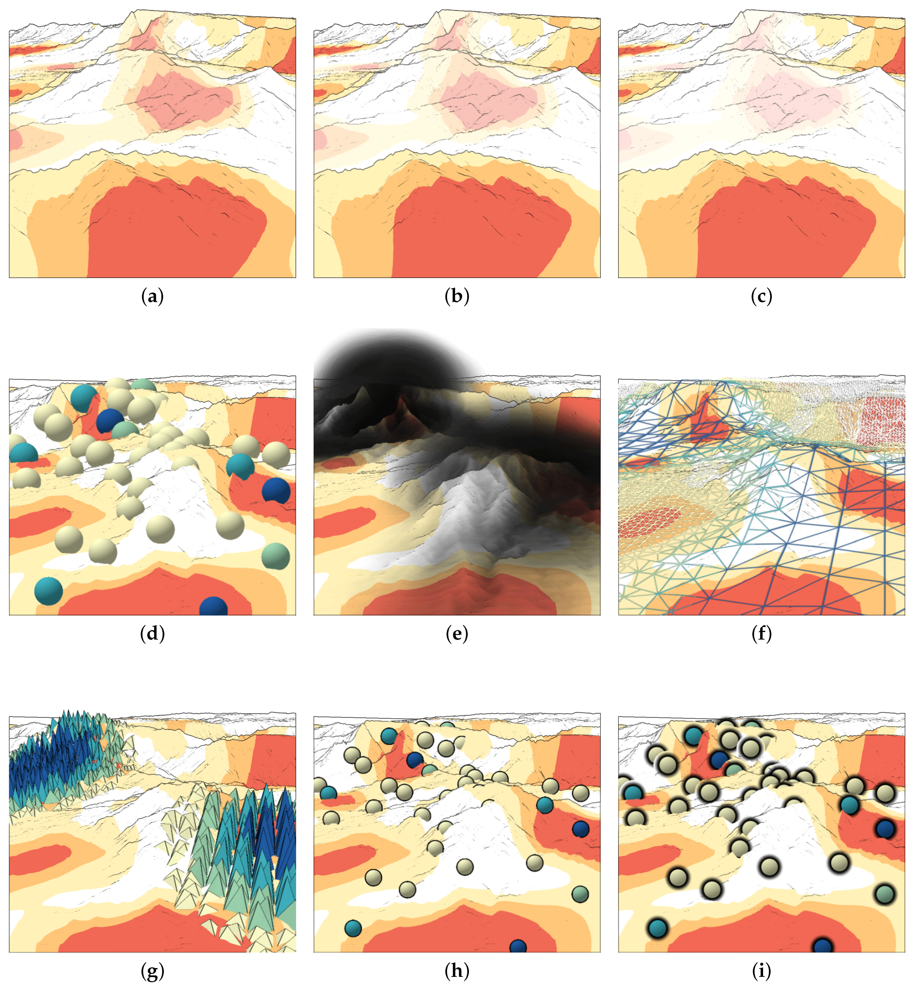
- Aggregation for : Representing aggregations, rather than individual values is a common approach. Different aggregation methods can be applied, including clustering, classification, or segmentation. As a result, individual data values are composed into larger units or groups. These units capture basic characteristics of the data and provide a good overview, yet they lack details. Figure 3a shows an example where aggregation is achieved by using a segmented color scale. The figure shows the severity of thunderstorm cells mapped onto the terrain surface. Four different colors classify regions into safe zones (white), potentially safe zones (light orange), hazardous zones (orange), and no-go zones (red). The four categories of zones can be distinguished easily, where as the underlying data values are abstracted away.
- Individual data values for : If there is a need to grasp more details, a trace back to the individual data values can be necessary. For example, detailed data could be required to figure out whether a hazardous weather zone rather tends to be a no-go zone. To continue our previous example, individual data values can be communicated using a continuous color scale, where each data value is associated with an individual color. Figure 3b shows the individual values of radar reflectivity (dBZ), which is the quantitative measure behind the previous qualitative categorization of the intensity of thunderstorm cells.
Representing Uncertainty U
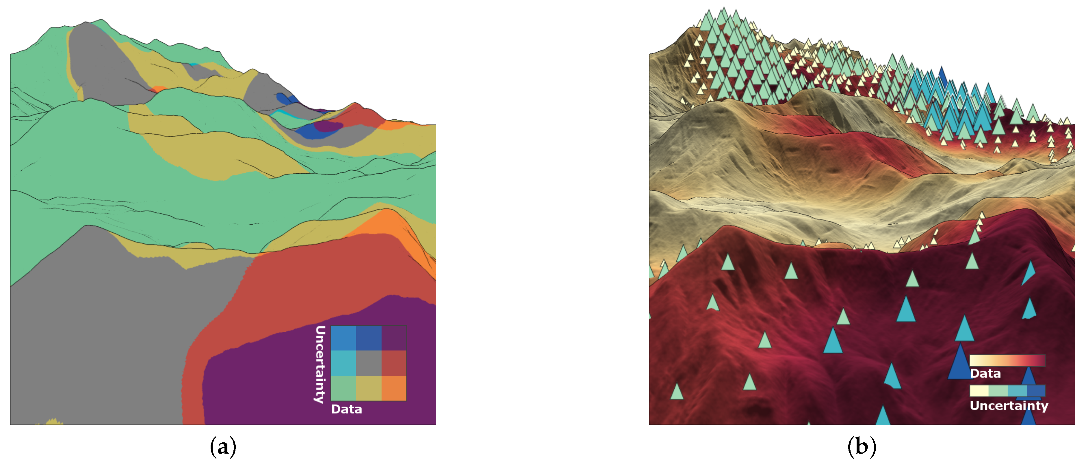
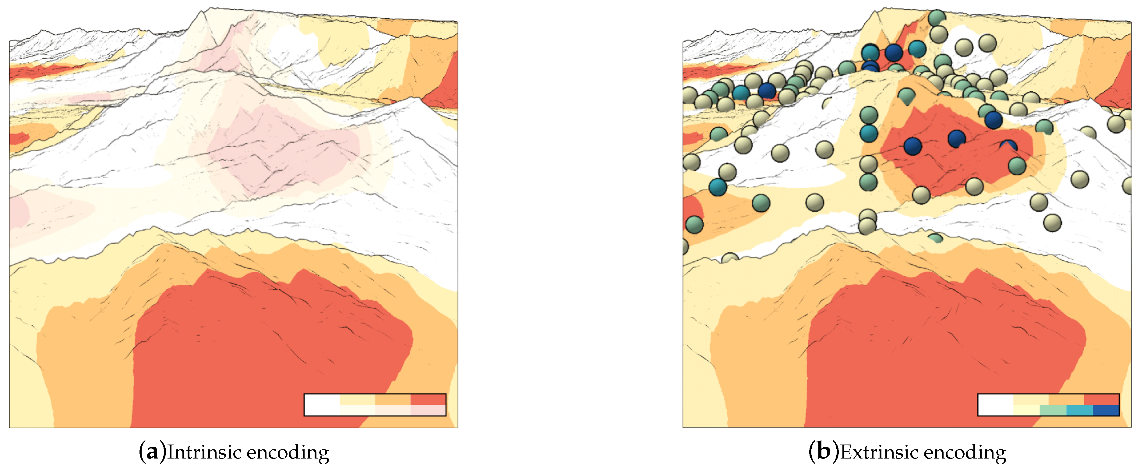
- Intrinsic encoding for : The idea of intrinsic techniques is to modify the existing visual elements. Common techniques are to use bivariate color maps, transparency, noise, or blur. Intrinsic encodings support qualitative assessments with about three or four distinguishable levels [30,43,44]. In Figure 4a, uncertainty is intrinsically encoded by modifying transparency. Higher transparency modulates the perception of color for uncertain data values, whereas colors in certain regions remain unchanged. This allows users to quickly grasp the existence of uncertainty, but not the precise degree of it.
- Extrinsic encoding for : Extrinsic techniques incorporate additional graphical elements. This offers a greater flexibility, better visual emphasis, and the potential to encode more details. Figure 4b illustrates an extrinsic encoding via color-coded dots embedded into the scene. In contrast to the intrinsic example, the dot’s color coding can communicate several degrees of uncertainty. Moreover, the dots clearly outline the areas that are afflicted with uncertainty.
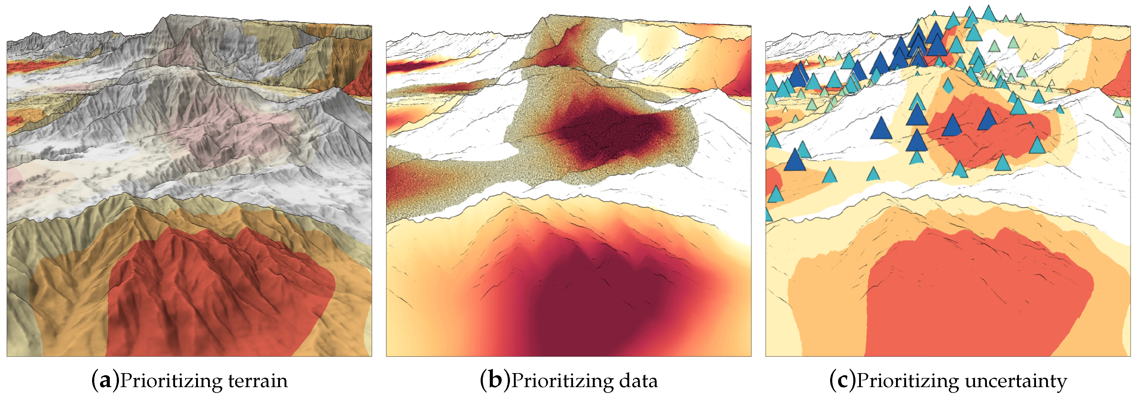
3.3. Prioritized Combinations
Prioritizing Terrain
Prioritizing Data
Prioritizing Uncertainty
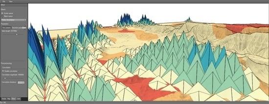
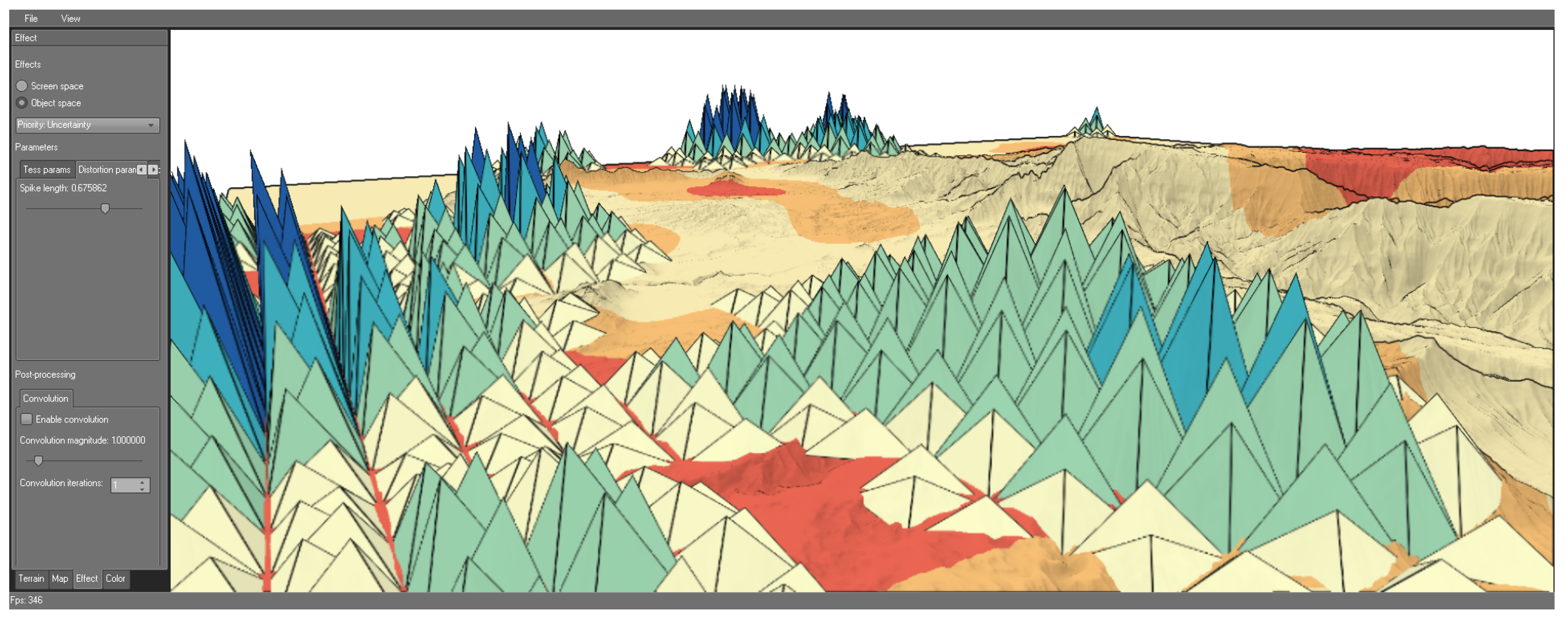
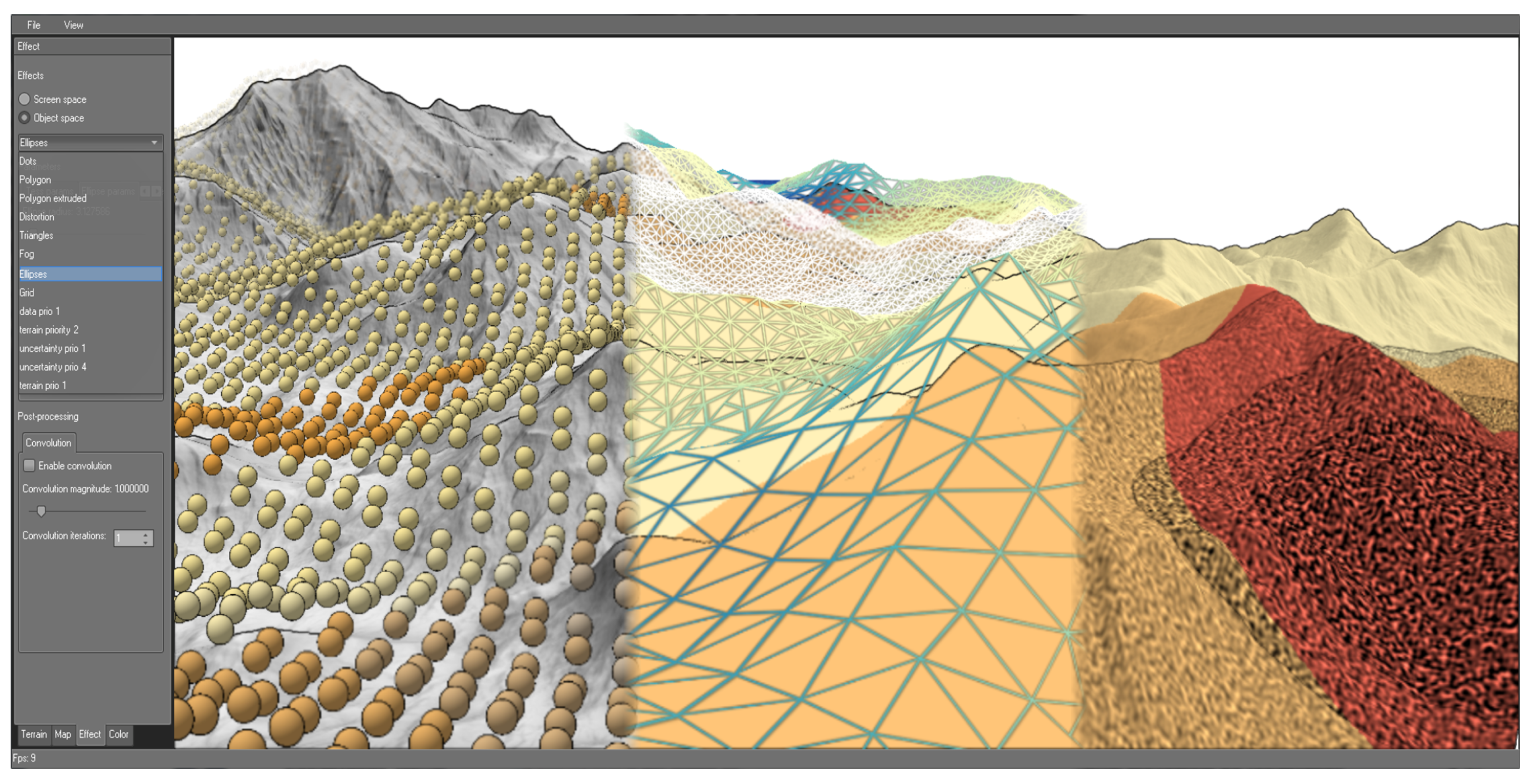
4. Prototyping Prioritized Visualizations
4.1. Parametrization
Terrain Visualization
Data Visualization
Uncertainty Visualization
4.2. Architecture
Resource Management
Interactive Parametrization and Exploration
5. Design Process and Feedback
6. Conclusions
Acknowledgments
Author Contributions
Conflicts of Interest
References
- Andrienko, N.; Andrienko, G. Exploratory Analysis of Spatial and Temporal Data: A Systematic Approach; Springer Science & Business Media: Berlin/Heidelberg, Germany, 2006. [Google Scholar]
- Helbig, C.; Bauer, H.S.; Rink, K.; Wulfmeyer, V.; Frank, M.; Kolditz, O. Concept and workflow for 3D visualization of atmospheric data in a virtual reality environment for analytical approaches. Environ. Earth Sci. 2014, 72, 3767–3780. [Google Scholar] [CrossRef]
- Bleisch, S. 3D Geovisualization—Definition and Structures for the Assessment of Usefulness. In Proceedings of the International Society for Photogrammetry and Remote Sensing Annals of the Photogrammetry, Remote Sensing and Spatial Information Sciences, Melbourne, Australia, 31 August–1 September 2012.
- Schmidt, G.; Chen, S.L.; Bryden, A.; Livingston, M.; Rosenblum, L.; Osborn, B. Multidimensional visual representations for underwater environmental uncertainty. IEEE Comput. Graph. Appl. 2004, 24, 56–65. [Google Scholar] [CrossRef] [PubMed]
- Pang, A.T.; Wittenbrink, C.M.; Lodha, S.K. Approaches to uncertainty visualization. Vis. Comput. 1997, 13, 370–390. [Google Scholar] [CrossRef]
- MacEachren, A.M.; Robinson, A.; Hopper, S.; Gardner, S.; Murray, R.; Gahegan, M.; Hetzler, E. Visualizing geospatial information uncertainty: What we know and what we need to know. Cartogr. Geogr. Inf. Sci. 2005, 32, 139–160. [Google Scholar] [CrossRef]
- Brodlie, K.; Osorio, R.A.; Lopes, A. A review of uncertainty in data visualization. In Expanding the Frontiers of Visual Analytics and Visualization; Springer: Berlin/Heidelberg, Germany, 2012; pp. 81–109. [Google Scholar]
- Dübel, S.; Röhlig, M.; Schumann, H.; Trapp, M. 2D and 3D presentation of spatial data: A systematic review. In Proceedings of the IEEE VIS International Workshop on 3DVis, Paris, France, 9 November 2014; pp. 11–18.
- DeCarlo, D.; Finkelstein, A.; Rusinkiewicz, S.; Santella, A. Suggestive contours for conveying shape. ACM Trans. Graph. 2003, 22, 848–855. [Google Scholar] [CrossRef]
- Ritschel, T.; Dachsbacher, C.; Grosch, T.; Kautz, J. The State of the Art in Interactive Global Illumination. Comput. Graph. Forum 2012. [Google Scholar] [CrossRef]
- Ware, C. Information Visualization: Perception for Design; Morgan Kaufmann: Burlington, MA, USA, 2012. [Google Scholar]
- Bolton, M.L.; Bass, E.J.; Comstock, J.R. Spatial awareness in synthetic vision systems: Using spatial and temporal judgments to evaluate texture and field of view. Hum. Factors 2007, 49, 961–974. [Google Scholar] [CrossRef] [PubMed]
- Stevens, K.A. Surface Perception From Local Analysis of Texture and Contour; Technical Report; Massachusetts Institute of Technology: Cambridge, MA, USA, 1980. [Google Scholar]
- Rautenhaus, M.; Kern, M.; Schäfler, A.; Westermann, R. Three-dimensional visualization of ensemble weather forecasts—Part 1: The visualization tool Met.3D (version 1.0). Geosci. Model Dev. 2015, 8, 2329–2353. [Google Scholar] [CrossRef]
- Röhlig, M.; Schumann, H. Visibility Widgets: Managing Occlusion of Quantitative Data in 3D Terrain Visualization. In Proceedings of the 9th International Symposium on Visual Information Communication and Interaction, ACM, Dallas, TX, USA, 24–26 September 2016.
- MacEachren, A.M. Visualizing uncertain information. Cartogr. Perspect. 1992, 13, 10–19. [Google Scholar] [CrossRef]
- Goodchild, M.; Buttenfield, B.; Wood, J. Introduction to visualizing data validity. In Visualization in Geographical Information Systems; John Wiley and Sons: Chichester, UK, 1994; pp. 141–149. [Google Scholar]
- Pang, A. Visualizing uncertainty in geo-spatial data. In Proceedings of the Workshop on the Intersections between Geospatial Information and Information Technology, National Research Council, Arlington, VA, USA, 1–2 October 2001; pp. 1–14.
- Kinkeldey, C.; MacEachren, A.M.; Schiewe, J. How to Assess Visual Communication of Uncertainty? A Systematic Review of Geospatial Uncertainty Visualisation User Studies. Cartogr. J. 2014, 51, 372–386. [Google Scholar] [CrossRef]
- Thomson, J.; Hetzler, E.; MacEachren, A.; Gahegan, M.; Pavel, M. A typology for visualizing uncertainty. In Electronic Imaging; International Society for Optics and Photonics: Bellingham, WA, USA, 2005; pp. 146–157. [Google Scholar]
- Potter, K.; Rosen, P.; Johnson, C.R. From quantification to visualization: A taxonomy of uncertainty visualization approaches. In Uncertainty Quantification in Scientific Computing; Springer: Berlin/Heidelberg, Germany, 2012; pp. 226–249. [Google Scholar]
- Griethe, H.; Schumann, H. The Visualization of Uncertain Data: Methods and Problems. In Proceedings of Simulation and Visualization; SCS Publishing House: Magdeburg, Germany, 2006; pp. 143–156. [Google Scholar]
- Aerts, J.C.; Clarke, K.C.; Keuper, A.D. Testing popular visualization techniques for representing model uncertainty. Cartogr. Geogr. Inf. Sci. 2003, 30, 249–261. [Google Scholar] [CrossRef]
- Guo, H.; Huang, J.; Laidlaw, D.H. Representing Uncertainty in Graph Edges: An Evaluation of Paired Visual Variables. IEEE Trans. Vis. Comput. Graph. 2015, 21, 1173–1186. [Google Scholar] [CrossRef] [PubMed]
- Luo, A.; Kao, D.; Pang, A. Visualizing spatial distribution data sets. In Proceedings of the Symposium on Data Visualization, Grenoble, France, 26–28 May 2003.
- Allendes Osorio, R.; Brodlie, K.W. Contouring with uncertainty. In Proceedings of the Theory and Practice of Computer Graphics, Manchester, UK, 9–11 June 2008; pp. 59–66.
- Drecki, I. Visualisation of uncertainty in geographical data. Spat. Data Qual. 2002, 140–159. [Google Scholar]
- Grigoryan, G.; Rheingans, P. Probabilistic surfaces: Point based primitives to show surface uncertainty. In Proceedings of the Conference on Visualization, Boston, MA, USA, 27 October–1 November 2002; pp. 147–154.
- Newman, T.S.; Lee, W. On visualizing uncertainty in volumetric data: Techniques and their evaluation. J. Vis. Lang. Comput. 2004, 15, 463–491. [Google Scholar] [CrossRef]
- MacEachren, A.; Roth, R.; O’Brien, J.; Li, B.; Swingley, D.; Gahegan, M. Visual Semiotics & Uncertainty Visualization: An Empirical Study. IEEE Trans. Vis. Comput. Graph. 2012, 18, 2496–2505. [Google Scholar] [PubMed]
- Kardos, J.; Benwell, G.; Moore, A. The visualisation of uncertainty for spatially referenced census data using hierarchical tessellations. Trans. GIS 2005, 9, 19–34. [Google Scholar] [CrossRef]
- Sanyal, J.; Zhang, S.; Dyer, J.; Mercer, A.; Amburn, P.; Moorhead, R.J. Noodles: A tool for visualization of numerical weather model ensemble uncertainty. IEEE Trans. Vis. Comput. Graph. 2010, 16, 1421–1430. [Google Scholar] [CrossRef] [PubMed]
- Cox, J.; House, D.; Lindell, M. Visualizing uncertainty in predicted hurricane tracks. Int. J. Uncertain. Quantif. 2013, 3, 143–156. [Google Scholar] [CrossRef]
- Johnson, C.R.; Sanderson, A.R. A next step: Visualizing errors and uncertainty. IEEE Comput. Graph. Appl. 2003, 23, 6–10. [Google Scholar] [CrossRef]
- Wittenbrink, C.; Pang, A.; Lodha, S. Glyphs for visualizing uncertainty in vector fields. IEEE Trans. Vis. Comput. Graph. 1996, 2, 266–279. [Google Scholar] [CrossRef]
- Davis, T.J.; Keller, C. Modelling and visualizing multiple spatial uncertainties. Comput. Geosci. 1997, 23, 397–408. [Google Scholar] [CrossRef]
- Kunz, M.; Grêt-Regamey, A.; Hurni, L. Visualization of uncertainty in natural hazards assessments using an interactive cartographic information system. Nat. Hazards 2011, 59, 1735–1751. [Google Scholar] [CrossRef]
- Hauser, H. Generalizing Focus+Context Visualization. In Scientific Visualization: The Visual Extraction of Knowledge from Data; Springer: Berlin/Heidelberg, Germany, 2006; pp. 305–327. [Google Scholar]
- Beecham, R.; Rooney, C.; Meier, S.; Dykes, J.; Slingsby, A.; Turkay, C.; Wood, J.; Wong, B.W. Faceted Views of Varying Emphasis (FaVVEs): A framework for visualising multi-perspective small multiples. Comput. Graph. Forum 2016, 35, 241–249. [Google Scholar] [CrossRef]
- Gooch, A.; Gooch, B.; Shirley, P.; Cohen, E. A Non-photorealistic Lighting Model for Automatic Technical Illustration. In Proceedings of the 25th Annual Conference on Computer Graphics and Interactive Techniques, Orlando, FL, USA, 19–24 July 1998.
- Buchin, K.; Sousa, M.C.; Döllner, J.; Samavati, F.F.; Walther, M. Illustrating terrains using direction of slope and lighting. In Proceedings of the 4th ICA Mountain Cartography Workshop, Catalonia, Spain, 30 September–2 October 2004.
- Kim, S.; Hagh-Shenas, H.; Interrante, V. Conveying Shape with Texture: Experimental Investigations of Texture’s Effects on Shape Categorization Judgments. IEEE Trans. Vis. Comput. Graph. 2004, 10, 471–483. [Google Scholar] [CrossRef] [PubMed]
- Robertson, P.; O’Callaghan, J. The Generation of Color Sequences for Univariate and Bivariate Mapping. IEEE Comput. Graph. Appl. 1986, 6, 24–32. [Google Scholar] [CrossRef]
- Carpendale, M. Considering Visual Variables as a Basis for Information Visualisation; Technical Report; Department of Computer Science, University of Calgary: Calgary, AB, Canada, 2003. [Google Scholar]
- Oat, C.; Sander, P.V. Ambient aperture lighting. In Proceedings of the Symposium on Interactive 3D Graphics and Games, Seattle, WA, USA, 29 April–2 May 2007; pp. 61–64.
- Tominski, C.; Fuchs, G.; Schumann, H. Task-Driven Color Coding. In Proceedings of the International Conference on Information Visualisation (IV), London, UK, 8–11 July 2008; pp. 373–380.
- Harrower, M.A.; Brewer, C.A. ColorBrewer.org: An Online Tool for Selecting Color Schemes for Maps. Cartogr. J. 2003, 40, 27–37. [Google Scholar] [CrossRef]
- Tominski, C.; Schulz, H.J. The Great Wall of Space-Time. In Proceedings of the Workshop on Vision, Modeling & Visualization (VMV), Magdeburg, Germany, 12–14 November 2012; pp. 199–206.
- Thakur, S.; Tateosian, L.; Mitasova, H.; Hardin, E.; Overton, M. Summary visualizations for coastal spatial-temporal dynamics. Int. J. Uncertain. Quantif. 2013, 3, 241–253. [Google Scholar] [CrossRef]


| Prioritization | Strategy for Terrain | Strategy for Data | Strategy for Uncertainty |
|---|---|---|---|
| Shading | Aggregation | Intrinsic | |
| Line drawing | Individual values | Intrinsic | |
| Line drawing | Aggregation | Extrinsic |
© 2017 by the authors; licensee MDPI, Basel, Switzerland. This article is an open access article distributed under the terms and conditions of the Creative Commons Attribution (CC BY) license ( http://creativecommons.org/licenses/by/4.0/).
Share and Cite
Dübel, S.; Röhlig, M.; Tominski, C.; Schumann, H. Visualizing 3D Terrain, Geo-Spatial Data, and Uncertainty. Informatics 2017, 4, 6. https://doi.org/10.3390/informatics4010006
Dübel S, Röhlig M, Tominski C, Schumann H. Visualizing 3D Terrain, Geo-Spatial Data, and Uncertainty. Informatics. 2017; 4(1):6. https://doi.org/10.3390/informatics4010006
Chicago/Turabian StyleDübel, Steve, Martin Röhlig, Christian Tominski, and Heidrun Schumann. 2017. "Visualizing 3D Terrain, Geo-Spatial Data, and Uncertainty" Informatics 4, no. 1: 6. https://doi.org/10.3390/informatics4010006