1. Introduction
On 12 January 12 2010, a
magnitude earthquake struck near Haiti’s capital, Port-au-Prince [
1]. The poorest nation in the Western Hemisphere, the earthquake shattered Haiti’s already weak infrastructure [
1]. Thousands of Haitians were killed, and even more were forced to flee to resettlement camps [
1].
In October 2010, the first case of cholera, ever on record, was reported in Haiti. A later UN investigation revealed the specific strain of
V. cholerae came from South Asia [
2]. The UN investigation and epidemiological literature suggest that the epidemic began outside of a UN peacekeeper camp near Mirebalais in the Centre department, along the Artibonite River [
2,
3]. As
V. cholerae is a waterborne pathogen, the Artibonite River is the ostensible route through which the disease spread throughout Haiti’s ten administrative regions, called departments [
4].
Anecdotal news reports describe the dismal situation for thousands of Haitians that still remain displaced months after the earthquake. Sewage of millions of people flow through open ditches. Human waste from septic pits and latrines is dumped into the canals and, after it rains, ends up in the sea. Those living close to the water use over-the-sea toilets, and next to these outhouses, fishing boats unload and sell the fish from plastic buckets,
etc. [
5].
Haiti’s two most populous regions, Ouest and Artibonite, were also the two regions hardest hit by the epidemic. Cases in Ouest and Artibonite account for 60% of the total burden of cholera in Haiti [
6]. For this reason, we chose to focus our analysis on the Ouest and Artibonite regions. By 7 April 2012, cholera had affected
of the total population in Ouest and
of the population in Artibonite [
6] (note: population data for Haiti is from 2009 [
4], one year before the earthquake).
1.1. Previous Research
Previous models dealing with cholera and climatic conditions (rainfall, precipitation and tides) in Haiti vary widely in approach. There are a number of dynamical models using variations of SIWR (Susceptible, Infected, contaminated Water, Recovered), proposed in 2001 by Codeço [
7] and, later, Tien and Earn [
8], that address the situation in Haiti [
9,
10,
11]. These models look at various compartmental and spatial structures, but do not take environmental conditions explicitly into account. The models proposed by Tuite,
et al. [
11] and Bertuzzo,
et al. [
10], for example, both incorporated a “gravity” term to study the interaction among departments. The model proposed by Andrews and Basu [
9] accounted for a bacterial “hyperinfectivity” stage, following research by Hartley,
et al. in 2006 showing that
V. cholerae initially has a higher infectivity before it decays to a lower infective rate in the aquatic reservoir. A paper by Chao
et al. [
12] uses an agent-based model to investigate hypothetical vaccination programs in Haiti. This model examined various vaccination strategies that included pre-vaccination and early (21 days after the epidemic begins) reactive vaccination using various strategies.
Other papers [
13,
14,
15] do take precipitation directly into account in cholera. The first [
13] is a spatiotemporal Markov chain model using seasonal rainfall that drives disease outbreaks in an urban core, which then propagates to other areas of the city. The second [
14] deals specifically with Haiti and was done by the same group that produced one of the earlier papers [
10]. In [
14], they looked at the reliability of the earlier studies, and they found that although those models do well in capturing the early dynamics of the epidemic, they fail to track latter recurrences forced by seasonal patterns [
14]. As a follow up, Rinaldo
et al. [
14] add a precipitation forcing function to their original model along with other modifications, such as the river network and population mobility. These modifications produce a better fit to the observed pattern of cases over the first year of the epidemic. The third model by Eisenberg
et al. [
15] looks at the link between precipitation and disease outbreaks in Haiti from a statistical and dynamical modeling approach. Their dynamical system is a hybrid SIWR-SIR approach, where the infection rate of the SIWR component includes a rainfall forcing function and the infection rate of the SIR component accounts for short-term direct contacts with infected individuals.
In addition, these models assessed the impact of potential intervention strategies, including vaccination. Bertuzzo found that a vaccination campaign aiming to vaccinate 150,000 people after 1 January 2011, would have little effect, in part because of the late timing and in part because of the large proportion of asymptomatic individuals who would need to get vaccinated [
10]. Both the models proposed by Tuite,
et al. [
11] and Andrews and Basu [
9] suggest that vaccination campaigns would have a modest effect. In March 2012, Partners in Health began vaccinating 100,000 individuals with Shanchol, a two-dose cholera vaccine [
16]. The size of the campaign was limited by the size of the global stockpile of Shanchol [
16]. The vaccination campaign is targeted at 50,000 individuals living in the slums of Port-au-Prince (Ouest region), where population density is thought to increase the rate of cholera exposure, and at 50,000 individuals living in the Artibonite River valley (Artibonite region), where the epidemic began [
16]. Chao
et al. [
12] showed that a targeted vaccination strategy would have the best results for this limited supply of vaccine, and by early vaccinating 30% of the population and hygienic improvements, the cases could be reduced by as much as 55%.
In 2001, Codeço proposed introducing an oscillating term to model seasonal variability [
7]. However, none of the Haiti-specific models published prior to 2012 account for seasonality. Haiti experienced flooding in June 2011, October 2011, and March 2012 [
17]. As cholera reached an endemic state in Haiti, connecting precipitation explicitly to disease dynamics became more suitable. Mathematical models incorporated seasonality in order to more accurately predict the course of the epidemic and to simulate the effects of potential interventions. In April 2012, Rinaldo
et al. [
14] reexamined the above four models (including their own [
10]) and concluded that, among other factors, seasonal rainfall patterns were necessary to account for resurgences in the epidemic. They use long-term monthly averages to augment the bacterial growth term of contaminated water-bodies. Eisenberg
et al. [
15] examined rainfall patterns and assessed lag times between precipitation events and cases in the early epidemic. These indicated short delays of four to seven days. Other papers dealing with environmental factors were: (1) a study of cholera in Zanzibar, East Africa that demonstrated an eight-week fixed delay [
18] between rainfall and cholera outbreaks; and (2) a study in Bangladesh [
19] that reports a somewhat shorter delay (four weeks). Both of these studies use a statistical approach with seasonal data. Both also made note of the potential influence of ocean environmental factors, and the Reyburn
et al. paper included sea surface height and sea surface temperature in their analysis, but failed to find any significant relationship [
18]. In a third paper Koelle
et al. (2005) [
20] model very long time periods, more than a year, in Bangladesh. This model also uses seasonal precipitation and models changes in the susceptible fraction of the population due to demographics and loss of immunity.
1.2. The Model
In this paper, we use detailed and current rainfall, temperature, and predicted tides to model cholera in the Artibonite and Ouest regions. This paper is the first, that we know of, that uses tidal range in a model of cholera dynamics. We forego a bacterial or contaminated water compartment in favor of a saturating infectious compartment with a time delay. This has the advantage of more tractable temporal estimates without over parameterizing and including compartments that are essentially unmeasurable.
These long-term trends and environmental influences establish the pattern of response of the epidemic in Artibonite and Ouest. Thus, parameters were chosen and model calibration set prior to a vaccination program being implemented. We then used the model to evaluate the performance of the vaccination program against the backdrop of an alternative history without vaccination.
3. Results
3.1. Parameter Fitting and Model Selection
Table 2 displays parameter values for each region obtained through curve-fitting to cumulative reported cases.
Plausible ranges for time lags were initially obtained from the Fourier analysis; then, parameter ranges and initial values were further refined by visually fitting the new cases predicted by the model to the new case data. We then used the Berkeley Madonna curve-fitting routine to find the remaining parameter set that minimized the sum of the square differences (SSD) between model output for cumulative cases and cumulative case data.
The half saturation constant
for the saturating infected function was very small compared to the numbers of infected people in Ouest and essentially zero in Artibonite (
Table 2). This indicates a very weak link between the numbers of infected and transmission rates. It may be that it requires only a handful of new cases to refresh the bacteria in the environment and/or there is a reservoir of viable bacteria in the environment itself (e.g., in plankton). In any event, we can force the dynamics of cholera in these two departments almost entirely by environmental conditions.
The Artibonite model with tide was not included in
Table 2, since inclusion of tide only slightly improved the model fit with cumulative cases and did not significantly improve the model fit for new cases (see
Table 3 and
Table 4). The statistics for the model fit are given in the following two tables.
Table 3 is for cumulative cases predicted by the model compared to cumulative case data.
Table 3.
Model predictions versus data statistics for the cumulative number of cases: root mean squared deviations (RMSD), coefficient of determination . Degrees of freedom for the statistics are adjusted by the number of parameters fit in the calibration process.
Table 3.
Model predictions versus data statistics for the cumulative number of cases: root mean squared deviations (RMSD), coefficient of determination . Degrees of freedom for the statistics are adjusted by the number of parameters fit in the calibration process.
| All Cases |
|---|
| Statistic | Artibonite (Tide) | Artibonite (No Tide) | Ouest (Tide) | Ouest (No Tide) |
|---|
| Data points | 153 | 153 | 153 | 153 |
| Parameters | 11 | 7 | 11 | 7 |
| Adj RMSD | | | | |
| Adj | | | | |
Table 4.
Model predictions versus data statistics for new cases: root mean squared deviations (RMSD), coefficient of determination . Degrees of freedom for the statistics are adjusted by the number of parameters fit in the calibration process.
Table 4.
Model predictions versus data statistics for new cases: root mean squared deviations (RMSD), coefficient of determination . Degrees of freedom for the statistics are adjusted by the number of parameters fit in the calibration process.
| New Cases |
|---|
| Statistic | Artibonite (Tide) | Artibonite (No Tide) | Ouest (Tide) | Ouest (No Tide) |
|---|
| Data points | 153 | 153 | 153 | 153 |
| Parameters | 11 | 7 | 11 | 7 |
| Adj RMSD | | | | |
| Adj | | | | |
For the full model in either region (model including tides), the parameters and c are added and the model is re-optimized. For Artibonite, an F-test for the nested models with cumulative cases gives the following results , and the p-value is . For the Ouest region, an F-test for the nested models gives the following results , and the p-value is indicating that the tidal data significantly improved the model fit.
Table 4 is for new cases predicted by the model compared to new case data. The
F-test for the Artibonite nested models using new cases gives the following results
, and the
p-value is
For Ouest, the difference is again significant with
, and the
p-value is
3.2. Lag Times
The total delays in response to precipitation and tides are the sum of the averaging window and the delay function. For precipitation in Artibonite, the averaging window is five weeks plus a
-week delay for a total delay range of
to
, and in Ouest, they are
and
weeks, respectively, for a total delay range of
to
weeks. Thus, the delays are similar in the two regions. These long delays are similar in magnitude to delays reported from a study of cholera in Zanzibar, East Africa (eight-week delay) [
18], but slightly longer than those reported in Bangladesh (four weeks) [
19] and much longer than reported in another study of the Haiti cholera epidemic (four to seven days) [
15]. For Ouest, the estimated averaging window and delay from response to changes in tidal range were about one week and two weeks, respectively, or a delay range of one to three weeks total. However, since the influence of tidal range has not been quantitatively reported elsewhere in the literature, we have nothing with which to compare this number.
At the time of this analysis, rainfall data were available only to the week of 29 September 2013 (Week 154, with the lag periods reported above, this brings the simulation out to 27 November for Artibonite and 20 November for Ouest. This is just before the data for new cases ends on 8 December 2013.
3.3. Vaccination
A program to vaccinate the most at risk populations began in the second week of April and ended in mid-June, 2012. Each site (Ouest and Artibonite Departments) vaccinated about 50,000 persons, and each site had about a second dose coverage. The administration of the first dose was staggered by age group (beginning first with 10-year-olds and up), because the Ministry of Health had a measles, rubella and polio vaccine catch-up campaign for children under 10 years of age that was taking place at the same time last April 2012 (communicated by Jordan Tappero, MD, MPH (CDC/CGH/DGDDER, Atlanta, GA, USA), 29 November 2012).
In the Ouest Department, GHESKIO (Groupe Haïtien d’Étude du Sarcome de Kaposi et des Infectieuses Opportunistes) vaccinated adults, adolescents and children over 10 years of age from 12–23 April 2012, and children under 10 from 26 May–3 June. The first dose of vaccine was given to 52,357 persons (of which, 47,520 received the second dose), living in the slums of Port-au-Prince and surrounding villages (communicated by Jean W. Pape, MD (GHESKIO, Weill Cornell Medical College, Port-au-Prince, Haiti), 29 November 2012).
In the Artibonite Department, PIH (Partners in Health) vaccinated 32,183 people in rural Bocozel and 13,185 people in Grand Saline, with of those people confirmed to get the second dose (or 41,194 for both locations). The campaign started 15 April 2012, and ran until 10 June 2012. Here, too, children under nine years old were vaccinated in the second half of the time period, because of the MMR and Polio vaccination campaign (communicated by Louise Ivers, MD (Partners in Health/ZL, Cange, Haiti), 29 November 2012).
With these basic facts, we constructed a crude vaccination schedule (
Table 5) using the following assumptions:
(1) approximately of the population is under 10 years old;
(2) the second dose was administered 14 days after the first dose was given [
35];
(3) the immune response took hold about 8.5 days after the second dose was given [
35];
(4) we used the average number of people vaccinated per day over a 12-day period for adults and 9 days for children.
Table 5.
Simulated vaccination schedule for Artibonite and Ouest.
Table 5.
Simulated vaccination schedule for Artibonite and Ouest.
| Ouest |
| | |
| | |
| – | |
| | |
| | |
| – | |
| Artibonite |
| | |
| | |
| – | |
| | |
| | |
| – | |
We ran simulations following the above schedule as closely as the simulation would allow by subtracting the numbers of at-risk persons (given below) from the susceptible compartment .
In Ouest, the vaccination algorithm involved removing 2970 at-risk persons per day starting on 4 May 2012, and ending on 15 May 2012, or 35,640 total (these correspond to the vaccination of persons over age 10). Then, the algorithm removed 1320 at-risk persons per day starting on 17 June 2012, and ending on 25 June 2012, or 11,880 total (children).
In Artibonite, the vaccination algorithm removed 2574.67 at-risk persons per day starting on 7 May 2012, and ending on 18 May 2012, or 30,896 total (over age 10); then, the algorithm removed 1144.22 persons per day starting on 10 June 2012, and ending on 18 June 2012, or 10,298 total (these correspond to the vaccination of the at-risk children). These simulations roughly follow the actual vaccination schedules given in
Table 5.
The efficacy of the vaccine (oral Shanchol) is reported to be between
and
[
35]. We fit efficacy as a parameter and found for Artibonite an efficacy of
and for Ouest
.
3.4. Simulations and Projections
We list the time line for particular events in
Table 6. Curve fitting (parameter estimation) was done between model output and data from Week 3 to Week 155. We refer to model output during the calibration period as “predictions”; simulations from Week 156 through Week 216 are referred to as “projections”. We used rainfall data that ended in Week 154 for the delay period. Data for new infections extended to Week 164. By “immune response for first...” and “immune response for last...”, we mean that this is when we begin and end removing susceptibles from the at-risk group, respectively.
Table 6.
Time line for modeling events.
Table 6.
Time line for modeling events.
| Date (Week of Epidemic) |
|---|
| Event | Artibonite | Ouest |
|---|
| Begin epidemic | 17 October 2010 (0) |
| Begin case data | 7 November 2010 (3) |
| End model fitting | 6 October 2012 (155) |
| Immune response for first adult vaccinated | 7 May 2012 (81.1) | 4 May 2012 (80.7) |
| Immune response for last adult vaccinated | 18 May 2012 (82.7) | 15 May 2012 (82.3) |
| Immune response for first child vaccinated | 10 June 2012 (86) | 17 June 2012 (87) |
| Immune response for last child vaccinated | 18 June 2012 (87.1) | 25 June 2012 (88.1) |
| End precipitation data | 29 September 2013 (154) |
| End precipitation data with delay | 27 November 2013 (162.4) | 20 November 2013 (161.4) |
| Begin random average rain fall data | 28 November 2013 (162.5) | 21 November 2013 (161.5) |
| End case data | 8 December 2013 (164) |
| End simulation | 7 December 2014 (216) |
3.4.1. Predictions Compared to Observations for Cumulative and New Cases
The following
Figure 2 and
Figure 3 show the model predictions compared to observations for the cumulative number of cases in the Artibonite and Ouest regions, respectively. Similarly,
Figure 4 and
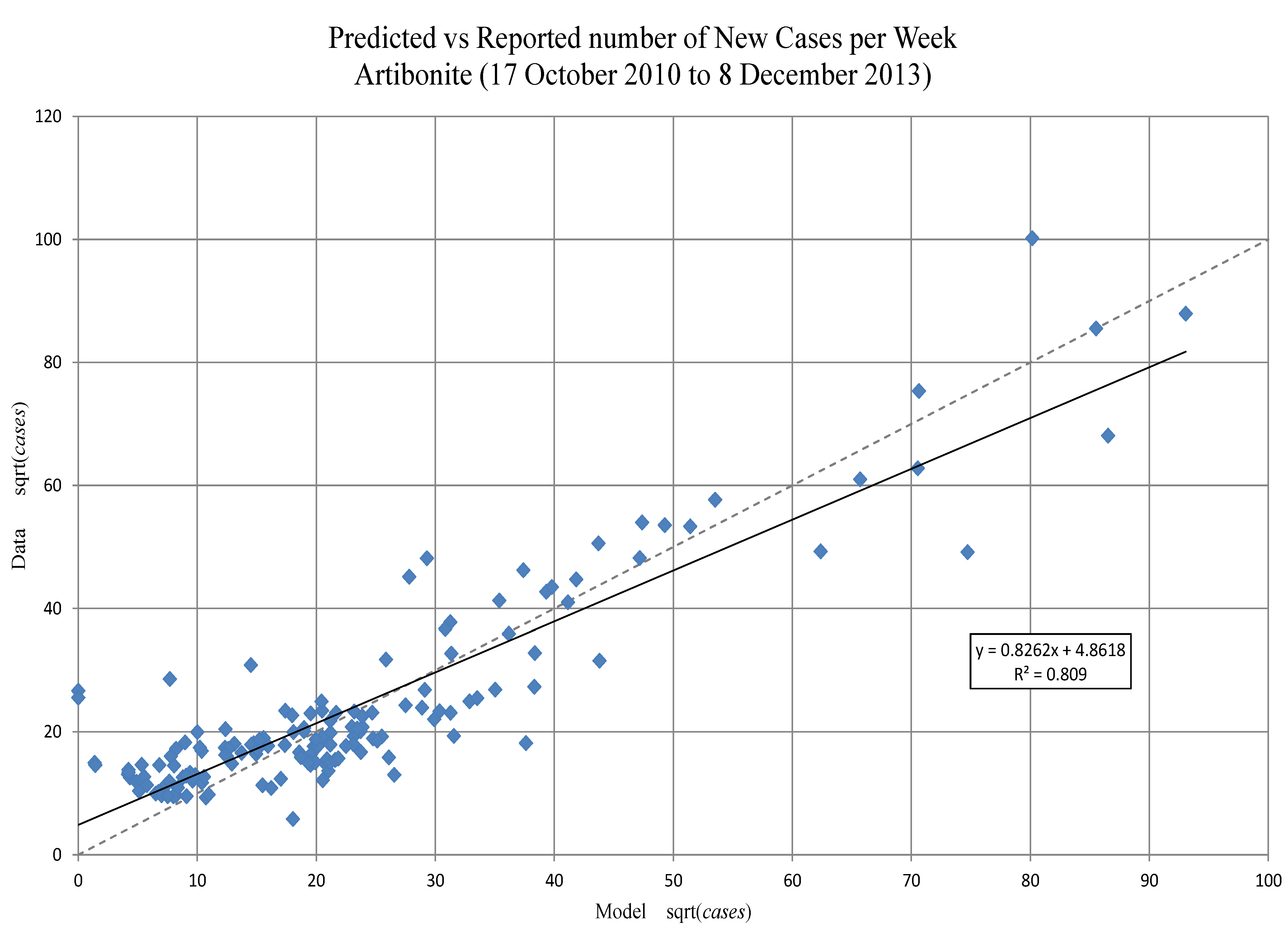
Figure 5 show the model predictions compared to observations for the new number of cases in Artibonite and Ouest regions, respectively. Prediction intervals were calculated only for the cumulative numbers, since the final model fitting was done on these numbers. Confidence intervals are shown for incidence. The match for the trends in new cases match fairly well: the slope of the expected (model) regressed against observed (data) is nearly one in both departments (see
Figure 6 and
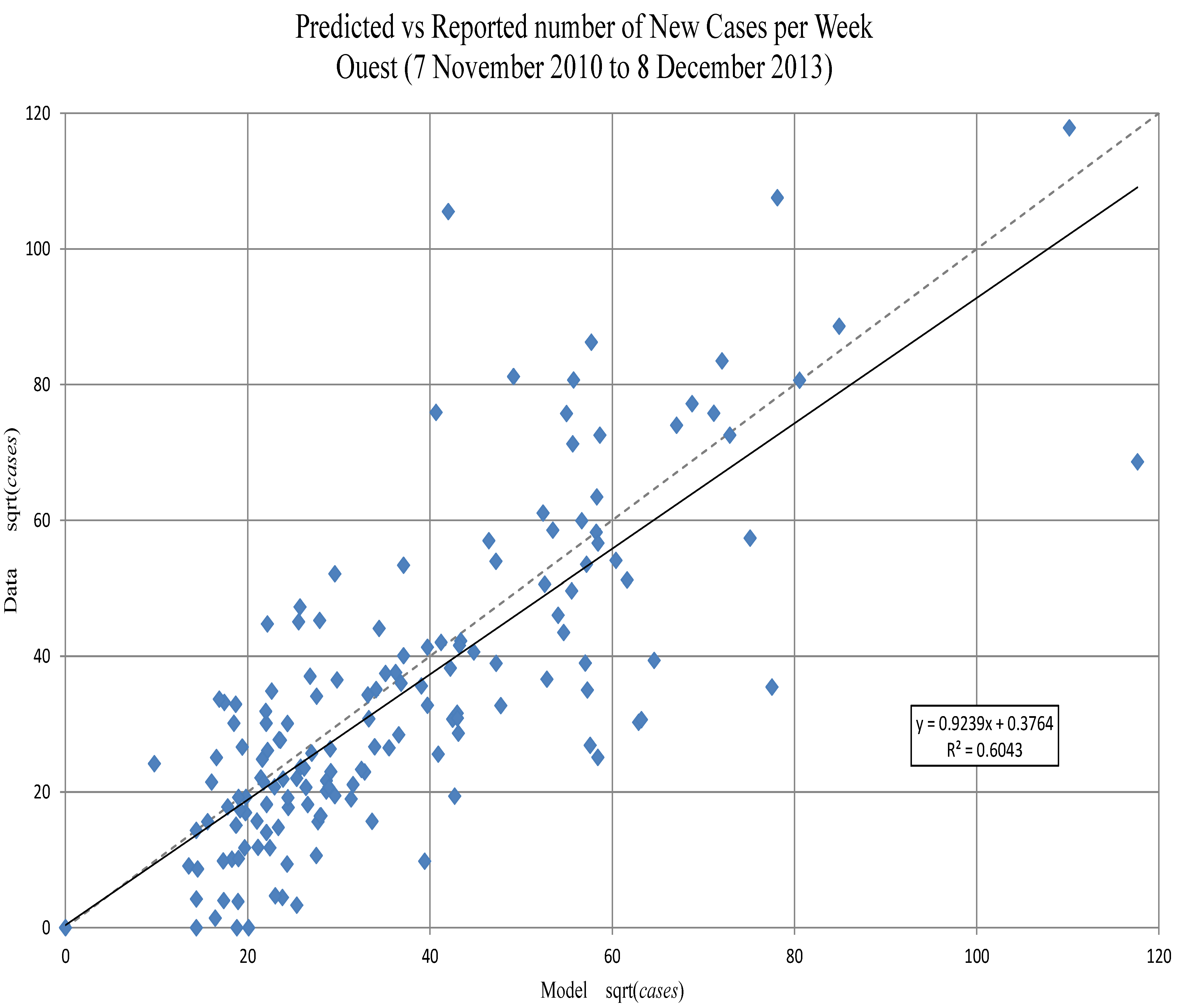
Figure 7), even though there is a substantial amount of unexplained variance. Whether this is due to the crude spatial resolution or other factors remains to be seen.
Prediction intervals (PIs) on the cumulative number of cases were calculated using the delta method adapted for differential equations (see, for example, Ramsay
et al. [
30]). After 29 September 2013, rainfall data from NASA was unavailable; for simulations after that date, we did 13 runs using rainfall patterns from each of the 13 prior years. The mean of those simulations was used, and the variance of the 13 runs, at each time step, was added to the variance from the estimation procedure before computing the PIs. We also included the upper and lower 95% percentiles of the rainfall patterns on projected new cases.
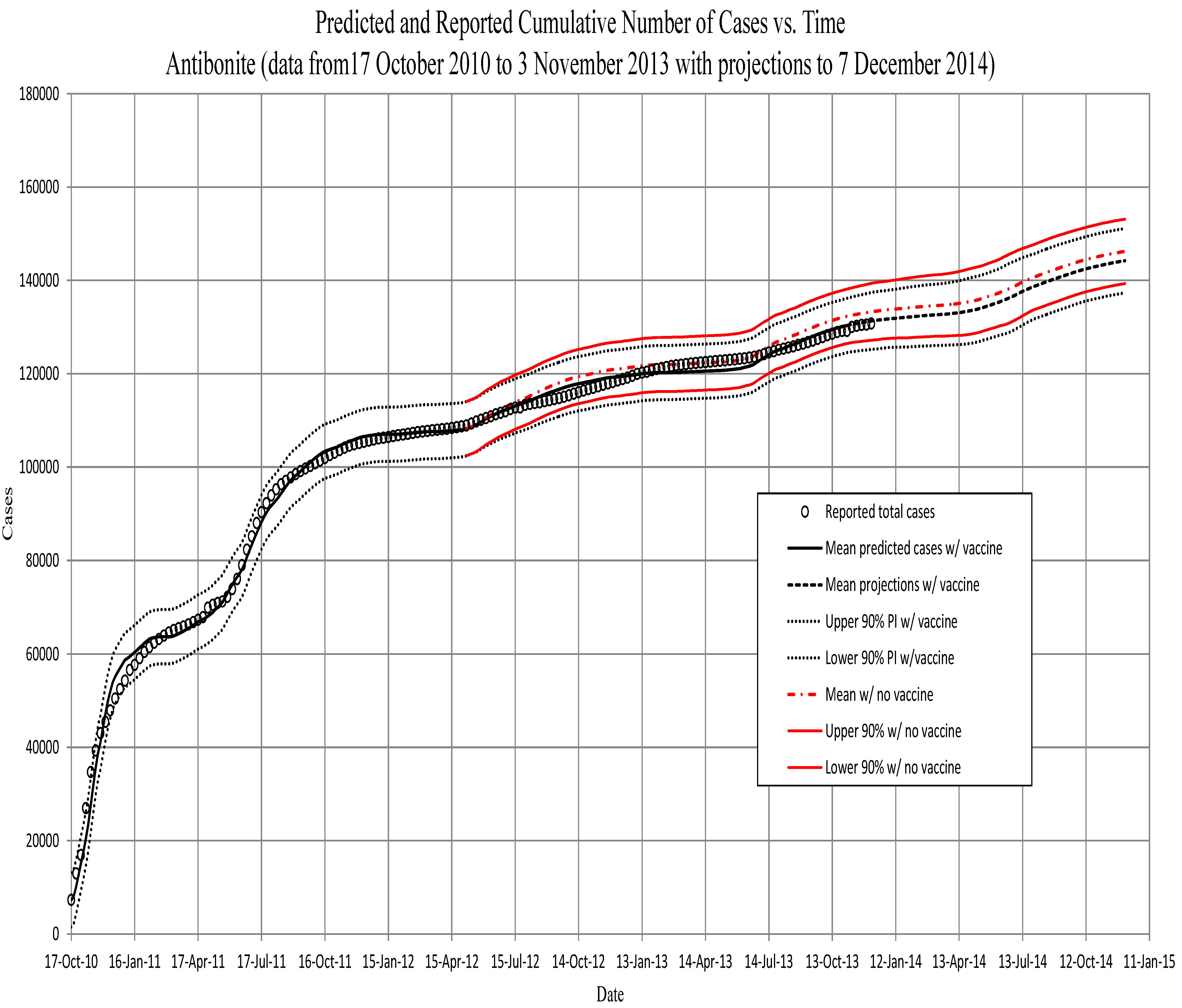
Figure 2.
Artibonite. The predicted cumulative number of symptomatic individuals, against total reported cases to 1 April 2012. Projections are from then to the end of February. Projections using the vaccination schedule (red) begin on 7 May 2012, approximately three weeks after beginning the vaccination program in Artibonite. All projections after 11 November 2012, are based on runs using the prior 13 years of precipitation, and PI’s include the variance of those data (see the text).
Figure 3.
Ouest. The predicted cumulative number of symptomatic individuals, against total reported cases to 1 April 2012. Projections are from then to the end of February. Projections using the vaccination schedule (red) begin on 4 May 2012, approximately three weeks after beginning the vaccination program in Ouest. All projections after 11 November 2012, are based on runs using the prior 13 years of precipitation, and PI’s include the variance of those data (see the text). Note that for the Ouest region, the model begins at the fourth week. We assume that the low initial numbers in the first three weeks are a result of the immigration of cases from the Artibonite region. The model therefore uses data for the first four weeks (assumed immigration numbers for the first three weeks and the initialization of the model from data for the fourth week).
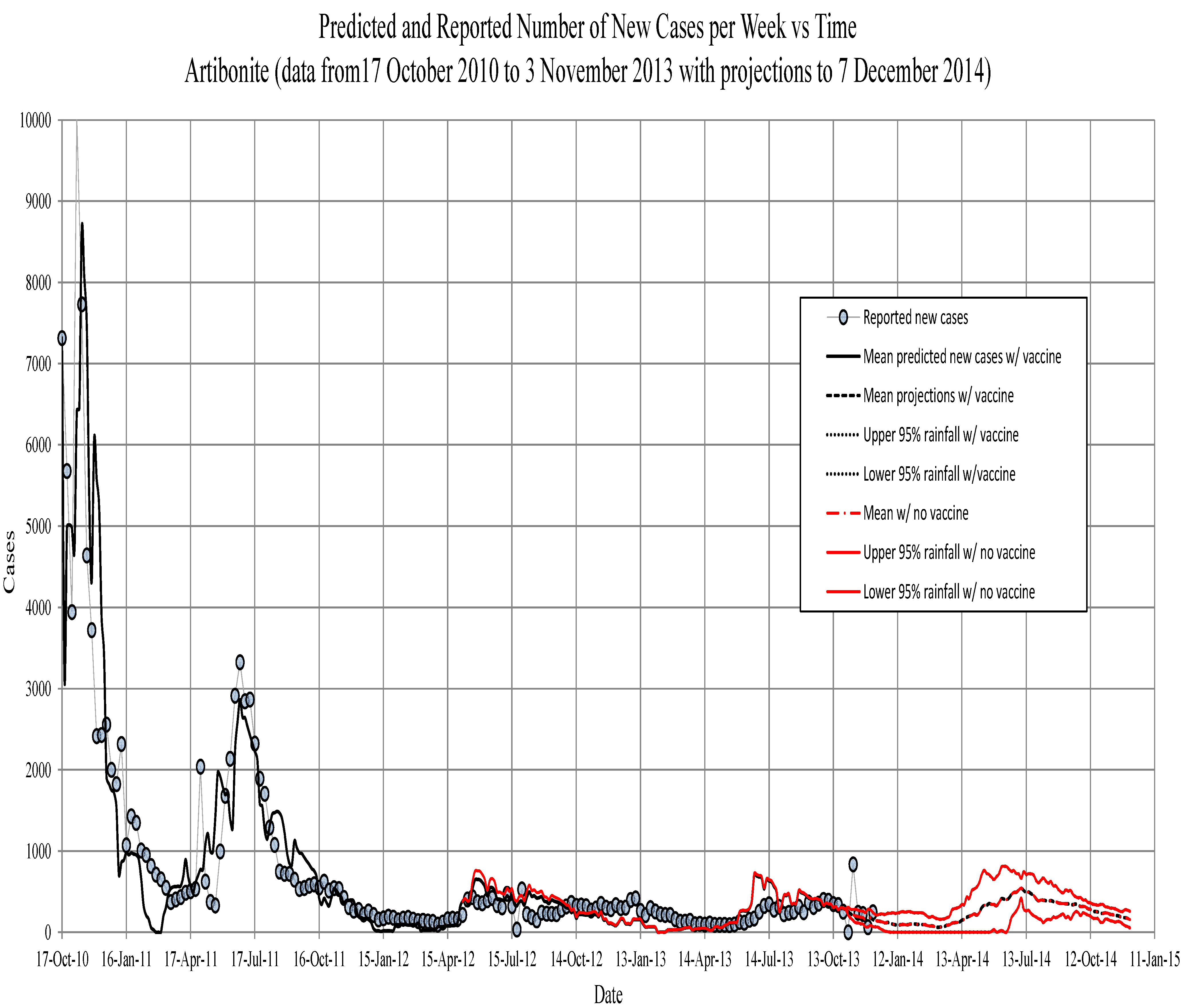
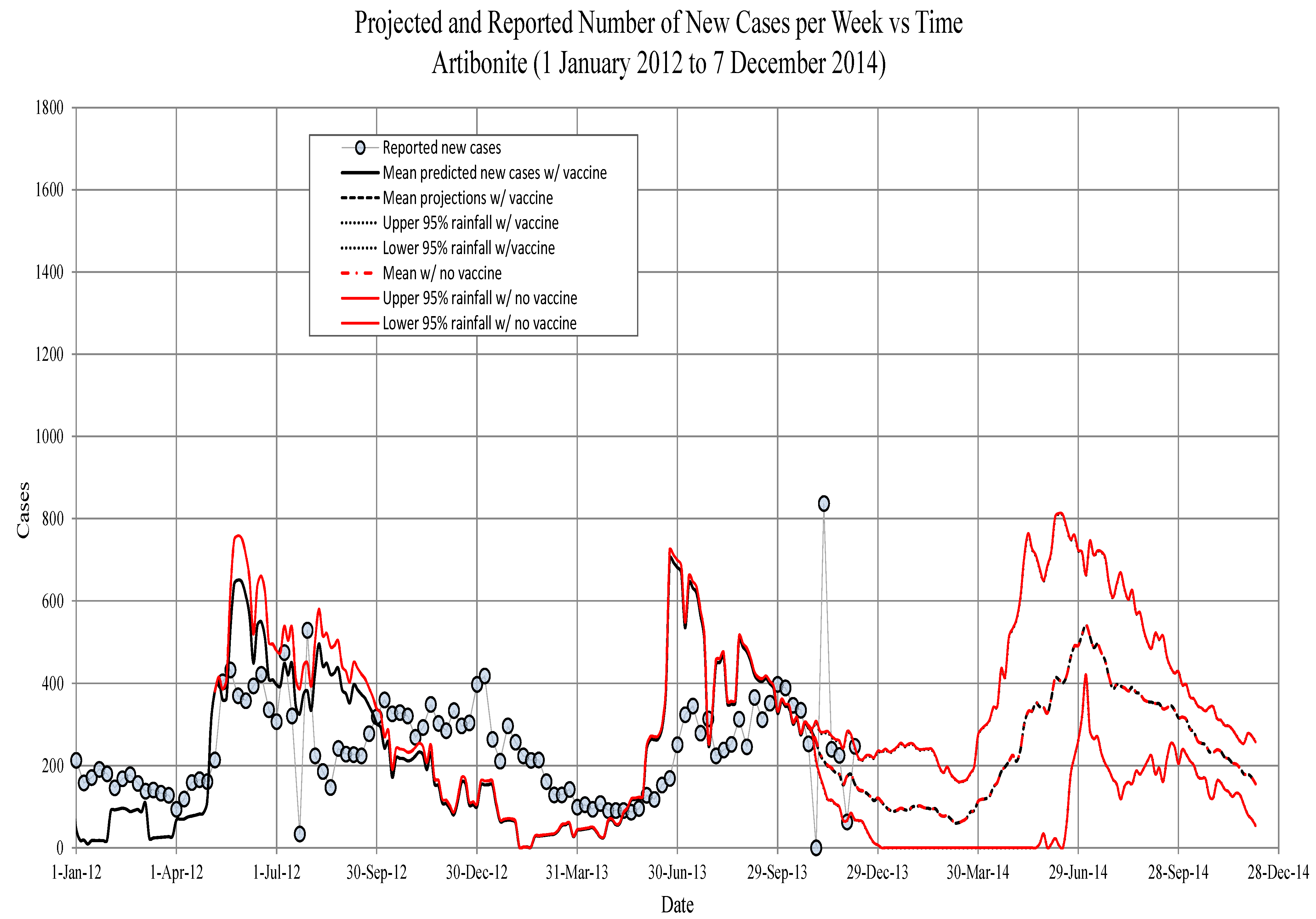
Figure 4.
Artibonite. The new symptomatic individuals vs. time. Circles, observed; solid line, model prediction; dashed lines, 95th percentile confidence intervals for model projections. The red line is projections with 75 percent vaccine efficacy.
Figure 4.
Artibonite. The new symptomatic individuals vs. time. Circles, observed; solid line, model prediction; dashed lines, 95th percentile confidence intervals for model projections. The red line is projections with 75 percent vaccine efficacy.
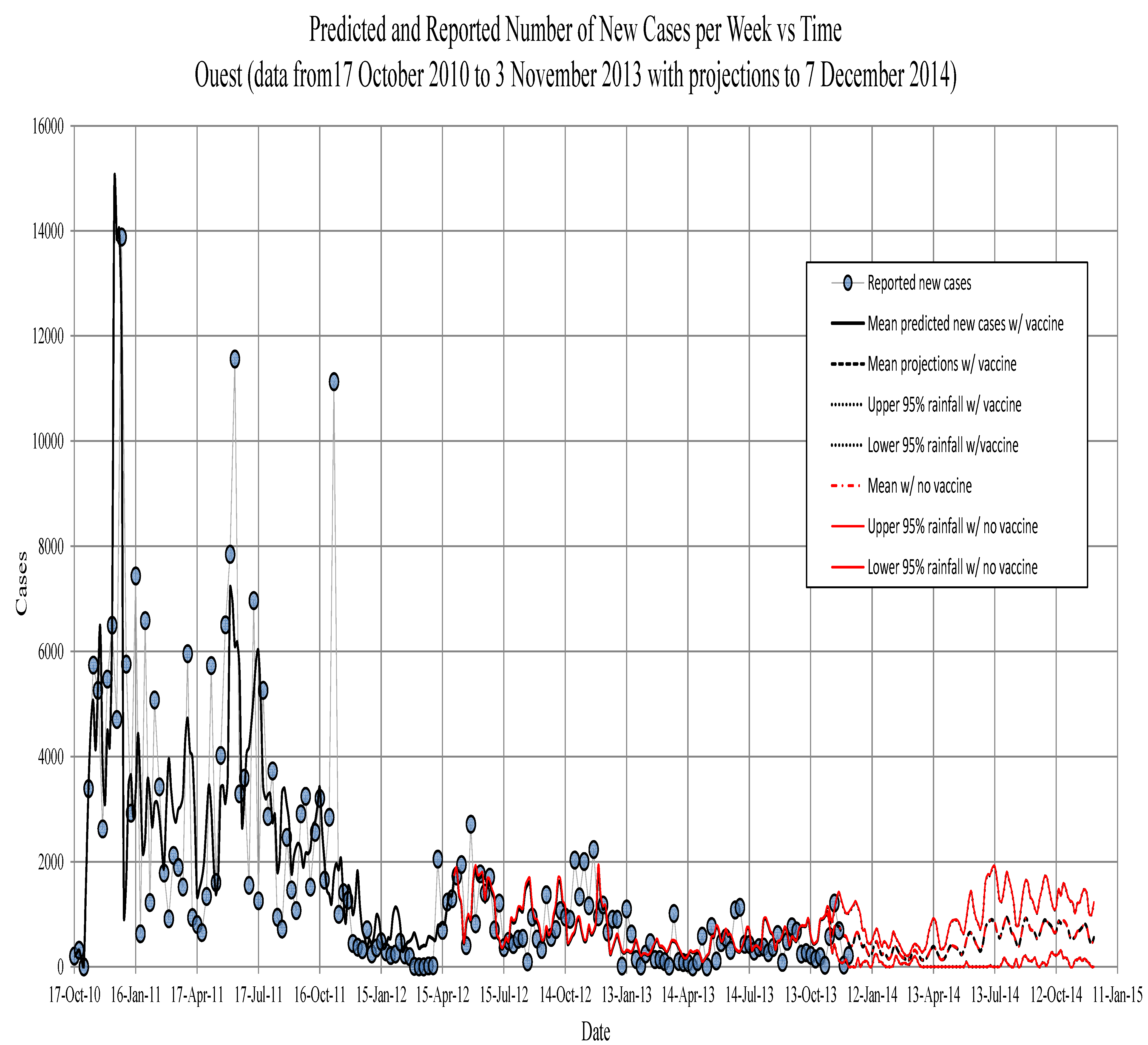
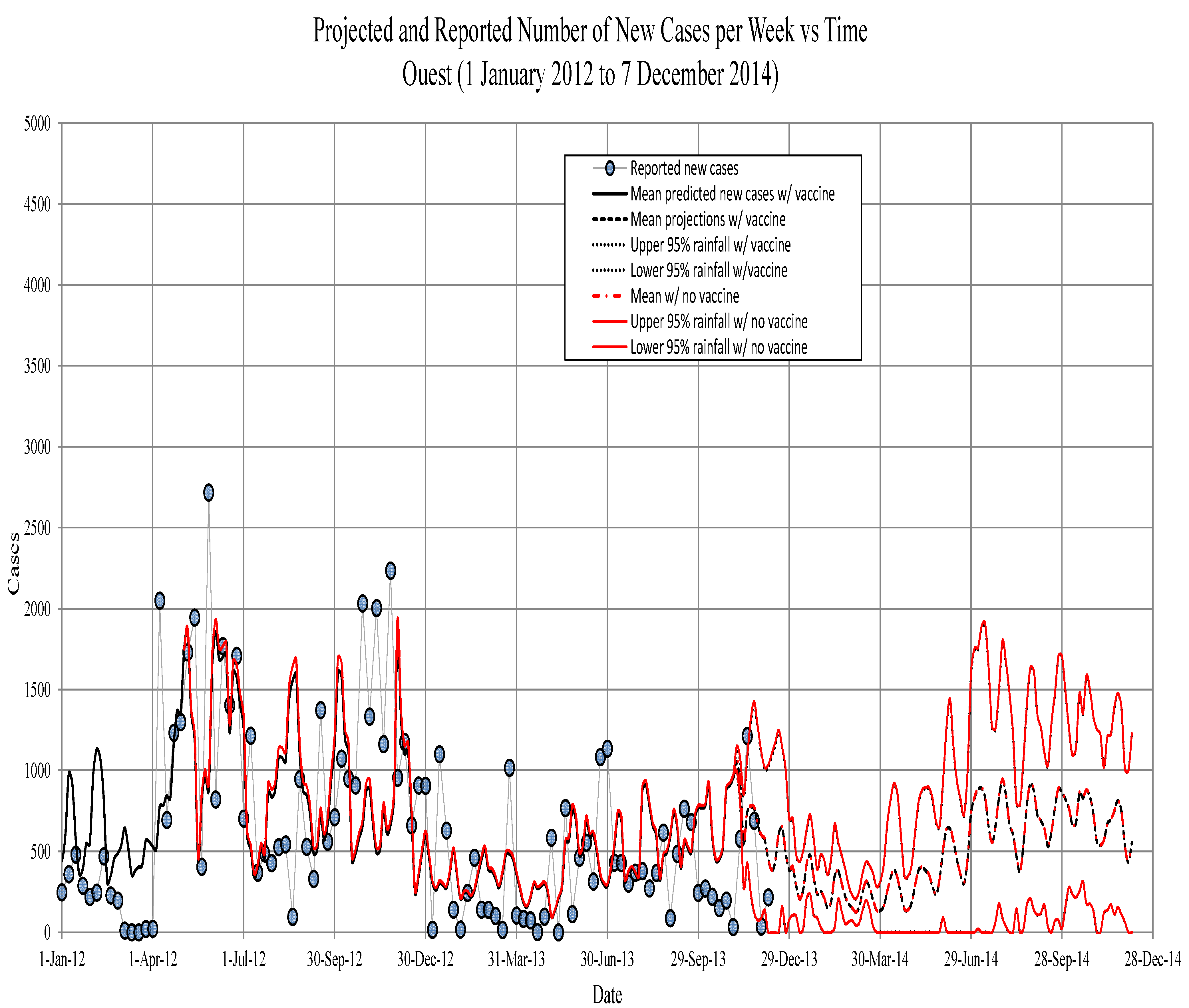
Figure 5.
Ouest. The new symptomatic individuals vs. time. Circles, observed; solid line, model prediction; dashed lines, fifth, 50the and 95th percentiles for model projections based on the past 13 years of precipitation records.
Figure 5.
Ouest. The new symptomatic individuals vs. time. Circles, observed; solid line, model prediction; dashed lines, fifth, 50the and 95th percentiles for model projections based on the past 13 years of precipitation records.
Figure 6.
Artibonite. The predicted new symptomatic individuals, against weekly reported cases to 1 April 2012 (square root transformed). A regression line matching the main diagonal dashed line would show an optimal fit; the discrepancy is due in part to fitting on the cumulative numbers.
Figure 6.
Artibonite. The predicted new symptomatic individuals, against weekly reported cases to 1 April 2012 (square root transformed). A regression line matching the main diagonal dashed line would show an optimal fit; the discrepancy is due in part to fitting on the cumulative numbers.
3.4.2. Epidemic Predictions and Projections for Artibonite
The model predicted that by 8 May 2013, one year after the vaccination program, Artibonite would have seen between 117,000 and 128,000 cholera cases without vaccine and between 115,000 and 127,000 with the implemented vaccination program (123,000 thousand actual), a decrease in about 1700 cases (see
Figure 8).
According to the model without vaccine, an average of 11,989 people would have gotten sick between 6 May 2012, and 7 November 2012 (six months), and over the same interval with vaccine, an average of 10,375 people would have gotten sick. This represents a
reduction in the number of people that would have gotten cholera. Between 6 May 2012, and 6 November 2013 (eighteen months), an average of 24,188 people would have gotten sick without vaccine, and over the same interval with vaccine, an average of 22,228 people would have gotten sick. This represents an
reduction in the number of people that would have gotten cholera. The maximum percent reduction in the number of cases due to vaccination occurs about 8 August 2012,
weeks after the assumed beginning of immunity with a
reduction in cases. Percent reductions start to taper off after this point, due to the loss of immunity, which is treated as an exponential decay, and the continued occurrence of new cases, which eventually dilutes the effect (see
Figure 9).
Figure 7.
Ouest. The predicted new symptomatic individuals, against weekly reported cases to 1 April 2012 (square root transformed). A regression line matching the line would show an optimal fit, the discrepancy is due in part to fitting on the cumulative numbers.
Figure 7.
Ouest. The predicted new symptomatic individuals, against weekly reported cases to 1 April 2012 (square root transformed). A regression line matching the line would show an optimal fit, the discrepancy is due in part to fitting on the cumulative numbers.
Figure 8.
Artibonite. The projected total symptomatic individuals vs. time. Circles, observed; solid line, model prediction; dashed lines, fifth, 50th and 95th percentiles for model projections based on the past 13 years of precipitation records. The red lines are the model runs with the vaccination schedule that occurred in spring, 2012 (see the text).
3.4.3. Epidemic Predictions and Projections for Ouest
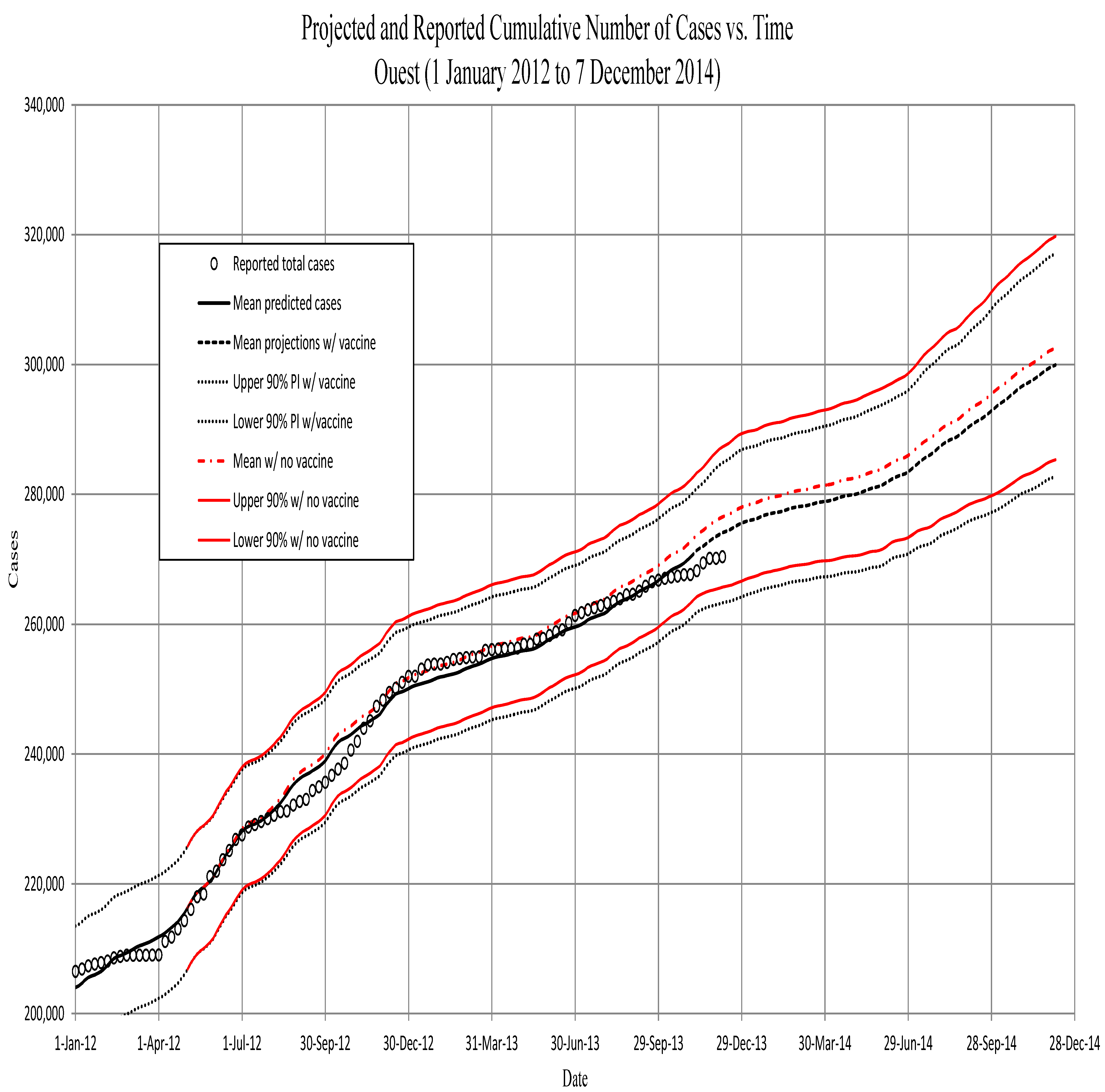
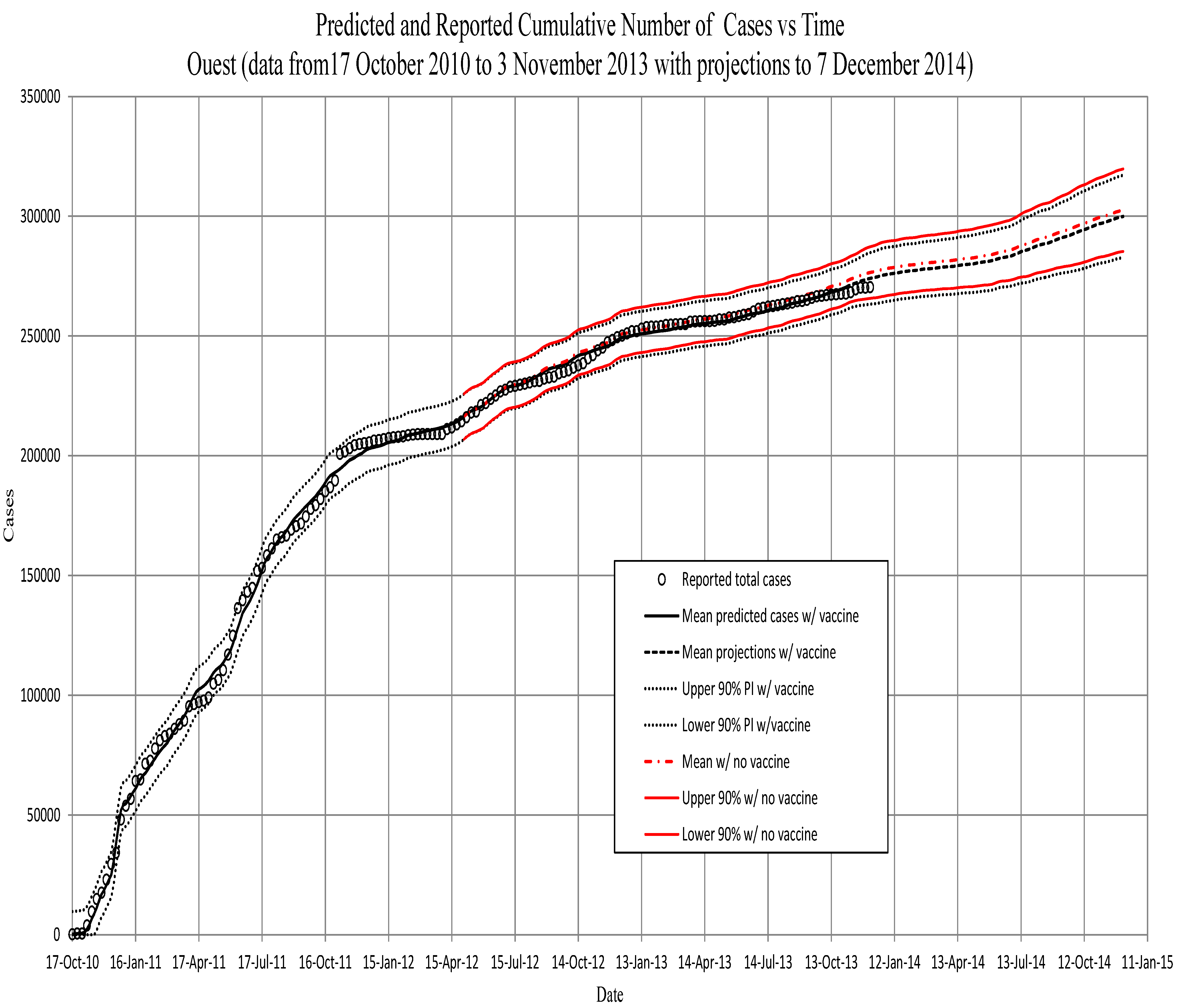
For Ouest, the model projected that by 5 May 2013, one year after the vaccination program there, Ouest would have seen between 248,000 and 267,000 cholera cases without vaccine and between 246,000 and 265,000 with the implemented vaccination program (257,000 actual), a decrease in about 1900 cases (see
Figure 10).
Figure 9.
Artibonite. The projected new symptomatic individuals vs. time. Circles, observed; solid line, model prediction; dashed lines, 95the percentile confidence intervals for model projections. The red line is projections with 75 percent vaccine efficacy.
Figure 9.
Artibonite. The projected new symptomatic individuals vs. time. Circles, observed; solid line, model prediction; dashed lines, 95the percentile confidence intervals for model projections. The red line is projections with 75 percent vaccine efficacy.
The Ouest model predicts, without vaccine, an average of 28,857 people would have gotten sick between 2 May 2012, and 4 November 2012 (six months), and over the same interval with vaccine, an average of 27,505 people would have gotten sick. This represents a
reduction in the number of people that would have gotten cholera. Between 2 May 2012, and 3 November 2013 (eighteen months), an average of 56,377 people would have gotten sick without vaccine, and over the same interval with vaccine, an average of 54,003 people would have gotten sick. This represents a
reduction in the number of people that would have gotten cholera. The maximum percent reduction in the number of cases due to vaccination occurs about 21 November 2012, 29 weeks after the assumed beginning of immunity with a
reduction in cases. The smaller fraction vaccinated in Ouest also leads to much subtler differences in the incidence. Percent reductions in Ouest start to taper off much later than in Artibonite, since the fraction of the at-risk population protected starts out at a much lower level, and the rate of decay of the effects are subsequently slower (see
Figure 11).
Figure 10.
Ouest. The projected total symptomatic individuals vs. time. Circles, observed; solid line, model prediction; dashed lines, fifth, 50th and 95th percentiles for model projections based on the past 13 years of precipitation records. The red lines are model runs with vaccination schedule that occurred in spring, 2012 (see text). The slow down in growth in late February and March was before the vaccination program began.
Figure 11.
Ouest. The projected new symptomatic individuals vs. time. Circles, observed; solid line, model prediction; dashed lines, fifth, 50th and 95th percentiles for model projections based on the past 13 years of precipitation records.
Figure 11.
Ouest. The projected new symptomatic individuals vs. time. Circles, observed; solid line, model prediction; dashed lines, fifth, 50th and 95th percentiles for model projections based on the past 13 years of precipitation records.
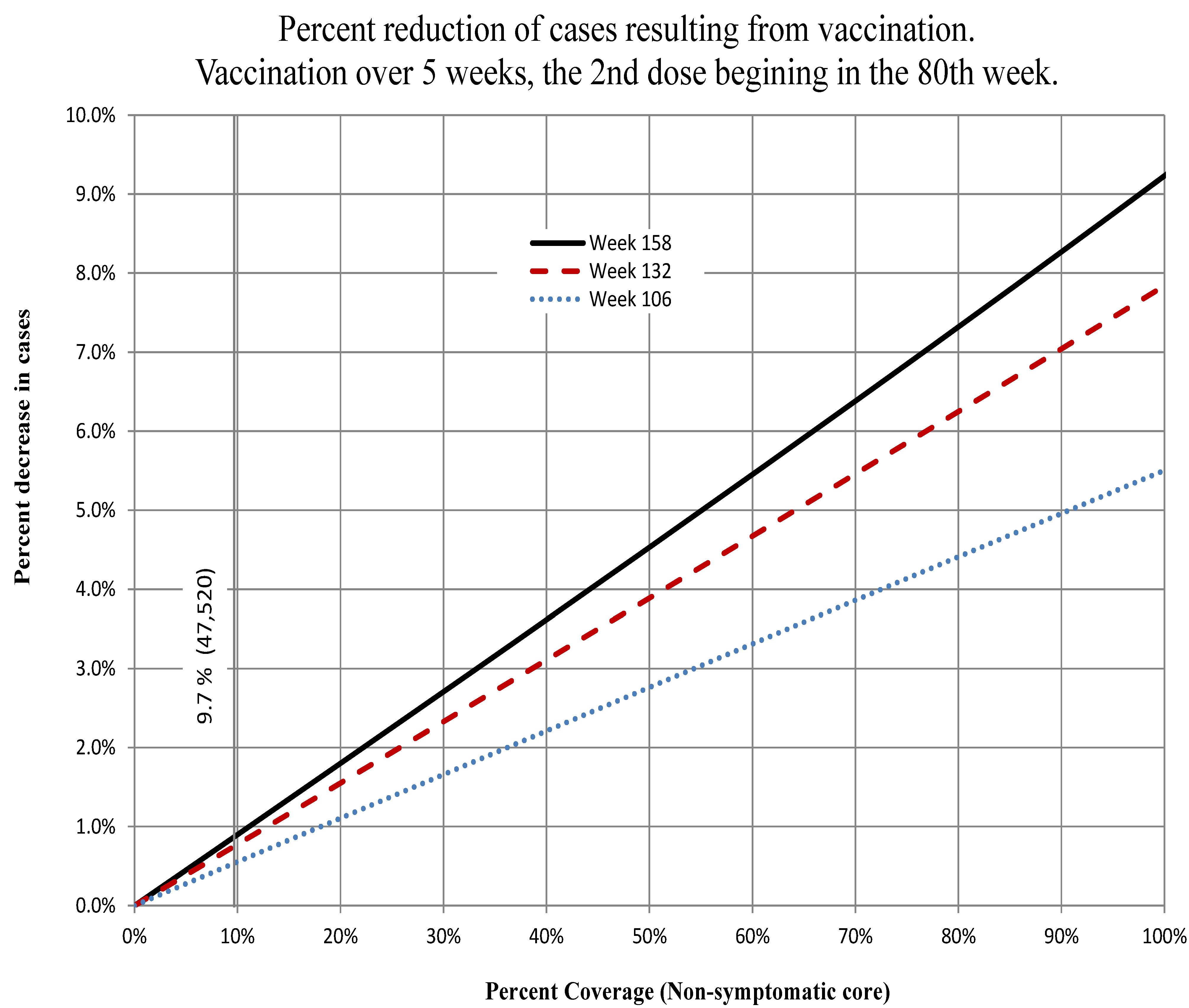
3.5. Vaccination Scenarios
We looked at changing the number of people vaccinated and the timing of vaccination to see if there is some optimal schedule that can be applied.
3.5.1. Changing the Number of People Vaccinated
The first experiment was to change the number of people vaccinated. We completed, in the model, all vaccinations within a five-week period. The second round of vaccination was assumed to begin in epidemiological Week 80, and the immune response was assumed to begin a week later in Week 81, with a
efficacy. This was to approximately match the timing of the initiation of the actual vaccination second dose. We varied the numbers vaccinated from
to
coverage of the non-symptomatic core group (susceptible, asymptomatic and recovered asymptomatic), in Artibonite and Ouest. The results are illustrated in
Figure 12 and
Figure 13. Percent coverage of the vaccinated is shown on the x-axis and percent decrease in cases on the y-axis. We show the percent decrease of cases at Weeks 100, 125 and 150 of the epidemic. These correspond to 20, 45 and 70 weeks after beginning administration of the second dose of the vaccine in the
week.
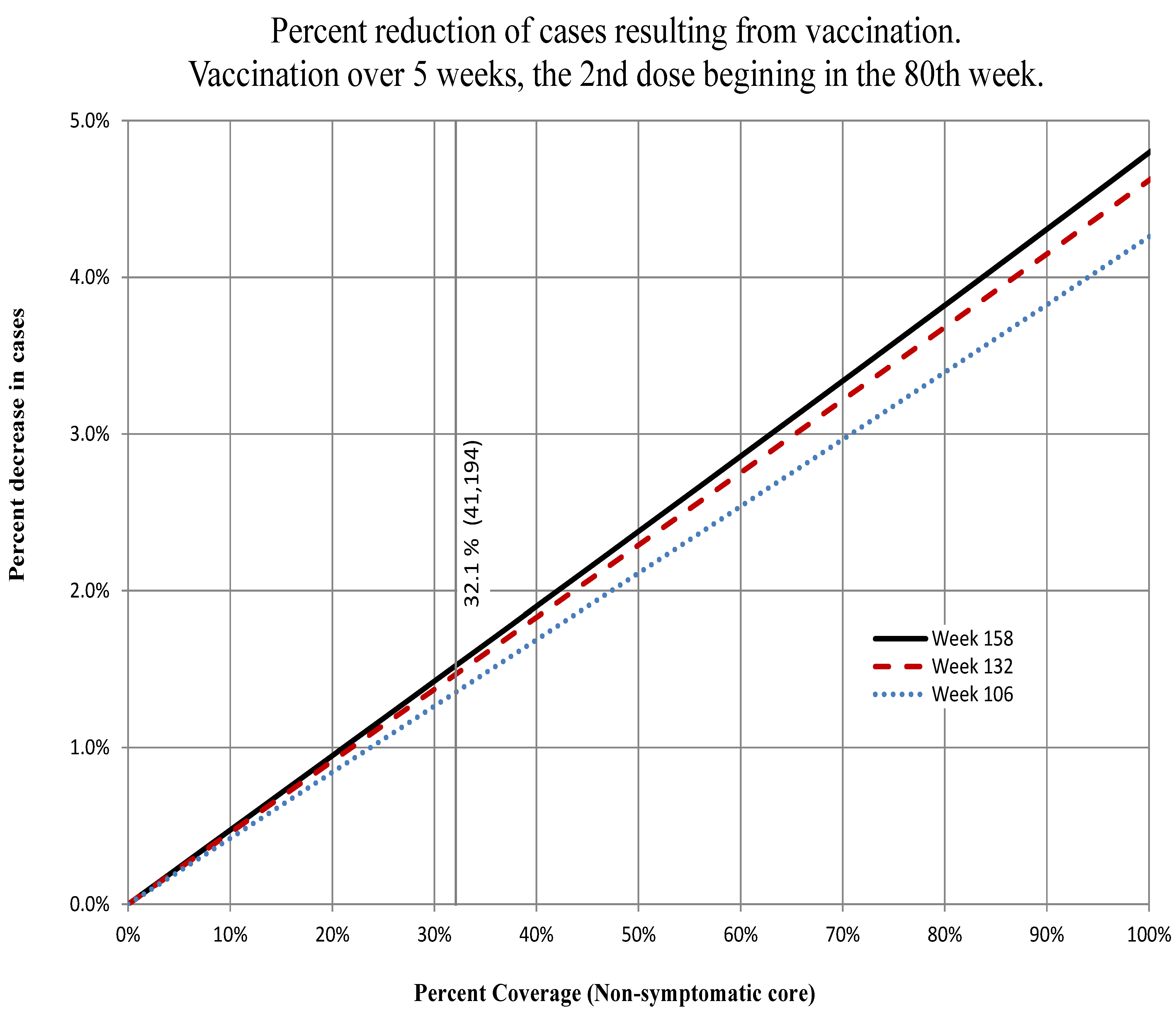
Figure 12.
Artibonite. The percent decrease in the total number of cases at Weeks 100, 125 and 150 for the percent of the non-symptomatic core group vaccinated indicated on the abscissa. The onset of the immune response was assumed to begin in Week 81 and complete in Week 85. We assume efficacy of the vaccine. The actual number completing vaccination (41,194) is indicated by the vertical line.
Figure 13.
Ouest. The percent decrease in the total number of cases at Weeks 100, 125 and 150 for the percent of the non-symptomatic core group vaccinated indicated on the abscissa. The onset of the immune response was assumed to begin in Week 81 and complete in Week 85. We assume efficacy of the vaccine. The actual number completing vaccination (47,520) is indicated by the vertical line.
In both departments, the percent decrease in the number of cases increases steadily until the number vaccinated reaches the number of people remaining in the at-risk group. At this point, there are no more people to be vaccinated, but of those people that were susceptible and vaccinated are still susceptible.
The curve increases almost as a straight line (almost, because the vaccination takes place over a finite period of time rather than instantaneously), indicating a constant elasticity of coverage (at 158 weeks, they were 0.048 in Artibonite and 0.092 in Ouest; see
Figure 12 and
Figure 13 respectively.) and that the potential benefit to each person remains constant (herd effects were minimal). The optimal amount to have vaccinated at 80 weeks would have been three times what was done in Artibonite and ten-fold greater in Ouest. However, the costs of vaccinating every person at risk (including those that are or were asymptomatic) is certainly not a linear function, and a cost-benefit analysis would be necessary to determine if, and at what point, the money and efforts would be better expended in other control measures.
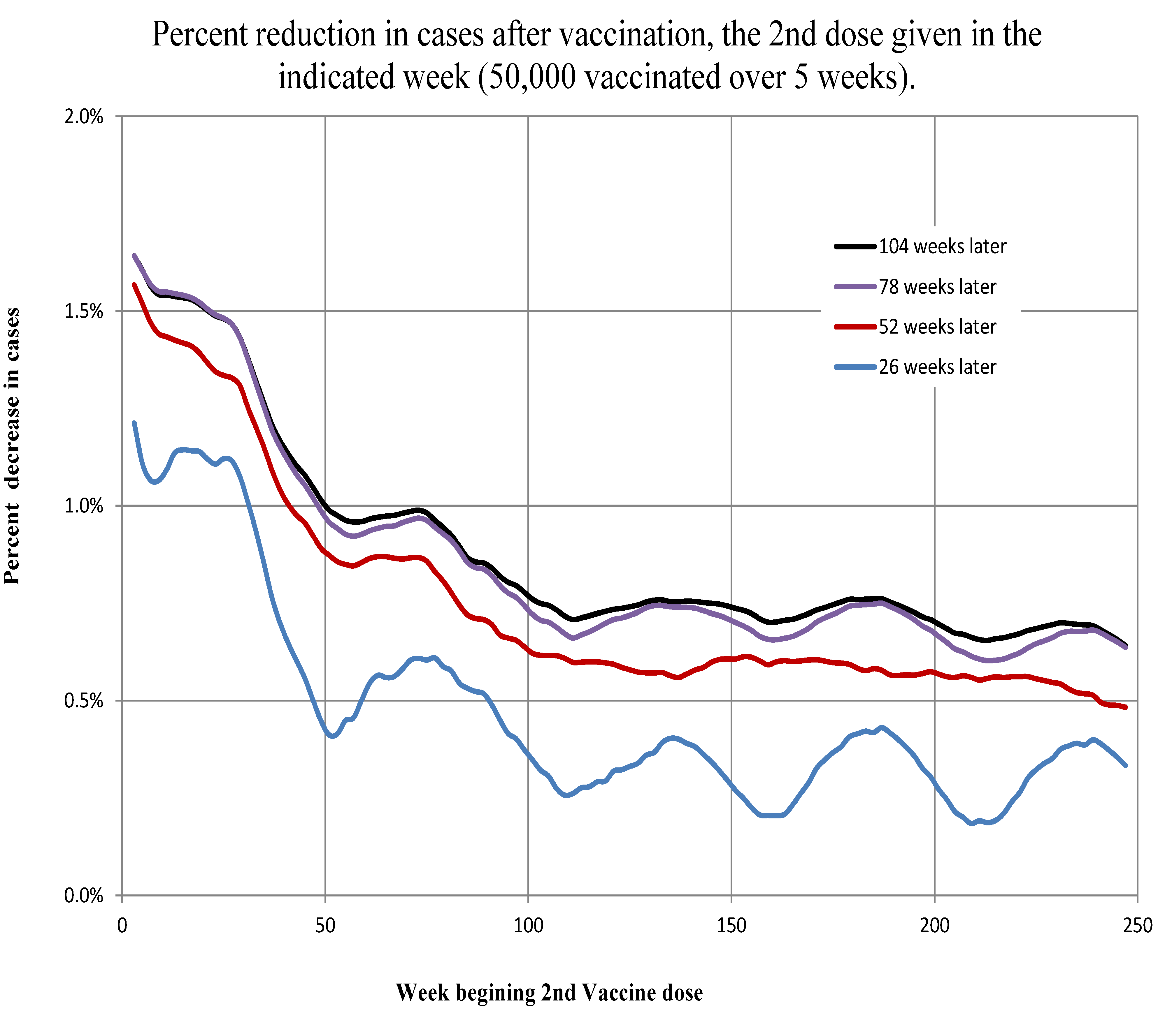
3.5.2. Changing the Timing of Vaccination
To investigate the best timing of vaccination, we ran two scenarios: the first, vaccination numbers at
coverage of non-symptomatic individuals; and the second, vaccination near the numbers actually vaccinated. We graph percent reduction in cases over scenarios without vaccination. In
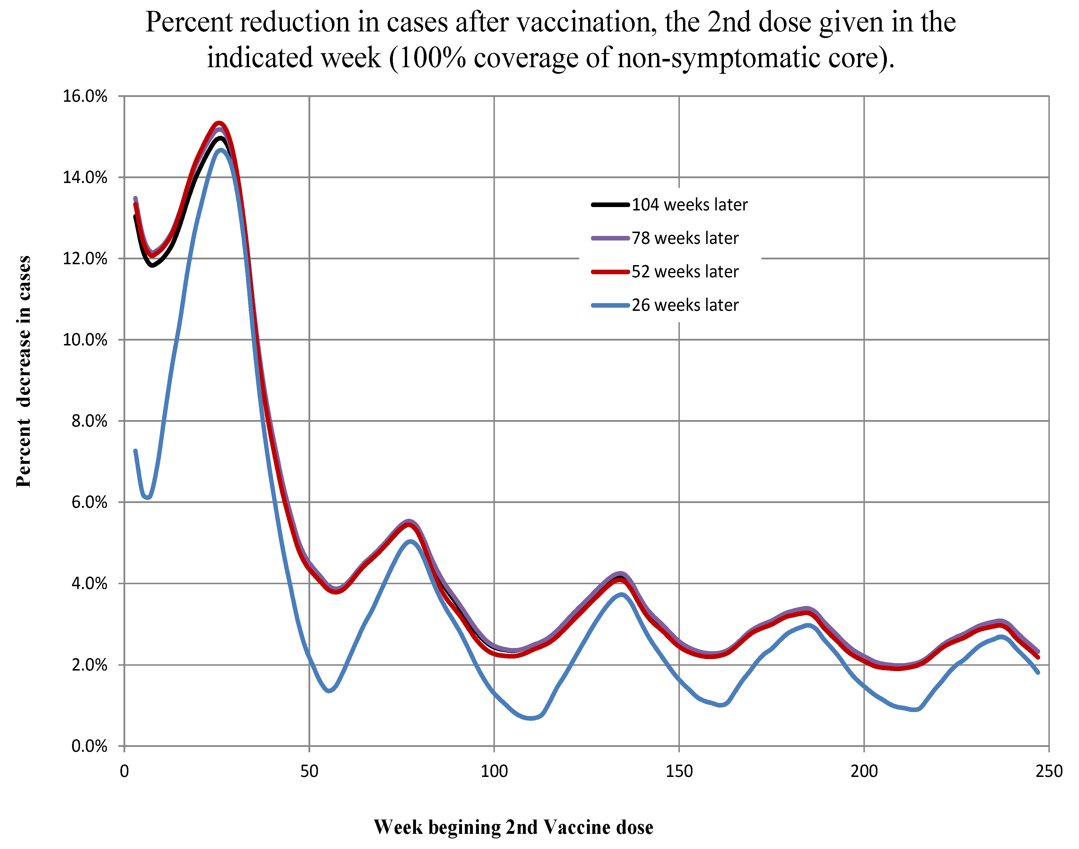
Figure 14 and
Figure 15, for example, the curves represent the percent reduction in cases as a function of the week in which the second dose was beginning to be administered. There are four different curves on each graph representing the percent reductions at given intervals (
, 1, 1
and 2 years) after the second dose of vaccination was begun. We simulated the timing of vaccination so that the beginning of the second round increased in weekly increments from the third week to the 247th week.
Figure 14.
Artibonite. The percent decrease in the total number of cases 26, 52, 78 and 104 weeks after the beginning of the second round of vaccination indicated on the abscissa. The onset of the immune response was assumed to begin a week later. We assume efficacy of the vaccine.
Figure 14.
Artibonite. The percent decrease in the total number of cases 26, 52, 78 and 104 weeks after the beginning of the second round of vaccination indicated on the abscissa. The onset of the immune response was assumed to begin a week later. We assume efficacy of the vaccine.
Figure 15.
Ouest. The percent decrease in the total number of cases 26, 52, 78 and 104 weeks after the beginning of the second round of vaccination indicated on the abscissa. The onset of the immune response was assumed to begin a week later. We assume efficacy of the vaccine.
Figure 15.
Ouest. The percent decrease in the total number of cases 26, 52, 78 and 104 weeks after the beginning of the second round of vaccination indicated on the abscissa. The onset of the immune response was assumed to begin a week later. We assume efficacy of the vaccine.
For the first scenario, we simulated the vaccination of the number of non-symptomatic individuals (susceptible, asymptomatic infected and recovered asymptomatic infected) in the core in Artibonite and Ouest. There are two cases for optimizing the timing of vaccination. The first case is to vaccinate as soon as possible after the epidemic begins. Some of the largest percent reductions in the number of cases occur when the vaccine second dose is given between the third and 12th weeks (between 7 November 2010, and 9 January 2011). The second case is to vaccinate in early to mid-spring. Vaccination between the 23rd and 25th weeks (27 March 2011, to 10 April 2011) is both early and seasonal and has the strongest response. As the weeks roll on, the effects of vaccine diminish with subsequent local maxima in occurrence between Weeks 73–77 (11 March 2012, to 8 April 2012), 133–137 (5 May 2013, to 2 June 2013), 185–187 (4 May 2014, to 18 May 2014) and 237–239 (3 May 2015, to 17 May 2015); see
Figure 14 and
Figure 15. There is a 46% drop between the first spring peak reduction in cases (2011) and the second spring peak reduction in cases (2012) in Artibonite and a 35% reduction in Ouest. After about the 35th week, percent case reduction subsequently drops about 14% per year in Artibonite and 10% per year in Ouest.
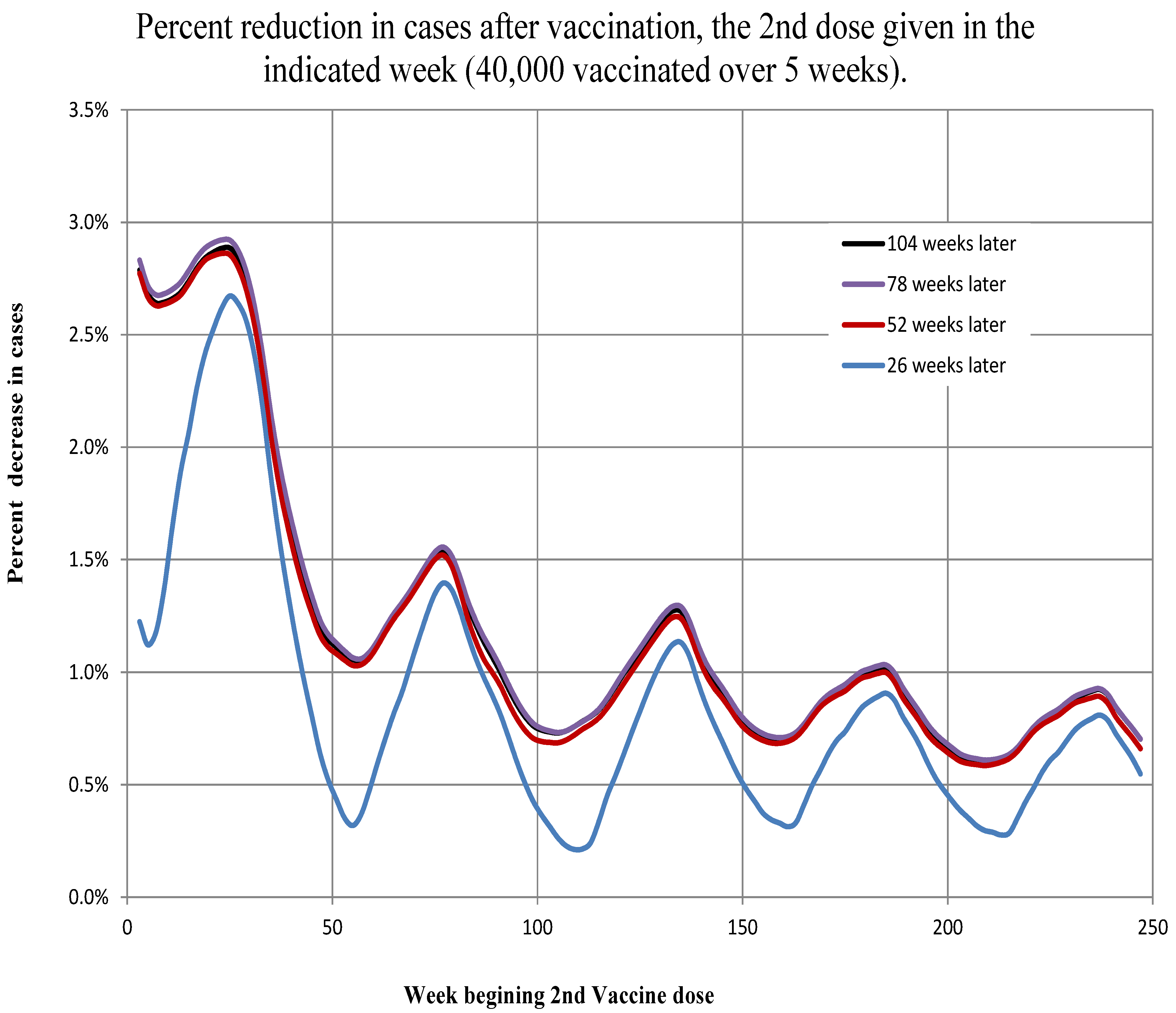
The second scenario (vaccination of 40 thousand in Artibonite and 50 thousand in Ouest) results in similar cases and timing of optimal vaccine administration. See
Figure 16 and
Figure 17. The amounts of reduction are not only much lower, but the relative effects are reversed. That is, in the first scenario (near optimal numbers), the percent reduction in cases after two years in Artibonite start at 12%–13% when vaccination begins at the outset and decline to 3%–4% when vaccination begins after 4
years. In Ouest, the percent reduction in cases after two years start at 22%–23% when vaccination begins at the outset and decline to 9%–11% when vaccination begins after 4
years.
Figure 16.
Artibonite. The percent decrease in the total number of cases 26, 52, 78 and 104 weeks after the beginning the second round of vaccination indicated on the abscissa. The onset of the immune response was assumed to begin a week later. We assume efficacy of the vaccine.
Figure 16.
Artibonite. The percent decrease in the total number of cases 26, 52, 78 and 104 weeks after the beginning the second round of vaccination indicated on the abscissa. The onset of the immune response was assumed to begin a week later. We assume efficacy of the vaccine.
Figure 17.
Ouest. The percent decrease in the total number of cases 26, 52, 78 and 104 weeks after the beginning the second round of vaccination indicated on the abscissa. The onset of the immune response was assumed to begin a week later. We assume efficacy of the vaccine.
Figure 17.
Ouest. The percent decrease in the total number of cases 26, 52, 78 and 104 weeks after the beginning the second round of vaccination indicated on the abscissa. The onset of the immune response was assumed to begin a week later. We assume efficacy of the vaccine.
In the second scenario (near actual numbers), the percent reduction in cases after two years in Artibonite starts at 2.6%–2.9% when vaccination begins at the outset and declines to 0.6%–0.9% when vaccination begins after 4 years. In Ouest, the percent reduction in cases after two years start at 1.6%–1.7% when vaccination begins at the outset and decline to 0.5%–0.7% when vaccination begins after 4 years.
The actual timing of the vaccination program was approximately Weeks 81 to 83 for adults and 86 to 87 for the second dose. This was about eight to ten weeks past the seasonal optimum, which is not quite halfway between the local crest and trough. Ideally, the vaccination should have been done within a half a year of the start of the epidemic.
4. Discussion
Modeling the dynamics of cholera in Haiti has been hampered by the lack of easily accessible, detailed historical meteorological data. We use NASA satellite data to address this problem. This study shows that with environmental data of sufficient detail and quality, projections of disease progression can be made with sufficient lead time to prepare for outbreaks. The lag times of over five weeks means that if even rudimentary, but reliable, meteorological and coastal records are kept, preparations and resources can be more focused. The gathering of basic weather information is simple and inexpensive and should be made a standard procedure when any agency takes part in interventions, particularly when the environmental component of the epidemiology is so well established.
In addition, we explored the hypothesis that, at least in the Ouest region, tidal influences play a significant role in the dynamics of the disease. It appeared that tidal range rather than the height of the tide itself had the strongest influence. Some connection to tidal influences should be expected where large populations are in close contact with bays and estuaries and humans are consuming local seafood [
19,
23]. It is not surprising that there was no effect of tidal range found in Artibonite, since the tide model was for off the coast of Port-au-Prince. Again, the lack of readily available detailed historical tide records or even a model for various regions along the coast hinders a thorough investigation of possible factors in the disease dynamics.
Studies from Africa [
18] found longer time lags (eight to 10 weeks) and in Bangladesh [
19] shorter ones (four weeks). The delays we found in the effects of precipitation on the infection rates were for Artibonite between
and
weeks and for Ouest between
and
weeks, similar in scale to those studies. However, very short delays (four to seven days) have been reported in a recent study of rainfall forcing in the Haiti cholera epidemic [
15]. This study limited the time spans investigated to under 20 days and only during the first year of the epidemic. The authors of that paper also note the discrepancy and suggest that it may reflect the differences between endemic
versus epidemic situations. An endemic situation would be dominated by rainfall driving transmission through a series of steps, such as washing nutrients leading to plankton blooms, whereas in an epidemic situation, rainfall can bring the population in direct and immediate contact with raw sewage [
15]. It would be interesting to investigate whether the delays have become longer as the epidemic has proceeded. It is certainly plausible, since the force of infection was so much higher at the beginning of the epidemic.
Over the course of the epidemic, the incidence has been tapering off. There has been steady and continued effort to improve hygiene and living conditions; however, the areas where the greatest strides are made are those where people leave the camps to return to normal living conditions and employment. The declining numbers of those at-risk in the overall population belie the fact that many local populations are still without basic hygienic facilities. This was reflected in the model by inclusion of the core group, which comprised about 9% of the population in Artibonite and 14% in Ouest. The initial values for these percentages were the
parameters. (The core’s percentages varied very little during the course of the simulations. In both departments, the difference between maximum and minimum was only about
) These values are somewhat higher than the approximate 5% of the population that OCHA (Office for the Coordination of Humanitarian Affairs - United Nations)reported in 2012 still displaced from the 2010 earthquake [
36]. Of course, the OCHA number is for the entire country of Haiti, not just Ouest and Artibonite.
On top of predicting when and how many cholera cases will increase with Haiti’s weather patterns and tides, any modeling to predict the effectiveness of interventions (such as vaccination) should consider these patterns. Considering that cholera may be maintained in the environment outside of the human chain of infection is essential to planing effective prophylaxes and interventions.
Using these models, we were able to do a basic assessment of the relative effectiveness of the recent vaccination program in Artibonite and Ouest. The discrepancy between the apparent effectiveness of vaccination in the two regions is perhaps not that puzzling when one considers the number vaccinated relative to the size of the at-risk population. In Artibonite, about 41,000 people and in Ouest about 47,000 people received both doses of the vaccine. However, our model suggests that in Artibonite, the at-risk population by May 6 was about 65,600, 59,400 of which were in the core population. In Ouest, the at-risk population was still over 379,000 with 295,000 in the core, almost five times the number in Artibonite. In addition, there were approximately 578 asymptomatic core cases in Artibonite and 3439 in Ouest, all of whom would have been eligible to receive the vaccine. Thus, in Artibonite, (40,799) of the most at-risk population apparently received the vaccine, while in Ouest, only (46,974) did. Further, in both regions, 100 people receiving vaccination does not mean 100 people protected. The vaccine was about effective in Artibonite and about effective in Ouest. Therefore, as a rough calculation, we might expect in Artibonite and people in Ouest protected directly.
Yet, of the 40,000 vaccinated in the Artibonite experiments, there is at most 9% (3529/40,000) of those vaccinated not resulting in cases two years hence, leading to a slightly less than 3% reduction in the overall number of cases (
Figure 16). This was vaccination at the earliest optimal date. Waiting until the week when actual vaccination occurred, there is about 5% (1919/40,000) of those vaccinated not resulting in cases leading to a 1.4% reduction in the overall number of cases. Thus, for 40,000 vaccinated, 30,000 are protected, and over the following two years, the total number of cases reduced due to this protection is about 2000. In the Ouest experiment, the 50,000 vaccinated there are about 8% (4037/50,000) of those vaccinated not resulting in cases leading to a 1.6% reduction in the overall number of cases (
Figure 17). Again, this was vaccination at the earliest optimal date. Waiting until when actual vaccination occurred, there is about 5.2% (2615/50,000) of those vaccinated not resulting in cases leading to about a 1% reduction in the overall number of cases.

