We begin this section by describing our data and explaining the steps followed to evaluate our model. We then furnish the empirical results and discuss our findings.
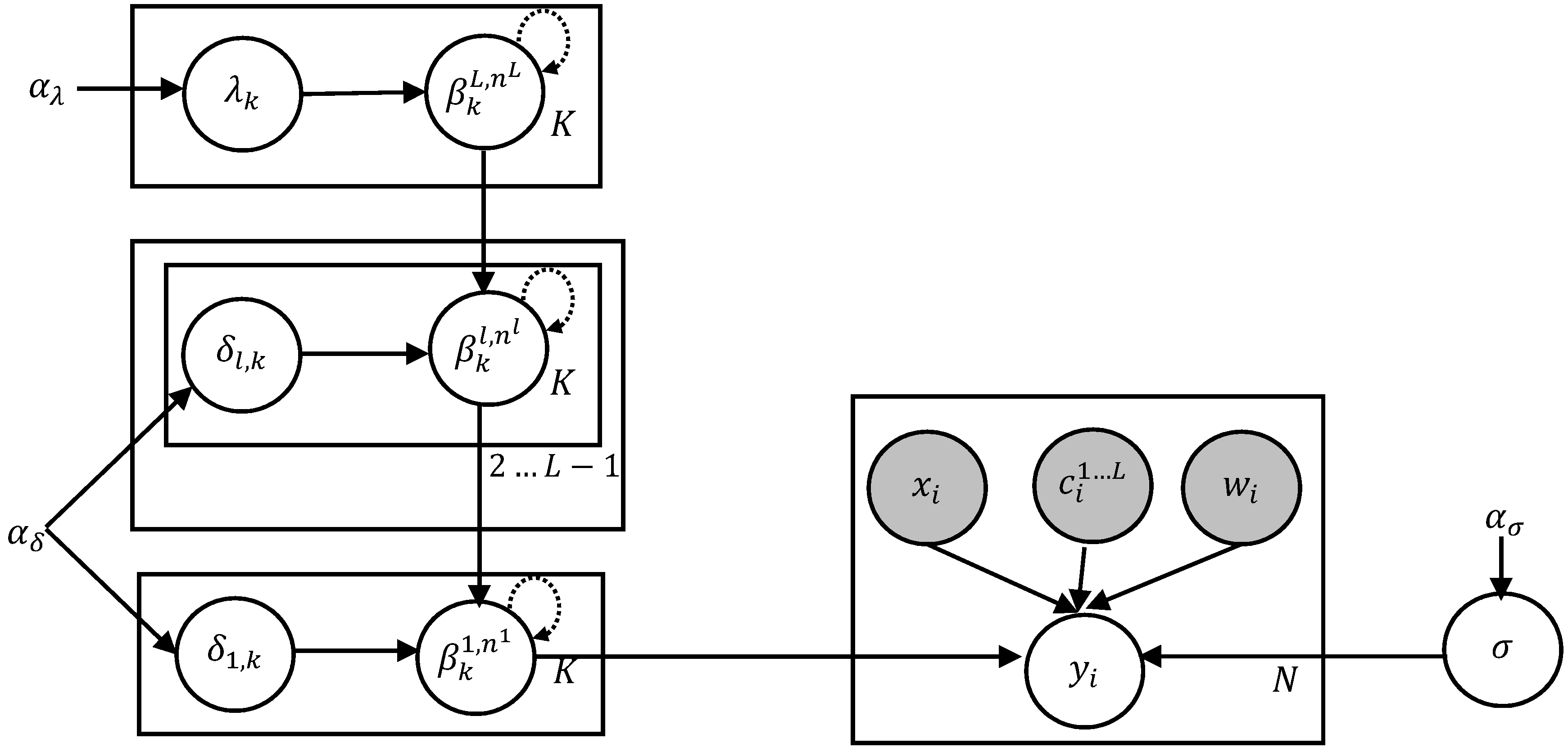
5.1. Data Preprocessing and Priors Setting
The transactions and terms and conditions as reported to the Municipal Securities Rulemaking Board
1 (MSRB) are used to obtain trade data. In particular, trades reported for all trading days between 13 April 2017 and 13 April 2018 are considered for experiments. We use about 350,000 trades whose trade volume were greater than or equal to
$750,000. Only bonds that are rated investment grade by one of the big three credit rating agencies S&P, Moody’s, and Fitch were considered. Noninvestment grade bonds and unrated bonds are excluded because they require fundamental credit analysis to arrive at meaningful price estimates. In addition, we also exclude bank qualified and pre-refunded bonds since they require a complex and subjective pricing model.
Table 1 summarizes the selection criteria for bonds that are included during experiments.
During preprocessing, an outlier detection method based on studentized residuals is applied to identify trades that may unduly affect the yield computation. First, a candidate regression function is fit using a frequentist linear regression method for the trades corresponding to a group in the lower most level of the curve hierarchy. The residual error for each trade, obtained using the regression function, is then divided by an estimate of its standard deviation. Trades with a resulting residual that is greater than a threshold were excluded. We did not employ any heteroscedasticity adjustments since the squared residuals appeared uncorrelated.
As discussed in
Section 3.3, each trade observation is associated with a relative weight value that encodes the importance of a trade. We consider two factors for deriving a transaction weight: the size of the trade and the date at which the trade occurred. The first weight factor is computed by scaling the trade size to a value between
and
with higher volume implying higher weight. Note that trades are capped at a volume of
$5,000,000. Trades that occurred in the distant past were downweighted exponentially. The most recent trade receives a maximum weight of
, while historical trade weights decay towards
. The final sample weight is computed as a product of these two weight factors.
Following Bayesian modeling, the variance parameters themselves have Half-Cauchy hyper priors with scale hyperparameters. The scale value for (the variance corresponding to the first regression coefficient of the top level), (the observation variance at the lower most level), and (the variance corresponding to the regression coefficients of all levels except the top level) were all set to . For (the variance corresponding to the rest of the coefficients in the top level) the scale value was set to . This reduced scale value encodes our prior belief that wiggly curves must be dissuaded to avoid overfitting. We used 10 interior knot points that were uniformly spaced between 0 and 30. This proved to be sufficient to capture all variety of the yield curves. The exact choice of values for the above hyperparameters were largely immaterial. We did not discover any significant change to the results when the above values were altered, confirming the weakly informative nature of the hyper priors employed.
During inference, all the parameters are sampled from their posterior distribution. The number of sampling iterations was set to a minimum of 4000 with the number increasing for large groups. Specifically, we increased the number of iterations by 10% for every 25 additional members in the group to account for an increase in the number of parameters. Following standard practice, a large number of samples during the burn-in period were discarded, and finally only 100 samples were retained. The regression surface is then computed from the mean of the posterior samples.
5.2. Results
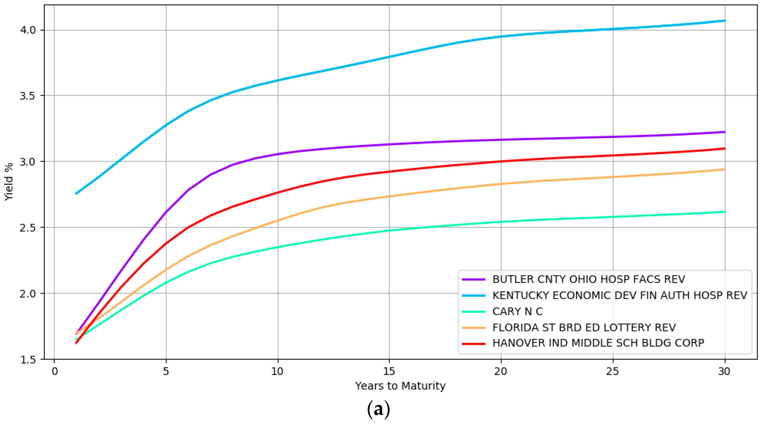
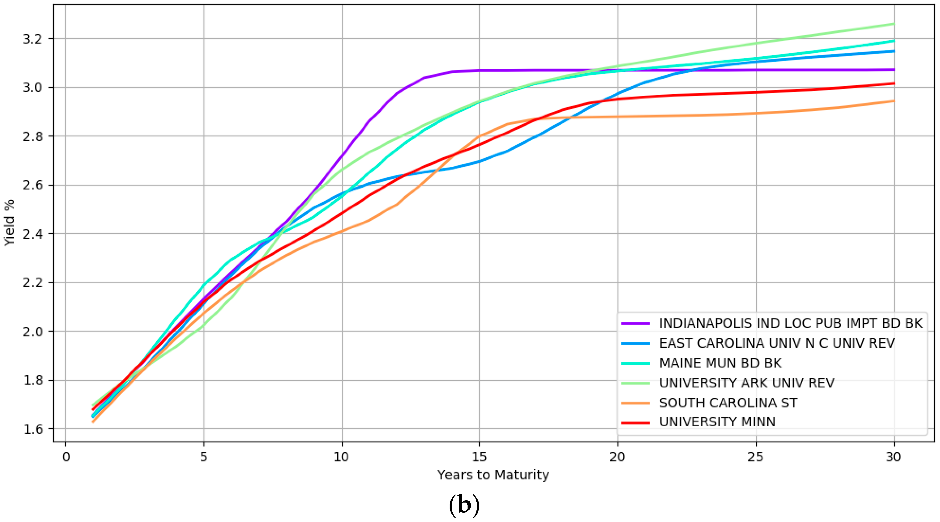
Some examples of the yield curve shapes inferred by the model at the lower most hierarchical level is presented in
Figure 2. Section (a) shows the modeling of simple curve shapes such as a quadratic curve. In contrast, section (b) displays complex shapes that the model can represent.
The yield curves in this figure at section (a) correspond to five different issuers namely, BUTLER CNTY OHIO HOSP FACS REV, KENTUCKY ECONOMIC DEV FIN AUTH HOSP REV, CARY N C, FLORIDA ST BRD ED LOTTERY REV, and HANOVER IND MIDDLE SCH BLDG CORP while section (b) highlights the yield curves of six different issuers namely, INDIANAPOLIS IND LOC PUB IMPT BD BK, EAST CAROLINA UNIV NC UNIV REV, MAINE MUN BD BK, UNIVERSITY ARK UNIV REV, SOUTH CAROLINA ST, and UNIVERSITY MINN. These issuers are from different geographical locations, issue bonds of different types (e.g., general obligation and revenue bonds) and are rated differently by the credit rating agencies (e.g., the second curve in the top section is a high yield bond with BBB rating at the time of writing). The wide array of inferred curves confirms the immense flexibility that a nonparametric approach provides with both simple and complex shapes being captured depending on the heterogeneity of the data.
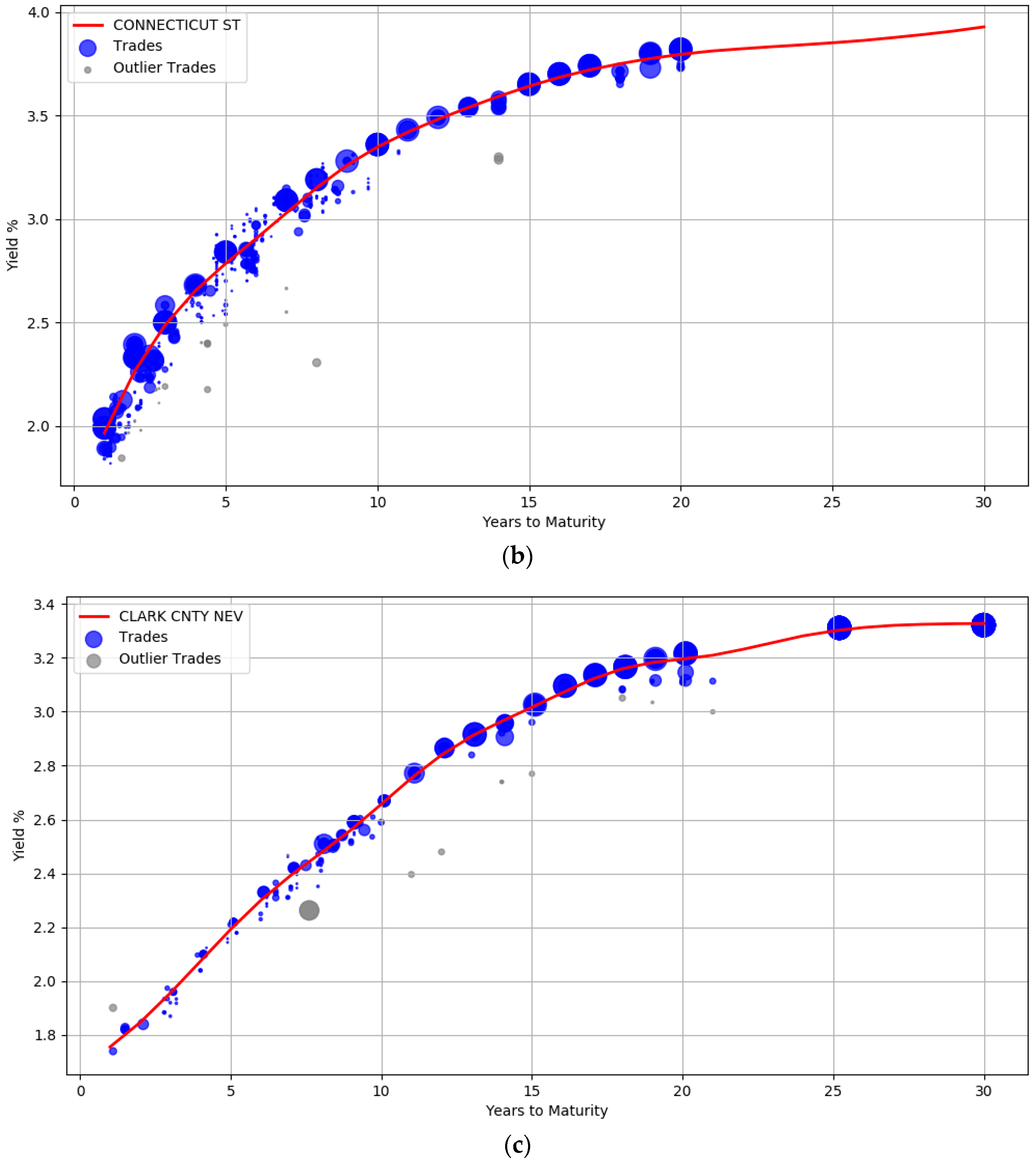
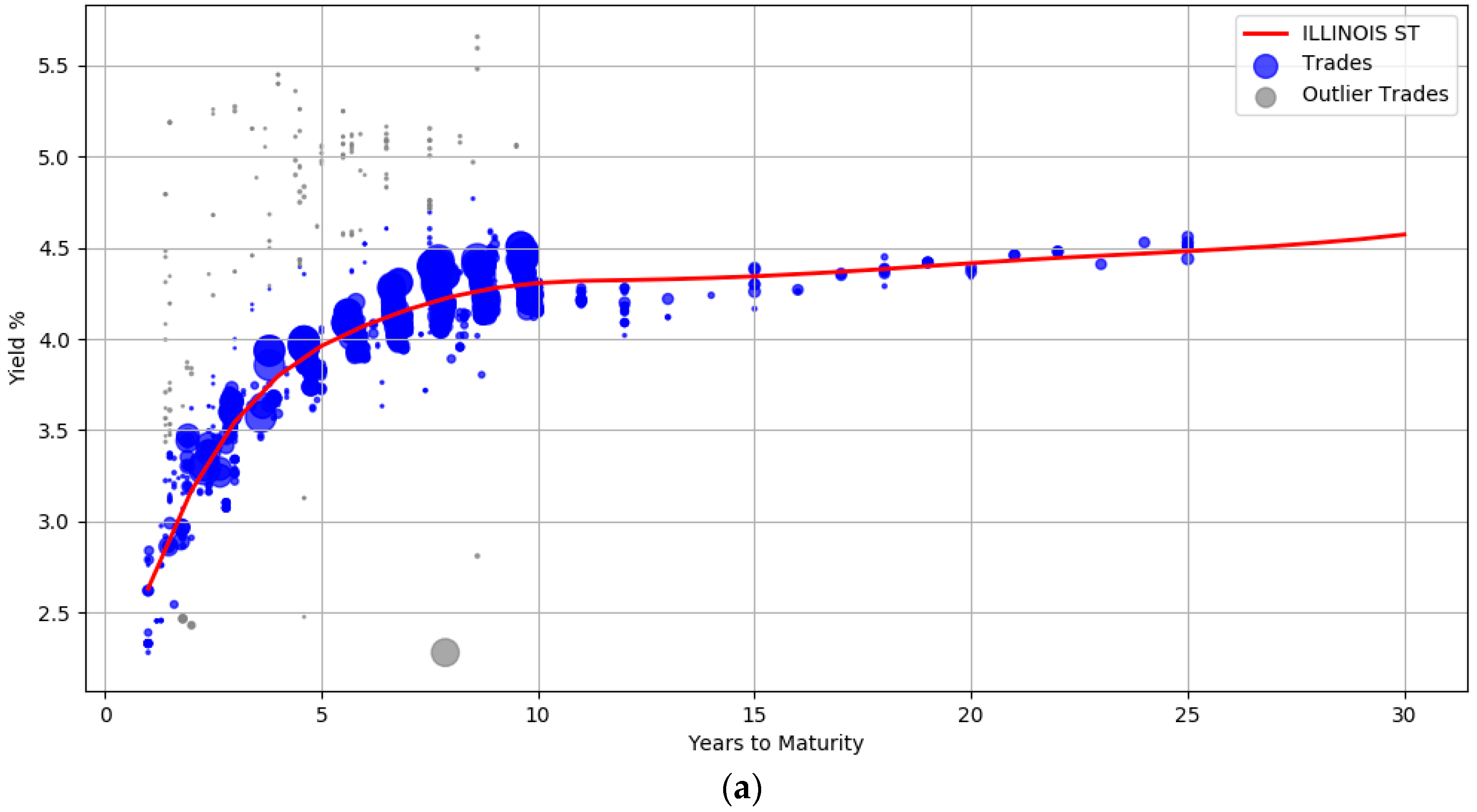
The trade information used to derive the yield curves is plotted in
Figure 3. The blue circles represent the trades weighted by their attributes such as the size of the trade and the date the trade occurred. Larger circles denote points with sample weights that are relatively higher. Intuitively, the data points corresponding to small circles do not influence the yield computation as much as the data points with large circle. Section (a) shows the yield curve for the issuer
ILLINOIS ST. It contains 1137 trades of general obligation bonds, all of them with a BBB credit rating. The yield curve for
CONNECTICUT ST (A rated bonds) with about 480 trades is shown in section (b), while section (c) contains the curve computed from 214 trades for
CLARK CNTY NEV (AA rated bonds).
The plots also show that the curves are not unduly affected by noise. There is a wide dispersion of yields for the BBB rated issuer, especially between maturity years one and ten (admittedly some of these transactions are assigned low sample weights). The prior was introduced to enforce smoothness to ensure that the curves were not overly wiggly and did not end up overfitting the data. The usefulness of the outlier detection preprocessing step can also be visualized. In all the three curves, the gray points indicate trade samples that were deemed to be abnormal and are marked as outliers.
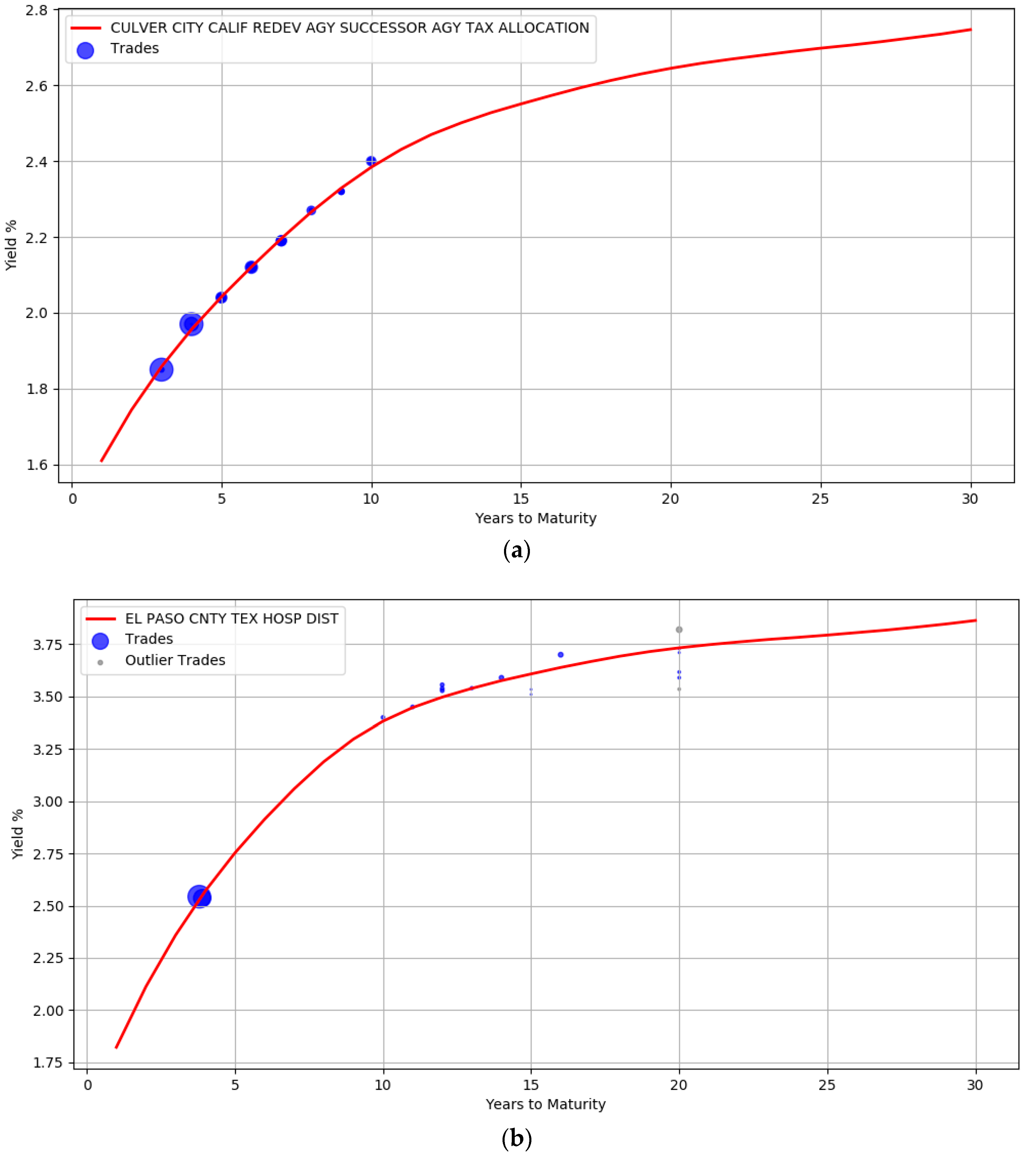
The robustness of the model to small sample size is evident from the curves illustrated in
Figure 4. Unlike
Figure 3, there are very few trades available for the issuers here. The AA rated issuer CULVER CITY CALIF has only 30 trades while EL PASO CNTY TEX HOSP DIST issuer has only 18 trades. In addition, both these issuers do not have trades at the left and right boundary of the maturity years. It is clear that the unavailability of data points at the boundary did not unduly impact the curve shape.
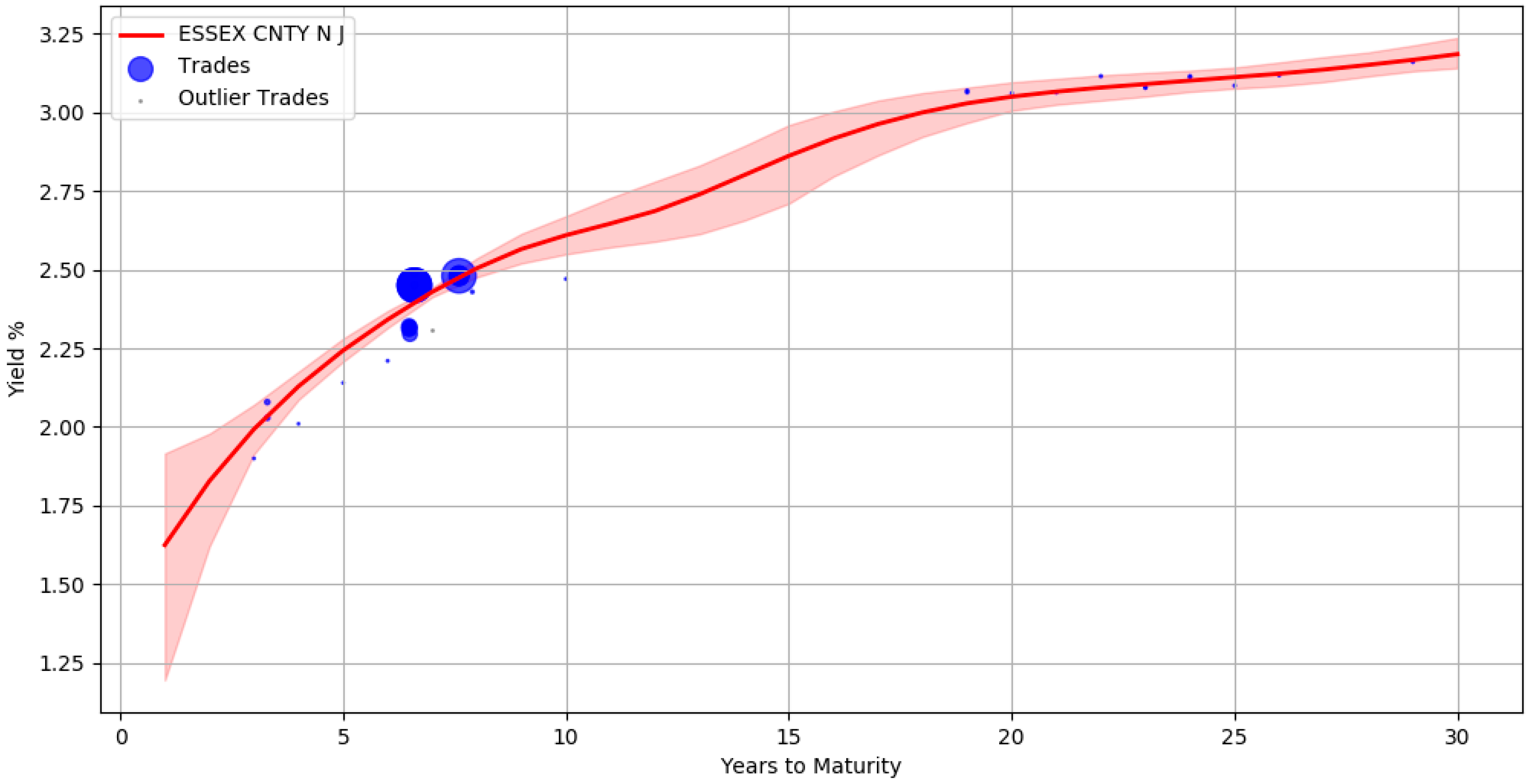
An advantage of using the Bayesian approach is that the uncertainty in parameter estimates can be captured effectively. For example,
Figure 5 shows the yield curve for issuer ESSEX CNTY N J containing approximately 40 trades. The red line corresponds to the yields computed from the mean of the posterior parameter values. The shaded region around the red line signifies the upper and lower bound of the yields when considering each individual sample of a parameter. This represents the uncertainty band around our best fit. There are no trades between maturity years 10 and 18 and the area of the shaded region here is large, depicting the greater uncertainty in our estimates.
By using the posterior distribution of the parameters, we could form credible intervals for the yield estimates during prediction. For example, when publishing the bond prices one can qualify the yield values with a certainty score that reflects the credibility of the estimates. This can be practically useful for an end user to make informed decisions.
Table 2 illustrates the certainty scores associated with a few bond yields of issuer ESSEX CNTY N J. This score is a value between 0 and 1 and is calculated for each bond from a normalized difference between the upper and lower bound of the credible interval region. The bond in the first row has 1.2 years to maturity and the low certainty score is related to the width of the uncertainty band during this maturity period. This is in contrast with the bonds in the second row (maturity at 13.3 years) and third row (maturity at 7.2 years) where the width of the band narrows down. Intuitively, bonds with higher certainty scores have relatively more stable estimates than bonds with lower scores.
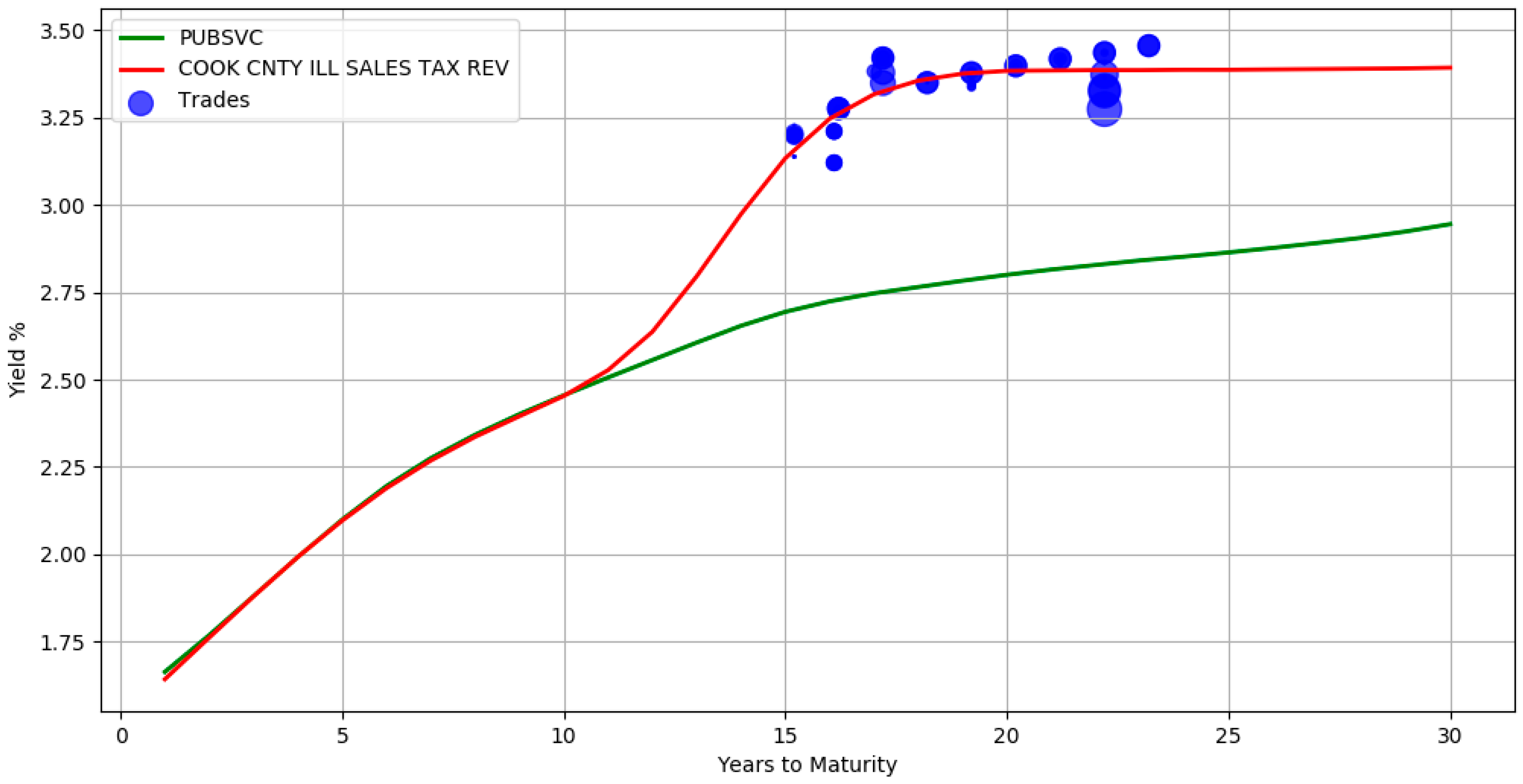
The use of a hierarchical structure allows information propagation from the top levels of the hierarchy to the bottom levels. In
Figure 6, there are no trades between maturity years 1 and 15 for issuer COOK CNTY ILL SALES TAX REV. The yields during this period are inferred directly from its parent sector Public Services (the green line yield curve). It can also be seen that in the presence of adequate trade information, the bottom level red line curve deviates from its parent. This signifies that the model accounts for both the group level similarities and individual specific differences. By borrowing information from higher levels, the absence of adequate trade samples is mitigated. The above hierarchical yield curve construction procedure assumes that the actively traded bonds of the related groups is representative of the market value of an illiquid bond. While this is an approximation, it is in line with pricing practices where a basket of constituents is often used to evaluate prices.
It may also be useful to visualize the curves at the various levels of hierarchy to gain insight on the latent relationship.
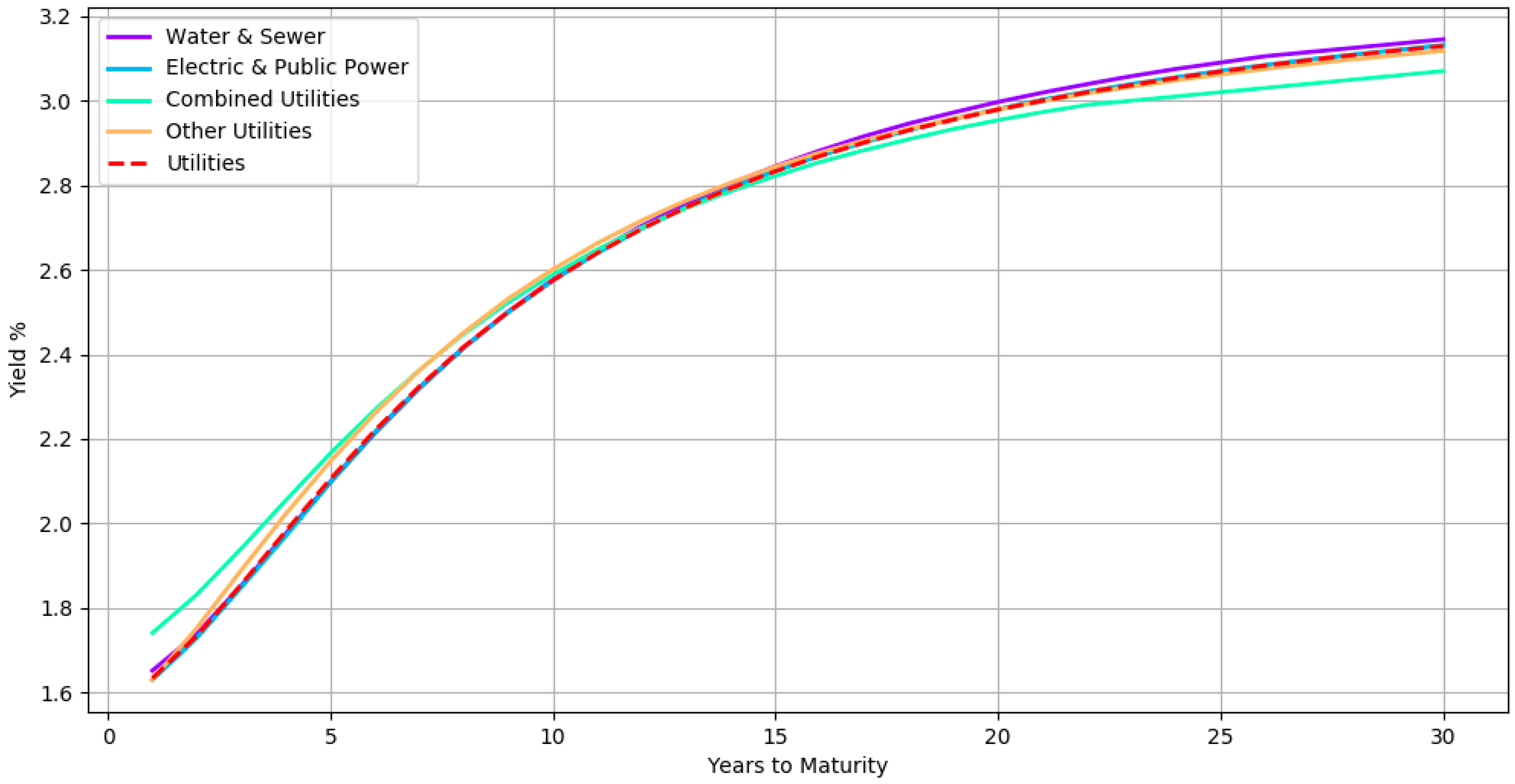
Figure 7 shows all the subsector yield curves of a particular sector. The curves here correspond to a hierarchical organization in which bonds with the same credit rating are at the top level, followed by bonds belonging to the same sector at third level, then bonds from the same subsector at second level and finally bonds from the same issuer at the bottom level. The yield curves of subsectors Water & Sewer, Electric & Public Power, Combined Utilities, and Other Utilities are shown along with its parent sector Utilities (dashed red line) for all AA rated bonds. By inspecting the curves in the hierarchy, one can analyze how each subsector compares with its peer and its parent. For instance, the Combined Utilities subsector seems to have slightly lower yields when compared with the other subsectors.
We also compare the yields estimated by the model with the yield evaluations of human experts. The evaluations were carried out by a team of more than 20 fixed income professionals with extensive municipal bond market knowledge. The experts apply their trading experience and market contacts to arrive at an evaluated yield for the bonds every day. We considered 101,354 bonds, spanning various credit ratings, sectors, states, and bond types. A summary of the bond characteristics can be seen in
Table 3. The manual evaluations correspond to price estimates as of the end-of-day on April 13 2018. The model estimates were obtained at a later date. However, the model had access to the trades only up to April 13 2018.
We used a three level hierarchical model with the bonds grouped by their credit ratings at the top level, followed by their state (for general obligation bonds) or sector (for revenue bonds) at the middle level and finally the issuer at the bottom level.
Table 4 contains a breakdown of the absolute difference in yields between the human evaluators and the model estimates. It can be seen that for more than half of the bonds, the difference is less than 10 basis points. For more than 80% of the bonds, the difference is less than 25 basis points. While this difference is statistically significant, it is important to note that the model estimates are based only on trade transactions. In contrast, the human evaluators typically have access to a much more diversified pool of information sources and price recipes derived from their experience.
We also measured the difference between the model estimated yields and the actual yields observed on the next trading day. This next day trading error assesses the forecasting ability of the model. Note that not all the bonds would have traded the next day, and hence it is a subset of our universe of bonds.
Table 5 displays the absolute spread between the observed yields and the model estimated yields. It also contains the spread between the next day trading yields and the yield provided by the experts. For more than half of the bonds, the model estimates perform as well as the humans’. In total, the human forecasts are within 25 basis points for 80% of the bonds while the model estimates are within 25 basis points for 72% of the bonds.


