1. Introduction
Communicating the likely outcomes of catastophic events to potential stakeholders is an integral part of disaster management. Building community resilience is as much about improving accessibility to information and arousing awareness of hazards, as it is about engaging engineering solutions. However, this aspect of post-disaster management has been less investigated as it deals with longer term, less tangible outcomes. Short-term protective fixes for hazards are always easier to quantify, visualize, and promote [
1]. In the case of coastal flooding, for example, defensive mechanisms can be easily illustrated and animated while the disequilibrating effects on population and land use are harder to convey.
The situation is further confounded by the fact that technology for potentially conveying these outcomes is moving ahead faster than the ability to generate applications. This means that much potential information that could be made available lies dormant for lack of suitable means of communication. In addition, the frequency and intensity of natural disaster events is becoming ever more extreme and less predictable. This serves to underscore the importance of a long-term perspective over a short-term hazard response. Aside from the immdediate needs for flood evacuation, disease prevention, building reconstruction, and the like, disaster management needs to also be concerned with raising awareness and preparedness through communicating plausible outcomes.
This paper illustrates how some of the analytic tools of geo-informatics can be harnessed for both generating and conveying outcomes in disaster management to a broader audience. For generating disaster outcomes, we use agent-based simulation. We utilize dynamic web mapping as the vehicle for communicating these outcomes. The next section discusses some of the uses of web GIS for disaster management. This is followed by a concise description of the analytic modeling framework in
Section 3. The simulation results are presented in
Section 4 where emphasis is placed on the very different outcomes implied by each disaster. Some of the technical features of the design of the platform including data formats and ancillary functionalities are described in
Section 5. In
Section 6 we present the web platform for communicating these outcomes and discuss its features. Finally, we conclude with some implications for public participation in disaster management arising from the increasing transparency of methods and outcomes.
2. Web Mapping for Disaster Management
Web GIS has been heralded as a key component in hazard management and vulnerability assessment [
2]. It extends desktop GIS capabilities to an internet environment and thus encourages the development of applications that are accessible, dynamic and interactive. In this respect, it releases disaster managers from the tasks of data collection and map generation and allows them to focus on visualization and analysis. As maps are an intuitive and user-friendly medium for communicating risk [
3], it is not suprising that the development of web-based mapping has been conceived as a central axis in incorporating public participation in disaster management. Little
et al. [
4] for example, show how web-based geovisualization tools can both encourage stakeholder involvement and public input into emergency management. The result is a framework that goes beyond improving disaster response and can contribute to the wider organizational realms of training, awareness enhancement and team building.
Many examples exist in which web mapping has been utilized in emergency management. For example, Hagemeier-Klose and Wagner [
5] evaluate the use of web mapping services in communicating flood risk, and Kwan and Lee [
6] analyze the potential use of real-time 3D GIS in the case of terror attacks. In fact, web mapping has raised its public profile through a series of natural and man-made disasters starting with the WTC attack on New York in 2001 and progressing through the ravages of Hurricane Katrina in New Orleans (2005), the Haiti and Christchurch earthquakes in 2010 and 2011, the Tokohu earthquake and tsunami (2011), and Superstorm Sandy (2012).
It should be noted that web-mapping these catastrophic events encourages collective and participatory activity and affords access to large scale data hitherto unavailable. Crowdsourcing, volunteered information, map mashups, the development of synthetic big data and the like, all challenge the conventional information chain [
7]. While web mapping is proclaimed as the ultimate democratizer that delivers information, empowers the public, and reduces the digital divide, caution needs to be taken to avoid methodological pitfalls. Web-based information allows for immediate change in spatial resolution. This can encourage misuse with respect to scale and issues of ecological fallacy. In addition, the ease in which data overlays can be performed can lead to suggestive, but spurious, correlations. Thus, while web-based platforms for disaster management are here to stay, care needs to be invested in their execution and design. They need to deliver outcomes in a seamless and non-technical fashion and these outcomes needs to have been generated in a plausible manner. It is to these two issues that we now turn.
3. Disaster Simulation Framework
We illustrate how geo-information can be generated by using an agent-based (AB) framework to simulate the long-term consequences of a disaster. While other modeling frameworks exist for disaster analysis (see for example, the suite of applications using multi-regional input-output modeling in Richardson
et al [
8]), the value of AB models lies in their ability to create high-resolution representations of the urban environment. The long-term indirect effects of an event are reflected in the behavioral responses of the agents. “Shocks” generated by a disaster are mediated through the aggregate behavior of “agents” (households, workers, land developers, firms, city authorities, and intervention agencies). These agents create complex network patterns of change. The patterns are not predicatable through simply aggregating individual agent behavior. However, the micro-scale interactions between individual agents can be modeled within a computable system grounded in the basic tenets of micro-economic behavior. This gives a rich set of opportunities for understanding the reactions of affected populations under varying conditions, times frames, levels of aggregation and spatial scales. Additionally, the outcomes of the disaster can be tied to local, place-specific circumstances. This frees disaster management from the constraints imposed by coarse administrative borders. Additionally AB models can represent dynamics at high levels of temporal resolution. Therefore, the AB framework has been readily applied in the context of natural disaster scenarios such as flooding, fires, and earthquakes [
9,
10,
11,
12,
13].
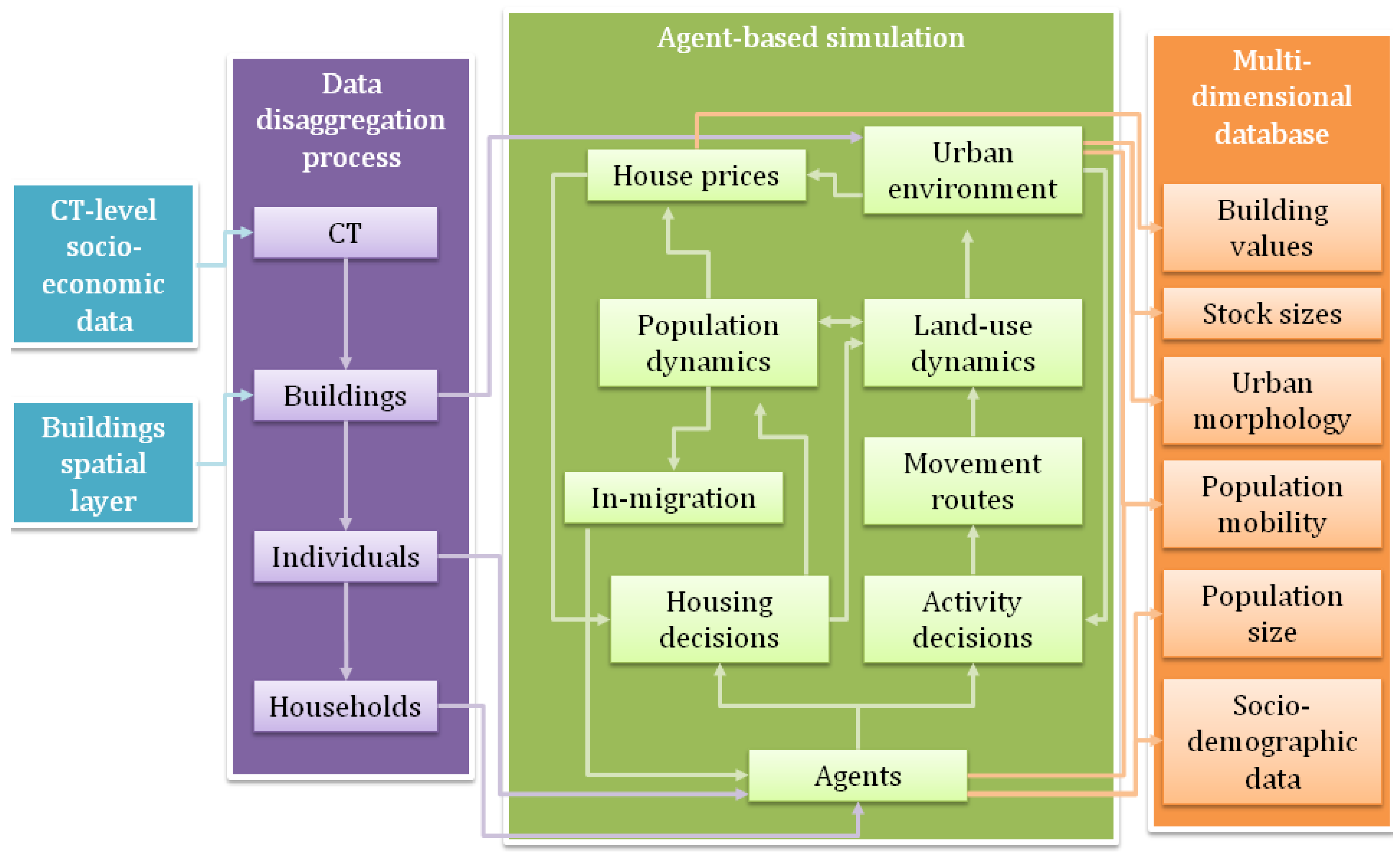
AB models are based upon three elements: the environment, the agents, and a set of rules guiding agent-agent and agent-environment interactions [
14]. The latter may be defined within the model based on social, economic, and spatial decision rules. The first two however are exogenous starting conditions of the simulation. As spatial socio-economic and urban data is usually available at aggregates such as census tracts, agent-level data must be generated synthetically. Here we use data disaggregation techniques to create “big” spatial data in which census tract-level socio-economic values are synthetically distributed over buildings, households, and individuals (see
Figure 1). The allocation algorithm preserves aggregate census tract-level values. The resulting database is used to represent the starting conditions upon which supply and demand dynamics following a disaster are simulated. These procedures are used to evaluate the long term effects of two scenarios: an earthquake and a missile attack both simulated on the same area in downtown Jerusalem, Israel.
Figure 1.
The Analytic Framework.
Figure 1.
The Analytic Framework.
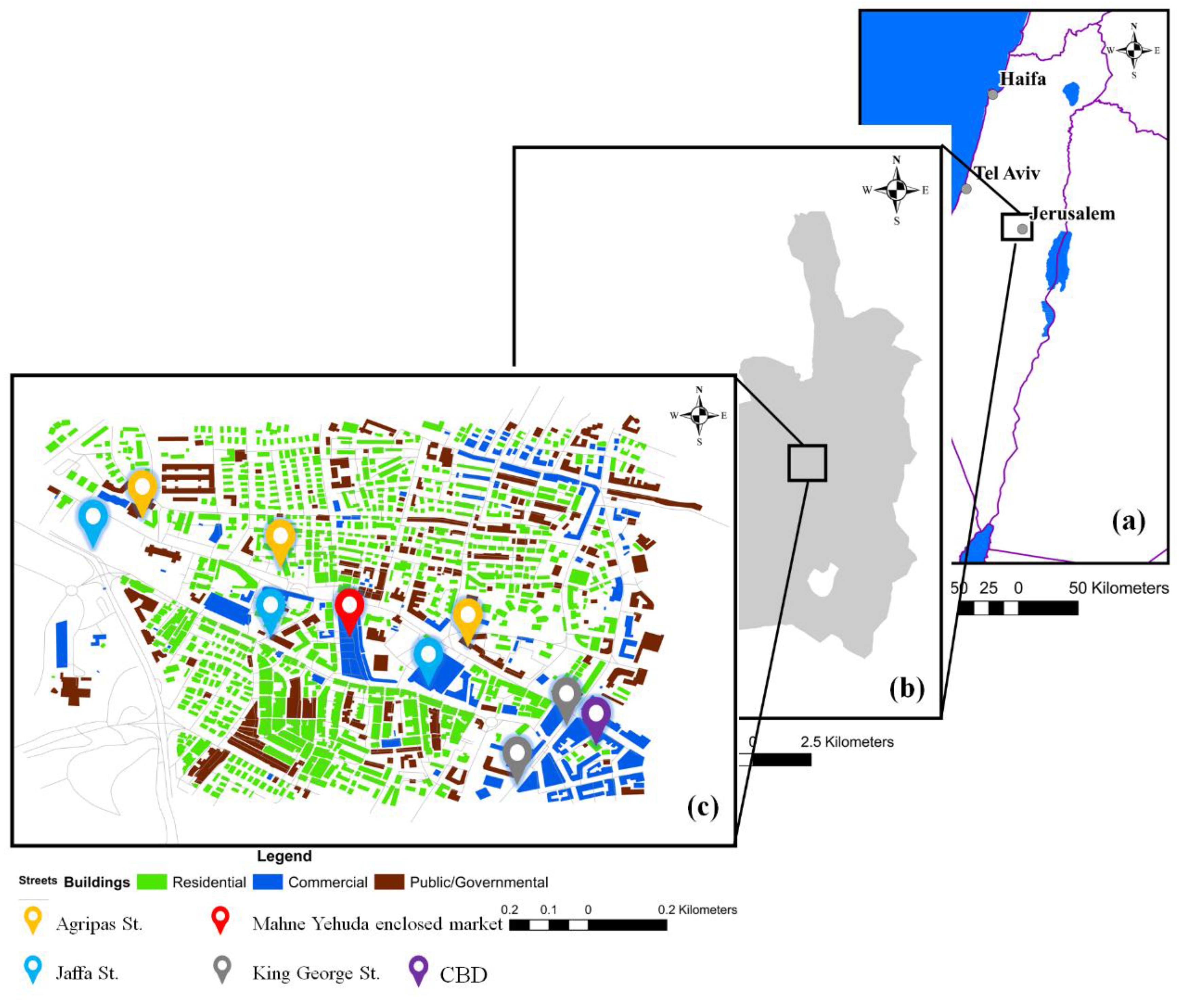
3.1. Spatial Context
The simulation is applied to the Jerusalem city center, a mixed-use area including two major commercial centers (the Mahaneh Yehuda enclosed market and the CBD), a number of other commercial and public-use venues and many low-rise residential building (see
Figure 2). Three major traffic arteries traverse the area: Agripas St. and Jaffa St. (light-railway route) running north-west to south-east and King George St. running north-south. The area comprises 22,243 residents, 717 residential buildings (243Th sqm), 119 commercial buildings (505Th sqm) and 179 governmental/public buildings (420Th sqm). The occurrence of both scenarios in the area is probable. It is situated 30 km north-west of the active Dead Sea fault and while the area is relatively seismically stable, most of the buildings in this part of the city were constructed prior to the introduction of earthquake-related building codes. This makes them prone to damage in such a scenario [
15]. In addition, the area was a focal point for various terror attacks over the years, including missile attacks in the summer of 2014.
Figure 2.
The study area (a) Israel; (b) Jerusalem municipal boundaries; and (c) study area.
Figure 2.
The study area (a) Israel; (b) Jerusalem municipal boundaries; and (c) study area.
3.2. Data Disaggregation
The literature offers a number of data disaggregation techniques such as population gridding [
16], areal interpolation [
17], dasymetric representation [
18,
19] proportional iterative fitting [
20,
21], and dynamic population modeling [
22,
23]. The method we use here is more in line with the technique used by Harper and Mayhew [
24,
25]. We combine administrative data available at a coarse spatial level and a detailed buildings GIS layer in order to create spatial representations of individuals and households within buildings and allocate synthetic socio-economic values to them. This involves two stages of down-scaling and one stage of clustering. We use an allocation algorithm to disaggregate from census tracts (CTs) to buildings and from buildings to individuals. We then cluster individuals into households (see
Figure 1). At each stage, the dataset is populated with the following values:
Buildings: land-use, floor-space, number of floors, building values, number of households.
Households: number of members, earnings, car ownership
Individuals: household membership, disability, participation in the work force, employment sector, age group, workplace location.
The sources of the data used in this process are the 2008 Israeli Census (for households, individuals and earnings, disability, age, labor force participation and employment by sector), a GPS-survey (for workplace location), National Tax Authority data (residential property value per meter), and capital stock estimates [
26].
Socio-economic values are allocated to buildings in the first stage in proportion to their floor-space. See Lichter and Felsenstein [
27] for a full articulation of the allocation method. As Equation (1) illustrates for population size, individual buildings values are calculated by multiplying CT-level densities with buildings-level floor-space:
where
Pop is population size,
fs is floor-space,
b is individual building and
c is census tract.
Floor-space is calculated according to aerial footprint and height in meters, assuming a floor-height of 5 m for residential buildings and 7 m for non-residential buildings. These figures were derived by comparing the calculated sum total of floor-space over all buildings by use with total national built floor-space. This proportional allocation process necessarily entails a loss of data due to the division of integers (e.g., population) by fractions (e.g., floor-space). The SQL-based allocation algorithm compensates for this by adjusting the floating point figures rounding threshold for each variable separately. In this manner, the algorithm verifies that CT control totals are met.
At the second stage, each of the individuals is given a unique id that is tied to a specific building and is located at a random location within the building. Next, demographic values (e.g., age, disability, workforce participation) are allocated to individuals so that the entire set of residents within a building represents the distribution of socio-economic variables within it. This distribution corresponds to the CT distribution from the previous stage. Under this allocation system, the socio-demographic structure of households in multi-unit buildings is homogenous while for single household units it is variable. Current research uses a more refined down-scaling method whereby disaggregation is based on representative distributions grounded in the national census rather than on floor-space area. Finally, individuals within a building are clustered into heterogeneous households. These represent a “traditional household” including both adults and children when possible. The clustering algorithm iterates through individuals and aims to create new household entities which are not identical but are closely similar in terms of age representation. Each household has a unique id, is assigned to a building, and individuals are assigned to it. This process results in a high-resolution spatial database at the national scale that includes accurate synthetic representations of 7,354,200 individuals allocated to 771,226 residential buildings (out of 1,075,904 buildings).
3.3. Agent-Based Simulation Dynamics
The synthetic big database is used to characterize the starting conditions of the urban simulation in terms of both environment and agents. Each synthetic representation of an individual and a household is transformed into an agent. A socio-economic profile, which consists of a set of variables unique to each agent type, is defined for each agent-age group, disability, employment status, employment sector, workplace location, household membership for individuals and monthly income, car ownership, and members for households. Values are allocated to these variables according to the characteristics of the relevant synthetic entity. Place of employment for agents working within the study area is the only variable whose values are generated within the model. Agent profiles are translated into behavior expressed through the operation of basic logical decision rules and constraints. Agents are rational, utility-seeking entities whose preferences reflect a mix of behavioral assumptions—satisficing behavior [
28], residential segregation [
29], and risk evasiveness.
In accordance with agent-based modeling, the dynamics of the city are characterized “bottom-up”. The individual actions of atomic units accumulate as aggregate changes. Households and their members are defined as agents. Their movements through buildings over the road network (representing the environment) over both diurnal and long-term temporal scales leads to environmental change (see
Figure 1). The model is implemented within the Repast Simphony 2.0 modeling platform [
30]. Each model iteration reflects one day in the urban setting in which agent behavior affects land-use, urban morphology, capital stock values, and population dynamics. The model is fully described in Grinberger, Lichter and Felsenstein [
11].
Agent behavior revolves around two location decisions-residential location choice made at the household level and individual-level activity decisions. These decisions are based on a combination of constraints (such as budget constraint) and preferences (such as segregative residential tendencies). Equation 2 shows an example of such a decision process in the case of residential location:
where:
h is home location for household
hh,
b is a building considered as new residence place, {
x} is a binary expression where 1 if
x is true and 0 otherwise,
HP is monthly cost of living in building
j,
k is a randomly drawn preference value for the household,
Φ(x) is the cumulative normal distribution value for
x,
Ā,
Ī are building-level average age and income respectively and
Aσ,
Iσ are standard deviation values for age and income in a building.
In the above equation, the constraint is a budget constraint. The randomly drawn preferences reflect segregative behavior by representing limited tolerance to changes in the demographic nature of the residential neighborhood. Similarly, activity decisions are based on land-use suitability and attractiveness in relation to random preferences. Attractiveness is related to the nature of the environment of the location, distance to current location (which is weighted by the mobility profile of the individual) and floor-space volume. In both decision processes, the first location to satisfy both constraints and preferences is selected in Accordance with satisficing behavior. Number of activities per day is set for each agent according to its mobility profile (age, disability, household car ownership) and employment profile (work force participation, workplace location). Residential mobility is motivated either by exogenous migration probabilities (intra- and inter-urban) or by changes to the environment (land-use change or destruction by disaster). In-migration is also considered where the number of potential new households in each iteration is dependent upon an in-migration/out-migration ratio and proportional to the number of vacant dwelling spaces.
The bottom-up dynamics described above capture demand-side interactions. A comprehensive urban model must also relate to supply side activities. Such interactions are simulated here by conceptualizing different spatial units-CTs, buildings, and residential units—as environmentally sensitive entities within a top-down environmental influence procedure (see
Figure 1). This process is expressed by changes in land-use patterns and residential units’ monthly (rental) prices. Land-use changes are based on the ratio of floor-space volume to local average traffic loads. We assume that higher volume traffic reflects more revenue from visits (represented by traffic) and greater commercial activity. Low ratio values (high traffic loads in relation to floor-space volume) encourage commercial activity at the expense of residential supply, while high values make the success of commercial activity less probable. The logistic probability of land-use change is based on the standardized cumulative exponential distribution values of floor-space and traffic loads in order to avoid inflation of small commercial uses and deflation of large land uses. Land-use changes affect house prices, along with changes in supply (number of residential buildings in a CT) and demand (the population size of the CT). Changes to these elements lead to changes in average house prices per meter in the CT. Rising service levels (number of non-residential units) drive up prices and in line with standard economic theory, prices will drop with increase in supply or decrease in demand. CT-level changes trickle down to the level of the individual building proportionate to floor-space volume. In addition, building values are adjusted according to their accessibility to non-residential (
i.e., service) functions. Greater accessibility makes a building more valuable. Finally, the value of each residential unit within a building is calculated, assuming uniform values within a building. Values are transformed into monthly housing costs in accordance with the population’s willingness-to-pay (represented by the budget constraint in Equation (2)).
3.4. Simulated Scenarios
We simulate two very different scenarios (
Table 1). The first relates to multiple missile attacks. These represent long term continuous, low level attrition of the urban system. The attacks are random in space, time and quantity (magnitude) and there is no single focus of the event. The second scenario is an earthquake. This delivers a catastrophic one-time shock to the urban system and has a defined focus (aftershocks not withstanding). Disaster management in both cases relates to the effects on the urban system in terms of speed to recovery, population and land use change and shifts in urban morphology.
Table 1.
Characteristics of Scenarios Simulated.
Table 1.
Characteristics of Scenarios Simulated.
| Scenario | Scenario Duration | Effects | Event Dynamics | Scale | Number of Event Foci |
|---|
| Multiple Missile Attack | Long term | Temporary | Diffuse | Citywide | Many |
| Earthquake | Long term | Permanent | Focused | Citywide | One |
Differences between the scenarios are formulated in relation to their temporal extent, intensities, direct and indirect effects. While the earthquake may affect an entire urban area, its impact is determined in relation to one focal location. Missile attacks, on the other hand, have more localized impacts that diffuse through the urban system via multiple foci. Moreover, effects of an earthquake tend to be irreversible (total destruction of buildings) while, in the missile attack scenario, such impact is rare and the temporal-behavioral effect is more dominant. Both the first missile attack and the earthquake occur at day 50 (i.e., the 50th simulation iteration) in order to afford a “run-in” period for the urban system to stabilize. While the earthquake shock occurs only once, the missile-attacks continue to appear until the simulation ends. The focal center of the shock is determined randomly to avoid place-based bias.
The earthquake is simulated as spreading outwards from the epicenter with declining intensity. The direct physical effect of this shock is manifested through the collapse of buildings. This effect is probabilistic in nature. The chance of a building being damaged is proportional to its distance from the epicenter and its height. The road nearest to a collapsed building is blocked and remains so until the building is restored. The restoration period is proportional to floor-space area. Upon physical restoration, the building may or may not also restore its functionality. This formalization of the hazard is necessarily simplistic. Given our aim of assessing socio-economic rather than physical resilience, we feel this approach is justifiable. The high variance in the distribution of physical damage across multiple simulations allows for estimating resilience levels that are not dependent on a specific event.
The missile attack is simulated as a series of multiple local shocks appearing every day and varying in number from 0–10. If a missile hits a road, it remains blocked for that iteration. If a building is hit, there is a 5% probability (depending on a randomly drawn value) of serious damage which results in the same physical effect as building collapse in the earthquake scenario. In addition to this effect, missile hits impact decision making processes. The accumulation of hits in a single place makes it less attractive as a residential location (reflecting risk-evasiveness), inducing out-migration and reducing in-migration. This is formalized in the behavior of residents. If their close neighborhood (50 m radius) is hit more than three times over the preceding 30 iterations, they are given a 20% probability of relocating. Such buildings have a zero chance of attracting new residents. Activity location decisions are also affected as agents avoid choosing destinations that were hit over the course of the current day. Exogenous shocks therefore directly affect urban dynamics via physical changes (destruction of buildings and disruption to movement) and psychological effects (risk evasiveness). Due to the model dynamics, these direct effects lead to a second round of indirect effects.
4. Simulation Outcomes
The results of the simulations include time-series data at high-level spatial resolution. They relate to changes in capital stock and population size, building values, urban morphology, and functionality. The richness of the outcomes facilitates analysis of urban development at multiple scales as well as across different scenarios. This section presents examples for macro and micro analysis and comparisons that unveil the main processes of change. These results relate to 25 simulations per scenario where each simulation comprises of 1010 simulated days. The results reported are the simulation averages.
4.1. Macro Trends
Table 2 presents a macro comparison of event effects in the two scenarios. We observe the tendency of key variables to return to pre-shock values and converge over time (over different values). Variables are considered convergent (
i.e., reach equilibrium) if they show no significant change over the last 50 iterations or more. The values in
Table 2 indicate the day at which on average the last significant change was registered until the end of the simulation.
Table 2.
Recovery of the Urban System by Simulated Scenario.
Table 2.
Recovery of the Urban System by Simulated Scenario.
| Parameter | Variable | Earthquake | Missile Attack |
|---|
| | | Average Final Change (% of Pre-Shock Value) | Frequency of Equilibrium (out of 25 Simulations) | Average Duration to Achieve Equilibrium (Days) | Average Final Change (% of Pre-Shock Value) | Frequency of Equilibrium (Out of 25 Simulations) | Average Duration to Achieve Equilibrium (Days) |
|---|
| Population | Population | 67.85 | 24 | 397 | 70.39 | 3 | 944 |
| Average Income | 50.53 | 11 | 950 | 50.62 | 6 | 954 |
| Residential stock | Residential Stock Size (# buildings) | 88.34 | 25 | 332 | 93.30 | 15 | 948 |
| Average Residential Value | 96.12 | 22 | 677 | 90.93 | 7 | 951 |
| Non-residential stock | Non-Residential Stock Size (# buildings) | 142.43 | 23 | 670 | 73.55 | 4 | 948 |
| Average Non-Residential Value | 78.61 | 25 | 385 | 89.45 | 12 | 926 |
Population and residential stock variables show similar behavior in the two scenarios in regard to regaining pre-event values. It seems that both types of shocks induce an out-flow of migration which includes more wealthy households. This leads to a slightly reduced and cheaper housing stock. Other variables point to striking differences between the scenarios. First, the immense growth of non-residential stock in the earthquake scenario is replaced by a reduction in size in the missile attack. Moreover, convergence over time is rarely achieved in the latter, while it frequently occurs in the former. These results may be attributed to the nature of the shocks. The missile attacks call for continuous adaptation in face of an on-going event. This erodes reorganizational ability that may be more attainable in the case of a one-time shock such as an earthquake.
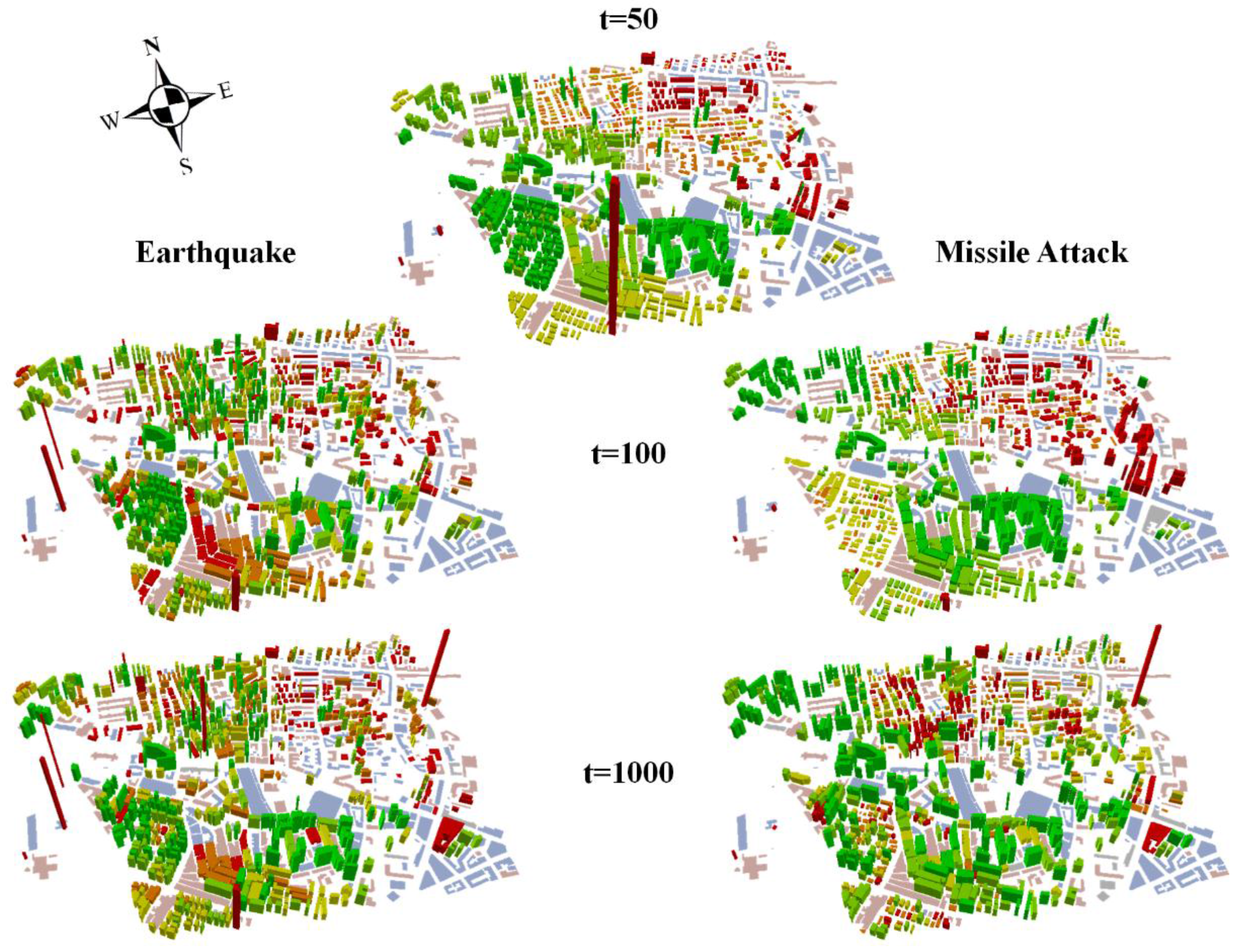
4.2. Micro Scale Change
Figure 3 presents micro-scale results relating to the different population and land-use dynamics resulting from the simulated disasters. In this figure, buildings are characterized at each point in time in terms of the most frequent land-use and the average Social Vulnerability Index (SVI) of resident households over the simulations. Following Felsenstein and Lichter [
31] we use four key social variables obtained from the national census (2008) to define social vulnerability scores of households. The SVI relates to demographic characteristics which may enhance or constrain a household’s adaptation capabilities. The index is constructed as follows:
where
hh is a household,
I is monthly income,
A is the share of dependent members,
Car is car ownership, and
Dis is the share of household members with disability. All values are standardized.
The variables comprising the SVI have been chosen with discretion. “Household income” represents a direct measure of socio-economic status. “Disabilities” represent the share of disabled persons in a household. It combines the share of persons who are unable or have difficulty walking, hearing, seeing, have memory problems or unable to dress and shower independently. “Age” portrays the size of the dependent population in the household and combines the percentage of persons over 65 and under 18. “Car” depicts households with no car, one car or more. While this can be construed as a measure of wealth it is also a measure of a capacity of evacuate in the case of an extreme event. We regard this indicator with caution since in large cities for example, it is not always an efficient indicator of wealth and some hazards such as sea level rise, do not require rapid evacuation. Therefore, this indicator is assigned a weight of 0.1 in the overall index. We divide the national distribution of each variables quintiles (1: least vulnerable, 5: most vulnerable) and assign each household area to its respective class.
The strong direct impact of the earthquake leads to immediate consequences. The population is forced to relocate and the initial northeast-southwest divide between more and less vulnerable populations (
Figure 3,
t = 50) is fractured (
Figure 3,
t = 100). In contrast, the missile attacks do not create such an accentuated result. The same process of dispersal and re-concentration only appears after damage has accumulated over time (
Figure 3,
t = 1000). This is because the effects on accessibility caused by physical destruction lead to indirect effects on the land-use system. As traffic disperses due to the inaccessibility of some roads, new commercial functions may develop in areas which attract more traffic at the expense of existing commercial venues located near previously busy roads. As traffic is constantly diverted by the continual flow of shocks in the missile scenario, new commercial functions struggle to survive. Accordingly, commercial activity goes into slow and protracted decline, as evidenced by the succession of commercial venues becoming vacant along King George St. and in the north-east corner of the study area (
Figure 3,
t = 1000).
Figure 3.
Changes in land-use and population demographics by building at discrete time points. Flat (2D) buildings are non-residential: grey for vacant, blue for commercial, and pink for public/governmental. 3D buildings are residential, where both height and color represent average SVI scores. Building height represents absolute values, i.e., buildings with negative values have “positive” heights. Color categories are ordered by quantiles: red signifies lower scores (high vulnerability) and green higher scores (low vulnerability).
On the other hand, in the earthquake scenario decline is accelerated. This enables a stabilization of traffic patterns, around new commercial centers that have succeeded to reorganize. As new functions attract more traffic, an agglomerative process occurs. The new clusters of commercial activity appearing in the areas to the southwest and northeast of the market (
Figure 3,
t = 1000) indicate such a process. Once commercial activity rejuvenates and land-uses patterns become fixed, fluctuations in house prices decrease and the population is able to re-organize. This process is visibly less prominent but can be detected as some of the less vulnerable clusters seem to grow in strength, such as the one south of the market (
Figure 3,
t = 1000). The continuous fluctuations in traffic patterns and in the land-use system under the missile scenario require agents to constantly adapt and disturb any attempt to achieve stability. This attrition effect is associated with constant low-grade shocks.
These contradicting micro-spatial patterns of reorganization
versus decay explain the propensity of the system to reach stability in each of the scenarios, as reported in
Table 2. Thus, while low-resolution spatial analysis may be useful in identifying patterns of aggregate change, utilizing the spatio-temporal richness of the data allows for insights regarding the causes of such patterns. As can be seen from the level of complexity in
Figure 3, it is not easy to communicate these results, especially if both time and space are visualized at high-resolutions.
6. Communicating Outcomes
Traditionally, research outputs are communicated through scientific publications and reports. These are limited in the amount of textual and visual information they contain. These constraints are compounded as the sophistication and volume of outputs increases. Furthermore, public participation in planning and decision-making is gaining increased currency [
33,
34]. The new consumers of information invariably do not have access to traditional sources of scientific information generating a need for communicating spatial information to professionals and the public alike in a comprehensible and intuitive manner.
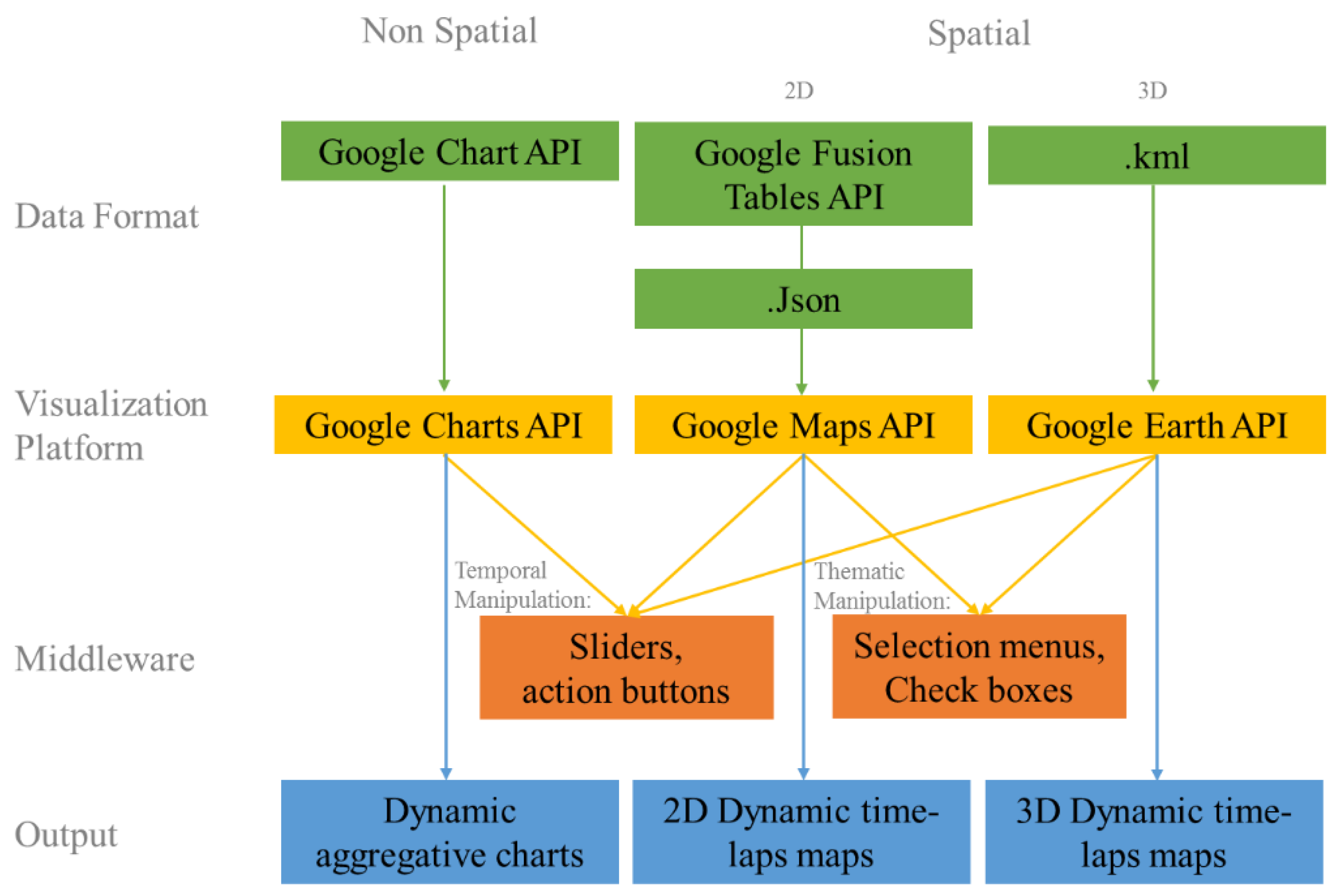
Communication of complex and information intensive research results to end-users from wide-ranging backgrounds is a challenging task. The increase in sophistication, volume, and complexity of modeling urban dynamics and the exponential growth of computing power and big data, compound this challenge. Web-based cartographic spatial and temporal visualization technologies can function as a bridge between the research environment in which outputs are generated and the user. We develop a web-based application that serves as a means to communicate outputs generated using an agent-based simulation model to potential end-users, such as urban engineers and evacuation planners. Communicating spatial information in this way helps to increase transparency and opens the door for public awareness and participation in planning processes post disaster. Our application allows the user to browse through four types of spatial and non-spatial visualization techniques.
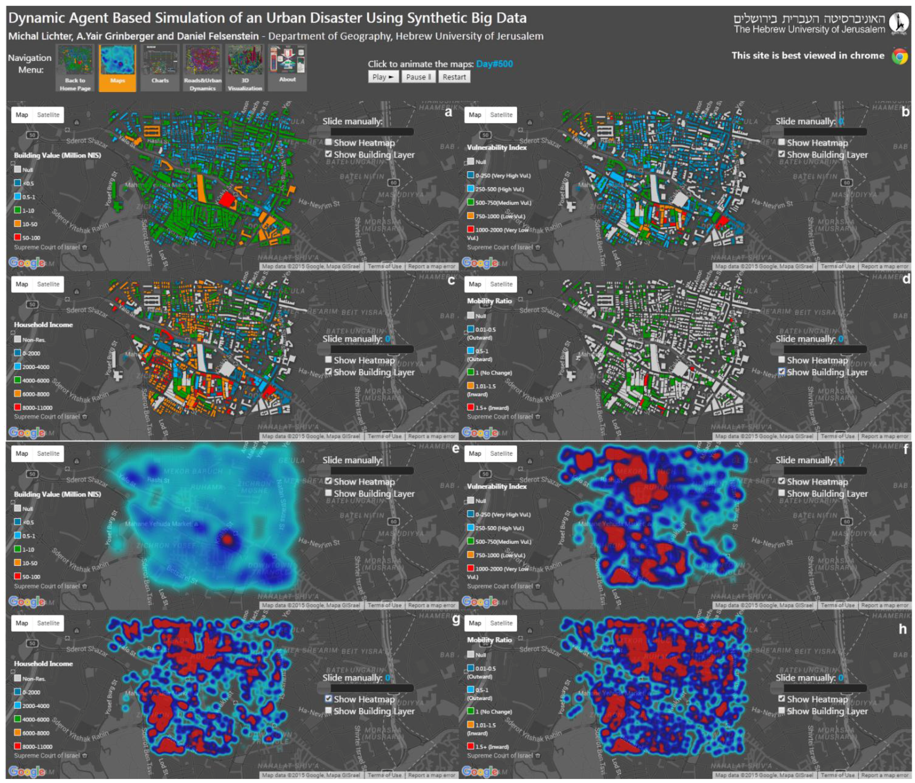
Figure 5.
The map comparison panels displaying (a–d) vector based discrete buildings and (e–h) continuous heatmap surface for building value (a,e), vulnerability index (b,f), household income (c,g) and mobility ratio (d,h).
Figure 5.
The map comparison panels displaying (a–d) vector based discrete buildings and (e–h) continuous heatmap surface for building value (a,e), vulnerability index (b,f), household income (c,g) and mobility ratio (d,h).
6.1. Map Comparison Panel
In this visualization the user can view four different maps of four different dynamically changing variables in the aftermath of a disaster (missile attack or earthquake): building value, vulnerability index, household income and mobility ratio. The maps are not static but rather can be animated to display a sequence of time lapse portrails of each variable. Each map contains “shots” in space and time of the variables from before the event (
t + 0) to the time of the event (
t + 50) to three years after the event (
t + 1000) in time steps of 50 days. The animated maps of each variable are presented in two formats from which the user can choose. The first is a discrete vector building layer format which displays the change in variable values over time through a change in building color. With a mouse-click on each building, the user can trigger a popup window with all the properties attached to the building (
Figure 5). The second format is a heatmap—this is a continuous surface draped over the study site which portrays high and low concentrations of a phenomenon using hot and cold colors. Areas where a certain variable displays high values, such as building values or mobility ratios, will be displayed in red. Areas with low values are displayed in blue. This enables the user to easily identify spatial trends and configurations, dynamically adjusting with the zoom level of the map. It does not however, allow value extraction by a click of the mouse. Both formats allow the user to animate the maps by clicking on the “play” button to automatically animate the maps over time or use a slider to manually change the a maps time steps.
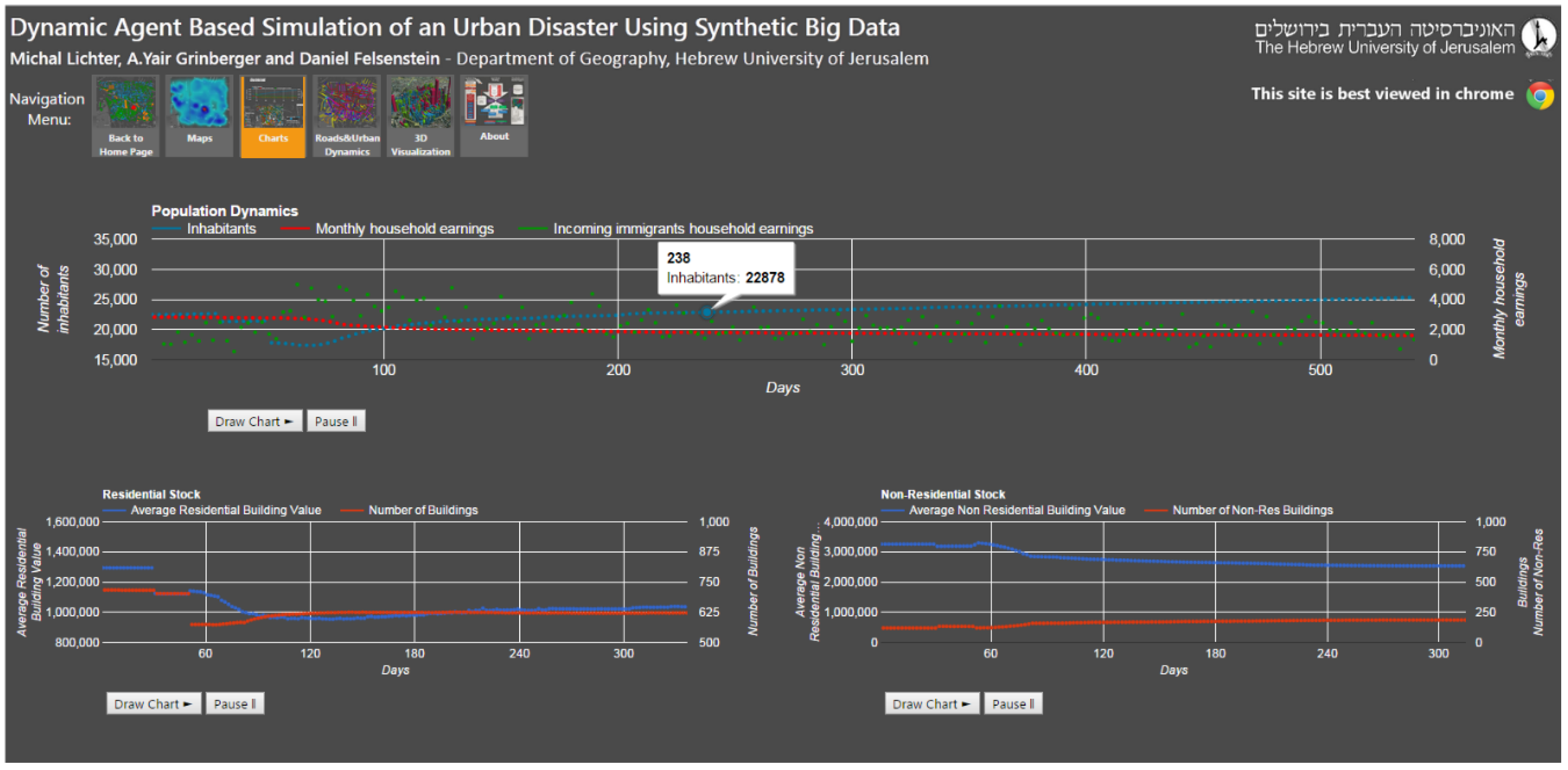
6.2. Dynamic Graphs Panel
In this panel, change in parameters is charted over dynamic-queryable graphs (
Figure 6). For example, variables relating to population dynamics, such as the number of inhabitants in the area and their monthly earnings at each point in time are displayed over the earnings of new in-migrants. This shows the increase in total poulation accompanied by a drop in the total earnings in the study area over the entire three year period, post-earthquake. Specifically, the high variance in household income of in-migrants can be noted. Other graphs display the change in value of residential and non-residential buildings out of total number of buildings in each category. Due to the model dynamics, this can constantly change as buildings are either destroyed or become uninhabitable after an event, as they become rehabilitated or as they change use from residential to non-residential and
vice versa. While this visualization is not spatial, it enables the display of aggregated results (macro analysis) related to the entire study area over time and lets the user query the graphs with a mouse click.
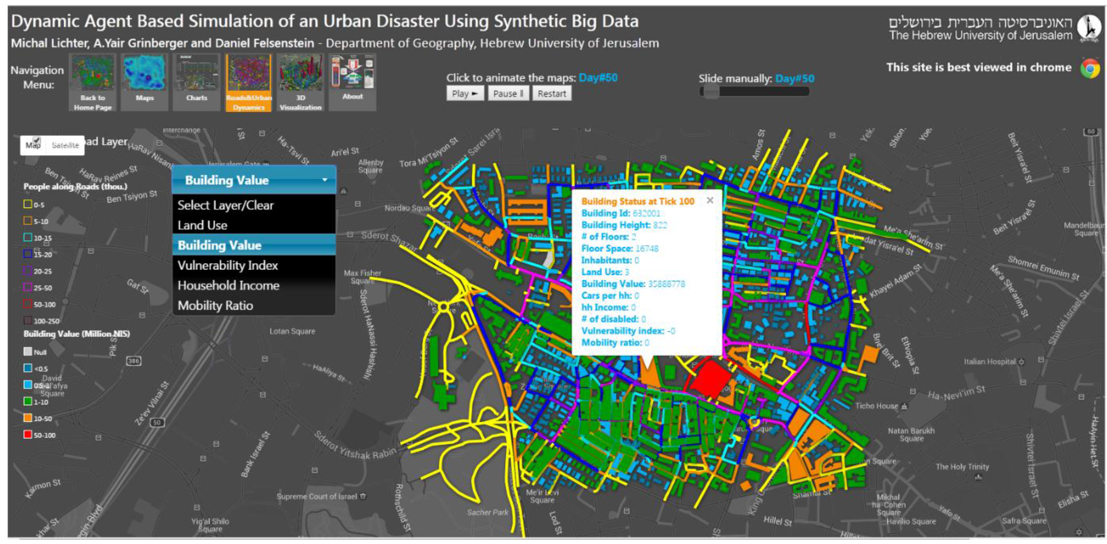
6.3. Roads and Urban Dynamics
This is a vector-based time lapse visualization which allows the animation of five different variables over time relating to change in the number of passengers along the road network in the study site (
Figure 7). This change in traffic volume ultimately drives dynamic processes in the model through changing accessibility. Here too, the time lapse visualization is based on a 50 day interval over three years. The user can choose one variable to display with the road network: land use, building value, vulnerability index, household income, and mobility ratio. Since this is a vector based visualization, the user can query elements such as buildings and road segments in the map, using a mouse, and extract the properties of each element at each point in time. This visualization can be animated using the relevant buttons and can be manually manipulated using a time lapse slider.
Figure 6.
Querying the dynamic charts by clicking on points in the graph representing the value of a variable at a certain point in time.
Figure 6.
Querying the dynamic charts by clicking on points in the graph representing the value of a variable at a certain point in time.
Figure 7.
Vector based 2D visualization of various variables over the road network.
Figure 7.
Vector based 2D visualization of various variables over the road network.
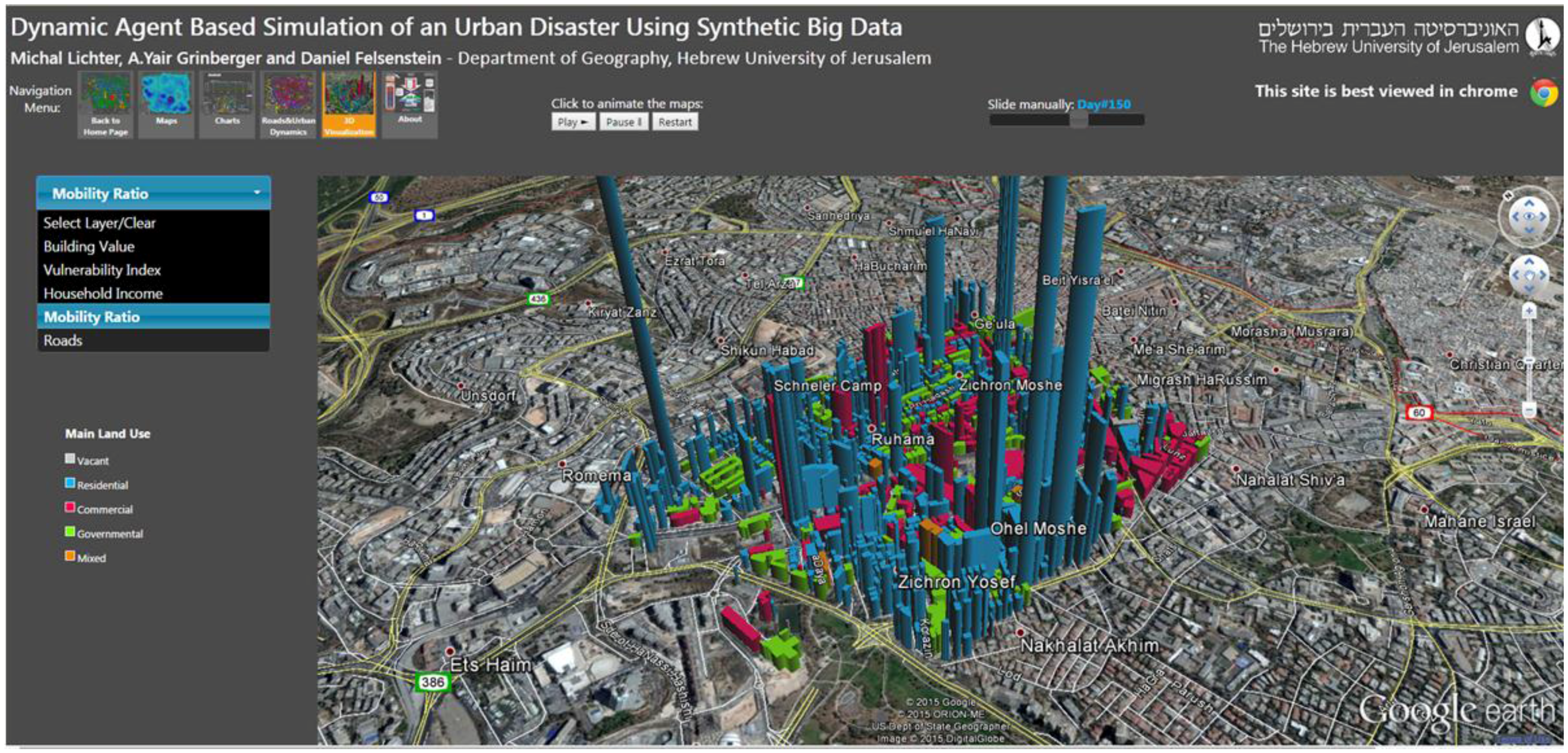
6.4. 3D visualization
This visualization uses 3D visualization techniques to display the change in variables over time. We use the color of buildings to display change in each building land use and we use building height to display the change in building value, vulnerability index, household income and mobility ratio. Due to data volume constraints we limit the visualization to one year post the event with a 50-day time interval (
Figure 8). This visualization also enables the user to familiarize the study site using 3D with Google Earth as the platform. Consequently, the user can rotate the scene and change the angle of presentation.
Figure 8.
3D visualization of various variables. Color represents the main land use of a building and height represents value of the variable.
Figure 8.
3D visualization of various variables. Color represents the main land use of a building and height represents value of the variable.
7. Conclusions
In terms of simulating outcomes, this paper has shown that diverse disaster situations result in very different outcomes. Over the long term, the city tends to recover from the earthquake and reaches equilibrium for key indicators over a period of 400–600 days. With the missile attack, things are rather different. The random, low-grade shocks erode re-organization capacity and the city never really recovers. This is also reflected at the micro level. The earthquake induces a process of dispersal and re-concentration of population and commercial activity. In contrast, the missile attacks cause residential and commercial clusters to decay as their capability to re-group is never allowed to materialize.
Just as these outcomes are very different, the methods of communicating them need to be delivered accordingly. The earthquake impacts need to be imparted to a population engaged in moving and re-adjusting post-disaster. In contrast, the missile outcomes need to be communicated to a population that stays put but gradually suffers from attrition. This implies that disaster management needs to move beyond providing engineering fixes and relate to wider process that differentiate across population groups affected by the disaster.
Improving accessibility to information is one route towards enahncing resilience to shocks. Along with the explosion of available information through enhanced computer power and techological progress, broader societal change also demands democratization of crisis management and increased citizen empowerment in the recovery process. The centralized, linear, top-down model of disaster management is slowly being augmented by a networked community-based approach [
35]. This mode of management is grounded in data pooling and public input through crowdsourcing and is lubricated by resources such as OpenStreetMap and GeoCommons. In this respect, the Internet acts as the great facilitator. It encourages open standards and simplified interfaces and generally makes information generation more transparent and democratic.
The web-based delivery of likely disaster outcomes not only encourages public participation in rebuilding and rejuvenation but also differentiates across the types of response required to withstand the shock. In our simulated cases, mitigating the effects of the earthquake point to the need for assisting recovery in new locations, encouraging personal mobility, and removing regulatory contraints to the physical recovery of communities. For the missile attack case, a very different suite of interventions may be relevant. These relate to community preservation and stabilization, for example stemming the tide of out-migration and bolstering local social services.


