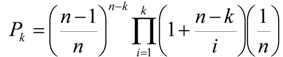
4.1. Land Use/Cover Change (LUCC) Model
The case study data come with the installation package of Dinamica EGO. It aims at modeling the spatial patterns of deforestation in Northern Mato-Grosso, an agricultural frontier in the Brazilian Amazon. The deforestation model used Weights of Evidence (WofE) to produce a map of the probability of post-1994 deforestation (
Figure 5) by using the following data layers: forest-cover of 1991, forest-cover of 1994, distance to roads, distance to forest, and slope [
17]. In many LUCC models, this type of map of probability is used to produce prospective land cover maps by allocating future deforestation. The simulation procedure usually allocates the changes in areas that exhibit higher transition probabilities. In order to assess the probability map’s predictive power, we compared the map of deforestation probability via ROC analysis with the actual deforestation between 1994 and 1999 (
Figure 6).
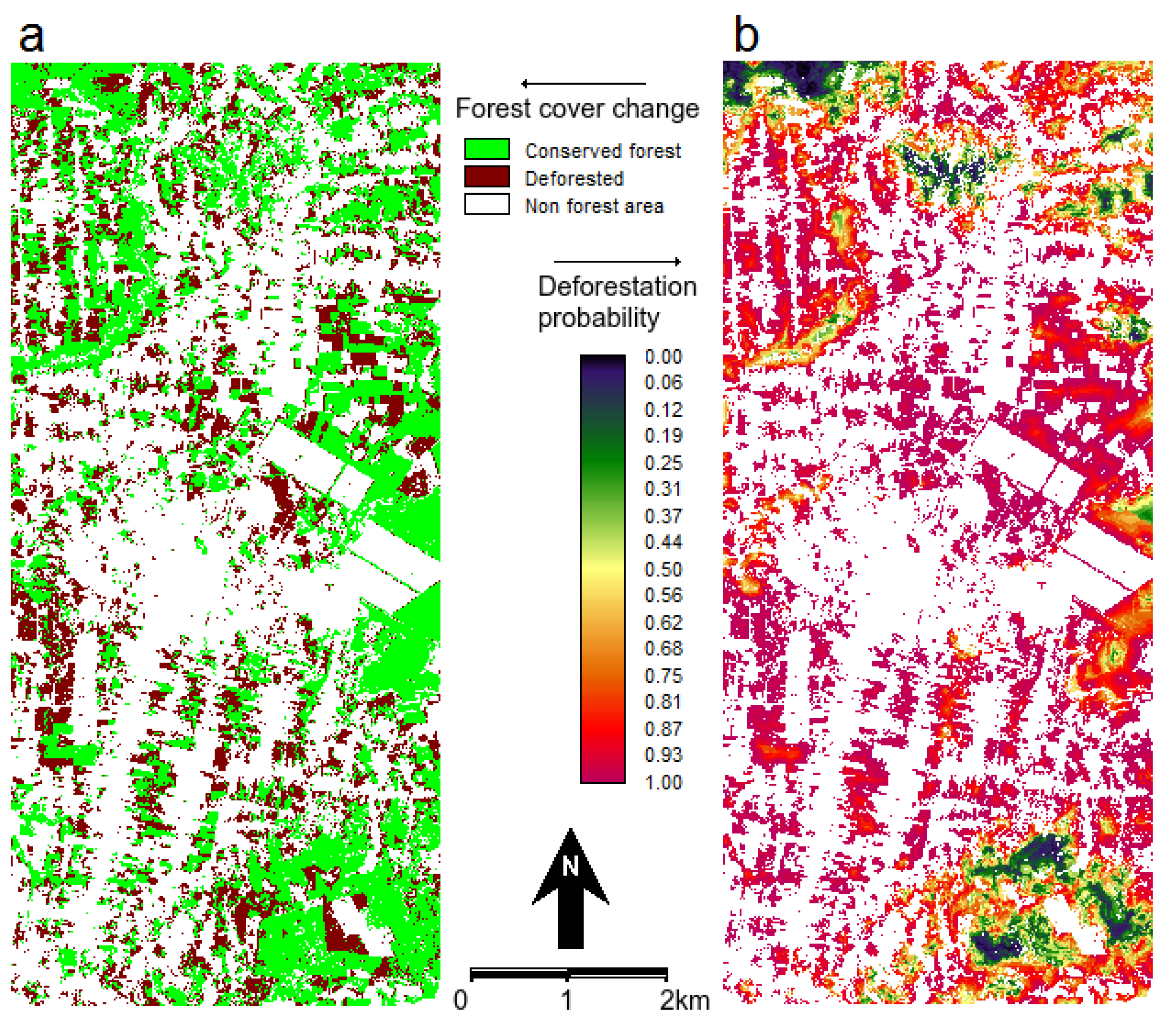
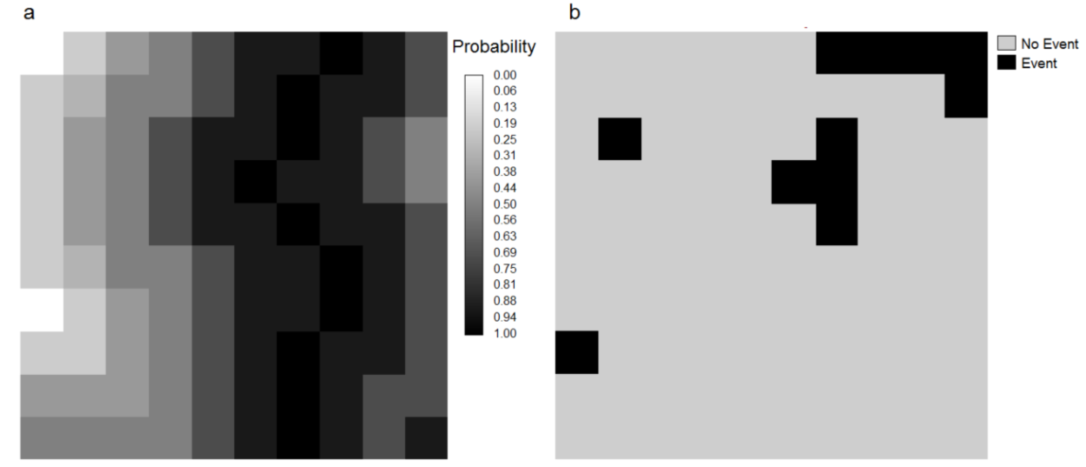
Figure 5.
(a) Map of observed forest cover change during 1994–1999 and (b) probability of post-1994 deforestation. The white non forest areas at 1994 are eliminated from the analysis.
Figure 5.
(a) Map of observed forest cover change during 1994–1999 and (b) probability of post-1994 deforestation. The white non forest areas at 1994 are eliminated from the analysis.
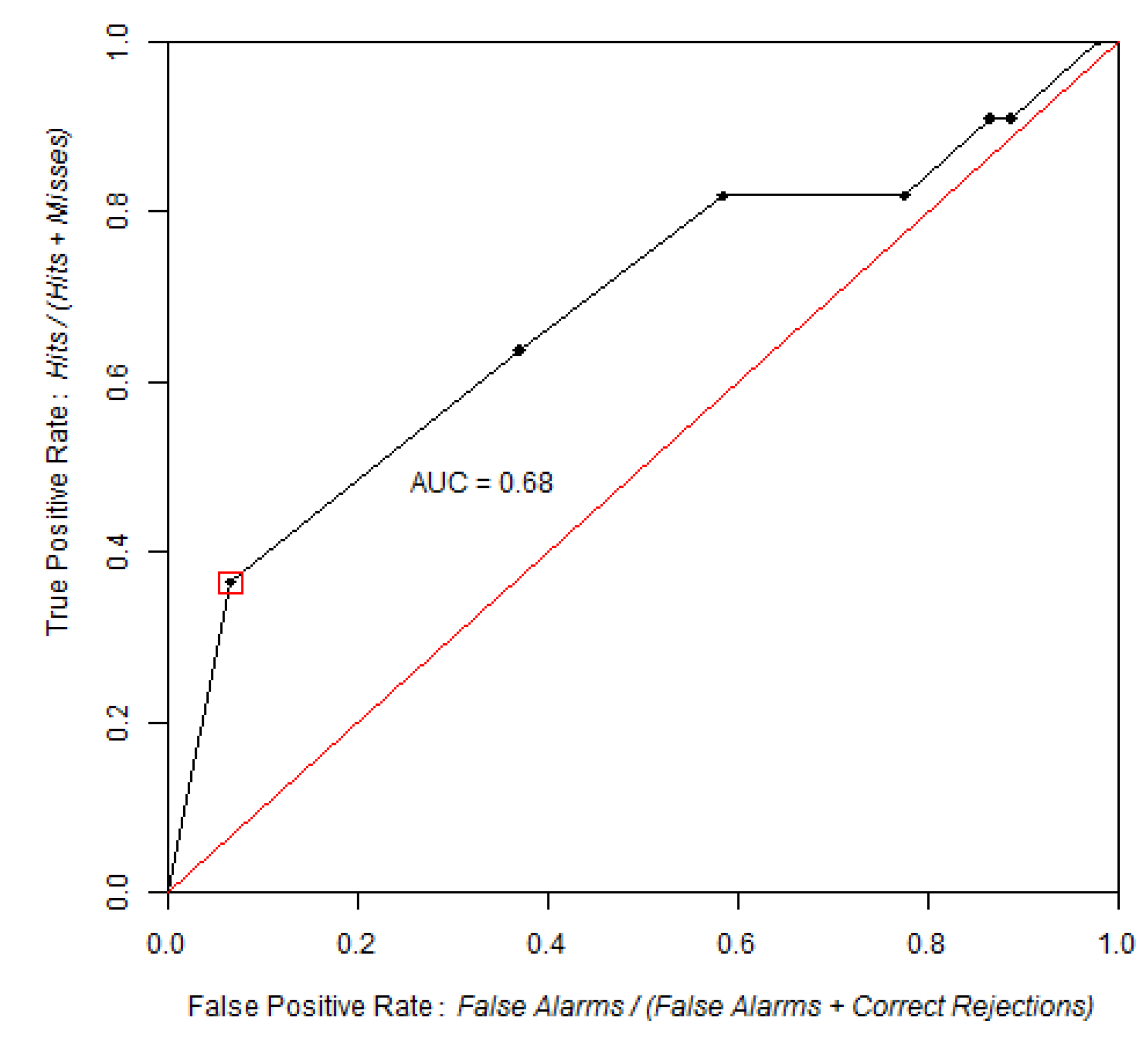
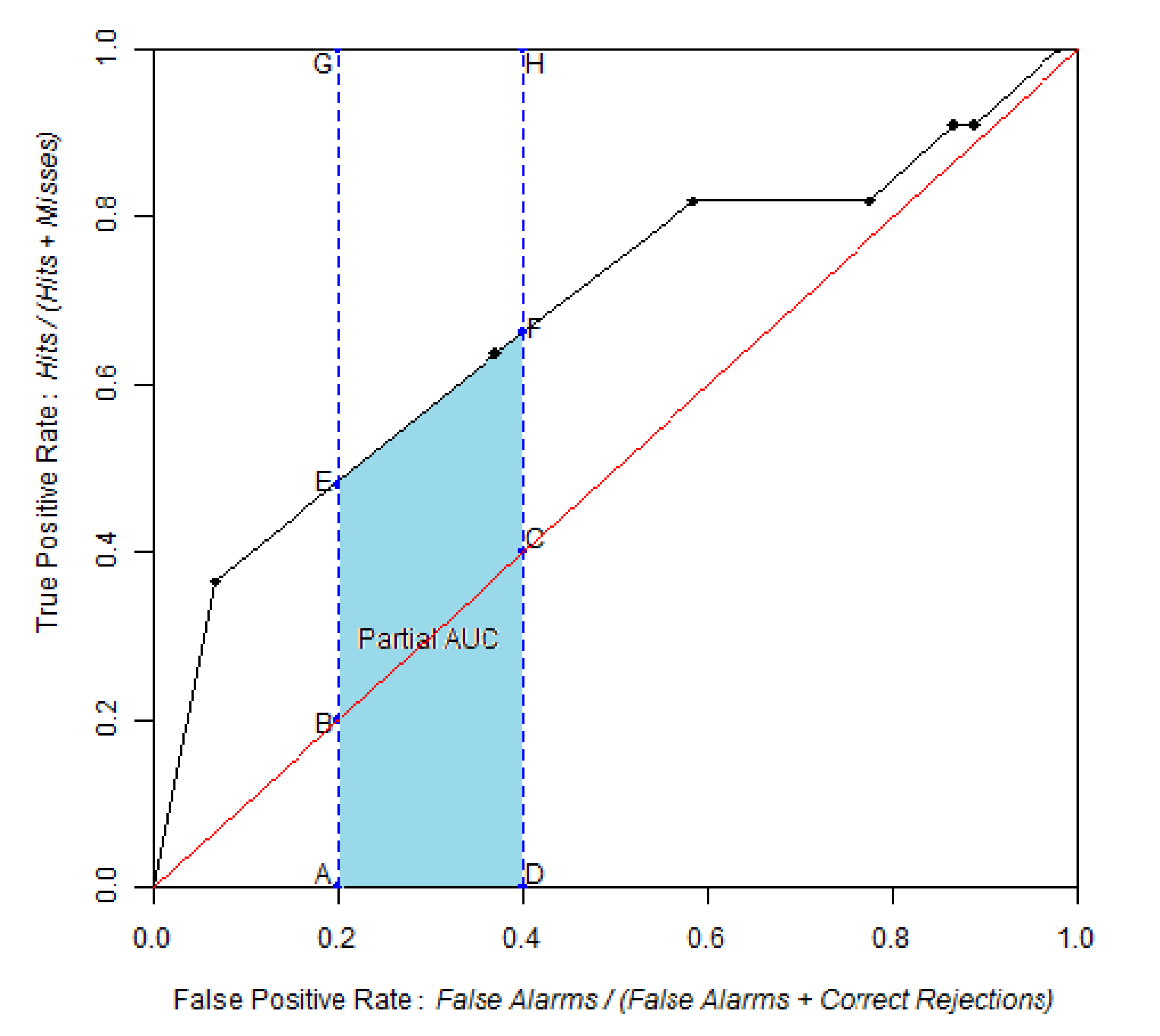
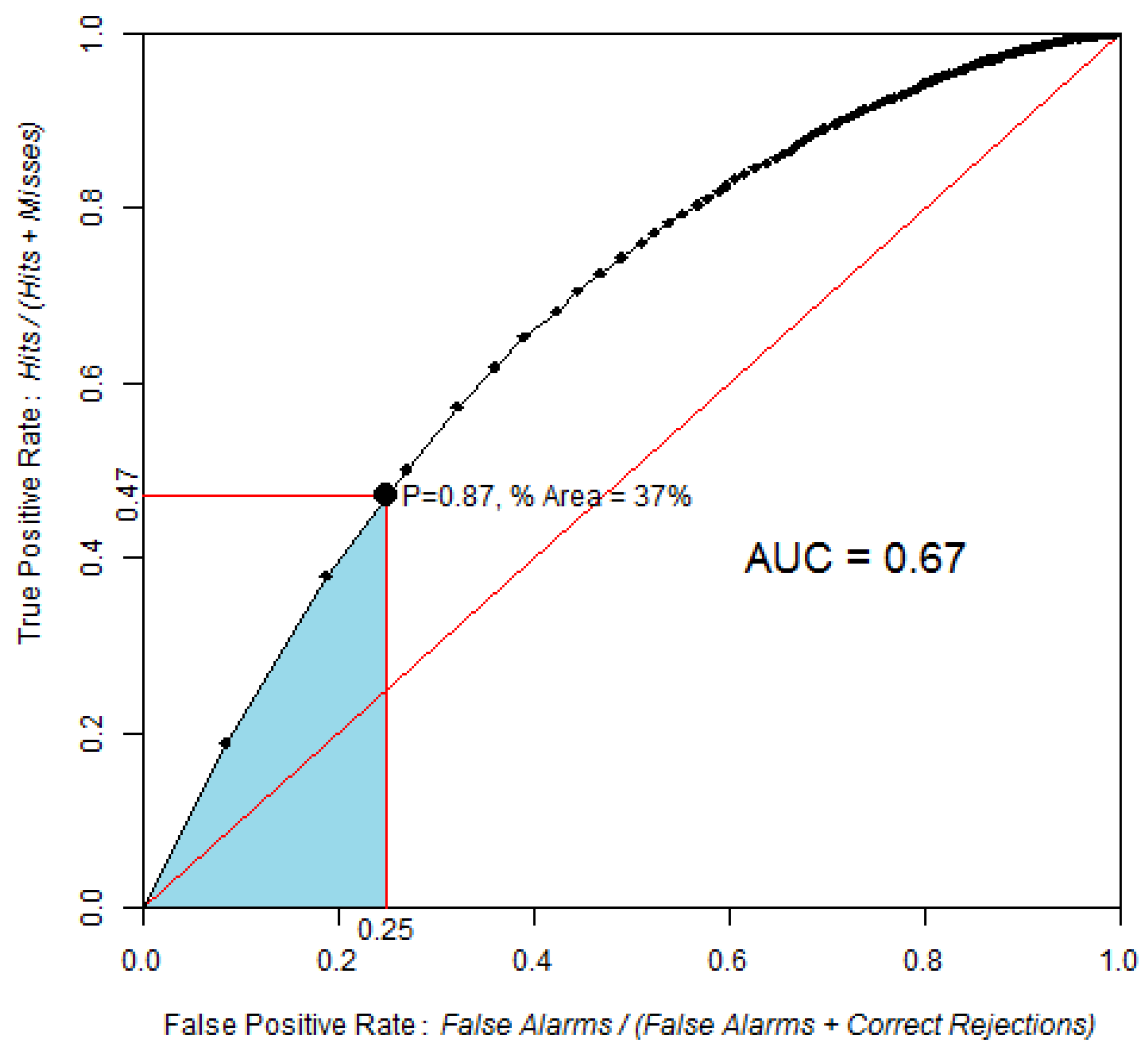
Figure 6.
ROC curve obtained by comparing the probability of post-1994 deforestation map versus observed deforestation between 1994 and 1999, using 100 bins and the equal probability increment method. The point identified in the ROC curve corresponds to the area expected to be deforested during 1994–1999, assuming pre-1994 trends were to continue beyond 1994. The blue area corresponds to the partial AUC focused on high probability values, which are 0–0.25 on the False Positive Rate axis.
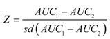
AUC is 0.67, which is significantly different from a random model. The Z test with 2000 Monte Carlo iterations was Z = 118, p-value = 5 × 10−89.
Based on the linear extrapolation of the deforestation rate observed during the calibration interval 1991–1994 (14,100 ha per year), about 37% of the 1994 forest area is expected to be cleared during 1994–1999, which corresponds to 70,500 ha of the 190,600 ha of 1994 forest. Therefore, a strategic threshold corresponds to 37% of the forested area in 1994. This point corresponds to a probability of 0.87 and is located at coordinates (0.25, 0.47) on the ROC curve. If we restrict the pAUC to the 0–0.25 interval on the false positive rate axis, then the pAUC will focus on the part of the curve where the probability map has its highest values. A normalized pAUC of 0.602 was found for this portion of the ROC curve. Stochastic models, such Dinamica, allocate some of the simulated changes in cells of low probability [
18], hence the performance of the model will depend on a broader part of the ROC curve.
Evaluation of LUCC models through ROC analysis is based on the coincidence of the observed changes and the map of change probability produced by the model, without regard to the spatial allocation of the hits, misses, false alarms, and correct rejections. Additional spatial aspects can be taken into account such as the realism of the simulated landscapes patterns [
18] and the match of changes within a search neighborhood [
19]. In this respect, a series of map comparison metrics available in Dinamica can complement ROC evaluation [
9].
4.2. Models of Species Distribution
We produced maps of potential distribution of
Bradypus variegatus using the data from (available at
http://www.cs.princeton.edu/~schapire/maxent/) [
15] using the program package MaxEnt (Maximum Entropy approach, [
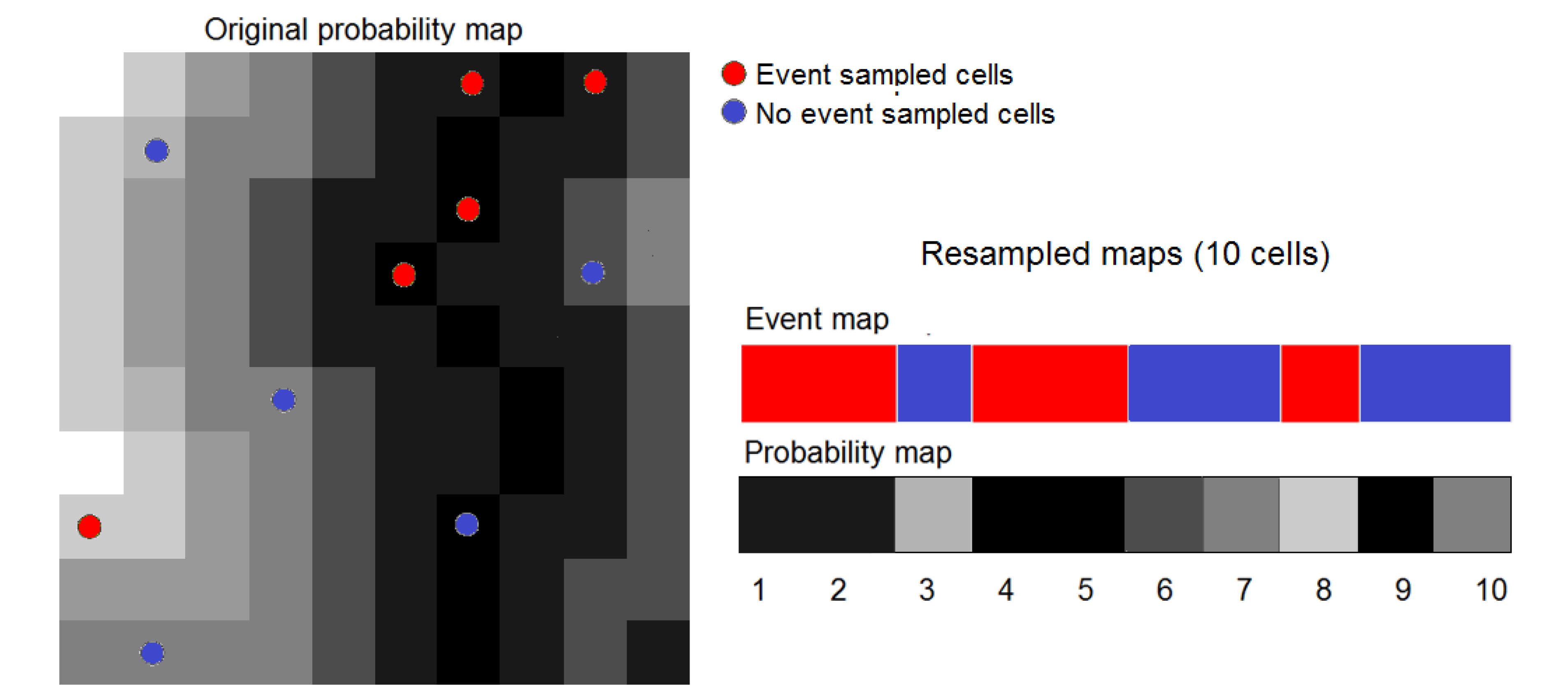
15]) and the method of the Weights of Evidence (WofE), which is available in Dinamica EGO. Occurrence data were split randomly into two subsets. We trained models using the first subset, consisting of 81 occurrence plus 699,719 pseudo-absence cells. We then carried out ROC analysis using the second subset, consisting of 34 occurrence plus 651,316 pseudo-absence cells. ROC analysis was also carried out after resampling the second subset data using the procedure described in the
Section 3.5. We used 100% of occurrence data (34 cells) and approximately 10% of pseudo-absence data (about 65,000 random cells). As a result, resampling enables us to process maps with 65,034 cells instead of the original maps with 1,929,504 (1,592 × 1,212) cells. This enables us to carry out bootstrapping with 2,000 replicates in a reasonable time, specifically 6 h 35 min using a desktop PC with a i7-3770k 3.50 GHz processor and 24 GB of RAM.
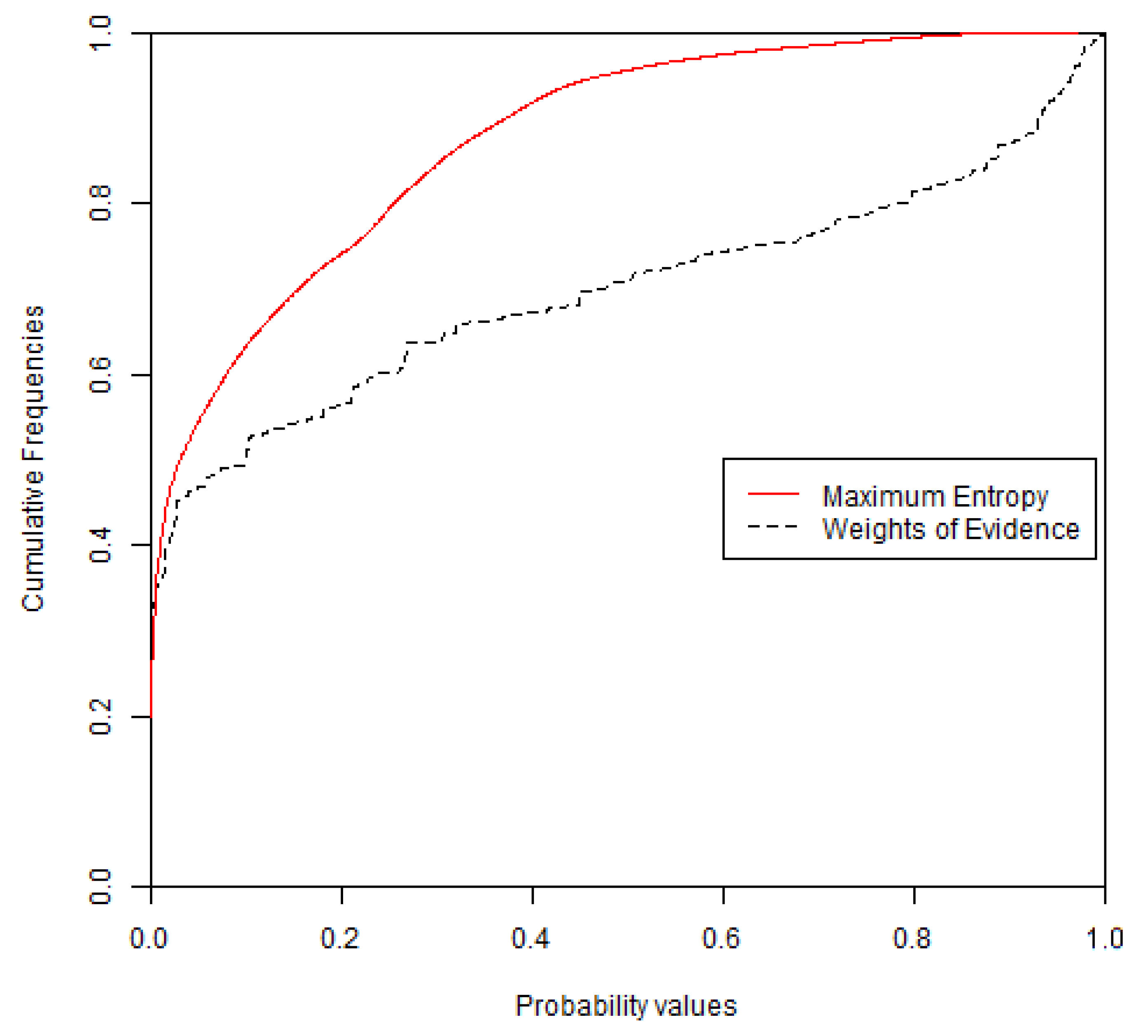
Figure 7,
Figure 8 show the probability maps and cumulative distribution functions (CDFs) obtained from WofE and MaxEnt. The probability map obtained with the WofE method has less continuous values because this method used categorical maps obtained by reclassifying continuous explanatory variables. About 97% of the MaxEnt cells have probability values below 0.6, while 74% of the WofE cells have probability values below 0.6.
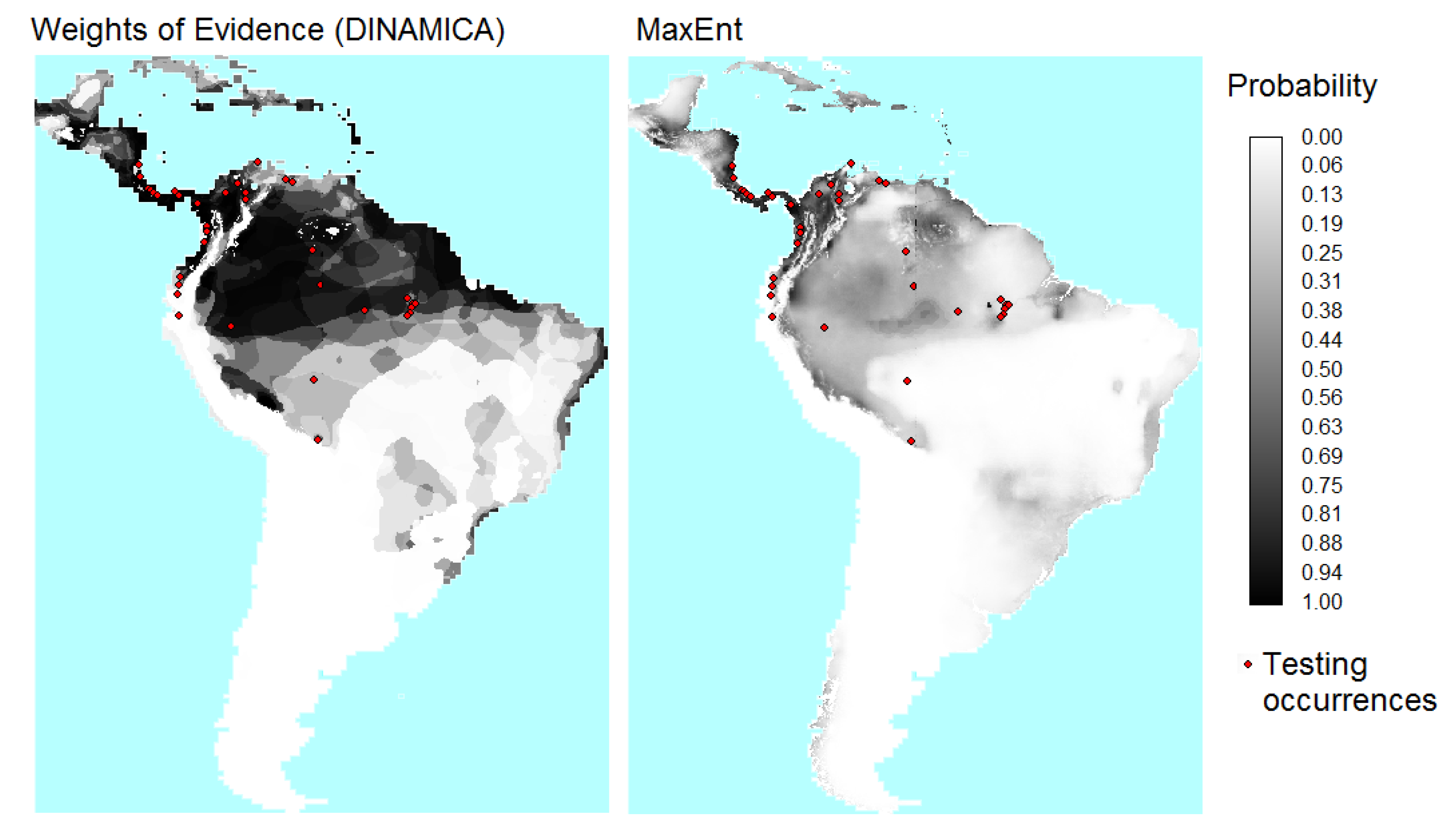
Figure 7.
Maps of probability of presence of B. variegatus obtained by Weights of Evidence (WofE) and MaxEnt methods.
Figure 7.
Maps of probability of presence of B. variegatus obtained by Weights of Evidence (WofE) and MaxEnt methods.
Figure 8.
Cumulative distribution functions (CDFs) for the probability maps from WofE and MaxEnt. The vertical axis is the proportion of the candidate region that has a probability values less than or equal to the value on the horizontal axis.
Figure 8.
Cumulative distribution functions (CDFs) for the probability maps from WofE and MaxEnt. The vertical axis is the proportion of the candidate region that has a probability values less than or equal to the value on the horizontal axis.
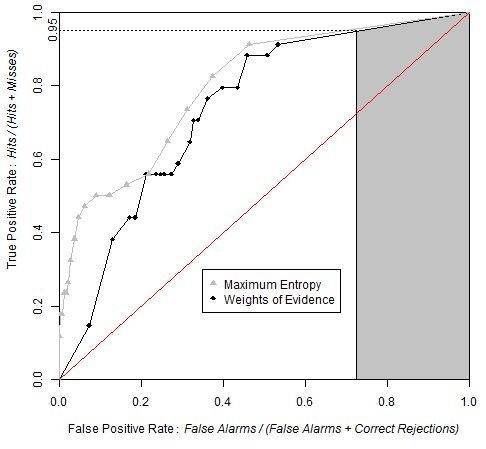
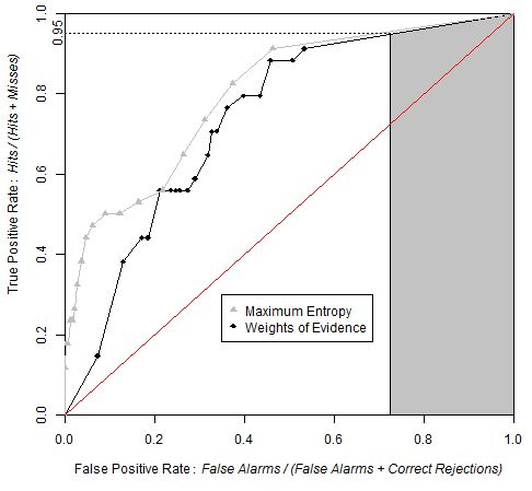
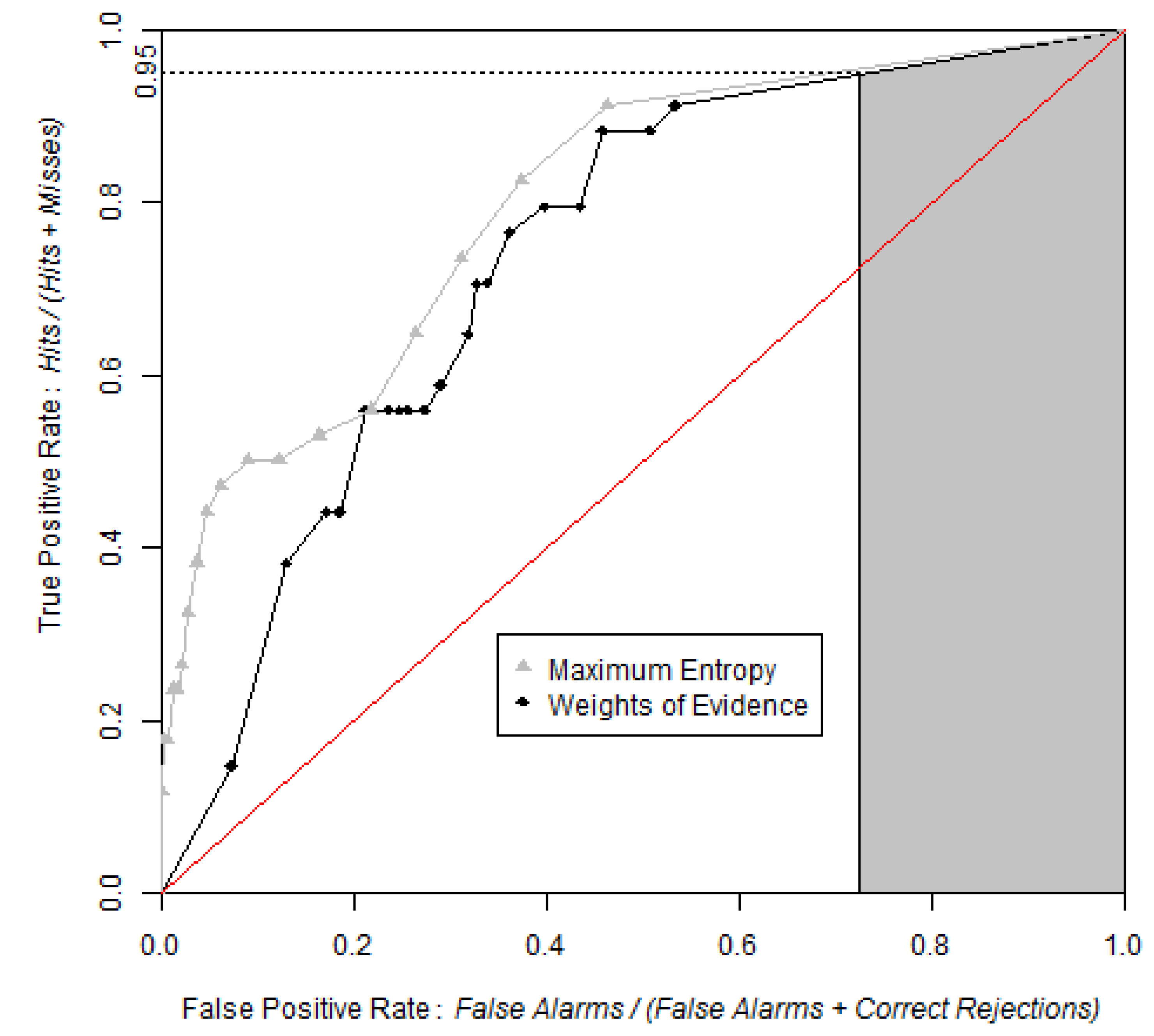
Figure 9 shows that the ROC curve from MaxEnt rises more abruptly than that of the WofE. The shape of the curve near the origin indicates that high probability areas from MaxEnt capture more presence cells than high probability areas obtained from WofE. Both curves are very close near the upper right of the ROC curve, which demonstrates that low probabilities correspond to areas where the species is absent.
The exact value of AUC obtained from the two methods was computed using the package pROC [
8], which uses the linear scan algorithm described by [
7]. AUC was computed as 0.7478 and 0.8110 respectively for WofE and MaxEnt.
Table 2 shows the values of AUC calculated using four threshold increments for the equal probability increment method and for the equal area increment method along with the difference between these values and the exact AUC value (in % of exact value). The results obtained using 100 and 20 bins have differences of less than 2% (equal probability increment), while results based on 10 and 5 bins are less accurate estimates (error between 2% and 10% for equal probability increment). The use of resampled data does not affect the AUC estimates importantly. The method used to threshold the probability map has a larger effect than the number of bins. Both approaches led to systematic underestimation of the AUC, while the underestimation is more severe for method that uses equal area increments, for our case study (Error between 0.3% and 9.3% and between 5.9% and 24.6% for equal probability and equal area increments respectively).
Figure 9.
ROC curves obtained by WofE and MaxEnt methods. Grey shaded area represents partial AUC of WofE model between 0.95 and 1 on the True Positive Rate axis. The pAUCs are similar for WofE and MaxEnt, which indicates that the probability maps are similar concerning where the relatively lower probabilities are allocated.
Table 2.
AUC values obtained using various thresholds increments and slicing methods on entire and resampled data. Exact values of AUC are 0.7478 and 0.8110 for WofE and MaxEnt respectively. Number between parentheses is the estimate’s error expressed as the relative difference between the value and the exact value (in % of the exact value).
Equal Probability Increments
Equal Probability Increments
| AUC | Based on Entire Data | | Based on Resampled Data | |
|---|
| Number of bins | 100 | 20 | 10 | 5 | 100 | 20 | 10 | 5 |
| WofE | 0.746
(−0.3) | 0.739
(−1.2) | 0.734
(−1.8) | 0.709
(−5.3) | 0.746
(−0.3) | 0.738
(−1.3) | 0.734
(−1.9) | 0.709
(−5.2) |
| MaxEnt | 0.806
(−0.6) | 0.800
(−1.3) | 0.782
(−3.6) | 0.737
(−9.2) | 0.805
(−0.7) | 0.800
(−1.4) | 0.781
(−3.7) | 0.736
(−9.3) |
Equal Area Increments
| AUC | Based on Entire Data | | Based on Resampled Data | |
|---|
| Number of bins | 100 | 20 | 10 | 5 | 100 | 20 | 10 | 5 |
| WofE | 0.704
(−5.9) | 0.687
(−8.1) | 0.665
(−11.1) | 0.656
(−12.3) | 0.703
(−6.0) | 0.687
(−8.1) | 0.665
(−11.1) | 0.657
(−12.2) |
| MaxEnt | 0.71
(−11.8) | 0.674
(−16.9) | 0.636
(−21.5) | 0.611
(−24.6) | 0.715
(−11.9) | 0.674
(-16.9) | 0.636
(−21.6) | 0.611
(−24.6) |
Table 3 shows AUClower and AUCupper computed with four different equal probability increments (0.01, 0.05, 0.10 and 0.20), implying four different bin sizes (100, 20, 10 and 5). We used the entire study area and the probability map from WofE. As expected, at coarse slicing increments, the uncertainty of AUC estimate is large (0.5952–0.8218 for 5 bins) and decreased considerably using narrower intervals (0.7299–0.7617 for 100 bins). The effect of the intervals used to slice the probability image can be appreciated in
Figure 10.
We calculated partial AUC for the range between 0.95 and 1 on the True Positive Rate (vertical) axis as suggested by [
10]. Finally, we calculated confidence intervals for AUC and pAUC through the bootstrap percentile interval method with 2,000 replicates and then tested the difference in AUC and pAUC values between the two models (
Table 4).
Table 3.
Values of upper, trapezoidal, and lower AUC at various numbers of bins for the equal probability increment method.
Table 3.
Values of upper, trapezoidal, and lower AUC at various numbers of bins for the equal probability increment method.
| Number of Bins |
|---|
| 100 | 20 | 10 | 5 |
| AUC upper | 0.7617 | 0.7780 | 0.8006 | 0.8218 |
| AUC | 0.7458 | 0.7385 | 0.7341 | 0.7085 |
| AUC lower | 0.7299 | 0.6990 | 0.6676 | 0.5952 |
Figure 10.
Trapezoidal, lower and upper ROC curves from the same probability map with 0.05 (Left) and 0.2 (Right) slicing increments. When the threshold increment is 0.2, the number of bins is 5.When the threshold increment is 0.05, the number of bins is 20.
Figure 10.
Trapezoidal, lower and upper ROC curves from the same probability map with 0.05 (Left) and 0.2 (Right) slicing increments. When the threshold increment is 0.2, the number of bins is 5.When the threshold increment is 0.05, the number of bins is 20.
Table 4.
AUC and partial AUC values along with their confidence interval using alpha = 0.05 obtained using WofE and MaxEnt. Partial AUC was calculated between 0.95 and one in the True Positive Rate (vertical) axis, values reported are normalized.
Table 4.
AUC and partial AUC values along with their confidence interval using alpha = 0.05 obtained using WofE and MaxEnt. Partial AUC was calculated between 0.95 and one in the True Positive Rate (vertical) axis, values reported are normalized.
| Software | Index | Inferior bound | Index Value | Superior bound |
|---|
| WofE | AUC | 0.6618 | 0.7382 | 0.8055 |
| MaxEnt | AUC | 0.7231 | 0.7996 | 0.8706 |
| WofE | pAUC | 0.7798 | 0.9051 | 0.9979 |
| MaxEnt | pAUC | 0.8352 | 0.9179 | 0.9990 |
The test used to compare the AUCs and pAUCs obtained from both models indicated that the AUC obtained from MaxEnt is significantly different from the AUC obtained from the WofE (Z = 1.73, two tailed p-value = 0.084). However there is no significant difference between the two pAUCs (Z = 0.00, two tailed p-value = 0.999). This indicates that if potential distribution maps are obtained by applying a threshold in the probability maps at a probability corresponding to a true positive rate of 0.95, then both MaxEnt and WofE will produce potential distribution maps that capture similar areas and number of occurrences points.
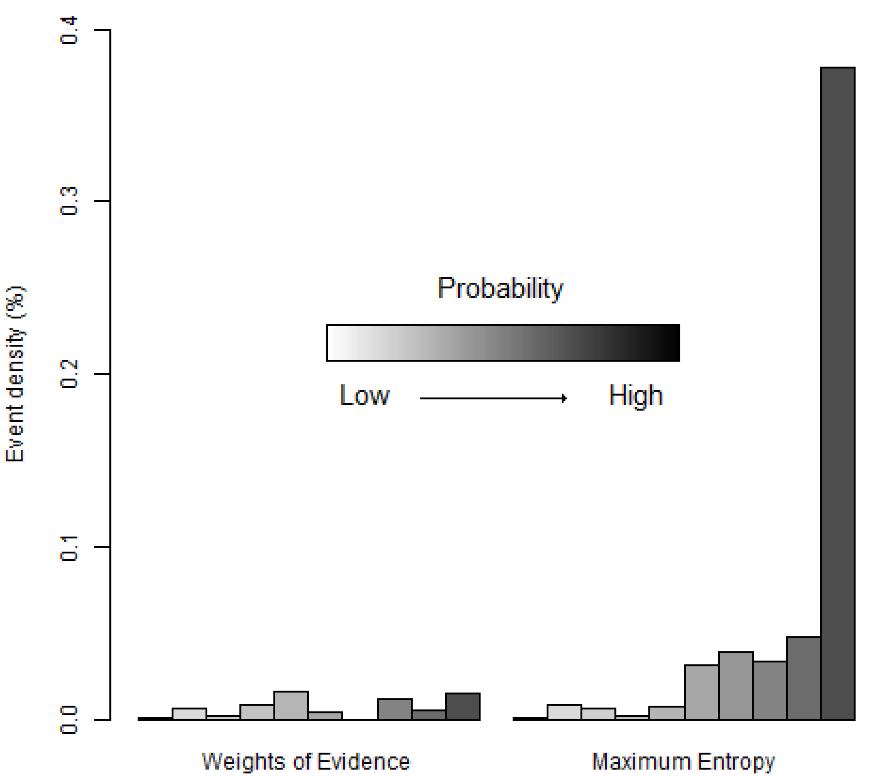
Another way to compare the two probability maps is assessing the density of occurrence points in each bin (
Figure 11).
Figure 11 shows that the high probability bins of MaxEnt have a greater density of occurrence points than the corresponding high probability bins of WofE. This is consistent with the ROC curve of MaxEnt that rises more abruptly near the origin of the ROC space than the ROC curve of WofE (
Figure 9).
Figure 11.
Density of species occurrence expressed as a proportion (%) in each bin (Equation (5)). Bins are ordered with lower probabilities on the left and higher probabilities on the right using the equal probability increment method.
Figure 11.
Density of species occurrence expressed as a proportion (%) in each bin (Equation (5)). Bins are ordered with lower probabilities on the left and higher probabilities on the right using the equal probability increment method.

 ,
, 


