
Patient and Clinician Experiences with Sharing Data Visualizations Integrated into Mental Health Treatment

Department of Psychiatry, Beth Israel Deaconess Medical Center, Harvard Medical School, 330 Brookline Ave, Boston, MA 02115, USA
*
Author to whom correspondence should be addressed.
Soc. Sci. 2023, 12(12), 648; https://doi.org/10.3390/socsci12120648
Submission received: 23 August 2023
/
Revised: 10 November 2023
/
Accepted: 15 November 2023
/
Published: 22 November 2023
(This article belongs to the Special Issue Technological and Digital Interventions for Mental Health and Wellbeing: Useful, Usable, and Safe?)
Abstract
:Digital mental health tools can collect vast amounts of data, but little research has been conducted on the impact of visualizing and sharing these data with patients in a clinical setting. In this study, semi-structured interviews were conducted via a HIPAA compliant platform with 10 patients and 5 clinicians in a digital mental health clinic about their experience with the integration of personal data visualizations into care. These interviews, spanning from April 2023 to July 2023, centered around the utility, meaningfulness, and clarity of the visualizations. The qualitative data were subsequently analyzed through an inductive approach for thematic analysis. Themes identified from patient interviews included the ability of visualizations to encourage reflection and action while also providing validation and motivation. Both clinicians and patients noted the importance of having an intermediary (digital navigator) to assist in interpreting the visualizations. The type of visualization preferred by patients varied from patient to patient. Overall, our findings highlight the value of utilizing visualizations in clinical care as a clear and effective way to communicate personal health data to patients and clinicians, suggesting the benefit of continued co-design with all parties.
1. Introduction
Since the COVID-19 pandemic, the popularity of digital mental health tools, specifically smartphones, has increased due to their scalability and convenience for managing mental health conditions (Torous et al. 2020). Given that smartphones are able to capture novel real-time, scalable, longitudinal data on behaviors (e.g., sleep, step count) and symptoms (e.g., surveys), interest in using these devices as new tools to develop a more holistic picture of each individuals’ mental health has also expanded (Lenze et al. 2023). Often called digital phenotyping (Torous et al. 2016), the potential of smartphones to gather novel behavioral data has shown promising results in monitoring various illnesses ranging from depression (Chang et al. 2023) to schizophrenia (Cohen et al. 2023). However, while these data are the focus of numerous ongoing research efforts, they are rarely shared back with participants and even less frequently used in clinical encounters. This is because despite the potential offered by digital phenotyping, transforming raw data into meaningful and actionable visualizations remains a less explored field of study.
The need for the visualization of digital phenotyping data is clear. As a simple example, if a patient agrees to share access to their smartphone accelerometry and geolocation data at 1 Hz so that clinicians can use those data to infer patters of sleep and home time, over 5 million data points would be captured in the course of one month. While summary statistics such the average amount of sleep duration or home time are useful, visualizations offer a compelling case for helping clinicians and patients share, explore, and discuss this vast amount of data (van Os et al. 2017; Polhemus et al. 2022).
The current literature already supports the fact that data visualizations have the potential to increase engagement and effectively communicate underlying trends in patient data (van Os et al. 2017; Polhemus et al. 2022). Recent studies on visualizations of personal healthcare data indicate that visuals can help patients transition from low to high health literacy, increase communication between patients and healthcare providers, facilitate more informed healthcare decisions, and enable quicker data comprehension (Brewer et al. 2012; Kim 2022). Additionally, effective visuals may enhance users’ trust and willingness to share their smartphone data, as they are provided a transparent view of how this information is being utilized and integrated into their care (Scheuer and Torous 2022).
Yet the unique nature of digital phenotyping data has resulted in, to date, limited efforts to visualize them. Beyond the sheer size of the data, the temporal and personal/sensitive nature of the data present novel considerations. In a prior study, our team found that effective data visualizations can increase patients’ understanding of digital biomarkers (e.g., sleep, step count) and help patients feel more comfortable sharing these biomarker data with care teams (Kim 2022). This demonstrates the utility of visualizations for increasing patient comfort with data sharing. However, this study did not address the personal utility that can be provided to both patients and clinicians when integrating data visualizations with clinical care. In addition, many data visualizations have been tailored primarily for healthcare providers (as was the case in this prior study), and less research has been dedicated towards making visualizations more effective and accessible to patients or understanding how visuals can benefit the provider–patient relationship (Faiola and Newlon 2011; Daley et al. 2013; Stadler et al. 2016; West et al. 2014; Wilbanks and Langford 2014; Turchioe et al. 2019).
Given that there is not a “one-size-fits-all” rule for visualizations and little research on the patient and clinician experience of visualizations utilized in mental healthcare, the need for expanded research is clear. In this study, we aim to address this gap by conducting interviews with both patients and clinicians about their experience with visuals being integrated into their care. We hope to ascertain patients’ thoughts and feelings about visual comprehension and usability as well as gain insights from clinicians about the benefits and challenges of implementing these visuals during sessions with patients. Results will enable the continued co-design of improved visualizations.
2. Materials and Methods
2.1. Procedures
Ten participants in this study were recruited from the Digital Clinic, a hybrid telehealth clinic that treats patients with moderate-to-severe anxiety and/or depression at Beth Israel Deaconess Medical Center (BIDMC) in Boston, MA. A paper detailing the specifics of the Digital Clinic was previously published, showing some of the visualizations utilized in the clinic (Macrynikola et al. 2023). Patients received care from the clinic for eight weeks. For the first two weeks, they utilized a mental health smartphone app, mindLAMP, that was developed by the Division of Digital Psychiatry at BIDMC. In addition to utilizing the app, they met with a digital navigator. The digital navigator introduced patients to the app and its features, encouraged the patient to complete assigned surveys and activities within the app, and troubleshooted any technical issues. Over the following six weeks, patients attended weekly sessions with their clinician to receive treatment in accordance with the Unified Protocol while continuing to engage with the app and meet weekly with their digital navigator. Through a predetermined timeframe of April 2023 to June 2023, all patients (35) who concluded their treatment at the clinic were invited to participate in this study during their last digital navigator meeting or through email. Twenty-five declined or did not respond. Participant characteristics are depicted in Table 1. From June 2023 to July 2023, all five clinicians of the clinic were asked to participate. IRB approval was received from Beth Israel Deaconess Medical Center (BIDMC IRB #2003P000231).
2.2. MindLAMP and Cortex
The mindLAMP app collected both survey data and passive data from each patient’s smartphone. Passive data are data collected by smartphone sensors and include metrics such as step count, amount of time spent at home, and duration of sleep. Additionally, participants received notifications to complete both daily and weekly surveys on the app. Surveys measured various mental health indicators including mood, anxiety levels, and quality of sleep. More information about the development of the app was previously published (Vaidyam et al. 2022).
All of the visualizations were generated utilizing the programming language Python in Jupyter Notebook. Cortex, a data analysis toolkit developed by the Division of Digital Psychiatry at BIDMC, was utilized to extract data from mindLAMP/participants’ smartphones. The documentation on and more information regarding Cortex can be found (Division of Digital Psychiatry at BIDMC 2023). Once the data were extracted, visualizations were created using the following Python libraries: Matplotlib (Hunter 2007), Seaborn (Waskom 2021), Plotly (Hossain 2019), and Vega-Altair (VanderPlas et al. 2018). Digital navigators presented the visualizations of the data collected to the patients during in-person or video visits in their course of care.
2.3. Researcher Characteristics
We acknowledge that researcher background may influence findings in qualitative studies; as such, we provide a brief overview of the authors’ backgrounds. At the time of the study, SC, LG, and NA were female research assistants working full-time in the same digital psychiatry lab. Their work revolved around integrating smartphone technology into mental healthcare. They were all under the age of 30 with college degrees. To reduce bias, interviewers had no prior relationships with the participants.
2.4. Semi-Structured Interviews
All authors developed an interview guide collaboratively with a clinician familiar with the Digital Clinic. The questions were designed to assess participants’ opinions of the visualizations and whether these visualizations impacted their treatment. Each of the five clinicians on the Digital Clinic team were also interviewed. Clinicians were presented with visualizations from a patient they had worked with in the clinic who had already completed care. Interview questions aimed to assess clinician’s opinions of the visualizations and determine to what extent clinicians incorporated them into care. A copy of both interview guides is provided in the Supplementary Materials (File S2).
LG, SC, and NA conducted the semi-structured interviews from April 2023 to July 2023 through a HIPAA-compliant virtual conferencing platform. Participants were informed that they would be interviewed by a member of the Division of Digital Psychiatry at BIDMC with whom they had not interacted before. Verbal consent was provided immediately prior to the start of each interview.
Interviews began with each participant completing a six-question survey measuring their graph literacy. The survey questions for this study were developed by LG and SC and are attached in the Supplementary Materials (File S1). Each of the questions is multiple choice, and a higher score indicates higher graph literacy. To check their understanding, participants were then asked to explain the types of data collected with mindLAMP. Participants were shown visualizations of their data collected during their time in the Digital Clinic. The types of visualizations fell under five categories; exemplary graphs for each category are provided in Table 2.
2.5. Data Analysis
Interviews were recorded on password-protected smartphones and were transcribed verbatim to password-protected hospital computers. All transcriptions were de-identified, and all audio recordings were deleted after transcriptions were complete.
Qualitative data analysis was conducted through inductive thematic analysis in accordance with Braun and Clarke’s framework (Braun and Clarke 2006). Initially, researchers NA and SC familiarized themselves with the data by listening to the audio recordings numerous times, re-reading transcripts, and noting down initial ideas. They then independently coded the transcripts line by line, deriving codes inductively. Subsequently, NA and SC reviewed their codes together and resolved any discrepancies through discussion with all authors. NA and SC then grouped initial codes to produce larger themes, arriving at similar themes. Themes were discussed by all authors and compared to interview transcripts to ensure their encompassment of the data. The definition of each theme and the analytical narrative were refined through discussions with all authors.
3. Results
Ten former Digital Clinic patients and five clinicians participated in interviews for this study. The average length of patient interviews was 19 min. The average length of clinician interviews was 15 min.
3.1. Patient-Focused Results
3.1.1. Quantitative Results
Patients were asked during their interviews if they understood the visualizations, if they found the visualizations meaningful, and if they found the data presented in the visualizations to be accurate. These results are presented in Table 3 below.
3.1.2. Most/Least Meaningful Visuals
Visuals that were listed as most meaningful by patients included the longitudinal symptom line graphs (listed by four participants); the correlation matrix the calendar charts, and the passive data bar graphs (each listed by two participants); and the radar plots (listed by one participant). One participant was not sure which visual they found to be the most meaningful. The majority of patients (eight of ten) stated that all visualizations were relevant. These results are presented in Figure 1.
3.1.3. Graph Literacy Survey
All patients completed the graph literacy survey, with the results indicating high graph literacy. Seven participants answered every question correctly. Three participants each answered a different question incorrectly.
3.1.4. Thematic Analysis
Thematic analysis identified three themes: (1) prompt reflection and action, (2) the visuals provided validation and motivation, and (3) the need for a digital navigator. Exemplary quotes are provided in Table 4 below.
Patients reported that the data visualizations had a myriad of impacts such as prompting them to reflect on past experiences, validating current emotions, visualizing any progress made during treatment, confirming trends between behaviors and their mood that they had already been aware of, and helping highlight new trends. Many reported that the visualizations accurately reflected personal events. This enhanced emotional and behavioral awareness empowered patients towards actionable change, motivating some to pursue receiving more care opportunities during and after their time in the Digital Clinic.
To fully utilize the potential benefits described above, patients reported the need for digital navigators. Many patients discussed the importance of putting data into a personal context, which digital navigators are equipped to do. Several patients also preferred human connection over reliance on technology, which digital navigators help support. Finally, digital navigators can initiate improvements recommended by patients, which include simplifying some of the visualizations, providing more in-depth explanations of data collection earlier in treatment, and troubleshooting technical difficulties.
3.2. Clinician-Focused Results
Due to the small sample size of five, the clinician interviews are summarized individually. The clinicians were a mix of M.S. in Counseling Psychology students, a clinician with a PhD in Health Psychology and Clinical Sciences, and a Counseling Psychology Doctoral candidate.
Clinician 1:
This clinician noted that the majority of the graphs were understandable and intuitive. They observed that the visualizations initiated “conversation points”, and “In terms of patient care, [the visualizations have] brought new opportunities to notice different patterns as well as showing somebody’s progression in treatment.” However, despite the additional insights the visuals provided, the clinician did not utilize them in clinical settings often.
Clinician 2:
This clinician stated that they understood the visualizations and would look at radar plots before patient sessions. Sometimes, they would look at other visuals if directed towards those by the digital navigator. For patients with “large fluctuations” in symptoms, the clinician found it helpful to review their patient’s past survey scores. They did not incorporate visualizations including passive data into care, noting that patients did not bring up issues or goals related to passive data features, and also brought up behaviors such as nail picking which were not reflected in the visualizations.
Clinician 3:
This clinician stated that they understood the visualizations but still found the digital navigator insights helpful and would discuss the trends noted by the digital navigator with patients. The accuracy of the visualizations was high, but dependent upon patient engagement and compliance with app data and survey collection.
Clinician 4:
This clinician found that the visualizations were easy to understand with the exception of the graphs combining passive and active data (combined line and bar graph). While the clinician understood that graph, it was not as digestible, requiring more time to “come out with anything meaningful”. They found that the reports rarely, if ever, augmented patient care. This clinician did show patients their longitudinal symptom improvement, but overall preferred to use the visualizations less due to lack of ease in bringing them into care. They deemed the visualizations to be somewhat accurate. Regarding usability, this clinician reported the visualizations were easy to read, giving a score of 9/10.
Clinician 5:
This clinician reported the visualizations to be, in general, understandable. They found the visualizations “motivational” and “stimulating” for patients and that they could be utilized to help patients work towards their goals. In particular, looking at the radar plots helped the clinician make decisions about how they introduced the course of care or approached building certain skills with the patient. They mentioned that the visualizations sparked conversations and, given the Digital Clinic’s short course of care, helped to guide and focus the patient’s treatment. They noted that, in some cases, they were wary of how bringing up certain visualizations may impact patients or cause them to become frustrated due to perceived lack of progress.
4. Discussion
4.1. General
In this study, we assessed how both patients and clinicians use digital phenotyping data visualizations in the context of mental healthcare. The majority of patients found the personalized data visualizations to be understandable, meaningful, and accurate. Upon qualitative data analysis of participants’ interviews, three central themes were identified: (1) prompt reflection and action, (2) validation and motivation, and (3) the need for a digital navigator.
The first theme, “prompt reflection and action”, underscores the potential for visualizations to encourage deeper self-reflection and proactive behavioral changes, a finding that is consistent with the current literature (van Os et al. 2017; Polhemus et al. 2022; Grossman et al. 2018). These visual tools allow patients to monitor symptoms longitudinally and better understand digital biomarkers (Scheuer and Torous 2022) and outcomes (Grossman et al. 2018). Our results support these findings as 9 of 10 of the participants reported comprehending their data, with some also appreciating insights gained from the visualizations. Participants felt that the visuals not only enhanced their understanding of their condition but also prompted them to reflect on their emotions and behaviors. This also aligns with the previous literature, which suggests that data visualizations can provide insights that may enhance emotional self-awareness, allowing individuals to better manage their mental health. The second theme centered on the ability of visualizations to both validate and motivate patients to make changes. Multiple participants felt validated upon seeing their experiences visually represented. Clinician 5 also noticed that patients often derived motivation from this practice, an observation in line with the current literature (Wu et al. 2020). The visuals provide a tangible representation of patient progress and challenges and encourage patients to actively engage in their treatment (Grossman et al. 2018). Currently, there is a lack of research on the impact of visualizations on patient validation and motivation, two crucial components of care that can enhance therapeutic outcomes and promote trust (Scheuer and Torous 2022; Henson et al. 2019). This represents a promising area for future research.
The need for a digital navigator was another theme that emerged in this study. Participants consistently shared that having someone explain the data visualizations and highlight specific trends was helpful. Three clinicians (Clinicians 2, 3, and 4) echoed this sentiment, further emphasizing the importance of digital navigator support in incorporating these visuals into care, especially given the time constraints clinicians may face in reviewing visualizations before clinical sessions. Our findings align with prior research which concluded that data interpretation must be enhanced in order for the integration of patient-generated health data into care to be successful. Digital navigators may be able to fill this gap. Our findings also indicate that while the needs of each individual (patient or clinician) varied, digital navigators can help bridge needs and ensure that the visualizations are understandable, relevant, and interpreted in the proper clinical and cultural context. This has profound implications for the role digital navigators could play in increasing healthcare equity as technology assumes a more dominant role in healthcare. Despite all participants scoring highly on the graph literacy survey, some still reported difficulty in understanding the data in a way that was relevant to their everyday lives. Digital navigators can alleviate this burden on patients by explaining the data and visualizations to the patient. In a field such as psychiatry where different activities and habits may affect individuals in different ways, personalized data interpretation is even more critical. Overall, our findings introduce an additional dimension to the existing literature, which supports having digital navigators or other human support in the integration of technology into mental healthcare (Noel et al. 2019; Ben-Zeev et al. 2015; Mohr et al. 2019).
In addition to the three main themes, there were other notable findings around the consensus of preferred visualization or the potential for harm.
There was no clear consensus on the type of graph or diagram preferred by participants or clinicians. This corroborates past studies that visualizations should not be approached as “one-size-fits-all;” rather, different methods of visualizing data may be useful for different people depending on their background and goals (Polhemus et al. 2022; Wu et al. 2020).
Overall, clinicians reported that the majority of visualizations were understandable and provided new insights about the behaviors and symptomology of their patients. Clinicians found the visualizations useful for initiating conversations with patients, tracking symptom progress, and motivating patients. Three clinicians (Clinicians 1, 3, and 5) specifically referred to the visuals acting as conversation points or prompts. This illustrates the potential for visualizations to be clinically useful by assisting the clinician in broaching certain questions or conversation topics.
While the sharing of health data often imparts benefits, our results do raise concerns about potential harm. For example, Clinician 5 expressed concerns about the impact certain visualizations may have on some patients (i.e., patients becoming frustrated due to a perceived lack of progress as displayed in visualizations). The visual representation, particularly of heightened depression or anxiety symptoms, could inadvertently exacerbate a patient’s condition. Although the specific negative repercussions of having access to data visualizations have yet to be explored, similar challenges have been brought up in regard to Open Notes. Preliminary evidence has shown that Open Notes, the now common practice of patients having unhindered access to their clinical notes, has the potential to cause harm via the nocebo effect (Blease 2022). This supports the need for a digital navigator who can assist patients in interpreting visualizations, ensuring that they are a beneficial tool rather than a source of distress. As digital phenotyping methods continue to generate more data, further efforts to assess its role and impact in treatment will be necessary. In particular, studies could be conducted to investigate any potential negative impacts of patients having access to such visualizations.
4.2. Limitations
This study has limitations. All participants scored very highly on the graph literacy survey, which may indicate that our results may be biased towards people with a higher baseline of graph literacy. Furthermore, participant characteristics did not represent the general population, affecting the generalizability of the results. Finally, as the Digital Clinic is a telehealth-based hybrid care model, results may not be transferable to populations receiving in-person care. Future research with larger and more diverse sample sizes across diverse clinical settings is essential to gain a deeper understanding of the potential role of visualizations in healthcare.
5. Conclusions
With the large amounts of data available today through digital phenotyping, finding ways for patients and clinicians to benefit from these data is paramount. Utilizing visualizations in clinical care offers an effective and digestible way for both patients and clinicians to observe patterns and trends that can help inform care and promote independent patient growth. Due to the vast number of variables that can be collected from smartphones, as well as people having different levels of graph literacy, having an intermediary such as a digital navigator who can help both patients and clinicians interpret visualizations is crucial in order for the visuals to have the maximum benefit.
Supplementary Materials
The following supporting information can be downloaded at: https://www.mdpi.com/article/10.3390/socsci12120648/s1, File S1: Graph literacy survey; File S2: Patient and clinician interview guides.
Author Contributions
Conceptualization, J.T. and S.C.; methodology, J.T., S.C., L.G., N.A.; software J.T., L.G., S.C.; validation, J.T., S.C., L.G., N.A.; formal analysis, J.T., S.C., L.G., N.A.; investigation, J.T., S.C., L.G., N.A.; resources, J.T.; data curation, J.T., S.C., L.G., N.A.; writing—original draft preparation, J.T., S.C., L.G., N.A.; writing—review and editing, J.T., S.C., L.G., N.A.; visualization, J.T., S.C., L.G., N.A.; supervision, J.T.; project administration, J.T., S.C., L.G., N.A.; funding acquisition, J.T. All authors have read and agreed to the published version of the manuscript.
Funding
This research was supported by the Sydney Baer Jr. Foundation.
Institutional Review Board Statement
The study was conducted in accordance with the Declaration of Helsinki, and approved by the Institutional Review Board of Beth Israel Deaconess Medical Center (BIDMC #2003P000231).
Informed Consent Statement
Informed consent was obtained from all subjects involved in the study.
Data Availability Statement
The data presented in this study are available on request from the corresponding author. The data are not publicly available due to privacy concerns and IRB regulations around this protocol.
Conflicts of Interest
The authors declare no conflict of interest.
References
- Ben-Zeev, Dror, Robert Drake, and Lisa Marsch. 2015. Clinical technology specialists. BMJ 350: h945. [Google Scholar] [CrossRef]
- Blease, Charlotte. 2022. Sharing online clinical notes with patients: Implications for nocebo effects and health equity. Journal of Medical ethics 49: 14–21. [Google Scholar] [CrossRef]
- Braun, Virginia, and Victoria Clarke. 2006. Using thematic analysis in psychology. Qualitative Research in Psychology 3: 77–101. [Google Scholar] [CrossRef]
- Brewer, Noel T., Melissa B. Gilkey, Sarah E. Lillie, Bradford W. Hesse, and Stacey L. Sheridan. 2012. Tables or bar graphs? presenting test results in Electronic Medical Records. Medical Decision Making 32: 545–53. [Google Scholar] [CrossRef] [PubMed]
- Chang, Sarah, Lucy Gray, and John Torous. 2023. Smartphone app engagement and clinical outcomes in a hybrid clinic. Psychiatry Research 319: 115015. [Google Scholar] [CrossRef]
- Cohen, Asher, John A. Naslund, Sarah Chang, Srilakshmi Nagendra, Anant Bhan, Abhijit Rozatkar, Jagadisha Thirthalli, Ameya Bondre, Deepak Tugnawat, Preethi V. Reddy, and et al. 2023. Relapse prediction in schizophrenia with smartphone digital phenotyping during COVID-19: A prospective, three-site, two-country, Longitudinal Study. Schizophrenia 9: 6. [Google Scholar] [CrossRef]
- Daley, Kate, Jonathan Richardson, Ian James, Annette Chambers, and David Corbett. 2013. Clinical dashboard: Use in older adult mental health wards. The Psychiatrist 37: 85–88. [Google Scholar] [CrossRef]
- Division of Digital Psychiatry at BIDMC. 2023. LAMP Platform. June 28. Available online: https://docs.lamp.digital/ (accessed on 1 August 2023).
- Faiola, Anthony, and Chris Newlon. 2011. Advancing Critical Care in the ICU: A human-centered biomedical data visualization systems. In Ergonomics and Health Aspects of Work with Computers. International Conference, EHAWC 2011, Orlando, FL, USA, 9–14 July 2011. Berlin/Heidelberg: Springer, pp. 119–28. [Google Scholar] [CrossRef]
- Grossman, Lisa V., Steven K. Feiner, Elliot G. Mitchell, and Ruth M. Masterson Creber. 2018. Leveraging Patient-Reported Outcomes Using Data Visualization. Applied Clinical Informatics 9: 565–75. [Google Scholar] [CrossRef]
- Henson, Philip, Pamela Peck, and John Torous. 2019. Considering the Therapeutic Alliance in Digital Mental Health Interventions. Harvard Review of Psychiatry 27: 268–73. [Google Scholar] [CrossRef]
- Hossain, Shammamah. 2019. Visualization of bioinformatics data with Dash Bio. Paper presented at the 18th Python in Science Conference, Austin, TX, USA, July 8–14; vol. 126, p. 133. [Google Scholar]
- Hunter, John D. 2007. Matplotlib: A 2D graphics environment. Computing in Science & Engineering 9: 90–95. [Google Scholar] [CrossRef]
- Kim, Sung-Hee. 2022. A systematic review on visualizations for self-generated health data for daily activities. International Journal of Environmental Research and Public Health 19: 11166. [Google Scholar] [CrossRef] [PubMed]
- Lenze, Eric, John Torous, and Patricia Arean. 2023. Digital and precision clinical trials: Innovations for testing mental health medications, devices, and psychosocial treatments. Neuropsychopharmacology. [Google Scholar] [CrossRef]
- Macrynikola, Natalia, Nicolas Nguyen, Erlend Lane, Shirley Yen, and John Torous. 2023. The Digital Clinic: An innovative mental health care delivery model utilizing hybrid synchronous and asynchronous treatment. NEJM Catalyst 4: 9. [Google Scholar] [CrossRef]
- Mohr, David C., Stephen M. Schueller, Kathryn N. Tomasino, Susan M. Kaiser, Nameyeh Alam, Chris Karr, Jessica L. Vergara, Elizabeth L. Gray, Mary J. Kwasny, and Emily G. Lattie. 2019. Comparison of the Effects of Coaching and Receipt of App Recommendations on Depression, Anxiety, and Engagement in the IntelliCare Platform: Factorial Randomized Controlled Trial. Journal of Medical Internet Research 21: e13609. [Google Scholar] [CrossRef]
- Noel, Valerie A., Elizabeth Carpenter-Song, Stephanie C. Acquilano, John Torous, and Robert E. Drake. 2019. The technology specialist: A 21st century support role in clinical care. NPJ Digital Medicine 2: 61. [Google Scholar] [CrossRef] [PubMed]
- Polhemus, Ashley, Jan Novak, Shazmin Majid, Sara Simblett, Daniel Morris, Stuart Bruce, Patrick Burke, Marissa F. Dockendorf, Gergely Temesi, and Til Wykes. 2022. Data visualization for chronic neurological and Mental Health Condition Self-management: Systematic review of User Perspectives. JMIR Mental Health 9: e25249. [Google Scholar] [CrossRef] [PubMed]
- Scheuer, Luke, and John Torous. 2022. Usable data visualization for digital biomarkers: An analysis of usability, Data Sharing, and clinician contact. Digital Biomarkers 6: 98–106. [Google Scholar] [CrossRef]
- Stadler, Jennifer G., Kipp Donlon, Jordan D. Siewert, Tessa Franken, and Nathaniel E. Lewis. 2016. Improving the efficiency and ease of healthcare analysis through use of data visualization dashboards. Big Data 4: 129–35. [Google Scholar] [CrossRef]
- Torous, John, Keris Jän Myrick, Natali Rauseo-Ricupero, and Joseph Firth. 2020. Digital Mental Health and COVID-19: Using technology today to accelerate the curve on access and quality Tomorrow. JMIR Mental Health 7: 3. [Google Scholar] [CrossRef]
- Torous, John, Matthew V. Kiang, Jeanette Lorme, and Jukka -P. Onnela. 2016. New Tools for New Research in Psychiatry: A Scalable and customizable platform to empower data driven smartphone research. JMIR Mental Health 3: e5165. [Google Scholar] [CrossRef]
- Turchioe, Meghan R., Annie Myers, Samuel Isaac, Dawon Baik, Lisa V. Grossman, Jessica S. Ancker, and Ruth M. Creber. 2019. A systematic review of patient-facing visualizations of personal health data. Applied Clinical Informatics 10: 751–70. [Google Scholar] [CrossRef]
- Vaidyam, Aditya, John Halamka, and John Torous. 2022. Enabling research and clinical use of patient-generated health data (the mindLAMP Platform): Digital phenotyping study. JMIR mHealth and uHealth 10: e30557. [Google Scholar] [CrossRef]
- van Os, Jim, Simone Verhagen, Anne Marsman, Frank Peeters, Maarten Bak, Machteld Marcelis, Marjan Drukker, Ulrich Reininghaus, Nele Jacobs, Tineke Lataster, and et al. 2017. The experience sampling method as an mHealth tool to support self-monitoring, self-insight, and personalized health care in clinical practice. Depress Anxiety 34: 481–93. [Google Scholar] [CrossRef]
- VanderPlas, Jacob, Brian Granger, Jeffrey Heer, Dominik Moritz, Kanit Wongsuphasawat, Arvind Satyanarayan, Eitan Lees, Ilia Timofeev, Ben Welsh, and Scott Sievert. 2018. Altair: Interactive statistical visualizations for python. Journal of Open Source Software 3: 1057. [Google Scholar] [CrossRef]
- Waskom, Michael. 2021. Seaborn: Statistical data visualization. Journal of Open Source Software 6: 3021. [Google Scholar] [CrossRef]
- West, Vivian L., David Borland, and W. Ed Hammond. 2014. Innovative Information Visualization of Electronic Health Record Data: A systematic review. Journal of the American Medical Informatics Association 22: 330–39. [Google Scholar] [CrossRef] [PubMed]
- Wilbanks, Bryan A., and Patsy A. Langford. 2014. A review of dashboards for data analytics in nursing. CIN: Computers Informatics Nursing 32: 545–49. [Google Scholar] [CrossRef] [PubMed]
- Wu, Danny T. Y., Chen Xin, Shwetha Bindhu, Catherine Xu, Jyoti Sachdeva, Jennifer L. Brown, and Heekyoung Jung. 2020. Clinician Perspectives and Design Implications in Using Patient-Generated Health Data to Improve Mental Health Practices: Mixed Methods Study. JMIR Formative Research 4: e18123. [Google Scholar] [CrossRef]
Figure 1.
Most useful types of charts as reported by patients.


Table 1.
Participant characteristics.
| Sample Characteristics | N (%) | Mean | SD | |
|---|---|---|---|---|
| Age (years), mean (SD) | 37 | 10.7 | ||
| Gender | ||||
| Male | 5 (50%) | |||
| Female | 5 (50%) | |||
| Race | ||||
| White | 8 (80%) | |||
| Asian | 2 (20%) | |||
| Total | 10 | |||
Table 2.
Chart types.
| Visual Type | Example |
|---|---|
| Passive Data Bar Graphs | 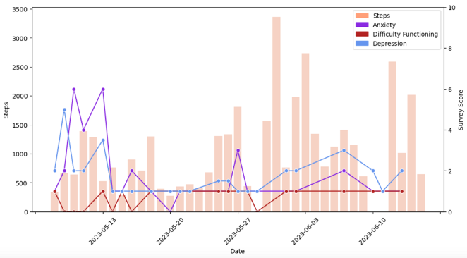 |
| Correlation Matrices | 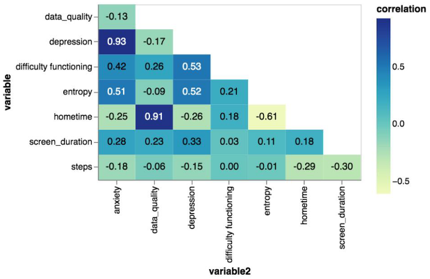 |
| Calendar Charts |  |
| Longitudinal Symptom Graphs | 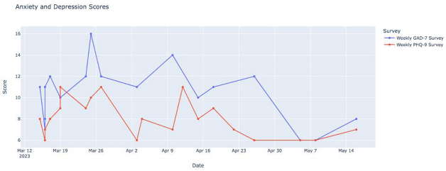 |
| Radar Plots | 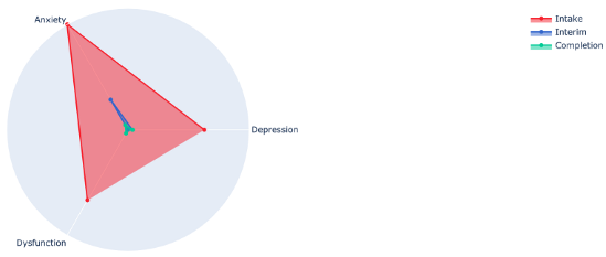 |
Table 3.
Responses to questions asked during the interview.
| Yes (%) | No (%) | |
|---|---|---|
| Understood the visualizations | 9 (90%) | 1 (10%) |
| Found the visualizations meaningful | 9 (90%) | 1 (10%) |
| Found the data/visualizations accurate | 9 (90%) | 1 (10%) |
Table 4.
Thematic analysis results.
| Theme | Quote |
|---|---|
| Prompt reflection and action | I like that they just create a record and show trends because with depression and anxiety you can get into a little bit of a fog sometimes and they just show like I said the trends and they can also show milestones and if you’re feeling like you’re doing better and you’re actually doing better and not just in your head |
| The various surveys were really helpful to see like the trends within those because I had a lot of personal things going on during this time that I was in this that were really stressful in different ways and being able to see how those outside events were like directly related like if I went back and looked at the timing was helpful | |
| I mean it shows on a screen something that I might not even notice is happening or so it’s good to see it like that. If it’s not good stuff I change it–my ways or whatever–to be better so it’s definitely interesting to see it | |
| Again, I guess because it just defines when you are feeling something at the moment you don’t really maybe can define it but then when you look back you can think about it a little bit more and try to understand what’s happening | |
| Validation and motivation | It was just incredibly validating. It just confirmed that my response was consistent to the sort of severity of the circumstances. |
| The graphs just kind of proved it to me that the sleep disturbances were really affecting how the depression affected me during the day. […] So that was important when I saw that sleep was definitely a big effect on the long COVID and the depression and everything. | |
| Need for digital navigator | I’ve done these kinds of surveys before. Not very often, but I’ve had my data collected before because I’m quite the complicated patient. People like to study me. I think this one [study] was very nice though because I got a very good explanation of the data afterwards. And that made the difference. That it wasn’t straining to figure out what all the information meant |
| Thank you for taking the time to go through the results. Especially the last three charts so now I feel like my life has changed, so thank you. | |
| I mean like it’s definitely helpful if someone can explain what the graph means for you and maybe can point out, maybe you have this problem sleeping at this like this particular time period |
Disclaimer/Publisher’s Note: The statements, opinions and data contained in all publications are solely those of the individual author(s) and contributor(s) and not of MDPI and/or the editor(s). MDPI and/or the editor(s) disclaim responsibility for any injury to people or property resulting from any ideas, methods, instructions or products referred to in the content. |
© 2023 by the authors. Licensee MDPI, Basel, Switzerland. This article is an open access article distributed under the terms and conditions of the Creative Commons Attribution (CC BY) license (https://creativecommons.org/licenses/by/4.0/).
Share and Cite
MDPI and ACS Style
Chang, S.; Gray, L.; Alon, N.; Torous, J. Patient and Clinician Experiences with Sharing Data Visualizations Integrated into Mental Health Treatment. Soc. Sci. 2023, 12, 648. https://doi.org/10.3390/socsci12120648
AMA Style
Chang S, Gray L, Alon N, Torous J. Patient and Clinician Experiences with Sharing Data Visualizations Integrated into Mental Health Treatment. Social Sciences. 2023; 12(12):648. https://doi.org/10.3390/socsci12120648
Chicago/Turabian StyleChang, Sarah, Lucy Gray, Noy Alon, and John Torous. 2023. "Patient and Clinician Experiences with Sharing Data Visualizations Integrated into Mental Health Treatment" Social Sciences 12, no. 12: 648. https://doi.org/10.3390/socsci12120648
Note that from the first issue of 2016, this journal uses article numbers instead of page numbers. See further details here.