Case Studies of Environmental Visualization
by
 and
and
Panagiotis Patlakas
1,*, 
Georgios Koronaios
2,
Rokia Raslan
3,
Gareth Neighbour
1 and
Hasim Altan
4 1
School of Engineering and the Built Environment, Birmingham City University, 15 Bartholomew Row, Birmingham B5 5JU, UK
2
Hodkinson Consultancy, 59-65 Lowlands Road, Harrow HA1 3AW, UK
3
Institute for Environmental Design and Engineering (IEDE), University College London, 14 Upper Woburn Place, London WC1H 0NN, UK
4
Department of Architectural Engineering, University of Sharjah, P. O. Box 27272 Sharjah, UAE
*
Author to whom correspondence should be addressed.
Energies 2017, 10(10), 1459; https://doi.org/10.3390/en10101459
Submission received: 23 August 2017
/
Revised: 15 September 2017
/
Accepted: 19 September 2017
/
Published: 21 September 2017
(This article belongs to the Special Issue Selected Papers from ZEMCH 2016: Building Energy Performance Evaluation/Simulation)
Abstract
:The performance gap between simulation and reality has been identified as a major challenge to achieving sustainability in the Built Environment. While Post-Occupancy Evaluation (POE) surveys are an integral part of better understanding building performance, and thus addressing this issue, the importance of POE remains relatively unacknowledged within the wider Built Environment community. A possible reason that has been highlighted is that POE survey data is not easily understood and utilizable by non-expert stakeholders, including designers. A potential method by which to address this is the visualization method, which has well established benefits for communication of big datasets. This paper presents two case studies where EnViz (short for “Environmental Visualization”), a prototype software application developed for research purposes, was utilized and its effectiveness tested via a range of analysis tasks. The results are discussed and compared with those of previous work that utilized variations of the methods presented here. The paper concludes by presenting the lessons drawn from the five-year period of EnViz, emphasizing the potential of environmental visualization for decision support in environmental design and engineering for the built environment, and suggests directions for future development.
1. Introduction
1.1. Sustainability and the Performance Gap
Sustainability and climate change have arguably been two of the core concerns of the scientific community over the last decades. The importance of buildings in achieving the former and controlling the latter has been recognized by policymakers, as reflected on the various initiatives on a national [1], international [2], and global level [3]. A wide number of support actions, including educational drives, subsidies, and others, have been offered in order to support sustainability in buildings in its various guises. Within the Built Environment community, the issue is often described in terms of Building Performance, which is meant to include the effects of buildings both on the environment (e.g., in terms of energy consumption) and on the occupants (e.g., in terms of thermal comfort or health effects). Originally a topic of mostly academic interest in the 1950s and 1960s, Building Performance is now a fundamental concern in design education, research, and practice. However, despite this considerable interest and engagement from all parties, the desired outcomes have as of yet remained partially elusive, and the efforts to achieve the desired energy efficiency continue to increase [4].
This partial underachievement stems partly from the process followed in the contemporary design process of energy-efficient buildings. As is common in other aspects of building design, such as structural design, and in contrast with engineering disciplines such as mechanical engineering, environmental design rarely relies on the construction and experimental testing of design prototypes. Instead, a suggested design is modelled digitally, and its environmental performance and impact is then simulated using appropriate software, a process often referred to as Building Performance Simulation (BPS) [5]. In the past two decades, technological advances and the widespread adoption of computing has resulted in the development of a range of software packages that aspire to move the field of building simulation and evaluation from academia into mainstream design practice. A key assumption of such packages is that the simulation model is sufficiently accurate to provide decisive guidance to designers, and thus promotes sustainable and climate-sensitive designs over ones that are less so, while remaining within the client’s budget. This assumption is also shared by influential [6] environmental rating systems such as the American Leadership in Energy and Environmental Design (LEED), and the British Building Research Establishment—Environmental Assessment Method (BREEAM) systems, which allow the use of digital BPS tools [7].
However, researchers have identified a number of issues with these tools. Firstly, variations and inconsistencies exist both in the energy consumption figures calculated by the digital BPS tools, but also in the importance assigned to these figures by the rating systems [8]. More importantly, buildings whose design relied on such software, and whose real-world performance was measured, were found to under-perform significantly. A decade ago, the term “credibility gap” was first used to describe the difference between the expectations at the design stage and the energy use of a building post-occupancy [9]. Today, the phenomenon is considered to be widespread enough that this disparity, now more commonly referred to as the “performance gap”, is largely taken for granted, and addressing it is considered to be a major aim of research in the field [10]. These disparities can be extremely high, with studies identifying ratios of actual-to-predicted use of 200–380% [11,12,13].
1.2. The Importance of Post-Occupancy Evaluation
Defined by Zimring and Reizenstein in 1980 as an “examination of the effectiveness for human users of occupied design environments” [14], Post-Occupancy Evaluation (POE) is now an all-encompassing term for surveys that aim to systematically monitor and evaluate the actual performance of a completed building or infrastructure work. POE surveys can be categorized into two main types: psychological, where largely subjective aspects are recorded, such as the occupants’ or users’ experience and satisfaction, and physical, where ‘hard’ data is measured and analyzed [15]. A major part of the latter POE surveys focuses on environmental issues, measuring properties such as temperature, relative humidity, concentration of CO2 particles, illuminance levels, etc. [16,17,18].
The benefits of POE analysis are multiple. Firstly, an understanding of the performance of a building can assist owners, facility managers, users, and other building stakeholders in optimizing their behavior to achieve what can be considered “ideal” environmental performance [19]. Secondly, designers and engineers can evaluate actual performance (as opposed to intended performance), and thus have a robust evidence base against which they can benchmark heuristically the accuracy of simulation processes and efficacy of designs [20,21].
Perhaps the most important aspect, however, is that POE is necessary in order to expand the knowledge of the scientific community on the topic of building performance, and thus allow the improvement of simulation tools [12]. The loop process of design—simulation—construction—monitoring—analysis is common in most fields of engineering design, and both its theoretical importance and practical efficiency are largely considered to be routine in such fields; the generally very high level of accuracy of structural analysis and design simulations, for example, comes from exactly this approach.
However, despite all the benefits of POE for environmentally-conscious and climate-sensitive architectural design, its wider take-up remains very limited. Obvious barriers that have been well-documented include costs, both in terms of money and time, as well as conflicting incentives [22]. The lack of POE skills within the discipline has also been observed [15]. One aspect of this lack of skills involves the large amounts of data generated by modern measurement techniques, which require extensive analysis by specialists, in order to provide meaningful insights. While researchers and environmental specialists might generally be able to handle this challenge, this is not necessarily the case for other stakeholders. Building owners, facilities managers, senior managers, and architectural designers are just some examples of stakeholders who may be less inclined to believe that monitoring data are easily communicable [23]. Given that POE surveys play a fundamental part in sustainability-oriented research, it is self-evident that they need to be promoted and such barriers addressed when and where possible.
1.3. The EnViz Software
In common with many other software packages employed in Architecture, Engineering, and Construction (AEC), the various BPS software packages make major use of visualization in order to facilitate the understanding of the results by the users [24], while researchers have suggested that this also enables the use of the results in sustainable design [25]. However, there has been little effort to develop similar tools for use with POE data, and previous work tends to use an ad-hoc approach that needs to be replicated in individual buildings or in work with observational data [26,27].
EnViz (short for “Environmental Visualization”) is a prototype research-oriented software application, developed at Southampton Solent University between 2011 and 2013. Its main aim was to highlight and apply the well-established advantages of 4D visualization [28] into the field of POE analysis. The application was developed in Java SE 7, utilizing the OpenGL programming interface for three dimensional (3D) graphics [29], implemented by way of the lightweight Java game library (LWJGL) [30]. The application is stand-alone and runs on the Windows operating system; however, future plans include a web-based version implementing the WebGL framework. The 3D model file format chosen is the Collada digital asset exchange, a text-based, human-readable format, utilising the extensible mark-up language (XML). This is lightweight and editable with any free text editor, allowing easy linkage between space models and space metadata. Collada is widely supported by 3D modelling applications, including freeware such as Trimble SketchUp.
The completed software provides 4D visualization of temperature and relative humidity POE data, in a 3D-model context. Multiple models can be handled at the same time, and relevant criteria, with a respective tolerance rate (e.g., ±2 °C), can be introduced within the visualization. The application also includes the relevant Chartered Institution of Building Services Engineers (CIBSE) guidance for the UK [31].
The typical EnViz use consists of the following steps:
- input of a 3D volumetric model of the building;
- input the source data from the data loggers;
- select from/to dates of interest;
- select a real-to-model time ratio;
- (optionally) set thermal comfort criteria.
The real-to-model time ratio refers to the 4D (dynamic) visualization. Effectively, the user sets the number of minutes of model time that will be displayed in one second of animation; for example, if the user sets a 1 s:10 min ratio, six seconds of video will show one hour of data. The minimum ratio that can be set is 1 s:1 min, while there is practically no maximum (it corresponds to the maximum value of a floating variable in Java, namely (2 − 2−23)·2127 [32]).
1.4. Aims and Objectives
In previous work the software was utilized in a range of test projects and also in a series of workshops, in order to evaluate its efficacy compared to standard methods of analysis with non-expert users, and the results were documented accordingly [33]. Generally, 4D visualization was found to be a powerful tool for the communication of large volumes of data regarding the environmental conditions of buildings, allowing the understanding of such data more quickly and with greater accuracy than standard graph-based methods. In addition, EnViz users found it easier to compare between spaces and to place a specific logger reading in the related building context.
The work presented in this paper describes the findings from two new case studies, where EnViz was utilized in combination with POE surveys and design stage simulation. The main aim of the work was to complement and extend what has been done previously with new methods, thus allowing for further evaluation of the previous findings.
The objectives of the work presented in these case studies were:
- to measure the effectiveness of 4D visualization in the decision-making process, building and expanding on the approaches followed previously
- to compare design-stage simulations with POE data using 4D visualization for both approaches
- to utilize EnViz in new types of spaces and building types, in order to test further the capacity of the software
- to gauge the importance of visualization in evaluating and addressing the performance gap.
- to compare the findings of this work with what has been previously reported, to identify whether the previous results were part of a general trend, or simply a result of the methodologies employed.
2. Methodology
In order for the aims of the work to be achieved, a multi-stage process was required with different methodological requirements in each, as described below.
2.1. Building Identification and Monitoring
A fundamental requirement of the research was to involve real buildings and collect real data. This was partly required in order to be able to compare the visualizations of the BPS and the POE, but also in order to be able to apply the software to quasi-real world situations that accurately reflect professional practice. However, as the aim of the study revolves around the effectiveness of the visualization, and not in producing a comprehensive environmental study, it was not deemed necessary to monitor the buildings for the periods typically utilized in comparable studies [34]. Both studies utilized HOBO data loggers (Onset U12-012), measuring dry-blub temperature (T) at an accuracy of ±0.35°C and relative humidity (RH) at an accuracy of ±2.5%.
With regard to the selection of the buildings, the main requirement was for typologies that were fairly common, so that they accurately represented the workload of potential users of the software. Further requirements concerned the ease of obtaining permission to log data, ease of access during the study period, and a wide availability of locations suitable for placing data loggers.
2.1.1. Case Study 1
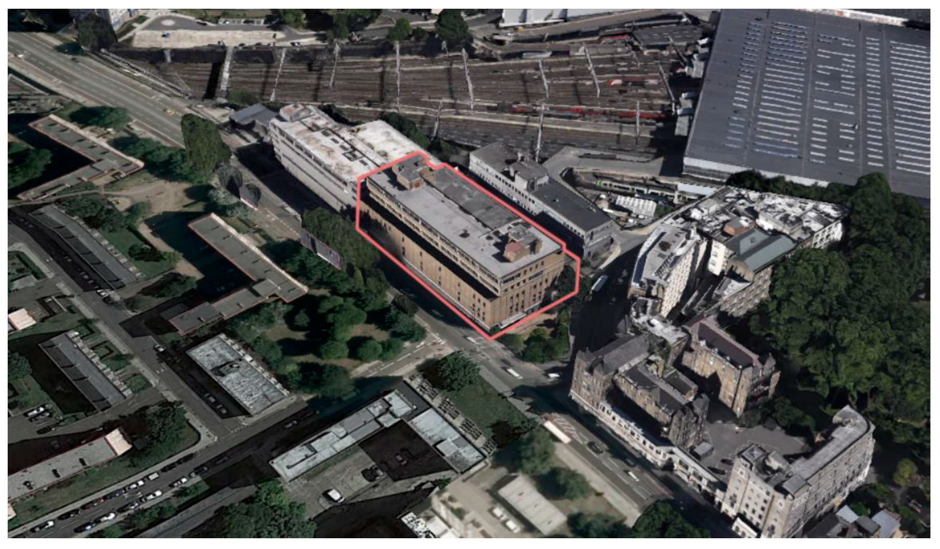
The first case study was the temporary home of the Bartlett School of Architecture of University College London (UCL), Hampstead Rd 140, in central London, UK (Figure 1). The building is a former warehouse that was refurbished to meet the needs of an educational studio/workshop space. A number of selective interviews were conducted with users of the space (students and teachers), as well as the facilities manager of the building. A key output of these interviews was that the Hampstead 140 building, and more specifically the first floor, is a temporary solution, equipped with the bare minimum, regarding cooling systems. Moreover, the overall construction, with high-floor plates, un-operable windows, and an entire section exposed to heat gains due to its uninsulated roofs, jeopardized the entire performance, creating unsuitable conditions for the occupants. As such, the space was particularly well-suited as a case study for a decision support system.
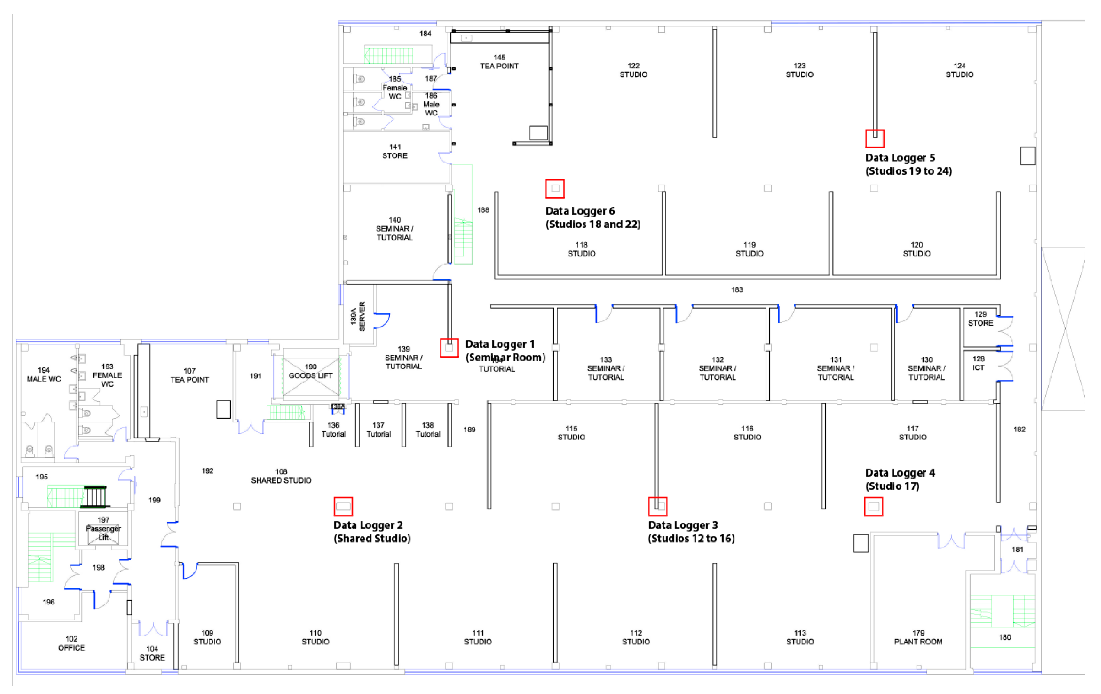
The overall rectangular plan configuration includes a lower ground level, a ground level and two additional floors. For the purpose of this study, the examination of all floors was deemed unnecessary. Therefore, the first floor, where the studios of architecture students were located, was monitored and analyzed. A total of six data loggers were placed, at a height of approximately 1.6 m (Figure 2).
The first floor is divided into two parts (east- and west-facing) which include studios divided by a series of lightweight partitions. These are separated by a row of enclosed seminar rooms and connected by two narrow corridors, which act as a barrier that slightly differentiate thermal conditions between the two zones depending on the time of day. The working and teaching spaces are serviced by a mechanical ventilation system, while the seminar rooms are fully-conditioned through a number of split air-conditioning units.
The monitored period was between the 17th and the 23th of July 2015. Dry-bulb temperature and relative humidity were measured in six spaces, with a data collection frequency of 10 min, which resulted in a total of more than 1000 measurements. The types of spaces monitored are provided in Table 1.
The POE data were then imported into EnViz, and a range of 3D (static) and 4D (dynamic) visualizations were produced. These were employed in a series of tasks to measure the effectiveness of the 4D visualizations in decision-making.
2.1.2. Case Study 2
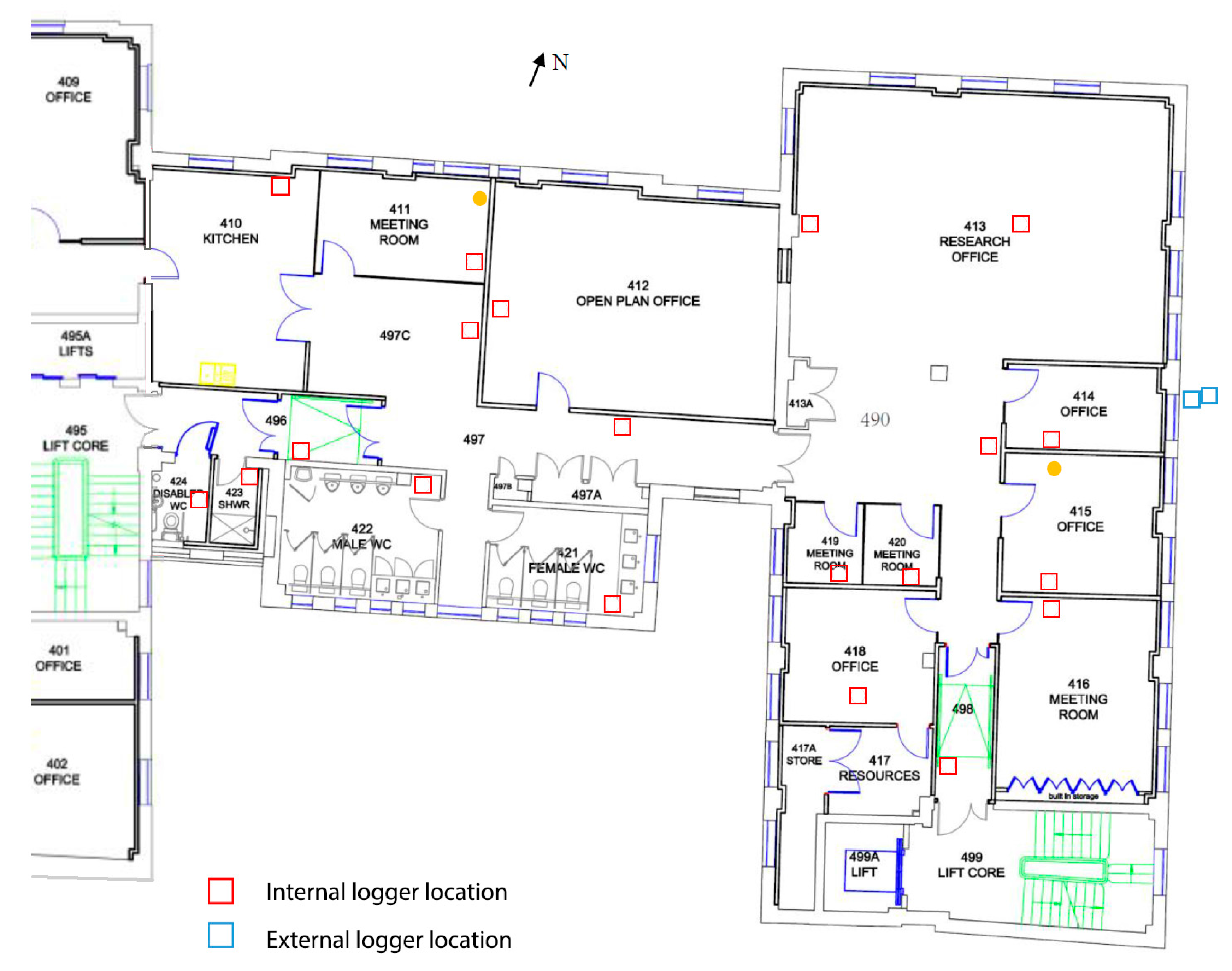
Central House, located in Euston in central London, is a building that was originally leased and then bought by UCL. The building had been recently refurbished to improve its spatial and environmental performance; however, no POE had been previously conducted to investigate its actual “base case” thermal performance beforehand.
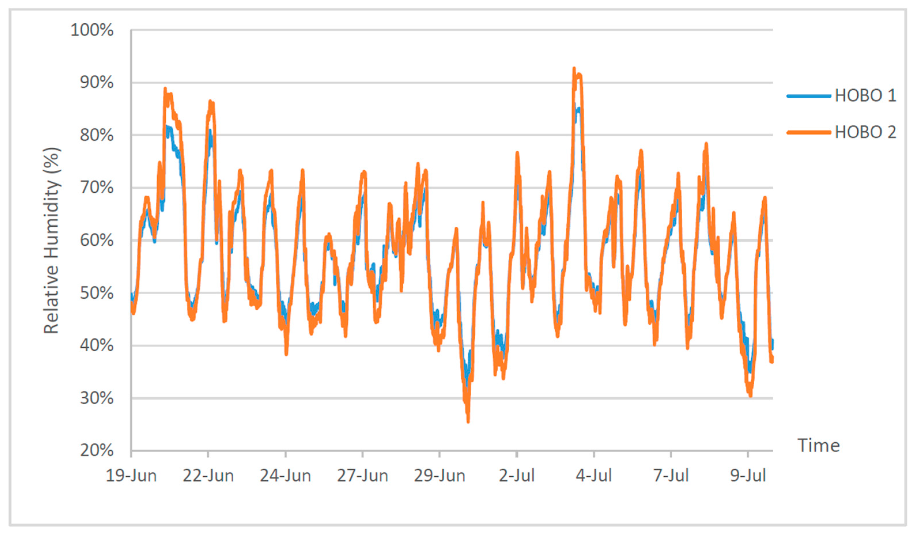
For the purposes of this study, the 4th floor of Central House was monitored. A total of 20 loggers were placed internally at the working level in a range of space types including corridors, toilet and shower rooms, meeting rooms, cellular offices, and open plan offices, as shown in Figure 3 [35]. Two further loggers were placed externally to monitor the external temperature and relative humidity during the monitoring period.
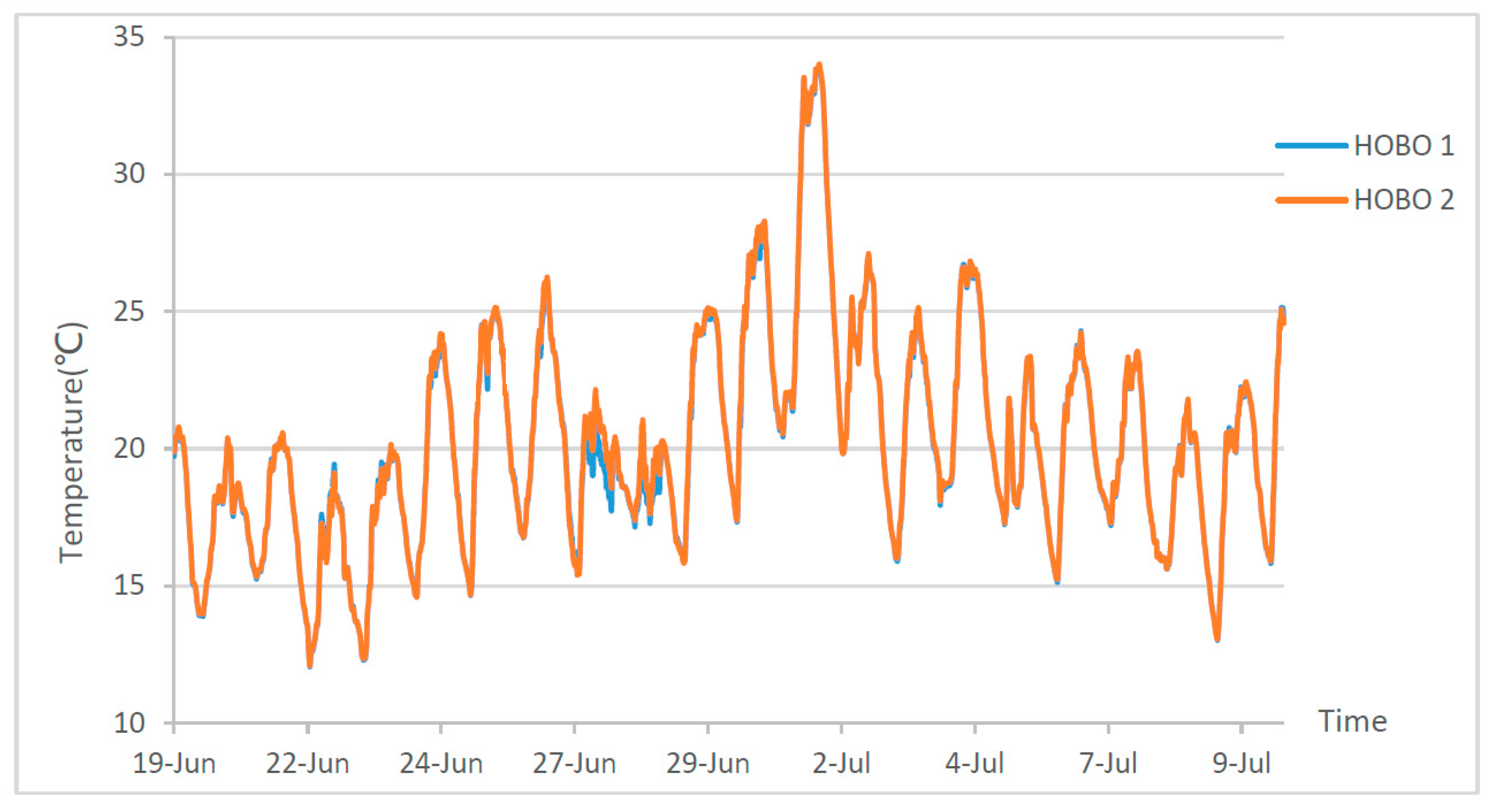
The monitoring took place between the 19th of June 2015 and the 10th of July 2015 (21 days). Dry bulb temperature and relative humidity were recorded at 15 min intervals. As before, the POE data were then imported into EnViz, and 3D/4D visualizations were produced.
2.2. Decision-Making Evaluation
One of the objectives of the work was to evaluate the effectiveness of the visualization in the decision-making process. In previous work [33], systematic Human-Computer Interaction (HCI) approaches were used, measuring Response Accuracy under a fixed Response Time, and assessing Mental Effort qualitatively [36]. Here, the intention was to address the problem from a practical, as opposed to an ontological, perspective and a mixed methods approach was utilized [37], over a series of three tasks.
All tasks intended to mimic or simulate real-world scenarios that environmental designers would face. The first two tasks were introductory and qualitative in nature, requiring participants to respond to technical questions using the EnViz output as the source of information. The objective of the first task was to identify whether participants would take action given the information of the visualization, while the objective of the second task was to gauge to what extent the interaction with the software could lead to reasonable assumptions about building performance.
The final task was more quantitative in nature and engaged participants in a “gamified” decision-making process. The particular rules of the game, as well as the gaming environment, were developed by the authors and can be found in detail in previous work [38]. In summary, participants were required to take on the role of a facilities manager, who has to decide how different building spaces perform, and decide which ones to prioritize for future maintenance and improvement.
The participants were provided with EnViz, preloaded with the data of the monitored spaces, as a decision-support tool. Some of these spaces failed to meet the required thermal comfort criteria for some periods of time. The participants were given a limited budget, appropriately selected so that it could not cover all areas, and were then asked to choose which ones they would ‘fix’ in order to meet required criteria. A further elaboration was set up, allowing participants to fix either the temperature or the relative humidity aspects in a room. Using EnViz, they had to track the changes in the coloring of the rooms, estimate their failure rates, and thus prioritize the most important spaces to “fix”. Participants’ performance (i.e., how accurate their decisions were) were intended to provide an insight into the accuracy of the conclusions drawn from the 4D visualization. The game environment is shown in Figure 4.
For this study, a group of 11 participants with specialist knowledge were chosen; namely, they were educated to at least a degree level in a Built Environment discipline, and had prior knowledge of environmental design principles. It should be noted that many of the individuals were not familiar with the case study building and none had been introduced to EnViz previously.
2.3. Survey of the Effectiveness of Visualization
A second objective of the work was to survey the effectiveness of the visualization, not only with regard to POE data as in the previous section, but also when those can be compared with BPS visualizations.
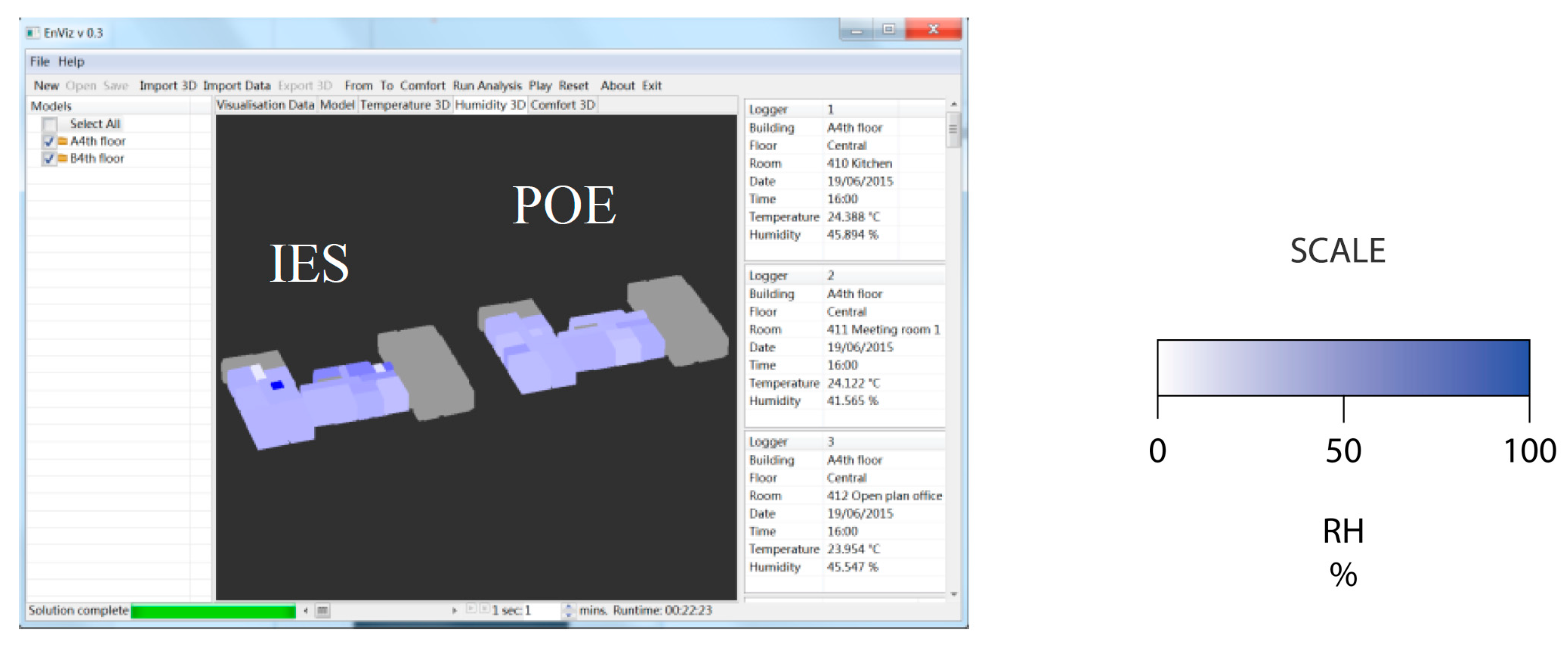
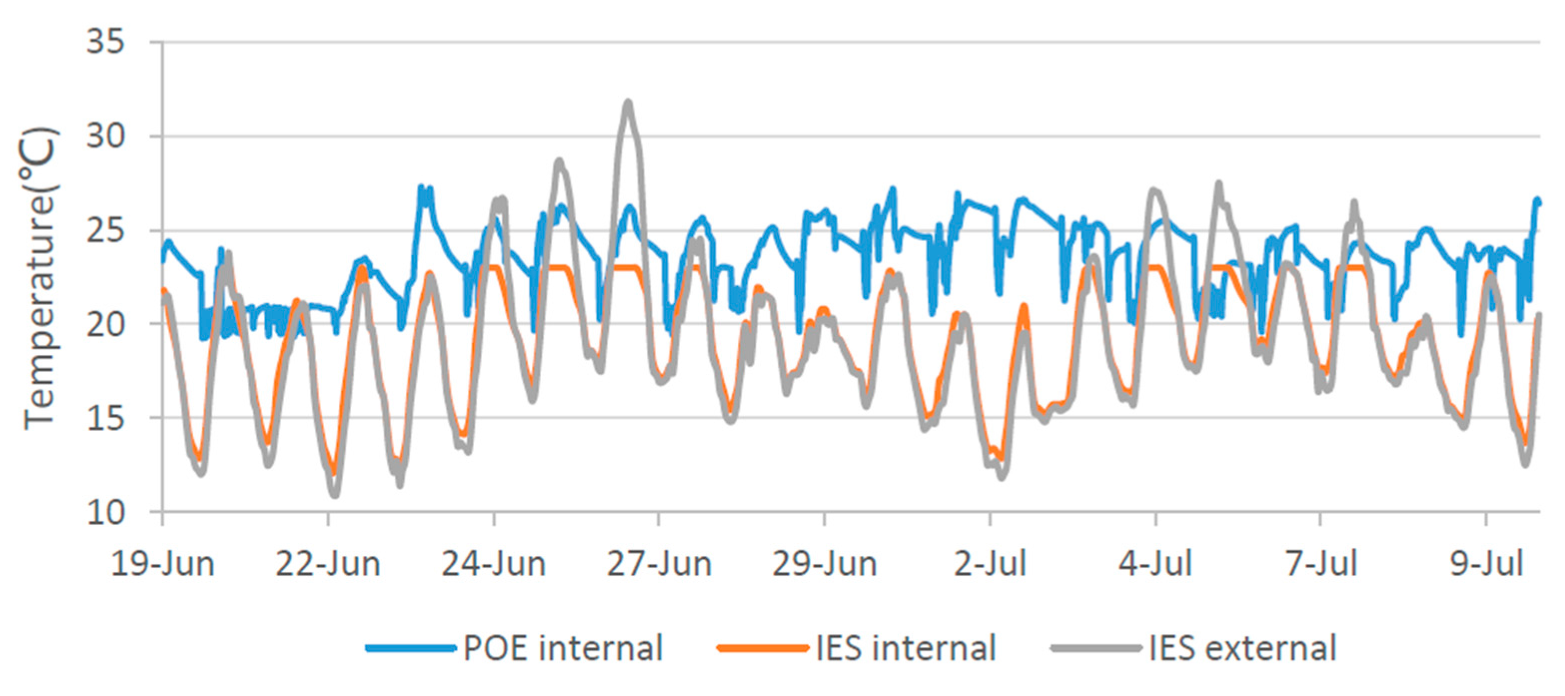
For this purpose, a thermal simulation study of the Central House building was also undertaken for the same period, using Integrated Environmental Solutions VE software (IES-VE 2014) and based on as-designed drawings and on some observation-based assumptions. The simulation included the adjacent buildings, as these were deemed to have a significant influence on the indoor environment of the monitored spaces (Figure 5).
The simulation and POE data was input into EnViz to provide a direct comparison of the simulated and the actual performance of the space during the monitored period. Some examples of the resulting visualizations are shown in Figure 6, Figure 7 and Figure 8.
Following the completion of the simulation, monitoring, and visualization process, an online survey was conducted to gauge the effectiveness of the 4D EnViz-based visualization process in communicating the comparison between the simulation and POE data, as opposed to the current state-of-the-art (typically 2D graphs and tables). Respondents were provided with three representations of the BPS and POE results from a single day. These representations were:
- a table;
- a 2D graph;
- an EnViz 3D visualization.
The questionnaire consisted of a total of 10 questions, eight of which concentrated on the direct comparison of the three approaches. A total of 100 respondents took part on the online survey. A total of 38% of respondents self-reported having been taught about indoor thermal comfort and/or more generally, environmental design and engineering. This was in line with expectations, as a number of the building users were either graduate architects or students undertaking an MSc in Environmental Design & Engineering.
3. Results & Discussion
3.1. POE Results
3.1.1. Case Study 1
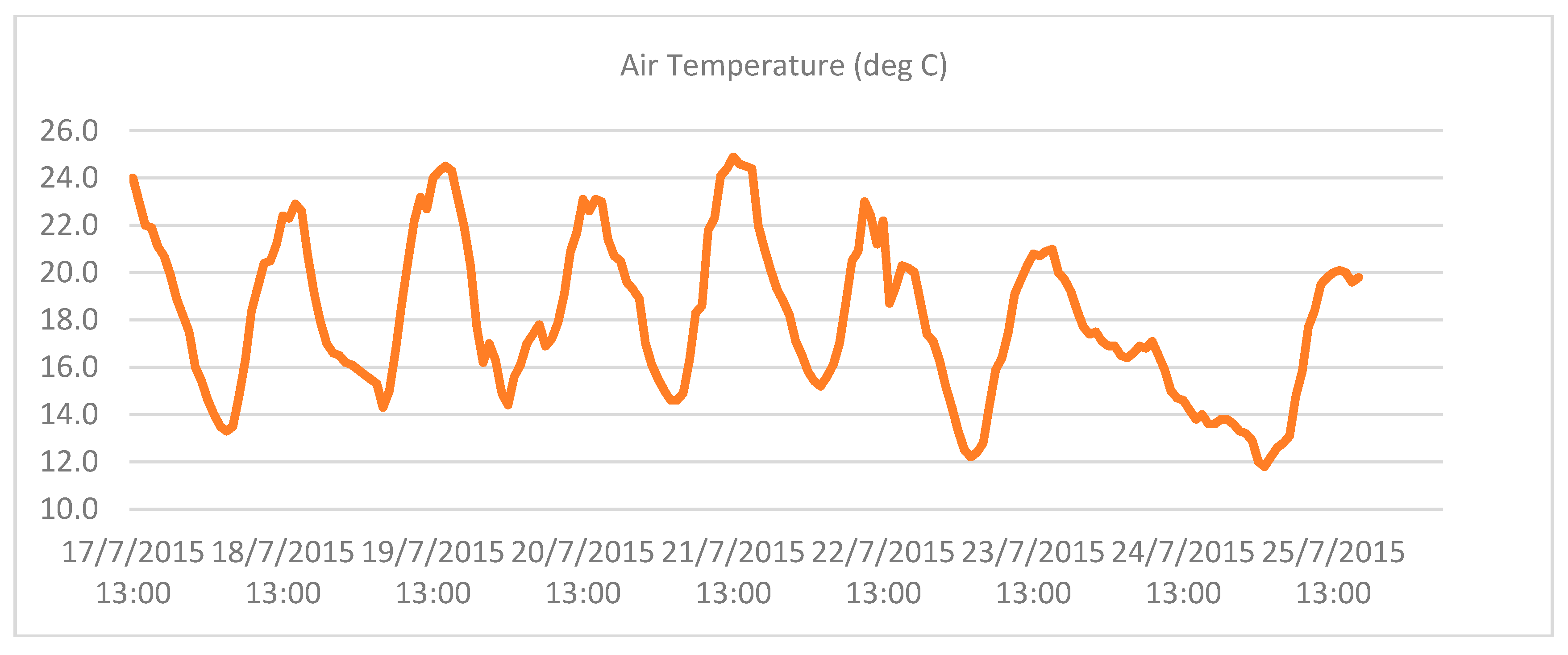
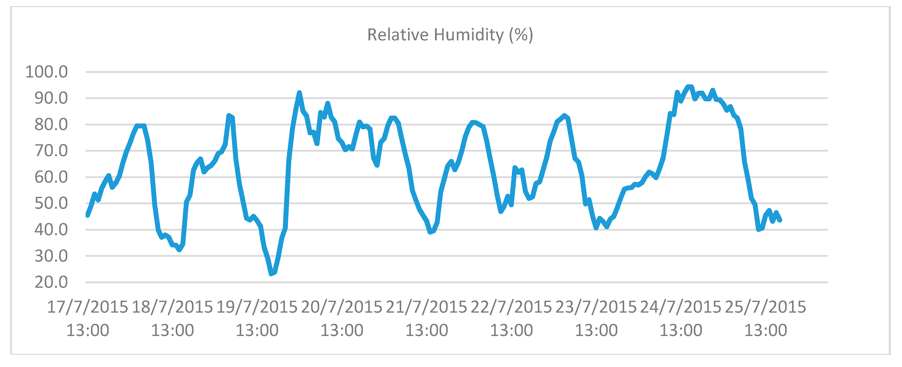
Figure 9 and Figure 10 present the fluctuations of external temperature and relative humidity in London for the monitoring period.
For the monitoring period, external temperature fluctuated between 11.8 °C and 24.9 °C, with an apparent drop in the last two days presented. The RH fluctuated between 23.2% and 94.3% with an extended rise during the last two days.
Table 2 and Table 3 present the maximum and minimum values of temperature and RH for two typical types of spaces, during the monitoring period.
As evident from the data, the spaces experienced considerable overheating throughout the 24-hour period. Similar results were found in the rest of the monitored spaces, the complete list of which can be found in Koronaios [39].
3.1.2. Case Study 2
The outdoor air temperature and relative humidity measured by the data loggers are given in Figure 11 and Figure 12 below.
Case Study 2 focused on the comparison between BPS and POE data. Sample results from two typical types of spaces are given in Figure 13 and Figure 14.
The POE survey highlighted important discrepancies between the simulated and the real performance of the building. Similar results were found in the rest of the monitored spaces, the complete list of which can be found in Sang [35]. As such, the building was a particularly useful case study for the effectiveness of visualization in comparing BPS and POE data.
3.2. Decision-Making Evaluation Study
As stated above, this consisted of three tasks, which are presented below.
3.2.1. Task 1: Decision-Making as Users
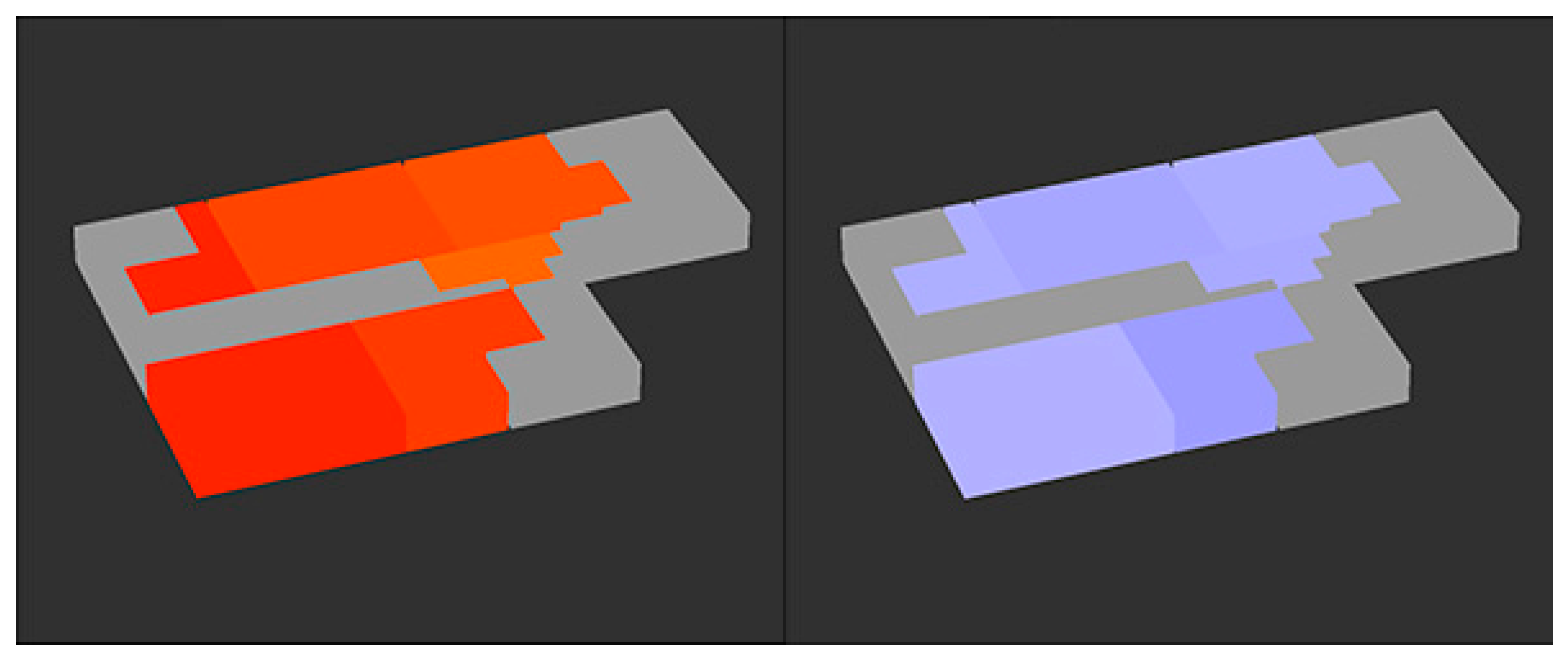
For the first task, participants were asked to decide on whether they would take any action to improve the thermal comfort of some spaces, through the evaluation of a specific 3D visualization (snapshot) and the estimation of temperatures and RH values in each monitored space. The actions available to the participants were limited to a short list, namely, in increasing scale of intervention: adjust clothes, open windows, or relocate.
A sample screenshot of the type of visualization with which the participants were provided is given in Figure 15. The participants were not provided with color maps; the intention was to test the software in the most challenging conditions possible, with the users relying solely on their intuitive understanding of the colors.
For the seminar room all participants stated that they would take no action, while for Studio 17, 10 out of 11 stated that they would relocate, and specifically to the seminar room. For the other spaces, the most frequently stated actions were to readjust clothing and open windows, in order to regulate temperature and increase RH, as the humidity was perceived by the participants to be significantly lower than it actually was.
It is interesting that participants who were not familiar with the case study showed a preference for interacting with the environment by using architectural elements (such as doors and windows) and not mechanical systems. That could be an indication that windows that open should be considered. In addition, it seemed that reading the color scale of temperature was much more successful and the decisions were instantly made. On the contrary, RH was much harder to identify and comprehend. Thus, the different color-coded scaling of the temperature visualization was much more effective for comprehension of the visualization, compared to the use of a gradient-based RH color scale. The detailed results are provided in Table 4.
3.2.2. Task 2: Introduction to EnViz
The second task attempted to gauge to what extent the interaction with the software could lead to reasonable assumptions on actual building performance. In addition, it served as an introduction to the software, so the participants could take part in the more complex third task.
Participants were presented with a 4D (dynamic) visualization of the monitored floor for the period between the 24th of July 2015, at 00:00 and the 25th of July 2015, at 15:20. Following this a range of descriptions (such as “Air conditioned”, “West facing” etc.) were presented in a random order. Participants were then tasked with the identification of the description that corresponded to each floor, by tracking the color changes in the visualization.
The success ratio for this task was 100%, which suggests that the tracking feature that showed changes in the color scale in multiple rooms provided a comparative tool that was both comprehensive and intuitive.
3.2.3. Task 3: Decision-Making as Stakeholders
As discussed in Section 2.2, Task 3 involved a game where the participants had to take the role of the facilities manager in a building with spaces of problematic performance, and decide which spaces to “fix”. They were given a limited budget, thus having to prioritize the more spaces with the biggest problems. The participants had to rely on EnViz visualizations only, and did not have access to the source POE data.
The actual failure rates of each space, derived from analysis of the POE data, are presented in Table 5.
Table 6 shows the decisions taken by the participants. Specifically, it shows the number of participants that chose to invest in fixing temperature issues (T) and relative humidity (RH) issues for each space, thus indicating they found that space problematic.
It is clear that through EnViz, the apparent overheating issue in studio 17 and the RH issues in the shared studio were identified and fixed by the participants. The space that was chosen to be fixed the most was Studio 17(10 T fixes and four RH fixes), with the shared studio following with 12 fixes, 10 of which was focused on RH. However, the optimum solution was not achieved by any participant.
The difference in the distribution between T and RH priorities by the participants, indicated that isolated examination of each of the factors (T and RH), was not very effective in providing clarity as to which rooms suffered the most. Namely, it appeared that participants misidentified spaces as failing critically with regard to humidity, when this might not have been the case. However, it is likely that this is due to lack of familiarity with the software and/or the respective color maps and thus could be easily addressed in future versions.
Interestingly, many participants decided not to spend the entire budget, suggesting that the lack of familiarity with the game led them to be conservative with the use of the virtual funds.
The full study, together with an analytic documentation of the POE measurements can be found in the work by Koronaios [39].
3.3. Survey of the Effectiveness of Visualisation Study
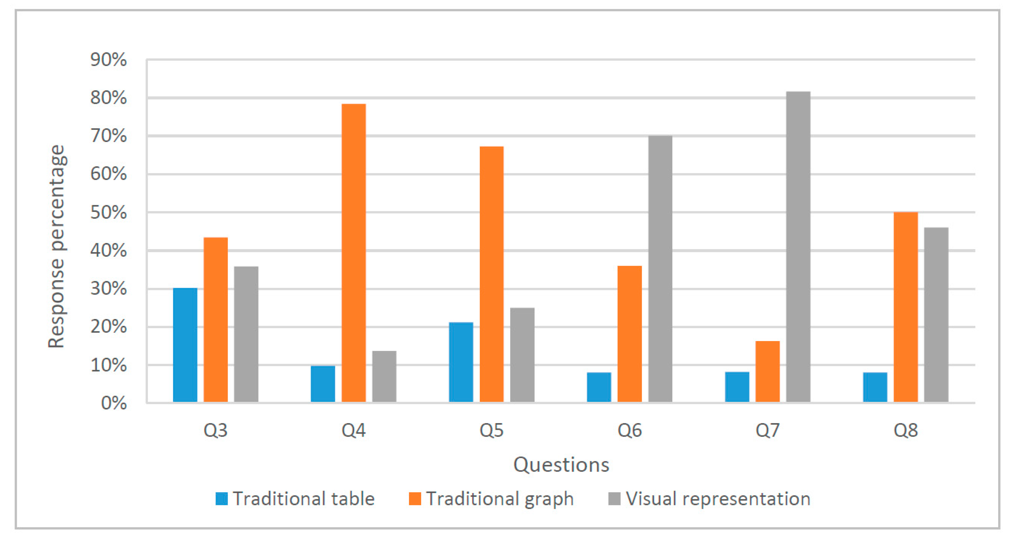
As discussed in Section 2.3, the survey was completed via a questionnaire. The visualization-related questions are presented in Table 7 and the answers in Figure 16.
It is interesting to note that, even though many participants found the graph more useful for comparing temperature changes, they overwhelmingly agreed that the 4D visualization was the most interesting, and ideal for clients. In addition, the survey only presented data for a single day, i.e., a single day and a single graph. The advantages of 4D visualization become much more significant when bigger datasets were introduced; previous work has suggested that users find it much easier to understand bigger datasets using EnViz, compared to data in spreadsheet form [33]. As such, it is reasonable to assume that if respondents were presented with bigger datasets, Questions 3 to 5 would have shown different trends.
It should be added that many respondents were critical not of the advantages of 4D visualization as a principle, but of the specific EnViz implementation. A number of participants commented on the lack of features in EnViz as compared to commercial-level software. Respondents also mentioned the visualization as comparable to features seen in computer games, which is typically the testing ground for the state-of-the-art in computer graphics.
The detailed results of the building simulation, POE monitoring and analysis, and the questionnaire survey can be found in the work by Sang [35].
4. Conclusions
The work presented here concludes a five-year project in which a prototype software application for the 3D and 4D visualization of POE data was developed and then tested extensively in order to understand the extent to which visualization can contribute to communicating the results of POE studies to a wide range of stakeholders, from designers to non-expert building users. The above case studies complement previous work by suggesting additional ways to measure the effectiveness, and their findings largely agree with previous efforts.
In summary, it appears that the conclusions reached in previous work [33] hold, namely:
- Visualization can be a powerful tool for the communication of large volumes of data regarding the environmental conditions in buildings.
- Visualization in a three-dimensional model context allows the understanding of building-related data more quickly and with greater accuracy compared to traditional graph-based methods.
- Time-based (four-dimensional) visualization provides a better understanding of time-fluctuating data.
- A volumetric model of a building can be created with a minimal overhead in time and cost.
- Color-mapping can be effective in communicating building-related data in a three-dimensional model context.
As in previous work, most of the weaknesses reported by users and survey participants do not focus on the principles of 4D visualization, but on inherent, mostly budgetary, limitations between a prototype app developed for research purposes, and commercial, corporate-level software.
Between the start of the EnViz project and today, various initiatives have focused on the visualization of building data (although using distinctly different approaches). The continuing increase in computational power and ease of software development, together with increased web capacity, point towards future developments such as real-time visualization of building performance and automatic building responses to changes in climatic conditions. Simultaneously, the expansion of Building Information Modelling (BIM) means that POE data need to fit into the wider BIM context. In addition, the continuing collection of POE data means bigger and bigger datasets and therefore all the challenges associated with Big Data. Thus, development of suitable digital frameworks is required if the Performance Gap is to be addressed, and the sustainability agenda furthered.
Acknowledgments
The authors would like to acknowledge the work of Yeyang Sang, aspects of which are presented throughout the paper and referenced accordingly. The EnViz software development was led by Darren Roberts. The development of EnViz was funded by Southampton Solent University (SSU). SSU was not involved in the writing of this paper.
Author Contributions
P.P. conceived and designed the methodology; G.K. performed the work related to Case Study 1; Y.S. performed the work related to Case Study 1; G.K. and Y.S. analyzed the data; R.R. and P.P. supervised the work of G.K. and Y.S.; P.P. wrote the paper with contributions by R.R., G.N., and H.A.
Conflicts of Interest
The authors declare no conflict of interest.
References
- Department Of Energy & Climate Change (DECC). The Carbon Plan: Delivering Our Low Carbon Future; DECC: London, UK, 2011.
- European Parliament and of the Council (EPC). Directive 2010/31/eu of the European Parliament and of the Council of 19 may 2010 on the energy performance of buildings (recast). Off. J. Eur. Union 2010, 18, 2010. [Google Scholar]
- Lucon, O.; Ürge-Vorsatz, D.; Ahmed, A.Z.; Akbari, H.; Bertoldi, P.; Cabeza, L.; Eyre, N.; Gadgil, A.; Harvey, L.; Jiang, Y. Buildings. In Climate Change 2014: Mitigation of Climate Change. Contribution of Working Group III to the Fifth Assessment Report of the Intergovernmental Panel; Cambridge University Press: Cambridge, UK, 2014. [Google Scholar]
- De Boeck, L.; Verbeke, S.; Audenaert, A.; De Mesmaeker, L. Improving the energy performance of residential buildings: A literature review. Renew. Sustain. Energy Rev. 2015, 52, 960–975. [Google Scholar] [CrossRef]
- Hensen, J.L.; Lamberts, R. Introduction to building performance simulation. In Building Performance Simulation for Design and Operation; Hensen, J.L., Lamberts, R., Eds.; Spon: London, UK, 2011; pp. 365–401. [Google Scholar]
- Dermisi, S. Effect of leed ratings and levels on office property assessed and market values. J. Sustain. Real Estate 2009, 1, 23–47. [Google Scholar]
- Roderick, Y.; McEwan, D.; Wheatley, C.; Alonso, C. Comparison of energy performance assessment between leed, breeam and green star. In Proceedings of the Eleventh International IBPSA Conference, Glasgow, UK, 27–30 July 2009; pp. 27–30. [Google Scholar]
- Schwartz, Y.; Raslan, R. Variations in results of building energy simulation tools, and their impact on breeam and leed ratings: A case study. Energy Build. 2013, 62, 350–359. [Google Scholar] [CrossRef]
- Bordass, B.; Cohen, R.; Field, J. Energy performance of non-domestic buildings: Closing the credibility gap. In Proceedings of the International Conference on ‘Improving the Energy Efficiency of Commercial Buildings (IEECB'04)’, Frankfurt, Germany, 18–22 April 2004. [Google Scholar]
- De Wilde, P. The gap between predicted and measured energy performance of buildings: A framework for investigation. Autom. Constr. 2014, 41, 40–49. [Google Scholar] [CrossRef]
- Pritchard, R.; Kelly, S. Realising operational energy performance in non-domestic buildings: Lessons learnt from initiatives applied in cambridge. Sustainability 2017, 9, 1345. [Google Scholar] [CrossRef]
- Menezes, A.C.; Cripps, A.; Bouchlaghem, D.; Buswell, R. Predicted vs. Actual energy performance of non-domestic buildings: Using post-occupancy evaluation data to reduce the performance gap. Appl. Energy 2012, 97, 355–364. [Google Scholar] [CrossRef] [Green Version]
- Palmer, J.; Terry, N.; Armitage, P. Building Performance Evaluation Programme: Findings from Non-Domestic Projects; Innovate: London, UK, 2016. [Google Scholar]
- Zimring, C.M.; Reizenstein, J.E. Post-occupancy evaluation: An overview. Environ. Behav. 1980, 12, 429–450. [Google Scholar] [CrossRef]
- Federal Facilities National Research Council. Learning from Our Buildings: A State-of-the-Practice Summary of Post-Occupancy Evaluation; National Academies Press: Washington, DC, USA, 2002; Volume 145. [Google Scholar]
- Geng, Y.; Ji, W.; Lin, B.; Zhu, Y. The impact of thermal environment on occupant ieq perception and productivity. Build. Environ. 2017, 121, 158–167. [Google Scholar] [CrossRef]
- Hirning, M.B.; Isoardi, G.L.; Coyne, S.; Garcia Hansen, V.R.; Cowling, I. Post occupancy evaluations relating to discomfort glare: A study of green buildings in brisbane. Build. Environ. 2013, 59, 349–357. [Google Scholar] [CrossRef] [Green Version]
- Salamone, F.; Belussi, L.; Danza, L.; Galanos, T.; Ghellere, M.; Meroni, I. Design and development of a nearable wireless system to control indoor air quality and indoor lighting quality. Sensors 2017, 17, 1021. [Google Scholar] [CrossRef] [PubMed]
- Nicol, F.; Roaf, S. Post-occupancy evaluation and field studies of thermal comfort. Build. Res. Inf. 2005, 33, 338–346. [Google Scholar] [CrossRef]
- Barbhuiya, S.; Barbhuiya, S. Thermal comfort and energy consumption in a UK educational building. Build. Environ. 2013, 68, 1–11. [Google Scholar] [CrossRef]
- Indraganti, M. Using the adaptive model of thermal comfort for obtaining indoor neutral temperature: Findings from a field study in hyderabad, india. Build. Environ. 2010, 45, 519–536. [Google Scholar] [CrossRef]
- Zimmerman, A.; Martin, M. Post-occupancy evaluation: Benefits and barriers. Build. Res. Inf. 2001, 29, 168–174. [Google Scholar] [CrossRef]
- Patlakas, P.; Altan, H. Visualizing post-occupancy evaluation data: Rationale, methodology and potential of enviz, a visualization software prototype. In Digital Physicality, Proceedings of the 30th eCAADe Conference, Prague, Czech Republic, 12–14 September 2012; Achten, H., Pavlicek, J., Hulin, J., Matejovska, D., Eds.; Czech Technical University in Prague: Prague, Czech Republic, 2012. [Google Scholar]
- Bahar, Y.N. Representation of Thermal Building Simulation in Virtual Reality for sustAinable Building. Ph.D. Thesis, Université de Bourgogne, Dijon, France, 2014. [Google Scholar]
- Jeong, W.; Kim, J.B.; Clayton, M.; Haberl, J.; Yan, W. Visualization of building energy performance in building information models. In Adaptive Architecture, Proceedings of the 33rd Annual Conference of the Association for Computer Aided Design in Architecture (ACADIA), Cambridge, ON, Canada, 24–26 October 2013; Riverside Architectural Press: Toronto, ON, Canada, 2013. [Google Scholar]
- Kensek, K.; Noble, D. Building Information Modeling: Bim in Current and Future Practice; John Wiley & Sons: Hoboken, NJ, USA, 2014. [Google Scholar]
- Lehrer, D.; Vasudev, J. Visualizing Information to Improve Building Performance: A Study of Expert Users; Center for the Built Environment: Berkeley, CA, USA, 2010. [Google Scholar]
- Ware, C. Information Visualization: Perception for Design; Morgan Kauffman: Waltham, MA, USA, 2012. [Google Scholar]
- Group, K. Opengl Api Documentation Overview. Available online: https://www.opengl.org/documentation/ (accessed on 9 September 2017).
- Lightweight Java Game Library (LWJGL). Lightweight Java Game Library 3. Available online: https://www.lwjgl.org/ (accessed on 9 September 2017).
- Chartered Institution of Building Services Engineers (CIBSE). Ks06: Comfort; CIBSE: London, UK, 2006. [Google Scholar]
- Oracle. Float Class Documentation. Available online: http://docs.oracle.com/javase/7/docs/api/java/lang/Float.html#MAX_VALUE (accessed on 9 September 2017).
- Patlakas, P.; Santacruz, H.B.; Altan, H. Visualising the environmental conditions of buildings. Proc. Inst. Civ. Eng. 2014, 167, 56. [Google Scholar] [CrossRef]
- Pfafferott, J.Ü.; Herkel, S.; Kalz, D.E.; Zeuschner, A. Comparison of low-energy office buildings in summer using different thermal comfort criteria. Energy Build. 2007, 39, 750–757. [Google Scholar] [CrossRef]
- Sang, Y. Comparison of Design-Stage Simulation with poe Data, and the Importance of Visualization in Evaluating the Performance Gap; UCL: London, UK, 2015. [Google Scholar]
- Huang, W.; Eades, P.; Hong, S.-H. Measuring effectiveness of graph visualizations: A cognitive load perspective. Inf. Vis. 2009, 8, 139–152. [Google Scholar] [CrossRef]
- Cameron, R. Mixed methods research: The five ps framework. Electron. J. Bus. Res. Methods 2011, 9, 96–108. [Google Scholar]
- Patlakas, P.; Raslan, R. A computer game to help people understand the energy performance of buildings. In Proceedings of the Institution of Civil Engineers-Engineering Sustainability; Thomas Telford Ltd: London, UK, 2017; pp. 1–14. [Google Scholar]
- Koronaios, G. Measuring the Effectiveness of 3D Visualization in the Decision-Making Process; UCL: London, UK, 2015. [Google Scholar]
Figure 1.
Case Study 1: Hampstead Rd 140.

Figure 2.
Hampstead Rd 140 first floor plan, with logger locations.

Figure 3.
Central House 4th floor, with logger locations.

Figure 4.
Snapshot of the game environment.
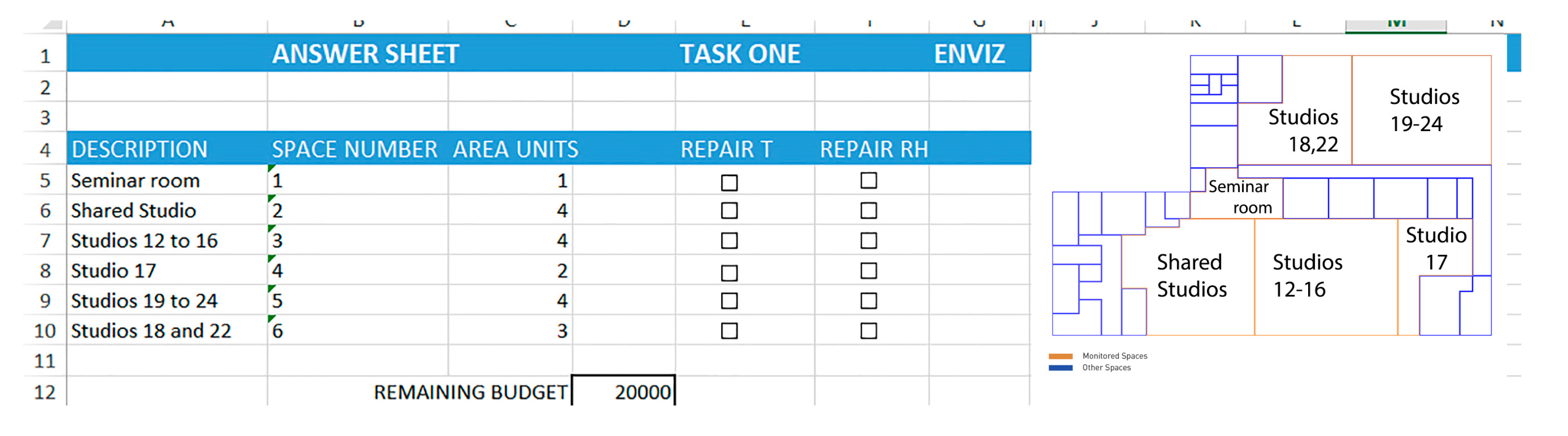
Figure 5.
IES model of Central House [28].
Figure 5.
IES model of Central House [28].
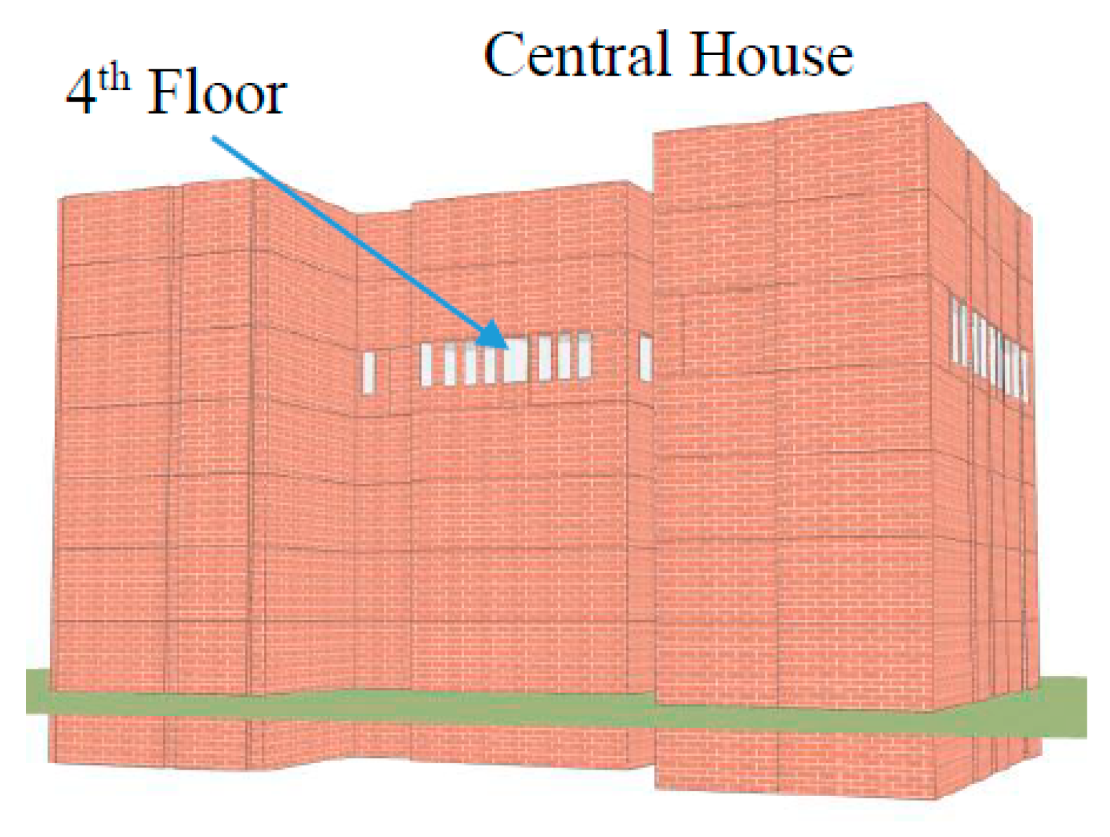
Figure 6.
Temperature visualization of IES and Post-Occupancy Evaluation (POE) data in Enviz (after [35]).
Figure 6.
Temperature visualization of IES and Post-Occupancy Evaluation (POE) data in Enviz (after [35]).
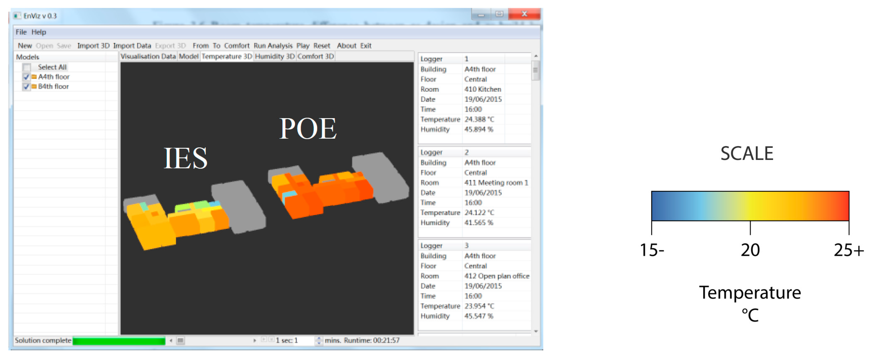
Figure 7.
Relative Humidity visualization of IES and POE data in Enviz (after [35]).
Figure 7.
Relative Humidity visualization of IES and POE data in Enviz (after [35]).

Figure 8.
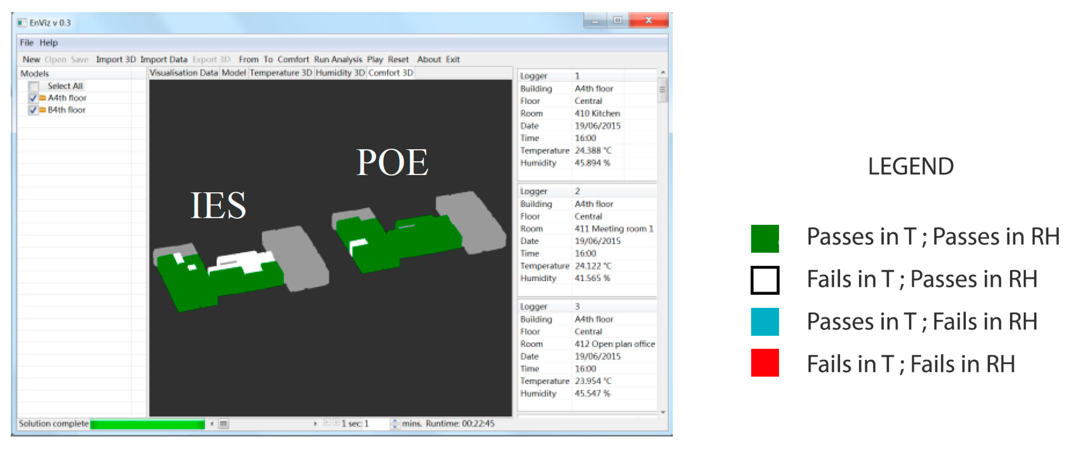
Visualization of IES and POE data in Enviz, showing if the conditions pass/fail the thermal comfort criteria (after [35]).
Figure 8.
Visualization of IES and POE data in Enviz, showing if the conditions pass/fail the thermal comfort criteria (after [35]).

Figure 9.
Exterior temperature in London during the monitored period.

Figure 10.
Exterior RH in London during the monitored period.

Figure 11.
Measured exterior temperature during the monitored period [35].
Figure 11.
Measured exterior temperature during the monitored period [35].

Figure 12.
Measured exterior relative humidity during the monitored period [35].
Figure 12.
Measured exterior relative humidity during the monitored period [35].

Figure 13.
Comparison between BPS and POE data for Office 2 during the monitored period [35].
Figure 13.
Comparison between BPS and POE data for Office 2 during the monitored period [35].

Figure 14.
Comparison between BPS and POE data for the Open Plan Office during the monitored period [35].
Figure 14.
Comparison between BPS and POE data for the Open Plan Office during the monitored period [35].
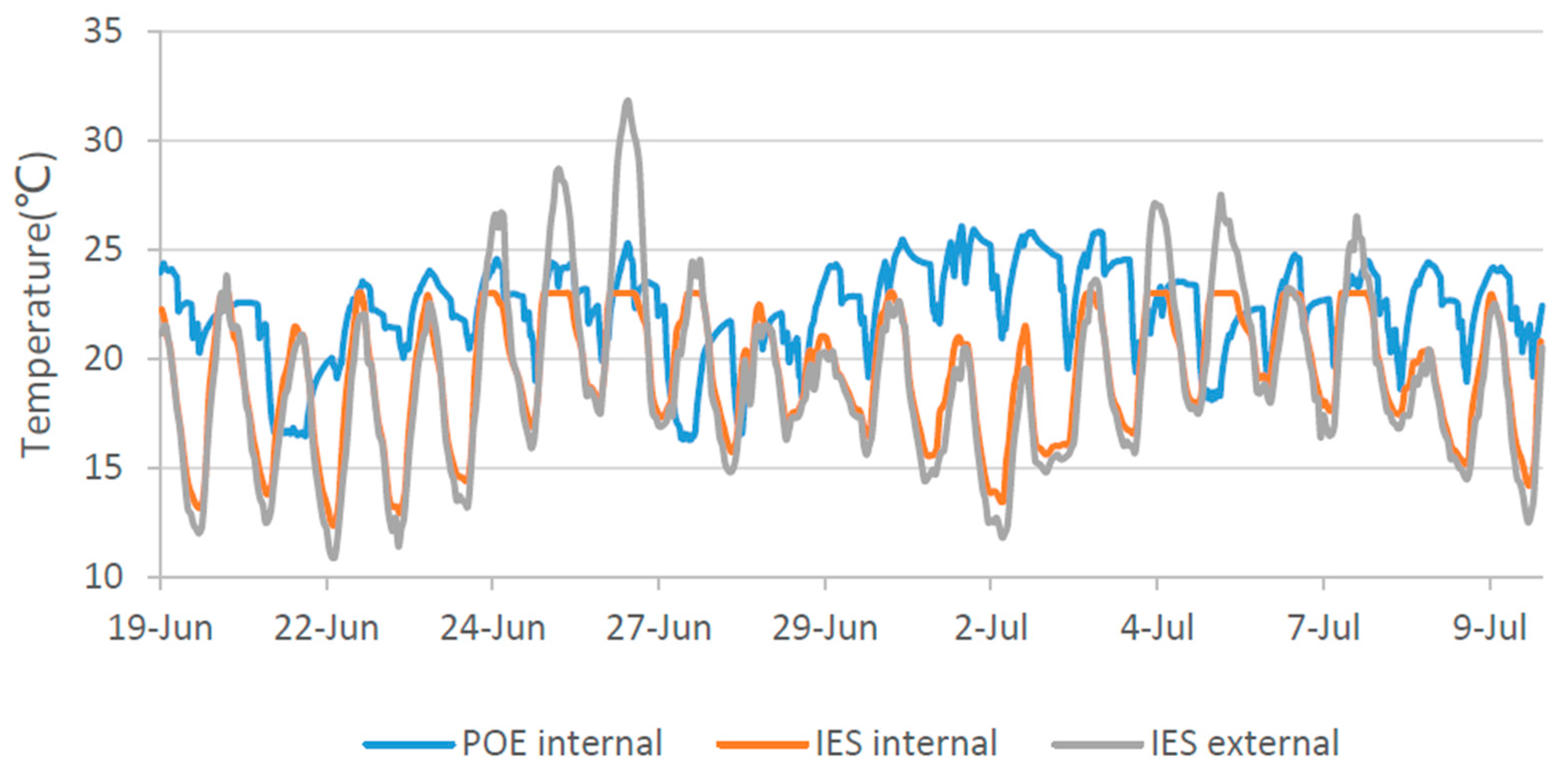
Figure 15.
Sample temperature (left) and RH (right) snapshot for Task 1.

Figure 16.
Results to Questions 3 to 8 (Table 7), comparing visualization options (adapted from [35]).


Table 1.
Monitored spaces.
| No | Space Type | Space Characteristics |
|---|---|---|
| 1 | Seminar room | Air Conditioned (cool) |
| 2 | Shared Studio | West-facing (heats up later) |
| 3 | Studios 12 to 16 | West-facing (heats up later) |
| 4 | Studio 17 | Close to Plant-Room (warm) |
| 5 | Studios 19 to 24 | East-facing (heats up earlier) |
| 6 | Studios 18 and 22 | East-facing (heats up earlier) |
Table 2.
Seminar Room Temperature (T) and Relative Humidity (RH) monitored values.
| Day | Min T (°C) | Min RH (%) | Max T (°C) | Max RH (%) |
|---|---|---|---|---|
| 1 | 23.978 | 47.627 | 25.574 | 49.977 |
| 2 | 23.569 | 39.307 | 24.46 | 49.046 |
| 3 | 23.617 | 38.283 | 24.267 | 46.469 |
| 4 | 23.617 | 38.509 | 24.75 | 57.033 |
| 5 | 23.328 | 44.33 | 25.162 | 54.527 |
| 6 | 24.315 | 44.04 | 25.04 | 48.175 |
| 7 | 24.122 | 39.308 | 25.21 | 47.477 |
| 8 | 23.641 | 40.268 | 25.04 | 50.839 |
| 9 | 23.641 | 41.812 | 24.195 | 47.933 |
Table 3.
Shared studio Temperature and RH monitored values.
| Day | Min T (°C) | Min RH (%) | Max T (°C) | Max RH (%) |
|---|---|---|---|---|
| 1 | 25.695 | 43.267 | 26.256 | 48.481 |
| 2 | 24.895 | 37.37 | 25.744 | 44.699 |
| 3 | 24.774 | 33.255 | 25.72 | 44.028 |
| 4 | 25.065 | 35.884 | 26.085 | 53.888 |
| 5 | 25.065 | 42.165 | 26.72 | 50.454 |
| 6 | 25.695 | 40.868 | 26.695 | 47.535 |
| 7 | 25.55 | 37.216 | 26.451 | 42.324 |
| 8 | 24.944 | 38.274 | 25.914 | 47.041 |
| 9 | 23.809 | 39.436 | 24.895 | 46.888 |
Table 4.
Decisions to improve thermal comfort in each space.
| Action | Seminar Room | Shared Studio | Studios 12 to 16 | Studio 17 | Studios 19 to 24 | Studios 18 and 22 |
|---|---|---|---|---|---|---|
| No action | 11 * | 0 | 1 | 1 | 1 | 1 |
| Adjust clothes | 0 | 4 * | 4 ** | 0 | 2 | 3 |
| Open windows | 0 | 5 ** | 6 * | 0 ** | 4 * | 3 * |
| Relocate | 0 | 1 | 0 | 10 * | 4 ** | 4 ** |
* The best (“correct”) option given the source data; ** The second-best option given the source data.
Table 5.
Failure rates of monitored spaces.
| Space | Overall Failure Ratio | Failure Ratio (T) | Failure Ratio (RH) |
|---|---|---|---|
| Seminar room | 5% | 0% | 5% |
| Shared Studio | 69% | 48% | 65% |
| Studios 12 to 16 | 62% | 59% | 45% |
| Studio 17 | 81% | 81% | 37% |
| Studios 19 to 24 | 66% | 62% | 35% |
| Studios 18 and 22 | 48% | 46% | 17% |
Table 6.
Participants’ decisions.
| Space | Fixed T | Fixed RH |
|---|---|---|
| Seminar room | 0 | 4 |
| Shared Studio | 2 | 10 |
| Studios 12 to 16 | 6 | 4 |
| Studio 17 | 10 | 4 |
| Studios 19 to 24 | 8 | 4 |
| Studios 18 and 22 | 6 | 2 |
Table 7.
Visualisation comparison questions.
| Q No. | Question Text |
|---|---|
| Q3 | Which (of the figures) do you think shows the detailed temperature most clearly? |
| Q4 | Which (of the figures) do you think shows the temperature change within a month most clearly? |
| Q5 | Which (of the figures) do you think is the best for analysing the temperature difference within a month? |
| Q6 | Which (of the figures) do you think is the most appropriate, in which data is presented to clients/occupants? |
| Q7 | Which (of the figures) do you think is the most interesting? |
| Q8 | Which (of the figures) do you (prefer)? |
© 2017 by the authors. Licensee MDPI, Basel, Switzerland. This article is an open access article distributed under the terms and conditions of the Creative Commons Attribution (CC BY) license (http://creativecommons.org/licenses/by/4.0/).
Share and Cite
MDPI and ACS Style
Patlakas, P.; Koronaios, G.; Raslan, R.; Neighbour, G.; Altan, H. Case Studies of Environmental Visualization. Energies 2017, 10, 1459. https://doi.org/10.3390/en10101459
AMA Style
Patlakas P, Koronaios G, Raslan R, Neighbour G, Altan H. Case Studies of Environmental Visualization. Energies. 2017; 10(10):1459. https://doi.org/10.3390/en10101459
Chicago/Turabian StylePatlakas, Panagiotis, Georgios Koronaios, Rokia Raslan, Gareth Neighbour, and Hasim Altan. 2017. "Case Studies of Environmental Visualization" Energies 10, no. 10: 1459. https://doi.org/10.3390/en10101459
Note that from the first issue of 2016, this journal uses article numbers instead of page numbers. See further details here.