3.1. Cumulative Probability Distribution Function
For a discrete number of about 220 countries in the EIA dataset [
1], it is more convenient to construct the empirical complementary cumulative distribution function (cdf) for energy consumption defined as
, rather than the probability density function (pdf)
. First, we sort all countries in the ascending order of their energy consumption per capita
, so that
corresponds to the country with the lowest consumption and
to the maximal consumption, where
L is the total number of countries. Then, the cumulative distribution function is:
which is the fraction of world population whose energy consumption per capita is greater than
. Effectively, this construction assigns the same energy consumption
to all
residents of the country,
n. This approach corresponds to Concept 2 in the studies of global inequality, according to the terminology from the book [
21]. In Concept 1, equal weights are assigned to all countries irrespective of their populations, so a group of tiny countries can outweigh the few most populous countries in the distribution of
. A more sensible approach is to assign weights to different countries proportional to their populations, which is done in Concept 2 and in the cdf in Equation (
1). The more sophisticated Concept 3 takes into account probability distributions (
i.e., inequality) within countries and combines them into a global probability distribution. Although Concept 3 is the most accurate, it is very difficult to find the required data, so we only use Concept 2 in our paper.
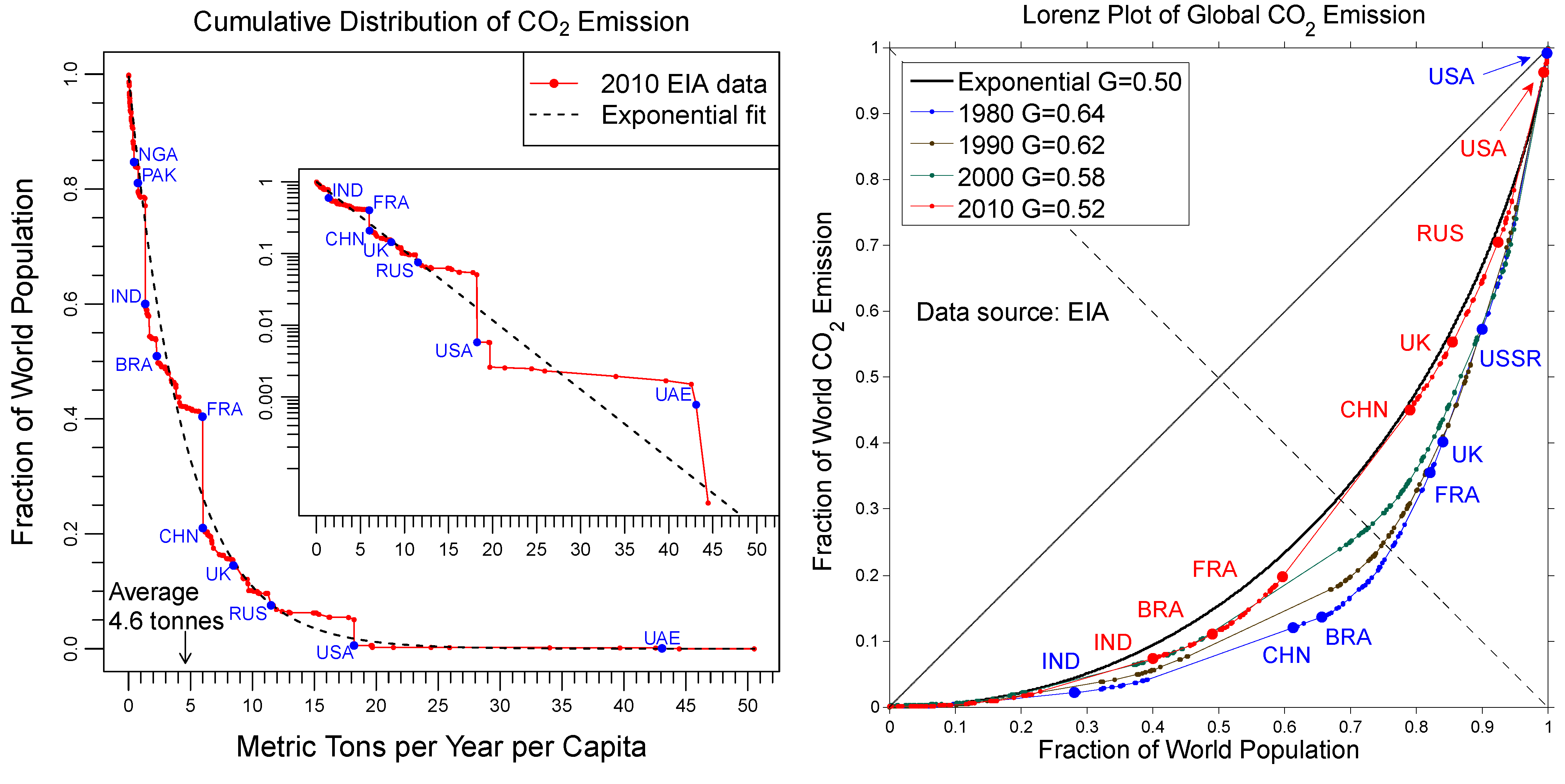
The empirical cdf,
, constructed from the EIA data for 2010 is shown in the left panel of
Figure 3 by the red solid line with circles. The global average energy consumption per capita is:
where
E is the total global energy consumption and
N is the total global population. In
Figure 3, we observe broad inequality, where
kW in the USA is four times
greater than
,
kW in India is four times
lower than
and
kW in China is approximately equal to
.
The black dashed line in the left panel of
Figure 3 shows the theoretical exponential probability distribution
, which gives a reasonably good fit of the whole distribution using
kW. The inset shows a log-linear plot of
, where the vertical axis is logarithmic and the horizontal axis is linear. In these coordinates, the exponential function becomes the straight dashed line, and the red empirical points fall reasonably close to the theoretical line. Thus, we conclude that the empirical probability distribution of energy consumption per capita in 2010 is close to exponential.
Figure 3.
(
Left panel) Complementary cumulative probability distribution function, Equation (
1), of the global energy consumption per capita in 2010 (red curve), compared with an exponential fit (black dashed curve). The inset shows the same plot in log-linear scale. (
Right panel) Lorenz plots for the global energy consumption per capita in 1980–2010 (colored curves), compared with an exponential distribution (black solid curve).
3.2. Lorenz Curves
To put this observation in historical perspective, we construct the Lorenz curves for energy consumption per capita from 1980–2010. For a given probability density
, let us introduce the variables:
where
is the fraction of the population whose energy consumption per capita is below
ϵ and
is the total energy consumption of this population normalized by
. The Lorenz curve [
22] is a parametric plot of
versus , where the parameter,
ϵ, varies from zero to
∞. The variables,
x and
y, are bounded between zero and one, so the Lorenz curve connects the points (0,0) and (1,1) in the
plane.
To construct a Lorenz curve from empirical data, we calculate
and
for a set of countries ordered by the index,
n, from the lowest to the highest energy consumption per capita
:
The right panel in
Figure 3 shows the parametric Lorenz plots of
versus constructed from the EIA data for 1980, 1990, 2000 and 2010. Over this time period, the Lorenz plots have moved up, which indicates that inequality in energy consumption per capita has decreased. However, even the latest Lorenz curve for 2010 is still very far from the straight diagonal line, which would correspond to perfect equality where all countries would have equal
.
The Lorenz curve for the theoretically expected exponential probability distribution discussed in
Section 2 was calculated in [
11] by substituting
into Equation (
3) and eliminating
ϵ:
This function, which has no fitting parameters, is shown by the solid black curve in the right panel of
Figure 3. We observe that the empirical red Lorenz curve for 2010 is quite close to the theoretical black curve derived for the exponential distribution. The full time evolution of the Lorenz curves from 1980 to 2010 is shown in a computer animation movie in the
supplementary online material. The movie shows the Lorenz curve evolving from a highly unequal distribution in 1980 to a more equal distribution in 2010, which is quite close to the exponential distribution expected from the principle of maximal entropy. This observation is in qualitative agreement with the earlier results presented in [
18] for a more limited dataset for 1990–2005.
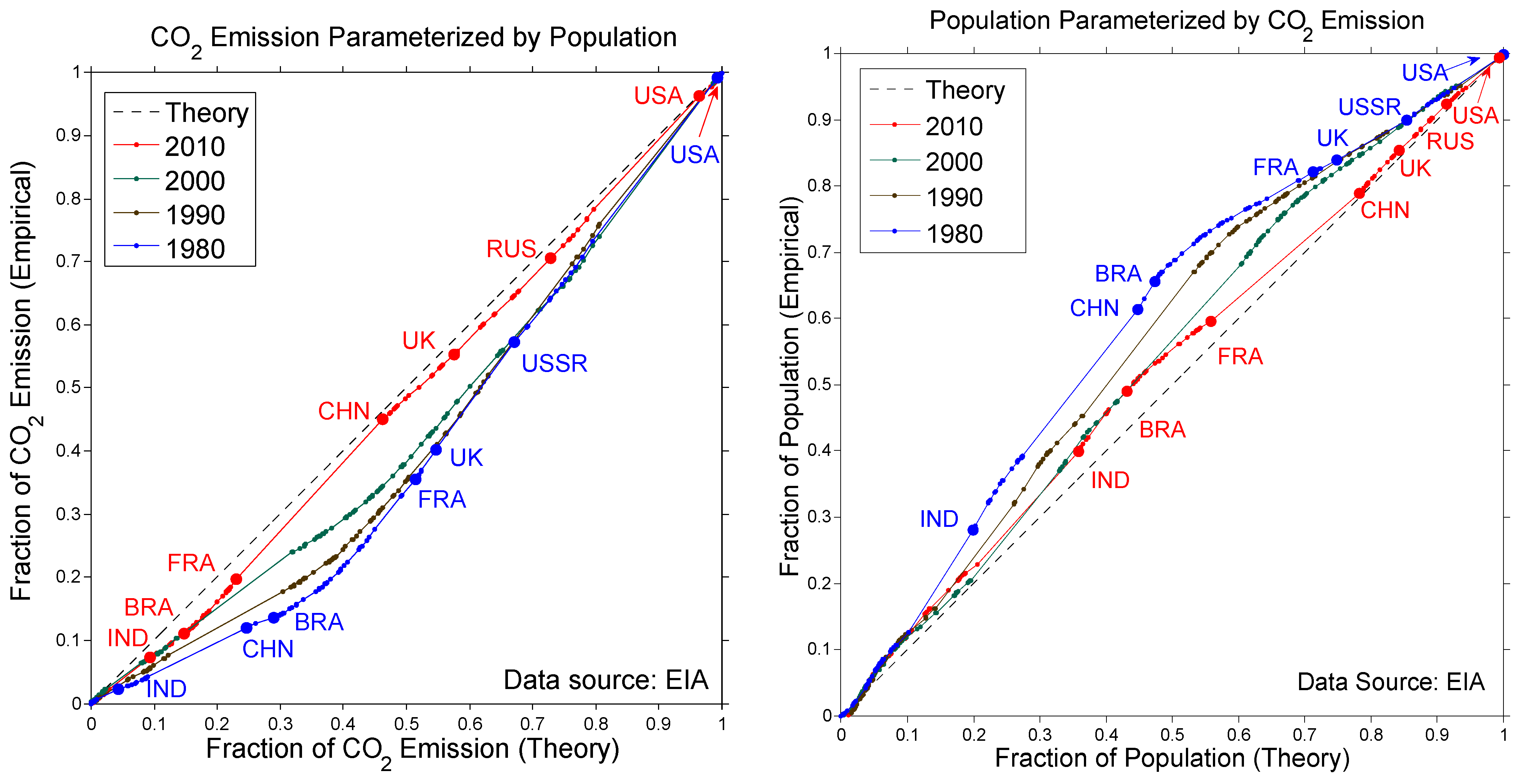
Convergence of the empirical Lorenz curve,
, Equation (
4), toward the theoretical one,
, Equation (
5), is also illustrated by the parametric plots in
Figure 4. The left panel shows the plots of
vs.
using
x as a parameter, whereas the right panel shows the plots of
vs.
using
y as a parameter. In both panels, as time progresses from 1980 to 2010, the curves move toward the dashed diagonal line corresponding to perfect agreement between empirical and theoretical Lorenz curves.
Figure 4.
(Left panel) Parametric plots of the empirical vs. exponential cumulative fractions of global energy consumption using the population fraction, x, as a parameter. (Right panel) Parametric plots of the empirical vs. exponential cumulative population fractions using the energy consumption fraction, y, as a parameter.
3.3. Gini Coefficient
A standard measure of inequality is the Gini coefficient,
G. It is defined as the area between the Lorenz curve and the solid diagonal line in the right panel of
Figure 3, divided by the area 1/2 of the triangle beneath the diagonal line. The Gini coefficient
varies from zero at perfect equality, where everybody receives an equal share, to one at extreme inequality, where everybody receives nothing, except for one person who receives everything. It was shown in [
11] that
for an exponential distribution.
The inset in the right panel of
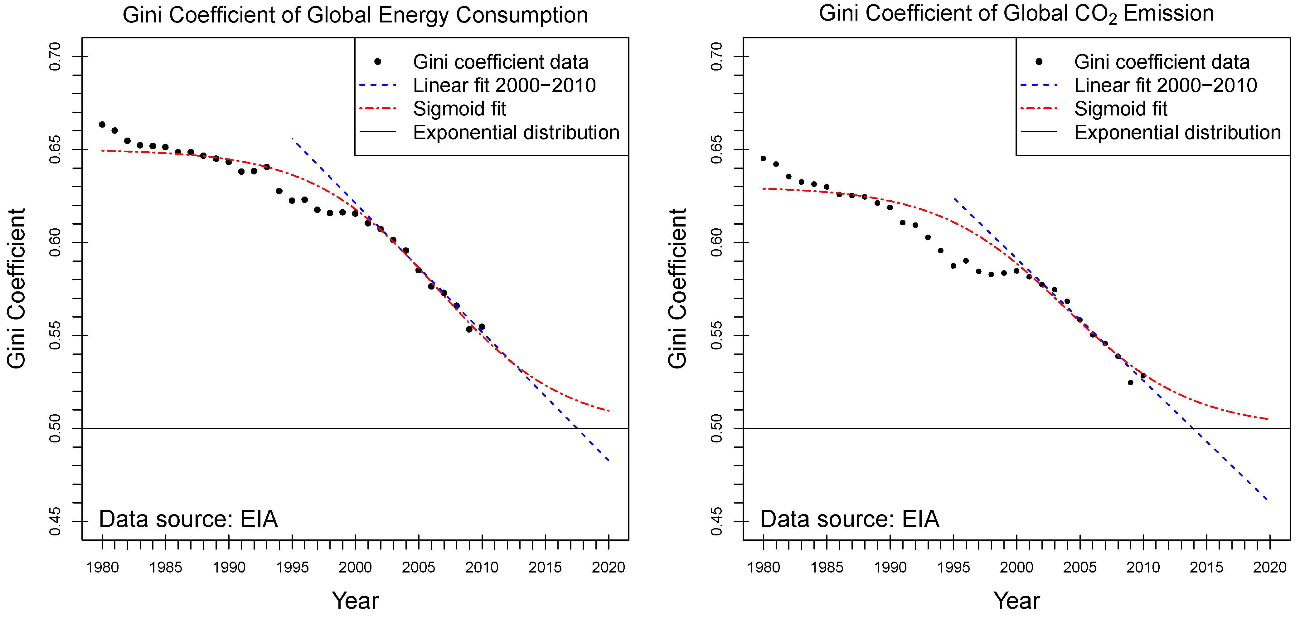
Figure 3 shows that the Gini coefficient for energy consumption per capita has decreased from 0.66 to 0.55 during 1980–2010 and now is close to the theoretical equilibrium value of 0.5. The full historical evolution of the Gini coefficient is shown in the left panel of
Figure 5 by the circles, whereas the horizontal line indicates the theoretical equilibrium value
for an exponential distribution. We observe that the Gini coefficient was decreasing particularly fast in the last decade of 2000–2010. We attribute this effect to the rapid globalization of the world economy, which brings the world closer to the state of maximal entropy. By making a naive linear extrapolation of the trend for the last 10 years, shown by the blue dashed line in
Figure 5, one might expect that the Gini coefficient will reach
around 2017 and will continue to decrease toward perfect equality. In contrast, the principle of maximal entropy suggests that the decrease of energy consumption inequality would slow down and saturate at the level
corresponding to the exponential distribution. Thus, we make a conjecture that the Gini coefficient will follow a sigmoid curve, shown by the red dashed-dotted line in
Figure 5, asymptotically approaching
, but not going below this value. We plan to revisit this study in five and ten years from now, when new data will become available, and verify our prediction. Making predictions about the future is always a challenging task. In physics, theories that not only explain known experiments, but also make successful predictions about future observations are particularly valuable. Our conjecture is, in principle, falsifiable,
i.e., it may be proven wrong by future observations.
There is widespread discussion in the media about coming global economic slowdown, which is sometimes called the “economic ice age” [
23,
24,
25]. In developed countries, the population has been aging, and consumption (including energy consumption) has been decreasing for some time already, accompanied by the stagnation of economic growth. In contrast, economic growth (and the corresponding growth of energy consumption) was fast in developing countries, particularly in China, in the last few decades. However, there are indications that this economic growth is ending, too. Commentators offer various specific reasons for the global economic slowdown [
24]. The export-oriented growth model is unsustainable, because it requires ever increasing consumption in developed countries, which is not the case any more. The population of China has stabilized and is beginning to age. India is mired in rupee inflation, underdeveloped infrastructure and gloomy economic prospects [
25]. However, in our opinion, the underlying reason for various manifestations of the global economic slowdown is actually entropic [
26]. As shown in the above graphs, the energy consumption inequality in 1980 was much higher than expected for thermal statistical equilibrium, so the entropy of the distribution was lower. This deviation from statistical equilibrium was driving globalization, thus increasing consumption in developing countries and decreasing global inequality. However, now, the world is close to the state of maximal entropy and thermal statistical equilibrium, so the driver for further evolution disappears, and the world is likely to stay put in the present state of global inequality. This reasoning is somewhat similar to the argument for the “thermal death of the Universe” much discussed in 19th century physics. In the 20th century, it was recognized that one way around this argument is the expansion of the Universe. Similarly, human development for centuries was driven by geographic expansion, but this era is over, and now the world is small, hot and “flat” [
27].
Figure 5.
Historical evolution of the global Gini coefficient, G (circles), for energy consumption per capita (left panel) and emissions per capita (right panel). The blue dashed line represents a linear extrapolation and the red dashed-dotted curve a sigmoid fit. The horizontal line at corresponds to an exponential distribution.
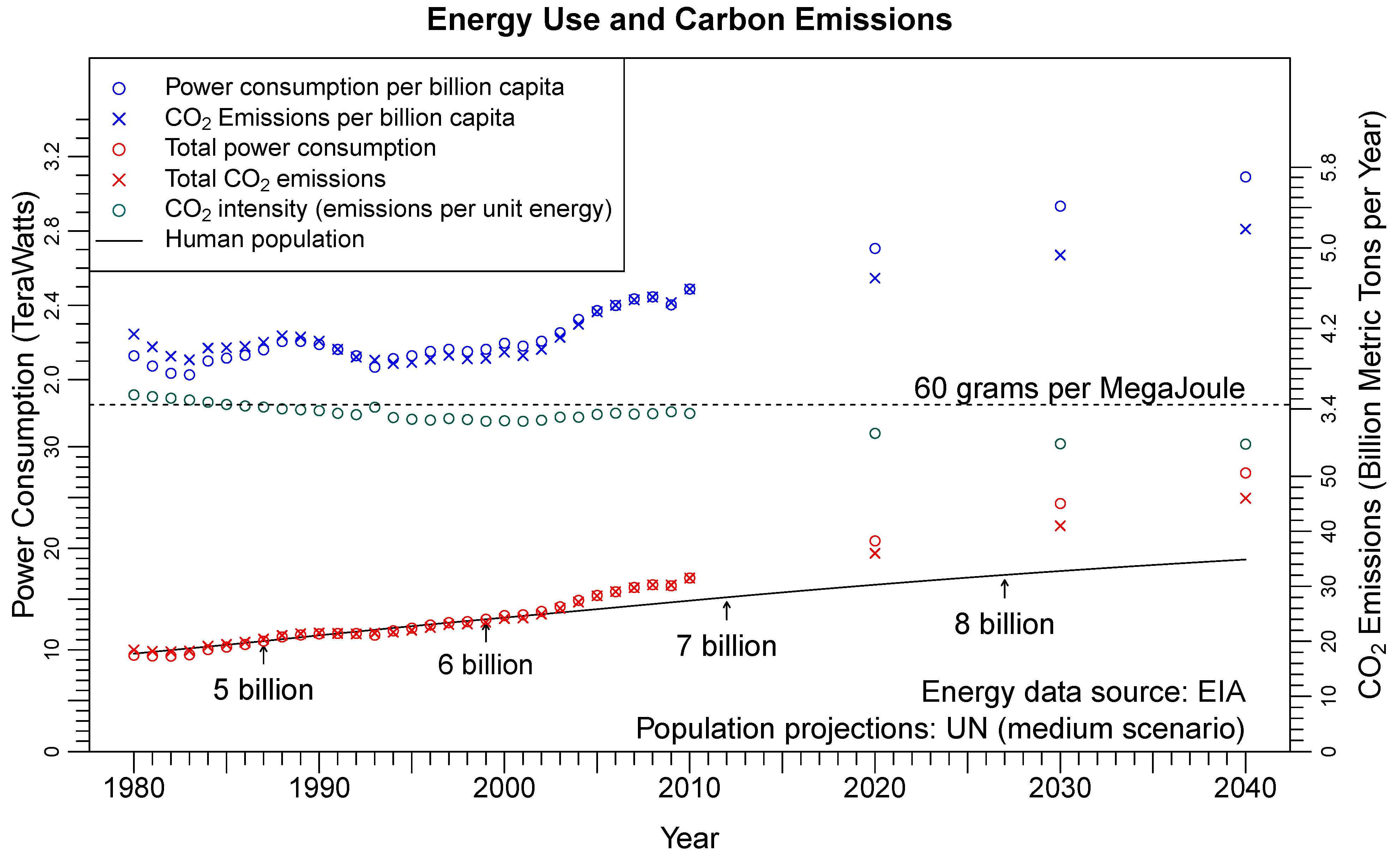
However, the “economic ice age” may have the beneficial effect of slowing down climate change. The EIA projections in
Figure 1 are based on the assumption of accelerated global economic growth in the future. The blue circles and crosses show an increase in global energy consumption and
emissions per capita in 2020–2040, departing from the relatively stable level in 1980–2010. In contrast, we expect that per-capita levels would stay approximately constant for the global slowdown scenario, so the total energy consumption and
emissions (red circles and crosses) would only increase in proportion to the population growth (black curve), as they did for most of 1980–2010.
3.4. The Law of 1/3
Given that the distribution of energy consumption per capita is already close to exponential, here, we formulate a new and important law, which we call the law of 1/3. It is analogous to the well-known Pareto’s principle of 80–20. Pareto observed in 1906 that 80% of land in Italy was owned by 20% of the people [
28]. Conversely, 80% of the people owned only 20% of the land. Since then, it was claimed by many authors that this principle applies to various other statistical distributions, although it is not always clear whether these claims are based on actual data or are just rhetorical flourishes. For any probability distribution of resource ownership, it is always possible to find a fraction,
, of the population owning the
fraction of the resource, e.g.,
for Pareto’s principle. Mathematically, the value of
is obtained by solving the equation
, where
is the Lorenz curve. Geometrically, it is obtained as an intersection of the Lorenz curve and the dashed diagonal line in the right panel of
Figure 3, as shown by the squares. Using Equation (
5) for an exponential distribution, we find
from the equation
, whereas the empirical value for the 2010 data is
. Since these values are quite close, we can say that
the top 1/3 of the world population consumes 2/3 of energy, which we call
the law of 1/3. This simple and easily understandable statement summarizes the current state of global inequality in energy consumption. We are not aware of this result to have been known before. Because it is a consequence of the principle of maximal entropy, we expect that the global energy consumption inequality will stay at this level in the future.
