
The Evidentiary Value of Late Nineteenth and Early Twentieth Century Postcards for Heritage Studies


Institute for Land, Water and Society, Charles Sturt University, P.O. Box 789, Albury, NSW 2640, Australia
Heritage 2021, 4(3), 1460-1496; https://doi.org/10.3390/heritage4030081
Submission received: 15 June 2021
/
Revised: 5 July 2021
/
Accepted: 21 July 2021
/
Published: 28 July 2021
(This article belongs to the Collection Feature Papers)
Abstract
:A postcard ‘craze’ engulfed the developed world and colonial world during the end of the nineteenth and the beginning of the twentieth century, when over 2.3 million picture postcards were mailed in 1904 alone. Formally published picture postcards can provide a rich source of information for heritage studies as they depict landscape scenery, towns, individual buildings and public plantings such as parks. The evidentiary value of late nineteenth and early twentieth century postcards depends on the veracity of the depicted image. While based on photographs, processes of postcard production allowed the publisher to modify the original imagery to improve the messaging entailed in the image. Modes of image manipulation, such as retouching, can sufficiently alter the content of the image to create limitations to using published postcard imagery as a tool for historic landscape and building analysis. This is the first paper to systematically discuss the process of postcard production and the manipulation of images depicted on the view size of picture postcards. It demonstrates that where evidentiary emphasis is placed on postcard images, it is imperative that a systematic search for variants is carried out.
1. Introduction
The interpretation of the historical appearance of a heritage property, be it a building in its setting, a street or an entire town, is augmented by pictorial evidence. These images can provide architectural details not available from other sources, such as alterations and additions, or provide information on spatial relationships between properties on their setting in a landscaped environment. In addition to documenting the appearance of properties, it is often the minor details included in the images that give evidence of social conditions (e.g., dress styles of occupants and pedestrians, street plantings), infrastructure services (e.g., telephone and power lines, paving of the road) and the like.
Due to their ubiquity as commercial items, picture postcards can provide pictorial evidence of many buildings, landscaping, public parks, streetscapes and townscapes for which original photographic images may no longer exist or which have not been identified due to inadequate labeling [1].
Late nineteenth and early twentieth century postcards have often been reproduced as pictorial compilations for selected towns, imbued with a sense of nostalgia [2,3,4,5,6]. Yet, these cards have also been productively drawn upon as historic evidence, in particular to interpret the spatial arrangement and appearance of buildings, as well as the chronology of construction activities [7]. Rogan classified photographic picture cards as topographical cards and differentiates between local cards and tourist cards [8]. The former “depicted various themes of special interest or immediate importance to local consumers, i.e., the inhabitants of a region, a town, or a village”, with typical motifs being “buildings, streets, markets and fairs, shops, or even the interiors of shops.” Typical motifs on tourist cards, according to Rogan were “landscape views, snowy mountains, waterfalls, fjords, glaciers, churches, cathedrals, castles, hotels and passenger ships, as well as folkloric themes like national costumes, folk dance scenes, peasants harvesting, etc.” [8]. In addition to the formally published postcards that were produced in large print runs, the development of film photography provided amateur photographers with the opportunity to print their own photos on postcard sized paper stock and thereby create personalized imagery.
While photographic images are known to have been manipulated through retouching, this occurred primarily for political purposes such as the well-known examples from the Stalinist Soviet Union [9,10,11]. Postcards are commonly assumed to be accurate depictions, even though egregious examples of complete manufacturing of images exist. The best example for this is postcard images purporting to show the collapse of the campanile of San Marco in Venice on 14 July 1902. As the event occurred unphotographed, Italian publishers simply created a postcard that claimed to have captured the event (Figure 1) [12].
This paper is derived from an in depth study of the depiction of American Fan Palms (Washingtonia spp.) on late nineteenth and early twentieth century postcards [13] which forms a wider research program into the ecology and history of ornamental palms [14,15,16,17], which were, inter alia, examined. During the analysis of more than 3200 images of postcards with 500 different postcard motifs and designs, numerous major and minor modifications were noted that illuminate postcard production and image manipulation processes. This dataset provided the opportunity to discuss in depth the nature of postcard production and to highlight how and to what extent postcard images of outdoor settings were manipulated. While the issues made in this paper are not unique to the Californian data set and could have been researched and collated at different locales in the USA or Germany for that matter, the size and thematic integrity of the Californian data set is unique.
The aim of this paper is to discuss in comprehensive form the nature and process of postcard production. This allows us to demonstrate the limitations of using published postcard imagery as a tool for historic landscape and building analysis. In order to adequately exemplify aspects of the manipulation process, this paper is unashamedly rich in images.
2. Materials and Methods
This paper draws on over 3000 images of postcards showing American Fan Palms (Washingtonia spp.) [13], that had been compiled and analyzed as part of a wider project examining the cultural history and social significance of ornamental palms during the late nineteenth and early twentieth century [14,15,18]. The full set of different postcards motifs, that had been located during a systematic search of the literature and on-line auctions, is documented elsewhere [13]. This paper extracts from that data set relevant example images that illuminate the points of postcard production and image manipulation made here. Where dates or date ranges are given in the captions, they are derived from postmarks of cards on record.
Throughout this paper, the term ‘cliché’ refers to an image as fixed on a printing plate, either as an original or as a stereotype. As will be shown, the appearance of a card can be modified by overprinting with different explanatory text even though the underlying image was printed from the same cliché.
3. Postcards as Physical Artefacts
The production of postcards as legitimate mail items commenced in late 1869 when they were introduced by the Austrian postal service. A year later, several German states followed suit by publishing official ‘correspondence cards’ composed of an address side with an imprinted stamp and a blank side for the message. Despite initial concerns about the privacy of messages sent on these cards, postcards became one of the mainstays of postal stationery worldwide. In the USA, such cards were authorized from 1 May 1873 onwards. Postcards remained in production as postal stationery by almost all stamp-issuing countries until they were essentially superseded by e-mail in the mid 1990s. By the mid 1870s, illustrated postcards had become popular items with the recto side printed with text and commercial and other imagery [19,20]. True picture postcards gained popularity after 1882 when the development of the gravure screen allowed the opportunity to dissolve photographs into discrete dots that could be printed (via lithography) on high-speed printing presses and thus allowed to readily produce postcards in larger volumes.
3.1. Background to Postcards
The nature of postcard publication is closely linked to a country’s postal regulations. For example, in the United Kingdom privately printed postcards could not be mailed until 1894 when the post office permitted users to affix stamps to the address side [21]. Prior to that date, British postcards had to bear an imprint of a postage stamp, which limited the production to a few authorized publishers or required publishers to buy blank government postcards and print the images on the blank message side.
3.2. Types of Postcards
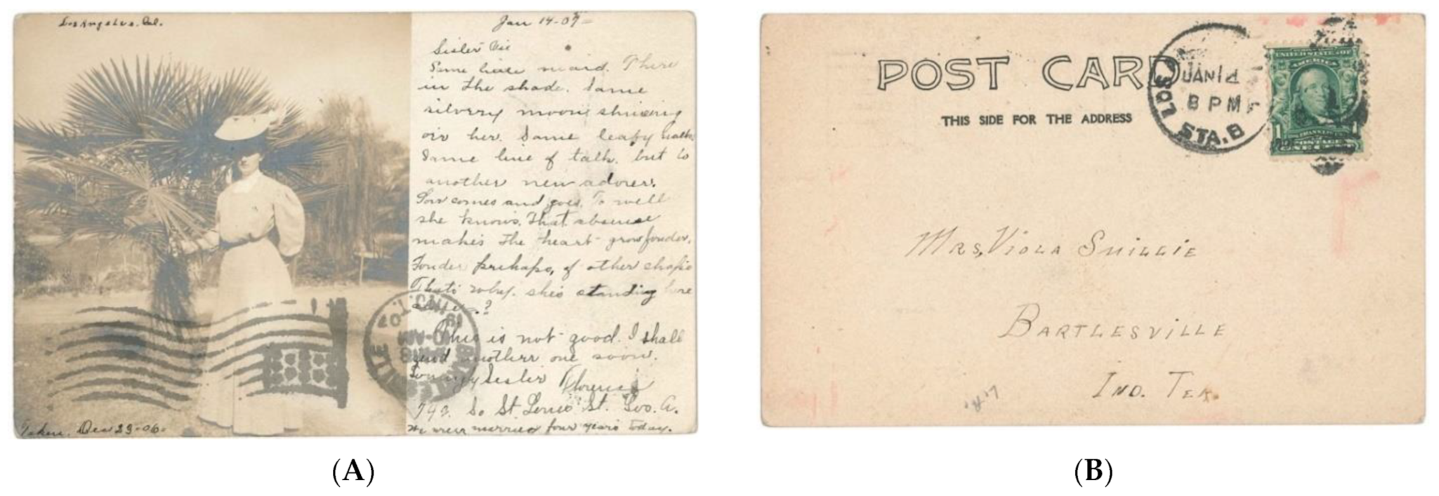
Germany led the way in true picture postcard production, when in 1885 the German Postal service permitted the production and mailing of picture postcards without imprinted stamps [19,20,22]. All early postcards were essentially open letters and thus had an undivided address field. It was prohibited to write anything but the address on the address side. In consequence, the early picture postcards had various amounts of white space on the image side suitable for the conveyance of brief messages (Figure 2 and Figure 3).
Starting in 1898, American publishers were allowed to print and sell postcards bearing the inscription, “Private Mailing Card, Authorized by Act of Congress on 19 May 1898” [23]. These cards had an undivided verso, allowing for the address only, while the recto would contain an image, usually with a wide white margin (Figure 3).
As the verso of the card was reserved for the address only, all identifying information, such as a caption for the photographs, as well as any publisher information, had to be printed on the recto side (Figure 2). In 1901, the U.S. Government granted the use of the words “Post Card” to be printed on the undivided back of privately printed cards and allowed publishers to drop the authorization inscription that was previously required (Figure 3).
In January 1902 the requirement for an undivided back was dropped in the United Kingdom [24], in November 1904 in France, in February 1905 in Germany [25] and in March 1907 in the USA. This development allowed the creation of full-size images on the front with a small text field of up to half of the verso side, creating picture postcards as they are in use today. These soon created an avenue for vacationers to broadcast where they had been and set in motion a concomitant collecting craze.
It needs to be stressed, however, that the picture postcards produced during the last decade of the nineteenth century do not exist in isolation but are an extension of visual imagery of travel destinations and other exotic locations that had been propagated on lantern slides as well as stereo cards [26]. Such sets could be purchased by the wealthy bourgeoisie for consumption in private or social circles and could be also experienced as a pay-per-view opportunity provided by travelling showmen.
Even though the introduction of the divided back allowed for some text to be moved to the verso side, postcard publishers continued the practice of printing the title or caption of the recto side. The publisher’s information, however, was moved to the verso, either along the margin (Figure 4B), or later, along the central dividing line. In addition, some publishers produced novelty cards, such as bifold cards that effectively doubled the image space, as well as booklets of selected postcards to be mailed as a whole or to be separated into their constituents and mailed individually (as recognizable by a perforated edge, e.g., Figure 5).
Soon after the turn of the twentieth century, postcards had become a major income source for the postal services, with 1.161 million cards mailed in Germany during 1904, while 770 million cards were mailed in the USA, 613 million in the UK and 487 million in Japan [21]. It was estimated that two thirds of that postcard volume were picture postcards rather than standard postal stationery cards [8]. Some 200–300 billion cards were produced during the heyday of lithographed postcard consumption until World War I [8].
After 1900, the development of cheap personal photography as popularized by Kodak empowered individuals to create their own imagery. Photopaper manufacturers capitalized on this trend and sold paper that carried the required text, as well as a field for the postage stamp on the non-emulsion (verso) side (Figure 6B and Figure 7B). Early books written on amateur photography, such as Wall and Snowden Ward [21] or Tennant [27], give directions on how amateurs could produce small-run real photo cards.
3.3. Postcards Are Social Artefacts
It is critical to understand that postcards are artefacts, creations made for consumption by a given market. The production of postcards during the late nineteenth and early twentieth century represents a relationship between the consumer and the publisher. In this paper, we are only concerned with picture postcards using photographic images as their basis. A large body of scholarship deconstructs the imagery shown on the picture postcards, especially those of colonial and exotic locales such as Tahiti [28,29], Senegal [30], New Caledonia [31], French Indo-China [32], Korea [33], Arabia [34], Mexico [35] and German Micronesia [36].
As outlined by Quanchi in his examination of French postcards from New Caledonia, the image selection and framing of postcards conveys political messages to the viewer, messages the audience of the time would have well understood [31]. Wehbe, analyzing some colonial era postcards of Beirut, demonstrated that the colonial images stereotyped the landscapes and points of view, documented and celebrated events and happenings, as well as show cards of colonial infrastructure and other architectural developments function as evidence of colonial power [37]. As such, postcards archived in visual form the signs of (French) colonial control over Lebanon. Without exception, the audience of this messaging were the consumers of the cards in the Western colonizing countries, and not the citizens of the depicted country itself [38].
As Vanderwood noted, when discussing postcards depicting the Battle of Veracruz (between U.S. and Mexican forces in 1914), the choice of subjects in the postcards sent back depended on the viewpoint of the sender, where “U.S. militarymen [sic] on occupation duty wanted people in the States to believe that they were suffering dangerous and rigorous hard-ship duty,” while Mexican defenders wanted to portray their vigilance and steadfastness [35].
Setting these personally produced cards aside, Corkery and Bailey argue that postcards are a good indicator of a visitor’s interest, as the sending of a postcard image requires an active selection of the image by the tourist [39]. This certainly holds true in localities where a range of postcards is available. In their study of two postcard series from Boston (1977 and 1990) the authors demonstrate how images, in order to construct a meaning, are carefully selected and framed—and on occasion edited. In addition to variations of the same scene under different light conditions and viewing angles, the newer postcard series has an increased range of subject matter to satisfy the increasingly diverse needs and interests of the visitors.
4. Postcard Production
The first picture postcard was created in Germany in July 1870 when a printer in Oldenburg used official government postcards and printed an additional black-and-white image on the address side. At least one such card is known to have been postally used [40,41]. Additionally in 1870, a French stationer at Sille-le-Ouillaume produced lithographed postcards showing piles of armaments with a space for text [22,42] but it is unclear whether they were posted as cards or sent in envelopes.
During the late nineteenth and early twentieth century, the primary postcard manufacturers were German printing firms which produced the cards on behalf of national and international publishers. Initially, color picture postcards were in printed black-and-white with the coloring executed by hand using diluted watercolors. To ensure quality control as well as to increase production rates, stencils were frequently employed. From the mid 1890s multi-color chromolithography was introduced but did not become the primary production method until the last decade before World War I, with German printing houses continuing to dominate the market [22].
4.1. Postcard Photography
The majority of images that were used for the production of published postcards was taken by local photographers, with the cards initially ordered by local businesses. The major publishing houses, such as Michael Rieder (Los Angeles), Edward H. Mitchell (San Francisco) or the Detroit Photographic Publishing Co. initially acted as agents, organizing the production by German printers. Soon after, however, the publishing houses added these clichés to their own catalogue of offers. Itinerant photographers broadened the image catalogues, both by broadening the coverage and intensifying the range of subjects.
As noted, picture postcards are an extension of visual imagery of travel destinations and other exotic locations that had been propagated on lantern slides as well as stereo cards (Figure 8). The postcard photographer followed these precedents, not only in the choice of subjects, but often also in the perspectives chosen, thereby effectively perpetuating pre-existing framing.
4.2. Conversion of Photographs into Printed Postcards
While there is not much literature on the actual production process of postcards, some of this can be inferred from empirical evidence based on the dataset compiled elsewhere [13]. On occasion, the original photographs have survived that formed the basis for postcard clichés. Examples for this are a palm at Montecito, there the image could be converted without change (Figure 9) and the Santa Fé railway hospital in Los Angeles where all that was required was to drop the photo on the top and bottom (compare original Figure 10A with postcard Figure 10B). In some instances, a postcard had been produced in small quantities as a real photo (essentially on demand) (Figure 11A). As demand increased, that image was formally published as a printed card (Figure 11B).
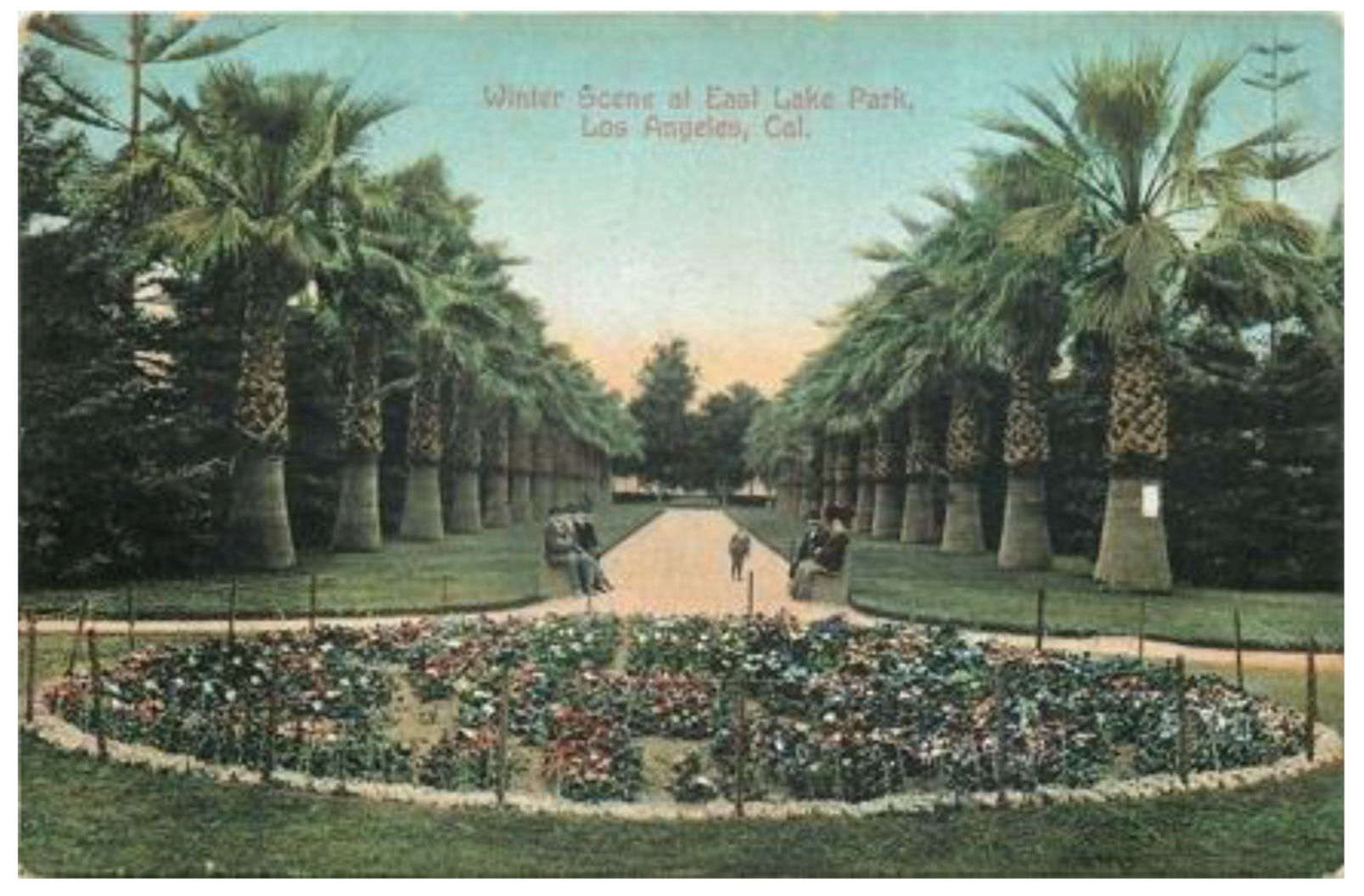
In addition to the conversion of photos into postcards, the images were also reproduced in travel brochures used by hotels and the railways. An example of the latter is a photograph of a palm-lined drive in East Lake Park, Los Angeles, that was produced in the promotional booklet “The road of a thousand wonders: the Coast Line-Shasta Route of the Southern Pacific Company” [43] (Figure 12A) and as a postcard (Figure 12B).
In most instances, the production of published postcards from photographs was a straight conversion from the full-sized, or a cropped, image to the cliché. Exceptions exist, however. A good example of this is the image of Hotel Maywood in Corning, CA. The published card appears straightforward, showing the subject of the vertically framed card set along a street with a well-planted park in the foreground (Figure 13B). The original image, however, has a different, horizontal framing, showing an adjacent building to the left and revealing that the park is much more sparsely planted (Figure 13B). For the conversion into the postcard image, the photo was cropped at the left and marginally rotated to straighten the building. Retouching added clouds, the street in the foreground and completed the fence as required (Figure 13C). A tall flagpole was added to the hotel building to project gravitas.
4.3. Postcard Printing
Given that German printing houses had invented and then perfected the process of dissolving photographs into discrete dots via the gravure screens and, via lithography, printing postcards in large volumes on high-speed printing presses, many American postcard publishers specialized German rather than American printing houses. The quality offered by German printers clearly outweighed the costs of shipment of the finished product. The reliance of American publishers on German printers continued until the early days of World War I, first because trans-Atlantic shipping was disrupted, and then because the USA entered the war against Germany in 1917. At that time, local printing became the, often patriotically advertised, substitute.
4.4. Postcard Reissues
Publishers regularly reprinted and reissued popular cards and often ‘updated’ the look and feel of the card. Direct and unmodified reprints cannot be detected unless the verso of the card shows changes in design or print color or design (Figure 14). Upon close inspection, of the printed image side, an updated look and feel is readily discernible in those instances where the text shows obvious changes in the color of the text; changes of the type face used for the lettering (Figure 15, Figure 16, Figure 17, Figure 18 and Figure 19); subtle changes in wording (Figure 20 and Figure 21), a relocation of the caption, or where text was added to existing clichés (Figure 22).
The latter is usually readily recognizable by changes in font size or type face or by mismatched text alignment (Figure 22A–F). On occasion the same text and font are used, but the spacing and alignment shows subtle differences (Figure 22G–I) or where the additional print shows a double impression (reentry) (Figure 22J). More drastic are instances where offending text is simply blocked out with a black overprint (Figure 23) or where the caption of the original image has been blocked out and new text added in a white field (Figure 24A). In these cases, at can be surmised that the surplus card stock existed and that a clean reprint was not deemed economically viable. In addition, reprints often exhibit a loss in image quality (Figure 25) suggesting that they were not reprinted from original clichés or photographic originals, but that a printed card served as the image master. In many instances these reprints carry the same stock number (e.g., Figure 22G–I), suggesting that such modifications were considered part of the normal way of doing business (Figure 26).
Frequently, an existing printing cliché was heavily modified by trimming off non-essential elements and inserting a different component, for example a cleaner-looking sky (Figure 27). Some cards were reissued with the scene cropped. On occasion, the quality assurance processes for postcard production failed. An example is a postcard depicting Kearney Avenue in Fresno, where the typesetter erroneously also reproduced the publisher’s instructions as to what constituted the card’s title (Figure 24B).
5. Authenticity of the Imagery
While there is a direct correlation between the postmark and the commercial availability of a postcard, the uncertainty factor is the latency of the card stock on sale at a location. If the demand was high, for example, at popular locales with a high volume of visitation, we can assume a close correlation, while at locations with a low visitor volume, we can surmise that cards would have been available for a longer period of time, which results in a low level of correlation. The practice of continual reprinting implies that there may only be a limited correlation between the postmarked date of the card and the age of the original image reproduced. This can affect the chronological understanding of the depicted buildings and streetscapes, for example by creating the perception that an alteration to a building had not yet occurred or that a business depicted on the card was still in operation. It has particular relevance, however, in the case of palms and other ornamental plantings, as a reliance on the postmark date will dramatically misinterpret the plant’s height and growth status. This then may lead to misinterpretations of the chronology of landscaping relative to the properties in the image.
It would be a fallacy to assume that the postcards are an authentic representation of the situation at the time of posting. The longevity of some of the motifs has already been commented upon. Unlike real photographs (which can also be retouched), printed postcards much more readily allow for the modification of the image during the production process. The selective deemphasizing of unwanted elements through practices of cropping and the addition of image elements has already been commented upon in the discussion of the production of the image showing Hotel Maywood (Figure 13). This also includes erroneous coloring and retouching between print runs. The modification of an existing printing cliché to insert a different, cleaner-looking sky has also already been mentioned (Figure 27).
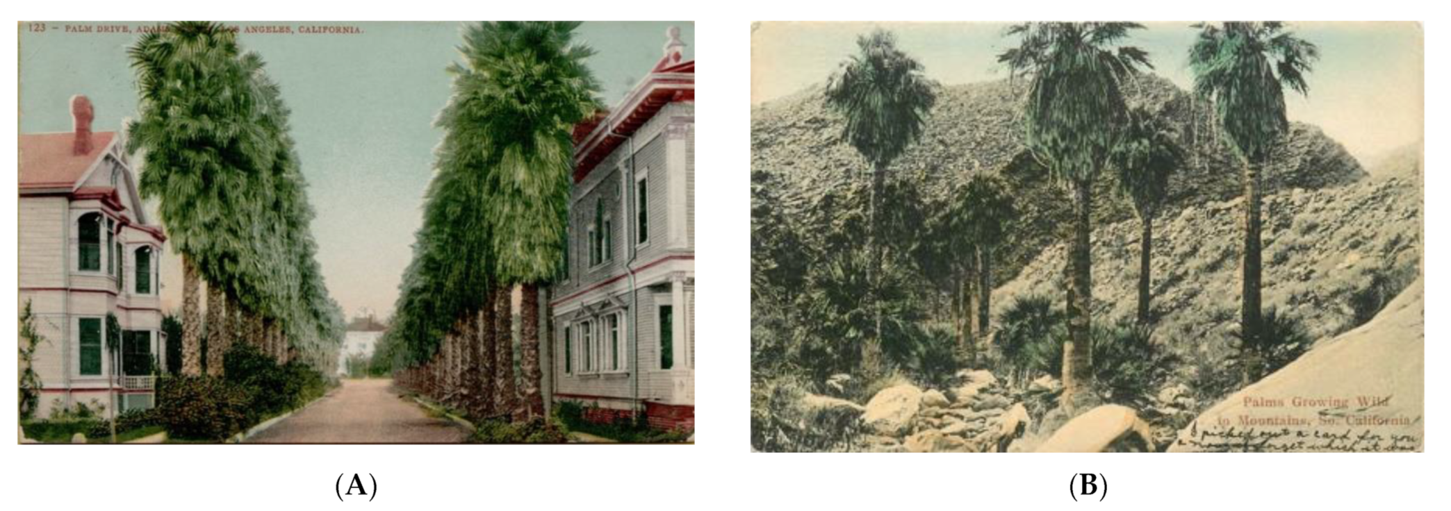
As the lithographed cards were initially printed black and white,, coloring was applied by hand using watercolor and egg-white based paints (Figure 28). As noted, some colorists used stencils to speed up the process and to avoid inaccuracies caused by free-hand coloring (Figure 29). The actual color of the buildings and decorative features is based on the interpretation of the colorist. We do not know to what extent detailed color guidance was provided by those who ordered the cards. Not surprisingly, errors in coloration could, and would, occur, especially where the colorists lived in a different country (mainly Germany) and thus were unfamiliar with the colors in nature. A good example is the postcard of the palm-lined Adams Street in Los Angeles. Here the ‘skirts’ of dead leaves that cover the stems of Washingtonia filifera were colored green, as if they were alive, rather than the obligatory dull light brown of dead leaves (Figure 28A). A similar example exists for the palms shown in their natural setting at Palm Canyon, where the mistaken coloring is carried through over different editions (Figure 28B).
5.1. Retouching
Several cards exhibit evidence of retouching, commonly emphasizing the outlines of people to make them stand out better against a similarly colored background (Figure 30). On occasion the retouching of the image is much more extensive. A good example is the image of the Hanford Court House. The original image published by the Newman Postcard Company shows an electricity pole in the foreground, affecting the image of the building (Figure 31A). On occasion of a reissue of the card, the pole was retouched out (Figure 31B). Another example of the removal of an offending power pole comes from San Bernadino (Figure 32). Yet, the presence of power poles allows us to interpret the nature of services a residential street had access to at the time. Thus, an interpretation based on a retouched postcard will be misleading.
Retouching was also used to ‘update’ an image by removing elements that dated the image, i.e., that would make it obvious to the viewer that the image did not represent the current state of affairs but was ‘old.’ A good example of this is an image of a drive in East Lake Park, Los Angles. The image in a travel brochure (Figure 11A) as well as the postcard produced by the Detroit Publishing Company (Figure 11B) shows a car in the middle of the drive (Figure 32C). The car is possibly a Ford Model B of 1905. In a reissue of the card, the car was retouched out (Figure 32D).
Unless the work is obvious, as in the case of thickened outlines or clumsy replacements, the retouching can only be detected by a comparison with the original image. An example of the removal of an offending shadow is provided by an image of the Santa Fe Railroad Hospital in Los Angeles. The Newman Post Card Co of ca. 1907 shows a major shadow in the foreground (Figure 33A) which is also present in the original photograph (Figure 9). The reissue of the card sees the shadow retouched out of existence (Figure 33B). In addition, the image is slightly cropped reducing the foreground.
In the case of the cards showing the bath house of Paso Robles, for example, an entire planting bed was removed that had dominated the foreground (Figure 34). The larger image, based on an original photograph, requires the planting bed to provide visual proportions and to situate the building in a landscaped environment. The tighter framed postcard could dispense with this and focus on the building—which required the removal of residual, but now jarring elements in the foreground.
The reverse can also be the case, where a generic image shows Washingtonia filifera as street planting at an unknown location in Pasadena (Figure 35A). In a reissue of the card, a person was added to the image (Figure 35B). In some cases, the image is slightly cropped to emphasize the central motif, which then may also require to subtly retouch some components. In the reissue of a postcard showing twin Washingtonia palms at an unknown location in Pasadena, saw the removal of a person in the original and the addition of another, larger human figure in the reissue (Figure 36).
On occasion the retouching efforts are quite extensive and contextually significant. A good example are cards that depict Pacific Park (now Lincoln Park) in Long Beach, CA. The original postcard is based on a photograph taken from an elevated position across the street and shows a park devoid of people. The image also shows a power pole next to a lantern pole, as well as overhead wires for a trolley bus (Figure 37A). The reissue of the card shows the park full of people, with the offending overhead wires and power pole removed, and an additional car placed on the road (Figure 37B).
In the first printing, the coloring of the trees in the back is quite heavy, deleting detail, while in the second the detail is allowed to emerge. The first printing cliché also removes some of the far background, which the second printing preserves. These details aside, what matters to viewers is the impression that the cards convey. The first postcard conveys a sense of abandonment, while the second card suggests that Pacific Park is ‘the place to be.” The general clarity of the print suggests that the publisher still had access to the original photograph, which becomes evident when looking at the bottom left corner which shows more of a parked vehicle than the original card.
5.2. Translocation of Settings and Generic Cards
Some publishers made use of the same cliché, marketing the image for different locations. An example is an image of a residential neighborhood, which was published under the title ‘Grand Street, Alameda, California’ (Figure 38A), as well as under the title ’View of a beautiful residence street, Oakland, Ca.’ (Figure 38B). The text as printed on a white block out on the colored card indicates that this may be the falsely attributed version.
A generic image of a palm-lined farm track was marketed by Bentham Publishing Company as ‘Palm Drive” with attributed locations of Ontario (Figure 39A) and Uplands (Figure 39B). As the farm is located between the two adjoining communities, the cards’ publisher could genuinely service two markets with the same image. Close inspection shows that these attributions were added later as overprints. Not only was an italics type face used for the location as opposed to the Roman face for the title, but the locational attribution is also printed at a slightly different angle from the title. The same locational flexibility applies to an image of a palm-lined driveway to the McNeill Ranch, which has been geographically attributed to both Azusa and Glendora. The first image, showing a longer driveway perspective and attributed to Azusa, was shot when the farm was owned by the Vosberg family (Figure 40A). Upon change of hands, it seems, the image was reshot with a shorter perspective (Figure 40B). That card was then reissued with a different caption, moving the attribution from Azusa to Glendora (Figure 40C). Again, as the farm is between the two adjoining communities, one image sufficed for two geographic appellations. That card image was then further reused in a generic fashion (Figure 40D).
While this dual usage can be justified given the proximity of the two communities, there are examples where the labeling of the imagery is plainly deceptive: one of the images reputedly of a street in Santa Ana (Figure 41A) bears a very strong resemblance to an albumen photograph taken at Adams Street, Los Angeles (Figure 41B). The semblance in details is such that the Santa Ana image is undoubtedly an example of deliberately spurious attribution.
On occasion, cards were reprinted with the original captioning replaced. An example of changes to the cliché blocking out original text with a coarse overprinting, not in keeping with the style of the original lettering, is a card from Palo Alto (Figure 24). At the time of writing the original card has not been located.
To maximize financial returns, some postcard publishers chose well-composed images and reproduced them under a generic title rather than just with the original geographic attribution. Images that were sufficiently generic, were simply relabeled—and thereby locationally disembodied. Common are generic cards with the title ‘A Californian Residence Street’ (or similar). Examples of such generic titles abound (e.g., Figure 42).
On occasion this relabeling took quite some literary license. Edward H Mitchell, publisher in San Francisco, produced an image of the Southern Pacific Railroad Co’s Hospital, Sacramento (Figure 43A) which he later, with the same stock number, republished as “A California Residence” (Figure 43A).
Another example is the re-use of generic imagery with imprints for different towns. The image of a palm lined walk in a park, for example, was published under the title ‘Palm Walk, Pacific Park, Long Beach, Cal.’ by Tichnor Brothers’ ‘Western publishing and Novelty Co.’ (Figure 44A) and under the title ‘Palm Walk, Los Angeles, Cal.’ by the Western Publishing and Novelty Company (Figure 44C). The twin palms of Pasadena (Figure 45A) were also republished as generic (Figure 45B) and as being located in Los Angeles (Figure 45C).
Annother, more egregious example of this is an image of a California Bungalow at Marimaar (Figure 46A) which the publishers Edward H Mitchell also marketed under the generic title ‘California Bungalow’ (Figure 46B). The consecutive order numbering, n° 2639 for the Marimaar image and n° 2640 for the generic one, demonstrates that this was a deliberate strategy from the onset, and not some marketing afterthought. The same image was then produced in ca. 1912 by HHR Co. as ‘A California Bungalow’ (Figure 46C) and as ‘An Oregon Bungalow’ (Figure 46D). The edition by the Newman Postcard Company (Los Angeles and San Francisco) ‘updated’ the image by removing the water tower, which would have signaled that the property was not ‘modern’ inasmuch as it was not on the piped town water supply (Figure 46G).
6. Discussion
Postcards can provide pictorial evidence of the appearance of buildings, gardens and streetscapes. This value derives from the visual depiction of the building or other subject on the view side, the descriptive text and attribution printed on the card and the date of that depiction as derived from the postmark on the card if it was mailed.
In general, two sets of data can be derived from the postmarks. The oldest documented postmark provides a terminus ante quem for that specific imprint of the card, and obviously also a terminus ante quem for the photograph on which the card is based. It is critical to understand, though, that considerable time may have elapsed between the original photograph and its conversion into a postcard. The total range of the postmark dates on record for a given card imprint allows us to demonstrate the time range during which the specific imprint was on sale, thus, at least in theory, permitting the thematic popularity of the issue and, possible, also the relative visitor volume.
The major methodological problem with these approaches is that during the late nineteenth and early twentieth century postcards were collectible items. Consequently, many cards were bought and sent to family and members of the social circle for appreciation of the local visited—and to authenticate one’s own visit to the location. Thus, unfortunately, the bulk of cards in collections, as well as the bulk of cards assessed in online auctions, has never been postally used and thus lack the important postmark.
Where evidentiary emphasis can be placed on postcard images and the descriptive text and attribution printed on the card, one of the problems inherent in the relabeling of specific properties to generic ones is that it distorts the reality of a community and generates a sense of affluence. An example for this is the postcard depicting the residence of Ulysses S. Grant jr. (the son of the 18th U.S. president of the same name) in San Diego (Figure 42A). The building is a grand, turreted, double story structure situated in a landscaped garden. When labeled ‘A California Residence’ ((Figure 42B) the attribution is factually still correct but suggests to the viewer that this is a typical residence. This even more egregious in the case of the Pacific Railroad Company Hospital in Sacramento (Figure 43), an ornate double story building. The reissue of the car as a ‘A California Residence’ disembodies the building geographically and adds a sense of affluence. Significantly, the publisher, Edward Mitchell, used the same stock number for both productions, which suggests preplanning and intent. In the absence of company records, we have to assume that the publisher would have not distributed the generic card in Sacramento itself. On occasion the labeling of the caption can be unintentionally misleading, as in the case of Figure 47, where a pair of Washingtonia filifera is labeled ‘California Date Palms’ (Phoenix dactylifera).
Finally, the veracity of the image needs to be verified. As shown in this paper, the cards were printed black and white and hand colored, often by overseas printing houses, which suggest that little store can be placed in the accuracy of coloring. There is also an abundance of retouching, both subtle and irrelevant in terms of impact on the evidentiary value, and substantive where critical elements such as electricity poles were removed.
To avoid potentially premature interpretations where evidentiary emphasis is to be placed on postcard images, it is imperative that a systematic search for printing variants is carried out to ensure that the image used has not been retouched or otherwise modified and that the card is from the original printing run and not a later reprint. Fortunately, then as well as now, nineteenth century postcards are collectible items, which are widely offered on on-line auction platforms such as eBay, Delcampe and Yahoo Japan, as well as by on-line second-hand retailers such as Amazon and Etsy. Image aggregator sites such as PicClick (http://picclick.com) allow ready access to images of cards currently on sale and through these to the original listings which may also show the verso sides of the cards. An additional valuable tool to locate digitized images is the image matching software provided as part of the search function of Google images (https://images.google.com).
Within the framework imposed by these limitations, the images provided on picture postcards provide heritage studies with a valuable source of visual information on the appearance of a specific building or structure. When examining streetscape imagery, postcards can be used to understand the spatial relationship of properties as well as the visual dominance (or lack thereof) of a given property in relation to its neighbors.
Museum and local history collections tend to favor postcards that show a clear and unaltered pictorial side, ideally in pristine condition. From the perspective as a museum item and as source for an illustration in a publication, such cards are certainly preferable to cards that have been scribbled on by the sender. Form a social history perspective providing context to the heritage discussed in these studies, however, such handwritten annotations of printed cards are highly valuable. The commentary by the senders, either on the text field or directly as annotations on the image, can illuminate the social relevance of the property or can highlight specific aspects deemed noteworthy, which may lead to different directions of historical enquiry. As these annotations are few and far between, and are thus less predictable in terms of availability at the time of study completion, it is imperative that systematic image ‘harvesting’ of online offerings is carried out over a prolonged period of time.
Heritage conservation studies routinely draw on historic postcard imagery of specific buildings or structures and community-based or main-street based heritage studies draw on historic postcard imagery to discuss the appearance of a given street over time. In their discussion, they often tend to overlook the significance of the fact that the object of study has been depicted on a postcard in the first place. Clearly, the specific building or structure was deemed important and a point of pride to the community, sufficiently so that the ‘outside world’ should be informed about this. This presents the opportunity to consider which buildings have been afforded the treatment of being singled out, while others were not. In some cases that may be driven by the business acumen of the receptive shop owner, but by others it may be driven by the postcard publishers.
When considering neighborhood streetscapes as depicted on pictorial cards (e.g., Figure 38), for example, heritage studies can benefit from a critical interrogation of the imagery shown on such picture postcards, drawing on a large body of scholarship deconstructing colonial and exotic locales [31,32,34,36]. Similarly, the very nature of retouching, while reducing the evidentiary value of the image, at the same time provides an insight to the social values of the time and thus adds to the understanding of the relative significance of the property and, by extension, the aspirations of the property owners and, possibly, the community at large.
7. Conclusions
Due to their ubiquitous nature, postcards form a unique and substantial body of pictorial, and dated evidence of the appearance of buildings, gardens and streetscapes. This body of data, however, has its own limitations which need to be researched and understood in order to understand their evidentiary value. Beyond the details of the image, the very fact that a property was deemed worthy of postcard treatment provides avenues for historic enquiry into the comparative significance of the property under discussion
Funding
This research received no external funding.
Conflicts of Interest
The author declares no conflict of interest.
Appendix A. Details to the Postcards Illustrated in the Figures
- Figure 1. (A) ‘14 Luglio 1902 ore 9.52 ant.’ Postcard with divided back published by Antonio de Paoli, Venice.—(B) ‘Il campanile di S. Marco crollato il 14 Judlio 1902 (ore 9.52 ant.). Postcard with divided back published by Giovanni Zanetti, Venice.
- Figure 2. Example of a commercially printed postcard with undivided back and Act of Congress notification. ‘Palms at East Side Park, Los Angeles, Cal.’ Card n° 14. Published by Edward M. Mitchell, San Francisco. (A) Recto; (B) verso.
- Figure 3. Example of a commercially printed postcard with undivided back. (A) Recto; (B) verso. ‘Palm Drive, Los Angeles, Cal.’ Postcard with undivided back published by M Rieder, Los Angeles (on record for 1904).
- Figure 4. Example of a commercially printed postcard with divided back. (A) Recto; (B) verso. ‘Palms growing wild in the mountains, Southern California.’ Card n° 798. Postcard with divided back published by M Kashower Co., Los Angeles.
- Figure 5. Example of a privately printed advertising postcard with undivided back. (A) Recto; (B) verso. Note the perforated edge at the bottom, indicating that the card was torn from a booklet. ‘The new bath house. Paso Robles Hot Springs Hotel. W.A. Junker, Lessee and Manager. Paso Robles, California’. Postcard with divided back. (on record for 1907).
- Figure 6. Example of a commercially produced real photo postcard with a divided back. (A) Recto; (B) verso. Real photo postcard printed on Azo paper.
- Figure 7. Commercially produced real photo advertising postcard with a divided back. (A) Recto; (B) verso. ‘Maywood Hotel showing real estate office in the distance. Corning, Cal.’ Real photo postcard printed on Azo paper.
- Figure 8. Promotion of local attractions and travel destinations through lantern slides and stereo cards (A) Hand-colored glass lantern slide showing the row of Washingtonia filifera planted along one side of Magnolia Avenue at Riverside, CA. Glass lantern slide in the Warren H. Manning Papers at the Iowa State University Library. (B) Stereo Card “Magnolia Avenue, tropical beauties of Riverside, California.” Copyright 1898 by Underwood & Underwood. Stereo Card printed ca 1903. Underwood & Underwood Publishers, New York, London, Toronto Canada, Ottawa-Kansas.
- Figure 9. Straight conversion of photograph into a postcard. The Santa Fe Railroad, Los Angeles. (A) Photograph ca. 1905 (Photo: California Historical Society Collection, 1860–1960). (B) Contemporary postcard published by Newman Post Card Co., Los Angeles (on record for 1908).
- Figure 10. Straight conversion of photograph into a postcard. Tall Washingtonia at Montecito. (A) ‘The tallest and oldest palm seen at Monteceito, Cal.’ Image n° 172. Photo by A.H. Roberts (California State Library 2012–0059). (B) ‘The tallest and oldest palm in the world, California.’ Card n° 3192. Published by M. Rieder, Los Angeles and Leipzig. Postcard with divided back printed in Germany (on record for 1906–1907).
- Figure 11. Multiple use of imagery. Parkland in Los Angeles. (A) Image taken from the promotional booklet ‘The road of a thousand wonders: the Coast Line-Shasta Route of the Southern Pacific Company’ [43]. (B) Postcard ‘Beautiful California—Fan Palm Drive, Los Angeles.’ Card n° 3841. Pacific Novelty Company. San Francisco. Postcard with divided back printed in Germany (ca 1905).
- Figure 12. Change of mode of productions. Street scene in Santa Rosa. (A) Example of a commercially produced real photo postcard with a divided back. (B) ‘Palm Trees on Fourth Street, Santa Rosa, Cal.’ Card n° 2214. Postcard with divided back published by Pacific Novelty Co., San Francisco (on record for 1913).
- Figure 13. Conversion of a photograph into a postcard image. Hotel Maywood, Corning, CA. (A) ‘Historic Photographs of Corning, California’ (http://www.calif-tech.com/events/historic/gallery/gallery.html) accessed 20 June 2021. (B) ‘Hotel Maywood, Homeseekers Headquarters, Corning, California, J.E.Ruggles, Prop. (C) Superimposition of image and card.
- Figure 14. Examples of different verso sides of the same card. ‘Palmetto Avenue, Los Angeles, California.’ Card n° 8. Postcard with divided back. Publisher not stated. (A) Recto of the card. (B–F) Verso of the card with different imprints. (B) Green ink, plain lettering of ‘Post Card’ (on record for 1909). (C) Green ink, ornamental outline lettering of ‘Post Card’ (on record for 1909–1912). (D) Green ink, ornamental outline lettering of ‘Post Card’ with additional text on verso: “Palmetto Avenue, Los Angeles, Calif.—Is one of the most beautiful boulevards in the delightful city of Los Angeles. It derives is name from the rows of palm trees which extend throughout its entire length.” Three types of ink are on record: grass green (blanks only), dark green (on record for 1909–1910) and black (on record for 1913). (E) Green ink, ornamental outline lettering of ‘Post Card’ with additional text on verso: “Palmetto Avenue, Los Angeles, Calif.—Is one of the most beautiful boulevards in the delightful city of Los Angeles. It derives is name from the rows of palm trees which extend throughout its entire length.” and additional seven-line advertising text for ‘Woman’s World’. (F) Black ink, ornamental outline lettering of ‘Post Card’ with inkwell and quill.
- Figure 15. ‘Winter Scene at East Lake Park, Los Angeles, Cal.’ Card n° A68, Published by Newman Postcard Co., Los Angeles. Card printed in Germany.
- Figure 16. An example of very subtle changes to the text. Note the missing full stop after ‘Cal’. (A) ‘Eastlake Park, “Winter Scene.” Los Angeles, Cal.’ Card n° 468. Postcard with divided back published by Van Ornum Colorprint Co., Los Angeles. (on record for 1910). (B) ‘Eastlake Park, “Winter Scene.” Los Angeles, Cal’. Card n° A68. ‘On the road of a thousand wonders.’ Published by Newman Postcard Co., Los Angeles. (on record for 1911).
- Figure 17. An example of subtle changes to the text. Note the spelling of ‘Eastlake’ and the missing full stop after ‘Cal’. (A) ‘Winter in Eastlake Park, Los Angeles, Cal.’ Card n° A 176. ‘On the road of a thousand wonders.’ Postcard with divided back published by The O. Newman Company, Los Angeles. Printed in USA (on record for 1902). (B) ‘Winter in East Lake Park, Los Angeles, Cal.’ Card n° A 176. ‘On the road of a thousand wonders.’ Postcard with divided back published by O. Newman Company, Los Angeles, San Francisco. Printed in USA (on record for 1911).
- Figure 18. Examples of changes to the type face and subtle changes to the text. (A) ‘Palmetto Avenue, Los Angeles, California.’ Card n° 4. Postcard with divided back. Publisher not stated (1908–1910). (B) ‘Palmetto Avenue, Los Angeles, California.’ Card n° 4. Postcard with divided back. Publisher not stated. (C) ‘Palmetto Avenue, Los Angeles, California.’ Card n° 8. Text on verso: “Palmetto Avenue, Los Angeles, Calif.—Is one of the most beautiful boulevards in the delightful city of Los Angeles. It derives is name from the rows of palm trees which extend throughout its entire length. Postcard with divided back. Publisher not stated. The verso exists in different colors (Figure 13). (D) ‘Palmetto Avenue, Los Angeles, California.’ Card n° 8. Postcard with divided back. Publisher not stated. Five different imprints of the verso of the card are on record (Figure 14).
- Figure 19. An example of changes in type face. (A) ‘Palm Drive at Westlake Park, Los Angeles, Cal.’ Card n° A6. Postcard with divided back published by Newman Postcard Co., Los Angeles and San Francisco (on record for 1909–1911). (B) ‘Palm Drive at Westlake Park, Los Angeles, Cal.’ Card n° A6 Postcard with divided back published by Newman Postcard Co., Los Angeles and San Francisco (on record for 1912). (C) ‘Palm Drive at West Lake Park, Los Angeles, Cal.’ Card n° 9795. Postcard with divided back published by A.C. Bosselmann & Co., New York (on record for 1909–1911). (All cards printed in Germany.
- Figure 20. Examples of changes in the wording of the caption. (A) ‘Winter Scene at East Lake Park, Los Angeles, Cal.’ Card n° A68, Published by Newman Postcard Co., Los Angeles. Card printed in Germany (detail of Figure 15). (B) ‘Eastlake Park, “Winter Scene,” Los Angeles, Cal.’ Card n° A 68. Postcard with divided back published by Newman Post Card Company, Los Angeles, San Francisco. (on record for 1911). (C) ‘A drive in East Lake Park, Los Angeles, Cal.’ Card n° 9349. Postcard with divided back published by M. Rieder, Los Angeles. Printed in Germany (on record for 1908). (D) ‘Lincoln Park, “Winter Scene,” Los Angeles, Cal., Bed of Pansies.’ Card n° 868. Postcard with divided back published by Van Ornum Colorprint Co., Los Angeles.
- Figure 21. An example of changes in the wording of the caption. (A) ‘Winter in Eastlake Park, Los Angeles, Cal.’ Card n° A 176. ‘On the road of a thousand wonders.’ Postcard with divided back published by The O. Newman Company, Los Angeles, San Francisco. Printed in USA (on record for 1910–1912). (B) ‘A Palm Walk, Midwinter, California.’ Postcard with divided back published for F.W. Woolworths Co. Printed in USA (on record for 1911). (C) ‘Pansy Bed, Eastlake Park, Los Angeles, Cal.’ Postcard with divided back published by Tichnor Bros. Inc. Boston, Mass (on record for 1912). (D) ‘Pansy Bed, Eastlake Park, Los Angeles, Cal.’ Postcard with divided back published Western Publishing and Novelty Co., Los Angeles. (E) ‘Winter Scene at Lincoln Park, Los Angeles, Cal.’ Card n° 8641. Postcard with divided back published by Edward H Mitchell, San Francisco (on record for 1920).
- Figure 22. Overprinting of generic cards to create a location-specific offering. (A) ‘Twin palms in California.’ Card n° 3081. Published by M Rieder Los Angeles. Card. Postcard with an undivided back. Postmarks on record printed in Germany. (B) Card n° B57, ‘Twin Palms near Pasadena, Cal.’ Published by Newman Postcard Co., Los Angeles. Cal. Made in Germany’ (on record for 1909). (C) ‘A California Residence street.’ Card n° 6818. Published by M. Rieder, Los Angeles and Dresden. Postcard with divided back. (D) same as C, overprinted ‘Redlands, Cal.’ (on record for 1903). (E) ‘Boulevard towards Los Banos del Mar, Santa Barbara, Cal.’ Card n° 13373. ‘Phostint’ Card. Card with divided back published by Detroit Publishing Co. (F) same as E, but overprinted ‘In front of Potter Hotel’. (G) ‘The tallest and oldest palm in the world, California.’ Card n° 3192. Published by M. Rieder, Los Angeles and Leipzig. Postcard with divided back printed in Germany (on record for 1906–1907) (detail of Figure 10B). (H) ‘The tallest and oldest palm in the world, California. Montecito near Santa Barbara.’ Card n° 3192. Published by M. Rieder, Los Angeles, Calif. Postcard printed in Germany. Postcard with undivided back (on record for 1906). (I) as image G, but card with divided back. (J) Washingtonia as ornamental plantings in private gardens, reputedly in Los Angeles, as depicted on a contemporary postcard. ‘California, Palms.’ Postcard with undivided back published by M Rieder, Los Angeles, Cal. Printed in Germany Note the double impression of ‘Los Angeles’ in the overprint.
- Figure 23. Overprinting of generic cards to remove identifying features. G, H Card n° 1207, ‘Fan Palm, Sacramento, California.’ Published by Edward H Mitchell, San Francisco (on record for 1912).
- Figure 24. Example of production issues. (A) ‘Cal. Residence and Grounds. Palo Alto, Cal.’ Published by Newman Post Card Co., Los Angeles (on record for 1908). Note the white panel at the bottom left. The original, not overprinted card has not yet been identified. (B) Typesetting error. Note the stray word ‘Title’ in the caption. Card n° 510. Published by Pacific Novelty Company, San Francisco. Printed in Germany (on record for 1912).
- Figure 25. Examples of degraded image clarity. Reprint by the same publishers but made from printed postcard as opposed from the original photograph. Original prints on left, reprints (with the same order number) on right. (A,B) ‘Hotel Virginia from the Park, Long Beach, Cal.’ At left margin: ‘Photo copyright 1909 by M Rieder’ Card n° 5318. Postcard with divided back published by M. Rieder, Los Angeles. Printed in Germany (B): on record for 1912). (C,D) ‘Winter Scene at East Lake Park, Los Angeles, Cal.’ Card n° A68, Published by Newman Postcard Co., Los Angeles. Card printed in Germany (D): on record for 1911).
- Figure 27. Examples of clichés trimmed to allow for the insertion of a different background. Note the cut lines at the edges of the foliage. (A) ‘Magnolia Ave, Riverside, Cal.’ Card n° M1. Postcard with divided back published by M. Rieder, Los Angeles. (B) ‘Three varieties of Palms, California’ Card n° G64. Postcard with divided back published by Pacific Novelty Co., San Francisco (on record for 1913).
- Figure 28. Erroneous coloring of features. Note the green coloring of the ‘skirts’ of dead leaves. (A) ‘Palm Drive from Singleton Court looking towards Adams Street, Los Angeles, Cal.’ Postcard with divided back published by Edward Mitchell, San Francisco. Printed in the USA (on record for 1909). (B) ‘Palms growing wild in the mountains, So. California.’ Card n° 1616. Postcard with divided back published by Newman Postcard Company Los Angeles and Dresden (on record for 1906).
- Figure 29. Differences in coloring of features, attesting to different levels of quality control. ‘Keeley Residence Adams St, Los Angeles, Cal. Card n° 1689. Published by Newman Postcard Co., Los Angeles, Cal. Printed in Germany. Postcard with divided back (on record for 1908).
- Figure 30. Retouching to enhance details. Compare the outline of the roof, the dress and the palm crowns in the image at left with the retouched image at right. (A) ‘Sunken Gardens, Hotel Virginia, Long Beach, Cal.’ Card n° D66. Postcard with divided published by Souvenir Publishing Co. (B) ‘Sunken Gardens, Hotel Virginia, Long Beach, California.’ Card n° 703. Published by M. Kashower Co., Los Angeles. Postcard with divided back printed by Van Ornum Colorprint, Los Angeles.
- Figure 31. Example of retouching to remove unwanted elements. Section of postcards depicting the Hanford Court House. Original at left, retouched version at right. (A) ‘Court House, Hanford, Cal.’ Card n° 5699. Postcard with divided back published by Newman Postcard Co., Los Angeles. Card printed in Germany. (B) ‘Court House, Hanford, Cal.’ Card n° AL 12. Postcard with divided back published by Newman Postcard Co., Los Angeles. (on record for 1909).
- Figure 32. Examples of retouching to remove unwanted elements. Originals at left, retouched versions at right. (A) Master copy of a postcard “High School, San Bernardino, California.” Card n° 2758. Published by M Rieder, Los Angeles. Printed in Germany by Brück & Sohn, Meißen. Printer’s code 8144. (Company archive via in WikiCommons). (B) ‘High School, San Bernardino, California.’ Card n° 44. Printed by Edward H. Mitchell, San Francisco. Postcard with divided back (ca on record for 1907). (C) Detail of Figure 11B. (D) ‘A palm bordered drive, California.’ Card n° 4062. Postcard with divided back published by Eno & Matteson, San Diego. Postcard printed in the USA.
- Figure 33. Retouching to remove shadows. Section of postcards depicting landscaping features lining a driveway at the Santa Fe Railroad Hospital, Los Angeles. (A) Figure 9B; (B) “Santa Fe Hospital, Los Angeles, Cal.”.
- Figure 34. Retouching to remove elements. The Paso Robles bath house. (A) Image in the promotional booklet ‘The road of a thousand wonders: the Coast Line-Shasta Route of the Southern Pacific Company.’ [43]. (B) The Paso Robles bath house, as depicted on a contemporary postcard. ‘Bath House, Paso Robles Hot Springs, California, on a Road of a Thousand Wonders.’ No printer stated. Postcard with divided back.
- Figure 35. Example of subtle retouching. Originals at left, retouched versions at right. (A,B) Bottom section of a postcard depicting Washingtonia filifera as street planting at an unknown location in Pasadena. (C,D) Bottom section of a postcard depicting Washingtonia filifera as street planting in Adams Street, Los Angeles. Note the failure to account for the correct alignment of shadows between the palms and the added person and car. (A) ‘Fan palm and ivy geranium. Winter scene in California at Pasadena.’ Card n° 2656. Postcard with divided back published by Souvenir Publishing Co., San Francisco. (on record for 1914). (B) ‘California fan palm and ivy geranium.’ Card n° 2656. Postcard with divided back published by Edward H. Mitchell, San Francisco (on record for 1912). (C) ‘Palm Drive, Adams Street, Los Angeles, California.’ Card n° 123. Postcard with divided back published by Edward H Mitchell, San Francisco (C on record for 1913). (D) ‘Palm Drive, Adams Street, Los Angeles, California.’ Card n° 123. Postcard with divided back published by Edward H Mitchell, San Francisco.
- Figure 36. Example of subtle retouching and cropping. Section of a postcard depicting twin palms at an unknown location in Pasadena. Original on left, retouched version on right Note the removal of the person in the original and the addition of another, larger human figure in the reissue. Full width of the postcards is shown. (A) Detail of Figure 45B. (B) Detail of Figure 45C.
- Figure 37. Retouching to remove unwanted items and to add elements. (A) ‘Pacific Park, Long Beach, Cal.’ Card n° 740. Postcard with divided back published by Von Ornum Colorprint Co., Los Angeles. (on record for 1912–1921). (B) ‘A Section of Pacific Park Virginia, Long Beach, California.’ Card n° L-5. Postcard with divided back published by Western Novelty Publishing Co. Theo Sohmer, Los Angeles. Printer’s Code A-59583. Printed in the USA (on record for 1920–1921).
- Figure 38. Spatially translocated re-use of image clichés (A) ‘Grand Street, Alameda, California. Card n° S-777. Postcard with divided back published by Souvenir Publishing Co., San Francisco, Los Angeles, Cal. (on record for 1914). (B) ‘View of a beautiful residence street, Oakland, Cal.’ Card n° 10535. Postcard with divided back published by Acmegraph Co. Chicago.
- Figure 39. Spatially translocated re-use of image clichés. (A) ‘Palm Drive, Ontario, Cal.’ Postcard with divided back published by Bentham Publishing Company, Los Angeles. (B) ‘Palm Drive., Ontario, Cal.’ Card n° 2947. Postcard with divided back published by Bentham Company, Los Angeles. Card printed in the USA (on record for 1913). (C) ‘Palm Drive., Uplands, Cal.’ Card n° 2947. Postcard with divided back published by Bentham Company, Los Angeles. Card printed in the USA.
- Figure 40. Spatially translocated re-use of image clichés. (A) ‘Palm Drive, Vosberg Ranch, Azusa, Cal.’ Postcard with divided back published for Thomas Drug Co., Azusa, by Newman Postcard Co., Los Angeles (on record for 1910). (B) ‘Palm Drive, McNeill Ranch, Azusa, Cal.’ Postcard with divided back published Western Publishing and Novelty Co., Los Angeles (ca on record for 1914). (C) ‘Palm Drive, McNeill Ranch, near Glendora, Cal.’ Postcard with divided back published by ¶¶. (D) ‘Palm Drive, Southern California.’ Postcard with divided back published Western Publishing and Novelty Co., Los Angeles.
- Figure 41. Spatially translocated re-use of images. (A) Palm Drive, Santa Ana, Cal.’ Card n° 9. Postcard with divided back published by K.Severance & Co., Los Angeles.Printed in Germany (on record for 1909). (B) A view from Adams Street, L.A.’ Albumen print by ‘F.H. FC’.
- Figure 42. Locationally disembodied re-use of image clichés. (A) ‘Residence of U.S. Grant, San Diego, Cal.’ Card n° L6. Published by Newman Postcard Co., Los Angeles. Postcard with divided back printed in Germany. (B) ‘A California Residence.’ Card n° 5583. Published by Paul Newman Postcard Co., Los Angeles. Postcard with divided back printed in Germany (on record for 1909).
- Figure 43. Locationally disembodied re-use of image clichés. (A) ‘Southern Pacific Railroad Co’s Hospital, Sacramento, California.’ Card no 1208. Published by Edward H Mitchell, San Francisco. Postcard with divided back printed in the USA. (B) ‘A California Residence.’ Card no 1208. Published by Edward H Mitchell, San Francisco.
- Figure 44. Locationally disembodied re-use of image clichés. (A) ‘Palm Walk, Pacific Park, Long Beach, Cal. Card n° 385. Postcard with undivided back published by Oscar Newman, Los Angeles (on record for 1907). (B) ‘Palm Walk, Pacific Park, Long Beach, Cal.’. Postcard with undivided back published by Western Publishing and Novelty Co., Los Angeles for the ‘From Coast to Coast’ series, Tichnor Brothers, Boston, Mass and Los Angeles, Calif (on record for 1913). (C) ‘Palm Walk, Los Angeles, Cal.’ Published by the Western Publishing and Novelty Company, Los Angeles.
- Figure 45. Spatially translocated images. (A) ‘Twin palms in California.’ Card n° 3081 Postcard with an undivided back published by M. Rieder, Los Angeles. Card printed in Germany (on record for 1906). (B) ‘Twin palms in California. Los Angeles’. Postcard with an undivided back published by M. Rieder, Los Angeles. Card printed in Germany (on record for 1905). (C) ‘Twin Palms near Pasadena, Cal.’ Card n° B57Published by Newman Postcard Co., Los Angeles, Cal. Card printed in Germany (on record for 1908)—(D) ‘Sentinel Palms in California.’ Card n° 3124. Postcard with a divided back published by M. Rieder, Los Angeles, Cal. and Leipzig (on record for 1907). (E,F) ‘Twin palms, Pasadena, California.’ Card n° 1195. Published by Eduard Mitchell, San Francisco. Card printed in the USA (on record for 1908–1909).
- Figure 46. Pre-planned duplicate production and subsequent sale of a clichés. Note the consecutive order numbers in A and B. (A) Card n° 2639 ‘A California Bungalow at Marimaar, near Santa Barbara, California.’ (on record for 1908–1912). (B) Card n° 2640 ‘A California Bungalow.’ Both cards published by Edward H Mitchell, San Francisco (on record for 1911). (C) Card C1961. ‘A California Bungalow.’ Published by HHT Co. (on record for 1913). (D)Card 7740, ‘An Oregon Bungalow.’ Published by HHT Co. (on record for 1913). (E) Card n° 4479 ‘A Bungalow Home at Miramar, Cal.’, Los Angeles. (F) Card n° 9007 ‘A California Bungalow.’ Both cards published by M.Rieder, Los Angeles (both on record for 1909). (G) Card n° AB3 ‘A California Bungalow.’ Card published by Newman Postcard Co., Los Angeles and San Francisco (on record for 1910).
- Figure 47. Pair of Californian fan palms (Washingtonia filifera) at an unknown location in California (possibly San Diego) wrongly labeled as date palms (Phoenix dactylifera). ‘California Date Palms.’ Card n° 6099.
References
- Dotterrer, S.; Cranz, G. The picture postcard: Its development and role in American urbanization. J. Am. Cult. 1982, 5, 44–50. [Google Scholar] [CrossRef]
- Grant, H.R. Ohio in Historic Postcards: Self-Portrait of a State; Kent State University Press: Kent, OH, USA, 1997. [Google Scholar]
- Walker, C. Railways of Latin America in Historic Postcards: Featuring South and Central America, the Caribbean and the West Indies; Trackside Publications: Bacchus Marsh, VIC, Australia, 1998. [Google Scholar]
- Man, T.C.; Toong, D.P.; Cheung, A.S.; Kai, M.Y. A Selective Collection of Hong Kong Historic Postcards Hong Kong; Joint Publishing (HK) Co., Ltd.: Hong Kong, China, 1993. [Google Scholar]
- Davidson, J. Moments in Time: A Book of Australian Postcards; National Library of Australia: Canberra, ACT, Australia, 2016. [Google Scholar]
- Pekrul, G.; Krieck, M. Schwerin auf Historischen Ansichtskarten: Altstadt: Schwerin in den Grenzen von 1884; Edition Digital: Pinnow, Germany, 2011. [Google Scholar]
- Arreola, D.D.; Burkhart, N. Photographic postcards and visual urban landscape. Urban. Geogr. 2010, 31, 885–904. [Google Scholar] [CrossRef]
- Rogan, B. An entangled object: The picture postcard as souvenir and collectible, exchange and ritual communication. Cult. Anal. 2005, 4, 1–27. [Google Scholar]
- Fineman, M. Faking it: Manipulated Photography before Photoshop; Metropolitan Museum of Art: New York, NY, USA, 2012. [Google Scholar]
- King, D. The Commissar Vanishes: The Falsification of Photographs and Art in Stalin’s Russia; Metropolitan Books: New York, NY, USA, 1997. [Google Scholar]
- Angusheva-Tihanov, A. Photographic Falsification; Taylor & Francis: Abingdon, UK, 1998. [Google Scholar]
- Marquis-Kyle, P. Collapse of the Campanile. Available online: https://www.marquis-kyle.com.au/mt/002109.php (accessed on 30 June 2021).
- Spennemann, D.H.R. “A Startling Impression of Orderly Picturesqueness.” A Visual Data Set of American Fan Palms (Washingtonia spp) Depicted on Early Twentieth Century Postcards; Institute for Land, Water and Society Report Institute for Land, Water and Society, Charles Sturt University: Albury, NSW, Australia, 2020. [Google Scholar]
- Spennemann, D.H.R. Canary Islands Palms (Phoenix canariensis) as ornamental plants. The first thirty years of the horticultural trade. Huntia 2019, 17, 79–102. [Google Scholar]
- Spennemann, D.H.R. Canary Islands Palms (Phoenix canariensis) in Australia: Introduction and early dispersal. Palms 2018, 62, 185–201. [Google Scholar]
- Spennemann, D.H.R. Washingtonia robusta (Mexican Fan Palm) as a coloniser in an artificial wetland at Albury, New South Wales. Cunninghamia 2018, 18, 109–122. [Google Scholar]
- Spennemann, D.H.R. Canary Island date palms invading a remnant riverine eucalypt forest in south-eastern Australia: Processes and patterns of recruitment. Cunninghamia 2020, 20, 245–257. [Google Scholar] [CrossRef]
- Spennemann, D.H.R. Nineteenth Century Depictions of the Canary Islands Date Palm (Phoenix Canariensis). A Visual Dataset; Institute for Land, Water and Society Report Institute for Land, Water and Society, Charles Sturt University: Albury, NSW, Australia, 2018. [Google Scholar]
- Hille, H. Postkarte Genügt. Ein Kulturhistorisch-Philatelistischer Streifzug; v. Decker: Heidelberg, Germany, 1988. [Google Scholar]
- Altonaer Museum. Die Bildpostkarte in Deutschland. Auch ein Spiegel. der Kulturgeschichte, Ausstellungs Katalog; Altonaer Museum: Hamburg, Germany, 1965. [Google Scholar]
- Wall, E.J.; Snowden Ward, H. The Photographic Picture Post-card; for Personal Use and for Profit, 2nd ed.; Dawbarn & Ward: London, UK, 1906. [Google Scholar]
- Staff, F. The Picture Postcard and Its Origins; Frederick A. Praeger: New York, NY, USA, 1966. [Google Scholar]
- Miller, G.; Miller, D. Picture Postcards in the United States, 1893–1918; Crown Publishers: New York, NY, USA, 1976. [Google Scholar]
- Lund, B. Postcard Collecting. A Beginner’s Guide. Reflection of a Bygone Age; Keyworth: Nottingham, UK, 2008. [Google Scholar]
- Reichspostamt. Verfügung Nr. 2 vom 17. Januar 1905. Amtsbl. Reichs-Postamts 1905, 33, 9–12. [Google Scholar]
- Spennemann, D.H.R. Nineteenth Century Depictions of American Fan Palms (Washingtonia spp). Visual Dataset; Institute for Land, Water and Society Report Institute for Land, Water and Society, Charles Sturt University: Albury, NSW, Australia, in prep.
- Tennant, J.A. Photographic Post-Cards. Photo Miniat. 1908, 8, 425–428. [Google Scholar]
- Kahn, M. Postcards from Tahiti: Picturing France’s colonial agendas, yesterday and today. In Cultures through the Post: Essays on Tourism and Postcards; Morgan, N., Robinson, M., Eds.; Channel View: Clevedon, UK, 2005. [Google Scholar]
- Kahn, M. Tahiti intertwined: Ancestral land, tourist postcard, and nuclear test site. Am. Anthropol. 2000, 102, 7–26. [Google Scholar] [CrossRef]
- Prochaska, D. Fantasia of the phototheque: French postcard views of colonial Senegal. Afr. Arts 1991, 24, 40. [Google Scholar] [CrossRef]
- Quanchi, M. Postcards from the colonies: Are postcards valuable as historical evidence? Ozhistorybytes 2004, 4, 1–15. [Google Scholar]
- Hoskins, J. Postcards from the Edge of Empire: Images and messages from French Indochina. SPAFA J. (Old Ser. 1991-2013) 2008, 18, 16–17. [Google Scholar]
- Il Pai, H. Staging ‘Koreana’for the Tourist Gaze: Imperialist Nostalgia and the Circulation of Picture Postcards. Hist. Photogr. 2013, 37, 301–311. [Google Scholar] [CrossRef]
- Burns, P. Six postcards from Arabia: A visual discourse of colonial travels in the Orient. Tour. Stud. 2004, 4, 255–275. [Google Scholar] [CrossRef]
- Vanderwood, P.J. The Picture Postcard as Historical Evidence: Veracruz, 1914. Americas 1988, 45, 201–225. [Google Scholar] [CrossRef]
- Spennemann, D.H.R. The Imagery of Postcards sold in Micronesia during the German Colonial Period. Micron. J. Human. Soc. Sci. 2006, 5, 345–374. [Google Scholar]
- Wehbe, R. Seeing Beirut through Colonial Postcards: A Charged Reality; Department of Architecture and Design: Beirut, Lebanon, 2006. [Google Scholar]
- Prochaska, D. Thinking postcards. Vis. Resour. 2001, 17, 383–399. [Google Scholar] [CrossRef]
- Corkery, C.K.; Bailey, A.J. Lobster is big in Boston: Postcards, place commodification, and tourism. GeoJournal 1994, 34, 491–498. [Google Scholar]
- Wolf, H. Seit wann gibt es Ansichtskarten? (1. Fortsetzung). Gruss asu…Deutsche Zeitung Ansichtskarten Heimatsammler 1983, 1, 1–2. [Google Scholar]
- von Schwerin, L. Die Ansichtspostkarte: Praktische Anleitung für Sammler zur Abschätzung und Unterscheidung der Karten Sowie zum Sammeln und Ordnnen Derselben mit Einer Kurzen Historischen Einleitung und Mehreren Postkartenbeilagen, 2nd ed.; Franz Lipp: Leipzig, German, 1902. [Google Scholar]
- Anonymous. Inventor of the Picture Postcard. New York Times, 21 September 1904; p 8 col. e. [Google Scholar]
- Southern Pacific Company. The Road of a Thousand Wonders: The Coast. Line-Shasta Route of the Southern Pacific Company from Los Angeles through San Francisco, to Portland, a Journey of over One Thousand Three Hundred Miles; Passenger Department, Southern Pacific Company: San Francisco, CA, USA, 1905. [Google Scholar]
Figure 1.
Examples of a postcards purporting to show the collapse of the campanile of San Marco in Venice as it happened. For full details of this and other figure captions please see Appendix A.
Figure 1.
Examples of a postcards purporting to show the collapse of the campanile of San Marco in Venice as it happened. For full details of this and other figure captions please see Appendix A.

Figure 2.
Example of a commercially printed postcard with undivided back and Act of Congress notification. (A) Recto; (B) verso.
Figure 2.
Example of a commercially printed postcard with undivided back and Act of Congress notification. (A) Recto; (B) verso.

Figure 3.
Example of a commercially printed postcard with undivided back. (A) Recto; (B) verso.

Figure 4.
Example of a commercially printed postcard with divided back. (A) Recto; (B) verso.

Figure 5.
Example of a privately printed advertising postcard with undivided back. (A) Recto; (B) verso. Note the perforated edge at the bottom, indicating that the card was torn from a booklet.
Figure 5.
Example of a privately printed advertising postcard with undivided back. (A) Recto; (B) verso. Note the perforated edge at the bottom, indicating that the card was torn from a booklet.

Figure 6.
Example of a commercially produced real photo postcard with a divided back. (A) Recto; (B) verso.
Figure 6.
Example of a commercially produced real photo postcard with a divided back. (A) Recto; (B) verso.

Figure 7.
Commercially produced real photo advertising postcard with a divided back. (A) Recto; (B) verso.
Figure 7.
Commercially produced real photo advertising postcard with a divided back. (A) Recto; (B) verso.

Figure 8.
Promotion of local attractions and travel destinations through lantern slides and stereo cards (A) Hand-colored glass lantern slide. (B) Stereo card.
Figure 8.
Promotion of local attractions and travel destinations through lantern slides and stereo cards (A) Hand-colored glass lantern slide. (B) Stereo card.

Figure 9.
Straight conversion of photograph into a postcard. Tall Washingtonia at Montecito. (A) Original photograph. (B) Published postcard.
Figure 9.
Straight conversion of photograph into a postcard. Tall Washingtonia at Montecito. (A) Original photograph. (B) Published postcard.

Figure 10.
Straight conversion of photograph into a postcard. The Santa Fe Railroad, Los Angeles. (A) Original photograph. (B) Published postcard.
Figure 10.
Straight conversion of photograph into a postcard. The Santa Fe Railroad, Los Angeles. (A) Original photograph. (B) Published postcard.

Figure 11.
Change of mode of production. Street scene in Santa Rosa. (A) Real photo postcard. (B) Printed card.
Figure 11.
Change of mode of production. Street scene in Santa Rosa. (A) Real photo postcard. (B) Printed card.

Figure 12.
Multiple use of imagery. Parkland in Los Angeles. (A) Promotional booklet; (B) published postcard.
Figure 12.
Multiple use of imagery. Parkland in Los Angeles. (A) Promotional booklet; (B) published postcard.

Figure 13.
Conversion of a photograph into a postcard image. Hotel Maywood, Corning, CA. (A) Original photograph. (B) Published postcard. (C) Superimposition of image and card.
Figure 13.
Conversion of a photograph into a postcard image. Hotel Maywood, Corning, CA. (A) Original photograph. (B) Published postcard. (C) Superimposition of image and card.

Figure 14.
Examples of different verso sides of the same card. (A) Recto of the ‘Palmetto Avenue, Los Angeles, California.’ (B–F) Verso of the card with different imprints.
Figure 14.
Examples of different verso sides of the same card. (A) Recto of the ‘Palmetto Avenue, Los Angeles, California.’ (B–F) Verso of the card with different imprints.

Figure 15.
‘Winter Scene at East Lake Park, Los Angeles, Cal.’.

Figure 16.
An example of very subtle changes to the text. Note the missing full stop after ‘Cal’.

Figure 17.
An example of subtle changes to the text. Note the spelling of ‘Eastlake’ and the missing full stop after ‘Cal’.
Figure 17.
An example of subtle changes to the text. Note the spelling of ‘Eastlake’ and the missing full stop after ‘Cal’.

Figure 18.
Examples of changes to the type face and subtle changes to the text.

Figure 19.
An example of changes in type face.

Figure 20.
Examples of changes in the wording of the caption.

Figure 21.
An example of changes in the wording of the caption.

Figure 22.
Overprinting of generic cards to create a location-specific offering.

Figure 23.
Overprinting of generic cards to remove identifying features.

Figure 24.
Example of production issues.

Figure 25.
Examples of degraded image clarity. Reprint by the same publishers but made from printed postcard as opposed from the original photograph. Original prints on left, reprints (with the same order number) on right.
Figure 25.
Examples of degraded image clarity. Reprint by the same publishers but made from printed postcard as opposed from the original photograph. Original prints on left, reprints (with the same order number) on right.

Figure 26.
Schematic representation of the postcard production process.

Figure 27.
Examples of clichés trimmed to allow for the insertion of a different background. Note the cut lines at the edges of the foliage.
Figure 27.
Examples of clichés trimmed to allow for the insertion of a different background. Note the cut lines at the edges of the foliage.

Figure 28.
Erroneous coloring of features. Note the green coloring of the ‘skirts’ of dead leaves.

Figure 29.
Differences in coloring of features, attesting to different levels of quality control.

Figure 30.
Retouching to enhance details. Compare the outline of the roof, the dress and the palm crowns in the image at left with the retouched image at right.
Figure 30.
Retouching to enhance details. Compare the outline of the roof, the dress and the palm crowns in the image at left with the retouched image at right.

Figure 31.
Example of retouching to remove unwanted elements.

Figure 32.
Examples of retouching to remove unwanted elements. Originals on left, retouched versions on right. (A,B) High School, San Bernardino; (C,D) Palm drive, Los Angeles.
Figure 32.
Examples of retouching to remove unwanted elements. Originals on left, retouched versions on right. (A,B) High School, San Bernardino; (C,D) Palm drive, Los Angeles.

Figure 33.
Retouching to remove shadows.

Figure 34.
Retouching to remove elements. The Paso Robles bath house.

Figure 35.
Example of subtle retouching. Originals on left, retouched versions on right. (A,B) Bottom section of a postcard depicting Washingtonia filifera as street planting at an unknown location in Pasadena. (C,D) Bottom section of a postcard depicting Washingtonia filifera as street planting in Adams Street, Los Angeles. Note the failure to account for the correct alignment of shadows between the palms and the added person and car.

Figure 36.
Example of subtle retouching and cropping. Section of a postcard depicting twin palms at an unknown location in Pasadena. Original on left, retouched version on right. Note the removal of the person in the original and the addition of another, larger human figure in the reissue. Full width of the postcards is shown.

Figure 37.
Retouching to remove unwanted items and to add elements.

Figure 38.
Spatially translocated re-use of image clichés.

Figure 39.
Spatially translocated re-use of image clichés.

Figure 40.
Spatially translocated re-use of image clichés.

Figure 41.
Spatially translocated re-use of images.

Figure 42.
Locationally disembodied re-use of image clichés.

Figure 43.
Locationally disembodied re-use of image clichés.

Figure 44.
Locationally disembodied re-use of image clichés.

Figure 45.
Spatially translocated images. (A) Twin palms in Pasadena.

Figure 46.
Pre-planned duplicate production and subsequent sale of a cliché. Note the consecutive order numbers in (A,B).
Figure 46.
Pre-planned duplicate production and subsequent sale of a cliché. Note the consecutive order numbers in (A,B).

Figure 47.
Pair of Californian fan palms (Washingtonia filifera) at an unknown location in California (possibly San Diego) wrongly labeled as date palms (Phoenix dactylifera).
Figure 47.
Pair of Californian fan palms (Washingtonia filifera) at an unknown location in California (possibly San Diego) wrongly labeled as date palms (Phoenix dactylifera).

Publisher’s Note: MDPI stays neutral with regard to jurisdictional claims in published maps and institutional affiliations. |
© 2021 by the author. Licensee MDPI, Basel, Switzerland. This article is an open access article distributed under the terms and conditions of the Creative Commons Attribution (CC BY) license (https://creativecommons.org/licenses/by/4.0/).
Share and Cite
MDPI and ACS Style
Spennemann, D.H.R. The Evidentiary Value of Late Nineteenth and Early Twentieth Century Postcards for Heritage Studies. Heritage 2021, 4, 1460-1496. https://doi.org/10.3390/heritage4030081
AMA Style
Spennemann DHR. The Evidentiary Value of Late Nineteenth and Early Twentieth Century Postcards for Heritage Studies. Heritage. 2021; 4(3):1460-1496. https://doi.org/10.3390/heritage4030081
Chicago/Turabian StyleSpennemann, Dirk H. R. 2021. "The Evidentiary Value of Late Nineteenth and Early Twentieth Century Postcards for Heritage Studies" Heritage 4, no. 3: 1460-1496. https://doi.org/10.3390/heritage4030081