Effects of the Swiss Franc/Euro Exchange Rate Floor on the Calibration of Probability Forecasts


Walter F. and Virginia Johnson School of Business, McMurry University, Abilene 79697, TX, USA
Forecasting 2019, 1(1), 3-25; https://doi.org/10.3390/forecast1010002
Submission received: 26 March 2018
/
Revised: 23 April 2018
/
Accepted: 26 April 2018
/
Published: 2 May 2018
Abstract
:Probability forecasts of the Swiss franc/euro (CHF/EUR) exchange rate are generated before, surrounding and after the placement of a floor on the CHF/EUR by the Swiss National Bank (SNB). The goal is to determine whether the exchange rate floor has a positive, negative or insignificant effect on the calibration of the probability forecasts from three time-series models: a vector autoregression (VAR) model, a VAR model augmented with the LiNGAM causal learning algorithm, and a univariate autoregressive model built on the independent components (ICs) of an independent component analysis (ICA). Score metric rankings of forecasts and plots of calibration functions are used in an attempt to identify the preferred time-series model based on forecast performance. The study not only finds evidence that the floor on the CHF/EUR has a negative impact on the forecasting performance of all three time-series models but also that the policy change by the SNB altered the causal structure underlying the six major currencies.
1. Introduction
On 6 September 2011, the Swiss National Bank (SNB) began intervening in the Swiss franc/euro (CHF/EUR) exchange rate market to prohibit the franc from appreciating beyond 1.20 francs per euro, and it continued this intervention throughout 2012 [1,2]. The objective of this study is to assess the impact of this currency intervention on the probability forecasts of the CHF/EUR from three time-series models: a vector autoregression (VAR) model, a VAR model augmented with the LiNGAM causal learning algorithm, and a univariate autoregressive model built on the independent components (ICs) of an independent component analysis (ICA). One-step-ahead forecasts of the CHF/EUR probability distribution are generated from each time-series model and are based on a series of intraday data for six exchange rates (all versus the Swiss franc). The forecasted probability distributions are tested for calibration and ranked with two different scoring techniques in periods of time before, surrounding, after and long after the beginning of the CHF/EUR exchange rate intervention.
In contrast to other literature on exchange rate forecasting that examines point forecasts of exchange rates, this study follows the example set by [3] and evaluates forecasted probability distributions. A brief summary of the most relevant literature concerning the exchange rate forecasting performance of multivariate time-series models is as follows. Reference [4] determines that the forecasting accuracy of restricted VAR models is better than that of unrestricted VAR models for forecasting the US dollar/yen, US dollar/Canadian dollar and US dollar/Deutsche Mark monthly exchange rates. Reference [5] uses VAR, Bayesian VAR and vector error correction (VEC) models to forecast the Australian Dollar/United States Dollar monthly exchange rate and concludes that the VEC exhibits superior forecasting performance. Reference [6] uses a VAR, restricted VAR, Bayesian VAR, VEC and Bayesian VEC to forecast five Central and Eastern European monthly exchange rates and concludes that none of the models outperform the others for three-month forecasts and that the Bayesian models tend to perform better than the others for five-month forecasts. Reference [7] forecasts the monthly exchange rates of 33 exchange rates against the US dollar using a large Bayesian VAR model; the results indicate that the Bayesian VAR model forecasts better than a random walk model for most of the currencies.
There are many other techniques used to forecast exchange rates in addition to VAR and VEC models. For instance, Reference [8] surveys the literature on exchange rate forecasting and reports that factor-based models and time-varying parameter models outperform a variety of other models, but the results are sensitive to the chosen sample periods and time horizons. Machine learning algorithms are also popular for forecasting foreign exchange. Reference [9] uses artificial neural network, k-nearest neighbor, decision tree, and naïve Bayesian classifier learning algorithms to predict the USD/GBP daily exchange rate. All algorithms had a similar performance and there was a high degree of correlation between their predictions. Reference [10] compared the performance of several machine learning algorithms including multi-layer perceptron, support vector regression, and gamma classifier to the performance of more traditional time-series models including autoregressive, autoregressive moving-average, and autoregressive integrated moving-average models. Results were mixed and depended upon which exchange rate (MXN/USD, JPY/USD, or USD/GBP) was being forecasted. Other studies such as [11] and [12] have focused on forecasting exchange rates using various artificial neural network models.
2. Materials and Methods
2.1. Probabilistic Forecasting
Let be the observed values of an vector time series at time period t. Suppose that at any time n, the forecaster knows values and must issue a set of probability distributions for the next observation . A prequential forecasting system (PFS) is a rule which associates a choice of with each value of n and with any possible set of outcomes [13]. A PFS is so named because it is the combination of probability forecasting and sequential prediction; this concept is also known as “probabilistic forecasting” or “density forecasting”.
Reference [13] suggests that the adequacy of a PFS as a probabilistic explanation of the data should depend only on the sequence of forecasts that the PFS in fact made; this is called the prequential principle. In practice, the prequential principle is implemented by using the calibration criterion to judge whether or not a PFS issues adequate probabilities. For a PFS to be well calibrated according to the calibration criterion, the PFS must assign a probability to each event that matches that event’s ex post relative frequency.
Formal testing of calibration relies on the probability integral transform as shown in [13] and summarized as follows. For a continuous random variable (i.e., the one period forecast for time series i), let be the continuous distribution function of . Under the are independent uniform random variables so that is considered to be well calibrated if the observed sequence of fractiles “looks like” a random sample from . In other words, the PFS is well calibrated if the observed sequence has cumulative distribution function .
The cumulative distribution function for is estimated by arranging the observed sequence in order of ascending value and calculating
Calibration performance can be shown graphically as a plot of the PFS’s observed fractiles (’s) on the x-axis against the estimated cumulative distribution function on the y-axis. This calibration plot will be approximately a 45-degree line for a well-calibrated PFS.
In practice, a chi-squared goodness-of-fit test can be performed to test a PFS for calibration. This test uses the sequence of observed fractiles (’s) from the sequence of probability forecasts . Under the null hypothesis that the forecasts are well calibrated, the distribution of a sequence of N observed fractiles is a uniform distribution on the interval [0, 1], whereas the alternative hypothesis is that the distribution of observed fractiles is not uniform. If the interval [0, 1] is divided into J nonoverlapping subintervals of length L (where ), the goodness-of-fit statistic is calculated as
where is the actual number of observed fractiles in interval j and is the length of interval j [3]. The goodness-of-fit statistic is compared to the chi-squared distribution with degrees of freedom. This test and all other chi-squared goodness-of-fit tests share a common form which is a sum of terms containing the square of a difference between an observed count and an expected count divided by the expected count
For more information on the goodness-of-fit test see [14].
2.2. Scoring Forecasts
In addition to calibration plots and calibration tests, prequential forecasting systems can be evaluated by metrics such as the mean-squared error (MSE) criterion or the probability score (Brier 1950) [15]. The MSE criterion is most often used to evaluate point forecasts, but it can also be used to evaluate predictive distributions [3]. The MSE is calculated for probability forecasts by using the expected value of the forecast distribution. Let be a sequence of probability forecasts for the ith element of the random time-series vector and be the expected value of the distribution . The MSE of the forecasts for is calculated as follows
where is the observed value of . The sequence of forecasts with the smallest MSE is preferred; a PFS P is chosen over an alternative PFS Q if the PFS P has the smallest MSE.
In contrast to the MSE, the probability score evaluates the entire forecasted probability distribution (Brier 1950) [15]. On any occasion n + 1, suppose that there are R possible outcomes for with probabilities so that
The probability score is defined as
where takes the value 1 if outcome j occurred and 0 otherwise. The usage of the probability score is similar to that of the MSE; the sequence of forecasts with the smallest probability score is preferred. A PFS P is chosen over an alternative PFS Q if the PFS P has the smallest probability score.
2.3. Independent Component Analysis
In basic independent component analysis, there are observed variables that are linear combinations of underlying statistically mutually independent source variables
which in vector-matrix form is written as
where is the unknown mixing coefficient matrix and is a vector of unobserved independent components. The observed variables are used to estimate both and . Both and can be assumed to have zero mean; if this is not true, then the preprocessing step
will center the original observed variables if they are not already centered. The independent components will then also have zero mean since
Basic ICA model estimation relies on the following assumptions [16]
- The independent components are assumed to be statistically independent, but this does not need to be exactly true in application.
- The mixing matrix is assumed to be square and invertible for the sake of convenience and simplicity.
- The independent components must have non-Gaussian distributions.
Many ICA models differ from the basic ICA model and have their own assumptions. For additional details see [16].
The independent components are not only uncorrelated, but they are also as statistically independent as possible. Because achieving this requires more information than a correlation matrix can provide, the estimation of independent components uses higher-order moments or other information such as the autocovariance structure for time-series variables in addition to correlation information.
The observed random variables can be linearly transformed into uncorrelated variables that have unit variances via a process called whitening. The whitened vector is computed as
where the decorrelating matrix is
In the above equation, is the matrix whose columns are the unit-norm eigenvectors of the covariance matrix and is the diagonal matrix of the eigenvalues of . Basic ICA estimation requires the higher-order moments of non-Gaussian distributions because there are an infinite number of matrices that can create decorrelated components.
2.4. ICA Time Series
If the independent components are time series, as opposed to independent random variables in the basic ICA model, then the ICA model takes the following form [16]
where is the time index. Since time-series variables have more structure than independent random variables, the time-series autocovariances may be used for estimation instead of the higher-order information that is required in the basic ICA model.
The AMUSE algorithm provides one method to estimate the time-series ICA model [16]. This algorithm requires the time-lagged covariance matrix in place of the higher-order moments used in the basic ICA model. The time-lagged covariance matrix is computed as
where is a lag constant, . This matrix contains the autocovariances of each signal and the covariances between signals.
The algorithm is based on the fact that the instantaneous and lagged covariances of are zero due to independence. Hence, the time-lagged covariance matrix is used to find a matrix so that all of the instantaneous and lagged covariances of
are equal to zero.
The AMUSE algorithm assumes that all of the ICs have autocovariances different from zero and different from each other. This assumption replaces the assumption of the basic ICA model that the independent components must have non-Gaussian distributions.
The AMUSE algorithm uses whitened, zero mean data as input and generates the separating matrix as output so that
The time-lagged covariance matrix is modified to be symmetric by the following computation
so that an eigenvalue decomposition on this new symmetric matrix is well defined. The steps of the AMUSE algorithm are as follows [16]:
- Center and whiten the observed data to obtain .
- Compute the eigenvalue decomposition of the symmetric, time-lagged covariance matrix (Equation (18)) for some time lag .
- The rows of the estimated separating matrix are given by the eigenvectors.
- The estimated separating matrix for the unwhitened data is in which is defined in Equation (12).
Time-series models are typically built using observed returns, which are represented in vector form by the notation
where is the return on a particular asset at time . In the following discussion, the vector of observed time-series variables is the vector of observed returns, i.e., . A prequential forecasting system can be created with the independent components by building on the forecasting method described in [17]. The following procedure is used to create a prequential forecasting system for a set of observed returns
- Compute the independent components using the estimated separating matrix
- Model each independent component with an autoregressive (AR) modelwhere c is a constant, k is the number of time-delays (lags) of the autoregression, are coefficients, and is the innovation process.
- Compute the estimates of the innovation process as followsand estimate the probability distributions of the innovations with a method such as kernel density estimation. For an overview of kernel density estimation see [18].
- Obtain samples from the estimated probability distributions of the innovations with a sampling technique such as Latin hypercube sampling. A stratified sampling technique such as Latin hypercube sampling is generally more accurate when there are low-probability outcomes, which is likely to be the case in this application [19].
- Use the samples of the innovations in conjunction with historical data and parameter estimates to compute the estimated probability distribution for the one-step-ahead independent components using Equation (21).
- Finally, transform the samples of the estimated probability distributions of the independent components into estimated probability distributions of the original variables
2.5. LiNGAM Algorithm
The LiNGAM algorithm assumes that the observed variables can be arranged in a causal order so that the data generating process can be represented by a directed acyclic graph (DAG), that the value assigned to each variable is a linear function of values assigned to variables positioned earlier in the causal order, that there are no latent common causes, and that the disturbance terms are mutually independent with non-Gaussian distributions and non-zero variances [20]. The non-Gaussian assumption is important because this allows LiNGAM to estimate the full causal model with no undetermined parameters.
LiNGAM assumes that the observed variables are linear functions of the disturbance variables. When the mean is subtracted from each variable, this is expressed as
Solving for , this becomes
where . Equation (24) in addition to the assumption that the disturbance terms are independent and have non-Gaussian distributions is the independent component analysis model. The ICA model has two indeterminacies that must be resolved before a graphical model can be constructed: neither the order nor the scaling of the independent components is defined. LiNGAM resolves both of these issues by permuting and normalizing the ICA output (i.e., the mixing matrix) to obtain a matrix containing the DAG connection strengths. The graphical representation of this matrix is the causal DAG model.
Because LiNGAM uses the non-Gaussian information contained in the disturbance terms, its output is just one DAG instead of the class of equivalent DAGs found by most causal learning algorithms. As noted earlier, this output includes parameter estimates for the linear model. The LiNGAM procedure is implemented both in MATLAB (version 7.7) provided by [20] and in the TETRAD IV software package (version 4.3.10) provided by [21]. In the application below, the MATLAB code is used to produce coefficient estimates, and TETRAD IV is used to produce DAG illustrations.
2.6. VAR Models
A vector autoregression (VAR) built using a time series of return observations (Equation (19)) is written as
where k is the number of time-delays (lags) of the autoregression, are matrices of coefficients, and is the innovation process.
To find an estimate of the innovation process, estimate the vector autoregressive model using any least squares method and compute the estimate of the innovation process as
In the application below, the VAR model is used as a one-step-ahead prequential forecasting system by using a multivariate normal distribution as the distribution of the innovations . Estimates of the expected value vector and covariance matrix of are used as parameters of the multivariate normal distribution. The multivariate normal distribution of the innovations is used in Equation (26) with historical data and parameter estimates to create a probability distribution for the one-step-ahead return vector .
2.7. Dynamic Directed Graph Discovery (VAR-LiNGAM)
LiNGAM can be combined with the VAR model in a specific way so that the VAR model becomes fully identified as described in [22]; in the following text, this combined model is called VAR-LiNGAM. The VAR-LiNGAM model is a combination of an autoregressive model with time-delays and a structural equation model, which does not consider the time-series structure in data. The autoregressive portion of VAR-LiNGAM is
where k is the number of time-delays (lags) of the autoregression, are matrices of coefficients, and is the innovation process. The structural equation portion of VAR-LiNGAM is
where is a vector of disturbances and the diagonal of is defined to be zero.
The complete VAR-LiNGAM model is the combination of Equations (28) and (29)
where k is the number of time-delays (lags) of the autoregression, are the matrices containing the causal effects between returns with time lag , and are random disturbances. The matrices for correspond to effects from the past to the present, while corresponds to instantaneous effects. The VAR-LiNGAM model is based on three assumptions:
- are mutually independent and temporally uncorrelated, both with each other and over time.
- are non-Gaussian.
- The matrix corresponds to an acyclic graph.
The model is estimated in two stages. First, estimate a traditional vector autoregressive model and compute the residuals of the model as described above. Then perform a LiNGAM analysis on the estimate of the innovation process to obtain an estimate of the matrix , which is the solution to the instantaneous causal model
Finally, use to compute for
where are estimated coefficient matrices of the VAR model in Equation (26).
The VAR-LiNGAM model becomes a prequential forecasting system for the one-step-ahead return vector with the following procedure. Compute an estimate of the independent components from the estimates of the innovations
Because there is essentially no stochastic dependence between the independent components, the probability distributions of the individual independent components can be estimated with a univariate estimation method such as kernel density estimation.
Next, obtain samples from the estimated probability distributions of the individual independent components with a sampling technique such as Latin hypercube sampling. Transform the samples of the independent components into samples of the innovations
Finally, samples of the innovations in conjunction with historical data and parameter estimates are used to compute the estimated probability distribution for the one-step-ahead return vector using Equation (26).
2.8. Application
In the remainder of the paper, probability forecasts of the CHF/EUR exchange rate are generated from the three time-series models. Forecast calibration is evaluated with calibration plots and goodness-of-fit calibration tests. The mean-squared error and the probability score metrics are then used to compare the forecasting accuracy of the models. The code used for forecast generation, calibration, and scoring metrics was programmed and executed with MATLAB [23].
2.9. Description of the Data
Data is obtained from the Sierra Chart historical data service using Sierra Chart software (version 842) [24]. Both spot and futures data are available from the data service, and virtually identical model estimation and forecast evaluation results are obtained regardless of which is used. The results presented later in the paper are all reported using futures data. The rationale for presenting these results is that the futures data originates from a globally accessible exchange whereas the Sierra Chart spot data which consists of transactions between a small forex dealer and its clients.
The data consists of futures contracts that are traded on the CME Group exchange for the Australian dollar (AUD), Canadian dollar (CAD), euro (EUR), Great Britain pound sterling (GBP), Japanese yen (JPY) and the Swiss franc (CHF). These currencies are chosen because they had the largest market turnover rates in 2010 according to the Triennial Central Bank Survey [25].
Sierra Chart software is used to join each currency’s future contracts into a single continuous time series for the corresponding currency; for instance, all futures contracts for the AUD (June 2010, ..., July 2012) were joined in sequence to form a single continuous time series for the AUD. The original data has one-minute periodicity and is aggregated across time into fifteen-minute intervals so that the resulting data used in this analysis has fifteen-minute periodicity. A fifteen-minute periodicity is used because it is large enough to give the currencies plenty of time to respond to each other and small enough to provide the LiNGAM algorithm with a sufficient number of observations.
The exchange rates for the six currencies are converted to direct quotations where the domestic currency is the CHF so that the data used for the analysis consists of observations of the AUD, CAD, EUR, GBP, JPY and USD quoted as CHF/X where X is one of the stated currencies.
Missing data is replaced by the most recent observation in each currency series. Log returns are then computed by taking the natural logarithm and first-differencing the exchange rates (in that order). All log returns in all time periods are stationary based on Dickey–Fuller tests.
2.10. Brief History of the Swiss Franc
During the second and third quarter of 2011, the SNB became worried that the appreciation of the franc against the euro was hurting the Swiss economy and increasing the risk of deflation. In August, the SNB drove interest rates to nearly zero and flooded the market with liquidity in an attempt to mitigate the franc’s appreciation, but neither of these actions were completely effective. Finally, the franc’s appreciation was halted in September when the SNB placed a floor on the CHF/EUR exchange rate. The sequence of SNB actions were as follows [1]:
- 3 August 2011: the SNB lowered the upper limit of its target range for the three-month Libor to 0–0.25 percent (from 0 to 0.75 percent).
- 10 August 2011: the SNB announced additional measures to increase liquidity and reduce the appreciation of the franc. These included pumping more liquidity into the Swiss money market and conducting foreign exchange swap transactions (a policy last used in late 2008).
- 11 August 2011: an SNB official said that a temporary peg to the euro was possible.
- 6 September 2011: the SNB announced that it was establishing a floor on the CHF/EUR exchange rate (ceiling on the EUR/CHF exchange rate). The franc would not be allowed to appreciate beyond 1.20 francs per euro.
2.11. Model Estimation
To analyze forecasts surrounding the establishment of the floor on the CHF/EUR exchange rate, the futures contract time-series data is segmented into four two-month data sets. These four forecast data sets have corresponding estimation data sets on which estimates of the econometric models are made. Note that it is the forecast data sets (not the estimation data sets) that are arranged around the 11 August 2011 intervention announcement, while the matching estimation data sets simply contain data in the prior six months. The names and descriptions of these four forecast datasets are as follows. In the before data set, the CHF/EUR exchange rate is unencumbered. The surrounding data set begins on 11 August 2011 when an SNB official announced that a temporary peg was possible; the SNB formally established a floor on the CHF/EUR exchange rate near the middle of this data set on 6 September 2011. The after data set begins after the floor has been in effect for just more than a month. The long after data set begins six months after the exchange rate floor has been in place. The exact dates of the forecast data sets and the dates of their accompanying estimation data sets are shown in Table 1. Expected values of the currency log returns in each forecast data set are shown in Table A1, and correlation matrices of the currency log returns in the estimation and forecast data sets are shown in Table A2 and Table A3. The estimation results for each of the models on all the estimation data sets are reported in Table A4, Table A5, Table A6 and Table A7.
Model estimation is performed using SAS software, Version 9.2 [26]. The lag lengths for the estimated VAR models are chosen by using the Hannan–Quinn information criterion and the Schwarz’s Bayesian criterion [27]. For VAR models in all estimation data sets, both the Hannan–Quinn information criterion and the Schwarz’s Bayesian criterion are best (most negative) for lag 1. The VAR model estimates of the autoregressive matrices for the estimation data sets are shown in Table A4.
Each VAR-LiNGAM model is built on an estimated VAR model by applying the LiNGAM structural learning algorithm to the VAR model’s estimated innovation processes. As evidence that the VAR-LiNGAM non-Gaussian assumption holds on every estimation data set, a Kolmogorov–Smirnov test performed on each currency’s corresponding independent factor confirms that the null hypothesis of normality is rejected with p-value less than 0.01 for each factor. The VAR-LiNGAM model estimates of the autoregressive matrices correspond to those of the VAR model and are shown in Table A4. The VAR-LiNGAM model estimates of the causal effect matrices are shown in Table A5.
Independent component analysis is performed on the currency time series and the independent components are modeled with univariate autoregressive processes. The separating matrices found by the AMUSE algorithm are shown in Table A6. Independent components are computed using the separating matrices as described in Equation (20). A Kolmogorov–Smirnov test is performed on each independent component to verify the ICA model’s non-Gaussian assumption; the test’s null hypothesis of normality is rejected with p-value less than 0.01 for each independent component.
The lag lengths for the estimated AR models are chosen by using Schwarz’s Bayesian criterion. For the AR models in all estimation data sets, Schwarz’s Bayesian criterion is best (most negative) for lag 1. Thus, the independent components are modeled with AR(1) processes whose parameter estimates are shown in Table A7.
3. Results
3.1. Forecast Generation
A multivariate normal distribution is used to model the one-step-ahead probability distribution of the VAR model innovation process. Latin hypercube samples from the multivariate normal distribution in conjunction with the VAR model parameter estimates and historical data are used to compute one-step-ahead probability distributions for the exchange rate returns.
An estimate of the independent factor process of the VAR-LiNGAM model is obtained from its estimated innovation process. Kernel density estimation with a normal probability window is used to estimate the probability distributions of the VAR-LiNGAM independent factor processes. Latin hypercube samples from the independent factor process distributions are transformed into one-step-ahead distributions of the VAR-LiNGAM innovation processes. The innovation process distribution samples plus the VAR-LiNGAM model parameter estimates and historical data are used to compute one-step-ahead probability distributions for the exchange rate returns.
Kernel density estimation with a normal probability window is used to estimate the probability distribution of each AR innovation process. Latin hypercube samples from the innovation process distributions plus the AR model estimates and historical data are used to compute one-step-ahead probability distributions for the independent components. The forecasted probability distributions of the independent components are transformed into forecasted probability distributions of the exchange rate returns as described in Equation (23).
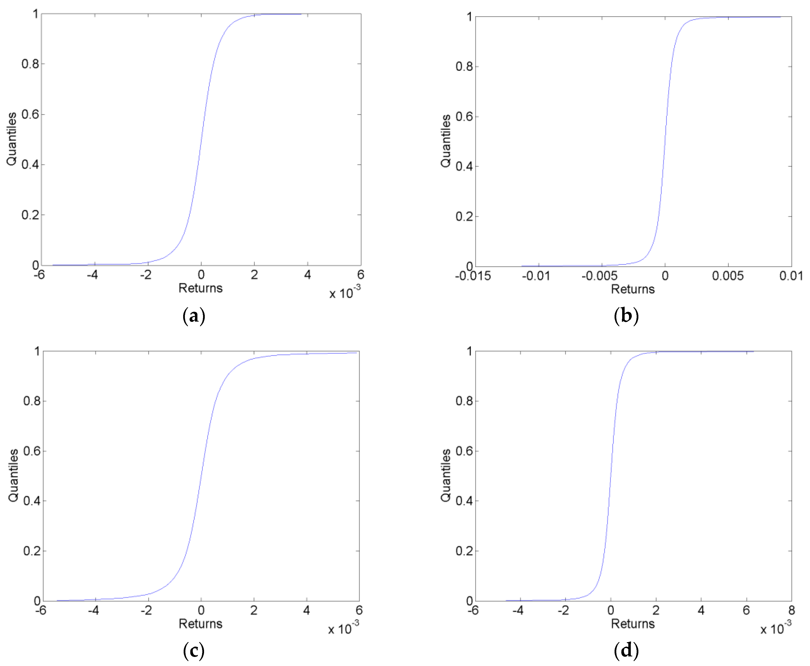
Sample one-step-ahead cumulative predictive distributions in each of the forecast data sets for the VAR-LiNGAM model are shown in Figure 1. These sample predictive cdfs are similar to those generated by the VAR and AR models.
3.2. Forecast Evaluation
The only forecasts considered here are those for the CHF/EUR exchange rate; the forecasts of other currencies are not evaluated. For the computation of calibration functions, the fractile of each outcome is determined by comparing the outcome to the estimated cumulative predictive distribution. These fractiles are used in conjunction with the estimated cumulative predictive distributions to compute the calibration functions. The calibration functions are both plotted and used to compute goodness-of-fit test statistics.
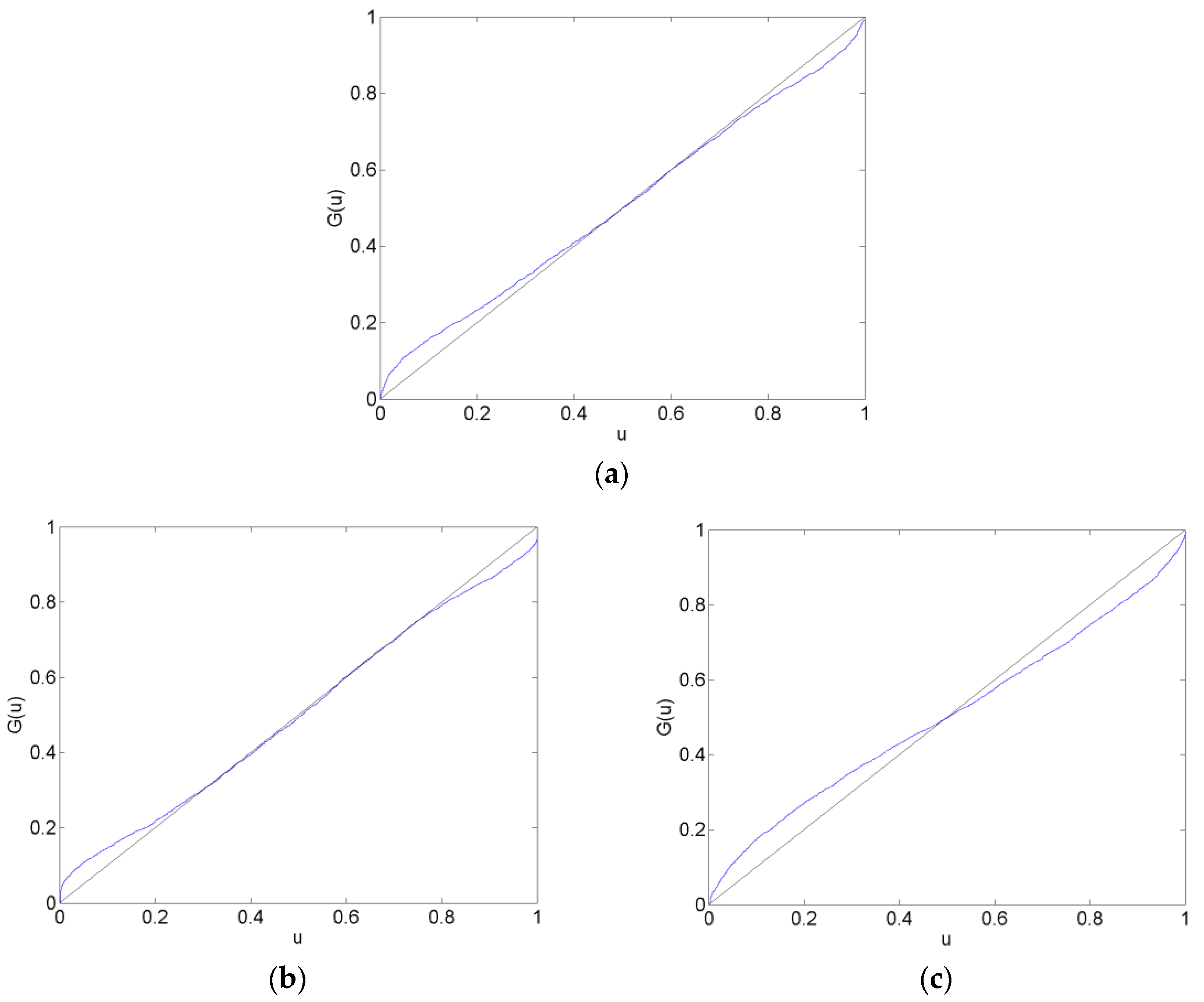
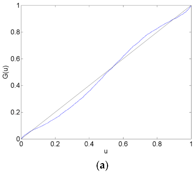
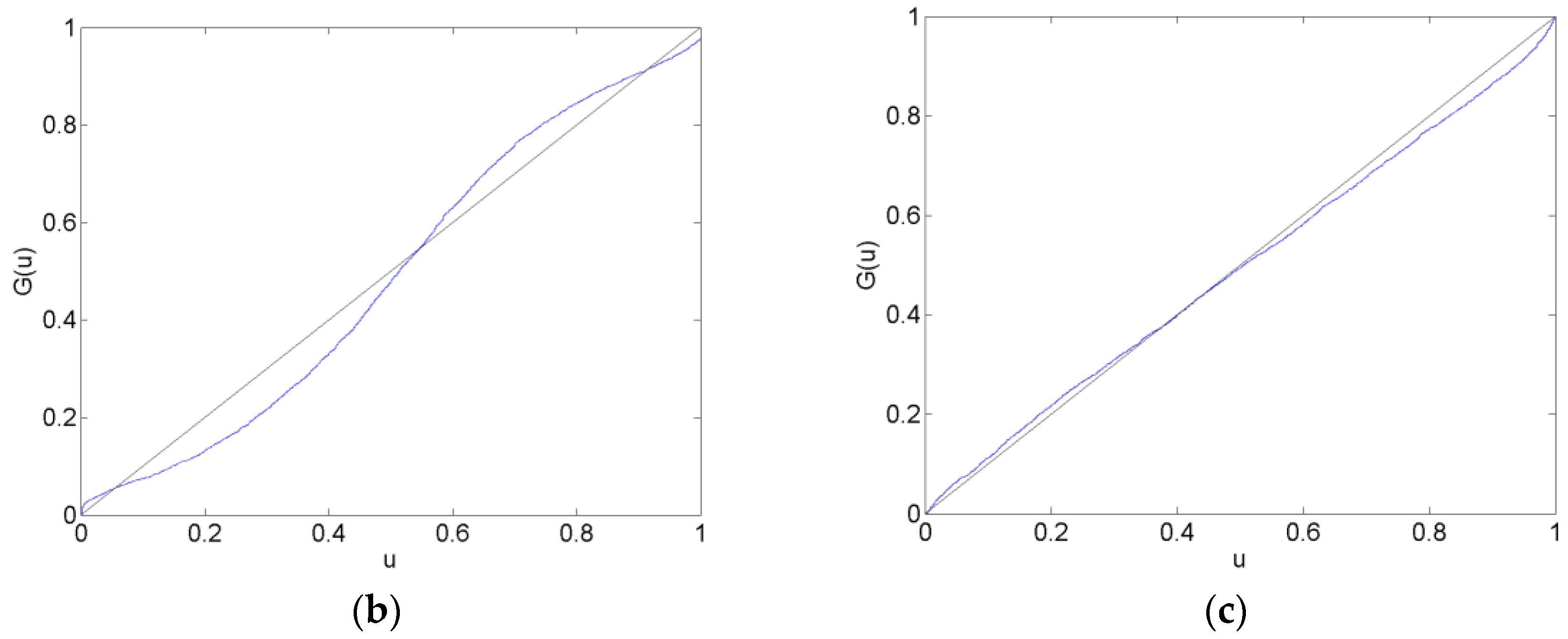
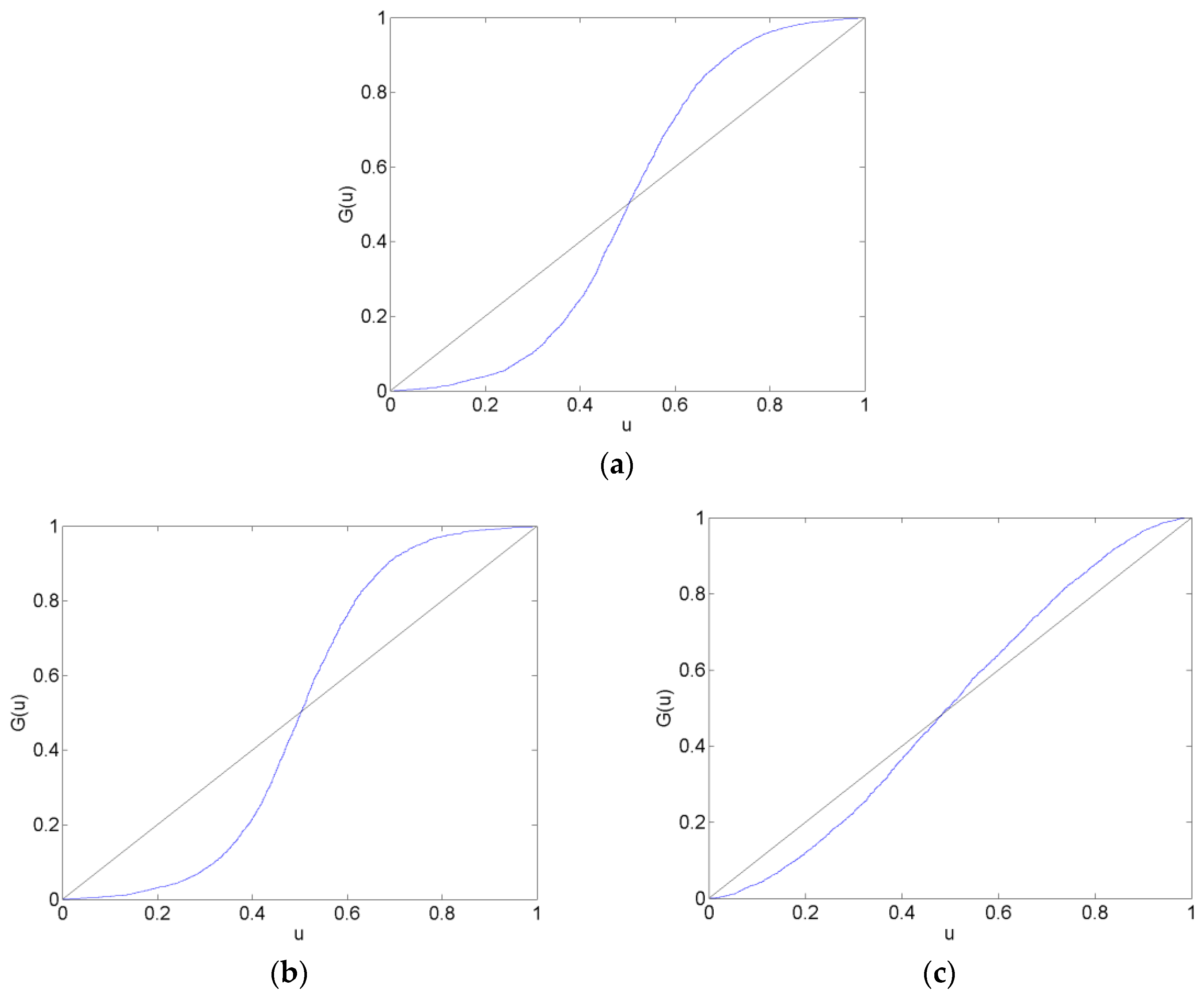
Calibration plots of the CHF/EUR for the before, surrounding, after and long after forecast data sets are in Figure 2, Figure 3, Figure 4 and Figure 5. The calibration plots for the AR, VAR and VAR-LiNGAM models in a particular forecast data set in addition to a 45-degree line for reference are shown in each figure. Underconfidence in probability assessments is indicated where the calibration function maps above the 45-degree line, while overconfidence in assessments is indicated where the calibration function maps below the 45-degree line.
For the before forecast data set, each model exhibits underconfidence on the lower end of the calibration function and overconfidence on the upper end. For the surrounding forecast data set, the AR and VAR models exhibit overconfidence on the lower end of the calibration function and underconfidence on the upper end; the extreme ends of both of these calibration functions show the opposite behavior. The calibration function for the VAR-LiNGAM model on the surrounding data set displays the opposite behavior of the AR and VAR models with underconfidence on the lower end and overconfidence on the upper end. For the after and long after data sets, the calibration functions for all models exhibit a large degree of overconfidence on the lower end and a large degree of underconfidence on the upper end.
Overall, the calibration plots show that all models are better calibrated (i.e., map closer to the 45-degree line) in the before and surrounding data sets than in the after and long after data sets. Forecasts are less calibrated after the placement of the floor on the CHF/EUR exchange rate; it appears that the Swiss National Bank’s market intervention had a negative effect on the calibration of the time-series models in the longer run.
Chi-squared goodness-of-fit tests are performed to test each time-series model for calibration during each forecast data set. The null hypothesis that the forecasts are well calibrated is rejected with a p-value near zero in every data set for every time-series model; no time-series model forecasts are well calibrated in any of the time periods under consideration. Some of the calibration functions appear to map closely to the 45-degree reference line, such as in Figure 2a,b. Nevertheless, none of the calibration functions shown in any of Figure 2, Figure 3, Figure 4 and Figure 5 reflect forecasts that are well calibrated according to the goodness-of-fit test.
In some of Figure 2, Figure 3, Figure 4 and Figure 5, the calibration problems appear to be in the tails of the distributions, such as in Figure 2a,b. Generating forecasts with distributions estimated via kernel density estimation with a normal probability window might be the source of this bad tail behavior. In the calibration plots that show bad tail behavior, the miscalibration of each tail is in the opposite direction; for example, in Figure 2b, the calibration function shows underconfidence on the low end and overconfidence on the upper end. If the normal probability widow was to blame for this poor tail performance, it would likely produce tails that were too heavy or too light at both ends of the distribution. For instance, if kernel density estimation with a normal probability window produced a distribution with tails that were too light to reflect the distribution of returns, then the corresponding calibration function would show underconfidence at both ends of the plot. Additionally, since other figures show that the problem with calibration is more in the central part of the distribution than in the tails, such as Figure 3a,b, it is unlikely that the normal probability window is the culprit for bad calibration.
In addition to the calibration tests, the mean-squared error (MSE) and the probability score metrics are used to rank the probability forecasting systems. The mean-squared errors of each model’s forecasts are reported in Table 2, and the probability scores of each model’s forecasts are reported in Table 3. The VAR and VAR-LiNGAM models both have the same MSE on each data set because they are both driven by the innovations of the VAR model (see Equation (26)).
The MSE results indicate that no model consistently outperforms the others. The VAR and VAR-LiNGAM models perform the best in the before and long after data sets, while the AR model performs the best in the surrounding and after data sets. This may indicate that all models have roughly the same forecasting performance or that the VAR and VAR-LiNGAM models perform better in periods isolated from structural change.
In contrast, the probability score rankings show that the VAR model outperforms the other models in all but the long after data set in which the VAR-LiNGAM’s performance is slightly better. Because the simple VAR model outperforms the other models that are built using independent components, the probability score results indicate that there is no gain in forecasting performance when using independent components. Additionally, the probability score ranks the AR forecasts higher than the VAR-LiNGAM forecasts in all periods but the last; this may indicate that in some cases the multivariate VAR-LiNGAM model provides no advantage over the univariate AR model.
The VAR and VAR-LiNGAM models generate better forecasts in the long after period according to the MSE and the probability score. This is some indication that the VAR-LiNGAM model performs better than the AR model after market intervention has been in effect for some period of time.
3.3. Change in the Causal Structure
The results from the LiNGAM algorithm show that there is evidence that the causal relationships among the exchange rates changed after the intervention by the Swiss National Bank. Table A5 reports the causal effect matrices for the different estimation data sets. These matrices show the causal effects from currencies listed in the columns to the currencies listed in the rows. For example, the first row of Table A5a shows that the AUD exchange rate is positively affected by the CAD, EUR, GBP and USD and negatively affected by the JPY. The causal effects contained in these matrices can be represented graphically by directed acyclic graphs. The causal structure of the currencies before the SNB intervention is shown in Figure 6a and the structure after the intervention is shown in Figure 6b.
Figure 6 shows that several causal relationships reversed direction following the SNB intervention:
- CAD → AUD changed to AUD → CAD
- GBP → AUD changed to AUD → GBP
- JPY → AUD changed to AUD → JPY
- USD → AUD changed to AUD → USD
- CAD → JPY changed to JPY → CAD
and the EUR → USD relationship changed sign from negative to positive. These graphs show that the policy change by the SNB altered the causal structure underlying the six major currencies. This result adds supporting evidence to the Lucas critique [28], wherein Lucas hypothesized that a policy change could change the structure of an econometric model.
It is difficult to say why this causal change occurred. One possible explanation is that the Swiss franc is a safe haven currency and a funding currency for currency carry trades [29], so the changes could be due to a change in the risk of the Swiss franc that affects its usefulness in either of these roles. A typical carry trade in 2011–2012 would have invested in the Australian dollar (a high-yielding currency) and been funded by the Swiss franc (a low-yielding currency) [29]. Thus, the changing causal relationships with the Australian dollar could be due to a change in the risk characteristics of the carry trade when the SNB imposed its floor on the CHF/EUR.
4. Discussion
This study assesses the impact of the Swiss National Bank’s manipulation of the CHF/EUR exchange rate on the probability forecasts from a VAR model, a VAR model augmented with the LiNGAM causal learning algorithm, and a univariate AR model built on the independent components of an independent component analysis. Forecasts are divided among data sets that represent periods of time before, surrounding, after and long after the beginning of the CHF/EUR exchange rate manipulation.
Calibration plots are shown for the forecasted probability distributions of CHF/EUR returns on all data sets. None of the forecasted probability distributions appear to be calibrated based on the calibration plots, and calibration tests confirm this. The calibration plots show that all models are better calibrated in the periods before and surrounding the beginning of the exchange rate manipulation than in the two periods after the floor on the CHF/EUR was established. This implies that the SNB‘s intervention in the CHF/EUR market had a negative impact on the forecasting performance of the time-series models.
The mean-squared error (MSE) and the probability score metrics are used to rank the probability forecasting systems. When comparing models within each data set, the MSE finds that the VAR and VAR-LiNGAM models generate better forecasts in the before and long after data sets, while the AR model generates better forecasts in the surrounding and after data sets. These results may indicate that all models have roughly the same forecasting performance or that the VAR and VAR-LiNGAM models perform better in periods isolated from structural change.
The probability score finds that the VAR model outperforms the other models in all data sets except the long after dataset in which the VAR-LiNGAM’s performance is slightly better. The relatively good performance of the VAR model, which does not take independent components into account, may indicate that there is no improvement in forecasting performance when independent components are used to generate forecasts. Additionally, the probability score ranks the AR forecasts higher than the VAR-LiNGAM forecasts in all periods but the last; this may indicate that in many cases the univariate independent component AR model provides as good or better forecasts than the multivariate VAR-LiNGAM model.
In addition to the forecasting results, this study finds evidence that the policy change by the SNB altered the causal structure underlying the six major currencies. Six causal pathways reversed direction after the policy change and one causal relationship changed from negative to positive.
The findings of this study raise some interesting questions. In particular, why was the causal structure of the foreign exchange market affected by the SNB policy change? Does central bank intervention in a currency market always have a negative impact on the forecasting performance of time-series models? Does the VAR model often generate forecasts that are as good as those from models that use independent components? Under what circumstances does the univariate independent component AR model generate better forecasts than the multivariate VAR-LiNGAM model? These are questions for future studies.
Acknowledgments
Thank you to David A. Bessler, James W. Mjelde, David J. Leatham, and three anonymous reviewers for helpful comments that improved the quality of this paper. This research did not receive any specific grant from funding agencies in the public, commercial, or not-for-profit sectors.
Conflicts of Interest
The author declares no conflict of interest.
Appendix A

Table A1.
These are the expected values of the currency log returns in the estimation data sets (a) and the forecast data sets (b) for the Australian dollar (AUD), Canadian dollar (CAD), euro (EUR), Great Britain pound sterling (GBP), Japanese yen (JPY) and United States dollar (USD).
Table A1.
These are the expected values of the currency log returns in the estimation data sets (a) and the forecast data sets (b) for the Australian dollar (AUD), Canadian dollar (CAD), euro (EUR), Great Britain pound sterling (GBP), Japanese yen (JPY) and United States dollar (USD).
| (a) | ||||
| Currency | Before | Surrounding | After | Long After |
| AUD | −7.152 × 10⁻⁶ | −2.378 × 10⁻⁵ | −5.459 × 10⁻⁶ | 5.858 × 10⁻⁶ |
| CAD | −1.028 × 10⁻⁵ | −2.471 × 10⁻⁵ | −6.673 × 10⁻⁶ | 4.508 × 10⁻⁶ |
| EUR | −6.023 × 10⁻⁶ | −2.153 × 10⁻⁵ | −5.508 × 10⁻⁶ | −1.065 × 10⁻⁷ |
| GBP | −1.068 × 10⁻⁵ | −2.472 × 10⁻⁵ | −4.399 × 10⁻⁶ | 4.276 × 10⁻⁶ |
| JPY | −9.118 × 10⁻⁶ | −1.776 × 10⁻⁵ | 8.366 × 10⁻⁶ | 2.120 × 10⁻⁶ |
| USD | −1.288 × 10⁻⁵ | −2.483 × 10⁻⁵ | −5.025 × 10⁻⁷ | 5.555 × 10⁻⁶ |
| (b) | ||||
| Currency | Before | Surrounding | After | Long After |
| AUD | −4.603 × 10⁻⁵ | 5.066 × 10⁻⁵ | 1.343 × 10⁻⁵ | −9.477 × 10⁻⁶ |
| CAD | −4.201 × 10⁻⁵ | 4.705 × 10⁻⁵ | 8.368 × 10⁻⁶ | 2.832 × 10⁻⁶ |
| EUR | −4.136 × 10⁻⁵ | 4.640 × 10⁻⁵ | 1.111 × 10⁻⁶ | −9.271 × 10⁻⁷ |
| GBP | −4.005 × 10⁻⁵ | 4.833 × 10⁻⁵ | 6.015 × 10⁻⁶ | 8.458 × 10⁻⁶ |
| JPY | −2.687 × 10⁻⁵ | 5.640 × 10⁻⁵ | 2.508 × 10⁻⁶ | 4.670 × 10⁻⁶ |
| USD | −3.853 × 10⁻⁵ | 5.600 × 10⁻⁵ | 5.585 × 10⁻⁶ | 2.018 × 10⁻⁶ |
Table A2.
These are the correlation matrices of the currency log returns in the before (a), surrounding (b), after (c) and long after (d) estimation data sets for the Australian dollar (AUD), Canadian dollar (CAD), euro (EUR), Great Britain pound sterling (GBP), Japanese yen (JPY) and the United States dollar (USD). All correlation coefficients are significant at the 1% level.
| (a) | ||||||
| AUD | CAD | EUR | GBP | JPY | USD | |
| AUD | 1 | |||||
| CAD | 0.7318 | 1 | ||||
| EUR | 0.6535 | 0.6884 | 1 | |||
| GBP | 0.7111 | 0.6556 | 0.6912 | 1 | ||
| JPY | 0.3254 | 0.3778 | 0.4206 | 0.3048 | 1 | |
| USD | 0.6028 | 0.7422 | 0.7064 | 0.5462 | 0.579 | 1 |
| (b) | ||||||
| AUD | CAD | EUR | GBP | JPY | USD | |
| AUD | 1 | |||||
| CAD | 0.8088 | 1 | ||||
| EUR | 0.7424 | 0.7743 | 1 | |||
| GBP | 0.803 | 0.7709 | 0.7906 | 1 | ||
| JPY | 0.394 | 0.4566 | 0.4919 | 0.4045 | 1 | |
| USD | 0.6763 | 0.7857 | 0.7773 | 0.6582 | 0.6402 | 1 |
| (c) | ||||||
| AUD | CAD | EUR | GBP | JPY | USD | |
| AUD | 1 | |||||
| CAD | 0.7694 | 1 | ||||
| EUR | 0.6688 | 0.7051 | 1 | |||
| GBP | 0.7479 | 0.719 | 0.7377 | 1 | ||
| JPY | 0.3096 | 0.4065 | 0.4874 | 0.3919 | 1 | |
| USD | 0.5546 | 0.6979 | 0.712 | 0.5854 | 0.716 | 1 |
| (d) | ||||||
| AUD | CAD | EUR | GBP | JPY | USD | |
| AUD | 1 | |||||
| CAD | 0.653 | 1 | ||||
| EUR | 0.4602 | 0.6071 | 1 | |||
| GBP | 0.6006 | 0.5822 | 0.5788 | 1 | ||
| JPY | 0.2484 | 0.4713 | 0.5867 | 0.3457 | 1 | |
| USD | 0.2671 | 0.5791 | 0.7013 | 0.3954 | 0.8105 | 1 |
Table A3.
These are the correlation matrices of the currency log returns in the before (a), surrounding (b), after (c) and long after (d) forecast data sets for the Australian dollar (AUD), Canadian dollar (CAD), euro (EUR), Great Britain pound sterling (GBP), Japanese yen (JPY) and United States Dollar (USD). All correlation coefficients are significant at the 1% level.
| (a) | ||||||
| AUD | CAD | EUR | GBP | JPY | USD | |
| AUD | 1 | |||||
| CAD | 0.8686 | 1 | ||||
| EUR | 0.8189 | 0.8404 | 1 | |||
| GBP | 0.8594 | 0.8413 | 0.8655 | 1 | ||
| JPY | 0.6167 | 0.6538 | 0.6858 | 0.6103 | 1 | |
| USD | 0.7516 | 0.8323 | 0.8405 | 0.7465 | 0.7853 | 1 |
| (b) | ||||||
| AUD | CAD | EUR | GBP | JPY | USD | |
| AUD | 1 | |||||
| CAD | 0.8486 | 1 | ||||
| EUR | 0.7679 | 0.8303 | 1 | |||
| GBP | 0.8453 | 0.8442 | 0.8557 | 1 | ||
| JPY | 0.6019 | 0.7241 | 0.7934 | 0.6958 | 1 | |
| USD | 0.655 | 0.8035 | 0.8515 | 0.7455 | 0.9084 | 1 |
| (c) | ||||||
| AUD | CAD | EUR | GBP | JPY | USD | |
| AUD | 1 | |||||
| CAD | 0.7838 | 1 | ||||
| EUR | 0.6975 | 0.7473 | 1 | |||
| GBP | 0.7794 | 0.7467 | 0.7659 | 1 | ||
| JPY | 0.4476 | 0.5301 | 0.595 | 0.4846 | 1 | |
| USD | 0.5800 | 0.7386 | 0.7633 | 0.614 | 0.7363 | 1 |
| (d) | ||||||
| AUD | CAD | EUR | GBP | JPY | USD | |
| AUD | 1 | |||||
| CAD | 0.5529 | 1 | ||||
| EUR | 0.2728 | 0.2749 | 1 | |||
| GBP | 0.3455 | 0.5053 | 0.3129 | 1 | ||
| JPY | 0.0913 | 0.2498 | 0.0960 | 0.3650 | 1 | |
| USD | 0.2992 | 0.6501 | 0.2456 | 0.6297 | 0.6073 | 1 |
Table A4.
These are the VAR and VAR-LiNGAM model estimates of the autoregressive matrices in the before (a), surrounding (b), after (c) and long after (d) estimation data sets for the Australian dollar (AUD), Canadian dollar (CAD), euro (EUR), Great Britain pound sterling (GBP), Japanese yen (JPY), and the United States dollar (USD). An matrix contains the estimates from a standard vector autoregressive model and reflects the autoregressive effects from the lag 1 period on the lag 0 period.
| (a) | ||||||
| AUD | CAD | EUR | GBP | JPY | USD | |
| AUD | −0.028 | 0.060 | −0.047 | 0.023 | 0.001 | −0.050 |
| CAD | 0.021 | −0.014 | −0.036 | 0.015 | −0.042 | 0.026 |
| EUR | 0.028 | 0.009 | −0.064 | 0.026 | −0.044 | 0.001 |
| GBP | 0.009 | 0.008 | −0.025 | 0.000 | −0.032 | −0.010 |
| JPY | 0.016 | −0.026 | −0.026 | 0.043 | −0.072 | −0.009 |
| USD | 0.001 | 0.010 | −0.037 | 0.027 | −0.025 | −0.018 |
| (b) | ||||||
| AUD | CAD | EUR | GBP | JPY | USD | |
| AUD | −0.015 | 0.111 | −0.066 | −0.031 | −0.012 | 0.012 |
| CAD | 0.036 | 0.028 | −0.047 | −0.038 | −0.056 | 0.069 |
| EUR | 0.030 | 0.061 | −0.084 | −0.016 | −0.046 | 0.023 |
| GBP | 0.021 | 0.052 | −0.033 | −0.061 | −0.040 | 0.033 |
| JPY | 0.024 | 0.028 | −0.028 | 0.017 | −0.084 | 0.018 |
| USD | 0.023 | 0.035 | −0.057 | 0.004 | −0.038 | 0.013 |
| (c) | ||||||
| AUD | CAD | EUR | GBP | JPY | USD | |
| AUD | 0.005 | 0.090 | −0.068 | −0.028 | −0.010 | 0.002 |
| CAD | 0.045 | 0.004 | −0.041 | −0.044 | −0.054 | 0.078 |
| EUR | 0.035 | 0.036 | −0.079 | −0.017 | −0.023 | 0.027 |
| GBP | 0.030 | 0.028 | −0.023 | −0.075 | −0.028 | 0.051 |
| JPY | 0.021 | 0.014 | −0.003 | 0.001 | −0.058 | 0.030 |
| USD | 0.024 | 0.006 | −0.030 | −0.002 | −0.032 | 0.032 |
| (d) | ||||||
| AUD | CAD | EUR | GBP | JPY | USD | |
| AUD | −0.050 | 0.064 | −0.101 | −0.008 | 0.029 | −0.047 |
| CAD | 0.037 | −0.041 | −0.103 | −0.033 | −0.002 | 0.025 |
| EUR | 0.004 | 0.005 | −0.149 | 0.004 | 0.005 | 0.000 |
| GBP | 0.002 | 0.017 | −0.116 | −0.050 | −0.008 | 0.020 |
| JPY | 0.005 | 0.017 | −0.134 | −0.018 | 0.017 | −0.009 |
| USD | −0.005 | 0.013 | −0.112 | −0.023 | −0.016 | 0.023 |
Table A5.
These are the VAR-LiNGAM model estimates of the causal effect matrices in the before (a), surrounding (b), after (c) and long after (d) estimation data sets for the Australian dollar (AUD), Canadian dollar (CAD), euro (EUR), Great Britain pound sterling (GBP), Japanese Yen (JPY) and United States Dollar (USD). A matrix contains the causal effects within the lag 0 period.
| (a) | ||||||
| AUD | CAD | EUR | GBP | JPY | USD | |
| AUD | 0.000 | 0.218 | 0.327 | 0.087 | −0.090 | 0.432 |
| CAD | 0.000 | 0.000 | 0.111 | 0.064 | 0.000 | 0.610 |
| EUR | 0.000 | 0.000 | 0.000 | 0.000 | 0.000 | 0.000 |
| GBP | 0.000 | 0.000 | 0.314 | 0.000 | 0.000 | 0.493 |
| JPY | 0.000 | −0.101 | 0.027 | 0.053 | 0.000 | 0.861 |
| USD | 0.000 | 0.000 | −1.397 | 0.000 | 0.000 | 0.000 |
| (b) | ||||||
| AUD | CAD | EUR | GBP | JPY | USD | |
| AUD | 0.000 | 0.285 | 0.373 | 0.096 | −0.084 | 0.381 |
| CAD | 0.000 | 0.000 | 0.209 | 0.090 | 0.000 | 0.580 |
| EUR | 0.000 | 0.000 | 0.000 | 0.000 | 0.000 | 0.000 |
| GBP | 0.000 | 0.000 | 0.339 | 0.000 | 0.000 | 0.535 |
| JPY | 0.000 | −0.115 | 0.018 | 0.050 | 0.000 | 0.917 |
| USD | 0.000 | 0.000 | −1.285 | 0.000 | 0.000 | 0.000 |
| (c) | ||||||
| AUD | CAD | EUR | GBP | JPY | USD | |
| AUD | 0.000 | 0.000 | 0.390 | 0.000 | 0.000 | 0.000 |
| CAD | 0.243 | 0.000 | 0.209 | 0.082 | −0.063 | 0.535 |
| EUR | 0.000 | 0.000 | 0.000 | 0.000 | 0.000 | 0.000 |
| GBP | 0.063 | 0.000 | 0.370 | 0.000 | 0.000 | 0.522 |
| JPY | −0.024 | 0.000 | 0.058 | 0.064 | 0.000 | 0.866 |
| USD | −0.405 | 0.000 | 1.604 | 0.000 | 0.000 | 0.000 |
| (d) | ||||||
| AUD | CAD | EUR | GBP | JPY | USD | |
| AUD | 0.000 | 0.000 | 0.446 | 0.000 | 0.000 | 0.000 |
| CAD | 0.256 | 0.000 | 0.220 | 0.057 | −0.020 | 0.476 |
| EUR | 0.000 | 0.000 | 0.000 | 0.000 | 0.000 | 0.000 |
| GBP | 0.081 | 0.000 | 0.369 | 0.000 | 0.000 | 0.485 |
| JPY | 0.002 | 0.000 | 0.064 | 0.050 | 0.000 | 0.864 |
| USD | −0.422 | 0.000 | 1.678 | 0.000 | 0.000 | 0.000 |
Table A6.
These are the independent component analysis estimates of the separating matrices in the before (a), surrounding (b), after (c) and long after (d) estimation data sets. A separating matrix facilitates the computation of the independent components from the original series of returns.
Table A6.
These are the independent component analysis estimates of the separating matrices in the before (a), surrounding (b), after (c) and long after (d) estimation data sets. A separating matrix facilitates the computation of the independent components from the original series of returns.
| (a) | ||||||
| AUD | CAD | EUR | GBP | JPY | USD | |
| AUD | 1041.500 | −975.250 | −799.850 | 192.680 | −1058.700 | 763.400 |
| CAD | 835.720 | −1312.800 | 686.570 | −517.450 | 418.740 | 1065.300 |
| EUR | 305.090 | 264.360 | −1718.700 | 1449.600 | 403.100 | −359.300 |
| GBP | −748.980 | −660.030 | 931.700 | 1437.400 | −462.980 | −53.321 |
| JPY | 813.100 | 558.800 | 260.040 | 216.830 | 246.000 | −1831.200 |
| USD | −338.380 | 1108.200 | 238.330 | −428.490 | −722.210 | 796.750 |
| (b) | ||||||
| AUD | CAD | EUR | GBP | JPY | USD | |
| AUD | −1056.600 | 866.120 | 419.950 | −105.300 | 995.360 | −540.200 |
| CAD | −261.170 | 1219.800 | −1543.200 | 1237.900 | −114.950 | −1134.300 |
| EUR | −0.382 | 759.010 | −36.187 | −1803.300 | −143.010 | 498.620 |
| GBP | −1134.700 | 663.180 | 1131.100 | 1.400 | −933.740 | 258.420 |
| JPY | 384.990 | 464.420 | 620.990 | −178.290 | 429.420 | −1955.600 |
| USD | 431.480 | 927.850 | −388.920 | −380.770 | 8.164 | 146.330 |
| (c) | ||||||
| AUD | CAD | EUR | GBP | JPY | USD | |
| AUD | −841.820 | 1196.200 | −857.140 | 1270.100 | 667.790 | −1341.300 |
| CAD | 171.540 | −575.170 | −23.868 | 1574.200 | −821.910 | −186.330 |
| EUR | −1066.100 | 786.610 | 1535.100 | −637.470 | −131.120 | −202.190 |
| GBP | −206.140 | 922.530 | −551.850 | −173.550 | −1187.200 | 666.690 |
| JPY | −377.760 | −364.880 | −185.320 | 58.571 | −505.290 | 1772.500 |
| USD | 708.380 | 741.860 | −633.710 | −357.350 | 171.970 | −143.690 |
| (d) | ||||||
| AUD | CAD | EUR | GBP | JPY | USD | |
| AUD | 160.910 | 44.985 | −2068.500 | −138.080 | −59.670 | 60.764 |
| CAD | 1550.900 | −1872.500 | −104.360 | −232.590 | −224.620 | 945.420 |
| EUR | 163.100 | −60.696 | −1500.400 | 2116.700 | −31.328 | −489.860 |
| GBP | −699.070 | −1096.900 | 975.310 | 843.040 | 380.600 | −703.930 |
| JPY | −222.460 | −341.220 | −157.180 | −550.090 | 600.320 | 955.210 |
| USD | 350.780 | 246.930 | −331.350 | −40.946 | 1642.000 | −1799.500 |
Table A7.
These are the AR model parameter estimates.
| Currency | Lag(1) Parameter | Constant |
|---|---|---|
| Before Estimation Data Set | ||
| AUD | −0.100 | 0.006 |
| CAD | −0.061 | −0.009 |
| EUR | −0.033 | −0.009 |
| GBP | −0.014 | −0.004 |
| JPY | −0.001 | 0.006 |
| USD | 0.013 | −0.009 |
| Surrounding Estimation Data Set | ||
| AUD | −0.090 | −0.008 |
| CAD | −0.066 | 0.010 |
| EUR | −0.049 | 0.018 |
| GBP | −0.030 | −0.004 |
| JPY | −0.007 | 0.011 |
| USD | 0.036 | −0.018 |
| After Estimation Data Set | ||
| AUD | −0.074 | 0.002 |
| CAD | −0.062 | −0.011 |
| EUR | −0.047 | −0.006 |
| GBP | −0.018 | −0.012 |
| JPY | 0.007 | 0.000 |
| USD | 0.023 | −0.002 |
| Long After Estimation Data Set | ||
| AUD | −0.136 | 0.001 |
| CAD | −0.098 | 0.005 |
| EUR | −0.044 | 0.007 |
| GBP | −0.012 | −0.009 |
| JPY | 0.003 | 0.001 |
| USD | 0.038 | −0.003 |
References
- Report to Congress on International Economic and Exchange Rate Policies; U.S. Department of the Treasury: Washington, DC, USA, 2011.
- Report to Congress on International Economic and Exchange Rate Policies; U.S. Department of the Treasury: Washington, DC, USA, 2012.
- Kling, J.L.; Bessler, D.A. Calibration-Based Predictive Distributions: An Application of Prequential Analysis to Interest Rates, Money, Prices, and Output. J. Bus. 1989, 62, 477–499. [Google Scholar] [CrossRef]
- Liu, T.-R.; Gerlow, M.E.; Irwin, S.H. The performance of alternative VAR models in forecasting exchange rates. Int. J. Forecast. 1994, 10, 419–433. [Google Scholar] [CrossRef]
- Hoque, A.; Latif, A. Forecasting exchange rate for the Australian dollar via-à-vis the US dollar using multivariate time-series models. Appl. Econ. 1993, 25, 403–407. [Google Scholar] [CrossRef]
- Cuaresma, J.C.; Hlouskova, J. Beating the random walk in Central and Eastern Europe. J. Forecast. 2005, 24, 189–201. [Google Scholar] [CrossRef]
- Carriero, A.; Kapetanios, G.; Marcellino, M. Forecasting exchange rates with a large Bayesian VAR. Int. J. Forecast. 2009, 25, 400–417. [Google Scholar] [CrossRef]
- Kavtaradze, L.; Mokhtari, M. Factor Models and Time-Varying Parameter Framework for Forecasting Exchange Rates and Inflation: A Survey. J. Econ. Surv. 2018, 32, 302–334. [Google Scholar] [CrossRef]
- Qian, B.; Rasheed, K. Foreign exchange market prediction with multiple classifiers. J. Forecast. 2010, 29, 271–284. [Google Scholar] [CrossRef]
- Jurado-Sánchez, O.S.; Yáñez-Márquez, C.; Camacho-Nieto, O.; López-Yáñez, I. Currency exchange rate forecasting using associative models. Res. Comput. Sci. 2014, 78, 67–76. [Google Scholar]
- Yu, L.; Wang, S.; Lai, K.K. Foreign-Exchange-Rate Forecasting With Artificial Neural Networks; International Series in Operations Research & Management Science; Springer US: Boston, MA, USA, 2007; Volume 107, ISBN 978-0-387-71719-7. [Google Scholar]
- Pacelli, V.; Bevilacqua, V.; Azzollini, M. An Artificial Neural Network Model to Forecast Exchange Rates. J. Intell. Learn. Syst. Appl. 2011, 3, 57–69. [Google Scholar] [CrossRef]
- Dawid, A.P. Present Position and Potential Developments: Some Personal Views: Statistical Theory: The Prequential Approach. J. R. Stat. Soc. Ser. A (General) 1984, 147, 278–292. [Google Scholar] [CrossRef]
- DeGroot, M.H.; Schervish, M.J. Probability and Statistics, 3rd ed.; Addison-Wesley: Boston, MA, USA, 2002; ISBN 978-0-201-52488-8. [Google Scholar]
- Brier, G.W. Verification of Forecasts Expressed in Terms of Probability. Mon. Weather Rev. 1950, 78, 1–3. [Google Scholar] [CrossRef]
- Hyvarinen, A.; Karhunen, J.; Oja, E. Independent Component Analysis; J. Wiley: New York, NY, USA, 2001; ISBN 978-0-471-40540-5. [Google Scholar]
- Popescu, T.D. Time Series Forecasting Using Independent Component Analysis. World Acad. Sci. Eng. Technol. 2009, 49, 667–672. [Google Scholar]
- Bowman, A.W.; Azzalini, A. Applied Smoothing Techniques for Data Analysis: The Kernel Approach with S-Plus Illustrations; Oxford University Press: Oxford, UK, 1997; ISBN 978-0-19-852396-3. [Google Scholar]
- Coping with Risk in Agriculture, 2nd ed.; Hardaker, J.B. (Ed.) CABI Pub: Wallingford, Oxfordshire, UK; Cambridge, MA, USA, 2004; ISBN 978-0-85199-831-2. [Google Scholar]
- Shimizu, S.; Hoyer, P.O.; Hyvärinen, A.; Kerminen, A. A Linear Non-Gaussian Acyclic Model for Causal Discovery. J. Mach. Learn. Res. 2006, 7, 2003–2030. [Google Scholar]
- Glymour, C.; Scheines, R.; Spirtes, P.; Ramsey, J. The TETRAD Project; Carnegie Mellon University: Pittsburgh, PA, USA, 2017. [Google Scholar]
- Hyvärinen, A.; Zhang, K.; Shimizu, S.; Hoyer, P.O.; Dayan, P. Estimation of a Structural Vector Autoregression Model Using Non-Gaussianity. J. Mach. Learn. Res. 2010, 11, 1709–1731. [Google Scholar]
- MATLAB; The Mathworks Inc.: Natick, MA, USA, 2017.
- Sierra Chart; Sierra Pacific Software Ltd.: Wellington, New Zealand, 2017.
- Bank for International Settlements. Triennial Central Bank Survey Report on Global Foreign Exchange Market Activity in 2010; Bank for International Settlements: Basel, Switzerland, 2010. [Google Scholar]
- SAS; SAS Institute Inc.: Cary, NC, USA, 2017.
- Quinn, B.G. Order Determination for a Multivariate Autoregression. J. R. Stat. Soc. 1980, 42, 182–185. [Google Scholar]
- Lucas, R.E. Econometric policy evaluation: A critique. In Carnegie-Rochester Conference Series on Public Policy; Elsevier Inc.: New York, NY, USA, 1976; Volume 1, pp. 19–46. [Google Scholar] [CrossRef]
- Grisse, C.; Nitschka, T. On financial risk and the safe haven characteristics of Swiss franc exchange rates. J. Empir. Financ. 2015, 32, 153–164. [Google Scholar] [CrossRef]
Figure 1.
Sample Cumulative Predictive Distributions. The plots show the sample one-step-ahead cumulative predictive distributions generated by the VAR-LiNGAM model in the before (a), surrounding (b), after (c) and long after (d) forecast data sets.
Figure 1.
Sample Cumulative Predictive Distributions. The plots show the sample one-step-ahead cumulative predictive distributions generated by the VAR-LiNGAM model in the before (a), surrounding (b), after (c) and long after (d) forecast data sets.

Figure 2.
CHF/EUR Calibration Functions in the Before Forecast Data Set. The plots show calibration functions for the CHF/EUR exchange rate that are generated by forecasts from the AR (a), VAR (b) and VAR-LiNGAM (c) models in the before forecast data set (11 June 2011–10 August 2011). A model is well calibrated if it maps onto the 45-degree reference line.

Figure 3.
CHF/EUR Calibration Functions in the Surrounding Forecast Data Set. The plots show calibration functions for the CHF/EUR exchange rate that are generated by forecasts from the AR (a), VAR (b) and VAR-LiNGAM (c) models in the surrounding data set (11 August 2011–10 October 2011). A model is well calibrated if it maps onto the 45-degree reference line.


Figure 4.
CHF/EUR Calibration Functions in the After Forecast Data Set. The plots show calibration functions for the CHF/EUR exchange rate that are generated by forecasts from the AR (a), VAR (b) and VAR-LiNGAM (c) models in the after data set (11 October 2011–10 December 2011). A model is well calibrated if it maps onto the 45-degree reference line.

Figure 5.
CHF/EUR Calibration Functions in the Long after Forecast Data Set. The plots show calibration functions for the CHF/EUR exchange rate that are generated by forecasts from the AR (a), VAR (b) and VAR-LiNGAM (c) models in the long after data set (7 March 2012–6 May 2012). A model is well calibrated if it maps onto the 45-degree reference line.
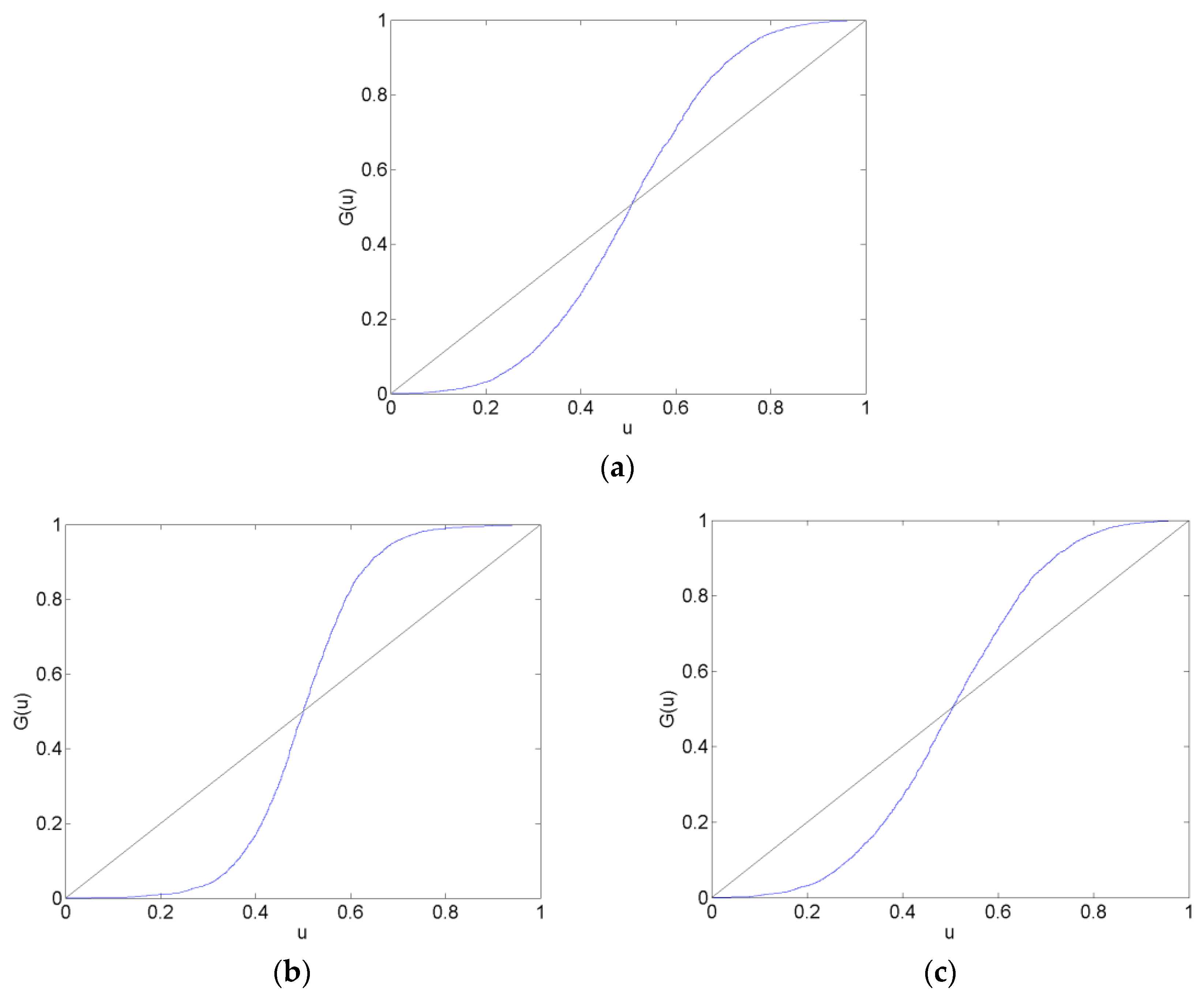
Figure 6.
Causal effects represented as directed acyclic graphs in the before (a) and the long after (b) estimation data sets. These correspond to the before and long after matrices in Table A5.
Figure 6.
Causal effects represented as directed acyclic graphs in the before (a) and the long after (b) estimation data sets. These correspond to the before and long after matrices in Table A5.
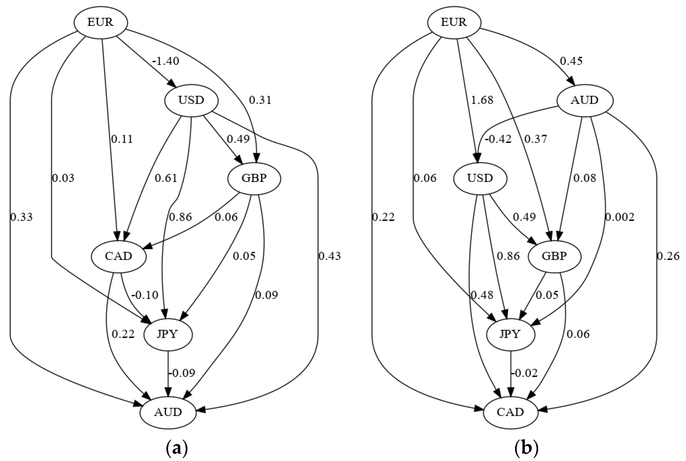
Table 1.
The table shows the data set starting and ending dates.
| Data Set | Starting Date | Ending Date |
|---|---|---|
| Estimation Data Sets | ||
| before | 11 December 2010 | 10 June 2011 |
| surrounding | 11 February 2011 | 10 August 2011 |
| after | 11 April 2011 | 10 October 2011 |
| long after | 7 September 2011 | 6 March 2012 |
| Forecast Data Sets | ||
| before | 11 June 2011 | 10 August 2011 |
| surrounding | 11 August 2011 | 10 October 2011 |
| after | 11 October 2011 | 10 December 2011 |
| long after | 7 March 2012 | 6 May 2012 |
Table 2.
The table shows the mean-squared errors of the CHF/EUR forecasts from the AR, VAR and VAR-LiNGAM models on each forecast data set.
Table 2.
The table shows the mean-squared errors of the CHF/EUR forecasts from the AR, VAR and VAR-LiNGAM models on each forecast data set.
| Data Set | AR | VAR & VAR-LiNGAM |
|---|---|---|
| before | 1.614 × 10⁻⁶ | 1.610 × 10⁻⁶ |
| surrounding | 2.982 × 10⁻⁶ | 2.983 × 10⁻⁶ |
| after | 3.409 × 10⁻⁷ | 3.415 × 10⁻⁷ |
| long after | 2.873 × 10⁻⁸ | 2.722 × 10⁻⁸ |
Table 3.
The table shows the probability scores of the CHF/EUR forecasts from the AR, VAR and VAR-LiNGAM models on each forecast data set.
Table 3.
The table shows the probability scores of the CHF/EUR forecasts from the AR, VAR and VAR-LiNGAM models on each forecast data set.
| Data Set | AR | VAR | VAR-LiNGAM |
|---|---|---|---|
| before | 0.99876 | 0.99860 | 0.99914 |
| surrounding | 0.99820 | 0.99803 | 0.99877 |
| after | 0.99715 | 0.99713 | 0.99776 |
| long after | 0.99700 | 0.99697 | 0.99696 |
© 2018 by the author. Licensee MDPI, Basel, Switzerland. This article is an open access article distributed under the terms and conditions of the Creative Commons Attribution (CC BY) license (http://creativecommons.org/licenses/by/4.0/).
Share and Cite
MDPI and ACS Style
Deaton, B.D. Effects of the Swiss Franc/Euro Exchange Rate Floor on the Calibration of Probability Forecasts. Forecasting 2019, 1, 3-25. https://doi.org/10.3390/forecast1010002
AMA Style
Deaton BD. Effects of the Swiss Franc/Euro Exchange Rate Floor on the Calibration of Probability Forecasts. Forecasting. 2019; 1(1):3-25. https://doi.org/10.3390/forecast1010002
Chicago/Turabian StyleDeaton, Brian D. 2019. "Effects of the Swiss Franc/Euro Exchange Rate Floor on the Calibration of Probability Forecasts" Forecasting 1, no. 1: 3-25. https://doi.org/10.3390/forecast1010002