1. Introduction
The relationship between text and images has been widely examined. From an artistic perspective, many works over the centuries have closely tested the boundary between the image and the text for highly different purposes (For a good overview: Parmiggiani, C. (ed.) Alfabeto in sogno. Dal carme figurato alla poesia concreta. Mazzotta: Milan, Italy, 2002). More recently, this has occurred as part of studies into semiotics, and more specifically in the work of academics and designers that propose and work according to a definition of inclusive writing that not only considers the form of the sign but also the relationships between the different signs in the space (Two Italian reference works are: Lussu, G. La lettera uccide: storie di grafica, Stampa Alternativa & Graffiti: Viterbo, Italy, 1999. and Perondi L. Sinsemie. Scritture nello spazio. Stampa Alternativa & Graffiti: Viterbo, Italy, 2012). With this in mind, this essay takes a practical viewpoint—that of a graphic designer, a creator of visual messages that assembles text and images in a single product—and examines case studies in which the type becomes an image using different methods depending on the context in which it is employed. The historical considerations are an opportunity to highlight how every graphic designer is required to develop their own personal approach to the text/image relationship, which is necessarily influenced by the period and the technologies used but also defined by their own personal creativity and graphical style, by their specific skills and expertise, as well as by the goals of the message.
2. Synesthetic Typography
Through the poetry of Stéphane Mallarmé and, later, the visual poetry of Guillaume Apollinaire, between the late 1800s and the early 1900s writing became an important tool of expression in the art world. Mallarmé’s work, for example, experimented with the relationship between form and content with phrases and words arranged on the page in relation to their meaning and in an unconventional and non-linear way. The form and layout of the text become even more important in the Calligrammes of Apollinaire in which the text of the poems, still perfectly legible, is arranged in figures and forms in order to stimulate the reader to go beyond merely reading the words and, at the same time, to strengthen the meaning of the work, helping the reader to understand the content more clearly. The definitive break with the linearity of script coincides with the advent of the futurist movement spearheaded by Filippo Tommaso Marinetti and his words-in-freedom,
The words-in-freedom is a literary style introduced by Futurism in which the words have no syntactic-grammatical connections: words and texts are not organized into phrases and sentences, the punctuation is abolished. The rules of the words-in-freedom were presented by Marinetti in the Manifesto tecnico della letteratura Futurista—Technical Manifesto of Futurist Literature (1912) and subsequently re-examined in Destruction of Syntax—Imagination without Strings—Words-in-Freedom (1913)
published through the Futurist Editions of Poesia.
We reserve the Futurist Editions of Poesia for those works that are absolutely Futurist in their violence and intellectual extremism and that cannot be published by others because of their typographical difficulties”. Marinetti, F. T.,
Enquête internationale sur le vers libre, Milan: Editions of Poesia, 1909. Marinetti founded the journal
Poesia in 1905 in Milan and, even though it was suppressed in 1909, the Editions of
Poesia continued to live on and, in 1910, was renamed
Edizioni Futuriste di Poesia—Poesia Futurist editions. From this moment on
Poesia Futurist editions became the main futurist publishing house and the book was “the principal means for diffusing the movement’s poetics and propaganda” [
1].
In 1913 Filippo Tommaso Marinetti theorised on the dematerialisation of the traditional book, especially concerning typography (With his manifesto
Destruction of Syntax—Imagination without Strings—Words-in-Freedom (1913), Filippo Tommaso Marinetti had called the traditional book syntax into question, a ‘typographical revolution’. These ideas had earlier been advocated in a previous Marinetti’s manifesto:
Manifesto tecnico della letteratura Futurista—Technical Manifesto of Futurist Literature (11 May 1912)):
I initiate a typographical revolution aimed at the bestial, nauseating idea of the book of passéist and D’Annunzian verse (…). The book must be the Futurist expression of our Futurist thought. Not only that. My revolution is aimed at the so-called typographical harmony of the page, which is contrary to the flux and reflux, the leaps and bursts of style that run through the page. On the same page, therefore, we will use three or four colors of ink, or even twenty different typefaces if necessary. For example: italics for a series of similar or swift sensations, boldface for the violent onomatopoeias, and so on. With this typographical revolution and this multicolored variety in the letters I mean to redouble the expressive force of words.
(Marinetti, F. T., 1913)
The theories published by Marinetti in the manifesto were consolidated in Zang Tumb Tuuum (1914) and Les mots en liberté futuristes (1919), books that showed no interest in maintaining the balance, albeit subtle, between form and content found in the poetry of Mallarmé and Apollinaire.
In futurist publications the direction of the text and its linearity are interrupted and alternated with exclusively expressive typographical compositions which seek to transmit a message despite eschewing the direction normally associated with alphabetic characters.
In this regard, Richard Hollis describes
Zang Tumb Tuuum as ‘a kind of verbal painting’ [
2]: typographical illustrations obtained using both pre-existing and original printed matter together with ad hoc typographical compositions in order to express concepts and sensations rather than representing them, as in the case of the Calligrammes, for example.
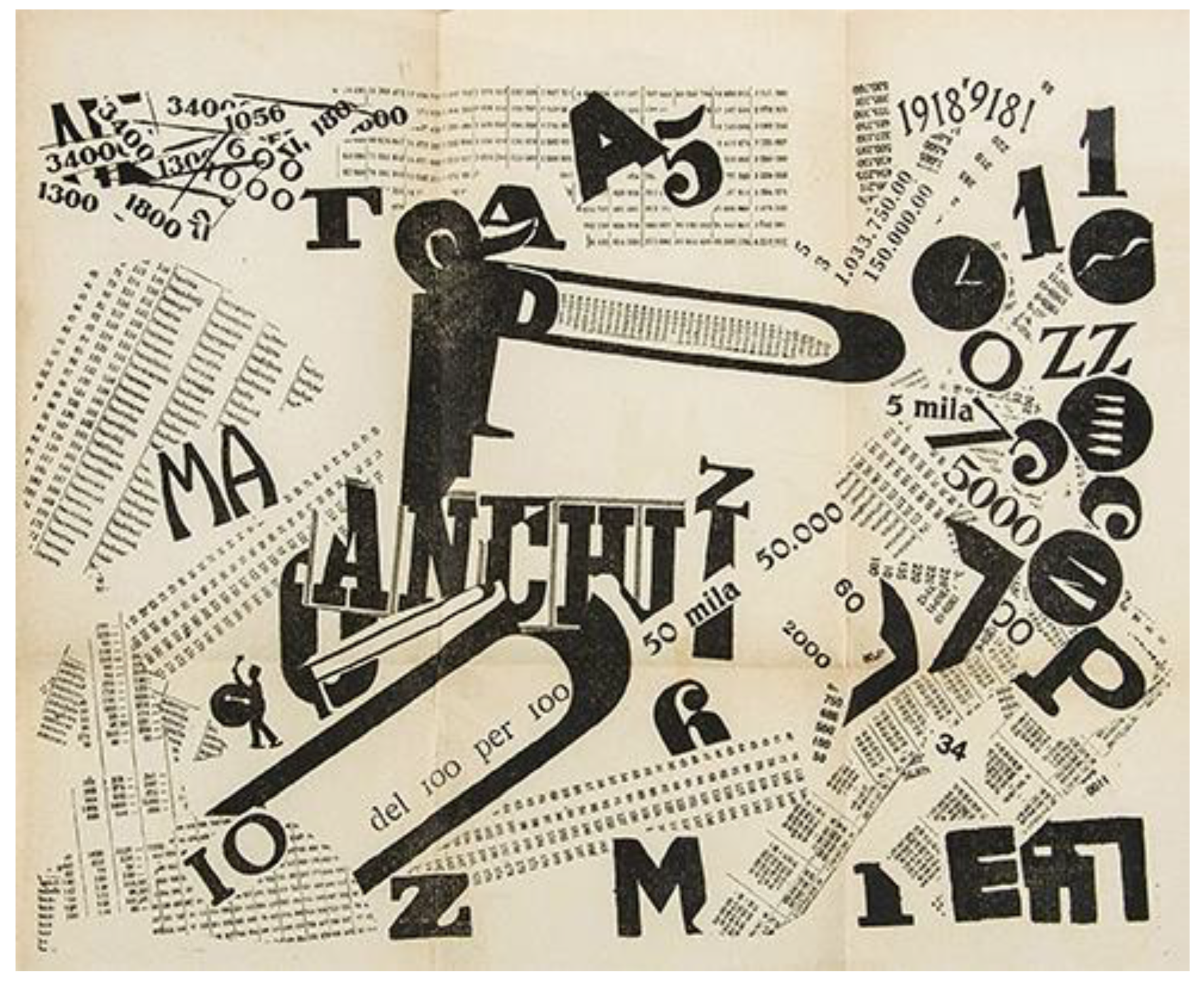
Looking at the free-word tables of
Les mots en liberté futuristes it is also interesting to note how some typographical elements derive from printed materials of the era: for example, the letter ‘P’ and the extended semi-circle (
Figure 1), used by Marinetti to give the composition dynamism, in all probability corresponds with the logo used by Pirelli in the early 1900s.
Again according to Hollis, ‘Marinetti realized that the letters that made up words were not mere alphabetic signs’, and therefore words that function as images (ibid).
By cutting and pasting existing types, Marinetti uses letters without worrying about their meaning, a bit like a photographer cropping one of their own photos. Becoming images, the words and letters in futurist compositions nonetheless carry out their communicative function albeit in a different way to linguistic and syntactical convention, adding an emotional level and therefore strengthening their meaning (The free-word tables of Les mots en liberté futuristes are created by mixing multiple techniques: from letterpress printing to xylography and lithography for the handwritten and hand-drawn parts, creating matrixes that can be identically reproduced on each copy in circulation using a printing press).
In addition to this, Fanelli and Godoli pointed out that ‘words-in-freedom is an indissoluble symbiosis of words reduced to a graphic sign that gives a simultaneous visual consumption eminently figurative. Words-in-freedom introduced the concept of the book as a sequence of images, which represents another significant bequest from futurism to the international avant gardes’ [
3].
Following these two above-mentioned titles, futurists started to experiment with the book as a medium of art as well as the container of their manifestos, producing several well-known experimental books. The books published by Edizioni Futuriste di Poesia—Poesia Futurist editions and the literary style of the words-in-freedom embodied how the spreads and pages were changing at that time, appearing as individual units and as sequences of images made of up typography.
3. The Body of Text
Once the synesthetic potential of words had been ascertained by the futurist, constructivist and dadaist avant-gardes, type became an increasingly fundamental medium for experimental artistic and graphic practices. Whereas typographical expression was no new phenomenon, it was once again the breaking of convention that lifted the lid on unexplored potential. This was the case of Karel Martens and Wolfgang Weingart: both came from typographical schools with long traditions—the Dutch and Swiss schools respectively—and both, albeit with completely different methods and results, experimented with the physicality of the typographical medium. Between the end of the 1950s and the late 1960s, Karel Martens’s interests included optical illusions, Vedic Mathematics (Vedic Mathematics is the name given to the ancient system of Indian Mathematics which was rediscovered from the Vedas between 1911 and 1918 by Sri Bharati Krsna Tirthaji (1884–1960). According to his research all mathematics is based on sixteen Sutras, or word-formulae), the theory of colours and, last but not least, numbers: Martens was fascinated by figures not so much for their arithmetical function but rather for the way they became images when printed on paper [
4,
5]. As well as numbers and letters, Martens would print the most diverse of objects, Meccano constructions, forms and shapes, treating them equally and without worrying about the nature of the matrix, imprinting the trace of their three-dimensionality on a two-dimensional medium (Martens’s
monoprints are obtained by using a printing press to print the inked object on old printed materials (including the forms of the Stedelijk Museum of Amsterdam)). Weingart, a designer hailing from the Swiss school (Also referred to as the International Typographic Style, the Swiss Style was a popular graphic design style in 1940s and 50s Switzerland. Weingart observed the teachings of two of the biggest exponents of this style: Armin Hoffmann and Emil Ruder. For a broader overview see: Hollis, R.
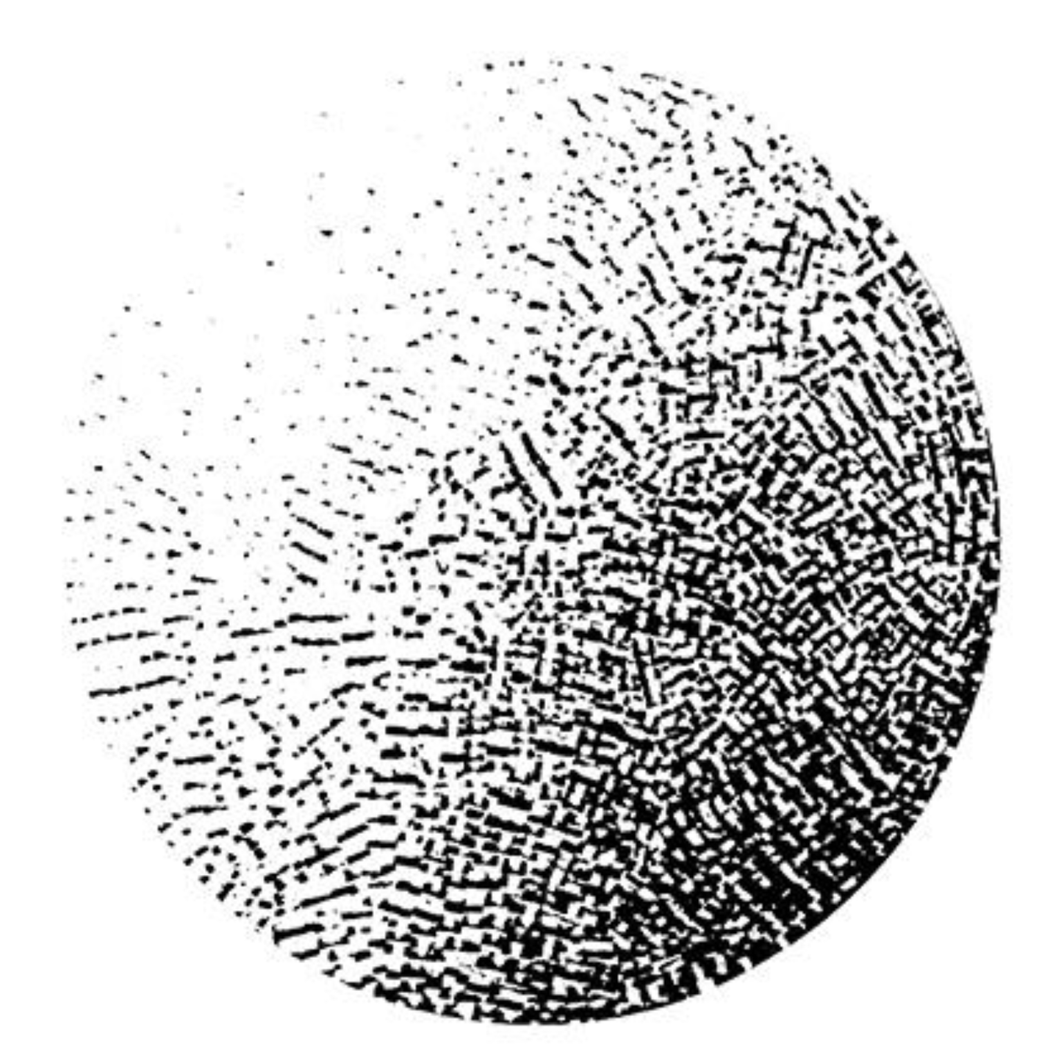
Swiss Graphic Design: The Origins and Growth of an International Style, 1920–1965. Yale University Press: New Haven, 2006), whose dogmas he would infringe with his typographical experimentation, did likewise. In both his professional work and his teaching work with his students, Weingart disregarded the linguistic functionality of letters, opting to focus on their expressiveness once they are printed, and therefore in the forms of signs and images, using letterpress. If we look at the composition in the circle (
Figure 2), obtained by composing the movable types inserted in a cardboard tube in a circular fashion, we can see that the print is produced by inking and printing the reverse side of the lead character. Using this expedient Weingart ignores the alphabetical sign, regarding type as a 3D object whose printed surface appears two-dimensionally like a square form of ink [
6,
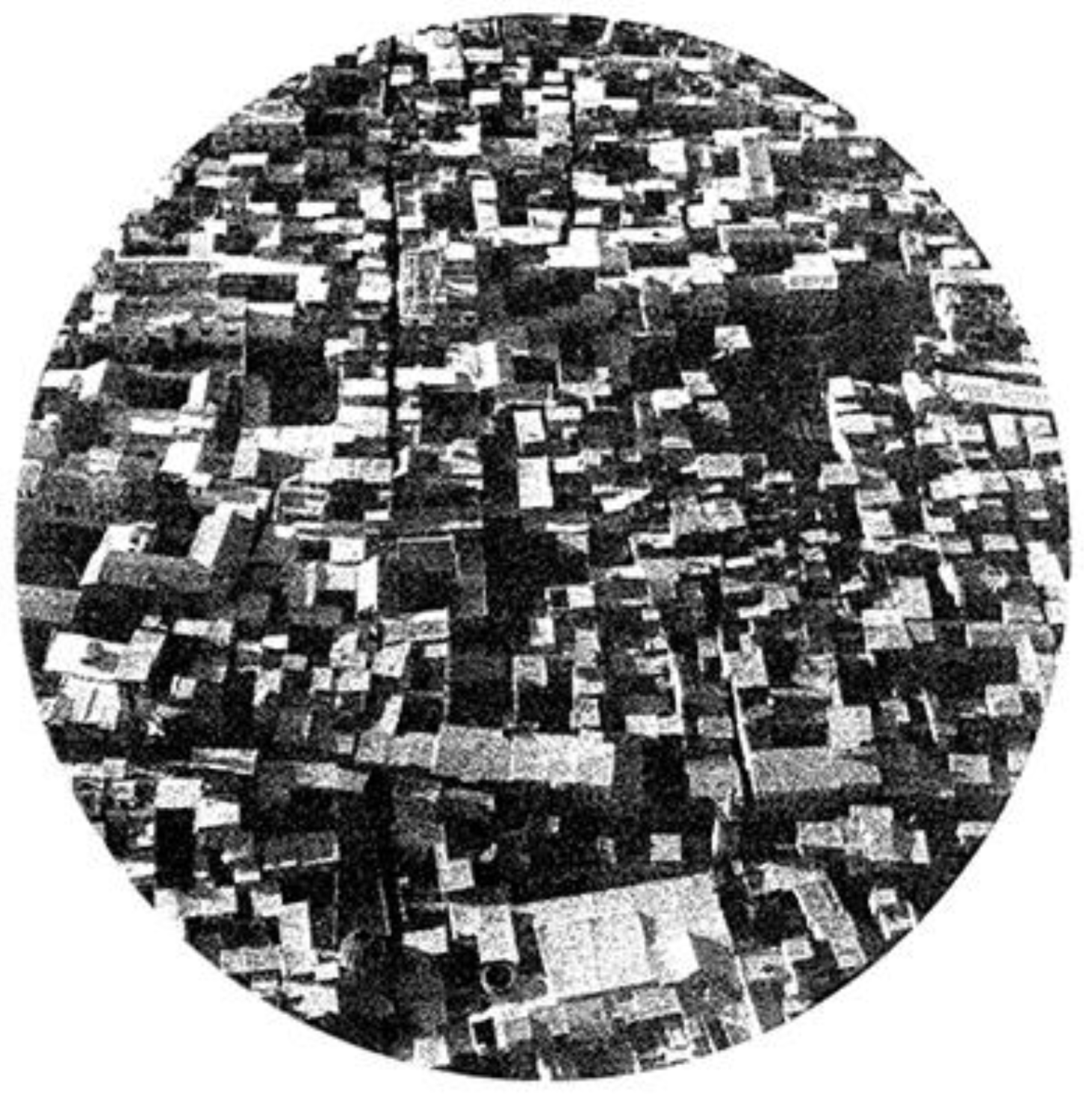
7]. In 1966, flying from Palmyra, Weingart took a photograph of the ancient section of the city of Damascus (
Figure 3). The photo was similar to the typographical compositions typical of Weingart’s experimental research, obtained by subverting the principles of movable type printing and the Swiss Style. Finding similarities between the two different media, letterpress and photography, is only possible if we regard typography as an image, devoid of linguistic sense, just like the photographic reproduction of the city of Palmyra from above, disregarding the fact that the forms of ink printed in the composition are in reality traces of movable lead type to purely observe the formal similarity.
Another approach based on visual similarity that we can ascribe to experimentation with the body of the text is that adopted by British artist and designer Paul Elliman who gathers together day-to-day objects whose silhouettes resemble letters of the alphabet. Finding visual similarities between objects and letters, Elliman produces sets of objectified characters that reflect on the shape of letters in an unconventional way (Found Fount. 1989—ongoing).
4. Photographic Characters
Since the late 1960s the technology of printing movable type using lead and wood has gradually been replaced with the process of phototypesetting. This has involved the reorganisation of work both inside and outside graphic design companies in terms of the outsourcing of some phases, such as the production of printing plates for the layouts. In studios, the most widely used instrument is the repro camera, a flat photographic machine used to compose different materials. The typographical characters are cut from samples or other magazines and then composed and reproduced. Alternatively, Letrasets can be used, sheets of transferrable typefaces for the composition of texts. While the lettering of titles and short texts is produced in this way or designed manually, running and secondary text is produced using a photolithograph and then inserted in the final graphical composition. The phototypesetting machine uses electronic and photographic media. The text, archived on external media like magnetic tape, optical disk or electronic memory cards, is composed using a keyboard similar to those of modern-day computers and then impressed on photographic film (Machines like the Fotomaster, introduced in the late 60s, made it possible to directly apply a series of deformations and distortions of the character, effects and filters, produced via a photographic process, during the composition process). The matrixes of characters are physical and produced on film. The characters and images are therefore produced from the same substance: both impressed on film, they can undergo similar treatments and transformations. The restrictive heaviness and rigidity of the composition materials that the avant-gardes, typographers and futurist printers had to contend with, as well as the aforementioned Weingart many years later, really appears to be a thing of the past. We are therefore closer to the electro-library prophetically announced by El Lissitzky in his 1923 manifesto
Topography of Typography [
8]. The synthetic and analytical possibilities created by the activation of the non-linear space is the biggest novelty of phototypesetting. With the break between the text and the image having been done away with, the linearity of the text can now be questioned more radically. But that’s not all, it is the essence of the text itself that represents the antithesis of the idea that the image is in danger: the text is the image. There is no need for theoretical discourses or practical experimentation to prove it. The evidence is the very substance from which the text and image are produced. Yet it is not necessarily the triumph of the expressive and synesthetic use of the text. The same phototypesetting procedure can be used to create graphics in which the text fully exploits and experiments with the plastic possibilities of design—Grignani’s graphics produced for Alfieri & Lacroix in the late 50s and early 60s, for example—or to produce layouts in which text and images are clearly distinct, not physically relating with each other. This can be seen in the posters created by Massimo Dolcini for the Municipality of Pesaro between 1971 and the mid-1980s. In his work, while the text is used to clearly and directly communicate an unequivocal message, the image is designed to convey information that can be interpreted in different ways, that is more evocative and less rational [
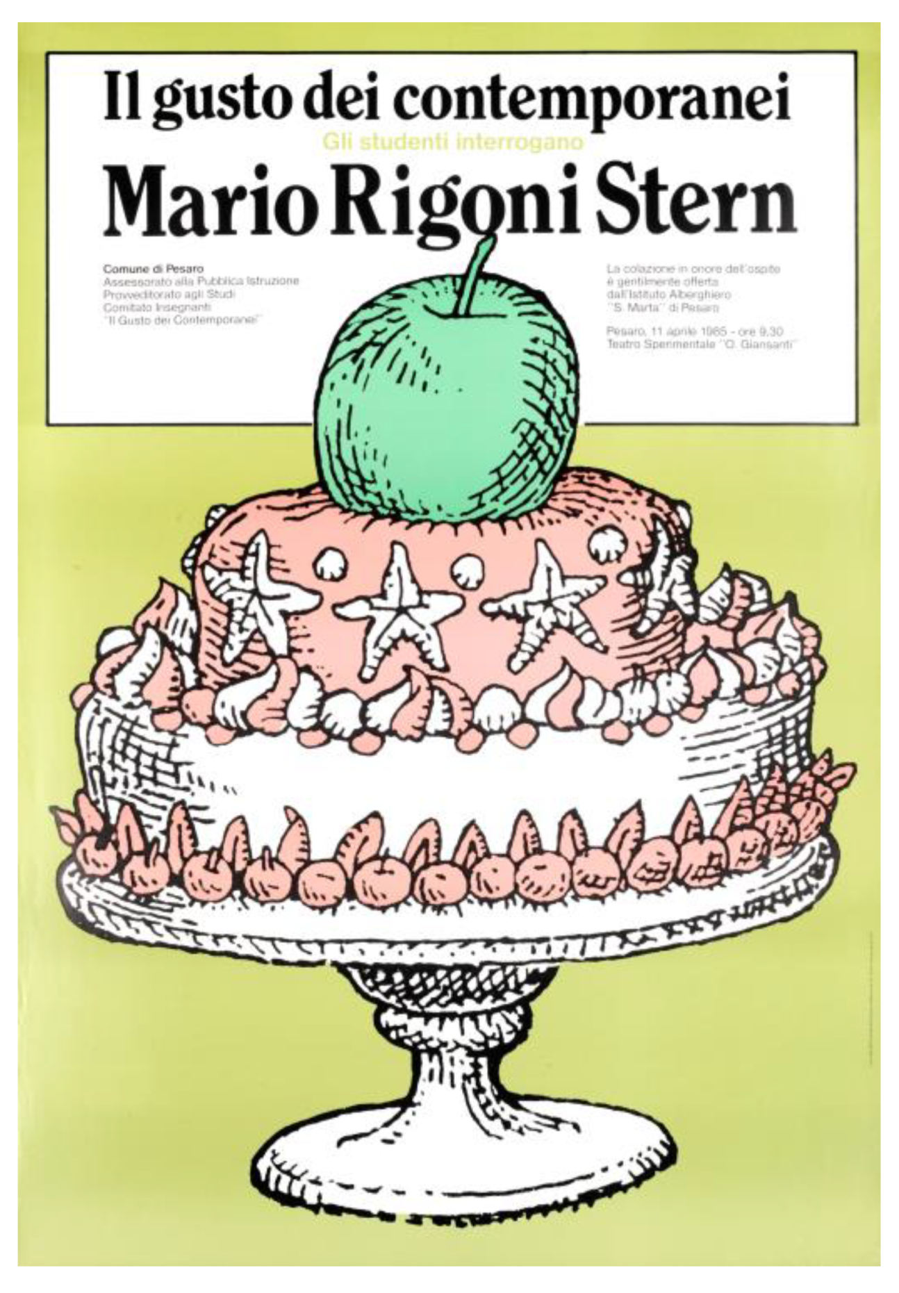
9]. While Dolcini’s images are always the result of a plastic and often iconic transformation, beginning with images found and taken from daily life and from the work of designers and artists in which he intervenes, the original design of the text remains untouched. One exception is one of his first manifestos, designed to encourage the public not to waste water because it is a public resource. Here, the headline, inserted in the form of a bottle, is rippled by means of a photographic transformation similar to many of those he carried out using a camera obscura when he was a student at ISIA in Urbino (The photographic experimentation carried out by Dolcini during the Photographic Techniques course he attended at ISIA in Urbino in 1968/1969 can be found at the Graphic Design Documentation Centre of the AIAP—the Italian Association of Visual Communication Design, Milan). (
Figure 4). However, in the majority of his manifestos, the design of the characters does not undergo changes. Not only are these not modified in terms of their design, their position compared with the image is also independent. The texts are often inserted in special spaces, fields or boxes which, like classic scrolls, graphically and unequivocally separate the text from the image (
Figure 5). Dolcini asserts that the aesthetic of his manifestos is a consequence of the use of a precise technique and a process, the use of a small repro camera and screen printing, which characterise his simple designs with their clear strokes and vibrant colours. But the technique is nothing other than a component of the project that contributes to producing the final graphic. In Dolcini’s work, in the definition of his approach to using text and therefore in his treatment of the text/image relationship, of primary importance are his reference models—those of a modern Imagerie d’Epinal [
10]—and the goals of the message, associated with a public function, addressed to a broad public and necessarily for immediate use.
5. Digital Typefaces as Layout Toolboxes
From the mid-80s onwards the personal computer became part of the set of tools belonging the graphic designer. In fact, it would be more accurate to say that it took their place, condensing down the phases of a production process previously divided between various figures into a single job carried out by the designer. It represented a further step towards the dematerialisation of text and the image. The technological impact was such that the profession itself was redefined, its raison d’être becoming the conceptualisation of the project with conception and production separated into two distinct phases corresponding with two separate roles [
11]. The accessibility of these tools and their user-friendliness had two effects. Whereas, in the short term, it is true that there was a proliferation of far from excellent designs, the opening up of the profession to non-designers also resulted in a boom in experimentation, generating aesthetics that would have been hard to imagine beforehand [
12].
These transformations had a particular impact on the design of typefaces, a highly specialist sector, and therefore largely inaccessible to the majority, in which the technical component of design, which we could almost describe as artisanal, constitutes an important part of the design process in which separating conception from production is less immediate. With the introduction of software that made it possible to design types like digital outlines through the management of Bézier curves—like Ikarus, but above all Fontographer and FontStudio—the scenario rapidly evolved. In this first phase, a lot of effort went into overcoming technological limitations, such as the low resolution of screens, by specially designing fonts for the new digital environment—Bitstream Charter by Matthew Carter, for example, or Stone by Sumner Stone for Adobe—or developing aesthetic solutions capable of establishing themselves as expressions of their time. This was the case with Californian type foundry Emigre owned by Zuzana Licko, whose characters are hybrid creatures with a markedly digital feel, or the Beowolf font by Erik van Blokland and Just van Rossum which, exploiting the limitations imposed by Post Script print technology, permits the production of infinite random variants of the design, echoing the spontaneity of handwriting.
The typeface, now defined as a set of digital information, firstly in PostScript and TrueType and then in OpenType (from 1996), had become a genuine piece of software that not only included a number of glyphs, alphabetical and non-alphabetical symbols defined in a vector format, but also contained information that determined the functioning of the font during the composition phase.
The definition of a typeface as a system and not just an original design is certainly not a prerogative of digital technology. For Noordzij,
typography with movable type is writing using prefabricated letters which are juxtaposed as necessary, and it is this modularity aimed at reproduction that sets it apart from
lettering, the study and design of a defined series of letters, designed ad hoc for a specific use [
13]. The approaches of the typeface designer and the graphic designer to the text/image relationship therefore appear to be distinct from one other. Nevertheless, many typeface designers have sought to go beyond, anticipating the use of typographical systems structured to varying different degrees. In fact, going right back to the era of “warm” composition, some experimental projects used the systematic structure of the typeface, one example being the
Fregio Mecano typeface produced and distributed by the Nebiolo type foundry in the 1920s, which consisted of a set of geometric shapes that could be assembled to create letters and images. Digital technologies have made it possible to maximise the systemic potential of the typeface. This is what happened, for example, with perhaps the most common typographical system, that of the family of weights and styles. Back in 1956 Frutiger designed
Univers, envisaging it as a series of variants identified through numbers rather than names, but it was in 1994, with
Thesis by Lucas De Groot, that the concept of the super family was born with classes normally treated separately (Sans and Serif) grouped together and a Mix version introduced.
But what attributes can vary and which must remain unchanged to ensure that different designs continue to belong to the same family? In some contemporary works the characters become, as was the case with Fregio Mecano, toolboxes that the graphic designer can freely dip into, taking explicit advantage of their semi-finished nature. This was the case with the History typeface by Peter Biľak: a collection of 21 fonts, a layered system inspired by the historical evolution of typography. Based on a common skeleton, sharing widths and other metric characteristics, the various typefaces can be freely combined, giving the graphic designer the opportunity to produce thousands of styles. In design terms, the importance of the collection’s versatility is underlined by the fact that, in addition to the typeface, Bil’ak also released an online editor to make it easier to use.
In some cases these typographical systems are inspired by and systematise experiments developed by the 20th century avant-garde. This is the case with the Julien family of typefaces, again by Bil’ak, a geometric font inspired by the typography of the avant-gardes based on elementary shapes and including multiple variants of each letter managed by a script.
These typefaces, a kind of halfway house between lettering and typography, provide the graphic designer with more open and flexible tools and point to the progressive convergence between the approach of the graphic designer and that of the typeface designer to the text/image relationship, a natural consequence of their non-exclusive roles.


