The Effect of Layout and Colour Temperature on the Perception of Tourism Websites for Mobile Devices


Department of Computer Science, University of Saskatchewan, Saskatoon, SK S7N 5C9, Canada
*
Author to whom correspondence should be addressed.
Multimodal Technol. Interact. 2020, 4(1), 8; https://doi.org/10.3390/mti4010008
Submission received: 17 February 2020
/
Revised: 6 March 2020
/
Accepted: 9 March 2020
/
Published: 13 March 2020
(This article belongs to the Special Issue Understanding UX through Implicit and Explicit Feedback)
Abstract
:In e-commerce, the user interface design of a website is critical to its success. However, there is limited research on how colour and layout design elements influence the perception of e-commerce websites for mobile devices. To bridge this gap, we conducted an empirical study to investigate, how the layout of information and colour temperature of an e-commerce tourism website for mobile device influence essential Technology Acceptance Model (TAM) user experience (UX) design attributes and intention to use the website. The results of our Partial Least Square Path Modelling (PLSPM) showed that both interface design elements significantly influence perceived aesthetics, perceived enjoyment, perceived usefulness and intention to use. Specifically, layout (list = 0 and grid = 1) positively influences perceived aesthetics and perceived enjoyment, while colour temperature negatively influences perceived usefulness and intention to use. The first finding suggests that in tourism website design for mobile devices, a grid layout of products and services provides a better hedonic user experience than a list layout. Moreover, the second finding suggests that cooler-temperature (blue and green) tourism websites are viewed by users as more useful than warmer-temperature (orange and red) tourism websites. We discuss the implications of these findings in the context of website UX design for mobile devices in the tourism domain.
1. Introduction
Many e-commerce vendors are extending their online products and services to the mobile domain. This move has become a trend given the ubiquity of mobile devices, their increasing portability and affordability over time and users interaction with them anywhere, anytime. According to Smith [1], with more than half of all internet traffic originating from the mobile device, it has become important for e-commerce vendors to ensure that their website is “primed for mobile viewing.” They went further to state that “If you plan on running a successful eCommerce website, or any website, you absolutely must cater to mobile users” [1]. This makes it important for human–computer-interaction (HCI) researchers to investigate user perception of mobile web designs to help future designers to tailor their mobile e-commerce websites to users’ preferences and improve the user experience. In this study, we aimed to uncover how interface design elements such as colour and layout of information influence user perception of tourism websites on mobile devices. We chose the tourism domain because prior research [2] has shown that information design is an important factor in the search for information, products and services in travel websites and the overall user experience. Second, we aimed to investigate the moderating effect of gender on the relationship between layout/colour and the user experience (UX) design attributes. Thus, we carried out an empirical study (n = 323) to investigate how both interface design elements and gender influence six UX design attributes and intention to use. To contextualize our study, we used a simple mobile website site for searching for travel and tourism information as a case study. Moreover, we focused our study on commonly researched Technology Acceptance Model (TAM) UX design constructs (perceived aesthetics, perceived ease of use, perceived usefulness and perceived enjoyment) and intention to use.
The results of the Partial Least Square Path Modelling (PLSPM) analysis show that that layout (list = 0 and grid = 1) positively influences the perception of classical and expressive aesthetics as well as enjoyment. This suggests that users perceive the grid layout as a better web design than the list layout with respect to hedonic qualities such as perceived aesthetics and perceived enjoyment. On the other hand, colour temperature negatively influences perceived usefulness and intention to use with respect to utilitarian qualities. This suggests that users prefer cooler colour schemes (blue and green) than warmer colour schemes (orange and red) in the domain of tourism. Our results show that there is no gender difference with respect to how colour temperature and layout influence the TAM constructs. In sum, our findings imply that designers of tourism websites should give higher priority to cool-temperature websites and/or grid layout than warm-temperature and/or list-based websites in the design of their mobile websites to increase their hedonic and utilitarian appeal, respectively.
2. Background and Related Work
In this section, we provide an overview of the web design elements and attributes we investigated in the context of user perception and a brief review of related work.
2.1. TAM Constructs
Table 1 shows the six web design attributes we investigated and their definitions. The attributes were drawn from the TAM, which models how users come to accept and/or adopt an information system. The investigated TAM constructs include perceived aesthetics, perceived enjoyment, perceived ease of use, perceived usefulness and intention to use. In particular, Aesthetics is a concept that is related to beauty [3]. Historically, it is regarded as the branch of philosophy concerned with the nature and appreciation of art, beauty and good taste” [4]. In HCI, perceived aesthetics refers to the degree to which a person believes that a website is visually appealing and pleasing to the eye. It is composed of two dimensions: classical aesthetics and expressive aesthetics. Perceived aesthetics and perceived enjoyment are hedonic constructs, while perceived ease of use and usefulness are utilitarian constructs. Hedonic and utilitarian design constructs are based on hedonic and utilitarian websites, respectively. Utilitarian websites are aimed at providing instrumental or productive value to their users (e.g., search engines) [5,6], while hedonic websites offer pleasure and enjoyment to their target users (e.g., game-based websites [7]. In the TAM, hedonic design attributes include perceived aesthetics and perceived enjoyment, while utilitarian attributes include perceived ease of use and perceived usefulness. Finally, intention to use is a TAM’s target construct, which can be predicted by the perception of hedonic and utilitarian constructs. Moreover, intention to use has the ability to predict the actual use of a system [8].
2.2. Colour Temperature
Colour is an essential design feature in web design, which can be used to convey the intention and emotion of the designer [12]. Research shows that the choice of colour has the potential to influence people’s feeling, reaction and productivity in different domains [13]. Basically, there are two types of colours: warm and cool. Warm colours are those that fall between red and yellow in the colour spectrum (with orange being the secondary by-product). They are called warm colours because they evoke warm feeling, which is reminiscent of the sun and fire. On the other hand, cool colours are those that center around blue, with green and purple being the secondary by-products [14]. They remind us of cooler natural objects such as the sky, sea and grass. Limited studies have been carried out on the influence of colour temperature on the perception of UX design attributes of websites, especially in the mobile domain [14]. We review some of the relevant prior studies, most of which are focused on the desktop domain.
In the education domain, Soldat et al. [15] conducted a study to examine the influence of colour of answer sheet on university students’ performance. The authors found that the colour of answer sheets that university students used in answering exam questions affected their performance. Specifically, they found that students who used blue sheets of paper scored higher marks than those who used red ones. In web design in the desktop domain, Kondratova and Goldfarb [16] investigated users’ design colour preferences, also known as cultural markers, for a number of countries. They found that colors such as white, black, all shades of gray, all shades of blue and light yellow, which they called the “international colors palette,” are used across the 15 countries they investigated. The countries include “Australia, Brazil, Canada (French and English), China, Finland, France, Germany, India, Italy, Japan, Russia, Saudi Arabia, Spain, United Kingdom, and United States of America” (p. 928) [17]. These countries fall under the two different types of culture (individualist and collectivist), which can impact how people perceive and interact with HCI artifacts such as websites [18]. For example, Brazil, China and India are collectivist cultures, while Canada, France and Germany are individualist cultures. The authors also identified two to four additional “country-specific” pallets for each of the 15 countries. For example, for Brazil, they identified medium orange and dark green colours; for Canada, medium red orange and dark green colours; for China, medium red orange and light green colours, to mention but a few. However, the authors did not investigate the relationships between the international and country-specific colors and the UX design attributes (e.g., perceived aesthetics, etc.) of the evaluated websites. Bonnardel et al. [13] examined users’ preferred colours for the design of the homepage of a website. They found that a grey-colour website was perceived as less appealing than a blue- and orange-colour websites. However, they did not investigate the effect of colour on UX design constructs such as perceived enjoyment, which our current paper investigated. Coursaris et al. [14] investigated the effect of colour temperature on the two main dimensions of perceived aesthetics (classical and expressive) using hotel websites as a case study. They found that colour temperature positively and negatively influences classical and expressive aesthetics, respectively. However, the effects of colour temperature on both dimensions are very weak (β < 0.05, p < 0.01). Moreover, the authors did not consider other UX design constructs than perceived aesthetics. Finally, Oyibo et al. [19] investigated the effect of colour temperature and age on the perceived aesthetics of tourism websites for mobile devices and the moderating effect of age. They found that, regardless of the colour temperature (cool or warm), younger people are more critical of the perceived aesthetics of the websites than older people.
2.3. Layout of Information
Layout refers to the organization of information or content in a website. It helps in defining how users interact with the content of a website and navigate through the site. According to Bart et al. [20], for websites with high information content, e.g., e-tailer and sports websites, navigation and presentation, which comprise the layout of information, are particularly important. According to the authors, users were more likely to perceive a high-information-content website that had a good appearance and layout of information (thus able to take them to their desired destination with a minimum number of clicks) as more trustworthy than the one with poor appearance and layout. In the desktop domain, Bonnardel et al. [13] examined the effect of layout on websites. They found that information presented in a nonlinear (indented) form in a website was better memorized by users than information presented in a linear form. However, they found that users stayed much longer on the linear webpages than on the nonlinear ones. Wu et al. [21] investigated the effect of online store layout design and atmosphere on consumer shopping intention on a website. They found that the layout design of an online store had a significant effect on customers’ attitude toward the website and purchase intention. In the mobile domain, in which there are basically two types of information layout (list and grid) [22], research shows that the layout of content in a webpage can influence the perception of UX design attributes such as perceived trustworthiness [23]. Oyibo et al. [19] investigated the effect of layout on visual aesthetics in the judgment of websites for mobile devices and the moderating effect of age. They found that older people perceived the list-based organization of information to be more aesthetic than younger people. However, they found no significant difference between both age groups with respect to the grid-based organization of information.
2.4. Gaps in the Existing Literature
Our review shows that very little research in the mobile domain addresses the effect of information design (layout and colour temperature) on the perception of TAM-based UX design attributes. Most of the studies presented above were carried out in the desktop domain. Those in the mobile domain such as Oyibo et al. [19] only focused on perceived aesthetics (and not perceived ease of use, perceived enjoyment, etc.) and the moderating effect of age. This paper aims to address the gap.
3. Method
In this section, we present our research objective, measurement instruments and the demographic information of participants.
3.1. Research Objective
The aim of our study was to investigate the influence of layout and colour temperature on web design attributes using an exploratory approach. Specifically, we aim to answer the following five research questions:
- Is layout more associated with utilitarian or hedonic attributes?
- Is colour temperature more associated with utilitarian or hedonic attributes?
- Which of layout and colour temperature is more associated with intention to use?
- Do layout and colour temperature interact to influence any of the TAM constructs?
- Are the relationships between the design elements (layout and colour temperature) and the TAM constructs moderated by gender?
To answer our research questions, we used a tourism-based prototype website (see Figure 1 [24]). We designed eight versions of the website with two different layouts (grid and list) and four colour schemes or temperatures (blue, green, orange and red). In total, there were four cool-temperature websites (blue-list, blue-grid, green-list and green-grid) and four warm-temperature websites (orange-list orange-grid, red-list and red-grid). Figure 2 shows our exploratory research model, with TAM construct representing the UX design attributes (such as classical aesthetics, perceived usefulness, etc.) and intention to use. In this paper, we are interested in examining the relative effect of layout and colour temperature on each TAM construct. Our layout comprises two types (list and grid), both of which are coded 0 and 1, respectively to make the PLSPM analysis, which requires ordinal data, possible. Moreover, the colour temperature ranges from colder colours—blue (1) and green (2)—to warmer colours—orange (3) and red (4). The latter two colours (orange and green) are the complementary colours of blue and green, respectively.
3.2. Rationale for Website Designs, Layouts and Colour Schemes
The layouts of the web designs (homepages) for mobile devices were adapted from actual websites available on the market in 2014. The websites include m.wakanow.com, mobile.united.com, mobile.utah.com and tourismwinnipeg.com. They are basically used to search for tourist attractions, destination and services (e.g., places, hotels, food, etc.). As of the time the study was conducted in 2014, the list and grid layouts were the most common organizations of products and services in the landing page (homepage) of most tourism websites for mobile devices. At the time of writing this paper, most of the websites had been redesigned and/or updated by their owners [25].
Secondly, the four colour schemes (blue, green, orange and red) were chosen based on their temperature, complementarity and popularity in website designs in many countries around the world. Regarding temperature, blue and green are cold colours on the colour wheel, complemented by orange and red, respectively, both of which are warm colours. Complementary colours are two colours that are directly opposite one another on the colour wheel. Both four colours were strategically chosen in such a way that: (1) they form a cross on the colour wheel; and (2) the numerical difference between two of the consecutive colour codes (1,2,3 and 4) can reflect the actual temperature difference and/or spatial distance from one another in their placement in the colour wheel. Regarding popularity, the blue colour scheme is regarded as an international website colour employed in many countries cutting across Asia, Australia, Europe and North America. Moreover, green is regarded as a country-specific website colour employed in Brazil, Canada, Finland, Germany, India, Italy, Japan, Suadi Arabia, and United States. Similarly, orange is a country-specific website colour employed in China, Finland, France, Italy and Spain. Finally, red is a country-specific website colour commonly employed in many countries as well, including Australia, China, Canada, France, Germany, Japan, Spain and the United Kingdom [17].
Thirdly, the foreground texts and images in the webpages are mostly black and white. Both colours were deliberately chosen to achieve as good a contrast as possible between the colours of the foreground images/texts and the color of the background. For example, as shown in Figure 1, the background colors of the webpages (except for the banner, icons and bars) are mostly light shades of gray to achieve a good contrast between them and the foreground texts, icons and bars.
3.3. Procedure
Screenshots of the eight web designs were administered to participants in an online survey. Specifically, to avoid fatigue bias, one of the eight versions of the website design was served to each participant in a randomized fashion on Amazon Mechanical Turk (AMT). The AMT is a commercial crowd-sourcing (recruitment) platform that enables researchers to recruit study participants from a large database of people having different demographic information, e.g., country, age, gender, geographical location, etc. At the end of a study, participants are compensated with a token for their time spent in completing the survey. The AMT platforms has measures in place that foster a more reliable data collection. For example, the researcher is given the opportunity to reject data points they consider “bad data,” e.g., straight lining [26]. This measure leads to participants with bad data points being eliminated from the final data analysis and not being compensated by the researcher on the platform [27,28]. To set the tone for the completion of the survey, the study participants were asked the following overarching question, “Assume you were looking for a website on travels on your mobile phone, and the website below [snapshot of website] happened to be one of the links returned by your search engine.” Then, the questions for each TAM construct presented in Section 3.4 followed.
3.4. Measurement Instruments
We used existing validated instruments to measure all of the web design constructs. Table 2 shows the scales together with their respective example items. For example, to measure classical aesthetics (3 items) and expressive aesthetics (3 items), we used the visual aesthetics scale proposed by Lavie and Tractinsky [3], as adapted by van Schaik and Ling [7]. The scale ranged from “Strongly Disagree (1)” to “Strongly Agree (7).” The scales for perceived ease of use (6 items), perceived usefulness (6 items) and intention to use (1 item) ranged from “Extremely unlikely (1)” to “Extremely likely.” The other scales are as shown in Table 2. The question preceding all of the items is, “Assume you were to use the previous website [snapshot of website] to search for a specific travel information (your job or task). Please rate the website based on the following criteria.”
3.5. Participants
The study was submitted to and approved by the Behaviour Research Ethics Board of our university. Thereafter, we used Amazon Mechanical Turk to recruit participants to partake in the online survey. Each of the participants that completed the survey was compensated with $0.5 in appreciation for their time. A total of 323 subjects participated in the study. Table 3 shows a summary of the demographics of participants: 48.9% females and 51.1% males.
4. Result
In this section, we present the results of the evaluation of the measurement models, analysis of structural models, and multigroup analysis.
4.1. Measurement Models
Prior to analyzing our structural (outer) models, we evaluated the inner models and ensured the reliability and validity of the constructs in the respective path models are met [30].
4.1.1. Indicator Reliability
All of the indicators in each model had an outer loading equal to or greater than 0.7 [30], except for the item “using the website to do my job would be [dull … exciting]” in perceived enjoyment, which outer loading was equal to 0.65.
4.1.2. Internal Consistency Reliability
The internal consistency reliability criterion for the TAM constructs in each model was assessed using the composite reliability criterion (Dillon-Goldstein’s rho), which was greater than 0.7 [30].
4.1.3. Convergent Validity
The convergent validity criterion for the web design constructs was assessed using the Average Variance Extracted (AVE), which was greater than 0.5 [30].
4.1.4. Discriminant Validity
The discriminant validity of each construct was evaluated using the crossloading criterion. No indicator loaded higher on any other construct than the one it was meant to measure [30].
4.2. Structural Models
Figure 3 shows the path model for each of the TAM constructs. The models are characterized by three parameters: coefficient of determination (R2), goodness of fit (GOF) and path coefficient (β) [30]. The R2 value indicates the amount of variance of the target TAM construct explained by either of colour temperature and layout exogenous constructs or both combined. The GOF values indicates how well each model fits its data. Finally, the β value shows the strength of the relationship between each of the predictors and the target construct. Overall, either of colour temperature and layout or both combined are able to predict 5 to 7% of the variance of each TAM construct, with a GOF value ranging from 18 to 23%. In particular, for the intention to use construct, there is no GOF value for the model given that only one item measured each of the constructs in the model. Moreover, our results show that layout positively influences classical aesthetics (β = 0.25, p < 0.001), expressive aesthetics (β = 0.23, p < 0.001) and perceived enjoyment (β = 0.18, p < 0.001). However, colour temperature negatively influences perceived usefulness (β = −0.23, p < 0.05) and intention to use (β = −0.23, p < 0.001). Our multigroup analysis shows that there is no significant difference (p > 0.05) between males and females with respect to all of the relationships. Finally, as shown in Figure 3, there is no interaction effect between colour temperature and layout on the target TAM construct in each of the models.
5. Discussion
We presented a PLSPM model to investigate the direct and interaction effect of layout and colour temperature on web design attributes from TAM. The results of the PLSPM (see Figure 3) show that layout positively influences perceived aesthetics and perceived enjoyment, while color temperature negatively influences perceived usefulness and intention to use. Table 4 summarizes the findings. Before proceeding to discuss the significant path coefficients in the light of each research question, it is worthy to note that the R2 and GOF values in each of the models presented in Figure 3 are low [30]. This in an indication that there are other constructs (other than colour temperature and layout) that account for the variance of each target TAM construct, which is not captured in the model.
With the above said, our results (Table 4) show that layout positively influences the two dimensions of perceived aesthetics and perceived enjoyment. The finding suggests that a website with a grid layout of content is perceived as more aesthetic (classically and expressively) and enjoyable than a website with a list layout of content. In other words, a mobile website with a grid layout of content is perceived as cleaner, more pleasant, creative and fascinating than its list-based counterpart. In general terms, the grid layout is more hedonic (emotionally pleasing and stimulating) than the list layout. In the context of user experience, one plausible explanation why users perceived the grid layout as more aesthetic and enjoyable than the list layout is that all the presented contents are visible on a single screen. In contrast the list layout, which, in our case, can only accommodate seven items, introduces an extra layer of navigation to access the other items [31]. Another plausible reason why the grid layout is perceived as more aesthetic and enjoyable than the list layout is that it is less prone to error when the user tries to select an item. However, in the case of the list layout, the items are closely touching, thereby increasing the chances of the user making a mistake when trying to select (click) on a particular item. Another plausible reason why the grid layout is perceived as more aesthetic and enjoyable than the list layout is that users are already familiar with the former given it is the default layout of applications on most smartphones, such as Android and Apple. However, based on the first two plausible reasons given above (navigation and error related), one would have expected that layout as a design element would be associated with utilitarian attributes such as perceived ease of use and perceived usefulness both of which are closely associated with usability [32]. Contrary to this expectation, in response to our first research question, our path model shows that layout is more associated with hedonic attributes than with utilitarian constructs as shown in Figure 3. Based on this finding, we recommend that designers of mobile websites in which contents, such as the website’s products and/or services, are laid out as selectable items (e.g., as icons or images with texts) on the homepage, should favour the grid layout over the list layout, especially when all of the items can fit into one screen.
Second, our results (Table 4) show that colour temperature negatively influences perceived usefulness. This finding indicates that, in the tourism domain, users find websites with cooler temperatures (blue and green) more useful than those with warmer temperatures (orange and red). This finding is independent of gender as the multigroup analysis shows that there is no significant difference between males and females in the relationship between of colour temperature and perceived usefulness. One plausible reason for the perception of cooler temperatures as more useful than warmer temperatures is that the target domain of study, tourism, concerns natural tourist sites of attraction such as the sea (which has a predominantly blue color) and game reserve (which has a predominantly green color). For example, in the context of tourism advertising, Smith [1] states that “the green grassland landscapes and the blue ocean tour all manifest rich emotional colors in [advertised] tourism images” (p. 261). Moreover, we found that colour temperature negatively influences perceived usefulness and intention to use. One plausible reason for this is that, in the context of TAM, both endogenous constructs are strongly related, with perceived usefulness found to be the strongest determinant of intention to use [33,34]. Thus, we see the negative effect of colour temperature on perceived usefulness (a strongly determinant of intention to use) propagating to negatively affecting intention to use due to the positive relationship between both TAM constructs. Based on our findings, in response to our second and third research questions, our PLSPM analysis shows that color temperature is more associated with utilitarian attributes (perceived usefulness) and users’ intention to use the websites in the tourism domain, with users being more favorable towards cooler temperatures than warmer temperatures in terms of their perceived usefulness. Moreover, the negative influence of colour temperature on perceived usefulness (β = −0.23, p < 0.05) and users’ intention to use (β = −0.23, p < 0.01) seems to be replicated with perceive ease of use (β = −0.22, p = n.s)—another utilitarian attribute—only that the said effect is not statistically significant. That said, based on the positive significant relationship between colour temperature and perceived ease of use/intention to use, we recommend that designers of mobile websites in the tourism domain, should favour cooler colour schemes (such as blue and green) over warmer colour schemes (such as orange and red).
Finally, in response to our fourth and fifth research questions, our results show that there is no interaction between layout and colour temperature in their effect on the respective TAM constructs. Similarly, our results show that gender does not moderate the relationships between both design elements and the respective TAM constructs.
In conclusion, based on our findings, we recommend that in the design of tourism websites, designers should favour cooler-temperature (grid-based) mobile website design, which reflects the domain, over warmer-temperature (list-based) website design.
Specifically, our results showed that the cooler the temperature, the more useful potential users perceive tourism websites. Moreover, the grid layout of products and services provides a better hedonic appeal and perceived enjoyment to users than a list layout. Our work, in the context of web design for mobile devices, is one of the first in the tourism domain to show empirically the influence of layout and colour temperature on the perceived UX design attributes of a website and users’ intention to use it. In future work, we will investigate if our findings apply to other domains and among other demographics than the North American audience.
6. Limitations and Future Work
Our study has a number of limitations. The first limitation is that the findings are based on users’ perceptions and not the actual use of tourism websites with the different layouts and colour schemes investigated in the paper. For this reason, our findings may not generalize to the context of actual use of the investigated website designs and to non-tourism domains. The second limitation of our study is that the investigated population is predominated by respondents from North America. This may threaten the generalizability of the findings to other populations outside North America such as Africa and Asia. For these reasons, further studies ought to be carried out to test the generalizability of the findings to the actual application domain, non-tourism domains and other populations. The third limitation of our study is that we only investigated four particular colour schemes of (blue, green, orange and red) coded 1, 2, 3 and 4, respectively. We acknowledge that, unlike an interval scale, the exact temperature differences between two of the investigated consecutive colours may not be actually equal as coded due to the choice of the respective colour shades. For example, the temperature difference between blue (1) and green (2) may not be the same numerically as that between green (2) and orange (3). The fourth limitation of our study is that we only considered two basic organizations (layouts) of information. There are other organizations/layouts of information (e.g., non-linear or indented list [13]) as well, which can be examined in future investigations. The fifth limitation of study is that the effect of the background colour is not examined and discussed in the paper due to the quantitative analysis carried out. However, in future work, we will look into the comments provided by participants on each of the web designs to uncover the possible effect of the background colour on the participants evaluation of the TAM constructs.
7. Conclusions
We presented the effect of layout and color temperature on the perception of commonly researched website UX design attributes (perceived aesthetics, perceived ease of use, perceived usefulness and perceived enjoyment) and intention to use using tourism websites for mobile devices as a case study. The results of our PLSPM showed that either or both design elements significantly influence perceived aesthetics, perceived enjoyment, perceived usefulness and intention to use. Specifically, layout (list = 0 and grid = 1) positively influences perceived aesthetics and perceived enjoyment, while colour temperature negatively influences perceived usefulness and intention to use. These findings underscore the need for designers of tourism-based websites in the mobile domain to give a higher priority to: (1) grid-based layout of products and services than a list-based layout; and (2) cool-temperature websites (e.g., with blue and green colour schemes) than warm-temperature websites (e.g., with orange and red colour schemes). Making this design choices will help to increase the tourism-based websites’ hedonic appeal, perceived usefulness and usage intentions among potential users.
Author Contributions
Conceptualization, K.O. and J.V.; methodology, K.O.; software, NA; validation, K.O. and J.V.; formal analysis, K.O.; investigation, K.O.; resources, J.V.; data curation, K.O.; writing—original draft preparation, K.O.; writing—review and editing, K.O. and J.V.; visualization, K.O.; supervision, J.V.; project administration, J.V.; funding acquisition, J.V. All authors have read and agreed to the published version of the manuscript.
Funding
This research was funded by the Natural Sciences and Engineering Research Council of Canada (NSERC) Discovery Grant (RGPIN-2016- 05762) of the second author.
Acknowledgments
We would like to thank Yash Shukla of the University of Saskatchewan for his support in the design of the investigated websites.
Conflicts of Interest
The authors declare no conflict of interest.
References
- Smith, J. Mobile eCommerce Stats in 2018 and the Future Trends of mCommerce. Available online: https://www.outerboxdesign.com/web-design-articles/mobile-ecommerce-statistics (accessed on 24 April 2018).
- Fogg, B.J.; Soohoo, C.; Danielson, D.; Marable, L.; Stanford, J.; Tauber, E.R. How Do People Evaluate a Web Site ’ s Credibility ? Results from a Large Study; Elsevier: Amsterdam, The Netherlands, 2002. [Google Scholar]
- Lavie, T.; Tractinsky, N. Assessing dimensions of perceived visual aesthetics of web sites. Int. J. Hum. Comput. Stud. 2004, 60, 269–298. [Google Scholar] [CrossRef] [Green Version]
- Mastin, L. The Basics of Philosophy. 2018. Available online: http://www.philosophybasics.com/branch_aesthetics.html (accessed on 23 September 2017).
- Wigelius, H.; Väätäjä, H. Dimensions of Context Affecting User Experience in Mobile Work. In Advances in Visual Computing; Springer Science and Business Media LLC: Berlin/Heidelberg, Germany, 2009; Volume 5727, pp. 604–617. [Google Scholar]
- Van Der Heijden, H. User Acceptance of Hedonic Information Systems. MIS Q. 2004, 28, 695. [Google Scholar] [CrossRef]
- Van Schaik, P.; Ling, J. The role of context in perceptions of the aesthetics of web pages over time. Int. J. Hum. Comput. Stud. 2009, 67, 79–89. [Google Scholar] [CrossRef] [Green Version]
- Van Der Heijden, H. Factors influencing the usage of websites: The case of a generic portal in The Netherlands. Inf. Manag. 2003, 40, 541–549. [Google Scholar] [CrossRef] [Green Version]
- Oyibo, K.; Adaji, I.; Orji, R.; Vassileva, J. What Drives the Perceived Credibility of Mobile Websites: Classical or Expressive? In In Proceedings of the International Conference of Human-Computer Interaction, Las Vegas, NV, USA, 15–20 July 2018; pp. 576–594. [Google Scholar]
- Davis, F.D. Perceived Usefulness, Perceived Ease of Use, and User Acceptance of Information Technology. MIS Q. 1989, 13, 319. [Google Scholar] [CrossRef] [Green Version]
- Chin, L.P.; Ahmad, Z.A. Perceived Enjoyment and Malaysian Consumers’ Intention to Use a Single Platform E-Payment. SHS Web Conf. 2015, 18, 1009. [Google Scholar] [CrossRef] [Green Version]
- Guohua, Z. Analysis of Graphic Design and Color Application in Tourism Advertising. In Proceedings of the 2015 International Conference on Social Science and Technology Education, Sanya, China, 11–12 April 2015. [Google Scholar]
- Bonnardel, N.; Piolat, A.; Le Bigot, L. The impact of colour on Website appeal and users’ cognitive processes. Displays 2011, 32, 69–80. [Google Scholar] [CrossRef]
- Coursaris, C.K.; Swierenga, S.J.; Watrall, E. An empirical investigation of color temperature and gender effects on web aesthetics. J. Usability Stud. 2008, 3, 103–117. [Google Scholar]
- Soldat, A.S.; Sinclair, R.C.; Mark, M.M. Color as an Environmental Processing Cue: External Affective Cues Can Directly Affect Processing Strategy Without Affecting Mood. Soc. Cogn. 1997, 15, 55–71. [Google Scholar] [CrossRef]
- Kondratova, I.; Goldfarb, I. Color Your Website: Use of Colors on the Web. In Proceedings of the Advances in Visual Computing; Springer Science and Business Media LLC: Berlin/Heidelberg, Germany, 2007; Volume 4560, pp. 123–132. [Google Scholar]
- Kondratova, I.; Goldfarb, I. Cultural Interface Design: Global Colors Study. In Computer Vision; Springer Science and Business Media LLC: Berlin/Heidelberg, Germany, 2006; Volume 4277, pp. 926–934. [Google Scholar]
- Oyibo, K.; Ali, Y.S.; Vassileva, J. An Empirical Analysis of the Perception of Mobile Websites and the Influence of Culture. In In Proceedings of the Personalization in Persuasive Technology Workshop, Salzburg, Austia, 5 April 2016; pp. 44–56. [Google Scholar]
- Oyibo, K.; Adaji, I.; Vassileva, J. The Effect of Age and Information Design on the Perception of Visual Aesthetics. In Proceedings of the 32nd International BCS Human Computer Interaction Conference, Belfast, UK, 4–6 July 2018. [Google Scholar]
- Bart, Y.; Shankar, V.; Sultan, F.; Urban, G.L. Are the Drivers and Role of Online Trust the Same for All Web Sites and Consumers? A Large-Scale Exploratory Empirical Study. J. Mark. 2005, 69, 133–152. [Google Scholar] [CrossRef] [Green Version]
- Wu, W.-Y.; Lee, C.-L.; Fu, C.-S.; Wang, H.-C. How can online store layout design and atmosphere influence consumer shopping intention on a website? Int. J. Retail. Distrib. Manag. 2013, 42, 4–24. [Google Scholar] [CrossRef]
- Oyibo, K.; Hamada, M. A Framework for Instantiating Native Mobile Multimedia Learning Applications on Android Platform. In Proceedings of the International Conference on Advances in Mobile Computing & Multimedia—MoMM ’13, Association for Computing Machinery (ACM). Vienna, Austria, 2–4 December 2013; pp. 589–593. [Google Scholar]
- Shirk, M.M. Design, Layout and Review Factors that Influence Consumer Trust in Online Stores and Best Practices for Optimization; University of Oregon: Eugene, OR, USA, 2016. [Google Scholar]
- Oyibo, K.; Orji, R.; Vassileva, J. The Influence of Personality on Mobile Web Credibility. In Proceedings of the Adjunct Publication of the 25th Conference on User Modeling, Adaptation and Personalization—UMAP ’17; Association for Computing Machinery (ACM), Bratislava, Slovakia, 9–12 July 2017; pp. 53–58. [Google Scholar]
- Oyibo, K.; Adaji, I.; Vassileva, J. Mobile Web Design: The Effect of Education on the Influence of Classical and Expressive Aesthetics on Perceived Credibility. In Advances in Visual Computing; Springer Science and Business Media LLC: Berlin/Heidelberg, Germany, 2019; pp. 66–79. [Google Scholar]
- Hair, J.F.; Hult, G.T.M.; Ringle, C.M.; Sarstedt, M. A Primer on Partial Least Squares Structural Equation Modeling (PLS-SEM); Sage Publications, Inc.: Washington, DC, USA, 2014. [Google Scholar]
- Buhrmester, M.D.; Kwang, T.; Gosling, S.D. Amazon’s Mechanical Turk. Perspect. Psychol. Sci. 2011, 6, 3–5. [Google Scholar] [CrossRef] [PubMed]
- Mason, W.; Suri, S. Conducting behavioral research on Amazon’s Mechanical Turk. Behav. Res. Methods 2011, 44, 1–23. [Google Scholar] [CrossRef] [PubMed]
- Sun, H.; Zhang, P. Causal Relationships between Perceived Enjoyment and Perceived Ease of Use: An Alternative Approach. J. Assoc. Inf. Syst. 2006, 7, 618–645. [Google Scholar] [CrossRef] [Green Version]
- Sanchez, G. PLS Path Modeling with R. In Berkley: Trowchez Editions; Berkley University Press: New York, NY, USA, 2013; pp. 1–222. [Google Scholar]
- Oyibo, K.; Ali, Y.S.; Vassileva, J. Gender Difference in the Credibility Perception of Mobile Websites. In Proceedings of the 2016 conference on 3rd ACM Conference on Information-Centric Networking—ACM-ICN ’16, Association for Computing Machinery (ACM). Kyoto, Japan, 26–28 September 2016; pp. 75–84. [Google Scholar]
- Oyibo, K.; Adaji, I.; Vassileva, J. The Influence of Internet Experience on the Judgment of Mobile Web Design. In Proceedings of the 32nd Human-Computer Interaction Conference, Belfast, UK, 2–6 July 2018. [Google Scholar]
- Davis, F. A Technology Acceptance Model for Empirically Testing New End-User Information Systems. Ph.D. Thesis, Massachusetts Institute of Technology, Cambridge, MA, USA, 1985. [Google Scholar]
- Davis, F.D.; Bagozzi, R.P.; Warshaw, P.R. User Acceptance of Computer Technology: A Comparison of Two Theoretical Models. Manag. Sci. 1989, 35, 982–1003. [Google Scholar] [CrossRef] [Green Version]
Figure 1.
Eight versions of a mobile website starting from the coldest temperature (blue) to the warmest temperature (red). The layout and colour temperatures are coded accordingly to allow us conduct a PLSPM analysis, which requires ordinal data.
Figure 1.
Eight versions of a mobile website starting from the coldest temperature (blue) to the warmest temperature (red). The layout and colour temperatures are coded accordingly to allow us conduct a PLSPM analysis, which requires ordinal data.
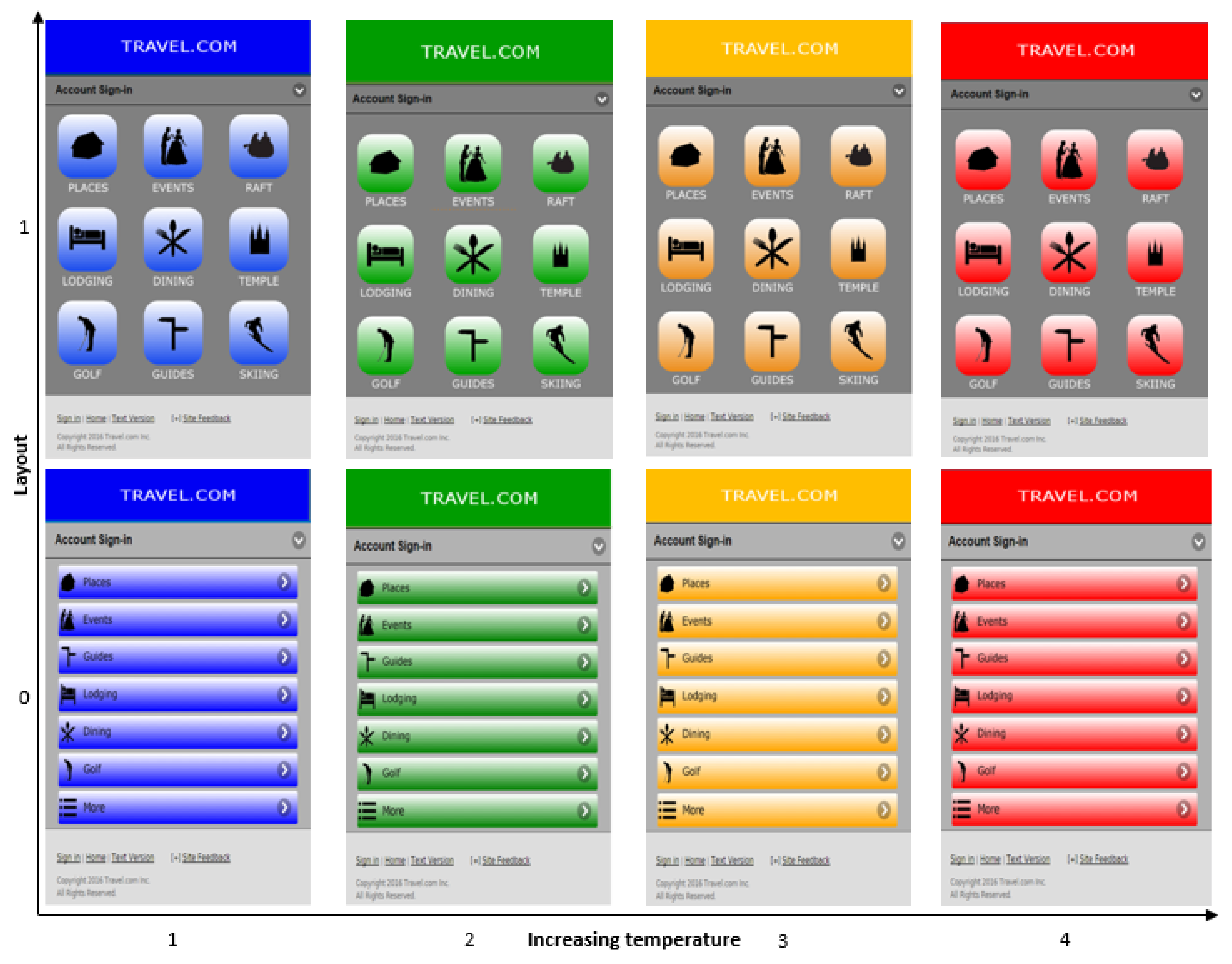
Figure 2.
Research model.
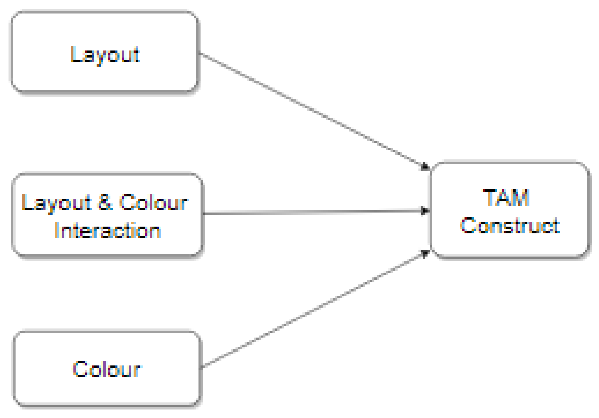
Figure 3.
Relationship between web design elements and TAM constructs. The list layout is coded as 0 and the grid layout as 1. Colour represents colour temperature ranging from blue (coolest) to red (warmest).
Figure 3.
Relationship between web design elements and TAM constructs. The list layout is coded as 0 and the grid layout as 1. Colour represents colour temperature ranging from blue (coolest) to red (warmest).
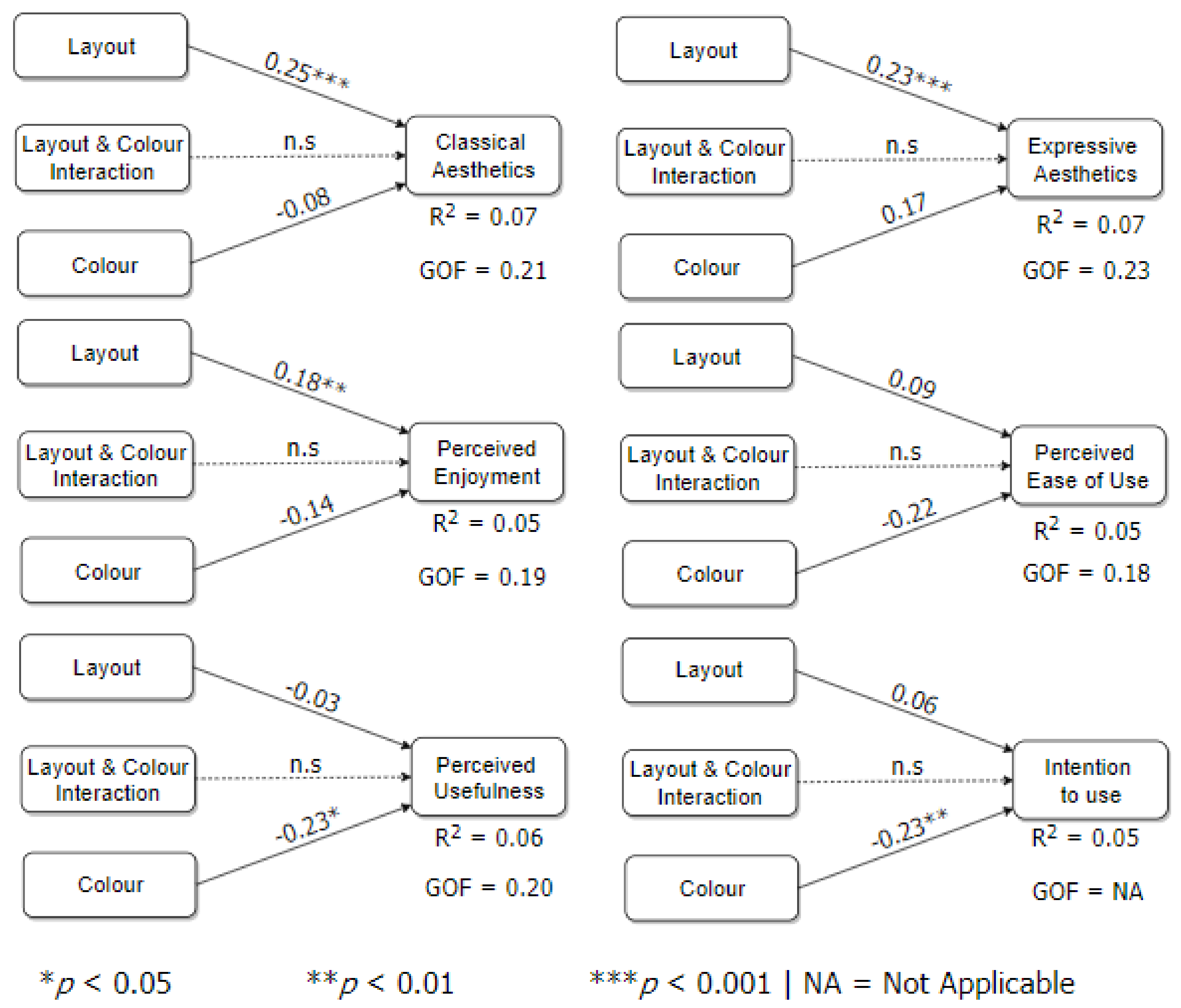

Table 1.
Overview of technology acceptance model (TAM)-based UX design constructs.
| Constructs | Definition of Construct |
|---|---|
| Classical Aesthetics | It entails the traditional notion of beauty, which is described by terms such as “well-organized,” “symmetrical,” “clean,” “clear,” etc. [3,9]. |
| Expressive Aesthetics | It entails the creativity and originality of the designer, including his/her ability to go beyond design conventions. It is described by terms such as “sophisticated,” “fascinating,” “creative,” etc. [3,9]. |
| Perceived Ease of use | The degree to which a user believes that using a website will be free of effort [10]. |
| Perceived Usefulness | The degree to which a user believes a website will help him/her perform his/her intended task [10]. |
| Perceived Enjoyment | The degree to which using a system is perceived to be enjoyable regardless of the actual performance of the system [11]. |
| Intention to Use | A measure of the users’ intention to use a website if deployed in a real-life context. |
Table 2.
Study’s constructs and indicators.
| Construct | Example Items in Scale |
|---|---|
| Classical Aesthetics [7] | 1. The website is visual 2. The website is clean 3. The website is pleasant |
| Expressive Aesthetics [7] | 1. The website is creative 2. The website is fascinating 3. The website is sophisticated |
| Perceived Ease of Use [10] | 1. I would find the website easy to use 2. I would find the website to be flexible to interact with |
| Perceived Usefulness [10] | 1. Using website in my job would enable me to accomplish 2. Using website in my job would increase my productivity |
| Perceived Enjoyment [6] | 1. Using the website to do my job would be [Dull (1) … Exciting (7)] 2. Using the website to do my job would be [Pleasant (1) … Unpleasant (7)] |
| Intention to Use [29] | Assuming the website would be available on my job, I predict that I will use it. |
Table 3.
Demographics of participants (n = 323).
| Criterion | Breakdown |
|---|---|
| Gender | Male (52.3%); Female (47.4%); Undisclosed (0.3%) |
| Age | 18–24 (17.3%); 25–34 (44.6%); > 34 (38.1%) |
| Education | Technical/Trade School (18.9%); High School (19.2%); Bachelor’s degree (44.9%); Postgraduate Degree (14.9%); Others (2.1%) |
| Continent | North America (84.2%); Africa (4.0%); Asia (5.9%); Others (2.8%) |
Table 4.
Summary of the main findings showing the effect of layout and colour temperature on the TAM constructs. The list layout is coded as 0 and the grid layout as 1. *p < 0.05, **p < 0.01, ***p < 0.001.
Table 4.
Summary of the main findings showing the effect of layout and colour temperature on the TAM constructs. The list layout is coded as 0 and the grid layout as 1. *p < 0.05, **p < 0.01, ***p < 0.001.
| Construct | Layout | Colour | Interaction |
|---|---|---|---|
| Classical Aesthetics | 0.25*** | −0.08 | No |
| Expressive Aesthetics | 0.23*** | 0.17 | No |
| Perceived Enjoyment | 0.18** | −0.14 | No |
| Perceived Ease of Use | 0.09 | −0.22 | No |
| Perceived Usefulness | −0.03 | −0.23* | No |
| Intention to Use | 0.06 | −0.23** | No |
© 2020 by the authors. Licensee MDPI, Basel, Switzerland. This article is an open access article distributed under the terms and conditions of the Creative Commons Attribution (CC BY) license (http://creativecommons.org/licenses/by/4.0/).
Share and Cite
MDPI and ACS Style
Oyibo, K.; Vassileva, J. The Effect of Layout and Colour Temperature on the Perception of Tourism Websites for Mobile Devices. Multimodal Technol. Interact. 2020, 4, 8. https://doi.org/10.3390/mti4010008
AMA Style
Oyibo K, Vassileva J. The Effect of Layout and Colour Temperature on the Perception of Tourism Websites for Mobile Devices. Multimodal Technologies and Interaction. 2020; 4(1):8. https://doi.org/10.3390/mti4010008
Chicago/Turabian StyleOyibo, Kiemute, and Julita Vassileva. 2020. "The Effect of Layout and Colour Temperature on the Perception of Tourism Websites for Mobile Devices" Multimodal Technologies and Interaction 4, no. 1: 8. https://doi.org/10.3390/mti4010008