Visual Narrative of the Loss of Energy after Natural Disasters


1
School of Humanities and Education, Tecnologico de Monterrey, Monterrey 64849, Mexico
2
International Research Institute of Disaster Science (IRIDeS), Tohoku University, Sendai 980-8572, Japan
*
Author to whom correspondence should be addressed.
Climate 2019, 7(10), 118; https://doi.org/10.3390/cli7100118
Submission received: 15 August 2019
/
Revised: 20 September 2019
/
Accepted: 25 September 2019
/
Published: 30 September 2019
Abstract
:Concerns exists regarding natural disasters, but what about the resulting power outages? This study investigates the characteristics of a digital visual narrative depicting the loss of electrical power after a natural disaster to identify how such situations are represented in images found on the internet. A qualitative approach with an exploratory scope was taken using digital methods. Six events in different places were selected, and 4691 images were analyzed using the Google Cloud Vision API. A constant comparison method was used to identify categories from these images. Then, a manual analysis was performed on a sample of the images of each event, and then categorized. It was found that more than half of the images refer to categories such as infrastructure, nature, and hazards, while the energy category was represented in 13.02% of the images. Most images were photographs; however, the non-photographic images found contained useful information regarding energy. Even when all events featuring power outages, few focused on the lack of energy and more on impacts to the infrastructure, despite energy being required for cities’ recovery.
1. Introduction
In 2016, the United Nations (UN) estimated that 54.5% of the world’s population lived in urban environments, and that by 2030, that urban areas would house around 60% of the world’s population [1]. As cities grow, more and more energy is required to sustain them. The International Energy Agency (IEA) forecasts that energy demands could increase by up to 40% by 2040 [2]. However, it does not much matter what the state of technology is in a city—without electricity, most of that will be useless. Thus, it is important to understand what happens in relation to the loss of energy following natural disasters. Such events profoundly affect people, causing deaths and property damage each year. From 2005 to 2015, over 700,000 people lost their lives in disasters, and in Asia alone, the economic losses from 1970 to 2016 are estimated to have been more than US $1.3 trillion [3]. Natural disasters may cause power outages, which impact public and private infrastructure, including communication, water, transportation, banking, food refrigeration, and many other systems [4]. Although power outages concern nearly every person, knowledge of energy issues is generally low. In Japan, a study found that only 13% of the students and 15% of the adults surveyed knew that Japan was almost 100% dependent on imported energy resources [5]. Additionally, the National Environmental Education and Training Foundation reported that in the United States, few of its citizens (12%) could correctly answer questions on energy knowledge, such as how electricity is generated or what the reasons for electricity shortages were [6].
Although natural disasters may have an impact on energy infrastructure, it is not widely understood how a lack of electricity can affect the aftermath. Many developed countries and some developing countries maintain a supply of energy resources, making it difficult for many customers to remember or to understand what it would mean to be without electricity. Until such a resource is lost, most will not realize the role that it plays in their lives. Even when we do understand how our energy use impacts our life, the ability to understand topics related to energy remains a work in progress.
The internet is a common vector for sharing and locating relevant information [7,8], including that related to the impact of a natural disaster. Much information shared on the web is visual, as images can generate more engagement [9]. Images can serve as vehicles for sharing information between people, but additionally, images document aspects of events. Digital memory banks, for example, are frequently used to preserve past experiences of natural disasters [10]. However, it seems that there is a lack of digital memory banks related to power outages.
It may be said that understanding the underlying categories of images found on the web may provide useful information to promote consciousness of the preservation of memories of the effects of natural disasters and the loss of energy, and to target educational efforts, since it is proposed that images associated with power outages could provide new insights in this area. Therefore, in this article, we propose to explore how the loss of electricity is represented in digital images found on the web in six different locales.
2. Literature Review
The UN Office for Disaster Risk Reduction defines a disaster as ‘a serious disruption of the functioning of a community or a society at any scale due to hazardous events interacting with conditions of exposure, vulnerability and capacity, leading to one or more of the following: human, material, economic and environmental losses and impacts’ [11]. A hazard is defined as ‘a process, phenomenon or human activity that may cause loss of life, injury or other health impacts, property damage, social and economic disruption or environmental degradation’. Technological hazards are included in this definition. Technological hazards originate in ‘technological or industrial conditions, dangerous procedures, infrastructure failures or specific human activities’ that may arise as a direct result of the impact of a natural hazard event [12]. Among other events, power outages may arise due to a disaster.
Over the last several decades, energy requirements have increased around the world. Natural hazards often interrupt the transmission and generation of electricity, causing economic and social damage. In 2017, hurricane Irma left around 64% of all customers without electricity in the state of Florida [13]. In Puerto Rico, after its landfall, hurricane María left the entire population without electricity, except for those with private generators [14]. In Ontario, Canada, freezing rain from ice storms caused thousands of people to be without electricity for hours in cold weather conditions [15]. In Mexico City, an earthquake left 3.8 million people without electricity [16]. Other phenomena, such as heat waves, have put pressure on Australian electricity grids, causing blackouts for more than 1900 homes and promoting priority energy management in hospitals [17]. In Argentina, around 70,000 electricity users were left without electricity due to the impact of floods, hail, and strong winds [18].
Stories of disasters and power outages have been collected in digital memory banks, from where they have gathered attention. These data repositories allow information to be gathered that communities may wish to study or remember; such information can be used for educational purposes in disaster awareness. For example, the Hurricane Digital Memory Bank, a project launched in 2005, collected over 25,000 items covering themes from museum collections, photograph collections, photographs tied to specific places, children’s artwork, and others [19]. For this project, memories of power outages occupy a space in the collection 121 Days of Darkness—Gentilly after Sunset, which illustrates the 121 days after hurricane Katrina during which approximately 40% of New Orleans was without power [10]. Still to be considered in digital repositories, a review of remote-sensing imagery suggest that satellite images would be an asset to providing an assessment of the economic impacts of natural hazards, and that nightlight images make it possible to study general information of their impact, [20] permitting viewers to have a broader view of the local and regional impact of a loss of electricity event.
The relevance of preserving ones memory related to energy issues is in comprehending that ‘the nature of blackouts is more than just a record of past failures; blackouts are dress rehearsals for the future in which they will appear with greater frequency and severity and, as urban areas become more compact, with greater consequences’ [21]. Thus, it is important to remember the disasters of the past and use the memories as a resource for the future. Following current digital trends, the information available on the internet will continue to give us further opportunities to understand the memories constructed during past events. As a result of the technological developments that have taken place in the new millennium, and due to the recent popularization of digital devices and Web 2.0-style services, users are more than just consumers, and are able to become creators of content. Landwehr and Carley [22] asserted that ‘a photograph is a richer data source than a 140-character message.’ It has been documented how people use social network sites such as Instagram, Facebook, Twitter, and others [22,23] to record and share their experiences in natural disasters. Much of that content, if available on the web, is accessible to search engines and is indexed as a resource for search results.
Images on the web are indexed in different ways depending on the search engine algorithm, each of which usually pertains to that company alone. More than 80% of searches worldwide are done using Google [24]. The Google search engine uses alt text and computer vision algorithms [25]; Google’s version of such an algorithm classifies images into different categories and detects individual objects as well as printed words on images and so on [26]. For this, another service, Google’s Cloud Vision API (an artificial intelligence service) can be used to perform quick analyses of millions of photos within a short time [27] using convolutional neural networks (CNN) by breaking an image down into smaller groups of pixels called a filter, with each filter being a matrix of pixels. The network does a series of calculations on these pixels, comparing them against pixels in the specific patterns that the network is looking for. To be able to determine whether the prediction is accurate, the CNN is trained in an extended label training using data, increasing the confidence from the initial to the correct prediction [28]. The service is able to detect objects and faces and read printed and handwritten text, thereby allowing it to classify images into millions of predefined categories [29]. This service has a free trial option [30].
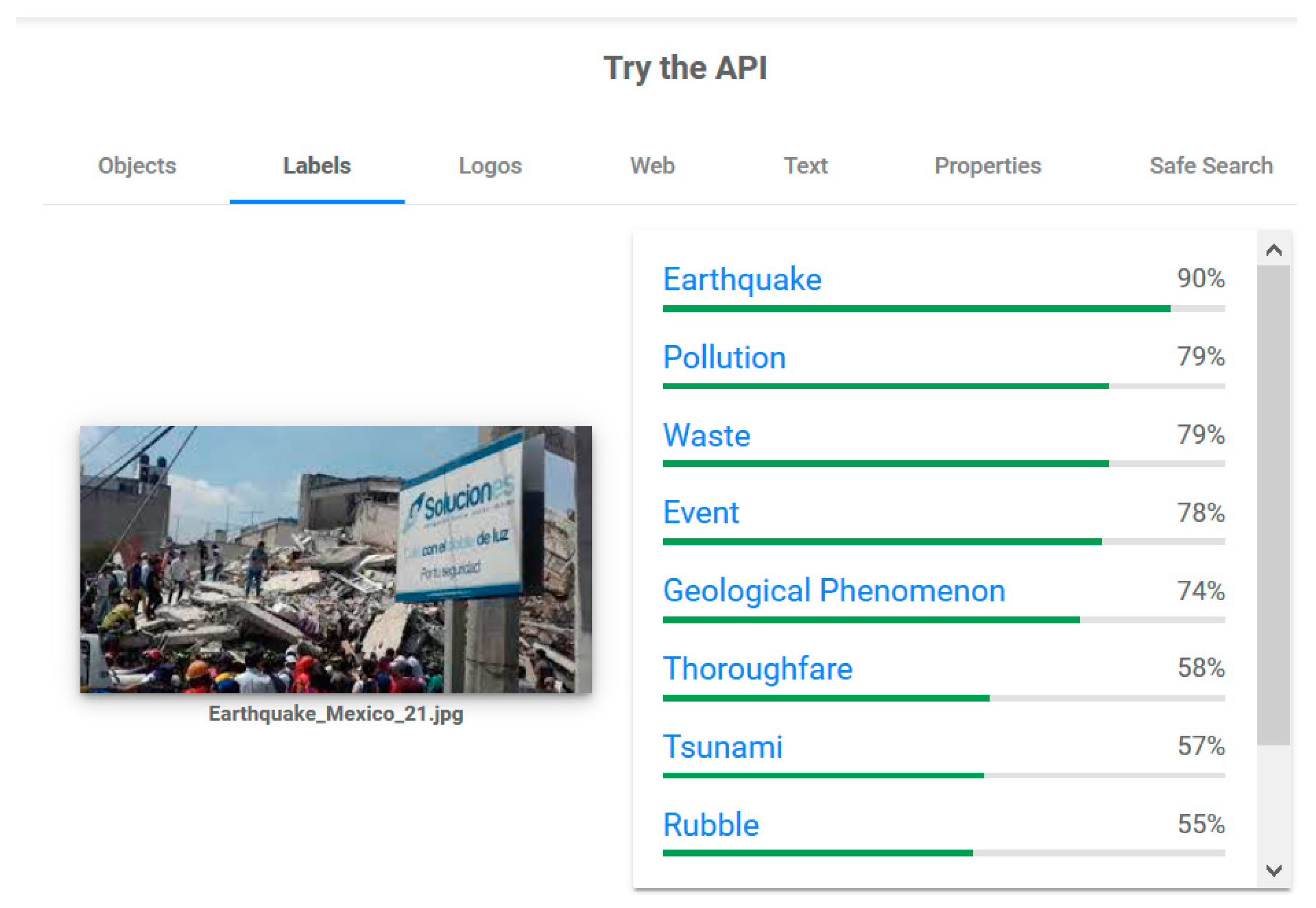
Labels are an important factor in terms of how image analysis works. Google defines a label as a ‘broad [set] of objects in your images, from flowers, animals, or transportation to thousands of other object categories commonly found within images’ [26]. In other words, Google’s API inspects the content of the image and categorizes it. To better exemplify how labels are obtained from an image, in Figure 1, an analysis made using Google Cloud Vision API is presented.
Analyzing the characteristics of digital visual narratives related to the loss of energy on different natural disasters around the world can greatly contribute to increasing awareness about the lack of a more educational rhetoric around this issue, just as has been done in other studies to understand what is found when searching for “saving energy” on the web [31]. We believe that people’s behaviors can be adjusted as the consciousness about an issue increases. That is why the main question of this research is: How is a visual digital narrative constructed from the Google’s best-ranked images relative to the loss of energy following a natural disaster?
3. Materials and Methods
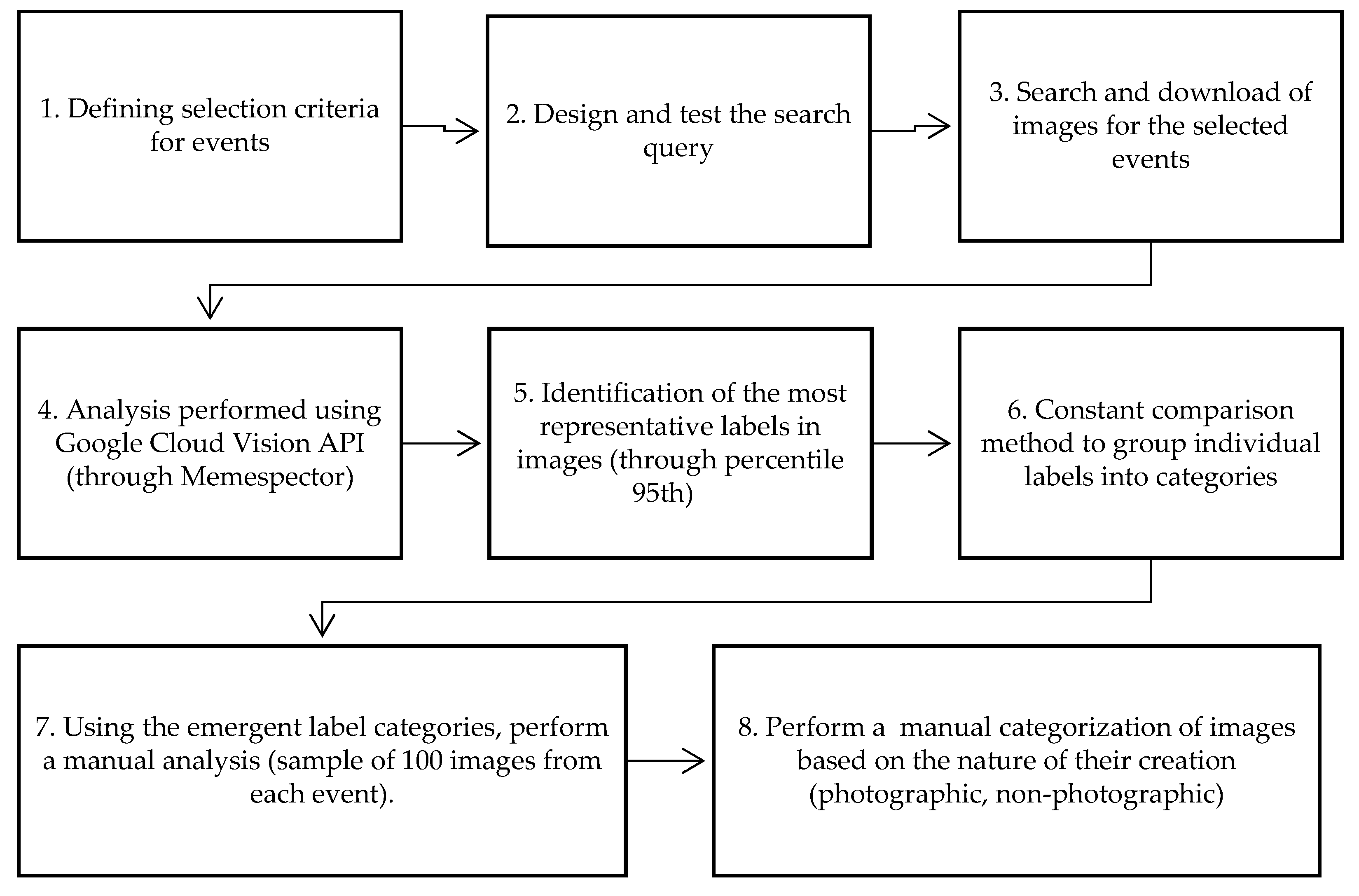
Given the nature of the general question, explorative and qualitative research was proposed. To answer it, the following steps were taken, and the resulting data is hereby presented in the same order as the order of operations: (1) definition of selection criteria for events, (2) design and test the search query, (3) search and download images from the six events, (4) perform an analysis of the downloaded images using Google Cloud Vision API (through Memespector), (5) identify the most representative labels (considering a 95th percentile), (6) using the constant comparison method to identify the main categories found in the labels, (7) manually categorize a sample (the first 100 images of each event, selected by an order of more to less relevant according to the search engine) and (8) categorize of the images based on the nature of their creation. Figure 2 presents a flowchart, showing each of the steps followed during the method process.
3.1. Define Selection Criteria for Events
Because this study requires certain conditions to be met, a list of disasters that have occurred in different places in the world was examined to determine the best approach to ensure that the information would be reliable for analysis. The following criteria were used.
- The disaster was mentioned by different sources, with governmental authorities being preferable.
- The region was affected by a natural hazard.
- A power outage occurred because of the natural hazard.
- The disaster event occurred no more than three years ago (2015–2018).
- Search information must be available in Spanish or English.
A list of the selected events can be viewed in Table 1.
3.2. Design and Test the Search Query
To collect the data, a search query was used in Google’s image search. The construction of the search query was completed following a series of tests of the search engine, with the intention of having a similar search pattern that could be used for every search. After many attempts to establish a pattern, the following one was settled on. First, the name of the natural hazard, and sometimes a specific location, was given (i.e., Ontario storm), because Google can limit results of a search to a geographical region. Then, ‘power outage’ was included in quotation marks to search for the specific string. Despite the fact that ‘blackout’ is another way to refer to an event of loss of electricity, this term was not included in the search query, since it brought back many images related to activism movements. As power outages may not be a usual search, the string ‘OR electricity’ was added, considering that this is a more commonly used word, and may be more prevalent in descriptions of the loss of electricity. The search in Spanish used translated words for the same purpose. In this instance, power outage was searched for as ‘apagón’, and electricity was ‘electricidad’. Bilingual researchers made the selection of the words. However, there are some exceptions to the general rule. For example: (1) the query for Mexico includes a—“Nuevo León” to remove the possibility of images associated with a power outage that occurred (not due to a natural disaster) in the state in Mexico during the considered time frame, (2) hazards were considered as specific to areas, instead of locales. For example, hurricane Irma may include images found in the USA in different states, in contrast to the situation of Ontario’s ice storm and Victoria’s heatwave.
The procedure for collecting images continued in the following way. An advanced Google search was conducted to obtain only images meeting certain predetermined criteria. The steps taken for the search were as follows. In Google’s image search, Advanced Search was selected and the following characteristics were entered: (1) image size: any size; (2) aspect ratio: any aspect ratio; (3) colors in the image: any color; (4) type of image: any type; (5) region: geographical area of the selected event; (6) site or domain: blank; (7) SafeSearch: show most relevant results; (8) file type: any format and (9) usage rights: not filtered by license.
The time frame selected for the images was discussed between authors, as there are differences in the timebound impact of different natural hazards (consider the duration of a hurricane or heat wave compared to that of an earthquake, which may have aftershocks, while hurricanes may last days or more). Consideration of these factors led to the decision that a period of two months from the beginning of the disaster would be a proper time horizon (neither too short or long). Table 1 indicates the final characteristics of the search query and specific criteria for the searches.
3.3. Search and Download of Images from the Six Events Using a Chosen Query
A total of 4691 images of the six events were downloaded and considered for this study (collection of images was done using Google Chrome, without being logged into a Google account and after cookies and other similar data were deleted. Searches were conducted in July 2018, using the advanced search function https://www.google.com/advanced_search. Each of the queries presented for each event was entered with the specific limitations of language, date range, and country. Note that the date range was selected after the search was executed, using the submenu “Tools” in the results page. The images obtained were downloaded using a Chrome plugin (GetThemAll) (URL: https://chrome.google.com/webstore/detail/getthemall/fhkjfciooifcflkailbnchdaihccdebf) and saved in a specific folder for the event. The plugin downloads images according to their presented order on the results page. This process was repeated for each of the events.
3.4. Perform an Analysis of the Downloaded Images, Using Memespector
To analyze the images, Memespector was used to do an automatized analysis of a set of images, resulting in a file containing data on the content of the images in the form of labels. Memespector is described as a ‘simple script for using Google Vision API’, which “takes a comma- or tab-separated file containing a column with image URLs as input, sends images to the Vision API and puts the detected annotations back into the list.” [32] Originally created by Bernhard Rieder for PHP and then developed for Python, Memespector allows the user to do multiple sequential image analyses. This software is used as a tool for projects related to the Digital Methods Initiative [33]. The automatized analysis produced a total of 1819 labels from the collected images. More information about how the software works can be found in the readme file at the repository of Memespector https://github.com/bernorieder/memespector.
3.5. Identify the Most Representative Labels (95th Percentile)
According to Cramer and Howitt [34], percentile is defined as “a way of expressing a score in terms of its relative standing to other scores.” Using the function = ‘Percentile.Exc()’ in Excel, a filter was applied to see the 95th percentile of the labels. With this action, the purpose was to reduce the number of labels, since most of them appeared a few times in some images and were not shared through different events, considerably reducing the data to be studied—from 1819 labels to 90—and allowing the most frequent elements to be examined.
3.6. Using the Constant Comparison Method to Identify the Main Categories Found in the Labels
Using the constant comparison method, words from similar branches were grouped together first, and after observing their nature, purpose, or descriptive behavior, categories were proposed and defined by the research team. The purpose of these categories was to grasp the main plot, idea, or meaning behind a label that was constantly found in a sample using one word. The constant comparison method is a data-analytic process in which each interpretation and finding is compared with existing findings as it emerges from analysis [35]. This method is used for comparing incidents to other incidents to establish underlying uniformity and the varying conditions of generated concepts (categories) and hypotheses. Then, the emerging concepts are compared to more incidents to generate new theoretical properties of the concepts and more hypotheses. At the end, the purpose is the elaboration, saturation, and densification of the concepts [36].
3.7. Manually Categorise a Sample (the First 100 Images of Each Event)
After the main categories of labels were identified, a researcher performed a manual inspection. A sample of the first 100 images for every event was considered, under the assumption that these were the most relevant to the query. Images were examined to identify which of the main categories of labels identified were represented in them, to compare how labels and observer perception would be similar or differ. More than one category could be present in one image (i.e., presence of nature, hazard related, and people would be three categories on one image). A frequency log was used to track how many times each category was represented through all the images. Table 2 presents examples of interest images for each category, as well as the labels associated with the image.
3.8. Categorize the Images Based on the Nature of Their Creation
Along with the visual analysis in step 3.7, the origin of the image (i.e., photographic or non-photographic) was identified. Images that were the result of a photograph would be labeled as “photographic”, while images whose presentation was either text, image, map, graphic, or infographic fell into the category of “Non-photographic”.
4. Results
Our first results are focused to step 3.5: identification of the most representative labels found in the event’s images in this study. As a result of the analysis through Memespector, 1961 labels that described 4691 images were identified. Due to a high quantity of labels, the 95th percentile was identified and selected to have the most representative labels. After the analysis, only 90 labels were considered as the most representative, which were then grouped using the constant comparison method to identify categories. The obtained results are as follows:
The main categories to describe the labels from the Memespector analysis.
- Business: Groups of labels related to any business standpoint (i.e., product, brand, advertising).
- Hazard related: Labels referring to natural phenomena with potential to cause disaster or consequences related to natural hazards (i.e., event, demolition, rubble, earthquake, winter).
- Energy: Labels related to energy itself (i.e., energy, electricity, public utility).
- Graphic: Labels with the purpose of conveying information in a graphical way (i.e., graphic, infographic).
- Infrastructure: Labels that refer to places, buildings, roads, architectural reference or materials to construct (i.e., building, city, facade).
- Nature: Labels referring to elements found in nature (i.e., tree, plant, sky). Non-hazard elements were considered.
- People and activities: Labels referring to persons and their activities (i.e., crowd, pedestrian, recreation, vacation).
- Transportation: Groups of labels referring to means of transportation (i.e., vehicle, mode of transport, car).
To provide results for step 3.6, constructed categories are organized in Table 2, with their frequency and the respective percentage of the 90 labels. Of a total of 90 labels, around a half of them were categorized as being associated with infrastructure (28.89%), nature (15.56%), or being hazard related (13.33%).
Once categories were identified, a human analysis of the images was done as part of step 3.7. To do this, a sample of the first one hundred images were selected per event. Tendencies of each category is represented by percentages in the Table 3, and the representation for each of the six cases is presented in Table 4.
Observing the analysis of the sample, it was found that around the 50% of the images focused on themes like the impact upon infrastructure, nature, and hazard related images (see Table 3). Australia appears as an exception, having graphic, energy, and business as the categories mostly identified in the images; additionally, transportation stands out, as no images were identified in this category. Mexico exhibits a high percentage of images related to the people and activities category compared to the other events.
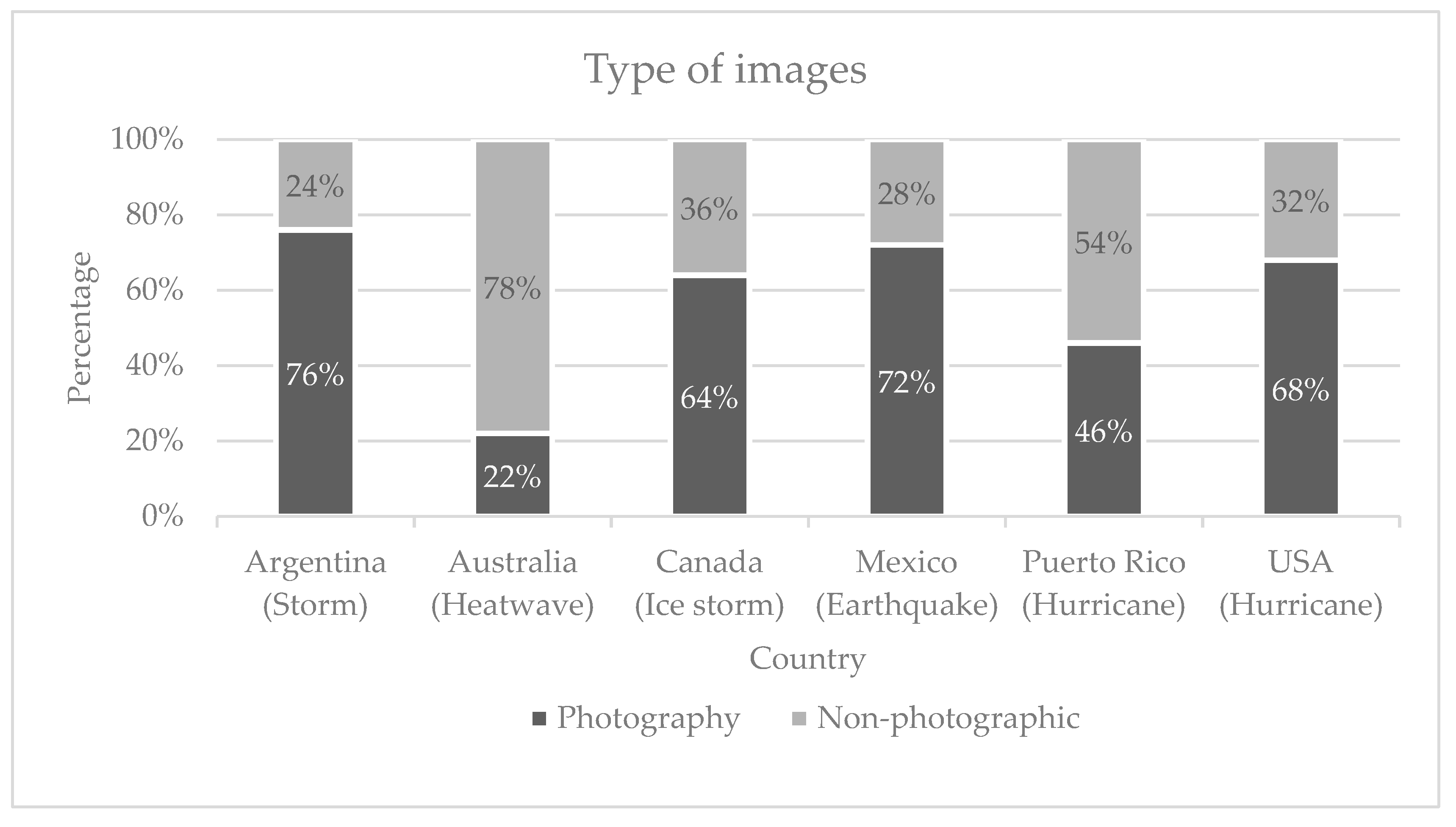
In another analysis for step 3.8, images were categorized based on the nature of their creation. Figure 3 portrays how the sample of images was categorized, per event.
Images portrayed in each event are mostly photographic in Argentina, Canada, Mexico, and United States. On the other hand, images of Australia’s heatwave were, for the most part, from non-photographic sources, e.g., infographics, followed by Puerto Rico. The other findings from the results of the examination of the categories are presented next:
- Infrastructure. Most images identified related to the earthquake in Mexico were categorized under this topic (27.82%), and most countries had at least 20% of their images within it as well, except for Australia (12.50%).
- Nature. Images containing natural elements were present in Canada to the greatest extent (22.47%), followed by Argentina (15.54%). No more than 10% of images related to Mexico, United States, and Puerto Rico were related to nature. Images associated with nature often showed fallen or broken trees, fields, sunsets, and branches with water (as droplets or frozen).
- Hazard related. In all, except for one region, more than 20% of images were related to this category. Australia was the exception and had a quite low figure, i.e., 2.94%. Even omitting any image of the direct impact of the heat wave, images suggesting heat wave hazards (such as wildfires, fires, or news related to the effects of a heat wave on animals or people) were not found.
- Graphic. Most of the images representing information in a graphic way were found for the Australian disaster (22.29%). The rest of the sampled countries had less than 10% occurrence of this category.
- Business. Australia had many images showing prices, products, companies, and other related topics (15.44%). No other region had more than 8% of its images in this category. Many of the images appeared to show a relationship to the price of electricity in different regions of the country.
- People and activities. Mexico had the highest percentage of images related to this category (22.56%), followed by Puerto Rico with 14.19%. The images in this category depicted a person or people. The images varied: many showed people facing natural hazards (hurricanes, earthquakes, or heat waves) or their consequences (working to repair public utility transmission lines or rescuing civilians under the rubble).
- Transportation. This category refers to vehicles. Around 10% of the images for Argentina and the United States contained elements of transportation. Australia was the only region that had no representation of vehicles in its sample. In many images, vehicles were playing the role of repair support (i.e., working on electric poles or transmission lines), transport, or were the object of a natural hazard.
- Energy. Elements related to energy included public utilities, transmission lines, and others. The results were variable. Australia, the United States, and Puerto Rico had the largest proportion of images containing elements related to it (25.74%, 17.2%, and 12.26% respectively). Canada, Argentina, and Mexico each had less than 10%. Even though all cases had power outages, and energy elements were present in all, these were represented quite differently in each event.
Most of Australia’s images were from non-photographic sources (78%); Puerto Rico had the second highest rate (54% non-photographic). In all other cases, the most prevalent images were photographs, and Argentina had the highest rate of these (76% of its images were photographs). There is room for further study of how types of images differ among events, and whether search engines distinguish between them.
5. Discussion
The analysis of images to understand the impacts and narratives of natural disasters has been used in other studies. One of these cases is from Murthy et al. [23], who interpreted Instagram images posted on Twitter during and after hurricane Sandy in United States in 2012. Their findings showed that users focused on different aspects of what they posted, depending on which phase of the event they were in (before, during, or after). In their work, the authors used the eleven categories (codes) previously proposed in another study, i.e., those of Liu et al. [37]: ad, animals, damage, drink, food, gear, macro, other, outside, people, and relief. Compared to our work, the most popular labels included in the 95th percentile didn’t have enough labels for some categories, such as drink, food, other, and relief, while other, similar categories were shared between their work and ours, such as ad (business category), damage (infrastructure or hazard related), gear (transportation), macro (graphic), and people (people and activities). Something important to note is that no energy category arose from the data, even though hurricane Sandy caused the loss of electricity to more than eight million customers for a few hours, and a whole week for another million people [38].
Differences were found between the results of image coding in percentage between the two studies. As an example, the category ‘people’ was coded for 21.1% of the images, while in our study, only Mexico’s earthquake had a similar percentage (22.56%). Even when the hazard (hurricane Sandy) was the same, US (14.19%) and Puerto Rico (8.06%) were far from having a similar percentage. In another aspect, ‘damage’ category was coded in 12.8%, while in our study, the category infrastructure (that included damage) showed a percentage range of 12.50–27.82% between events. These differences may be explained by the sources of data, being that the study based on hurricane Sandy gathered tweets from major US cities users, while Google may collect these images from different websites (i.e., news websites, blogs, social network sites).
Some studies found that image themes may differ, depending on the platform used to find them. That’s the case of Seltzer et al. [39], who studied the content of images found on Instagram and Flickr using the keyword #Ebola. To determine image themes, a sample analysis of one hundred images was performed. With the created themes, an additional 100 images were coded, and no new themes were identified. Comparing this to our work, our categories were created through the labels identified by the Google Cloud Vision API through 4691, and one hundred images (as with the other study) were coded for each of our six events. Even though it was not mentioned, their method of studying a sample from among one hundred images is very similar to the constant comparison method used in our study. Comparing the sample size, images analyzed for each platform were similar (Instagram n = 609, Flickr = 608) compared to ours (Google Images, n = 600; 100 for each event). However, when observing the characteristics between a natural and a biological disaster, we found differences between themes. Nine themes were identified in the Ebola outbreak study: healthcare workers and professionals, West Africa, facts, fear, virus image, political, joke, artistic image, and unrelated/unknown. Most of the images depicting the biological disaster seemed to be presented by the theme “Healthcare workers and professionals”, more on Flickr (46% of images; n = 281) compared to Instagram (4% of images; n = 609). In contrast, the theme ‘jokes’ was found to be frequent on Instagram (42%; n = 609) but not on Flickr (5%; n = 608). In our samples, we didn’t find this theme, neither in labels nor through human analysis. In our study, images depicting workers were included in the category of “people and activities”, but no distinction was made between workers, civilians, military, or others. Lastly, images showing jokes were not found in the first one hundred images of each event.
When talking about the results associated with each category, it is interesting to find that the category “people and activities” had Mexico, Puerto Rico, and Argentina (both Spanish speaking countries) with above average values compared to the other countries. It remains unclear if the interest of the observers (photographer) or the search engine may cause this. In the case of Australia’s heatwave, its ‘transportation’ category had 0% of images associated with it—a value far from the 6.60% average in the same category of the sample (Table 3). One reason for this may be that Australia’s sample images were mostly non-photographic (78%), presenting information in categories related to graphic (22.79% of images) and energy (25.74%) topics, such as prices of electricity, grid information, suggestions to tackle the heatwave, and others.
Lastly, it’s important to speak about the uncertainties of our research. While these images may provide information about what happens in the narrative of the loss of energy and natural disasters, images change across time, and their arrangement can change depending on the algorithm used by its owner (in this case, Google). Therefore, replication of this study may show different results in terms of images, while we expect that categories would differ less, and may be useful for future studies.
6. Conclusions
Power outages continue to occur around the world. Despite that, awareness of the implications of the loss of power over long periods of time due natural disasters remains limited for most people. In our study, we found that the visual digital narrative of the loss of energy due to natural disasters may differ depending on the type of disasters and the locale. Sudden disasters like Mexico’s 2017 earthquake (with a high impact in a short time) seem to present more images focused on the damage to infrastructure, hazardous contexts, and people, while other hazards of longer duration—such as Australia’s heatwave—presented more information through graphics which was especially associated with energy issues such as the electricity infrastructure, peaks of production, higher prices, etc. Unfortunately, there is a lack images showing the burden of living without electricity during a cold storm in Canada, the consequences of being without energy for days or weeks in Puerto Rico, or the need for a working energy grid after an earthquake in Mexico, among others. The differences between and memories of each natural hazard remain unclear, presenting an opportunity to gather these experiences for the future.
Natural hazards may cause natural disasters around the world. However, the lack of energy increases the impacts of these, disrupting the technological progress made by humankind more than one hundred years ago. For cities inhabited by millions of people, the lack of critical infrastructure such as sewage, drainage and water pumps, telecommunications, public transportation, and financial services may create chaos if these are not quickly repaired. In many natural disasters, societies have overcome these difficulties at a cost. However, there is still work to be done to increase awareness and to prevent further future damage caused by climate change and the rising need to provide energy resources to all the people in the world.
Around one hundred years ago, a group of flat stones were carved as a reminder, a warning for future generations not to build any homes below their location, avoiding the loss of more lives [40]. However, in the words of Masayuki Oishi, “we need a modern version of the tsunami stones” [40]. The opportunity remains to use these images as a tool to increase awareness of the lack of energy due to disaster experiences and to provide a historical memory, as occurs with projects such as the Hurricane Digital Memory Bank [10,19]. Even when of public services (such as drainage and potable water, public lights, or medical services) are interrupted due to a power outage, the memory of these experiences may not be preserved. In conclusion, it is relevant to maintain a sense of the importance of identifying and understanding the types of narratives that exist relative to losses of energy following natural disasters; as Byrd and Matthewman [21] put it: ‘no matter how a “smart” a city may be, it becomes “dumb” when the power goes out’.
Author Contributions
G.C. contributed by executing data curation, formal analysis, investigation and writing. G.V. contributed through formal analysis, methodology and supervision. T.I. contributed through conceptualization and resources.
Funding
This study was made with funds from the energy sustainability fund CONACYT-SENER (Agreement: S0019-2014-01).
Acknowledgments
The Mexican authors would like to thank the courses and resources provided by the International Research Institute of Disaster Science (IRIDeS) and the University of Tohoku.
Conflicts of Interest
The authors declare no conflict of interest.
References
- United Nations (UN). The World’s Cities in 2016. Available online: http://www.un.org/en/development/desa/population/publications/pdf/urbanization/the_worlds_cities_in_2016_data_booklet.pdf (accessed on 10 October 2018).
- International Energy Agency (IEA). World Energy Outlook. 2017. Available online: https://www.iea.org/Textbase/npsum/weo2017SUM.pdf (accessed on 10 October 2018).
- United Nations Office for Disaster Risk Reduction (UNISDR). Asian Governments to Meet on Disaster Prevention. 2018. Available online: https://www.unisdr.org/archive/57637 (accessed on 20 July 2018).
- US Department of Homeland Security (DHS). Power Outages. 2009. Available online: https://www.ready.gov/power-outages (accessed on 14 October 2018).
- Akitsu, Y.; Ishihara, K.N.; Okumura, H. Investigating energy literacy and its structural model for lower secondary students in Japan. Int. J. Environ. Sci. Educ. 2017, 12, 1067–1095. Available online: https://files.eric.ed.gov/fulltext/EJ1145592.pdf (accessed on 2 April 2018).
- The National Environmental Education and Training Foundation (NEETF). Americans’ Low “Energy IQ”: A Risk to Our Energy Future. The Tenth Annual National Report Card: Energy Knowledge, Attitudes, and Behavior. Washington, DC, 2002. Available online: https://www.neefusa.org/file/240/download?token=bDhMcukz (accessed on 26 April 2018).
- Takeuchi, Y.; Peary, B.D.; Shaw, R. Utilization of Social Media in the East Japan Earthquake and Tsunami and its Effectiveness. J. Nat. Disaster Sci. 2012, 34, 3–18. [Google Scholar] [CrossRef] [Green Version]
- Velev, D.; Zlateva, P. Use of Social Media in Natural Disaster Management. Int. Proc. Econ. Dev. Res. 2012, 39, 41–45. [Google Scholar] [CrossRef]
- Pew Research Center. Photo and Video Sharing Grow Online. Washington, DC. 2013. Available online: http://www.pewinternet.org/files/old-media//Files/Reports/2013/PIP_Photos and videos online_102813.pdf (accessed on 21 July 2018).
- Roy Rosenzweig Center for History and New Media (CHNM). 121 Days of Darkness—Gentilly after Sunset—12.27.05. 2005. Available online: http://hurricanearchive.org/items/browse?collection=50 (accessed on 14 October 2018).
- United Nations Office for Disaster Risk Reduction (UNISDR). Disaster. 2017. Available online: https://www.preventionweb.net/terminology/view/475 (accessed on 20 July 2018).
- United Nations Office for Disaster Risk Reduction (UNISDR). Hazard. 2017. Available online: https://www.preventionweb.net/terminology/view/488 (accessed on 20 July 2018).
- Hodge, T.; April, L. Hurricane Irma Cut Power to Nearly Two-Thirds of Florida’s Electricity Customers. 2017. Available online: https://www.eia.gov/todayinenergy/detail.php?id=32992 (accessed on 14 October 2018).
- Tsai, K.; Zaretskaya, V. Puerto Rico’s Electricity Service is Slow to Return after Hurricane Maria. 2017. Available online: https://www.eia.gov/todayinenergy/detail.php?id=33452 (accessed on 14 October 2018).
- Wilson, C.; Freeman, J. Thousands in the Dark Across GTA, Southern Ontario as April Ice Storm Slams the Region. CP 24. 2018. Available online: https://www.cp24.com/weather/thousands-in-the-dark-across-gta-southern-ontario-as-april-ice-storm-slams-the-region-1.3885743 (accessed on 14 October 2018).
- González, N. Sismo Deja Sin Energía Eléctrica a 3.8 Millones de Personas. Excelsior. 2 September 2019. Available online: https://www.excelsior.com.mx/nacional/2017/09/19/1189411 (accessed on 7 August 2018).
- Griffiths, L. Heatwave Puts Pressure on National Electricity Grid. The Australian. 2018. Available online: https://www.theaustralian.com.au/national-affairs/climate/heatwave-puts-pressure-on-national-electricity-grid/news-story/ef9ebbd91d8fb5758be25ff646e63fb7 (accessed on 7 August 2018).
- Ente Nacional Regulador de la Electricidad (ENRE). Resarcimiento Para Usuarios de Edenor y Edesur. Res. ENRE No 118 y 119/2018. 2018. Available online: https://www.argentina.gob.ar/noticias/resarcimiento-para-usuarios-de-edenor-y-edesur-res-enre-no-118-y-1192018 (accessed on 14 October 2018).
- Roy Rosenzweig Center for History and New Media (CHNM). Hurricane Digital Memory Bank. 2018. Available online: http://hurricanearchive.org/ (accessed on 14 October 2018).
- Ghaffarian, S.; Kerle, N.; Filatova, T. Remote Sensing-Based Proxies for Urban Disaster Risk Management and Resilience: A Review. Remote Sens. 2018, 10, 1760. [Google Scholar] [CrossRef]
- Byrd, H.; Matthewman, S. Exergy and the City: The Technology and Sociology of Power (Failure). J. Urban Technol. 2014, 21, 85–102. [Google Scholar] [CrossRef] [Green Version]
- Landwehr, P.; Carley, K. Social Media in Disaster Relief Usage Patterns, Data Mining Tools, and Current Research Directions. In Data Mining and Knowledge Discovery for Big Data Studies in Big Data; Springer: Berlin/Heidelberg, Germany, 2014; Volume 1, pp. 225–257. [Google Scholar] [CrossRef]
- Murthy, D.; Gross, A.; McGarry, M. Visual Social Media and Big Data. Interpreting Instagram Images Posted on Twitter. Digit. Cult. Soc. 2016, 2. [Google Scholar] [CrossRef]
- Statista. Worldwide Desktop Market Share of Leading Search Engines from January 2010 to April 2018. 2018. Available online: https://www.statista.com/statistics/216573/worldwide-market-share-of-search-engines/ (accessed on 16 August 2018).
- Google. Google Image Publishing Guidelines. 2018. Available online: https://support.google.com/webmasters/answer/114016 (accessed on 16 August 2018).
- Google. Cloud Vision. 2018. Available online: https://cloud.google.com/vision/ (accessed on 16 August 2018).
- Kwak, H.; An, J. Revealing the Hidden Patterns of News Photos: Analysis of Millions of News Photos Using GDELT and Deep Learning-based Vision APIs. ArXiv Cs.CY, 3, 04531. 2016. Available online: http://arxiv.org/abs/1603.04531 (accessed on 16 August 2018).
- Google. How Computer Vision Works. 2018. Available online: https://www.youtube.com/watch?v=OcycT1Jwsns (accessed on 16 August 2018).
- Google. Vision AI. 2019. Available online: https://cloud.google.com/vision/ (accessed on 12 September 2019).
- Google. Try It! 2019. Available online: https://cloud.google.com/vision/docs/drag-and-drop (accessed on 12 September 2019).
- Valerio-Ureña, G.; Rogers, R. Characteristics of the Digital Content about Energy-Saving in Different Countries around the World. Sustainability 2019, 11, 4704. [Google Scholar] [CrossRef]
- Rieder, B. Readme. 2017. Available online: https://github.com/bernorieder/memespector/blob/master/README.md (accessed on 12 September 2019).
- Aiello, G.; Bardelli, F.; Chiarini, S.; Giacomo, F.; Boas, S.; Brussaard, E.; Colombari, J.; Estermann, R.; Piquer, O.; Schelling, J.; et al. Taking Stock: Can News Images Be Generic? 2016. Available online: https://wiki.digitalmethods.net/Dmi/TakingStock (accessed on 14 October 2018).
- Cramer, D.; Howitt, D. The SAGE Dictionary of Statistics; SAGE Publications: London, UK, 2004. [Google Scholar] [CrossRef]
- Lewis-Beck, M.S.; Bryman, A.; Futing Liao, T. Constant Comparison. In The SAGE Encyclopedia of Qualitative Research Methods; SAGE Publications: London, UK, 2004; pp. 115–116. [Google Scholar] [CrossRef]
- Holton, J.A. The SAGE Handbook of Grounded Theory; SAGE Publications Ltd.: London, UK, 2007. [Google Scholar] [CrossRef]
- Liu, S.B.; Palen, L.; Sutton, J.; Hughes, A.L.; Vieweg, S. In Search of the Bigger Picture: The Emergent Role of On-line Photo Sharing in Times of Disaster. In Proceedings of the 5th International ISCRAM Conference, 4–7 May 2008; pp. 140–149. Available online: https://works.bepress.com/vieweg/11/ (accessed on 21 July 2018).
- Henry, D.; Ramirez-Marquez, E. On the Impacts of Power Outages during Hurricane Sandy—A Resilience-Based Analysis. Syst. Eng. 2016, 19, 59–75. [Google Scholar] [CrossRef]
- Seltzer, E.K.; Jean, N.S.; Kramer-Golinkoff, E.; Asch, D.A.; Merchant, R.M. The content of social media’s shared images about Ebola: A retrospective study. Public Health 2015, 129, 1273–1277. [Google Scholar] [CrossRef] [PubMed]
- Fackler, M. Tsunami Warnings, Written in Stone. The New York Times. 2011. Available online: https://www.nytimes.com/2011/04/21/world/asia/21stones.html?_r=2 (accessed on 18 September 2019).
Figure 1.
Example of how labels are obtained from an image in the Google Cloud Vision API. The image is of the aftermath of Mexico’s 2017 earthquake. The Vision API detects possible contents on the image and tries to determine its context. The percentage represents its certainty of a characteristic on the image.

Figure 2.
Flowchart of method.

Figure 3.
Type of images in every event.


Table 1.
List of selected natural disasters that included power outage events, as well as the search query, date range considered, and images obtained.
Table 1.
List of selected natural disasters that included power outage events, as well as the search query, date range considered, and images obtained.
| Storm (Argentina) | Heatwave (Australia) |
|---|---|
| Tormenta Córdoba apagón OR electricidad | Heatwave Victoria “power outage” OR electricity |
| Criteria (Advanced search): | Criteria (Advanced search): |
| Country: Argentina | Country: Australia |
| Language: Spanish | Language: English |
| Dates: 28 April 2018 to 28 June 2018 | Dates: 1 January 2018 to 1 March 2018 |
| Images obtained: 852 | Images obtained: 866 |
| Ice Storm (Canada) | Hurricane (USA) |
| Ontario storm “power outage” OR electricity | Hurricane Irma “power outage” OR electricity |
| Criteria (Advanced search) | Criteria (Advanced search): |
| Country: Canada | Country: EUA |
| Language: English | Language: English |
| Dates: 31 March 2018 to 31 May 2018 | Dates: 31 August 2017 to 31 October 2017 |
| Images obtained: 835 | Images obtained: 651 |
| Earthquake (Mexico) | Hurricane (Puerto Rico) |
| Terremoto apagón OR electricidad –“Nuevo León” | Huracán María apagón OR electricidad |
| Criteria (Advanced search): | Criteria (Advanced search): |
| Country: Mexico. | Country: Puerto Rico |
| Language: Spanish | Language: Spanish |
| Dates: 8 September 2017 to 8 November 2017 | Dates: 15 September 2017 to 15 November 2017 |
| Images obtained: 742 | Images obtained: 745 |
Table 2.
Examples of images related to every category.
 |  |  |  |
| 1. Business | 2. Hazard related | 3. Energy | 4. Graphic |
| Labels: Traffic light (95%), lighting (91%), signaling device (90%), tree (89%), light fixture (88%), electricity (87%) | Labels: Overhead power line (98%), atmospheric phenomenon (89%), wind (81%), storm (78%), transmission tower (77%) | Labels: Pool (74%), room (66%), indoor games and sports (53%), games (52%) | Labels: text (99%), font (95%), line (82%), number (75%) |
 |  |  |  |
| 5. Infrastructure | 6. Nature | 7. People and activities | 8. Transportation |
| Labels: Electricity (96%), transmission tower (95%), electrical supply (94%), overhead power line (93%) | Labels: Snow (99%), winter (97%), nature (96%), tree (92%), atmospheric phenomenon (92%) | Labels: People (94%), crowd (88%), event (78%), public event (76%), geological phenomenon (62%) | Labels: Transport (90%), vehicle (86%), tree (83%), truck (72%), job (62%), plant (59%), car (56%) |
Table 3.
Categories created from labels in the 95 percentiles (with frequency and percentage).
| Categories | Frequency | Categories | Frequency |
|---|---|---|---|
| Infrastructure | 26 (28.89%) | Business | 7 (7.78%) |
| Nature | 14 (15.56%) | People and activities | 7 (7.78%) |
| Hazard related | 12 (13.33%) | Transportation | 7 (7.78%) |
| Graphic | 12 (13.33%) | Energy | 5 (5.56%) |
Table 4.
Categories identified in a manual image analysis using a sample of the first 100 images of each event.
Table 4.
Categories identified in a manual image analysis using a sample of the first 100 images of each event.
| Categories | Argentina | Australia | Canada | USA | Mexico | Puerto Rico | Average |
|---|---|---|---|---|---|---|---|
| Infrastructure | 20.27% | 12.50% | 20.22% | 18.82% | 27.82% | 25.81% | 20.90% |
| Nature | 15.54% | 13.97% | 22.47% | 8.06% | 7.52% | 9.68% | 12.87% |
| Hazard related | 25.68% | 2.94% | 26.40% | 20.43% | 27.82% | 20.65% | 20.65% |
| Graphic | 4.05% | 22.79% | 1.69% | 9.68% | 3.76% | 3.87% | 7.64% |
| Business | 3.38% | 15.44% | 3.37% | 6.99% | 1.50% | 7.10% | 6.29% |
| People and activities | 12.16% | 6.62% | 8.43% | 8.06% | 22.56% | 14.19% | 12% |
| Transportation | 10.81% | 0.00% | 7.87% | 10.75% | 3.76% | 6.45% | 6.60% |
| Energy | 8.11% | 25.74% | 9.55% | 17.20% | 5.26% | 12.26% | 13.02% |
| Total | 100% | 100% | 100% | 100% | 100% | 100% | 100% |
© 2019 by the authors. Licensee MDPI, Basel, Switzerland. This article is an open access article distributed under the terms and conditions of the Creative Commons Attribution (CC BY) license (http://creativecommons.org/licenses/by/4.0/).
Share and Cite
MDPI and ACS Style
Castañeda-Garza, G.; Valerio-Ureña, G.; Izumi, T. Visual Narrative of the Loss of Energy after Natural Disasters. Climate 2019, 7, 118. https://doi.org/10.3390/cli7100118
AMA Style
Castañeda-Garza G, Valerio-Ureña G, Izumi T. Visual Narrative of the Loss of Energy after Natural Disasters. Climate. 2019; 7(10):118. https://doi.org/10.3390/cli7100118
Chicago/Turabian StyleCastañeda-Garza, Gerardo, Gabriel Valerio-Ureña, and Takako Izumi. 2019. "Visual Narrative of the Loss of Energy after Natural Disasters" Climate 7, no. 10: 118. https://doi.org/10.3390/cli7100118
Note that from the first issue of 2016, this journal uses article numbers instead of page numbers. See further details here.