
Evaluation of Extreme Hydroclimatic Trends in River Basins Located in the Northeast and South Regions of Brazil

1
LAMMOC Group, Biosystems Engineering Graduate Program, Department of Agricultural and Environmental Engineering, Federal Fluminense University, Niterói 24210-240, Brazil
2
MAR Group, Department of Physics, School of Chemistry, University of Murcia, 30100 Murcia, Spain
*
Author to whom correspondence should be addressed.
Atmosphere 2023, 14(9), 1388; https://doi.org/10.3390/atmos14091388
Submission received: 28 July 2023
/
Revised: 28 August 2023
/
Accepted: 30 August 2023
/
Published: 2 September 2023
(This article belongs to the Special Issue Prediction and Modeling of Extreme Weather Events)
Abstract
:Brazil has a large availability of natural resources, and its economy was historically built around their exploitation. Changes in climate trends are already causing several environmental impacts, which affect the economic and social organization of the country. Impacts linked to the hydrological cycle are particularly concerning since water resources are used for electricity production, representing approximately 65% of the Brazilian electricity matrix. This study, therefore, aims to evaluate the extreme hydroclimatic trends of river basins located in the Northeast and South regions of the country. For this purpose, we carried out a flow analysis from 2020 to 2100, considering the precipitation data from the BCC CSM1-1, CCSM4, MIROC5, and NorESM1-M models presented in the Fifth Assessment Report of the Intergovernmental Panel on Climate Change (IPCC). We used the SMAP rainfall-runoff model to obtain future flow projections for the RCP4.5 and RCP8.5 scenarios. As a result, we observed a trend toward water loss and the intensification of extreme events, with an increase in variability in both scenarios. We also noted that these climate models have difficulty reproducing the natural variability of southern basins, as parameterization of small-scale atmospheric processes prevents them from correctly projecting the precipitation.
1. Introduction
Changes in climate trends intensify the occurrence of extreme events and impact the hydrological cycle, affecting the distribution of rainfall and water availability in Brazilian river basins. Projections from the Intergovernmental Panel on Climate Change [1] indicate, for example, an intensification of dryness in northeastern Brazil by the end of the 21st century, leading to more intense droughts stressing water supply systems. For the long term (2080–2100), models project changes in extreme flows in the south of the Amazon, with medium confidence that the eastern Amazon basin will experience lower precipitation and more severe droughts, while a substantial increase in precipitation is projected for southeastern South America.
In Brazil, these impacts take on another dimension due to the reliance on water resources for electricity production. According to the country’s Energy Efficiency Atlas [2], there is a strong correlation between the domestic energy supply and the Gross Domestic Product (GDP), with hydropower accounting for approximately 65% of the country’s electricity matrix. Hydroelectric power plants also offer additional benefits, such as navigation, flood control, and water storage during drought periods. Therefore, the creation of reservoirs serves as a resilient solution to mitigate the impacts of climate change [3]. However, according to a Technical Note jointly released by the Brazilian Ministry of Mines and Energy and the Energy Research Office [4], out of the 176 GWs identified in the country, only 108 GWs have been utilized so far. Moreover, the development of the remaining potential faces challenges due to high implementation costs and the presence of conservation units and indigenous lands in the proposed locations.
Therefore, hydropower in Brazil is subject to two main constants: climate variability and environmental impacts. Regarding the latter, it should be noted that many hydropower plants in the country were built around the 1960s and have dams that create large reservoirs. During their construction, it was necessary to flood extensive areas, resulting in the loss of fauna and flora, as well as increased CO2 and CH4 emissions and landslides. With advancements in legislation, the licensing of large power plants has become increasingly challenging [5,6]. In this regard, run-of-river power plants have been given priority due to their lower environmental impact and reduced flooding areas, as they do not require the formation of reservoirs for water storage. Nevertheless, their limited capacity for flow control renders them unsuitable as a viable energy supply in times of water scarcity [7].
In light of this, it is worth noting the natural flow data provided by the National Electric System Operator—ONS [8]. They suggest a shift in the rainfall distribution within Brazil, with a greater concentration in the South region and a decrease in the Northeast region. This trend is a matter of concern, given that hydropower plant reservoirs in southern Brazil have a lower storage capacity than those in the Northeast. In addition, a great part of the Brazilian territory has recently experienced a water crisis, which has shown the need to re-evaluate public policies regarding water use in the country [9].
Thus, this study aims to identify hydroclimatic trends of river basins in the Northeast and South regions of Brazil, to assess the impact of climate change on their water availability and its potential consequences for the country. To this end, we carried out flow projections from 2020 to 2100, based on precipitation data from the climate change scenarios presented in the Fifth Assessment Report (AR5). We used pre-selected climate models previously employed in climate projection studies in Brazil and evaluated their performance in simulating both the current climate and projected trends for the study area.
2. Materials and Methods
2.1. Characterization of the Study Area
To better understand hydroclimatic patterns, our analysis in the Northeast region focused on assessing trends in the Parnaíba River basin and the São Francisco River basin, while in the South region, we examined the Iguaçu River basin and the Uruguay River basin. We chose these areas for their social and economic relevance and also for having important hydropower plants that are part of the Brazilian Interconnected System (SIN). Consequently, the potential impacts of climate change on these basins could compromise not only the regional socioeconomic development but also the country’s energy supply. Therefore, it is crucial to investigate potential changes in future water availability and their repercussions for the environment, the economy, and local communities. Figure 1 shows a visual representation of the geographic locations of these basins in Brazil.
The Parnaíba River basin spans three states (Ceará, Maranhão, and Piauí) and covers a drainage area of approximately 333,000 km2, accounting for 3.9% of Brazil’s territory. It is considered by the National Water and Sanitation Agency (ANA) as the second most important basin in the Northeast region [10]. It encompasses important Brazilian biomes such as Cerrado and Caatinga, and according to the Köppen classification, the basin area has a hot semi-arid (BSh) and a savanna (Aw) climate. The region is also influenced by atmospheric systems such as the Intertropical Convergence Zone (ITCZ), particularly in the coastal area [10].
The basin has a population of approximately 5 million people, with 35% living in rural areas [11], and key economic activities include agriculture, livestock farming, and extraction, with industrial activities underdeveloped [12]. Regarding energy potential, the basin boasts around 800 MW, with 225 MW already utilized. However, 55% of the remaining potential faces some type of interference [3]. The main plant in operation is the Boa Esperança power plant, which is part of the SIN and facilitates transmission between the North and Northeast regions. The construction of the plant’s reservoir has contributed to the removal of natural barriers in the river, enabling upstream navigation [13].
The São Francisco River basin, in turn, spans seven states (Alagoas, Bahia, Distrito Federal, Goiás, Minas Gerais, Pernambuco, and Sergipe) and covers a drainage area of 640,000 km2, accounting for 8% of the national territory [14]. It integrates multiple regions of Brazil and includes valuable biomes such as Caatinga, Cerrado, Atlantic Forest, and Estuarine Ecosystems. About 54% of the basin’s territory lies within the semi-arid region, characterized by environmental fragility, erosion, desertification, and deforestation [15]. According to the Köppen classification, a hot semi-arid climate (BSh) and a savannah climate are found in the basin. Precipitation exhibits great spatial and temporal variation, influenced by atmospheric systems like the South Atlantic Convergence Zone (SACZ) and the Intertropical Convergence Zone (ITCZ) [14].
With a population of 14 million people, the basin displays considerable heterogeneity in urbanization, population distribution, and economic activities [11]. This diversity contributes to the basin’s GDP, accounting for 5.7% of Brazil’s total wealth in 2012 [15]. In terms of electricity production, there are nine hydroelectric power plants in operation, five of which have reservoirs for flow control: Queimado, Retiro Baixo, Itaparica, Sobradinho, and Três Marias [16]. According to the 2030 National Energy Plan [3], the basin has an estimated potential of 25,000 MW for electricity production, but more than 8000 MW comes from units that do not provide assured contributions to the SIN.
The Iguaçu River basin covers a drainage area of approximately 70,800 km2, with 80% of its territory in the state of Paraná, 18.5% in the state of Santa Catarina, and 2.5% in Argentina. It encompasses important phytophysiognomies of the Atlantic Forest biome and features floodplain grassland vegetation [17]. According to the Köppen classification, the basin exhibits a humid subtropical climate (Cfa) and a temperate oceanic climate (Cfb), resulting in uniform precipitation throughout the year. Precipitation is also influenced by atmospheric systems, including frontal systems [18].
Approximately 4.5 million people live in the basin, which represents over 40% of Paraná’s population. The metropolitan region alone has 2.5 million residents and is known for its industrial and tourism sectors, particularly the automobile and agro-industries [11]. The Iguaçu basin is also renowned for the Iguaçu Falls, the largest waterfalls globally and a UNESCO World Heritage site [19]. It also houses several hydropower plants, with nine operated by the ONS. Among them, Foz do Areia, Segredo, and Salto Santiago have reservoirs for flow control [20]. The 2030 National Energy Plan [3] estimates a potential in the basin of 9800 MW, of which 7300 MW are already in use, with a focus on the Foz do Areia (1676 MW), Salto Santiago (1420 MW), and Segredo (1260 MW) power plants.
The Uruguay River basin spans around 349,000 km2, with 174,000 km2 in Brazil, 62,000 km2 in Argentina, and 113,000 km2 in Uruguay. In Brazil, the basin covers the states of Rio Grande do Sul (73%) and Santa Catarina (27%), corresponding to 2% of the national territory [21]. It hosts important phytophysiognomies of the Atlantic Forest and Pampa biomes, but deforestation has reduced native vegetation, leaving few areas protected as conservation units [22]. According to the Köppen classification, a humid subtropical climate (Cfa) and a temperate oceanic climate (Cfb) are found in the area, with rainfall distributed throughout the year but concentrated in winter. Tropical and polar air mass systems also influence the weather [22,23].
The basin’s population is around 6 million, with 61% residing in urban areas [11]. Agriculture and livestock are key economic activities, but agro-industry, metallurgy, and chemical industry also play important roles. However, this economic profile has led to environmental problems, including the deterioration of water quality. There are also supply challenges due to droughts caused by the low storage capacity of soil and a rainfall-dependent flow regime. These factors, combined with the topography, result in floods that impact mainly low-income communities, increasing their vulnerability [23]. In terms of electricity generation, the basin has an estimated potential of 12,800 MW, with 5000 MW (40.4%) already in use and 6500 MW (50.6%) inventoried [3]. Brazil’s share includes eleven hydropower plants operated by the ONS, six of which have storage reservoirs: Garibaldi, Campos Novos, Barra Grande, Machadinho, Passo Fundo, and Quebra Queixo [24].
2.2. Selection of Rainfall Stations
To perform the flow modeling, we first needed to calibrate and validate the SMAP model. This involved establishing the coverage area for converting rainfall into flow and then acquiring precipitation data from selected rainfall stations in the study basins. The choice of these stations was based on the availability of other SMAP inputs, such as observed flow. Due to the difficulty of obtaining observed flow data, we used the natural flow data from hydropower plant reservoirs. These data represent the flow that would naturally occur in river sections without human intervention upstream. The ONS provides and reconstitutes these natural flow series from 1931 to 2005, and they are authorized by the Brazilian National Electric Energy Agency (ANEEL) for use in SIN planning and programming.
The study area encompassed the hydropower plant reservoirs located in the Northeast and South regions of Brazil. We selected rainfall stations in the reservoir area and upstream of the Boa Esperança power plant (Parnaíba basin), the Três Marias power plant (São Francisco basin), the Salto Santiago power plant (Uruguay basin), and the Itá power plant (Iguaçu basin). The stations were selected based on the ANA website inventory. We specified an analysis period of at least 20 consecutive years for SMAP calibration and validation, and stations that did not meet this criterion were excluded. For the final selection, we considered the morphological characteristics of the basins, choosing stations located in different areas and altitudes to represent various landscapes and soil types. Approximately 25 stations were selected for each basin, ensuring continuous records over the 20-year period. The same 20-year period was not feasible for analyzing all the basins, due to data unavailability during the exact timeframes. Therefore, for the Parnaíba River basin, we utilized data from 1966 to 1985, while for the São Francisco River basin, it was from 1985 to 2004. As for the Iguaçu River basin, the period covered was 1994 to 2014, and finally, for the Uruguay River basin, data from 1988 to 2007 were employed.
The 20-year interval was established as a baseline because it captures the predominant hydrological characteristics of the basins, alongside potential climatic and hydrological variations, allowing us to verify how the basins respond to different rainfall patterns. Although we have flow series available from 1931 to 2005, it is impossible to obtain observed rainfall data for this entire period, because many older stations are no longer operational, while others have only been recently activated. Therefore, to obtain a representative set of precipitation data for the basins, it is necessary to establish a shorter analysis period for calibrating and validating the SMAP. This approach ensures that more stations along the range of hydropower plant reservoirs can be included in the process.
Then, we evaluated the historical series of rainfall data from these stations, excluding those with a gap occurrence exceeding 12%. Outlier detection was performed, identifying values greater than 95% of the rainfall distribution. Outliers were removed if they were higher than data from other stations or the rainfall profile of the station. The discarded values were treated as gaps and filled using the regional weighting method [25]. It should be noted that despite this process, it was not possible to achieve a fully representative choice due to stations no longer being in operation or incomplete historical series.
2.3. Choosing Models and Obtaining Climate Data
For this study, we focused on two of the four Representative Concentration Pathways (RCPs) presented in the Fifth Assessment Report (AR5): RCP4.5 and RCP8.5. These emission scenarios were selected to represent different climate evolution conditions within the Northeast and South regions of Brazil. RCP4.5 represents an intermediate stabilization scenario where radiative forcing stabilizes around 4.5 W/m2 after 2100. Its focus lies in mitigating greenhouse gas (GHG) emissions and limiting anthropogenic climate change [26]. RCP8.5, in turn, is a high-GHG-emissions scenario where radiative forcing reaches 8.5 W/m2 by 2100 and continues to rise. It assumes a continued dependence on fossil fuels as the main energy source, with a high probability of global surface temperature exceeding 1.5 °C by the end of the 21st century [27]. We chose RCP4.5 for its conservative nature, with emissions mitigation policies promoting sustainable development, and RCP8.5 for representing an extreme pathway characterized by increasing GHGs emissions driven by population growth and limited technology development.
We collected climate data from the RCP4.5 and RCP8.5 scenarios and four climate models from CMIP5. Our focus was on employing pre-selected models that had previously demonstrated successful outcomes in studies related to Brazil. Hence, our approach did not encompass the utilization of all the models within the CMIP5 dataset for the projection of future flow trends, since the existing literature indicated that certain models do not yield accurate results for the study area. Our selection process was based on a literature review, concentrating on models that have demonstrated good performance in simulating climate conditions in Brazil and Latin America. We also considered bias-correction results and prioritized models with lower adjustment coefficients. The chosen models were the Beijing Climate Center Climate System Model (BCC CSM), the fourth version of the Community Climate System Model (CCSM4), the fifth version of the Model for Interdisciplinary Research on Climate (MIROC5), and the Norwegian Earth System Model (NorESM1-M).
All four models have been used in several climate-projection studies, showing good performance and producing strong correlations [28,29,30]. However, it should be noted that given the climatic differences within Brazil, it is difficult to find models that accurately represent all climatic conditions of the country. Therefore, some models better reproduce the climatology of the basins located in the Northeast region, while others better represent the climatology of the basins in the South region.
For example, BCC CSM1-1 showed a good correlation of precipitation in the state of Ceará in the Northeast region and accurately reproduced the seasonality of the São Francisco River basin [30,31]. In the South region, it was used in water-availability studies for both the states of Rio Grande do Sul and Santa Catarina but displayed a high bias and required pronounced correction for the river basins in Santa Catarina [32,33]. CCSM4, in turn, demonstrated relatively good performance in simulating extreme climate indices, especially the precipitation index, over South Brazil and the South Atlantic basin [34]. However, it has shown limitations in simulating atmospheric patterns and precipitation for the Uruguay basin in the South region [28,34]. For the Northeast region, the model accurately captures natural variability and projects future rainfall and flow reductions in the Northeast region [30,35]
In Brazil, MIROC5 was used in water-availability studies for various basins, exhibiting great skill in representing sensitive regions and correctly simulating precipitation patterns in the Northeast, Southeast, and Amazon regions [36,37,38]. The model was also able to reproduce the rainfall in South America, adequately representing the Consecutive Wet Days Index and producing significant correlations for the Consecutive Dry Days Index for the La Plata basin [39]. Additionally, MIROC5 successfully represented the spatial-temporal precipitation patterns for northeastern Brazil [40]. NorESM1-M, in turn, projected the lowest temperature increase trends for Brazilian hydrographic regions, including the Uruguay basin [32,41]. The model also showed a low variation for observed rainfall but had difficulty representing the seasonality of the southern basins [28,42]. In the Northeast region, NorESM1 m performed well in simulating evapotranspiration and precipitation, while projecting reduced annual flows under RCP4.5 and RCP8.5 [43].
We obtained precipitation simulations for these four models from the World Data Center for Climate (WDCC) platform, hosted by the German Climate Computation Center (DKRZ). These included historical data, as well as data from the RCP4.5 and RCP8.5 scenarios. The data were initially in netCDF format and were converted to text files to serve as input for the SMAP rainfall-runoff model. Then, we extracted rainfall data from specific latitude and longitude points within the basins, focusing on specific periods: the 1931–2005 interval for historical data, aligning with the availability of natural flow records for the Brazilian basins, and the 2020–2100 interval for the RCP4.5 and RCP8.5 scenarios, to observe future flow behavior. Subsequently, we proceeded with the bias-correction step.
2.4. Bias Correction
Bias correction is an important step in atmospheric modeling to address limitations in the resolution and parameterization of climate models that affect data reliability at small scales. It aims to remove systematic errors, improve simulation results, and minimize performance errors [38,44]. Several statistical and dynamic approaches can be applied to General Circulation Models (GCM), such as those based on the relationship between observed and projected data for historical periods, as well as those utilizing regional climate models forced with global model boundary conditions [45].
For precipitation data, a commonly used approach involves calculating a coefficient based on the average rainfall from observations and GCM outputs for the same period. This coefficient is then used to correct rainfall data in future scenarios. This method has been previously employed in climate projections for Brazil, enhancing flow simulations and improving the alignment of projected historical flows with observed data [35,36,46]. In our study, bias correction played an important role in the selection of the climate model, alongside the literature search. We conducted individual basin analyses, carefully observing the projections’ behavior for each case. Models with high bias that oversimplified atmospheric physics and failed to replicate precipitation patterns were excluded from consideration.
To correct the bias in the CMIP5 datasets, first, we converted the units from kg/m2/month to mm/month to ensure compatibility with other inputs and initialization parameters of the SMAP model. Then, we input the historical data (1931–2005) from each selected model into the SMAP. To establish a common analysis period between observed precipitation and the model’s historical output, we aligned it with the SMAP calibration period. Subsequently, we calculated monthly averages and bias-correction coefficients for each month of the year by establishing the relationship between observed data and GCMs output for the same period (Equation (1)). Finally, we applied these coefficients to historical precipitation data (1931–2005) and future projections (2020–2100) from the RCP4.5 and RCP8.5 scenarios (Equation (2)).
where Cm is the correction coefficient for month m, Pobsm is the average observed precipitation for month m, considering the basin area, Pprojm is the average projected rainfall for month m, and Pj(t) is the corrected rainfall.
Cm = 1+ (Pobsm − Pprojm)/Pprojm,
Pj(t) = Pprojm(t) × Cm,
2.5. Calibration and Validation of the SMAP Model
The Soil Moisture Accounting Procedure (SMAP) is a hydrological, deterministic, and conceptual model based on the water balance concept and the law of conservation of mass. It simulates the conversion of rainfall into runoff, using transfer equations that are dependent on time, while the spatial distribution of precipitation is represented by the weight of rainfall stations [47]. The SMAP uses river basins to represent hydrological processes, and its input data include precipitation, flow, evapotranspiration, and initialization parameters that describe the soil. Over time, the SMAP has undergone many improvements to better capture different time scales, as well as physical and hydrological processes in basins. In our study, we used the monthly version of the model, which updates transfer equations every month and utilizes optimization tools for global maximum efficiency.
The model has been widely applied in water-availability studies focusing on river basins. Fernández Bou, de Sá, and Cataldi [46], for example, used the SMAP to predict flood events at the top of the Uruguay River basin, obtaining a good correspondence between calculated and observed flows. Similarly, Silveira et al. [48] obtained flow projections in basins important for the Brazilian electricity sector, also employing bias correction in rainfall data. Miranda, Cataldi, and da Silva [49], in turn, used CMIP data coupled with the SMAP to study the Northeast basins, noting the model’s accurate representation of observed flow in those areas.
To use the SMAP model, we performed individual calibration and validation for each study basin. This process involved using rainfall data from ANA stations and natural flow and evapotranspiration data from the ONS. The natural flow refers to the observed flow in the reservoirs of Boa Esperança (Parnaíba), Três Marias (São Francisco), Salto Santiago (Iguaçu), and Itá (Uruguay) power plants. The utilized flow data corresponded only to the same interval as the observed rainfall data acquired during the selection of rainfall stations. Consequently, only a 20-year interval of flow data was employed for this step, rather than the entire series from 1931 to 2005. For calibration, we used 60% of the data within the 20-year interval, inputting them into the SMAP model month by month. Specifically, for the Parnaíba River basin, the selected period was from June 1966 to May 1978, while for the São Francisco River basin, it was from August 1985 to August 1966. Similarly, the chosen period for the Iguaçu River basin was from June 1994 to December 2006, and for the Uruguay River basin, it was from January 1988 to March 2000.
We assigned initial values for soil saturation capacity (Str), field capacity (Capc), runoff recession constant (k), and surface runoff (k2t) and fixed their respective limits. The drainage area (Ad) was set as the corresponding area of the power plant reservoirs. For the spatial weight of rainfall stations, we adopted an initial value between its lower and upper limits. These limits were defined as a fraction of the total number of stations to achieve a final sum of 1.0 for the spatial weight. Adjustments were made to the temporal weight, considering that the SMAP uses data from the previous three months to predict flow in the following month. Similarly, we adopted arbitrary values to ensure a final weight sum of 1.00, with a higher value assigned to the current month. Next, we adjusted the initial base flow (Ebin) and the initial soil moisture content (Tuin) based on the visual analysis of the calibration chart to align the observed and calculated flow curves. Finally, the optimization of initialization parameters was conducted to maximize the global efficiency coefficient, thus concluding the calibration process.
The validation of the SMAP model followed a similar approach, utilizing the remaining 40% of the data and the optimized values of initialization parameters. For the validation process, the period extended from June 1978 to December 1985 for the Parnaíba River basin and from September 1996 to December 2004 for the São Francisco River basin. Similarly, the selected period for the Iguaçu River basin ranged from January 2007 to December 2014, while for the Uruguay River basin, it was from April 2000 to December 2007. We made additional adjustments to Ebin and Tuin to maintain alignment between the observed and calculated flow curves. The global efficiency coefficient was obtained as a measure of validation performance. Figure 2 and Figure 3 showcase the calibration and validation chart for the Iguaçu River basin as an example of these processes. We highlight that because SMAP utilizes the previous three months to prepare the forecasts, the flows are always predicted from the 4th month of the dataset employed.
The SMAP global efficiency is determined by the Nash–Sutcliffe Efficiency Coefficient (NASH) and the Mean Absolute Percentage Error (MAPE). NASH measures the model’s efficiency in predicting flows, with values closer to 1 indicating higher efficiency. MAPE, in turn, represents the percentage deviation between the forecast and observations, with values closer to 0 indicating smaller errors [46]. In calibration and validation, the highest global efficiency coefficient that can be achieved through optimization is 2, and a high coefficient value indicates better model performance. As shown in Table 1 and Table 2, our coefficients varied across the basins due to climate, soil characteristics, and input data, particularly precipitation from rainfall stations. The São Francisco River basin had the highest coefficients, followed by the Iguaçu and Uruguay basins. Overall, all coefficients are close to the maximum efficiency predicted for the SMAP, indicating the model’s ability to project future flows for the study basins.
Moreover, it is important to highlight that while model calibration is a crucial step in studies concerning the analysis of hydroclimatic simulations, its impact on results remains an ongoing subject of investigation. For instance, Majon et al. [50] point out how the calibration process can influence the prediction of flow extremes by hydrological models and, consequently, the evaluation of future scenarios. According to these authors, the utilization of various types of datasets (observed or simulated) can affect the accuracy and consistency of the simulations. Therefore, the similarity between predicted and observed time series may not be enough to indicate a correct optimization of the model in reproducing extreme events. This, in turn, implies that the model’s response may vary when its inputs include data from climate models, potentially resulting in flow extremes that lack statistical consistency with observations.
In this regard, it should be noted that the SMAP, as employed in this study, is fundamentally based on conceptual principles. Consequently, calibration using observed data becomes imperative to ensure that the model can accurately replicate the physical parameters of the soil. Thus, despite the acknowledged limitations, the utilization of observed data is essential for the model to effectively capture the characteristics of the studied basins. It is worth noting that the calibration methodology presented for SMAP has also been successfully used in other hydrological studies concerning extreme flows, producing great outcomes [51,52,53,54]. In this way, while these issues may hold more significance for statistical and purely mathematical models, which can to some extent assimilate error in simulated rainfall during calibration, we hold the belief that this aspect can also be improved in future studies involving the application of the SMAP model.
3. Results
3.1. Bias Correction Analysis
Considering Equations (1) and (2) for bias correction, a coefficient of 1.0 shows the best fit between observed and projected rainfall, indicating the GCMs’ ability to correctly reproduce the climatology. Coefficients lower than 1.0 suggest that GCMs overestimate precipitation in the basin, while values greater than 1.0 indicate underestimation. In our study, the selected GCMs tended to overestimate rainfall for the Parnaíba basin, particularly during the wet season, while underestimating rainfall for other basins, requiring strong corrections. The Iguaçu and Uruguay basins exhibited the highest coefficients, indicating that the GCMs face challenges in reproducing the climatology of southern Brazil.
Figure 4 provides a graphical representation of the coefficients obtained for all models. Notably, the BCC CSM1-1 curve shows high values during the wet season, particularly for the São Francisco and Uruguay basins, which suggests limitations in simulating atmospheric behavior during spring. As for the Parnaíba, all curves show similar behavior, and the bias correction aligns with the basin’s climatology. For the Iguaçu basin, it is difficult to establish a clear pattern in bias correction, but the CCSM4 and NorESM1-M coefficients are close to 1.0 from November to March, indicating an accurate simulation of rainfall in these months.
After bias correction of the GCMs’ outputs, we used the corrected precipitation as the final input of the SMAP model and proceeded to generate flow forecasts for each basin. To compare the results, we also conducted a historical simulation with the uncorrected precipitation. Subsequently, we calculated the monthly averages of both the corrected and uncorrected flows and compared them with the natural flow data provided by the ONS. To assess the accuracy of the projections, we computed the Mean Absolute Error (MAE) and Mean Absolute Percentage Error (MAPE).
Regarding the Parnaíba basin, Table 3 shows that the average of uncorrected flows for the historical period (1931–2005) was higher than the average of observed flow (465 m3/s), here also called long-term average (LTA). For instance, the results from BCC CSM1-1 and NorESM1-M were about six times greater than the LTA of 465.88 m3/s, with values exceeding 3000 m3/s. This dataset also exhibited substantial errors, with the highest MAE and MAPE values among all the basins. However, after the correction, the average of projected flows decreased and approached the basin’s LTA. The MAE and MAPE values also decreased, showing a better agreement between the projected and observed flows. The most notable bias corrections were verified in the BCC CSM1-1 and NorESM1-M datasets, while CCSM4 demonstrated the best adjustment to the simulated averages.
As for the São Francisco River basin, the average of uncorrected flows was lower than the basin’s LTA of 687.50 m3/s, as shown in Table 4. Among the models, BCC CSM1-1 had the lowest result of 229.43 m3/s, while NorESM1-M was closest to the observed flow with 497.29 m3/s. This difference suggests that all models underestimate precipitation in the basin, which is further supported by the high MAE and MAPE values calculated for the GCMs outputs. After bias correction, however, there was an increase in the average of projected flows. CCSM4 stood out, requiring the least expressive correction among the models, while BCC CSM1-1 required greater correction, aligning with its higher coefficients, particularly during the wet season. The MAE values decreased, except for the results from MIROC5, while the MAPE values increased. This suggests that although the correction increased the projected flows, the simplifications in the model’s parameterizations prevent them from correctly reproducing total precipitation.
The results for the Iguaçu basin indicate that the average of uncorrected flows was lower than the LTA of 994.56 m3/s, with NorESM1-M projecting the highest average flow of 173.61 m3/s, as can be seen in Table 5. The BCC CSM1-1 model stood out again, projecting an average flow of 32.03 m3/s, which is about 97% lower than the observed average. The high MAE values indicate a large difference between the projected and observed flows, while the MAPE values suggest that the models underestimated the climatology of the basin. The bias correction increased the projected flows, bringing the average values closer to the calculated LTA. As identified in the other basins, the CCSM4 simulation was the closest to the observed flow, while BCC CSM1-1 once again stood out for requiring strong correction, which aligns with the high coefficients obtained in the bias analysis. Additionally, all MAE and MAPE values increased, indicating that the models tended to overestimate the flow.
Finally, for the Uruguay River basin, we verified that the average of uncorrected flows was lower than the LTA of 1030.08 m3/s, with BCC CSM1-1 again showing the lowest result (32.81 m3/s), similar to the Iguaçu basin, as can be seen in Table 6. MIROC5 also stood out, as its average of projected flows was 95% lower than the calculated LTA. The high MAE and MAPE values indicated a marked difference between the projected and observed flows, with the models underestimating the precipitation in the Uruguay basin. After the bias correction, we noticed a general increase in the flow averages, bringing them closer to the observed LTA. The corrected flows for BCC CSM1-1 and MIROC exceeded the observed average, indicating a notable bias correction. The NorESM1-M projections, in turn, required minimal correction, while CCSM4 was the model that best matched the observed flow. Despite the bias correction, both MAE and MAPE increased, highlighting that the simplifications in cumulus, convection, and microphysics parameterizations prevent the models from correctly reproducing precipitation, particularly in the South region.
3.2. Analysis of Monthly Flows
3.2.1. Historical Period (1931–2005)
After obtaining the corrected precipitation and flow forecasts, we conducted a monthly flow analysis using the natural flow data from the ONS as a reference. To compare the datasets, we created histograms and plotted normal distribution curves. Each graph included five curves: one for the observed data and the other for the simulations of the models, as can be seen in Figure 5.
In the Parnaíba basin, the observed flow has a higher density between 200 and 400 m3/s, with the normal curve indicating a lower occurrence of extreme events. The CCSM4 simulations align with the observed flow, while BCC CSM1-1 and MIROC5, despite projecting averages close to the LTA, exhibit a lower concentration of values near the peak and a higher probability of flows above 800 m3/s. NorESM1-M, in turn, shows a different pattern with a lower average but a higher concentration of data at the peak and a longer tail. For the São Francisco River basin, the observed flow is concentrated primarily between 0 and 500 m3/s, with 65% of the values close to the average. NorESM1-M projects a lower average and a smaller proportion of data near the peak, but it is the longest, with flows exceeding 4000 m3/s. BCC CSM1-1 and MIROC5 show similar trends with flattened curves, fewer data concentrated near the average, and higher data densities at flows above 2250 m3/s. The CCSM4 projections exhibit an average close to 500 m3/s and a lower probability of extreme events compared to the observed flow.
Overall, the models can simulate the climatology of the Northeast region basins, with NorESM1-M best reproducing the observed flow behavior in the São Francisco basin and CCSM4 performing best in the Parnaíba basin. However, most models display a lower concentration of data around the average flow while projecting higher frequencies and magnitudes of extreme events, with tails extending beyond 3500 m3/s.
Regarding the Iguaçu River basin, the observed flow has a higher density between 0 and 1000 m3/s, with 50% of the values close to the average. CCSM4 closely matches the observed flow but has greater flattening, with only 35% of the data near the peak. MIROC5, in turn, projects a higher average but lower probability of values at the peak, with an increased concentration of values in its tail. BCC CSM1-1 and NorESM1-M exhibit similar flattened curves, shifted to the right, and prolonged tails, with averages around 1500 m3/s. As for the Uruguay River basin, the observed flow behaves similarly to the Iguaçu basin, with a higher data density between 0 and 1000 m3/s and the normal curve peaking near 1000 m3/s. However, there is a lower concentration of flows (47%) around this value. CCSM4, MIROC5, and NorESM1-M show similar trends, with curves in phase with the observed flow, although only 30% of the values occur near the average, with higher densities in the tails. BCC CSM1-1, in turn, has a flattened curve shifted to the right, with less than 20% of flows close to the peak. It is important to highlight the tail’s extension, which exceeds 8000 m3/s in the BCC CSM1-1 and NorESM1-M simulations.
In summary, the models face challenges in simulating the flow behavior of the Iguaçu basin, but they can replicate the flow behavior in the Uruguay basin. However, in both cases, the projected curves are flatter, with lower concentration of values around the average, and larger standard deviations compared to natural variability. Additionally, the extension of the tails indicates a projection of extreme events with greater magnitude than what is currently observed in these basins.
3.2.2. RCP4.5 Scenario (2020–2100)
Subsequently, we analyzed future flow projections from 2020 to 2100 based on the RCP4.5 climate scenario. For comparison, we utilized the observed flow data from the ONS as a reference, as illustrated in the histograms in Figure 6.
In the RCP4.5 projections for the Parnaíba River basin, the normal curves of the climate models no longer align with the observed flow. The curves also exhibit right-shifted peaks, with different density values near the peaks, and longer tails. As for the models, the CCSM4 and NorESM1-M projections now show similar characteristics, with flatter curves and higher data density in the tails, although still close to the basin’s LTA of around 530 m3/s. The BCC CSM1-1 projection follows a similar pattern, but its curve is more shifted to the right, averaging 560 m3/s, while the MIROC5 exhibits the greatest flattening. Concerning the São Francisco River basin, the climate models exhibit flatter curves, with longer tails and flow peaks shifted to the right. BCC CSM1-1 and MIROC5 show similar behavior to the historical period simulations, but their normal curves are flatter, with only 30% of the values around the mean. The NorESM1-M curve exhibits greater flattening, averaging approximately 880 m3/s but with a 15% reduction in flows around the peak compared to the historical projection. These models also have high data density in the tails, with an increase of up to 15% in the probability of flows exceeding 2250 m3/s. The CCSM4 curve is flatter but behaves more similarly to the observed flow, with an average increase of 600 m3/s.
As for the Iguaçu River basin, there are no major differences compared to the historical period. The normal curves remain flattened, with a lower concentration of values around the average and higher data density in the tails. The MIROC5 projections now exhibit a flatter curve with an increased average of 1430 m3/s, although only 25% of flows occur at the peak. The BCC CSM1-1 and NorESM1-M curves behave similarly to their simulations of the historical periods, but their averages are higher, around 1600 m3/s, and there is a higher data density in the tails, with 15% of the values concentrated at 3000 m3/s. In contrast, the CCSM4 simulations show a 10% reduction on average, accompanied by an increase in the occurrence of flows near the peak. All cases exhibit extensive tails exceeding 7000 m3/s.
Regarding the Uruguay River basin, there is a noticeable change in future flows. The normal curves are flatter with greater data density in the tails, which is consistent with the patterns verified in other basins under this scenario. Among the climate models, BCC CSM1-1 shows the smallest variation compared to its projection for the 1931–2005 interval, with only 17% of the values occurring around the average, which is now projected at 1550 m3/s. There is also a high concentration of values in its tail, with extreme flows occurring 15 times more frequently than observed in the basin. CCSM4, in turn, projects a reduction in average flow but has a higher data density near the peak. The MIROC5 and NorESM1-M results continue to display similar trends, although the MIROC5 curve is shifted more to the right, peaking at 1300 m3/s, while the NorESM1-M peak is close to 1000 m3/s. Both models exhibit only 25% of flows near the peak and a higher probability of extreme events.
Therefore, the simulations indicate that the curves tend to behave more uniformly, with a lower density around the average flow and an increase in data concentration in the tails. This suggests an increase in the standard deviation and the intensification of extreme events, particularly in the projections of BCC CSM1-1, MIROC5, and NorESM1-M, where the tails approach 9000 m3/s. The intensification of extreme events and water loss are anticipated, with flood waves interspersed with periods of drought, resulting in a fluctuating water supply in the basins. Depending on their magnitude and frequency, reservoirs may struggle to regulate these flows, exacerbating water scarcity. These results align with studies highlighting the impact of human activities on environmental quality, which destabilize the Holocene conditions and drive the transition to a new geological era [55,56]. In the historical period, for instance, about 50% of observed data were concentrated around the average, with extreme values occurring with low frequency, indicating the long-term variability and the equilibrium state of the Holocene. However, in the RCP4.5 projections, the models indicate a change in these previously observed stability conditions.
3.2.3. RCP8.5 Scenario (2020–2100)
Finally, we conducted a future flow analysis from 2020 to 2100 based on the RCP8.5 scenario. Similar to the approach taken for RCP4.5, we compared the simulated flows with observed flows for the 1931–2005 interval, as shown in the histograms in Figure 7.
Regarding the Parnaíba River basin, all climate models exhibit flatter normal curves, with shifted peaks and elongated tails, deviating from the observed flow curve. BCC CSM1-1 and CCSM4 demonstrate similar characteristics, with average flows around 560 m3/s and tails extending up to 1800 m3/s. However, BCC CSM1-1 shows a higher concentration of values near the peak, while CCSM4 has a high data density in its tail, with up to a 20% increase in flows above 1000 m3/s compared to the observed flow. In contrast to the RCP4.5 scenario, the MIROC5 and NorESM1-M curves are now in phase with each other, displaying similar behavior and average flows around 700 m3/s, with tails reaching 2000 m3/s. Both curves also show a pronounced flattening, with fewer flows concentrated around the average.
In the São Francisco River basin, the normal curves now show even greater flattening compared to the RCP4.5 scenario. Most have ill-defined peaks, very long tails, and more uniform data density. Among the climate models, the BCC CSM1-1 and MIROC5 curves are no longer in phase with each other. The BCC CSM1-1 projection exhibits greater uniformity in data distribution, with less than 30% of flows around the average, while the NorESM1-M curve behaves similarly to the previous scenario but with an average of 1000 m3/s and only 35% of flows around the average. The CCSM4 projection is in phase with the observed flow but with a slight reduction in data density near the peak.
As for the Iguaçu River basin, the normal curves show similar characteristics to the other basins, including poorly defined peaks, long tails, and a more uniform distribution of data density. The BCC CSM1-1, MIROC5, and NorESM1-M curves exhibit similar behaviors, with tails extending to 9000 m3/s and an average of around 1600 m3/s. The NorESM1-M projection has a higher concentration of data at the peak, with at least 23% of the flows occurring at average values, while BCC CSM1-1 and MIROC5 have concentrations below 20%. The CCSM4 curve is flatter and shifted to the right, projecting an average close to 1000 m3/s, with a higher data density in the tail, while still being in phase with the observed flow curve.
Finally, for the Uruguay River basin, the normal curves are flatter and show a more pronounced trend toward uniform data distribution. Regarding the climate models, the CCSM4, MIROC5, and NorESM1-M projections exhibit similarities, with curves in phase with the observed flow. However, only 25% of flows occur around the average, which ranges from 1000 m3/s in CCSM4 and NorESM1-M projections to 1440 m3/s in MIROC5 projections. The BCC CSM1-1 curve shows a sharp flattening, with less than 20% of values occurring near the peak and an average lower than in the previous scenario. The tails also have higher data density, with 11% of flows above 3500 m3/s in the BCC CSM1-1 and MIROC5 projections.
In summary, the histograms in the RCP8.5 scenario indicate a tendency toward reduced water availability for all basins, as evidenced by the flattening of the normal curves and high data densities below the average. Despite overall average increases in the projections, the uniformity of data distribution suggests a higher likelihood of flows deviating from the historical average. The intensification of extreme events is also expected, with a higher concentration of data in the tails, particularly in the BCC CSM1-1, MIROC5, and NorESM1-M projections. It is noteworthy that the BCC CSM1-1 curve consistently exhibits limited variations across the scenarios, indicating challenges in capturing the basin’s flow regime. This difficulty is reflected in the high error values even after bias correction.
3.3. Standard Deviation Analysis
3.3.1. Historical Period (1931–2005)
After the analysis of the monthly flow histograms, we assessed the standard deviation of the projected flows to examine the disparity between natural variability and the modeled variability in the study basins. For the historical period (1931–2005), we calculated the standard deviation of the observed flow and compared it to the results obtained from the models. Figure 8 presents a bar chart comparing the monthly standard deviations calculated from the simulated flows for the historical period.
For the Parnaíba River basin, the observed flow has the highest standard deviation values between December and April, corresponding to the wet season, while the lowest values occur in June, July, and August. This pattern indicates a well-defined seasonality in the basin, with natural variability increasing during the wet season and decreasing during the winter months when the standard deviation is below 50 m3/s. In the São Francisco River basin, the observed flow exhibits the highest standard deviation values in January, February, and March, exceeding 500 m3/s, while the lowest values occur in August and September, below 100 m3/s. There is a well-defined seasonality, with variability increasing during the wet period and decreasing during periods of low rainfall. Similarly, to the Parnaíba basin, the models capture this pattern, although they tend to overestimate the natural variability, particularly in spring and summer.
Overall, for the basins located in the Northeast region, the models successfully replicate the observed patterns, with BCC CSM1-1 and MIROC5 projecting the highest standard deviation values and peaking in January and February. These results align with the calculated MAE and MAPE, indicating that even after bias correction, both models still show differences compared to the observed flow. CCSM4 and NorESM1-M, in turn, project values close to the observed natural variability, although NorESM1-M underestimates the variability during the wet season and produces values below the observed deviation in certain months.
Regarding the Iguaçu River basin, the variability of the observed flow does not exhibit a clear seasonality due to the basin’s climatology, characterized by uniform precipitation throughout the year. However, the standard deviation values of the models are much higher than those calculated for the basins in the Northeast region, with increases of 1000% in some months. These findings align with the analysis of monthly flows, which showed lower data concentration around the average in the projected normal curves for the Iguaçu basin. As for the Uruguay River basin, the observed flow shows greater variability during the winter months, which is in line with the basin’s climatology. The local climate is characterized by rainfall distribution throughout the year but with a concentration of precipitation in winter, particularly between May and September. Similar to the findings in the Iguaçu analysis, the variability projected by the models is higher compared to the Northeast basins. This is linked to the models’ difficulty simulating the climate of the southern basins, as reflected in the high MAE values even after bias correction.
Therefore, the climate models struggle to reproduce the natural variability in the basins of the South region, overestimating the standard deviations throughout the year. BCC CSM1-1 and NorESM1-M particularly stand out for projecting the highest values for the entire period, which is also in line with their flow histograms, where BCC CSM1-1 exhibited the flattest curves. CCSM4 and MIROC5, in turn, project values that are close to the observed natural variability in certain months. However, these values are interspersed with projections of extremely high standard deviations.
3.3.2. RCP4.5 Scenario (2020–2100)
Following the evaluation of the standard deviation for the historical period, we proceeded to evaluate the standard deviation of future flow projections from 2020 to 2100. For this step, we performed a percentage increase analysis and verified the extent to which the standard deviation simulated by the models for the RCP4.5 scenario increased compared to the simulations from 1931 to 2005. Figure 9 displays a bar chart comparing the monthly standard deviations calculated from the simulated flows for the RCP4.5 scenario.
Concerning the Parnaíba River Basin, the future flow simulations show a notable increase in variability, with every month exhibiting a growth above 100%. The RCP4.5 projections indicate that the seasonality is not maintained, as the models project high standard deviation values during both the wet and dry periods. These results suggest a higher occurrence of extreme events in the future, aligning with the analysis of monthly flows for this scenario. For the São Francisco River basin, there is also an increase in the standard deviation, particularly during the wet season, with the models projecting an increase above 150%. Similar to the results for the Parnaíba basin, there is no clear seasonality in this scenario, as the increases in standard deviation are projected throughout the year, indicating a higher propensity for extreme events. This finding, once again, is in line with the analysis of monthly flows, where the normal curves exhibited a decrease in the concentration of values around the observed average.
Regarding the climate models, MIROC5 projected the highest percentage increases in standard deviation in the Parnaíba basin, especially in November, with a 200% increase. In contrast, for the Uruguay basin, it was the NorESM1-M model that exhibited the highest percentage increases, followed by MIROC5 again and CCSM4. The latter, for instance, projected a growth of approximately 200% in June. The BCC CSM1-1 model, in turn, showed smaller percentage increases for both basins, despite presenting a high standard deviation between 1931 and 2005.
In the Iguaçu River basin, there is also an increase in the standard deviation, exceeding 150% in some months. This is remarkable, especially considering the already high values obtained in the projections for the historical period (1931–2005). These findings are in line with the results obtained in the analysis of monthly flows for the RCP4.5 scenario, where the normal curves exhibited a flatter shape and reduced data concentrations around the observed average. As for the Uruguay River basin, the models project large increases in standard deviation values. In all cases, there is an increase of at least 50% compared to the results of the historical period. Similar to the other basins, the RCP8.5 projections do not exhibit a clear seasonality, with random increases occurring throughout the months and varying among different climate models. There is also a wide range between the predicted values, particularly from July to December, where the difference between projections exceeds 150%.
These results indicate that the models exhibit similar trends for both the Iguaçu and Uruguay basins. MIROC5 stands out for projecting some of the highest standard deviation values obtained for the RCP4.5 in both basins. CCSM4 also projects high values for the Iguaçu basin, while NorESM1-M projects high values for the Uruguay basin. These findings align with the flow histograms, where the normal curves of these models exhibited great flattening, lower data concentration around the average, and greater data density in the tails. We highlight that the growth percentages, although similar to those verified in the Northeast basins, are calculated based on the standard deviation values projected for the historical period. Therefore, the projected standard deviation for the RCP4.5 scenario is much higher for the southern basins, reaching approximately 3000 m3/s.
3.3.3. RCP8.5 Scenario (2020–2100)
Finally, we evaluated the standard deviation of future flow projections from 2020 to 2100, regarding the RCP8.5 scenario. Similarly to the RCP4.5 analyses, we conducted a percentage increase analysis to determine the extent to which the standard deviation simulated by the models increased compared to the simulations of the historical period (1931 to 2005). The results obtained are presented in Figure 10.
For the Parnaíba River basin, there is an overall increase in variability, with the seasonal patterns observed in the historical period not being preserved in the future flow projections under the RCP8.5 scenario. The standard deviation values exhibit a wide range among the models, with some showing increases exceeding 300%, while others reach values below 100%. This variability is consistent with the analysis of the monthly flows, where the models projected flattened curves with varying data in the tails. Regarding the São Francisco River basin, the models project a more substantial increase in standard deviation values, particularly from July to November, with values exceeding 200%. Similar to the Parnaíba basin, the future simulations deviate from the observed seasonality in the historical period, indicating a stronger trend toward increasing extreme events compared to the RCP4.5 scenario. This pattern is also in line with the analysis of monthly histograms, which showed greater uniformity in data distribution under normal curves and a decrease in values around the averages.
Among the models, NorESM1-M stands out for showing the highest increases in standard deviation for both the Parnaíba and São Francisco basins, with values exceeding 300% during the wet period. However, it is noteworthy that in the São Francisco basin, the BCC CSM1-1 model exhibits the highest overall increase (465%), in contrast to the Parnaíba basin, where it projects the lowest values, which is in line with the histograms. CCSM4 and MIROC5 follow a similar pattern for the Parnaíba basin, but for the São Francisco basin, the standard deviation projections of CCSM4 are generally higher than those of MIROC5.
In the Iguaçu River basin, there is an expressive increase compared to the previous scenario, with the models projecting growth of more than 200% for certain months. From March to September, there is also a large variation in the calculated standard deviations, with differences exceeding 100% among the simulations. These results align with the trends observed in the analysis of monthly flows, where the curves exhibited a sharp flattening. Concerning the Uruguay River basin, there are no remarkable differences from the results of the RCP4.5 scenario. The standard deviations remain high, and there is a wide range of values across models’ simulations. However, notable discrepancies arise in the behavior of the models, particularly with CCSM4, which projects some of the highest values seen in the RCP8.5 scenario. Similar increases are also evident in the results of MIROC5 and NorESM1-M, which are in line with the patterns observed in the monthly flows histogram, where these three models displayed curves in the phase.
As for the climate models, the MIROC5 stands out for projecting some of the highest values for both the Parnaíba and Uruguay basins, with differences exceeding 150% in certain months. Regarding the histograms, it is worth highlighting the results of the BCC CSM1-1 model, as its projected curves did not show major variation between the historical period and the future scenarios. This consistency is also reflected in variability, as the increases in the RCP scenarios for BCC CSM1-1 do not stand out compared to other models, despite projecting high values for the period of 1931–2005.
3.4. Trend Analysis
3.4.1. Parnaíba River Basin
Finally, utilizing the corrected flow data, we carried out a seasonal decomposition of the time series for each model and analyzed the trends and residuals. This process was specifically performed for future scenarios (RCP4.5 and RCP8.5) to elucidate the projected flow patterns from 2020 to 2100. Figure 11 and Figure 12 illustrate the results obtained for the Parnaíba River basin, facilitating a comprehensive comparison of the projections rendered by all models.
For the RCP4.5 scenario, we observed substantial variation in the trend curve throughout the analyzed period, characterized by alternating intervals of growth and decline. Notably, the growth peaks often span consecutive years, reaching values close to 2000 m3/s, while the declines can approach values near 200 m2/s. Regarding the residuals, discernible patterns are relatively scarce, with prominent outliers coinciding with major variations observed in the trend graph. Among them, we highlight those projected through the 2040s and 2080s. The model projections, in general, exhibit a similar pattern in terms of trend and residual variations, though certain growths are projected at distinct intervals and involve different absolute values. It is important to highlight that while the residual outliers align with the highest growth peaks in trends across all cases, several instances of ranges of trend growth do not correspond to increases in residuals. These increments are recurrently interspersed with declining trends, which is consistent with the analyses of flow histograms and suggests that extreme flow events will often be preceded by other extreme events, including droughts.
Regarding the RCP8.5 scenario, the projections of all models exhibit growth trends interspersed with periods of decline. The noises in the data display a consistent pattern, featuring localized and easily identifiable outliers that coincide with the points of highest growth in trends. Moreover, while the behavior of the trends resembles that observed in the RCP4.5 scenario, in RCP8.5, the increases and decreases appear to be more pronounced. These shifts could be attributed to the peak values attained (which are higher in the RCP8.5 scenario), the duration of these peak periods, or the regular alternation between peaks and valleys. Concerning the climate models, it should be noted that they all show similar trends, differing mainly in the magnitude of increases and decreases, as well as the intervals in which these peaks are projected, with MIROC5 and NorESM exhibiting the most pronounced variations.
3.4.2. São Francisco River Basin
The São Francisco River basin underwent a similar seasonal decomposition analysis of the flow time series, resulting in Figure 13 and Figure 14, which depict the trends projected by each model for the RCP4.5 and RCP8.5 scenarios, respectively. As showcased by these figures, the trends of the models’ projections for RCP4.5 also exhibit periods of alternating growth and decline, with peak values surpassing those predicted for the Parnaíba basin and occasionally reaching 3000 m3/s in certain projections. The residuals, in turn, portray a less uniform behavior compared to the previous basin, displaying more frequent and spaced outliers, particularly in negative values. Nonetheless, it is notable that these outliers predominantly align with the highest peaks in the trend curve. We emphasize once again that, despite the models presenting similar trends, variations exist in the timing and duration of the peaks of the trend curves. However, all models project substantial growth between 2060 and 2070, as well as during the period from 2080 to 2090, with BCC CSM1-1 and MIROC5 projecting the most substantial growth trends.
The RCP8.5 projections, in turn, show more pronounced growth and decline trends, with growth peaks reaching higher values than those in the previous scenario. These peaks also appear to be less concentrated within specific periods, occurring throughout the time series. Nevertheless, the growth projected for the beginning of the period analyzed, between 2040 and 2050, as well as toward the end of the century, stands out. The residuals, conversely, exhibit more outliers, which, as in the previous cases, are projected during intervals where the highest growth trend is observed. Regarding the climate models, similar to the findings for the Parnaíba basin, it can be noted that all models project growth trends interspersed with decline. Although the intensity of these peaks varies, they are all projected within similar intervals, such as the 2030s, 2040s, and 2080s, with values close to 2000 m3/s and 2500 m3/s. This once again aligns with the analyses of flow histograms, which suggest an increase in variability and the potential for higher values to be achieved by flood peaks.
3.4.3. Iguaçu River Basin
Similar to the approach employed for the Northeast basins, we performed the same procedure for the seasonal decomposition of the flow series for the Iguaçu River basin. Figure 15 and Figure 16 present the trend and noise projections obtained for the RCP4.5 and RCP8.5 scenarios, respectively. For the RCP4.5, the noise behavior demonstrates less uniformity and greater dispersion compared to the previous basins. However, numerous positive outliers are noticeable, coinciding with the peaks in the trend curve, as well as several negative outliers. Concerning the trend curve, a pattern akin to that of the Northeast basins is evident, featuring high-growth peaks interspersed with decline intervals, although the peak values in the Iguaçu basin are higher, close to 4000 m3/s in most projections. These findings align with the analyses of flow histograms, suggesting not only a higher frequency of extreme events but also an escalation in their magnitude.
As for the RCP8.5 projections, there is a notable increase in the dispersion of residuals across all models’ projections, with a greater occurrence of outliers throughout the analyzed period. This observation emphasizes the challenges faced by the models in accurately capturing the climatology of the South region basins. Concerning the trend curve, we highlight that variations are not very pronounced compared to the previous scenario, as the pattern of alternating growth peaks and decline intervals persists. However, some models project increases compared to their projections for the RCP4.5, as exemplified by CCSM4 and MIROC5. Overall, it becomes apparent that the models encounter difficulties in projecting distinct trend patterns since there is no inclination for either a consistent increase or decrease in flows, with values varying throughout the entirety of the future scenarios. Consequently, there is an increase in variability, with a higher likelihood of extreme flow values occurring.
3.4.4. Uruguay River Basin
Concluding our analysis, we proceeded to examine the Uruguay River basin by conducting the seasonal decomposition of projected flows based on data from climate models. Figure 17 and Figure 18 illustrate the outcomes for the RCP4.5 and RCP8.5 scenarios, respectively. Similar to the finding in the Iguaçu River basin, in the RCP4.5, there is a greater dispersion of residuals compared to the Northeast basins. This highlights, once again, the models’ difficulty in establishing consistent trend patterns for the South region. Nonetheless, the outliers can be easily observed and in most cases align with the growth peaks in the trend curve, which can reach values close to 3500 m3/s in the Uruguay basin. As seen previously, a definitive single trend is not discernible, with the curve fluctuating across the entire analyzed period, encompassing both very high and low values in succession. This points towards the increase in variability and the propensity for more extreme events, which could potentially extend to longer time scales.
In the RCP85 scenario, in turn, we cannot observe substantial changes compared to the previous scenario, as the projection of certain models merely exhibits a greater dispersion of the residuals. There is an increase in outliers throughout the analyzed period, yet establishing a definite relationship between outliers and growth peaks of the trend curve becomes more challenging. Regarding the trend curve, the difficulty in discerning a single clear trend persists, with growth peaks alternating with decreases, and the highest values reached remaining close to 3500 m3/s. This, once again, denotes the increase in variability, with the projected occurrence of numerous extreme events and the absence of a distinct seasonality due to the lack of a consistent trend of increasing or decreasing flow.
4. Discussion
Regarding the basins of the Northeast region, the models were capable of reproducing the rainfall regime and also the annual seasonality, as evidenced by the calculated errors (EMA and EMR), flow histograms, and variability charts. However, in the case of the South region, the models struggled to accurately represent the natural variability. It is worth noting that the Iguaçu and Uruguay River basins lack well-defined seasonality, which was inadequately captured by the models. Therefore, although the bias correction was crucial in bringing the projected values closer to the long-term averages (LTA), it revealed that the difficulty in forecasting is not only due to the models’ average performance errors but also to the simplifications of atmospheric phenomena parameterizations.
Hence, in both future scenarios, there is a trend of increasing water loss and variability. This trend is evident through the flattening of the normal curves, where only 30% of the data are within the average flow. The elongation of the tails indicates the prevalence of continuous flood waves rather than a general flow increase, particularly in the RCP8.5 scenario. In contrast, the concentration of data near zero implies a higher frequency of dry periods, which may become more intense. This differs from the balanced distribution verified for the observed flow in the historical period, resulting in more flows deviating from the long-term averages and ultimately contributing to situations of water scarcity. The regulation of such flows becomes more complex when consecutive events of the same nature, such as floods or droughts, take place.
This presents a major challenge for the southern basins, as their likelihood of experiencing flows above 3000 m3/s is projected to be up to 20 times higher than the historical period. The absence of storage reservoirs in many hydroelectric power plants along the Iguaçu and Uruguay rivers compounds the issue. As a result, the vulnerability of municipalities will be intensified since flood waves remain unmitigated and water cannot be stored for use during periods of low rainfall.
We highlight that temperature also plays a crucial role in hydrological analysis, as its fluctuations can influence precipitation and evapotranspiration rates. The IPCC itself [1] utilizes temperature to depict the global impacts of climate change, providing estimates of temperature increase until the end of the 21st century. For this study, we concentrated solely on flow derived from the precipitation data of the CMIP5 models. This decision was based on the fact that flow is the primary variable employed in the management of hydroelectric power plant reservoirs. It should be noted that the SMAP model does not use temperature as one of its inputs or initialization parameters, thus rendering its acquisition unnecessary. However, recent studies indicate a high probability of average temperature increases in Brazil, which could impact the water balance on a larger scale [57,58]. Therefore, we recommend that future studies consider integrating temperature analysis alongside flow to obtain more accurate results regarding the potential impacts of climate change on water availability. These analyses will help to better understand the socioeconomic vulnerabilities within regions and the potential risks of these alterations.
Furthermore, in the context of flow analysis, we also recommend incorporating the graphical representation of the empirical cumulative distribution function (ECDF) to improve the comprehension of how data are distributed across different flow values. The ECDF provides a means to evaluate the probability of values surpassing or falling below established limits, and it facilitates the examination of changes in flow distribution over various time intervals. Additionally, it offers a way to compare different flow distributions observed within the basins and projected by the models. In this regard, we believe that this approach would enhance the clarity of seasonal patterns and projected trends in future scenarios, thereby enabling more precise inferences regarding shifts in flow behavior and adding crucial information for the management of water resources.
5. Conclusions
The results obtained from 2020 to 2100 show trends towards a reduction in water availability and an increase in the magnitude and frequency of extreme events for the Parnaíba and São Francisco River basins in the Northeast Region, as well as for the Iguaçu and Uruguay River basins in the South Region. The projections based on the RCP8.5 scenario also show a greater intensification of these events compared to RCP4.5. This demonstrates the potential future impact of climate change on water resources in the study areas since these trends are verified in all four river basins.
Overall, projections indicate that the entire study area will be affected, resulting in a compromised public water supply and the destruction of crops and natural habitats. The intensification of droughts in Parnaíba and São Francisco could also impact the energy production in the Northeast Subsystem, potentially overloading other systems to sustain the consumer market’s supply. It should be noted that localized flow increases cannot be properly used for energy production due to the magnitude of these events and the capacity limitations of the plant’s reservoirs.
Therefore, it is the government’s responsibility to develop feasible strategies to mitigate climate change and promote effective measures for the conservation of water resources. It is important to acknowledge that the construction of new storage reservoirs is a complex endeavor; therefore, structural measures within urban areas should be implemented to minimize the impact of flood waves. These measures are essential for preserving nature and its potential and also for ensuring public water supply, food production, and energy provision. Access to water is both a right and a duty for all citizens, and the preservation of its availability must be treated as a central issue in Brazil.
Author Contributions
Conceptualization, P.E.C. and M.C.; methodology, P.E.C. and M.C.; software, P.E.C.; validation, M.C.; formal analysis, M.C.; investigation, P.E.C.; resources, M.C.; data curation, P.E.C.; writing—original draft preparation, P.E.C.; writing—review and editing, P.E.C. and M.C.; visualization, P.E.C. and M.C.; supervision, M.C. All authors have read and agreed to the published version of the manuscript.
Funding
This research received no external funding.
Institutional Review Board Statement
Not applicable.
Informed Consent Statement
Not applicable.
Data Availability Statement
The data are contained within the article.
Conflicts of Interest
The authors declare no conflict of interest.
References
- Intergovernmental Panel on Climate Change (IPCC). Climate Change 2014: Impacts, Adaptation, and Vulnerability. Part A: Global and Sectoral Aspects. Contribution of Working Group II to the Fifth Assessment Report of the Intergovernmental Panel on Climate Change; Field, C.B., Barros, V.R., Dokken, D.J., Mach, K.J., Mastrandrea, M.D., Bilir, T.E., Chatterjee, M., Ebi, K.L., Estrada, Y.O., Genova, R.C., et al., Eds.; Cambridge University: Cambridge, UK; New York, NY, USA, 2014; p. 1132. ISBN 978-1-107-64165-5. [Google Scholar]
- Ministry of Mines and Energy (MME); Energy Research Office (EPE). Atlas of Energy Efficiency in Brazil 2019—Indicators Report; MME, EPE: Brasília, Brazil, 2019. [Google Scholar]
- Ministry of Mines and Energy (MME); Energy Research Office (EPE). National Energy Plan 2030; MME, EPE: Brasília, Brazil, 2007. [Google Scholar]
- Ministry of Mines and Energy (MME); Energy Research Office (EPE). Technical Note PR 04/18—Potential of Energy Resources by 2050; MME, EPE: Rio de Janeiro, Brazil, 2018. [Google Scholar]
- Silveira, P.G. Energy and climate change: Environmental and social impacts of hydropower plants and the diversification of the Brazilian energy matrix. Opin. Jurid. 2018, 17, 123–148. [Google Scholar] [CrossRef]
- Terrin, K.A.P.; Blanchet, L.A. Energy law and sustainability: An analysis of the negative impacts of hydropower plants in Brazil. Revista Videre 2019, 11, 47–63. [Google Scholar] [CrossRef]
- National Electric Energy Agency (ANEEL). Atlas of Electric Energy in Brazil, 3rd ed.; ANEEL: Brasília, Brazil, 2008; p. 236. ISBN 978-85-87491-10-7. [Google Scholar]
- National Electric System Operator (ONS). Update of Historical Streamflow Series: Period 1931 to 2018; ONS: Rio de Janeiro, Brazil, 2019; p. 38. [Google Scholar]
- Getirana, A.; Libonati, R.; Cataldi, M. Brazil is in water crisis—It needs a drought plan. Nature 2021, 600, 218–220. [Google Scholar] [CrossRef] [PubMed]
- São Francisco and Parnaíba Valley Development Company (CODEVASF). Parnaíba Spring Plan: Plan for the Preservation and Recovery of Springs in the Parnaíba River Basin; IABS Publisher: Brasília, Brazil, 2016; p. 174. ISBN 978-85-64478-52-7. [Google Scholar]
- Brazilian Institute of Geography and Statistics (IBGE). Demographic Census 2010; IBGE: Rio de Janeiro, Brazil, 2012; p. 256. ISBN 978-85-240-4187-7. [Google Scholar]
- Ministry of Mines and Energy (MME); Geological Survey of Brazil (CPRM). Situational Report on Surface Water Resources of the Parnaíba River Basin; MME, CPRM: Brasília, Brazil, 2017. [Google Scholar]
- National Water and Sanitation Agency (ANA). Technical Note No. 177/2009/GEREG/SOF-ANA—Document No. 28774/2009. Declarations of Water Availability Reserve for the Hydroelectric Power Plants Ribeiro Gonçalves, Uruçuí, Cachoeira, Estreito, and Castelhano, Located in the Parnaíba River; ANA: Brasília, Brazil, 2009. [Google Scholar]
- São Francisco River Basin Committee (CBHSF). The Basin. Available online: https://cbhsaofrancisco.org.br/a-bacia/ (accessed on 3 September 2021).
- São Francisco River Basin Committee (CBHSF). Executive Summary of the Water Resources Plan of the Sao Francisco River Basin 2016–2025; CBHSF: Alagoas, Brazil, 2016. [Google Scholar]
- National Electric System Operator (ONS). Energy Operation Plan 2018/2022—Executive Summary; ONS: Rio de Janeiro, Brazil, 2018. [Google Scholar]
- State Secretariat of the Environment and Water Resources (SEMA). Hydrographic Basins of Paraná—Historical Series, 2nd ed.; SEMA: Curitiba, Brazil, 2013; p. 138. [Google Scholar]
- State Secretariat of the Environment and Water Resources (SEMA). Description and Diagnosis of the Hydrographic Unit of the Tributaries of Baixo Iguaçu with a View to the Creation of the Basin Committee; SEMA: Curitiba, Brazil, 2012; p. 16. [Google Scholar]
- Ministry of the Environment (MMA); Chico Mendes Institute for Biodiversity Conservation (ICMBio). Visitor’s Guide—Iguaçu National Park. Available online: https://www.icmbio.gov.br/parnaiguacu/guia-do-visitante.html (accessed on 11 September 2021).
- National Electric System Operator (ONS). Operation Procedures Manual: Module 5—Submodule 5.12—Control of Reservoirs in the Paraná Hydrographic Region—Iguaçu River Basin; ONS: Rio de Janeiro, Brazil, 2021. [Google Scholar]
- Marcuzzo, F.F.N. Uruguay River Basin: Altimetry and Areas. In Proceedings of the XXII Brazilian Symposium on Water Resources, Florianópolis, Brazil, 28 November 2017; Brazilian Association of Water Resources: Porto Alegre, Brazil, 2017; pp. 1–8. [Google Scholar]
- Federal University of Santa Maria (UFSM); Federal University of Pampa (UNIPAMPA). Methodological and Technological Development for Integrated Environmental Assessment Applied to the Feasibility Analysis Process of Hydropower Plants—Phase 2; UFSM, UNIPAMPA: Rio Grande do Sul, Brazil, 2011. [Google Scholar]
- National Water and Sanitation Agency (ANA). Water Resources Overview in Brazil: Brazilian Hydrographic Regions, special ed.; ANA: Brasília, Brazil, 2015; p. 163. ISBN 978-85-8210-027-1. [Google Scholar]
- National Electric System Operator (ONS). Operation Procedures Manual: Module 5—Submodule 5.12—Control of Reservoirs in the Uruguay Hydrographic Region—Uruguay River Basin; ONS: Rio de Janeiro, Brazil, 2020. [Google Scholar]
- Bertoni, J.C.; Tucci, C.E.M. Hydrology: Science and Application, 2nd ed.; Universidade/UFRGS/ABRH: Porto Alegre, Brazil, 2001; ISBN 85-7025-298-6. [Google Scholar]
- Thomson, A.M.; Calvin, K.V.; Smith, S.J.; Kyle, G.P.; Volke, A.; Patel, P.; Delgado-Arias, S.; Bond-Lamberty, B.; Wise, M.A.; Clarke, L.E.; et al. RCP4.5: A pathway for stabilization of radiative forcing by 2100. Clim. Chang. 2011, 109, 77. [Google Scholar] [CrossRef]
- Intergovernmental Panel on Climate Change (IPCC). Synthesis Report. Contribution of Working Group I, II and III to the Fifth Assessment Report of the Intergovernmental Panel on Climate Change; Core Writing Team, Pachauri, R.K., Meyer, L.A., Eds.; IPCC: Geneva, Switzerland, 2014; p. 151. ISBN 978-92-9169-143-2. [Google Scholar]
- Barros, V.R.; Doyle, M.E. Low-level circulation and precipitation simulated by CMIP5 GCMS over southeastern South America. Int. J. Climatol. 2018, 38, 5476–5490. [Google Scholar] [CrossRef]
- Hirota, N.; Takayabu, Y.N. Reproducibility of precipitation distribution over the tropical oceans in CMIP5 multi-climate models compared to CMIP3. Clim. Dyn. 2013, 41, 2909–2920. [Google Scholar] [CrossRef]
- Gondim, R.; Silveira, C.; de Souza Filho, F.; Vasconcelos Júnior, F.; Cid, D. Climate change impacts on water demand and availability using CMIP5 models in the Jaguaribe basin, semi-arid Brazil. Environ. Earth. Sci. 2018, 77, 550. [Google Scholar] [CrossRef]
- da Silva Silveira, C.; de Souza Filho, F.d.A.; Martins, E.S.P.R.; Oliveira, J.L.; Costa, A.C.; Nobrega, M.T.; de Souza, S.A.; Silva, R.F.V. Climate change in the São Francisco river basin: Analysis of precipitation and temperature. Braz. J. Water Resour. 2016, 21, 416–428. [Google Scholar] [CrossRef]
- Schuster, R.C.; Fan, F.M.; Collischonn, W. Scenarios of climate change effects in water availability within the Patos Lagoon’s Basin. Braz. J. Water Resour. 2020, 25, 15. [Google Scholar] [CrossRef]
- Brighenti, T.M. Use of the SWAT Model and Climate Models in the Analysis of Water Availability: A Study with Basins in Santa Catarina. Ph.D. Thesis, Federal University of Santa Catarina, Florianópolis, Brazil, 2019; p. 103. [Google Scholar]
- Avila-Diaz, A.; Abrahão, G.; Justino, F.; Torres, R.; Wilson, A. Extreme climate indices in Brazil: Evaluation of downscaled earth system models at high horizontal resolution. Clim. Dyn. 2020, 54, 5065–5088. [Google Scholar] [CrossRef]
- Coutinho, P.E.; Cataldi, M. Assessment of water availability in the period of 100 years at the head of the São Francisco river basin, based on climate change scenarios. Reveng 2021, 29, 107–121. [Google Scholar] [CrossRef]
- Amancio, E.S. Flow projection for the Paraíba do Sul River basin and study of water availability based on IPCC scenarios. Bol. Obs. Ambient. Alberto Ribeiro Lamego 2020, 14, 131–151. [Google Scholar] [CrossRef]
- Debortoli, N.S.; Camarinha, P.I.M.; Marengo, J.A.; Rodrigues, R.R. An index of Brazil’s vulnerability to expected increases in natural flash flooding and landslide disasters in the context of climate change. Nat. Hazards 2017, 86, 557–582. [Google Scholar] [CrossRef]
- da Silva, F.d.N.R.; Alves, J.L.D.; Cataldi, M. Climate downscaling over South America for 1971–2000: Application in SMAP rainfall-runoff model for Grande River Basin. Clim. Dyn. 2019, 52, 681–696. [Google Scholar] [CrossRef]
- Iacovone, M.F.; Pántano, V.C.; Penalba, O.C. Consecutive dry and wet days over South America and their association with ENSO events, in CMIP5 simulations. Theor. Appl. Climatol. 2020, 142, 791–804. [Google Scholar] [CrossRef]
- Barreto, N.J.C.; Mendes, D.; Lucio, P.S. Sensitivity of the CMIP5 models to precipitation in Tropical Brazil. Ibero-Am. J. Environ. Sci. 2021, 12, 180–191. [Google Scholar] [CrossRef]
- da Silva, G.K.; Silveira, C.d.S.; Silva, M.V.M.d.; Marcos Júnior, A.D.; de Souza Filho, F.d.A.; Guimarães, S.O. Analysis of climate change projections on precipitation and temperature in Brazilian Hydrographic regions for the 21st century. Rev. Bras. Ciênc. Ambient. 2020, 55, 420–436. [Google Scholar] [CrossRef]
- da Silva Silveira, C.; Vasconcelos Junior, F.; de Souza Filho, F.d.A.; Guimarães, S.O.; Duarte Marcos Junior, A.; dos Reis, G.N.L.; Porto, V.C. Performance evaluation of AR5-CMIP5 models for the representation of seasonal and multi-annual variability of precipitation in Brazilian hydropower sector basins under RCP8.5 scenario. Hydrol. Sci. J. 2019, 64, 1279–1296. [Google Scholar] [CrossRef]
- Guimarães, S.O.; Costa, A.A.; Vasconcelos Júnior, F.; da Silva, E.M.; Sales, D.C.; de Araújo Júnior, L.M.; de Souza, S.G. Climate Change Projections for the Brazilian Northeast from CMIP5 and CORDEX Models. Rev. Bras. Meteorol. 2016, 31, 337–365. [Google Scholar] [CrossRef]
- Meyer, J.D.D.; Jin, J. Bias correction of the CCSM4 for improved regional climate modeling of the North American monsoon. Clim. Dyn. 2016, 46, 2961–2976. [Google Scholar] [CrossRef]
- Mishra, V.; Bhatia, U.; Tiwari, A.D. Bias-corrected climate projections for South Asia from Coupled Model Intercomparison Project-6. Sci. Data 2020, 7, 338. [Google Scholar] [CrossRef]
- Fernández Bou, A.S.; de Sá, R.V.; Cataldi, M. Flood forecasting in the upper Uruguay River basin. Nat. Hazards 2015, 79, 1239–1256. [Google Scholar] [CrossRef]
- Lopes, J.E.G.; Braga, B.P.F.; Conejo, J.G.L. SMAP: A simplified hydrological model. In Applied Modelling in Catchment Hydrology, 1st ed.; Singh, V.P., Ed.; Water Resources Publications: Littleton, CO, USA, 1982. [Google Scholar]
- da Silva Silveira, C.; de Souza Filho, F.d.A.; Lopes, J.E.G.; Barbosa, P.S.F.; Tiezzi, R.d.O. Analysis of flow projections in the basins of the Brazilian electric sector using IPCC-AR4 data for the XXI century. Braz. J. Water Resour. 2014, 19, 4. [Google Scholar] [CrossRef]
- Miranda, N.M.; Cataldi, M.; da Silva, F.N.R. Simulation of the hydrological regime of the headwaters of the São Francisco River using the SMAP and REGCM models. Anuário IGEO 2017, 40, 328–339. [Google Scholar] [CrossRef]
- Majone, B.; Avesani, D.; Zulian, P.; Fiori, A.; Bellin, A. Analysis of high streamflow extremes in climate change studies: How do we calibrate hydrological models? Hydrol. Earth Syst. Sci. 2022, 26, 3863–3883. [Google Scholar] [CrossRef]
- Chen, M.; Cataldi, M.; Francisco, C.N. Application of Hydrological Modeling Related to the 2011 Disaster in the Mountainous Region of Rio De Janeiro, Brazil. Climate 2023, 11, 55. [Google Scholar] [CrossRef]
- da Cunha Luz Barcellos, P.; Cataldi, M. Flash Flood and Extreme Rainfall Forecast through One-Way Coupling of WRF-SMAP Models: Natural Hazards in Rio de Janeiro State. Atmosphere 2020, 11, 834. [Google Scholar] [CrossRef]
- Calvacante, M.R.G.; da Cunha Luz Barcellos, P.; Cataldi, M. Flash flood in the mountainous region of Rio de Janeiro state (Brazil) in 2011: Part I-calibration watershed through hydrological SMAP model. Nat. Hazards 2020, 102, 1117–1134. [Google Scholar] [CrossRef]
- de Paiva, L.F.G.; Montenegro, S.M.; Cataldi, M. Prediction of monthly flows for Três Marias reservoir (São Francisco river basin) using the CFS climate forecast model. RBHR 2020, 25, 1–18. [Google Scholar] [CrossRef]
- Steffen, W.; Richardson, K.; Rockström, J.; Cornell, S.E.; Fetzer, I.; Bennett, E.M.; Biggs, R.; Carpenter, S.R.; de Vries, W.; de Wit, C.A.; et al. Planetary boundaries: Guiding human development on a changing planet. Science 2015, 347, 736–747. [Google Scholar] [CrossRef] [PubMed]
- Steffen, W.; Rockström, J.; Richardson, K.; Lenton, T.M.; Folke, C.; Liverman, D.; Summerhayes, C.P.; Barnosky, A.D.; Cornell, S.E.; Crucifix, M.; et al. Trajectories of the Earth System in the Anthropocene. Proc. Natl. Acad. Sci. USA 2018, 115, 8252–8259. [Google Scholar] [CrossRef] [PubMed]
- Brêda, J.P.L.F.; de Paiva, R.C.D.; Collischon, W.; Bravo, J.M.; Siqueira, V.A.; Steinke, E.B. Climate change impacts on South American water balance from a continental-scale hydrological model driven by CMIP5 projections. Clim. Chang. 2020, 159, 503–522. [Google Scholar] [CrossRef]
- Avila-Diaz, A.; Benezoli, V.; Justino, F.; Torres, R.; Wilson, A. Assessing current and future trends of climate extremes across Brazil based on reanalyses and earth system model projections. Clim. Dyn. 2020, 55, 1403–1426. [Google Scholar] [CrossRef]
Figure 1.
Location map of the analyzed basins in the Northeast and South regions of Brazil. The Parnaíba River basin is in green, the São Francisco River basin is orange, the Iguaçu River basin is in red, and the Uruguay River basin is blue. The Boa Esperança, Três Marias, Salto Santiago, and Itá Power Plants are all marked in black. These power plants were analyzed for precipitation-to-flow conversion.

Figure 2.
Hydrograph representing the calibration of the SMAP model for the Iguaçu River basin, considering the storage reservoir of the Salto Santiago Power Plant. The purple columns represent the precipitation within the basin, while the blue, red, and green curves correspond to the observed flow, the calculated flow, and the base flow, respectively, obtained from 1994 to 2006. This interval represents 60% of the data from the 20-year interval established for the SMAP calibration.

Figure 3.
Hydrograph representing the validation of the SMAP model for the Iguaçu River basin, considering the storage reservoir of the Salto Santiago Power Plant. The purple columns represent the precipitation within the basin, while the blue, red, and green curves correspond to the observed flow, the calculated flow, and the base flow, respectively, obtained from 2007 to 2014. This interval represents 40% of the data from the 20-year interval established for the SMAP validation.

Figure 4.
Comparison of bias-correction coefficients obtained for each study basin. The blue, green, lilac, and red curves represent the coefficients calculated for the BCC CSM1-1, CCSM4, MIROC5, and NorESM1-M models, respectively. The y-axis scale was fixed to allow the visualization of the curves’ behavior at lower values.

Figure 5.
Histograms of simulated monthly flows obtained for each study basin for the historical period (1931–2005). The observed flow is represented by the blue bars and the dotted black curve. The simulated flows are shown by the blue, green, lilac, and red curves, corresponding to the BCC CSM1-1, CCSM4, MIROC5, and NorESM1-M models, respectively.

Figure 6.
Histograms of simulated monthly flows obtained for each study basin for the RCP4.5 scenario (2020–2100). The observed flow is represented by the blue bars and the dotted black curve. The simulated future flows are shown by the blue, green, lilac, and red curves, corresponding to the BCC CSM1-1, CCSM4, MIROC5, and NorESM1-M models, respectively.

Figure 7.
Histograms of simulated monthly flows obtained for each study basin for the RCP8.5 scenario (2020–2100). The observed flow is represented by the blue bars and the dotted black curve. The simulated future flows are shown by the blue, green, lilac, and red curves, corresponding to the BCC CSM1-1, CCSM4, MIROC5, and NorESM1-M models, respectively.

Figure 8.
Comparison of monthly standard deviations calculated from simulated flows for the historical period (1931–2005), considering each study basin. The black column represents the observed flow provided by ONS, while the blue, green, lilac, and red columns represent the standard deviations obtained from the BCC CSM1-1, CCSM4, MIROC5, and NorESM1-M models, respectively.

Figure 9.
Comparison of monthly standard deviations calculated from simulated flows for the RCP4.5 scenario (2020–2100), considering each study basin. The displayed values are representative of the percentage increases relative to the simulations for the historical period. The blue, green, lilac, and red columns refer to the BCC CSM1-1, CCSM4, MIROC5, and NorESM1-M models, respectively.

Figure 10.
Comparison of monthly standard deviations calculated from simulated flows for the RCP8.5 scenario (2020–2100), considering each study basin. The displayed values are representative of the percentage increases relative to the simulations for the historical period. The blue, green, lilac, and red columns refer to the BCC CSM1-1, CCSM4, MIROC5, and NorESM1-M models, respectively.

Figure 11.
Comparison of the trends and noises resulting from the seasonal decomposition of simulated flows for the RCP4.5 scenario (2020–2100), focusing on the Parnaíba River basin. The results for each model (BCC CSM1-1, CCSM4, MIROC5, and NorESM1-M) are presented, with trends depicted by the blue curves and residuals represented by the red dots.

Figure 12.
Comparison of the trends and noises resulting from the seasonal decomposition of simulated flows for the RCP8.5 scenario (2020–2100), focusing on the Parnaíba River basin. The results for each model (BCC CSM1-1, CCSM4, MIROC5, and NorESM1-M) are presented, with trends depicted by the blue curves and residuals represented by the red dots.

Figure 13.
Comparison of the trends and noises resulting from the seasonal decomposition of simulated flows for the RCP4.5 scenario (2020–2100), focusing on the São Francisco River basin. The results for each model (BCC CSM1-1, CCSM4, MIROC5, and NorESM1-M) are presented, with trends depicted by the blue curves and residuals represented by the red dots.

Figure 14.
Comparison of the trends and noises resulting from the seasonal decomposition of simulated flows for the RCP8.5 scenario (2020–2100), focusing on the São Francisco River basin. The results for each model (BCC CSM1-1, CCSM4, MIROC5, and NorESM1-M) are presented, with trends depicted by the blue curves and residuals represented by the red dots.

Figure 15.
Comparison of the trends and noises resulting from the seasonal decomposition of simulated flows for the RCP4.5 scenario (2020–2100), focusing on the Iguaçu River basin. The results for each model (BCC CSM1-1, CCSM4, MIROC5, and NorESM1-M) are presented, with trends depicted by the blue curves and residuals represented by the red dots.

Figure 16.
Comparison of the trends and noises resulting from the seasonal decomposition of simulated flows for the RCP8.5 scenario (2020–2100), focusing on the Iguaçu River basin. The results for each model (BCC CSM1-1, CCSM4, MIROC5, and NorESM1-M) are presented, with trends depicted by the blue curves and residuals represented by the red dots.

Figure 17.
Comparison of the trends and noises resulting from the seasonal decomposition of simulated flows for the RCP4.5 scenario (2020–2100), focusing on the Uruguay River basin. The results for each model (BCC CSM1-1, CCSM4, MIROC5, and NorESM1-M) are presented, with trends depicted by the blue curves and residuals represented by the red dots.

Figure 18.
Comparison of the trends and noises resulting from the seasonal decomposition of simulated flows for the RCP8.5 scenario (2020–2100), focusing on the Uruguay River basin. The results for each model (BCC CSM1-1, CCSM4, MIROC5, and NorESM1-M) are presented, with trends depicted by the blue curves and residuals represented by the red dots.


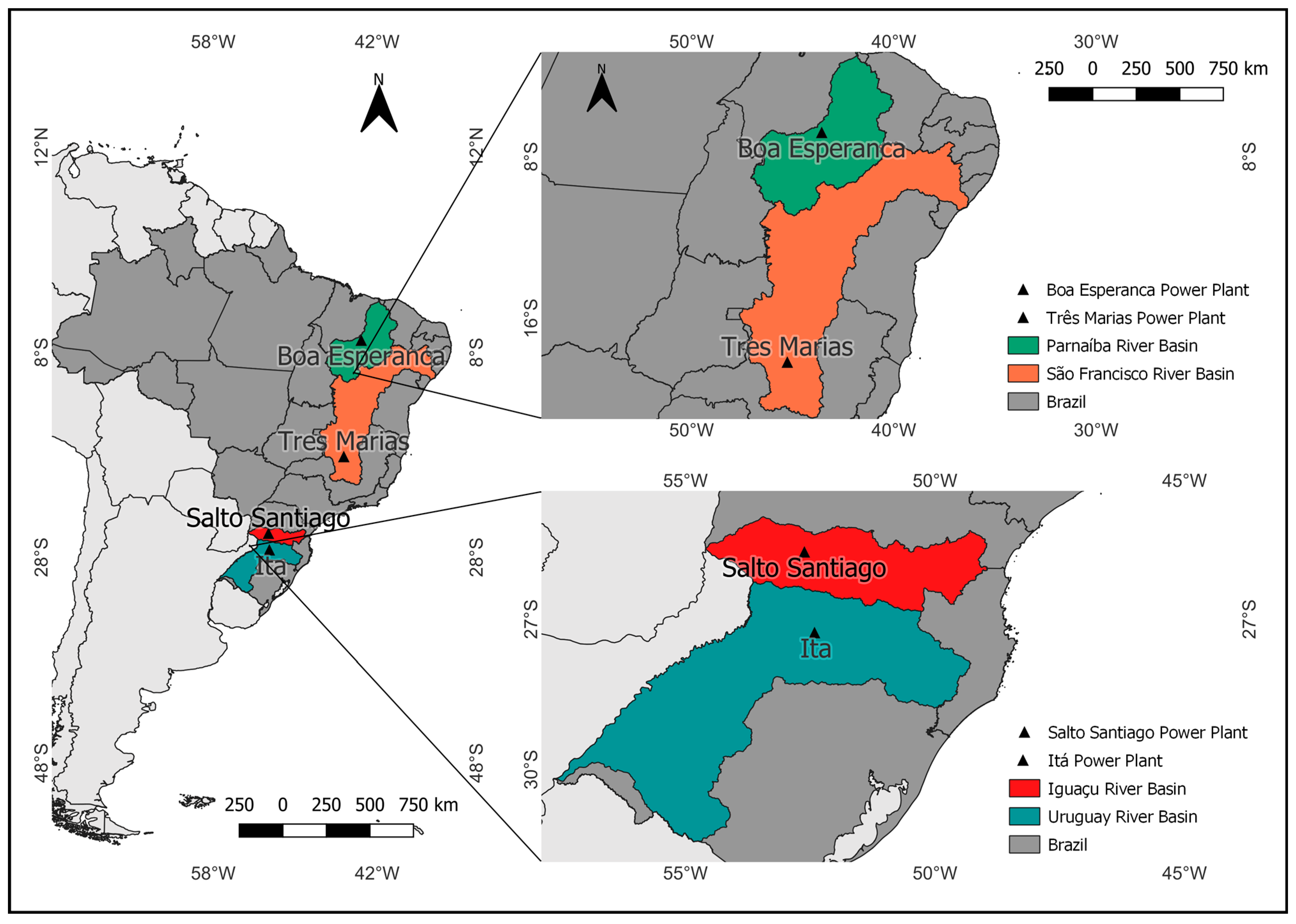
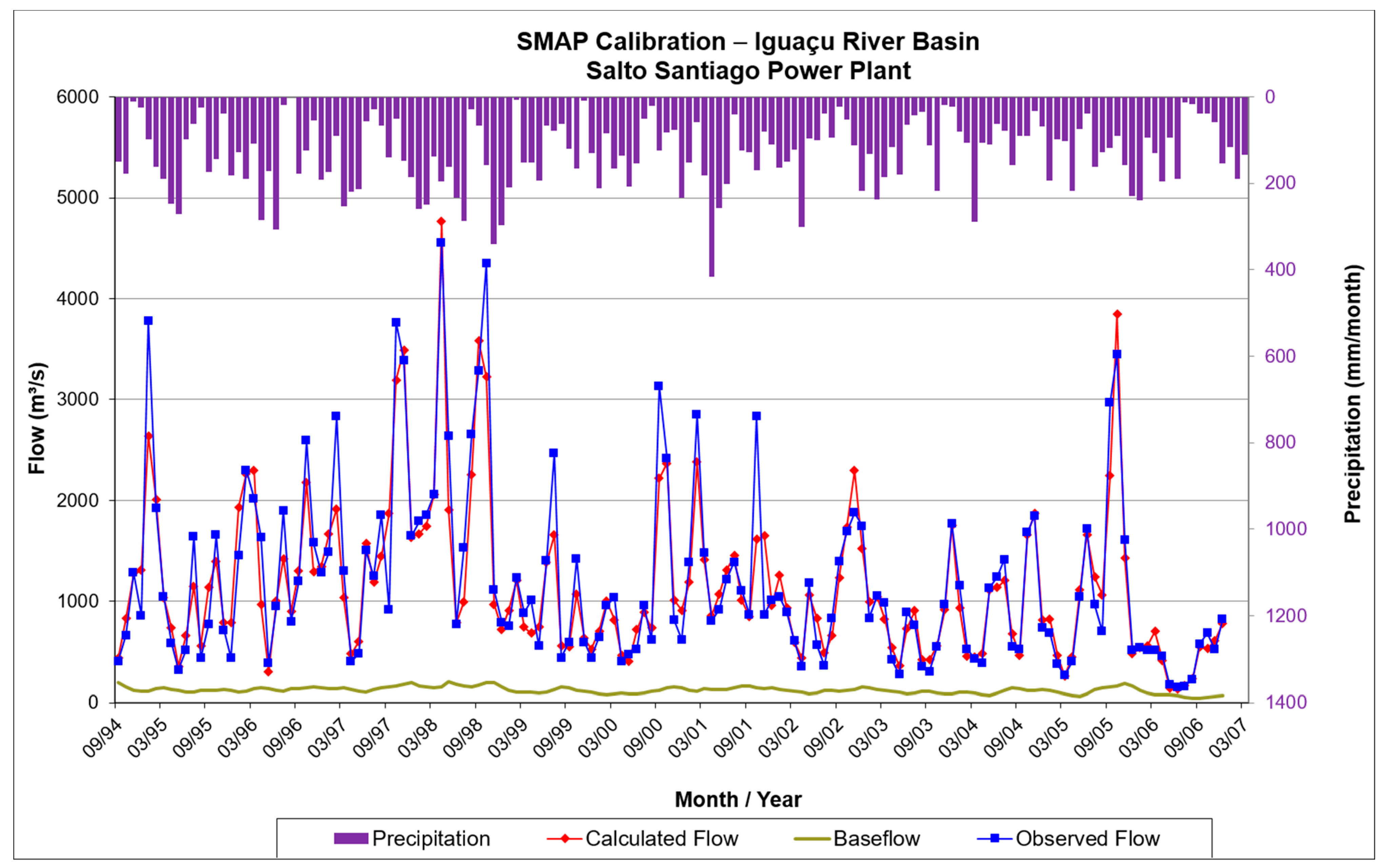
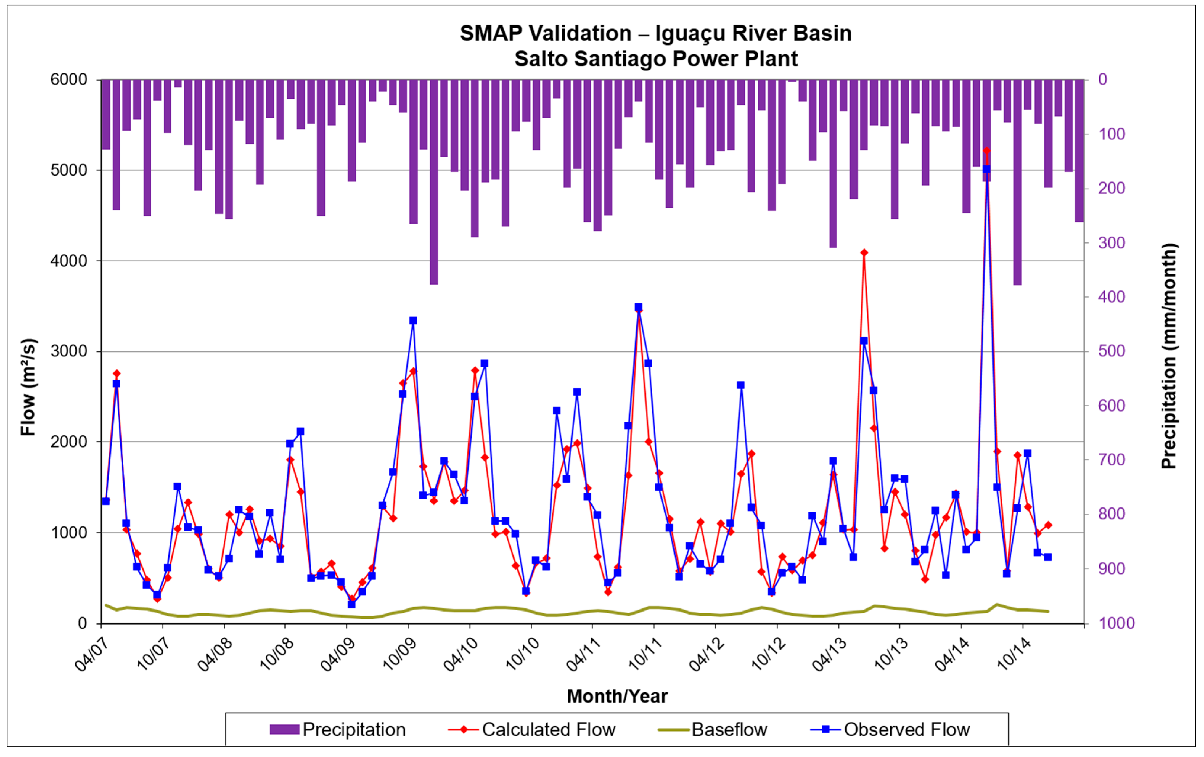
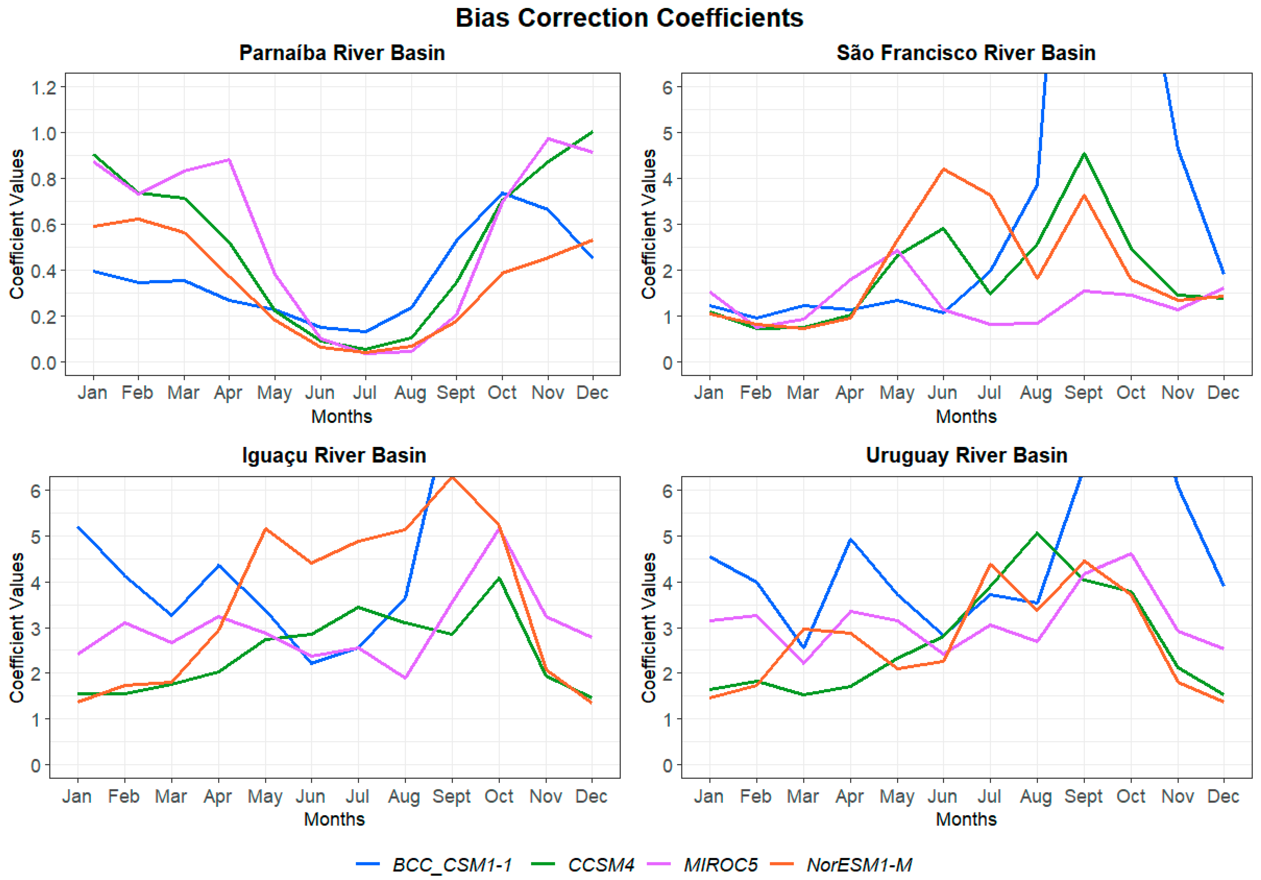
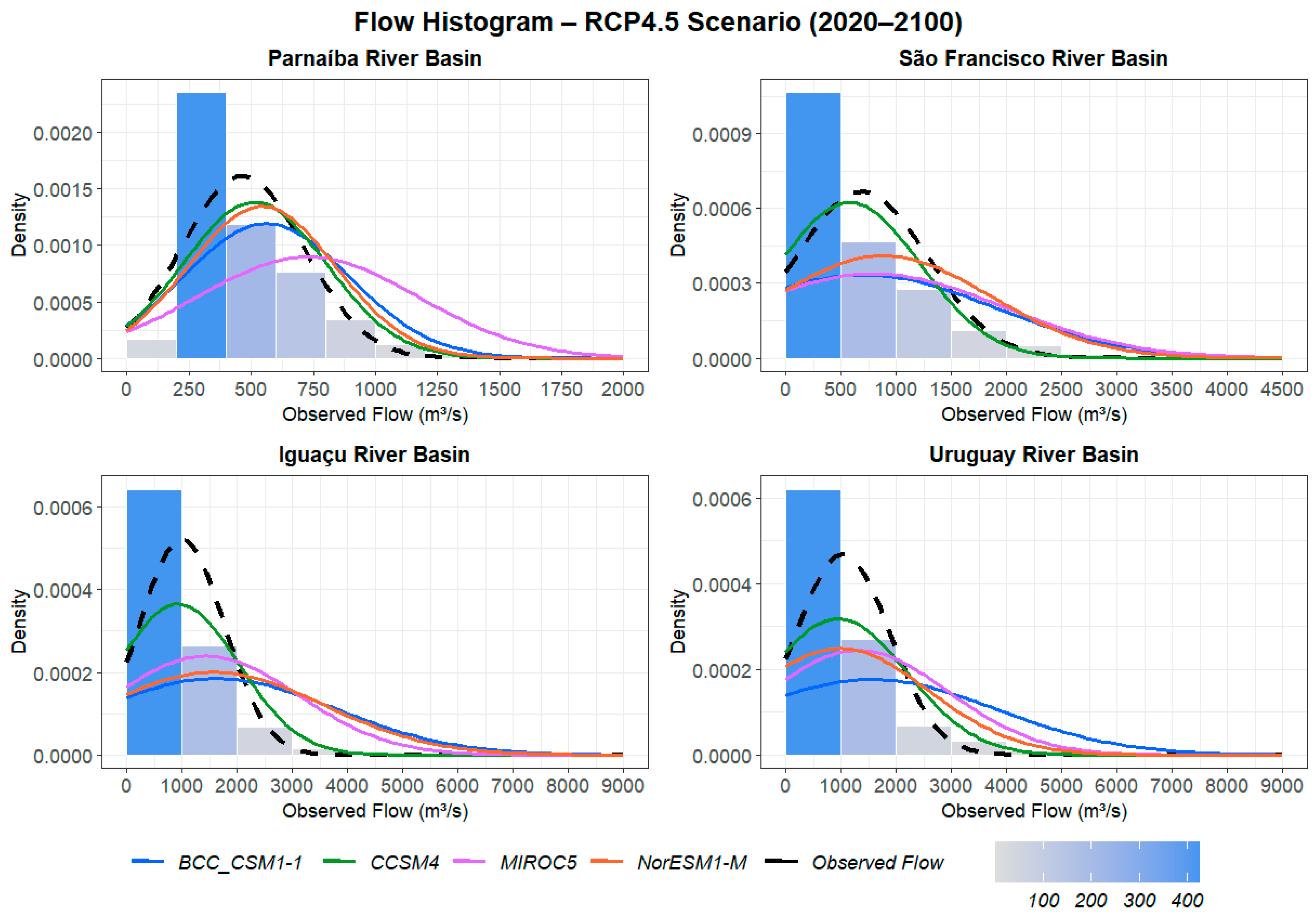
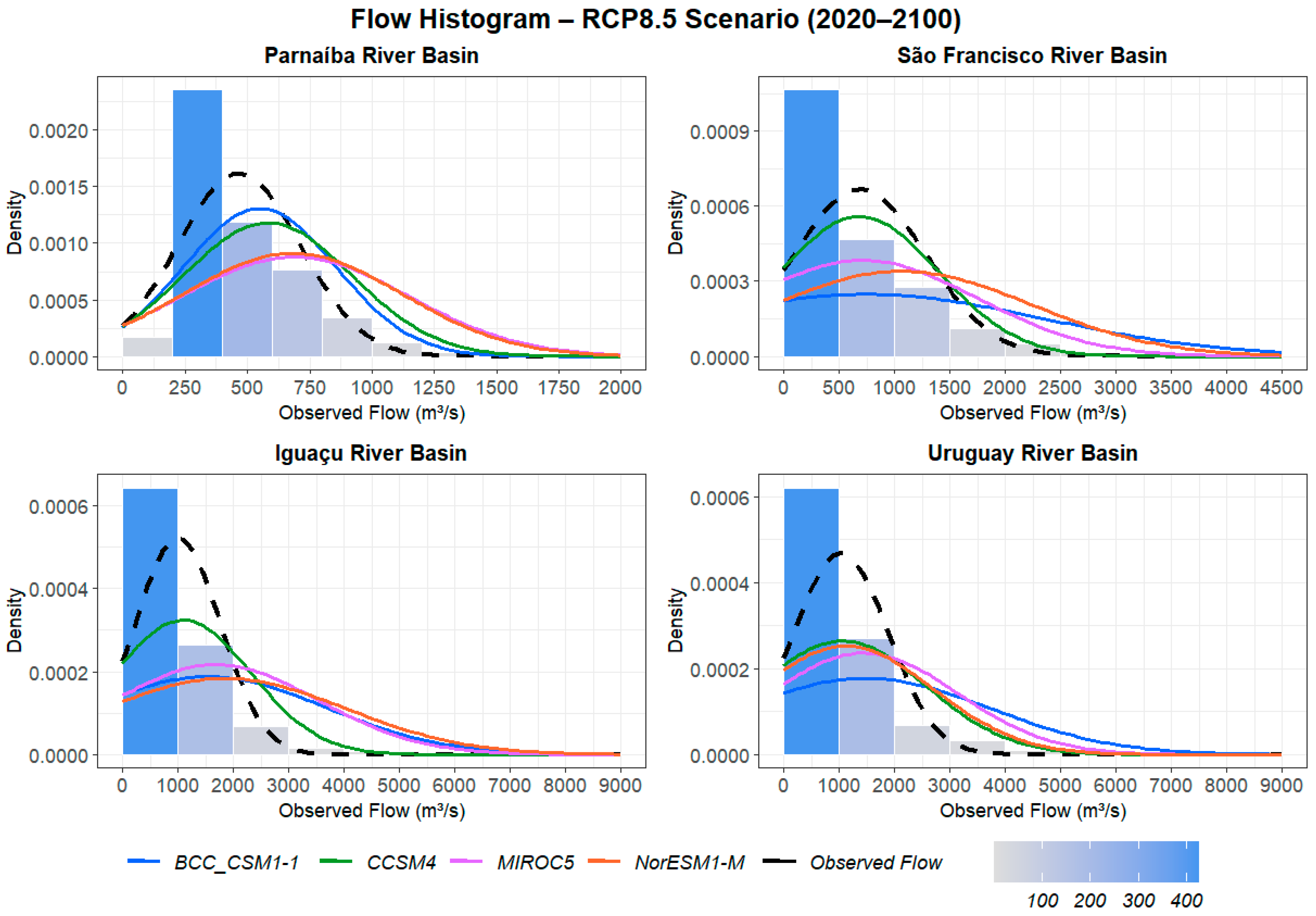
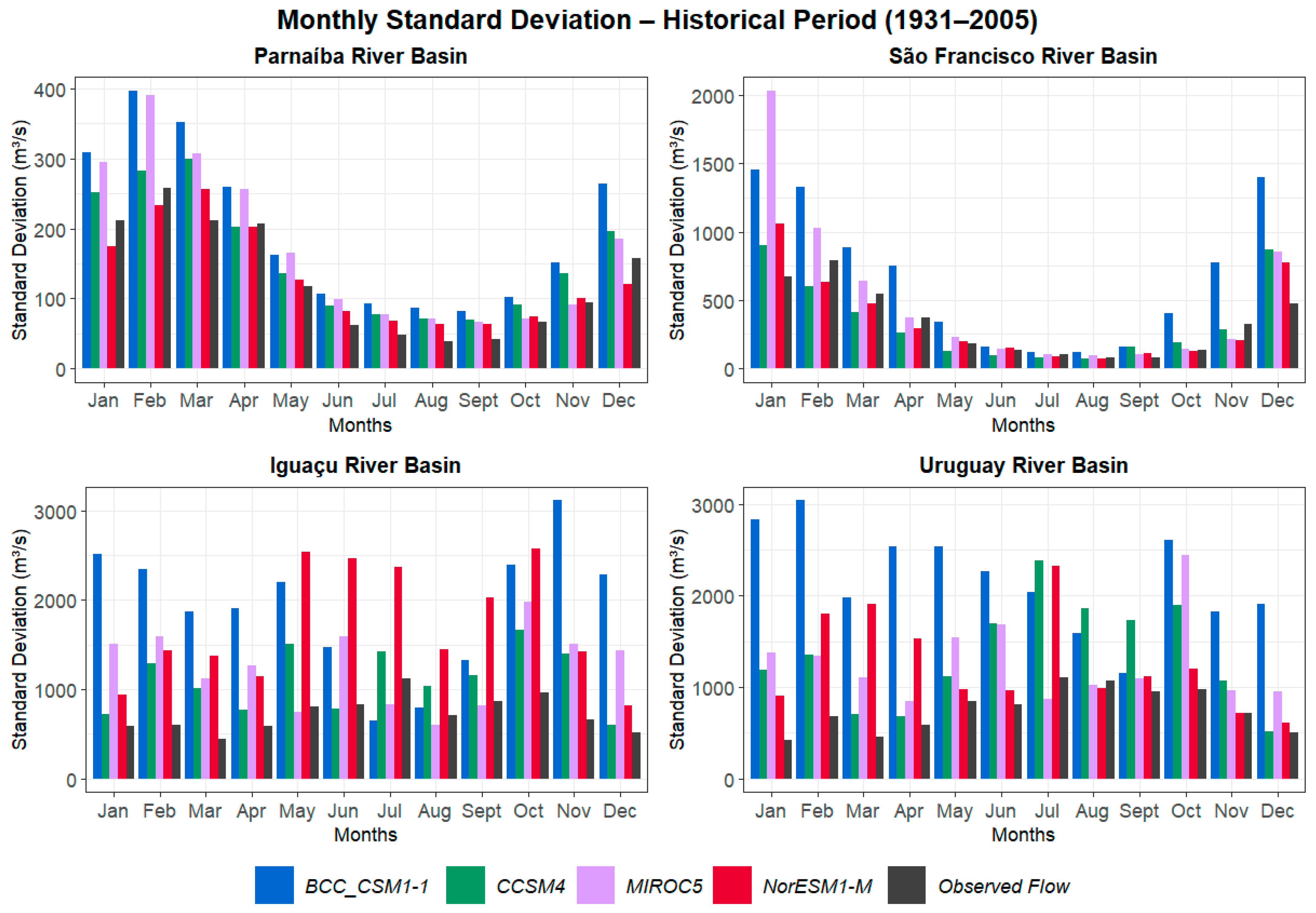
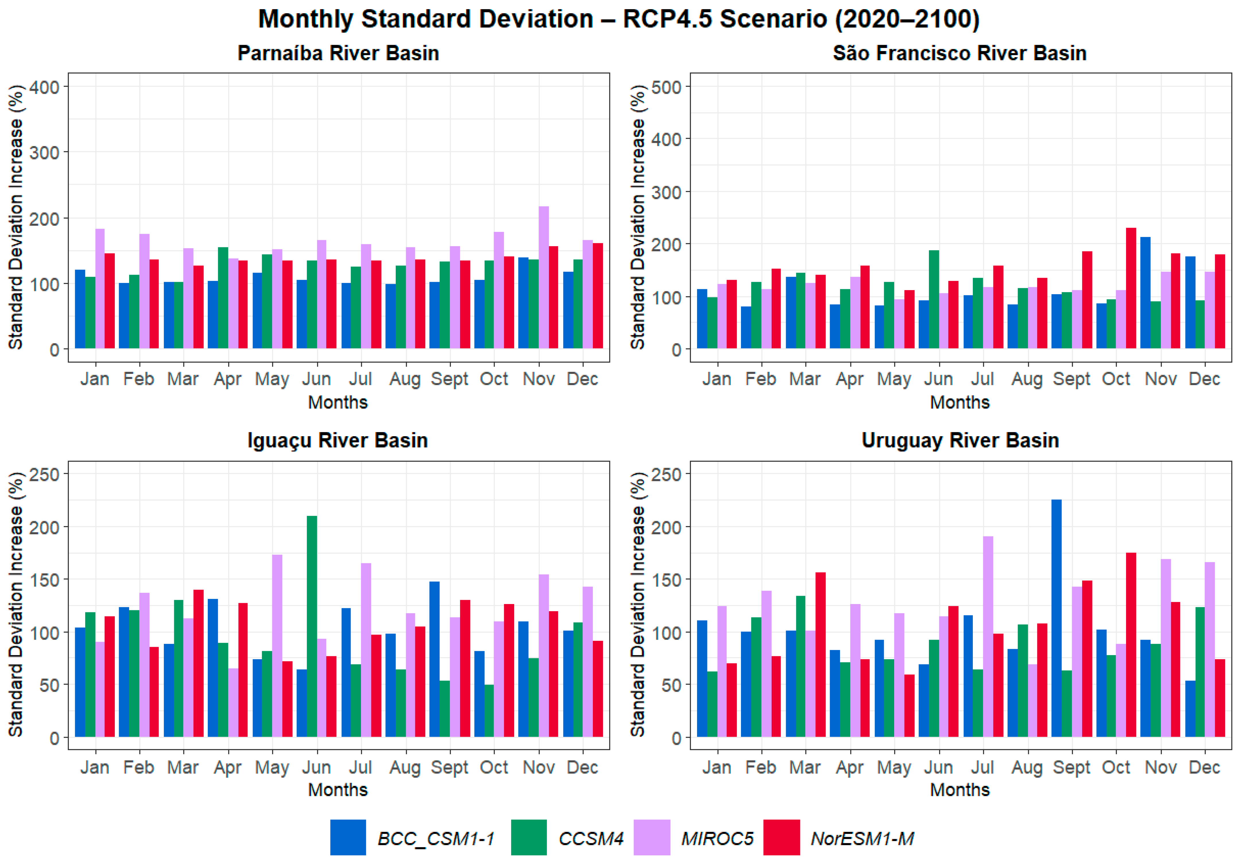
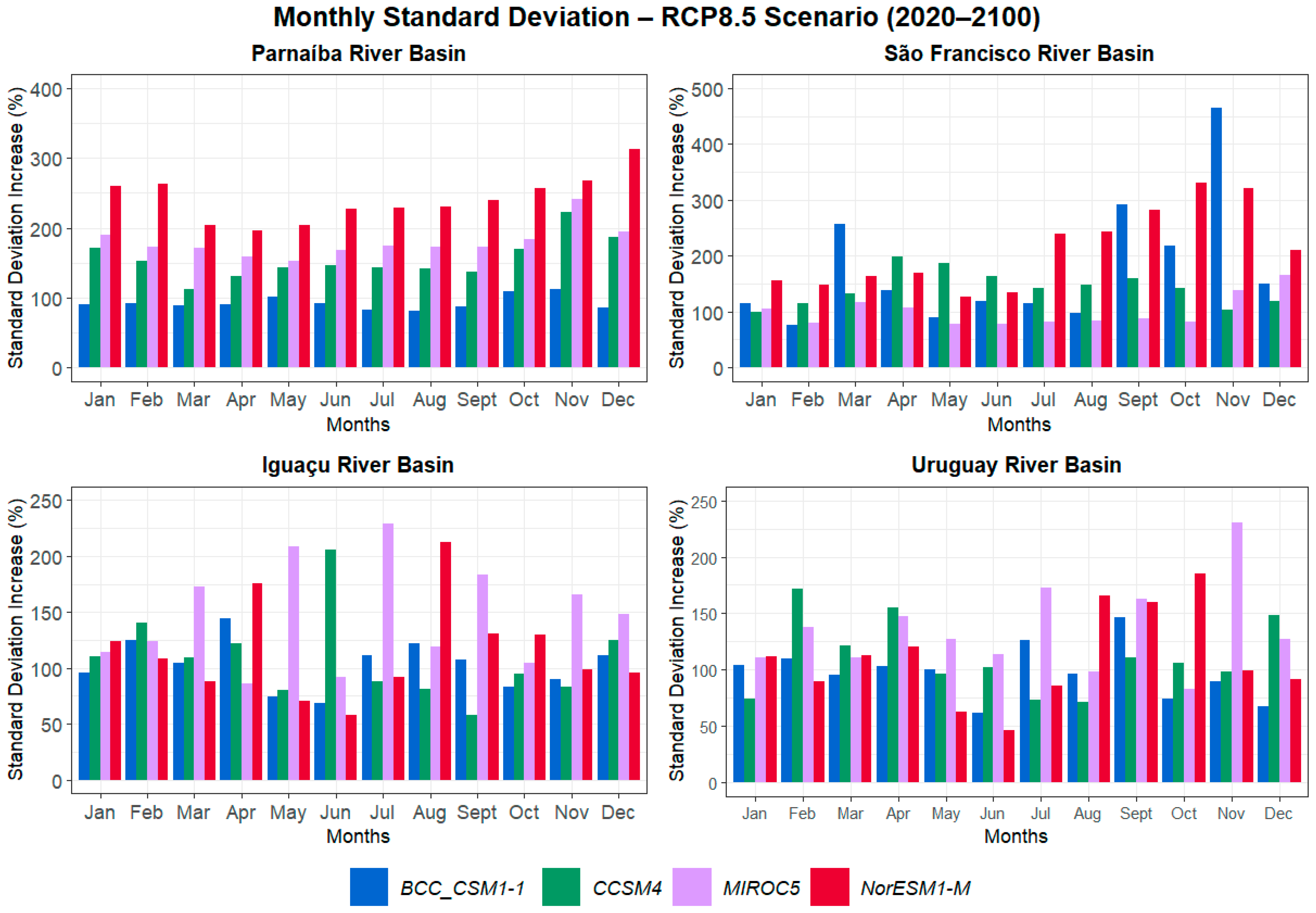
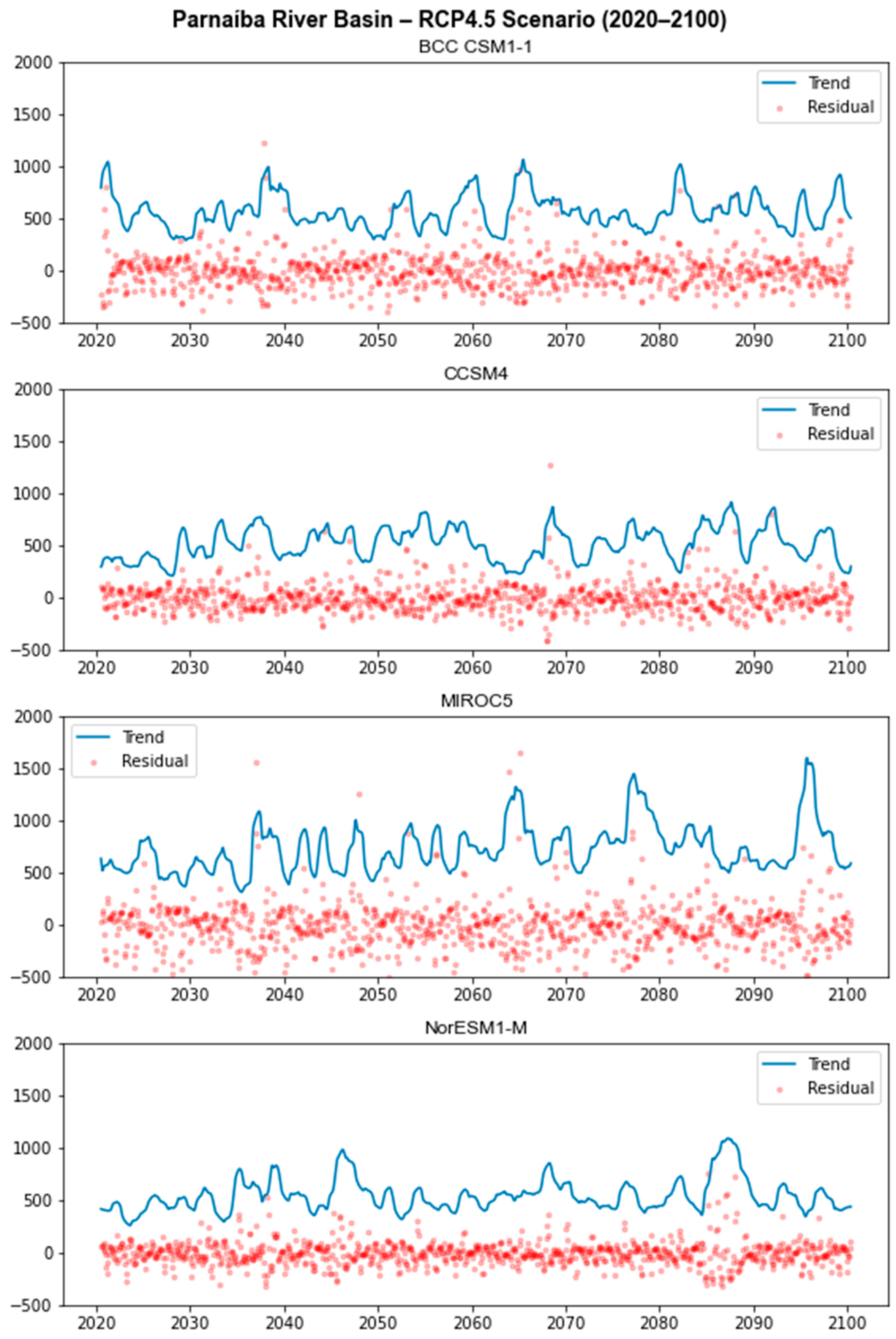
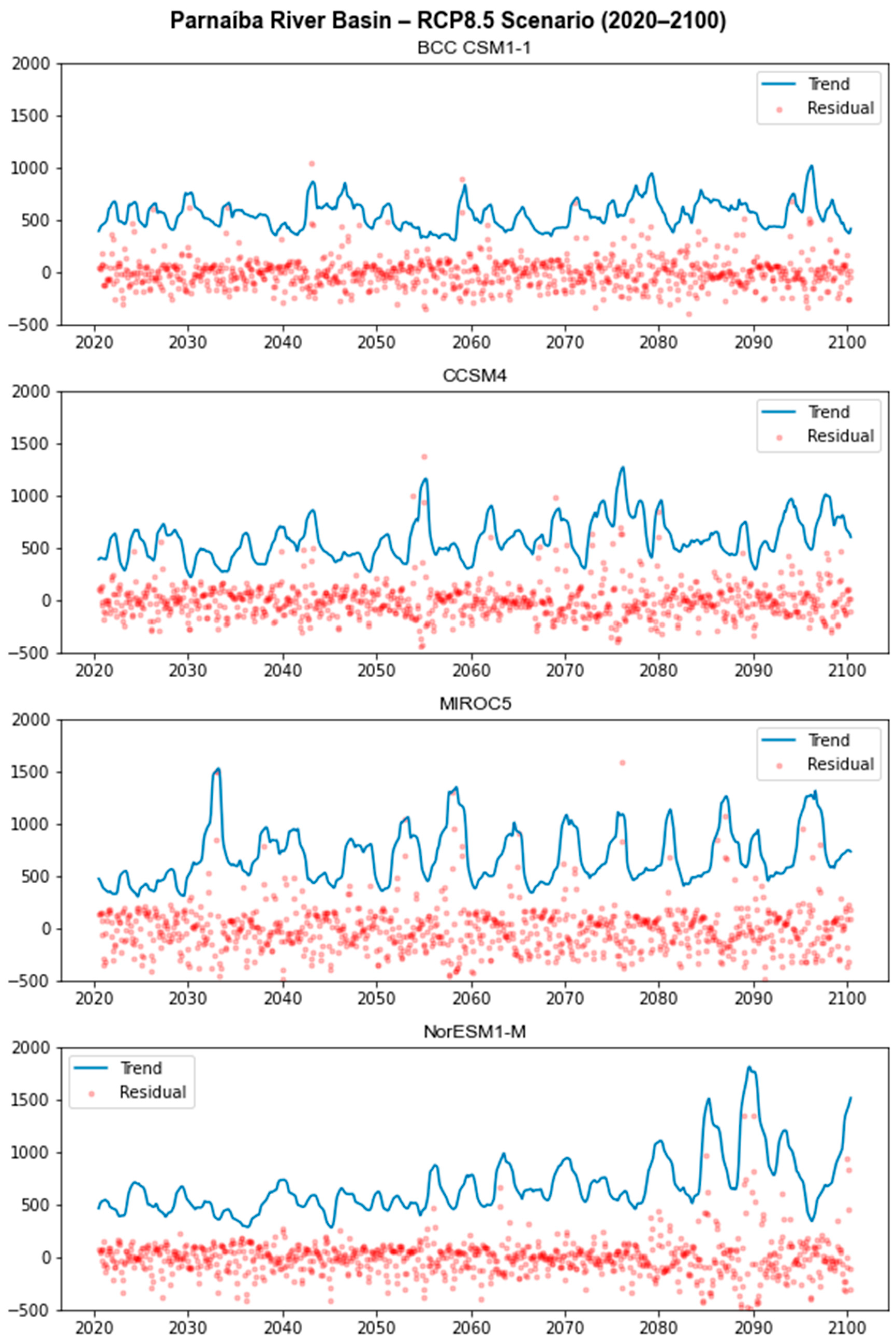
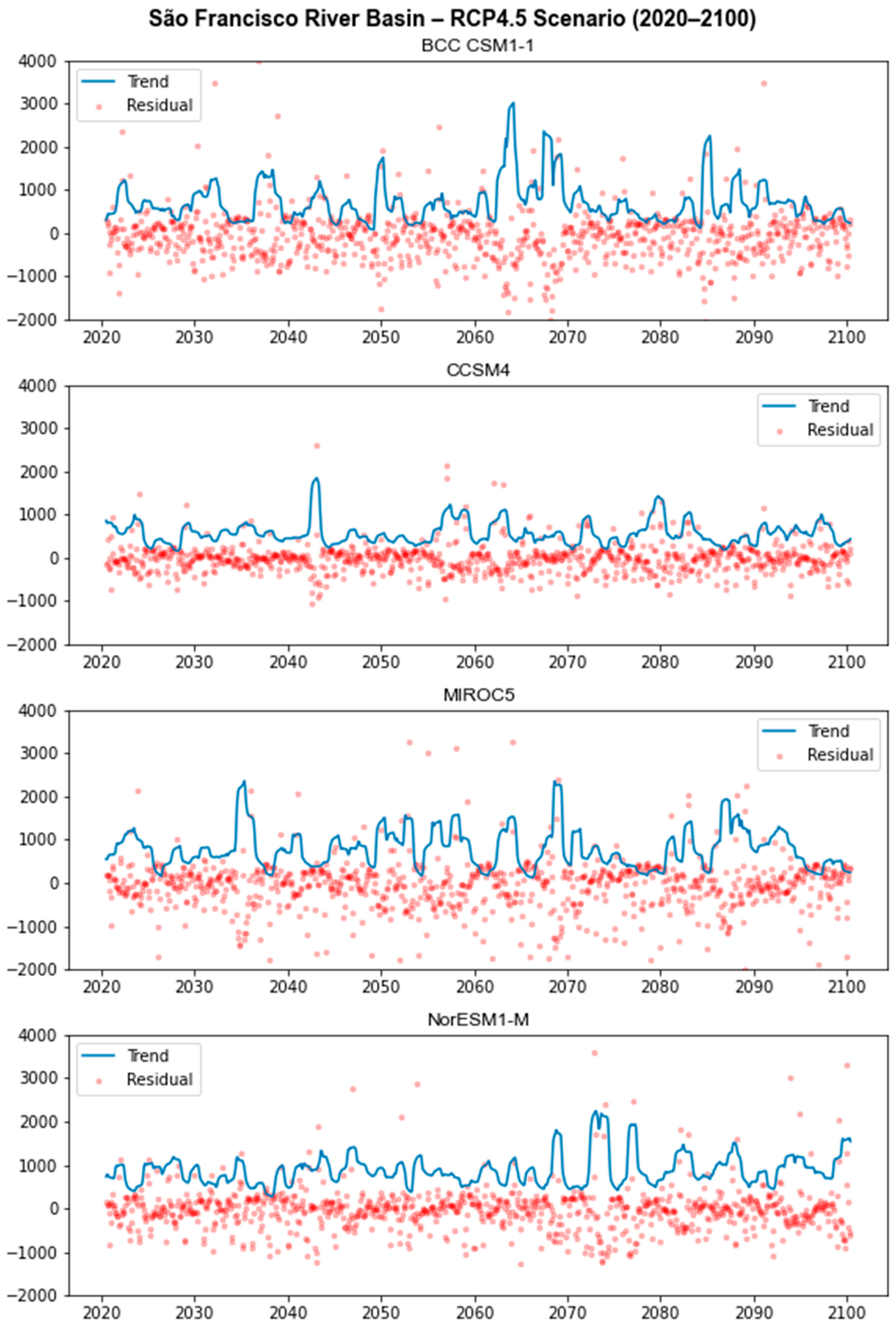
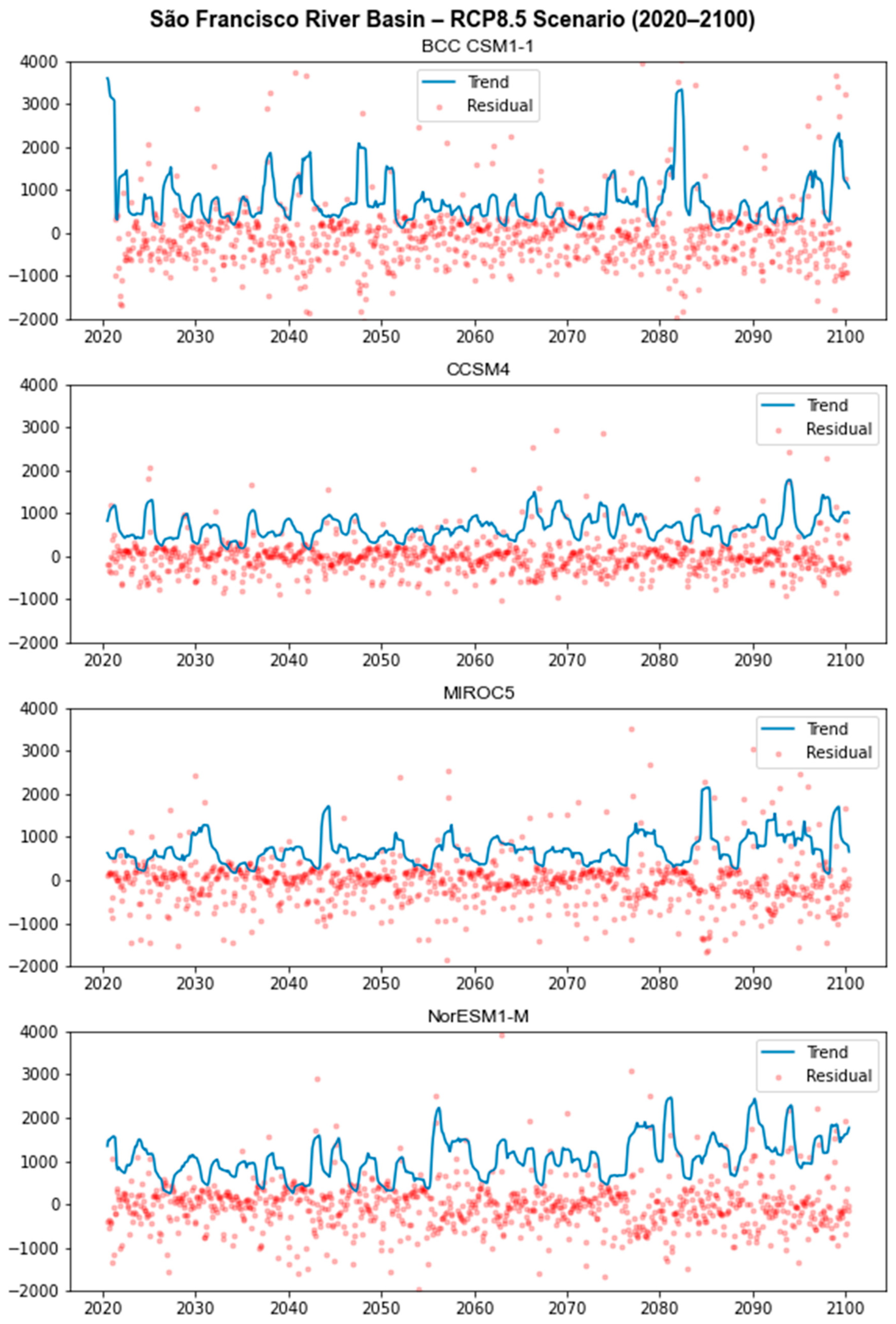
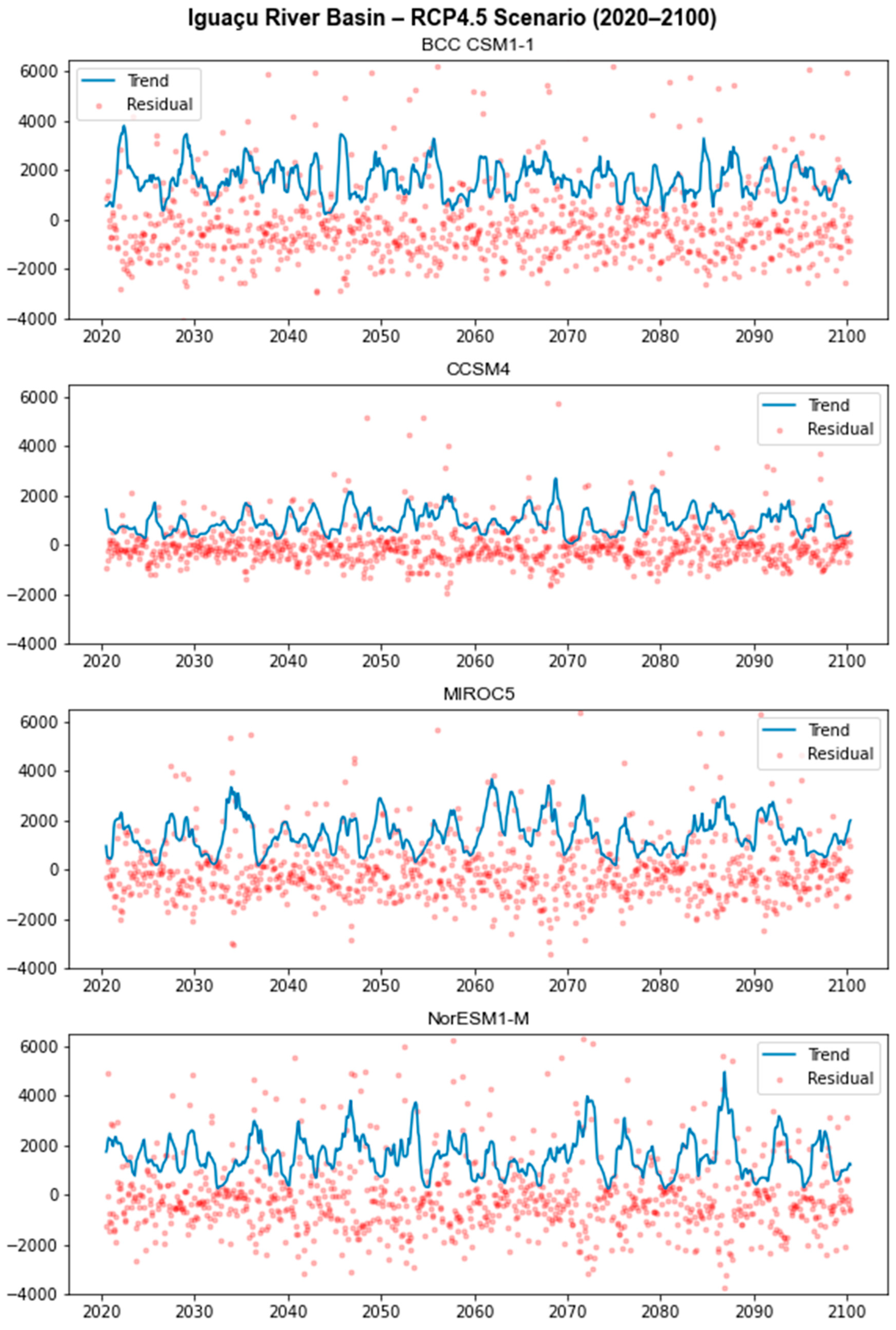
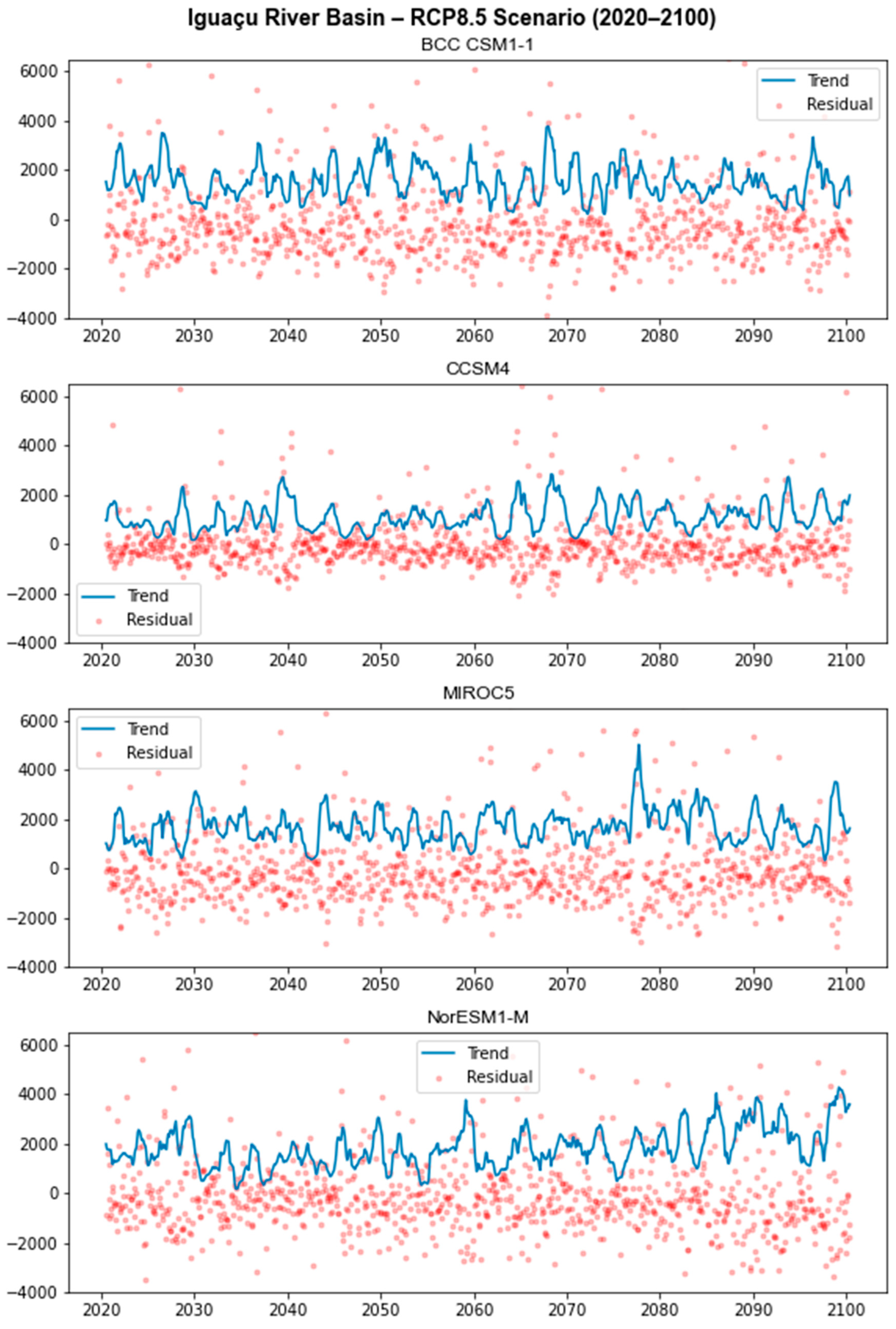
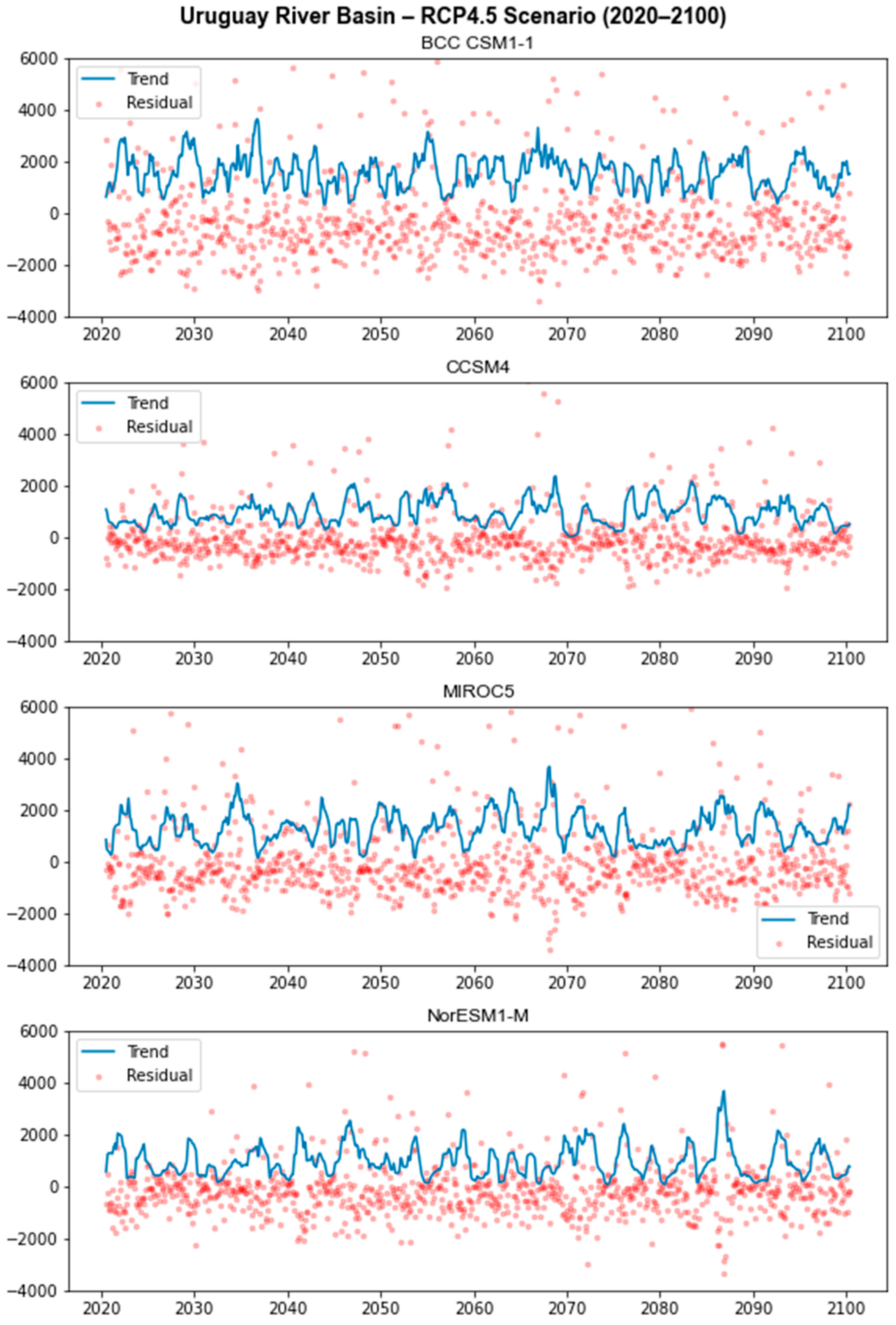
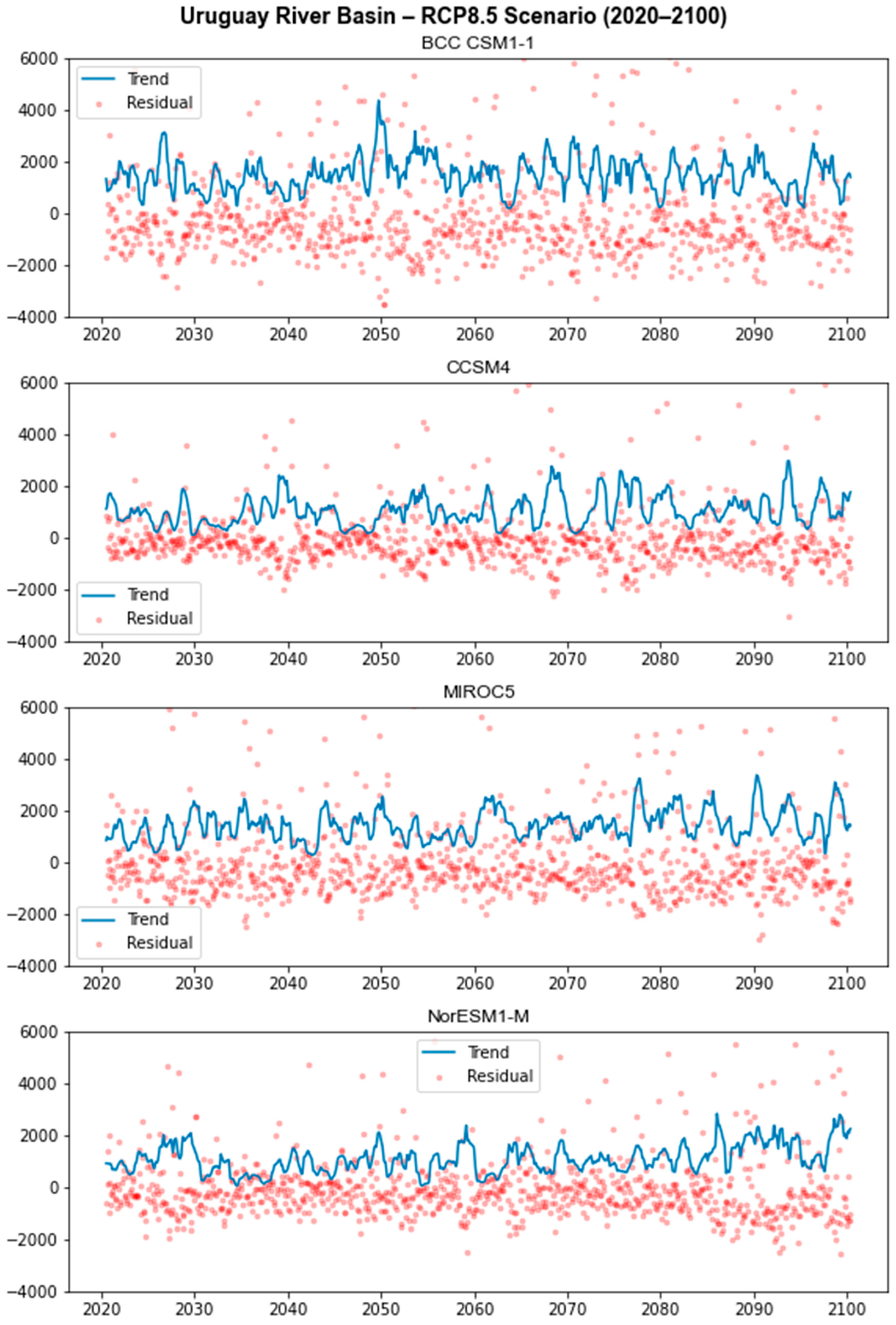
Table 1.
Efficiency coefficients obtained for basins in the Northeast region of Brazil.
| Parnaíba | São Francisco | |||
|---|---|---|---|---|
| Coefficients | Calibration | Validation | Calibration | Validation |
| NASH | 0.73 | 0.79 | 0.91 | 0.89 |
| MAPE | 0.16 | 0.18 | 0.14 | 0.21 |
| 1-MAPE | 0.84 | 0.82 | 0.86 | 0.79 |
| Global Efficiency | 1.57 | 1.61 | 1.76 | 1.68 |
Table 2.
Efficiency coefficients obtained for basins in the South region of Brazil.
| Iguaçu | Uruguay | |||
|---|---|---|---|---|
| Coefficients | Calibration | Validation | Calibration | Validation |
| NASH | 0.87 | 0.83 | 0.88 | 0.87 |
| MAPE | 0.17 | 0.21 | 0.18 | 0.21 |
| 1-MAPE | 0.83 | 0.79 | 0.82 | 0.79 |
| Global Efficiency | 1.70 | 1.62 | 1.69 | 1.67 |
Table 3.
Comparison of Average Simulated Flows, Mean Absolute Errors (MAEs), and Mean Absolute Percentage Errors (MAPEs), before and after bias correction, for the Parnaíba River basin.
Table 3.
Comparison of Average Simulated Flows, Mean Absolute Errors (MAEs), and Mean Absolute Percentage Errors (MAPEs), before and after bias correction, for the Parnaíba River basin.
| Average Flow (1931–2005) | BCC CSM1-1 | CCSM4 | MIROC5 | NorESM1-M |
|---|---|---|---|---|
| Before Correction | ||||
| Simulated (m3/s) | 3466.92 | 1680.68 | 1749.31 | 3141.73 |
| MAE | 3001.05 | 1218.23 | 1284.58 | 2675.85 |
| MAPE (%) | 654.04 | 334.60 | 365.74 | 696.03 |
| After Correction | ||||
| Simulated (m3/s) | 480.41 | 469.03 | 519.93 | 427.10 |
| MAE | 175.82 | 163.78 | 171.61 | 146.95 |
| MAPE (%) | 37.53 | 34.57 | 37.75 | 29.43 |
Table 4.
Comparison of Average Simulated Flows, Mean Absolute Errors (MAEs), and Mean Absolute Percentage Errors (MAPEs), before and after bias correction, for the São Francisco River basin.
Table 4.
Comparison of Average Simulated Flows, Mean Absolute Errors (MAEs), and Mean Absolute Percentage Errors (MAPEs), before and after bias correction, for the São Francisco River basin.
| Average Flow (1931–2005) | BCC CSM1-1 | CCSM4 | MIROC5 | NorESM1-M |
|---|---|---|---|---|
| Before Correction | ||||
| Simulated (m3/s) | 229.43 | 384.91 | 381.29 | 497.29 |
| MAE | 537.57 | 440.81 | 455.05 | 392.19 |
| MAPE (%) | 74.19 | 59.79 | 61.96 | 54.03 |
| After Correction | ||||
| Simulated (m3/s) | 699.67 | 517.03 | 636.20 | 650.49 |
| MAE | 524.67 | 403.76 | 481.70 | 385.28 |
| MAPE (%) | 78.99 | 60.09 | 66.68 | 57.26 |
Table 5.
Comparison of Average Simulated Flows, Mean Absolute Errors (MAEs), and Mean Absolute Percentage Errors (MAPEs), before and after bias correction, for the Iguaçu basin.
Table 5.
Comparison of Average Simulated Flows, Mean Absolute Errors (MAEs), and Mean Absolute Percentage Errors (MAPEs), before and after bias correction, for the Iguaçu basin.
| Average Flow (1931–2005) | BCC CSM1-1 | CCSM4 | MIROC5 | NorESM1-M |
|---|---|---|---|---|
| Before Correction | ||||
| Simulated (m3/s) | 32.03 | 162.20 | 87.66 | 173.61 |
| MAE | 962.98 | 869.06 | 911.78 | 876.16 |
| MAPE (%) | 95.29 | 82.94 | 87.60 | 85.11 |
| After Correction | ||||
| Simulated (m3/s) | 1538.07 | 999.10 | 1257.78 | 1488.64 |
| MAE | 1342.10 | 925.33 | 997.66 | 1215.06 |
| MAPE (%) | 198.64 | 136.46 | 145.82 | 199.86 |
Table 6.
Comparison of Average Simulated Flows, Mean Absolute Errors (MAEs), and Mean Absolute Percentage Errors (MAPEs), before and after bias correction, for the Uruguay basin.
Table 6.
Comparison of Average Simulated Flows, Mean Absolute Errors (MAEs), and Mean Absolute Percentage Errors (MAPEs), before and after bias correction, for the Uruguay basin.
| Average Flow (1931–2005) | BCC CSM1-1 | CCSM4 | MIROC5 | NorESM1-M |
|---|---|---|---|---|
| Before Correction | ||||
| Simulated (m3/s) | 32.81 | 115.35 | 46.93 | 94.64 |
| MAE | 997.38 | 947.73 | 983.56 | 967.32 |
| MAPE (%) | 94.99 | 91.41 | 93.04 | 91.41 |
| After Correction | ||||
| Simulated (m3/s) | 1454.69 | 1047.62 | 1102.51 | 918.78 |
| MAE | 1392.61 | 1049.98 | 990.60 | 1026.58 |
| MAPE (%) | 237.58 | 163.36 | 155,80 | 158.59 |
Disclaimer/Publisher’s Note: The statements, opinions and data contained in all publications are solely those of the individual author(s) and contributor(s) and not of MDPI and/or the editor(s). MDPI and/or the editor(s) disclaim responsibility for any injury to people or property resulting from any ideas, methods, instructions or products referred to in the content. |
© 2023 by the authors. Licensee MDPI, Basel, Switzerland. This article is an open access article distributed under the terms and conditions of the Creative Commons Attribution (CC BY) license (https://creativecommons.org/licenses/by/4.0/).
Share and Cite
MDPI and ACS Style
Esposte Coutinho, P.; Cataldi, M. Evaluation of Extreme Hydroclimatic Trends in River Basins Located in the Northeast and South Regions of Brazil. Atmosphere 2023, 14, 1388. https://doi.org/10.3390/atmos14091388
AMA Style
Esposte Coutinho P, Cataldi M. Evaluation of Extreme Hydroclimatic Trends in River Basins Located in the Northeast and South Regions of Brazil. Atmosphere. 2023; 14(9):1388. https://doi.org/10.3390/atmos14091388
Chicago/Turabian StyleEsposte Coutinho, Priscila, and Marcio Cataldi. 2023. "Evaluation of Extreme Hydroclimatic Trends in River Basins Located in the Northeast and South Regions of Brazil" Atmosphere 14, no. 9: 1388. https://doi.org/10.3390/atmos14091388
Note that from the first issue of 2016, this journal uses article numbers instead of page numbers. See further details here.