
Place-Specific Corona Dashboards for Health Policy: Design and Application of a ‘Dutchboard’

1
CAROU/Department of Management Science, Open University of the Netherlands, Valkenburgerweg 177, 6419 AT Heerlen, The Netherlands
2
Centre for European Studies, Alexandru Ioan Cuza University, 700507 Iasi, Romania
*
Author to whom correspondence should be addressed.
Sustainability 2022, 14(2), 836; https://doi.org/10.3390/su14020836
Submission received: 3 November 2021
/
Revised: 22 December 2021
/
Accepted: 28 December 2021
/
Published: 12 January 2022
(This article belongs to the Special Issue Social Capital, Infrastructural Capital and Resilience Capacity in Urban Systems)
Abstract
:Since the outbreak of the corona virus in the end of 2019, many worldwide attempts have been made to monitor and control the COVID-19 pandemic. A wealth of empirical data has been collected and used by national health authorities to understand and mitigate the spread and impacts of the corona virus. In various countries this serious health concern has led to the development of corona dashboards monitoring the COVID-19 evolution. The present study aims to design and test an extended corona dashboard, in which—beside up-to-date daily core data on infections, hospital and intensive care admissions, and numbers of deceased people—also the evolution of vaccinations in a country is mapped out. This dashboard system is next extended with time-dependent contextual information on lockdown and policy stringency measures, while disaggregate information on the geographic spread of the COVID-19 disease is provided by means of big data on contact intensity and mobility motives based on detailed Google Mobility data. Finally, this context-specific corona dashboard, named ‘Dutchboard’, is further extended towards the regional and local level so as to allow also for space-specific ‘health checks’ and assessments.
1. Introduction
COVID-19 has become a disruptive factor in human health conditions all over the world. It has not only affected the life and wellbeing of millions of people on our planet but has also exerted major devastating impacts on the welfare of many people, in particular, low income groups. Apart from a few noticeable exceptions, most countries have made serious attempts—within the resources available—to cope with this pandemic, through socio-medical and socio-economic intervention policies. Despite the generally rather uniform space-time spread pattern of a pandemic, most countries have developed country-specific medical prevention and mitigation strategies, so that from a worldwide perspective the space-time dispersion of the pandemic exhibits a capricious complex space-time evolution. In addition, the emergence of new variants of the corona virus has led to irregular dispersion curves, reflected in successive corona waves.
Public health authorities in many countries have tried to keep records of the development of COVID-19 cases by collecting up-to-date and open-access information on new COVID-19 infections, hospital admissions, intensive care admissions, and number of deceased persons. In a later stage (as of the beginning of 2021)—with the introduction of various vaccines—also more information became available on the penetration rates and impacts of several vaccines for different population groups.
In several countries, health authorities have made a serious attempt to put together the available COVID-19 data in an up-to-date corona dashboard, often even on a daily basis. Examples can be found inter alia in Belgium, The Netherlands, and the USA (in particular, the Johns Hopkins Coronavirus Center in Baltimore). Such dashboards aim to monitor the health situation in a country and are meant to act as a signpost for public health policy. Consequently, since the pandemic outbreak a rich database on the fluctuations in COVID-19 infections could be built up. However, to understand the dynamics of a range of such often irregular corona curves—over time and space—calls for more quantitative insight into various critical contextual (or background) factors, in particular, the development of corona vaccinations (and different vaccines), the intensity of policy intervention measures, and the social-spatial behaviour of people in terms of social-physical interaction (ranging from work mobility to family visits). Measuring such interactive effects is not an easy task. As we know, from the first epidemiological models [1], the quantitative and consistent measurement of epidemiological spread patterns—influenced by a combination of vaccination impacts, lockdown measures and spatial-behavioural contact impacts—is fraught with many empirical data and applied statistical problems [2,3].
In general, broad systematic and comparable information, at least in a quantitative sense, was hardly available at the beginning of the pandemic, in particular on conditioning factors for physical human interaction and on the nature, intensity and pervasiveness of a variety of government intervention measures. Consequently, the effects of a series of public lockdown and other prevention measures in relation to social behaviour are less understood. An interesting evidence-based study on the spatial spread and concentration of COVID-19 in relation to lockdown measures can be found in [4]. On a global scale, the Oxford policy stringency index, which has recently gained quite some popularity, provides a quantitative indicator on national direct and indirect policies to cope with COVID-19. Clearly, sometimes these policy mechanisms showed wild fluctuations over time and across countries. Consequently, the impacts of public policy measures worldwide on the intensity and spread of COVID-19 are very pluriform, so that a comparative impact assessment of the success of policies is extremely difficult. It goes without saying that an assessment of the effect of the policy context on the corona developments in a country calls for up-to-date and detailed quantitative information on various background factors.
A major context-specific determinant of the spread of the corona virus is clearly shaped by physical transmission of the virus among people in close proximity. From a data perspective, physical interaction and mobility patterns are thus critical, as interaction and mobility form the intermediate vehicle for physical contact and human communication. Therefore, detailed information on social interaction (including its reverse, viz. ‘social distancing’) is a sine qua non for a detailed understanding of the spread pattern of COVID-19. In our study on context-specific corona dashboards we will, therefore, employ ‘big data’ taken from the Google Mobility database.
Another striking phenomenon is the great heterogeneity in the density and spread pattern of COVID-19, even within the same country. The geographical pattern of COVID-19 shows a great diversity over regions and cities of a country. Therefore, there is a need for a localised corona dashboard information that captures much of the above mentioned spatially granular information so as to create a decision support tool for regional or local ‘health checks’ on a short-term basis.
The present paper—focused on The Netherlands as the study area—aims to provide the foundation and an illustrative application for a context-specific corona dashboard (serving as a quantitative visualised decision support tool) that combines—beside core COVID-19 data—various background factors that influence the detailed space-time trajectory of the spread of COVID-19, ranging from the national to the local level. However, serious doubts have been expressed on the functioning of such health dashboards, and thus a critical general assessment of dashboards in public policy is also needed.
This paper is organised as follows. After this introductory section which sets the scene for our study, we will introduce and summarise in Section 2 the general nature and benefits of a dashboard for policy making or management in both the private and public sector. Next, in Section 3 the architecture of a corona dashboard for health policy will be described, against the background of a prevailing national corona dashboard developed in The Netherlands. Section 4 will then be devoted to the necessary extension of such a dashboard by addressing three context-specific factors, viz. the vaccination programme, the intensity of policy intervention (‘policy stringency’) and the social interaction/mobility patterns by using big data from Google. Given the need to analyse geography-specific factors, we will in Section 5 present regionalised or localised versions of the context-specific corona dashboard, so as to serve the information needs of regional or local health authorities. In a final section (Section 6), we will offer some prospective views on possible improvements of the proposed local or regional corona dashboard.
2. Dashboards: A ‘Deus Ex Machina’?
2.1. Dashboards: Introduction
The currently popular corona dashboards are mainly inspired by dashboard applications in the management sciences. Dashboards have in the past decades become a popular policy and decision support tool in many fields of research and management [5,6,7,8,9,10]. The number of definitions of a dashboard is vast, while the range of applications is broad. In the present study we will conceive of a dashboard as an organised management or policy information system with focused quantitative up-to-date information (‘data’) that is essential for actionable response; it is a visualised and compact decision support system usually based on critical thresholds or target values of pre-specified policy-relevant variables [11].
It should be noted that a dashboard is not a miraculous panacea for treating all kinds of diseases (a ‘deus ex machina’). It acts as a lighthouse for consistent decisions or policy making, but it does not imply a decision per se nor function as a compelling choice tool; it offers only an insightful, evidence-based and instrumental interface mechanism for interventions of competent agents. Furthermore, it is not a prediction model: a dashboard captures only in a systematic and condensed form relevant past information. Trend extrapolations, expert-based forecasts or imagineering tools can be added to a dashboard in the form of ‘satellite information’ around the data core of the dashboard. Thus, mental experiments of a ‘what … if’ nature (e.g., in the form of ‘flight simulators’, scenario choice exercises, or gaming experiments in a decision lab) may be included as complementary tools to a dashboard (see also [12] for an application to uncertain transportation planning in the future). Dashboards serve to reduce information on complex, multi-layered and interdependent systems into surveyable and actionable information presented in the form of a lighthouse for management navigation tasks [13,14]. Dashboards do not only comprise a limited collection of meters which serve as a visual yardstick for decision making, they also need systematic background information in order to interpret the visualised outcomes on a dashboard (‘contextualised information’). Therefore, context specificity is a key feature of any operational dashboard. Consequently, due attention is needed for: (i) dashboard principles; (ii) dashboard design; (iii) dashboard data; and (iv) dashboard analysis and use (see Section 2.2, Section 2.3, Section 2.4 and Section 2.5). These descriptions will be used as key elements for designing the corona dashboard and to assess its usefulness at the end of this paper.
2.2. Dashboards: Principles
Since the corona pandemic outbreak, several countries have developed so-called corona dashboards as a monitoring tool for public health policy. In many discussions and implementations of corona intervention strategies, a reference is made to quantitative corona dashboard data. Such discussions give the impression that a corona dashboard is a cybernetic steering instrument. However, dashboards are no ‘automatic pilots’; they are data-driven information tools for balanced decision making so as to keep a complex organisation on course. In general, they are usually part of a strategic performance management system, in which the achievement of pre-set key performance indicators (KPIs) is the main managerial challenge [15,16,17,18,19,20,21,22,23,24,25,26,27,28,29,30,31,32]. In current health care policy regarding COVID-19, KPIs are also extensively used, such as professional hospital treatment of corona patients (and other patients), satisfactory vaccination intensity or restricted mobility and physical interaction. Just like in management practice, such KPIs should play a key role in a corona dashboard.
The general literature on business management and industrial organisation contains a wealth of contributions on dashboards, KPIs and balanced scorecard methods. They all serve to provide systematic information for monitoring, adjusting or changing the organisation’s trajectory. Deviations from a pre-set course require appropriate and timely response, as is known from cybernetics. Historically, in the literature on macro-economic policy, the seminal work of Nobel laureate Jan Tinbergen [33] (1956) is noteworthy in this context; based on pre-set fixed targets (acting as reference points for decisions), he was able to specify the courses of actions (‘instruments’) that were needed to reach these goals. His work was later on extended by Theil [34] (1964) who introduced a quantitative target achievement model for government and industry decisions, using a quadratic penalty function for a deviation from the pre-specified development trajectory of the target variables. This work was later on extended in multiple-goal programming models in the form of multi-objective achievement analysis [35]. A first transition towards a scoreboard and dashboard analysis in multi-criteria decision making can be found in the multi-dimensional flag model in which the performance of an agent in terms of achieving several targets (or avoiding cost factors) is presented by the colours of distinct flags describing the degree of success or desired outcome [36].
In recent years, scorecards and dashboards have gained increasing popularity. Scorecards aim to confront the values of strategic goals of an organisation with its actual outcomes or results: performance is judged on the basis of pre-specified goals. In general, scorecards are static representations of goals achievements of KPIs, although in a multi-temporal framework they can also be used as monitoring tools. Scorecard methods may essentially be conceived of as a quantitative gap analysis.
Dashboards have a more embracing character and map out the state of a complex dynamic organisation on the basis of multiple interdependent metrics related to KPIs. Although the core of a dashboard is formed by a small number of pre-selected meters depicting in a bird’s eye view the performance of the agent, it contains in practice—as additional information sources—several graphs, charts or diagrams to visualise the state of KPIs and related parameters. A dashboard then monitors the evolution of an agent’s performance, and provides the necessary—though not sufficient—information for operational—strategic or managerial—interventions. Clearly, its usefulness depends on up-to-date provision of relevant data for actionable management. A dashboard can thus be used for both long-range strategic performance management and day-to-day management decisions. It is clear that in a pressing corona context, a dashboard is mainly used as an information tool for short-term decisions and less for long-term strategy development. A good example can be found in the corona dashboard developed in Belgium which contains much detailed information which serves as a guiding tool for regular adjustments in Belgian corona policies (available online: https://datastudio.google.com/embed/reporting/c14a5cfc-cab7-4812-848c-0369173148ab/page/ZwmOB (accessed on 1 September 2020).
2.3. Dashboards: Design
Corona dashboard data are often reported in daily newspapers; they have frequently been the source of public debate. In general, dashboards are useful for a visualised performance measurement and monitoring, but need an adequate design in terms of flexibility and information coverage, so that real-time data can be generated—and visualised—for understanding and changing the current evolutionary state. Given the multiplicity of potential corporate objectives and targets, a systematic design of a dashboard is a sine qua non. A guide may be found in Miller’s [37] (1956) ‘magical number seven’, which stipulates that the maximum number of objectives that can simultaneously, consistently and effectively be taken into consideration by a smart decision maker is seven. Beyond this threshold, decisions become inconsistent and flawed, as can be shown by experimental research. This principle is not only respected in a car dashboard, but also in current corona dashboard applications, where the number of indicators simultaneously included in a corona dashboard is normally four to five (e.g., daily infections, hospital admissions, occupancy of intensive care units, death tolls, or vaccination percentage). In case of many objectives (or KPIs), a systematic architecture and decomposition of decision factors has to be carried out (see in particular, [38]) so that a logical decision tree can be constructed, in which each class of choice or decision criteria receives more or less a similar weight in the decision procedure (see also [39]). Consequently, a hierarchical decision tree has to be constructed so as to design a dashboard with a limited set of pre-specified strategic or operational indicators (KPIs). This decomposition principle will also be adopted in our corona dashboard design.
Any dashboard should be able to show interlinkages among KPIs, while it should also provide meaningful interactive information to all qualified users. The visualisation of the dashboard information should be straightforward and as simple/accessible as possible [40,41,42].
Depending on the class of competent users, a dashboard may adopt different scopes; in particular, a distinction may be made according to operational dashboards (with real-time data for a snapshot of performance), analytical dashboard (with more focus on trends and future outlooks including scenario experiments), and strategic dashboards (analysis of key performance indicators for a better alignment with corporate strategy, including uncertainty analysis). It is clear that over the past few years, dashboard design and analysis has become an intelligent ‘art’ serving the needs of management and policy making in both the private and the public sector (see also [40]). In the current corona times, dashboards with COVID-19 data have become shared information tools in society, with a main focus on operational short-term dashboards.
2.4. Dashboards: Data
Dashboards for corona policy may provide different handles for adaptive policy; looking only at one meter (e.g., infections) may lead to a neglect of another meter (e.g., death cases). So, the ‘art’ of dashboard use is to offer a balanced and simultaneous overview of a limited number of key indicators. Due to fluctuating patterns in COVID-19 cases, there is an ongoing need for up-to-date information on these key indicators. Dashboards are indeed data-driven decision-support tools. They provide up-to-date information on a selective set up of heterogeneous data that characterise a complex organisation. The transformation of pluriform data into useful dashboard information on KPIs presupposes: (i) a transparent access to all relevant data by competent actors; (ii) a systematic simplification of complex data into decomposed user-oriented data; (iii) a useful coding and decoding of the data so as to facilitate the meaning/understanding of data; (iv) the generation of a clear user interface with the data employed in the dashboard.
In the light of the strategic importance and accountable functioning of a dashboard, the following data requirements are necessary (see also [43]):
- A clear recording of all data sources;
- A transparent presentation of all data used;
- Online access to all data in the dashboard (the ‘5-s rule’);
- A clear justification of the data metrics in the context of relevant KPIs;
- An objective and non-value loaden data content so as to stimulate innovative, but balanced and accountable decision making;
- A user-oriented visualisation of the trajectory of all decision-relevant data;
- The presence of user interfaces so as to facilitate unconventional thinking of agents;
- Incorporation of filtering and navigation tools in combination with future scenarios (including gamification tools).
Dashboards are data-driven policy-support tools in a learning management system characterised by a multiplicity of heterogeneous data put together in a user-friendly ‘instrument panel’. The great potential of digital technology has propelled the data handling capacity of professionals and users, not only in a business environment, but also in public policy, e.g., in urban policy (see, e.g., [44,45,46] and health policy [47,48,49,50,51,52,53]). This has stimulated the use of data-driven systematic dashboards, mainly to monitor performance progress, but also to identify outliers in a dynamic decision environment.
Against the background of urgent policy needs regarding COVID-19 management, a corona dashboard should fulfil the following criteria: synchronisation of data, simultaneous interactivity of relevant information, and selectivity of key performance data on COVID-19.
In conclusion, dashboards are data-based information tools that serve the needs of decision-making agents by access to and presentation of relevant core information in an attractive and insightful manner. The current corona times demonstrate clearly the need for up-to-date policy-relevant information.
2.5. Dashboards: Analysis and Use
There are hardly any studies with a critical assessment of corona dashboards. However, in the general management dashboard literature we find many reviews. In several publications [54,55] a critical review of the advantages of a dashboard use has been articulated, such as: communication improvement, more focus on strategy, better internal coordination, more ‘out of the box’ thinking, better quality control and more professional business planning. There is no doubt that over the past few years, dashboards have gained much popularity as efficient decision support tools, in both private and public circles. Examples in the business sector can be found inter alia in: productivity analysis, marketing, HRM, financial management or quality control. Public sector applications can be found inter alia in: environmental management, energy planning, traffic safety management, education or health care. A dashboard may, therefore, be seen as an applied business intelligence tool in a corporate organisation and in the public domain, while also allowing for online analytical processing.
The widespread use of dashboards was analysed in the framework of the present study by undertaking a review and meta-analytical synthesis of the existing literature during the year 2020, using Guidelines for Performing Systematic Literature Reviews in Software Engineering. Based on a keyword search and filtering, a total of 52 papers remained.
Our overall findings from this meta-analytic search process can be summarised as follows. Dashboards are becoming an important means of tracking key performance indicators for private, nonprofit, and public organizations. Broadly, dashboards summarise “key performance metrics and underlying performance drivers” [56] (p. 177). Typically, dashboards facilitate the processing of complex information in less time than it would take to comprehend otherwise with the use of information graphical representations and explanatory texts.
Applications from the health care sector are rare, while applications to COVID-19 were not yet found in this database.
In the public sector, dashboards appear to be normally used for three applications:
- Monitoring in near-real time, (often) employed by front-line workers to keep track of operations to monitor processes, events and activities on a real-time (near) basis;
- Analysis and benchmarking, in which executives use tactical dashboards to review and benchmark the performance of departmental activities and processes; departmental managers may use dashboards for monitoring their unit’s progress;
- Strategic tracking, so as to track progress toward achieving strategic objectives; these dashboards are often implemented using a balanced scorecard framework.
These applications are usually set up with the goal to communicate, improve internal performance, or increase accountability and transparency within or across sectors with a focus on collaboration and participation from the citizens and key stakeholders.
It is noteworthy that the recent development and popularity of corona dashboards was not characterised by a solid and comprehensive knowledge of dashboard design principles. Most countries which have designed a corona dashboard (see e.g., https://coronavirus.data.gov.uk/details/cases, accessed on 1 July 2021) did so in a rather ad hoc manner, without respecting the scientific design principles. As a consequence, the information provided by many corona dashboards is usually not directly comparable. In Europe, this lack of systematic design, use and interpretation of COVID-19 information has hampered the coordination of corona policies in European countries and the sharing of insights from national corona monitoring panels. Several ad hoc corona dashboards were created in Europe, which were sometimes based on false expectations regarding policy outcomes. In our subsequent description of a corona dashboard we have, therefore, paid due attention to the conceptualisation, contextualisation and operationalisation of a corona dashboard.
3. Organisation and Architecture of a Corona Dashboard
After the unforeseen outbreak of the corona virus and the sudden emergence of COVID-19 as a life-threatening and infectious pneumonia in Wuhan (Hubei, China) in December 2019, it took only a few months for the virus to reach and cover the whole world. This public health emergency called for firm policy responses, which ideally should be based on evidence-based information on the causes, the spread, the treatment and the prevention of this corona disease. In several countries, scientists started to develop—often online and interactive—corona dashboards so as to monitor and visualise the reported cases of COVID-19 as the basis for awareness creation and informed policy responses. A well-known example is the corona dashboard hosted by the Center for Systems Science and Engineering (CSSE)—Johns Hopkins University (Baltimore), but also many other corona dashboard initiatives were launched elsewhere, including The Netherlands. In general, such dashboards capture the number, date and location of confirmed COVID-19 cases, as well as the number of hospital admissions and officially confirmed death cases. It is evident that with rising COVID-19 cases the data collection and processing for a corona dashboard cannot be completed manually, so that it became necessary to go for an automated data collection procedure, in which health authorities (including medical doctors, clinics, hospital etc.) were playing a pivotal information role. This turned out to be a painstaking process, so that the accountable collection of reliable and comparable COVID-19 data in different parts of the world became a nightmare, which opened the door for doubts on the reliability of data.
Right from the beginning, the Dutch health authorities have decided to create one open-access corona dashboard which contained all COVID-19 data from all sources to the maximum extent possible, in order to inform the public, to monitor the corona situation in The Netherlands as compared to the spread elsewhere, and to provide a data-based yardstick for public intervention strategies in the country. The daily corona figures were collected and presented on an open platform, so that the evolution could be traced, including possible ex-post effects of government interventions (including lockdown measures), or changes in social contact behaviour (e.g., home office work, teleshopping etc.), as well as of vaccination programmes (as of the beginning of 2021). The main focus of the Dutch corona dashboard (developed by the RIVM, The Netherlands State Institute for Public Health and Environment) was on the actual corona figures, including the visualisation of fluctuations and of various waves, for the country as a whole and for various regions and urban agglomerations. This information base contained the following in particular: the number of daily reported COVID-19 cases, the number of officially reported hospital cases, the number of COVID-19 admissions in intensive care divisions, and the number of officially reported COVID-19 deaths.
The backbone of the COVID-19 dashboard was formed by the design and use of geographically disaggregated risk maps for health/safety regions in the country where a classification was made into: (i) caution (low risk), (ii) concern (medium risk), (iii) serious (high risk), (iv) very severe (extremely high risk). Based on progressive weekly averages, the corona situation for these risk regions could be monitored on a daily basis. This dashboard information was supplemented by vulnerability data for specific target groups (e.g., in elderly homes and care facilities) and by an assessment of the reproduction rate of the corona spread (with a number 1 as the reference index). This dashboard—only based on verified data—has played an important role in the first part of the corona crisis as the basis for evidence-based public health care decisions, e.g., on school closures, compulsory use of face masks, encouragement of online activities, etc.
The Dutch corona dashboard created by the RIVM has many merits; it is a rich up-to-date and open-access information base which has been instrumental as a systematic policy support tool for developing evidence-based health care strategies; it is publicly accessible, so that the confidence in this monitoring system is rather high; it also allows for flexible target setting for various KPIs during the corona crisis, although it is not an interactive scoreboard system. It is essentially more a well-crafted systematic information base than a decision or policy support tool. Consequently, target settings are less transparent, while neither the action orientation nor the forecasting capabilities are strongly developed. The latter limitation is particularly salient in case of policy needs for local or socio-economic purposes. To cope with the latter challenge, a more comprehensive and systemic approach in a broader spatial context would be desirable, in which the virus spread, contact patterns of people, public intervention measures and vaccination rates are brought together in one analytical and accountable framework.
We will start the presentation of our new dashboard design (‘Dutchboard’) with a schematic picture of the core of the corona dashboard which incapsulates the cornerstones of any base corona dashboard containing the base figures on COVID-19 (see Figure 1).
The visual numerical information content captured by this dashboard is presented here as a screenshot on an arbitrary date, viz. 28 February 2021 (see Figure 2).
We note that the online numerical information captured by Figure 1 and Figure 2 is still incomplete. Detailed information on two important information categories is missing: (i) population heterogeneity and composition effects (e.g., age, gender, blue collar/white collar, vaccination willingness, income/poverty; (ii) urban geography and morphology (e.g., density/proximity/interaction, urban liveability/environment/green, social capital/social and cultural bonds). To understand the complexity of the corona curves over space and time a digital extended and localised corona dashboard is needed, cascading from national to local levels and providing contextualised data on spatial contact patterns in relation to lockdown measures and vaccination rates.
4. The Corona Dashboard in Context (‘Dutchboard’)
The core corona dashboard depicts quantitative data—systemically decomposed—on key facts of the space and time spread of COVID-19 cases. The time trajectory of key data on the corona cases will be depicted and commented on in Section 4.1. As mentioned, there are three context-specific factors that determine the trajectory of the spread of the corona virus: (i) the degree of vaccination intensity in a given country; (ii) the policy stringency in coping with the virus; (iii) the degree of intensity of social contacts. These three factors shaping the dynamic force field of the COVID-19 spread (see also Figure 4) will be mapped out in Section 4.2, Section 4.3 and Section 4.4, successively, in the form of the ‘Dutchboard’).
4.1. COVID-19 Time Trajectories
The time trajectory of corona cases (beginning March 2020 until July 2021) in The Netherlands shows many fluctuations. Figure 5 describes the daily patterns (averaged over progressing weekly data) of the COVID-19 spread, measured in the number of infections, number of hospital admissions (including intensive care admissions) and number of deceased COVID-19 patients. This figure forms an empirical part of the broader corona dashboard designed in the context of this study (see http//www.smart-city-dashboards.com, accessed on 1 July 2021). Two observations can be made on these curves: (i) there is a considerable correlation pattern between the three curves in this diagram in the initial stage of the corona disease; (ii) over the 18-month period, five corona waves can be identified, with rather different time intervals and amplitudes, however. In the last month of 2021, the impacts of the Omicron variant can already be observed. These data are also available on a regional and municipal level, as will be shown in Section 5.
It is an important question whether the shape and amplitude of these curves show a similarity with the patterns of the three aforementioned contextual factors, viz. vaccination, policy intensity and social contacts. To that end, we will provide a concise presentation of the time patterns of the curves concerned in Section 4.2, Section 4.3 and Section 4.4.
4.2. COVID-19 Vaccination Intensity
Right from the outset, it has immediately been argued by experts that next to a natural herd group immunisation, a strong vaccination programme would be the best way to get out of the crisis. The pharmaceutical industry has almost created a miracle by the extraordinarily fast invention, production and market entrance of various vaccines, of which in the western world AstraZeneca, Moderna, BioNTech Pfizer and Janssen are the most well-known. These four vaccines have different degrees of protection (also in regard to successive corona virus variants) and different vaccination conditions. Especially in the initial period (beginning of 2021), there was a real scarcity of all vaccines, so that the implementation of the vaccination programme showed many ups and downs. Furthermore, in addition to uncertain delivery schemes of these vaccines, health authorities in different countries developed a vaccination scheme that was co-determined by health conditions, age, vulnerability of groups, contact patterns of people, key professionals, or socio-economic status, so that the time trajectory of vaccinations—and hence of corona cases—was difficult to monitor and to control. Finally, many uncertainties and beliefs in ‘fake news’ also influenced the acceptance rates of the public.
The vaccination programmes in most countries started in the beginning of 2021 and showed different intensities and growth paths for most countries, with forerunners such as Israel and the UK, and with many backrunners in the developing world. Figure 6 shows that the vaccination programme in The Netherlands started somewhat slow in the first month of 2021, but then the country accelerated its vaccination efforts. It is noteworthy that daily vaccination data are not available due to a complicated recording and reporting system, with many agencies involved. Another complexity is formed by the doses needed for a full vaccination (two for AstraZeneca, Moderna and BionNTech Pfizer, and one for Janssen). Therefore, the current vaccination curves are not very accurate, especially if a subdivision is made according to the shares of the four abovementioned vaccines (see also Figure 7). It should be noted that gradually also more spatially disaggregate data on vaccinations become available.
One might expect an increasing impact of the rising vaccinations curves over the first six months of 2021, but this is—in light of the fourth corona wave in the end of June and beginning of July (see Figure 5)—not a valid assumption, unless other intervening factors can be identified. Therefore, we will in Section 4.3 pay attention to the role of public health policy.
4.3. COVID-19 Policy Intensity
The unexpected sudden rise of the worldwide corona crisis has led to a variety of uncoordinated policy interventions in many countries, regions and cities. Three types of governmental interventions can be distinguished:
- Health care responses, such as compulsory use of face masks, discouragement of handshaking contacts, social distancing, many test stations for COVID-19, network or contact tracing in case of positive corona tests, etc.;
- Containment measures, so as to create restricted ‘social bubbles’, such as abandonment of family visits, school closures, prohibition of sports or cultural events, closure of bars, restaurants or hotels, discouragement of physical work presence, and stimulation of online activities (home office);
- Economic support and incentive measures, so as to keep business alive or to support low-income groups, such as loans or tax reliefs for entrepreneurs or income transfers to vulnerable socio-economic groups.
Most of the policy intervention data are only available at the national level; given the small scale of the country, a locally or regionally differentiated policy has proven to be not very feasible. Since the COVID-19 policy interventions, the Global Oxford COVID-19 Government Response Tracker has been designed and put into operation with a view to a systematic information collection on a great variety of policy responses and measures regarding the pandemic, based on 23 indicators classified according to the above trichotomic categorisation. This is a rich open-access database that covers at present almost all countries. It has led to the definition and measurement of a policy stringency index measured on a scale from 1 to 100. Most policy stringency data are recorded on a national level and permanently updated, but do not display daily information, so that a straightforward comparison with the corona curves or the vaccination curves is not possible. Figure 8 depicts the development of the intensity of COVID-19 policy intervention schemes for The Netherlands. It is noteworthy that a straightforward correlation with the curve on corona cases is hard to find, although it should be mentioned that the sudden drop of lockdown and other measures in the second part of June 2021 is rather soon followed by a very sharp rise of the corona infection curve (mainly young people) in the first two weeks of July 2021, which is a plausible outcome.
In general, however, the amplitude, slope and curvature of the three curves depicted so far do not show a clear direct correspondence. Therefore, it is important to examine a fourth background factor for the COVID-19 spread, viz. physical social contact (see Section 4.4).
4.4. COVID-19 Contact and Mobility Patterns
The spread of COVID-19 is caused by close physical contact proximity and interaction [45,57,58]. Such data on the individual level hardly exist (with a few exceptions, such as data from a corona app). The intensity of human interaction can be approximated by disaggregate mobility data. Since spatial mobility is a derived demand, it is evident that mobile people travel for social contact, work, entertainment, shopping etc., and thus, detailed daily mobility data provide a proxy for the intensity of social interaction in an economy [59,60].
In our research, we were fortunate to have access to an important data source, viz. the Google Mobility Data Reports which record and present on a daily basis several types of human spatial movements, not only nationally, but also locally. The advantage of this database is that it makes a distinction into different main classes of travel motives, such as: retailing, shopping, recreation, groceries, pharmacies, parks, workplaces, transit stations, residential social visits, etc. This is a rich source of information and may be used as a proxy for social contacts (or inversely, of ‘social distancing’). Figure 9 provides a visualisation of daily interaction or mobility patterns in The Netherlands—in relation to a baseline profile—since the beginning of the pandemic.
It is noteworthy from Figure 9 that visits to nature and parks are highly peaking in a period where lockdown measures were rather stringent (thus, a substitution effect). Most of the other mobility curves run more or less parallel, with sharp declines at the beginning of a new or more strict lockdown measure. Clearly, the mobility data have also a local or regional dimension.
Comparing now the three types of curves which form the contextual background for the corona dashboard information (and its trajectory over time) brings to light that individually these curves do not show a direct correlation with the corona curves. Apparently, the causal framework for understanding the complexity of the COVID-19 phenomenon is not yet fully developed. Therefore, we turn to another possibly important background factor, viz. the geographical pattern of the COVID-19 dispersion. This will be described in Section 5.
5. The Geography of COVID-19 (‘Spatial Dutchboard’)
The corona dashboard—described in Section 3 from a national perspective—can also be deployed at a regional (provincial), sub-regional and local level, as data on COVID-19 cases are available at a spatially disaggregated level (see for an illustration of policy interventions and corona disease cases the screenshot in Figure 10).
Thus, also the corona curves at the local level can be depicted. We have, for the sake of illustration, presented here the corona curves for the city of Heerlen in the southern Dutch province of Limburg.
We note that the policy stringency curves are not available at local level, so that, at best, national information may provide some proxy information here. Given the spatial disparities in COVID-19 cases and in vaccination rates, this is a limitation in the data metrics. However, the spatial interaction/mobility data—as an interact response—can be distilled at local level from the Google Mobility Data system, so that an overlay can be made of the local corona curves, the local interaction/mobility curves, the cumulative vaccination curve and the aggregate (national) policy stringency curve (for an arbitrary illustration, see Figure 11). These types of curves can be drafted for the nation as a whole, for all provinces and for all municipalities.
The degree of regional/local differentiation in corona cases (and related other Dutchboard indicators) appears to be very high, as is also illustrated by the locally differentiated corona map (see Figure 12 and Figure 13) of The Netherlands (also available on a day-by-day basis; see http://www.smartcity-dashboards.com, accessed on 15 November 2021).
An examination of the spatial corona dashboard system with the national corona dashboard system brings to light that generally some similar patterns can be observed, but that the degree of variability between local and national dashboard information is significant (see also [61]). This observation prompts also a question on the effectiveness of national intervention schemes, if local/regional factors are not yet sufficiently understood or mapped out. Nevertheless, the importance of local dashboards as an intervention decision support tool is uncontested, since it offers local and regional health authorities a fine-tuned, tailor-made and high-granular toolbox for coping with the COVID-19 pandemic from a bottom-up perspective.
6. Concluding Remarks
The design and application of the extended and localised corona dashboard (‘Dutchboard’) presented in this study has prompted much interest from both the academic and public policy side. This type of dashboard appears to generate an added value, but prompts also new questions in several respects:
- An open-access interactive dashboard enhances the citizens’ awareness on local factors determining the spread of COVID-19. The local responsiveness and community consultation to such dashboard information is a topic for further research;
- Solid academic interest in handling tonnes of big data which are mirrored in capricious space-time curves is needed, because the pattern recognition of such complex data cannot be undertaken by conventional econometric approaches, and calls for AI techniques, in particular computational neural networks and machine learning (see e.g., [62]). This data metrics challenge is also an important future research topic;
- The space-time spread pattern of COVID-19, seen from a contextual perspective, prompts novel research questions, for instance, on the socio-economic impact factors, the business environment, and the geographic-morphological structures in relation to the corona crisis; it goes without saying that a profound causal pattern analysis would need an integration of multivariate path modelling with dynamic complexity analysis;
- On the data side, a new effort on collecting longitudinal data or panel data at a disaggregate level would be needed, in particular, in regard to physical contact patterns, while on the effect side the interest should not only be on COVID-19 cases (ranging from infection to death), but also on all other diseases which were aggravated due to postponement of regular medical treatment (ranging from general practitioners to hospital surgeries). The selection and filtering of the right data on KPIs is a major research challenge;
- The forecasting capability of corona dashboard is rather limited due to lack of insight into the causal patterns in the COVID-19 dynamics. Clearly, several ‘what …. if …’ statements can be envisaged on spread patterns of a virus, but the statistical-econometric tests and the general reliability and hence the solidity of such forecasting experiments—taking into consideration the broader spatial and socio-economic determinants—are still feeble due to lack of evidence-based causality analysis, in particular in regard to prevention and control measures. Time and again, both policy makers and researchers are surprised by unexpected events or new corona variants (such as the omicron variant);
- The corona ‘Dutchboard’ is not a static guiding tool; it is an adaptive and online information and policy vehicle—from national to local levels—which is an important signpost for up-to-date corona curves management;
- The impact of policy intervention schemes—at different geographical levels (ranging from national to local) and addressing different economic sectors (ranging from entertainment to retailing)—needs also a careful analysis, in particular, since community responses and compliance with corona rules shows considerable geographic differences. There is certainly much scope for future-oriented spatial corona scenario analysis (‘wind-tunnelling testing’ (see e.g., [63,64,65]);
- The capricious pattern of corona curves and the lack of empirical and evidence-based insights into the complexity of the corona phenomenon in an open space-economy lead to a modest position of any corona dashboard. It is a necessary but by no means sufficient decision support tool for public health intervention strategies. It ought to be complemented with both expert opinion and plausibility reasoning by various agencies involved. This is evident from recent discussions on the effectiveness of booster vaccines;
- Finally, there is the broader macro-economic question on the long-run impact of the corona crisis on local, regional and national economies (see e.g., [66]), in particular, on sectoral implications (e.g., physical vs. online shopping), on commuting patterns (e.g., home offices), on tourism and recreation, and on socio-economic disparities (ranging from micro to macro levels).
The deep societal impact and the seemingly uncontrollable nature of COVID-19 has prompted a global research interest in the causes, spread, intervention measures, and the geographical and socio-economic dimensions of this disease. It has left far-reaching footprints in all places and will be a source of much evidence-based research in the years to come. The construction of advanced and informed corona dashboards seems to be a critical step forward in effective contemporary research on infectious diseases, so as to better understand the backgrounds of corona resilience capacity in countries and regions. This would have to be complemented with dynamic correlation analyses (e.g., co-integration methods) to understand the complex interwoven dynamics of the multiplicity of corona-related curves.
Author Contributions
Both authors have made equal contributions to the publication at all stages of creating this article. All authors have read and agreed to the published version of the manuscript.
Funding
Karima Kourtit and Peter Nijkamp acknowledge the grant from the Axel och Margaret Ax:son Johnsons Stiftelse, Sweden.
Institutional Review Board Statement
Not applicable.
Informed Consent Statement
Not applicable.
Data Availability Statement
Public data.
Acknowledgments
The authors are grateful to Parvathy Krishnan, Umut Türk and Deniz İren for their assistance in the data analytics of this study. Finally, the authors are grateful to two anonymous reviewers who provided well thought and detailed comments on previous drafts of this study.
Conflicts of Interest
The authors declare no conflict of interest.
References
- Aerts, A.; Martin, D.B. Leveraging Data and AI to Deliver on the Promise of Digital Health. Int. J. Med. Inform. 2021, 150, 104456. [Google Scholar] [CrossRef] [PubMed]
- Ahasan, R.; Hossain, M.M. Leveraging GIS and Spatial Analysis for Informed Decision-making in COVID-19 Pandemic. Health Policy Technol. 2020, 10, 7–9. [Google Scholar] [CrossRef]
- Bello-Orgaz, G.; Jung, J.J.; Camacho, D. Social Big Data: Recent Achievements and New Challenges. Inf. Fusion 2016, 28, 45–59. [Google Scholar] [CrossRef]
- Bourdin, S.; Jeanne, L.; Nadou, F.; Noiret, G. Does Lockdown Work? A Spatial Analysis of the Spread and Concentration of COVID-19 in Italy. Reg. Stud. 2021, 55, 1182–1193. [Google Scholar] [CrossRef]
- Bourne, M.; Mills, J.; Wilcox, M.; Neely, A.; Platts, K. Designing, Implementing and updating Performance Measurement Systems. Int. J. Oper. Prod. Manag. 2000, 20, 754–771. [Google Scholar] [CrossRef] [Green Version]
- Bourne, M.; Franco-Santos, M.; Micheli, P.; Pavlov, A. Performance Measurement and Management: A System of Systems Perspective. Int. J. Prod. Res. 2018, 56, 2788–2799. [Google Scholar] [CrossRef]
- Brîndusa, M.P. Challenges when Developing Performance Indicators. J. Def. Resour. Manag. 2015, 6, 111–114. [Google Scholar]
- Brown, D.S.; Aydin, C.E.; Donaldson, N. Quartile Dashboards: Translating Large Data Sets into Performance Improvement Priorities. J. Healthc. Qual. 2008, 30, 18–30. [Google Scholar] [CrossRef] [PubMed]
- Budd, J.; Miller, B.S.; Manning, E.M.; Lampos, V.; Zhuang, M.; Edelstein, M.; Rees, G.; Emery, V.C.; Stevens, M.M.; Keegan, N. Digital technologies in the public-health response to COVID-19. Nat. Med. 2020, 26, 1183–1192. [Google Scholar] [CrossRef]
- Chermack, T.J.; van der Merwe, L. The role of constructivist learning in scenario planning. Futures 2003, 35, 445–460. [Google Scholar] [CrossRef]
- Chinazzi, M.; Davis, J.T.; Ajelli, M.; Giovanni, C.; Lievinova, M.; Merler, S.; Viboad, C. The Effect of Travel Restrictions on the Spread of the 2019 Novel Coronavirus (COVID-19) Outbreak. Science 2020, 369, 395–400. [Google Scholar] [CrossRef] [PubMed] [Green Version]
- Christopoulos, K.; Eleftherious, K.; Nijkamp, P. The Role of Pre-pandemic Teleworking and E-commerce Culture in the COVID-19 Dispersion in Europe. Lett. Spat. Resour. Sci. 2021. [Google Scholar] [CrossRef] [PubMed]
- Cortes, H.; Daaboul, J.; Le Duigou, J.; Eynard, B. Strategic Lean Management: Integration of Operational Performance Indicators for Strategic Lean Management. IFAC-PapOnline 2016, 49, 65–70. [Google Scholar] [CrossRef]
- Desjardins, M.R.A.; Hohl, A.; Delmelle, E.M. Rapid Surveillance of COVID-19 in the United States using a Prospective Space-time Scan Statistic: Detecting and Evaluating Emerging Clusters. Appl. Geogr. 2020, 118, 102202. [Google Scholar] [CrossRef]
- De Geus, A. The Living Company: Growth, Learning and Longevity; Harvard Business School Press: Boston, MA, USA, 1999. [Google Scholar]
- De Waal, A.A.; Kourtit, K.; Nijkamp, P. The Relationship between the Level of Completeness of a Strategic Performance Management System and Perceived Advantages and Disadvantages. Int. J. Oper. Prod. Manag. 2009, 29, 1242–1265. [Google Scholar] [CrossRef] [Green Version]
- De Waal, A.; Kourtit, K. Performance Measurement and Management in Practice: Advantages, Disadvantages and Reasons for Use. Int. J. Product. Perform. Manag. 2013, 62, 446–473. [Google Scholar] [CrossRef]
- De Sanctis, M.; Iovino, L.; Rossi, M.T.; Wimmer, M. A Flexible Architecture for Key Performance Indicators Assessment in Smart Cities. In Software Architecture. ECSA 2020. Lecture Notes in Computer Science; Jansen, A., Malavolta, I., Muccini, H., Ozkaya, I., Zimmermann, O., Eds.; Springer: Cham, Switzerland, 2020; Volume 12292. [Google Scholar] [CrossRef]
- Eckerson, W. Performance Dashboards: Measuring, Monitoring and Managing Your Business; John Wiley: New York, NY, USA, 2006. [Google Scholar]
- Farmanbar, M.; Rong, C. Triangulum City Dashboard: An Interactive Data Analytic Platform for Visualizing Smart City Performance. Processes 2020, 8, 250. [Google Scholar] [CrossRef] [Green Version]
- Few, S. Information Dashboard Design; O’Reilly: Beijing, China, 2006. [Google Scholar]
- Healey, M.; Rawlinson, M. Interviewing Techniques in Business And Management Research. In Principles and Practice in Business and Management Research; Wass, V., Wells, P., Eds.; Brookfield: Aldershot, UK, 1994; pp. 123–146. [Google Scholar]
- Huovila, A.; Bosch, P.; Airaksinen, M. Comparative analysis of standardized indicators for Smart sustainable cities: What indicators and standards to use and when? Cities 2019, 89, 141–153. [Google Scholar] [CrossRef]
- Isik, O. Business Intelligence Success: An Empirical Evaluation of the Role of BI Capabilities and Organization’s Decision Environment. Ph.D. Thesis, University of North Texas, Denton, TX, USA, 2009; pp. 1–13. Available online: https://aisel.aisnet.org/amcis2009_dc/13 (accessed on 20 February 2021).
- ITU. Evaluation and Assessment Key Performance Indicators for Smart Sustainable Cities to Assess the Achievement of Sustainable Development Goals; United Nations: New York, NY, USA, 2016; Available online: https://www.itu.int/en/ITU-T/ssc/united/Documents/SmartSustainableCities-KPI-ConceptNote-U4SSC-website.pdf (accessed on 1 April 2021).
- Jing, C.; Du, M.; Li, S.; Liu, S. Geospatial Dashboard for Monitoring Smart City Performance. Sustainability 2019, 11, 5648. [Google Scholar] [CrossRef] [Green Version]
- Kaplan, R.S.; Norton, D.P. The Balanced Scorecard—Measures that Drive Performance; Harvard Business Review: Boston, MA, USA, 1992; pp. 71–79. [Google Scholar]
- Kaplan, R.S.; Norton, D.P. The Balanced Scorecard: Translating Strategy into Action; Harvard Business School: Boston, MA, USA, 1996. [Google Scholar]
- Kaplan, R.S.; Norton, D.P. Strategy Maps: Converting Intangible Assets into Tangible Outcomes; Harvard Business School: Boston, MA, USA, 2004. [Google Scholar]
- Kaplan, R.; Cooper, R. Cost and Effect: Using Integrated Cost Systems to Drive Profitability and Performance; Harvard Business School: Boston, MA, USA, 1997. [Google Scholar]
- Kemp, S. Digital 2020 Global Digital Overview. In DataReportal Website; 2020; Available online: https://datareportal.com/reports/digital-2020-global-digital-overview (accessed on 1 April 2021).
- Kermack, W.O.; McKendrick, A.G.; Walker, G.T. A Contribution to the Mathematical Theory of Epidemics. Proc. R. Soc. Lond. Part A 1927, 115, 700–721. [Google Scholar]
- Kitchin, R.; Laureiault, T.P.; McArdle, G. Knowing and Growing Cities through Urban Indicators, City Benchmarking and Real-Time Dashboards. Reg. Stud. Reg. Sci. 2015, 2, 6–28. [Google Scholar]
- Kitchin, R.; Maalsen, S.; McArdle, G. The praxis and politics of building urban dashboards. Geoforum 2016, 77, 93–101. [Google Scholar] [CrossRef] [Green Version]
- Kourtit, K.; Nijkamp, P.; Romao, J. Cultural Heritage Appraisal by Visitors to Global Cities: The Use of Social Media and Urban Analytics in Urban Buzz Research. Sustainability 2019, 11, 3470. [Google Scholar] [CrossRef] [Green Version]
- Maheshwari, D.; Janssen, M. Measurement and Benchmarking Foundations: Providing Support to Organizations in their Development and Growth using Dashboards. Gov. Inf. Q. 2013, 30, S83–S93. [Google Scholar] [CrossRef]
- Mattern, S. Mission Control: A History of the Urban Dashboard. Places J. 2015. [Google Scholar] [CrossRef]
- Mattheus, R.; Janssen, M.; Maheshwari, D. Data Science Empowering the Public: Data-driven Dashboards for Transparent and Accountable Decision-making in Smart Cities. Gov. Inf. Q. 2020, 37, 101284. [Google Scholar] [CrossRef]
- McCall, B. COVID-19 and Artificial Intelligence: Protecting Health-Care Workers and Curbing the Spread. Lancet Digit. Health 2020, 2, e166–e167. [Google Scholar] [CrossRef]
- Miller, G.A. The Magical Number Seven, Plus or Minus Two: Some Limits on our Capacity for Processing Information. Psychol. Rev. 1956, 63, 81–97. [Google Scholar] [CrossRef] [Green Version]
- Munster, V.J.; Koopmans, M.; van Dooremalen, N.; van Riel, D.; de Wit, E. A Novel Coronavirus Emerging in China—Key Questions for Impact Assessment. N. Engl. J. Med. 2020, 382, 692–694. [Google Scholar] [CrossRef]
- Neely, A.; Gregory, M.; Platts, K. Performance Measurement System Design: A Literature Review and Research Agenda. Int. J. Oper. Prod. Manag. 2005, 25, 1228–1263. [Google Scholar] [CrossRef]
- Nijkamp, P.; Ouwersloot, H. Multidimensional Sustainability Analysis: The Flag Model. In Theory and Implementation of Economic Models for Sustainable Development; Van den Bergh, J.C.J.M., Hofkes, M.W., Eds.; Springer: Dordrecht, The Netherlands, 1998. [Google Scholar] [CrossRef]
- Nijkamp, P.; Rienstra, S.; Vleugel, J. Transportation Planning and the Future; Wiley: New York, NY, USA, 1998. [Google Scholar]
- Nijkamp, P.; Rietveld, P.; Voogd, H. Multicriteria Evaluation in Physical Planning; Elsevier: Amsterdam, The Netherlands, 1990. [Google Scholar]
- OECD. Measuring Smart Cities’ Performance—Do Smart Cities Benefit Everyone? Scoping Note. 2nd OECD Roundtable on Smart Cities and Inclusive Growth. 3 December 2020. Available online: https://www.oecd.org/cfe/cities/Smart-cities-measurement-framework-scoping.pdf (accessed on 20 April 2021).
- Paez, A.; Lopez, F.A.; Menezes, T.; Cavalcanti, R.; Pitta, M.G.D.R. A Spatio-temporal Analysis of the Environmental Correlates of COVID-19 Incidence in Spain. Geogr. Anal. 2020, 53, 397–421. [Google Scholar] [CrossRef]
- Panagopoulos, I.; Atkin, C.J.; Sikora, I. Developing a Performance Indicators Lean-Sigma Framework for Measuring Aviation System’s Safety Performance. Transp. Res. Proc. 2017, 22, 35–44. [Google Scholar] [CrossRef]
- Parmenter, D. Key Performance Indicators: Developing, Implementing, and Using Winning KPIs; Wiley: Hoboken, NJ, USA, 2009. [Google Scholar]
- Pauwels, K.; Ambler, T.; Clark, B.; LaPointe, P.; Reibstein, D.; Skiera, B.; Wierenga, B.; Wiesel, T. Dashboards & Marketing: Why, What, How and Which Research is Needed? J. Serv. Res. 2009, 12, 175–189. [Google Scholar] [CrossRef]
- Pinilla, J.; Barber, P.; Vallejo-Torres, L.; Rodriquez-Mircles, S.; Lopez-Valcarcel, B.G.; Serra-Majem, L. The Economic Impact of the SARS-CoV-2 (COVID-19) Pandemic in Spain. Int. J. Environ. Res. Public Health 2021, 18, 4708. [Google Scholar] [CrossRef]
- Raghupathi, W.; Raghupathi, V. Big data analytics in healthcare: Promise and potential. Health Inf. Sci. Syst. 2014, 2, 3. [Google Scholar] [CrossRef]
- Repette, P.; Sabatini-Marques, J.; Yigitcanlar, T.; Sell, D.; Costa, E. The Evolution of City-as-a-Platform: Smart Urban Development Governance with Collective Knowledge-Based Platform Urbanism. Land 2021, 10, 33. [Google Scholar] [CrossRef]
- Robertson, C.; Nelson, T.A. An Overview of Spatial Analysis of Emerging Infectious Diseases. Prof. Geogr. 2014, 66, 579–588. [Google Scholar] [CrossRef]
- Simon, H.A. The Architecture of Complexity. Proc. Am. Philos. Soc. 1962, 106, 467–482. [Google Scholar]
- Smith, R.; Mobley, R. Key Performance Indicators. In Rules of Thumb for Maintenance and Reliability Engineers; Smith, R., Ricky, S., Mobley, R.K., Eds.; Butterworth-Heinemann: Avenel, NJ, USA, 2008; pp. 89–106. [Google Scholar]
- Spronk, J. Interactive Multiple Goal Programming; Martinus Nijhoff: Boston, MA, USA, 1981. [Google Scholar]
- Thackara, J. In the Bubble: Designing in a Complex World; MIT Press: Cambridge, MA, USA, 2006. [Google Scholar]
- Theil, H. Optional Decision Rules for Government and Industry; North-Holland Publishing: Amsterdam, The Netherlands, 1964. [Google Scholar]
- Tinbergen, J. Economic Policy: Principles and Design; North-Holland Publishing: Amsterdam, The Netherlands, 1956. [Google Scholar]
- Ting, D.S.W.; Carin, L.; Dzau, V.; Wong, T.Y. Digital technology and COVID-19. Nat. Med. 2020, 26, 459–461. [Google Scholar] [CrossRef] [PubMed] [Green Version]
- Thorpe, R.; Beasley, T. The Characteristics of Performance Management Research, Implications and Challenges. Int. J. Product. Perform. Manag. 2004, 53, 334–344. [Google Scholar] [CrossRef]
- Van der Heijden, K. Scenarios, Strategies and the Strategy Process; Nijenrode University Press: Breukelen, The Netherlands, 1997. [Google Scholar]
- Wass, V.; Wells, P. Principles and Practice in Business and Management Research; Brookfield: Aldershot, UK, 1994. [Google Scholar]
- Wesolowski, A.; Buckee, C.O.; Bengtsson, L.; Wetter, E.; Lu, X.; Tatem, A.J. Commentary: Containing the Ebola Outbreak—The Potential and Challenge of Mobile Network Data. PLoS Curr. 2014, 6. [Google Scholar] [CrossRef] [PubMed]
- Yigitbasioglu, O.M.; Velcu, O. A Review of Dashboards in Performance Management: Implications for Design and Research. Int. J. Account. Inf. Syst. 2012, 13, 41–59. [Google Scholar] [CrossRef]
Figure 1.
Core COVID-19 dashboard.

Figure 2.
Illustration of COVID-19 in numbers in the basic corona ‘Dutchboard’, 21–28 February 2021. Source: The Center for Actionable Research of the Open University (CAROU) (http://www.smartcity-dashboards.com, accessed on 1 July 2021) Legend: The corona dashboard shows five columns of information—cases, deaths, hospital admissions, ICU admissions and vaccinations.

Figure 3.
Interactive corona dashboard system. Authors’ own work.

Figure 4.
COVID-19 dashboard architecture. Authors’ own work.

Figure 5.
Illustration of corona patterns and curves: cases, December 2021. Source: The Center for Actionable Research of the Open University (CAROU), http://www.smartcity-dashboards.com, accessed on 15 December 2021. Authors’ own compilation.
Figure 5.
Illustration of corona patterns and curves: cases, December 2021. Source: The Center for Actionable Research of the Open University (CAROU), http://www.smartcity-dashboards.com, accessed on 15 December 2021. Authors’ own compilation.

Figure 6.
Illustration of COVID-19 vaccine doses administered per 100 people. Data source: Official data collection by Our World in Data (20 December 2021), Legend: For vaccines that require multiple doses, each individual dose is counted. As the same person may receive more than one dose, the number of doses per 100 people can be higher than 100.

Figure 7.
Illustration of different vaccines used in The Netherlands. Source: RIVM.
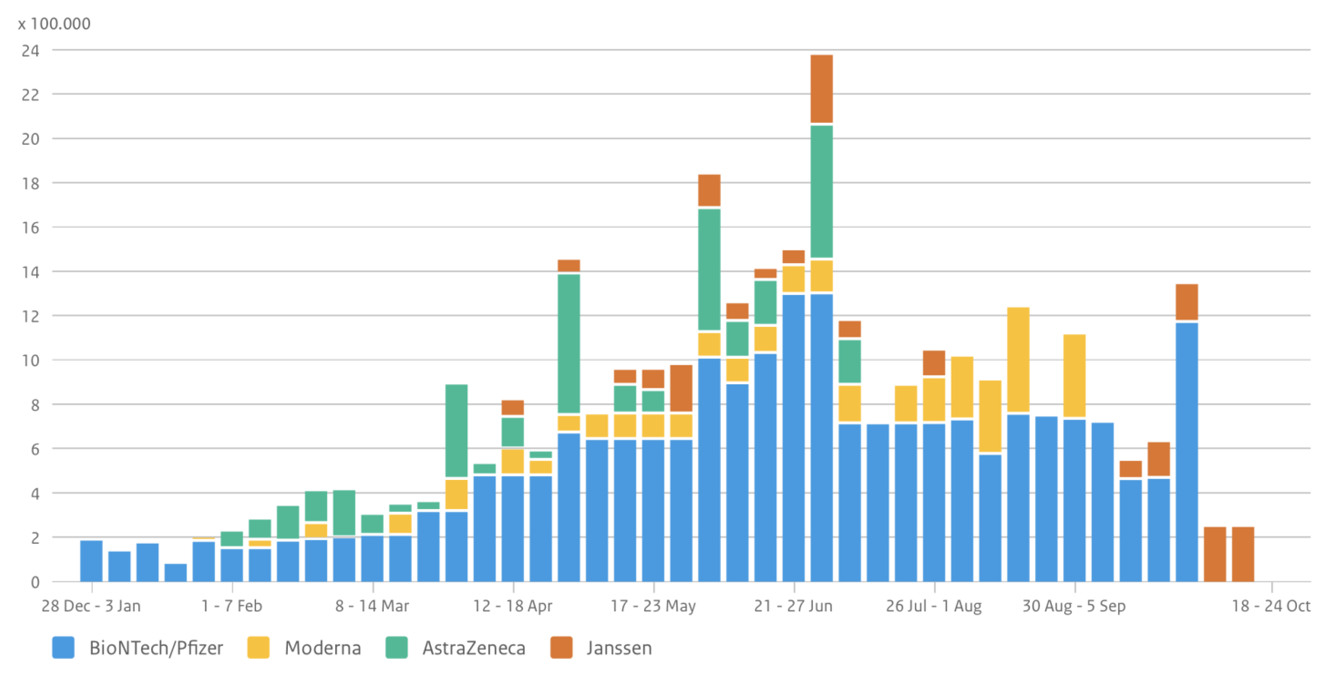
Figure 8.
Illustration of policy stringency curve and number of cases in The Netherlands. Data sources: Official data collection by Our World in Data and RIVM. Authors’ own compilation.
Figure 8.
Illustration of policy stringency curve and number of cases in The Netherlands. Data sources: Official data collection by Our World in Data and RIVM. Authors’ own compilation.

Figure 9.
Illustration of evaluation of mobility patterns and motives during corona times in The Netherlands. Data source: Google COVID-19 Community Mobility Reports.
Figure 9.
Illustration of evaluation of mobility patterns and motives during corona times in The Netherlands. Data source: Google COVID-19 Community Mobility Reports.

Figure 10.
Illustration of a spatially disaggregated corona dashboard (city of Heerlen, Limburg). Source: The Center for Actionable Research of the Open University (CAROU), http://www.smartcity-dashboards.com, accessed on 1 July 2021. Authors’ own compilation.
Figure 10.
Illustration of a spatially disaggregated corona dashboard (city of Heerlen, Limburg). Source: The Center for Actionable Research of the Open University (CAROU), http://www.smartcity-dashboards.com, accessed on 1 July 2021. Authors’ own compilation.

Figure 11.
Illustration of integrated Dutchboard indicators on COVID-19 dynamics (2020–2021). Authors’ own compilation.
Figure 11.
Illustration of integrated Dutchboard indicators on COVID-19 dynamics (2020–2021). Authors’ own compilation.

Figure 12.
Illustrative map of corona cases of The Netherlands (as part of the spatial Dutchboard). Authors’ own compilation.
Figure 12.
Illustrative map of corona cases of The Netherlands (as part of the spatial Dutchboard). Authors’ own compilation.


Figure 13.
Illustrative map of visits to parks during different corona periods in The Netherlands (as part of the spatial Dutchboard). Authors’ own compilation.
Figure 13.
Illustrative map of visits to parks during different corona periods in The Netherlands (as part of the spatial Dutchboard). Authors’ own compilation.

Publisher’s Note: MDPI stays neutral with regard to jurisdictional claims in published maps and institutional affiliations. |
© 2022 by the authors. Licensee MDPI, Basel, Switzerland. This article is an open access article distributed under the terms and conditions of the Creative Commons Attribution (CC BY) license (https://creativecommons.org/licenses/by/4.0/).
Share and Cite
MDPI and ACS Style
Nijkamp, P.; Kourtit, K. Place-Specific Corona Dashboards for Health Policy: Design and Application of a ‘Dutchboard’. Sustainability 2022, 14, 836. https://doi.org/10.3390/su14020836
AMA Style
Nijkamp P, Kourtit K. Place-Specific Corona Dashboards for Health Policy: Design and Application of a ‘Dutchboard’. Sustainability. 2022; 14(2):836. https://doi.org/10.3390/su14020836
Chicago/Turabian StyleNijkamp, Peter, and Karima Kourtit. 2022. "Place-Specific Corona Dashboards for Health Policy: Design and Application of a ‘Dutchboard’" Sustainability 14, no. 2: 836. https://doi.org/10.3390/su14020836
Note that from the first issue of 2016, this journal uses article numbers instead of page numbers. See further details here.