Multilevel Visualization of Travelogue Trajectory Data

1
Department of Electronic, Electrical and Communication Engineering, University of Chinese Academy of Sciences, Beijing 100190, China
2
The Key Laboratory of Technology in Geo-Spatial Information Processing and Application System, Institute of Electronics, Chinese Academy of Sciences, Beijing 100190, China
*
Author to whom correspondence should be addressed.
ISPRS Int. J. Geo-Inf. 2018, 7(1), 12; https://doi.org/10.3390/ijgi7010012
Submission received: 24 October 2017
/
Revised: 20 December 2017
/
Accepted: 22 December 2017
/
Published: 3 January 2018
(This article belongs to the Special Issue Discovery and Prediction of Moving Objects in Databases using GIS-based Tools)
Abstract
:User-generated travelogues can generate much geographic data, containing abundant semantic and geographic information that reflects people’s movement patterns. The tourist movement patterns in travelogues can help others when planning trips, or understanding how people travel within certain regions. The trajectory data in travelogues might include tourist attractions, restaurants and other locations. In addition, all travelogues generate a trajectory, which has a large volume. The variety and volume of trajectory data make it very hard to directly find patterns contained within them. Moreover, existing work about movement patterns has only explored the simple semantic information, without considering using visualization to find hidden information. We propose a multilevel visual analytical method to help find movement patterns in travelogues. The data characteristic of a single travelogue are different from multiple travelogues. When exploring a single travelogue, the individual movement patterns comprise our main concern, like semantic information. While looking at many travelogues, we focus more on the patterns of population movement. In addition, when choosing the levels for multilevel aggregation, we apply an adaptive method. By combining the multilevel visualization in a single travelogue and multiple travelogues, we can better explore the movement patterns in travelogues.
1. Introduction
Travel is becoming an important lifestyle element. When people visit a tourist attraction, some choose to write a formal and formatted article to record their travel details, called a travelogue. Of all the information contained in a travelogue, the trajectory is very important for helping to understand movement patterns. Travelogues generated by personal experience contain many travel activities in related cities. For example, by finding the movement pattern through the districts of a city, we can find which districts lie on the most popular travel route. The trajectory data in travelogues might include tourist attractions, restaurants, shopping destinations and other locations. Besides, all travelogues generate a large volume of trajectory data. The variety and volume of trajectory data make it very hard to directly find patterns.
How can these data be explored? We can use related information extraction techniques or trajectory extraction techniques to get the trajectory information in a travelogue. Then, we can use trajectory data visualization to interrogate the trajectory information in the travelogue for movement patterns. According to Andrienko et al. [1], the methods to visualize trajectories can be divided into three categories: direct visualization directly draws the trajectory; clustering visualization summarizes the data with some view or attribute, such as a timestamp, then draws the aggregated data; feature visualization finds patterns or events, then draws them. We combine these methods and the characteristics of travelogue data to develop methods of visualization. When it comes to travelogues of a region, our aim is to explore patterns of movement of populations. However, when looking at a single travelogue, we pay more attention to semantic information of movement patterns. Therefore, we separate the trajectory data into two types. The first type is the trajectory of a single travelogue, and the second type is the trajectory of a vast travelogue. The trajectory of a single travelogue means that there is only one trajectory sequence with one user in a single travelogue. The trajectory in a vast travelogue means that there are many trajectory sequences with many users. We propose visualization methods for these two data types, to help explore the movement patterns.
For the trajectory of a single travelogue, the trajectory graph is scattered and sparse in general, but dense in some areas. This is because people always choose an area to travel to that is far away, then a small tourist region around the main tourist center. Existing work to explore the semantic patterns in a single travelogue is most about the cluster method.lAnkerst et al. [2] used the clustering algorithm OPTICS for clustering the trips, while Wan et al. [3] used different similarity measurement to extract the semantic trajectory pattern. However, the trajectory data in a travelogue are the sequence of positions, without a concrete time of arrival. There is no way to apply other data mining techniques. Therefore, after detecting a region of interest, we need a visual analytic method to find more hidden information. Specifically, we use a trajectory compression method to reduce visual confusion and explore the data further.
For the trajectory of a vast travelogue, the trajectory graph is intensive, not only in general, but also in detail. At the same time, the trajectory lines cross each other. This is because of the different interests of different people. The trajectory of individuals is scattered. It is hard to explore these data using direct visualization. Therefore, we introduce edge bundling to solve the visual confusion. Next, we use an aggregation method with different attributes to find population-level patterns of movement.
Scales are a convenient abstraction for a fundamental task in visualization, mapping a dimension of abstract data to a visual representation. The scale of a map is the ratio of distances on paper to distances of real-world objects being mapped [4]. The map scale is the basic spatial interaction in visualization. The scale is more applicable for materialized representations, such as paper maps, rather than spatial data in a computer representation [5]. Although a map scale is convenient for exploring spatial data on a map using spatial visualization, it is not sufficient to reduce visual confusion of large and differentiated spatial data. To explore spatial data, we need to connect the value characteristics of attributes with map interaction. We note that multilevel visualization is a common way to process big data [6]. The scale of spatial data means that it is necessary to map it to several levels by the scale function on data attributes. The plotting scale chooses the function for mapping the original range to the currentrange. It is a common term in measuring or CAD drawing. For continuous quantitative data, a linear scale is typically required. If the distribution calls for it, a power or log scale can be considered to transform the data. However, the distribution of these discrete attributes is not suited to finding the cutoff point by a regular math function. Therefore, we have designed an adaptive scale using a clustering method in order to get a better cutoff point that reflects the data characteristics.
Based on the above discussion, the main contributions are as follows:
- We propose a visual analytic framework for trajectory data with large volume and variety, by considering the characteristics of the travelogue.
- We propose a multilevel visualization method to explore individual movement patterns and population movement patterns in travelogues.
- We propose an adaptive plotting scale for choosing the cutoff point in multilevel visualizations to help find movement patterns.
2. Related Work
Some related work focuses on mining travelogue data, while most work is concerned with understanding the content of travelogues. Wang et al. [7] used a location-aware topic model to study the relationship between locations and words. For location information, Pang et al. [8] proposed a framework to summarize tourist destinations by connecting the travelogues and photos with location tags. With regards to the location structure view of travelogues, Zhu et al. [9] discovered the relations between a geographic entity and the semantic relationship. When mining trajectory data, the noise filter is a critical component. A mean filter and the Kalman filters [10] can be used to filter noise. For outlier detection, Lee et al. [11] proposed a novel partition-and-detect framework for trajectories. For trajectory classification, a branch of research uses time period information to detect trajectory patterns. Patel et al. [12] focused on the classification problem and introduced duration information to classification.
Few existing works target solving the problem of making sense of trajectory data in travelogues. Bakshev et al. [13] presented a framework to provide meaningful representations of trajectories, while Krueger et al. [14] used GPS data to analyze movement behaviors. However, the trajectory of a travelogue has a large volume and variety and contains sparse information that cannot be fully explored by data mining techniques. We need visualization techniques to explore the hidden information further.
When visualizing the trajectory data as only origin-destination data, some origin-destination [15] analysis methods can be applied. A flow map uses a real map to show origin and destination flow as a graph [16]. It clearly represents the spatial features of origin-destination flows. Alternatively, an origin-destination matrix [17] visualization can be used for visualization of the origin-destination data. The matrix separates origin-destination pairs from a map and uses a matrix to show the patterns of origin-destination flows. However, travelogue data cannot be visualized as origin-destination data, because when people travel to a city, the origin and destination are usually the same place. Furthermore, the locations visited between origin and destination are necessary to explore movement patterns. Therefore, flow maps can be a part of the visualization of the trajectory, but are not sufficient by themselves.
For a large trajectory dataset, edge bundling was used to reduce visual clutter. In the geometry-based edge bundling method [18], a control mesh guides the edge-clustering process. Edge bundles are formed by forcing all edges to pass through the same control points on the mesh. The force-directed technique is the common method in graph drawing. Holten et al. [19] proposed a Force-Directed Edge Bundling (FDEB) algorithm . This algorithm takes edges as flexible springs that attract each other. When two edges are compatible, the attractive force between is comparatively large. Its advantage is that it builds smooth bundles. Gansner et al. [20] proposed a multilevel agglomerative edge bundling method based on the principle of minimizing the ink needed to represent edges, with additional constraints on the curvature of the resulting splines. The proposed method is much faster than previous ones, able to bundle hundreds of thousands of edges in seconds. By connecting multilevel agglomerative edge bundling with multilevel aggregation methods, the flow map can be shown when the number of levels is high.
After solving the problem of visual clusters in large trajectories, we applied a trajectory compression technique to tackle the visual confusion of intensive regions. The Douglas–Peucker [21] is the most classical method to compress trajectories. Other works, like that of Chen et al. [22], have presented a fast, multiresolution, polygonal approximation algorithm for trajectory simplification. Klein et al. [23] used several image-based visualization techniques, including animation, density maps and bundled graphs, to show the flight data.
3. Data Processing
We crawled 10,349 travelogues using the crawler from the XieCheng website [24]. Next, we extracted the text information in the header of the travelogue. These text data included departure time, duration days, travel itinerary, etc. After getting the text information, we transformed it to a more usable format. To obtain trajectories from geographic data, we took the travel itinerary, which is composed of a series of sites, as the trajectory. Although we directly used the travel itinerary as the trajectory, avoiding the effort of extracting the trajectory from the travelogue content, there are also two major problems in data processing. Firstly, there is a lot of noise in the trajectories, because the travelogue has been written from memory. The noise is mostly a result of the site list in trajectories having the wrong time order. For massive travelogue visualization, the noise can be ignored because the data magnitude can cover the noise. However, for a single travelogue visualization, the noise is striking. In this case, we used the basic clustering method to build a simple principle for outlier detection. We removed the outliers according to the data characteristics of a single travelogue in which the trajectory is composed of a main spot surrounded by many small spots. Secondly, with regard to parsing the geographic text, we used the Google GeoCoding API to get the geographic information, including detailed administrative geographic information. Disambiguation is required when translating the geographic text to site with GPS location. Ambiguity mostly arose from short names, like a chain store or chain hotel. When parsing these chain sites, we added the region it belongs to, using the common administrative region of the previous site and next site. For data cleaning, we set the geographic bounding box of a specific area, such as Taiwan, in our project. Finally, we obtained the formatted travelogues containing departure time, duration days and travel trajectory.
4. Design Consideration
4.1. Data Characteristic
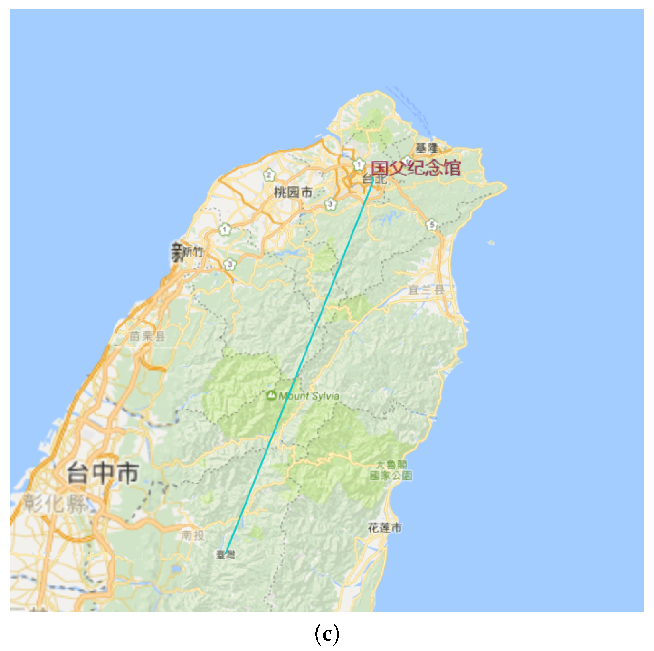
In this section, we define the travelogue trajectory. Definition (travelogue trajectory): A trajectory in a travelogue is a discrete trace that the moving object travels in geographical space. Generally, it is a sequence of geo-locations with corresponding timestamps in spatio-temporal space.
We have identified some unique features of travelogue data in order to design a visual analytic method for exploring the data.
In a single travelogue, the features are as follows:
- Trajectory with semantic information: When people travel to a place, they always choose a region and wander around this region. Then, they take a coach or train to the next region. The semantic information in a trajectory is very important to show the movement patterns of a trajectory.
- Intensive region of interest: The primary data characteristic is that the trajectory graph is scattered and sparse in general, but dense in some center area. This feature leads to comparatively large numbers of lines in the intensive area. When the intensive area holds over twenty sites, the trajectory in this area in too dense to explore. This characteristic arises because people always choose some key or famous spot in a region to constitute the skeleton of their trajectory, and these main tourist attractions are far away. On arriving, people always choose small tourist sites around the primary tourist site.
In a vast travelogue, the features are as follows:
- Large amount of trajectory data and wide geographic coverage: The number of travelogues is large. Every traveler has his/her own interests and considerations. It is a big challenge to visualize the large numbers of trajectories and keep the geographic information to explore the movement patterns or help travel route planning.
- Many types of sites and messy trajectory: Trajectory data in a travelogue might include tourist attractions, restaurants, shopping destinations and other locations. Therefore, it is not a good idea to visualize the trajectory directly. At the same time, the number of sites in a trajectory is very variable. It is not appropriate to compare the movement patterns between a trip that lasts two days and a trip that lasts two weeks.
4.2. Visual Analytical Framework
Hence, our goal was to design a method to explore movement patterns according to the features of the data. We combined visualization methods to handle the extensive trajectory data with methods like clustering and filtering to handle the messy trajectories from the following perspectives:
- For trajectories in a single travelogue, the trajectory lines are dense in detail, but sparse in in general. Firstly, for the semantic movement pattern, we clustered the trajectory data to get the region of interest, which is the main area. Although there are many machine learning methods to mine the semantic information, the information in a trajectory only uses GPS. It is better to use the cluster method to get the clustering area. Secondly, for exploring the hidden information after ROI detection, we used the trajectory compression algorithm to reduce visual confusion of regions of interest. Besides, for detailed information, we obtained the scale from the compression algorithm, then used the multilevel trajectory compression method to visualize the single travelogue trajectory data in multilevel views.
- For trajectories in a vast travelogue, the trajectory lines are dense, not only in general, but also in detail. At the same time, the trajectory lines always cross each other. It is hard to explore these data using direct visualization. For the density and line intersection problems, we used an edge bundling algorithm. Furthermore, we applied data filtering through temporal filtering or spatial filtering to reduce visual confusion about volume. Next, we applied the aggregation method to solve the problem of messy trajectories. We designed three aggregation visualization methods to explore population movement patterns. For an administrative view of all kinds of location, we firstly aggregated the trajectories at the administrative level to identify which two cities were the most popular trajectory. This method categorizes the messy trajectories into administrative regions. Next, we designed a multilevel method to explore the pattern in the view of the hottest site. Finally, we developed a multilevel method to view the hottest trajectory.
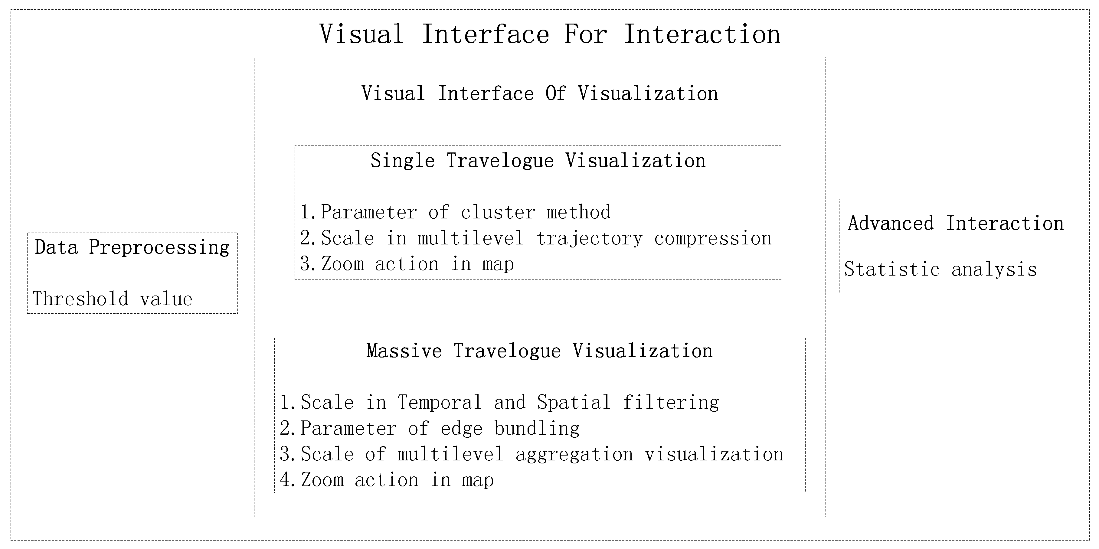
To achieve our goal, we have proposed a visual analytical pipeline with the following components. In Figure 1, we can see the steps of the pipeline.
- Data preprocessing: In this step, we use information extraction techniques to extract related information about a travelogue, then parse the geographic text into GPS location and clean the data to put it into a formatted structure.
- Spatial temporal visualization: In this step, the user can apply interactions to filter according to some attributes like trips days, trip time and trip site. For example, they can choose the trips in September to filter the travelogues.
- Massive travelogue visualization: In this step, we first use multilevel edge bounding to simplify the massive travelogue. Next, we propose an adaptive plotting scale according to the data distribution to choose the plotting scale in multilevel dynamic aggregation. Finally, we develop three aggregation methods to explore the movement patterns. These three aggregation methods can also help travel route planning.
- Single travelogue visualization: In this step, we first use the cluster method to cluster the trajectory to several interest regions. Then, for solving the problem of many lines in the dense regions, we use the trajectory compression method to simplify these trajectories. We also extract the scale in the trajectory compression to show the trajectory in a multilevel way.
- Movement pattern exploration: In this step, we can use the methods like filtering and data aggregation to interact with travelogues and explore movement patterns. For example, we can know which trajectory between two districts is the hottest in October.
5. Single Travelogue Visualization
People tend to choose some known areas as their main plan, and these areas are far away. Then, people always prefer small tourist sites around these primary tourist places to enrich their trip schedule. For example, when we want to travel to Australia, we firstly choose a famous spot like Sydney Opera House, the Gold Coast or St. Paul’s Cathedral in Melbourne as an important part of our schedule. When we arrive to these popular spots, we randomly choose local attraction around the main spot to visit. This phenomenon causes the characteristic that the trajectory graph is scattered and sparse in general, but dense in some central area. For the semantic information, we need to get the main tourist attractions areas.
5.1. Region of Interest Detection
In region of interest detection about travelogue trajectories, the attributes of the trajectory are only the GPS locations of the points on the trajectory. We used unsupervised learning to get the main regions, based on travel location clustering. There are many cluster methods to get the region of interest. Common cluster method like k-means or k-medoids provide a basic clustering result. However, these partition-based methods are sensitive to initialization of arguments and noise. Density-based methods can also be applied to detect ROI, such as DBSCAN and OPTICS. Ankerst et al. [2] used OPTICS to cluster trips. Compared with a partition-based method, it is less sensitive to noise. However, it is also sensitive to initialization of arguments. Chen et al. [25] used a fuzzy clustering method, the Gaussian mixture model, for movement semantic analysis. The fuzzy clustering method allows some movements to be considered as noise, while it needs to set the clustering number. Considering the unknown categories, we chose the well-known mean-shift algorithm [26] to get the main regions of a single trajectory. The mean-shift is a non-parametric cluster analysis method that shifts to a clustering area. Mean-shift is always used in trajectory pattern mining [27]. The advantage of the mean-shift method the kernel that means different values of features lead to different contributions to the center point. However, the clustering method is not the key point in our work, and clustering methods such as GMM, OPTICS and mean-shift can also be applied to detect ROI. Finally, the argument of the cluster method can be the parameter of the visual interface to be adjusted through interaction.
5.2. Multilevel Trajectory Compression
We chose the mean-shift algorithm to get simple semantic information to explore movement patterns in a single travelogue. However, the ROI is so dense in the visualization that we cannot find more hidden information. For exploring the more hidden information after ROI detection, we proposed a multilevel algorithm to help us interact with the trajectory data. After we get a rough sketch of the trajectory, we used the Douglas–Peucker [21] trajectory compression algorithm to reduce visual confusion in the region of interest. The algorithm recursively divides the line. Initially, it is given all the points between the first and last point. It automatically marks the first and last point to be kept. It then finds the point that is furthest from the line segment with the first and last points as end points; this point is obviously furthest on the curve from the approximating line segment between the end points. The maximum distance between the points and the line segment is the value for multilevel. With regard to the multilevel visualization, we extracted the maximum value in every recursion and took these value as the scale to set the epsilon.
From Figure 2b, we find that the line is intensive in the cluster area. However, the result of the cluster is too simple and cannot reveal the detail of the trajectory in the cluster area (see Figure 2c). Therefore, we applied the trajectory compression algorithm to simplify the original graph. At the same time, we extracted the temporal epsilon from the process of compression.
To find the scale during the process of compression to make the multilevel visualization, we changed the Douglas–Peucker algorithm by directly setting the epsilon to zero and using the list to save the temporal maximum distance (see Algorithm 1 ScaleDouglasPeucker). This algorithm has a worst-case time complexity of O().
6. Vast Travelogue Visualization
Different tourists have different interests in traveling. When people visit the same country or city, such as Japan, most sites in this country will be visited, not just the famous sites. This phenomenon is in accordance with the data characteristic of trajectories in a vast travelogue, which appears intensive in all places. When we directly visualize these trajectory data, we find that the lines are staggered, and the points are scattered across all maps. To solve the line intersection, we used an edge bundling algorithm to reduce visual confusion.
| Algorithm 1 Scale Douglas–Peucker. |
|
In the geometry-based edge bundling method [18], the control mesh guides edge bundling with similar edges. The Force-Directed Edge Bundling (FDEB) method [19], which is based on the forced-directed algorithm, was also used to cluster the edge with the springs. However, traditional edge bundling algorithms lack multilevel interaction for massive data. Gansner et al. [20] proposed a multilevel edge bundling algorithm based on the force-directed edge bundling algorithm. Their algorithm offers many parameters to interact with a massive graph in multilevel visualizations. The most important parameter for us is the parameter to resize the edge similarity. The largest value of this parameter can leads to flow maps of the graph. However, it is far from enough. The trajectories are composed of tourist attractions, restaurants, shopping destinations and other locations. They are messy data, which means we cannot directly explore the movement patterns. We require aggregation visualization methods to solve the problem. Thus, we propose three aggregation visualization methods to understand the trajectories in travelogues and help travel route planning. In the multilevel aggregation visualization, we need a good plotting scale. We designed an adaptive plotting scale algorithm to help us choose the cutoff point for multilevel visualization. Finally, it is common to understand the data from the time dimension and the space dimension, because of the characteristics of spatial-temporal data.
6.1. Edge Bundling
Vast travelogue trajectories lead to large graphs. When visualizing these trajectories on a map, there is too much visual clustering on large graphs. Edge bundling is an effective methods to reduce visual confusion and reveal high-level edge patterns. The first method suitable for general undirected layouts was Geometry-Based Edge Bundling (GBEB) [18]. In GBEB, a control mesh guides the edge-clustering process. The principle of edge bundling is to force edges to pass through the same control points on the mesh. The force-directed techniques is the most common method for graph drawing. Holten et al. [19] proposed the Force-Directed Edge Bundling (FDEB) algorithm. This algorithm take edges as flexible springs that attract each other. When two edges are compatible, the attractive force between is comparative large. This leads to smoother bundles that are easier to read. Gansner et al. [20] proposed a multilevel agglomerative edge bundling method based on an approach of minimizing the ink needed to represent edges, with additional constraints on the curvature of the resulting splines. The proposed method was much faster than previous ones, able to bundle hundreds of thousands of edges in seconds. An edge proximity graph G can be constructed in time . We decided to use the multilevel agglomerative edge-bundling method to cluster large numbers of trajectories.
6.2. Multilevel Aggregation Procedure and Adaptive Plotting Scale
Data aggregation is any process in which information is gathered and expressed in a summary form for purposes such as statistical analysis. A common aggregation process is to get more information about particular groups based on specific variables such as age, profession or income. Aggregation visualization is a common method to reduce the visual confusion of big data. Chen et al. [25] aggregated WeiBo in one place. They extract the number of visits, unique visitors and the average time interval of the movement in/out of a place.
Generally, aggregation of travelogue trajectory data leads to a sequence of geo-locations with corresponding attributes in spatio-temporal space. Formally, indicates a place with the name and attributes , e.g., {<Hawaii, (State) >}. After the basic statistical process, we can get other attributes of the place, such as visiting times. The aggregation of specific attribute transforms the value of these attributes into one category. For the trajectory sequences , we get after aggregation. For example, for a trajectory with <Honolulu,(City)>,<University of Hawaii,(Street) >,<Anchorage,(City)>, if we aggregate the trajectory on administrative level with State, we get Hawaii,<Honolulu,(City)»,<Hawaii,<University of Hawaii,(Street)»,<Alaska,<Anchorage,(City)».
The aggregation of data combines large data by one attribute, while multilevel aggregation aggregates at multiple levels. For a single trajectory sequence, we can obtain several sequences with different levels. Formally, for the trajectory sequences , we have after aggregation, where denotes category kwith level li. For example, for a trajectory with <Honolulu,(City)>,<University of Hawaii,(Street) >,<Anchorage,(City)>, with multilevel aggregation at the administrative level, we get the levels of State, City, Town, Street. Using the State administrative level, we get Hawaii,<Honolulu,(City)»,<Hawaii,<University of Hawaii,(Street)»,<Alaska,<Anchorage,(City)». Using the city administrative level: Honolulu,<Honolulu,(City)»,<Honolulu,<University of Hawaii,(Street)»,<Anchorage,<Anchorage,(City)».
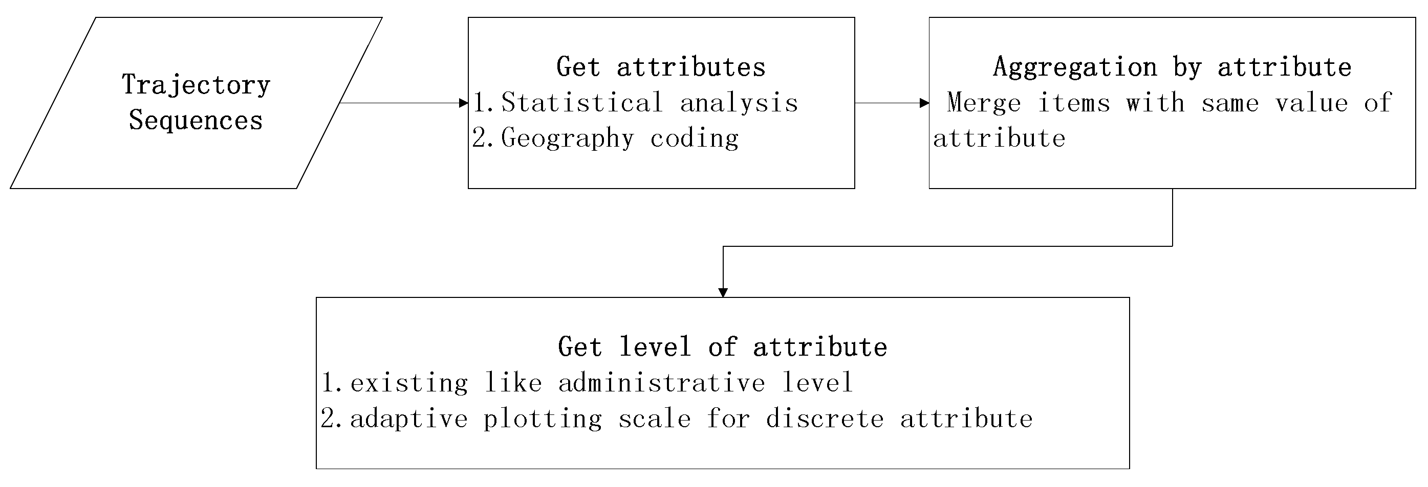
The important part is how to find the level division. With regards to aggregation using attributes of the administrative level, it is convenient to map the location names to the administrative level. With regards to common attributes with a value, level division need a plotting scale with statistical analysis. Firstly, we get all the possible values of the attributes, then use the plotting scale to map them to a given range of categories. For example, for aggregation of the hottest site, the attribute might refer to the number of times a place occurs in the trajectories. We get all values of visiting times as a list and use a linear scale to put the value range into several categories. Figure 3 is the flowchart that shows the multilevel aggregation procedure.
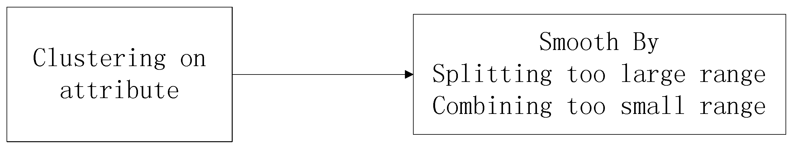
Traditional scales use a mathematical function to map an input domain to an output range. The choice of function is determined by the data distribution. However, the data do not always conform to any standard distribution. In this case, we need a method to find a good cutoff point according to the data distribution. This is when the data between the two cutoff points display similar characteristics. That principle is in accordance with the cluster method. We used the cluster method to choose the cutoff point in the multilevel case. Figure 4 shows the procedure for adaptive scales; smoothing on the range length is applied after the cluster method.
6.3. Aggregation in the Time Dimension
First, we aggregated the trajectory data in the time dimension. The time information about the travelogue is departure time and duration days. We formatted the departure time and aggregated by month. For the visiting days, we aggregated the days to the classic periods of the 3–5 days, 6–12 days, 12–20 days or over 20 days.
6.4. Aggregation in the Space Dimension
About these spatial data, it is obvious that the administrative level is the most important view. Then, we take all the trajectories as the trajectory network on the map. Naturally, the point weight and the line weight are our concern. Therefore, we aggregate the data by hottest site and hottest trajectory.
6.4.1. Aggregation by Administrative Region
We found the trajectory data of travelogues, then aggregated them at the administrative region with two levels. The first level was for the country or city and the second for the district and town. By aggregating the trajectory data in this way, we could better understand the data. Most importantly, this method partly solved the problem of data variety. We sorted the spatial data from the administrative level, then we could explore the movement patterns at the same administrative level.
6.4.2. Aggregation by Hottest Site
We extracted trajectories from all travelogues, then sorted the location by its frequency, which we interpreted as its popularity. By taking all trajectories as the trajectory network on the map, we explored the population movement pattern from the spatial point of view. After aggregating the data by hottest site, we could explore the popularity of the site. Based on this visualization, we could better explore patterns for the site.
6.4.3. Aggregation in Hottest Trajectory
We extracted trajectories from all travelogues, then sorted the trajectories by frequency, which we took as a measure of popularity. Taking all trajectories together as the trajectory network on the map, we explored the movement patterns from the spatial view. After aggregating the data in the hottest trajectory, we explored the popularity of the trajectory. Based on this visualization, we could better explore the trajectory patterns.
7. Interaction
Many parameters for a map can be changed interactively, apart from the zoom. However, the visual interactive interface was not our main work.
When we select a space using a box, we get a limited area. We can use the statistical methods like frequency statistics to show information in this area. From this simple statistical interaction, we can know which city is the hottest and which trajectory is the hottest.
Figure 5 shows the places with which we can interact. In data preprocessing, we can interact via the threshold value when tackling the noise of the data. In a single travelogue visualization, the first choice is which cluster method to use and the parameter to choose. Afterwards, we can change the scale in the multilevel trajectory compression. We can also zoom in and out of the map. In a vast travelogue visualization, the most basic thing is to choose the parameter for temporal and spatial filtering. Besides, the choice of the parameter for edge bundling is also important. Moreover, we can change the scale of multilevel aggregation visualization. Last but not least, we can zoom into and out of the map. Apart from the above interactions, advanced statistical analysis can be applied to the visual analysis. When we select a space using a box, we get a limited area. We can use the statistical tool to show the data in this area. From this simple statistical interaction, we can know which city is the hottest and which trajectory is the hottest.
8. Experiment
We applied our multilevel visual analytical methods to the trajectory data of all travelogue data about Taiwan from the XieCheng website. Our hardware was equipped with a CPU:i3-2350M and GPU:AMD Radeon HD 7050M. The number of travelogue documents was about 5000, which produced a graph with 53,240 edges. Table 1 shows the time spent by our methods.
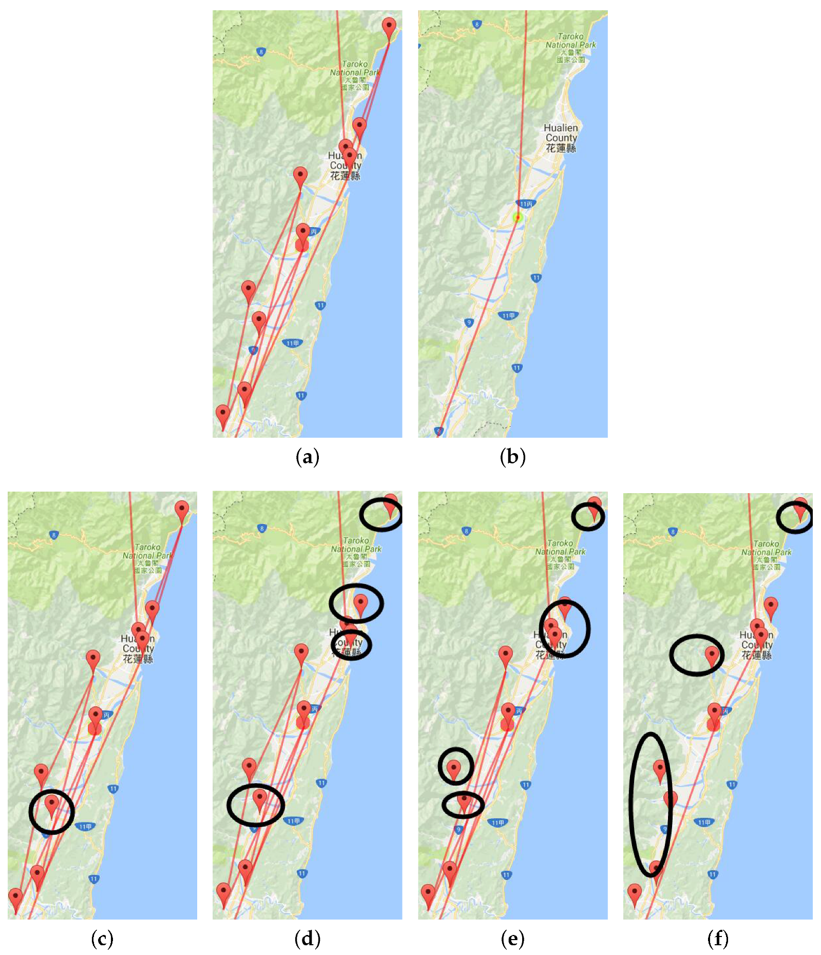
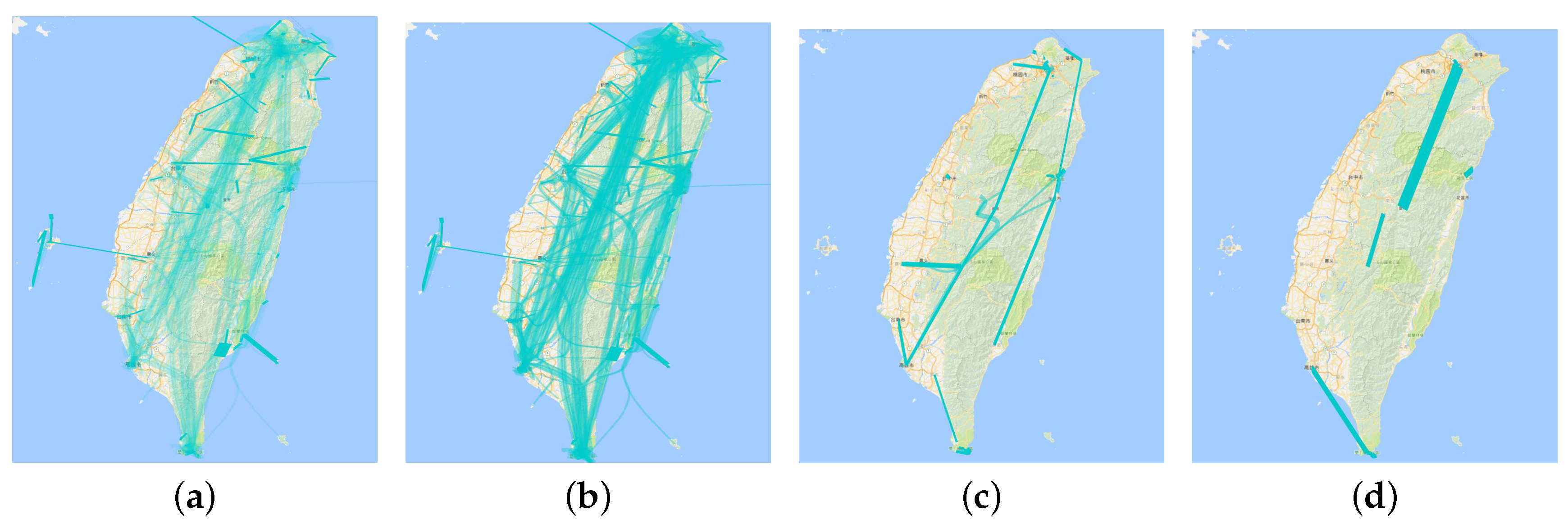
8.1. Multilevel Trajectory Compression
Figure 6a shows the original trajectories in the Hualien region from a travelogue. We see that lines are too thick here. We used the multilevel trajectory compression method to reduce visual confusion. Figure 6b is the clustering result for the Hualien region in a travelogue, which is too simple. Figure 6c–f are the result of multilevel scaling by the Douglas–Peucker algorithm. From this multilevel visualization, we can further explore the hidden information of a single travelogue.
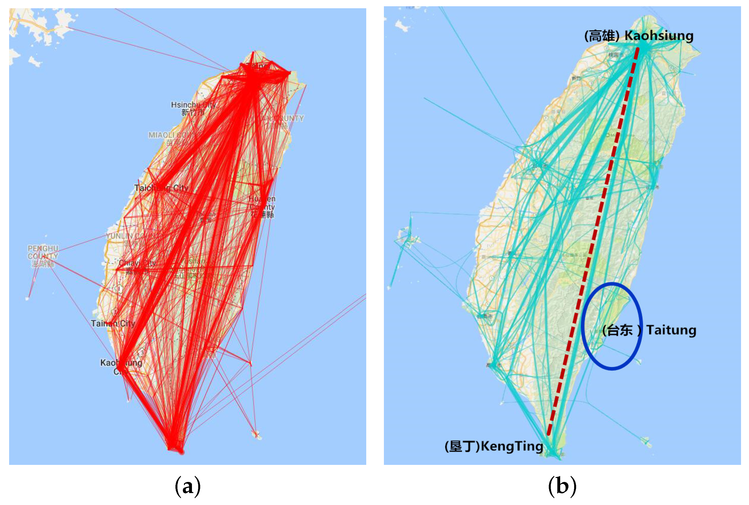
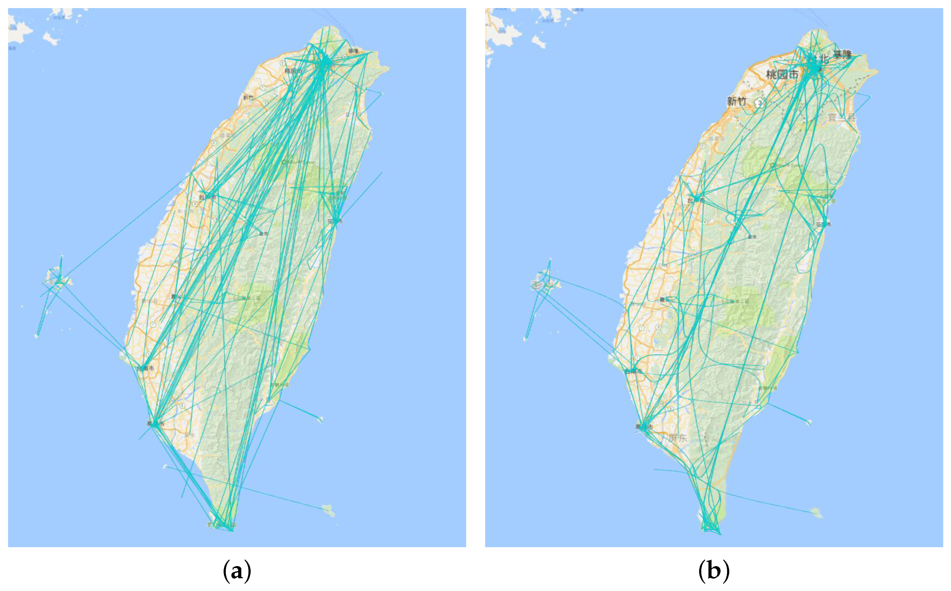
8.2. Edge Bundling
Figure 7a is the direct visualization of all travelogue trajectories, while Figure 7b is the result of edge bundling. Comparing these two figure, we can find that edge bundling can effectively reduce the visual clustering of the graph. The visual confusion that arose from line intersections has been reduced. However, the large trajectory is also in a state of chaos. Therefore, we used the aggregation visualization to solve this problem and explore the hidden information in the trajectory.
8.3. Aggregation in the Time Dimension
Figure 8a is all the trajectories for which the departure time is from June–September and visiting days are from 3–5. We find that the direct visualization is too hard to explore. Figure 8b has the same trajectory data as above while applying the edge bundling algorithm [20]. We can find that this visualization is clearer than before. Figure 8c is also the trajectory department time from June–September as above, while visiting days are from 12–20. We found that the direct trajectory from Kaohsiung to Kenting is less dense, while people chose Hualien as the stay point between the two cities when their length of visit increased. Figure 8d is the trajectory for which department time is from the September–December and visiting days are from 3–5. Comparing Figure 8b and Figure 8d, we find that the two graphs are similar, which reveals that travel in Taiwan is not much affected by month. At the same time, there is little difference in the Taitung area between winter and summer and that the number of journeys in winter is slightly more than in summer.
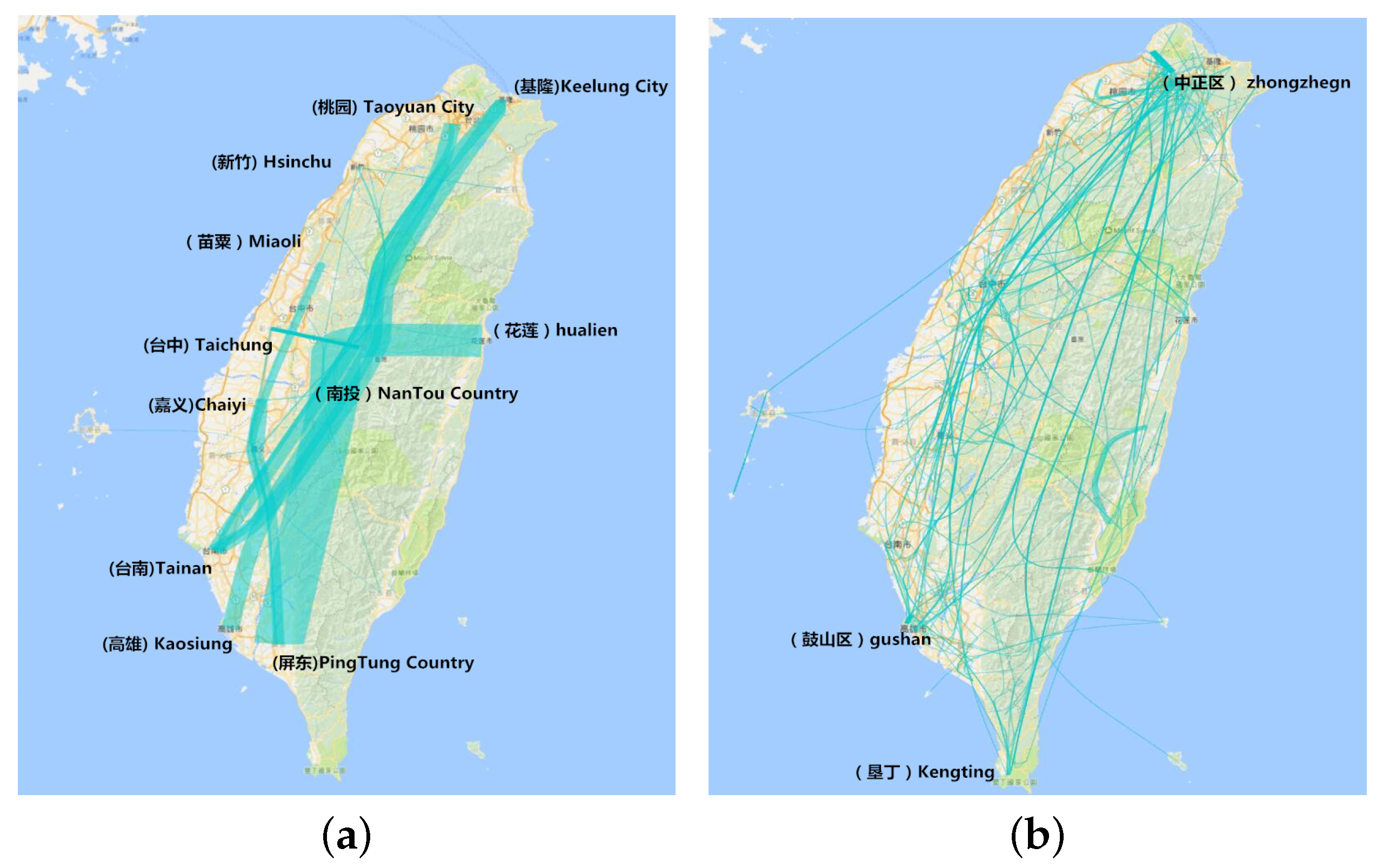
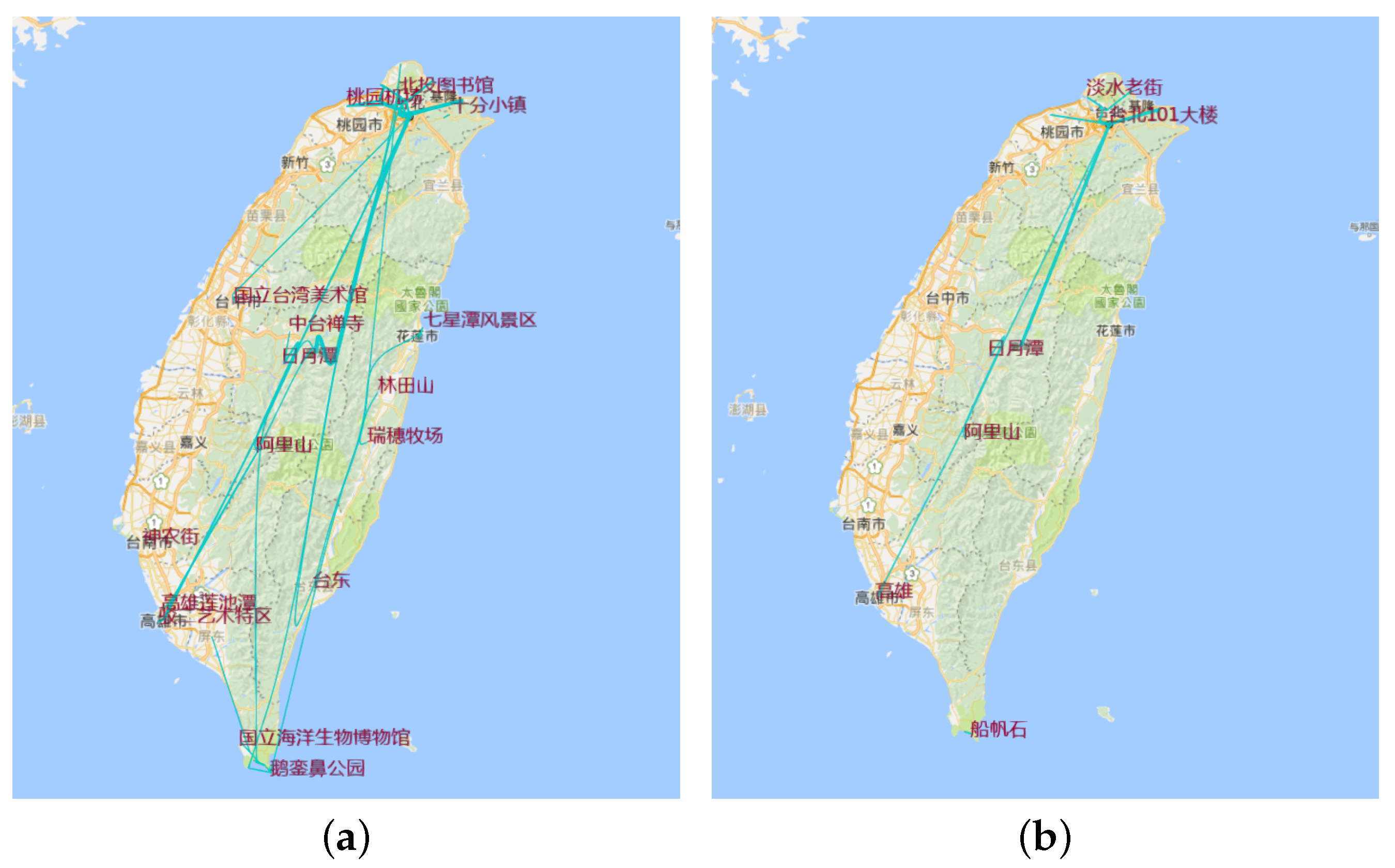
8.4. Aggregation in the Administrative Region
Figure 9a is a view of city and county data, while Figure 9b is the view of district and town data. Taiwan has 17 cities and 317 districts. From Figure 8a, we can see that the main trajectory is from Keelung city to Pingtung County. Nantou County is the hottest site because it is the middle of Taiwan. A long journey takes it a mid-point for traveling from the most northern to the southern cities, or from Hualien to the southern cities. People always visit Chaiyi, Taichung and Miaoli as the sites in the same trajectory. From Figure 8b, we find that, although Pingtuan and Taipei are the most famous cities, there are only several of the hottest districts in these towns. While Taichuang City is less famous compared to Pingtuan, the number of visits is more than that in Pingtuan. This reveals that when people go to a famous city like Pingtuan, most of them choose the hottest sites like Kenting in Pingtuan, but also visit other districts and towns in this famous city.
8.5. Aggregation by Hottest Site
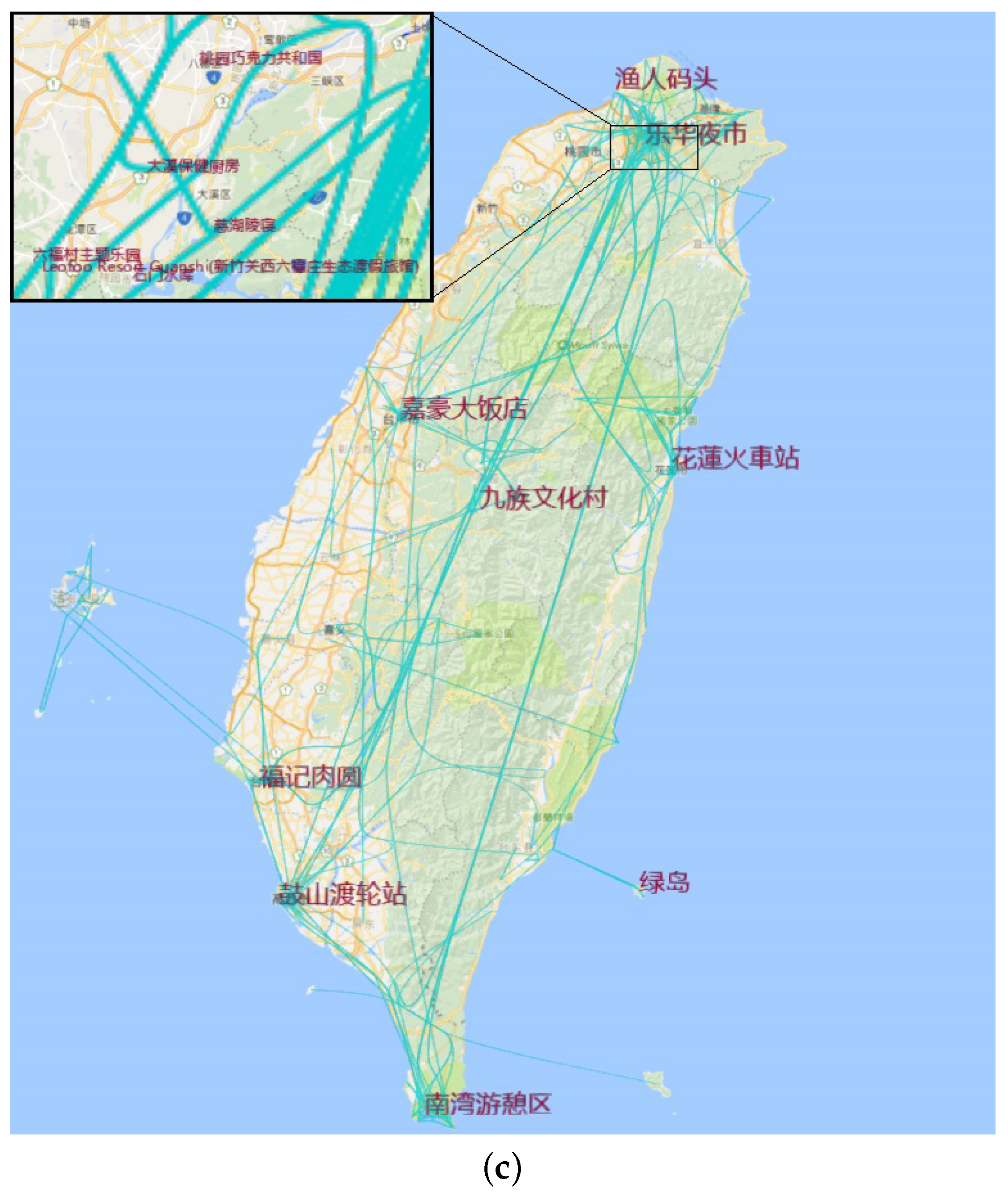
We put the number of site visits into the adaptive plotting scale and cluster the value into four range categories. Figure 10a is the trajectory composed of the scenic spots that were visited more than 652 times in all travelogues. Figure 10b is the trajectory composed of the scenic spots that were visited more than 395 times in all travelogues, Figure 10c with more than 165 and Figure 10d with more than 2. From these figures, we see that Kaohsiung, Kenting, Hualien and Keelung are the hottest cities. At the same time, Jiufen, Hsi Meng Ding and Taipei 101 are also very popular spots. When we do route planning, we can choose these hottest sites as the primary locations, then add the less hot sites like Riyuetan and Chisingtan.
8.6. Aggregation by Hottest Trajectory
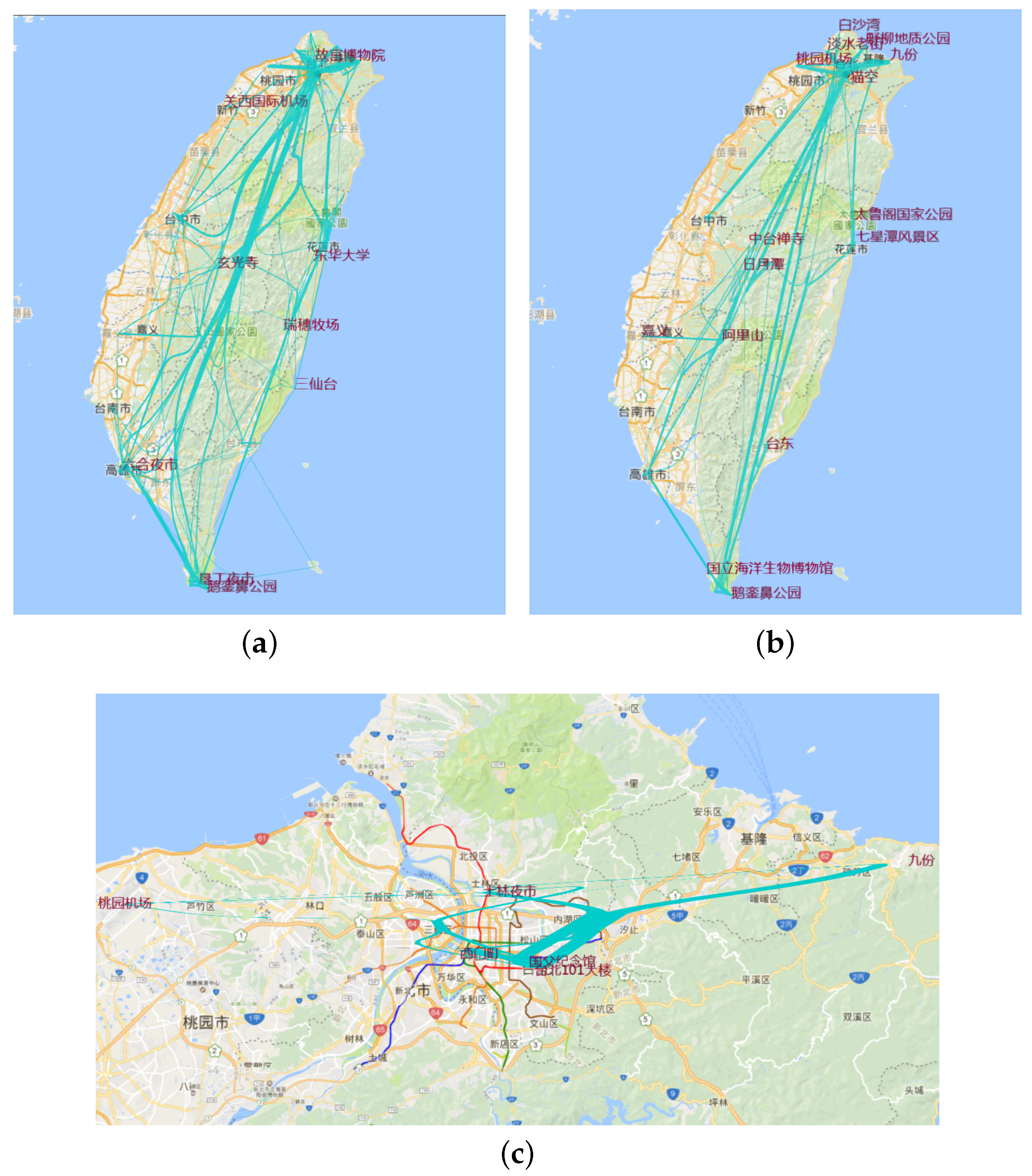
As above, we put the number of line visits into the adaptive plotting scale and clustered the values into four range categories. Figure 11a is the trajectories that were visited more than six times. Figure 11b is the trajectories that were visited more than 11 times, Figure 11c more than 47 times and Figure 11d more than 136 visits. When the filtering threshold value is 47, or 136, we find that the hottest trajectory is from the Taipei to Nantou city. The route between Kaohsiung and Kenting is also a hot trajectory.
9. Discussion
9.1. Adaptive Plotting Scale
Scales are a convenient abstraction for a fundamental task in visualization: mapping a dimension of abstract data to a visual representation. For continuous quantitative data, you typically want a linear scale and for time series data, a time dimension. If the distribution calls for it, you may consider transforming data using a power or log scale. Traditional scales use the mathematical functions to map an input domain to an output range. The choice of function is determined by the data distribution. However, the data do not always conform to any standard distribution. In this case, we need to find a good cutoff point according to the data distribution. A good cutoff point is where the data between the two cutoff points display similar characteristics. This principle is in line with the cluster method. Then, we use the cluster method to choose the cutoff point for multilevel visualization.
For the cluster method, we can choose many cluster methods as being above ROI detection. However, the data to be clustered are always one-dimensional for axis marking, so we do not need overly complex cluster methods. In any case, the cluster method is not our main work. Finally, we chose the simple K -Means methods to get the scale and to compare it with traditional plotting scales.
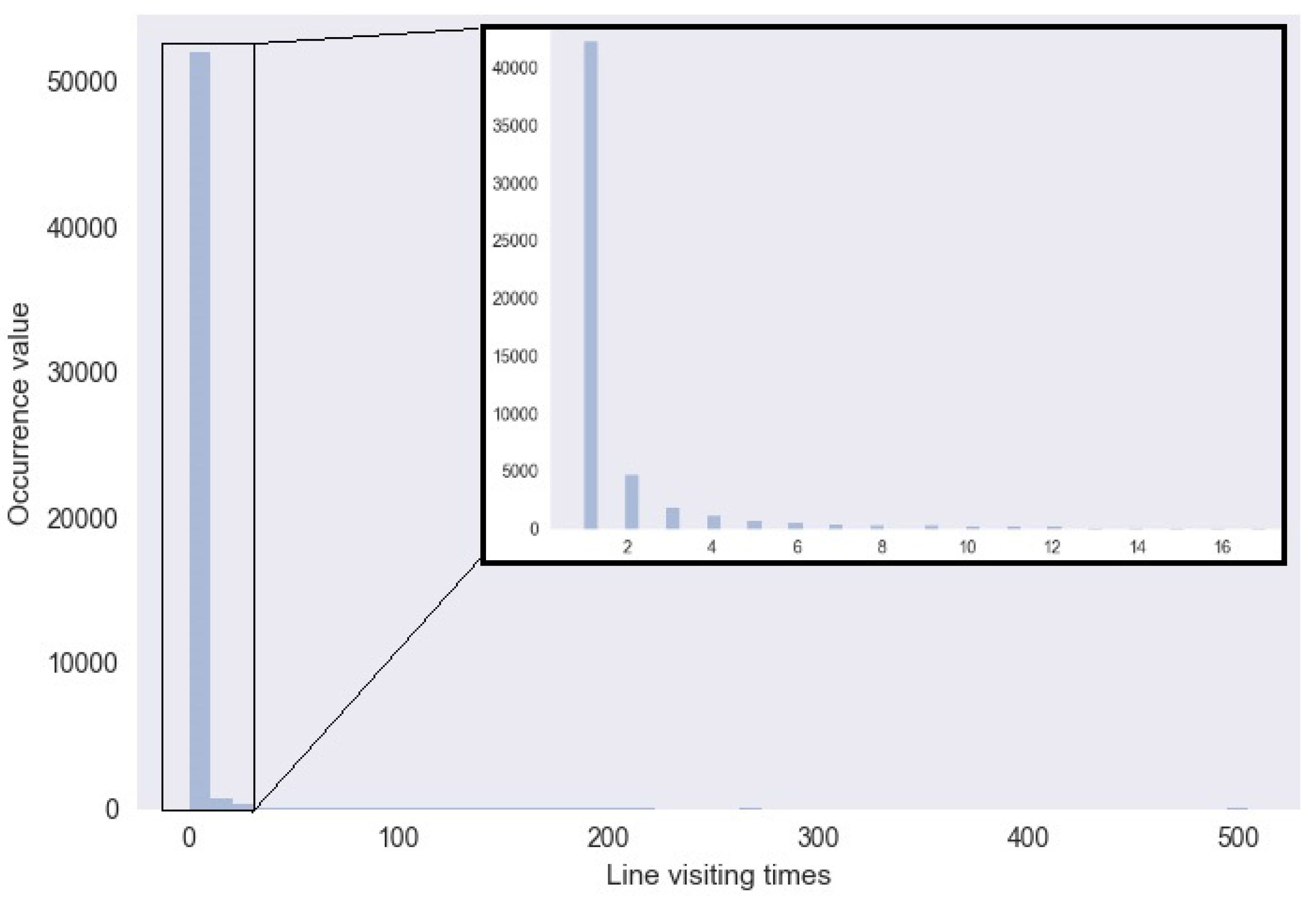
We compared our adaptive plotting scale with a traditional function scale in the aggregation of the hottest trajectory. In the original graph, the number of lines is 53,240, and line weight ranged from 1–504. The distribution of these data is similar to a power distribution (see Figure 12). Table 1 is the multilevel result by our algorithm. We used the d3.scale.linear().domain([0,504]).ticks(5) function to get a linear plotting scale (see Table 2), and Table 3 is the result with d3.scale.pow. Comparing the pow function scale with our scale (see Table 4), we find that in the first cutoff point, our algorithm shows more smoothness than the other method. At the same time, in the other cutoff points of scale, our algorithm is similar to the power scale.
We applied our algorithm to data with a uniform distribution(see Table 5). We found that cutoff points in our scale is approximately uniform.
9.2. Movement Patterns Exploration
By solving the problem of variety and volume, we can explore movement patterns more efficiently. There is some previous work about using geographic text to explore movement patterns. Siming Chen et al. [25] proposed a framework to discover movement patterns from sampled geo-tagged social media data. In the case study about the movement patterns in Taiwan, they firstly found the overall movement about Taiwan, then filtered some places of interest to find frequent routes. They also used an uncertainty model to analyze the average trip time. Comparing our work with Case Study 2 in this work, we can hold more trajectories in the maps for exploration. At the same time, they did not consider the variety of places. We used the aggregation visualization to solve the place variety. For example, when they found the frequent route between the cities Kaohsiung and Kenting, they ignored the route between Maolin District to Long Luan tamin which Maolin District belongs to Kaohsiung and Luan tam belongs to Kenting.
10. Application on Travel Route Planning
After exploring the movement patterns of the travelogue, we can use this method for travel route planning. Because route planning is a complex and personalized problem, we should take much information into account, including cost, the flight path and whether there is a good friend to visit. Although it cannot directly make the travel plan for us, it can help us understand the trajectory of other travelers to assist our route planing.
For example, we plan to travel to Taiwan, and we only have five days of vacation in September. In five days, it is comfortable to travel to about three regions. Using the time scale filter, we can get the travelogue in September and visits of 3–5 days. With these criteria, there are only 116 items with 1185 lines in all travelogues.
Firstly, let us simply do the visualization. From Figure 13, we find that trajectories are related with six hottest areas. We can explore these trajectories by zooming in on the map.
Secondly, let us aggregate these trajectories on the scale of administrative level. From Figure 14, we find the trajectories between different cities or towns. Then, we will generate thoughts about to which cities to go.
Thirdly, let us explore the hottest places in these trajectories (see Figure 15). After filtering the site by the number of multilevel hottest spots, we get the hottest place. It is useful to generate the plan of which hottest attractions to go to and choosing trajectories between the hottest points.
Fourthly, let us explore the hottest trajectories (see Figure 16). After calculating the number of times each trajectory occurs, we get a range from 1–10. Next, we use our adaptive scale algorithm to cut the range for multilevel visualization. It is beneficial for us to understand the patterns of trajectories in this area. Thus, we get the three figures.
Fifthly, let us choose a travelogue that is a journey of about five days and in September. Figure 17 is the direct visualization. It is obvious that the trajectories in the region of interest have much visual confusion. We use the trajectory compression method to make the multilevel visualization (see Figure 18). This method helps us to understand the movement patterns in this region, which benefits our routing plan.
Finally, let us combine the interactive method with the other methods, choose an area and get the hottest city and hottest trajectories dynamically.
11. Conclusions
In this paper, we propose a multilevel visualization method to explore the trajectory data in travelogues. By example in the discussion, we combined our method to explore movement patterns and help with travel route planning. We find that our method can help the user to explore these travelogue data. We also proposed an adaptive scale to choose the level. By comparing our scale algorithm with the traditional function scale, we reach the conclusion that our adaptive scale algorithm is robust with regards to data distribution and cutoff points with the traditional function scale well.
Acknowledgments
The work was funded by the travelogue data mining and visualization project. We would like to thank Huijun Xu for providing the support of the map source.
Author Contributions
Yang Wang, Guangluan Xu and Xianqing Tai designed the visual analysis procedure; Yongsai Ma performed the experiments and wrote the paper.
Conflicts of Interest
The authors declare no conflicts of interest.
References
- Andrienko, G.; Andrienko, N.; Dykes, J.; Fabrikant, S.I.; Wachowicz, M. Geovisualization of dynamics, movement and changKeye: Issues and developing approaches in visualization research. Inf. Vis. 2008, 7, 173–180. [Google Scholar] [CrossRef]
- Ankerst, M.; Breunig, M.M.; Kriegel, H.P.; Sander, J. OPTICS: Ordering Points to Identify the Clustering Structure; ACM Sigmod Record; ACM: New York, NY, USA, 1999; Volume 28, pp. 49–60. [Google Scholar]
- Wan, Y.; Zhou, C.; Pei, T. Semantic-geographic trajectory pattern mining based on a new similarity measurement. ISPRS Int. J. Geo-Inf. 2017, 6, 212. [Google Scholar] [CrossRef]
- Surhone, L.M.; Tennoe, M.T.; Henssonow, S.F.; Model, S.; Projection, M.; Map, S. Scale (Ratio). Comput. Sci. 2010, 12, 795–801. [Google Scholar]
- Thompson, R.J. Generalisation of spatial information. Spatial data—The final frontier: To boldly go into 3, 4 or more dimensions. Otb Res. Inst. 2009, 36, 150–151. [Google Scholar]
- Eades, P.; Feng, Q.W. Multilevel visualization of clustered graphs. In Proceedings of the Symposium on Graph Drawing, Berkeley, CA, USA, 18–20 September 1996; pp. 101–112. [Google Scholar]
- Wang, C.; Wang, J.; Xie, X.; Ma, W.Y. Mining geographic knowledge using location aware topic model. In Proceedings of the 4th ACM Workshop on Geographical Information Retrieval, Lisbon, Portugal, 9 November 2007; pp. 65–70. [Google Scholar]
- Pang, Y.; Hao, Q.; Yuan, Y.; Hu, T.; Cai, R.; Zhang, L. Summarizing tourist destinations by mining user-generated travelogues and photos. Comput. Vis. Image Underst. 2011, 115, 352–363. [Google Scholar] [CrossRef]
- Zhu, Z.; Shou, L.; Chen, K. Get into the spirit of a location by mining user-generated travelogues. Neurocomputing 2016, 204, 61–69. [Google Scholar] [CrossRef]
- Zheng, Y.; Zhou, X. Computing with Spatial Trajectories; Springer Science & Business Media: New York, NY, USA, 2011; pp. 1–31. [Google Scholar]
- Lee, J.G.; Han, J.; Li, X. Trajectory outlier detection: A partition-and-detect framework. In Proceedings of the 2008 IEEE 24th International Conference on Data Engineering, Cancun, Mexico, 7–12 April 2008; pp. 140–149. [Google Scholar]
- Patel, D.; Sheng, C.; Hsu, W.; Lee, M.L. Incorporating duration information for trajectory classification. In Proceedings of the 2012 IEEE 28th International Conference on Data Engineering (ICDE), Arlington, VA, USA, 1–5 April 2012; pp. 1132–1143. [Google Scholar]
- Bakshev, S.; Spisanti, L.; Fernández de Macedo, J.; Vidal, V.; Casanova, M. Semantic visualization of trajectories. In Proceedings of the 13th International Conference on Enterprise Information Systems, Beijing, China, 8–11 June 2011. [Google Scholar]
- Krueger, R.; Thom, D.; Ertl, T. Visual analysis of movement behavior using web data for context enrichment. In Proceedings of the 2014 IEEE Pacific Visualization Symposium (PacificVis), Yokohama, Japan, 4–7 March 2014; pp. 193–200. [Google Scholar]
- Wood, J.; Dykes, J.; Slingsby, A. Visualisation of origins, destinations and flows with OD maps. Cartogr. J. 2010, 47, 117–129. [Google Scholar] [CrossRef]
- Guo, D. Flow mapping and multivariate visualization of large spatial interaction data. IEEE Trans. Vis. Comput. Graph. 2009, 15, 1041–1048. [Google Scholar] [PubMed]
- Ashok, K.; Ben-Akiva, M.E. Dynamic origin-destination matrix estimation and prediction for real-time traffic management systems. In Proceedings of the 12th International Symposium on the Theory of Traffic Flow and Transportation, Berkeley, CA, USA, 21–23 July 1993. [Google Scholar]
- Cui, W.; Zhou, H.; Qu, H.; Wong, P.C.; Li, X. Geometry-based edge clustering for graph visualization. IEEE Trans. Vis. Comput. Graph. 2008, 14, 1277–1284. [Google Scholar] [CrossRef] [PubMed]
- Holten, D.; Van Wijk, J.J. Force-Directed Edge Bundling for Graph Visualization; Computer Graphics Forum; Wiley Online Library: Hoboken, NJ, USA, 2009; Volume 28, pp. 983–990. [Google Scholar]
- Gansner, E.R.; Hu, Y.; North, S.; Scheidegger, C. Multilevel agglomerative edge bundling for visualizing large graphs. In Proceedings of the 2011 IEEE Pacific Visualization Symposium (PacificVis), Hong Kong, China, 1–4 March 2011; pp. 187–194. [Google Scholar]
- Visvalingam, M.; Whyatt, J.D. The Douglas-Peucker Algorithm for Line Simplification: Re-Evaluation through Visualization. Comput. Graph. Forum 1990, 9, 213–225. [Google Scholar] [CrossRef]
- Chen, M.; Xu, M.; Franti, P. A fast o(n) multiresolution polygonal approximation algorithm for GPS trajectory simplification. IEEE Trans. Image Process. 2012, 21, 2770–2785. [Google Scholar] [CrossRef] [PubMed]
- Klein, T.; Van Der Zwan, M.; Telea, A. Dynamic multiscale visualization of flight data. In Proceedings of the 2014 International Conference on Computer Vision Theory and Applications (VISAPP), Lisbon, Portugal, 5–8 January 2014; Volume 1, pp. 104–114. [Google Scholar]
- XieCheng website. Available online: http://you.ctrip.com/travels/ (accessed on 2 June 2017).
- Chen, S.; Yuan, X.; Wang, Z.; Guo, C.; Liang, J.; Wang, Z.; Zhang, X.L.; Zhang, J. Interactive visual discovering of movement patterns from sparsely sampled geo-tagged social media data. IEEE Trans. Vis. Comput. Graph. 2016, 22, 270–279. [Google Scholar] [CrossRef] [PubMed]
- Cheng, Y. Mean shift, mode seeking, and clustering. IEEE Trans. Pattern Anal. Mach. Intell. 1995, 17, 790–799. [Google Scholar] [CrossRef]
- Kurashima, T.; Iwata, T.; Irie, G.; Fujimura, K. Travel route recommendation using geotags in photo sharing sites. In Proceedings of the 19th ACM International Conference on Information and Knowledge Management, Toronto, ON, Canada, 26–30 October 2010; pp. 579–588. [Google Scholar]
Figure 1.
Visual analytical pipeline.
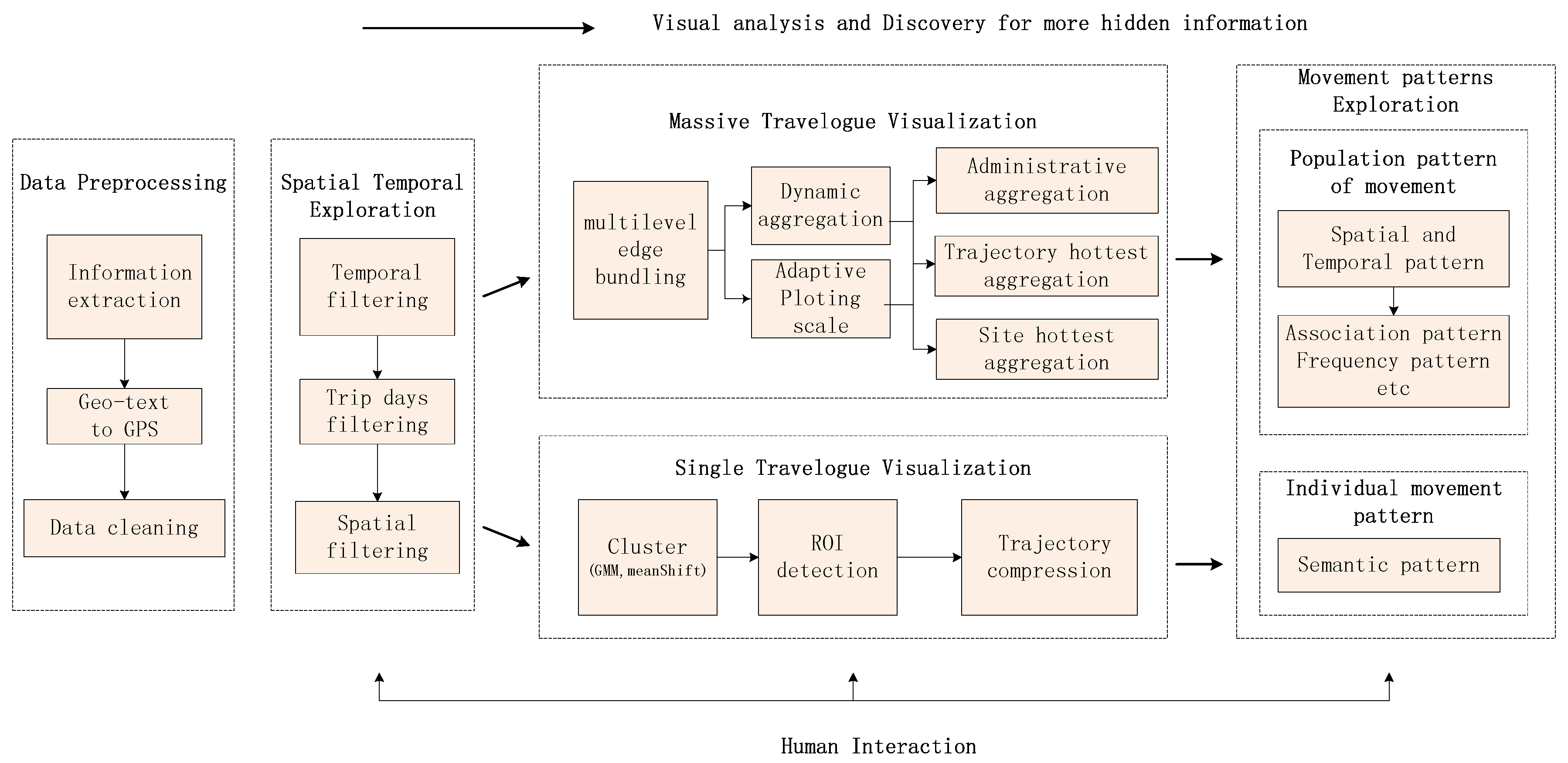
Figure 2.
Visualization of trajectories in single travelogue. (a) Visualization before outlier processing; (b) visualization after outlier processing; (c) visualization after clustering.
Figure 2.
Visualization of trajectories in single travelogue. (a) Visualization before outlier processing; (b) visualization after outlier processing; (c) visualization after clustering.

Figure 3.
Multilevel aggregation procedure.

Figure 4.
Adaptive scale procedure.

Figure 5.
Visual interface of the interactions.

Figure 6.
Multilevel visualization using the DP algorithm. (a) origin ROI; (b) compression with only one point; (c) first compression; (d) second compression; (e) third compression; (f) fourth compression.
Figure 6.
Multilevel visualization using the DP algorithm. (a) origin ROI; (b) compression with only one point; (c) first compression; (d) second compression; (e) third compression; (f) fourth compression.

Figure 7.
Edge bundling on travelogue trajectory for Taiwan. (a) Initial view; (b) after edge bundling.
Figure 7.
Edge bundling on travelogue trajectory for Taiwan. (a) Initial view; (b) after edge bundling.
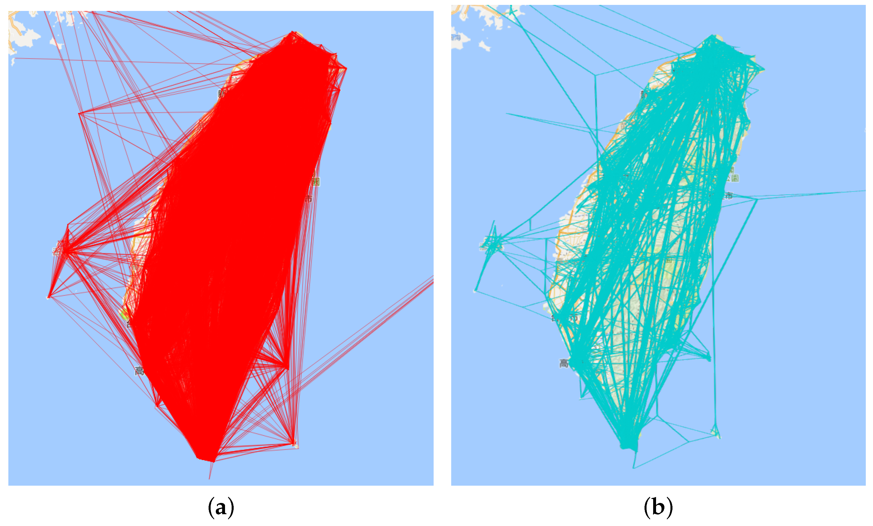
Figure 8.
Aggregation visualization in the time dimension. (a) Direct trajectory visualization; (b) visualization with months 6–9 and days 3–5; (c) visualization with months 6–9 and days 12–20; (d) visualization with months 9–12 and days 3–5.
Figure 8.
Aggregation visualization in the time dimension. (a) Direct trajectory visualization; (b) visualization with months 6–9 and days 3–5; (c) visualization with months 6–9 and days 12–20; (d) visualization with months 9–12 and days 3–5.

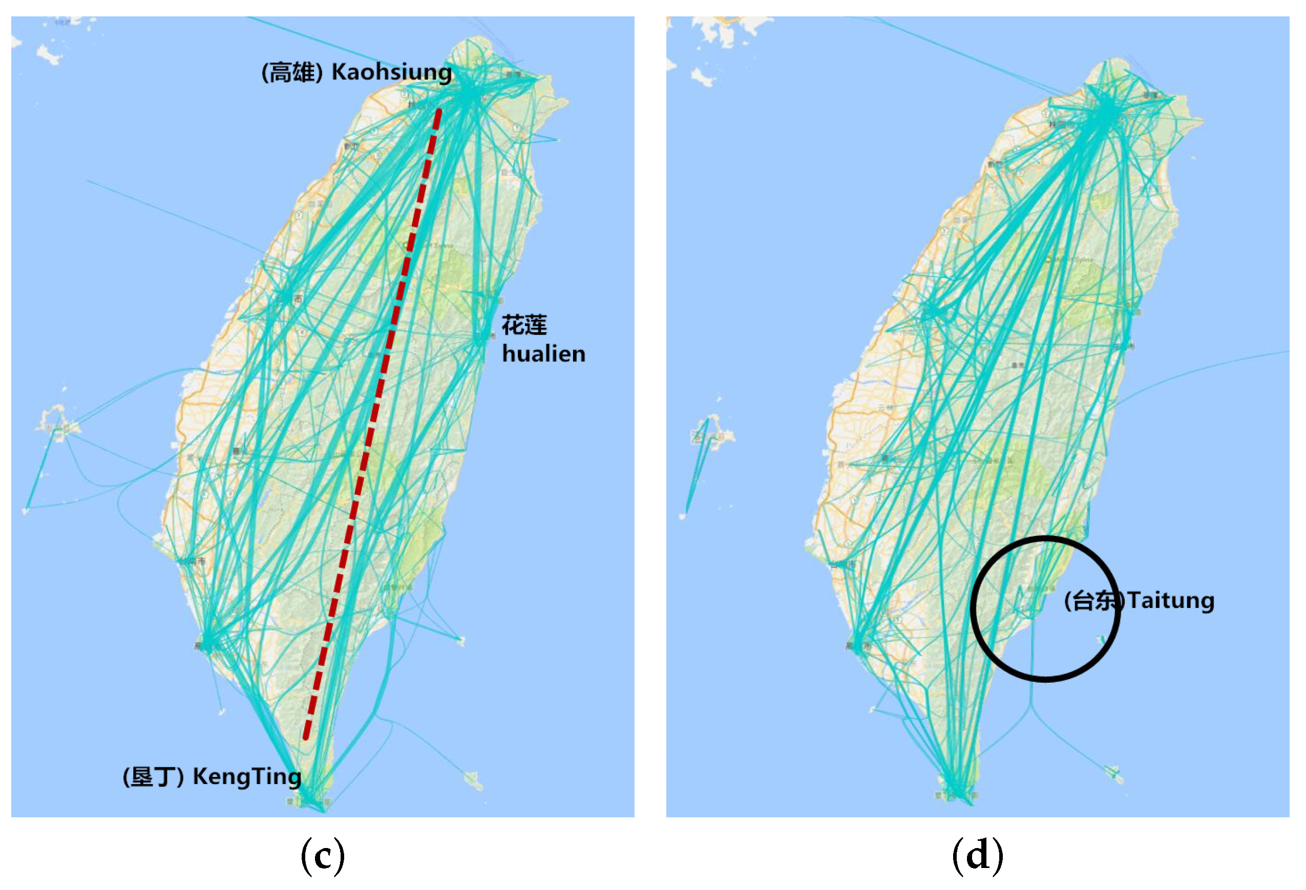
Figure 9.
Clustering at the administrative level. (a) Aggregation visualization using flow map visualization at the city level; (b) aggregation visualization using flow map visualization at the district level.
Figure 9.
Clustering at the administrative level. (a) Aggregation visualization using flow map visualization at the city level; (b) aggregation visualization using flow map visualization at the district level.

Figure 10.
Multilevel hottest trajectories. (a) Visualization with filtering site of weight over 652; (b) visualization with filtering site of weight over 395; (c) visualization with filtering site of weight over 165; (d) visualization with filtering site of weight over 2.
Figure 10.
Multilevel hottest trajectories. (a) Visualization with filtering site of weight over 652; (b) visualization with filtering site of weight over 395; (c) visualization with filtering site of weight over 165; (d) visualization with filtering site of weight over 2.
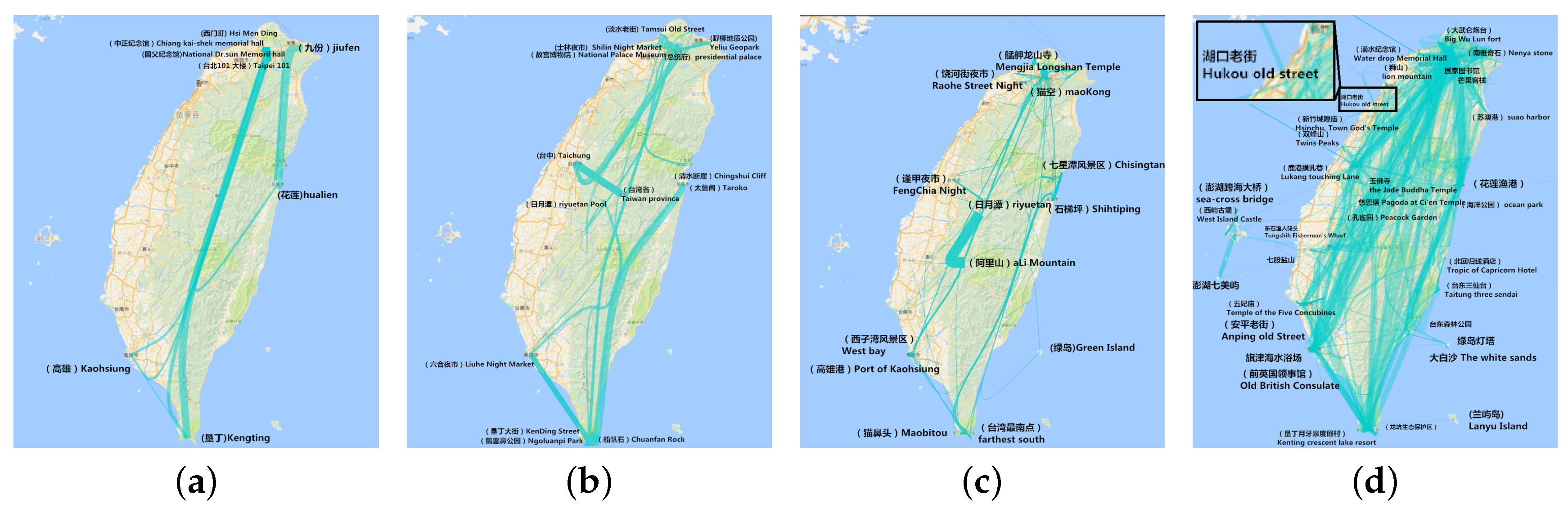
Figure 11.
Multilevel hottest sites. (a) Visualization with filtering line weight over six; (b) visualization with filtering line weight over 11; (c) visualization with filtering line weight over 47; (d) visualization with filtering line weight over 136.
Figure 11.
Multilevel hottest sites. (a) Visualization with filtering line weight over six; (b) visualization with filtering line weight over 11; (c) visualization with filtering line weight over 47; (d) visualization with filtering line weight over 136.

Figure 12.
Histogram of visiting times.

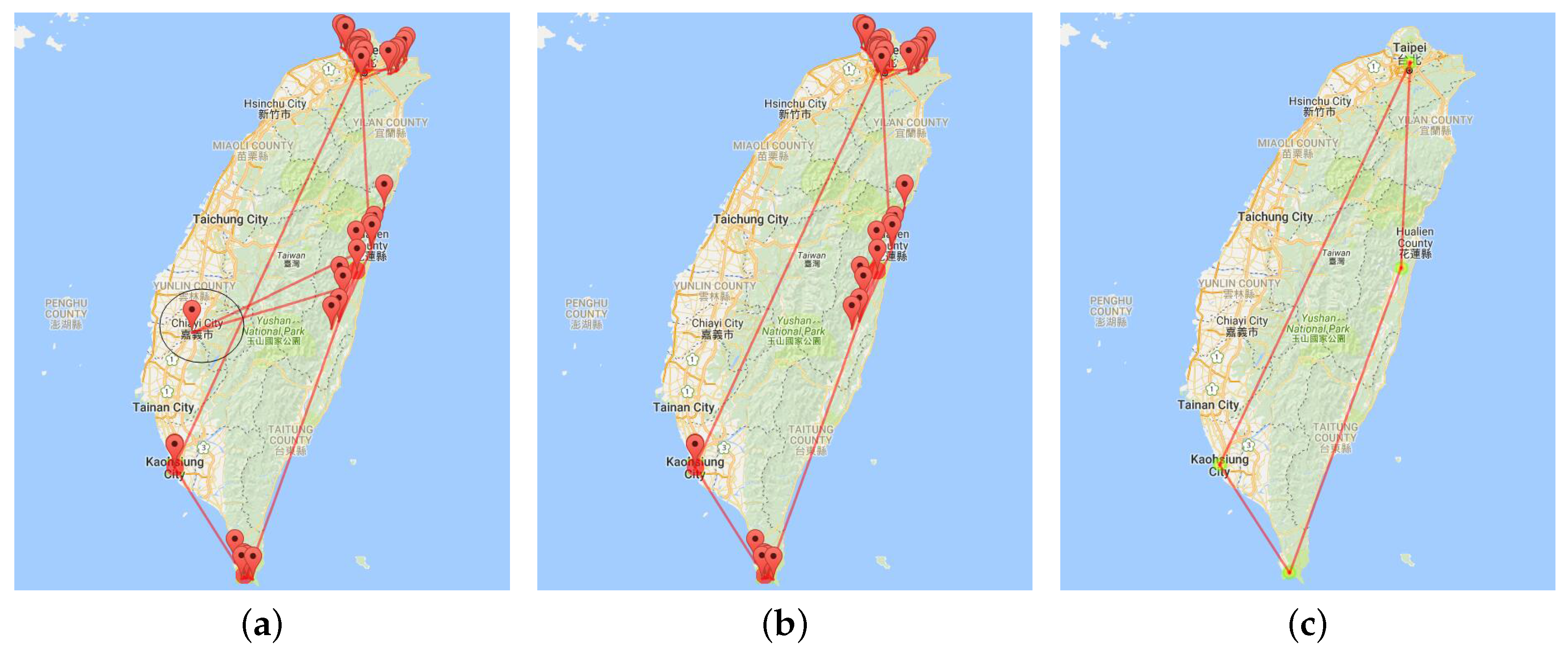
Figure 13.
Visualization of trajectories with trip days of 3–5 in September. (a) Direct visualization as graph drawing; (b) visualization after edge bundling; (c) visualization after edge bundling with a text marker.
Figure 13.
Visualization of trajectories with trip days of 3–5 in September. (a) Direct visualization as graph drawing; (b) visualization after edge bundling; (c) visualization after edge bundling with a text marker.


Figure 14.
Trajectories at the administrative level. (a) Trajectories at Administrative Levels 1 and 2; (b) trajectories at Administrative Level 3.
Figure 14.
Trajectories at the administrative level. (a) Trajectories at Administrative Levels 1 and 2; (b) trajectories at Administrative Level 3.
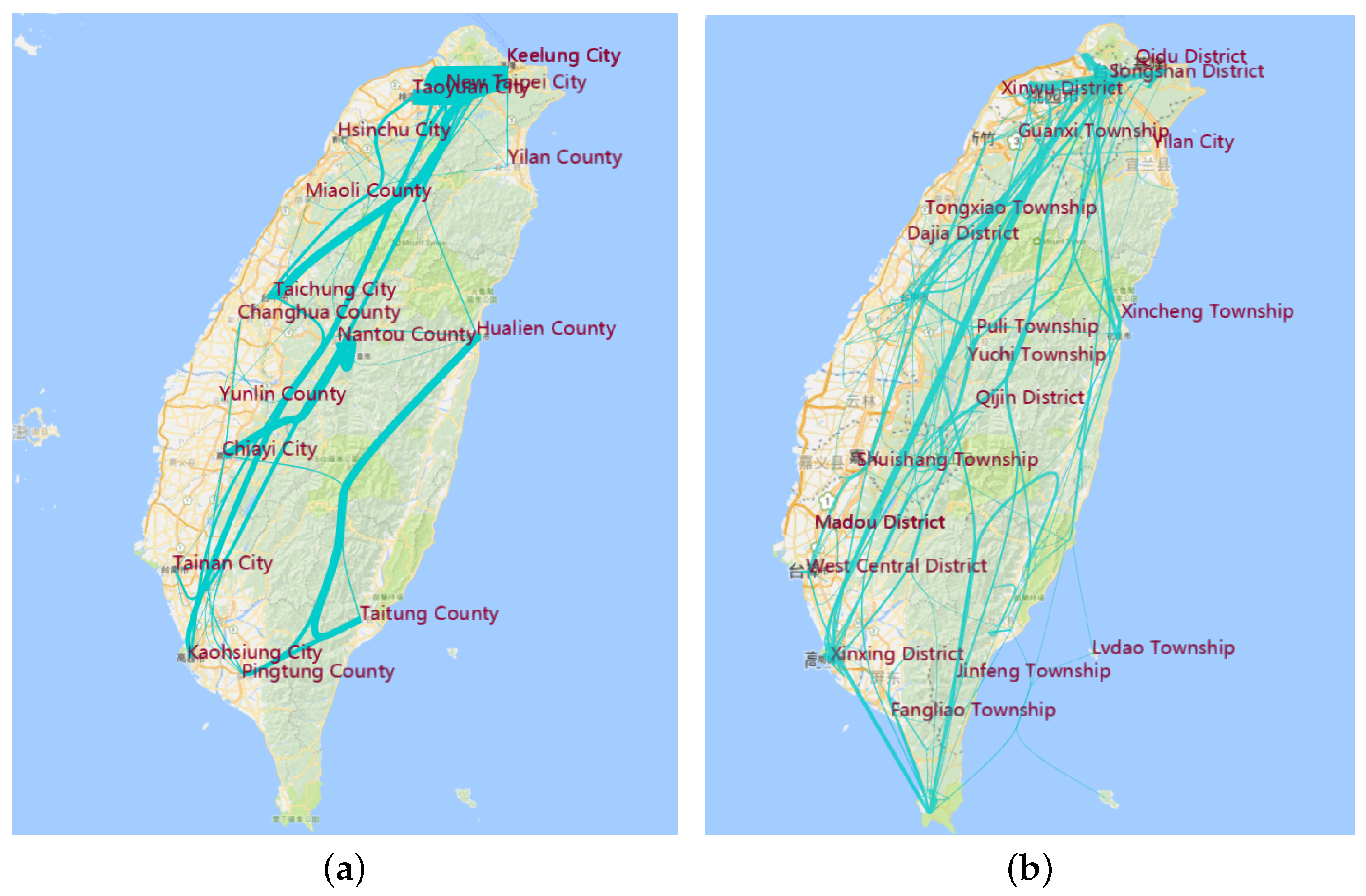
Figure 15.
Hottest site. (a) Site with visiting times more than one; (b) site with visiting times more than four; (c) site with visiting times more than 19.
Figure 15.
Hottest site. (a) Site with visiting times more than one; (b) site with visiting times more than four; (c) site with visiting times more than 19.

Figure 16.
Hottest trajectory. (a) Trajectories with visiting times more than one; (b) trajectories with visiting times more than two; (c) trajectories with visiting times more than five.
Figure 16.
Hottest trajectory. (a) Trajectories with visiting times more than one; (b) trajectories with visiting times more than two; (c) trajectories with visiting times more than five.


Figure 17.
Trajectories between different multilevel hot sites. (a) Visualization of a single travelogue; (b) visualization of trajectories in lanyuTownship.
Figure 17.
Trajectories between different multilevel hot sites. (a) Visualization of a single travelogue; (b) visualization of trajectories in lanyuTownship.
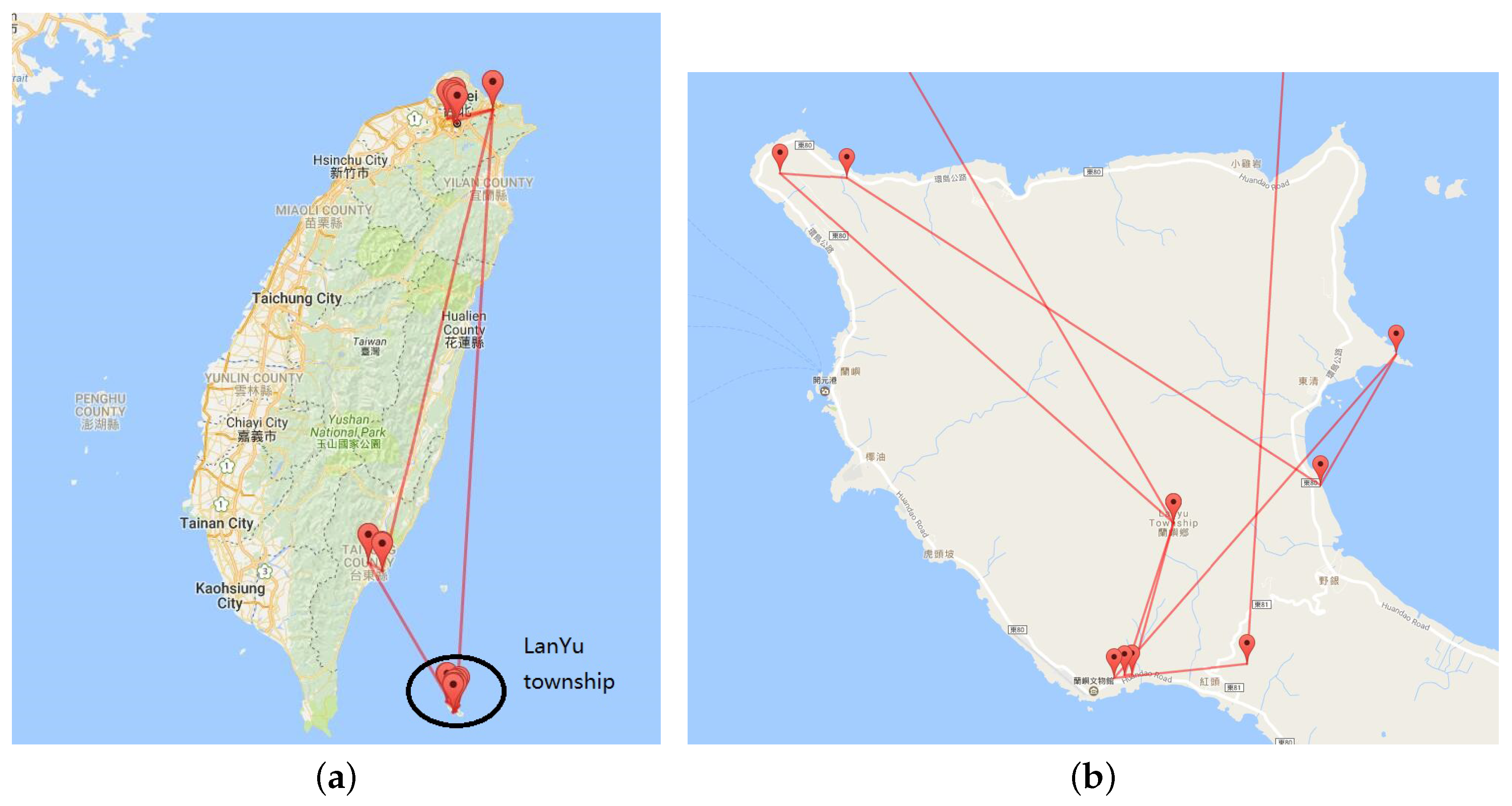
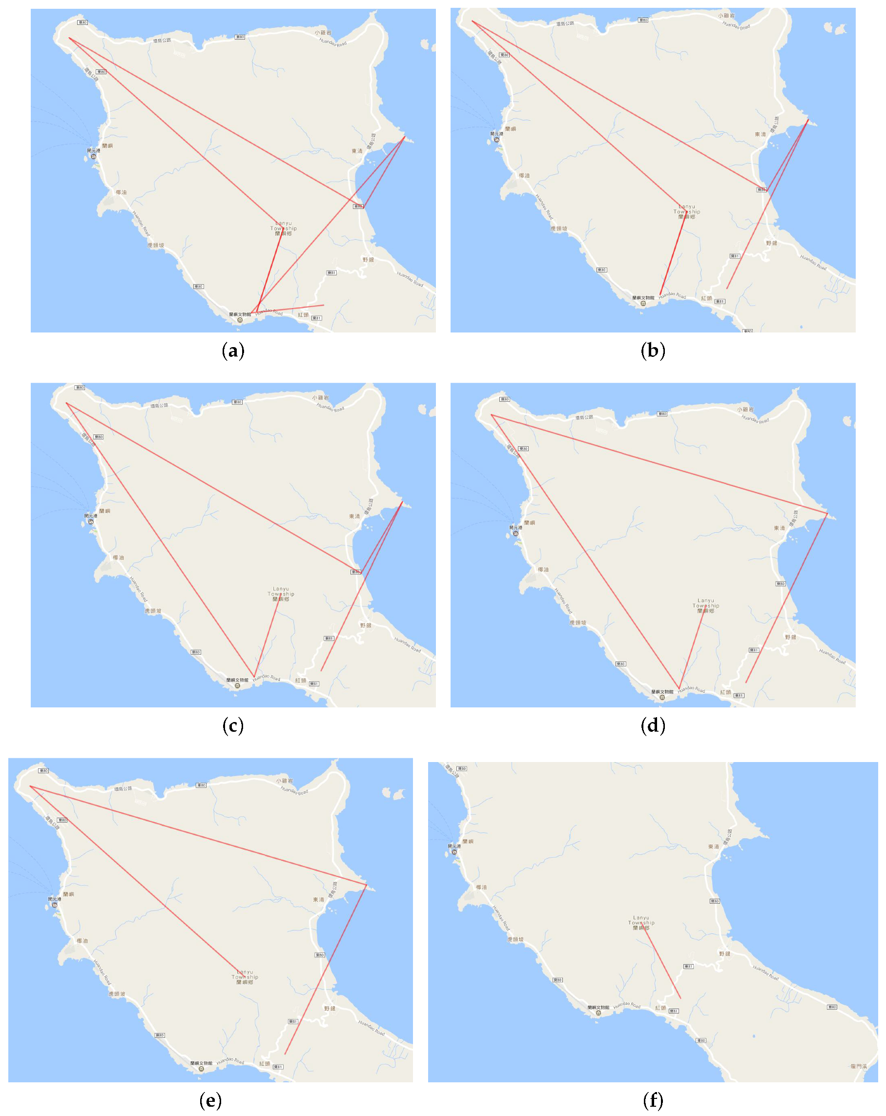
Figure 18.
Trajectories between hot site. (a) First compression; (b) second compression; (c) third compression; (d) fourth compression; (e) fifth compression; (f) compression with only one point.
Figure 18.
Trajectories between hot site. (a) First compression; (b) second compression; (c) third compression; (d) fourth compression; (e) fifth compression; (f) compression with only one point.


Table 1.
Time spent on visual analytical methods.
| Method | Time Spent | Data Size |
|---|---|---|
| ROI detection with mean-shift | 2.3 s | trajectory with 28 edges |
| Trajectory compression with Douglas-Peucker | 0.8 s | trajectory with 11 edges |
| Edge bundling with MINGLE | 6 s | trajectory with 53,240 edges |
| Adaptive scale with K-means | 2.8 s | trajectory with 53,240 edges |
Table 2.
Cutoff with our algorithm.
| K-th Cut-off Point | Line Number | Line Weight Value Range |
|---|---|---|
| 0 | 53,240 | 1–504 |
| 1 (again cutoff) | 10,319 | 6–504 |
| 2 | 1275 | 11–504 |
| 3 | 200 | 47–504 |
| 4 | 17 | 136–504 |
Table 3.
Cutoff with a linear plotting scale.
| K-th Cut-off Point | Line Number | Line Weight Value Range |
|---|---|---|
| 0 | 53,240 | 1–504 |
| 1 | 50 | 101–504 |
| 2 | 5 | 201–504 |
| 3 | 2 | 300–504 |
| 4 | 1 | 400–504 |
Table 4.
Cutoff with a log scale.
| K-th Cut-off Point | Line Number | Line Weight Value Range |
|---|---|---|
| 0 | 53,240 | 1–504 |
| 1 | 3546 | 4–504 |
| 2 | 1156 | 13–504 |
| 3 | 246 | 42–504 |
| 4 | 15 | 146–504 |
Table 5.
Cutoff with our algorithm on uniform distribution.
| K-th Cut-off Point | Line Number | Line Weight Value Range |
|---|---|---|
| 0 | 10,000 | 1–200 |
| 1 | 7473 | 52–200 |
| 2 | 5003 | 102–200 |
| 3 | 2547 | 151–200 |
© 2018 by the authors. Licensee MDPI, Basel, Switzerland. This article is an open access article distributed under the terms and conditions of the Creative Commons Attribution (CC BY) license (http://creativecommons.org/licenses/by/4.0/).
Share and Cite
MDPI and ACS Style
Ma, Y.; Wang, Y.; Xu, G.; Tai, X. Multilevel Visualization of Travelogue Trajectory Data. ISPRS Int. J. Geo-Inf. 2018, 7, 12. https://doi.org/10.3390/ijgi7010012
AMA Style
Ma Y, Wang Y, Xu G, Tai X. Multilevel Visualization of Travelogue Trajectory Data. ISPRS International Journal of Geo-Information. 2018; 7(1):12. https://doi.org/10.3390/ijgi7010012
Chicago/Turabian StyleMa, Yongsai, Yang Wang, Guangluan Xu, and Xianqing Tai. 2018. "Multilevel Visualization of Travelogue Trajectory Data" ISPRS International Journal of Geo-Information 7, no. 1: 12. https://doi.org/10.3390/ijgi7010012
Note that from the first issue of 2016, this journal uses article numbers instead of page numbers. See further details here.