
Geospatial Analysis and Mapping Strategies for Fine-Grained and Detailed COVID-19 Data with GIS


1
Galician Studies and Development Institute (IDEGA), University of Santiago de Compostela, 15782 Santiago, Spain
2
MIT Media Lab, 75 Amherst St, Cambridge, MA 02139, USA
*
Author to whom correspondence should be addressed.
ISPRS Int. J. Geo-Inf. 2021, 10(9), 602; https://doi.org/10.3390/ijgi10090602
Submission received: 23 June 2021
/
Revised: 21 August 2021
/
Accepted: 9 September 2021
/
Published: 12 September 2021
(This article belongs to the Special Issue Geospatial Approaches for Understanding the Social, Economic and Environmental Impacts of COVID-19)
Abstract
:The unprecedented COVID-19 pandemic is showing dramatic impact across the world. Public health authorities attempt to fight against the virus while maintaining economic activity. In the face of the uncertainty derived from the virus, all the countries have adopted non-pharmaceutical interventions for limiting the mobility and maintaining social distancing. In order to support these interventions, some health authorities and governments have opted for sharing very fine-grained data related with the impact of the virus in their territories. Geographical science is playing a major role in terms of understanding how the virus spreads across regions. Location of cases allows identifying the spatial patterns traced by the virus. Understanding these patterns makes controlling the virus spread feasible, minimizes its impact in vulnerable regions, anticipates potential outbreaks, or elaborates predictive risk maps. The application of geospatial analysis to fine-grained data must be urgently adopted for optimal decision making in real and near-real time. However, some aspects related to process and map sensitive health data in emergency cases have not yet been sufficiently explored. Among them include concerns about how these datasets with sensitive information must be shown depending on aspects related to data aggregation, scaling, privacy issues, or the need to know in advance the particularities of the study area. In this paper, we introduce our experience in mapping fine-grained data related to the incidence of the COVID-19 during the first wave in the region of Galicia (NW Spain), and after that we discuss the mentioned aspects.
1. Introduction
On 31 December 2019, China reported several cases of pneumonia related to a novel coronavirus in Wuhan, mainland China. Twelve weeks later, on 11 March 2020, the World Health Organization (WHO) declared a global pandemic originating from severe acute respiratory syndrome coronavirus 2 (SARS-CoV-2), also known as the novel coronavirus 2019-nCoV. In just a few weeks, the virus spread uncontrollably across the world, despite all the mitigation interventions adopted. As of 22 June 2021, 177.6 million cases and 3.8 million deaths had been reported. In addition, the impact of the pandemic foreshadows difficult economic scenarios [1], including impoverishment of large sections of communities and a substantial increase in social inequalities across multiple scales [2,3]. Social behavior is the major factor behind the virus spread. Most of the world, especially western countries, had shown serious difficulties in containing the virus along the pandemic. Different national strategies were implemented that ranged from a coexistence with the virus to its total suppression (i.e., Zero COVID), being a referent in both extremes the policies initially adopted by Sweden and China.
Since people who are pre-symptomatic or asymptomatic may spread the virus, substantial undetected transmission is very likely to appear before cases are officially reported. Before the vaccine was approved, the most effective strategy against the virus was to massively reduce mobility flows in order to reduce the virus spread. The struggle against the virus requires understanding its spatial behavior over time to avoid and anticipate outbreaks. In the event of new cases, fast tracking of their movements and contact tracing is required. This process requires fast and effective data management, taking into account the incubation period of the virus and the fact that the rate of asymptomatic patients is relatively high.
For addressing this emergency, many authorities in health management from western countries have decided to share sensitive data with the scientific community. The aim was to contribute in understanding the virus and to support their interventions based on scientific criteria. In the particular case of geo-information, it plays a key role for a better understanding of the virus spread across the globe. Geographic Information Systems (GIS) and geospatial analysis not only became essential tools for modelling the virus spread but also in subsequent steps related with contact tracing of cases, testing, and/or vaccine distribution according with the territorial particularities of a region.
Geospatial technologies have captured great attention during the pandemic. The proliferation of web-mapping applications and dashboards was a pivotal source of information by combining advanced computer graphics and technologically innovative imaging solutions [4]. Geospatial tools have not only helped to inform people but also have raised social awareness in society by contributing in managing the uncertainty associated with the virus. In addition, these tools had facilitated a transparent communication by policy authorities.
Mapping COVID-19 data in real time (or near-real time) allows classifying areas depending on risks and supports decision-making process. Globally, the most popular dashboards were the published by the Center for Systems Science and Engineering at Johns Hopkins University [5] and the World Health Organization [6]. Both dashboards represent official data by countries/regions in near-real time and are updated every 15 min approximately. Another popular dashboard, HealthMap [7] uses online media data sources for real time surveillance, showing better spatial resolution in some particular regions.
The range of application of geospatial technologies within this context is much more extensive, including the optimal location of emergency treatment units, basic resources and medical supplies in critical situations, and the centers for vaccination and/or testing, among others [8]. In addition, China and other countries have used unmanned aerial vehicles (UAV) during the pandemic, especially at the most critical times. The integration between UAV vehicles and GIS technologies contributes in terms of optimizing efforts for controlling the virus, especially in vulnerable regions. Thus, the combined use of both technologies can be used for tracing the most optimal flying routes, delivering basic goods or medical supplies to quarantined individuals and people living in remote areas, surveillance tasks, and search and rescue operations, among others [9,10]. The adoption of these technologies underlines the need for accurate and updated three-dimensional models of the intervention areas [11,12]. On the other hand, geospatial technologies were also implemented for tracing potential cases and close contacts. The use of web app/platforms for tracing allows inferring spatial patterns over time and allows checking the actual transmissibility of the virus. With different successes, many countries developed their own web app/platforms such as the Close Contact Detector in China [13], Trace Together in Singapore [14], COCOA in Japan [15], SwissCoVID in Switzerland [16], and RadarCoVID in Spain [17].
All of these applications and examples demonstrate the importance of geospatial analysis during this pandemic. Paradoxically, COVID-19 became a great opportunity for the development and implementation of geospatial analysis in emergencies [18]. The exponential growth of computational capacity of GIS tools has increased our ability for dealing with big datasets and extended our analytical skills by raising more questions that can be replied to more accurately than ever. However, in the face of an unprecedented boom related with geo-information, there are some shortcomings related to the adoption of the most appropriate mapping strategies that should be discussed.
The case study presented here is conducted in the region of Galicia, Northwestern Spain. We count the accurate and detailed fine-grained dataset related with all the cases officially reported during the first wave of the pandemic. Among other data, this dataset includes the personal address of each patient. The aim presented here is to propose valid mapping strategies for this dataset for enhancing the value of these data while avoiding conflicts associated with them.
It is also worth highlighting the spatial context where this study is conducted. Spain was one of the worst severely affected countries by the COVID-19 during the first months (see Section 4.1). The suboptimal national response to the pandemic has been widely criticized [19]. In subsequent editorials of The Lancet, a group of experts referred to the weakness of the so-called test-trace-isolate tryptic for explaining the tremendous impact of the virus in this country. For that, they made a desperate appeal to authorities to make public fine-grained and detailed data related to the incidence of the virus [20,21], which would help in responding adequately to new outbreaks. The study presented here is consistent with their approach, showing the great potential of these data for better understanding the virus impact in a particular region.
This paper is structured as follows. Section 2 provides a comprehensive literature review on how mapping has been used in disease mapping before the emergence of COVID-19. Section 3 presents the aim and methodology of this research. Section 4 introduces the study area and describes the entire dataset. Section 5 introduces some visual results in the form of maps that show the incidence of the virus across the region of Galicia. Section 6 discusses the previous results and the most relevant aspects that must be considered. Finally, the most relevant ideas shown in this paper are summarized in the Conclusions section.
2. Literature Review
Throughout history, emerging and re-emerging infectious diseases have threatened humanity. Some of these diseases became epidemics affecting a large number of people in a short time lapses. Disease spreading depends on the intrinsic mechanism, human mobility, and control strategy [22]. A complete understanding of these diseases requires identifying their spatial patterns, which are explained by a complex set of interactions between human and environmental factors [23]. Health geography studies the spatial factors behind the impact of diseases. According to Kearns and Moon [24], this subdiscipline not only presents a predominantly utilitarian and technical perspective of the territory but also considers cultural and anthropological factors.
Mapping tools can plot the spatial impact of any disease and its spatial spread. The Atlas of Cancer Mortality in China [25] and in the United States [26] are two very representative examples of disease mapping. These studies mostly depict incidence data related to cancer disease, but they also estimate risk levels by region and identity spatial patterns across multiple scales [27]. Similarly with other diseases, Castronovo, Chui, and Naumova [28] analyzed the spatio-temporal dynamics of salmonella infections for 2002 in elderly people in the United States, while Mohd, Jacobsen, and Wiersma [29] established risk maps of hepatitis A virus across the world.
One of the first maps about infectious disease was carried out in 1694 on plague containment in Southern Italy [30]. Sure enough, the John Snow’s map on the 1854 cholera outbreak in London is the most paradigmatic example of the importance of disease mapping [31]. In recent years, a relevant number of recent studies on disease mapping were published. In 2014, a review paper about geo-health found that 248 research papers (out of 865) were focused on disease mapping [32]. Wahid et al. [33] analyzed the spread of Chikungunya virus, a mosquito-transmitted alphavirus, since the first case was reported in Tanzania in 1952. It spread across the entire globe, causing large numbers of epidemics infecting millions of people in Asia, India, Europe, the Americas, and Pacific Islands. Pigott et al. [34] assembled location data on all recorded zoonotic transmission relative to humans and Ebola virus infection in bats and primates since 1976 to 2014, predicting transmission niches in Central Africa and West Africa. Their study showed, despite 22 million people inhabiting regions at risk, that the rarity of human outbreaks emphasizes the very low probability of transmission between humans. Cattarino et al. [35] implemented a high-resolution global map about dengue spread by adapting geospatial models based on the environment. Samy et al. [36] reported recent outbreaks of Zika, a new virus discovered in Uganda in 1947 and transmitted by aedes mosquitoes. They analyzed Zika virus spread in South America, addressing urgent knowledge gaps regarding transmission’s drivers. Messina et al. [37] showed how large portions of tropical and subtropical regions, where around 2.17 billion inhabitants live, developed suitable environmental conditions for the Zika virus. Some other studies focused on the regional impact of other viruses. Reeves, Samy, and Peterson [38] carried out a first detailed study of MERS-CoV cases across the Middle East. Deka and Morshed [39] analyzed the spatial spread of the Nipah virus in South Asia and Southeast Asia, while Sánchez-Gomez et al. [40] conducted the same analysis with West Nile virus in Spain.
Interactions between social and environmental factors explain the impact of pandemics. Geospatial approaches help mitigate this impact through spatial statistics, finding spatial correlations with other parameters, and identifying transmission dynamics [41,42]. GIS systems favors a dynamic mapping based on simultaneous visualization of temporal and spatial information, enabling evaluation of complex interactions between humans and their surrounding environment [28]. In this context, Grantz et al. [43] showed how living in US census tracts with higher illiteracy rates increased the risk of influenza and pneumonia mortality during the influenza pandemic of 1918 in Chicago. Allcott et al. [44] evaluated the relationship between COVID-19 reported cases and the compliance level relative to containment measures against the virus in the United States.
The use of GIS for tracking and mapping infectious diseases was recently analyzed. Parks, MacDonald, and Beiko [45] used an automated pipeline to collect data for analysis with the geospatial package GenGIS, which allows spatio-temporal tracking of new sequence types and polymorphisms related to the 2009 swine-origin strain of influenza A-H1N1. Giyonko et al. [46] analyzed the epidemiological role of camels in the transmission of MERS-CoV virus by implementing an iterative empirical process in GIS to identify potential hotspots. Fuller et al. [47] identified those areas where assortment events might occur and how high pathogenicity avian influenza virus might travel if it would affect wild bird populations.
Similarly, these geospatial tools are already playing a key role in the current COVID-19 pandemic. These serve for integrating big data from multiple sources, displaying intuitive visualizations, tracking reported cases, predicting risk transmission levels, managing supply and demand of material resources, and formulating new interventions, etc. [48]. Some recent studies adopt a traditional approach based on evaluating the territorial impact of the virus across multiple scales [49,50]. A cross-sectional research shows an association between the accelerated virus spread and the high levels of air pollution combined with mild winds [51]. Oto-Peralías [52] conducted a multifaceted study by combining geographical and socio-economic variables to explain the large disparity of cases across Spain. He found interesting correlations between COVID-19 incidences with temperature and distance from the city of Madrid during the first wave.
The relevance of the spatial component suggests reviewing the cartographic management of these data. Cicalò and Valentino [4] introduced new approaches for visualizing spatial patterns related to different diseases. One of the most critical issues for their study was to define the most appropriate mapping unit for visualizing health data [53]. In analytical geography, this problem is often referred to the modifiable areal unit problem (MAUP), which is ever present although not always appreciated. MAUP refers to the cartographic representation of data for which its attributes are significantly influenced by spatial scale and level of data aggregation [54]. Some scholars limited their study areas to nearby regions where they had sufficient data. For example, Tuckel et al. [55] analyzed the diffusion of the influenza pandemic of 1918 in Hartford, United States, while Smallman-Raynor, Johnson, and Cliff [56] conducted the same analysis in London and the county boroughs of England and Wales. More recently, Rodriguez-Morales et al. [57] studied a recent Zika virus outbreak in Valle de Cauca, Colombia.
Nowadays, the availability of much more information, in addition to the high computational capacity of GIS tools, makes covering much larger areas feasible. This is the framework for the COVID-19 pandemic, where the first studies were mostly conducted for mapping the incidence at country-wide scales. Some studies were carried out in countries such as Iran [58], Afghanistan [59], Italy [60], United States [61], or India [62] in order to determine what local drivers were behind the particular transmissibility of the virus across these countries. These studies not only allow understanding the virus mechanisms much better but also consider the particularities of each spatial unit, including the internal inequalities.
Mappings of cases allow identifying spatial patterns associated with COVID-19. These patterns are the first step towards other studies addressing the complexity behind the virus spread, the response capacity against it, and the application of predictive risk modeling. Verhagen et al. [63] analyzed how the health system capacity matched spatial variation in the underlying population risk in England and Wales. They found fine-grained local differences in hospitalization capacity supply versus demand, which anticipated needs for shifting capacity and rapid redistribution of resources. In India, Roy et al. [64] predicted the epidemiologic risk using weighted overlay analysis in GIS, while Khan et al. [65] predicted the criticality of COVID-19 transmission using GIS and machine learning methods.
Related to mapping spatial patterns during COVID-19, Fatima et al. [66] provided a synthesis of the most used GIS techniques and approaches, which were separately classified into three categories: disease mapping, exposure mapping, and spatial epidemiological modeling. The most common spatial methods used were clustering, hotspot analysis, space-time scan statistic, and regression modeling. According to their study, the use of these spatial techniques is limited by the unavailability and bias of COVID-19 data that restrained most of the researchers from exploring causal relationships of potential influencing factors of COVID-19. By precisely possessing this type of data, we can substantially increase the possibilities of geospatial analysis, but it raises other types of concerns and conflicts that we must take into account in the future where we will have more fine-grained and detailed data. For this purpose, we will review some aspects to take into account within the new data paradigm for geographical information.
3. Aim and Methodology
We represent fine-grained data associated with COVID-19 in the Spanish region of Galicia. The original raw dataset was provided by the regional health authorities with the goal of achieving a better understanding of the transmission of the virus in this region. This dataset contains individual and precise information, including biographical data and indicators such as the recognition of early symptoms, test results, and other information related to the follow-up of the disease for each patient. Some of these indicators were based on questionnaires and personal surveys, while testing data were officially registered by medical services.
This dataset also includes the address of each patient, which allows a very detailed spatio-temporal follow-up of all the cases. By considering that Spain decreed a hard lockdown on 14 March 2020 and Galicia was one of the regions where the virus entered later, the authorities could perform quite reliable tracing for most of the cases. Based on the addresses, we could geolocate each case across the region.
The lack of a clear catalog of appropriate practices of map-making motivated us to develop our own strategies for mapping these fine-grained data and addressing our concerns [67]. Different solutions were proposed across multiple scales using different criteria. Our proposals were based on a heuristic experience with health authorities for the identification of outbreaks, classification of risk levels, identification of spatial patterns, and subsequent decision making. In addition, the fact that some maps could be publicly published required taking special care with certain privacy concerns by reaching the optimal trade-off between public entitlement to being informed and the right to personal privacy. The results presented attempt to provide an answer to the major concerning issues that we found relevant.
Given that, the primary objective is to raise optimal mapping strategies for helping regional authorities in decision making. At the same time, we discuss about the appropriate processing, management, and representation of this kind of data. Maps are not only crucial for identifying and extracting common or anomalous spatial patterns related with the virus but also other aspects relating to the adequacy and success of the policies adopted. Aspects related to data aggregation, multiscale approach, and other issues related to data privacy are reviewed and later discussed.
Our findings are shown in the maps shown along the paper, which show the incidence of the virus. For mapping, we used the ESRI’s GIS mapping software ArcGIS, in the version 10.8. The geographic coordinate system used was the European Terrestrial Reference System 1989 (ETRS-89), and all the maps were projected in the UTM Zone 29N. Map representation of cases is based on very simple set of geometric features: points, lines, and polygons. Fine disaggregated data are represented with points, whereas aggregated data are represented with lines and polygons in choropleth data. The extraction of spatial patterns is carried out in heat maps. For the computation of raster values in these heat maps, we conducted an interpolation procedure with a function of the number of points per area unit, i.e., the point density. The density value () in a location () is determined by using a kernel function based on Equation (1):
for with are the entry points located in distance lower than the radius considered with regard to the origin point (); this means . is the value of the population of the point . is the distance between the point and the origin point ().
ArcGIS software counts with a specific tool for estimating the density of points around each output raster cell according to the quartic kernel function described in Silverman [68]. Conceptually, a smoothly curved surface is fitted over each point. The surface value is highest at the location of the point and diminishes with increasing distance from the point, reaching zero at any radius distance previously considered by the operator. Only a circular neighborhood is possible. The density at each output raster cell is calculated by adding the values of all the kernel surfaces where they overlay the raster cell center. For all the heat maps shown in the paper, we considered a cell raster size of 1000 × 1000 and . The radius is computed specifically to the input dataset using a spatial variant of Silverman’s rule of thumb that is robust to spatial outliers, neglecting the influence of the points that are located far away from the rest of the points. This radius is estimated by using the shortest path on a flat earth (planar) method. Visualization of heat maps is conducted by stretching values along a color ramp. We applied a linear stretch between the values defined by the standard deviation () value with . This means that all the pixel values out of the range are equivalent to 0 at the low end and 255 at the high end. The remaining values within the range are stretched in between 0 and 255. Moreover, for visualization purposes, we added some vertical exaggeration to the raster (hillshade effect) by applying a scaling factor .
4. Data and Study AREA
In this section, we present both the study area and the datasets used. This section is sub-divided as follows. Initially, Section 4.1 contextualizes the impact of the pandemic at a national scale. Section 4.2 introduces our study area, the region of Galicia, based on two aspects: (a) its sociodemographic reality and (b) the major indicators related to COVID-19 [69,70]. Finally, a short perspective of main dataset is presented in Section 4.2.3.
4.1. The Spanish Context
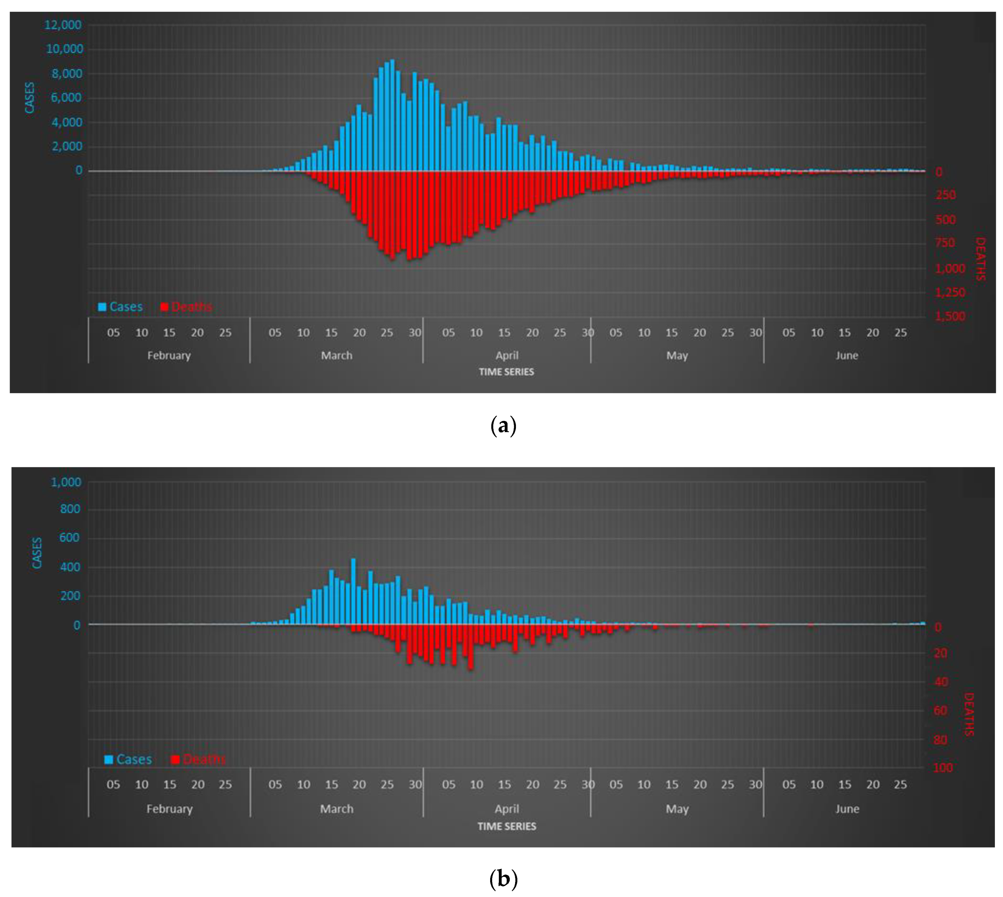
The novel coronavirus 2019-nCoV entered Spain on 31 January 2020, although no community spread was detected until early March. On 14 March 2020 national authorities imposed a hard lockdown with extreme mobility restrictions and a forced halt to most labor activities. At that time, Spain counted 6332 infected cases and 193 deaths. The lockdown lasted 49 days, followed by 48 days in which most of restrictions were progressively eased until July. The balance of this first wave, as of 21 June 2020, was 246,504 infected cases and 28,313 deaths. At that time, Spain was one of the most affected countries by the virus in the world.
However, these data could be even worse. According with the tables reporting excess mortality [71], the actual number of deaths could be a third higher [72]. The seroprevalence studies carried out during the first wave, between 27 April and 11 May 2020, estimated that only 5 percent of Spaniards had suffered the disease. These studies demonstrated substantial geographical variability, with higher prevalence around Madrid (>10 percent) and lower in coastal areas (<3 percent) [73].
4.2. The Study Area: The Region of Galicia
Firstly, we introduce the most important sociodemographic indicators in this region (Section 4.2.1), which will help in understanding the spatial pattern of the virus. After that, we will check the impact of the pandemic according to the officially reported numbers (Section 4.2.2).
4.2.1. Geographical Context
The region of Galicia is located in Northwestern Spain. This region has a population of 2.7 million inhabitants (6.1 percent of Spanish population) covering 29,575 square kilometer (5.8 percent of Spain). Its population density was 91.3 inhabitants per square kilometer in 2020. It is administratively divided into 4 provinces, 313 municipalities, and 217 mobility areas, which were recently defined by the Spanish Statistical Office [74]. These mobility areas represent units with a more homogeneous population distribution than the municipalities, which implies a fragmentation of the most populated urban municipalities and an aggregation of the most populated rural municipalities.
This region is characterized by the high dissemination of its population across the territory. In fact, around half of the human settlements in Spain are placed in this region, which is around eight times more comparatively than its demographic weight at a national level [75]. In the last few decades, its traditional population model entered in crisis, with more people living in a much-reduced number of towns or cities [76]. Nowadays, most of its population live next to the so-called Atlantic Axis, where the major and most thriving cities are located. Five of the seven main cities are located along this axis (Figure 1). Vigo and A Coruña are the two most important cities in the region, with approximately 300,000 inhabitants each one. The rest of the major cities concentrates around 100,000 inhabitants, with the exception of Pontevedra and Ferrol, which are slightly less populated. From an urban perspective, this region barely counts with intermediate urban nodes with population between 30,000 and 100,000 inhabitants. However, in very recent years, the suburbanization of the most important cities and the decline of some traditional cities (Ferrol) had resulted in an emergence of an increase in numerous groups of middle cities.
The urban structure of this region is hierarchically dominated by the western sector. Except for some rare cases [77], the western sector presents positive rates of population growth both from a quantitative (higher rates of fertility and positive migratory balances) and a qualitative (less aged population) approach. Mostly opposite trends are shown in the eastern sector where the two most populated cities concentrate most of the socioeconomic activity of their respective provinces. The rest of the region is dominated by a reduced group of head towns with a relevant influence over large rural areas.
4.2.2. Incidence of COVID-19
On 15 June 2020, Galicia counted 10,489 infections and 619 deaths. The fatality rate was 5.9 deaths per 100 reported cases and 22.3 deaths per 100,000 inhabitants. The seroprevalence study carried out by the Galician government during the first wave estimated that only 1.15% of its population had been infected, being one of the least affected regions in Spain. A comparative analysis between the incidence in Spain and Galicia during the first wave is shown in Figure 2.
4.2.3. Datasets
We have individually reported all the cases in this region during the first wave, ranging between 1 March and 15 July, 2020. This dataset includes information related to all the cases officially reported by the Galician Health Service (SERGAS), the major health management authority. This dataset counts 11,070 records initially.
This database includes bio data, official address, relevant dates related with the disease (early symptoms and testing), and other indicators. This information allows checking a complete follow-up of the disease since the early symptoms were reported (i.e., home bound/hospital admission/death). Given that mobility was mostly restricted by the hard lockdown after 15 March 2020, the great majority of cases are spatial and temporally constrained. The place of residence for each reported case is defined by the last official address reported by each person to local authorities.
5. Results
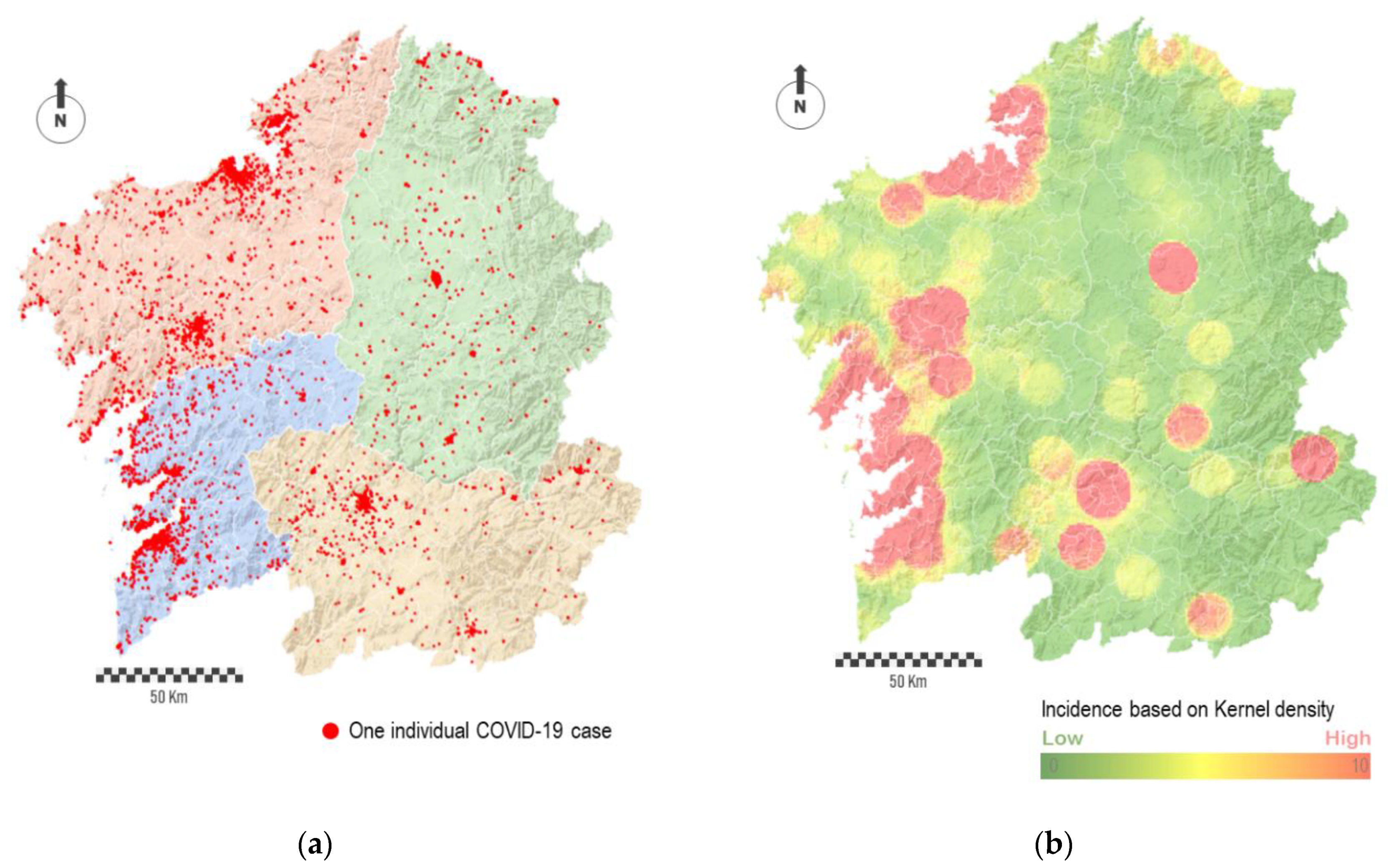
Data of patients were collected by a decentralized administrative service where different operators had access. The supervision of the raw dataset showed the existence of certain inconsistencies related to the presence of duplicate fields, errors in numbering or street names, and typing errors. For this reason, we conducted a pre-processing phase in order to eliminate duplicates and to standardize the structure of the complete dataset. After that, we carry out a semi-automatic process of geo-referencing the data by using the API tool implemented in ArcGIS. Each record was spatially represented as a point for which its location was determined according to the address and municipality values included in the database. Typing errors in some names or inconsistencies between the address and the municipality hampered the location of some records. In short, 10,853 records were successfully geolocated, which corresponds to 98 percent of the total cases.
The individual geolocation of cases shows how the most populated cities concentrated clusters of cases (Figure 3a). Apart from this, a relatively large number of points is spatially disseminated across the region. In some way, the noise behind the complete point cloud traced by cases hides the prevailing and relevant spatial patterns, both in absolute or relative terms. Thus, depending on the spatial scale, the interpolation of points into a raster map allow identifying spatial patterns behind the virus. For this purpose, we conducted an interpolation procedure based on the number of points per area unit, i.e., point density. Figure 3b shows the result in the form of a heat map. The red-colored areas represent the most affected regions, while the green-colored areas represent the least affected ones. The degradation between these colors, which means areas in yellow, corresponds to regions with average impact.
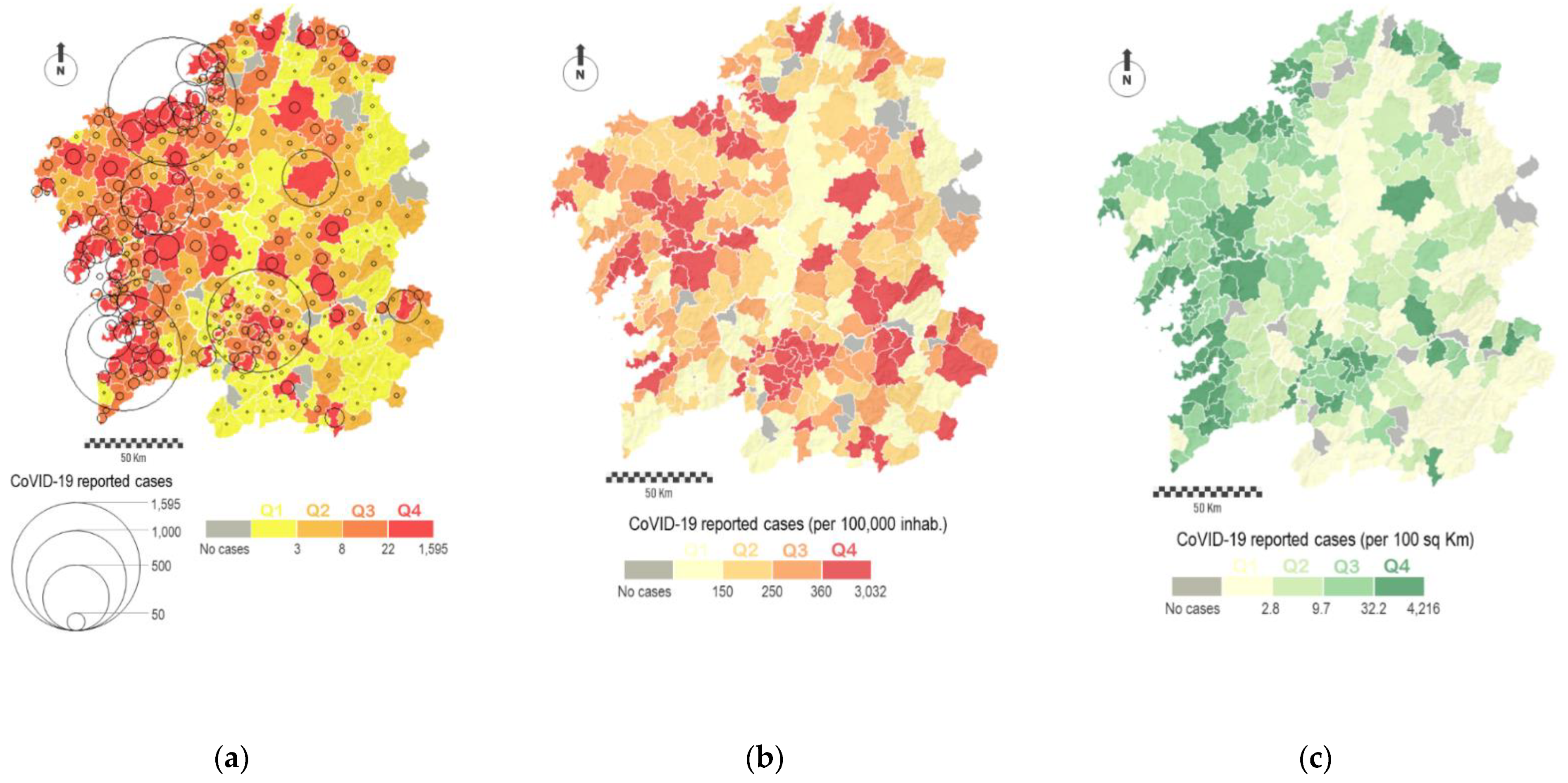
The aggregation of data in combination with the estimation of some significant rates allows reaching a more insightful perspective of these spatial patterns. For this purpose, we elaborate choropleth maps where each polygon is color-shaded according to a distribution in value intervals. In our study, we show virus spread in relation to the total population and the surface area of each municipality. Figure 4a represents the total number of cases by municipalities by using two strategies: total number of cases (circle size) and the level of incidence classified in four different intervals (color). The spatial distribution of cases corresponds to the expected according to the population pattern with most of the cases concentrated in the western sector. Figure 4b shows the number of cases per 100,000 people, while Figure 4c represents the number of cases per 100 square kilometers. The value intervals in these choropleth maps are classified in regular intervals, where each interval encompasses the same number of cases. These maps demonstrate the spatial heterogeneity of the virus across the region, not only showing new patterns with continuity in certain sectors but also some relevant differences in the incidence of the virus in neighboring municipalities, which demonstrates the effect of the aggregation of data in the results.
The map of cases by square kilometer presents a similar spatial pattern in comparison with previous figures, where most of municipalities along the Atlantic Axis present major incidences. However, the map of cases by population presents additional analysis such as the emergence of some municipalities located outside of the most populated axis showing high incidence rates. In any case, it must be said that some of the municipalities, colored in grey in the successive maps, were not affected at all by the virus, at least during the first wave. In total, these group counts with 18 municipalities (5.7 percent of the total), and these were mostly located in the eastern sector of the region.
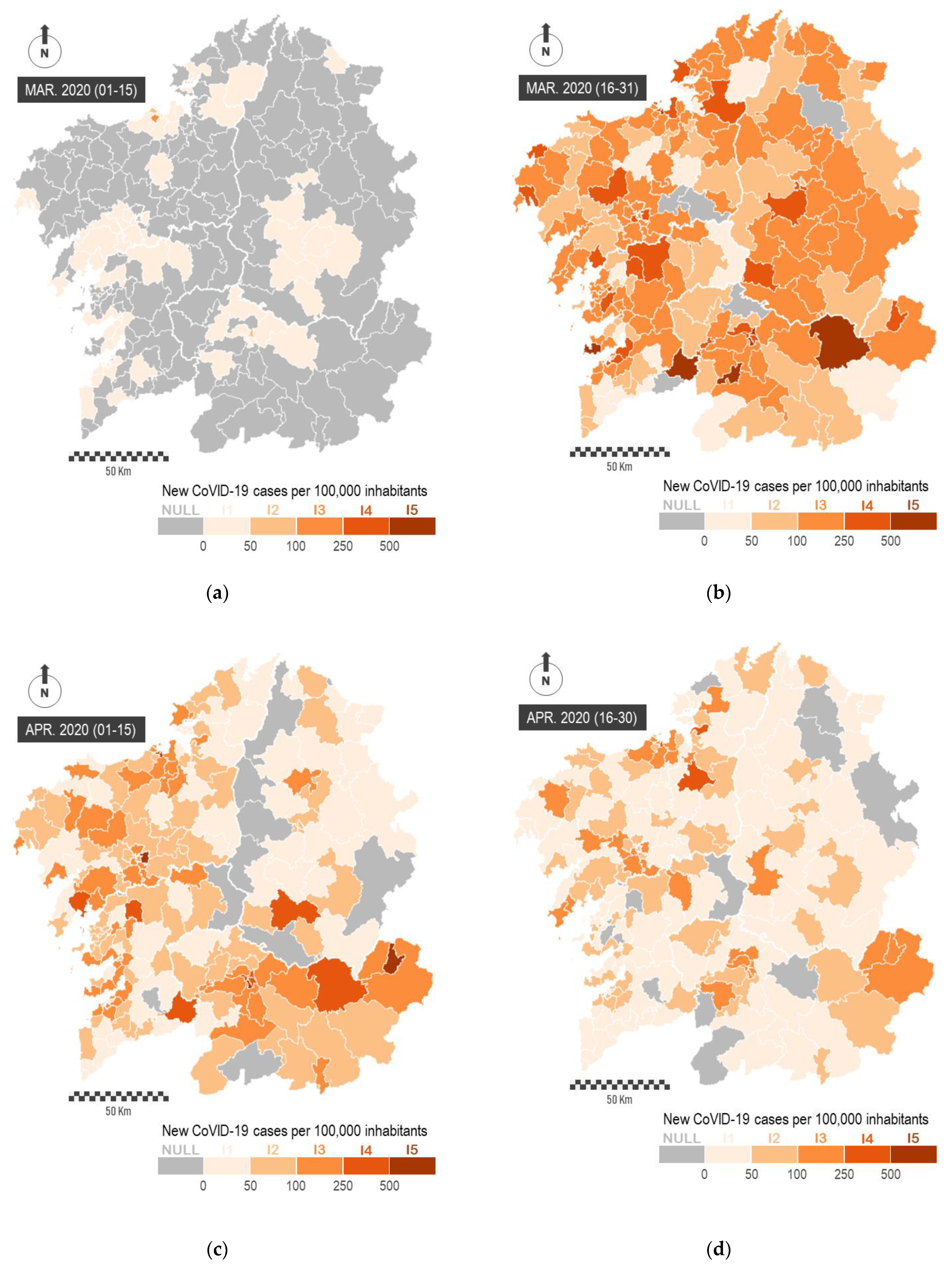
The study of spatial patterns can be conducted from a temporal perspective. In Figure 5, we represent the impact of the virus during the first two months of the pandemic. In order to perform this, we represent the number of new COVID-19 cases officially reported every 15 days per 100,000 inhabitants. This representation is carried out on mobility areas, and it allows observing the emergence of the virus in the most populated urban areas and the prompt spreading across the whole region. The sequential representation of data makes it possible to evaluate the general impact of the pandemic and to determine the largest territorial outbreaks, as well as the effectiveness of containment measures for the virus. These maps show a great heterogeneity in the spatial incidence of the virus across the region.
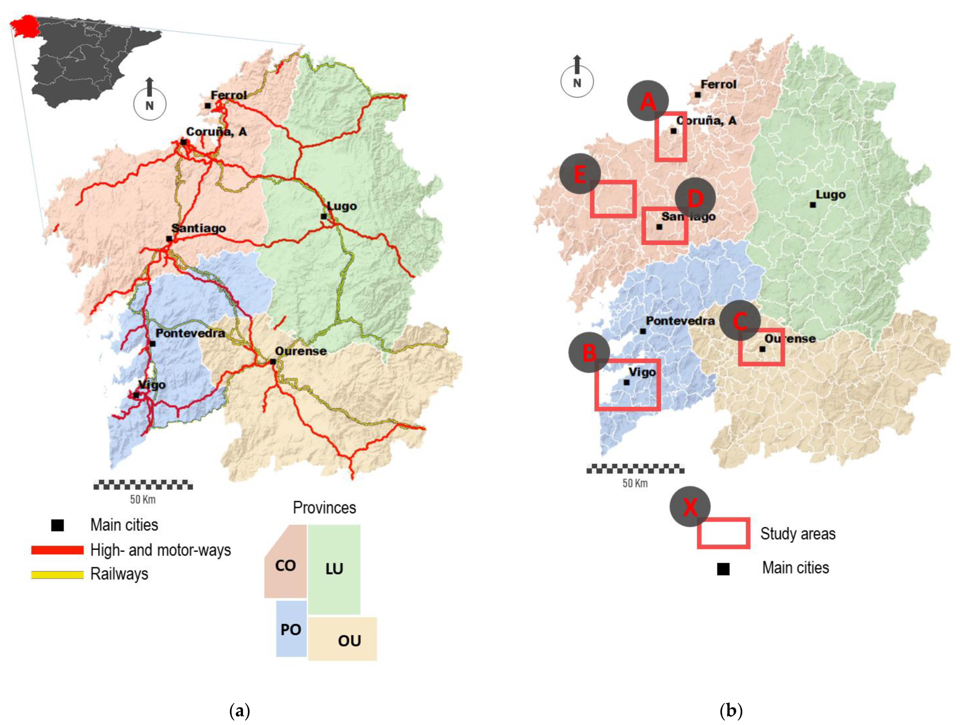
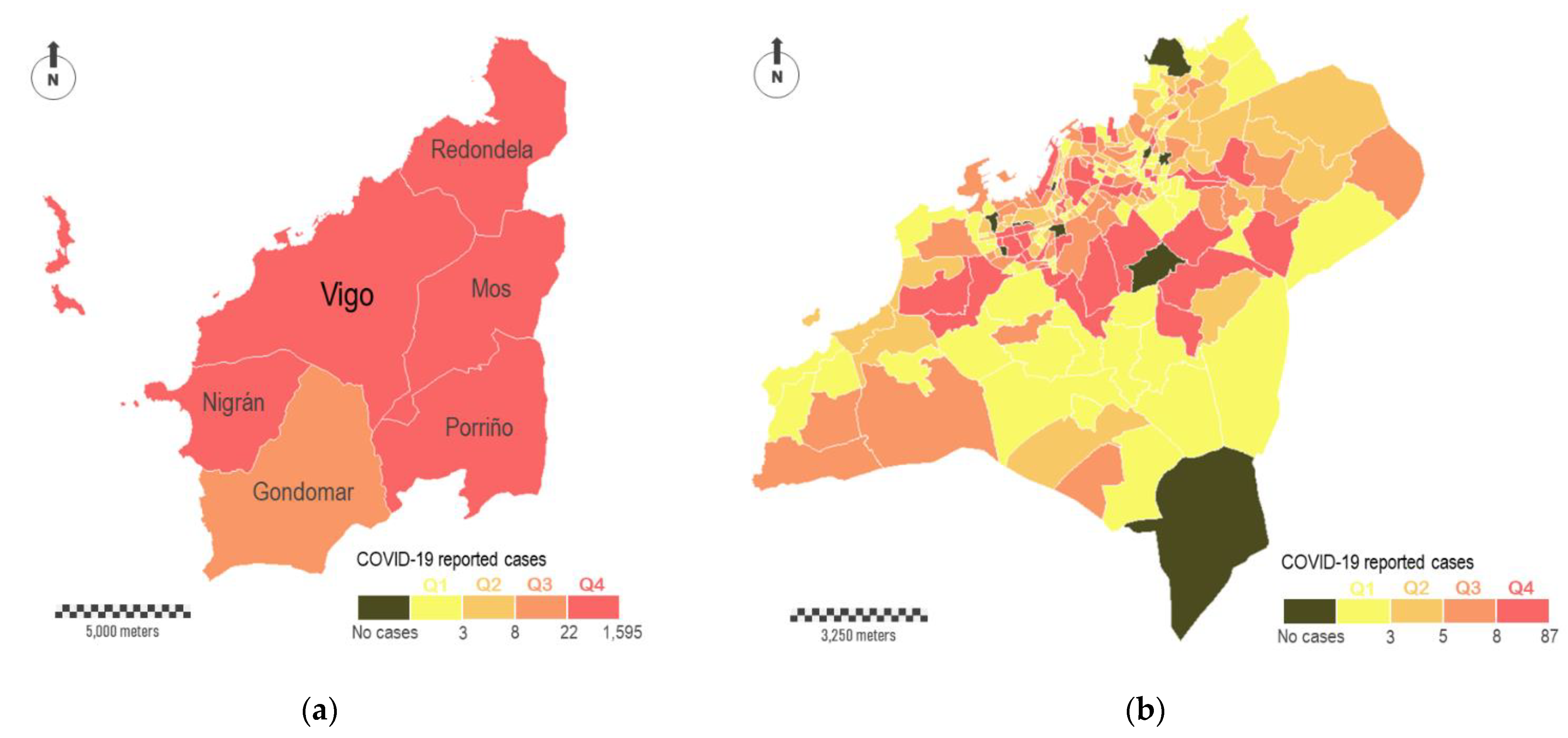
The complexity of the territory explains the spatial heterogeneity of the virus. For this reason, we must analyze the spatial incidence across multiple scales. Figure 6a shows the total number of cases surrounding Vigo, the most populated city with about 300,000 inhabitants. A group of six municipalities comprises this study area, with Vigo occupying the central position (study area A in Figure 1b). The color legend is the same used in Figure 4a, where the four intervals of virus incidence were fixed for the complete region. According to this, the six municipalities showed the highest levels of incidence (five in Q4 and one in Q3). Data disaggregation at major scales reveals a great heterogeneity in the incidence of the virus across this particular study area. In Figure 6b, we aggregate COVID-19 cases in census districts within Vigo municipality. In short, this municipality is fragmented in 250 polygons that correspond with census districts. These polygons differ in their surface areas, which vary substantially depending on the resident population. The smallest census districts are located in the consolidated urban area, while the largest ones are located on the city surroundings. According with the distribution of cases, some relevant aspects can be outlined. The most affected districts (Q4) are located in the central part, although not all of them are located downtown, where theoretically the economic diversity and social interactions are higher. A relevant number of red-colored polygons correspond to residential areas, where the virus is spread mostly in familiar circles. The dichotomy between downtown and periphery seems evident depending on the scale. Ten census districts did not report any COVID-19 cases, and some of them are located downtown. Areas located downtown are supposed to be a hotspot of transmission, but the people affected usually do not live there. A zoomed in view of the internal distribution of cases downtown is shown in Figure 6c,d. In the first of these sub-figures, cases are aggregately represented by census districts (polygons), whereas in the second one the cases are individually represented (points).
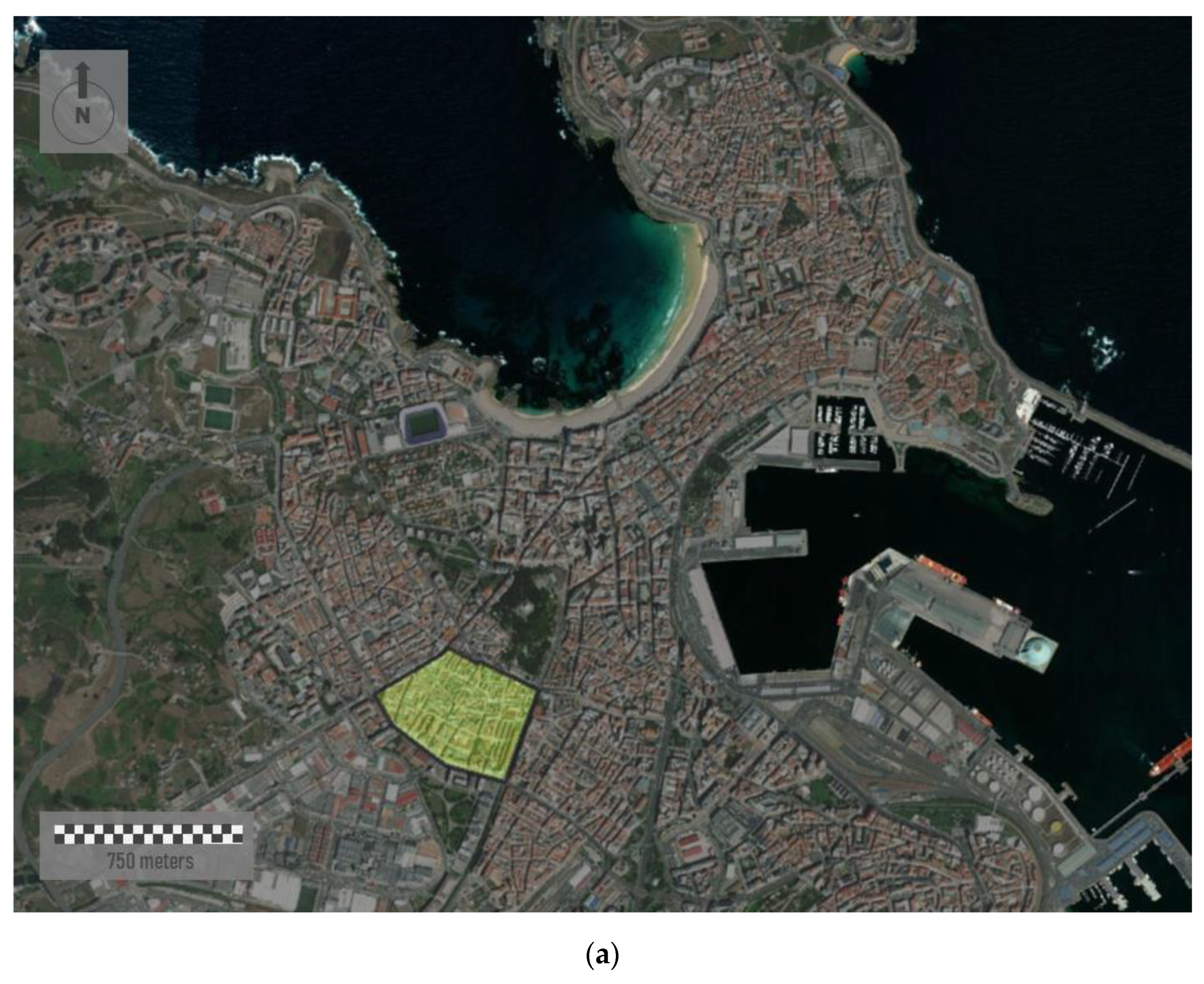
Data aggregation can be carried out with different geometries, such linear features. Figure 7 represents the density of cases in a specific area of A Coruña, the second most populated city with about 250,000 inhabitants (study area B in Figure 1b). The sample area shown is located in the south of the city, covering an area of 0.21 square Kilometers (Figure 7a). We aggregate all the individual cases registered by road sections. To perform this, we apply a spatial join between points (cases) and linear features (road sections) in ArcGIS. It is important consider that the same road is partitioned in different linear segments. Each road section corresponds to an individual segment inserted between two vertexes.
The urban morphology of the study area shows a dense street network where most of the buildings are around eight floors high. Although the urban street layout draws mostly rectilinear road sections, urban fabric is irregular and lacking in orthogonality. In addition, a lack of green spaces is observed. Visualization of cases along streets shows a close perspective of the incidence of the virus for residents, favoring the adoption of more scalable interventions in each city region by health authorities. Here, the incidence rate is classified on four levels. These levels are represented based on differences in both color and magnitude. Thus, wider linear features in red represent the road sections with more incidence. In short, 51 cases were reported in this area, showing a very unequal distribution over the study area. According to Figure 7b, two short street sections in red showed the highest incidence rates. In 91 of 130 road sections, represented in white and with a lower thickness, no cases were registered.
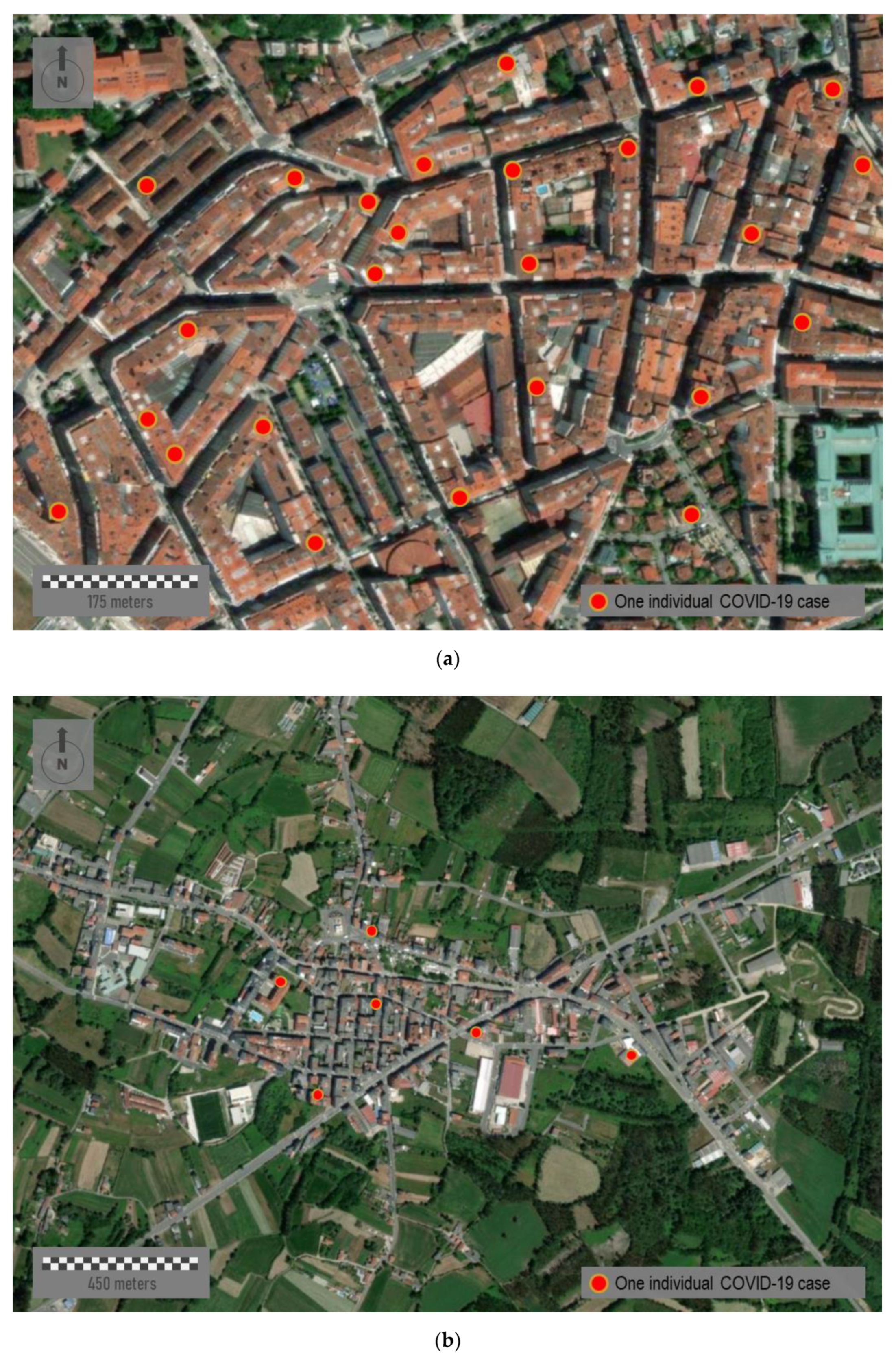
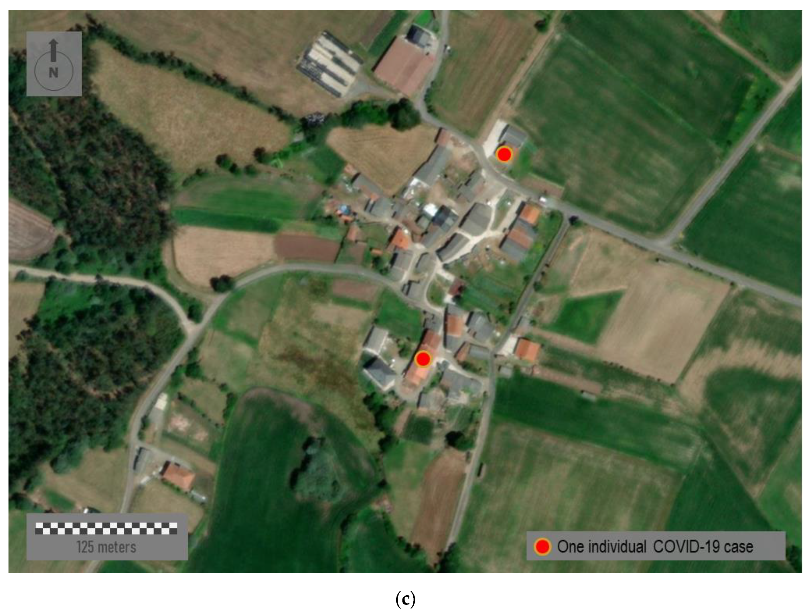
The representation of all the individual cases allows reaching the maximum amount of detail and highest spatial resolution. However, this sort of representation has certain disadvantages, especially when we manage sensitive data due to privacy concerns. Figure 8 represents three sample areas with different typologies: urban, semi-urban, and rural. The first panel, Figure 8a, represents a random sample area located downtown of Santiago de Compostela, the capital of the region (study area C in Figure 1b). This city area presents an urban structure of open blocks with large patios. It comprises narrow streets with a rectilinear layout and tall buildings over eight floors high. Figure 8b corresponds to the center of a middle town, Santa Comba (study area D in Figure 1b). This town has about 3000 inhabitants, and it is the most important urban reference across a large rural area. This town is characterized by an orthogonal layout and a dense occupation of the urban space, with buildings of variable height from one to six floors high [75]. Finally, Figure 8c corresponds to a distinctly rural area located somewhere in the north of the region. This small village shows a rural nucleus with a few ground-floor houses. Mapping individual cases must never be carried out in eminently rural environments nor, in many cases, in semi-urban ones where the anonymity and privacy of patients cannot be guaranteed. Therefore, mapping strategies must be scalable and adapted to the zoom factor and spatial scale in each case.
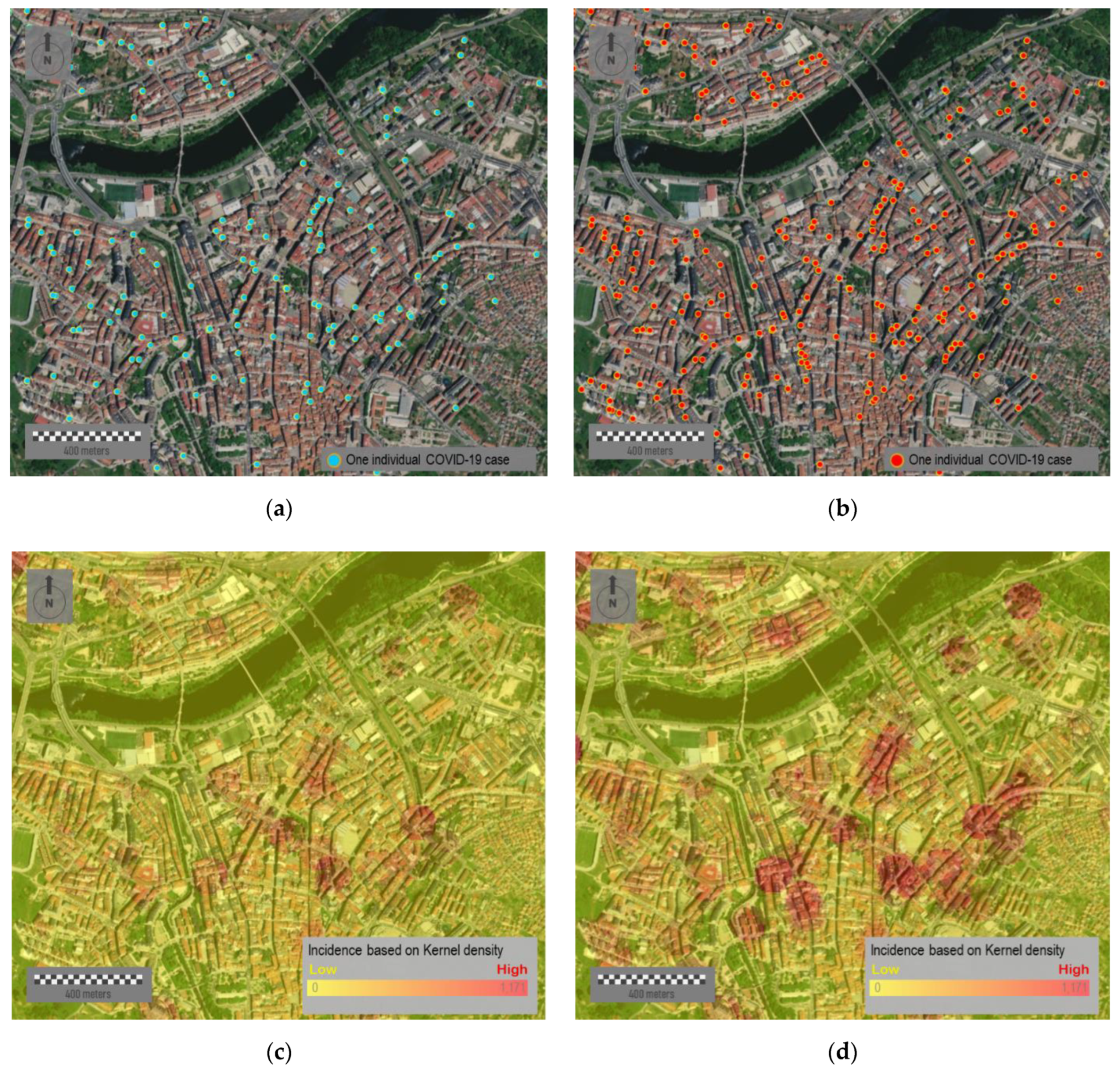
Mapping individual cases may mislead the identification of spatial patterns across multiple scales. The next figures show the temporal evolution of cases in Ourense, the third most populated city with about 105,000 inhabitants (study area E in Figure 1b). Figure 9a,b show the cases reported with 12 weeks in between. The first figure represents a total of 254 points and the second one 546, which is more than the double. Even though it is a substantial difference in the density of points shown, it results in difficulty in terms of identifying risk patterns and checking how these patterns evolve over time. Figure 9c,d represent the same data in the form of a heat map where the cases’ density is shown by colors. Both maps allow understanding the infection risk over time. The incorporation of aerial images in the background facilitates establishing a hypothesis that correlates spatial risk patterns and the emergence of potential outbreaks based on the existing risk levels.
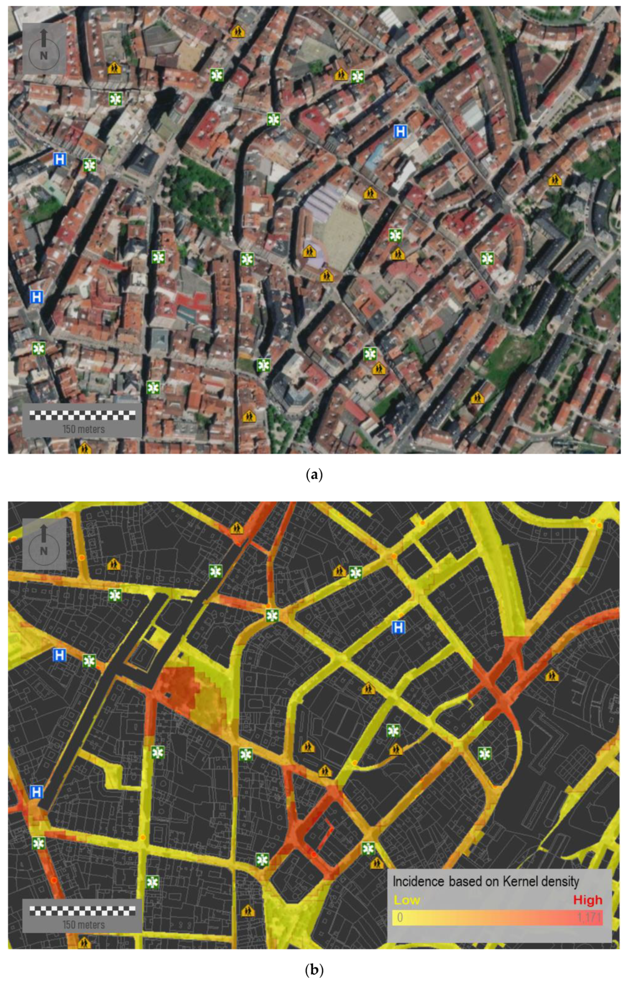
A more efficient and realistic strategy for decision making is to reduce the mapping area to specific intervention areas, that is, the public space. Figure 10a corresponds to a sample area located downtown of this same city. This area presents a medium-high urban density, with different types of city blocks and a limited presence of green spaces. The urban layout, although mostly rectilinear, is characterized by its lack of orthogonality. Figure 10b shows the accumulated incidence of COVID-19 of 15 July 2020. Over this figure, we place a relevant number of different socio-community centers and public facilities—such as educational centers, hospitals, pharmacies, and health centers—which could have influences on the virus spread at a very first instance. The simultaneous visualization of potential risk elements allows spatially constraining the infection area by analyzing the spatial correlation between facilities and potential outbreaks. Among other relevant aspects, we can observe how some outbreaks are suspiciously close to educational centers.
In addition, it is important to point out that location of individual cases is based on their residential addresses, whereas patients could be infected in distant locations, e.g., industrial areas surrounding cities. However, a high percentage of the virus spread took place in familiar events and home addresses. After the hard lockdown adopted on 15 March 2020 where mobility was massively reduced to very short distances from resident addresses, these maps could help in identifying potential hotspots and infection sources.
6. Discussion
The COVID-19 pandemic has generated great uncertainty from social, health, and economic perspectives. This emergence has forced health authorities and policy makers to adopt unusual decisions in terms of joining forces and finding answers. Some of them have understood the size of the challenge we face by opting to share fine-grained and sensitive data with the scientific community. These data made it possible to conduct complex analyses across multiple scales, allowing us to reach a better understanding of the spatial behavior of the virus.
In this paper, we have not only discussed the importance of geospatial analysis for understanding the spatial patterns of the virus but also some relevant issues related to implement adequate mapping strategies for this kind of data. Geospatial tools can simplify complex and often abstract realities, turning them into graphical translations by using arbitrary symbols. In the current pandemic, geospatial tools have made feasible to evaluate a great number of hypothesis by analyzing the actual influence of a great number of environmental and social factors on the virus spread.
Spatial analysts must respond to questions related to what issue to represent, how to represent the issue, and for what purpose. The first point determines the type and amount of information to show. The second point determines what symbols to use or how classify and organize visually the data. The last point determines the final objective of the map. Although there are fundamental principles of good and easy-to-read mapping, the output must be adapted to the audience [78]. The message must be clear, unambiguous, and self-explanatory. A clear visualization can enormously facilitate subsequent steps related to the analysis and interpretation of data.
During the pandemic, numerous institutions and governments have implemented web-dashboards based on GIS tools. Although most of them were implemented for informative purposes, web-maps could be built for decision making. However, it would have some additional requirements related to the use of trusted, detailed, accurate, and reliable information. The second one relates to the need of implementing appropriate mapping strategies for each particular objective [79]. GIS tools allow synthesizing the complex abstraction of reality into a specific number of data layers. The operator can control, organize, and adapt these data layers [80]. Beyond the value of these geospatial tools, the cartographic treatment of data by some dashboards has been widely criticized [81], especially in a context with the ease and speed of map-making [67]. In fact, the following are common issues: an excess of tools that take a long time to load and that do not work correctly; the predominance of complex and counter-intuitive designs; and/or some platforms with limited effectiveness. The same happens with the design of maps, with a tendency to both over-represent and under-represent information, in addition to an inappropriate uses of choropleth maps and different cartographic features such as datum, projection systems, and scales [81]. In any case, these web-dashboards demonstrate the importance of integrating mapping with other charts. Cartography adds a new dimension of insight into data, but it does not replace all other visualizations.
With regard to results, we show different mapping strategies presented using fine-grained and detailed COVID-19 data that include personal information. We use simple features (points, lines, and polygons) depending on fundamental aspects such as the level of aggregation of the data or the spatial scale. Data aggregation requires implementing choropleth maps. These maps help to classify complete regions, but sharp boundaries between polygons do not totally fit with to reality [82]. Thus, risk delimitation per area may arbitrarily shift depending on scale and the data aggregation, which reaffirms the existence of the MAUP issue. Two aspects are fundamental in the appearance, readability, and credibility of these maps: color scheme and classification method [83]. Both factors affect the visual perception of spatial patterns and determine the final output. For the color legend, we applied a sequential color scheme in most of the maps. With regard to the classification method, we opted for a regular distribution of values in regular intervals (quartiles) with the same number of cases for each one. In this manner, we present a very general and balanced classification of the risk levels that is appropriate for the purposes of this paper. However, it is also worth noting there is an open discussion about the methods for classifying epidemiological data on choropleth maps, with some of these methods presenting advantages in function of the aims [84]. An inappropriate or biased implementation of these map elements can result in a manipulated output [67].
Additionally, all the map elements must be adjusted according to the privacy and sensitivity of data. Health data mapping must pursue objectives while preserving aspects such as the data integrity, user privacy, self-sovereign data ownership, as well as the legislation on data protection. Consequently, this requires implementing strategies and approaches to data governance for ensuring that data are appropriately managed. That is particularly important for visualization of socially vulnerable people such COVID-19 patients. Kim et al. [85] indicated that perceived disclosure risk increases as the amount of locational information displayed on a map increases, and it depends on factors as the map scale and the presence of information of other people. Compared to point-based maps, the perceived disclosure risk is significantly lower for kernel density maps, convex hull maps, and standard deviational ellipse maps. Data aggregation is the most effective method in preventing the re-identification of individuals, but it must be considered depending on the spatial scale and the complexity of the phenomenon. Our study demonstrates the emergence of a complex trade-off between the transparency to provide accurate information to society and to avoid the shortcomings derived from it. A very detailed representation of COVID-19 cases can be counterproductive, creating an unjustified state of general alarm or resulting in a rejection of certain individuals or communities. The same occurs with mapping strategies, which require adopting certain arbitrary criteria (quantitative or visual) for preserving the anonymity of users. As an example, mapping individual cases can guarantee the identity of an infected individual in an urban environment but probably not in a rural environment. In the particular case of this region, this is even more complicated in areas with an apparently urban morphology such as in head towns, where data privacy is not guaranteed when the individual cases are shown. This requires the need to know the territory and to implement data aggregation strategies according with the particular characteristics of each region.
The use of geospatial tools in this pandemic is just one more example of the potential of GIS tools for health data management [86], but this potential spans much further. In the last few years, the volume of health datasets has exponentially grown due to the enhanced capacity of portable devices such as wearables, which have favored the explosion of personal health data [87]. It explains the progressive shift of data and services towards the cloud, partly due to convenience (availability of complete patient medical history in real time) and cost savings [88]. This paradigm favors the creation of multidisciplinary working teams in order to reach more creative and efficient solutions in order to face a multifaceted issue such as the health management. It is here where maps must adopt a crucial role due to their capacity for integrating experts with different backgrounds within the same working team. The most optimal map is the one that facilitates a comprehensive interpretation of the spatial behavior of the virus, enriching the discussion between experts.
The importance of GIS systems goes far beyond traditional maps. These tools can be used as centralized systems for managing data in near-real time. It not only presupposes great benefits for tracing reported cases but also people at risk. The success of interventions adopted by some countries is mostly based on these technologies, which contribute to mitigating the impact on health, society, and economy.
Several aspects must be considered in our research study. We use structured datasets, which were arranged before mapping. However, future health management anticipates a boom of unstructured datasets stemming from personal devices, home sensors, and wearables. This requires implementing more advanced strategies and methodologies for handling, managing, and mapping these data. According to Fornace et al. [89], efforts will be focused on developing real time and high-resolution mapping strategies ready to be used with mobile technology-based applications.
Our proposal is framed in a very exceptional context related with the current pandemic, which had encouraged many public administrations to share sensitive information. However, this experience must go beyond. Nowadays, many governments are trying to implement open data platforms with public data available in non-proprietary formats, available free of charge, and available without distribution rights [90]. This, together with the ongoing digital transformation process in health management, requires developing strategies to improve population health, enhancing the quality of care services, and reducing cost growth (i.e., the so-called triple aim) [91].
Finally, maps presented help identifying spatial patterns but always within a particular geographical context. We can not only infer some of the most relevant spatial patterns of the virus in this region but also the effectiveness of the containment policies. This region was one of the least severely affected in Spain by COVID-19 in the first wave. This was largely due to the adoption of the hard lockdown in Spain when the presence of the virus was still quite residual in this region. The virus traced a spatial pattern very similar to the urban structure of the region with most of the cases being concentrated in the most populated areas, close to the Atlantic Axis. In future studies, the authors will conduct a more comprehensive analysis of the internal differences in the incidence rate of the virus across the study area.
7. Conclusions
The adoption of geospatial analysis is crucial for dealing with emergencies. Web-based dashboards and digital maps are being used to educate and inform the population, whereas governments and authorities gain transparency in their public management. However, the importance of geospatial tools must be more than merely informative; it should become an essential tool for decision making in almost real time.
It requires a willingness to share fine-grained, detailed, and accurate information by responsible authorities. Some concerns related to mapping this kind of data must be considered, such as maintaining data privacy or avoiding counterproductive effects such as generating unjustified false alarms. An appropriate and responsible management of geo-information is required, adapting every map to specific audiences and purposes. In addition to an optimal use of all the map elements, experts must implement the most appropriate strategies for mapping according to the particular objectives at any time.
In this paper, we have presented some strategies for mapping fine-grained and detailed COVID-19 data that include personal information. Maps were adapted to different purposes, objectives, and spatial scales. Based on our experience, we have presented and discussed some concerns related to mapping these kinds of data. Our final objective was to enhance the value of geospatial analysis for making decisions and to discuss about the most relevant concerns related to mapping fine-grained and detailed health data. Data visualization must be clear and adapted relative to the audience by facilitating the integration of epidemiologists, health authorities, and policymakers for adopting the most adequate decisions across multiple scales.
Author Contributions
Conceptualization, Angel Miramontes Carballada and Jose Balsa-Barreiro; methodology, Jose Balsa-Barreiro; software, Jose Balsa-Barreiro; resources, Angel Miramontes Carballada; data cura-tion, Angel Miramontes Carballada; writing—original draft preparation, Angel Miramontes Car-ballada and Jose Balsa-Barreiro; writing—review and editing, Angel Miramontes Carballada and Jose Balsa-Barreiro; visualization, Jose Balsa-Barreiro; supervision, Angel Miramontes Carballada and Jose Balsa-Barreiro; project administration, Angel Miramontes Carballada. All authors have read and agreed to the published version of the manuscript.
Funding
This research was funded by the Galician Innovation Agency (GAIN) under the agreement number COVID-19/119-2020.
Institutional Review Board Statement
Not applicable.
Informed Consent Statement
Informed consent was obtained from all subjects involved in the study.
Data Availability Statement
Aggregated data are partially published by the National Centre of Epidemiology (Health Institute Carlos III, Spain) and the Galician Health Service (SERGAS). Fine-grained data were yielded to the authors under confidentiality.
Acknowledgments
The authors would like to thank the Galician Health Service (SERGAS), which depends on the Xunta de Galicia (Spain), for providing the data used here.
Conflicts of Interest
The examples and figures are shown for research purposes. The authors declare no conflict of interest.
References
- Ortega, A. Coronavirus: Trends and Landscapes for the Aftermath. Elcano Royal Institute: ARI 51/2020. 2020. Available online: http://www.realinstitutoelcano.org/wps/portal/rielcano_en/contenido?WCM_GLOBAL_CONTEXT=/elcano/elcano_in/zonas_in/ari-51-2020-ortega-coronavirus-trends-and-landscapes-for-the-aftermath (accessed on 15 August 2021).
- Chakraborty, I.; Maity, P. COVID-19 outbreak: Migration, effects on society, global environment and prevention. Sci. Total Environ. 2020, 44, 10953–10961. [Google Scholar] [CrossRef]
- Bambra, C.; Riordan, R.; Ford, J.; Matthews, F. The COVID-19 pandemic and health inequalities. J. Epidemiol. Community Health 2020, 74, 964–968. [Google Scholar]
- Cicalò, E.; Valentino, F. Mapping and visualisation of health data. The contribution of the graphic sciences to medical research from New York yellow fever to China coronavirus. Disegnarecon 2019, 12, 12–21. [Google Scholar]
- COVID-19 Dashboard by the Center for Systems Science and Engineering at Johns Hopkins University. Available online: https://coronavirus.jhu.edu/map.html (accessed on 15 August 2021).
- World Health Organization Coronavirus Disease (COVID-19) Dashboard. Available online: https://covid19.who.int (accessed on 15 August 2021).
- Heathmap. Novel Coronavirus 2019-nCOV Dashboard. Available online: https://healthmap.org/wuhan (accessed on 15 August 2021).
- Boulos, M.N.; Geraghty, E.M. Geographical tracking and mapping of coronavirus disease COVID-19/severe acute respiratory syndrome coronavirus 2 (SARS-CoV-2) epidemic and associated events around the world: How 21st century GIS technologies are supporting the global fight against outbreaks and epidemics. Int. J. Health Geogr. 2020, 19, 8. [Google Scholar]
- Skorup, B.; Haaland, C. How drones can help fight the coronavirus. Mercatus Center Res. Pap. Ser. 2020. [Google Scholar] [CrossRef]
- Konert, A.; Smereka, J.; Szarpak, L. The use of drones in emergency medicine: Practical and legal aspects. Emerg. Med. Int. 2019, 3589792, 5. [Google Scholar] [CrossRef] [PubMed] [Green Version]
- Balsa-Barreiro, J.; Lerma, J.L. Aplicación de la tecnología del láser escáner aerotransportado (ALS) a la generación de modelos digitales urbanos. Topogr. Y Cartogr. 2006, 23, 3–8. [Google Scholar]
- Balsa-Barreiro, J. LiDAR for management in natural disasters and catastrophes. In Government Briefing Book: Emerging Technology & Human Rights; Greene, K.G., Ed.; Greene Strategy: Cambridge, MA, USA, 2019; Volume 11. [Google Scholar]
- China launches Coronavirus ‘Close Contact Detector’ App. BBC. 2020. Available online: https://www.bbc.com/news/technology-51439401 (accessed on 15 August 2021).
- Singapore Government Agency Website. 2020. Available online: https://www.tracetogether.gov.sg (accessed on 15 August 2021).
- Nakamoto, I.; Jiang, M.; Zhang, J.; Zhuang, W.; Guo, Y.; Jin, M.; Huang, Y.; Tang, K. Evaluation of the design and implementation of a peer-to-peer COVID-19 contact tracing mobile app (COCOA) in Japan. JMIR mHealth and uHealth 2020, 8, e22098. [Google Scholar] [CrossRef] [PubMed]
- Federal Office of Public Health. Coronavirus: SwissCovid App and Contact Tracing. 2020. Available online: https://www.bag.admin.ch/bag/en/home/krankheiten/ausbrueche-epidemien-pandemien/aktuelle-ausbrueche-epidemien/novel-cov/swisscovid-app-und-contact-tracing.html (accessed on 15 August 2021).
- Spanish Government. RadarCovid. 2020. Available online: https://radarcovid.gob.es (accessed on 15 August 2021).
- Goldsmith, S.; Leger, M.A. Shining Moment for GIS: Responding to COVID-19 with Maps. Harvard Kennedy School, ASH Center for Democratic Governance and Innovation. 2020. Available online: https://datasmart.ash.harvard.edu/news/article/shining-moment-gis-responding-covid-19-maps (accessed on 15 August 2021).
- García-Basteiro, A.; Alvarez-Dardet, C.; Arenas, A.; Bengoa, R.; Borrell, C.; Del Val, M.; Franco, M.; Gea-Sánchez, M.; Otero, J.J.G.; Valcárcel, B.G.L.; et al. The need for an independent evaluation of the COVID-19 response in Spain. Lancet 2020, 396, 529–530. [Google Scholar] [CrossRef]
- Trias-Llimós, S.; Alustiza, A.; Prats, C.; Tobias, A.; Rif, T. The need for detailed COVID-19 data in Spain. Lancet Public Health 2020, 5, e576. [Google Scholar] [CrossRef]
- The Lancet Public Health Editorial. COVID-19 in Spain: A predictable storm? Lancet Public Health 2020, 5, e568. [Google Scholar] [CrossRef]
- Gross, B.; Zheng, Z.; Liu, S.; Chen, X.; Sela, A.; Li, J.; Li, D.; Havlin, S. Spatio-temporal propagation of COVID-19 pandemics. MedRxiv 2020, 131, 58003. [Google Scholar] [CrossRef] [Green Version]
- Schnaiberg, A.; Gould, K. Environment and society: The enduring conflict. Contemp. Sociol. 1994, 23. [Google Scholar] [CrossRef]
- Kearns, R.; Moon, G. From medical to health geography: Novelty, place and theory after a decade of change. Prog. Hum. Geogr. 2002, 26, 605–625. [Google Scholar] [CrossRef]
- Li, J.Y.; Llu, B.Q.; Li, G.Y.; Chen, Z.J.; Sun, X.I.; Rong, S.D. Atlas of cancer mortality in the People’s Republic of China. An aid for cancer control and research. Int. J. Epidemiol. 1981, 10, 127–133. [Google Scholar] [CrossRef] [PubMed]
- Devesa, S.; Grauman, D.J.; Blot, W.J.; Pennello, G.A.; Hoover, R.N. Atlas of Cancer Mortality in the United States, 1950–1994. National Cancer Institute: Center Drive, MI, USA, 1999. [Google Scholar]
- Kulldorff, M.; Song, C.; Gregorio, D.; Samociuk, H.; DeChello, L. Cancer map patterns: Are they random or not? Am. J. Prev. Med. 2006, 30, S37–S49. [Google Scholar] [CrossRef]
- Castronovo, D.A.; Chui, K.K.; Naumova, E.N. Dynamic maps: A visual-analytic methodology for exploring spatio-temporal disease patterns. Environ. Health 2009, 8, 61. [Google Scholar] [CrossRef] [Green Version]
- Mohd, K.; Jacobsen, K.H.; Wiersma, S.T. Challenges to mapping the health risk of hepatitis A virus infection. Int. J. Health Geogr. 2011, 10, 57. [Google Scholar] [CrossRef] [Green Version]
- Koch, T. Plague: Bari, Naples 1690–1692. In Cartographies of Disease: Maps, Mapping and Medicine, 2nd. ed.; Koch, T., Ed.; Esri Press: Redlands, CA, USA, 2017; pp. 19–24. [Google Scholar]
- Shiode, N.; Shiode, S.; Rod-Thatcher, E.; Rana, S.; Vinten-Johansen, P. The mortality rates and the space-time patterns of John Snow’s cholera epidemic map. Int. J. Health Geogr. 2015, 14, 21. [Google Scholar] [CrossRef] [Green Version]
- Lyseen, A.K.; Nøhr, C.; Sørensen, E.M.; Gudes, O.; Geraghty, E.M.; Shaw, N.T.; Bivona-Tellez, C. A review and framework for categorizing current research and development in health related geographical information systems (GIS) studies. Yearb. Med. Inform. 2014, 23, 110–124. [Google Scholar]
- Wahid, B.; Ali, A.; Rafique, S.; Idrees, M. Global expansion of chikungunya virus: Mapping the 64-year history. Int. J. Infect. Dis. 2017, 58, 69–76. [Google Scholar] [CrossRef] [PubMed] [Green Version]
- Pigott, D.M.; Golding, N.; Mylne, A.; Huang, Z.; Henry, A.J.; Weiss, D.J.; Brady, O.J.; Kraemer, M.U.; Smith, D.L.; Moyes, C.L.; et al. Mapping the zoonotic niche of Ebola virus disease in Africa. eLife 2014, 8, e04395. [Google Scholar] [CrossRef] [Green Version]
- Cattarino, L.; Rodriguez-Barraquer, I.; Imai, N.; Cummings, D.A.T.; Ferguson, N.M. Mapping global variation in dengue transmission intensity. Sci. Transl. Med. 2020, 12. [Google Scholar] [CrossRef] [PubMed]
- Samy, A.M.; Thomas, S.M.; Wahed, A.A.E.; Cohoon, K.P.; Peterson, A.T. Mapping the global geographic potential of Zika virus spread. Memórias Do Inst. Oswaldo Cruz. 2016, 111, 559–560. [Google Scholar] [CrossRef] [Green Version]
- Messina, J.P.; Kraemer, M.U.; Brady, O.J.; Pigott, D.M.; Shearer, F.M.; Weiss, D.J.; Golding, N.; Ruktanonchai, C.W.; Gething, P.W.; Cohn, E.; et al. Mapping global environmental suitability for Zika virus. eLife 2016, 19, e15272. [Google Scholar] [CrossRef]
- Reeves, T.; Samy, A.M.; Peterson, A.T. MERS-CoV geography and ecology in the Middle East: Analyses of reported camel exposures and a preliminary risk map. BMC Res. Notes 2015, 8, 801. [Google Scholar] [CrossRef] [Green Version]
- Deka, M.A.; Morshed, N. Mapping disease transmission risk of Nipah virus in south and Southeast Asia. Trop. Med. Infect. Dis. 2018, 3, 57. [Google Scholar] [CrossRef] [PubMed] [Green Version]
- Sánchez-Gómez, A.; Amela, C.; Fernández-Carrión, E.; Martínez-Avilés, M.; Sánchez-Vizcaíno, J.M.; Sierra-Moros, M.J. Risk mapping of West Nile virus circulation in Spain. Acta Trop. 2017, 169, 163–169. [Google Scholar] [CrossRef]
- Xiong, C.; Hu, S.; Yang, M.; Luo, W.; Zhang, L. Mobile device data reveal the dynamics in a positive relationship between human mobility and COVID-19 infections. Proc. Natl. Acad. Sci. USA 2020, 117, 27087–27089. [Google Scholar] [CrossRef] [PubMed]
- Richardson, D.B.; Volkow, N.D.; Kwan, M.P.; Kaplan, R.M.; Goodchild, M.F.; Croyle, R.T. Spatial turn in health research. Science 2013, 339, 1390–1392. [Google Scholar] [CrossRef] [Green Version]
- Grantz, K.H.; Rane, M.S.; Salje, H.; Glass, G.E.; Schachterle, S.E.; Cummings, D. Sociodemographic disparities of influenza in 1918. Proc. Natl. Acad. Sci. USA 2016, 113, 13839–13844. [Google Scholar] [CrossRef] [Green Version]
- Allcott, H.; Boxell, L.; Conway, J.; Gentzkow, M.; Thaler, M.; Yang, D. Polarization and Public Health: Partisan Differences in Social Distancing during the Coronavirus Pandemic; NBER Working Paper No. w26946; National Bureau of Economic Research: Cambridge, MA, USA, 2020. [Google Scholar]
- Parks, D.; MacDonald, N.; Beiko, R. Tracking the evolution and geographic spread of Influenza A. PLoS Curr. Influenza 2009. [Google Scholar] [CrossRef]
- Gikonyo, S.; Kimani, T.; Matere, J.; Kimutai, J.; Kiambi, S.G.; Bitek, A.O.; Ngeiywa, K.J.; Makonnen, Y.J.; Tripodi, A.; Morzaria, S.; et al. Mapping potential amplification and transmission hotspots for MERS-CoV, Kenya. EcoHealth 2018, 15, 372–387. [Google Scholar] [CrossRef] [PubMed] [Green Version]
- Fuller, T.L.; Saatchi, S.S.; Curd, E.E.; Toffelmier, E.; Thomassen, H.A.; Buermann, W.; DeSante, D.F.; Nott, M.P.; Saracco, J.F.; Ralph, C.J.; et al. Mapping the risk of avian influenza in wild birds in the US. BMC Infect. Dis. 2010, 10, 187. [Google Scholar] [CrossRef] [PubMed] [Green Version]
- Zhou, P.; Yang, X.L.; Wang, X.G.; Hu, B.; Zhang, L.; Zhang, W.; Si, H.R.; Zhu, Y.; Li, B.; Huang, C.L.; et al. A pneumonia outbreak associated with a new coronavirus of probable bat origin. Nature 2020, 579, 270–273. [Google Scholar] [CrossRef] [PubMed] [Green Version]
- Amdaoud, M.; Arcuri, G.; Levratto, N.; Succurro, M.; Costanzo, D. Geography of COVID-19 Outbreak and First Policy Answers in European Regions and Cities. Archive Ouverte en Sciences de l’Homme et de la Société. 2020. Available online: https://halshs.archives-ouvertes.fr/halshs-03046489 (accessed on 15 August 2021).
- OECD. The Territorial Impact of COVID-19: Managing the Crisis across Levels of Government; OECD Policy Responses to Coronavirus; OECD Publishing: Paris, France, 2020; Available online: https://www.oecd-ilibrary.org/urban-rural-and-regional-development/the-territorial-impact-of-covid-19-managing-the-crisis-across-levels-of-government_d3e314e1-en (accessed on 15 August 2021).
- Ali, N.; Islam, F. The effects of air pollution on COVID-19 infection and mortality. A review on recent evidence. Front. Public Health 2020, 8, 580057. [Google Scholar] [CrossRef]
- Oto-Peralías, D. Regional Correlations of COVID-19 in Spain. OSF Preprints. 2020. Available online: https://osf.io/tjdgw/ (accessed on 15 August 2021).
- Wang, F. Why public health needs GIS: A methodological overview. Ann. GIS 2020, 26, 1–12. [Google Scholar] [CrossRef] [Green Version]
- Buzzelli, M. Modifiable areal unit problem. Int. Encycl. Hum. Geogr. 2020, 169–173. [Google Scholar] [CrossRef]
- Tuckel, P.; Sassler, S.; Maisel, R.; Leykam, A. The diffusion of the influenza pandemic of 1918 in Hartford, Connecticut. Soc. Sci. Hist. 2006, 30, 167–196. [Google Scholar] [CrossRef]
- Smallman–Raynor, M.; Johnson, N.; Cliff, A.D. The spatial anatomy of an epidemic: Influenza in London and the county boroughs of England and Wales, 1918–1919. Trans Inst. Br. Geogr. 2002, 27, 452–470. [Google Scholar] [CrossRef]
- Rodriguez-Morales, A.J.; Galindo-Marquez, M.L.; García-Loaiza, C.J.; Sabogal-Roman, J.A.; Marin-Loaiza, S.; Ayala, A.F.; Lagos-Grisales, G.J.; Lozada-Riascos, C.O.; Parra-Valencia, E.; Rojas-Palacios, J.H.; et al. Mapping Zika virus disease incidence in Valle del Cauca. Infection 2017, 45, 93–102. [Google Scholar] [CrossRef] [Green Version]
- Hazbavi, Z.; Mostfazadeh, R.; Alaei, N.; Azizi, E. Spatial and temporal analysis of the COVID-19 incidence pattern in Iran. Environ. Sci. Pollut. Res. 2021, 28, 13605–13615. [Google Scholar] [CrossRef]
- Mousavi, S.H.; Zahid, S.U.; Wardak, K.; Azimi, K.A.; Hosseini, S.M.R.; Wafaee, M.; Dhama, K.; Sah, R.; Rabaan, A.A.; Arteaga-Livias, K.; et al. Mapping the changes on incidence, case fatality rates and recovery proportion of COVID-19 in Afghanistan using Geographical Information Systems. Arch. Med. Res. 2020, 51, 600–602. [Google Scholar] [CrossRef]
- Martellucci, C.A.; Sah, R.; Rabaan, A.A.; Dhama, K.; Casalone, C.; Arteaga-Livias, K.; Sawano, T.; Ozaki, A.; Bhandari, D.; Higuchi, A.; et al. Changes in the spatial distribution of COVID-19 incidence in Italy using GIS-based maps. Ann. Clin. Microbiol. Antimicrob. 2020, 19, 30. [Google Scholar] [CrossRef] [PubMed]
- Mollalo, A.; Vahedib, B.; Rivera, K.M. GIS-based spatial modeling of COVID-19 incidence rate in the continental United States. Sci. Total Environ. 2020, 728, 138884. [Google Scholar] [CrossRef]
- Parvin, F.; Ali, S.A.; Hashmi, S.N.I.; Ahmad, A. Spatial prediction and mapping of the COVID-19 hotspot in India using geostatistical technique. Spat Inf. Res. 2021, 29, 479–494. [Google Scholar] [CrossRef]
- Verhagen, M.D.; Brazel, D.M.; Dowd, J.B.; Kashnitsky, I.; Mills, M. Mapping hospital demand: Demographics, spatial variation, and the risk of “hospital deserts” during COVID-19 in England and Wales. OSF Preprints 2020. [CrossRef]
- Roy, S.; Bhunia, G.S.; Shit, P.K. Spatial prediction of COVID-19 epidemic using ARIMA techniques in India. Model Earth Syst. Environ. 2021, 7, 1385–1391. [Google Scholar] [CrossRef]
- Khan, F.M.; Kumar, A.; Puppala, H.; Kumar, G.; Gupta, R. Projecting the criticality of COVID-19 transmission in India using GIS and machine learning methods. J Saf. Sci. Resil. 2021, 2, 50–62. [Google Scholar]
- Fatima, M.; O’Keefe, K.J.; Wei, W.; Arshad, S.; Gruebner, O. Geospatial analysis of COVID-19: A scoping review. Int. J. Environ. Res. Public Health 2021, 18, 2336. [Google Scholar] [CrossRef] [PubMed]
- Juergens, C. Trustworthy COVID-19 mapping: Geo-spatial data literacy aspects of choropleth maps. KN J. Cartogr. Geogr. Inf. 2020, 70, 155–161. [Google Scholar] [CrossRef] [PubMed]
- Silverman, B. Density estimation for statistics and data analysis. Chapman & Hall: London, UK; New York, NY, USA, 1986; p. 175. [Google Scholar]
- National Centre of Epidemiology, Health Institute Carlos III (Spain). 2020. Available online: https://cnecovid.isciii.es/covid19 (accessed on 15 August 2021).
- Galician COVID Info. Available online: https://galiciancovid19.info (accessed on 15 August 2021).
- MoMo Dashboard. Instituto de Salud Carlos III (Spain). Available online: https://momo.isciii.es/public/momo/dashboard/momo_dashboard.html (accessed on 15 August 2021).
- Romero, J.M. Los Muertos de la Pandemia en España: 44.868. El País. 2020. Available online: https://elpais.com/sociedad/2020-07-25/las-44868-muertes-de-la-pandemia-en-espana.html (accessed on 15 August 2021).
- Pollán, M.; Pérez-Gómez, B.; Pastor-Barriuso, R.; Oteo, J.; Hernán, M.A.; Pérez-Olmeda, M.; Sanmartín, J.L.; Fernández-García, A.; Cruz, I.; de Larrea, N.F.; et al. Prevalence of SARS-CoV-2 in Spain (ENE-COVID): A nationwide, population-based seroepidemiological study. Lancet 2020, 396, 535–544. [Google Scholar] [CrossRef]
- Spanish Statistical Office. 2019. Available online: https://www.ine.es (accessed on 15 August 2021).
- Nomenclátor INE. Población del Padrón Continuo Por Unidad Poblacional. 2020. Available online: https://www.ine.es/nomen2/index.do (accessed on 15 August 2021).
- Balsa-Barreiro, J.; Morales, A.; Lois, R.C. Mapping population dynamics at local scales using spatial networks. Complexity 2021, 2021, 8632086. [Google Scholar] [CrossRef]
- Balsa-Barreiro, J. Insostenibilidad de modelos territoriales desde un punto de vista demográfico. El caso de Costa da Morte (Galicia, España). Pap. De Población 2013, 19, 167–206. [Google Scholar]
- Robinson, A.; Sale, R.; Morrison, J. Elements of Cartography; John Wiley and Sons: New York, NY, USA, 1978. [Google Scholar]
- Kraak, M.J.; Ricker, B.; Engelhardt, Y. Challenges of Mapping Sustainable Development Goals Indicators Data. ISPRS Int. J. Geo-Inf. 2018, 7, 482. [Google Scholar] [CrossRef] [Green Version]
- Balsa-Barreiro, J.; Valero-Mora, P.M.; Berné-Valero, J.L.; Varela-García, F.A. GIS mapping of driving behavior based on naturalistic driving data. ISPRS Int. J. Geo-Inf. 2019, 8, 226. [Google Scholar] [CrossRef] [Green Version]
- Franch-Pardo, I.; Napoletano, B.M.; Rosete-Verges, F.; Billa, L. Spatial analysis and GIS in the study of COVID-19. A review. Sci Total Environ. 2020. [Google Scholar] [CrossRef]
- Azevedo, L.; Pereira, M.J.; Ribeiro, M.C.; Soares, A. Geostatistical COVID-19 infection risk maps for Portugal. Int. J. Health Geogr. 2020, 19, 25. [Google Scholar] [CrossRef]
- Schiewe, J. Empirical studies on the visual perception of spatial patterns in choropleth maps. KN J. Cartogr. Geogr. Inf. 2019, 69, 217–228. [Google Scholar] [CrossRef] [Green Version]
- Brewer, C.A.; Pickle, L. Evaluation of methods for classifying epidemiological data on choropleth maps. Ann. Assoc. Am. Geogr. 2002, 92, 662–681. [Google Scholar] [CrossRef]
- Kim, J.; Kwan, M.; Levenstein, M.C.; Richardson, D.B. How do people perceive the disclosure risk of maps? Examining the perceived disclosure risk of maps and its implications for geoprivacy protection. Cartogr. Geogr. Inf. Sci. 2021, 48, 2–20. [Google Scholar] [CrossRef]
- Rosenkrantz, L.; Schuurman, N.; Bell, N.; Amram, O. The need for GIScience in mapping COVID-19. Health Place 2020, 67, 102389. [Google Scholar] [CrossRef] [PubMed]
- Karampela, M.; Ouhbi, S.; Isomursu, M. Personal health data: A systematic mapping study. Int. J. Med. Inf. 2018, 118, 86–98. [Google Scholar] [CrossRef] [PubMed]
- Esposito, C.; Santis, A.; Tortora, G.; Chang, H.; Kim-Kwang, R.C. Blockchain: A panacea for healthcare cloud-based data security and privacy? IEEE Cloud Comput. 2018, 5, 31–37. [Google Scholar] [CrossRef]
- Fornace, K.M.; Surendra, H.; Abidin, T.R.; Reyes, R.; Macalinao, M.L.M.; Stresman, G.; Luchavez, J.; Ahmad, R.A.; Supargiyono, S.; Espino, F.; et al. Use of mobile technology-based participatory mapping approaches to geolocate health facility attendees for disease surveillance in low resource settings. Int. J. Health Geogr. 2018, 17, 21. [Google Scholar] [CrossRef]
- Martin, E.G.; Law, J.; Ran, W.; Helbig, N.; Birkhead, G.S. Evaluating the quality and usability of open data for public health research: A systematic review of data offerings on three open data platforms. J. Public Health Manag. Pract. 2017, 23, e5–e13. [Google Scholar] [CrossRef] [PubMed]
- Steenkamer, B.M.; Drewes, H.W.; Heijink, R.; Baan, C.A.; Struijs, J.N. Defining population health management: A scoping review of the literature. Popul. Health Manag. 2017, 20, 74–85. [Google Scholar] [CrossRef] [PubMed]
Figure 1.
(a) The region of Galicia within Spain. The background colors correspond to the four provinces: A Coruña (CO), Lugo (LU), Ourense (OU), and Pontevedra (PO). The main road infrastructure network and the most populated cities are shown. (b) The successive study areas shown in Section 5 are delimitated and labelled by red boxes.

Figure 2.
Number of reported cases and deaths of COVID-19 in (a) Spain and (b) Galicia during the first wave. Reported cases are shown in blue (Y-axis) and deaths in red (Y-axis inverted).
Figure 2.
Number of reported cases and deaths of COVID-19 in (a) Spain and (b) Galicia during the first wave. Reported cases are shown in blue (Y-axis) and deaths in red (Y-axis inverted).

Figure 3.
Mapping individual COVID-19 cases. (a) Mapping all the individual cases. In this map, each single red point corresponds to one individual case, which is spatially located based on its private address. (b) Heat map obtained by interpolating point densities. High incidence rates correspond to areas in red, and low incidence rates correspond to areas in green. Raster composed of 358 columns and 323 rows, with a cell size 1000 × 1000.

Figure 4.
Data aggregation of COVID-19 cases by municipalities. (a) Total number of cases. (b) Number of cases per 100,000 inhabitants. (c) Number of cases per 100 square kilometer. In all the maps, polygons with values > 0 are distributed in four intervals with the same number of cases. For the color legend, we apply a sequential color scheme. In grey, we represent the municipalities where no cases were reported.

Figure 5.
New reported cases officially reported every two weeks per 100,000 inhabitants. Time series corresponds to the first weeks of the pandemic: (a) from March 1 to 15, (b) from March 15 to 30, (c) from April 1 to 15, and (d) from April 15 to 30. In each map, polygons with values > 0 are distributed in five natural intervals arbitrarily fixed according to the dataset. For the color legend, we apply a sequential color scheme. In grey, we represent the mobility areas where no cases were reported.

Figure 6.
(a) Number of COVID-19 cases by municipalities in the study area A shown in Figure 1b. In the center, the Vigo municipality. The color legend is in accordance with the one shown in Figure 4a for the whole region. (b) Number of COVID-19 cases by census districts in Vigo. Polygons with values > 0 are distributed in regular intervals with the same number of cases for each one. For the color legend, we apply a sequential color scheme. (c) Zooming into the downtown area of Vigo. Data aggregation of COVID-19 cases by census districts. (d) Mapping all the individual cases in the same area than before.

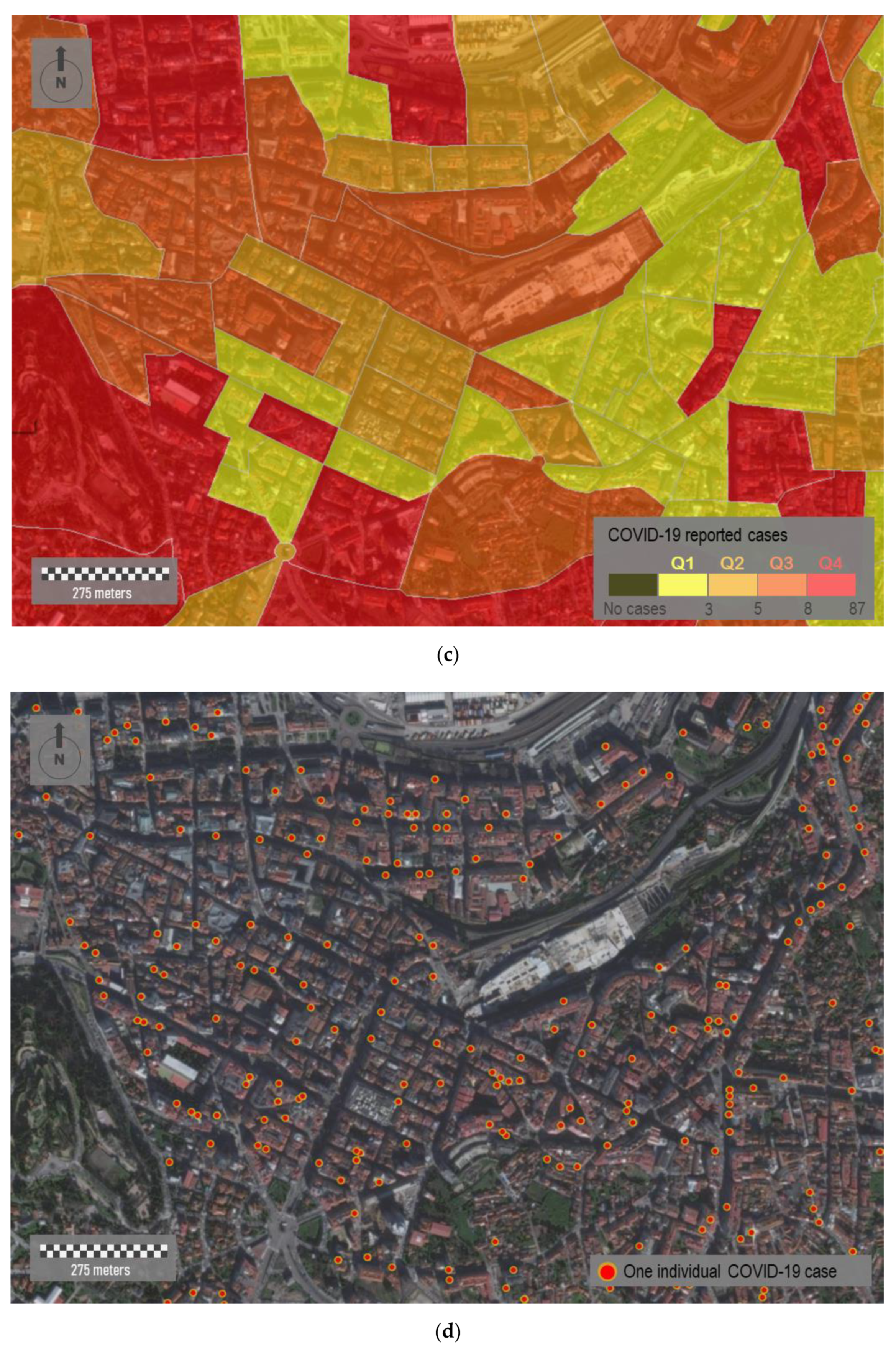
Figure 7.
Data aggregation of COVID-19 cases in study area B shown in Figure 1b. (a) In yellow, delimitation of the sample area. (b) Data aggregation of COVID-19 cases by road sections.
Figure 7.
Data aggregation of COVID-19 cases in study area B shown in Figure 1b. (a) In yellow, delimitation of the sample area. (b) Data aggregation of COVID-19 cases by road sections.

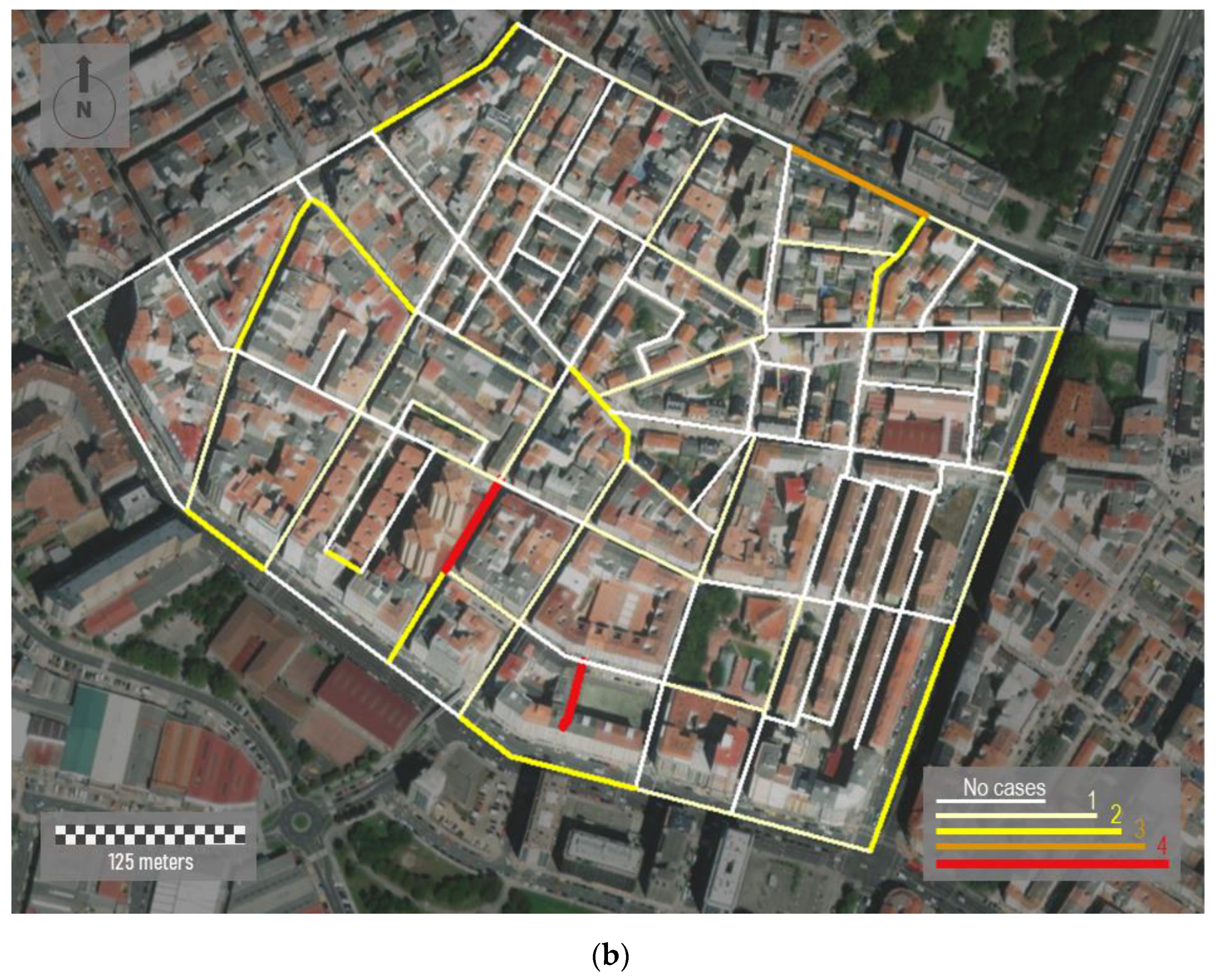
Figure 8.
Mapping individual COVID-19 cases in three different scenarios: (a) The downtown area of the city of Santiago de Compostela, (b) the center of a head town located in the northwestern part of the region, and (c) a small village for which its location is undetermined. Due to privacy concerns, the location of points is arbitrarily assigned, and it does not correspond with real data.


Figure 9.
Temporal evolution of the COVID-19 incidence in the city of Ourense. Mapping all the individual cases (a) on 15 April and (b) 15 July 2020. Heat map showing the density of cases for the above dates: (c) 15 April and (d) 15 July 2020. Raster composed of 272 columns and 356 rows, with a cell size 10 × 10.

Figure 10.
Incidence of COVID-19 located downtown of Ourense. (a) Aerial image of this sample area. (b) Mapping incidence by considering only the public space, i.e., streets and parks. The built urban space is represented by shading. In both panels, the most representative public facilities (such as educational centers, pharmacies, and health centers) with potential impact on virus spread are overlapped. Raster composed of 272 columns and 356 rows, with a cell size 1 × 10.

Publisher’s Note: MDPI stays neutral with regard to jurisdictional claims in published maps and institutional affiliations. |
© 2021 by the authors. Licensee MDPI, Basel, Switzerland. This article is an open access article distributed under the terms and conditions of the Creative Commons Attribution (CC BY) license (https://creativecommons.org/licenses/by/4.0/).
Share and Cite
MDPI and ACS Style
Carballada, A.M.; Balsa-Barreiro, J. Geospatial Analysis and Mapping Strategies for Fine-Grained and Detailed COVID-19 Data with GIS. ISPRS Int. J. Geo-Inf. 2021, 10, 602. https://doi.org/10.3390/ijgi10090602
AMA Style
Carballada AM, Balsa-Barreiro J. Geospatial Analysis and Mapping Strategies for Fine-Grained and Detailed COVID-19 Data with GIS. ISPRS International Journal of Geo-Information. 2021; 10(9):602. https://doi.org/10.3390/ijgi10090602
Chicago/Turabian StyleCarballada, Angel Miramontes, and Jose Balsa-Barreiro. 2021. "Geospatial Analysis and Mapping Strategies for Fine-Grained and Detailed COVID-19 Data with GIS" ISPRS International Journal of Geo-Information 10, no. 9: 602. https://doi.org/10.3390/ijgi10090602
Note that from the first issue of 2016, this journal uses article numbers instead of page numbers. See further details here.