
Health Literacy for the General Public: Making a Case for Non-Trivial Visualizations

Department of Computer Science, Western University, London, ON N6A 3K7, Canada
*
Author to whom correspondence should be addressed.
Informatics 2017, 4(4), 33; https://doi.org/10.3390/informatics4040033
Submission received: 3 July 2017
/
Revised: 18 August 2017
/
Accepted: 13 September 2017
/
Published: 23 September 2017
Abstract
:Health literacy is concerned with the degree to which individuals can access and understand information to make health decisions. The multifaceted nature of health data presents challenges for individuals seeking to improve their understanding of health. To aid health literacy efforts, we have developed HealthConfection, a visualization tool that uses elaborate and non-typical interactive visualizations to represent health data. In this paper, we report on two studies we conducted with HealthConfection. In the first study, we investigate whether individuals can learn to use non-typical visualizations, and the impact that short, minimalist video tutorials will have on participants’ understanding of the visualizations. The findings from this study suggest that individuals can learn to use non-typical visualizations and that participants who used the tutorials achieved higher scores than those without tutorials. This work indicates that non-typical visualizations are a viable option for conveying complex datasets. Based on this foundation, we conducted a second study to investigate if non-typical visualizations can improve health literacy for the general public. Results show that participants who used HealthConfection achieved higher scores than those who did not interact with the tool. Our work suggests that non-typical visualizations can be used to improve health literacy.
1. Introduction and Rationale
Health literacy can be defined as an individual’s ability to make health decisions based on a sound analysis of relevant data. Over the last few decades, health literacy has garnered attention across the world. This in part is due to research that suggests that health literacy is a key determinant of health. For instance, according to the American Medical Association, health literacy is a stronger predictor of a person’s health than age, income, employment status, education level, or race [1]. A survey conducted across eight European countries notes that individuals with lower levels of health literacy tend to have worse health [2]. In addition to the health implications, low health literacy has financial implications for individuals as well as governments [3,4,5].
Health literacy is multifaceted and encompasses a person’s ability to access, understand, process, and apply health information relevant to disease prevention, healthcare, and health promotion [6]. Disease prevention is an important aspect of public health [7]. In 2000, 35% of deaths in the United States were linked to tobacco and alcohol use, poor diet, and physical inactivity [8]. On a global scale, 10% of mortality is attributed to physical inactivity and dietary risk factors [9]. From a disease prevention standpoint, individuals with low health literacy have been shown to make poor health choices, engage in risky behavior, and have low self-management [5]. Though professionals are charged with educating the public about health risks, hazards, and issues, there is a need for personal empowerment as well [10,11,12]. Improving health literacy is a nontrivial endeavor. Currently, individuals seeking to access and understand health data are confronted with a myriad of data-related challenges. For instance, health data is often voluminous and originates from heterogeneous sources [13,14,15,16]. As a result, people find themselves having to engage in a time-consuming traversal of multiple websites to access relevant data. In addition to access, presenting data to individuals in a dense and understandable fashion is crucial to improving health literacy for the public [13]. Given the scale and complexity of the data related to disease prevention, visualizations have the potential to play a crucial role.
Interactive visualizations predominately represent data in a visual format and allow users to manipulate how the data is shown. Simple visualizations such as bar charts, scatter plots, and pie charts have been used extensively over the last two centuries in the health domain. However, as the size of data increases, there is a need for visualizations that can mirror the complexity of the data and facilitate its understanding without straining the cognitive resources of users [17]. While the development of elaborate non-trivial visualizations has increased in recent years, research on instructional materials for visualizations is sparse [18,19,20]. As users’ understanding of the tool influences their ability to use the tool to complete tasks effectively, more research on visualization literacy—which is the ability of users to interpret and extract information from visualizations—is necessary. Borner et al. highlight the need for instruction so that individuals are better equipped to understand novel visualizations [21]. While some may avoid using non-typical visualizations because of their complexity, it is important to investigate, if, with training, individuals can learn to use such visualizations. Therefore, before we can explore the use of non-typical visualizations for health literacy, it is important to first examine visualization literacy.
The purpose of this paper is twofold. First, to present research that investigates the ability of individuals to learn to use elaborate interactive visualizations. Second, to examine the ability of non-trivial visualizations to improve health literacy. To this end, we have created a visualization tool, HealthConfection, that allows individuals to make sense of the causes and risk factors that contribute to mortality across the world. Using this tool, we have conducted two user studies. The results from the first study, which is for visualization literacy, informs the second study that investigates health literacy. In this paper, we report our findings and discuss the implications for the visualization and health communities. The rest of the paper is organized as follows. Section 2 provides some conceptual and terminological background. Section 3 describes the visualization tool that we have created. Section 4 presents the research methodology and results from the visualization literacy study. Section 5 presents the health literacy study that we conducted. The final section, Section 6, presents the general conclusions.
2. Background
2.1. Health Literacy
Health literacy is concerned with the ability of an individual to access, read, and understand health information, and act based on that information [6]. Health literacy is a public health imperative [5,22]. Studies indicate that individuals with low health literacy are at a greater risk of long-term and life-limiting health conditions, as well as earlier mortality [23,24]. Individuals with low health literacy are less likely to be able to make sense of information related to clinical issues, risk factors, and social and physical determinants of health. In addition to the individual repercussions, low health literacy increases healthcare utilization and expenditure [3]. A 2007 report estimates that the cost of low health literacy to the U.S. economy was between $106 and $238 billion each year [4]. Advancing health literacy may also lead to more equity and sustainability of changes in public health [6,25].
In this paper, we focus on disease prevention. From a health literacy standpoint, individuals need to be able to access, understand, and interpret information on risk factors for health [6]. Disease prevention data is sourced from hospital records, demographic and health surveys, mortality reports, and research studies. Even after the data has been aggregated, individuals typically need to traverse multiple text-based tables to find information. To understand the causes that lead to mortality and the implications of certain risk factors is an exploratory process, in which individuals need to be able to ask questions, get answers, and observe trends. In other words, they need to be able to interact with the data seamlessly. While videos and infographics have been beneficial in helping to improve health literacy [26], when it comes to large sets of data there is a need for tools that allow users to control the flow of data and how data is represented.
2.2. Visualizations for Health Literacy
Visualizations, otherwise known as visual representations, have been used in varying capacities to help promote the understanding of health data. In the mid-19th century, Florence Nightingale used the coxcomb to visualize patient data and educate the Crown on sanitation-related deaths of soldiers during the Crimean War [27]. Visualizations have evolved in complexity both with respect to how data is represented and how users can interact with the data. On one hand, simple visualizations, such as bar charts and scatter plots, are being replaced with visualizations that allow users to encode multiple aspects of the data simultaneously [17]. On the other hand, static visualizations are being replaced with interactive ones that allow users to control how and what data is shown at a specific point in time. In this section, we highlight some of the recent work aimed at providing the public with an accessible manner to make sense of health data.
HealthMap provides a comprehensive view of the current global state of infectious diseases by bringing together disparate data sources [28]. Health GeoJunction extracts textual information from scientific literature, PH reports, and news reports to support the discovery of relationships between documents [29]. Weave is a web-based analysis and visualization environment that has been used to facilitate the exploration of breast and ovarian cancer data [30]. Community Health Map allows users to explore and compare the healthcare indicators across counties in the United States [31]. Zhao et al. [32] integrate ringmaps into the InstantAtlas software environment to explore complex socio-spatial patterns of cardiovascular disease in New Zealand. Their tool supports the exploration of cardiovascular disease at multiple levels of granularity. Liu et al. [13] have developed a tool that allows patients to visualize data from PubMed on cardiorenal disease and its comorbidities, as well as patient data from wearable sensors.
While existing research has advanced the use of visualization tools to make sense of health data, most tools typically focus on a specific disease or viewpoint. For instance, the tool by Zhao et al. focuses solely on cardiovascular diseases. Similarly, HealthMap supports heterogeneous data sources, but only for one group of diseases—infectious diseases. One notable exception is the suite of visualizations created by the Institute for Health Metrics and Evaluation (IHME) [33]. Our visualization prototype, HealthConfection, which will be described in Section 3, builds on existing research and seeks to advance the use of visualizations for health literacy.
2.3. Visualization Literacy
Visualization literacy has been defined as the ability and skill to read, interpret, and extract information from visualizations [34]. How people learn to use a visualization can influence their ability to understand the underlying data and complete tasks with the tool [35]. A study that involved 273 participants and 20 common visualizations provides strong evidence that a very high proportion of adults and youth have low visualization literacy [21]. Although users can improve visualization literacy through trial-and-error processes, past research indicates that sometimes when a faulty conceptualization of a visualization is formed users tend not to revise that conceptualization [19]. If users do not know how to properly use a visualization, they are less likely to use it and may abandon the information-seeking tasks entirely if they become frustrated. To support information-seeking behavior, it is necessary to provide users with tools that support, rather than hinder, their tasks.
More work on empowering individuals to understand visualizations is needed [21]. The visualization community recognizes this and is taking steps to improve visualization literacy within the general public. Recent efforts to improve visualization literacy investigate how instructional materials should be designed [18,20,36,37]. Ruchikachorn and Mueller demonstrated that by morphing visualizations from the familiar to the unfamiliar, participants could learn new representational forms [18]. Alper et al. [37] have developed an online platform for children in grades K to 4 to learn about pictographs and bar charts. Tanahashi et al. [20] investigated the top-down and bottom-up teaching methods, and active or passive learning types for the scatter plot, graph, storyline, and treemap. In general, they observed that participants who used the instructional materials that utilized the top-down teaching method and catered to active learning showed the greatest improvement in the test segment. Kwon and Lee further studied active learning strategies. Using the parallel coordinates visualization and three tutorials types: static, video, and interactive, they observed that participants with the interactive and video tutorials outperformed participants with static or no tutorials [36]. Some of the studies mentioned above have focused on simple visualizations, while others have investigated visualization literacy for static visualizations. Our research builds on this foundation and explores the impact of video tutorials for complex, sophisticated interactive visualizations.
3. HealthConfection
HealthConfection is a visualization tool that allows users to explore and make sense of the risk factors and the causes of mortality. The tool incorporates selected datasets aggregated by IHME [33]. The datasets include over 12 million records that estimate the 57 risk factors and over 235 causes that lead to death. Part of the challenge when working with large datasets is determining how users will explore the data. In visualizations, providing an overview is beneficial. When properly designed, overviews can provide users with an immediate appreciation for the size and extent of the data space, and support the navigation and exploration of the data space [38]. Previous visualization tools have shown the importance of providing users with a high-level overview of the data [30,32]. In addition to creating an overview visualization, we have also developed visualizations that emphasize four different perspectives through which users improve their health literacy: demography, geography, chronology, and sentiment.
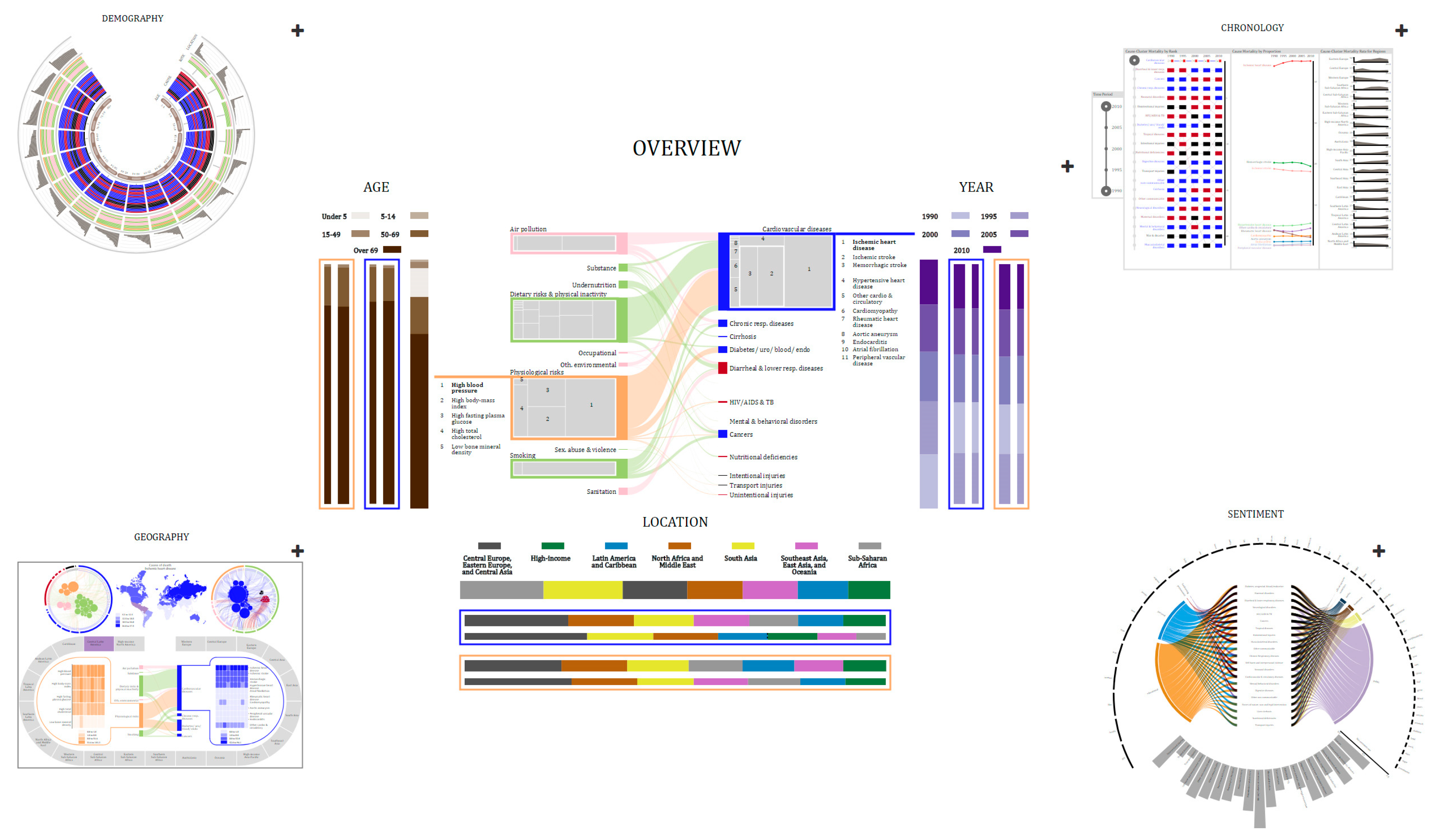
When working with multiple visualizations, it is important to provide users with consistent structures and navigational cues and anchors [38,39]. As users navigate a data-centered tool, they find themselves confronted with familiar questions, including where am I? where can I go? and how do I get there? Visual metaphors can help to provide consistent structures. When users internalize visual metaphors, they can navigate visualizations effectively [40]. One technique to organize several representations is to use the visual confection metaphor. A visual confection is an assembly of visual representations, juxtaposed to tell a story, present visual comparisons, and show relationships and transitions [41]. Confections focus on the organization of representations through compartments, which can then be used to zoom in on visual elements. The consistent structure and navigation allow users always to be aware of their current location. Based on the Gestalt principle of symmetry, one viable technique for juxtaposing visual confections is to have a central representation around which other representations are arranged [42]. Placing a representation at the center implies that the representations surrounding it are conceptually related to it [42]. The central representation, then, is where users begin their exploration of the story of the data. Figure 1 shows the visual organization of our tool.
HealthConfection provides cues that allow users to explore health data from different perspectives while at the same time minimizing visual discontinuity. By interacting with the ‘+’ anchor to the right of each compartment, users can explore a perspective, control which visualization is in the center, watch the tutorial, and hide other visualizations. The Overview visualization in Figure 1, shows the relationships between the causes of death and risk factors at a global level and allows users to select specific age groups, geographic locations, or points in time for investigation. The surrounding compartments allow users to explore the story of the data from the four perspectives. In the IHME datasets, causes and risk factors are grouped at the level of clusters and groups. For causes, there are 21 clusters and three groups: communicable, non-communicable, and injury. For risk factors, there are ten clusters and three groups: metabolic, behavioral, and environmental and occupational risks. In our visualizations, we use a consistent color coding to emphasize the hierarchical structure of causes and risks. Non-communicable, communicable, and injury causes are encoded with blue, red, and black, respectively. For risks, we use light shades of orange, green, and pink for metabolic, behavioral, and environmental and occupational risk groups, respectively.
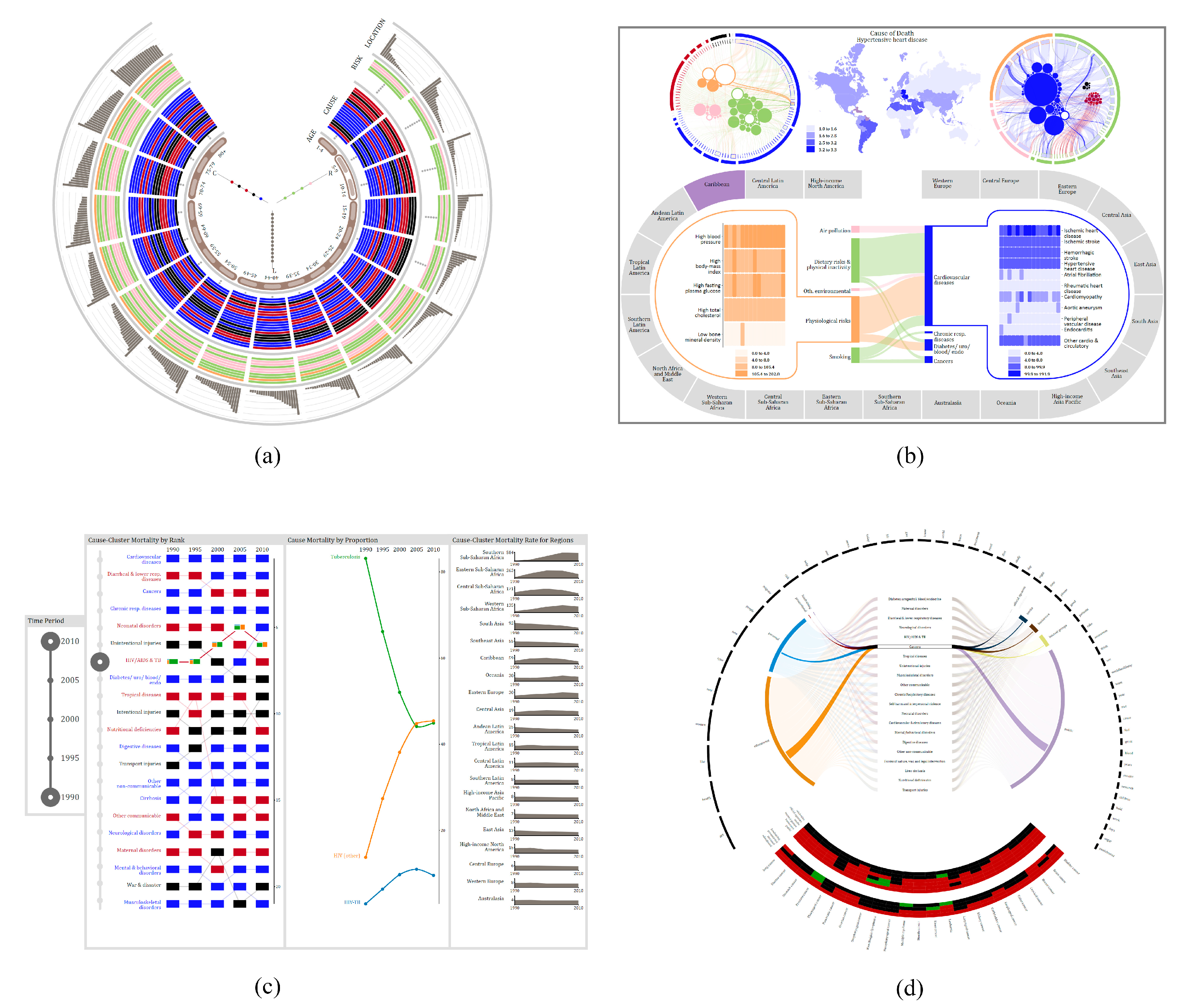
The Demography visualization allows users to explore which risks and causes affect different age groups. It also ranks the regions of the world based on their mortality rate for each age group. The visualization, enlarged in Figure 2a, has five main components, four of which are arranged as tracks. The innermost track represents the age groups at which the data is aggregated (e.g., 1–4, 50–54). The second track depicts the ranking of cause-clusters for each age group. Clusters are arranged in descending order, with the cause-cluster with the highest rank on the outside. The third track depicts the ranking of risk-clusters. The gray circles in the cause and risk tracks depict clusters that do not contribute to mortality for the age group. The last track shows the ranking of location clusters. Risk, cause, and location clusters are ranked and arranged according to their mortality rate per 100,000 people. The sub-visualization placed in the center of the tracks depicts the relationship between causes and risks for specific locations for a specific age group. The Demography visualization is a dense visualization that encodes over 800 data items in its initial configuration. Through interaction, users can control the amount of data shown and perform a variety of tasks. For instance, users can filter to understand how a risk-cluster affects different age groups. Users can also search for a specific cluster and then drill to get more information on the causes or risk factors that make up that cluster.
The Geography visualization (Figure 2b) allows users to explore the relationships between causes and risk factors at three levels of granularity: global, regional, country. The top half of the visualization encodes the relationship between risk factors and causes at a global level and the regional distribution of mortality for a selected cause or risk factor. The circular sub-visualizations on either side of the map show the same relationships but from different perspectives. The left one shows risk factors as circles and the causes related to them as arcs, while the sub-visualization on the right shows causes as circles and risk factors as arcs. The map shows how a selected risk or cause affects different regions of the world. The bottom half of the visualization allows users to explore the cause-risk relationship for a specific region of the world. The oval track is comprised of 21 visual elements, each representing a region. By selecting a region, cause- and risk-related mortality rates are shown as heatmaps, for the countries in the region. Connecting the risk and cause heatmap portions of the visualization are links that emphasize the relationship between cause-clusters and risk-clusters for that specific region. By interacting with the Geography visualization, users can determine the regions of the world that are most affected by a cause, cause-cluster, risk, or risk-cluster. They can also compare the impact that certain diseases have on countries and make sense of the relationship between causes and risk factors at multiple levels of granularity.
The Chronology visualization (Figure 2c) allows users to explore how mortality has changed over time. This visualization has two main controls and three panels. The first control allows users to filter data by selecting a specific time period. The second control is part of the first panel and allows users to select a cause-cluster for further examination. The first panel depicts the ranking of cause-clusters at a global level over the specified time frame. Each cause-cluster is arranged based on its rank for a specific year and links are drawn between each year’s placement to help users understand the temporal trend. The second panel depicts the proportion of mortality for causes in a selected cluster. The third panel portrays the temporal distribution of cause-cluster specific mortality for each region of the world. With interaction, users can determine which cause-cluster results in the highest mortality at a global level and explore how mortality has changed over time. The Sentiment visualization (Figure 2d) allows users to explore the public’s perception of different health hazards. This visualization uses Twitter data (data not from IHME) that includes over four hundred thousand health-related tweets. Using machine learning models, we classified each tweet by its user category and subject theme. The circular arcs at the top of the visualization represent the top 50 words for the dataset. The middle portion depicts the categorization of tweets by user groups and tweet themes. In its initial configuration (Figure 1), the bottom of the sentiment visualization depicts the sentiment rate for cause-clusters. Users can drill to retrieve additional information for a selected cause-cluster. For instance, in Figure 2d, when cancer is selected, the curved heatmaps depict the sentiment for each cause in the cluster for each user group and tweet theme.
Interaction plays a crucial role in the exploration of data. To facilitate the understanding of health patterns and trends, each visualization has different interactions such as filtering, drilling, selecting, searching, and comparing, that are operationalized in a consistent manner. For an in-depth discussion of how the visualizations were designed, the interested reader is directed to [17].
4. Visualization Literacy Study
4.1. Research Methodology
Ethics approval for this study was granted by the University of Western Ontario (#108944). To investigate how instructional material influences individuals as they seek to make sense of non-typical visualizations, we utilized the Demography and Geography visualizations from HealthConfection (see Figure 2a,b). We selected these two visualizations as the testbed because they include novel and unfamiliar sub-visualizations. For each visualization, we used two versions in our study, one that had a video tutorial and one that did not include the tutorial. The video tutorials for the Demography [43] and Geography [44] visualizations were hosted on YouTube.
4.1.1. Participants
A total of 33 participants were recruited from a university in Canada. All of the participants had to be at least 18 years of age and registered students. Participants also needed to be able to use a mouse, keyboard, and computer without any assistance. To recruit participants, we visited first- and second-year class sessions, presented a five-minute summary on the study, and allowed students to sign up or send emails to indicate that they desired to participate. Posters and flyers were also posted on university boards. All of the participants were volunteers, and none had seen or used the visualizations before.
4.1.2. Procedure
The experiment was conducted in the following steps. After providing consent, each participant was randomly assigned to either the control or the treatment group. Next, we provided a general introduction to the study. The participant then completed a short demographics form. Following this, the participant was given access to the Demography visualization and allowed to explore it. If the participant was a part of the treatment group, they watched the tutorial (i.e., short 5-mi video), and then explored the tool for an additional 5 min. If the participant was a part of the control group, they did not receive the tutorial but were given an equal amount of time to familiarize themselves with the tool (i.e., 10 min). Next, the participant was given access to the online question set for demography and instructed to use the visualization to complete the question set in 25 minutes. At the end of the timeframe, the participant could take a short break. Similar to the first part, the participant explored the Geography visualization, was provided access to the second question set, and instructed to use the visualization to complete the question set. Following this, the participant was given a questionnaire to self-report their experience. Finally, the participant was asked to fill out a form to indicate whether they would like to participate in the interview session. The entire procedure took approximately 90 minutes.
Of those who did not object to being interviewed, some participants were invited to participate in an interview session. During the interview session, after signing the consent form, the participant was asked questions to elaborate on their previously written responses. Also, they were shown the other version of the two visualizations and asked a series of questions. The interview session was audio-recorded. The entire procedure for a participant in this session took approximately 30 min.
4.1.3. Sources of Data
Four sources of data were used in the study: (1) achievement results and confidence scores obtained from the statistical analysis of the scores on the two question sets; (2) demographics forms; (3) experience questionnaires; and, (4) interview transcripts, obtained from the audio recording during the interview sessions.
Instead of paper and pencil tests, online tests were used to keep track of the overall time spent by each participant. The questions were multiple-choice and fill-in-the-blank type questions. The questions were designed to provide a comparative measure to assess an individual’s understanding of how data was encoded and how to interact with the visualization. Some questions required users to perform one sub-task. For example, for the Geography visualization users were asked, within the environmental and occupational risk group, which risk factor contributes to the most deaths worldwide? To answer this question, participants had to use one of the circular sub-visualizations to identify the largest risk that belonged to the specified group. Other questions required users to perform multiple sub-tasks. For instance, for the Demography visualization, to answer the question, what country in sub-Saharan Africa has the highest mortality rate for individuals between the ages of 35 and 39, participants had to perform three sub-tasks. They had to identify or search for all of the regions of sub-Saharan Africa for the age group. Next, they needed to select each region and then drill to determine which country had the highest mortality rate. In addition to answering the questions, participants were asked to rank their confidence in the correctness of their answer, for each question, on a 7-point Likert scale. The demographics form included questions relating to participants’ age, major, and gender. The form also asked questions about participants’ previous use of, and exposure to, visualizations. The experience questionnaire was used to collect quantitative and qualitative data detailing participants’ opinions of the visualizations and (if applicable) tutorials. The purpose of the interviews was to provide further information about the responses on the experience questionnaire and to help provide a deeper understanding of quantitative data. During the interview, participants from the control group viewed the tutorials and were asked for their opinions. Audio recordings were made of all the interviews. The recordings were later transcribed by the investigators.
4.1.4. Hypotheses
The visualization literacy study attempted to test the following two hypotheses.
Hypothesis 1.
Instructional materials (i.e., short, minimalist video tutorials) will improve participants’ understanding of non-typical visualizations. The group with instructional materials will outperform the control group. Performance will be measured using two main indicators (1) question set scores and (2) self-reported confidence scores.
Hypothesis 2.
This was the null hypothesis of the study: the performance of the two groups would be the same.
4.2. Results
To provide a clearer picture of the participants, prior to a discussion of the results, we present a summary of some data gathered from the demographics forms. The participants came from a wide range of departments, including creative writing, health science, urban development, medical science, kinesiology, music, computer science, biology, geography, women’s studies, economics, actuarial science, psychology, media studies, linguistics, and library information science. On a 7-point Likert scale, participants were asked to measure their use of typical and non-typical visualizations on a weekly basis. 64% of the participants in both groups reported using typical visualizations at least occasionally. On the other hand, 64% of participants in both groups reported using non-typical visualizations rarely, very rarely, or never. Table 1 shows a summary of demographic information of the participants by their group.
The rest of this section is divided into two subsections. In the first section, we present an analysis of the quantitative results. In the second section, we present an analysis of the qualitative data gathered from the experience questionnaires and during the interview sessions.
4.2.1. Analysis of Quantitative Results
A simple scheme was utilized; and, questions were awarded points based on the number of sub-questions. The first seven questions on the Demography visualization were awarded one point each, while the last three questions were awarded four points each because they each included four sub-questions. For the geography test, the first eight questions were awarded one point each, while the last two questions were awarded four points each. Skipped or incomplete questions were awarded a mark of zero. The points were added and then converted to a percentage. For the scoring of confidence, the Likert scale values were converted to numerical numbers (i.e., 7–strongly agree, 1–strongly disagree). The values were then added and converted to percentages.
Statistical analysis was conducted on the achievement and confidence scores. Table 2 shows the descriptive statistical summary. The treatment group generally performed better than the control group. The mean difference for the achievement score between groups is 13.4%. Figure 3 shows the box plot of the overall achievement scores per group. The mean difference for the self-reported confidence is 9.5%.
To examine whether there is any statistical significance to using the tutorial a one-way analysis of variance (ANOVA) test was performed. The analysis results are depicted in Table 3. We found that participants who used the tutorial performed significantly better on the question sets than participants in the control group, F(1,32) = 5.15, p < 0.05. A one-way ANOVA statistical test was performed on the confidence levels as well. The results indicate the difference in confidence scores is significant, F(1,32) = 6.31, p < 0.05. Based on the ANOVA tests and the descriptive statistical analysis of the achievement and confidence scores, Hypothesis 1 can be accepted and the null hypothesis can be rejected for the study.
4.2.2. Analysis of Qualitative Results
As the above quantitative analysis shows, using the tutorials improved participants’ achievement and confidence scores. In this section, we present the analysis of the qualitative data to get a better understanding of the experience of participants and the effect of the tutorials. These results include a combination of responses from the experience questionnaire and comments during the interview sessions. Participants are referred to by their number and their group, and participants in the control group are referred to as PC<#>, while those in the treatment group are referred to as PT<#>.
Effect of the Tutorial
On the experience questionnaire, participants were asked to speak to the effect of the tutorial on their ability to complete the question set. Some of the comments are:
- “I had never seen a Demography visualization before so the video introduced it to me and taught me how to use it. The video, although short, really explained how to use the visualization and made it clear where to find the things I needed to find.” (PT06)
- “Simply looking at the 2 circles was a bit offputting; with the tutorial it was made clear what the purpose was. I was immediately confused about the lines; however the tutorial cleared that up.” (PT10)
- “Being told how to interpret complex diagrams is very helpful when presented with a wide array of options/buttons to click. Being told what things meant and how to find them was very helpful.” (PT13)
- “Without any instructions on how the data is organized, it is difficult to get the hang of it yourself without spending lots of time.” (PT15)
During the interview, members of the treatment group were shown the version without the tutorial and asked if it would have been more or less difficult to use. PT07 said, “Extremely more difficult. I felt that I had difficulty even after having seen the tutorial, so I worry that without it I wouldn’t have managed to be slightly confident for the tasks”. PT13 had a similar opinion: “It would have been so much more difficult because the amount of data that you are trying to show to somebody. I’m sure I could have figured it out, but it would have taken me at least an hour to figure it out without the aid of the tutorial”.
Strategy for Making Sense without Aid
When asked how their strategy for using the visualization to complete the question set would have differed without the tutorial, PT07 said, “I can’t imagine how, but I want to say yes. Because for most of the questions I had an idea of where to start because I knew basically how most of the visualization worked, so I think I had a starting point. It would have been much more random guessing at the start of each question until I found something that answered the question and then I would have tried to figure it out from there”.
This observation is similar to the responses of the participants in the control group who participated in the interview. When they were asked how they learned to use the visualization, they said:
- “My process was just to click around until something happened and then try to understand what happened. I was able to figure out the second one because of the color scheme; the reserved colors help me to know that they were related.” (PC06)
- “Explore and understand it step by step. So, I break it down and go through the different sections to try and understand how they work together. It is kinda of funny. I didn’t notice the legend on the side until I had already gone through it and figured out what the categories meant on my own.” (PC10)
- “I started looking at the headings and just stared at it for a while. I did not realize that you could click or interact with it. And then when I started looking at the questions and answering them it started to make sense. Then I saw the + sign at the top and all the other things that started popping up.” (PC12)
Experience of Participants without the Tutorial
Four participants from the control group participated in the interview session, where each of them was shown the tutorial and then asked a series of questions. In terms of interacting with the visualizations, three of the four interviewed participants were unaware of many interaction options that existed for the Demography visualization. PC10 said, “I did not know that [the menu with five different interaction options] was there. I didn’t know how to use the hive plot. I just put low for the answer because I did not know what to do”. After watching the tutorial, PC12 said “WHAT! I did not see that. NO! I knew there was more but wasn’t sure how to get to it. There are so many things!” PC06 said, “Oh wow. This would have been beneficial to helping me use the tool”. When asked how using the tutorial might have impacted their exploration, they said:
- “It would have potentially helped me to find the other elements a little more easily. The things in the tutorial where things I figured out along the way. Where I struggled was combining different parts to find the answer. Narrowing down to the region or a specific country within an age group for a cause or risk. I think it would have helped me to skim off that part of figuring it out.” (PC02)
- “I would have been more purposeful in my interaction. I wouldn’t have had to click randomly to see the connection.” (PC06)
- “It would have helped me to feel more secure in the knowledge and my understanding of it. I think that in terms of which one was highest or lowest that was definitely something that I had to poke around with to figure it out. To figure out which was highest or lowest, when I clicked on it, I would compare the actual numbers. Understanding how the interactions work, that was something I was iffy on, so that would have been something that the tutorial would have helped with.” (PC10)
- “It would have made it better for me to figure things out. It would have changed my strategy. Cause I would know where to look for things because at first it was going to try and see what pops up and one of the things that I assumed that the causes at the top were the highest but I wasn’t sure if it was that way.” (PC12)
Our study reveals that the participants’ achievement and confidence scores increased with the use of the short, minimalist video tutorials. The qualitative data further underscores the benefits of instructional materials, especially when time is a factor. Some researchers believe that we should only use simple, chart-like visualizations, and have argued against the use of elaborate visualizations. This study shows that even when individuals have a low exposure to complex visualizations, the majority of participants reported using non-typical visualizations rarely or less than that, they were able to increase their visualization literacy through focused exploration. This study helps to emphasize the benefits of video tutorials and the ability of humans to learn to use non-trivial visualizations. Now that we have evidence indicating that individuals can properly use non-typical visualizations, in the next section, we investigate HealthConfection’s ability to improve health literacy.
5. Health Literacy Study
5.1. Research Methodology
In this section, we describe the research methodology to investigate the ability of visualizations to improve health literacy. Ethics approval for this study was granted by the University of Western Ontario (#108994). Once again, our study tool was HealthConfection. Participants used the Geography, Demography, Chronology, and Overview visualizations and had access to the respective tutorials. The Sentiment visualization was not included in the study because the public’s opinion on health issues is not an aspect of disease prevention.
5.1.1. Participants
A total of 28 participants were recruited from a university in Canada. All of the participants had to be at least 18 years of age and registered undergraduate or graduate students. Participants also needed to be able to use a mouse, keyboard, and computer without any assistance. To recruit participants, we visited first- and second-year classes and presented a five-minute summary on the study and allowed students to sign up or to send emails to indicate whether they desired to participate in the study. Posters and flyers were also posted on university boards. All of the participants were volunteers. None of the participants had seen or used the tool before.
5.1.2. Procedure
The experiment involved two sessions: a test session and an interview session. For the test session, the participants were randomly assigned to either the control or the treatment group, and were given the appropriate consent form. After obtaining consent, each participant completed a short demographics form. Next, for those in the control group, they were administered the health literacy quiz. This concluded their participation in the study. For a participant in the treatment group, they were given a brief overview of the tool and then given a task sheet to complete. The task sheet was designed to facilitate a guided exploration through each visualization. Upon completion of the tasks, the participant could take a short break. Next, the quiz was administered and then the participant was given a questionnaire to self-report their experience. Lastly, the participant was asked to fill out a form to indicate whether they would like to be interviewed. The entire procedure for a participant in the treatment group was approximately 100 min, while for a participant in the control group it was approximately 25 min.
Of those who consented to being interviewed, some participants were invited to participate in an interview session. During the interview session, the participant was asked a series of questions. The entire procedure for a participant in this session took approximately 25 min.
5.1.3. Tasks
Participants in the treatment group were asked to complete a series of tasks. Being that the data space is large (i.e., 12 million records), an unguided exploration by participants would result in different concepts being learned. The tasks were intended to provide participants with pre-determined goals to facilitate the learning of specific health concepts within the limited duration of the study. For each visualization, participants were asked to complete five tasks. Most tasks required users to perform a combination of sub-tasks and to interpret how the data was encoded. For instance, for the Geography visualization, participants were asked to determine which regions of the world are severely impacted by a diet low in fruits. This task can be completed in multiple ways. One way would involve, first locating, and then selecting, the diet low in fruits risk factor from one of the two circular sub-visualizations in the top half of the visualization. Next, a participant could use the map’s legend to select the regions that fall between the third and fourth quartiles. If a participant is unfamiliar with the regions highlighted, then he/she could select each region to determine its name. Participants were not told which steps to take. Instead, they were given the tasks and instructed to use the tool to complete them. As users performed the assigned tasks, they were able to gradually explore the story of the data and discover different trends that exist. Table 4 includes a sampling of tasks assigned.
5.1.4. Sources of Data
Four sources of data were used in the study: (1) achievement results obtained from the statistical analysis of the quiz scores; (2) demographics forms; (3) experience questionnaires; and, (4) interview transcripts, obtained from the audio recording during the interview sessions. A paper-and-pencil quiz was constructed. The purpose of the quiz was to ascertain participants’ global health literacy. The quiz contained 20 multiple-choice questions, which were based on the exploration tasks. The demographics form included questions relating to participants’ age, major, and gender. The form also asked questions about participants’ interest and exposure to global health concepts, as well as their previous use of and exposure to visualizations. The experience questionnaire, which was only for the treatment group, was used to collect quantitative and qualitative data detailing participants’ opinions of the tool. On the questionnaire, we surveyed seven questions regarding HealthConfection on the 7-point Likert scale: (1) Engagement; (2) Fun; (3) Ease of use; (4) Ease of learning; (5) Enjoyability; (6) Benefit to health literacy; and, (7) Layout of the visualization. During the interview sessions, participants were asked to expound on their written responses and provide detailed feedback on the efficacy of the tool. The investigators transcribed the audio recordings of the interviews.
5.1.5. Hypotheses
The health literacy study attempted to test the following two hypotheses.
Hypothesis 3.
The developed visualization tool improves health literacy. The group that uses the tool will outperform the control group on the quiz. Performance will be measured by achievement scores.
Hypothesis 4.
This was the null hypothesis of the study: the performance of the two groups would be the same.
5.2. Results
Before a discussion of the results, we present a summary of some data gathered from the demographics forms. The participants were from diverse departments including biology, computer science, psychology, kinesiology, political science, chemistry, biochemistry, linguistics, occupational therapy, management and organizational studies, urban development, electrical engineering, and library information science. On a 7-point Likert scale, participants were asked to measure their use of non-typical visualizations on a weekly basis. 70% of the participants in both groups use non-typical visualizations rarely, very rarely, or never. More than half of the participants in both groups mentioned that they had been exposed to global health in a formal school setting. Table 5 shows a summary of demographic information of the participants by their group.
5.2.1. Quiz Results
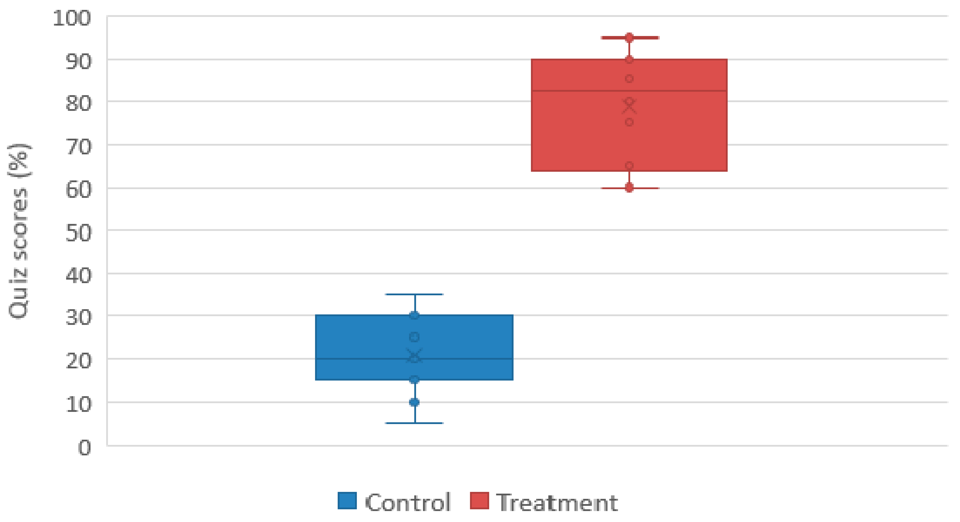
Each question on the global health literacy quiz was awarded one point. Skipped or incomplete questions were awarded a mark of zero. The points were converted to percentages. The participants in the treatment group achieved a higher score than those in the control group. Table 6 shows the descriptive statistical summary by group and Figure 4 shows the box plot of the overall scores. To determine if the effect of HealthConfection to improve health literacy is statistically significant, we applied a one-way ANOVA test on the quiz scores. The results of these analyses, F = 195.40, Fcrit = 13.74, p = 1.33 × 10¹³, thus p < 0.001, confirm our third hypothesis that the visualization tool improves health literacy.
5.2.2. Experience Questionnaire and Interview Feedback
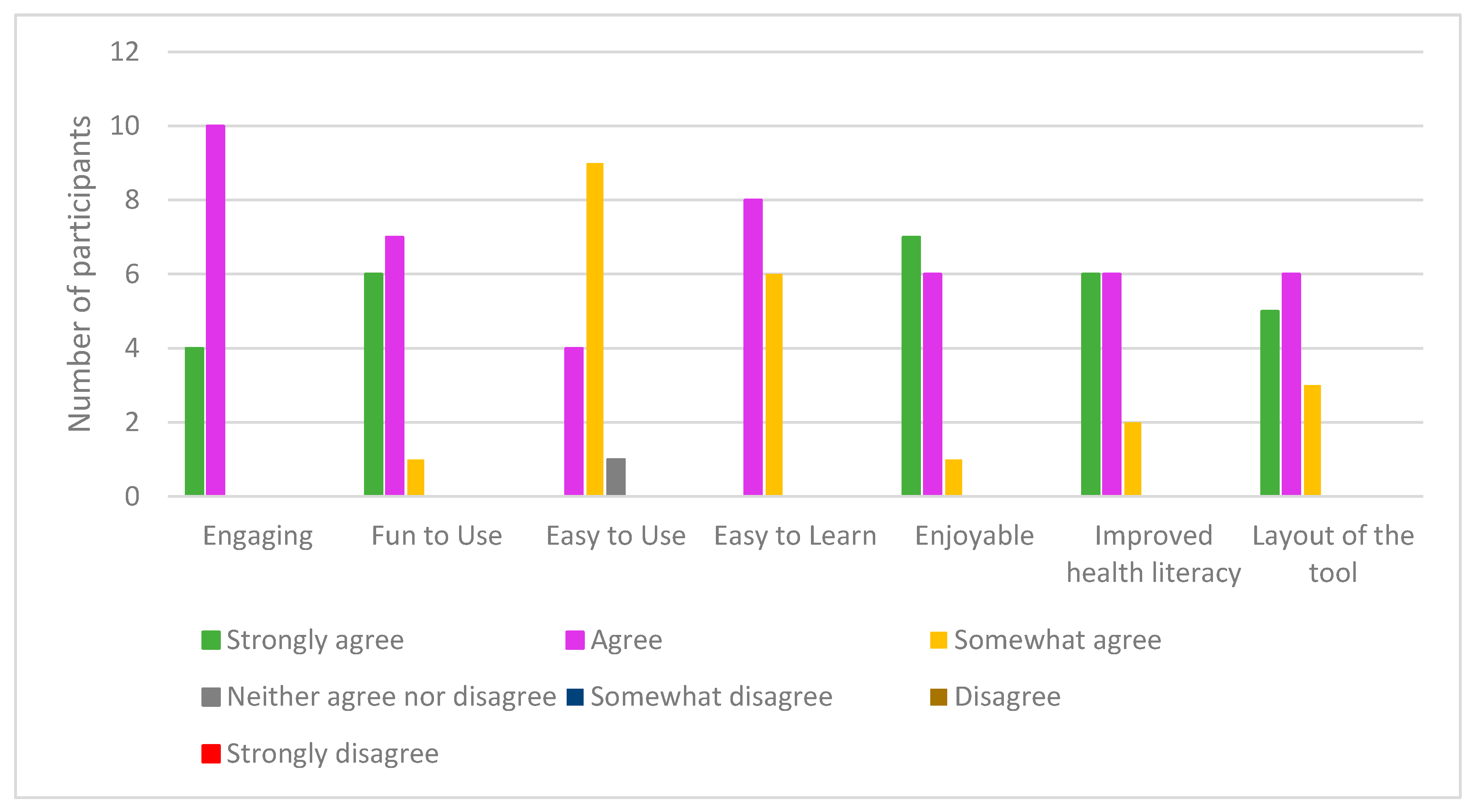
In this sub-section, we examine the quantitative and qualitative feedback received on the experience questionnaire and during the interview sessions. On the experience questionnaire, participants in the treatment group were surveyed to ascertain their experience with HealthConfection. Some of the questions were related to the layout of the visualizations and how engaging, fun to use, easy to use, easy to learn, and enjoyable to use the tool was. We also asked them to state whether they thought the tool improved their understanding of global health concepts. A 7-point Likert scale was utilized and Figure 5 details the responses. In addition to these questions, participants also provided written comments on their experience. Three of the 14 participants took part in the interview session. Participants are referred to as PT<#>, where # represents their identification number.
Generally, the participants’ responses were positive. 13 of the 14 participants agreed or strongly agreed with the statements relating to engagement, fun, and enjoyability. In the comment section, PT02 wrote “Super cool! I was very mesmerized by the entire program. Very interactive and fun to play around on. Good for visual learners. Elegant presentation of a mind-boggling amount of information”. PT13 wrote “Really neat! I think it could be really helpful for those who aren’t as mathematically inclined or those who learn visually”. In terms of ease of use, one participant was ambivalent, while the majority of participants somewhat agreed with the statement. During the interview, both PT13 and PT07 alluded to having to return to the tutorials during their completion of the tasks because they were not sure how to use the tool properly. When asked about the layout of the visualizations, five of the participants strongly agreed that it was beneficial for navigation, while six agreed, and three somewhat agreed. During the interview, PT13 mentioned that the benefit of having the layout is that you see everything together and know everything that is being offered. PT07 liked the layout and said, “it is like a mind map that improves navigation.” This sentiment was echoed by PT05 who said “The layout was beneficial for me; you can see how things are related. It is easier to move through because they are all close together. This idea of being able to move through the visualization, and thus navigate through the data is beneficial for exploration.
On the questionnaire, regarding health literacy, six participants strongly agreed that the tool was beneficial, six agreed, and two somewhat agreed with the statement. In the comments section, PT08 wrote, “Very informative and really fun to play around with and learn about global health. As someone who does not know very much about global health, I really enjoyed using this tool to learn about this topic”. PT11 commented “Very impressive; I wish they used these in class, it would really help the students learn better especially for health scientists”. During the interview session, PT05 who had his/her interview a week after the first session commented on the memorability of the data, “I still remember some of the information, like it was about my country, I was like Oh I didn’t know that. I would love to use it again”.
In this study, we investigated whether non-trivial visualizations can be used as health literacy tools. Our results were statistically significant and indicate that visualizations can be used to improve the general public’s understanding of health patterns and trends. An analysis of the qualitative data emphasizes the positive response of participants regarding HealthConfection as a health literacy tool.
6. Discussion and Conclusions
This paper has presented two multi-method empirical studies: the first investigated the use of short video tutorials to improve visualization literacy, and the second investigated the use of visualizations to improve health literacy. The testbed for both investigations was a visualization tool that we created, HealthConfection. This tool uses aggregated datasets of global health data.
The first study evaluated the effect of video tutorials on visualization literacy. The study showed that even without support structures, participants could learn how to use two sophisticated, non-trivial visualizations. In particular, participants with the tutorials achieved higher scores than those without instructional materials, indicating that the video tutorials improved participants’ understanding of the Geography and Demography visualizations. This study and its results have certain limitations. First, the participants are all university students who are not an accurate representation of the general public. Second, interviewees may have wanted to please the interviewer by providing desirable answers. Despite these limitations, the research can lead to a few general conclusions that have implications for the use of visualizations. First, our results can be generalized to other elaborate and unfamiliar visualizations; we believe that short, minimalist video tutorials can help to improve the public’s ability to use such visualizations. Second, contrary to our expectations, participants without the tutorial could make sense of aspects of the visualizations. These results suggest that if given time, the general public can make sense of and learn how data is encoded, and how to interact with novel, non-typical visualizations, even though they are complex and unfamiliar. That being said, it is possible that the closed nature of the questions served as an unconscious tutorial. Further research is needed to design more advanced and open-ended questions to better ascertain such knowledge. The second study investigated the use of non-typical visualizations to improve health literacy. The study showed that during an hour of goal-oriented exploration, the participants were able to improve their understanding of global health trends. Some limitations of the study include the sample size and the fact that students are not representative of the general public. Another limitation was that the control group did not have any exposure to the data within the visualization tool before taking the quiz. Future research should compare the use of visualizations to the use of existing repositories of data, including reports and search engines. In spite of these limitations, the study has implications for health literacy. The findings of this research demonstrate that non-trivial visualizations can be used to improve health literacy. In situations where individuals are motivated to learn, visualizations that initially may seem complex can be learned with short video tutorials. While in the past, typical visualizations, such as column charts and line charts, have been advocated for because of their simplicity, our research implies that more complex visual representation forms can be used to improve health literacy. Furthermore, the research suggests that when confronted with large amounts of data, visualizations that allow users to disclose information gradually are beneficial. The ease of use highlighted by users and their quiz scores underscore this point. The interactive nature of visualizations is also important. The research suggests that providing users with diverse interactions allows them to perform various tasks. Also, when exploration is a key task of users, the layout of visualizations may impact their ability to navigate. While we did not test the impact of different layouts, both the comments of users and the quantitative data suggest that providing users with a single interface that provides an overview, clear and consistent structures, and navigational cues is beneficial. With these visualizations, participants were able to engage in an exploration of the story of the data. The findings of this research imply that visualizations can be used to empower the general public to learn about disease prevention. Overall, we expect that our findings on using tutorials to improve visualization literacy and non-typical visualizations to improve health literacy could be generalized to other visualizations and other domains where large repositories of data need to be made available to the public in an accessible manner. Ultimately, we hope that our work serves as encouragement to those seeking to advance health literacy.
Author Contributions
Both authors contributed to the design of the tool and the experiments; O.O. implemented the tool, performed the experiments, and analyzed the data. Both authors contributed to the paper.
Conflicts of Interest
The authors declare no conflict of interest.
References
- Parker, R.M.; Williams, M.V.; Weiss, B.D.; Baker, D.W.; Davis, T.C.; Doak, C.C.; Doak, L.G.; Hein, K.; Meade, C.D.; Nurss, J.; Schwartzberg, J.G. Health literacy: Report of the Council on Scientific Affairs. Ad Hoc Committee on Health Literacy for the Council on Scientific Affairs, American Medical Association. JAMA 1999, 281, 552–557. [Google Scholar]
- Sørensen, K.; Pelikan, J.M.; Rothlin, F.; Ganahl, K.; Slonska, Z.; Doyle, G.; Fullam, J.; Kondilis, B.; Agrafiotis, D.; Uiters, E.; et al. Health literacy in Europe: Comparative results of the European health literacy survey (HLS-EU). Eur. J. Public Health 2015, 25, 1053–1058. [Google Scholar] [CrossRef] [PubMed]
- Rasu, R.S.; Bawa, W.A.; Suminski, R.; Snella, K.; Warady, B. Health literacy impact on national healthcare utilization and expenditure. Int. J. Health Policy Manag. 2015, 4, 747–755. [Google Scholar] [CrossRef] [PubMed]
- Vernon, J.; Trujillo, A.; Rosenbaum, S.; Debuono, B. Low Health Literacy Implications for National Health Policy. Available online: http://hsrc.himmelfarb.gwu.edu/sphhs_policy_facpubs/172/ (accessed on 13 August 2017).
- Kickbusch, I.; Pelikan, J.; Apfel, F.; Tsouros, A. Health Literacy the Solid Facts; WHO Regional Office: Copenhagen, Denmark, 2013. [Google Scholar]
- Sørensen, K.; Van den Broucke, S.; Fullam, J.; Doyle, G.; Pelikan, J.; Slonska, Z.; Brand, H. Consortium Health Literacy Project, European. Health literacy and public health: A systematic review and integration of definitions and models. BMC Public Health 2012, 12. [Google Scholar] [CrossRef] [PubMed]
- National Research Council. The Future of Public Health; The National Academies Press: Washington, DC, USA, 1988. [Google Scholar]
- Mokdad, A.H.; Marks, J.S.; Stroup, D.F.; Gerberding, J.L. Actual causes of death in the united states. JAMA 2004, 291, 1238–1245. [Google Scholar] [CrossRef] [PubMed]
- Lim, S.S.; Vos, T.; Flaxman, A.D.; Danaei, G.; Shibuya, K.; Adair-Rohani, H.; AlMazroa, M.A.; Amann, M.; Anderson, H.R.; Andrews, K.G.; et al. A comparative risk assessment of burden of disease and injury attributable to 67 risk factors and risk factor clusters in 21 regions, 1990–2010: A systematic analysis for the global burden of disease study 2010. Lancet 2012, 380, 2224–2260. [Google Scholar] [CrossRef]
- Schulz, P.J.; Nakamoto, K. Health literacy and patient empowerment in health communication: The importance of separating conjoined twins. Patient Educ. Couns. 2013, 90, 4–11. [Google Scholar] [CrossRef] [PubMed]
- Lemire, M.; Sicotte, C.; Paré, G. Internet use and the logics of personal empowerment in health. Health Policy (New York) 2008, 88, 130–140. [Google Scholar] [CrossRef] [PubMed]
- Nutbeam, D. Health literacy as a public health goal: A challenge for contemporary health education and communication strategies into the 21st century. Health Promot. Int. 2000, 15, 259–267. [Google Scholar] [CrossRef]
- Liu, E.; Zhao, Y.; Wei, H.; Roumeliotis, S.; Kaldoudi, E. Navigating health literacy using interactive data visualisation. In Proceedings of the 2016 IEEE 16th International Conference on Bioinformatics and Bioengineering (BIBE), Taichung, Taiwan, 31 October–2 November 2016. [Google Scholar]
- Ola, O.; Sedig, K. The challenge of big data in public health: An opportunity for visual analytics. Online J. Public Health Inform. 2014, 5, 223. [Google Scholar] [PubMed]
- Gotz, D.; Borland, D. Data-driven healthcare challenges and opportunities for interactive visualization. IEEE Comput. Graph. Appl. 2016, 36, 90–96. [Google Scholar] [CrossRef] [PubMed]
- Herland, M.; Khoshgoftaar, T.M.; Wald, R. A review of data mining using big data in health informatics. J. Big Data 2014, 1. [Google Scholar] [CrossRef]
- Ola, O.; Sedig, K. Beyond simple charts: Design of visualizations for big health data. Online J. Public Health Inform. 2016, 8, e195. [Google Scholar] [CrossRef] [PubMed]
- Ruchikachorn, P.; Mueller, K. Learning visualizations by analogy: Promoting visual literacy through visualization morphing. IEEE Trans. Vis. Comput. Graph. 2015, 21, 1028–1044. [Google Scholar] [CrossRef] [PubMed]
- Lee, S.; Kim, S.H.; Hung, Y.H.; Lam, H.; Kang, Y.A.; Yi, J.S. How do people make sense of unfamiliar visualizations?: A grounded model of novice’s information visualization sensemaking. IEEE Trans. Vis. Comput. Graph. 2016, 22, 499–508. [Google Scholar] [CrossRef] [PubMed]
- Tanahashi, Y.; Leaf, N.; Ma, K.-L. A study on designing effective introductory materials for information visualization. Comput. Graph. Forum 2016, 35, 117–126. [Google Scholar] [CrossRef]
- Börner, K.; Maltese, A.; Balliet, R.N.; Heimlich, J. Investigating aspects of data visualization literacy using 20 information visualizations and 273 science museum visitors. Inform. Vis. 2015, 15, 198–213. [Google Scholar] [CrossRef]
- Gazmararian, J.A.; Curran, J.W.; Parker, R.M.; Bernhardt, J.M.; DeBuono, B.A. Public health literacy in america: An ethical imperative. Am. J. Prev. Med. 2005, 28, 317–322. [Google Scholar] [CrossRef] [PubMed]
- Bostock, S.; Steptoe, A. Association between low functional health literacy and mortality in older adults: Longitudinal cohort study. BMJ 2012, 344, e1602. [Google Scholar] [CrossRef] [PubMed]
- Berkman, N.D.; Sheridan, S.L.; Donahue, K.E.; Halpern, D.J.; Viera, A.; Crotty, K.; Holland, A.; Brasure, M.; Lohr, K.N.; Harden, E.; et al. Health Literacy Interventions and Outcomes: An Updated Systematic Review; Agency for Healthcare Research and Quality: Rockville, MD, USA, 2011.
- Rowlands, G.; Shaw, A.; Jaswal, S.; Smith, S.; Harpham, T. Health literacy and the social determinants of health: A qualitative model from adult learners. Health Promot. Int. 2017, 32, 130–138. [Google Scholar] [CrossRef] [PubMed]
- Occa, A.; Suggs, L.S. Communicating breast cancer screening with young women: An experimental test of didactic and narrative messages using video and infographics. J. Health Commun. 2016, 21, 1–11. [Google Scholar] [CrossRef] [PubMed]
- Cohen, B. Florence nightingale. Sci. Am. 1984, 250, 128–137. [Google Scholar] [CrossRef] [PubMed]
- Freifeld, C.C.; Mandl, K.D.; Reis, B.Y.; Brownstein, J.S. Healthmap: Global infectious disease monitoring through automated classification and visualization of internet media reports. J. Am. Med. Inform. Assoc. 2008, 15, 150–157. [Google Scholar] [CrossRef] [PubMed]
- MacEachren, A.M.; Stryker, M.S.; Turton, I.J.; Pezanowski, S. HEALTHGeoJunction: Place-time-concept browsing of health publications. Int. J. Health Geogr. 2010, 9. [Google Scholar] [CrossRef] [PubMed]
- Purushe, S.; Grinstein, G.; Smrtic, M.B.; Lyons, H. Interactive animated visualizations of breast, ovarian cancer and other health indicator data using weave, an interactive web—Based analysis and visualization environment. In Proceedings of the 2011 15th International Conference on Information Visualisation, London, UK, 13–15 July 2011. [Google Scholar]
- Sopan, A.; Noh, A.S.-I.; Karol, S.; Rosenfeld, P.; Lee, G.; Shneiderman, B. Community health map: A geospatial and multivariate data visualization tool for public health datasets. Gov. Inform. Q. 2012, 29, 223–234. [Google Scholar] [CrossRef]
- Zhao, J.; Exeter, D.; Moss, L.; Hanham, G.; Riddell, T.; Wells, S. Incorporating ringmaps into interactive web mapping for enhanced understanding of cardiovascular disease. In Proceedings of the 2013 21st International Conference on Geoinformatics, Kaifeng, China, 20–22 June 2013. [Google Scholar]
- Institute for Health Metrics and Evaluation. Global Burden of Disease. 2013. Available online: http://www.healthdata.org/gbd. (accessed on 17 April 2017).
- Lee, S.; Kim, S.H.; Kwon, B.C. Vlat: Development of a visualization literacy assessment test. IEEE Trans. Vis. Comput. Graph. 2017, 23, 551–560. [Google Scholar] [CrossRef] [PubMed]
- Tory, M.; Möller, T. Human factors in visualization research. IEEE Trans. Vis. Comput. Graph. 2004, 10, 72–84. [Google Scholar] [CrossRef] [PubMed]
- Kwon, B.C.; Lee, B. A comparative evaluation on online learning approaches using parallel coordinate visualization. In Proceedings of the 2016 CHI Conference on Human Factors in Computing Systems, San Jose, CA, USA, 7–12 May 2016. [Google Scholar]
- Alper, B.; Riche, N.H.; Chevalier, F.; Boy, J.; Sezgin, M. Visualization literacy at elementary school. In Proceedings of the 2017 CHI Conference on Human Factors in Computing Systems, Denver, CO, USA, 6–11 May 2017. [Google Scholar]
- Hornbæk, K.; Hertzum, M. The notion of overview in information visualization. Int. J. Hum. Comput. Stud. 2011, 69, 509–525. [Google Scholar] [CrossRef]
- Spence, R. Information Visualization: An Introduction, 3rd ed.; Springer: Heidelberg, Germany, 2014. [Google Scholar]
- Ziemkiewicz, C.; Kosara, R. The shaping of information by visual metaphors. IEEE Trans. Vis. Comput. Graph. 2007, 14, 1269–1276. [Google Scholar] [CrossRef] [PubMed]
- Tufte, E.R. Visual explanations: Images and Quantities, Evidence and Narrative; Graphics Press: Cheshire, CT, USA, 1997. [Google Scholar]
- Gadanidis, G.; Sedig, K.; Liang, H.-N. Designing online mathematical investigation. J. Comput. Math. Sci. Teach. 2004, 23, 275–298. [Google Scholar]
- Demography Visualization Tutorial. Available online: https://youtu.be/HwKF9Cbozpo. (accessed on 13 August 2017).
- Geography Visualization Tutorial. Available online: https://youtu.be/HaR7sRfaVtY. (accessed on 13 August 2017).
Figure 1.
HealthConfection visualization tool.

Figure 2.
(a) Demography visualization; (b) Geography visualization; (c) Chronology visualization; and, (d) Sentiment visualization.
Figure 2.
(a) Demography visualization; (b) Geography visualization; (c) Chronology visualization; and, (d) Sentiment visualization.

Figure 3.
Box plot of the overall achievement scores for the control and treatment groups.
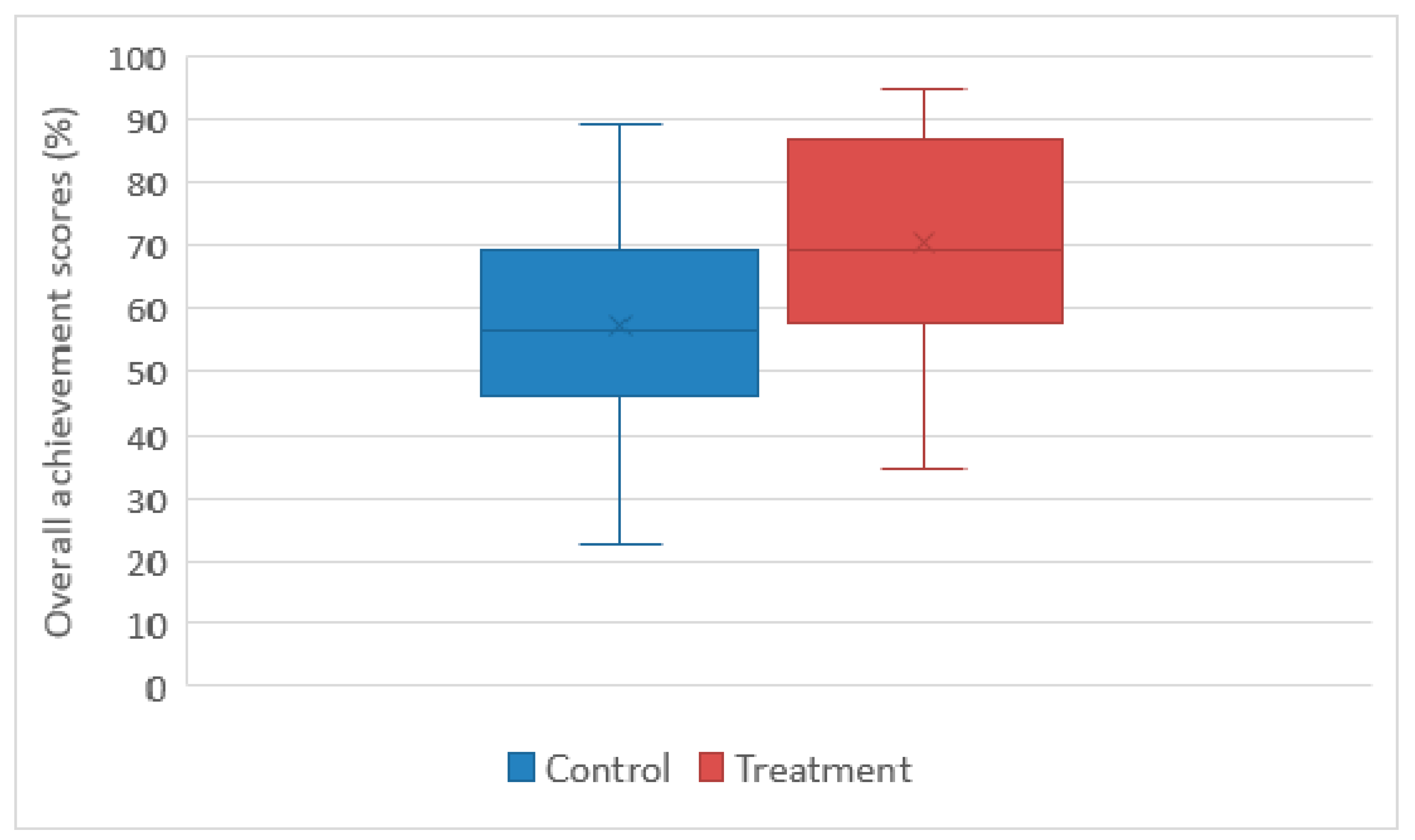
Figure 4.
Box plot quiz scores for the treatment and control groups.

Figure 5.
Responses on health literacy experience questionnaire.


Table 1.
Summary of participant demographics for visualization literacy study 1.
| Gender | |||||||
| Group | Male | Female | |||||
| Control | 6 | 11 | |||||
| Treatment | 7 | 9 | |||||
| Program Level | |||||||
| Undergraduate | Graduate | ||||||
| Control | 15 | 2 | |||||
| Treatment | 14 | 2 | |||||
| Use of Typical Visualizations | |||||||
| Always | Very Frequently | Frequently | Occasionally | Rarely | Very Rarely | Never | |
| Control | 1 | 3 | 0 | 7 | 4 | 1 | 0 |
| Treatment | 2 | 0 | 4 | 3 | 4 | 1 | 0 |
| Use of Non-Typical Visualizations | |||||||
| Always | Very Frequently | Frequently | Occasionally | Rarely | Very Rarely | Never | |
| Control | 0 | 0 | 0 | 2 | 5 | 6 | 3 |
| Treatment | 0 | 1 | 1 | 3 | 2 | 3 | 4 |
1 Two participants PT08 and PT10 declined to answer the questions relating to their use of visualizations.
Table 2.
Overall descriptive statistical summary for the visualization literacy study.
| Question Set | Confidence Level | |||
|---|---|---|---|---|
| Control | Treatment | Control | Treatment | |
| Mean | 57.31 | 70.68 | 75.92 | 85.38 |
| Standard Error | 4.16 | 4.16 | 2.85 | 2.43 |
| Median | 56.41 | 69.33 | 80.18 | 85 |
| Mode | 48.68 | 88.49 | 82.14 | N/A |
| Standard Deviation | 17.17 | 16.66 | 11.74 | 9.72 |
Table 3.
One-way variance analysis test for the visualization literacy study.
| Question Set | Confidence | |
|---|---|---|
| F(1,32) | 5.15 | 6.31 |
| Fcrit | 4.16 | 4.16 |
| p-value | 0.030 | 0.017 |
Table 4.
Sample tasks for health literacy study.
| Visualization | Task |
|---|---|
| Geography | At a global level, what are the risk factors that contribute to death from tuberculosis? |
| Chronology | Which cause-clusters significantly increased in rank between 1990 and 2010? |
| Demography | For which age groups, is dietary risk factor and physical inactivity the highest ranked risk-cluster that contributes to death? |
| Overview | Which cancer results in the highest number of deaths for adults in sub-Saharan Africa? |
Table 5.
Summary of participant demographics for health literacy study.
| Gender | |||||||
| Group | Male | Female | |||||
| Control | 5 | 9 | |||||
| Treatment | 5 | 9 | |||||
| Program Level | |||||||
| Undergraduate | Graduate | ||||||
| Control | 8 | 6 | |||||
| Treatment | 9 | 5 | |||||
| Use of Non-Typical Visualizations | |||||||
| Always | Very Frequently | Frequently | Occasionally | Rarely | Very Rarely | Never | |
| Control | 1 | 0 | 0 | 0 | 4 | 4 | 5 |
| Treatment | 1 | 0 | 1 | 2 | 3 | 1 | 6 |
| Exposure to global health concepts in school | |||||||
| Strongly Agree | Agree | Somewhat Agree | Neither Agree nor Disagree | Somewhat Disagree | Disagree | Strongly Disagree | |
| Control | 1 | 3 | 4 | 0 | 4 | 1 | 1 |
| Treatment | 1 | 3 | 5 | 1 | 3 | 1 | 0 |
Table 6.
Descriptive Summary of Quiz Scores.
| Treatment | Control | |
|---|---|---|
| Mean | 78.93 | 21.07 |
| Standard Error | 3.44 | 2.30 |
| Median | 82.50 | 20.00 |
| Mode | 60.00 | 15.00 |
| Standard Deviation | 12.89 | 8.59 |
© 2017 by the authors. Licensee MDPI, Basel, Switzerland. This article is an open access article distributed under the terms and conditions of the Creative Commons Attribution (CC BY) license (http://creativecommons.org/licenses/by/4.0/).
Share and Cite
MDPI and ACS Style
Ola, O.; Sedig, K. Health Literacy for the General Public: Making a Case for Non-Trivial Visualizations. Informatics 2017, 4, 33. https://doi.org/10.3390/informatics4040033
AMA Style
Ola O, Sedig K. Health Literacy for the General Public: Making a Case for Non-Trivial Visualizations. Informatics. 2017; 4(4):33. https://doi.org/10.3390/informatics4040033
Chicago/Turabian StyleOla, Oluwakemi, and Kamran Sedig. 2017. "Health Literacy for the General Public: Making a Case for Non-Trivial Visualizations" Informatics 4, no. 4: 33. https://doi.org/10.3390/informatics4040033
Note that from the first issue of 2016, this journal uses article numbers instead of page numbers. See further details here.