Task-Oriented Visualization Approaches for Landscape and Urban Change Analysis


Lab for Geoinformatics and Geovisualization (g2lab), HafenCity University Hamburg, Überseeallee 16, 20457 Hamburg, Germany
ISPRS Int. J. Geo-Inf. 2018, 7(8), 288; https://doi.org/10.3390/ijgi7080288
Submission received: 7 May 2018
/
Revised: 13 July 2018
/
Accepted: 20 July 2018
/
Published: 24 July 2018
(This article belongs to the Special Issue Historic Settlement and Landscape Analysis)
Abstract
:Approaches to landscape and urban change analysis are still far away from being fully automatic or operational. For this reason, the concept of Geovisual Analytics is proposed, combining computational and visual/manual processing steps. This contribution concentrates on the latter part with the overall goal of improving its usability. For this purpose, a classification of tasks is created, which often occur in the context of change analysis. This serves as the basis for the assignment of suitable map types to change processing results. Beyond this, it is pointed out that in many cases an appropriate pre-processing of data is imperative to preserve or enhance certain spatial relationships or characteristics for visualization. This is demonstrated using the example of data classification prior to choropleth mapping. Methods are described which allow the preservation of local extreme values, large value differences between adjacent polygons, clusters, and hot/cold spots. Finally, discussing future research and developments, it will be stressed that the importance of visual methods in the context of big data change analysis will continue to increase, which is due to the particular ability of maps to generalize and reduce complex data to a minimum.
1. Introduction
The increasing volume and variety as well as the improved characteristics of spatio-temporal data allow for an increasingly detailed and complex change analysis in the context of urban and landscape research. In particular, the trend toward higher temporal resolutions and an open data policy like the Copernicus program supports more users with more detailed and informative data.
However, approaches to analyzing this data are far away from being fully automatic or operational. For this reason, the concept of Geovisual Analytics is pursued, which follows a close linkage between computational and visual/manual processing steps [1]. Computational methods are able to describe results for various spatial effects such as heterogeneity or hot spots. On the other hand, maps and other visualization formats are still necessary in the analysis process [2]. First, visual representations for exploration and hypothesis building are well accepted in a multi-level approach. Second, in some cases, computational methods only give a global value for the entire scene being examined (such as the standard deviation of all attribute values or the global Moran’s index). Visualizations in turn allow for an impression or interpretation of the actual geographic distribution or arrangement (such as northwest gradients, islands, etc.) and other variations in space [3].
This paper focuses on the visual part of the Geovisual Analytics concept. Within this framework, the main contributions are as follows:
- A classification of low-level tasks is developed that frequently occur in the course of landscape and urban change analysis. This not only takes into account remotely sensed and other categorical data (such as land use classes), but also quantitative data such as (geo-) statistical numbers.
- An assignment of suitable visualization methods or map types to the given change analysis tasks is developed. These comprehensive and generalizable recommendations follow the idea of using maps effectively and efficiently, thus improving the overall visual/manual processing part of the analysis. This aspect, together with the aforementioned task classification, follows the frequently expressed demand for “identifying a ‘right’ visualization type for the data/purpose/audience” [4] (p. 126), [3] (p. 130).
- It is stressed that not only the pure graphical representation, but also the corresponding pre-processing of the data is of great importance. This aspect is demonstrated by the step of data classification prior visualization by emphasizing the need for and development of an algorithmic solution to the problem of preserving spatial properties such as local extreme values or hot spots, which could be lost in maps with conventional data classification methods.
After briefly presenting related work in which this article is embedded (Section 2), Section 3 deals with the classification of low-level change analysis tasks. Based on this, Section 4 describes the guiding principles for the visualization and provides a detailed correspondence of the map types with the type of change analysis outputs. The solution for the aforementioned problem related to data classification is presented in Section 5. Finally, Section 6 summarizes the work and provides some hints for future research and development, especially taking into account the various aspects of future big data.
2. Previous Work
As mentioned above, this paper focuses on the visualization component within a Geovisual Analytics concept. According to Keim et al. [5], Visual Analytics “combines automated analysis techniques with interactive visualizations for an effective understanding, reasoning and decision-making on the basis of very large and complex datasets”. As a subdomain, Geovisual Analytics stresses the use of geographical data and analysis methods in an interdisciplinary context [1]. A more detailed discussion of this domain, including its relation to Geovisualization or Cartography, is given in [6].
There are numerous case studies focusing on the change analysis of urban or landscape elements. Because most of them rely on remotely sensed data, change analysis is often restricted to comparing the respective classes based on the pixel or segment level of two or more scenes. More advanced methods are based on object-oriented data modeling concepts [7,8]. In order to integrate more detailed features such as patterns or auxiliary information (like population numbers), quantitative data should also be taken into account [9].
What is missing is an abstract classification of basic tasks that occur in the process of change analysis and allow a close linkage to the visualization of results. This paper uses existing classifications of general tasks related to geographic data as a basis for deriving the specific tasks that occur in the context of spatial change analysis. Firstly, the concept of the Map Use Cube by MacEachren and Kraak [10] is taken into account, which considers the parameters’ information content, user expertise and interactivity of the map. The approach of Peuquet [11] uses the simple spatio-temporal questions “what”, “when” and “where,” for which normally two aspects are given and the missing third is sought. The task taxonomy proposed by Andrienko and Andrienko [12] describes elementary and synoptic tasks, which also include several comparison tasks, some of which are used and modified for the scope of this contribution.
Many case studies have been published regarding the visualization of spatial changes, but a well-accepted and abstract classification scheme that provides recommendations for effective and efficient display is not known [4]. There are some theoretical works that combine visualizations of categorical changes with computational techniques, following the idea of Geovisual Analytics [13,14]. Other authors developed software packages that enable interactive change analysis [15,16,17]; however, a structured classification of “simple” map types for the various types of change analyses is not given here either.
3. Classification of Change Analysis Tasks
In order to be able to assign suitable visualization types (Section 4), a well-structured classification of low-level tasks is required, which often occurs in the context of change analysis. In the following, it is assumed that the change analysis includes at least two data sets consisting of more than one reference region (represented by “Canadian provinces” in most of the following examples).
Following the general classification of map use tasks [10], the focus here is on presentation tasks, i.e., the communication of already interpreted data and information. In contrast, exploration tasks want to create or verify hypotheses. A conceptual classification framework is proposed that uses the triad model of spatiotemporal analysis introduced by Peuquet [11] as basis. This model breaks down tasks into their components “What”, “Where” and “When”, two of which are generally specified and asked for the third. For each of the combinations (e.g., “What” as output clause), possible changes’ features (e.g., existential change) are compiled. For each change feature, possible outcomes (e.g., in the case of “existential change”: gain, loss or none) and exemplary questions for illustration purposes are listed. This follows the approach of Andrienko and Andrienko [12] who developed a taxonomy for elementary and synoptic spatio-temporal tasks; however, they did not explicitly address change tasks.
The most complex component, the “What” clause, describes the thematic component in the context of change analysis. Table 1 summarizes possible features and focuses on the “What” clause as output components only. In addition, it is of course possible that “What” input clauses also contain non-change features (i.e., existence, class, absolute or relative value).
Cardinal data are divided into absolute and relative values (1d and 1e, resp.), as this affects follow-up visualization (Chapter 4). In both cases, a change value may include the actual value difference, but also just a trend (increase, decrease, constant), local or global extreme values (maximum, minimum), or other statistical parameters such as mean or standard deviation.
It should be noted that the “What” output clause could also integrate the important aspect of analyzing changes in patterns such as hot or cold spots, clusters, or neighboring gradients. Using hot and cold spots as an example, all types of change features are possible, for example:
- Existential change: “What kind of existential change of hot spots can be observed in Canadian provinces between 1950 and 2000?”
- Unspecified class changes: “What changes in hot spot classes (such as very significant, significant, etc.) can be observed in Canadian provinces between 1950 and 2000?
- Specified class change: “In Canadian provinces between 1950 and 2000, is there any change between very significant hot spots (Getis Ord Index z-score above 2.0) and very significant cold spots (Getis Ord Index z-score below −2.0)?”
- Change in relative value: “What is the change in Getis Ord Index z-core for describing hot spots in Canadian provinces between 1950 and 2000?”
All examples given in Table 1 ask for a bi-temporal comparison between two given dates. Of course, it is possible to extend these questions to multi-temporal scenarios, for example:
- Existential change: “What kind of existential changes in lakes can be observed in Canada in 1950, 1960, 1970 and 1980?”
- Change in absolute values: What is the average population change in Canadian provinces between 1950 and 2000 in 10-year-increments?
The “Where” clause (Table 2) describes the spatial component of the change analysis. It should be noted that “Where” explicitly asks only for a position or a position change. Other geometric attributes such as size or shape can be used in addition to the position, but, in these cases, they are normally treated as absolute or relative thematic values. The following example, looking for a change in area size, is illustrating this: “Where in Canada can we observe an increase in forest areas between 1950 and 2000?” Often, the triad model requires “Where” clauses in the input and output (for example: 2c).
The “When” clause (Table 3) describes the temporal component of the change analysis. Most output clauses ask for dates or time periods (duration, time interval, and time series) that relate to specified thematic and/or geometric events or changes. Frequently, “When” clauses appear in both the input and output components of the task (3a to 3d). Questions about actual changes in time features (such a change in duration; 3e) can also be described with the next order time type (e.g., a change in date is equal to a duration or time interval).
Finally, it should be noted that, for all “W” combinations, there are also exceptions from the standard syntax that two given components require. For example, the following task, following the syntax “When ➲ What ⊕ Where”, has only one input and two output components: “How has the position and health index of forest areas in Canadian provinces changed between 1950 and 2000?”
4. Visualizing Outputs of Change Analysis
4.1. Guiding Principles
Apart from the typical quality requirements such as accuracy and legibility, the overall guiding principle for the development of visual elements should be usability, i.e., the provision of effective and efficient solutions for the analysis of changes. Satisfaction, the third aspect of usability according to its definition [18], is neglected in the remainder of this paper. The need for further research and development in this context is expressed, among others, in the research agendas of the International Cartographic Association (e.g., [19]).
A major goal of maps is a reduction of complexity and a focus on relevant change behavior. Based on common cartographic and cognitive concepts and principles (e.g., [20,21,22]), a couple of detailed recommendations for this specific change analysis case can be derived. These recommendations relate to the actual graphical (and possibly interactive) design, but in some cases also to the data processing stage (see Section 5):
- A rather fundamental aspect relates to the question of whether spatial context (e.g., spatial distribution of changes in the scene) is relevant for the specific application. This leads either to the need for cartographic visualization (either as a single map or as linked views), or to the explicit abandonment of a map-like representation.
- The visualization should be tailored to the tasks or questions that relate to the specific application. This requires a predetermined classification of tasks that often occur in the context of change analysis. This task-oriented approach is becoming increasingly apparent as the complexity of applications increases and workflows should be still effective and efficient.
- In terms of efficiency, explicit visualization of changes should be made where possible. For example, instead of displaying two maps of different points in time side-by-side and asking the users to detect changes themselves, changes should be explicitly displayed in a difference map in order to free human resources for interpretation tasks.
- More technically, the visualization should minimize eye-movements. During these movements (called saccades), cognitive reception of information is not possible and, even worse, a typical loss of exact locations can occur as one moves from one map to another.
- One should also consider an appropriate degree of interaction functionalities—again, to allow efficient use.
- In this context, the tools should also enable users to save and annotate on findings for further interpretation and comparison [19] (p. 38).
Taking into account the aforementioned principles, the possible output feature values from Table 1 to Table 3 are taken up in the following and assigned to suitable map types—differentiating between bi-temporal and multi-temporal applications (Section 4.2 and Section 4.3, resp.). Basically, polygons are assumed as reference geometries. Of course, each of the following elementary maps, which show only the output result, can also be supplemented by input components for a better understanding.
4.2. Recommendations for Representing Bi-Temporal Changes
Having two maps of different times side by side, we face the problem of various eye movements and the need for further cognitive work by the user to separate changes from non-changes. Therefore, it is claimed here that the difference map is the preferred type in the case of bi-temporal changes because it allows a fast and explicit view on changes.
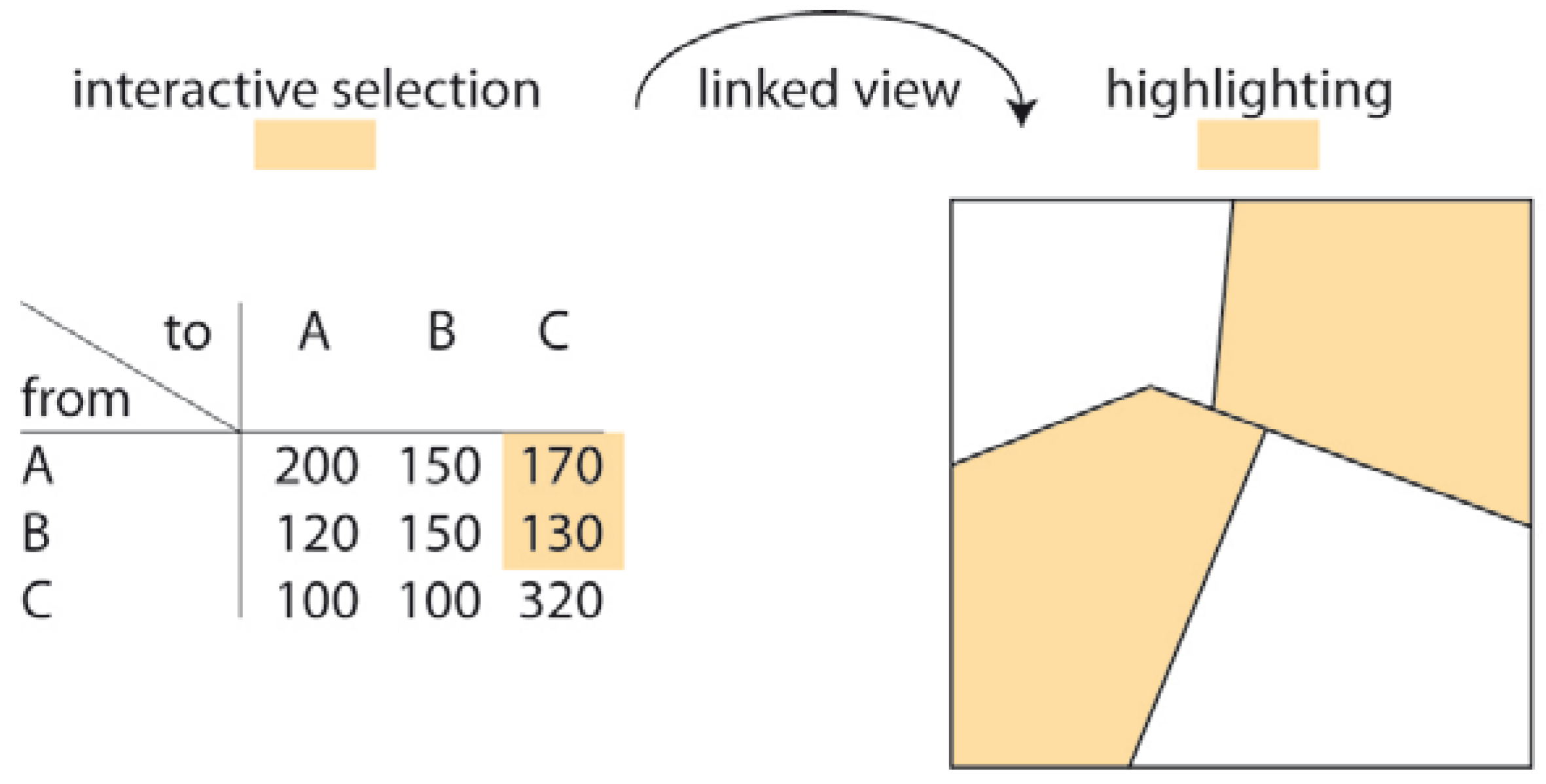
With respect to the “What” output clauses, maps have to distinguish between data at nominal (categorical) or metric (cardinal) levels of measurement (Table 4). In the first case (4a to 4c), symbol maps should generally be used to depict the differences [20]. Assuming polygons as reference geometries, areal symbol maps (mosaic maps) are the first choice when the number of possible output values is limited and can be represented by a small amount of colors filling the polygons (preferably with associative meanings such as green for increase, red for decrease, and grey for constant behavior; 4a). On the other hand, if the number of output values is too large or more than one value is required per polygon, point like symbols or (micro) diagrams should be used. An example of this is an unspecified land cover class change (4b), where many combinations of from and to classes are possible. A specified class change might consist only of a particular tuple of classes (such as change from forest to urban; 4c). A larger number of class combinations can be visualized using a linked view with a change matrix (Figure 1).
In the case of metric data, absolute and relative values must be differentiated for visualization purposes, resulting in proportional symbol maps (4d) or choropleth maps (4e) [20]. If the value difference as such is not wanted, but only the trend (increase, decrease, none), one can refer to existential change maps (4a). If also extreme values shall be highlighted, additional symbols (such as flags) can be used.
With respect to the “Where” output clauses (Table 5), a typical map based task is to represent regions or locations that meet certain thematic and/or geometric conditions (5a and 5b). In order to depict translations or movements of objects, origin-destination flow maps [23] are an appropriate choice in which vectors represent the distance and orientation of the movement (5c). Depending on the complexity, also the objects under consideration (such as grassland regions in example 5c) can be visualized together with the vectors for clarification purposes. It should be noted that curved arrows, in contrast to the recommendations for origin-destination flow maps [23], do not make sense because an accurate description of the direction of movement is lost.
With respect to the “When” output clauses (Table 6), maps mainly show dates or time periods (duration, time interval, time series) that are related to defined thematic and/or geometric events or changes. Either labels or the presented graphical depictions may be used for this purpose (6a to 6d). It has to be noted that dates (such as years in 6a) are strictly speaking absolute values; however, we prefer choropleth maps in order to enhance the more important sequential aspect.
Based on the previous lists for single change features (Table 4, Table 5 and Table 6), it is also possible to combine graphical recommendations for more complex tasks. Considering the example mentioned in Section 3 (“How has the position and health index of forest areas in Canadian provinces changed between 1950 and 2000?”), Figure 2 shows that the proposed representations for translation (flow map) and absolute value (proportional symbol) can be combined into a compact symbol instead of using separate representations.
4.3. Recommendations for Representing Multi-Temporal Changes
Animations are often used as a presentation format for multi-temporal scenes. From a cognitive point of view, however, they inherit some limitations [24,25,26,27]. For useful animations, the changes should be fairly close together in the users’ field of view and show the same trend over the entire scene (e.g., loss of forest only). Otherwise, too many changes are simply overlooked and too many eye movements (saccades) are needed, which in many cases cannot be handled due to the limited animation frequency. The integration of interactive control elements (such as stop, backward) seems to avoid these problems; however, the use of these elements in turn requires additional eye-movements and leads to a cognitive loss of information.
The map series, i.e., a sequence of static single maps, is an alternative to animations [20]. To extend the aforementioned recommendation in the context of bi-temporal changes, difference maps should also be used here: For n scenes with different points of time, this would cause (n − 1) difference maps if only a comparison between directly subsequent dates takes place. If all possible combinations of dates are desired, (n − 1)! difference maps must be generated. Again, a linkage similar to that between the change matrix and the binary mosaic map (Figure 1) may help to select the desired combination in an interactive manner.
Of course, the multi-temporal change analysis can also include the search for various specific temporal patterns over two or more selected scenes—like the aforementioned question “In which successive years can we observe an increase and then a decrease in population numbers in Canadian provinces?” In principle, it is possible to reduce each of these temporal patterns to elementary outputs as shown in Section 3.
5. Data Processing Prior Visualization
5.1. Problem Statement
The aforementioned choice of map types has the goal of effectively and efficiently supporting change analysis tasks through a graphical display of information. In many applications, it is also necessary to perform an appropriate pre-processing of data before a display can be meaningful at all. This includes, for example:
- a proper choice of time intervals (e.g., to avoid smoothing effects due to long time lags or a large redundancy due to short time lags),
- a meaningful aggregation of spatial units,
- the definition of thresholds (e.g., to separate an actual change from random behavior), or simply,
- an appropriate cartographical generalization.
Another very relevant problem, which will be elaborated in more detail below, is related to the use of classified choropleth maps, which are necessary for the depiction of relative values (Table 4e and Table 6a). In contrast to the unclassified version, the transformation of original values into discrete intervals offers the advantage of a better and faster overview due to the reduced number of classes together with sharper color or grey value contrasts. However, conventional classification methods such as equidistant, quantile or natural breaks, together with the number of classes, the consideration of boundary classes or the possible neglect of outliers, are known to have a significant impact on the class memberships—and thus on the visual perception and interpretation of choropleth maps.
Moreover, the above-mentioned classification methods, which are typically implemented in GI software packages, do not consider spatial context. This could result to the loss of important spatial relationships or patterns such as extreme values, hot/cold spots, or clusters. The reason for this is that these methods work data driven, i.e., intervals are determined only on the frequency distribution of original values without consideration of topological properties. For example, it may happen that a region having an extreme value is placed into the same class as one or more of its neighboring regions. Thus, the extreme value can no longer be extracted visually.
Relatively little has been published on the problem of neglecting the spatial context or a task-oriented approach; an overview is given by [20,28]. Attempts to describe and maintain value differences of spatial neighbors were published several years ago, for example, by [29,30,31]. Often, however, the aim here was to simplify the patterns so that the map user can more quickly grasp the gross trends in the representation without being disturbed by a detailed and “patchy” impression [32,33,34]. However, this procedure does not guarantee that any existing significant spatial variations and patterns will be maintained.
One way to tackle this problem is to perform a manual-subjective selection from many data classification methods. Instead, task-oriented methods should be developed and applied—Section 5.2 provides a selection from some of these developments.
Finally, it has to be pointed out that there is no objective or even correct classification; however, it is necessary for a map to preserve or enhance certain relationships of interest depending on the task or purpose.
5.2. Task-Oriented Data Classification Methods
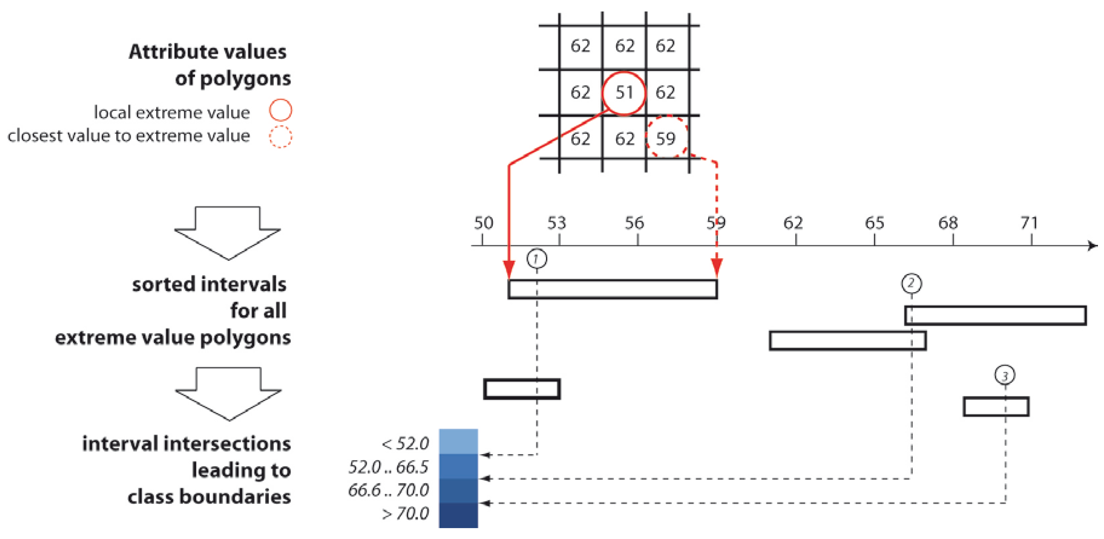
A typical task is to preserve local extreme values, i.e., those polygons that show (significant) higher or lower value compared to all of their neighbors. A detailed description of the proposed method is given in [35]; the following is an overview of the principle (see also Figure 3).
The search for extreme value polygons by considering the value differences to all direct neighbors is accelerated by a spatial R-tree index. From all neighbors of a local extreme polygon, the attribute value closest to the extreme value is extracted—setting a class boundary within the interval between this neighboring value and the extreme value ensures the isolation of the extreme value against all neighbors. All of these intervals are sorted by magnitude and plotted on a number line. A plane sweep algorithm is used to identify the optimal class boundaries: to do this, a line is passed incrementally over the range of values while counting and storing the number of intersections. Starting from the polygon with the largest interval width, the first class boundary is then set where the maximum number of intersections is found. After excluding all intervals that are hit by this first boundary, the next pass is made over the next largest remaining interval. This step is repeated until either all intervals (i.e., all local extreme values) have been covered or the predetermined number of classes has been reached.
In order to not only visually demonstrate the added value of the approach (Figure 4), empirical tests were conducted to investigate the degree of conservation of local extreme value polygons depending on the number of classes and the characteristics of the data set. Table 7 describes three selected datasets and Figure 5 shows the respective numerical results.
In summary, the empirical tests have demonstrated that the presented approach, in comparison to the known data-driven methods, requires a significantly smaller number of classes in order to achieve the desired goal of preserving extreme value polygons. Conversely, the degree of preservation for a given number of classes is greater for the proposed method. Unfortunately, a prediction of the preservation rate based on statistical measures of the input data is difficult. Obviously, the number of necessary classes for a 100 preservation rate correlates to the absolute number of local extreme values that exist, which varies from application to application.
Another objective could be to preserve or enhance “large” attribute value differences of adjacent polygons in choropleth maps. A detailed description of the method outlined below is given in [36]. The algorithm starts with a determination of the value differences of all neighboring polygons. Thereafter, a reduction to the “significant” (i.e., the largest differences) takes place. The necessary threshold can be derived, for example, from a percentile of the frequency distribution. Then, various data classifications are calculated taking into account predefined conditions such as minimum and maximum number of classes. For each classification, a new index, the Edge Preserving Index (EPI), is calculated, which compares the original attribute value difference with the respective class value difference. Based on this index, it is now possible to identify best preservation (EPI against 0) or the best emphasis (EPI against +1). Not only numerically via the EPI [36], but also visually, it can be shown that the new approach improves the desired effect of preserving or emphasizing value differences (Figure 6).
Another task is to preserve or enhance spatial clusters, i.e., polygons that have similar values in a certain neighborhood. In a first step, the identification of clusters takes place, for example with the Watershed algorithm [37]. All polygons belonging to a cluster are labeled. The transformation of the original polygon values into class values then follows the same principle as described above for the adjacent polygons with large value differences.
A special case is the preservation or emphasis of hot or cold spots, i.e., polygons with high (or small) values surrounded by polygons with high (or small) values in a certain neighborhood. These polygons are determined by standard methods such as the Getis Ord index (and derived z scores in conjunction with the application of a threshold value for these; [38]). From this, a binary classification (and labeling) into hot/cold spots and other polygons is possible. The transformation of the original polygon values into class values then follows the idea of preserving local extreme values (see above). The only difference is that now it has to be ensured that all polygons that belong to a spot must be in a different class than any polygon that surrounds this spot.
6. Conclusions
6.1. Summary
In the context of change analysis of urban or landscape research, a visual display and interpretation is still needed to reduce the complexity of the inherent information and to reveal the actual, possibly non-homogeneous, geographic distribution of changes. In this paper, two major requirements for the use visual representations (and in particular maps) along with computational methods have been addressed.
First, the type of map and its design should consider usability aspects. For this purpose, one contribution of this article has been to develop a detailed classification framework for low-level tasks that frequently occur in the course of landscape and urban change analysis. Tasks are broken down to their “What”, “Where” and “When” components, for which normally two aspects are given and the missing third is sought. For each combination of components, a list has been set up comprising relevant change features (e.g., existential change) and possible feature values (e.g., gain/loss/none). This list can now be used for the categorization of any given change analysis task for any type of data (including remotely sensed and other categorical data, as well as quantitative data).
Based on this classification, an assignment of suitable visualization methods or map types to the given change analysis tasks has been developed, meeting the frequently expressed demand for identifying a ‘right’ visualization type, along with the fact that further guidelines have been summarized—which include the demand for explicit display of changes (e.g., by using difference maps) or the minimization of eye movements.
The second requirement for the use visual representations relates to appropriate pre-processing of data focusing on the preservation of spatial relationships. As an example, the data classification step prior to choropleth mapping was treated: since conventional methods do not consider the actual spatial context such as neighborhoods, important spatial information or patterns might be lost. The contribution of this paper has not only been to raise awareness of the problem, but also to present the concepts for algorithms that focus on the preservation of extreme values, hot/cold spots, large value differences between adjacent polygons, or clusters.
6.2. Future Directions
In the context of map use tasks according to MacEachren and Kraak [10], the focus of this contribution was on the presentation of rather low-level tasks in the context of change analysis. However, it is believed that these representations can provide a valuable foundation for more complex workflows in a Geovisual Analytics environment. Obviously, this requires future work for the integration and implementation of these visual representations into those workflows.
With the primary goal of usability in mind, it is obvious that, in the future, a profound empirical usability testing has to be carried out. By testing a particular visual representation of uncertainty information in the context of land cover change analysis, we have had positive experiences with quality-based methods, namely semi-structured interviews with expert groups [39].
In the context of change analysis based on remotely sensed data, it is often noted that this domain has been working for many years with “big data”. This might be the case because of the actual volume of data—although there is no strict limit between “small” and “big” data in terms of bytes. However, considering the “4V” definition of big data (volume, velocity, variety, veracity) and focusing on the analysis of change, there are still major research and developments gaps, for example:
- Big data is characterized by a complex and less structured appearance. As an example, earlier in this paper, the benefits of difference maps also in the case of multi-temporal scenes that lead to (n − 1)! maps were pointed out. This increases the need for a compact and generalized presentation. In this context, the role of maps and Cartography needs to be emphasized again as maps are well-accepted means of reducing and generalizing data to a usable minimum. On the other hand, methods for visualization, for interacting with them as well as for pre-processing (e.g., data classification or generalization) are not sufficiently integrated in big data platforms yet. This is also due to the fact that many GIS methods are not able to deal with extremely large amounts of data [3,19].
- The core goal of inductive big data analytics is to detect and interpret patterns, correlations and other information. For this purpose, an extended task-oriented approach is certainly helpful, especially at early stages in dealing with big data for getting an overview. However, again, existing methods for overview purposes are not suited for big data cases yet [19].
- With the increasing volume and variety of data, the consideration of inherent uncertainties (i.e., veracity) becomes more and more important [40]. This is particularly important in change analysis where a distinction must always be made between actual changes and differences due to uncertain input information and modeling operations. In earlier studies, we have already made attempts in this direction by reviewing the various methods for uncertainty visualization [41]; however, more application scenarios are needed along with usability testing.
Funding
Part of the work presented here (in particular, Section 5) has been conducted within the project “Task-oriented data classification and design of choropleth maps (aChor)”, funded by the German Research Foundation (DFG).
Conflicts of Interest
The author declares no conflicts of interest.
References
- Andrienko, G.; Andrienko, N.; Keim, D.; MacEachren, A.M.; Wrobel, S. Challenging Problems of Geospatial Visual Analytics. J. Vis. Lang. Comput. 2011, 22, 251–256. [Google Scholar] [CrossRef]
- Zhang, L.; Stoffel, A.; Behrisch, M.; Mittelstadt, S.; Schreck, T.; Pompl, R. Visual analytics for the big data era—A comparative review of state-of-the-art commercial systems. In Proceedings of the 2012 IEEE Conference on Visual Analytics Science and Technology (VAST), Seattle, WA, USA, 14–19 October 2012; pp. 173–182. [Google Scholar]
- Li, S.; Dragicevic, S.; Castro, F.A.; Sester, M.; Winter, S.; Coltekin, A.; Cheng, T. Geospatial big data handling theory and methods: A review and research challenges. ISPRS J. Photogramm. Remote Sens. 2016, 115, 119–133. [Google Scholar] [CrossRef] [Green Version]
- Çöltekin, A.; Bleisch, S.; Andrienko, G.; Dykes, J. Persistent challenges in geovisualization—A community perspective. Int. J. Cartogr. 2017, 3, 115–139. [Google Scholar] [CrossRef]
- Keim, D.; Kohlhammer, J.; Ellis, G.; Mansmann, F. Mastering the Information Age—Solving Problems with Visual Analytics; Eurographics Association: Goslar, Germany, 2011; ISBN 978-3-905673-77-7. [Google Scholar]
- Schiewe, J. Geovisualization and geovisual analytics: The interdisciplinary perspective on cartography. Kartogr. Nachr. 2013, 122–126. [Google Scholar]
- Tiede, D. A new geospatial overlay method for the analysis and visualization of spatial change patterns using object-oriented data modeling concepts. Cartogr. Geogr. Inf. Sci. 2014, 41, 227–234. [Google Scholar] [CrossRef] [PubMed]
- Ma, L.; Fu, T.; Blaschke, T.; Li, M.; Tiede, D.; Zhou, Z.; Ma, X.; Chen, D. Evaluation of feature selection methods for object-based land cover mapping of unmanned aerial vehicle imagery using random forest and support vector machine classifiers. ISPRS Int. J. Geo Inf. 2017, 6, 51. [Google Scholar] [CrossRef]
- Krüger, T.; Meinel, G.; Schumacher, U. Land-use monitoring by topographic data analysis. Cartogr. Geogr. Inf. Sci. 2013, 40, 220–228. [Google Scholar] [CrossRef]
- MacEachren, A.M.; Kraak, M.-J. Research challenges in geovisualization. Cartogr. Geogr. Inf. Sci. 2001, 28, 3–12. [Google Scholar] [CrossRef]
- Peuquet, D.J. It’s about time: A conceptual framework for the representation of temporal dynamics in geographic information systems. Ann. Assoc. Am. Geogr. 1994, 84, 441–461. [Google Scholar] [CrossRef]
- Andrienko, N.; Andrienko, G. Exploratory Analysis of Spatial and Temporal Data: A Systematic Approach; Springer: Heidelberg, Germany, 2006; ISBN 978-3-540-31190-4. [Google Scholar]
- Andrienko, N.; Andrienko, G.; Gatalsky, P. Impact of data and task characteristics on design of spatio-temporal data visualization tools. In Exploring Geovisualization; Dykes, J., MacEachren, A.M., Kraak, M.-J., Eds.; Elsevier: New York, NY, USA, 2005; pp. 201–222. ISBN 9780080445311. [Google Scholar]
- Von Landesberger, T.; Bremm, S.; Andrienko, N.; Andrienko, G.; Tekusova, M. Visual analytics methods for categoric spatio-temporal data. In Proceedings of the IEEE Conference on Visual Analytics Science and Technology (VAST), Seattle, WA, USA, 14–19 October 2012; pp. 183–192. [Google Scholar]
- Zurita-Milla, R.; Blok, C.; Retsios, V. Geovisual analytics of satellite image time series. In Proceedings of the 2012 International Congress on Environmental Modelling and Software, Leipzig, Germany, 1–5 July 2011; pp. 1431–1438. [Google Scholar]
- Green, K. Change matters. Photogramm. Eng. Remote Sens. 2011, 77, 305–309. [Google Scholar]
- Bogucka, E.P.; Jahnke, M. Feasibility of the space-time cube in temporal cultural landscape visualization. ISPRS Int. J. Geo Inf. 2017, 7, 209. [Google Scholar] [CrossRef]
- International Organization for Standardization (ISO). 1995. Available online: http://www.cipr.rpi.edu/research/publications/Woods/MPEGcontrib/S15.doc (accessed on 12 May 2018).
- Robinson, A.C.; Demsar, U.; Moore, A.B.; Buckley, A.; Jiang, B.; Field, K.; Kraak, M.-J.; Camboin, S.P.; Sluter, C.R. Geospatial big data and cartography: Research challenges and opportunities for making maps that matter. Int. J. Cartogr. 2017, 3, 32–60. [Google Scholar] [CrossRef]
- Slocum, T.A.; McMaster, R.B.; Kessler, F.C.; Howard, H.H. Thematic Cartography and Geovisualization; Pearson Prentice Hall: Upper Saddle River, NJ, USA, 2009. [Google Scholar]
- Slocum, T.A.; Blok, C.; Jiang, B.; Koussoulakou, A.; Montello, D.; Fuhrmann, S.; Hedley, N. Cognitive and usability issues in geovisualization. Cartogr. Geogr. Inf. Sci. 2001, 28, 61–75. [Google Scholar] [CrossRef]
- MacEachren, A.M.; Boscoe, F.P.; Haug, D.; Pickle, L.W. Geographic visualization: Designing manipulable maps for exploring temporally varying georeferenced statistics. In Proceedings of the IEEE Symposium on Information Visualization, Research Triangle, CA, USA, 19–20 October 1998; pp. 87–94. [Google Scholar]
- Jenny, B.; Stephen, D.M.; Muehlenhaus, I.; Marston, B.E.; Sharma, R.; Zhang, E.; Jenny, H. Design principles for origin-destination flow maps. Cartogr. Geogr. Inf. Sci. 2016, 62–75. [Google Scholar] [CrossRef]
- Opach, T. Semantic and pragmatic aspects of transmitting information by animated maps. In Proceedings of the ICA International Cartographic Conference, A Coruna, Spain, 9–16 July 2005. [Google Scholar]
- Harrower, M. Cognitive limits of animated maps. Cartographica 2007, 42, 349–357. [Google Scholar] [CrossRef]
- Goldsberry, K.; Battersby, S. Issues of change detection in animated choropleth maps. Cartographica 2009, 44, 201–215. [Google Scholar] [CrossRef]
- Fish, C.; Goldsberry, K.P.; Battersby, S. Change blindness in animated choropleth maps: An empirical study. Cartogr. Geogr. Inf. Sci. 2011, 38, 350–362. [Google Scholar] [CrossRef]
- Armstrong, M.P.; Xiao, N.; Bennett, D.A. Using genetic algorithms to create multicriteria class intervals for choropleth maps. Ann. Assoc. Am. Geogr. 2003, 91, 595–623. [Google Scholar] [CrossRef]
- Smith, R.M. Comparing traditional methods for selecting class intervals on choropleth maps. Prof. Geogr. 1986, 38, 62–67. [Google Scholar] [CrossRef]
- Monmonier, M. Contiguity-biased class-interval selection and location allocation models. Geogr. Rev. 1972, 62, 203–228. [Google Scholar] [CrossRef]
- Jenks, G.; Caspall, F. Error on choroplethic maps: Definition, measurement, reduction. Ann. Assoc. Am. Geogr. 1971, 61, 217–244. [Google Scholar] [CrossRef]
- Andrienko, G.; Andrienko, N.; Savinov, A. Choropleth maps: Classification revisited. In Proceedings of the ICA International Cartographic Conference, Rome, Italy, 2–7 September 2001. [Google Scholar]
- Cromley, R.G. A comparison of optimal classification strategies for choroplethic displays of spatially aggregated data. Int. J. Geogr. Inf. Syst. 1996, 10, 405–424. [Google Scholar] [CrossRef]
- MacEachren, A.M. Some Truth with Maps: A Primer on Symbolization and Design. Available online: http://www.cartographicperspectives.org/index.php/journal/article/view/cp20-patton/936 (accessed on 12 May 2018).
- Schiewe, J. Data classification for highlighting polygons with local extreme values in choropleth maps. In Advances in Cartography and GIScience; Peterson, M.P., Ed.; Lecture Notes in Geoinformation and Cartography; Springer: Heidelberg, Germany, 2017; pp. 449–459. [Google Scholar]
- Schiewe, J. Preserving attribute value differences of neighboring regions in classified choropleth maps. Int. J. Cartogr. 2016, 2, 6–19. [Google Scholar] [CrossRef]
- Beucher, S.; Meyer, F. The morphological approach to segmentation: The watershed transformation. In Mathematical Morphology in Image Processing; Dougherty, E., Ed.; Marcel Dekker Inc.: New York, NY, USA, 1993; pp. 433–481. ISBN 08247-87242. [Google Scholar]
- Getis, A.; Ord, J.K. The analysis of spatial association by use of distance statistics. Geogr. Anal. 1992, 24, 189–206. [Google Scholar] [CrossRef]
- Kinkeldey, C.; Schiewe, J.; Gerstmann, H.; Götze, C.; Kit, O.; Lüdecke, M.; Taubenböck, H.; Wurm, M. Evaluating the use of uncertainty visualization for exploratory analysis of land cover change: A qualitative expert user study. Comput. Geosci. 2015, 84, 46–53. [Google Scholar] [CrossRef]
- Shi, W.; Zhang, A.; Zhou, X.; Zhang, M. Challenges and prospects of uncertainties in spatial big data analytics. Ann. Am. Assoc. Geogr. 2018. [Google Scholar] [CrossRef]
- Kinkeldey, C.; MacEachren, A.M.; Schiewe, J. How to assess visual communication of uncertainty? A systematic review of geospatial uncertainty visualisation user studies. Cartogr. J. 2015, 51, 372–386. [Google Scholar] [CrossRef]
Figure 1.
Linked view between change matrix and binary mosaic map for depicting various combinations of class changes (related task: “Is there any change from any class to class C in Canadian provinces between 1900 and 2000?”).
Figure 1.
Linked view between change matrix and binary mosaic map for depicting various combinations of class changes (related task: “Is there any change from any class to class C in Canadian provinces between 1900 and 2000?”).

Figure 2.
Combined symbol for object translation and change in absolute value.
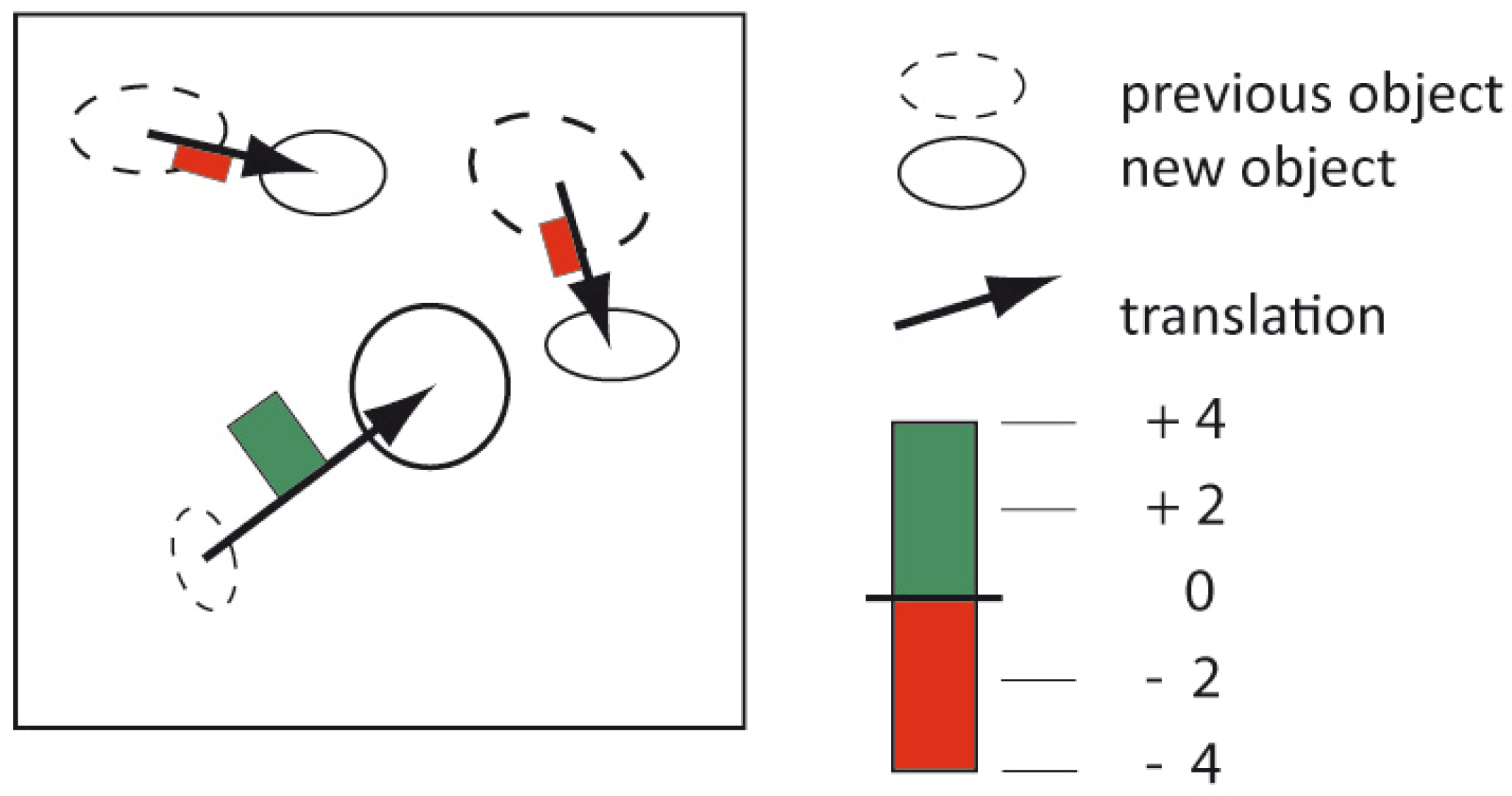
Figure 3.
Schematic workflow for preserving local extreme value polygons: Determination of intervals and setting of class boundaries.
Figure 3.
Schematic workflow for preserving local extreme value polygons: Determination of intervals and setting of class boundaries.

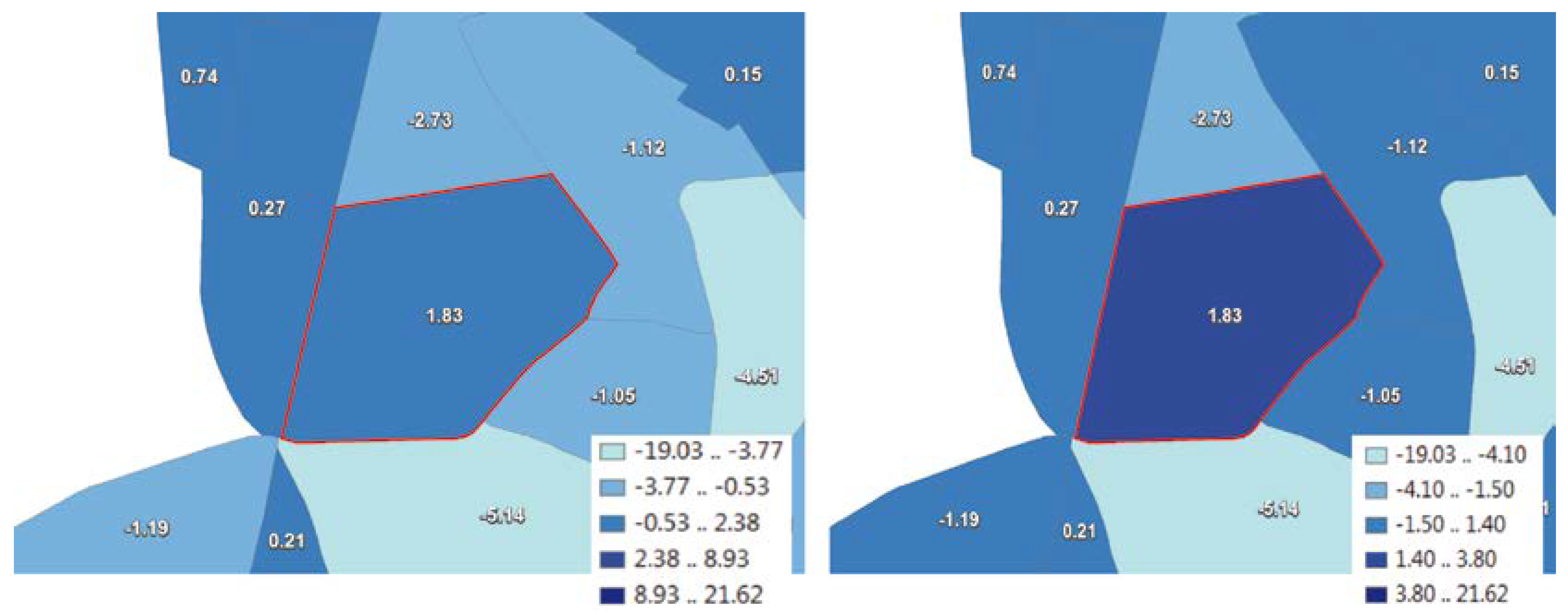
Figure 4.
Depending on the data classification method, local extreme values (outlined in red) can be partially categorized with neighboring regions into one class (left; using the natural breaks method, the extreme value polygon is in the same class (0.53 .. 2.38) as its left neighbor), or be isolated in one class as desired (right, using the proposed method); data set B (see Table 4).

Figure 5.
Better preservation of polygons with local extreme values using the proposed approach (red line) compared to conventional methods—the right axis shows number of classes, the upper axis shows preservation rate (data sources: see Table 4).
Figure 5.
Better preservation of polygons with local extreme values using the proposed approach (red line) compared to conventional methods—the right axis shows number of classes, the upper axis shows preservation rate (data sources: see Table 4).
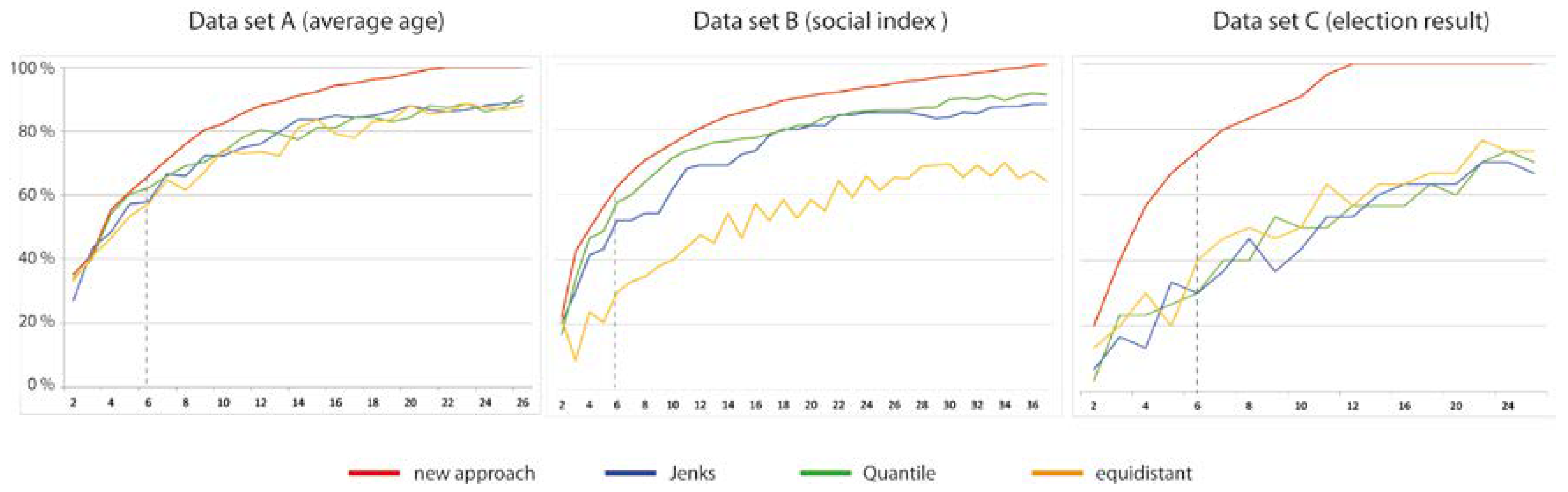
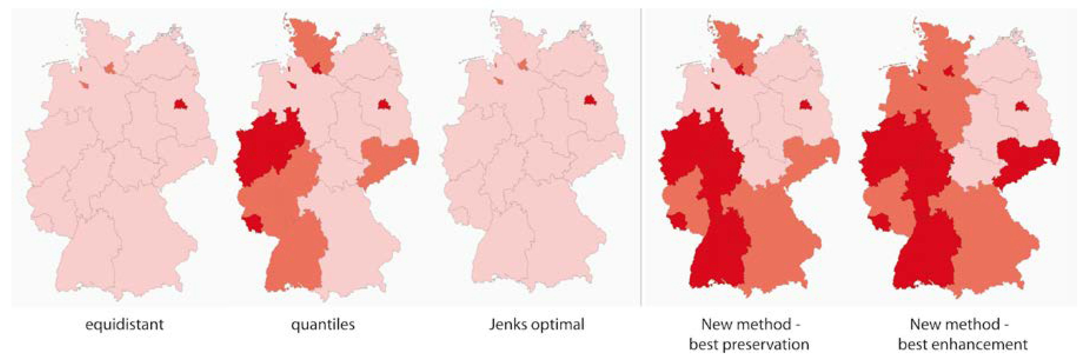
Figure 6.
Comparison of choropleth maps generated with different methods for data classification following the purpose of preserving large value differences of adjacent polygons: Data set shows population density in Germany in 2012 (darker colors indicate larger values), in each map three classes are used. Data Source: http://de.statista.com/statistik/daten/studie/1242/umfrage/bevoelkerungsdichte-in-deutschland-nach-bundeslaendern/.


Table 1.
Characteristics of “What” output clauses.
| Change Feature | Feature Value | Example Change Questions: When ⊕ Where ➲ What |
|---|---|---|
| 1a Existential change | gain/loss/none | What kind of existential change of forest areas can be observed in Canadian provinces between 1950 and 2000? |
| 1b Unspecified class change | <from/to class name (s)> | What class changes can be observed in Canadian provinces between 1950 and 2000? |
| 1c Specified class change (from/to) | yes/no | Is there any class change between forest and urban in Canadian provinces between 1950 and 2000? |
| 1d Change of absolute value | <difference> OR: increase/decrease/constant OR: <max/min difference> | What is the population change in Canadian provinces between 1950 and 2000? What kind of population change can be observed in Canadian provinces between 1950 and 2000? What maximum population change in Canadian provinces can be observed between 1950 and 2000? |
| 1e Change of relative value | <difference > OR: increase/decrease/constant OR: <max/min difference> | What is the change of population density in Canadian provinces between 1950 and 2000? What kind of change of population density can be observed in Canadian provinces between 1950 and 2000? What maximum change of population density can be observed in Canadian provinces between 1950 and 2000? |
Table 2.
Characteristics of “Where” output clauses.
| Change Feature | Feature Value | Example Change Questions: When ⊕ What ➲ Where |
|---|---|---|
| 2a Region | <region name> OR <co-ordinate list, bounding box> | In which Canadian provinces did the population change between 1950 and 2000? |
| 2b Location | <location name> OR <co-ordinate> | In which Canadian cities did the population change between 1950 and 2000? |
| 2c Translation | <distance and direction of translation> | Which movements of grassland can be observed between 1950 and 2000 in Canadian provinces? |
Table 3.
Possible characteristics of “When” output clauses.
| Change Feature | Feature Value | Example Change Questions: Where ⊕ What ➲ When |
|---|---|---|
| 3a Date | <date> | In which year between 1940 and 2000 was the maximum population number reached in Canadian provinces? |
| 3b Duration | <duration> | How long did it take to double the population in Canadian provinces since 1900? |
| 3c Time-interval (bi-temporal) | <time interval> | In which decade between 1900 and 2000 was the maximum increase in population in Canadian provinces? |
| 3d Time series (multi-temporal) | <time series> | In which successive years can we observe an increase and then a decrease in population numbers in Canadian provinces within the entire time span between 1900 and 2000? |
| 3e Change in duration | <duration 1, duration 2> | What is the time period difference to increase the population about 10% in the neighboring countries compared to France? |
Table 4.
Visualization of “What” output clauses (compare classification in Table 1).
Table 4.
Visualization of “What” output clauses (compare classification in Table 1).
| Change Feature | Example Change Question | Visualization | |
|---|---|---|---|
| Map Type | Example | ||
| 4a Existential change | What kind of existential change of forest areas can be observed in Canadian provinces between 1950 and 2000? | Mosaic map |  |
| 4b Unspecified class change | What class changes can be observed in Canadian provinces between 1950 and 2000? | Symbol map/micro diagrams |  |
| 4c Specified class change (from/to) | Is there any class change between forest and urban in Canadian provinces between 1950 and 2000? | (Binary) mosaic map (possibly linked with change matrix) |  |
| 4d Change of absolute value | (1) What is the population change in Canadian provinces between 1950 and 2000? | (Bi-polar) Proportional Symbol map |  |
| (2) What kind of population change can be observed in Canadian provinces between 1950 and 2000? | Mosaic map | rf. to 4a | |
| 4e Change of relative value | (1) What is the change of population density in Canadian provinces between 1950 and 2000? | (Bi-polar) Choropleth map |  |
| (2) What kind of change of population density can be observed in Canadian provinces between 1950 and 2000? | Mosaic map | rf. to 4a | |
Table 5.
Visualization of “Where” output clauses (compare classification in Table 2).
Table 5.
Visualization of “Where” output clauses (compare classification in Table 2).
| Change Feature | Example Change Question | Visualization | |
|---|---|---|---|
| Map Type | Example | ||
| 5a Region | In which Canadian provinces did the population change between 1950 and 2000? | (Binary) mosaic map |  |
| 5b Location | In which Canadian cities did the population change between 1950 and 2000? | (Binary) Point map |  |
| 5c Trans-lation | Which relocations of grassland can be observed between 1950 and 2000 in Canadian provinces? | Origin-desti-nation flow maps |  |
Table 6.
Visualization of “When” output clauses (compare classification in Table 3).
Table 6.
Visualization of “When” output clauses (compare classification in Table 3).
| Change Feature | Example Change Question | Visualization | |
|---|---|---|---|
| Map Type | Example | ||
| 6a Date | In which year between 1940 and 2000 was the maximum population number reached in Canadian provinces? | Choropleth map |  |
| 6b Duration | How long did it take to double the population in Canadian provinces since 1900? | Proportional Symbol map |  |
| 6c Time-interval (bi-temporal) | In which decade between 1900 and 2000 was the maximum increase in population in Canadian provinces? | Symbol map (micro diagrams) |  |
| 6d Time series (multi-temporal) | In which successive years can we observe an increase and then a decrease in population numbers in Canadian provinces in the entire time span between 1900 and 2000? | Symbol map (micro diagrams) |  |
| 6e Change in duration | What is the time period difference to increase the population about 10% in the neighboring countries compared to France? | (Bipolar) Choropleth map |  |
Table 7.
Data sets for empirical tests.
| Data Set | Input Data Set | Proposed Method: No. of Classes to Preserve All Extreme Values | |
|---|---|---|---|
| No. of Polygons | No. of Local Extreme Values | ||
| A: Average age | 439 | 159 (36%) | 22 |
| B: Social index | 847 | 271 (32%) | 37 |
| C: Election result | 103 | 30 (29%) | 12 |
Data sources: A: Average age of Germans, per county in 2011. https://www.destatis.de/DE/Methoden/Zensus_/Downloads/2F_BevoelkerungAlterGeschlecht.html. B: Social monitoring Hamburg 2016. http://suche.transparenz.hamburg.de/dataset/sozialmonitoring-integrierte-stadtteilentwicklung-bericht-2016-anhang. C: Federal elections 2017, second votes for SPD party in Hamburg: https://www.statistik-nord.de/wahlen/wahlen-in-hamburg/bundestagswahlen/2017/.
© 2018 by the author. Licensee MDPI, Basel, Switzerland. This article is an open access article distributed under the terms and conditions of the Creative Commons Attribution (CC BY) license (http://creativecommons.org/licenses/by/4.0/).
Share and Cite
MDPI and ACS Style
Schiewe, J. Task-Oriented Visualization Approaches for Landscape and Urban Change Analysis. ISPRS Int. J. Geo-Inf. 2018, 7, 288. https://doi.org/10.3390/ijgi7080288
AMA Style
Schiewe J. Task-Oriented Visualization Approaches for Landscape and Urban Change Analysis. ISPRS International Journal of Geo-Information. 2018; 7(8):288. https://doi.org/10.3390/ijgi7080288
Chicago/Turabian StyleSchiewe, Jochen. 2018. "Task-Oriented Visualization Approaches for Landscape and Urban Change Analysis" ISPRS International Journal of Geo-Information 7, no. 8: 288. https://doi.org/10.3390/ijgi7080288
Note that from the first issue of 2016, this journal uses article numbers instead of page numbers. See further details here.