
Mapping Deeply

Independent Scholar, 3205 Hillsborough Street, Raleigh, NC 27607, USA
Humanities 2015, 4(3), 304-318; https://doi.org/10.3390/h4030304
Submission received: 5 June 2015
/
Revised: 28 July 2015
/
Accepted: 30 July 2015
/
Published: 6 August 2015
(This article belongs to the Special Issue Deep Mapping)
Abstract
:This is a description of an avant la lettre deep mapping project carried out by a geographer and a number of landscape architecture students in the early 1980s. Although humanists seem to take the “mapping” in deep mapping more metaphorically than cartographically, in this neighborhood mapping project, the mapmaking was taken literally, with the goal of producing an atlas of the neighborhood. In this, the neighborhood was construed as a transformer, turning the stuff of the world (gas, water, electricity) into the stuff of individual lives (sidewalk graffiti, wind chimes, barking dogs), and vice versa. Maps in the central transformer section of the atlas were to have charted this process in action, as in one showing the route of an individual newspaper into the neighborhood, then through the neighborhood to a home, and finally, as trash, out of the neighborhood in a garbage truck; though few of these had been completed when the project concluded in 1986. Resurrected in 1998 in an episode on Ira Glass’ This American Life, the atlas was finally published, as Everything Sings: Maps for a Narrative Atlas, in 2010 (and an expanded edition in 2013).
Deep maps, deep mapping…
Yes, yes, but such a strange name for the practice. A practice that so often delivers far, far less than it promises. Especially maps. So many instances of deep mapping lack any at all.
Why mapping? Why not…thick description? Oh. Maybe because deep mapping is about place, while thick description is about…behavior? But aren’t the two all mixed up together? Isn’t that what deep mapping is supposed to be about—at least one of the things it’s supposed to be about—the unfolding of human life here, the mutual relations of people and soil and plants and animals and…go on, you name it…here in this…place?
Well, obviously I’m just trying to figure out why they call it deep mapping, when mapping isn’t what they are about, at all. They’re storytellers mostly, which is great, but mostly they’re not mappers. I’m talking about almost all of them, from William Least Heat-Moon to the most recent anthology of work on spatial narratives.
Not that you can’t tell stories with maps. You can. In fact, every map tells a story, stories actually, many of them. Even maps that people who don’t know much about maps call thin maps tell stories, ordinary, taken-for-granted maps, like highway maps, like the state highway map of North Carolina that John Fels and I spent fifty pages writing about back in 1986, and whose surface we barely scratched [1,2]. Thin maps…
Maps are models of concision, especially the ordinary taken-for-granted ones, cramming so many layers—so much history—into each line, into this line, for instance, this county border, the border of Wake County, first drawn in 1771 when the county was laid out of from parts of previously existing counties, but redrawn in 1787, 1881 and 1911, and named after Margaret Wake in 1771, the wife of William Tryon, then the colonial governor of North Carolina. All of this and so much more are caught up in that line that looks so simple but is anything but. And there’re a hundred counties on this highway map of North Carolina, which also sports state borders, coasts, highways, roads, cities, towns, parks, reservations, military bases, forests and other things. This map is not simple, this map. It’s not thin. It’s deep and thick. Most maps are like this.
A lot of them wield power too, great power. We think about maps as being representations of the world, but they’re not. They’re arguments about the world, and many of these arguments are serious. “High court to hear map challenge in August” reads the headline to an article on the second page of yesterday’s News and Observer [3]. A couple of days earlier, the lead editorial had been headed: “Rule on maps: the N.C. Supreme Court must quickly resolve a challenge to redistricting maps.” [4]. These maps are about who gets to vote in which districts, that is, are about whether Democrats or Republicans will reign in state government. This has huge consequences for the distribution of wealth, education, health, you name it.
Let’s not even think about the problems with immigration caused by the lines called national borders; or about the lines that bound school districts.
Some have more power than others, but all maps have it.
1. My Fight with Maps
My fight with maps, actually with cartography, was ignited by their rejection of modernism. As modernism was noisily turning its back on the failed rationalities, on the empty harmonies, on the make-believe coherences of Enlightenment, of Victorian thinking, cartography was clutching them ever more tightly to its breast. Painters may have been deconstructing pictorial space, composers shredding inherited tonalities, architects stripping walls of pilasters, cornices, and dentil moldings, poets following Pound’s cry to “Make it new”, and novelists indulging a self-consciousness that was all but the hallmark of the age, but cartographers, they were content to hone, to polish, to extend inherited forms.
Cartography exalted its unreflective empiricism as its raison d’être. It cherished the graphic conventions it had laid down in the 19th century. Even today, few maps acknowledge the 19th century’s over. This, despite the fact maps were never what they were claimed to be, never what the map themselves claimed to be: veridical and value-free pictures of reality. They were always arguments about the way the maps’ makers—or about the way those who paid the maps’ makers—thought the world should be.
With modernism came a predisposition for resistance and smashing traditional forms, for going someplace stripped down, someplace essential, someplace real, for asking, Why not? I long felt around for a new map that wasn’t of the same old subjects, that didn’t have the same old forms, that looked and felt modern. Schoenberg wanted to emancipate the dissonance. Arp wanted to destroy existing modes of making art. Fifty years later, I wanted to destroy the existing ways of making maps through which millions were subjugated, herded, and all too often killed. I wanted to emancipate dream and desire as subjects of the map.
Hard to do in geography: it was nearly as hidebound as cartography.
But when I found myself teaching landscape architecture studios in the School of Design at North Carolina State University, I found my opportunity. I knew nothing about landscape architecture. I knew less about studios, about how they worked, about what they were supposed to do. However, I figured landscape architects needed to know something about the environment in which they were working, and I figured that making maps might be a good way to learn—to discover—what it was they needed to know. So I set the first studio I taught—well, I set the students—the task of mapping a nearby neighborhood. The thing was, these were design students. They were undergraduate design students.
They had had little professional training (they weren’t hidebound). They were wildly creative (which is why they had entered the School of Design). They knew nothing about the conventions of making maps (they were blank slates). So when I set them tasks like mapping sounds, or making maps from the perspective of bees, or constructing maps out of food they leaped at them like, like frolicking gazelles! They were all over these projects. They made the most amazing things.
I kept none of the maps. I mean, there were always more studios, more students, more maps. However, in a studio I co-taught with Robin Moore in the spring of 1982, we decided to make an atlas, a neighborhood atlas, an atlas we could reproduce on a copy machine, that we could distribute to the neighbors when we had finished. This meant the work had to make sense in black and white (in the early 1980s, color copy machines barely existed, and landscape architecture students loved to use colored markers), and it had to make sense to the neighbors (and so not be completely off-the-wall). This did not mean it had to be mapmaking the way these grad students had come to know it (and they were much more hidebound than the undergrads). That I was adamant about. But it didn’t matter what they were mapping: I couldn’t get them to leave the streets off their maps.
I was trying to get them to map the way the land smelled, the way it felt in their legs when they walked it, the way twilight made all the difference. I wasn’t sure what the streets had to do with any of these, but the streets were an irreducible subject in the eyes of these students, the whatever-it-was that made the neighborhood a neighborhood. If you’re going to be laying out subdivisions, which a lot of these students would be doing professionally, streets are really all you have to play with. I got that, but at the same time, the streets did seem to inhibit the other qualities I was trying to draw the students’ attentions to. No matter how far into the background they intended the streets to recede, somehow they always stood out front.
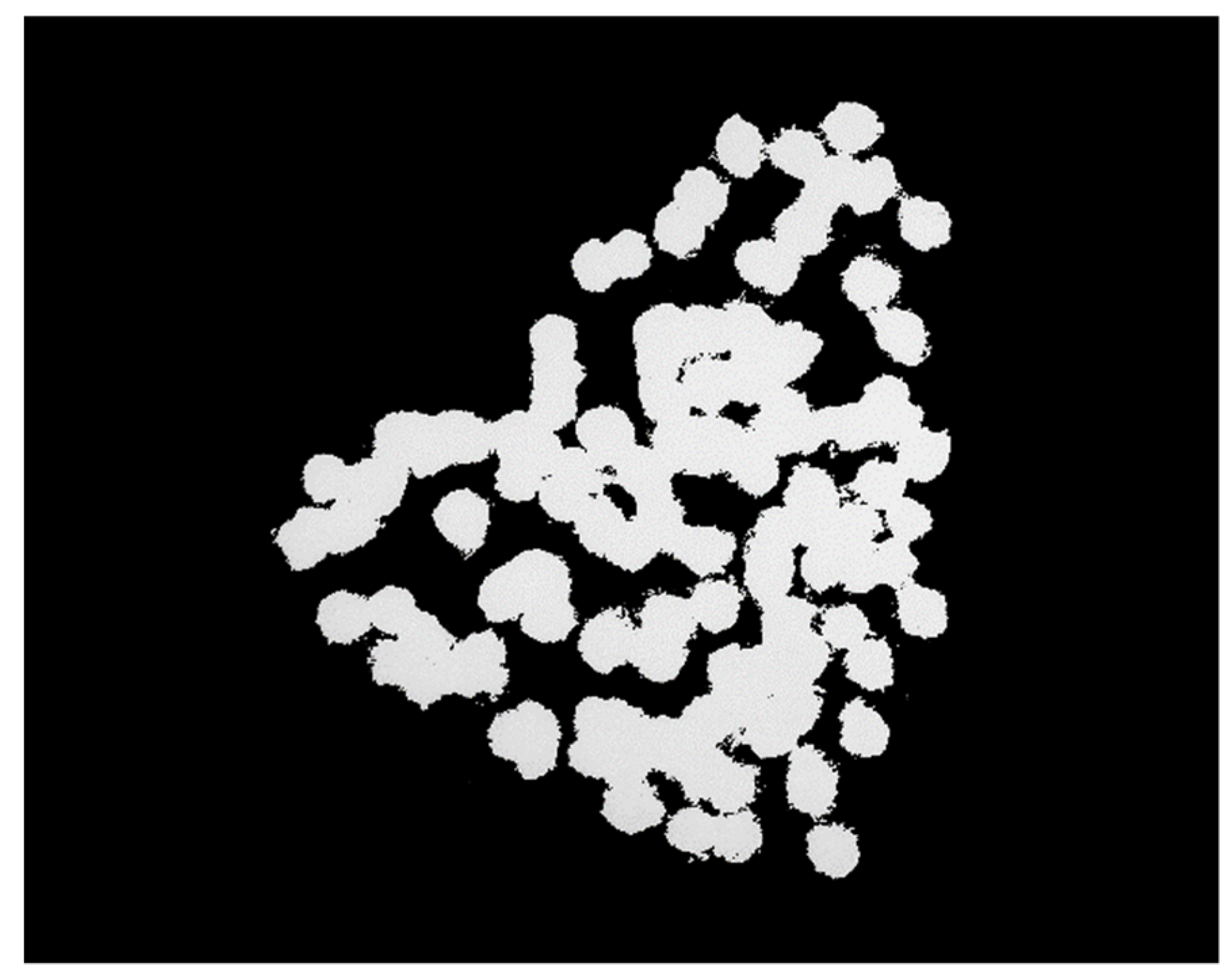
Then, once when we were working on a map of streetlights, we just kept paring away the non-streetlights. We dumped the map crap (the neat line, the scale, the north arrow), the neighborhood boundaries, and the topography. Finally, we dumped the streets: first the scaled streets, then a schematic grid of the streets, finally even a hint of a grid of the streets. Daylight went too—that default daylight that most maps take for granted—so that we were fooling around with circles of white on a black background. That’s when it became clear that the map wasn’t about lamp posts, but about lamp light, and light was something we weren’t sure how to deal with. Certainly, the uniform white circles we’d been drawing caught nothing of the way the light was fringed by the trees; and one night, armed with a camera, we scaled a fence and climbed a radio tower on the edge of the neighborhood hoping to catch the night lights on film. What a disappointment. The view from above was nothing like walking in and out of the pools of dappled light on the streets below. But I had a pochoir brush at home and when Carter Crawford—who had put himself in charge of atlas graphics—used it to draw the circles, it was magical (Figure 1). Nothing but blotches of white: that was the way it felt to be walking the streets at night.
Figure 1.
Pools of Light, map by Carter Crawford (from ([5], p. 53, used with permission).
Figure 1.
Pools of Light, map by Carter Crawford (from ([5], p. 53, used with permission).

The usual “efficient” map would have located everything on the street onto a single sheet—that is, different marks for lamp posts, fire hydrants, street signs, trees. Our inefficient map concentrated on a single subject and rather than lamp posts, it brought the pools of light into view. No legend, no north arrow, no neat line, none of the usual apparatus. At last: a modernist feel! Maybe even a sense of poetry, something imagistic, a little like Pound’s “The apparition of these faces in the crowd;/Petals on a wet, black bough” [6] or Williams’s red wheel barrow, but as it might manifest on a map, a map attentive to the experience of place [7].
That’s when I knew we could write poems in maps. That’s when I began thinking seriously about a poetics of cartography.
2. Making Maps
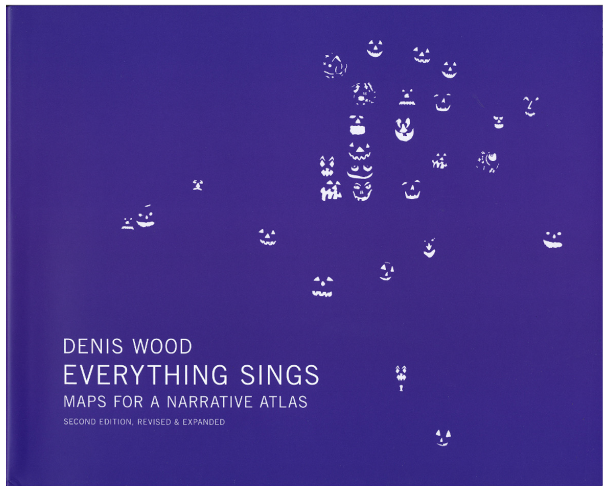
Once we got to this point, we started wanting to map everything. In the version of the atlas that was published in 2013 (Figure 2), there are 67 maps of the neighborhood [5], but back in the mid-1980s, we imagined well over a hundred, all the things we did make maps of—sewers and stars, streets and trees—but lots of others too, historical maps, the neighborhood as the Tuscarora would have known it, the neighborhood when it was a slave plantation, the neighborhood when it was laid out back in 1907, the neighborhood when my father had moved into it in 1921 and when he had moved out of it in 1927 (when he was six years old), the neighborhood after the soldiers came back from World War II, and…well, there were to have been a lot of historical maps. We wanted to map the history of the changes in lot ownership in regular increments (in the atlas as it stands there is a single map of ownership), the neighborhood gardens, selected block faces, the neighborhood as its kids knew it, the old-timers, the passers-through, the…
Figure 2.
Cover of Everything Sings ([5], used with permission).
Figure 2.
Cover of Everything Sings ([5], used with permission).
Well, almost no end to the list. The neighborhood mapping studios went on semester after semester, but students dropped out one after another—I mean, how long can anyone do this? Then, in 1986, I put it all in a box and forgot about it. It was nearly twenty-five years before it was published (though over the years it did acquire a certain notoriety).
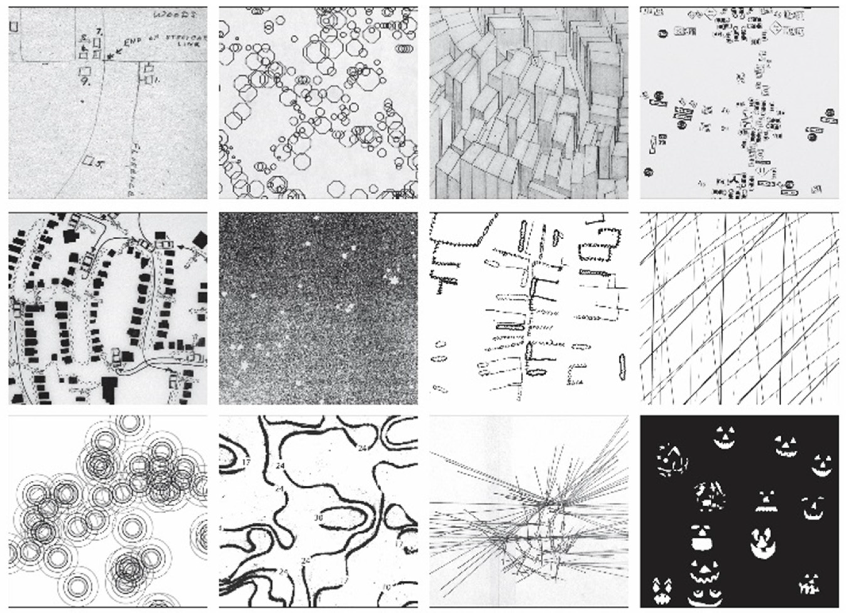
All thats interesting, but not half as interesting as the forms the maps took as we took on the successive challenges the mapping threw at us. Figure 3 is the front endpaper from the second edition of Everything Sings: Maps for a Narrative Atlas. It was put together by Lisa Pearson, the publisher at Siglio (the press that brought the atlas out, first in 2010, then in a new edition with a bunch of new maps and other features in 2013), by excerpting segments from twelve of the book’s maps. From top left, the first is from a map made by my father’s older sister the time she visited us in the mid-1980s; the next from a map of the ages of the neighborhood’s trees; the next from a map of house types; the next from a map of street signs; the next from a map of the postman’s 1982 route; the next of the stars that shine on the neighborhood; the next of the neighborhood’s fences; the next of a selection of radio waves passing through the neighborhood; the next of wind chimes; the next of property values; the next of the distance you can see out of the neighborhood from each of its intersections; and, the last, of the pumpkins that were on the porches, Halloween, 1982.
Figure 3.
Front endpaper of Everything Sings ([5], used with permission).
Figure 3.
Front endpaper of Everything Sings ([5], used with permission).
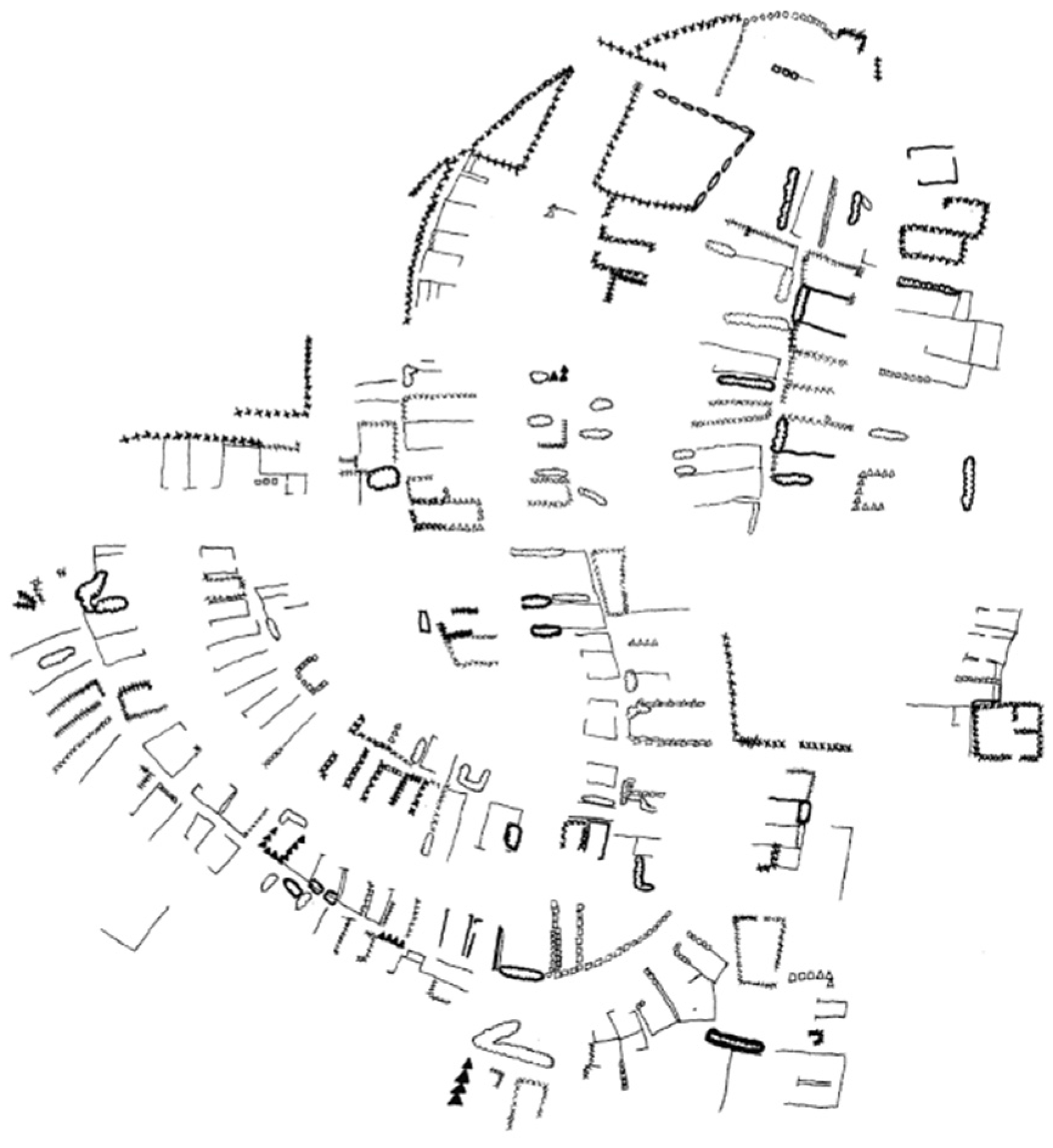
An equally varied bunch decorate the back endpaper (Figure 4): again, from upper left, footprints of the buildings in the neighborhood and surrounding area; the downtown Raleigh forest; the neighborhood’s sewer, gas, and water lines; the topography of the hill the neighborhood tumbles over; the ages of the trees (a second time); a map of the flow of rent from the neighborhood; the power, telephone and cable lines; barking dogs; mentions in the neighborhood newsletter across its first decade; a map of sidewalk graffiti; of the sizes of the neighborhood trees; of its streetlights. No streets—though there is a map of streets in the atlas (along with one of traffic flows)—but the streets have such a profound affect on the location of everything else that you can pick them out on most of the maps, on the map of disfigured trees (Figure 5), for instance, which is more or less a map of where Carolina Power and Light had had the Asplundh Tree Expert Company butcher the trees to make sure the rare winter storms couldn’t knock down the power lines along the streets and alleys.
The variation in these maps, which is characteristic of all the rest of them as well, reflects, of course, the work of individual students. Susan Waldrop’s map of the neighborhood’s fences (Figure 6) could have been made by no one else. Her map also reflects the wild variations in the data we collected, as well as our commitment to a poetics of cartography. Susan walked the neighborhood’s streets and alleys to gather her data and, guided by our map of streetlights, laid it down like this (though she also had photos and rubbings). The straightforward way to make this map would have been to lay the fences down on a map of property lines (which would also be a map of streets). That way you could…what? What could you do with that map that you can’t do with this, especially since elsewhere in the atlas there is a map of house numbers, and the two maps can be superimposed? In fact, this map of fences was one of the six maps published in the limited edition of Everything Sings as glicée prints on acid-free vellum, precisely so that you could superimpose them [8].
Figure 4.
Back endpaper of Everything Sings ([5], used with permission).
Figure 4.
Back endpaper of Everything Sings ([5], used with permission).

Figure 5.
Disfigured Trees, map by Shaub Dunkley ([5], p. 51, used with permission).
Figure 5.
Disfigured Trees, map by Shaub Dunkley ([5], p. 51, used with permission).

Figure 6.
Fences, map by Helen Waldrop ([5], p. 95, used with permission).
Figure 6.
Fences, map by Helen Waldrop ([5], p. 95, used with permission).
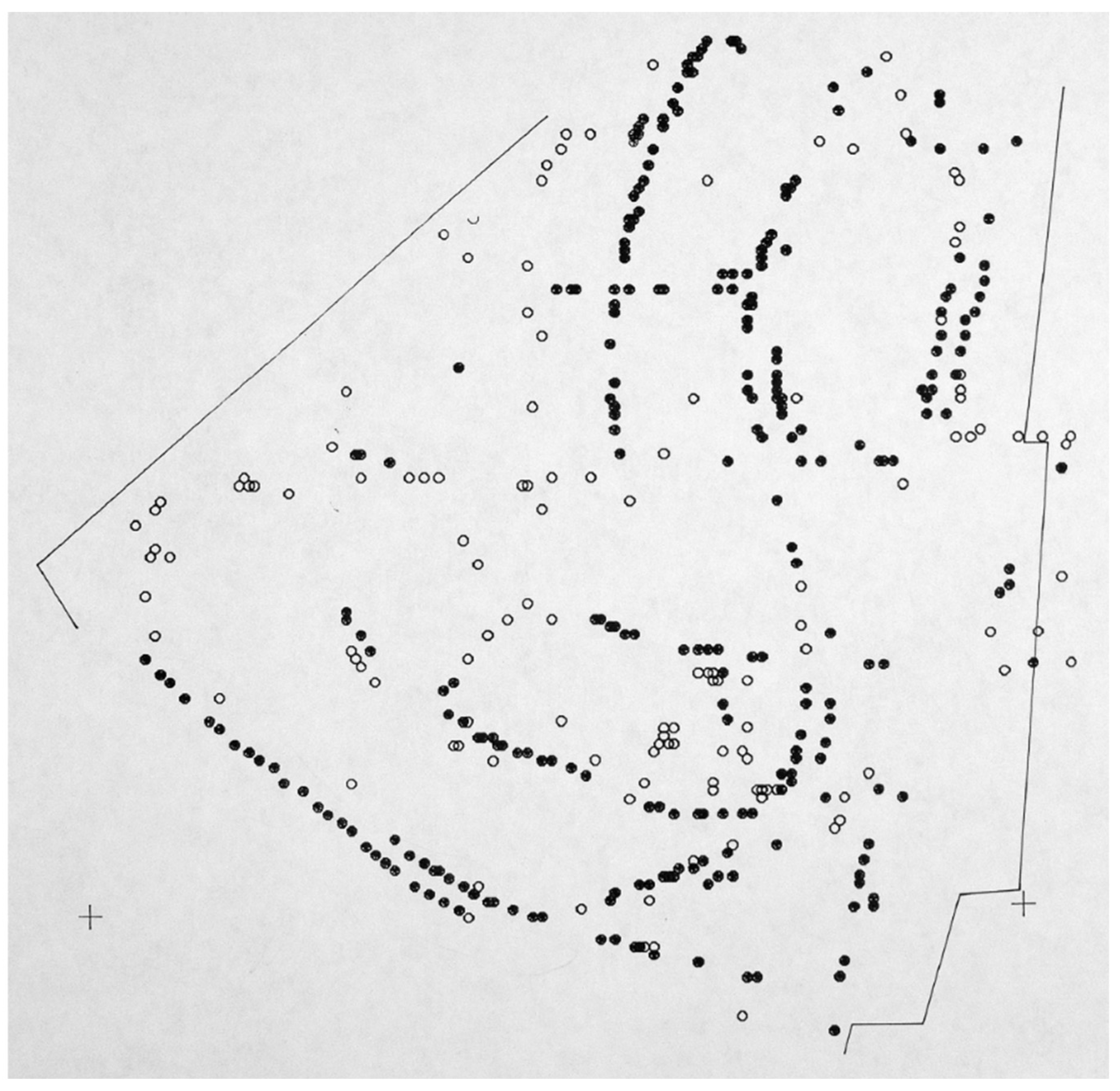
As glicée prints, this limited edition included the maps of fences, overhead power lines, autumn leaves, police calls, graffiti, and wind chimes. Figure 7 shows us looking down through police calls (the numbers), overhead lines (the dots and lines), and fences. But if it had included the maps of the mains, the hill, the streets, the overhead power and other lines, large trees, and rooflines, you’d be able to look down, pretty deeply, from the tops of the houses through the trees, through the net of the power lines and the pavements to the storm drains below. Depending on the height of the roofline and the depth of the storm drain that could be fifty, sixty feet. That’s pretty deep. Add the map of the stars and…
Figure 7.
Three superimposed glicée prints, of Police Calls (data collected by numerous students, map by Denis Wood), Squirrel Highways (data collected by Shaub Dunkley, Carter Crawford and Denis Wood, map by Carter Crawford), and Fences (map by Helen Waldrop) ([8] used with permission).
Figure 7.
Three superimposed glicée prints, of Police Calls (data collected by numerous students, map by Denis Wood), Squirrel Highways (data collected by Shaub Dunkley, Carter Crawford and Denis Wood, map by Carter Crawford), and Fences (map by Helen Waldrop) ([8] used with permission).

3. Deep Mapping
But I doubt that’s what deep mappers are talking about when they talk about deep mapping, though it would illustrate a meaning of the phrase worth thinking about. I’ve long wanted to make a map like it. On this map you’d look up at the neighborhood from below, from underneath the trees’s deepest roots, up through that latticework—that mesh—to the mains, but then you’d look through the mains to the house connections snaking up into the houses and forking there to the toilets and sinks and tubs and showers like capillaries, and then down again, down the drains and through the waste pipes to the laterals and so down to the sewer lines, the house itself suspended in this web of flows, crystallizing out of them. Can you see it? You wouldn’t see the house itself, just the water lines reaching up—as if to the sun, like branches—almost touching the drains. In the gap between? You, standing in the shower, the water shooting up from the underground, fountaining from the showerhead around you, cascading to the floor, pooling to the drain, and so down, down, down, you suspended in that gap, in that space, in that fountain. Lawrence Durrell says:
Which is all the neighborhood is: a fountain of flesh, shingles, concrete, two-by-fours, trees, dirt, asphalt, iron pipes, starlight and the light cast through the leaves onto a summer night’s sidewalk.You tell yourself that it is a woman you hold in your arms, but watching the sleeper you see all her growth in time, the unerring unfolding of cells which group and dispose themselves into the beloved face which remains always and for ever mysterious…And if, as biology tells us, every single cell in our body is replaced every seven years by another? At the most I hold in my arms something like a fountain of flesh, continuously playing, and in my mind a rainbow of dust.[9]
Which gets us a lot closer to what deep mappers have on their minds, the play of things and events that produce, that result in, that constitute the…neighborhood. At least in our case, the neighborhood. The name for the atlas originally—the one in the mid-1980s that we never published—was Dancing and Singing—from “Singing in the Rain”, which is what we’d been doing one night, mapping in the rain—A Narrative Atlas of Boylan Heights. That was when we imagined we’d finish it. But of course we didn’t, we couldn’t. But when I published it as Everything Sings: Maps for a Narrative Atlas, though I changed everything else, I kept narrative atlas. “Maps for” acknowledges its unfinishability, but the retention of narrative atlas points to the fact that whatever else might have changed, its narrative structure—its narrative intention—remains the same.
Such a narrative could unfold any number of events in any number of ways but for us it had to unfold, first, our idea of what neighborhoods did, and then what this particular neighborhood, Boylan Heights, actually did. We made our idea of what neighborhoods did explicit, in introductions (the original had four of these), but all along our intention had been to lay it out through the example of our neighborhood, to let Boylan Heights itself speak for neighborhoods in general.
Our idea was this: the neighborhood is a process, a process-place or a process-thing that transforms anywhere into here, and here into everywhere, the city into the space of our lives, the citizen into the individual, and vice versa. Correspondingly, the atlas is organized in three phases that insensibly lead from one to the other. The first embodies the neighborhood’s everywhere and anywhere quality, its continuity with the rest of the city; the second its character as a transformer, literally turning city stuff into neighborhood stuff (and vice versa); and the third, its irreducible uniqueness, its discreteness in the city. The first and third phases reflect each other through the transformer acting on them, so that if in the first phase the hill the neighborhood tumbles down is presented as a fact of geomorphology, in the third it shows up as the slopes the kids sled down in the snow (but we never mapped this sledding); or if in the first phase the neighborhood trees are just a part of the downtown Raleigh forest, in the third they acquire individuality, like the superlative water oak at 901 South Street.
Generic thing to unique thing: to make a pot of tea we light the flame on the stove. With the flame we pop—literally, actually, physically—up through space from the stove to the whole southeast of the United States, up through a nested hierarchy of spaces through a nested hierarchy of pipes of ever increasing size; from the slender tube running to the burner, to the pipe running to the stove, to the line running to the house, to the line running through the neighborhood, to the main snaking across the state, to the transcontinental pipeline tying together the many states of this southeast into one vast region of gas tied into the fields of the Gulf of Mexico. We are here; we are there; both at once; and the gas burns, time passes, and, over time, the heat latent in the gas is transferred to the water in the kettle and the water begins to boil. Then, the kettle whistles and, in time sings. In time and space, the tea is ready. I bring it to you on my porch, and we drink it, together, whole in Boylan Heights.
The maps and the text are at once very personal and yet essentially abstract, for while the atlas is very much about Boylan Heights, it’s also about any neighborhood anywhere. They are maps with all of the science and technology that this implies, yet they have fingerprints all over them. I don’t know where it comes from, but our maps have heart.
They also have trees and trees make another great example. The neighborhood trees are like neighborhood kids: they all grew up here. Of course, we also know that the trees are part of the greater Raleigh forest, which is but a piece of the great Southern Hardwood Forest which is…Suffice it to say, all the trees in the world are related. But this is to speak of trees in general. Once we relate the trees to their immediate environment (to a particular history of planting, nurturing, neglecting, cutting down—i.e., to the saws of Asplundh), then we can begin to see patterns unique to Boylan Heights. We can see how unique an individual tree might be.
To get from one of these ends to the other? In the original idea of the atlas we’d intended for our map of Boylan Heights trees to be up front—sort of where it is the published atlas—and then to successively filter that map as we moved through the atlas. The last map would display a single, a unique tree. So first we recast the map of trees by size—we could have used age or something else—and then filtered out all but the large trees. This gave us a map of large trees. Then we recast the map of trees by species, and used oak as a filter to produce a map of oak trees (willow oaks, water oaks, Southern red oaks, Darlington oaks, and white oaks). We used this map to filter the map of large trees to give us a map of large oak trees. We then used our map of Public and Private Trees as a filter to get a map of large oaks in front yards. Filtering this by “good condition” and “location favorable to full growth” gave us nothing new, still all the large oaks in front yards. These we filtered for water oaks: large water oaks in front yards in good condition and a location favorable to full growth. This left us with four trees. We eliminated one of these that was suffering from Asplundh side-trimming to give us a map of large water oaks in front yards in absolutely good condition and a location favorable to full growth. Finally, filtering by age, we yanked the young and the old. This left us with large mature water oaks in front yards in absolutely good condition and a location favorable to full growth. Aha! There was only one of these, the magnificent water oak at 901 South Street. In the published atlas, where we printed all twelve filter maps on a single page, we turned its other side over to a photograph of this one great tree.
You can run this backwards. The neighborhood’s a transformer: it doesn’t care which way you go.
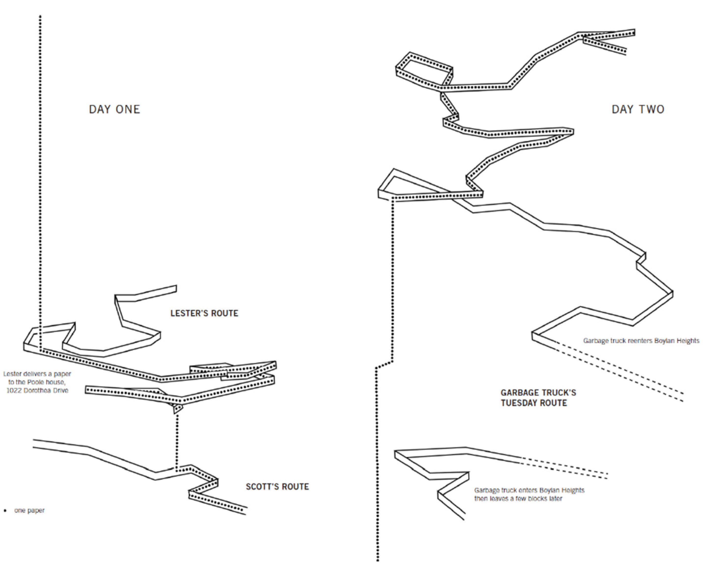
In this way it’s like digestion, though not quite like digestion; though digestion does transform food, from without, into shit, from within, while producing life. In this way it works like a neighborhood. We tried to catch this aspect in a map that I think about as where the atlas pivots, from the early mapping of things coming in from outside the neighborhood—the maps of electricity, water, gas, and in this particular case, newspapers—to the maps of things the neighborhood produces—graffiti, the sounds of wind chimes, barking dogs, and in this particular case, garbage, trash. At the same time, in this instance, it generates conversation and shopping plans; consternation and amusement; movie choices and voting behavior (Figure 8).
Figure 8.
The Paper Route, data collected by Diane Pacella, Tim Hess, and Aurora Dee, map by Denis Wood ([5], p. 71, used with permission).
Figure 8.
The Paper Route, data collected by Diane Pacella, Tim Hess, and Aurora Dee, map by Denis Wood ([5], p. 71, used with permission).

This space–time diagram—time running vertically up the page—comes after two other maps in the atlas. The first of these tracks Lester Mims on his paper route, the space–time ribbon of Lester delivering his route floating above an oblique map of the neighborhood, to which it’s tethered at his house (where he picks the papers up that Scott has left him). The second map adds Scott’s route. Scott was the distribution manager for Raleigh Times District 170, the guy who left the bundle of newspapers on Lester’s porch. His space–time ribbon is also floating above an oblique map of the neighborhood and, again, tethered at Lester’s house. In Figure 8, we add to these a third space-time ribbon as we follow a Monday Raleigh Times through the neighborhood. This enters the neighborhood bundled in Scott’s truck, is spread throughout Boylan Heights by Lester on his bicycle, and is then collected Tuesday morning by City of Raleigh garbage truck No. 1135, which trundles it off to the county landfill. The dotted line tracks the route of a single copy, digested (as something other than cellulose) by the Poole family members at 1022 Dorothea Drive. In the text facing the map we say, “The neighborhood: a metabolic machine (it eats newspapers).”
4. Coming to Deep Mapping
We didn’t think about any of this as deep mapping. We had no idea what we were getting into, what we were doing. It started because I was asked to teach a landscape architecture studio and had no idea how to do it. The idea of having my students make maps was born of my background in geography and cartography, and the idea of having them map neighborhoods was born of my long-standing interest in neighborhoods. I’d brought the two together a couple of years earlier when I set high school students in Worcester, Massachusetts, the task of figuring out what teenagers meant when they said “neighborhood”, and they had had other teenagers draw maps to help them figure it out [10]. I had written my master’s thesis about teenagers’ “mental maps” of their small town in southern Mexico where barrios were an essential piece of their identity [11], and my dissertation was about American teenage-tourists’ “mental maps” of London, Rome, and Paris [12]. Maps and neighborhoods were things I thought about. However, having landscape architecture students get into them was sheer panic.
Since it turned out to be fun and productive, I’d done it several times. With different studios I’d done different neighborhoods and come at them with different questions but, as I said earlier, though I was getting more and more interested in the maps, I kept none of them. This was pretty much how we approached the atlas studio that spring in 1982: we were just going to make a bunch of maps and copy them into an atlas to hand out to the neighbors. The problem was…atlas? Atlases have structure, form. There’s a progression among the maps in an atlas. They begin somewhere and they go somewhere else [13]. The students were picking things to map they were interested in or that they imagined they could find data for or they were just flailing around. But by mid-semester there was a list of maps that were going to be in the atlas and it just screamed…structure?
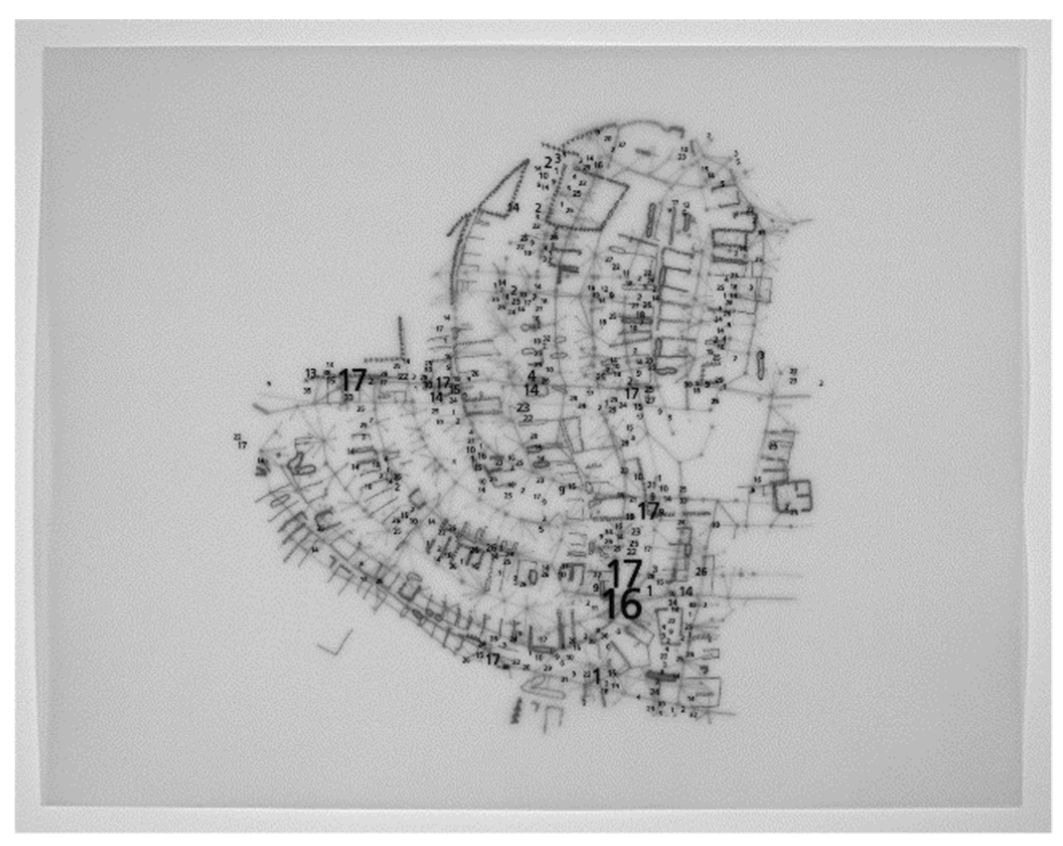
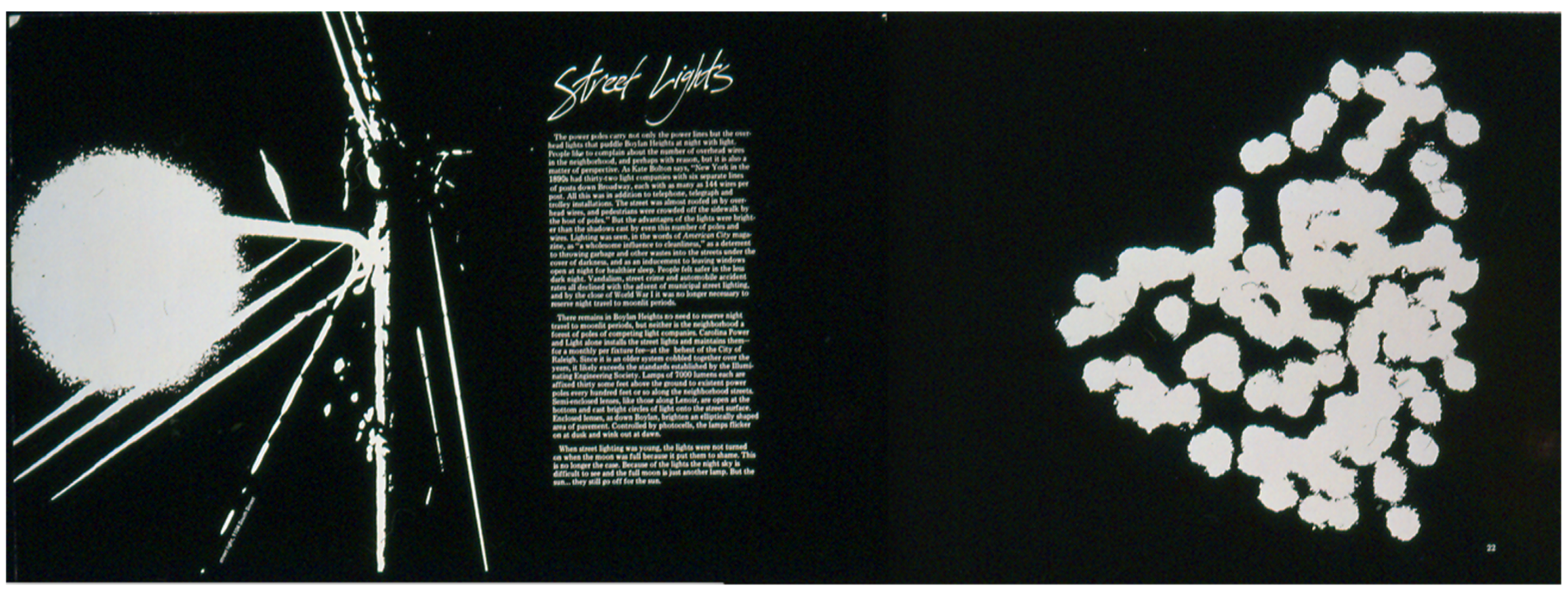
That was one thing. What really kicked us into gear, though, was the streetlight map, the streetlight map and the layout of the page it was going to be on. We had chosen 11′′ × 17′′ as our page size, opening to 11′′ × 34′′, and we were quite excited by the spread (Figure 9). We began to imagine that the atlas could be attractive—not just a jumble of maps—and this really pushed us to think about its structure. Clearly, this would have to have something to do with the neighborhood and this forced us to think—for the first time, two-thirds of the way through the semester—about the structure of the neighborhood. Structure? It forced us to think about neighborhoods, about what they were, how they functioned, what they did. We hadn’t thought about this at all, just taken the neighborhood for granted. There was a lot of literature but it didn’t take long to realize it wasn’t going to help much—for many reasons—and one night—I don’t remember how it happened—we had been talking it through and the idea of the transformer popped out, whole, like Venus arising fully formed from the sea.
This certainly gave us the structure we were looking for, but when we had laid out the maps, we had, or were going to have, it was like a few here and a few there. It was like a pamphlet. It was nothing like an atlas. The maps were hard to do. Much of the data had to be collected on the ground, walking through the neighborhood, systematically, again and again. Imagine Shaub Dunkley collecting the tree data: it took forever. It took way longer than the semester, and afterwards he had to code it for computer processing, mainframe computer processing (there were no real personal computers in 1982). Think about copying—nothing was online in those days—the maps for the water lines, the gas lines, the sewers. There were no small scale maps of these things: Aurora Dee and Tim Hess had to copy, and then compile the maps in the hands of the City of Raleigh and the Public Service Company of North Carolina; they had to reduce this mass to tractable form before they could even think about how they map would look. There weren’t that many of us in the studio to begin with, and not everyone was as enthusiastic as me and Carter and Aurora and Shaub and Tim Hess and Jimmy Thiem.
Figure 9.
Street Lights, by Carter Crawford ([14]; used with permission).
Figure 9.
Street Lights, by Carter Crawford ([14]; used with permission).
So we continued the work into the first summer semester, where the first thing we did was sketch out the maps we thought we’d need. This was when we began to think like deep mappers: what were the things that played a role? And then we had to figure out where to get the data or we had to go out and collect it ourselves. We began photographing, we began making rubbings, of everything. As we began to turn the new data into maps, and then into spreads, they pushed us to go out and collect more stuff. The mapping drove the thinking, drove the collecting, drove the design; and all these things drove the mapping, pushing us into new subjects, forcing us to find or collect new data, and…it didn’t stop. The first summer semester bled into the second; and that bled into the fall semester and that into the spring. That spring studio was the fifth, and it was the last formal atlas studio for which credit was given.
It was nuts and gradually it withered away, but it’s important to acknowledge how the mapping drove the project forward. It wasn’t a project for which some maps were made for illustrative purposes. It was a project in which the mapping insisted on the collecting of data and the asking of questions and the drafting of maps, which in turn insisted on the collection of further data, on the asking of further questions, on the drafting of further maps. This never really ended. A few years later, I published The Power of Maps to accompany a show I’d curated for New York’s Cooper-Hewitt, the Smithsonian’s design museum (a couple of years later we remounted it at the Smithsonian in Washington) [15]. The shows and the book were popular, and they led to articles in Scientific American and Cartographica and other magazines and journals [16], including the recent collection, Rethinking Maps [17]. There are a couple of the atlas maps in The Power of Maps but what led a producer from Ira Glass’ This American Life to set up an interview for him to talk with me were…maps in general, on background, for a show he was planning on maps. At the end of the hour he asked me if I made maps myself and I said, “No, not really, I’m more of a map theoretician, though I have been working on this atlas of my neighborhood for a number of years.” He asked about it and decided we needed to talk for another hour.
Suddenly the interview wasn’t on background anymore.
The broadcast of that episode of This American Life changed everything. Shortly thereafter I was approached by a curator for the Tang Teaching Museum at Skidmore College who wanted to know if I’d be interested in exhibiting any of the maps in a show of map art he was putting together [18]. He wanted the draft maps, the art. He was the first of many. Shortly after that, publishers began getting in touch. My favorite was the big art publisher who, in rejecting the project, told me to never again send black-and-white photocopies of the work. Apparently she hadn’t gotten the message that it was a black and white book. Twelve years later, siglio brought Everything Sings out with an introduction by Ira Glass and a dozen new maps made from our old data; and then three years later brought out a second edition with another ten new maps. There’s still tons of data. A Korean edition came out earlier this year [19]. It’s a juggernaut.
5. Concluding Remarks: Mapping Deeply
I grant the idiosyncrasies of the project—people cannot get enough of the pumpkin map—and the attractiveness of the maps, especially their variety; but it’s worth stressing that the key is…mapping; and by mapping I don’t mean dropping some data into a computer mapping program, I mean getting out and doing the fieldwork. I also grant that Boylan Heights is small and therefore comparatively tractable, but what’s essential is getting out in the field—whatever that field is—and looking hard at stuff. Walking through it and writing it down forces a valuable kind of attention, an irreplaceable kind of attention.
This kind of immersion makes you think about things, dream about them, and this prompts new questions, which send you back out into the field. It doesn’t take long to get deep into things when you’re paying attention, and mapping focuses attention. I know I’ve said this all before, but if I thought it would help, I’d say it again. And again. Get deep into things!
Conflicts of Interest
The authors declare no conflict of interest.
References
- Denis Wood, and John Fels. “Designs on Signs: Myth and Meaning in Maps.” Cartographica 23 (1986): 54–103. [Google Scholar] [CrossRef]
- Denis Wood, and John Fels. “Designs on Signs: Myth and Meaning in Maps.” In Classics in Cartography: Reflections on the Most Influential Articles from the Journal Cartographica. Edited by Martin Dodge and Jeremy Crampton. New York: Wiley, 2011, pp. 209–70. [Google Scholar]
- Anonymous. “High court to hear map challenge in August.” News and Observer, 8 May 2015, A2. [Google Scholar]
- Anonymous. “Rule on maps: The N.C. Supreme Court must quickly resolve a challenge to redistricting maps.” News and Observer, 6 May 2015, A12. [Google Scholar]
- Denis Wood. Everything Sings: Maps for a Narrative Atlas, 2nd ed. Revised and Expanded; Los Angeles: Siglio, 2013. [Google Scholar]
- Ezra Pound. “In a Station of the Metro.” Poetry, April 1913, 12. [Google Scholar]
- William Carlos Williams. “XXII.” In Spring and All. New York: Contact Publishing, 1923. [Google Scholar]
- Denis Wood. Everything Sings: Maps for a Narrative Atlas. Los Angeles: Siglio Editions, 2010. [Google Scholar]
- Lawrence Durrell. Clea. New York: Dutton, 1960, p. 98. [Google Scholar]
- Denis Wood. “A neighborhood is to hang around.” Children’s Environments Quarterly 1 (1984–1985): 29–45. [Google Scholar]
- Denis Wood. Fleeting Glimpses, or Adolescent and Other Images of the Entity Called San Cristobal las Casas. Worcester: Clark University Cartographic Laboratory, 1971. [Google Scholar]
- Denis Wood. I Don’t Want To, But I Will. Worcester: Clark University Cartographic Laboratory, 1973. [Google Scholar]
- Denis Wood. “Pleasure in the Idea: The Atlas as Narrative Form.” Cartographica 24 (1987): 24–45. [Google Scholar] [CrossRef]
- Denis Wood. Dancing and Singing: A Narrative Atlas of Boylan Heights, Unpublished manuscript. 1982.
- Denis Wood. The Power of Maps. New York: Guilford Press, 1992. [Google Scholar]
- Denis Wood. “The Power of Maps.” Scientific American 268 (1993): 88–83. [Google Scholar] [CrossRef]
- John Krygier, and Denis Wood. “Ce n’est pasle monde (This is not the world).” In Rethinking Maps: New Frontiers in Cartographic Theory. Edited by Martin Dodge, Rob Kitchin and Chris Perkins. New York: Routledge, 2009, pp. 188–19. [Google Scholar]
- Susan Bender, and Ian Berry. The World According to the Newest and Most Exact Observations: Mapping Art and Science. Saratoga Springs: Tang Teaching Museum and Art Gallery, 2001, pp. 80–81. [Google Scholar]
- Denis Wood. 모든 것은 노래한다:이야기하는 지도들 (Everything Sings: Maps for a Narrative Atlas). Paju Book City: Propaganda Press, 2015. [Google Scholar]
© 2015 by the author; licensee MDPI, Basel, Switzerland. This article is an open access article distributed under the terms and conditions of the Creative Commons Attribution license (http://creativecommons.org/licenses/by/4.0/).
Share and Cite
MDPI and ACS Style
Wood, D. Mapping Deeply. Humanities 2015, 4, 304-318. https://doi.org/10.3390/h4030304
AMA Style
Wood D. Mapping Deeply. Humanities. 2015; 4(3):304-318. https://doi.org/10.3390/h4030304
Chicago/Turabian StyleWood, Denis. 2015. "Mapping Deeply" Humanities 4, no. 3: 304-318. https://doi.org/10.3390/h4030304