Article

A Novel Classification Technique of Landsat-8 OLI Image-Based Data Visualization: The Application of Andrews’ Plots and Fuzzy Evidential Reasoning

1
State Key Laboratory of Remote Sensing Science, Institute of Remote Sensing and Digital Earth, University of Chinese Academy of Sciences, Beijing 100094, China
2
National Astronomical Observatories, Chinese Academy of Sciences, Beijing 100012, China
*
Author to whom correspondence should be addressed.
Remote Sens. 2017, 9(5), 427; https://doi.org/10.3390/rs9050427
Submission received: 21 February 2017 / Revised: 20 April 2017 / Accepted: 28 April 2017 / Published: 30 April 2017

Abstract

:
Andrews first proposed an equation to visualize the structures within data in 1972. Since then, this equation has been used for data transformation and visualization in a wide variety of fields. However, it has yet to be applied to satellite image data. The effect of unwanted, or impure, pixels occurring in these data varies with their distribution in the image; the effect is greater if impurity pixels are included in a classifier’s training set. Andrews’ curves enable the interpreter to select outlier or impurity data that can be grouped into a new category for classification. This study overcomes the above-mentioned problem and illustrates the novelty of applying Andrews’ plots to satellite image data, and proposes a robust method for classifying the plots that combines Dempster-Shafer theory with fuzzy set theory. In addition, we present an example, obtained from real satellite images, to demonstrate the application of the proposed classification method. The accuracy and robustness of the proposed method are investigated for different training set sizes and crop types, and are compared with the results of two traditional classification methods. We find that outlier data are easily eliminated by examining Andrews’ curves and that the proposed method significantly outperforms traditional methods when considering the classification accuracy.

Graphical Abstract

1. Introduction

Scientists currently adopt a wide array of methods to visualize the structures hidden within data. Andrews’ plots [1] constitute one such method that enables scientists to identify structures within data, because they preserve some inherent properties of the data after transformation. In recent decades, Andrews’ plots have been applied via data transformation to fields including ecology [2], social sciences [3], biomedical techniques [4], signal processing [5], Internet user clustering [6], and data mining [7], but not, thus far, to satellite image classification. Of specific interest is a study by Norliza et al. [4], which used Andrews’ plots to study X-ray data from mycobacterium tuberculosis patients, as well as to compare new patient data with existing disease data, showing that diseased and healthy patient curves can be visually separated.
Fuzzy sets [8] and their various extensions can elucidate vagueness in mathematical theory, as well as explain real-life phenomena. Their evident flexibility stems from the adjustability of their inference procedures through IF-THEN rules [9]. Several types of fuzzy sets have been developed to provide an attractive framework for building classifiers that closely mimic human perception [10]. Fuzzification is a process that assigns a degree of fuzziness to a crisp input that belongs to a certain membership function. Fuzzification and fuzzy algorithms have been effectively adopted in a wide range of studies [11,12,13].
The Dempster-Shafer (DS) theory of evidence [14,15] is a generalization of the Bayesian theory of subjective probability, which obtains degrees of belief for different hypotheses from a combination of independent lines of evidence that can be acquired from one or more sources. In contrast to traditional probability theory, multiple events can occur in a piece of evidence. The most attractive feature of this theory is that it can manage different levels of data precision, and the results can be flexibly interpreted for different purposes [16].
DS theory and fuzzy sets or their extensions have been jointly applied to numerous fields. For example, a model for selecting a plant location and its application were proposed in [17]. In the article, linguistic conditions were used to assign uncertainties to the model. Moreover, Dempster’s rule of combination was proved to be efficient in the decision model. Mönks et al. focused on the fuzzified balanced two-layer conflict solving (µBalYLCS) algorithm, which originates from DS theory and operates on fuzzy sets. The algorithm works well in situations with high data conflict [18]. Furthermore, Lu et al. [19] have confirmed the effectiveness and usefulness of fuzzy logic combined with an extension of DS theory in data fusion. In land cover classification, DS theory and fuzzy-contextual information [20] have been used in the classification of multispectral satellite images. This method reduces classification error compared to Markov random field (MRF)-based contextual classification. Recently, Yang et al. [21] proposed a classification approach based on DS theory and fuzzy rough sets. This approach can effectively delineate land cover types in urban fringe areas when uncertainties occur in the processing.
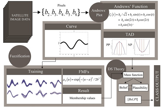
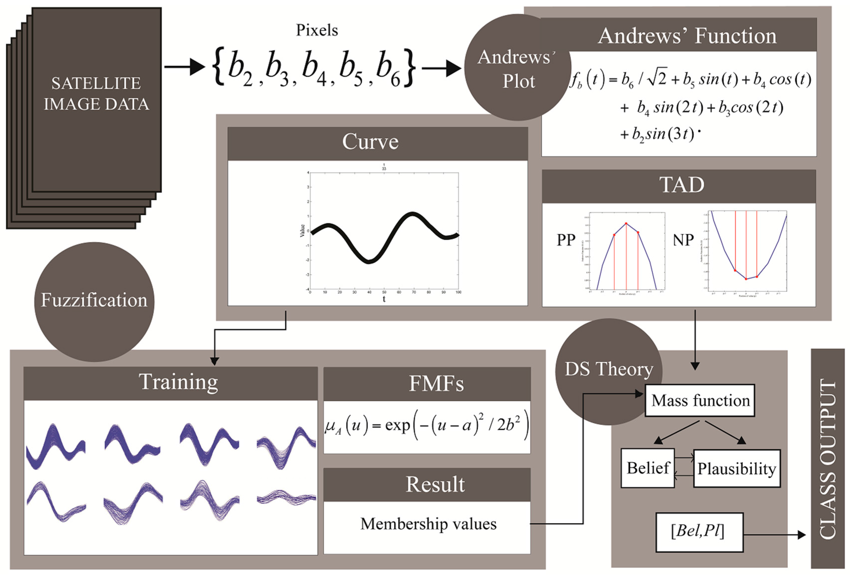
The main problem that might arise when dealing with relatively coarse-resolution satellite image data is the inclusion of small objects inside a pixel [22], e.g., a farmhouse in the middle of a crop area, a small pond, or a road. Unwanted, or impure, pixels have a greater impact when they occur within training data. To visualize multivariate data, such as the different dimensions of satellite image pixels, Andrews’ curves enable the interpreter to select outlier or impurity data that can be grouped into a new category for classification. These tasks can be performed using only a single Andrews’ function combined with a visual interpreter.
For satellite images, assigning a class to an input pixel by human action, involves transforming the input into an Andrews' curve and visually matching it with various prepared training Andrews’ curves. However, this process is time-consuming and its precision is limited by human perception, especially as the number of categories and the curve’s complexity increases, i.e., a full satellite image. To overcome these problems, this paper proposes a method for Andrews’ curve classification based on a combination of fuzzy sets and DS theory. By examining training curves, we found identical patterns in the same crop type. The learning-based classifier builds on several sets of training curves incorporating the curves’ properties. The membership value for each curve is calculated by fuzzification, and the probability of the curve’s characteristic or the type of Andrews’ curve dynamic (TAD) is obtained. DS theory is used to obtain confidence intervals, which are based on maximum belief and plausibility, to determine which curves are assigned to each category. Finally, the results obtained by the proposed method validate our hypothesis that Andrews’ plots can be applied to satellite image data. We compare this method with traditional supervised classification methods, and discuss the accuracy, precision, and robustness of our approach, as well as its additional advantages and disadvantages.

2. Background

2.1. Andrews’ Curve of Satellite Image Pixels

Andrews’ curves [1] were developed for visualizing multi-dimensional data by mapping each observation onto a function. For any n bands, regardless of their order in a satellite image, an image pixel b can be expressed by b = { b 1 , b 2 , b 3 , , b n } , t is the time domain from π   t o   π , and the Andrews’ function is defined as:
f b ( t ) = b 1 / 2 + b 2 sin ( t ) + b 3 cos ( t ) + b 4 sin ( 2 t ) + b 5 cos ( 2 t ) +
From Equation (1), we see that each observation is projected onto a set of orthogonal basis functions represented by sines and cosines, and that each data point may be viewed as a curve. Because of the mathematical properties of the trigonometric functions, the Andrews’ functions preserve the means, distances, and variances. On the one hand, a consequence of this equation is that any samples which have data values in every dimension that are close together produce Andrews’ curves that are also close together. On the other hand, if there is a pattern within the data, it may be visible in the Andrews’ curve of the data [23].

2.2. Fuzzification Approach

According to fuzzy set theory, fuzzification is the process that takes the inputs and determines the degree to which they belong to each of the appropriate fuzzy sets via the membership function.
A fuzzy set F based on a universe of discourse (UOD) U with elements u is expressed as:
F = { μ A ( u ) / u } u U
where μ A ( u ) is a membership function or FMF of the fuzzy variable u in the set F , and it provides a mapping of U in the closed interval (0, 1). The term μ A ( u ) is simply a measure of the degree to or by which u belongs to the set F . Here, it should be noted that the notation only represents a fuzzy set and is not related to usual integration or summation. There are several types of FMFs [24]. We employed the basic Gaussian-shaped function in our study, which is given by:
μ A ( u ) = exp ( ( u a ) 2 / 2 b 2 )
where a and b signify the mean and standard deviation of the membership function, respectively; the function is distributed around parameter a , and parameter b determines the width of the function.

2.3. Principles of Dempster-Shafer (DS) Theory

As mentioned above, the evidence of the traditional probability theory is associated with only one possible event, whereas the evidence of the DS theory can be associated with multiple possible events, e.g., sets of events. The DS theory is advantageous owing to its ability to capture the natural behavior of reasoning by narrowing the hypothesis set down to a smaller number of possibilities as the evidence increases [15]. It allows for the direct representation of the uncertainty in system responses, where an imprecise input can be characterized by a set or an interval and the resulting output is a set or an interval.
The three important elements of the DS theory are the basic probability assignment (BPA) or m , the belief function or B e l , and the plausibility function or P l . The BPA is a primitive of evidence theory, describing the degree of an event A from the frame of discernment Θ (commonly referred to as the power set), where m of the null set is 0 and the summation of the m degrees of all the subsets of Θ is 1. The value of the basic probability assignment for a given set A , represented as m ( A ) , only pertains to the set A and makes no additional claims about any subsets of A . On the other hand, any further evidence on the subsets of A would be represented by another value, i.e., m ( B ) for B A , which satisfies the condition:
m : P ( H ) [ 0 , 1 ]
m ( ) = 0
A P ( H ) m ( A ) = 1
where P ( H ) represents the power set of H , ø is the null set, and A is a set in the power set, i.e., A P ( H ) .
From the m values, the upper and lower bounds of an interval can be defined (7). This interval contains the precise probability of a set of interest, and it is bounded by the belief and plausibility. The belief for a set A is defined as the sum of all m values of the proper subsets ( B ) of the set of interest ( A ) ( B A ) . The plausibility is the sum of all the m values of the sets ( B ) that intersect the set of interest (A) ( B A ) .
[ B e l ( A ) , P l ( A ) ]
B e l ( A ) = B | B A m ( B )
P l ( A ) = B | B A m ( B )
Note that the sum of all the belief measures need not always be 1. Similarly, the sum of all the plausibility measures need not always be 1, because of their nonadditive property [25].
In addition to being derived from the basic probability assignment ( m ), the belief and plausibility measures can be derived from each other. The plausibility can be alternatively derived from the belief, as follows:
P l ( A ) = 1 B e l ( A ¯ )
B e l ( A ¯ ) = 1 B | B A m ( B )
where A ¯ is the classical complement of A . This definition of plausibility in terms of belief is based on the fact that all basic assignments must sum up to 1.
To obtain a combined probability assignment over the frame of discernment, Dempster’s rule of evidence is applied. The combination of evidence defines the intersection of the subsets for the frame of discernment based on conjunctive pooled evidence. Consider an example involving two pieces of evidence, B and C ( m 1 and m 2 ); their combination can be expressed as:
m 12 ( A ) = B C m 1 ( B ) m 2 ( C ) / ( 1 K )
when A , m 12 ( ) = 0 :
K = B C m 1 ( B ) m 2 ( C )
where K represents the basic probability mass associated with conflict, which is determined by summing the products of the m values of all sets where the intersection is null.
The final result can be easily determined using the belief interval that has the maximum belief among all the subsets. The DS theory allows for flexibility in the final decision criteria after the extraction of belief intervals for all potential composite events, which is highly dependent on the user preferences and the specific application [26].

3. Materials and Methods

3.1. Data

3.1.1. Rubber and Palm Data (RP)

The satellite image utilized in this study is a Landsat-8 Operational Land Imager (OLI) image produced using the Level 1 Product Generation System (LPGS), version 2.2.3. We conducted atmospheric correction by obtaining the Top-of-Atmosphere (TOA) surface reflectance using the manual recommended by the Yale University Center for Earth Observation [27]. Z-score transformation was applied to every data point to obtain a mean of 0 and a variance of 1 [28]. Further, 4473 labeled pixels were carefully constructed in Google Earth using Thailand’s 2015 land cover ground survey data obtained from the Geo-Informatics and Space Technology Development Agency (GISTDA). The considered area (Figure 1) is located in the Surat Thani province, the largest province in the south of Thailand, where two main crops are grown: rubber (Hevea brasiliensis), a deciduous crop; and oil palm (Elaeis guineensis), a nondeciduous crop. The image’s acquisition took place during the leaf shedding period of deciduous plants in the area, which is the main obstacle for delineating shed, shedding, and nonshedding trees. Urban areas, water bodies, and permanent constructions were excluded from the data for further analyses, leaving 2317 pixels. Further, 793 pixels were selected as the training set using the process described below. The remaining 1524 pixels were used for an assessment of the accuracy.

3.1.2. Paddy and Sugarcane Data (PS)

To test the performance of the algorithm, we used Landsat-8 OLI data acquired on 14 January 2014 (path = 130, row = 49) from the Kumphang-Phet province, Thailand (Figure 2). Using the same machine type and version, we reran the same workflows as for the RP data. On the image, we manually digitized 300 plantation fields by slightly reducing the margin of the crop field, to avoid mixed pixels at the edges that might affect the classification [29,30], for instance, by reducing the unity of the training sets, leading to a lower classification accuracy. We used Thailand’s 2014 land cover ground survey data obtained from GISTDA. The considered area is four times larger than the area in the RP data and includes many area of paddy fields, as well as a few small isolated sugarcane fields, harvested areas, and bodies of water. The image’s acquisition time was during the sugarcane harvest, which causes anomalies in normal sugarcane fields; this makes classifying the data more challenging.

3.2. Proposed Method

3.2.1. Training and Testing Data Selection

Selecting a training sample is a key step that can affect the accuracy of the classification results [31]. Here, we propose three steps for selecting an appropriate training sample from the data. For each dataset, we first iteratively calculate the Euclidean distance between each pair of satellite data to be provided as the input in the complete-linkage clustering method explained in [32]. In complete-linkage clustering, the link between two clusters contains all element pairs, and the distance between the clusters equals the distance between those two elements (one in each cluster) that are farthest apart. The shortest link that remains in any step causes the two clusters whose elements are involved to fuse. We arranged the shortest link results in ascending order and then selected a training dataset. For the RP data, we selected 793 samples (34%) for training, and the remaining samples were used as the test data (66%). We adopted a similar approach for the PS data, but with different proportions based on the complexity and characteristics of the data (17% training and 83% test data).
Moreover, to test the robustness of the training sample, we used the same number of samples; however, the sample sizes were reduced proportionally to the training data, to ensure that the curves corresponding to each class were sufficiently large. Table 1 shows the class abbreviations and descriptions with the training and test sizes.
In the second step, an Andrews’ Equation (1) was applied to all image pixels. However, Andrews’ curves are strongly dependent on the order of the variables. Lower-frequency terms have a greater impact on the shape of the curve [23]. We plotted the set of curves having identical labels and manually compared them via visual interpretation. As mentioned previously, the shape of an Andrews’ curve is very sensitive to the order of variables, especially in the lower-frequency terms. Therefore, in Equation (1), we plotted them in different arrangements. For example, in the first round, we plotted the order of the bands as 2, 3, 4, 5, 6; however, class A and class B are not distinguishable. When plotting the order of the bands as 3, 4, 2, 5, 6, we also obtained nondistinguishable results. We repeated this process until we had obtained the appropriate order: 6, 5, 4, 3, 2. This order is supported by the spectral reflection of the plants, which lie mainly in the infrared and red bands, represented by bands 6 and 5 of the Landsat-8 data [33]. Note that one must understand the basic properties of any data before using them, which supports the use of an Andrews’ equation.
Finally, we examined the Andrews’ curves of the training sets. The main objective of this step is to manually remove noise from the data, as shown in Figure 3c. Another advantage of this step is that the user can observe the overlapping area of the Andrews’ curves for class pairs by simply plotting each class in a different color (Figure 3a). Moreover, overlapping areas in the classes can be extracted to several subgroups, as shown in Figure 3b, which prevents the misclassification of the curve that lies in the overlapping area by improving the accuracy of membership grade acquisition. Note that extracting the overlapping area is an option and can be avoided if details of the land cover are available in reference data.

3.2.2. Membership Grade Acquisition

The Andrews’ curve of the data for each training set is obtained by projecting each data point onto the orthogonal function. For one set of training data, each continuous curve is fragmented into a set of 100 discrete values g , where the position p of value v has N points of training samples. Then, we calculate the mean a and standard deviation b as follows:
a p = ( v 1 + v 2 + v 3 + + v N ) / N
b p = 1 N i = 1 N ( v i a p ) 2
Per the Gaussian-shaped membership Function (3), for any discrete input value at any position, we can calculate the grade membership function in any training set A as follows:
μ A ( v p ) = exp ( ( v p a p ) 2 / 2 b p 2 )
According to Equation (16), only the matching position of the discrete value would be the input for each iterative Gaussian membership function. The illustration of Gaussian membership functions in a position of the discrete value is shown in Figure 3d. The results are membership grades with regard to the positions of the discrete values. There were 100 values per pixel per membership function or subgroup. These fuzziness values represent the probability that each discrete input value belongs to each set of discrete values in the training set. Finally, we obtained the arithmetic sum of the values and divided them by N to obtain only one value for a membership function, which was then compared with other values inside the class. We selected the candidate with the maximum membership value as representative of the class.

3.2.3. Type of Andrews’ Curve Dynamic (TAD)

After calculating the membership grade, we examined the shape of the Andrews’ curves. An Andrews’ curve is generated by continuously combining the sine and cosine curves with different frequencies, increasing by 1 in each sine function. The remote sensing data have five data points for each sample; thus, the highest-frequency term is s i n ( 3 t ) , i.e., the sum of the maximum number of positive peaks P P and negative peaks N P must be 6. Possible peak patterns occurring in the data are referred to as the TAD (Table 2).
Note that not all possible patterns occurred in this study; occurrence depends on the value of the input data point. To find the TAD of each curve, we performed a simple brute-force search by iteratively examining every three discrete data values against the following conditions.
Let G ( 1 , 2 , 3 , , 100 ) be an array of 100 discrete Andrews’ curve values and i be indices from 2 to 99 (since G ( 1 ) and G ( 100 ) cannot be the candidates). G [ i ] can be defined as a P P if it satisfies Equation (17); otherwise, it can be defined as an N P by Equation (18).
G [ i 1 ] G [ i ] G [ i + 1 ]
Note that the terms “positive” and “negative” only refer to the vertical direction of the peak and not its value. Figure 4 illustrates the occurrence of P P s and N P s in an Andrews’ curve.

3.2.4. Calculation of Belief and Plausibility

The final goal of the study is to determine the class assignments from belief and plausibility (belief interval). Our DS-theory-based workflow for obtaining the belief and plausibility is shown in Figure 5. The results of fuzzification and the TAD were set as the inputs for obtaining belief and plausibility. All input elements are normalized, resulting in a basic probability assignment of each class. The belief (8) and plausibility (9) equations are employed based on their relationship with basic probability assignment. DS theory allows users to determine the final crisp classification [26]. We simply assign the class with the maximum belief value to the output of the input curve pattern.
In conclusion, Figure 5 shows the overall procedure from the satellite image input through the proposed process until the output data is obtained. First, the satellite image data are loaded into the workspace. Then, the pixel data are iteratively transformed into a continuous Andrews’ curve by applying an Andrews’ Function (1). The data points are arranged in descending order from bands 6 to 2 (lower to higher frequencies). Each Andrews’ curve is divided into 100 discrete values and its TAD is obtained by the iterative procedure in Equations (17) and (18).
For the discrete values, fuzzification is applied, i.e., the degree assignment of discrete values belonging to each class. The results of 100 membership values are converted into a value ranging from 0 to 1 for each subgroup. Because all subgroup membership functions are considered, the subgroup with the most membership values is selected as a candidate of the class. Once we obtain the candidate from every class, the values are normalized into basic probability assignments. For example, let a set of fuzzification results of an input be 0.70, 0.40, and 0.20 for classes PD, SC, and BLPS, respectively. The results are normalized to 0.70/1.30 = 0.54 for class PD, 0.40/1.30 = 0.31 for class SC, and 0.20/1.30 = 0.15 for class BLPS. However, uncertainty that affects these values may arise in the dataset. In this study, the reference providers observed that a slight change might misclassify PD to SC or SC to PD. If the data included in the training set and in fuzzification cannot be visually removed in training data selection, unreliable membership function results will be obtained. To deal with this uncertainty, we initially reduced the obtained membership values of PD and SC by 15% (see Section 4.2), namely, the bias of PD and SC.
For the TAD, all inputs are observed from the beginning, and we examine the probability that each randomly drawn out training sample belongs to a TAD. Then, the final decision is made by experts, who directly assign that value to basic probability assignment.
The basic probability assignment derived from the fuzzification and TAD result are used as parameters for the belief and plausibility calculation (Figure 5), using the method and equations described in our methodology. Finally, the class with the maximum belief value is assigned as the output.

4. Results

4.1. Andrews’ Curve of Training Sets

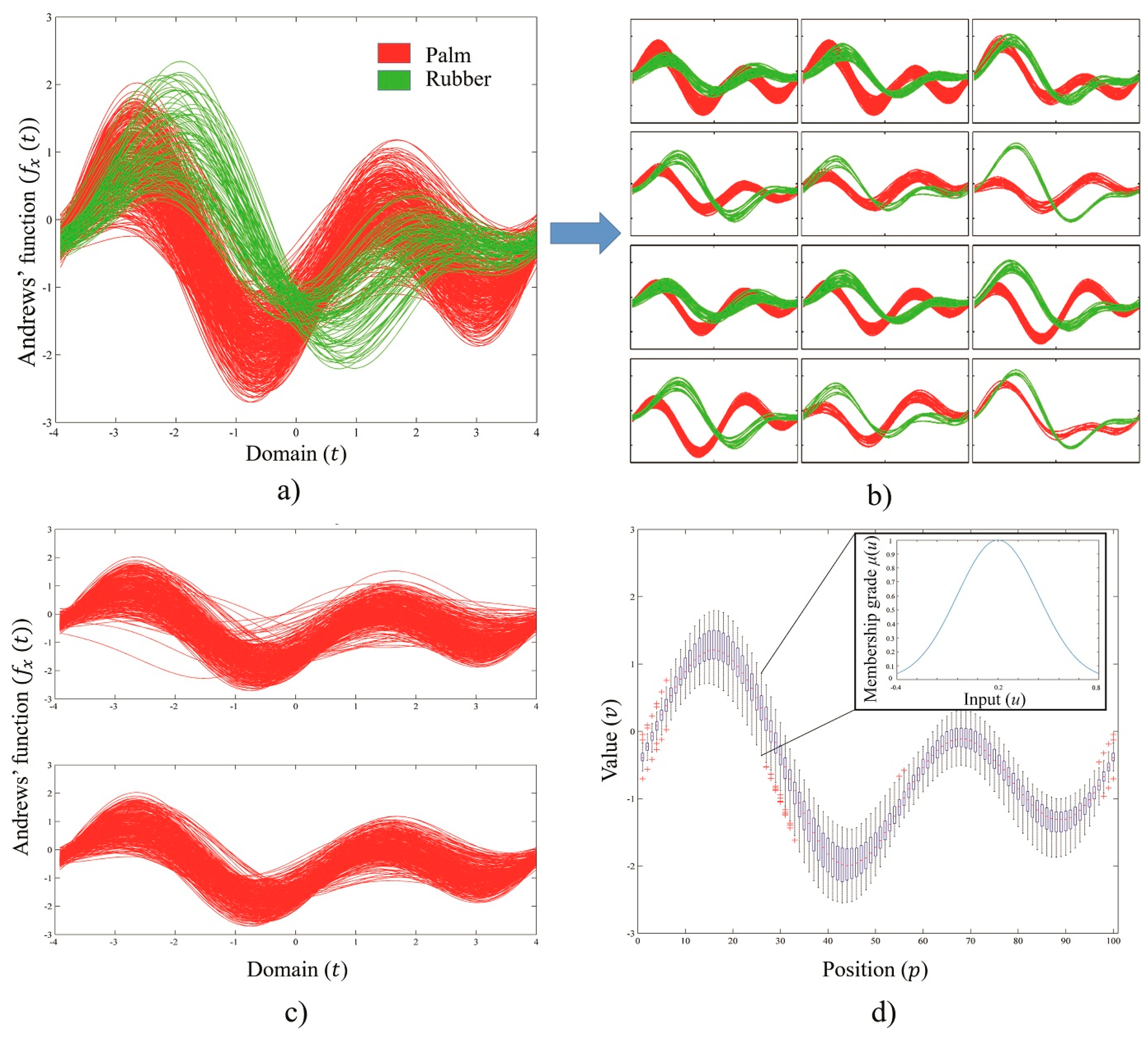
The training classes were divided into categories based on their TAD. To avoid confusion within the overlapping area, as shown in Figure 3a, we simply subdivided the types by visual interpretation, which is the main advantage of using Andrews’ curves (see, e.g., the separation illustrated in Figure 3b). Furthermore, Figure 3c shows a training set of the PM class before (top) and after (bottom) manual noise removal and subgroup extraction with visual interpretation.
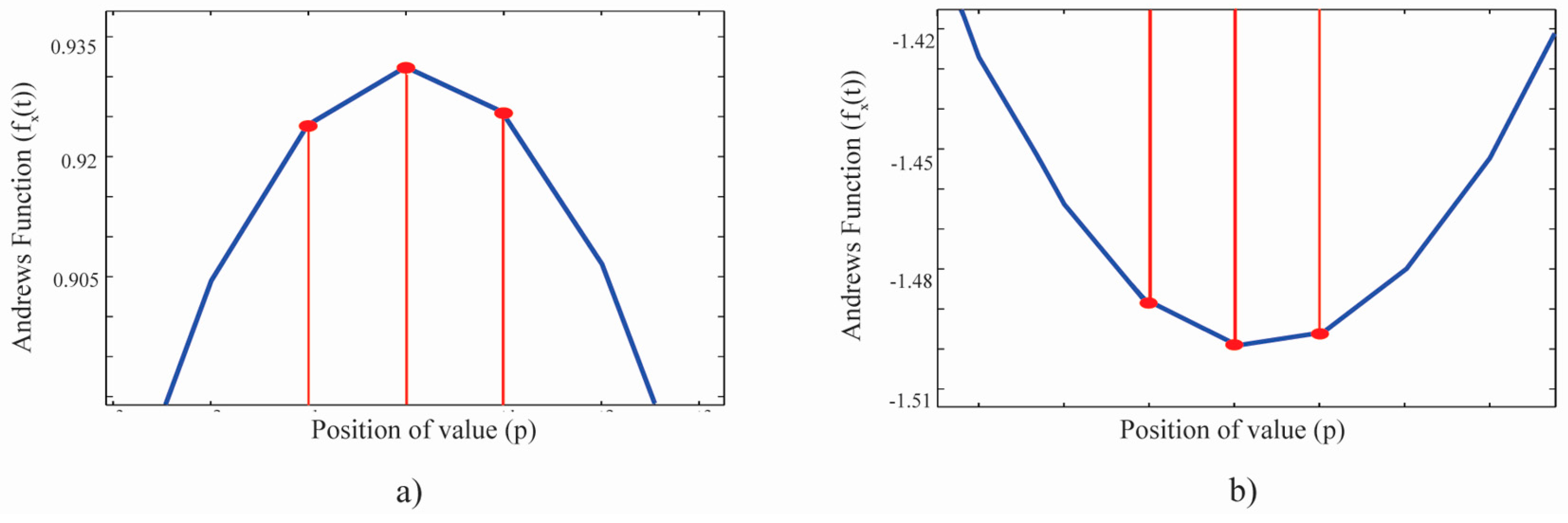
The possible TAD of all remote sensing datasets and the basic probability assignments are presented in Table 2, where 1 and 0 denote the positive and negative peaks of the Andrews’ curves, respectively. The number patterns directly refer to the order of peak arrangement in the curve.
The result from the examined TAD of each training set shows that different classes may have different TADs, but if they have the same TAD, their Andrews’ value pattern must differ. However, this conclusion is limited by the precision of the data and the maximum ability for classifying the data type.

4.2. Example Fuzzification, Belief and Plausibility Calculation Results

To easily understand how the process works, we selected an input (labeled as PD) as a sample for illustrating the calculation. The two pieces of evidence are fuzziness m 1 and dynamic m 2 . The fuzzification believes that the input curve pattern is in BLPS with a probability of 0.1924, PD with a probability of 0.6235, or SC with a probability of 0.1841. However, we added a bias (directly multiply by 0.85) to the PD and SC fuzzification results of 15% of the original results. This caused the results of PD and SC to be reduced to 0.5300 and 0.1565, respectively, based on the assumption that the summation of the mass values in a set must be equal to 1 in Equation (6). The dynamic believes that the input is BLPS with a probability of 0.1000, PD with a probability of 0.6000, or SC with a probability of 0.3000.
Dempster’s rule of combination in Equations (12) and (13) was adopted for the distribution of the basic probability assignments, as shown in Table 3.
There are seven null entries in Table 3. Thus, we computed K in Equation (13) and the mass combinations in Equation (12), which gave the belief in Equation (8), and we computed the plausibility by its relationship with the belief in Equations (10) and (11) or directly from the mass combinations in Equation (9), as follows:
K = 0.0530 + 0.0157 + 0.0121 + 0.1155 + 0.0939 + 0.0577 + 0.1590 = 0.05069
1 K = 0.4931
B e l ( { B L p } ) = m 1 m 2 ( { B L p } ) = 0.0192 / 0.4931 = 0.0389
B e l ( { P D } ) = m 1 m 2 ( { P D } ) = ( 0.3180 + 0.0727 ) / 0.4931 = 0.7923
B e l ( { S C } ) = m 1 m 2 ( { S C } ) = ( 0.0469 + 0.0363 ) / 0.4931 = 0.1687
for the maximum belief of 0.7923 in the PD set,
P l ( { P D } ) = 1 0.0192 0.0157 0.0121 0.0577 0.0469 0.0363 = 0.8121
The belief interval ranges from 0.7923 to 0.8121, i.e., the two classifiers coincidentally believe that the input curve is in PD with a minimum probability of 0.7923 and a maximum probability of 0.8121. Therefore, the crisp output is from the PD class for the example input that matches with its true class from the reference.

5. Discussion

5.1. Accuracy and Data Uncertainties

Per the fixed validation dataset (Table 1), the overall accuracy of the RP data was 92.06%, compared to 91.80% and 90.16% for the 24% and 11% training sets, respectively. This behavior is similar to that of the PS data, with a slight decrease from 98.35% for the 15% training set to 98.20% and 97.92% for the 10% and 7% training sets, respectively. The PS satellite data, collected in the sugarcane harvest season, may introduce a certain discrepancy, as the non-cut sugarcane area, already cut sugarcane area with bare land, medium-growth sugarcane, and paddy field have similar reflectance data. A similar ambiguity arises in the RP data, wherein the satellite acquisition occurs during the shedding season of rubber, when palm is non-shed. Herein, there is ambiguity between young palm with shedding rubber, young palm or young rubber with bare land, and shed rubber with bare land, which have similar reflectance data. The confusion matrix between the reference and classified data is shown in Table 4 and Table 5.

5.2. Representative of Training Data

We inspected the significance of the difference in accuracy between the RP and PS data. As per Table 1, the number of training samples directly influences the accuracy if it cannot represent most of the characteristics of the class. For the same training size proportion (around 10%), the number of paddy field reference curves (the majority class of the PS dataset) is 1035, which may be sufficient to represent all possible paddy fields occurring in the area, while oil palm (the majority class of RP dataset) has only 109 curves. However, we can assume that the training sets of RP data may be less representative than the training sets of PS data at the same training ratio. The training sample cannot completely represent all input data, which is the main drawback of the sampling design [31].

5.3. Robustness

To test the performance of our method, we randomly reduced the number of training samples to different proportions. Although the training data were reduced, the test data remained at the same proportion of the population. The accuracy of the result shows that the reduction in training data leads to a slight decrease in the overall accuracy of the remote sensing data. This phenomenon is referred to as an increase in commission and emission errors (those that can be interpreted from the reduction of the user’s and producer’s accuracy, respectively). The main reason for such errors is that the random procedure of our method generates an extremely small training size in some subgroups. After examining the result of misclassified curves, e.g., we scanned the 11% training set of the RP data and found that some subgroups show a substantial change in width compared to the original training set of 35% (some subgroups left only four training curves). However, the overall accuracy is greater than 90% for all datasets.
Moreover, we compared the proposed method with two traditional classification methods, the maximum likelihood and minimum distance, for the RP data. We used the minimum training size of 11% and the same 1524 validating points. The experiment was completed using supervised classification functions in the ENVI 5.0 software and its results showed that the proposed method has a commission error rate for the PM class greater than that of the minimum distance method—about 8%—while the minimum distance method provided a poor user accuracy for the RB class. In contrast, the maximum likelihood yielded the highest user accuracy for the PM class, but seemed to include the RB and PM classes in the results of the BLRP class, more so than the other two methods. In conclusion, the proposed method has the highest overall accuracy among the methods.
The benefit of using Andrews’ plots in preparing training data is to screen outliers that may be included, as well as to subdivide the training sets to improve the accuracy. The next step is to reject low membership grade inputs by DS theory. These are the differences of the proposed method from traditional methods. Table 6 illustrates the accuracies from the comparison experiment.

5.4. Limitations and Suggestions

Andrews’ plots can precisely visualize high-dimensional data. However, they also have a shortcoming, i.e., their shapes become completely different when the order of the variables is changed. This phenomenon was described by Andrews himself in his original paper [1]. Note that it is expedient to subordinate the most important variables with low frequencies, as we did with the near-infrared band, whose values were mainly affected by the plants. Conversely, this shortcoming may be advantageous in other contexts. The differing shapes of Andrews’ curves illustrate different characteristics of the data source. For example, in a complicated work, one may use at least two orders to ensure that a pixel is categorized precisely into a class based on the distinguishability of the orders. If an order is insufficient to represent the pixel, it may be advantageous to draw another order based on the band characteristics.
As we noted in Section 3.2.1, extracting the overlapping area in the training data is an optional task to optimize the training selection procedure. The main objective of this method is to reduce the overlapping area of the curves, resulting in less overlap in the shape of the membership function of each class. However, it can be avoided in many cases if details of the reference used are available.
Owing to the high flexibility provided by the core concepts of fuzzification and DS theory, users can develop their own rules and make individual decisions. The two theories are representative of vagueness and uncertainty. The major problem of any classification task is achieving maximal accuracy. These theories are usually used to handle vagueness in data that normal crisp methods cannot. However, when the data have no uncertainty, to use such theories may be inappropriate. Note that very good data may produce relatively good results, while fairly good training data may also produce equally good results from a well-prepared method that reduces time and cost requirements. Theoretically, the power of such a supervised method depends on understanding the data and the experience of the user in designing a workflow.

5.5. Future Work

We hypothesized that different subgroups may be due to stages of cultivation or the specific characteristics of the crop species, depending on the date of data acquisition. However, this assumption cannot be proven in the current paper because the ground survey reference used does not show stages of crop cultivation or areas containing a large amount of private crop land, where planting is based on individual decisions. Moreover, the proof must be pursued carefully using time series and available ground survey data.
The data used in this study were acquired using the same sensor, Landsat-8 OLI. However, the acquisition date, area elevation, weather, and so on, varied. Moreover, the crop land occurring in the areas had varied properties. For example, rubber is a deciduous crop, but oil palm is not, whereas paddy and sugarcane fields share the same reflectance at some stages of cultivation. The classifier worked well under these ambiguous conditions. Furthermore, the Andrews’ curve of the bare land class seemed to have the same shape across the two datasets and was distinct from that of pure vegetation areas. In addition, the data points that included a combination of bare land, construction areas, bodies of water, and vegetation seemed to have specific curves. Further investigation is required to ensure that different objects have at least one specific Andrews’ curve that can be used to distinguish them under the controlled conditions of Andrews’ curve plotting. Moreover, comparisons with other classification techniques must be observed.

6. Conclusions

In this study, the satellite image pixels were accurately classified using a technique based on data visualization (Andrews’ plots) and the combination of DS and fuzzy set theory (accuracy more than 97% and 90% for PS and RP data, respectively). The main advantage of using Andrews’ plots is that they make impure data more easily detectable by human interpretation. Moreover, they envision not only the structures within data, but also seem to yield signature curves for a class. Two widely used machine learning algorithms were used to handle the many transformed curves. Fuzzification was used to obtain the membership grades, which assign each curve to a given training-curve class, while the real decisions were made by DS theory with the obtained grades and a few given conditions (curve’s characteristic possibilities and assigned uncertainties). The study provided not only a crop type classification framework, but also incidentally gave a practical method for finding curve similarities. The proposed method still worked well when we changed the training sizes. At the same training size, it also produced a better result when compared to the maximum likelihood and minimum distance algorithm. However, the proposed framework also has its shortcomings, e.g., the Andrews’ function is very sensitive to the data arrangement applied. Furthermore, the process requires a relatively fast computer that supports curve visualization. Future work will focus on investigating the signature curves for commercial crops and a comparison of the proposed method with other advanced methods such as the support vector machine, neural network, pure fuzzy classification, decision tree, etc.

Acknowledgments

This work was funded by the Special Fund for Forest Scientific Research in the Public Welfare (Grant No. 201504323) and the Special Fund for the Ecological Assessment of Three Gorges Project (Grant No. 0001792015CB5005), China. The authors would like to extend their gratitude to Chonthicha Chitpaiboon and Chinta Wongparn of the Geo-Informatics and Space Technology Development Agency (GISTDA), Thailand, for their assistance with the reference data, and to Patcharin Insom for her assistance in suggesting the algorithms. Sornkitja Boonprong would like to express his gratitude to the Royal Thai Government for their support and the scholarship provided. The authors would also like to thank the institute’s teachers and anonymous reviewers for their insightful comments, which have significantly improved this paper.

Author Contributions

Sornkitja Boonprong conceived and designed the experiments; Sornitja Boonprong performed the experiments; Sornkitja Boonprong and Peerapong Torteeka analyzed the data; Chunxiang Cao and Wei Chen contributed materials and analysis tools; and Sornkitja Boonprong wrote the paper.

Conflicts of Interest

The authors declare no conflict of interest.

References

  1. Andrews, D.F. Plots of high-dimensional data. Biomatrics 1972, 28, 125–136. [Google Scholar] [CrossRef]
  2. David, A.P.; Robert, P.G.; Andrew, R.M.; Stephanie, L.M. Abiotic and Biotic soil characteristics in old growth forests and thinned or unthinned mature stands in three regions of Oregon. Diversity 2012, 4, 334–362. [Google Scholar]
  3. Spencer, N.H. Investigating data with Andrews plots. Soc. Sci. Comput. Rev. 2003, 21, 244–249. [Google Scholar] [CrossRef]
  4. Norliza, M.N.; Omar, M.R.; Chang, Y.F. A feature detection method for pulmonary Mycobacterium Tuberculosis using conventional chest radiographs. In Proceedings of the XII. European Signal Processing Conference (EUSIPCO 2004), Vienna, Austria, 6–10 September 2004. [Google Scholar]
  5. Rietman, E.A.; Layadi, N. A study on Rm→R1 maps: Application to a 0.16-μm via etch process endpoint. IEEE Trans. Semicond. Manuf. 2000, 13, 457–468. [Google Scholar] [CrossRef]
  6. Koutsonikola, V.A.; Vakali, A.I. A fuzzy bi-clustering approach to correlate web users and pages. Int. J. Knowl. Web Intell. 2009, 1, 3–23. [Google Scholar] [CrossRef]
  7. Moustafa, R.E.; Hadi, A.S.; Symanzik, J. Multi-class data exploration using space transformed visualization plots. J. Comput. Graph. Stat. 2011, 20, 298–315. [Google Scholar] [CrossRef]
  8. Zadeh, L.A. Fuzzy sets. Inform. Control 1965, 8, 338–353. [Google Scholar] [CrossRef]
  9. Zadeh, L.A. Fuzzy Algorithms. Inform. Control 1968, 12, 94–102. [Google Scholar] [CrossRef]
  10. Bustince, H.; Barrenechea, E.; Pagola, M.; Fernandez, J.; Xu, Z.; Bedregal, B.; Montero, J.; Hagras, H.; Herrera, F.; Baets, B.D. A historical account of types of fuzzy sets and their relationships. IEEE Trans. Fuzzy Syst. 2016, 24, 179–194. [Google Scholar] [CrossRef]
  11. Chen, Y.-N.; Hsieh, C.-T.; Wen, M.-G.; Han, C.-C.; Fan, K.-C. A Dimension Reduction Framework for HIS Classification Using Fuzzy and Kernel NFLE Transformation. Remote Sens. 2015, 7, 14292–14326. [Google Scholar] [CrossRef]
  12. Park, S.-E.; Moon, W.M. Unsupervised classification of scattering mechanisms in Polarimetric SAR data using fuzzy logic in entropy and Alpha Plane. IEEE Trans. Geosci. Remote Sens. 2007, 45, 2652–2664. [Google Scholar] [CrossRef]
  13. Xu, S.; Wang, T.; Hu, S. Dynamic Assessment of Water Quality Based on a Variable Fuzzy Pattern Recognition Model. Int. J. Environ. Public Health 2015, 12, 2230–2248. [Google Scholar] [CrossRef] [PubMed]
  14. Dempster, A.P. Upper and lower probabilities induced by a Multivalued mapping. Ann. Math. Stat. 1967, 38, 325–339. [Google Scholar] [CrossRef]
  15. Shafer, G. A Mathematical Theory of Evidence; Princeton University Press: Princeton, NJ, USA, 1976. [Google Scholar]
  16. Sentz, K.; Ferson, S. Combination of Evidence in Dempster-Shafer Theory; U.S. Department of Energy’s (DOE): Washington, DC, USA, 2002.
  17. Deng, Y.; Su, X.Y.; Jiang, W. A Fuzzy Dempster Shafer Method and its Application in Plant Location Selection. Adv. Mater. Res. 2010, 102–104, 831–835. [Google Scholar] [CrossRef]
  18. Mönks, U.; Dorksen, H.; Lohweg, V.; Hubner, M. Information Fusion of Conflicting Input Data. Sensors 2016, 16, 1798. [Google Scholar] [CrossRef] [PubMed]
  19. Lu, F.; Jiang, C.; Huang, J.; Wang, Y.; You, C. A Novel Data Hierarchical Fusion Method for Gas Turbine Engine Performance Fault Diasnosis. Energies 2016, 9, 828. [Google Scholar] [CrossRef]
  20. Laha, A.; Pal, N.R.; Das, J. Land cover classification using fuzzy rules and aggregation of contextual information through evidence theory. IEEE Trans. Geosci. Remote 2006, 44, 1633–1641. [Google Scholar] [CrossRef]
  21. Yang, Y.-T.; Wang, Y.; Wu, K.; Yu, X. Classification of Complex Urban Fringe Land Cover Using Evidential Reasoning Based on Fuzzy Rough Set: A Case Study of Wuhan City. Remote Sens. 2016, 8, 304. [Google Scholar] [CrossRef]
  22. Hsieh, P.-F.; Lee, L.C.; Chen, N.-Y. Effect of spatial resolution on classification errors of pure and mixed pixels in remote sensing. IEEE Trans. Geosci. Remote 2001, 39, 2657–2663. [Google Scholar] [CrossRef]
  23. Cesar, G.-O.; Fyfe, C. Visualization of high-dimensinal data via orthogonal curves. J. Univers. Comput. Sci. 2005, 11, 1806–1819. [Google Scholar]
  24. Raol, J.R. Multi-Sensor Data Fusion with MATLAB: Theory and Practice; Taylor & Francis: Boca Raton, FL, USA, 2009. [Google Scholar]
  25. Klir, G.J.; Wierman, M.J. Uncertainty Based Information: Elements of Generalized Information Theory; Physica-Verlag GmbH & Co.: Heidelberg, NY, USA, 1998. [Google Scholar]
  26. Petrou, Z.I.; Kosmidou, V.; Manakos, I.; Stathaki, T.; Adamo, M.; Tarantino, C.; Tomaselli, V.; Blonda, P.; Petrou, M. A rule-based classification methodology to handle uncertainty in habitat mapping employing evidential reasoning and fuzzy logic. Pattern Recognit. Lett. 2014, 48, 24–33. [Google Scholar] [CrossRef]
  27. How to Convert Landsat DNs to Top of Atmosphere (ToA) Reflectance. Center for Earth Observation, 2016. Available online: http://yceo.yale.edu/how-convert-landsat-dns-top-atmosphere-toa-reflectance. (accessed on 12 December 2016).
  28. Martinez, W.L.; Martinez, A.R.; Solka, J.L. Exploratory Data Analysis with MATLAB, 2nd ed.; CRC Press: Boca Raton, FL, USA, 2010. [Google Scholar]
  29. Raciti, S.M.; Hutyra, L.R.; Newell, J.D. Mapping carbon storage in urban trees with multi-source remote sensing data: Relationships between biomass, land use, and demographics in Boston neighborhoods. Sci. Total Environ. 2014, 500–501, 72–83. [Google Scholar] [CrossRef] [PubMed]
  30. Gray, J.; Song, C. Mapping leaf area index using spatial, spectral, and temporal information from multiple sensors. Remote Sens. Environ. 2012, 119, 173–183. [Google Scholar] [CrossRef]
  31. Olofsson, P.; Foody, G.M.; Herold, M.; Stehman, S.V.; Woodcock, C.E.; Wulder, M.A. Good practices for estimating area and assessing accuracy of land change. Remote Sens. Environ. 2014, 148, 42–57. [Google Scholar] [CrossRef]
  32. Defays, D. An efficient algorithm for a complete link method. Comput. J. 1977, 20, 364–366. [Google Scholar] [CrossRef]
  33. Loyd, C. Landsat 8 Bands. Landsat Science, 6 January 2014. Available online: http://landsat.gsfc.nasa.gov/landsat-8/landsat-8-bands (accessed on 20 December 2016).
Figure 1. The location of RP data, Left band 5 (R), 4 (G), 3 (B) composite of the Landsat 8 OLI image.
Remotesensing 09 00427 g001
Figure 2. The location of PS data, Left band 5 (R), 4 (G), 3 (B) composite of the Landsat 8 OLI image.
Remotesensing 09 00427 g002
Figure 3. (a) Andrews’ curves of a PM’s training set (red) plotted together with an RB’s training set (green); (b) Example of the distribution of the two training sets that seem more separable than (a); (c) Comparison of the PM’s training set before (upper) and after (lower) noise removal; (d) Set of Gaussian membership functions generated from the mean and standard deviation of a set of training values at the same position.
Remotesensing 09 00427 g003
Figure 4. Examples of (a) positive and (b) negative peaks from Andrews’ curves.
Remotesensing 09 00427 g004
Figure 5. Overall analysis process. First, an Andrews’ function is applied to pixels from the satellite image data to obtain the curves and TAD. Second, the training curves are selected and used in fuzzification to obtain the membership values of each class. Finally, the membership values and TAD are used as parameters in DS theory. The final class decisions are determined by the obtained belief interval.
Remotesensing 09 00427 g005
Table 1. Training and testing data.
ClassesDescriptionsTraining (Pixels)Testing (Pixels)
RP data34%22%11%66%
BLRPBare land/harvested area in RP data8053271524
RBRubber field329219109
PMPalm field384255127
PS data15%10%7%83%
BLPSBare land/harvested area in PS data89461643115,065
PDPaddy field15031035724
SCSugarcane field227156110
Table 2. Type of Andrews’ curve dynamic and possibilities 1.
ClassesT1 (1010)T2 (0101)T3 (10)T4 (01)T5 (101)T6 (010)
PM0.50.10.30.20.30.33
RB0.50.30.60.40.60.33
BLRP00.60.10.40.10.34
PD0.60.10.450.40.450.33
SC0.40.40.450.20.450.33
BLPS00.50.10.40.10.34
1 of types occurring in the data.
Table 3. Calculation of mass value combination.
Input 1 m 1
{ B L p } { P D } { S C } { B i a s }
0.19240.53000.15650.1211
m 2 { B L P S } 0.1000 { B L p } { } { } { }
0.01920.05300.01570.0121
{ P D } 0.6000 { } { P D } { } { P D }
0.11550.31800.09390.0727
{ S C }0.3000 { } { } { S C } { S C }
0.05770.15900.04690.0363
1 Input number 8708 from PS data.
Table 4. Error matrix table of RP data.
Training SizeReference Data (Pixels)
BLRPRBPMTotalUA (%)
35%BLRP1484015297.37
RB145663261292.48
PM17068976090.66
Total1636407211524
PA (%)90.8088.4495.56OA (%) = 92.06
24%BLRP1484015297.37
RB155623561291.83
PM17068976090.66
Total1646367241524
PA (%)90.2488.3695.17OA (%) = 91.80
11%BLRP1465115296.05
RB125643661292.16
PM19566476087.37
Total1596647011524
PA (%)91.8284.9494.72OA (%) = 90.16
Table 5. Error matrix table of PS data.
Training SizeReference Data (Curves)
BLPSPDSCTotalUA (%)
15%BLPS4809121482299.73
PD52861272873698.58
SC51601396150792.63
Total49128684146915065
PA (%)97.9099.1795.03OA (%) = 98.35
10%BLPS4791274482299.36
PD57860871873698.53
SC48631395150792.63
Total48958698147115065
PA (%)97.8698.9794.90OA (%) = 98.21
7%BLPS4798195482299.50
PD100857165873698.11
SC43631383150791.77
Total49418671145315065
PA (%)97.1198.8595.18OA(%) = 97.92
Table 6. The error matrix of three classification methods.
MethodsReference Data (Pixels)
BLRPRBPMTotalUA (%)
Minimum DistanceBLRP129121115284.87
RB141120061267.16
PM03772376095.13
Total1304609341524
PA (%)99.2389.3577.41OA (%) = 82.48
Maximum LikelihoodBLRP1483115297.37
RB425551561290.67
PM108666476087.37
Total2006446801524
PA (%)74.0086.1897.65OA (%) = 89.70
The proposed methodBLRP1465115296.05
RB125643661292.16
PM19566476087.37
Total1596647011524
PA (%)91.8284.9494.72OA (%) = 90.16

