Article

Methods to Quantify Regional Differences in Land Cover Change

1
School of Geography, University of Leeds, Leeds LS2 9JT, UK
2
Centre for Landscape and Climate Research, Department of Geography, University of Leicester, Leicester LE1 7RH, UK
3
Geography and Environment, University of Southampton, Southampton SO17 1BJ, UK
*
Author to whom correspondence should be addressed.
These authors contributed equally to this work.
This author has been deceased.
Remote Sens. 2016, 8(3), 176; https://doi.org/10.3390/rs8030176
Submission received: 17 November 2015 / Revised: 8 February 2016 / Accepted: 14 February 2016 / Published: 25 February 2016
(This article belongs to the Special Issue Validation and Inter-Comparison of Land Cover and Land Use Data)

Abstract

:
This paper describes and illustrates methods for quantifying regional differences in land use/land cover changes. A series of approaches are used to analyse differences in land cover change from data held in change matrices. These are contingency tables and are commonly used in remote sensing to describe the spatial coincidence of land cover recorded over two time periods. Comparative analyses of regional change are developed using odds ratios to analyse data in two regions. These approaches are extended using generalised linear models to analyse data for three or more regions. A generalised Poisson regression model is used to generate a comparative index of change based on differences in change likelihoods. Mosaic plots are used to provide a visual representation of statistically surprising land use losses and gains. The methods are explored using a hypothetical but tractable dataset and then applied to a national case study of coastal land use changes over 50 years conducted for the National Trust. The suitability of the different approaches to different types of problem and the potential for their application to land cover accuracy measures are briefly discussed.

Graphical Abstract

1. Introduction

The correspondence matrix has become the de facto method for reporting on post classification land cover change [1,2,3]. There are many examples of its use to describe land cover and land use change (e.g., [4,5,6,7]). It is a form of contingency table, summarising the coincident areas or spatial intersection of land classified over two time periods and is referred to as the change, correspondence or transition matrix. A number of summary measures are commonly derived from the change matrix including the overall change/no change proportions and class probabilities of change from the margin totals (columns and rows), described in terms of per class Losses from Time 1 and Gains at Time 2. Various Kappa statistics are frequently used to describe global changes and per class rates of landscape and land cover changes (e.g., [8]) although these measures are not without their critics [1,9,10].
The purpose of this paper is not to contribute to the debate about the salience of Kappa and similar statistics for describing change or accuracy. Rather, it is to explore how methods for analysing contingency tables may be applied to correspondence matrices arising from analyses of land cover and land use data in order to generate comparative measures of land use/land cover change. Specifically, the aim is to describe how land changes observed in one area relate to those observed in another. Methods for quantifying regional differences are lacking in the land use/land cover and remote sensing literature and yet the object of much geographical analysis is to determine how processes vary spatially. Variation may be a result of different underlying environmental processes (e.g., geological, climatic, etc.), different socio-economic activities, spatial planning policies or different ownership and management regimes. Possible objectives include determining how much more probable land cover change is in Region A compared to Region B or C, or the relative likelihood of a specific change (e.g., from forest to agriculture) in Zone Z compared to Zone Y.
It is within this context that this paper suggests some statistical approaches that can be readily applied to land cover change data, as summarised in a correspondence matrix. These are used to generate comparative statistical measures of per class land cover changes, of regional differences in change and of the likelihood of specific class to class transitions, arising perhaps as a result of different land management strategies.

2. Background

There is a longstanding body of literature describing approaches for measuring land cover change detection. A recent review of land cover change using optical remote sensing identified post-classification comparison as the most widely used change analysis along with the correspondence matrix [3,11]. Methods for quantifying regional differences in land cover changes are, however, surprisingly lacking in the remote sensing literature. For example, Lambin et al. [12] describe the different causes of variation in land cover change operating at regional scales and Lunetta et al. [13] identified variations in the rates of land cover change in different ecological zones using MODIS data but these present only high level explanations for observed regional differences. Some reports of regional analyses can be found. For example, Balzter et al. [14] compared SAR-derived forest maps of Siberia for different forest enterprise districts, and Pijanowski and Robinson [15] compared transition percentages in different metropolitan regions at different spatial scales in the USA using the concept of land cover persistence with ratios of loss and gain. Kumar et al. [16] examined the underlying social and physical reasons for historical cropland cover change associated with different eco-regions using nonlinear bi-analytical statistics to model discrete trajectories for different regions. Balej et al. [17] compared the regional relationships between change and external variables associated with land cover changes, but sought to identify the regionally varying drivers of change rather than to compare regional changes per se. In summary, very few regional comparisons of land cover change have been undertaken and where they have, only simple areal comparisons have been made, with no statistical tests of difference.
In many inter-regional land cover change analyses, the independent probabilities arising from separate correspondence matrices are compared. For example, Duveiller et al. [18] compared the proportions of deforestation and reforestation in different regions in Central Africa under a range of different sampling regimes. Interestingly, Colditz et al. [19] compared land cover in different bio-geographic regions in Mexico but made no statistical comparison. Indeed, these authors comment that such regions cannot be compared because of the uneven spatial distribution of land cover classes across them (“there are known issues in the spatial distribution of classes for specific regions, which can hardly be quantified with statistical measures” p. 551). Concerns over the use of summary statistics, commonly in the form of proportions and percentages of loss or gain for different classes, from matrix row or column totals for regional comparisons may be well-founded: while they provide unconditional probability measures, these are specific to each matrix and to each regional analysis. As a result, they may not provide information about how the changes observed in one zone relate statistically to those in another. In other areas of information sciences and statistics, a number of different approaches have been developed for analysing and comparing frequencies in contingency tables such as correspondence matrices, and for performing simple tests to identify statistically surprising results. These are applied in the next section, as well as odds ratios and relative likelihoods from generalized linear models, to allow direct statistical comparisons across different regions.

3. Methods

3.1. Hypothetical Data

A simulated or hypothetical dataset was generated to illustrate the methods and to provide clarity and transparency. These are presented in a series of change matrices and are shown in Table 1. These describe the intersecting areas, in pixel counts, of different land classes over two time periods for three hypothetical regions.

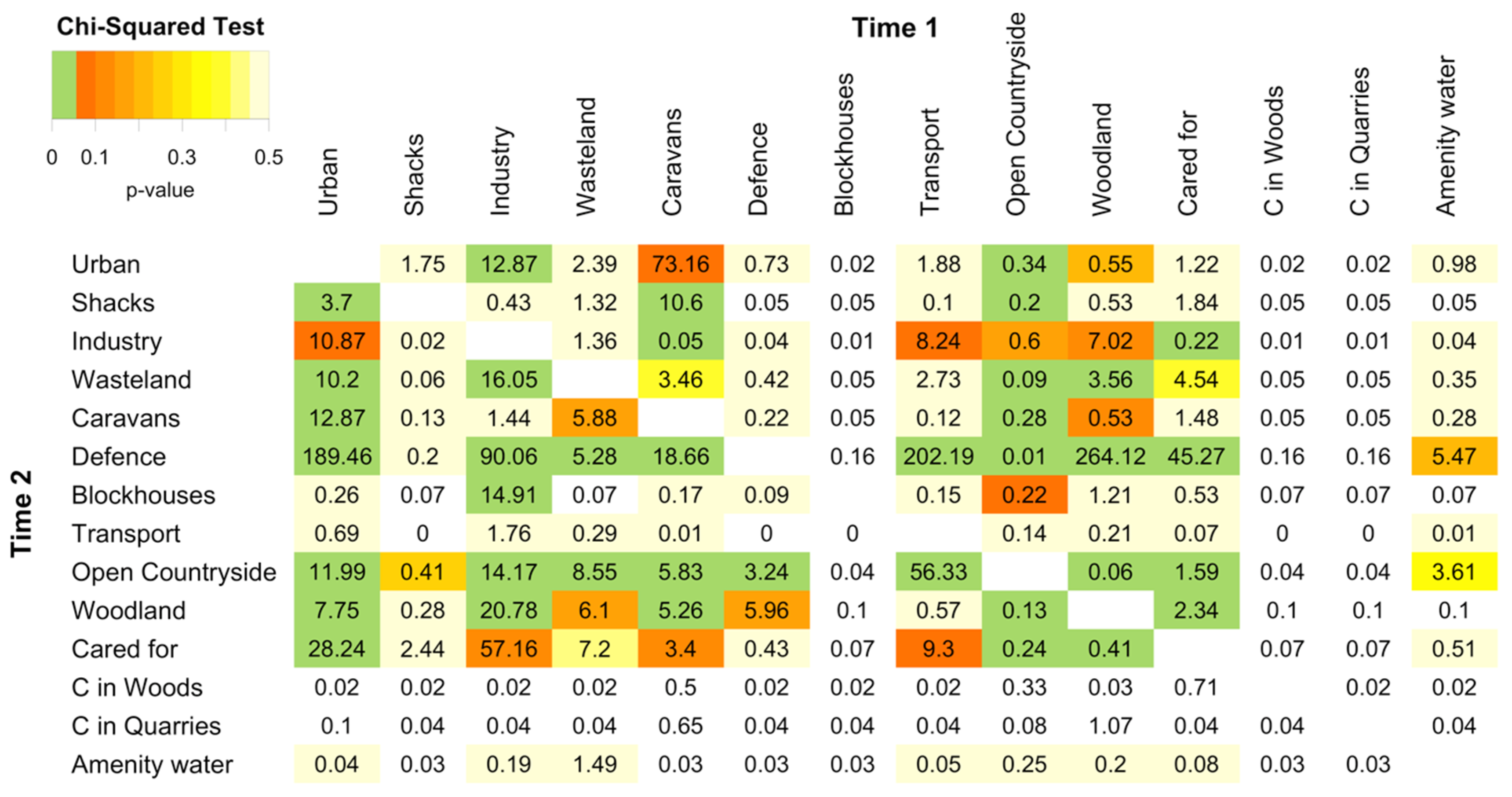
3.2. Visualising Change Matrices

A number of tools are available to analyse contingency tables such as correspondence matrices and to depict the results of simple statistical tests. These include agreement plots [20] and mosaic plots [21,22]. Their implementation within the vcd package in R is described in code snippets accompanying the package and worked examples are given in Meyer et al. [23], Zeileis et al. [24] and Friendly [25]. All of the statistical analyses, tables and figures in this paper were implemented in R version 3.2.1, the open source statistical software, using the vcd and gplot packages. The data and code used in this analysis will be freely provided to interested researchers on request.
Agreement plots [20] provide a graphical representation of the diagonal and off-diagonal elements in a correspondence matrix. The agreement plots arising from the correspondence matrices in Table 1 are shown in Figure 1. Large off-diagonal values in the matrix are indicated by the areas around the diagonal and their size, orientation and shading indicates the direction of change. A number of statements about the correspondence matrices can be very quickly deduced from Figure 1. For example, the agreement plot shows:
  • high overall losses from Farmland to Urban and Woodland (Figure 1a);
  • high overall gains to Urban from Farmland (Figure 1a);
  • relatively high levels of change in Region 3 compared to the other regions;
  • high gains in Woodland from Farmland in Region 2 (Figure 1c);
  • large areas of Urban in Region 3 and its gains from Farmland (Figure 1d).

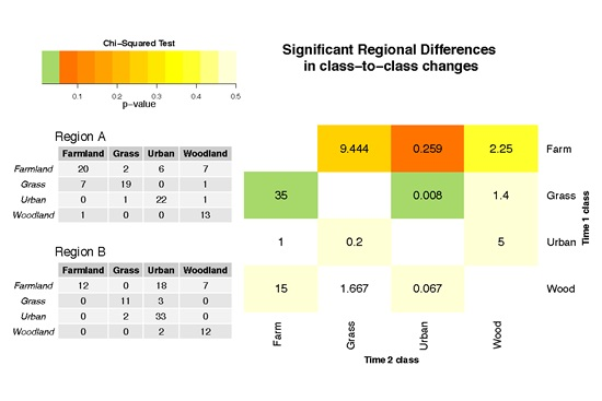
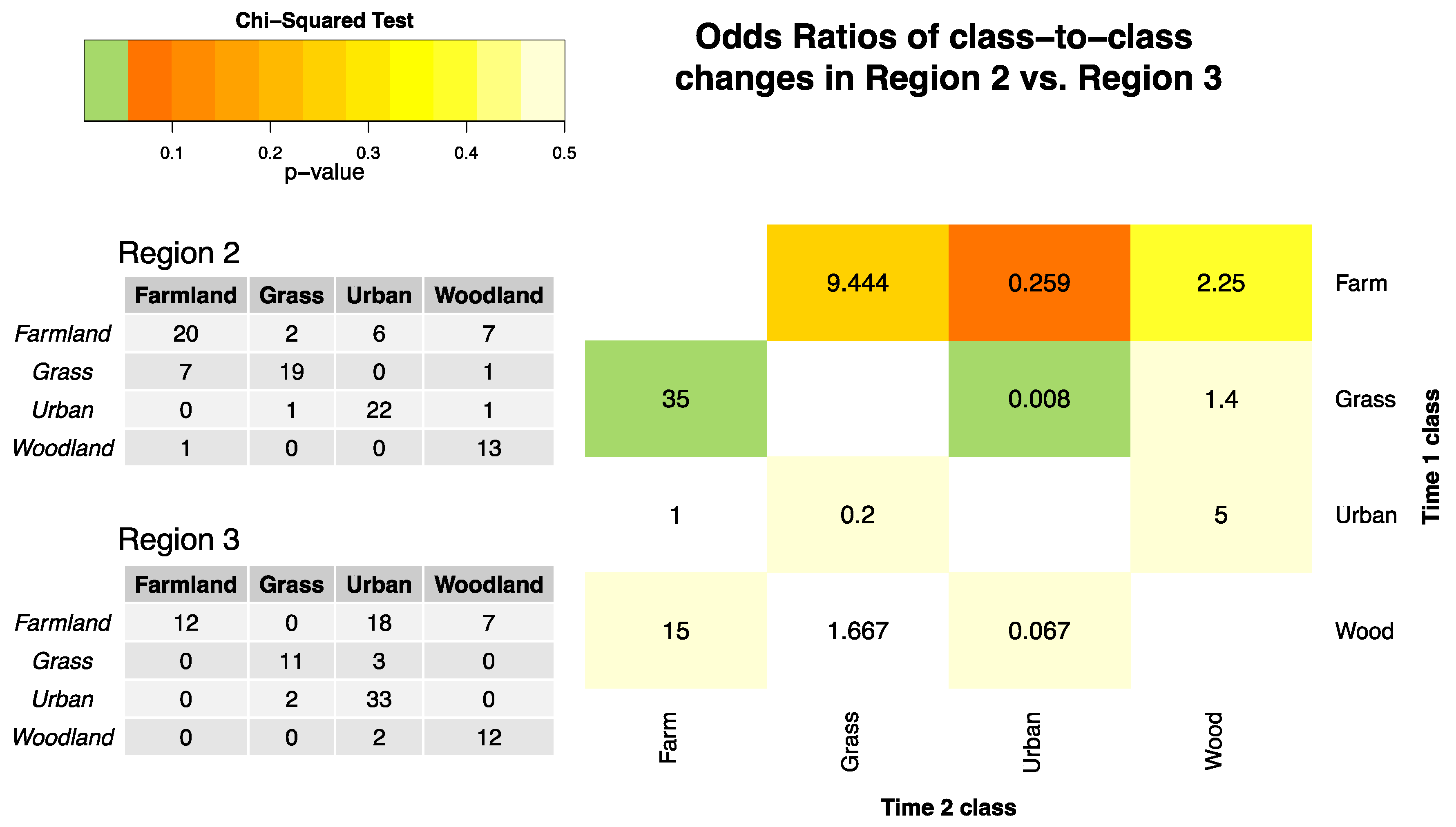
3.3. Comparing Changes in Two Regions Using Odds Ratios

It is possible to make a number of statements from the regional change matrices in Table 1 about the probability of change for any given class in any given region. Losses and gains are derived from the row and column marginal totals and diagonals. For example, the probability of Farmland losses are as follows:
Overall: 47/(67 + 2 + 30 + 15) = 0.41
Region 1: 7/(35 + 0 + 6 + 1) = 0.17
Region 2: 15/(20 + 2 + 6 + 7) = 0.43
Region 3: 25/(12 + 0 + 18 + 7) = 0.68
The objective in some land cover change studies is to compare changes in different regions, perhaps relating to management, policy or ownership. Probabilities provide useful descriptive statistics of the change but they are not directly comparable in this form as they are specific to each region. Odds ratios provide a widely used technique in land use modelling and assessment, principally to examine the underlying drivers and factors associated with land use but as yet they have not been used to compare regional differences.
Odds ratios can be used to compare any two individual regions or class-to-class changes. They indicate the relative likelihood of change between different treatments. Thus, they provide a comparative measure of change and can be used to describe regional differences, differences between land cover classes and differences in specific class to class changes observed in two regions. The odds ratio, θ, of the relative likelihood of change is defined as follows:
θ = O d d s ( c h a n g e | R e g i o n A ) O d d s ( c h a n g e | R e g i o n B )
An odds ratio of 1 indicates change is equally likely to occur in both regions. If it is greater than 1, then this suggests that change is more likely to occur in Region A. If the odds ratio is less than 1, then this indicates that change is less likely in Region A than in Region B and, in this case, the ratio is inverted to describe likelihood of change in Region B relative to Region A.
To determine odds ratios, the diagonal and off-diagonal elements of the change matrices are collapsed into 2 by 2 matrices, which can then be used to calculate the relative odds of changes in one region compared to another. The overall changes in Regions 1 and 2 indicate change in 13 out of 100 pixels in Region 1 and in 26 out of 100 pixels in Region 2. This results in no change totals of 87 and 74 pixels respectively. The relative likelihood of land cover change in Region 1 compared to Region 2 is:
θ = 13 / 87 26 / 74 = 0.13 0.26 = 0.425
That is, relative odds of change in Region 2 are 0.425−1 or 2.35 times higher than in Region 1. The significance of the interactions between regions and land cover change can be tested using a χ2-test and in this case it indicates a significant difference at the 95% level between Regions 1 and 2 (p-value = 0.032).
It is also possible calculate to the relative odds and associated significance for changes to different classes. Table 2 shows the relative odds of land cover losses and gains comparing Region 1 with Region 2.
A number of significant differences in land cover change are suggested by Table 2:
  • the relative odds of loss from Farmland is 3.7 (0.267−1) times greater in Region 2 than in Region 1;
  • the relative odds of gains in Farmland and Woodland area are 29.4 (0.034−1) and 6.3 (0.158−1) times greater in Region 2 than in Region 1.
Other losses and gains are not significant.
The gross changes may hide more subtle changes in each class. As a result, the odds ratios may present an example of Simpson’s paradox [26], where different rates (and directions) of per class changes may be masked by the aggregate gross changes. It is possible to quantify differences in the likelihood of specific class-to-class transitions, rather than just losses and gains, and how they vary in different regions. As an example of a specific direction of change, consider the transitions from Farmland to Urban class in Regions 2 and 3 (Table 1). The diagonal and off-diagonal elements of the correspondence matrices are collapsed into a 2 by 2 contingency matrix, which is used to generate the relative odds of a specific land cover transition in one region compared to another, as in Table 3. The odds ratios suggest that the relative odds of Farmland changing to Urban are (0.218−1) 4.59 times more likely in Region 3 than in Region 2.
θ 1 = 6 / 29 18 / 19 = 0.218
Of course, it is important to consider the data that are used to populate the contingency table: by including the areas that did not change as well as those that did, the correct interpretation of this odds ratio above is, change from Farmland to Urban is 4.6 (0.218−1) times more likely in Region 3 than in Region 3, when all possible states of change and no change are considered, and the χ2-test showed this to be significant at the 95% confidence level (p-value = 0.0098). This analysis can be further refined to consider only land use changes (i.e., without considering areas Farmland that did not change). The data are shown in Table 4 and the odds ratio now describes a different problem: that change from Farmland to Urban is 3.8 times more likely in Region 1 than in Region 2, when only observed changes from Farmland are considered, although in this case the differences were not found to be significant (χ2 p-value = 0.0956) when only changes were considered.
θ 2 = 6 / 9 18 / 7 = 18.591
Finally, the analysis can be extended to determine the relative odds of change to and from all possible classes. Figure 2 shows the odds ratios for each class to class pair, comparing changes in Region 2 with those in Region 3. The table elements are shaded by the significance arising from the χ2-test. Figure 2 describes the relative odds of class-to-class changes in Region 2 compared to Region 3, when only changes from the original class are considered. It is easy to identify significant regional differences (shaded in green) and to make the following statements:
  • changes from Grass to Farmland changes are 35 times more likely in Region 2 than Region 3;
  • changes from Farmland to Urban change are 125 times more likely (0.008−1) in Region 3 than in Region 2.

3.4. Comparing Changes in More than Two Regions

The preceding analyses compared only two regions, with data collapsed into 2 by 2 contingency tables. However, in many studies, the objective is to compare more than two treatments and to evaluate differences across multiple factors. Consider, for example, the regional losses and gains in 
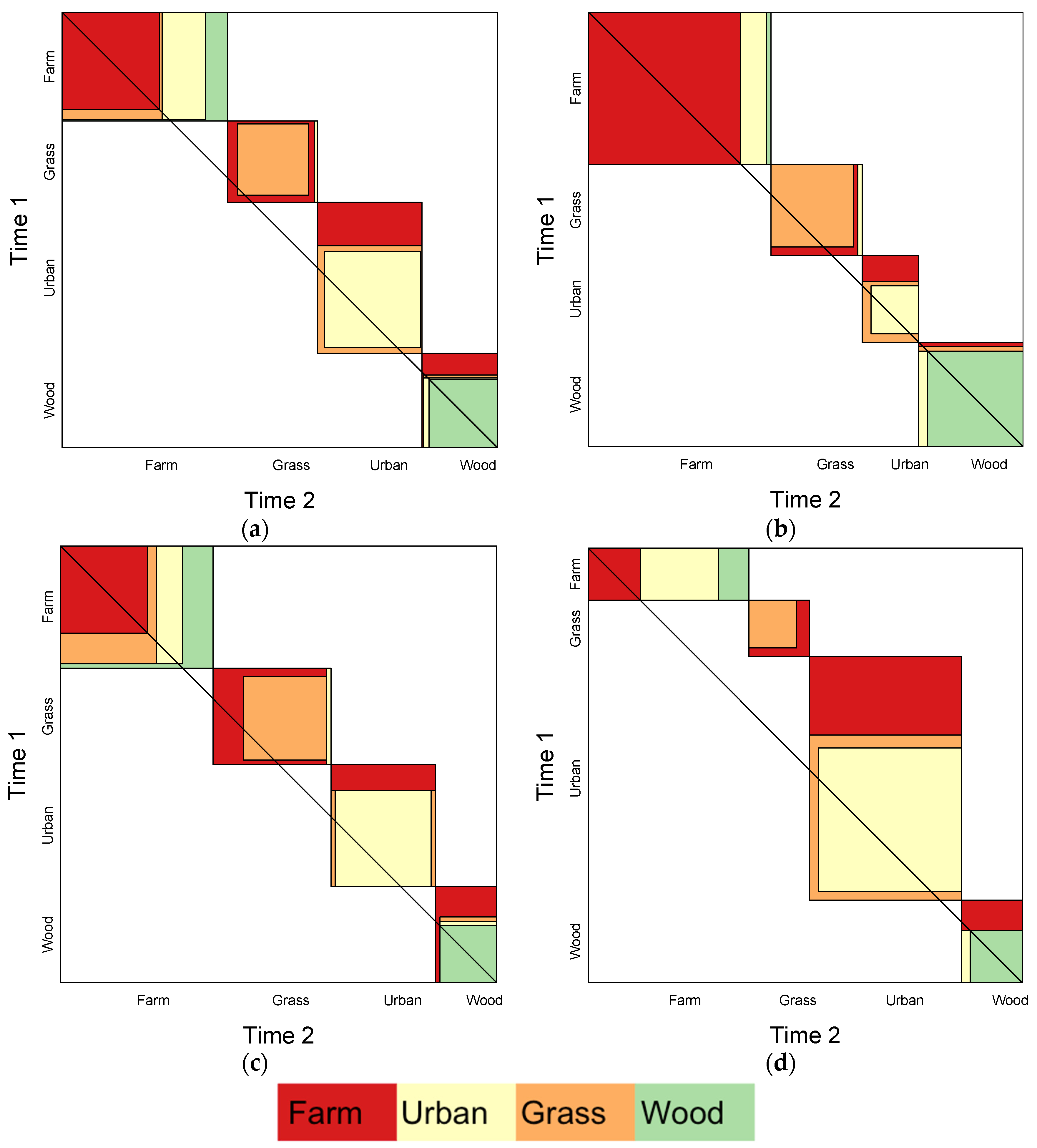
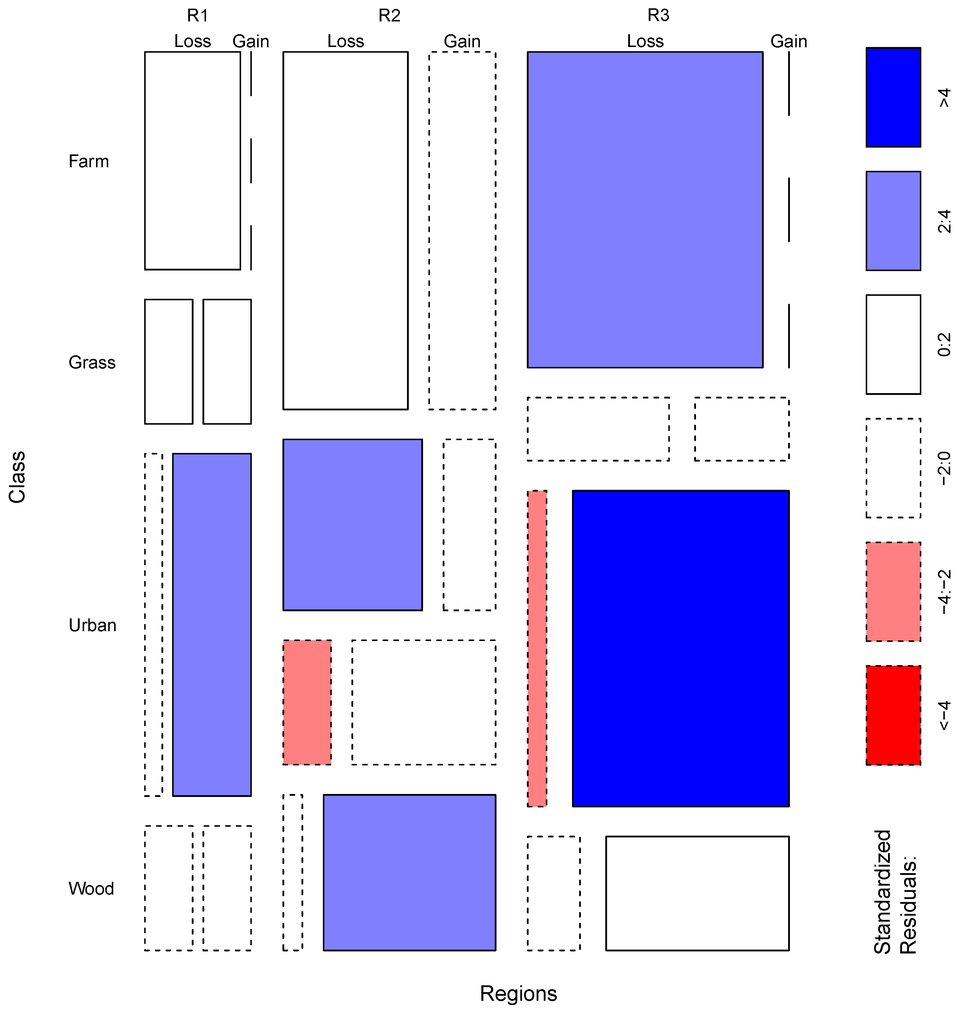
Table 5. These can be analysed using mosaic plots which provide a method to evaluate and visualise statistical differences in contingency tables (symmetrical and non-symmetrical).
Mosaic plots were proposed by Hartigan and Kleiner [21] and extended by Friendly [22]. In these, the significance of the interactions between column and row factors are indicated by the shading, in which the standardised residuals of a log-linear model are indicated by the colour and outline of the mosaic tiles. The mosaic plot in Figure 3 has axes for the different regions being compared and the land cover change types. The size of the plot tiles is proportionate to the land cover areas (counts in the contingency tables). Their shading indicates whether the combinations of groups, regions, classes etc. are less or greater than expected under a model of proportionality. In the examples below, tiles shaded deep blue show interactions that are significantly higher than would be expected (i.e., corresponding to combinations of change and region whose standardized residuals are greater than +4), when compared to a model of proportionally equal levels of change. Tiles shaded deep red correspond to residuals less than −4 indicating significantly lower frequencies than would be expected when compared to the model. The standardized Pearson residuals measure the deviation of each tile from independence. From Figure 3, statements can be extracted under the assumption of proportionally equal levels of change (loss and gain) for each land cover class and region. In this case, the mosaic plot indicates that the gains to Urban in Region 3 are much greater than expected.
It is possible to apply a different type of analysis to the correspondence matrix in order to compare regional land use changes against a model that expects proportionally equal levels of change in each region. Generalised linear models can be used to estimate the likelihood of change as a function of the regions. The counts of change (loss) and no change are summed for each region in a table of counts. In this, the rows indicate whether change had occurred or not and the columns indicate the region—a transpose of Table 5. To test for an association, A, between the row and column effects, the Poisson regression model is applied:
A ( c i j ) = log ( r + C i + R j )
where the count in column i and row j is denoted by cij and has a Poisson distribution, r is an intercept term, Ci is a column effect and Rj is a row effect, which is compared against the model:
A ( c i j ) = log ( r + C i + R j + I i j )
where the extra term Iij is an interaction effect between rows and columns. If this is significantly different from zero, then it suggests that there is some degree of association between the row and column effects. Values of Iij were estimated by fitting Equation (3) to the regional data and the resulting coefficients were related to a comparative index of loss for each of the row categories, using the formula:
C H A N G E = 100 ( exp ( I i j ) 1 )
In summary, Equations (2)–(4) apply a generalized linear model to a cross-tabulation of how different factors interact (regions and classes) in order to predict the frequency of occurrence of the count under a Poisson distribution. Note that in the analyses below the CHANGE term in Equation (4) is used to evaluate land cover losses from Time 1 and gains at Time 2. Due to the way the interaction terms are calibrated, this compares each column category j (regions) against a “reference” category which is usually the region with largest area. However, in this case all of the regions have the same number of pixels and so the reference is Region 1. A value of 0 suggests the likelihood of loss for category j is the same as for the reference category. A value of +50 for category j suggests loss is one-and-a-half times as likely as the reference category, a value of −50 that it is half as likely, and so on. The analysis of loss from a transpose of Table 5 was calculated and the results are shown in Table 6.
The results in Table 6 suggest that the likelihood of change in Region 2 is 135% greater than in Region 1 and that the likelihood of change in Region 3 is 215% greater than in Region 1.
The application of the generalised linear models can be further extended to consider how specific class-to-class transitions vary in different regions. Consider the summary data in Table 7. This describes the changes from Farmland to Urban and to non-Urban classes (i.e., Grass and Woodland) in the three regions, ordered left to right by the largest column totals. It is possible to determine the likelihood of change to Urban in different regions relative to the region with the largest area of change, in this case Region 3. The results are shown in Table 8 and indicate that likelihood of land cover change from Farmland to Urban is 286% greater in Region 2 than in Region 3 and 57% less in Region 1 compared to Region 3, although this difference was not found to be significant.
Finally, it is sometimes useful to be able to compare different land cover transitions. Consider the data in Table 9. They summarise the changes from Farmland to Urban and to Woodland in the three regions, again ordered left to right by the greatest volume of change. The results are shown in Table 10 and indicate that likelihood of change from Farmland to Urban rather than from Farmland to Woodland is 200% greater in Region 2 compared to Region 3 and 57% less in Region 1 compared to Region 3, although in this case neither of these differences are significant.

3.5. Summary

The methods presented in this section describe analyses to compare two treatments using odds ratios (Section 3.3) which are extended to approaches for comparing more than two treatments using generalized linear models. These approaches are not new, for example, Comber et al. [27] applied the methods presented in Section 3.4, but they have not been applied in the context of land cover analysis and data which are commonly summarised in contingency tables.

4. Case Study

4.1. Introduction

The methods presented in Section 3 were developed using a simple, hypothetical case study. In this section, these are applied to the results of a national coastal land use change study that compared data from 1965 and 2014. The research was commissioned by the National Trust as part of the Neptune initiative [28]. The full results are in [29] as well as some press reports [30], and the 1965 and 2015 data are provided online [31]. In brief, coastal land use was recorded in 1965 in a survey conducted by students from the University of Reading. The survey was updated manually in 2014 using freely available, open source aerial photography and mapping software, with the remote sensing imagery providing critical evidence for the update mapping. The project adopted a set of change mapping protocols that were specifically developed to ensure robust measures of land use change by minimising spurious or methodological inconsistency between the surveys, details of which are in [29]. Figure 4 shows examples of the hand drawn and annotated basemaps and data from the two time periods, as well as the National Trust administrative regions.
The National Trust was critically interested in two specific aspects of land use change. First, the Trust manages around 775 km of the coastline in England, Wales and Northern Ireland (Scotland has a separate organisation). Consequently, it wanted to understand what the impacts were of their land management policies on land use change, in part to demonstrate the conservation value of its activities. Second, it wanted to understand how changes in coastal land uses varied regionally, specifically across and between its administrative regions.

4.2. Non-National Trust vs. National Trust Change

It is important to recall that land use changes are composed of losses and gains and these may occur to and from the same class at different locations, reflecting local land use churn—for example, where a campsite is relocated to a larger field by a farmer, this is both a loss to the Campsite land use (e.g., to Open countryside) and a larger gain. Table 11 shows the overall losses and gains in coastal land use recorded on non-National Trust and National Trust land. These are derived from the marginal totals of the full change matrices included in the Appendices. The data reflect recent, general land use trends: urbanisation, increases in woodland at the arable fringe, decreases of defence land uses and increases in leisure activities (camping, caravans, recreational land such as golf-courses and sports fields which are labelled as Cared for but non-productive).
The data in Table 11 can be used to compare losses and gains in areas managed by the National Trust with those in other areas using odds ratios (Equation (1)). These generate regional comparative measures of the relative odds of change and a χ2-test indicates the significance (statistical likelihood) of the differences. The results of comparing the losses and gains for each land use class in this way are shown in Table 12 and indicate the relative odds of change on non-National Trust land compared to National Trust land. The 95% confidence intervals of the odds for losses and gains are also included.
A number of statements about significant land use losses can be made from Table 12. The relative odds of land use losses on non-National Trust land compared to National Trust land are:
  • 4.05 times greater for Urban land uses
  • 26.19 times greater for Industrial land uses
  • 2.63 times greater for Wasteland
  • 8.95 times greater for Defence land uses
  • 18.36 times greater for Caravans and campsites
  • 1.47 times greater for Cared for but non-productive land
The relative odds of land use losses on National Trust land verses non-National Trust land are:
  • 3.44 times greater (0.29−1) for Transport land uses
  • 2.66 times greater (0.38−1) for Open Countryside
  • 1.46 times greater (0.69−1) for Woodland
A number of statements about significant land use gains can be made from Table 12. The relative odds of land use gains on non-National Trust land compared to National Trust land are:
  • 4.67 times greater for Industrial land uses
  • 3.34 times greater for Caravans and campsites
The relative odds of land use gains on National Trust land versus non-National Trust land are:
  • 1.82 times greater (0.55−1) for Wasteland
  • 1.87 times greater (0.54−1) for Defence land uses
  • 1.39 times greater (0.72−1) for Open Countryside
  • 1.24 times greater (0.80−1) for Woodland
  • 2.14 times greater (0.47−1) for Cared for but non-productive land
It also possible to compare the class to class changes on National Trust land with those recorded on non-National Trust land and to identify any significant differences. The relative odds of class-to-class changes on non-National Trust land compared to National Trust land, when only changes from the original class are considered are shown in Figure 5. So, for example, changes from Open Countryside at Time 1 to Urban at Time 2 (i.e., Urban gains from Open Countryside) were 11.99 times more likely on non-National Trust land.

4.3. Regional Comparison

One of the main reasons for the original survey in 1965 was concern over what was seen as unfettered development. In the update, there was particular interest in quantifying how rates of development varied in different parts of England, Wales and Northern Ireland. To consider this, the changes (gains) to the land use classes of Urban, Industry, Transport and Caravan and campsites (Table 13) were evaluated using the generalized linear models described in Equations (2) to (4). The data used for this analysis are the gains to these classes and the amount of land that did not change (Table 13). The results indicate the relative likelihoods of these changes across the National Trust regions (Table 14) and show that development, for example, is 53% greater in London and the South East region than in Wales, whereas it is ~15% less likely in the South West region. All of the differences were found to be significant.
The mosaic plot in Figure 6 provides a statistical summary of losses and gains for three regions: East of England, South West and London & South East. The classes are on the Y-axis and the X-axis columns indicate the regional losses and gains. The table should be read horizontally to interpret regional differences in class losses and gains. It provides a convenient statistical summary of the per class losses and gains, summarising the areas of loss and gain by the size of the tiles which can have the consequence that the classes may be at different “heights”. It also provides a statistical measure of the unexpectedness of the observed changes in each region (under a model that assumes equal areas of change). Tiles that are shaded deep blue show interactions that are significantly higher than would be expected and those shaded deep red indicate significantly lower frequencies than would be expected. This provides a detailed comparison of specific losses and gains for individual classes in different regions. Figure 6 indicates that, for example, Urban gains are greater than would be expected in all regions, that losses to Cared for but non-productive were less than expected in the East of England and the South West regions (but not in London and South East) and that gains to Caravan and campsites were greater than expected in the East of England and the South West regions (but not in London and South East).

5. Discussion

This paper describes a series of approaches for statistically comparing land cover change in different regions (or treatments) based on analyses of data held in correspondence matrices. The methods provide a suite of approaches from which appropriate techniques can be selected depending on the task in hand. They are not intended to be used together as they relate to different questions about change: Section 3.3 describes methods for comparing two treatments or regions and Section 3.4 for comparing more than two treatments. The methods are based odds ratios and generalised linear models, are commonly applied to data held in correspondence matrices in other disciplines but have not been previously applied to quantify differences in land cover change or error matrices.
Each of the approaches uses slightly different formulations of the correspondence matrix, the most commonly used framework for describing and analysing land use/land cover changes (and also for accuracy assessments in remote sensing). Odds ratios were used to compare changes in two regions. They describe the relative likelihood of a change occurring in one region compared to another. Generalised linear models (Poisson regression models) were used to quantify the relative differences between changes in three or more regions. An index of change was proposed to compare the likelihood of changes in multiple regions. This measures the relative change likelihood of regions, when compared to one “reference” region. In that sense, they perform a series of binary comparisons of each region to the reference region. This is the nature of comparative statistics—they are by definition relative. However, each region could be specified as the referent in turn to compare all regions against each other.
The approaches described above are relatively easy to compute from the either the raw, classified data or from correspondence matrices. These methods are commonly used to analyse data in contingency tables in many areas of information science and statistics but have not been applied within land cover research, despite the correspondence matrix being the method of reporting change and error in land cover and land use analyses. This paper has sought to illustrate that such statistics are also widely applicable, especially in analyses of land cover change, and have the capacity to generate more informative reporting of change and error than simple consideration of different correspondence matrices.
The correspondence matrix is also the de facto approach for assessing error and accuracy in land cover and land use. In this context, it is frequently referred to in the literature as the error, validation or accuracy matrix. In the error matrix, predicted or modelled data, for example from a classification of remotely sensed imagery, are cross tabulated with observed or ground truth data, commonly derived from a field survey or data that are deemed to be of higher quality. A number of statistics are commonly generated describing from the correspondence matrix including overall accuracy and per class Type I and Type II errors (errors of omission and commission, user and producer accuracies). The generalised linear models suggested by Equation (4) could be modified such that Accuracy is predicted by the regression rather than Change (loss or gain) and an Index of error constructed to allow the likelihood of errors in multiple regions to be compared. Future work will explore these approaches in accuracy reporting.

6. Conclusions

In much of land mapping work, there is a need to report how “different” changes observed in one region are from those observed in another. This research was motivated by the need within a project to generate statistics comparing land ownership regions, but the regions may relate to spatial feature: management practices, ecological zones, underlying geological process, etc. Methods for doing this are lacking in the remote sensing and land cover literature and within the sub-disciplines concerned with quantifying land cover change and accuracy. The analyses described in this paper use odds ratios and generalised linear models to compare change in different regions. These approaches are commonly applied in other information sciences. They are simple and intuitive and can be used to compare overall changes, specific class to class changes and per class loss and gains arising in different locations or as a result of different treatments.

Acknowledgments

This work was supported by the National Trust under the Neptune Coastal Land Use Mapping Project. Sadly, Peter Fisher died during the preparation of this manuscript. He will be missed. The authors would like to thank the anonymous reviewers whose comments helped significantly improve this article.

Author Contributions

A.C. designed the methods, managed the research and led the writing. H.B. edited the manuscript. B.C. developed some of scoping work to support the methodology and edited the M.S. P.F. guided the methods. S.C.M.J. ran the change mapping and edited the manuscript. B.O. contributed to initial research specification.

Conflicts of Interest

The authors declare no conflict of interest.

Appendix A

The correspondence matrix of land use on non-National Trust land (hectares).
ClassTime 2
UrbanShacksIndustryWastelandCaravansDefenceBlockhousesTransportO. CountrysideWoodlandCared forC in WoodsC in QuarriesAmenity Water
Time 1Urban40,0751025175190410424992522240022
Shacks212613141340013042244000
Industry42605404128728103661294316120001
Wasteland1340429522344027124026251003
Caravans451114583060201914101122002
Defence53102682048011,622056225212003180017
Blockhouses106901001751616000
Transport4110378207100023243225854009
O. Countryside12,48735366277830909270707283,558835643120046
Woodland4451101301502902211415,306165000
Cared for127522512690306586543211,034003
C in Woods0000100007113000
C in Quarries10004000060000
Amenity water003150000931000

Appendix B

The correspondence matrix of land use on National Trust land (hectares).
ClassTime 2
UrbanShacksIndustryWastelandCaravansDefenceBlockhousesTransportO. CountrysideWoodlandCared forC in WoodsC in QuarriesAmenity Water
Time 1Urban19300101002094000
Shacks320010002621000
Industry0021050001805000
Wasteland1027000010141000
Caravans200080006594000
Defence000612090073401000
Blockhouses00000000912000
Transport00000003000000
O. Countryside61311422110032,2071118111000
Woodland6000300028322007000
Cared for6100200012760515000
C in Woods00000000000000
C in Quarries00000000000000
Amenity water00000000000000

References

  1. Foody, G.M. Status of land cover classification accuracy assessment. Remote Sens. Environ. 2002, 80, 185–201. [Google Scholar] [CrossRef]
  2. Cakir, H.I.; Khorram, S.; Nelson, S.A. Correspondence analysis for detecting land cover change. Remote Sens. Environ. 2006, 102, 306–317. [Google Scholar] [CrossRef]
  3. Tewkesbury, A.P.; Comber, A.J.; Tate, N.J.; Lamb, A.; Fisher, P.F. A critical synthesis of remotely sensed optical image change detection techniques. Remote Sens. Environ. 2015, 160, 1–14. [Google Scholar] [CrossRef]
  4. Petit, C.; Scudder, T.; Lambin, E. Quantifying processes of land-cover change by remote sensing: Resettlement and rapid land-cover changes in south-eastern Zambia. Int. J. Remote Sens. 2001, 22, 3435–3456. [Google Scholar] [CrossRef]
  5. Alphan, H.; Doygun, H.; Unlukaplan, Y.I. Post-classification comparison of land cover using multitemporal Landsat and ASTER imagery: The case of Kahramanmaraş, Turkey. Environ. Monit. Assess. 2009, 151, 327–336. [Google Scholar] [CrossRef] [PubMed]
  6. Dewan, A.M.; Yamaguchi, Y. Land use and land cover change in Greater Dhaka, Bangladesh: Using remote sensing to promote sustainable urbanization. Appl. Geogr. 2009, 29, 390–401. [Google Scholar] [CrossRef]
  7. Sánchez-Cuervo, A.M.; Aide, T.M.; Clark, M.L.; Etter, A. Land cover change in Colombia: Surprising forest recovery trends between 2001 and 2010. PLoS ONE 2012, 7, e43943. [Google Scholar] [CrossRef] [PubMed]
  8. Calvo-Iglesias, M.S.; Fra-Paleo, U.; Crecente-Maseda, R.; Díaz-Varela, R.A. Directions of change in land cover and landscape patterns from 1957 to 2000 in agricultural landscapes in NW Spain. Environ. Manag. 2006, 38, 921–933. [Google Scholar] [CrossRef] [PubMed]
  9. Pontius, R.G., Jr.; Millones, M. Death to Kappa: Birth of quantity disagreement and allocation disagreement for accuracy assessment. Int. J. Remote Sens. 2011, 32, 4407–4429. [Google Scholar] [CrossRef]
  10. Foody, G.M. Thematic map comparison. Photogramm. Eng. Remote Sens. 2004, 70, 627–633. [Google Scholar] [CrossRef]
  11. Olofsson, P.; Foody, G.M.; Stehman, S.V.; Woodcock, C.E. Making better use of accuracy data in land change studies: Estimating accuracy and area and quantifying uncertainty using stratified estimation. Remote Sens. Environ. 2013, 129, 122–131. [Google Scholar] [CrossRef]
  12. Lambin, E.F.; Turner, B.L.; Geist, H.J.; Agbola, S.B.; Angelsen, A.; Bruce, J.W.; Coomes, O.T.; Dirzo, R.; Fischer, G.; Folke, C.; et al. The causes of land-use and land-cover change: Moving beyond the myths. Glob. Environ. Chang. 2001, 11, 261–269. [Google Scholar] [CrossRef]
  13. Lunetta, R.S.; Knight, J.F.; Ediriwickrema, J.; Lyon, J.G.; Worthy, L.D. Land-cover change detection using multi-temporal MODIS NDVI data. Remote Sens. Environ. 2006, 105, 142–154. [Google Scholar] [CrossRef]
  14. Balzter, H.; Rowland, C.S.; Saich, P. Forest canopy height and carbon estimation at Monks Wood National Nature Reserve, UK, using dual-wavelength SAR interferometry. Remote Sens. Environ. 2007, 108, 224–239. [Google Scholar] [CrossRef]
  15. Pijanowski, B.C.; Robinson, K.D. Rates and patterns of land use change in the Upper Great Lakes States, USA: A framework for spatial temporal analysis. Landsc. Urban Plan. 2011, 102, 102–116. [Google Scholar] [CrossRef]
  16. Kumar, S.; Merwade, V.; Rao, P.S.C.; Pijanowski, B.C. Characterizing long term land use/cover change in the United States from 1850 to 2000 using a nonlinear bi-analytical model. AMBIO 2013, 42, 285–297. [Google Scholar] [CrossRef] [PubMed]
  17. Balej, M.; Anděl, J.; Koutský, J.; Olšová, P. Comparing Regional Differentiation of Land Cover Changes in Natural and Administrative Regions of the Czech Republic Using Multivariate Statistics. Available online: http://www-sre.wu.ac.at/ersa/ersaconfs/ersa11/ersa11acfinal00768.pdf (accessed on 1 January 2016).
  18. Duveiller, G.; Defourny, P.; Desclée, B.; Mayaux, P. Deforestation in Central Africa: Estimates at regional, national and landscape levels by advanced processing of systematically-distributed Landsat extracts. Remote Sens. Environ. 2008, 112, 1969–1981. [Google Scholar] [CrossRef]
  19. Colditz, R.R.; López Saldaña, G.; Maeda, P.; Espinoza, J.A.; Tovar, C.M.; Hernández, A.V.; Benítez, C.B.; López, I.C.; Ressl, R. Generation and analysis of the 2005 land cover map for Mexico using 250 m MODIS data. Remote Sens. Environ. 2012, 123, 541–552. [Google Scholar] [CrossRef]
  20. Bangdiwala, S.I. The Agreement Chart. Department of Biostatistics, University of North Carolina at Chapel Hill, Institute of Statistics Mimeo Series No. 1859. 1988. Available online: http://www.stat.ncsu.edu/information/library/mimeo.archive/ISMS_1988_1859.pdf (accessed on 16 January 2016).
  21. Hartigan, J.A.; Kleiner, B. Mosaics for contingency tables. In Computer Science and Statistics: Proceedings of the 13th Symposium on the Interface; Springer: New York, NY, USA, 1981; pp. 268–273. [Google Scholar]
  22. Friendly, M. Mosaic displays for multi-way contingency tables. J. Am. Stat. Assoc. 1994, 89, 190–200. [Google Scholar] [CrossRef]
  23. Meyer, D.; Zeileis, A.; Hornik, K. The strucplot framework: Visualizing multi-way contingency tables with vcd. J. Stat. Softw. 2006, 17, 1–48. [Google Scholar] [CrossRef]
  24. Zeileis, A.; Meyer, D.; Hornik, K. Residual-based shadings for visualizing (conditional) independence. J. Comput. Graph. Stat. 2007, 16, 507–525. [Google Scholar] [CrossRef]
  25. Friendly, M. Working with Categorical Data with R and the vcd and vcdExtra Packages. Available online: http://202.90.158.4/pub/R/web/packages/vcdExtra/vignettes/vcd-tutorial.pdf (accessed on 1 January 2016).
  26. Simpson, E. The interpretation of interaction in contingency tables. J. R. Stat. Soc. Ser. B 1951, 13, 238–241. [Google Scholar]
  27. Comber, A.; Brunsdon, C.; Green, E. Using a GIS-based network analysis to determine urban greenspace accessibility for different ethnic and religious groups. Landsc. Urban Plan. 2008, 86, 103–114. [Google Scholar] [CrossRef]
  28. Fifty Years of Land Use Change at the Coast. Available online: http://www.nationaltrust.org.uk/article-1355914106958/ (accessed on 16 January 2016).
  29. Comber, A.; Davies, H.; Pinder, D.; Whittow, J.B.; Woodhall, A.; Johnson, C.M. Mapping coastal land use changes 1965–2014: Methods for handling historical thematic data. Trans. Inst. Br. Geogr. 2016, submitted. [Google Scholar]
  30. Coastal Construction “How Britain’s Shoreline Changed in 50 Years”. Available online: http://www.theguardian.com/environment/ng-interactive/2015/oct/20/50-years-british-coast-line-then-and-now (accessed on 16 January 2016).
  31. Mapping Our Shores: 1965 & 2014 Land Use. Available online: http://goo.gl/4DlZ09 (accessed on 16 January 2016).
Figure 1. Agreement plots of the overall and regional correspondence matrices. The size, shade and orientation of the plot elements indicate the off-diagonal row and column values. (a) Overall; (b) Region 1; (c) Region 2; (d) Region 3.
Remotesensing 08 00176 g001
Figure 2. The odds ratios of the class-to-class land cover changes (i.e., excluding the diagonal values in the correspondence matrices) between Region 2 and Region 3. The cell shading indicates the p-values arising from a χ2-test, with empty cells indicating where a comparison is not made. The correspondence matrices for Regions 2 and 3 are included for illustration purposes. Significant regional differences are shaded in green.
Remotesensing 08 00176 g002
Figure 3. A mosaic plot comparing the losses from and gains to each land cover class in each region (R1–R3).
Remotesensing 08 00176 g003
Figure 4. Examples of the National Trust land use data (a) the original base maps; (b) the 1965 data; (c) the 2014 data; and (d) the National Trust administrative regions with the coastal strip in red. A legend for the classes is not included.
Remotesensing 08 00176 g004
Figure 5. Significant differences in class to class changes observed on non-National Trust land compared to those observed on National Trust land. The figures in the table indicate the odds ratios of those changes and the shading indicates the results of χ2-test, with significant differences shaded in green.
Remotesensing 08 00176 g005
Figure 6. A mosaic plot of the per class land use losses and gains in different regions: East of England (EE), South West (SW) and London & South East (LSE).
Remotesensing 08 00176 g006
Table 1. Land cover changes for (a) overall; (b) Region 1; (c) Region 2 and (d) Region 3.
OverallTime 2
FarmlandGrassUrbanWoodlandLoss
Time 1Farmland672301547
Grass7494213
Urban056616
Woodland104475
Gain873818
(a)
Region 1Time 2
FarmlandGrassUrbanWoodlandLoss
Time 1Farmland350617
Grass019112
Urban021102
Woodland002222
Gain0292
(b)
Region 2Time 2
FarmlandGrassUrbanWoodlandLoss
Time 1Farmland2026715
Grass719018
Urban012212
Woodland100131
Gain8369
(c)
Region 3Time 2
FarmlandGrassUrbanWoodlandLoss
Time 1Farmland12018725
Grass011303
Urban023302
Woodland002122
Gain02237
(d)
Table 2. The odds ratios of land cover losses and gains in Region 1 compared to Region 2.
ClassOdds RatioLog Odds RatioStd. Errorz ValuePr (>|z|)
LossFarmland0.267−1.3220.537−2.4630.014
Grass0.250−1.3860.855−1.6220.105
Urban2.0000.6931.0660.6500.516
Woodland1.1820.1671.2740.1310.896
GainFarmland0.034−3.3821.481−2.2830.022
Grass0.714−0.3360.888−0.3790.705
Urban2.8601.0510.6251.6810.093
Woodland0.158−1.8460.790−2.3370.019
Table 3. The 2 by 2 contingency table describing the areas of change from Farmland to Urban in Regions 2 and 3 and the associated odds ratios. The table values summarise the losses from Farmland to Urban and to other classes (Urban).
RegionUrbanUrban
Region 2629
Region 31819
Table 4. The 2 by 2 contingency table showing the areas of change from Farmland to Urban and from Farmland to other land covers in Regions 1 and 2 and the associated odds ratios.
RegionFarmland to UrbanFarmland to Other
Region 169
Region 2187
Table 5. The losses and gains in three different regions.
StatusRegionFarmlandGrassUrbanWoodland
LossRegion 17222
Region 215821
Region 325322
GainRegion 10292
Region 28369
Region 302237
Table 6. The likelihood of land use changes for different regions in the study area, relative to Region 1.
RegionChange LikelihoodPr (>|z|)
Region 2135.10.0225
Region 3214.90.0018
Table 7. The regional changes from Farmland at Time 1 to Urban and other classes (non-Urban) at Time 2.
Change from FarmlandRegion 3Region 2
To Urban186
To non-Urban79
Table 8. The likelihood of regional land cover changes from Farmland to Urban relative to Region 3.
Change LikelihoodPr (>|z|)
Region 2285.70.0504
Region 1−57.10.4683
Table 9. The changes from Farmland at Time 1 to Urban and to Woodland at Time 2.
Change from FarmlandRegion 3Region 2Region 1
To Urban1866
To Woodland771
Table 10. The likelihood of land cover changes from Farmland to Urban rather than Farmland to Woodland in Region 2 and Region 1 relative to Region 3.
Change LikelihoodPr (>|z|)
Region 2200.00.1232
Region 1−57.10.4683
Table 11. The losses from and gains to different land use classes in hectares on land managed by the National Trust and other land.
ClassNon-National Trust LandNational Trust Land
SameLossGainSameLossGain
Urban40,075177219,2771933586
Shacks61762942344
Industry54043985766223913
Wasteland52322872988710922
Caravans, campsites30601722392388134
Defence11,6224757130220976713
Blockhouses *019700120
Transport232414893644310
Open Countryside283,55836,65421,65532,20715651765
Woodland15,306308810,55622003051221
Cared for but non-productive11,03428806302515198137
Caravans in Woods *0310000
Caravans in Quarries *0110000
* Not mapped in 2014.
Table 12. The Odds Ratios of losses and gains for changes on non-National Trust vs. National Trust land. Bold values show significant likelihoods of greater change on National Trust land.
ClassLossGain
OR2.5%97.5%p-ValueOR2.5%97.5%p-Value
Urban4.052.815.830.0000.920.711.190.575
Shacks1.180.304.571.0001.240.256.291.000
Industry26.196.32108.550.0004.671.0620.680.048
Wasteland3.631.677.890.0010.550.231.300.263
Caravans, campsites18.368.8238.250.0003.341.547.270.002
Defence8.957.6510.460.0000.540.300.950.039
Transport0.290.015.950.7790.100.011.970.154
Open Countryside0.380.360.400.0000.720.680.750.000
Woodland0.690.610.780.0000.800.750.870.000
Cared for but non-productive1.471.241.740.0000.470.390.570.000
Table 13. The areal changes in hectares to land use associated with development (Urban, Industry, Transport and Caravan and campsites).
RegionNo ChangeChange
East of England57,8612909
Yorkshire & North East36,4013007
North West35,2292564
Wales87,8685589
South West87,9224768
London & South East60,1435866
Midlands12,675495
Northern Ireland29,8222122
Table 14. The likelihood of developmental changes in different regions relative to Wales, the region with the largest area.
RegionChange LikelihoodPr (>|z|)
South West−14.740.0000
London & South East53.330.0000
East of England−20.950.0000
Yorkshire & North East29.850.0000
North West14.420.0000
Northern Ireland11.850.0000
Midlands−38.640.0000

