Classification of Normal and Abnormal Regimes in Financial Markets

Centre for Computational Finance and Economic Agents (CCFEA), University of Essex, Colchester CO4 3SQ, UK
*
Author to whom correspondence should be addressed.
†
These authors contributed equally to this work.
Algorithms 2018, 11(12), 202; https://doi.org/10.3390/a11120202
Submission received: 14 September 2018
/
Revised: 23 November 2018
/
Accepted: 10 December 2018
/
Published: 12 December 2018
(This article belongs to the Special Issue Algorithms in Computational Finance)
Abstract
:When financial market conditions change, traders adopt different strategies. The traders’ collective behaviour may cause significant changes in the statistical properties of price movements. When this happens, the market is said to have gone through “regime changes”. The purpose of this paper is to characterise what is a “normal market regime” as well as what is an “abnormal market regime”, under observations in Directional Changes (DC). Our study starts with historical data from 10 financial markets. For each market, we focus on a period of time in which significant events could have triggered regime changes. The observations of regime changes in these markets are then positioned in a designed two-dimensional indicator space based on DC. Our results suggest that the normal regimes from different markets share similar statistical characteristics. In other words, with our observations, it is possible to distinguish normal regimes from abnormal regimes. This is significant, because, for the first time, we can tell whether a market is in a normal regime by observing the DC indicators in the market. This opens the door for future work to be able to dynamically monitor the market for regime change.
1. Introduction
Prices in financial markets are records of transactions between market participants. When significant political and economic events take place, traders may have to adopt different trading strategies to counteract them. When that happens, their collective behaviour could change significantly—researchers call such changes in the market “regime changes”. Regime changes can therefore be seen as a reflection of significant changes in the statistical properties of price movements in the financial markets.
A common approach to detect what is regime change is to analyse the statistical properties of time-series [1]. Here, market volatility is calculated over time. When volatility has changed significantly over a period of time, we may conclude that regime changes have taken place.
Thus, Directional Change (DC) is an alternative way to that of time-series to summarise what are financial price movements [2]. Unlike time-series, under this approach the data is not sampled at fixed intervals. A data point is sampled only when the market has changed direction. The market is considered to have changed direction when the price has dropped by a certain percentage (which is called the threshold) from the last market high point, or has risen by the threshold, from the last market low point [3]. In other words, DC and time-series are looking at the same data, but from different angles. Therefore, there is no reason why one cannot detect regime change using DC series.
Tsang et al. [4] introduced a number of indicators to measure volatility in DC series. Based on these indicators, Tsang and Chen [5] introduced a new method to detect regime changes under DC. Basically, this approach was used to collect values of those DC-based indicators in a DC summary, and put this data to a Hidden Markov Model [6], which classified the input into two regimes. The details of this approach will be summarised in the next section.
Tsang and Chen [5] then discovered that there was regime change in the wake of the Pound-to-Dollar (GBP–USD) exchange market after the British public voted for Brexit, in June 2016. The market became significantly more volatile following when the result of the referendum was announced. For convenience, we label the regime with greater volatility as an “abnormal regime”, as opposed to the “normal regime” in which the market operated for most of the time.
The aim of this paper is to investigate whether normal regimes in different markets at different times share similar statistical properties. Being able to characterise normal regimes is useful. This is because it would enables us to generalise as to what are the results across different markets and times. It moves us one step closer to being able to monitor the financial market to locate what is its regime position while trading (this topic will be left for future research). For example, if the market is moving away from the normal regime, a trader may consider closing their position or adopting a different trading strategy.
The remainder of this paper is organised as follows: Section 2 recapitulates our previous work in detecting regime changes under the directional change approach. Section 3 introduces the methodology for characterising different types of market regimes. Section 4 describes our experiments. Section 5 presents the results of the experiments and discusses our main findings. Section 6 concludes the paper.
2. Regime Change Detection
In this section, we will recapitulate our previous work on regime change recognition [5]. Given a series of transaction prices over a period of time, the task is to classify them into the two regimes which are based on market volatilities.
The raw data of a market records every single transaction; this is called the tick data. Transactions take place in irregular time, which sometimes can inconvenience analysis. Most people prefer to sample data at fixed intervals: one data point is taken at every interval, e.g., minute by minute, hourly or daily. This is what forms the makeup of time-series that researchers are familiar with.
Thus, given the way that data is sampled in time-series, changes between two sample points are not recorded. This means some significant price movements may not be recorded. By contrast, Directional Change (DC) is an alternative way to sample data [2]. While a time-series is time-driven, DC is data-driven: This is where a data point is sampled retrospectively when the price has changed in the opposite direction of the current trend and beyond a pre-defined threshold [7]. The market is thus partitioned into uptrends and downtrends, which correspond to bull and bear markets that traders are familiar with. Thus, through its sampling method, extreme points (the highest and lowest points before the direction changes) are always sampled in a DC series, so that no market fluctuation is missed.
However, the majority of the studies on regime changes are based on time-series analysis. Various regime-switching models have been developed for modelling regime changes. The idea of these models was to track the behaviour of asset prices. For example, if the mean, volatility and correlation patterns in asset prices change dramatically, a regime change is concluded to have occurred [1]. Empirical studies demonstrate that these models are capable of capturing sudden changes of market behaviour [1]. However, due to the way that data is sampled in time-series, these regime-switching models run the risk of missing important transaction price changes between sample points. This motivated us to use DC series, in which all extreme points are sampled.
In our pioneering work, we have demonstrated that regime changes can be recognised using DC indicators [5]. The Hidden Markov Model was employed to detect non-stationary markets—it attempted to recognise a hidden state, which tends to persist over time (which may be observed as volatility clustering under time-series). We compared the time-series approach with the DC approach in effective regime change detection. The two approaches were both used to examine data from the time period over the UK’s Brexit referendum in June 2016. The results demonstrated that the financial market did experience regime change. The evidence showed that: firstly, the DC approach can be used to detect regime change just as effectively as the time-series approach.
Secondly, the DC approach managed to pick up some signals of regime change that were missed under the time-series approach. Therefore, the DC approach offered a different but useful perspective to regime change detection. Encouraged by this research, this paper will take the research further, and go on to study what is the mechanism of regime change, and will attempt to classify what are the different types of market regimes revealed by the data.
3. Methodology
In this section, a new method is proposed to recognise what are the different types of market regimes in the financial market. Firstly, financial data is sampled by a data-driven approach, which results in a series of Directional Changes (DCs) [2]. Values of a certain indicator are observed from the DC series [4]. With values in this DC-indicator, the hidden Markov model (HMM), a machine learning model, is employed to detect regime changes [5]. Finally, new with this paper, is that the periods of market regimes are profiled in a two dimensional DC-indicator space. By observing the market regimes in the indicator space, we attempt to locate the relative positions of normal regimes and abnormal regimes.
3.1. Summarising Financial Data in DC
Simply put, traders buy and sell for profit in financial markets. And then the transaction prices are recorded, which forms the basis of financial data. Transactions also take place in irregular time, there may be many transactions in one second, but none in the next. Thus, raw transaction data is therefore difficult to clearly be able to reason from, because of its irregularity. Most researchers would summarise the data using time-series, where one data point is recorded at the end of each fixed time interval. For example, the final price on each trading day can be recorded as the “daily closing price”. Time series analysis is commonly used to summarise financial data in this way.
This paper adopts an alternative way to summarise financial data. It is based on the concept of DC [2]. When summarising data under DC, it is the observer who determines what constitutes to a significant change in the data. This significant percentage of change is called the “threshold”. Whenever the price changes in the opposite direction of the current trend and reaches the threshold, the extreme price is retrospectively recorded as a data point. Thus, financial data is recorded as a series of trends, defined by the extreme points (i.e., the peak and trough). Details of DC can be found in [7]. By recording data in this way, the use of DC makes sure that the significant changes in the market are captured, whenever they occurred.
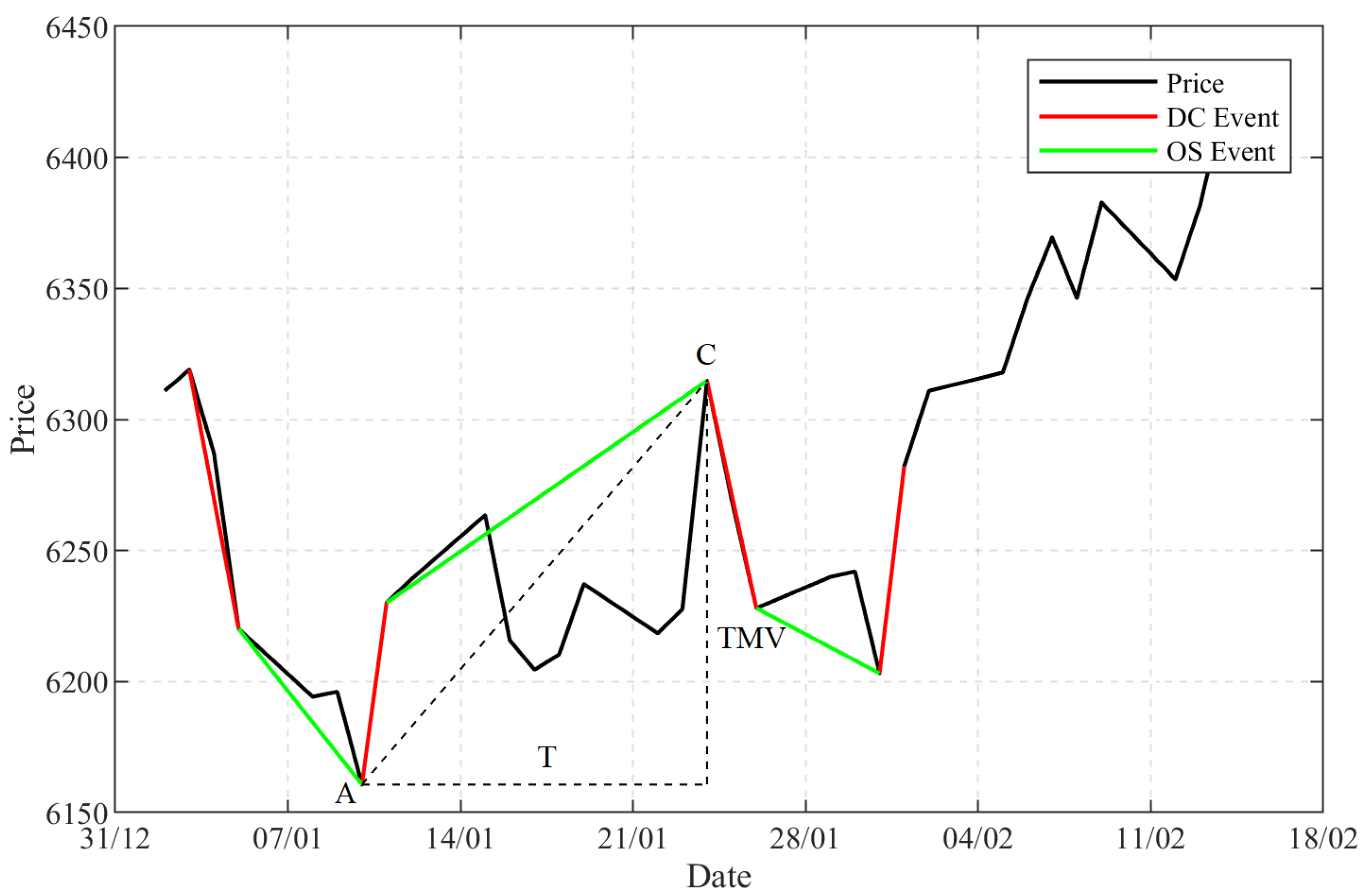
Figure 1 shows an example of summarising financial data under DC. When prices change from A to B, if the change is greater than or equal to the threshold, then AB is called a Directional Change Event (DC Event for short). Point “A” is retrospectively recognised as an extreme point which ended the previous downtrend and started the current uptrend. From Point “C”, the price drops by the specified threshold. Therefore, C ended the current uptrend and started the next downtrend. The price movement from Point “B” to Point “C” is called an “Overshoot Event” (OS Event for short). In other words, a trend (e.g., from “A” to “C” in Figure 1) comprised a DC Event and an OS Event. The market is thus partitioned into a series of alternating uptrends and downtrends, which could be read as the bull and bear markets that traders are familiar with.
Therefore, to help with the analysis of DC series, Tsang et al. [4] has proposed a number of indicators. Below, we introduce indicators used in this paper. The percentage price change in a trend measured by an indicator is called “Total Price Movement” (TMV for short). To allow us to compare DC series generated by different thresholds, we normalised the price changes by the threshold :
where is the price at the start of the trend, and is the price at the end of the trend.
The time that it takes to complete a trend is measured by another indicator which is called “Time” (T for short). “Return” (R for short) takes the usual meaning, which measures price change over time:
For example, in Figure 1, the price difference between point “A” to Point “C” is the in that trend, and the time that it takes to complete this trend is T.
Overall, in a DC-based summary, the financial data is sampled first by two types of events: a DC event, and an OS event, according to the value of the threshold, and secondly, a number of indicators are used to extract the trading information from these two events.
3.2. Detecting Regime Change through HMM
Building on our previous work [5], the hidden Markov model (HMM) was employed to detect regime changes from a series of DC indicators. The idea was to use HMM to estimate the hidden and unobserved “states” from the input data. In our case, the values of the DC indicator R were used as input data to the HMM. The output of HMM were hidden states detected by the model. Our interpretation, which was supported by significant political events (see [5]), was that different hidden states represent different market regimes.
As in our previous work [5], a two-state HMM was adopted in this study. It meant that the HMM will only infer two types of hidden states from the input data. And to help us compare the market regimes across different datasets, we label a market period with less fluctuation as “Regime 1”, which is considered as a rather stable market period. Alternatively, a market period with more sharp rises or falls in the price is labelled as “Regime 2”, which is considered as a more volatile market period.
3.3. Comparing Market Regimes in an Indicator Space
A market regime represents the behaviour of a market during a particular period of time. Market regimes across different financial markets may share similar characteristics with each other. For example, the Regime 1 of the UK stock market may have a similar performance to the Regime 1 of the US stock market. One way to compare and contrast market regimes of different financial markets is to position them into an indicator space. If the position of a market regime is close to another market regime into the indicator space, then one may conclude that they are similar to each other. Furthermore, by observing enough numbers of market regimes, one may be able to generalise where the normal regimes occupy in the indicator space.
Figure 2 depicts an example of being able to position market regimes in an indicator space. As mentioned above, the market regime is detected by adapting the HMM, and the input data of the model is the data of the DC-based indicator R, which is calculated by the other two DC-based indicators: TMV and T. Thus, a period of one market regime can also be described by two DC-based indicators: TMV and T. In Figure 2, a two-dimensional indicator space is constructed, where the x-axis measures the average value of T, and the y-axis measures an average value of TMV. The average T and average TMV can be measured in each period within a market regime. Each period therefore occupies one position in the indicator space. Five hypothetical periods of each regime are shown in Figure 2.
Market regimes detected in different financial markets may vary in their TMV and T. For example, in one market, the TMV could range between 1 and 6, but in another market, TMV could range between 1 and 8. To relate the results found in different markets, we normalise the values of the DC-indicators before positioning them into the indicator space. An approach called “feature scaling” or “Min-Max scaling” is used here to normalise the range of the data [8]. With this approach, the data of the DC-based indicators is scaled to a fixed range between 0 and 1. The formula of normalisation is given as:
Here and refer to the maximum and minimum values within the observed data set for the particular market. For example, the maximum and minimum value of TMV and T were observed for the EUR-GBP exchange market over the period of data used, which were then used to normalise the values of TMV and T of each period. With data normalised, it is possible to retrospectively compare and contrast regimes from different markets.
4. Empirical Study
We then attempt to characterise what are normal and abnormal market regimes across different markets. To do so, we identify market regimes in different markets and in different periods. We compared the normal and abnormal regimes from different markets in the normalised indicator space. We wanted to see whether (a) normal regimes from different markets and different periods occupy similar positions in the normalised indicator space, and (b) whether positions occupied by normal regimes are separated from positions occupied by abnormal regimes across markets and time.
4.1. Datasets
In order to characterise regimes across markets, ten different datasets are examined (see Table 1). The datasets are selected on both daily (low frequency) data and minute-by-minute (high frequency) data. They covered three different asset types: stocks, commodities and foreign exchanges. The data that was selected was because they were related to four interesting market periods (See the list below). During these periods of time, volatility in the financial markets changed abruptly, which indicated the possibility of observable regime changes in the markets.
- The global financial crisis of 2008–2009
- The oil crash of 2014–2016
- The UK’s European Union membership referendum in 2016
- The Chinese stock market turbulence of 2015–2016
For the study of the global financial crisis of 2008–2009, the closing price of three major stock indices was selected: Dow Jones Industrial Average index (DJIA), FTSE 100 index (FTSE100) and S&P 500 index (S&P500). These three stock indices reflected the general trend of the U.S. and the UK stock market.
For the study of the oil crash of 2014–2016, the price of two primary oil benchmarks were selected: the Brent crude oil and the WTI (West Texas Intermediate) crude oil. Oil prices significantly affected what is the cost of global industrial production. Brent oil represents about two-thirds of oil traded around the world, while the WTI oil is the benchmark of the oil price in the U.S. [9].
For the study of the UK’s EU referendum, three currency exchange rates were selected: Euro to British Pound (EUR-GBP), British Pound to U.S. dollar (GBP–USD) and Euro to U.S. dollar (EUR-USD). The British pound fluctuated against the euro and the dollar due to the uncertainty of the political events surrounding Brexit.
For the study of the turbulence in the Chinese stock market, two major stock market indices were selected: the Shanghai Stock Exchange (SSE) and the Shenzhen Stock Exchange Component Index (SZSE). The Chinese indices were studied for comparison with the US and UK indices mentioned above.
4.2. Summarising Data under DC
Under the DC approach, different observers may use different thresholds to sample prices. Here, for each dataset, ten evenly distributed thresholds were applied to summarise the financial data: 0.1%, 0.2%, 0.3%, 0.4%, 0.5%, 0.6%, 0.7%, 0.8%, 0.9%, 1.0%. This meant that each dataset was independently summarised with ten different thresholds. Thus, ten DC series were generated for each dataset. With each DC series, values in three DC indicators were collected: TMV, T and R.
4.3. Detecting Regime Changes under HMM
As mentioned in Section 3.2, a two-state HMM was used for detecting regime changes. The values of the indicator R were fed into the HMM, which segmented the input period into two regimes, Regime 1 and Regime 2.
For the purpose of classifying the market regimes across different financial markets, the market regime that represents a stable period of time was labelled as Regime 1, or the normal regime, and the market regime that represented a more volatile period of time was labelled as Regime 2.
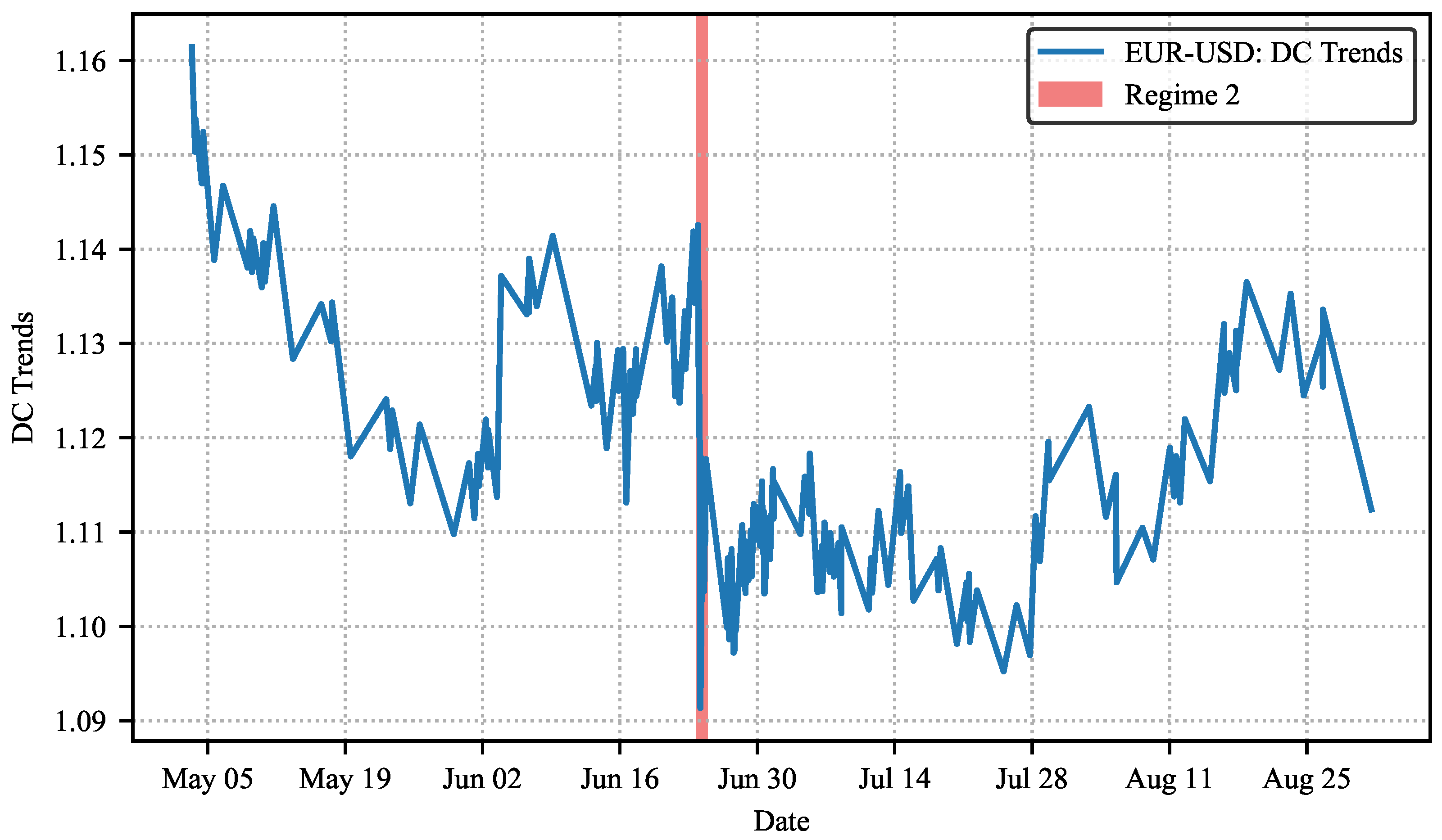
Extracted from [5], Figure 3 and Figure 4 show examples of market regimes detected from the Brexit period. With the DC approach, the original price movement of the selected exchange rate, the euro against the U.S. dollar (EUR-USD), is summarised into DC trends. Then market regimes were recognised through the HMM. The (short) time periods of Regime 2 were indicated in red shades, and the remains of the time periods were recognised as Regime 1.
4.4. Observing Market Regimes in the Normalised Indicator Space
In the previous step, market regimes are identified by the HMM. In order to compare and contrast different market regimes from different data-sets, we placed the regimes on a DC indicator space. Earlier, we mentioned that the HMM used the DC indicator R to detect regimes. Indicator R is computed by how much time it took (which is measured by T) to reach a certain level of price change (which is measured by TMV). We proposed to compare and contrast regimes with these raw measures, T and TMV. This would allow us to see more precisely how the two indicators interact and contribute to the differences between regimes.
A DC summary is a series of alternating uptrends and downtrends. HMM partitions trends in this series into two regimes. A regime is a continuous sequence of trends in the DC summary. In a DC summary, we measure the T and TMV values of each trend [4]. After the trends are classified to be Regime 1 or Regime 2, we computed the average T and TMV values for the trends in each regime. Different markets and time periods may have had different norms in their T and TMV values. Therefore, to compare regimes from different markets, we normalised the T and TMV values as suggested in Equation (3) above.
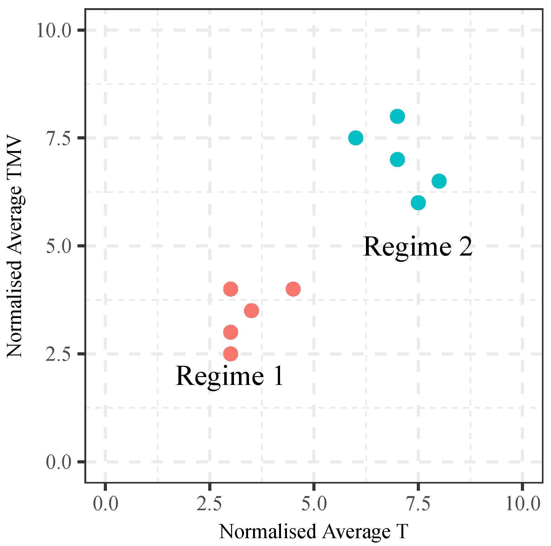
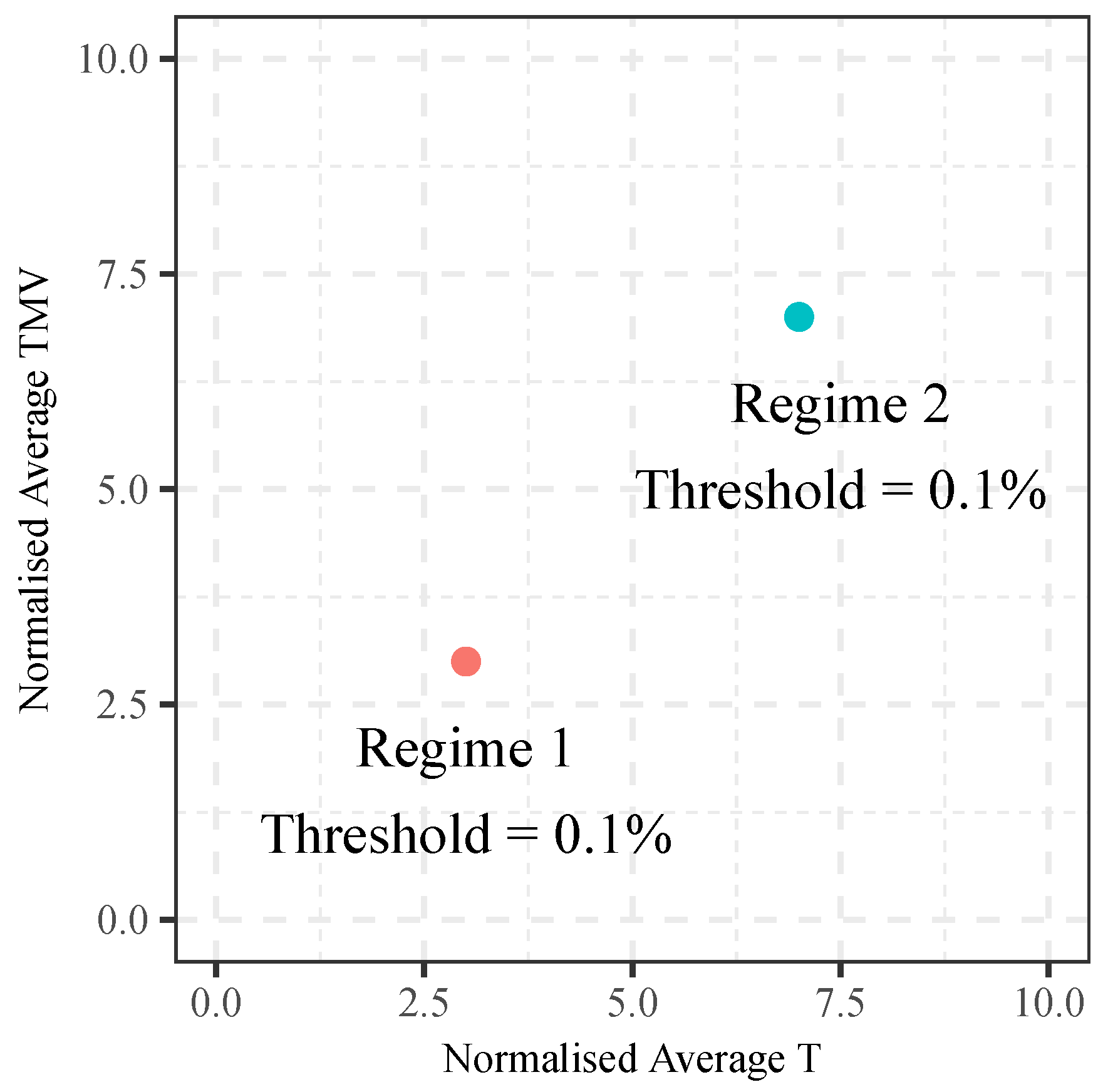
The normalised average T and TMV values of each regime can be plotted onto a two-dimensional indicator space. Figure 5 shows the positions of two market regimes in this two-dimensional space. In this example, trends in Regime 1 had a normalised average T value of 3 and normalised average TMV value of 3. Regime 2, on the other hand, had a normalised average T and TMV values of 7 and 7, respectively.
By visualising the positions of the regimes in this indicator space, we aim to observe similarities and dissimilarities between different market regimes in different data sets, with the hope to be able to discover regularities.
5. Results and Discussions
So far, we have explained that under a given threshold, DC summarised a dataset into trends. HMM classified these trends into regimes, with each regime comprising a sequence of trends. Each trend defines a TMV and a T value. We computed the average TMV and average T values for each regime in each data set. In this section, we compare the normalised TMV and T values of the two regimes from different markets and time periods.
For each dataset, we computed the average TMV and T values for all the trends of each regime. For example, we computed the average normalised TMV and T values of all trends in Regime 1 in the data of GBP–USD, which is summarised under the threshold 0.1%, and the same is done for Regime 2. Each market regime in each dataset will occupy a position within the two dimensional (T-TMV) indicator space. This will allow us to see whether Regimes 1 and 2 occupy different regions of the indicator space. If they do, then it is possible to define the region of normal regime and abnormal regime.
5.1. Market Regimes in the Indicator Space
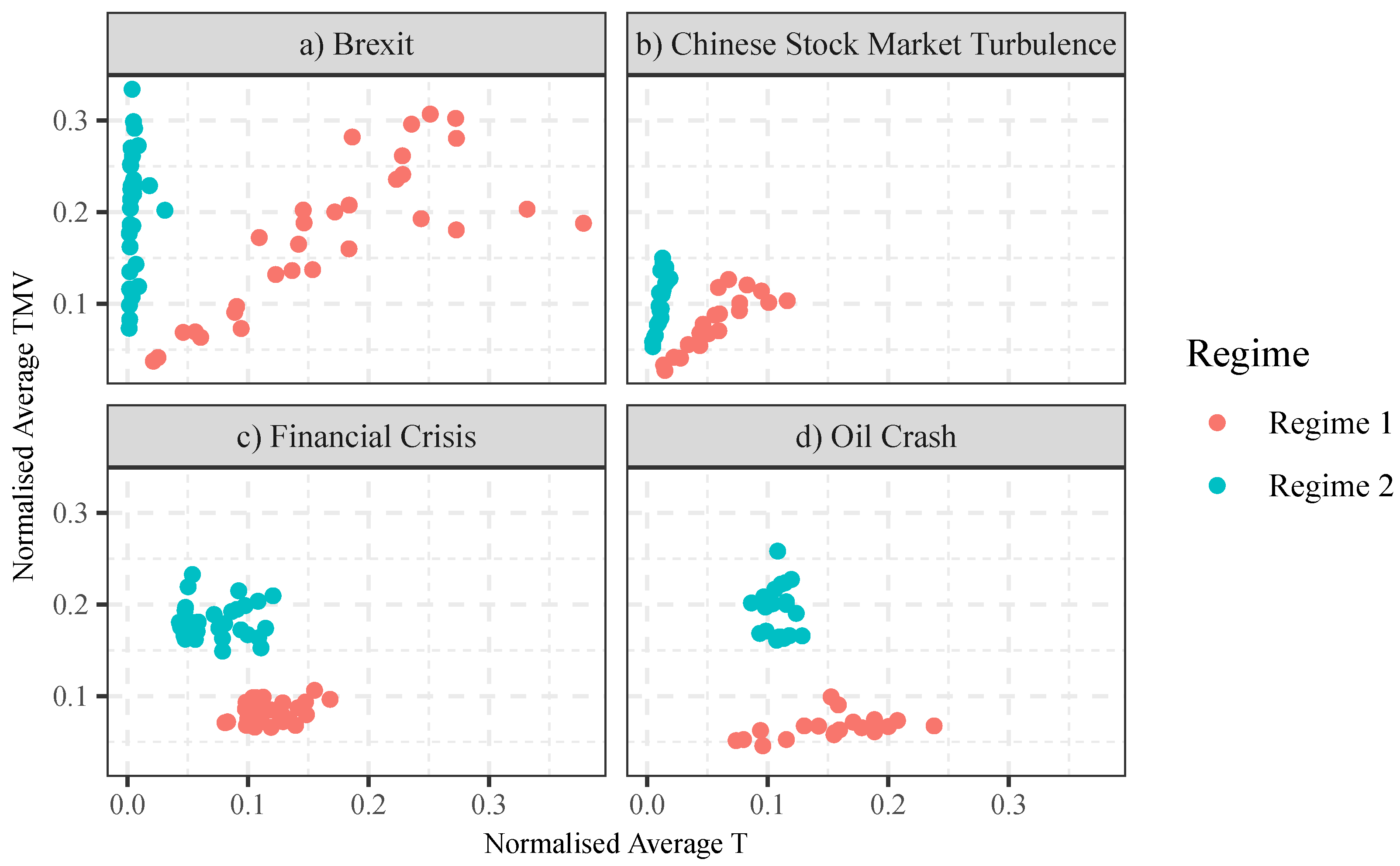
Figure 6 shows the positions of the regimes from all data sets on the T-TMV indicator space. They are grouped by their periods as shown in Table 1. To recap, the x-axis measures the normalised average value of the indicator T, and the y-axis measures the normalised average value of the indicator TMV. Each point in the indicator space shows the position of one market regime of one data set. The red points showed the positions of Regime 1, and the blue points showed the positions of Regime 2. For example, one of the red points in Figure 6a would show the average normalised TMV and T values of all trends in Regime 1 in GBP–USD summarised under the threshold 0.1%.
In Figure 6, we shall study the market regimes found in the four market events separately: (a) market regimes from the data of Brexit; (b) market regimes from the data of Chinese stock market turbulence of 2015–2016; (c) market regimes from the (three) data sets of the financial crisis of 2007–2008; (d) market regimes from the (two) data sets of the oil crash of 2014–2016.
As we examined three foreign exchange pairs (EUR–USD, EUR–GBP and GBP–USD) and each data set is summarised with ten thresholds, there are 30 data points for each regime in Figure 6a. As we used two Chinese indices (SSE and SZSE) and ten thresholds per data set, there are 20 data points for each regime in Figure 6b. There are 30 and 20 data points per regime for Figure 6c,d, respectively.
Figure 6 clearly shows that, within each group, Regime 1 and Regime 2 are clearly separable in the T-TMV indicator space. For example, Figure 6a shows that, compared to Regime 1, Regime 2 takes a much shorter time than normal to complete (readers are reminded that the x-axis represents normalised T, not absolute T). Figure 6a shows that Regime 2 has a much higher (normalised) TMV to (normalised) T ratio. The same is observed in Figure 6b–d.
Distribution of the regimes in the normalised T-TMV space is also significant: the market regimes that occurred from the data taken from the events of Brexit and that of the Chinese stock market turbulence were linearly distributed. But the market regimes from the data of the financial crisis and the oil crash formed clusters. The obvious difference between these data sets is that high frequency (minute-to-minute) data was used for the former, and low frequency (daily) data was used for the latter. Having said that, the exact reason for these differences in distributions demands further investigation; this will be left to future research.
In general, Regime 2 suggests a market with higher TMV to (normalised) T ratio. This means, given the same T, Regime 2 tends to have a larger TMV than Regime 1. Given the same TMV, Regime 2 tends to have a smaller T than Regime 1. As pointed out by Tsang et al. [4], both larger TMV and smaller T are indicators of higher volatility. Therefore, one could roughly understand Regime 2 as a regime that represents periods of higher volatility.
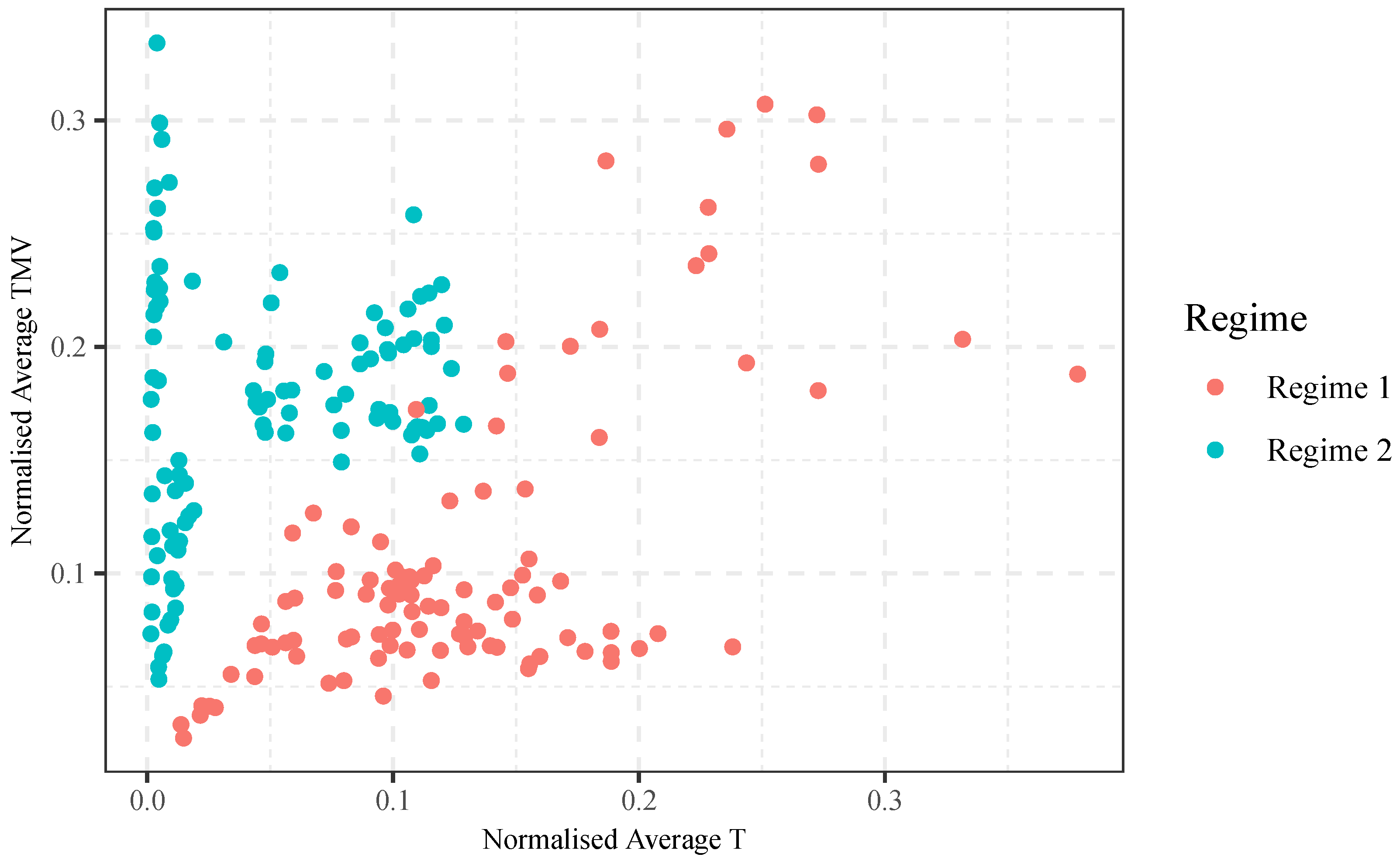
Figure 7 shows the market regimes of all the datasets together in one indicator space. We can see from Figure 7 that the positions of Regime 1 and Regime 2 are largely separable, with some exceptions around (0.11, 0.16). Figure 7 suggests that, across asset types, time and thresholds, Regimes 1 and 2 occupy different areas in the normalised T-TMV indicator space.
5.2. Market Regimes under Different Thresholds
When summarising data with DC, different observers may use different thresholds. The question is: are the positions of the regimes sensitive to the thresholds used? To be able to answer that, we analyse the market regimes observed under different thresholds.
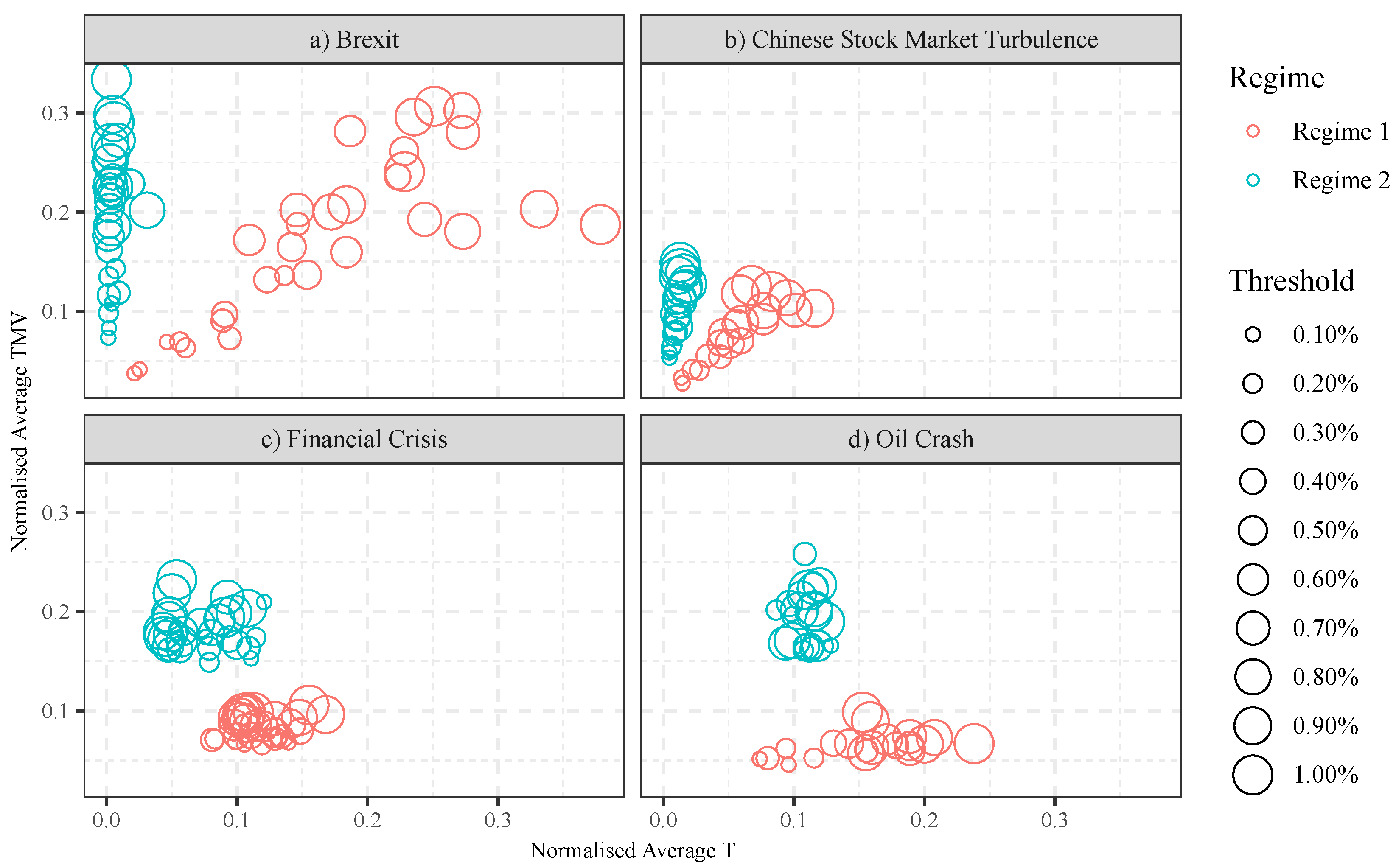
Figure 8 depicts the market regimes in the normalised T-TMV indicator space with regard to different value of thresholds. It shows that positions of the market regimes are changing along with the value of thresholds in some data-sets, but not all of them. For instance, in Figure 8a,b, the market regimes with larger price movements (indicator TMV) are captured under larger thresholds, even after normalisation.
However, Figure 8c,d shows a different picture. Data points collected from different thresholds mingled. This suggests that the size of threshold has little effect on the T-TMV positions of the market regimes in these two data-sets.
5.3. Discussion
In this section, we shall highlight some of the major points made in this paper.
Firstly, we have demonstrated that the DC indicator space is useful for comparing different markets. By positioning the market regimes in the DC indicator space, the distance between different regimes can be measured. This allows us to quantitatively measure the distance between different regimes in different markets. We can determine whether regimes are different or similar to each other, in terms of their positions in the indicator space.
Secondly, the position of the market regimes allows us to classify different types of the market regimes. We have found that all the Regime 1’s are similar to each other across assets, markets and time. All of the Regime 2’s are similar to each other. But Regime 1’s and Regime 2’s occupy different positions in the DC indicator space. As shown in Figure 8, the two regimes are clearly separable in each of the four markets studied. Even when we put the regimes found in different markets together, Regime 1s and Regime 2s are separable, with a little amount of overlap (see Figure 9). The overlap is mainly due to regimes found in the Oil Crash market (2014–2016). This could suggest that the commodity market is slightly different from the stock and foreign exchange market; this is a much bigger topic which will be left for future research.
Thirdly, by observing the positions of the market regimes, it is possible to define the region of normal market and the abnormal market in the indicator space. We called them normal and abnormal because in all the periods that we chose, dramatic external events took place, for example the bank failures in the 2007–2008 global financial crisis or the shock result of the Brexit referendum in Britain in 2016, all of which affected financial markets. In all our observations, the market changed from Regime 1 (which experienced less volatility) to Regime 2 (higher volatility) around these events. It is reasonable to believe that the regime change was either an anticipation, or a reaction, to these unpredictable events. For convenience, we have described what has happened when the markets changed from a normal regime to an abnormal regime.
Let us elaborate our findings by looking more closely into the results. We say that the market experienced less volatility in Regime 1, the normal market. This can be seen in Figure 6a,b, where less time (indicator T) is required to complete similar amount of price movements (indicator TMV) in Regime 2 than that of in Regime 1, and in Figure 6c,d, less price movements are achieved within a similar amount of time when the market was in Regime 1, compared to the market periods in Regime 2. This indicated that Regime 1 represented a less volatile market period.
On the other hand, we say that the market experienced higher volatility in Regime 2, the abnormal market. This can be seen in Figure 6a,b, where bigger price movements were observed within a shorter period of time in the region of Regime 2, than those in the region of Regime 1. In Figure 6c,d, bigger price movements (TMV) were completed in Regime 2, than those completed in Regime 1, within a similar amount of time (T). These indicated that Regime 2 represented a higher level of market volatility.
We note that the choice of threshold affected the positions of the markets on the indicator space in some markets but not others. But overall, independent of the thresholds used, the two regimes occupy different areas of the DC indicator space. The relative positions of the normal and abnormal regimes are insensitive to the thresholds used, which indicated that our research is correct, that thresholds do not influence the outcome of regime positions.
Finally, it is worth clarifying that our aim is not about finding the “optimal” threshold for regimes clarification. The intention was to generalise DC characteristics of normal regimes. That is why various thresholds are used to find normal regimes, and their results are used together to characterise normal regimes. Figure 8c,d shows that the same regimes found under different thresholds mingle with each other.
6. Conclusions
In a previous paper [5], we had established an approach as to how to recognise regime changes using market data; the approach was to summarise raw data as trends under DC [10]. Following [4], we collected values of the DC indicator R (which measures return) for each trend. The series of R was fed into a Hidden Markov Model (HMM), which classified trends into two regimes. In other words, the market is partitioned into periods of two regimes, classified by us as normal and abnormal.
The purpose of this paper is to characterise normal and abnormal market regimes. To achieve this, a new way is proposed to compare, contrast and classify different market regimes. We have applied the approach that has been developed [5] to more data: ten different assets were selected from four market periods during which significant events took place (see Table 1). For generalisation over data frequency, we used both high frequency (daily closing prices) and low frequency (minute-by-minute closing price) data of different types (stocks, foreign exchange and commodities).
The proposed method [5] was applied to detect regime changes in each of the 10 market-periods. To enable us to compare and contrast results across market-periods, we labelled the regime with lower R values Regime 1, and the regime with higher R values Regime 2 in each market period. We call Regime 1 the normal market periods and Regime 2 the abnormal market periods, because the latter always took place after significant events occurred in our study. The market typically returned to and stayed in Regime 1 afterwards.
We profiled each regime detected with the two DC indicators that define R: TMV (price changes in a trend) and T (time). This allowed us to plot each regime onto a two-dimensional DC-indicators space. The plottings enabled us to see that the two regimes are clearly separable within each group of datasets (Figure 6). Plotting the results of all datasets together suggested that the two regimes are reasonably separable (Figure 7). In other words, similarities were found between regimes across different assets types, time, data frequencies and thresholds. This was a significant discovery: it suggested that the TMV and T values of the last trend (and the current, unfinished trend) could potentially be used to monitor the market, to see whether regime change transition is taking place. This would have implications for risk assessment and selection of trading strategies.
To summarise: this is the first attempt to establish statistical properties of normal regimes in terms of their positions in the DC indicators space, under the DC framework. These properties hold across asset types, time, data frequencies and thresholds. Being able to characterise normal regimes opens doors for future research in monitoring regime changes. For example, if the market is moving away from the normal regime to an abnormal regime, a trader may consider closing their position or adopting a different trading strategy. Market monitoring and trading will be left for future research.
Author Contributions
Conceptualization and methodology, E.P.K.T. and J.C.; software and validation, J.C.; investigation, E.P.K.T. and J.C.; writing-original draft preparation, J.C.; writing-review and editing, E.P.K.T.; and supervision, E.P.K.T.
Funding
This research received no external funding.
Acknowledgments
The authors would like to thank Sara Colquhoun for her editorial supports.
Conflicts of Interest
The authors declare no conflicts of interest.
References
- Ang, A.; Timmermann, A. Regime changes and financial markets. Annu. Rev. Financ. Econ. 2012, 4, 313–337. [Google Scholar] [CrossRef]
- Glattfelder, J.B.; Dupuis, A.; Olsen, R.B. Patterns in high-frequency FX data: Discovery of 12 empirical scaling laws. Quant. Financ. 2010, 11, 599–614. [Google Scholar] [CrossRef]
- Tsang, E.P.K. Directional changes, definitions. In Working Paper WP050-10; Centre for Computational Finance and Economic Agents (CCFEA), University of Essex: Colchester, UK, 2010; Available online: http://finance.bracil.net/papers/Tsang-DC-CCFEA_WP050-2010.pdf (accessed on 19 September 2018).
- Tsang, E.P.K.; Tao, R.; Serguieva, A.; Ma, S. Profiling high-frequency equity price movements in directional changes. Quant. Financ. 2017, 17, 217–225. [Google Scholar] [CrossRef]
- Tsang, E.P.K.; Chen, J. Regime change detection using directional change indicators in the foreign exchange market to chart Brexit. IEEE Trans. Emerg. Technol. Comput. Intell. 2018, 2, 185–193. [Google Scholar] [CrossRef]
- Murphy, K.P. Machine Learning, a Probabilistic Perspective; MIT Press: Cambridge, MA, USA, 2014. [Google Scholar]
- Tsang, E.P.K. Directional changes: A new way to look at price dynamics. In International Conference on Computational Intelligence, Communications, and Business Analytics; Springer: Singapore, 2017; pp. 45–55. [Google Scholar]
- Aksoy, S.; Haralick, R.M. Feature normalization and likelihood-based similarity measures for image retrieval. Pattern Recognit. Lett. 2001, 22, 563–582. [Google Scholar] [CrossRef] [Green Version]
- Bain, C. Guide to Commodities: Producers, Players and Prices, Markets, Consumers and Trends; John Wiley & Sons: Hoboken, NJ, USA, 2013. [Google Scholar]
- Guillaume, D.M.; Dacorogna, M.M.; Davé, R.R.; Müller, U.A.; Olsen, R.B.; Pictet, O.V. From the bird’s eye to the microscope: A survey of new stylized facts of the intra-daily foreign exchange markets. Financ. Stoch. 1997, 1, 95–129. [Google Scholar] [CrossRef]
Figure 1.
An example of data summary under DC . The black curve describes the daily price of the FTSE 100 index (32 trading days from 2 January 2007 to 14 February 2007). The red lines describe the DC event and the green lines describe the OS event.
Figure 1.
An example of data summary under DC . The black curve describes the daily price of the FTSE 100 index (32 trading days from 2 January 2007 to 14 February 2007). The red lines describe the DC event and the green lines describe the OS event.

Figure 2.
A hypothetical example of an indicator space.

Figure 3.
An example of recognition of market regimes. The DC trends of the exchange rate are presented in blue curves. The time periods of Regime 2 are indicated in red shades, and the remains of the time periods are recognised as Regime 1.
Figure 3.
An example of recognition of market regimes. The DC trends of the exchange rate are presented in blue curves. The time periods of Regime 2 are indicated in red shades, and the remains of the time periods are recognised as Regime 1.

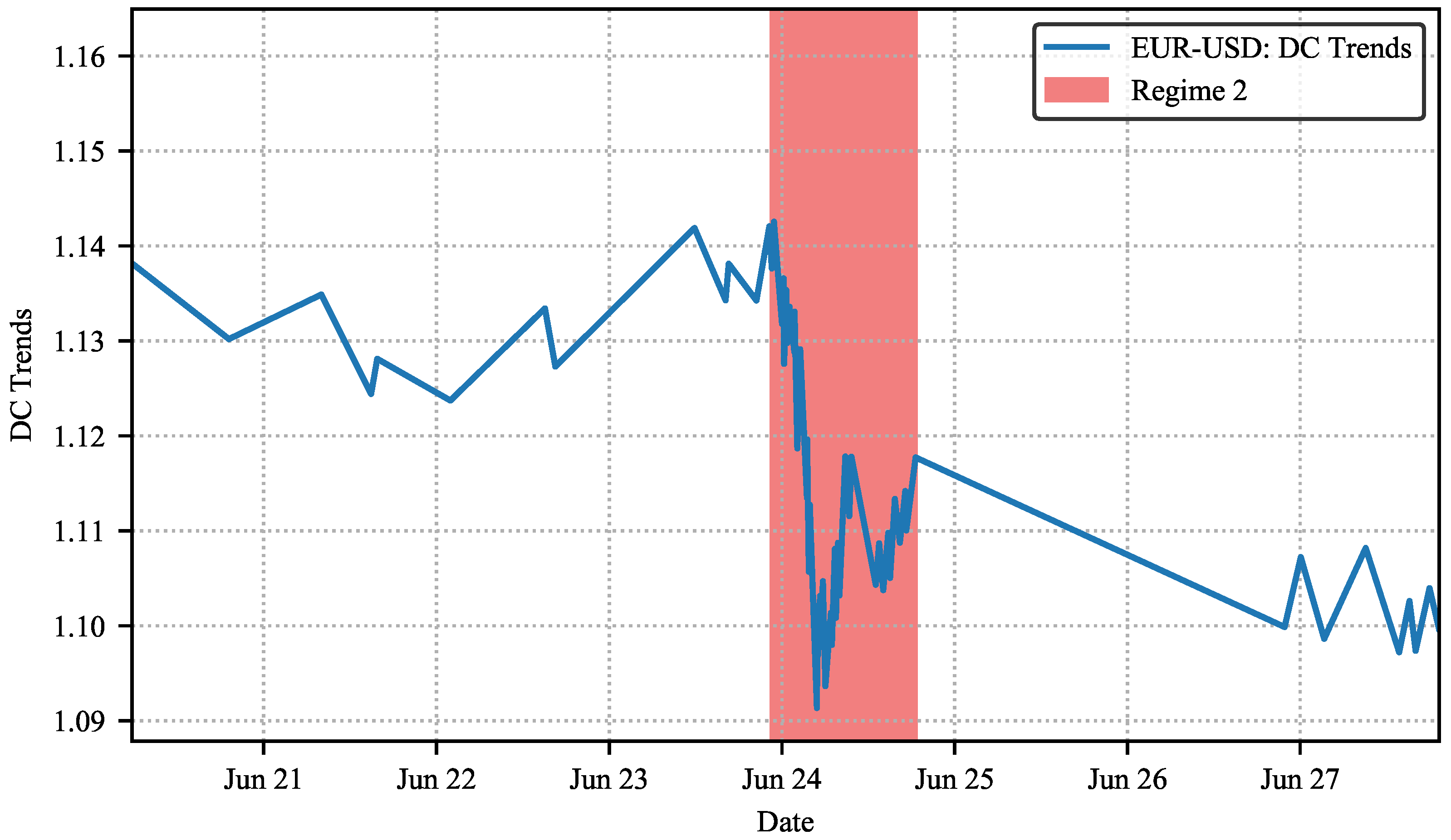
Figure 4.
A zoomed-in version of the DC trends of EUR-USD.

Figure 5.
An example of describing market regimes in an indicator space.

Figure 6.
(a–d) Market regimes in the indicator space, which are organized by four market events: (a) market regimes from the data of Brexit, (b) market regimes from the data of Chinese stock market turbulence, (c) market regimes from the data of financial crisis, (d) market regimes from the data of oil crash.

Figure 7.
Indicator Space of all data-sets.

Figure 8.
(a–d) Market regimes in the indicator space with regards to different value of thresholds.
Figure 8.
(a–d) Market regimes in the indicator space with regards to different value of thresholds.

Figure 9.
Indicator Space of all data-sets with regards to different value of thresholds.


Table 1.
Data-sets.
| Data | Daily Data | Minute-by-Minute Data | ||
|---|---|---|---|---|
| Financial Crisis 2007–2008 | Oil Crash 2014–2016 | Brexit 2016 | Chinese Stock Market Turbulence 2015–2016 | |
| DJIA | √ | |||
| FTSE 100 | √ | |||
| S&P 500 | √ | |||
| Brent Oil | √ | |||
| WTI Oil | √ | |||
| EUR-GBP | √ | |||
| GBP–USD | √ | |||
| EUR-USD | √ | |||
| SSE | √ | |||
| SZSE | √ | |||
© 2018 by the authors. Licensee MDPI, Basel, Switzerland. This article is an open access article distributed under the terms and conditions of the Creative Commons Attribution (CC BY) license (http://creativecommons.org/licenses/by/4.0/).
Share and Cite
MDPI and ACS Style
Chen, J.; Tsang, E.P.K. Classification of Normal and Abnormal Regimes in Financial Markets. Algorithms 2018, 11, 202. https://doi.org/10.3390/a11120202
AMA Style
Chen J, Tsang EPK. Classification of Normal and Abnormal Regimes in Financial Markets. Algorithms. 2018; 11(12):202. https://doi.org/10.3390/a11120202
Chicago/Turabian StyleChen, Jun, and Edward P. K. Tsang. 2018. "Classification of Normal and Abnormal Regimes in Financial Markets" Algorithms 11, no. 12: 202. https://doi.org/10.3390/a11120202
Note that from the first issue of 2016, this journal uses article numbers instead of page numbers. See further details here.