1. Introduction
The global stock of electric vehicle (EV) cars surpassed three million vehicles in 2017 after crossing the one million unit mark in 2015 and the two million mark in 2016. With a 39% sale share, Norway has undoubtedly achieved the most successful deployment of EVs in terms of market share globally, followed by Sweden and the Netherlands, at 6.3% and 2.7% respectively. This also corresponds to the highest car stock in Europe of over 178,000 in Norway, followed by the United Kingdom and the Netherlands with 133,000 and 119,000, respectively [
1]. More than half of global sales of electric cars were in China, which corresponds to a market share of 2.2% in 2017. In 2017, China had an EV stock of 951,000, followed by the United States, with 401,000. Just 20 cities account for about 40% of the world’s EVs [
2]. Strong regulatory and fiscal policy has driven the early electric vehicle market. The markets with the highest electric vehicle uptake are the following: China, Europe, Japan, and the United States, which have implemented a combination of vehicle CO
2 or efficiency regulations, strong consumer incentives, and direct electric vehicle requirements. Charging infrastructure support to consumers is also a common characteristic of these markets.
The main concerns addressed in the literature regarding the charging infrastructure deployment are related to cost, charging effectiveness, and ability to satisfy dynamic demand, as well as its overall environmental impact. According to the EAFO (European alternative fuels observatory) [
3], the ratio of cars per charger vary widely from country to country, from 66 to 3.7 cars per charger in Iceland and Spain, respectively. Even though at first sight, factors such as the driven distance per year, and population size and density, do not change proportionally. There are no commonly accepted goals or standards for charging infrastructure density, either on a per-capita or per-vehicle basis. Different countries seem to follow different sizing and options for the public charging infrastructure development. This depends on many factors. There is no clear way to achieve an efficient deployment of EV charging infrastructure and the associated policy that will need to be addressed to help pave the way for electrification. A study on the emerging best practices for EV charging infrastructure [
4] provides insights into the differences between present infrastructure roll outs. Using a multivariable regression of 350 metropolitan areas, the authors find that both level 2 and direct current (DC) charging are linked to EV acceptance, as are consumer purchase incentives. Yet the significant charging variability across hundreds of cities points to major differences across the EV markets regarding the role of public charging.
An economic-based approach is asserted by other authors. A study [
5] assesses factors influencing EV adoption across 30 countries in 2012 at a national level, focusing primarily on financial incentives. A regression of several variables, with EV market share as the dependent variable, shows that a charging infrastructure is the best predictor of national EV market share. Nonetheless, there are exceptions to this trend, such as Israel and Ireland, with relatively extensive charging infrastructure and low EV sales shares. From a cost point of view, other authors [
6] have modelled the impact of several factors, including charging infrastructure, on EV market share in Europe. This model calculated the utility and respective market share of different powertrain types, using feedback loops to capture realistic decision-making patterns by drivers, manufacturers, charging infrastructure providers, and policymakers. The model also assesses the profitability of charging stations under various scenarios and considers subsidies and government targets for charging infrastructure. The authors found that the private market can profitably support 95% of public charging stations, up to a ratio of 25 electric vehicles per charge point. They also found that EV market share increases as the electric vehicle/charge point ratio decreases from 25 to 5 electric vehicles per charge point. Charging infrastructure availability also appears to have the strongest impact on uptake once EV stock share exceeds 5%, which is currently the case only in Norway.
An environmental approach assessing the materials and the overall impact of the infrastructure is also a topic that is receiving increasingly more attention [
7]. Analysing the complete supply chain and infrastructure materials for the Portuguese case, the authors conclude that EV supply infrastructure is more carbon and energetic intensive than conventional supply infrastructure. Considering a ratio of 9.5 and 333 vehicles per normal and fast charger, respectively, the contribution in overall vehicle life cycle analysis (LCA) may reach 7.9% of gCO
2eq/km, identifying the chargers as the main contributors. This clearly puts a threshold onto the limits of chargers to be installed per vehicle with a risk of attaining higher environmental impacts than desired. Other studies address charging point allocation phenomena, presenting models or solving optimization problems [
8,
9,
10,
11,
12,
13,
14]. Particular attention is given to the road segment allocation of chargers [
8], privileging the use of existing infrastructure such as fuel stations and rest areas or parking lots. There seems to somehow be a tendency to separate electrical studies from their geospatial distribution. Other optimization problems [
15,
16,
17,
18,
19] focus on case studies trying to find the optimal ratio of chargers per car and distribution intensity. No common approach is followed; different objective functions and variables are considered, but tend to be the following: charging costs, securing a minimal distance from a charger to a given point on a map, distance between chargers, relation to population density, or relation with fuel stations. The literature [
20] compares rollout strategies in the Netherlands, demand driven or strategically driven. Demand driven charger installations are considered the ones placed on demand by EV users for home charging. Strategic installations are largely based on expected use at points of interest or highly populated areas. From the literature, one may conclude that there is neither a common benchmark for the number of electric vehicles per public charge point nor a common approach to the infrastructure roll-out. Given the wide variation of public charging availability across markets with higher EV adoption, and housing differences, as well as the population density characteristics, it seems clear that there is no ideal global ratio for the number of EVs per public charge point. Comparisons of similar markets still offer an instructive way to understand where and how charging is insufficient. For this reason, there is a need to formulate representative indicators providing evidential feedback that can be used to identify performance gaps and best practices. In this paper, we describe the methodology to obtain such indicators using exploratory data analysis. Given the Dutch advanced implementation regarding charging infrastructure and data availability, this study focuses on a dataset provided by one of the main organisations in the field of smart charging infrastructure, ElaadNL [
21]. Despite the data format, the indicators developed should be simple, reliable and effective in quantifying the potential impact on given any similar dataset.
Charging Infrastructure Programs
In terms of public infrastructure, Belgium, Norway, and Sweden had a ratio of 1 publicly accessible charging outlet for just over 20 electric cars in 2017. Both of these values are significantly disproportional from the global average of one charger per seven electric cars observed in 2017. Another ratio guidance comes from the Alternative Fuel Infrastructure (AFI) Directive of the European Union (EU) [
22], which recommends a ratio of one publicly accessible charger per ten electric cars. Countries with densely populated cities such as China and Japan already have a stronger publicly accessible EV infrastructure than others, with one outlet for six electric cars in China and one outlet for seven electric cars in Japan. About 43% of electric vehicle sales in 2016 were registered in only eight countries across Asia, Europe, and North America [
4]. An overview of the public infrastructure programs of these main markets is provided below.
There are two main programs in China: (i) city government-funded construction in pilot cities, and ii) regional investments by automakers and State Grid national charging corridors. This last one intends to construct fast charging plazas within cities and intercity corridors, aiming at 120,000 fast charging stations and 500,000 total public stations by 2020 [
23]. The mechanisms of support come from mainly state owned utility programs, public–private partnerships, and grants to local governments. In Japan, the main program was the Next Generation Vehicle Charging Infrastructure Deployment Promotion Project to fund charging stations around cities and highway rest stations in 2013–14 [
23]. Apart from this, the Development Bank of Japan also partnered with automakers and power company TEPCO to construct the Nippon Charge Service (NCS), a nationwide network of charging stations. Almost 7500 stations are now part of this network, with continued funding at least through 2018. Main mechanisms of support are grants to local governments and highway operators as well as public–private partnerships.
In Europe, charging infrastructures have been constructed by a combination of private charge point providers, power companies, automakers, and governments, primarily at the national and city levels. The main policy document is the AFI Directive [
22]. The EC has supported more than a dozen electric vehicle infrastructure projects through the TEN-T/CEF-T program, with a focus on creating trans-European corridors and linking the projects operated by Member States (MS) [
24]. Moreover, the EU has promoted interoperability, open standards, and smart charging, as demonstrated for example by the Green eMotion research project [
25]. At an MS level, in France, local governments may apply for grants with main programs involving the funding given to 3000 cities for deploying 12,000 charge points. In Germany, the program involves €300 million for 10,000 Level 2 and 5000 DC fast charging stations with subsidies for 60% of costs for all eligible businesses. In the Netherlands, much of the early construction of charging infrastructure was initiated by ElaadNL [
21], which maintains and upgrades about 3000 stations. Support has been provided through contracts tendered to businesses on a project-by-project basis. The federal government also provided €16 million in incentives for charging infrastructure through their “
2011 Electric Mobility Gets Up to Speed” program. More recently, the federal government consolidated various programs and began to promote charging stations through its “
Green Deal” [
4]. The key sponsor of Norway’s charging infrastructure has been Enova [
26], an agency funded through petroleum and natural gas. It has been working with grant schemes from 2009 onwards with quarterly calls for proposals for targeted projects. In Sweden, the government introduced two investment support schemes (Climate Leap and Urban Environment Agreements), with the goal to promote charging infrastructures. Public normal charging is developed by many actors, both public and private. The public network has reached approximately 3600 charging points distributed over 1060 charging stations [
26].
In the United States, much of the initial investment in charging infrastructure came from the American Recovery and Reinvestment Act of 2009, which has provided federal funding through the EV Project and the U.S. Department of Transportation’s Transportation Investment Generating Economic Recovery program, among many infrastructure projects in the United States from 2010 to 2013. According to the Department of Energy (DoE) [
4], there were over 18,000 public Level 1 and 2 and DC fast electric charge points installed.
2. ElaadNL Dataset
The main tool for data processing and statistical analysis used for developing the evaluation framework is R studios Crystal Ball [
27] was used for uncertainty estimation and statistical distribution fit. Regarding geospatial analysis the open source, Q-GIS 2.18 has been used and the Geographic Resources Analysis Support System GIS, GRASS 7.4, which is an open source geographic information system providing powerful raster, vector, and geospatial processing capabilities. The EV dataset was obtained by ElaadNL, a Dutch smart charging service provider, and contains the records of the charging stations’ utilisation. It includes historic transactions, from January 2012 until March 2016, of 1747 charging stations (2900 charging points) installed over the entire geographical area of the Netherlands. The charging stations are all three-phase with a maximum output power of 12 kW. In the year 2015, the dataset represented 16% of all the charging stations installed in the Netherlands [
3]. The dataset has approximately one million charging events (transactions) over a four-year period, and for each transaction, the parameters are registered with the corresponding timestamp using Universal Time Coordinated (UTC) units and updated every 15 min (the dataset has around 32 million observations). From the transactions identifier (user’s card), it has been possible to estimate 53,849 EV drivers who have used the charging stations during the four-year observation period. The installation of the charging stations was, however, phased in time and only in the beginning of 2014 could the whole network be completed. For this reason, and to ensure higher volume of transactions and a higher number of the chargers, the years 2014 and 2015 were used. After removing the null lines with no data or error, a total of 1683 chargers remained, corresponding to over 96% of the initial dataset. The total number of transactions is 733,794, which represents approximately 70% of the initial total number of transactions in the whole dataset. The numbers of individual cards are assumed to be EV owners (42,400 EVs). The original dataset consists of a set of 19-tuple elements: “Index”, “Transaction Id”, “Charge Point”, “Connectors”, “UTC Transaction Start”, “UTC Transaction Stop”, “Meter Start”, “Meter Stop”, “Start Card”, “Stop Card”, “Connected Time”, “Charge Time”, “Idle Time”, “Total Energy”, “Max Power”, “Latitude”, “Longitude”, “Street”, and “Road Segment”.
As the goal of the study is to focus on the charging columns, the data has been grouped by chargers (Charge Point), charging event data was discarded, such as UTC Transaction Start/Stop, Meter Start/Stop or Card Start Stop, and the remaining corresponding information is aggregated. This originated the following tuple: “Charge Points ID”, “Sum of Energy”, “Sum of Idle Time”, “Sum of Connected Time”, “Mean of Max. Power”, “Max. Power”, “Sum of Charge Time”, “Latitude”, “Longitude”, “Road Segment”, and “Number of Connectors”. From this stage of the dataset, other indicators useful to the indicators analysis were generated and given by Equations (1)–(3). Such parameters may be derived from other dataset sources depending on the dataset composition under analysis. The first one is the energy use ratio of a given charger over the observed period. This corresponds to the energy actually provided in a given period by each charger divided by the energy that it could have been provided at its nominal power rate in the same period of time. T
0 is the observation time in hours. In this analysis, T
0 = 2 × 365 × 24 = 17,520 h for a two-year period.
The use time ratio in Equation (2), is given by the total time (expressed in hours) during which a charger is occupied by a vehicle (connected time, that is, charge time plus idle time), divided by the number of hours of the observation period, multiplied by the number of connectors.
Since the use time ratio indicator provides the percentage of use, where 1 corresponds to 100% of usage of the chargers, the availability factor will help analyse this indicator and can be obtained by Equation (3) as follows:
3. Analysis of Indicators
Across the world’s main economies, the targets for the electrification of the mobility sector are being set with a tendency to achieve ambitious goals by 2020 to 2030. In the EU, despite an agreement on time horizons, MS seem to have a different pace in implementation. The “
trilogue” between the European Commission (EC), Parliament, and Council, often results in non-binding targets, where numbers are scarce as is the case of the AFI Directive [
22]. According to the comments to the directive [
28] “
the completeness, coherence, and ambition of the National Policies Frameworks (NPFs) vary greatly”. The adoption of a reliable set of indicators will contribute to a more solid benchmarking procedure and to supporting future initiatives. A crucial factor that influences the infrastructure sizing and design is its energy demand. To estimate this factor, several aspects need to be taken into account, among them, the total amount of energy required by the fleet and the residential structure, such as urban densification and private parking/garage per car. The first one can be estimated by an average driven distance per car and an average consumption per km. The second one will provide an estimation of how much of the charging on average is done at home. The remaining energy to be fulfilled should provide a good estimate of the energy required from public chargers. However, to acquire and treat such information is not so straightforward if we consider the different realities across markets, urban, semi-urban, and rural areas. Hence, we follow a bottom up approach, starting from real implementation data in a developed market and using information from openly available external datasets.
3.1. Energy Demand from the Network
The willingness to charge at home or on a public network depends on the residential characterization. EV owners in California, for example, more frequently have access to home and workplace charging, and one public charger per 25 to 30 electric vehicles is typical. On the other hand, in the Netherlands, private parking and charging are relatively rare, and one public charger per 2 to 7 electric vehicles is typical [
4]. Hence, the levels of support by such infrastructure should derive from a functional unit of chargers/MJ or equivalent use and not simply chargers per car. It is in fact misleading to compare the number of cars per chargers (or connector) if the network is used differently. Consider two networks with the same number of vehicles and efficiency, with the first one having a 10 EV/charger ratio and the second a 5 EV/charger ratio. If, on average, a car charges 10 kWh per week on the first network and 20 kWh on the second one, even though the second one is larger in terms of number of charging stations per EV, both networks are dimensioned to provide the same amount of energy (1 charger per 100 kWh). Based on this reasoning we thus pursue an energy focused analysis of the network. From the dataset under analysis, the two-year average energy demand is 6.25 × 10
3 MWh, which means 11.25 × 10
6 MJ/year. Allocating these numbers to the infrastructure results in an energy demand of 6685.72 MJ
year/charger and 4040.23 MJ
year/connector.
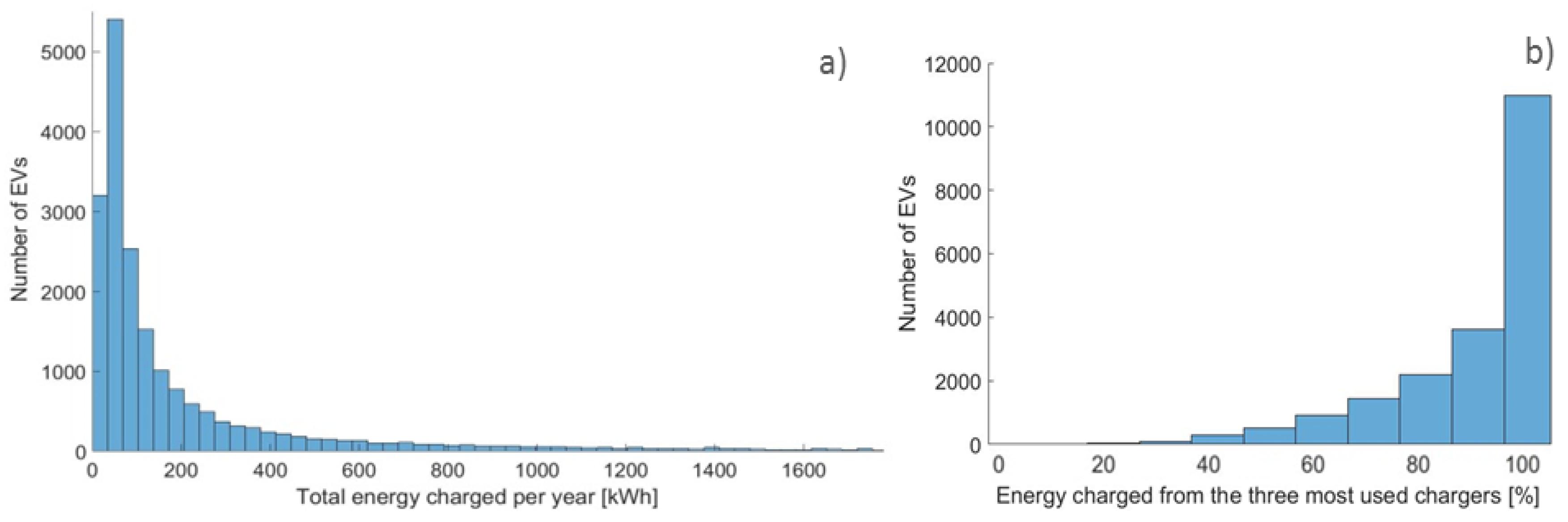
Yet a more detailed picture can be extracted from the EVs dataset regarding charging behaviour and frequency. Considering only the vehicles charging more than 24 kWh in two years (20,069), we focus on the number of chargers used by these EVs. As can be observed in
Figure 1a, more than 83% of EVs are charging less than 200 kWh on ElaadNL’s infrastructure. Taking a reference EV efficiency of 0.15 kWh/km, this implies that on average each EV is driven less than 1333 km per year, only 10% compared to the current average of 13,000 km annual driven distance in the Netherlands. The remaining charging needs are satisfied by other networks or home/work chargers. Further considerations may be drawn regarding energy demand patterns.
Figure 1b show the energy (%) that drivers retrieve from the three most used chargers. Evidently, the majority of drivers have a preference to charge on a restricted number of chargers. More than 83% of the total yearly energy is requested to three chargers.
3.2. Energy Use Intensity
Whenever designing the charging network, both distribution and density of chargers should be taken into account. The electricity grid is of utmost importance, hence costly upgrades, potential overburden in transformers, and cables capacity should be avoided. The public infrastructure in urban areas is more likely to have higher energy demand from mobility than semi-urban or rural areas. This means more connection points tend to be deployed in areas with higher population density. However, the service ratio (chargers/vehicle) should be sufficiently high outside urban areas so as to secure a reasonable distance from a charger to every point in the map at which an EV user may be located. In this section, we take advantage of the fact that the chargers’ locations are often given in the datasets and perform a geospatial analysis in two steps. The first one geographically analyses the energy use intensity to see if there is a homogeneous use of the network, and the seconds one evaluates correlations to support its density distribution (charger’s intensity distribution). The energy use intensity analysis of the network provides insights on how well it is distributed. The analysis refers not only to its geographical distribution, but also to the energy demand balance across the network.
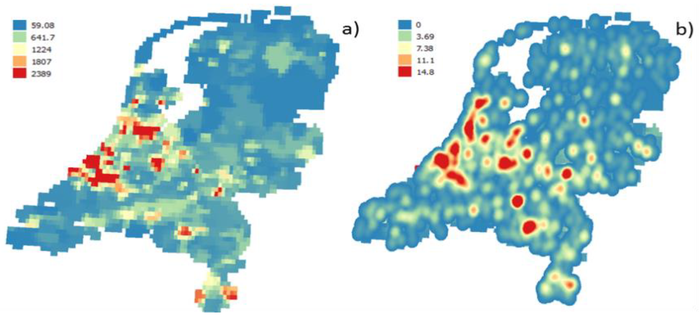
Figure 2 shows the locations of the chargers by road segment (a) and a heat map of energy demand (b). High energy demand is mostly concentrated in six areas. This corresponds to the main urban centres where in fact higher density of chargers exists, hence a higher aggregated value of energy is observed in the serving areas.
For instance, despite its high aggregated energy demand, in the Den Haag area, charging points have a demand lower than the middle value of all the chargers in the dataset. This may be observed in
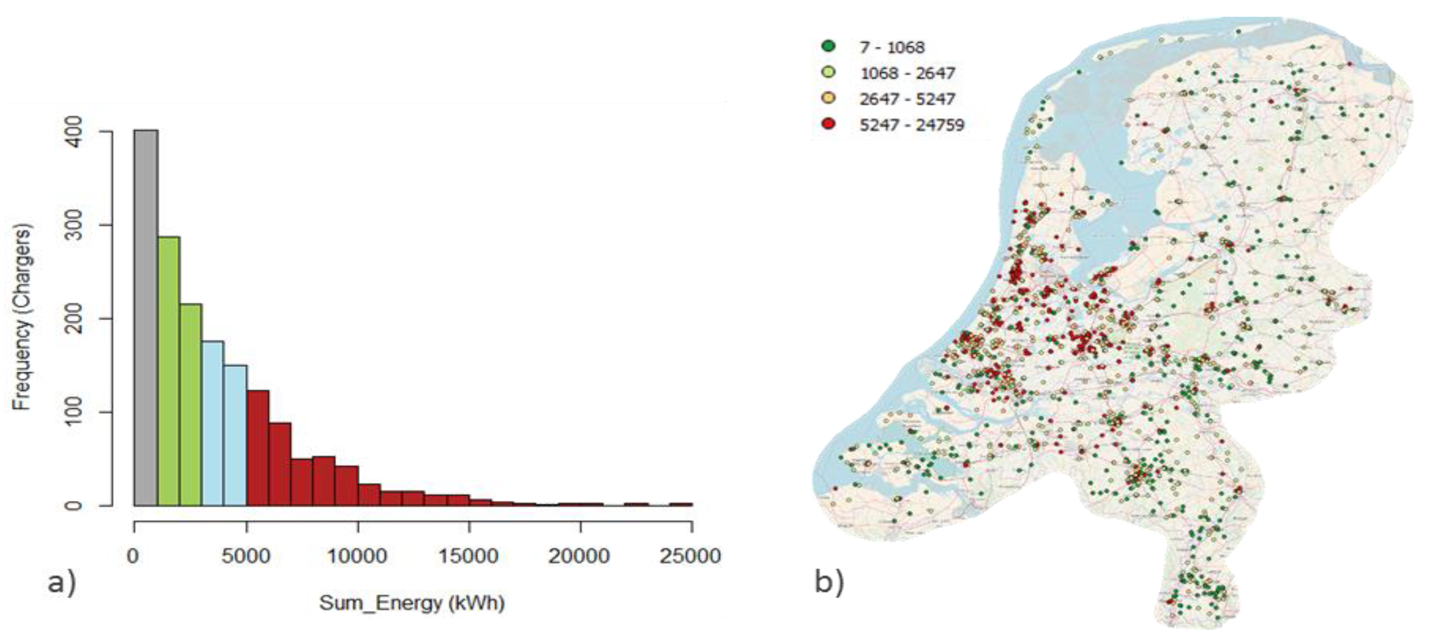
Figure 2b. This indicates that there are in fact many chargers, but with a relatively low energy use per charger (green points). Such locations, when aggregated, result evidently in an energy intense area. It may well be then, that the chargers that are used the most are not located necessarily in urban regions. To better understand the intensity of charging behaviour, a statistical analysis can help. A histogram with quantile breaks is presented in
Figure 3a, together with the corresponding Q-GIS quantile map in
Figure 3b.
The histogram is presented with quantile breaks, which means that each colour divides the range of the probability distribution into contiguous intervals with equal probabilities. One can observe for example, that 25% of the chargers provided below 1000 kWh, or that 75% of the chargers provided below approximately 5000 kWh in two years. The fact that the last quantile (in red) ranges from approximately 5000–25,000 kWh with significant frequency is a good indicator of concentration of energy demand. The figure shows the energy demand with a long red tail. This can be explained by the fact that only 19.6% of the total charging columns (330) is responsible for 50% of the total energy supplied by the infrastructure under study.
By observing
Figure 3b, it is visible that the points corresponding to the last quantile (in red) also show geographical density identical to the one shown in
Figure 2b. Therefore, both approaches demonstrate that there is high concentration of energy use both geographically and in the number of charger.
3.3. Chargers Intensity Distribution
A suitable way to evaluate a given dataset is to try to look for correlations. The literature tends to support the concept that the intensity and location of chargers should follow existing structures to minimize costs, social impacts, and resources, and make use of existing data [
8]. Fuel stations and parking lots are hence regarded as a proxy to estimate the agglomeration of demands. Further, the population density seems to be a comparison factor to which the size or intensity of the network is often compared [
1,
3,
4]. For this reason, and because of the availability of data when analysing other datasets from other infrastructures, we use these three parameters and check their correlation with the chargers distribution. The availability of high-resolution aerial imagery has led to many points of interest (POI) features being recorded as areas (building or site outlines), not points, in open street map. One may, for example, often find a restaurant or hotel drawn as an area. In this study, we use the data for fuel stations available by points and parking lots from [
29] using the “traffic” point and the area subset. The choice of using the area file for parking lots is to acknowledge that these facilities have different areas and number of parking places, which may have an impact on the outcome. However, the correlation was also done for point layer. For the population density, the Eurostat database [
30] or NASA’s Socioeconomic Data and Applications Centre (SEDAC) are useful centres of information. Such references present data for the great majority of the world, enabling its use when applied to other infrastructures’ datasets.
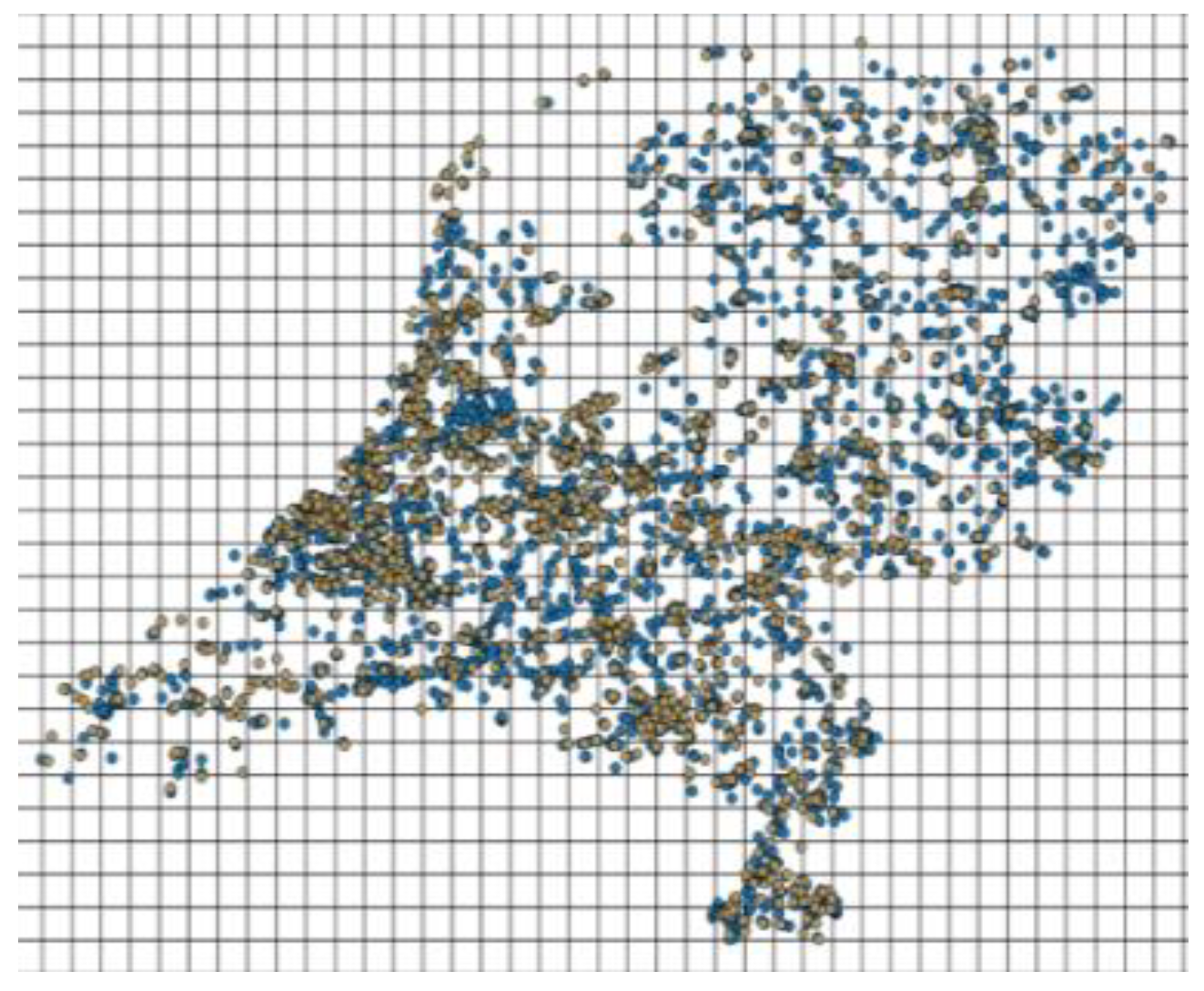
Figure 4 presents the way the correlation was obtained between fuel stations data and the chargers data.
The goal of this exercise is not to infer on the ratio of fuel stations and chargers, but instead on its intensity distribution. The ratios between inputs may be completely different, because fuel stations normally have several fuel dispensers, have different kinds of fuel, and are now higher in number. In order to perform a correlation, data normalization is required. For this reason, the use of a matrix is an efficient way to correlate the two datasets. This can be done by generating a grid on Q-GIS and by running a counting script to return the number of points in each grid cell. From the density data series generated, the correlation can then be calculated. The correlation between the charging point density data series and fuel stations density was found to be 75.7% strong. Likewise,
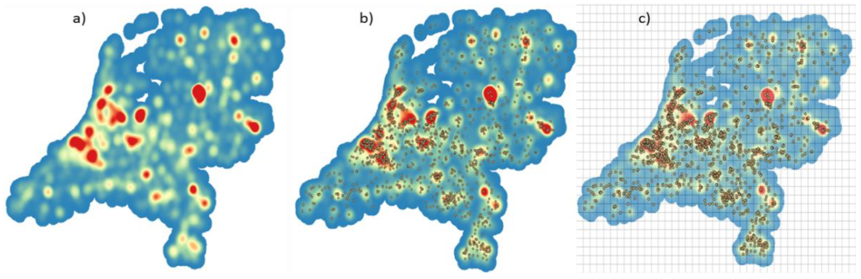
Figure 5 shows the analysis of information for the parking lots in three steps (a), (b), and (c)
First a raster layer and corresponding area/point was loaded in Q-GIS. Because of the large quantity of information, a good way to perceive the areas of intensity is through heat maps or by creating raster layers. This intensity can be visible in three levels; red (most intense), yellow, and blue (least intense). The second step is to overlay the charging infrastructure point layer. Third, a grid is generated and the Q-GIS counting script outputs the number of points on each cell. The correlation between charging points density and parking lots density, is moderate to strong being 63.00% using the area layer for the parking lots. Using the point layer, however, the correlation is 73.19%.
For covariance/correlation estimation of the population data [
31], two raster layers were used. The population density grid refers to a 5 km scale for the year 2015, the latest year to which the dataset refers. The population density raster in
Figure 6a consists of estimates of human population (number of persons per square kilometre), which is consistent with national census and population registers. The charger density presented in
Figure 6b was created using the heat map tool of the raster set in Q-GIS, following a 10,000 radius of the layer’s units. As the raster layers act as a matrix of pixels, no normalization is needed, hence no grid generation as in the later cases. Using the Grass command tool, “
r.covar”, and a generated sample of size
n, Q-GIS provided the output of the covariance/correlation matrix. With
n = 2759, a correlation of 62.51% was obtained. We can visually observe from the raster layers that there is in fact a moderate positive relation between the concentration of people and charging columns density given by the dataset.
There may well be many factors influencing the decision for the charging infrastructure deployment, however from the three factors analysed, it can be verified they are positively correlated (moderate to strong), and hence a good explanation for the chargers density. In addition to this, the parameters used are easily available and may be applied in a straightforward way to other datasets under study as described in the present study.
3.4. Nearest Neighbour Distance and Availability
The distance at which charging points are located from each other or from a point on a map is yet another variable of study often found in the literature [
6,
9,
11]. The authors find different ways of approaching distances, such as using polygon overlay methods, line layer distance, and Delaunay triangulations, among others. In this study, we use a nearest neighbour (NN) distance analysis, which, despite its shortcomings, compensates for its simplicity of use. Furthermore, working with mostly meshed networks, averages, and large scale data contributes to mitigating the plainness of the method. It is important to notice that the indicator only refers to the dataset under analysis and does not include the whole country’s network. The minimum, maximum, and average distance between chargers and a given point in the network must be secured to allow the vehicle to reach a charging point within “reasonable” distances regarding its state of charge (SOC). This should be done by road segment in order to avoid situations such as a charger on a highway being close to another outside the highway, but impossible to reach. The distances are important to consider with the availability to charge factor. On one hand, if high availability to charge is observed, then longer distances between connectors may exist, on the other hand, if low availability to charge exists, then it should be compensated by shortening the distances between connectors.
Table 1 presents the distances between connectors and columns by road segment and total values. Also, the availability is shown by road segment, which tends to be higher in primary roads and lower in residential.
In Q-GIS, layers are often assigned a geographic coordinate reference system (WGS 84 or similar), which will provide degrees instead of metric system distances (projected reference system). It is important to define the same reference system for the layers according to the positioning of the area under study. A straightforward tool to identify the grid zones of the world is available online [
32]. The values presented in
Table 1 refer to the mean, nearest neighbour distance, maximum and minimum between charging columns, and the average nearest neighbour distance between connectors. Approximately 65% (1087 out of 1683) of the charging columns have more than two connectors. For these columns, we consider the NN distance to be zero, which is the next available option a user has for charging his/her car if the first connector is occupied. The maximum distance is the same for both situations even if we consider the columns to have more than one connector. It is important to highlight that the minimum value is zero for the chargers with more than one connector.
Table 1 also shows the minimum distances of the nearest neighbour column. Not only is the distance of the next available charging option per segment important to assess, but so is the case when the complete network is considered. In this case, the distance between road segments is calculated and, hence, the closest neighbour will frequently be a charger belonging to another road segment, which is why the total has a lower value when compared with the individual segments. In the dataset, there is one charger in the secondary road segment that has 3 connectors and another charger with 14 and 3 connectors in the residential segment.
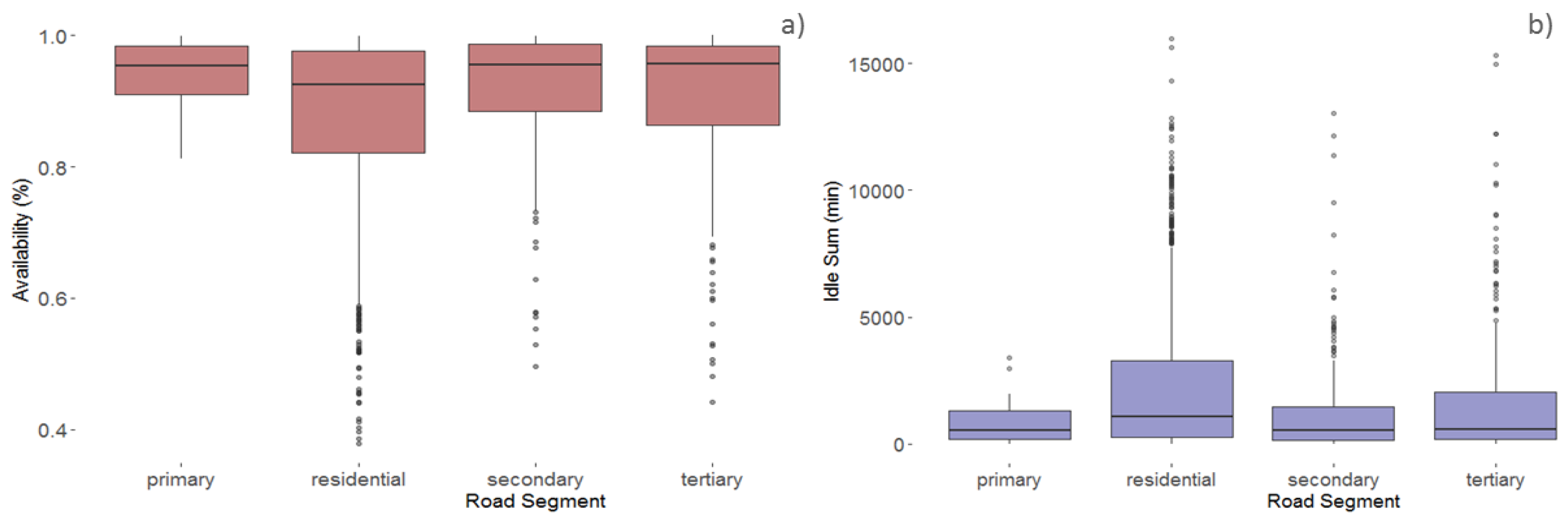
Figure 7 provides a comprehensive view of the availability (a) and relation with idle times (b) by road segment.
Considering the complete dataset for the two years under analysis, the highest maximum value of idle time is observed in the residential and tertiary road segments, which are approximately the same, just over 15,000 min. A higher idle time directly impacts the availability, which is why there is a lower minimum of availability to charge on the road segment’s chargers (37%). On the contrary, if the primary road segment is observed, the median and maximum values of idle time are lower, which correspond to a higher general availability to charge. More than one connector per column mitigates the lack of availability in some locations.
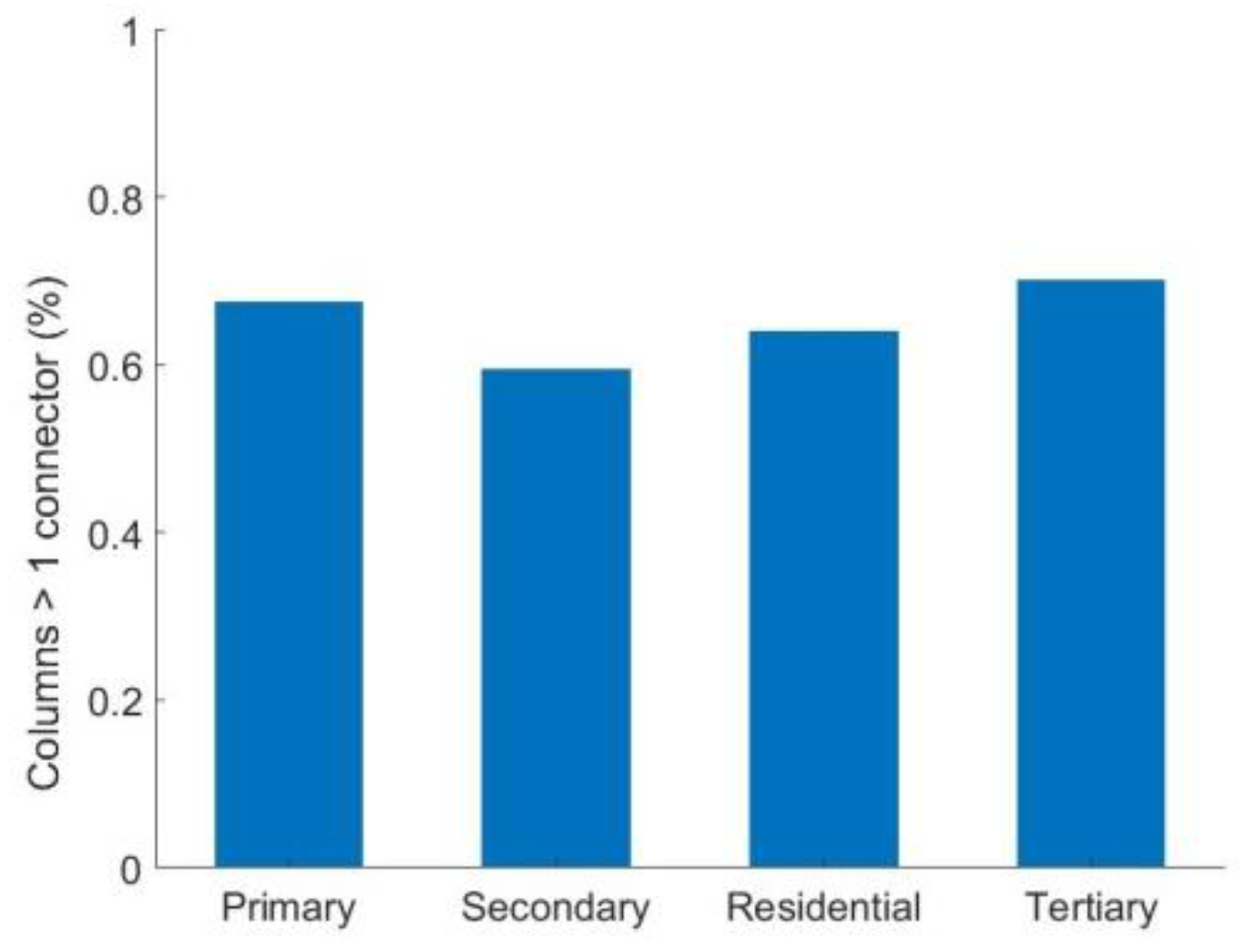
According to
Figure 8, the percentage of residential chargers with two connectors (64%) is less than that in the tertiary (70%) or primary road segment (67.5%). The lower percentage of chargers with two connectors is observed in the secondary segment (59.4%). To improve the availability in the residential segment, which is the lowest, either the number of connectors per charger should be increased, or the idle time should be decreased.
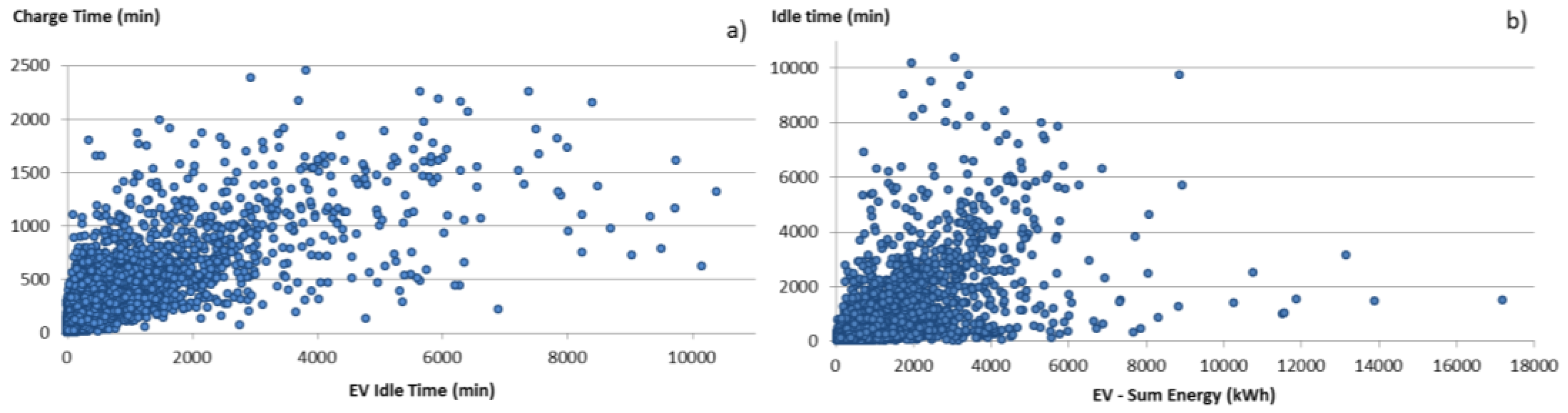
The fact that a vehicle is parked in idle time prevents other vehicles from using the infrastructure for charging. If the charger is occupied, the vehicle has to approach the nearest neighbour charging column/connector to charge, which again may be occupied. In principle, this would motivate an extra installation, increasing the number of chargers per vehicle. Idle time should hence be discouraged in order to reduce the use service ratio, allowing maximum availability. One would expect to see less energy being provided by a charger whenever high idle time exists. However, this cannot be observed directly from the data, because the idle time is directly proportional to both the charging time and energy provided. However, looking at the dataset from the vehicles perspective (only vehicles that charge more than 24 kWh), it is visible in
Figure 9a that vehicles often tend to be parked in idle more than the actual charging time.
Figure 9b shows the positive relation between energy charged and idle time.
3.5. Use Time Ratio
The use time ratio, given by Equation (2), provides insights on the recharging infrastructure utilization. The use time ratio is calculated using the connected time, which represent the sum of idle time and charging time, divided by the total number of connectors multiplied by the corresponding hours. The ratios shown in
Table 2 have been calculated by road segment. The results show that the installed infrastructures in primary and secondary roads segments are less used. On the other hand, the residential use time ratio shows that 12.14% of the time, the connectors are plugged to EVs. Such a high value should not be completely attributed to a proportional higher energy take from the infrastructure, as can be seen in
Table 3. The idle time in the residential road segment is higher because of the fact that cars stay connected overnight, making use of this time for both charging and parking.
As previously mentioned, each StartCard is assumed to be assigned to a specific EV. The total number of StartCards for the year 2014 and 2015 is 42,400. Among these users, the average number of recharges in two years is 17.31, with a lower median value of four charging events (max of 1105). The low mean and median values can be explained by the fact that only 47.4% of EVs (20,069) charge more than 24 kWh in two years. If only these EVs are considered, the average number of charges per each StartCard is 34.09 instead of 17.31.
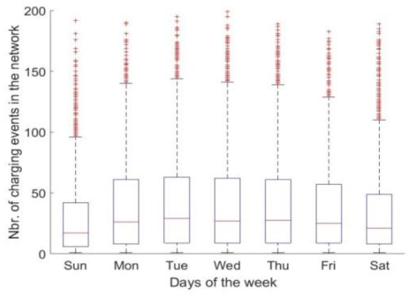
Figure 10 only considers such EVs that have been identified as frequent users (>24 kWh) of the ElaadNL infrastructure. It shows the average number of recharges in the whole infrastructure per week day. There is a marked difference between the number of recharges during week days (median of 45), and the weekend days where it drops to 36 on Saturday and 29 on Sunday. The use time ratio is hence well distributed across the all weekdays, with a lower expected use on weekends. However, the energy use ratio can further help verifying this observation.
3.6. Energy Use Ratio
The energy use ratio is given by Equation (1). Observing
Table 3, even if the average maximum power is considered to estimate the total infrastructure capacity, only 3.56% of the energy is actually being drawn. The residential segment appears again with a higher share, as it was expected from the use time ratio observed in
Table 2. Even though the residential segment chargers are those with the higher idle time, they are also responsible for the higher amount of energy provided.
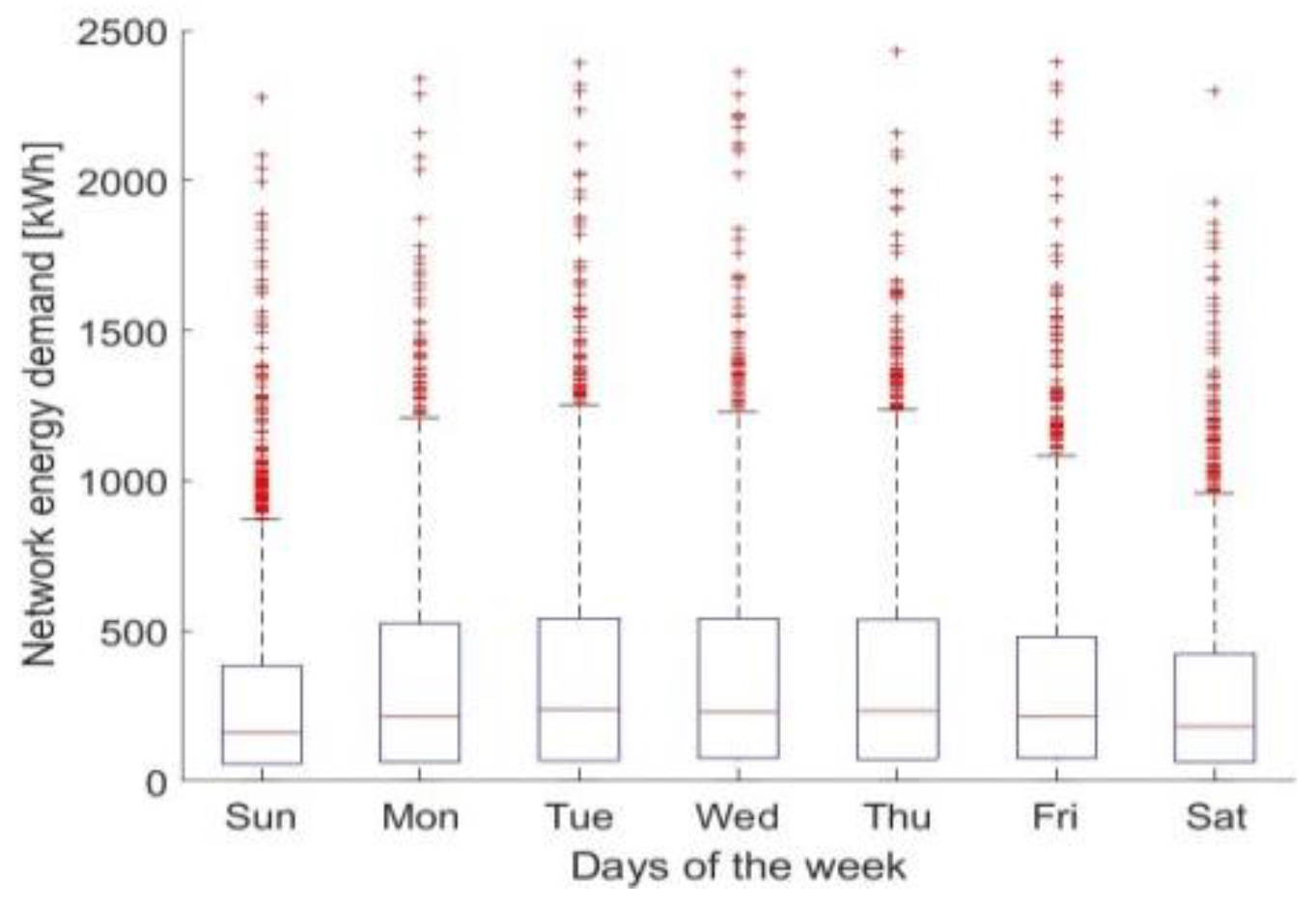
Figure 11 illustrates the average energy provided by the network for each day of the week. The mean daily energy demand is 400 kWh during working week days. Likewise, the amount of energy required during the weekends is lower when compared with working days, by 22% (31.2 kWh) on Saturday and 35% (260 kWh) on Sunday, on average. The fact that there is more energy drawn from the network during weekdays is substantiated by the higher number of charging events when compared with weekend days.
3.7. Total Service Ratio
The classic service ratio refers to the relation between the amount of cars per chargers or chargers per car. However, the functional unit of analysis should be energy related and if a direct comparison of vehicles to the number of points is to be made, it should contemplate the number of connectors, not columns. The number of vehicles per number of positions (34,380 positions of normal power in the Netherlands) in European Alternative Fuel Observatory (EAFO) [
3] is 3.59 vehicles per charger. From the dataset under analysis, there are 42,400 vehicles using the network, which correspond to 25.19 vehicles per column. However, if the connectors are considered (2785), this implies 15.22 vehicles per connector. It should be highlighted that the vehicles do not use the charging network exclusively, meaning that they can be assigned to other providers’ connectors as well. As stated before, more than half of the EVs (22,331) in the dataset used less than an average full charge (24 kWh) in two years. This shows one more reason why the vehicles alone should not be used as an indicator. Considering only the EVs charging more than 24 kWh will yield a ratio of 7.2 EV/connector (20,069/2785). There are just over 119,000 [
1] EVs in the Netherlands, and as we know that the dataset under analysis (2014 and 2015) corresponds to 8.1% (2785 connectors/34,380) of the total network in 2018, if, in exclusivity, 8.1% of the vehicles would be allocated to the network, then it would correspond to 3.46 (119,000 × 0.081/2785) EVs per connector. This value, given the proportion, is in line with the EAFO data (3.59).
3.8. Carbon Intensity of the Infrastructure
Equation (4) calculates the global warming potential (GWP) from the life cycle analysis (LCA) of materials used in the chargers per total energy flowing in CO
2eq/MJ (MJ in final energy). This is given by the carbon intensity of the normal charger (187.04 gCO
2/MJ) inventory, based on Lucas et al. [
7]. The inventory value is based on a column with two connectors. Evidently, the energy flowing through the chargers that have two connectors will be higher, hence contributing to its overall reduction. Such a value is then multiplied by the percentage of normal chargers (%
) of the total number of chargers-per-vehicle and by the chargers-per-vehicle ratio (SR
Total). The numerator is then divided by the total energy that flows through the chargers, which is calculated by multiplying the average energy consumed by a car per year (Avrcar
MJ/year = TTW
Energy X km/year) by the percentage of charge actually being performed in this type of charger (%N
ch) during its lifetime period (LTime
Nch). In the present study, in which an infrastructure is assessed, no assumptions have to be made regarding the proportion of chargers, because it is given by the dataset. The number of chargers corresponding to the
part in the numerator is 1683. The energy in the denominator is the sum of the two years, which has to be estimated in an annual basis. The lifetime used was 10 years.
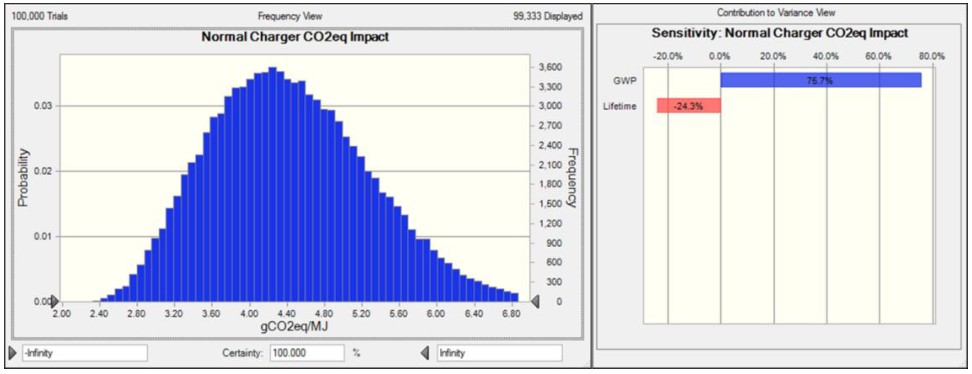
The uncertainty associated with the parameters used is based on the literature [
7]. There is no data on the exact expected lifetime of the product, however, we have increased it and considered 10 years to account for technology evolution and material degradation. Crystal Ball [
27] was used to introduce the uncertainty statistical distributions. After running 100,000 trials, the forecast is given in
Figure 12. The mean value for the carbon intensity indicator is 4.44 gCO
2eq/MJ and the standard deviation is 0.87, with minimum and maximum being 2.09 and 10.65, respectively. The value found is 30% higher, but in line to the ones reported in the literature [
26]. For the Portuguese case study, the authors found a mean of 3.4 gCO
2eq/MJ. Evidently, this occurs because there is on average less energy flowing through the charging network than in the Portuguese study.
Table 4 shows a summary of the indicators discussed and analysed in this section. In total, eight indicators were developed. A fair comparison can only be done in relative terms to other datasets. However, in absolute terms, one can observe that there is a discrepancy between the use time ratio and the energy use ratio. This is due to low charging time when compared with idle time. The fact that there is high availability means that overall, there is low energy demand when compared with what the network could provide. This causes a low allocation of the carbon intensity, which seems to be higher regarding values in the literature. The values reveal that the network could be over dimensioned, which is normal for the early adoption stage. Nevertheless, because of the energy use and service ratio assessed, one may observe that 52.6% of the vehicles charge less than 24 kWh in two years, which is a misuse of the network. In addition to this, it may be observed that the correlations assessed are moderate to strong, which seems to indicate that the network is well distributed. There is also a moderate charger and geographic concentration in terms of energy demand concentration. Still, there is high enough charging availability and dispersion to promote EV adoption.
4. Impact of Public Policies
At this stage of EV market penetration, policy support is still indispensable for lowering the barriers for adoption. A supportive policy environment enables market growth by making EVs appealing to consumers, reducing risks for investors, and encouraging manufacturers willing to develop EV business to start implementing them. Policy support mechanisms can be grouped into four major categories: supporting research and development of innovative technologies; targets, mandates, and regulations; financial incentives; and other instruments (primarily enforced by the cities). Naturally, cities and municipalities benefit from, and are constrained by, policy at the regional and national level. Such targeted policies are best developed and adapted to the unique, local mobility conditions of each urban area. Popular examples are the following: exemptions from access restrictions to urban areas, free public charging, EV-friendly building and parking codes, special road or lane access, car registration benefits, parking benefits, and local purchase incentives [
2,
33,
34]. Such policies have a direct effect on the infrastructure use, and hence on the assessed indicators discussed here. As an example, EV support actions promoting parking benefits are commonly found in major cities such as Amsterdam, Shanghai, Utrecht, Oslo, San Jose, Shenzhen, or Taiyuan [
2]. They are, however, only effective in a promotion stage, because they could allow a potential misuse of the network by increasing the idle time, thus decreasing the availability to other users. By assessing the indicators presented in this article, infrastructures both already in place and in the design stage may benefit from information towards optimization. Variables can be changed and the effect they may have on the indicators can be studied.
Effect on Indicators by Changing Parameters
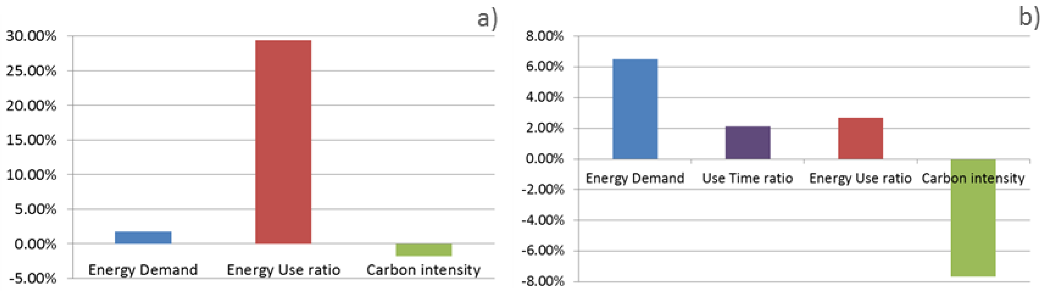
We provide two examples to show how some indicators may be influenced by changing target variables of public policies. The first case considers a public policy aiming for a 50% reduction of idle time. One may approach this exercise by fixing different parameters. In this case, we assume that the use time ratio, and hence availability of the system, is maintained. We will recalculate indicators referred as 1, 6, and 8 in
Table 4, which are the ones directly impacted. Regarding the first, the energy demand indicator, if actions are taken to reduce the idle time by 50%, maintaining the use time ratio, this means that the connected time is also maintained. Because the connected time is the sum of the idle time plus the charging time, the corresponding decrease in the first will lead to the same increase in the second. The connected time (in minutes) is 5.27 × 10
6 = 3.38 × 10
6 (total sum of idle) + 1.89 × 10
6 (total sum of charging times) being 50% of 3.38 × 10
6 = 1.62 × 10
6 min or 27.0 × 10
3 h. This extra time, if used as charging time, at an average power of 3.87 kWh (from the dataset), means an extra flow of energy of 103.8 × 10
3 kWh, which means 11.45 × 10
6 MJ/year. Dividing this by the number of charging columns or connectors provides the first indicator output of 6802.08 MJ
year/column and 4110.56 MJ
year/connector. Following the same principle for the other indicators, considering the new amount of energy demand, indicator 6 becomes 4.68% and indicator 8 becomes 4.36 gCO
2eq/MJ.
Figure 13a shows the variation on the assessed indicators with policy aiming for a reduction of 50% of the idle time in place.
For the second example, increasing the NN distance would correspond to eliminating certain columns. Decreasing the number of chargers means that the ratio of cars/charger will be higher. This also means that the energy use ratio will increase and the availability will decrease, therefore, an acceptable compromise must be found. We consider the residential road segment, which has lower average distance between connection points (1101 m) and columns (1838 m). Considering, for instance, that an increase of 20% of the distance between columns would increase it to 2205 m. Firstly the distances of the existing residential chargers dataset are organized in ascending order. Secondly, the ones that are lower are removed and the new average computed in an iterative process until the 2205 m distance is reached. Once this is done, the number of chargers removed is obtained, which is 103, corresponding to 6.12% of all the chargers. The total energy demand is assumed to remain constant. The energy demand indicator becomes 7121.56 MJ
year/chargers in this case, the use time ratio indicator is now 11.45% of total and 12.57% for residential. In terms of the energy use ratio, increasing the NN distance results in ratio of 3.85% and the infrastructure carbon intensity indicator reduces to 4.10 gCO
2eq/MJ.
Figure 13b presents the corresponding variation of the assessed indicators, when the residential NN distance is increased by 20% compared with the base case.
These examples show how policy implementation may affect the indicators, and hence be used as a straightforward tool to manage the operation of charging networks.
5. Conclusions
The article presents a methodology based on eight indicators to analyse the EV charging infrastructure features and performances. The methodology is developed around the principle that energy demand from EVs, rather than the mere number of chargers, should be used as the functional unit to build the indicators characterising the charging infrastructure. The analysed dataset reveals a high availability and a low energy use ratio in the infrastructure under study. This means that low energy flows through the network. This causes a low allocation of the carbon intensity, which seems high regarding values in the literature. Moreover, the fuel station, parking lots, and population density correlations assessed are moderate to strong, which seems to indicate that the network distribution is appropriate. The values reveal that the network could be over dimensioned, which may sound reasonable at the early stage of EV adoption. There is nevertheless moderate charger and geographic concentration in terms of energy demand. Still, there is high enough charging availability and dispersion to promote EV deployment. In terms of public policies, idle time was observed to be one parameter to negatively impact the infrastructure size and use. As EV penetration starts to increase, policies such as free parking should be phased out. An inadequately sized grid negatively impacts all indicators. If undersized, the EV adoption may be inferior, as the user perception of an adequate infrastructure may be undermined. On the other hand, an over dimensioned network will increase the cost, social impact, and environmental burden.


